Best icons for 2025
Celebrating the year’s most impactful icons, where design meets simplicity and creative problem-solving.
Since January 2024 the Streamline team has been on a monthly quest to curate the best and most creative icon design. It's been inspiring to see the work being done, and we've gathered over 500 projects in a year.
Last month, things got tougher as we narrowed down this huge collection to a smaller group of fifteen standouts. Because, let us say it again, good icon design is about more than just visuals — it's about solving communication challenges.
So, to celebrate the designers who excel at this tricky balance of simplicity and impact, we're excited to announce the second edition of the Best Icon Awards. These awards honor exceptional skill, original thinking, and the power of visual communication.
Our team spent a lot of time reviewing the finalists and voting on our favorites. Join us as we reveal the winners and celebrate these inspiring icons and the talented artists who created them.
The honorable mention
Before we reveal the winners, we want to highlight some other outstanding projects that deserve attention. These designs, while not award recipients, demonstrate the incredible talent and diverse approaches we saw last year.
15. Trait by Studio zur Strassen
Kicking of our list is a set of icons designed by Studio zur Strassen for Trait, a running app. These icons managed to capture the energy of running culture — those bold, powerful movements — and then softened it with these gentle curves that hint at the gradual process of building a healthy habit. It's a really clever visual language that ties in perfectly with Trait's fresh rebranding.
The whole set feels playful and purposeful as if it's celebrating that feeling of post-run euphoria and the journey to a healthier lifestyle. It's a delicate dance between practicality and personality, and Studio zur Strassen has executed it flawlessly.
14. University of Barcelona by Forma & Co
Forma & Co clearly put a lot of thought into these icons for the University of Barcelona, designing visuals that would work for everyone from freshmen to professors. The result is a set of icons that are clean and minimalist, with bold, geometric shapes that feel both modern and in line with the university's formal identity.
But they're not just stylish — they're incredibly functional too. The icon for "bookshelf" is a great example of how intuitive they are. It's clear that a great deal of care went into making these icons intuitive for such a diverse user base. The result is a set of icons that not only enhances usability but also subtly reinforces the University of Barcelona's professionalism and commitment to a user-friendly digital experience.

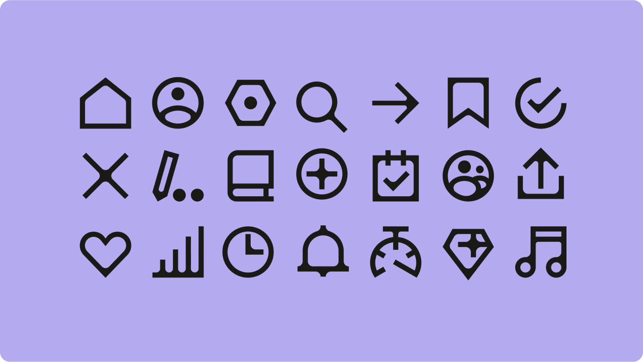
13. Landed by Jordan Jenkins
Jordan Jenkins' icons for Landed are designed to seamlessly integrate with the brand's approachable personality, which is crucial for a platform focused on connecting companies with top talent. Landed uses rounded corners and soft edges throughout its website and marketing materials to create a sense of warmth and accessibility, and the icons extend this visual language.
The rounded forms and simple lines, like those on the "globe" and "mail" icons, contribute to a less intimidating and more intuitive experience for both recruiters and job seekers. This consistency in visual language across the entire platform reinforces Landed's commitment to a user-friendly experience and builds trust with its users.

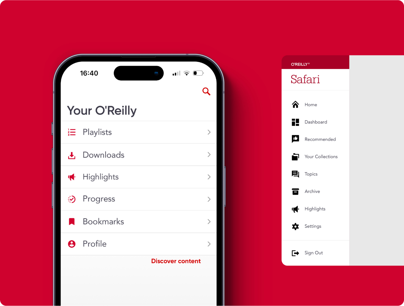
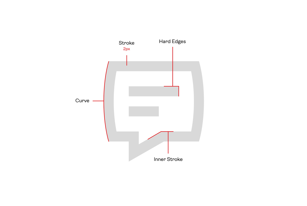
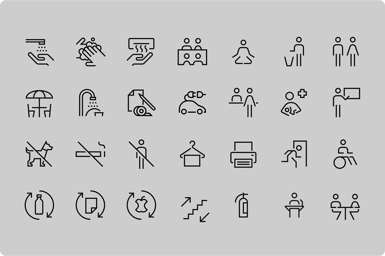
12. O’Reily Media by Makers Company
Built strictly following grids and keyshapes — you can almost see the underlying structure in the clean lines and balanced forms — the icons created by Makers Company for O'Reilly Media strike a perfect balance between sturdy lines, solid shapes, and white space. Three words to describe them: clean, functional, appealing. I mean, you can guess what each icon means even without any text accompanying them.
The subtly rounded corners give the icons a bit of personality while maintaining a neutral look. And their clarity makes it easy to find what you're looking for, even when you're quickly scanning a busy interface. This is especially important in a complex app like O'Reilly's, where users need to access information quickly and efficiently.
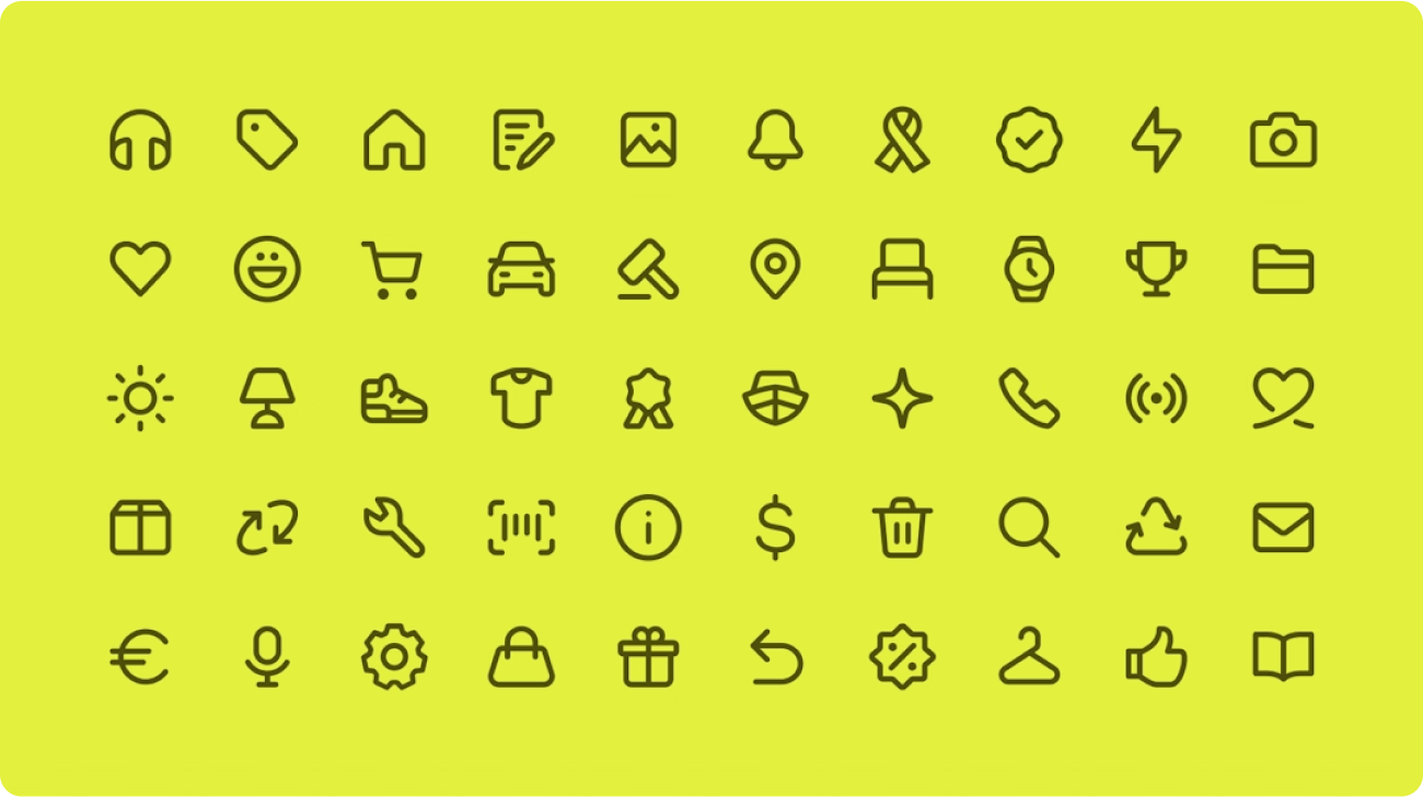
11. UMAUMA by Laura Nunes
The peak trend of flat icon style has long passed, but Laura Nunes' icons for UMAUMA prove that good design is timeless. You can really see the geometric influence from their logo — basic shapes built with straight lines and sharp corners, like the file icon — it's a smart way to tie everything together visually.

And the colors! So vibrant and energetic, which is perfect for a company in the entertainment sector. It's clear these icons aren't just functional, they're designed to inject some personality into UMAUMA's internal communications. I can imagine them making company newsletters and announcements a lot more engaging.
The Winners
The honorable mentions already demonstrated the power of great icon design, but now it's time to give the spotlight to the very best. Choosing the top 10 was a huge challenge, but the winners are a testament to the incredible talent out there. Let's now explore these truly remarkable projects.
10. Superbet by Dmitri Litvinov
I can see how Dmitri Litvinov wanted to make Superbet's icons stand out — apparently the sports betting market is a competitive one! Following a grid of 24px and keylines, these icons are clean and geometric, which gives them a modern feel.
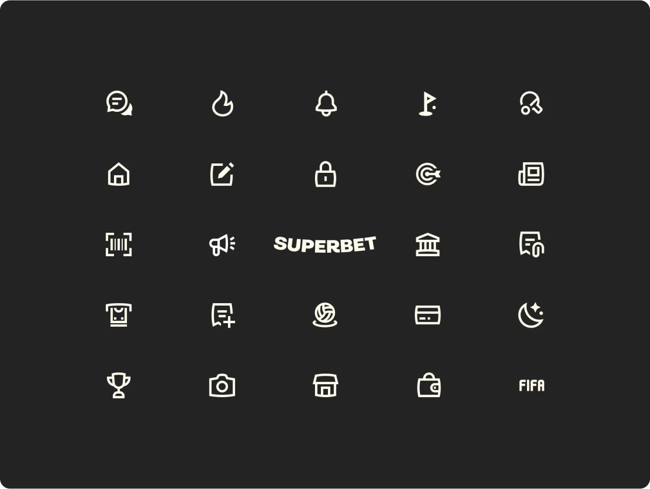

There's also this little touch of the subtly curved lines, like the message icon. It softens the geometric feel just enough to make the design feel more playful and, more importantly, it keeps the set from feeling too sterile. The icons are functional too — you can tell what each one represents at a glance. And they work well as a set, creating a consistent look across the app.
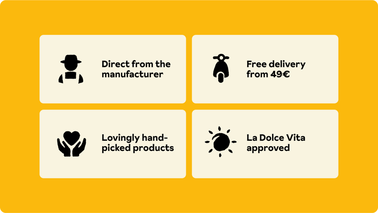
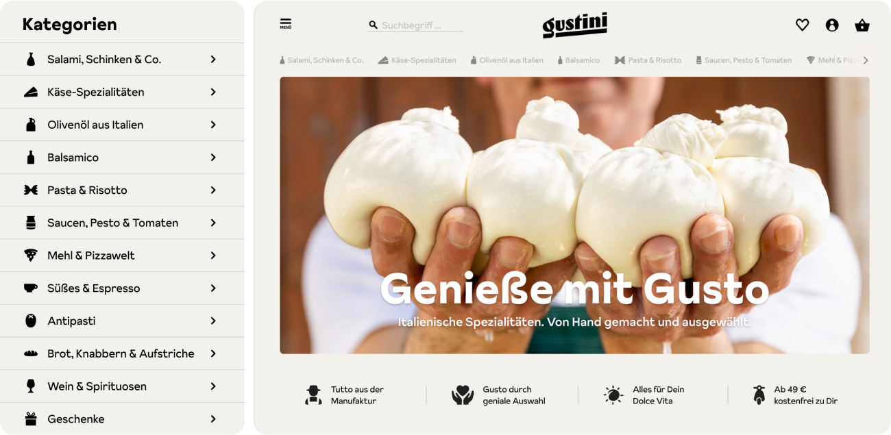
09. Gustini by Koto Studio
These Gustini icons, designed by Koto Studio, feel like a little treasure hunt for anyone who loves Italian food. With an organic look inspired by key products like cheeses, olive oil, and balsamico, the icons capture the brand's blend of tradition and contemporary charm. Their design works nicely with the quirky, painterly style of the Sunset Gothic Pro typeface, creating a cohesive visual identity.
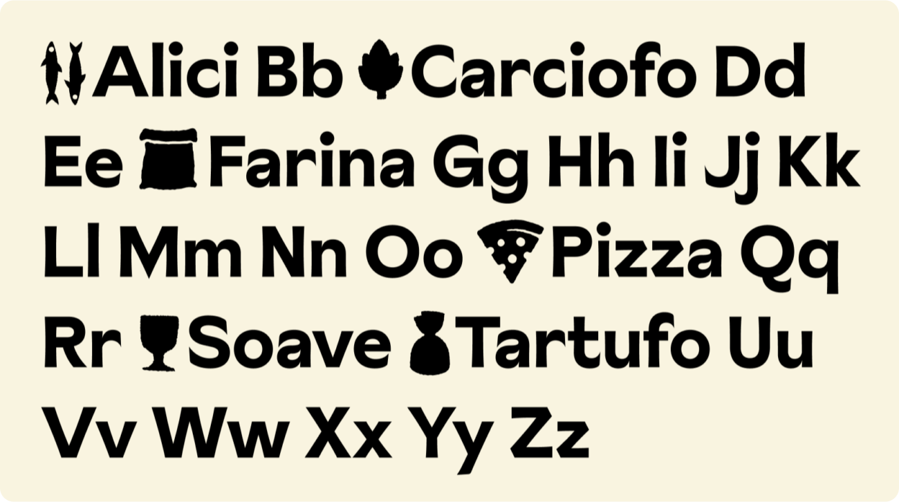

Integrated with the warm typography and Mediterranean color palette, the icons enhance Gustini’s relaxed feel. Their playful nature adds to the brand’s storytelling while subtly evoking the joy of Italian cuisine and lifestyle.
Koto’s design makes navigation easier and feel more inviting. The down-to-earth look of the icons makes you crave the good life — and maybe even a holiday?
08. Simon Switch by Forma & CO
In eighth place is a set of stylish wayfinding icons designed by Forma & Co for Simon Switch. The team described their vision as harmonious and quiet — and I think they nailed it.

The elegant lines with a geometric touch make them a perfect fit for a sophisticated office environtment. But more importantly, these icons are subtle. They blend in with the building's architecture like they belong there, not just tacked on. And yet, they're incredibly effective at making navigation effortless.
It's a tricky balance to strike, making wayfinding clear without being visually overwhelming, but these icons manage to do both. Beautiful, isn't it?

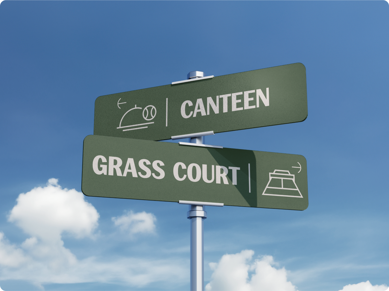
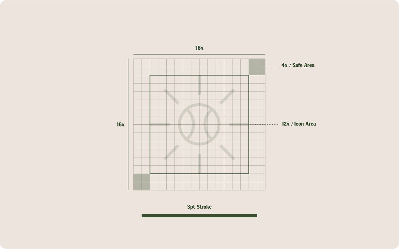
07. Sankt Niklaus Tennis Club by Pedro Renan
The way Pedro Renan has captured the feel of the Sankt Niklaus Tennis Club in these icons is amazing. You can see the clean, minimalist lines right away displaying a modern vibe. And look at the arrow icons, shaped like the curving lines of a tennis ball.
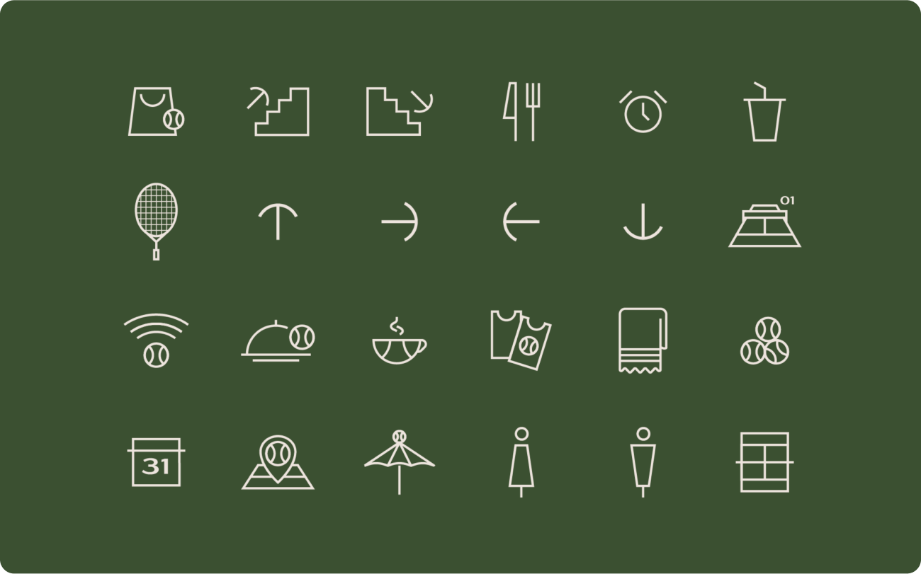

Their design is dynamic and elegant, echoing the typographic energy of Dropshot Display with the sophisticated green palette tying them to the club’s heritage. But it's not just about making things look pretty, these icons are clearly designed to be functional too.
Imagine members and visitors easily finding their way around the club using them. It's a great example of how design can respect the past while still feeling fresh and contemporary.
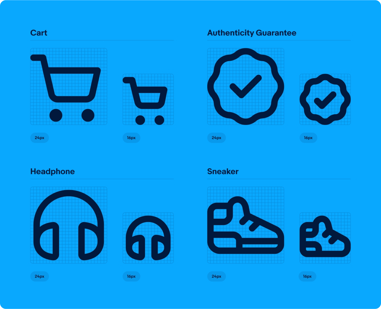
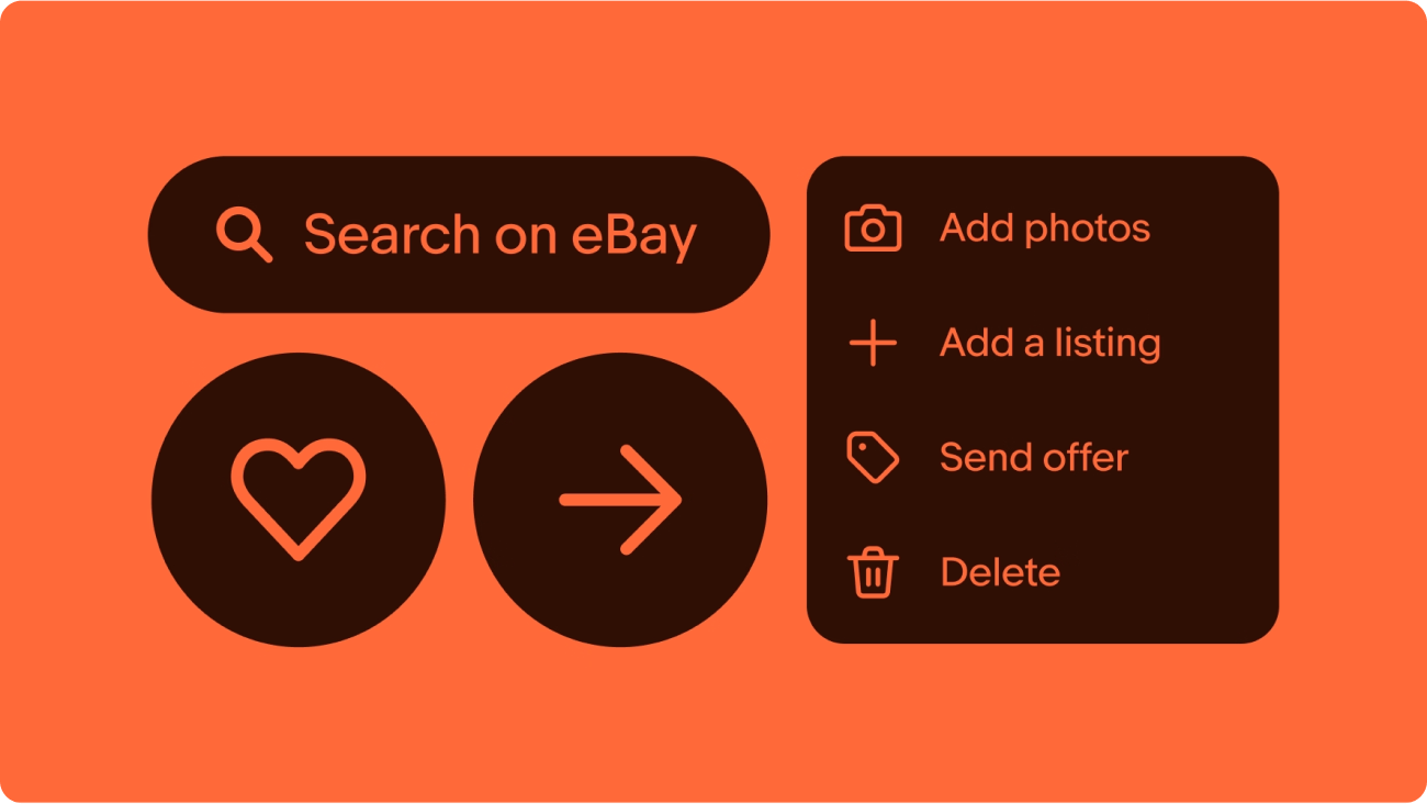
06. eBay by eBay in-house team
Developed as part of the eBay Evo brand and design system, the icons designed by eBay design team are stripped of unnecessary detail — a perfect way for creating a user-friendly experience on a platform with so much content.

Built on common metaphors like the cart and gift, consistent stroke weights, and refined details, the set adds up to the eBay experience, making navigation across platforms effortlessly easy. I mean, look at the sneaker icons — you can tell they're sneakers even without the label.
The launch of eBay Evo marks a major step forward, and it's undeniable that this icon set isn’t just about aesthetics — it embodies eBay’s ongoing commitment to a better user experience.
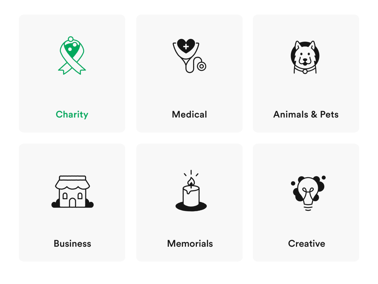
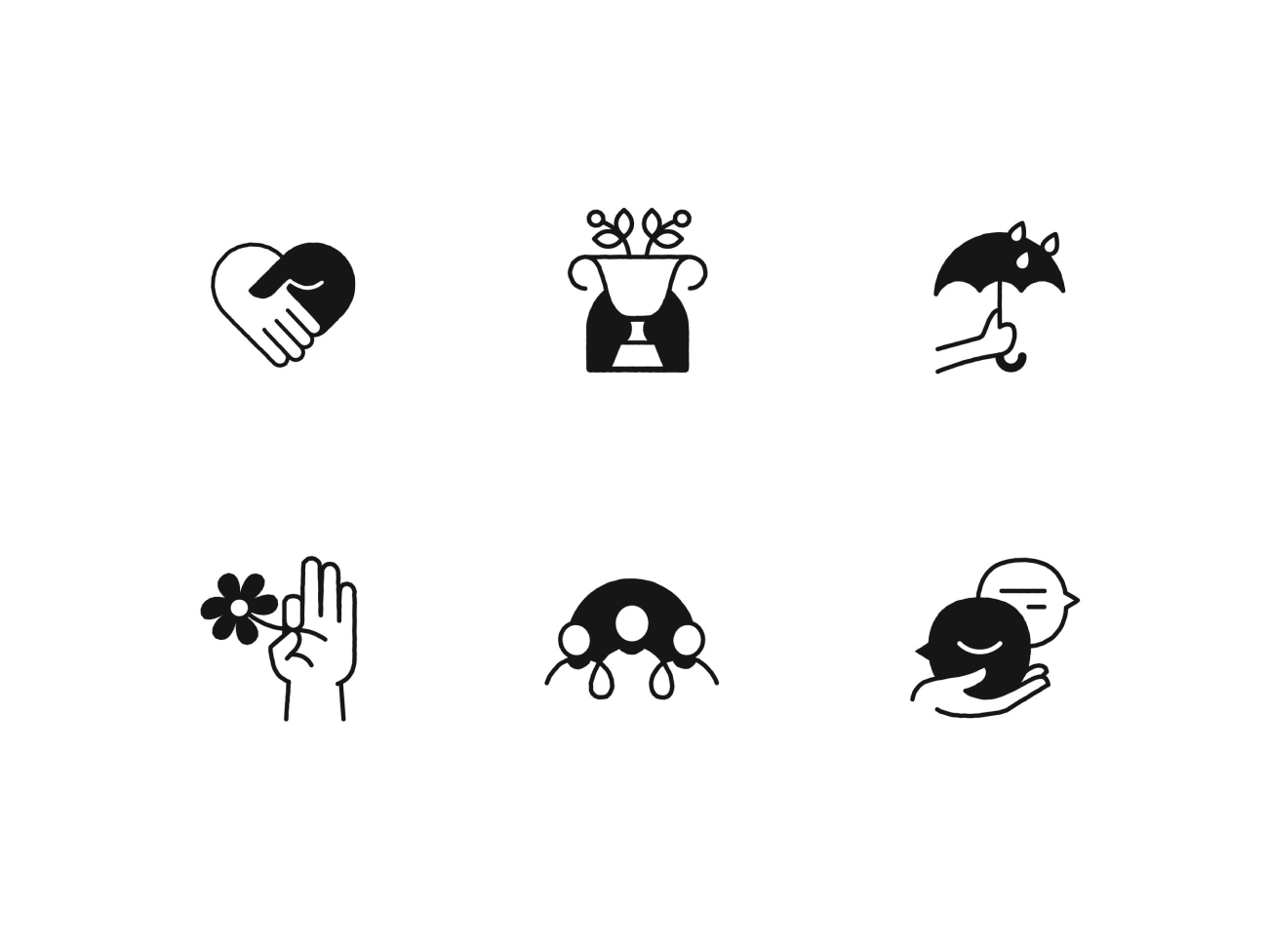
05. Gofundme by Zach Roszczewski
Human touch is a key point in these two sets of icons created by Zach Roszczewski for Gofundme, designed to uplift users facing difficult life events while using the app. The interface icons, like the hand holding a heart, show simplicity and friendliness. The clean, flowing lines feel kind and approachable, creating a sense of ease and support.
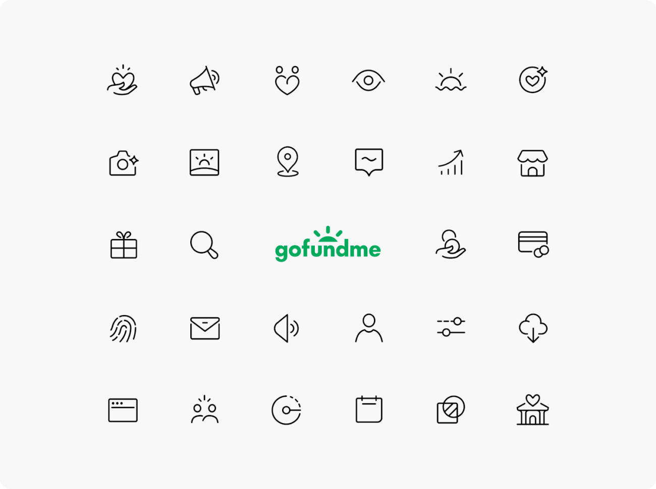

The illustrated icons bring an extra layer of warmth and authenticity. With their hand-drawn, rough-stroke style, they resonate on a deeply personal level. The use of candles for memorials and ribbons for charity is particularly effective, instantly conveying the specific purpose of each donation category.
Together, both sets create a cohesive and emotionally compelling visual language that perfectly embodies GoFundMe's mission of compassion and connection.
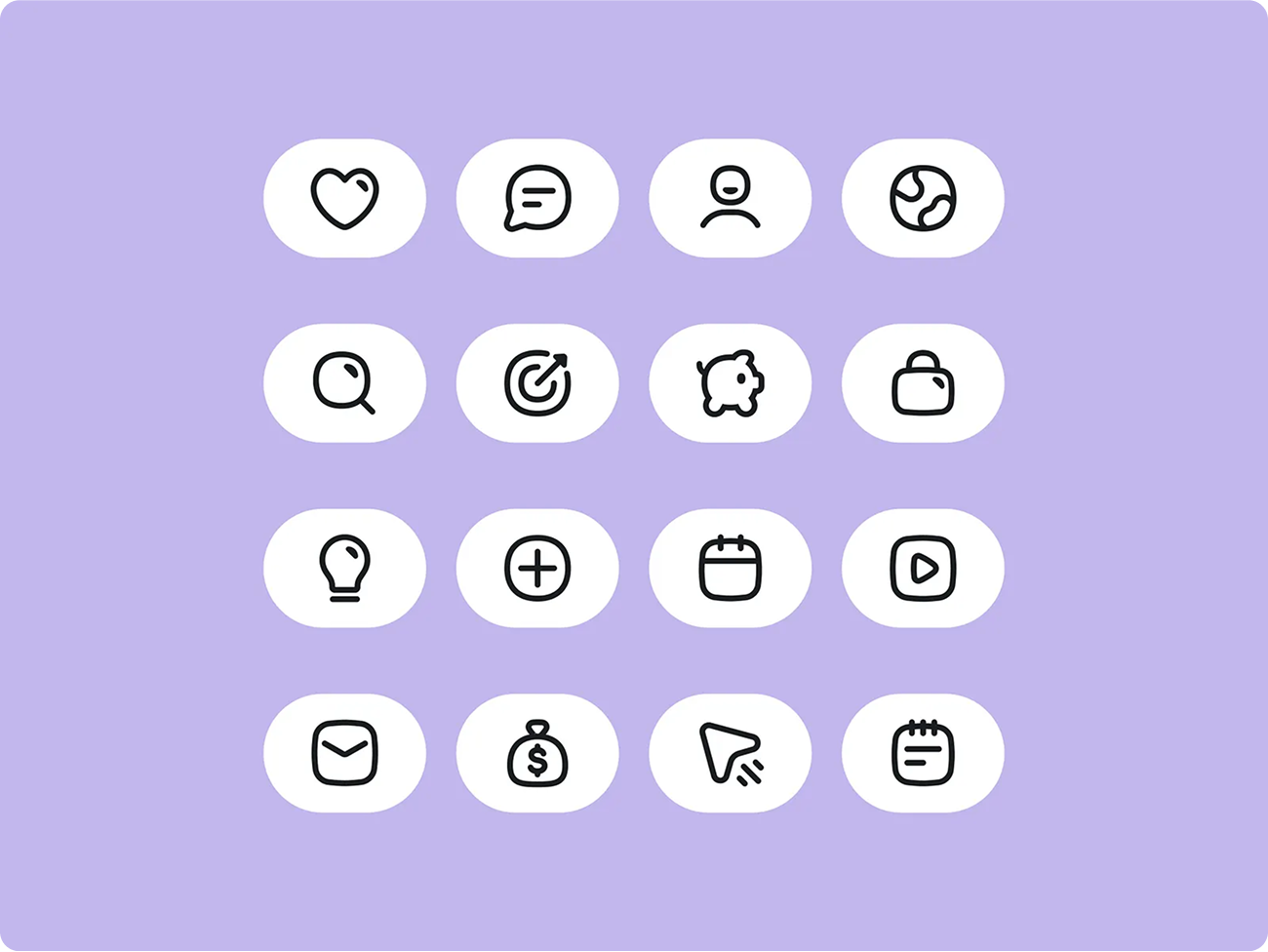
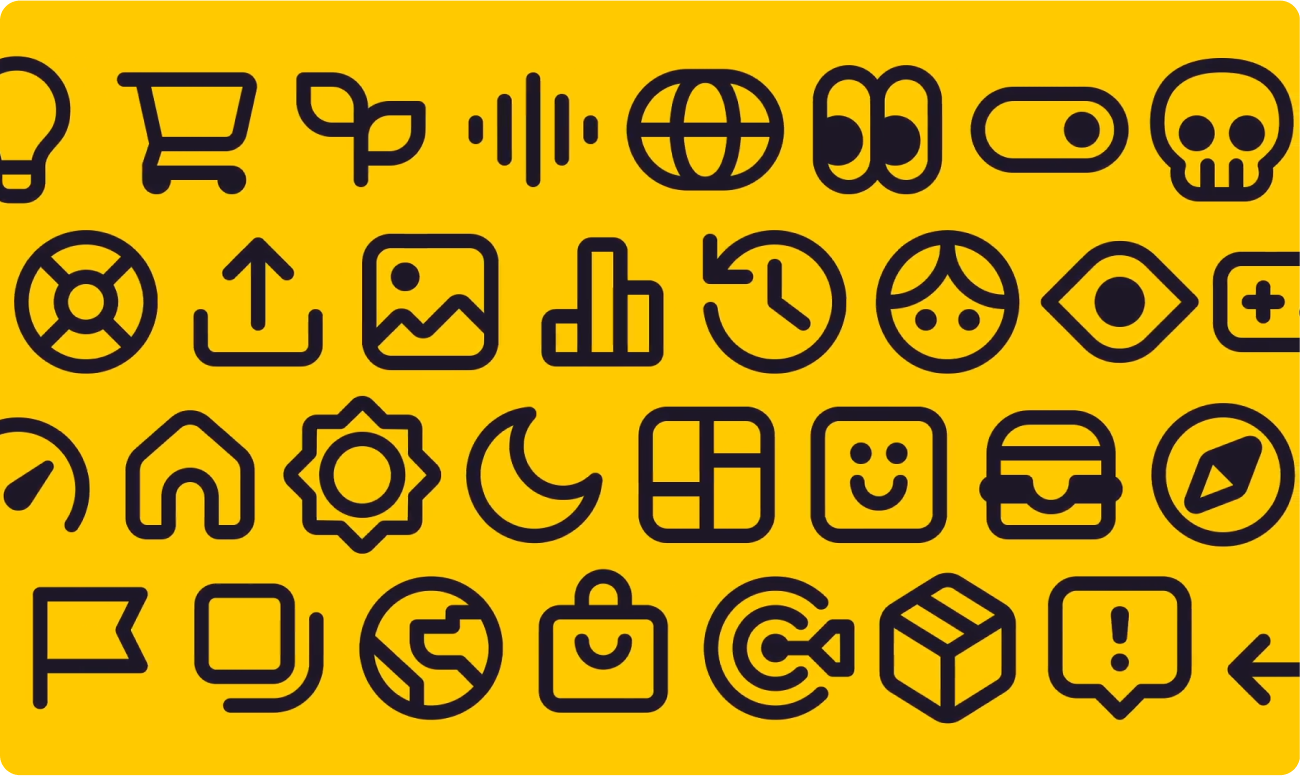
04. Mobbin by Victor Erixon
Victor Erixon’s icons for Mobbin have a really crisp, clean look that feels both modern and practical. You can tell they're designed with a lot of attention to detail – everything is geometrically consistent, which makes the whole set feel cohesive. They just seem like they'd effortlessly guide you around the Mobbin interface. The balance of solid shapes and clean, bold lines is a design well done, making sure the icons are easy to see no matter what size they are.
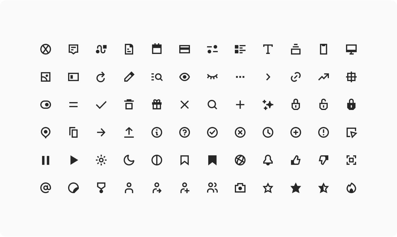

What I like about these icons is that they're simple without being boring — the "image" icon is a personal favorite. They cover all the essential actions you'd expect, like bookmarking and searching, and even the interactive elements like toggles and notifications feel intuitive. They just blend seamlessly into Mobbin’s sleek and uncluttered design.
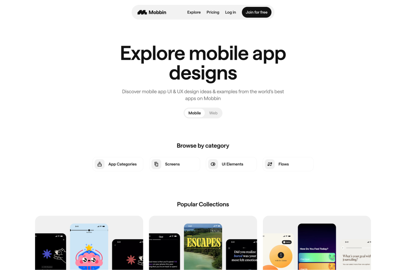
You can tell Erixon really focused on making sure the line weights are consistent and that the icons work well together as a set. It reflects Mobbin’s user-focused approach, and it definitely makes navigating the website feel smooth and intuitive. Also, take a look at this motion video introducing the icons. Perfection!
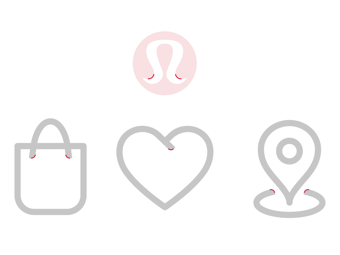
03. Lululemon by Zach Roszczewski
Zach Roszczewski's "Mudra" icon set for Lululemon earns its place in our ranking. These icons beautifully capture the balance between movement and stillness that lies at the heart of yoga. The subtly curved edges soften the underlying geometric forms, giving the whole set a sense of grace and fluidity.
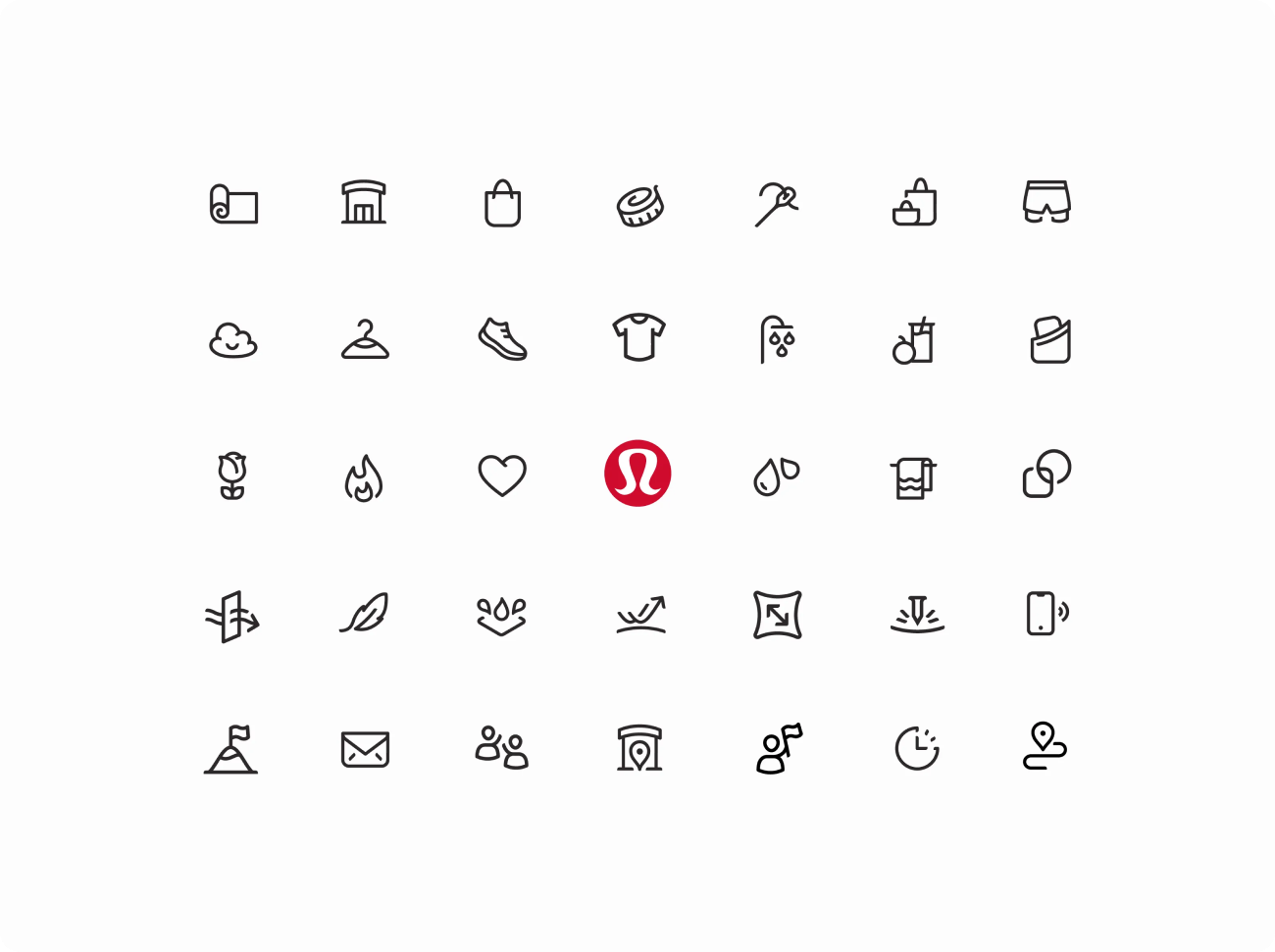

They manage to be both minimalist and expressive, adding a touch of serenity to any app interface. The "meditation" icon, for example, is a simple pictogram of a person in a seated position, with gently curved lines that evoke a sense of calm and focus.
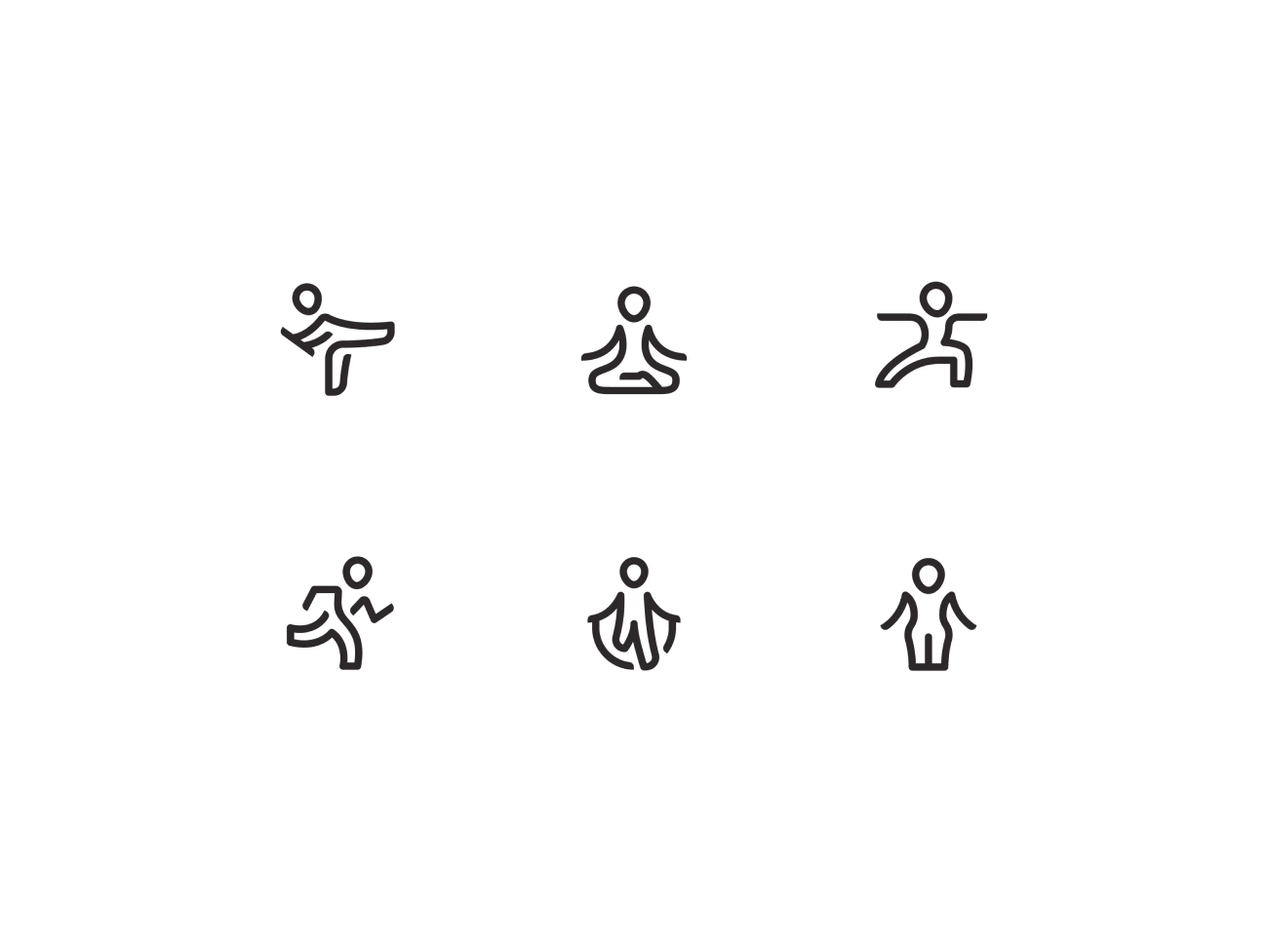
For their audience, who are passionate about yoga and mindfulness, these elegant and functional icons will enhance their experience on the platform. Overall, it's a cohesive and visually soothing set that perfectly complements the Lululemon brand and that sets its place in our ranking.
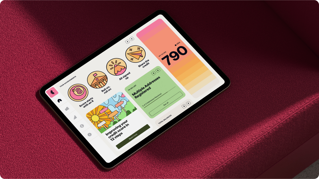
02. Checkmyfile by Ragged Edge
Ragged Edge’s icons for Checkmyfile have a really friendly and approachable feel, which is perfect for a credit-checking service. They're clean and rounded, which gives them a soft, optimistic look, and they definitely make you feel like you're making progress as you use the app.

The bold, simple designs make it easy to find what you're looking for, and the colorful backgrounds add a bit of warmth without being overwhelming. I like how the icons work with the rest of the visuals to highlight important actions like tracking your score, getting notifications, and seeing your achievements.
The icons really capture Checkmyfile’s goal of making credit checking less intimidating and more manageable. They're clear, vibrant, and definitely make the whole experience feel more optimistic and easy.
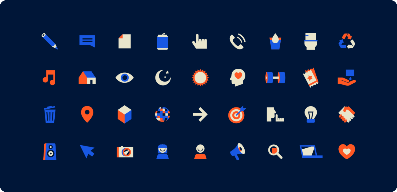
01. Banzai by Jeff Wiggins
Jeff Wiggins’ icon set for Banzai is huge – over 400 icons! – and it has a really nice, friendly feel that fits Banzai’s brand perfectly. They're based on simple geometric shapes with rounded corners and smooth lines, which makes them both playful and easy to read — a neat way to make it much more engaging to use Banzai’s educational platform.

It’s clear this set was designed to last. It works really well with Banzai’s typeface, VC Cardinal, creating a consistent visual identity. What’s really impressive is how forward-thinking the design is. Wiggins has made sure these icons are compatible with previous versions and other Banzai products, which makes life easier for the design team. The fact that they’re all based on a shared grid and come with detailed guidelines shows how scalable and sustainable this set is. It’s a smart investment that can grow and change without losing its core identity.
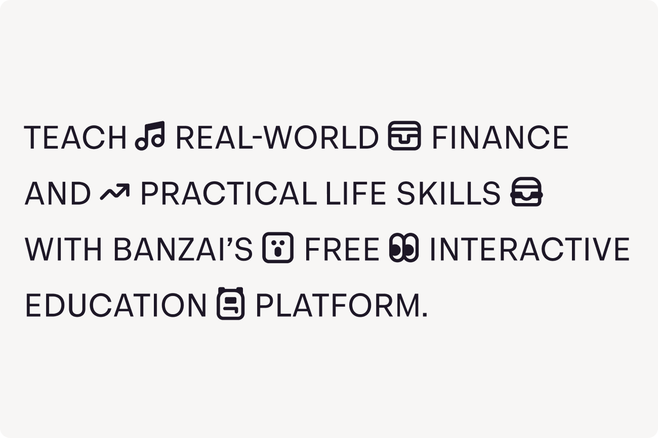
This icon set is a great example of how attention to detail and user-focused design can really elevate a brand. It’s not just about making things look nice; it’s about making the whole Banzai experience better. It’s a really well-executed project. Bravo!
Year in review
Creating and curating icons has taught us that great icon design goes beyond aesthetics. It’s about visualizing ideas for instant recognition, enabling communication for diverse users, even without words or labels. And the impact goes further: different projects have shown that icons can connect us to our heritage, strengthen identity, convey emotions, and inspire action. It's incredible how these seemingly simple visuals can have such a huge impact — a testament to the remarkable designers who create them.
We're always on the lookout for great icon design. Every month, we share some of the most inspiring icon projects we've found online in our Icon Design Spotlight newsletter. And each year, we celebrate the absolute best in icon design with our Best Icon Awards. Subscribe to catch our curated selection of outstanding work, or explore our archive for past publications.
Icon Design Spotlight 2024
- Icon Design Spotlight (January 2024)
- Icon Design Spotlight (February 2024)
- Icon Design Spotlight (March 2024)
- Icon Design Spotlight (April 2024)
- Icon Design Spotlight (May 2024)
- Icon Design Spotlight (June 2024)
- Icon Design Spotlight (July 2024)
- Icon Design Spotlight (August 2024)
- Icon Design Spotlight (September 2024)
- Icon Design Spotlight (October 2024)
- Icon Design Spotlight (November 2024)
- Icon Design Spotlight (December 2024)
Annual Best Icons
P.S. If you've spotted a truly innovative or unique icon project — maybe even your own! — we'd love to see it. Send it our way, and it might just be featured in an upcoming newsletter. Until then, let’s keep spreading the love for icons! ❤️