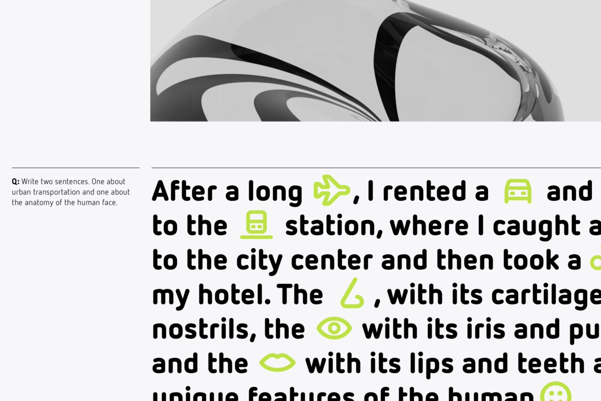
Best icons sets for 2023
A collection of the year's top 10 icon projects, curated and ranked by our team of icon designers. The choice of the winner surprised us!
Feeling overwhelmed by amazing projects and talented creators? As a designer, it's natural to compare yourself. But let's be inspired, not discouraged!
Icon design isn't just about beauty, but about creatively solving communication problems. We're introducing awards to honor the best in icon design, celebrating exceptional skill, unique approaches, and the ability to convey complex ideas simply.
Our team carefully selected these icons through a meticulous voting process. Join us in appreciating these inspiring icons and the artists who made them.
Welcome, dear reader, to the very first edition of The Streamline Awards.
The honorable mentions
Before the award ceremony, we want to acknowledge other notable projects. They showcase the diverse talent and unique approaches of designs that didn't reach the top but still merit recognition. These projects offer insight into exceptional design standards set over the year.
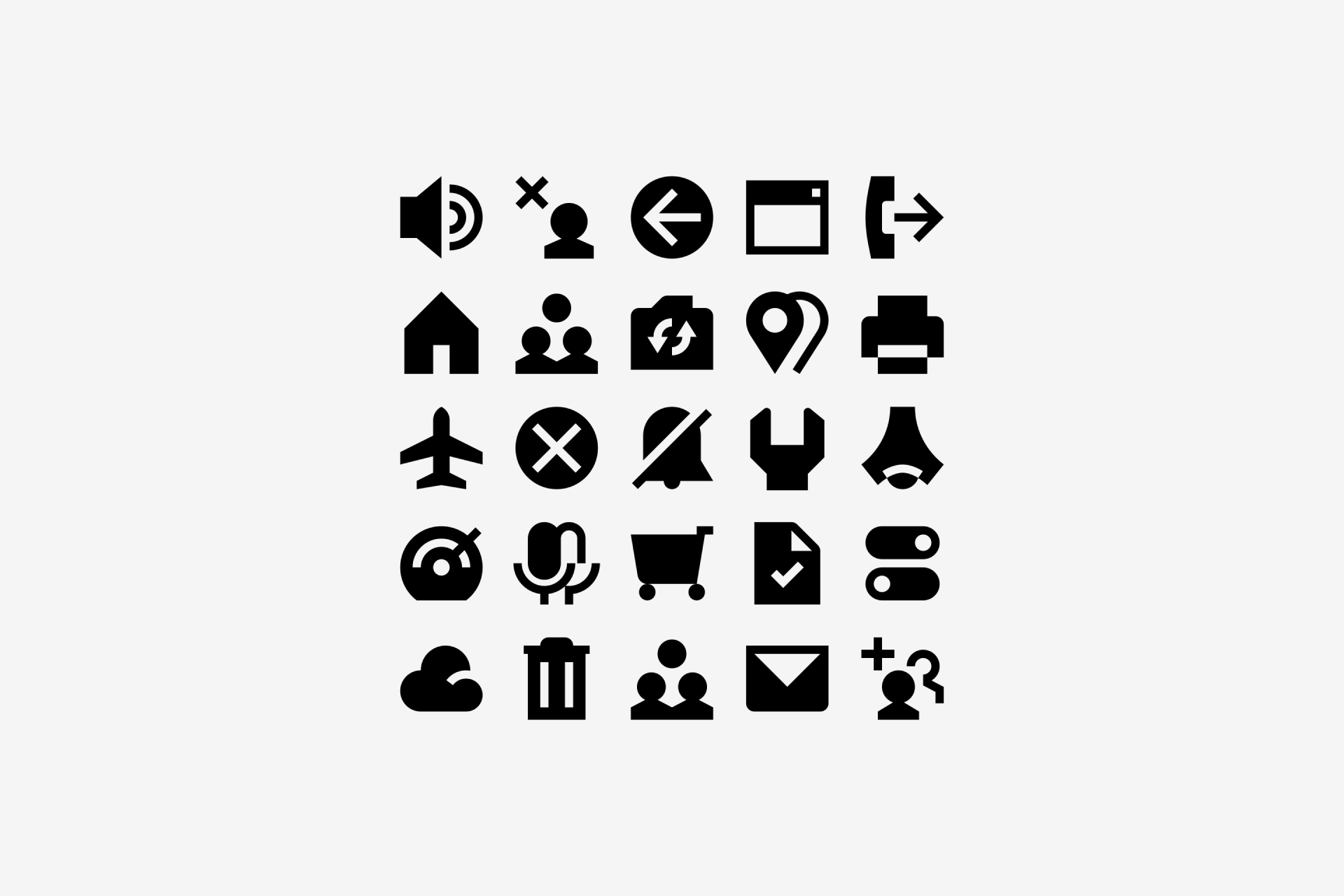
Phenom by Clay
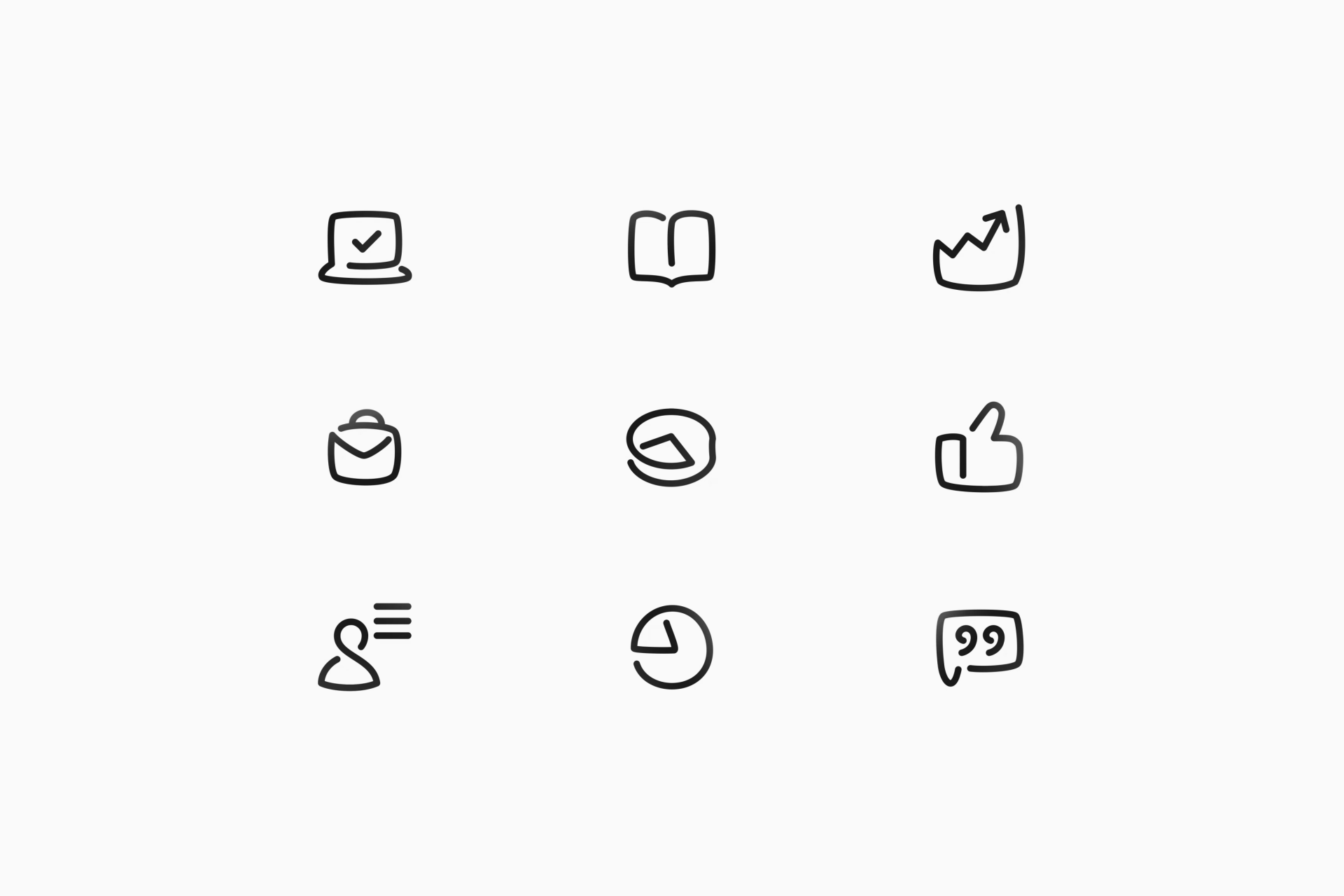
This first set, beautifully crafted by Clay, is a perfect example of curvy, organic icons. They’re slightly based on Phenom's own logo, although the team achieved a stronger personality thanks to the use of gaps, simulating that the icons have been drawn with a single stroke. The truth is that this little detail not only makes them more unique, but also more spacious, dynamic and modern. Plus, the marvellous animations add an extra layer of style, giving an already impressive set that extra touch of class and smoothness.
Pendant by Jeff Wiggins
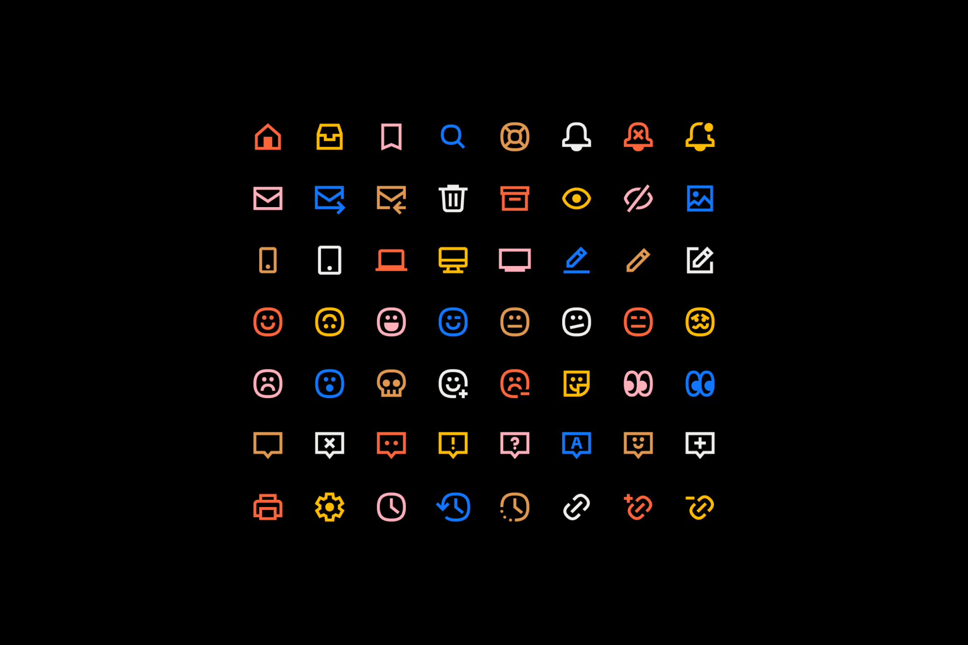
In the field of icon design, the widespread use of 'squircles' has become a clear trend. Taking advantage of its popularity, Jeff Wiggins created a set of over 150 lovely icons for Pendant. The mix of simple geometric shapes, straight ends, and, of course, squircles, has a reasoning beyond aesthetics: these icons must coexist with a typeface of great personality such as GT Flexa, full of circular glyphs. The result? An immensely cohesive set in formal and conceptual harmony with the brand, adopting a fun but elegant tone.
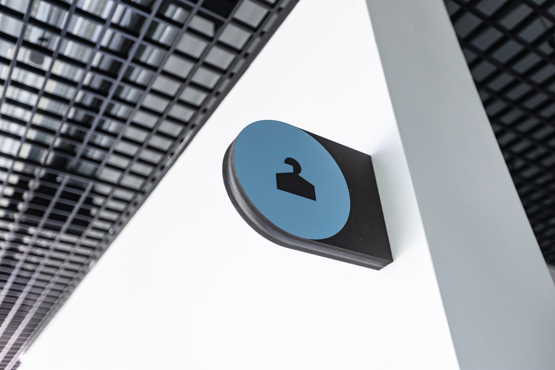
Teatr Ochoty by Blank Studio

Created by Blank Studio, these icons are part of a signage system designed for Teatr Ochoty, a cultural gem located in Warsaw. According to the team at Blank, this theater embodies ideals of openness and accessibility, reflected in informal graphic materials and its association with a distinctive logo. Therefore, the signage system draws inspiration from these foundational elements to create a geometric and minimalist icon set that manage to maintain a formal consistency while guiding users with clarity. Don't you just love Polish designers?
Netto by Daniel Utz
The similarities between icon and typeface design are more than obvious, and this revitalized version of Netto proves it. This new release not only maintains its original charm and functionality, but also expands its icon system. The design clearly focuses on a seamless integration of symbols and letters, achieving a perfect balance that allows it to convey information effectively. The simplicity of these icons, characterized by rounded and monolinear strokes, reflects the meticulous craftsmanship of a timeless classic.
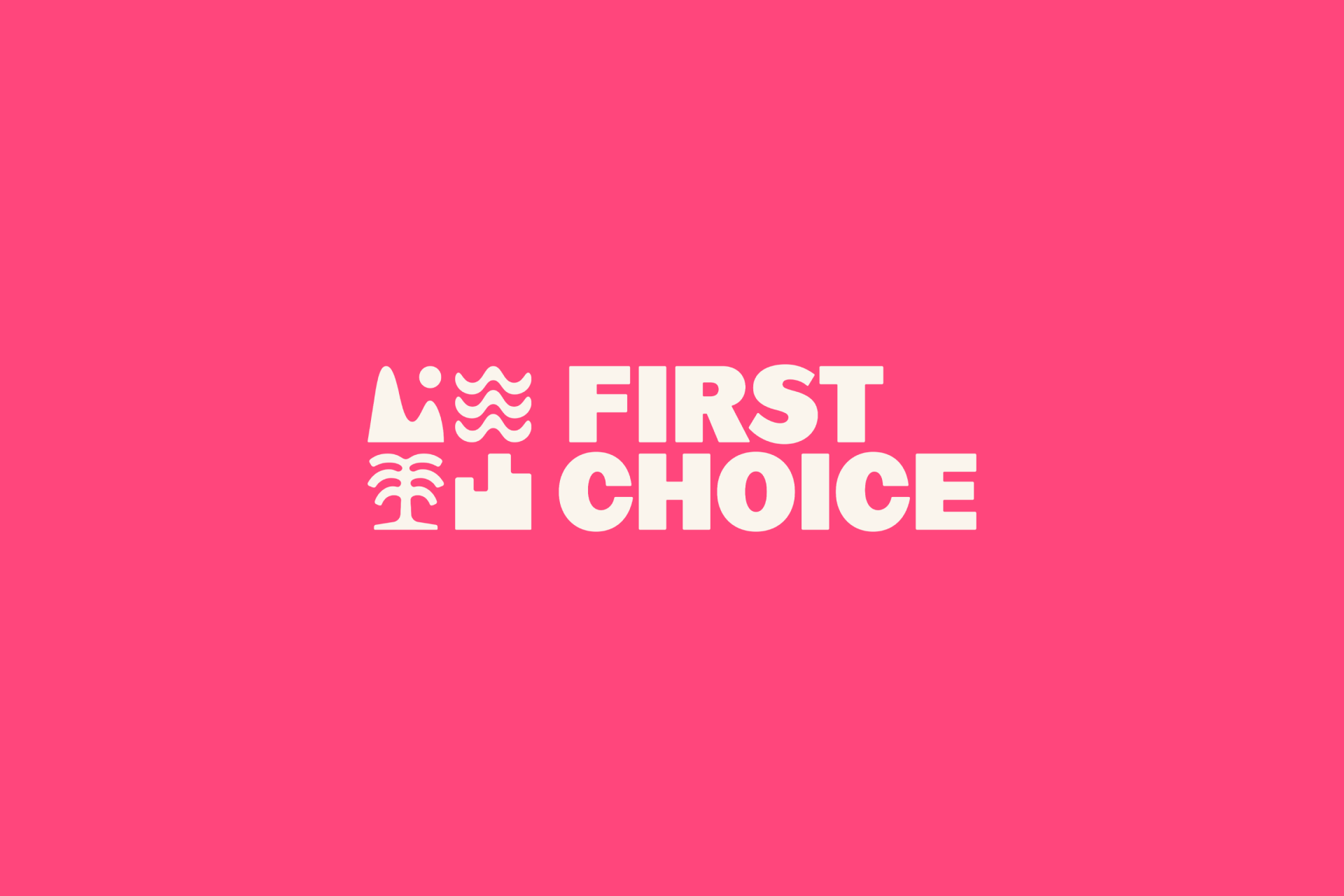
First Choice by Ragged Edge
Sometimes icons aren't just part of a brand identity, sometimes they're the brand itself. First Choice has been a symbol of British vacations for decades, but the evolution of young people's preferences prompted a redefinition of the brand by Ragged Edge. As part of this transformation, the team crafted a bold and modern set of icons that represent the art of organizing tailored travel experiences. These signs are seamlessly integrated into the brand logo and communications, resulting in an iconic identity (in every sense of the word).
The winners
The honorable mentions set high expectations for the winners' reveal. Choosing the top 5 icon sets was tough, but they represent a diverse and creative standout mix. Let's now explore the year's most captivating projects.
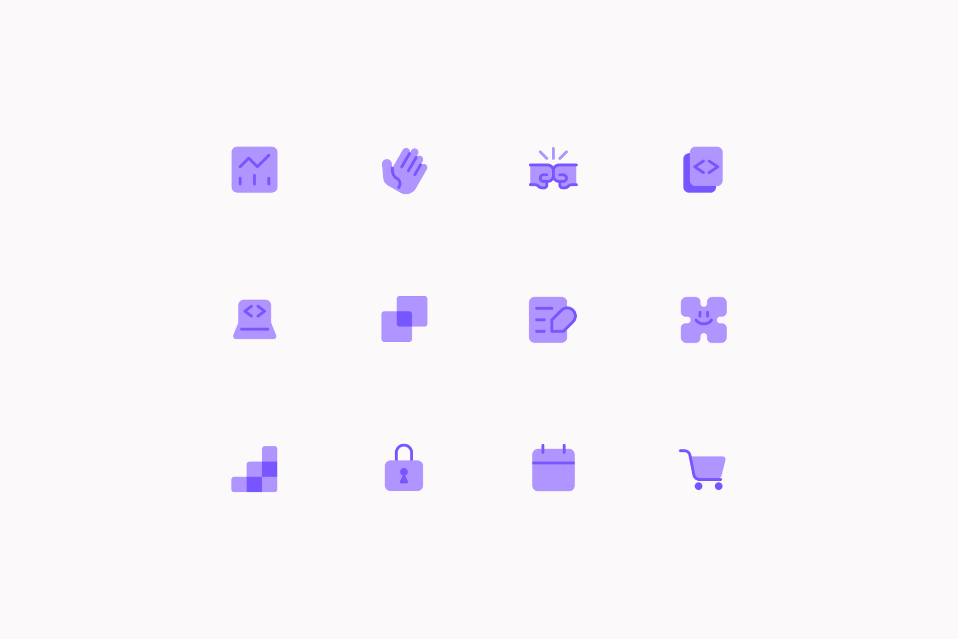
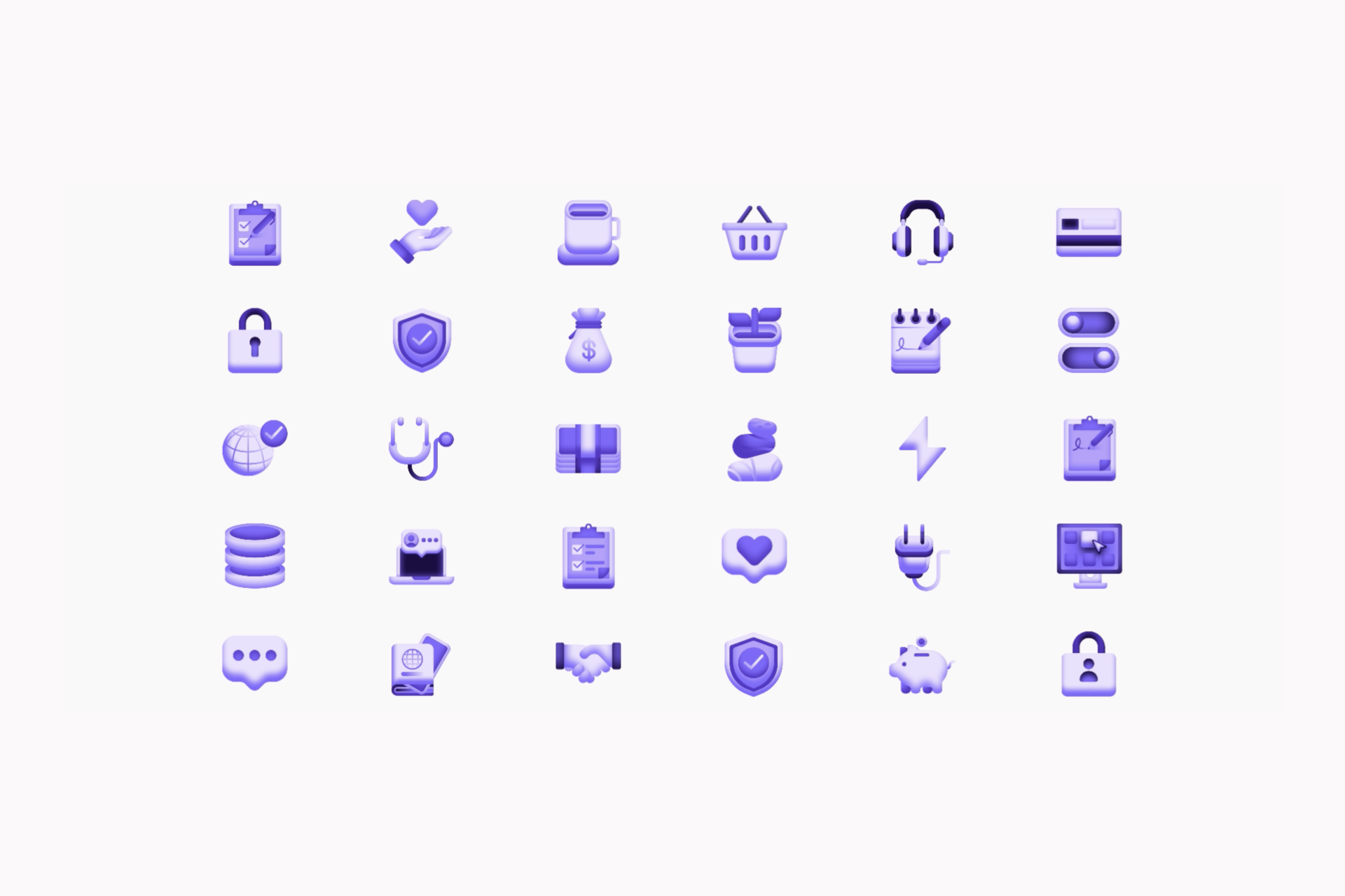
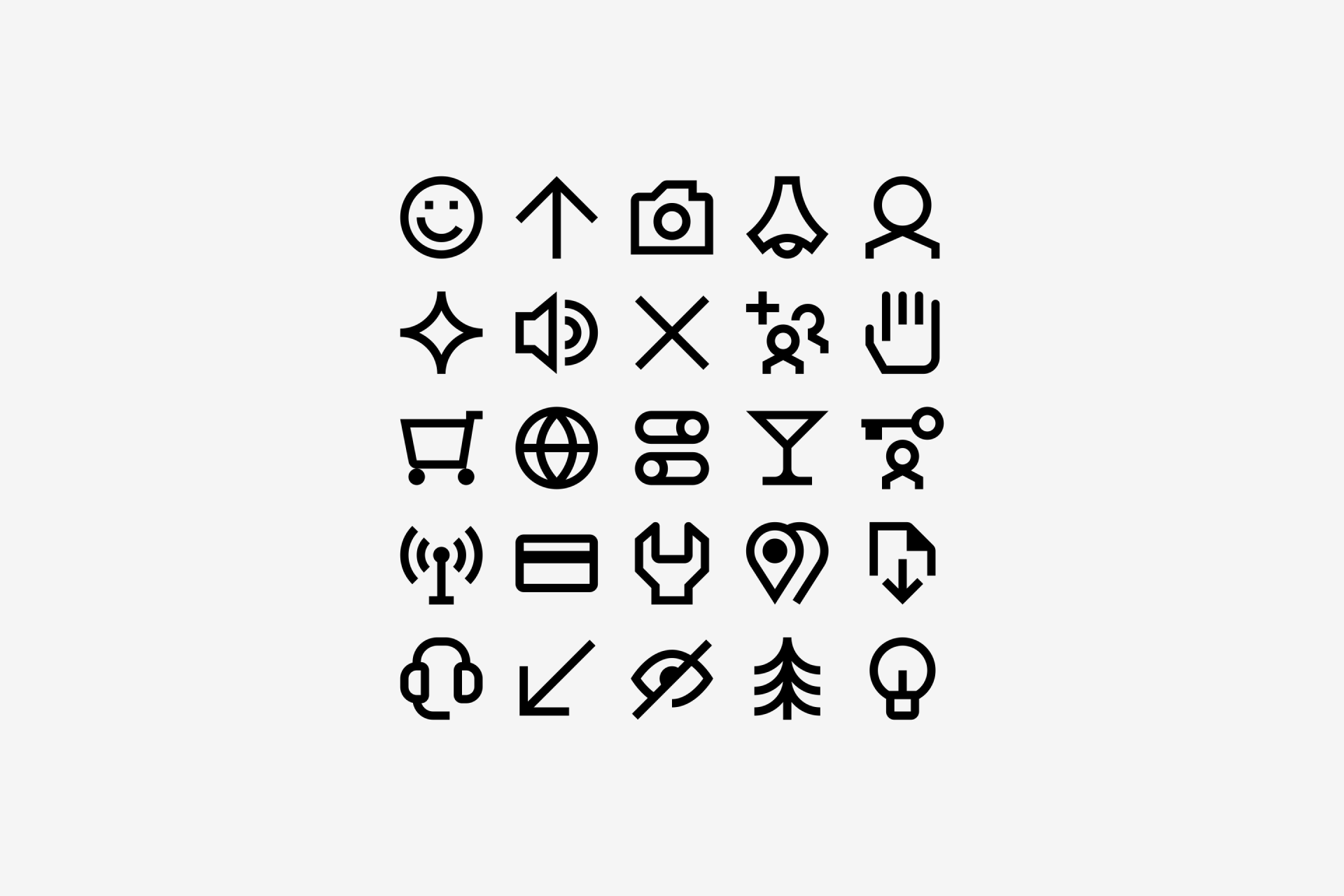
5. Mixpanel by Mixpanel's in-house team
"I'm a sucker for good, strong, and consistent branding, and Mixpanel's purple color on these icons really makes it their own."
— Ysabell Bondoc, Content Promotion at Streamline
Mixpanel's rebranding was one of the most celebrated this year, following a transformation process that didn't only involve superficial changes but delved into fundamental values and the overall tone of its communications. A standout aspect of this rebranding was the reimagination of their visual language, including not one, but two sets of icons.
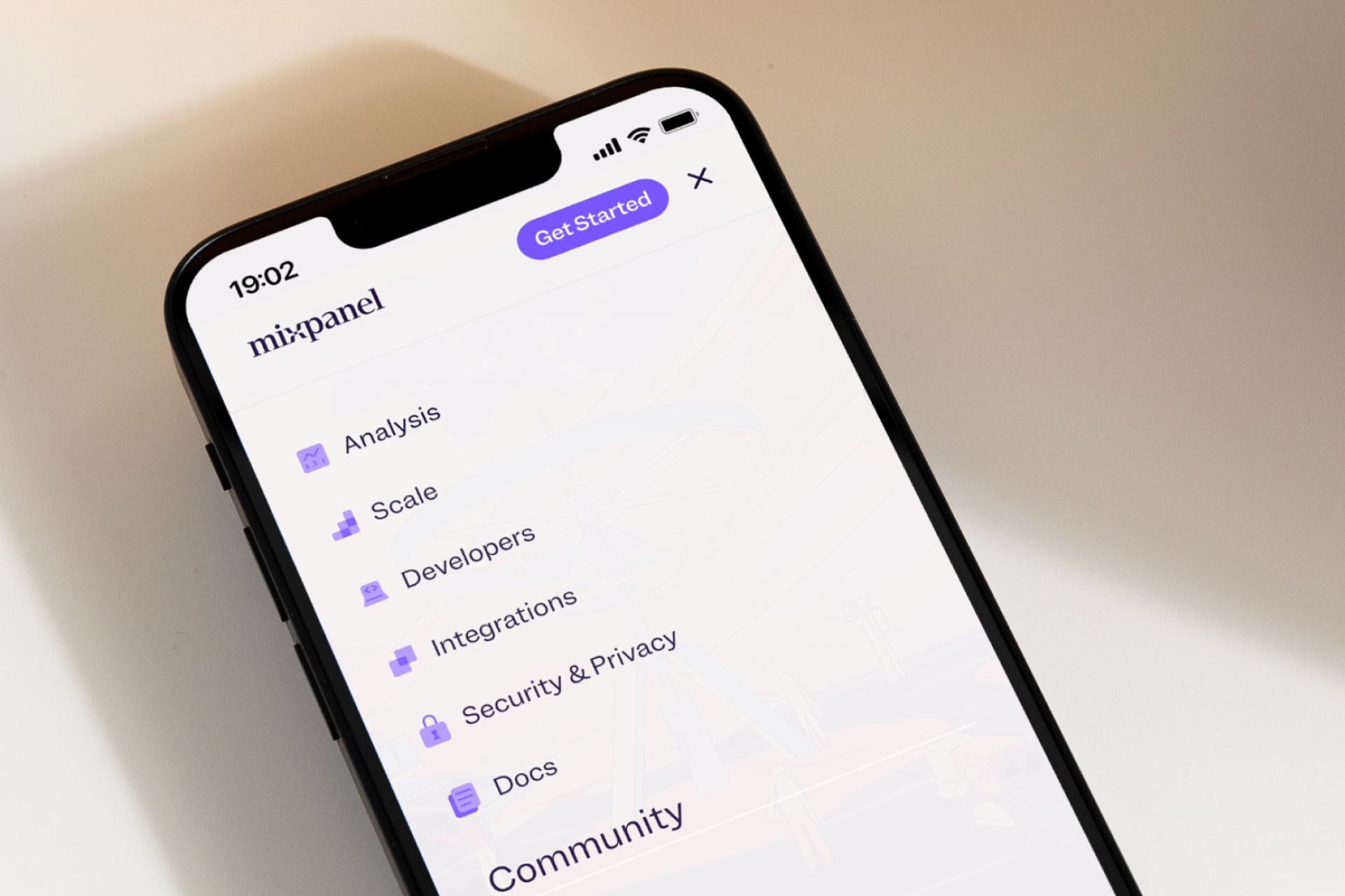
The first one focuses on improving the usability of their UI through menus and buttons, featuring a minimalist approach with a unique mix of lines and solid shapes while using their brand colors in a very refreshing way. The second set is more detailed, especially thanks to the use of gradients, and is reserved for more illustrative purposes. In any case, it's undeniable that both of these sets are part of a meticulous exercise to maintain consistency with the parent brand and, therefore, have secured their place in our ranking.
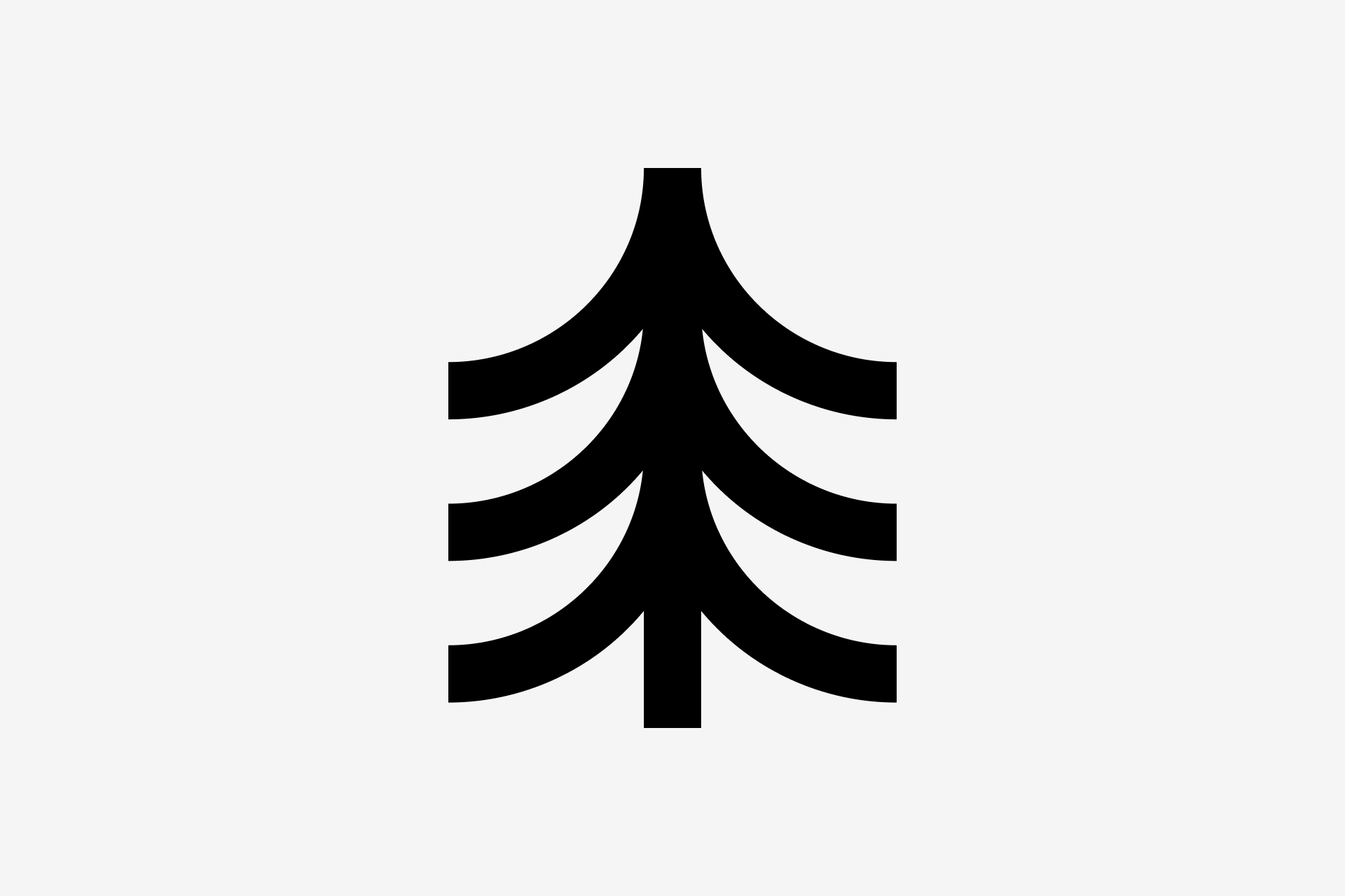
4. NFON Cloudya by Timo Meyer
"There's a beautiful balance between the use of sharp ends and subtle curves in these icons that truly make them stand out."
— Pascal Malaize, Icon Designer at Streamline
Timo Meyer's creation of over 200 icons for NFON's Cloudya, a cloud communications platform, has earned its place as one of the best sets of the year. Despite its minimalist appearance, this collection has a distinctive character, displaying a fascinating mix of subtle curves and sharp ends. This fusion of elements offers a unique visual language that not only communicates its ideas effectively but also adds an element of personality to Cloudya's interface.
In addition, this system was developed in two styles: Line and Solid. Meyer's approach to creating these icons demonstrates a keen eye for detail, evident in his deliberate choice of simple shapes, his meticulous execution, and the smooth transition between these two styles. A perfect example of how to make icons. Also, this set has what's probably the best icon of the year. I mean, look at that tree!
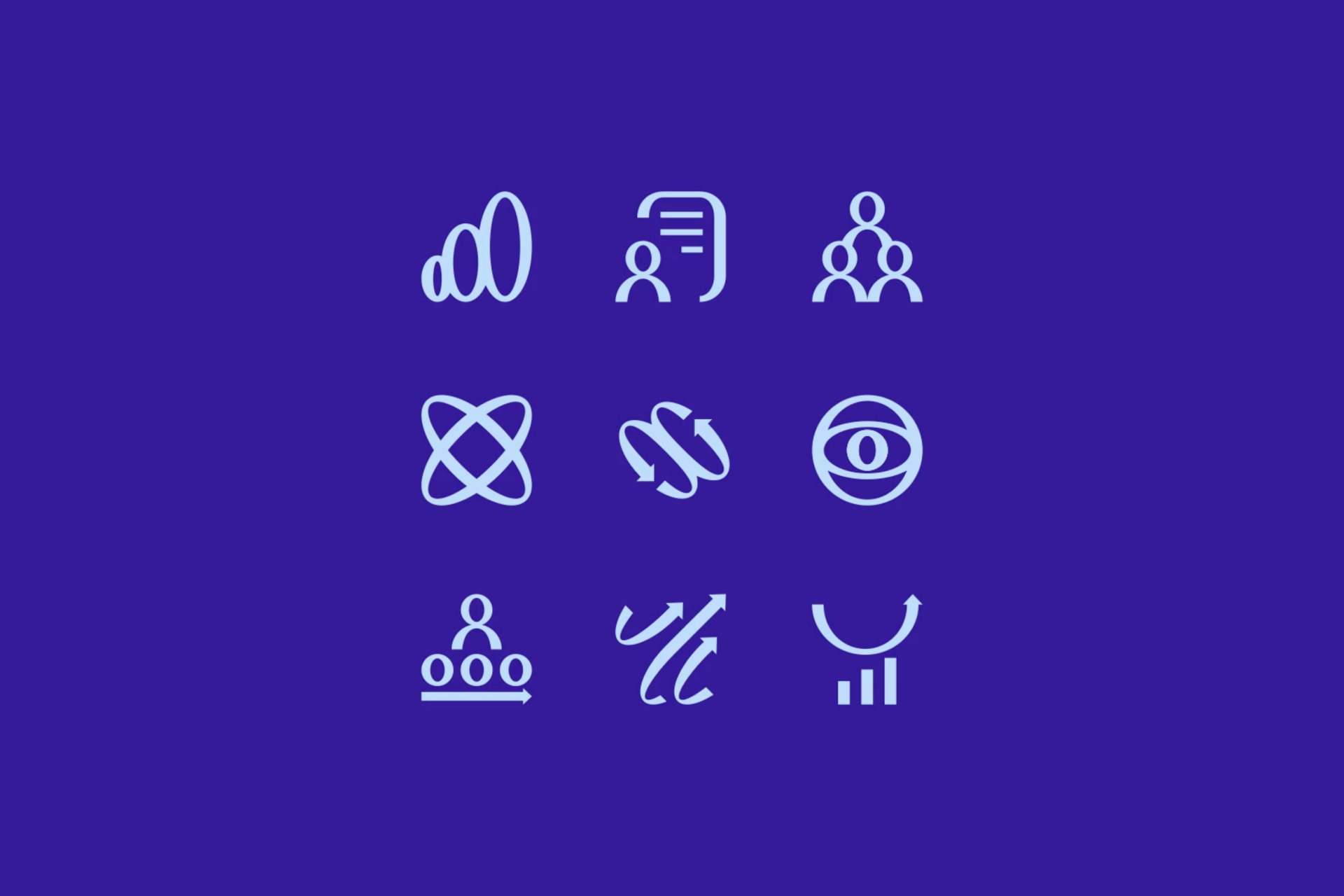
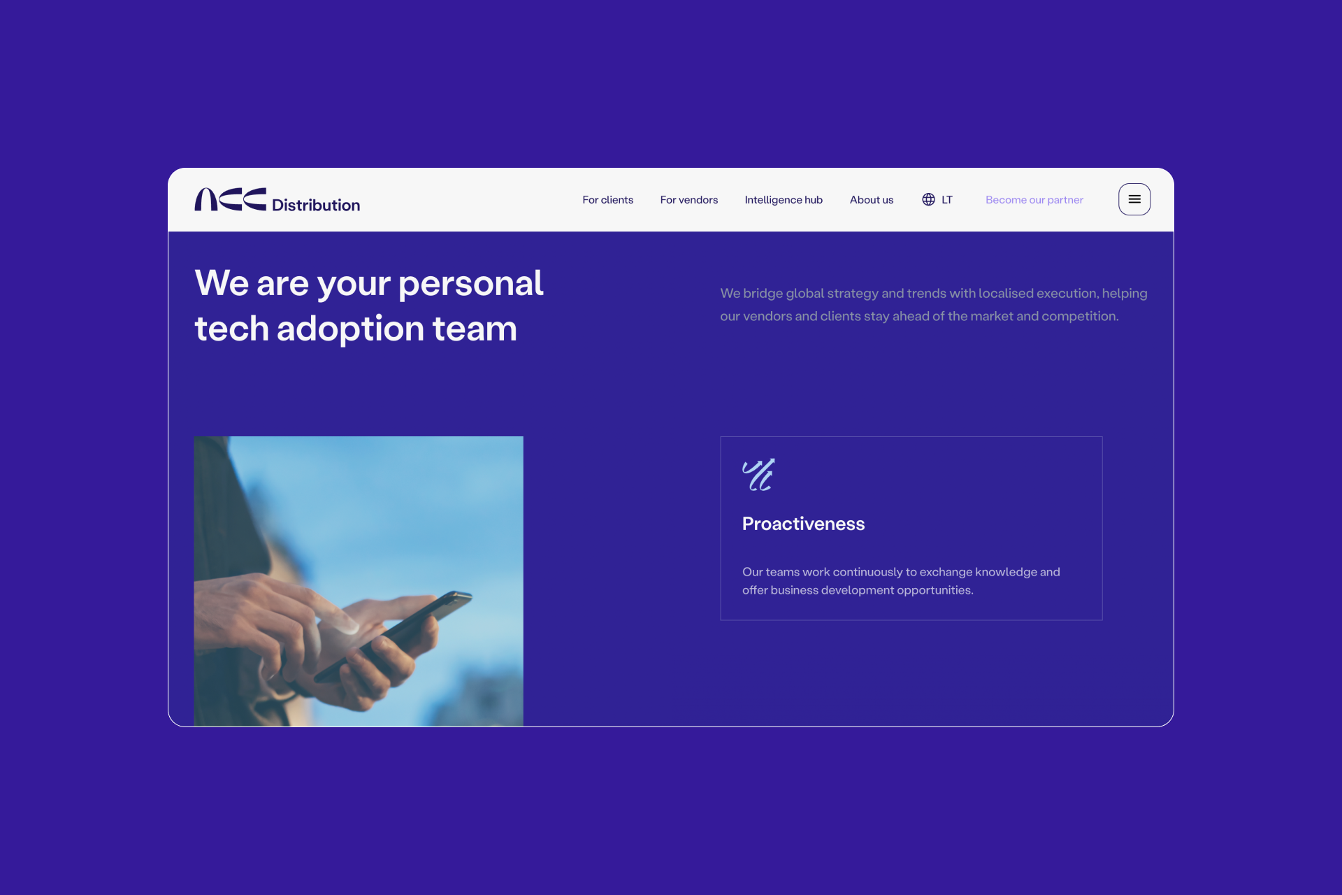
3. ACC Distribution by Andstudio
"A very unique set that provokes a sense of dimension and speed, making the icons look really lively. They captured the brand identity perfectly."
— Suchao Suwannapong, Icon Designer at Streamline
Andstudio's work for ACC Distribution aligns beautifully with what a custom icon set should be. The ACC logo symbolizes its role as a gateway to new opportunities, echoing a sense of reliability and modernity, a concept that's perfectly integrated into the rest of the elements that are part of the brand: typeface, color, web design and, obviously, icons.
The team at Andstudio clearly translates the characteristics of the logo into this set: the modulated stroke, the dynamic shapes, the wide negative spaces and the overall feeling of dynamism. These icons aren't just decorative symbols, they're a reflection of ACC's identity. The meticulous attention to detail and the coherent visual narrative throughout the project reinforces the brand's commitment to modernity and user engagement.

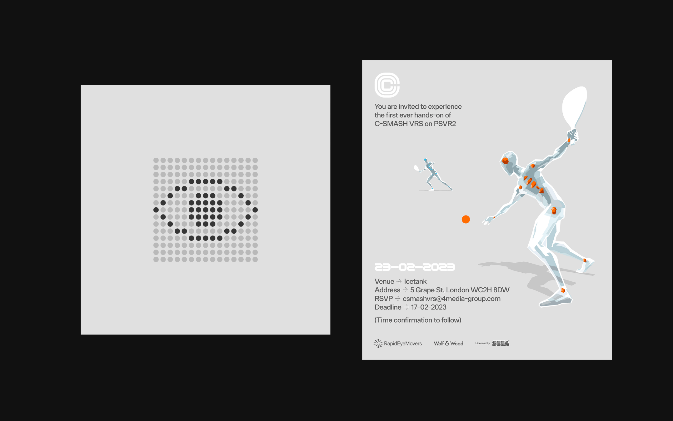
2. C-Smash VRS by Cory Schmitz and Arkotype
"I AM IN LOVE WITH THESE!"
— Jia Santos, Illustration Art Director at Streamline
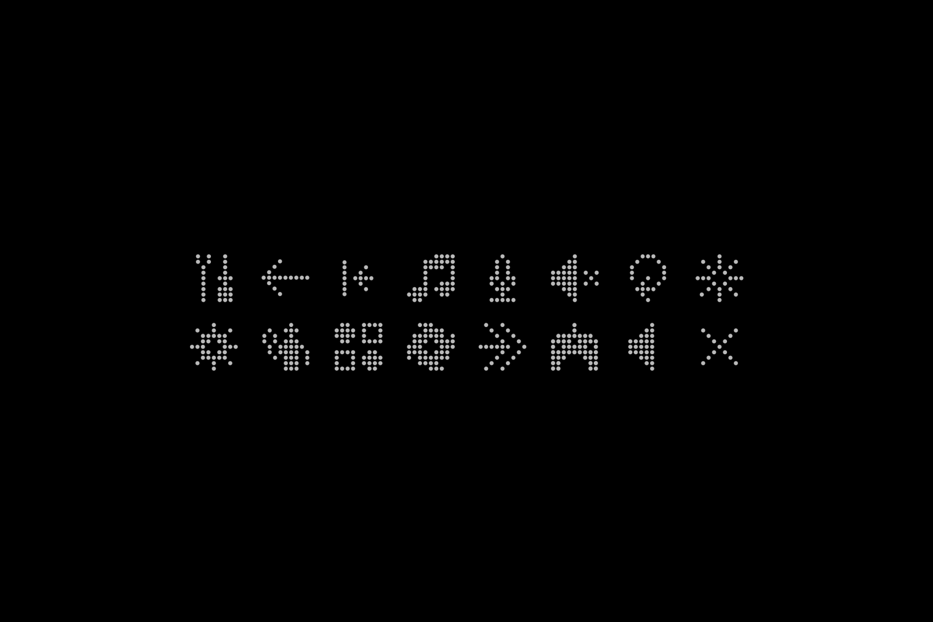
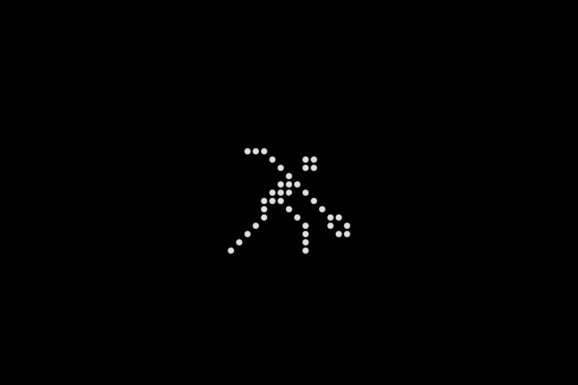
These icons were born as a result of the collaboration between Arkotype and Cory Schmitz, two fantastic designers normally linked to the video game industry. This peculiar icon set was designed for C-Smash VRS, a sequel to the iconic SEGA game Cosmic Smash, developed by Wolf & Wood and produced by RapidEyeMovers. What a unique use case, right?
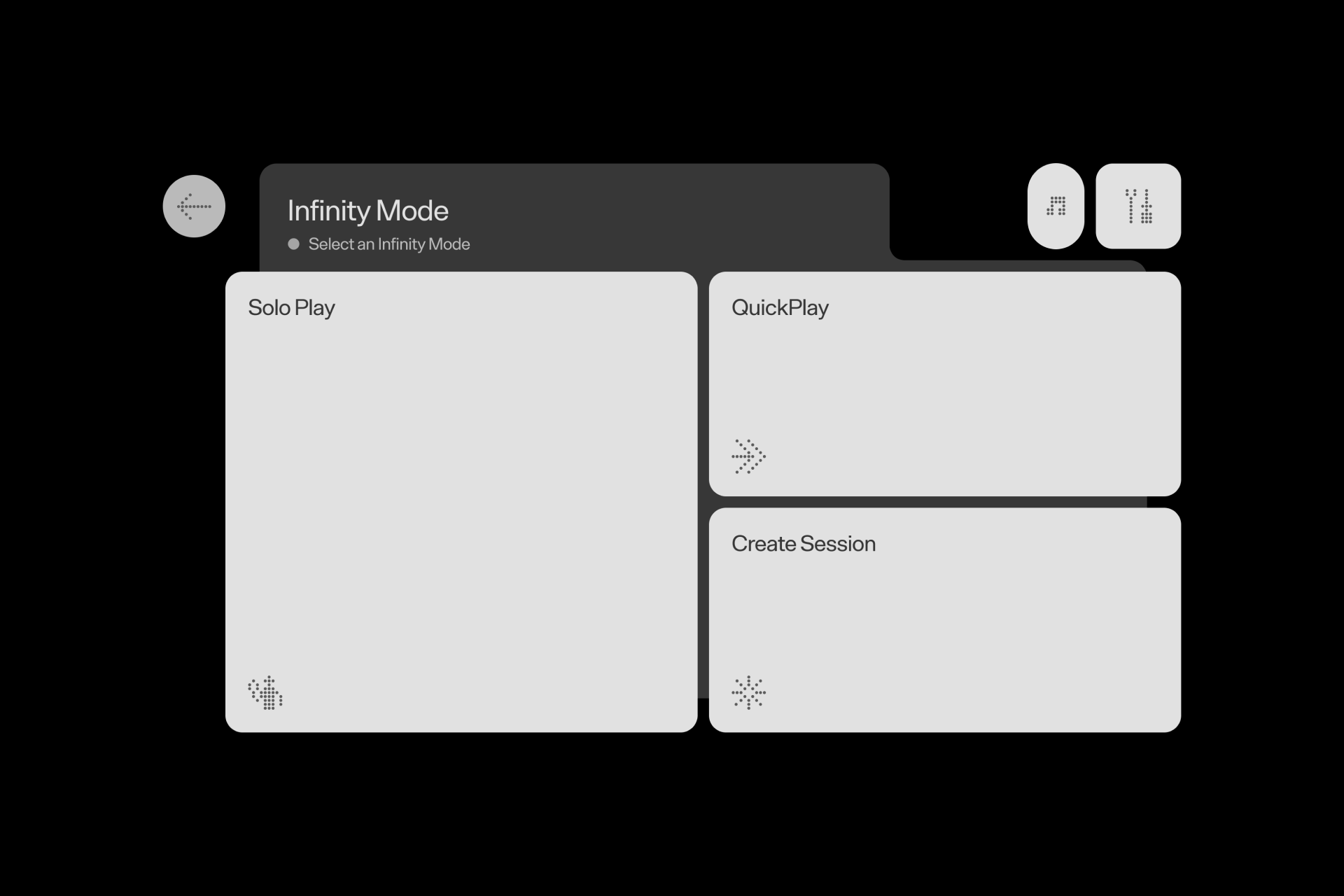
The references behind the project are clear, inspired by the design philosophies of Dieter Rams (famous for his product design at Braun) and Otl Aicher's revolutionary 1972 Olympic design system. Following the interface's minimalist aesthetic, the icons combine functionality with a captivating and unique design. The most prominent feature of these icons is their unique dotted style, which encapsulates the essence of simplicity and retro charm while maintaining an almost surprising legibility. It could have easily been in the first place.
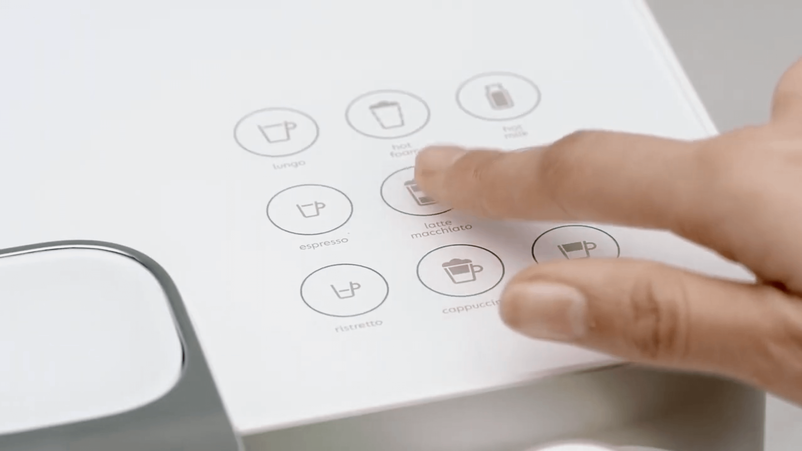
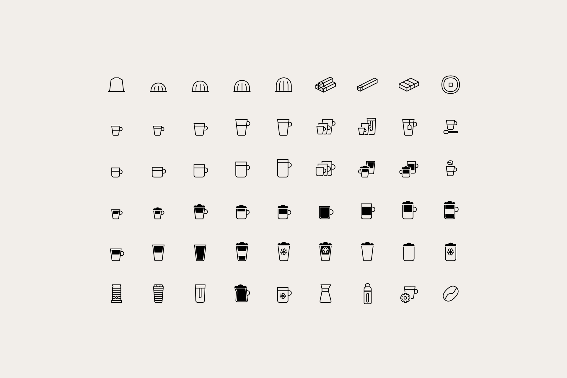
1. Nespresso by Forma & Co
"Think about how many times we struggle operating devices because the icons don’t make sense. Great to see a brand and team crafting clear and beautiful icons such as these."
— Vincent Le Moign, Streamline's founder
Forma & Co's creation of Nespresso's new iconographic system takes the crown as the best icon set of the year. More than 500 icons were designed in two different sizes and used globally in machines, packaging and other communications. They completely captured the essence of Nespresso's logo, resulting in a unique and sophisticated collection.
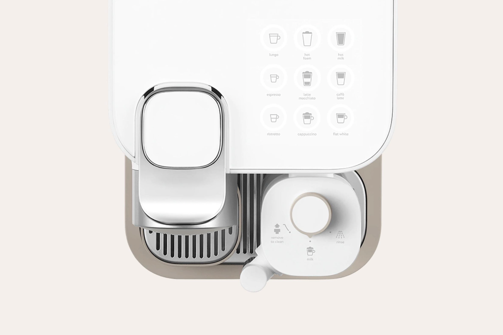
The team at Forma & Co really managed to develop a consistent and elegant system that fully solves Nespresso's branding needs in various applications. This smart and harmonious approach not only enhances their visual identity, but also shows the team's ability to offer a solution that instantly aligns with Nespresso's identity while remaining practical across different platforms. Hats off!
Year in review
Great icon design transcends mere aesthetics; it encapsulates the art of conveying complex ideas, fostering instant recognition and solving communication hurdles that can reinforce a brand's identity. The icons that stand out as the best of the year aren't just visually striking; they're the epitome of innovation and functionality, proving their ability to communicate effortlessly and resonate with users across diverse landscapes of culture and language. Because there's nothing more universal than icons.
As we wrap up the the year, it's obvious that these projects have left an indelible mark with their innovative and influential approach. Their emphasis on signs that are both practical and visually appealing should set the tone for upcoming trends in 2024, including a focus on minimalist signs and the rise of interactive icons.
So we're excited to see the designs awaiting us next year and look forward to sharing the finest with you. Until then, let's keep spreading the love for icons.
Good night!
What are your thoughts on our selections? Do you have an icon set or designer that you think should make it to the list? Let us know!