How to design icons in Figma
An in-depth guide to icon creation
Design should be democratic, that's why our team refuses to hide the process behind our art. So here we are, ready to reveal all our tricks in what has become by its own merits a great home for any icon designer: Figma.
What you need to know before designing
We want to make sure that this article is interesting for those who are already familiar with the icon design field, but also accessible for those who are entering the unknown. In either case, we have you covered. We recommend you read two of our previous articles to get the full picture.
 Jerónimo García
 Jerónimo García
The basic tools
Let's make a brief introduction to Figma, especially focused on icon design and all the tools that will become your best allies.
Frames and grids
The frame is where all the magic will happen. You can access this tool through the toolbar or by pressing the F key. When we create this frame we'll be setting the size at which our icons will be built.
To this frame we'll add a grid, which you can create and adjust in the right menu. When working with icons you don't need to make any flourishes with the grid, we'll just set it to 1px and adjust the color and opacity to our liking.
Snap to pixel grid
The snap to grid option is essential for any icon project. It basically allows us to place our shapes on specific coordinates, which ensures that the designs remain pixel-perfect. So make sure you always have this option enabled.
Shapes and pen tool
The shapes tool is the most basic feature we can use when designing icons. From the toolbar we can access all of them, but we'll probably only make use of the rectangle (R) and the ellipse (O).
For more complex shapes we can count on the classic pen tool (P), which will allow us to design with freedom those icons that require a little more precision.
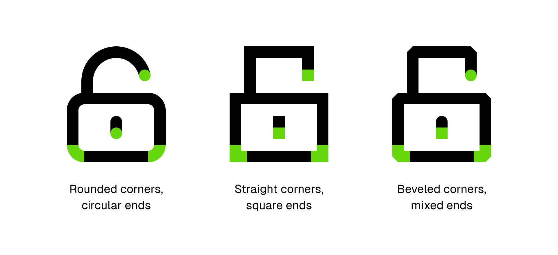
Corner radius, end points and joins
These three little tools will give us a lot of possibilities to achieve the desired look for our icons. With the corner radius we can set the roundness of each angle, with the end points we can define the endings of the strokes and with the joins we can change the appearance of the default corners.
For example, an icon can have a friendly look if the corners are fully rounded and the end points circular. But the same icon can look sophisticated if the corners are straight and the end points square. In a more extreme case, using beveled corners and mixed end points could result in an icon that is, at least, original.
Boolean operations
This set of tools is another of the most essential instruments we can use in icon design. It basically consists of taking two or more shapes and joining, subtracting, intersecting or excluding them depending on our needs.
But in Figma, this tool comes with a twist. When you apply one of these operations, instead of losing the original shapes in favor of a new one, they remain perfectly editable. This is, my dear friends, a game changer.
Components and variants
Figma components are graphic elements that can be easily reused, facilitating the consistency within a project. We can create instances from these components, which are copies of the original design that can be edited to create slightly different versions. And, if that's not enough, by editing the original component these changes will be applied to all instances.
Following a similar logic, we can also make use of component variants, which allow us to group a series of components applicable into long series of icons as some sort of modifiers. Again, by adjusting the original component, these changes will be applied to all instances.
Grids and key shapes
The first thing we'll design is the frame in which we'll draw each sign, setting the default size, grid and key shapes for the whole set.
Jerónimo García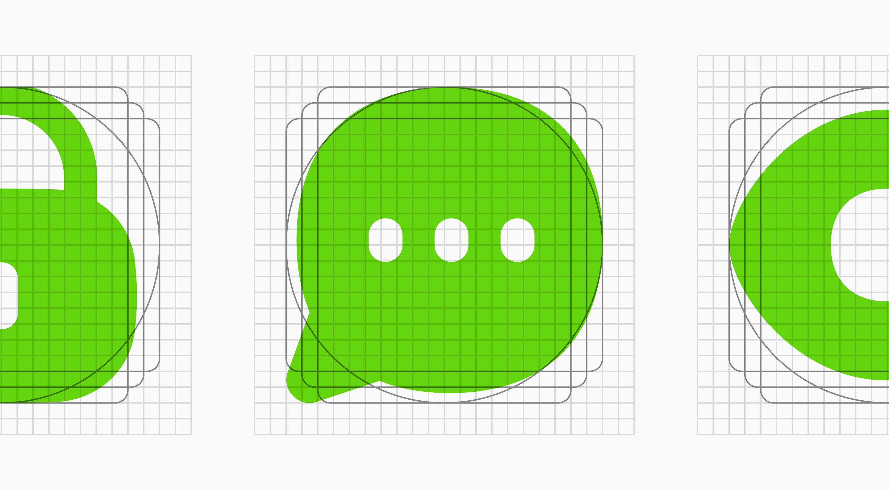
If you click on the link above you can access the article we've already dedicated to grids and key shapes, in which we explore in depth their creation and usage. Here we'll see how to create our gridded frame step by step, directly in Figma.
As a summary, you should know that grids are structured frameworks used in icon design which consist of intersecting horizontal and vertical lines that ensure formal continuity and visual rhythm while also optimizing the design phase.
On the other hand, key shapes are fundamental forms used in design to establish the foundation for visual balance. They serve as guidelines that define the basic proportions of the elements while ensuring harmony between them, whether they're circles, squares or rectangles.
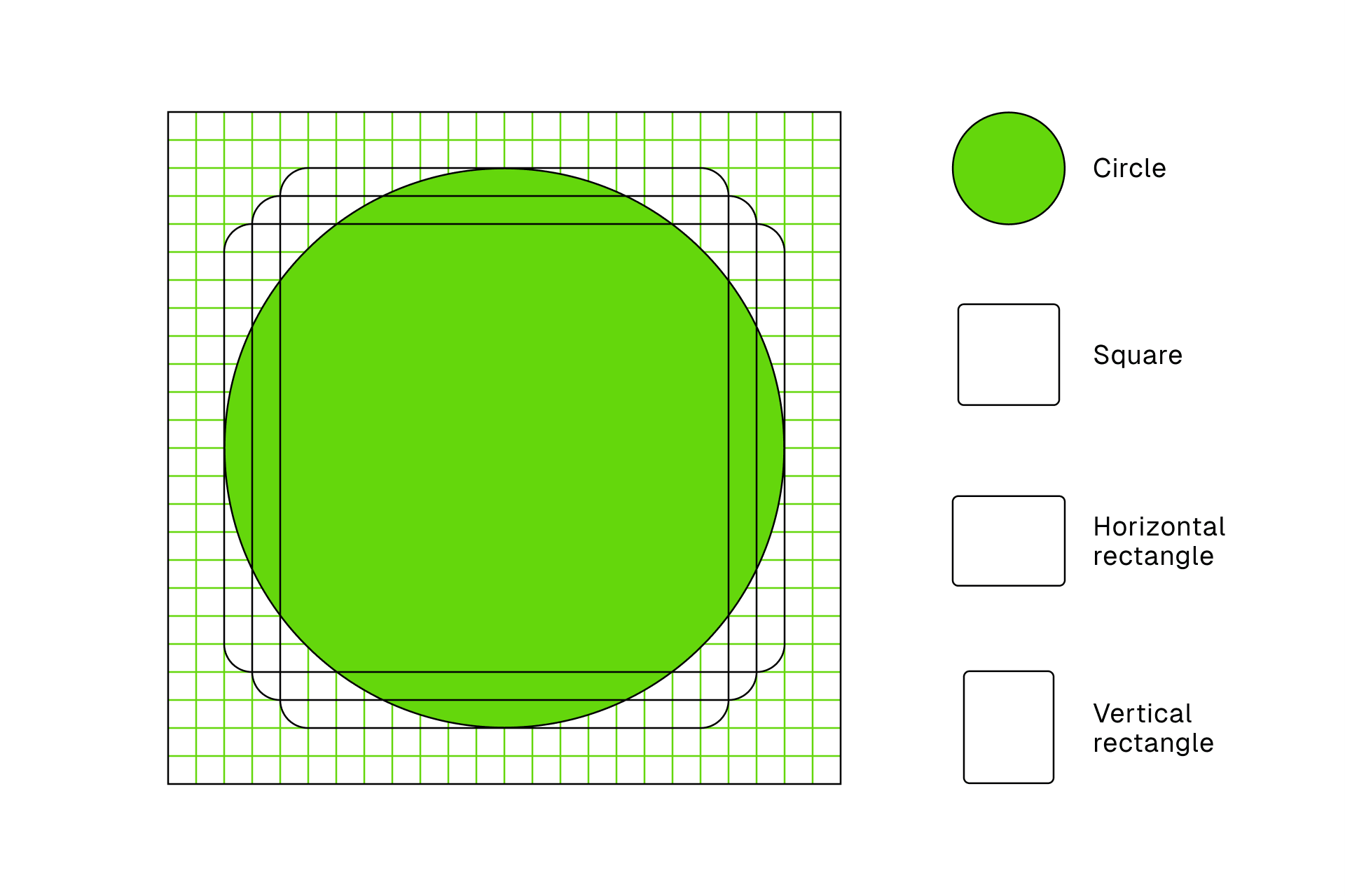
The first thing to do is to create the frame at the size at which our icons would ideally be reproduced. Some standard sizes would be 16x16, 24x24, 32x32, 48x48, etc. The larger the grid, the more details we can allow in our designs.
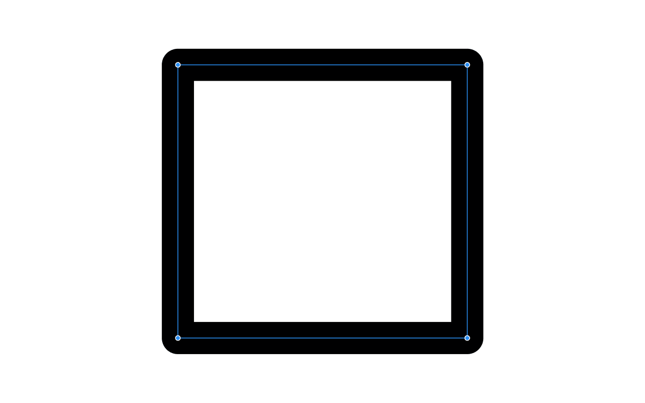
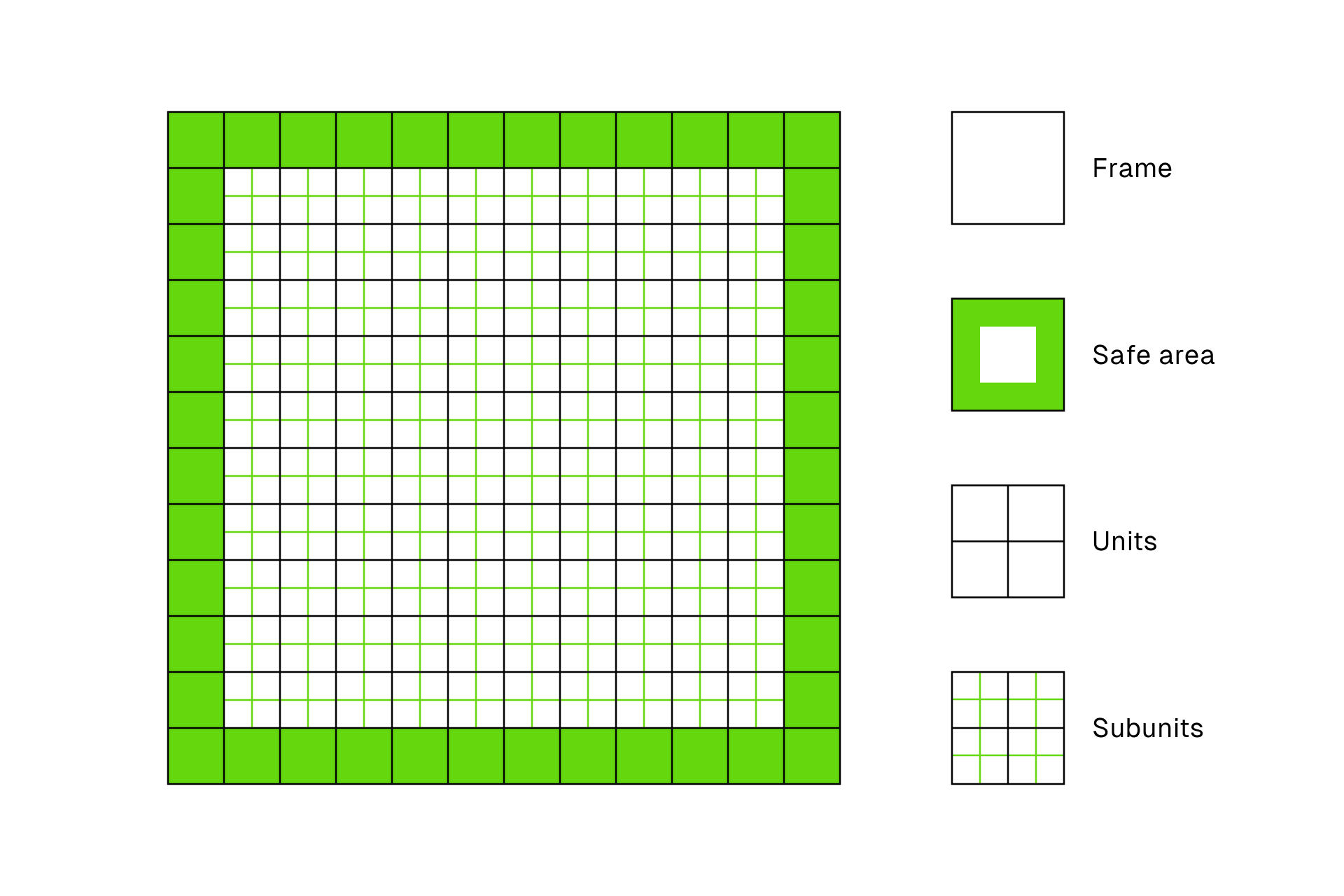
Then we'll add a 1px grid to see more clearly the divisions that mark the positioning of our elements. In addition, we'll add another grid to indicate the safe area around our frame, over which we shouldn't place any graphic element.
Last but not least, we'll have to create the key shapes that will define the basic proportions of our icons while maintaining the visual balance between them. To do so, we can draw these shapes with the tool of the same name and lock them in our layer menu so that they don't disturb us during the design phase.
If for some reason you prefer to skip this step, you're in luck, we recently shared a file in the Figma Community with a few standard templates that you can reuse for your icons, completely free.
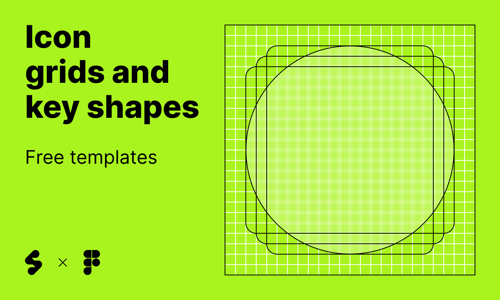
Icon grids and key shapes, free templates
A collection of free templates to get you started.
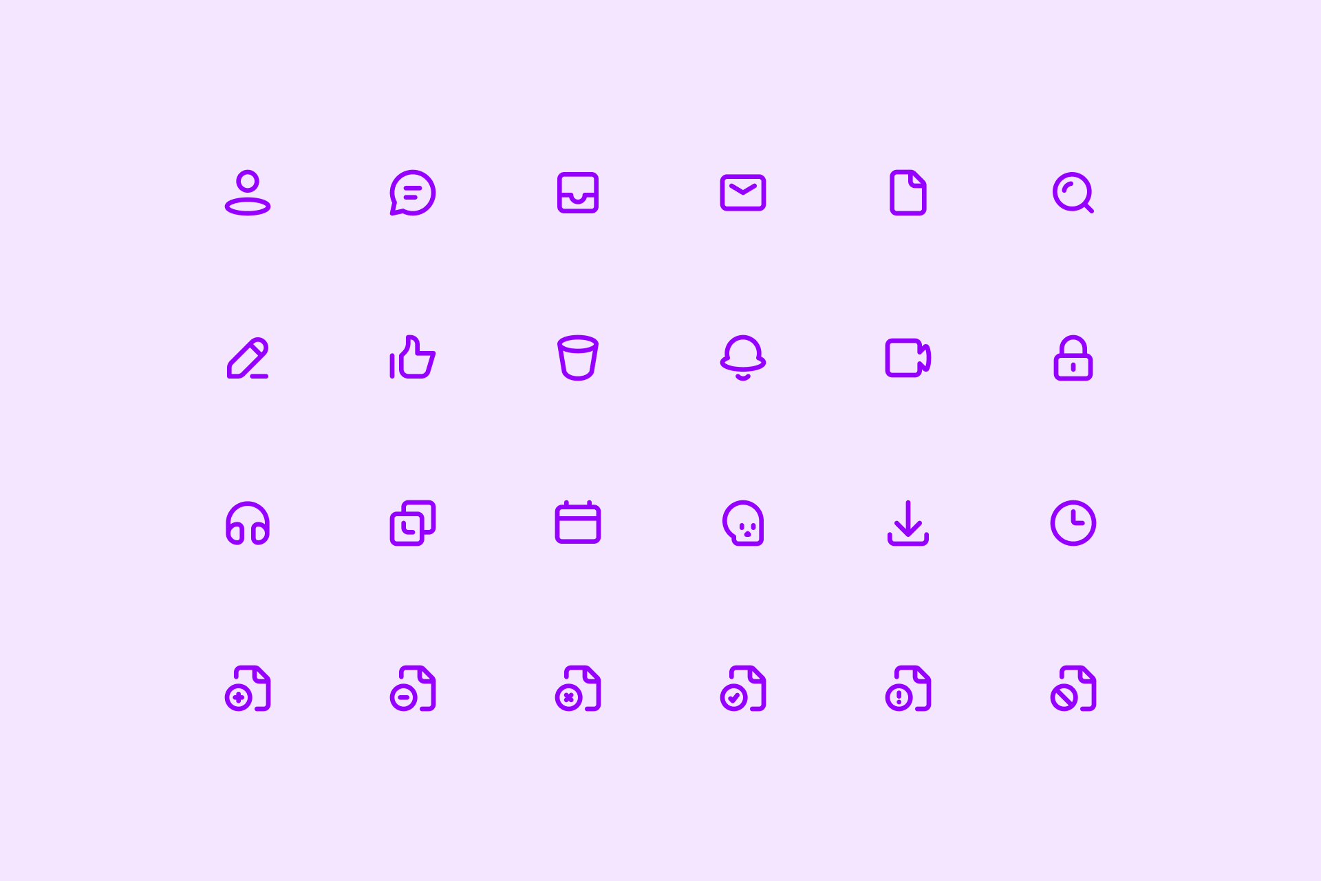
Designing the set
To start with, let's create something simple and friendly and see how we organically move from a single icon to a complete and consistent set.
Building the first icon
Don't be afraid of the blank canvas. You have to design the first icon with a clear idea in mind: it won't affect the rest, you can always come back and tweak it. Personally, I like to start with the "User" icon.
Designing four icons based on key shapes
Now that we've got the stage fright out of the way, it's time to design a slightly larger sample. In this case I recommend choosing four icons with different proportions that fit the key shapes: one circular icon, one square icon and two rectangular icons (one of them horizontal and the other vertical).
Creating a series of icons
So far we have five icons, not bad! Now we're going to create six more, but with a different approach. Let's take the "File" icon we designed earlier and turn it into a series of icons. Thanks to the use of component variants we can create different modifiers that will be applied to other icons, achieving a consistent look.
And before you know it, we have a full set
Even having designed just a few icons, you'll soon realize how much material can (and should!) be recycled from one sign to another. This will greatly speed up the process as well as ensure consistency across the set. Before you know it, you'll have designed dozens of icons until your set is complete.
Evaluating your work
We still have another article that will help you know if your icons are perfectly recognizable, consistent and legible.
Jerónimo García
In this article we tried to explain the constant evaluation process we put our icons through to make sure we always launch the best possible product. It's a very simple system that can be easily replicated by anyone in which we evaluate an icon based on its meaning (is it recognizable?), how well it fits in with other icons (is it consistent?) and its use or context (is it legible?).
The export options
If Figma isn't the final tool in which you'll use these icons, you also have the option to export them as in any other graphic design software. You can export as many icons as you want at a time in the following formats: JPG, PNG, SVG and PDF.
No time for this?
Access thousands of free icons instantly
Don't worry! If all you need are icons for your project but you don't have the time to design them, we have an amazing Figma plugin through which you can access our entire library, including thousands of free icons!
Easy-peasy