The five rules of good icon design
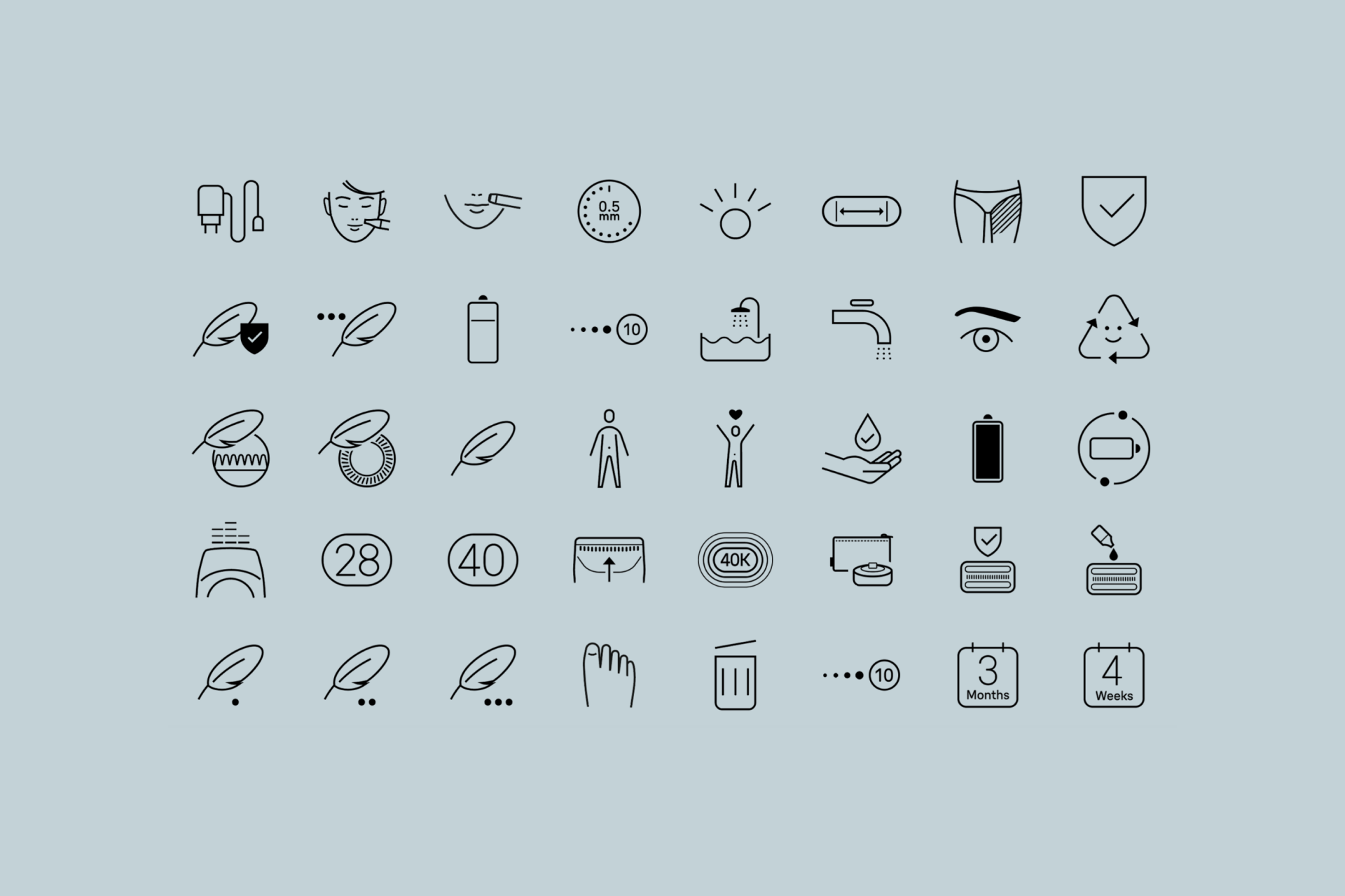
Over twelve years, our team of 8 icon designers applied these principles to create legible, efficient, consistent icons.
Icons can closely align with Dieter Rams' celebrated principles of good design, which reflect a clear commitment to clarity ("Good design is unobtrusive"), simplicity ("Good design is as little design as possible") and user-centered functionality ("Good design is honest"). But good icons also have their own rules, so let's try to define them one by one.
1 – Good icons are universal
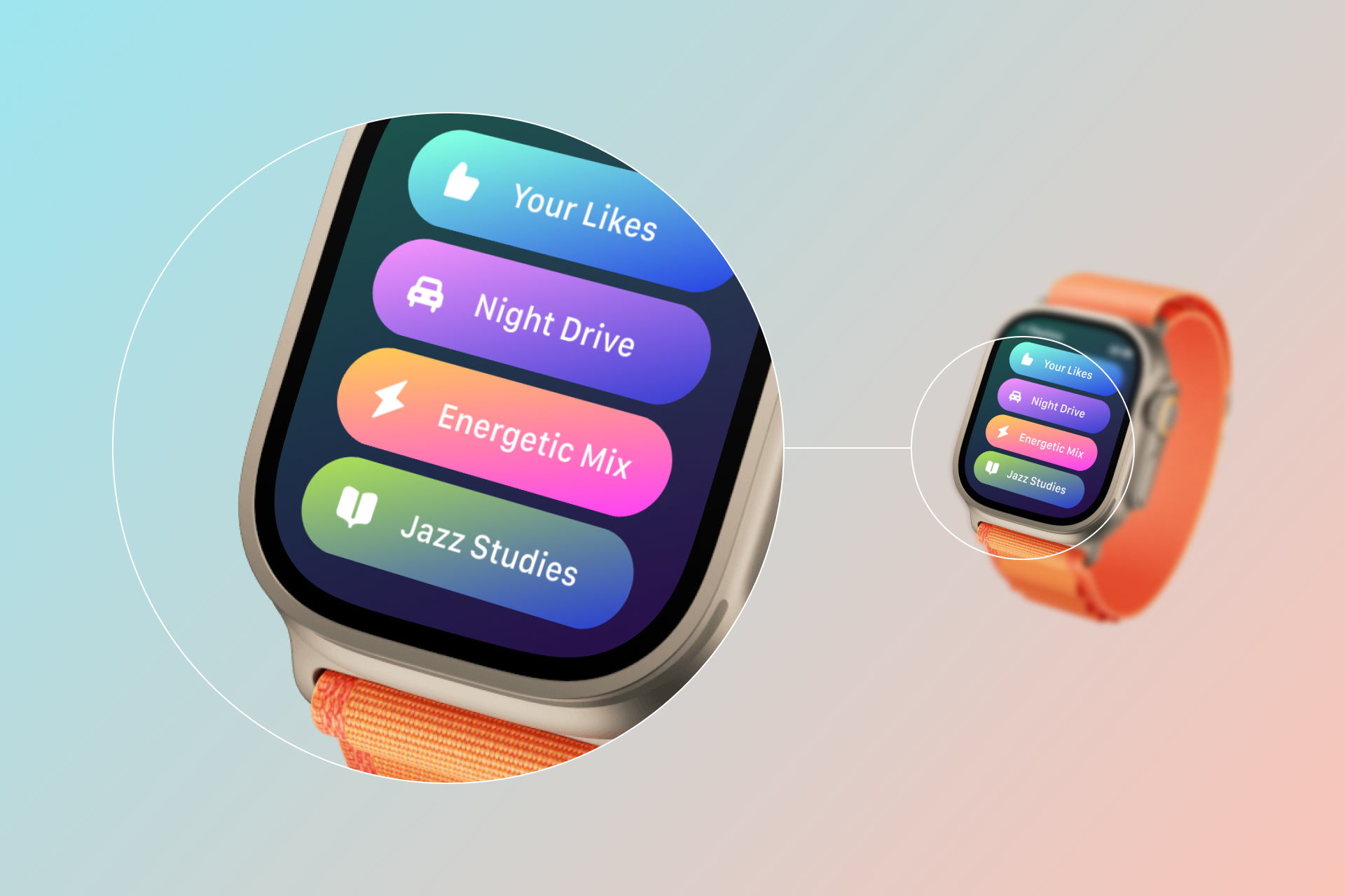
Icons must communicate precise and relevant messages, so we need to choose the object or action that best fits what we're trying to represent.
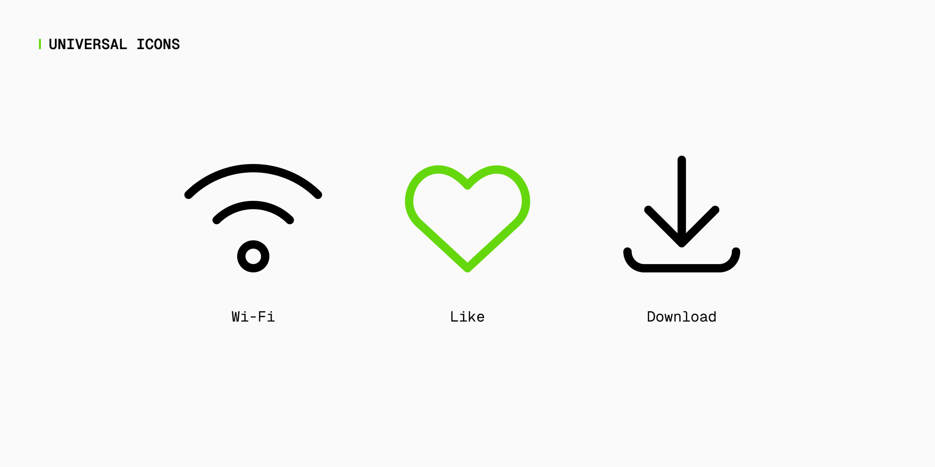
It's crucial to choose images that are widely understood and don't rely heavily on cultural or contextual nuances. A universal icon transcends language barriers, ensuring that its meaning is clear and accessible to a diverse audience.

Even if an icon is intended to communicate an abstract item or action such as "Wi-Fi", "Like" or "Download", there are already a number of widely used visual standards that are inherently associated with those concepts.


2 – Good icons are simple
Each icon must be designed as simplified as possible in order to avoid using irrelevant information, but without falling into abstraction.
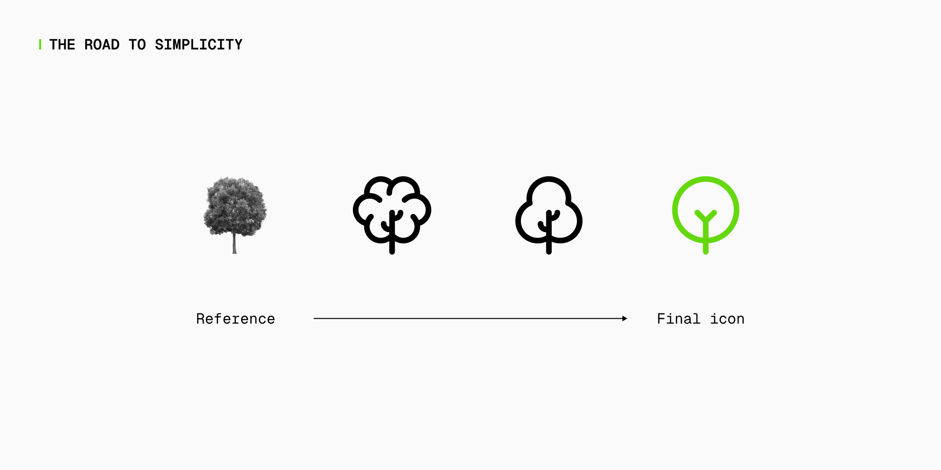
Simplicity in icon design is essential for clarity and quick recognition, especially in contexts where space is limited or users need to process information quickly.
However, we also have to be careful with excessive abstraction or unnecessary details. Icons must retain enough recognizable elements to convey their meaning without being overly complex or difficult to decode. Achieving this balance ensures that the icons remain effective at all times.
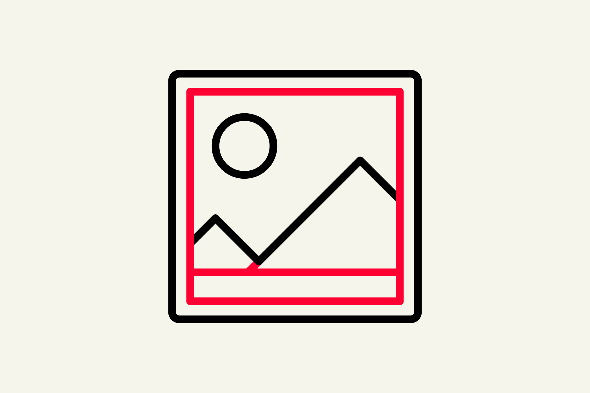
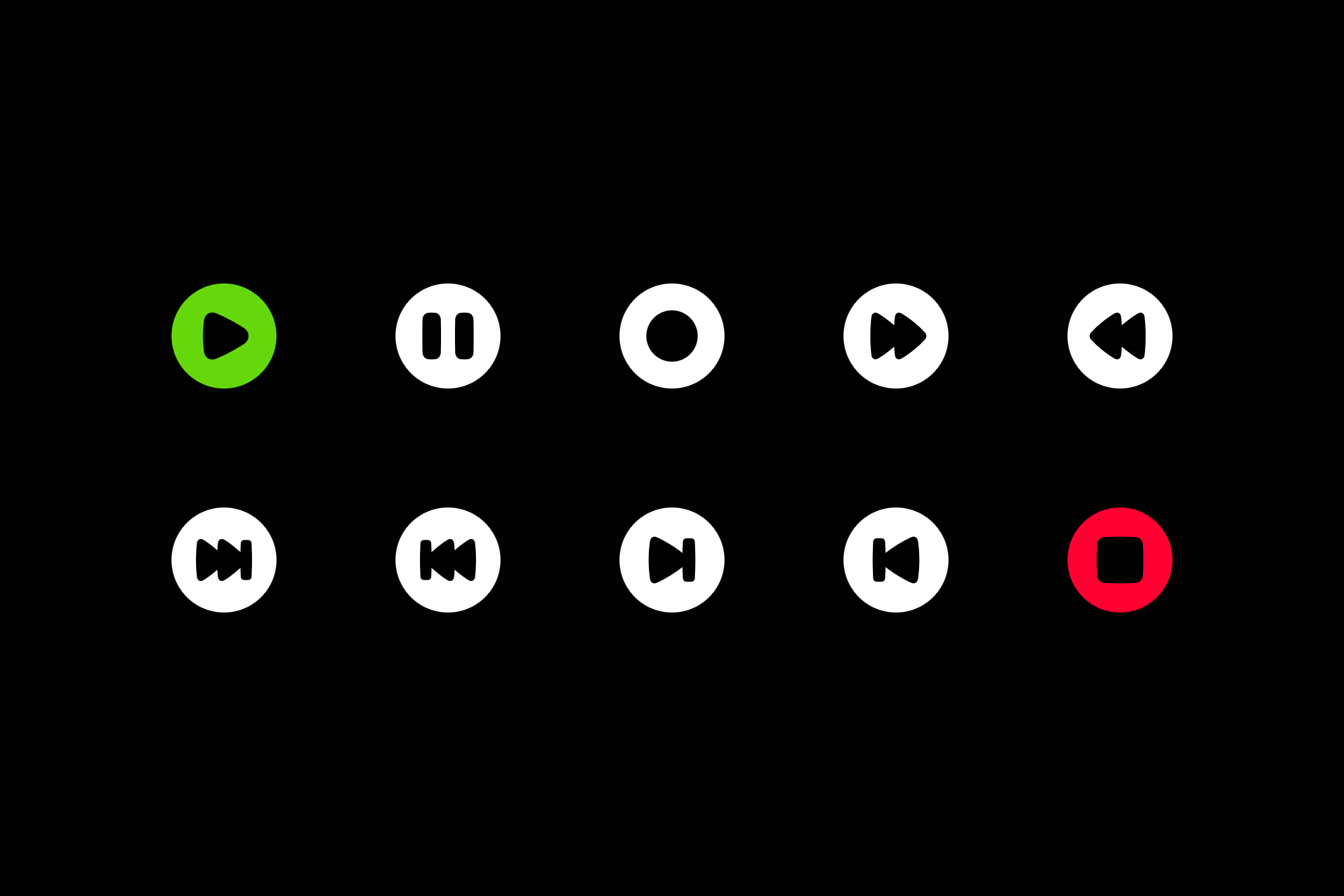
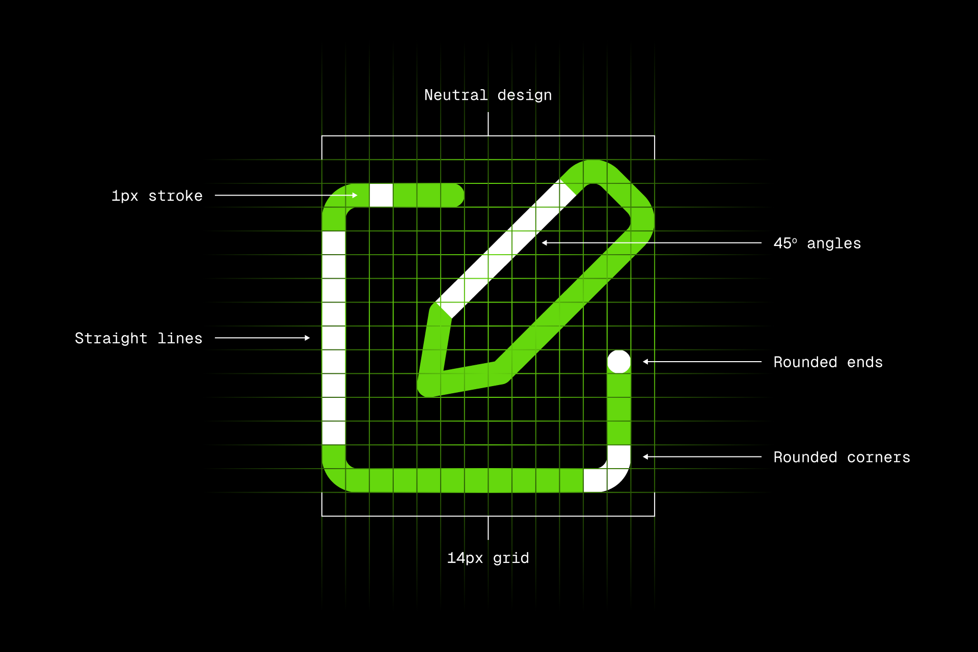
3 – Good icons are legible
Icons must allow effective reduction and work in more "extreme" contexts without compromising legibility.
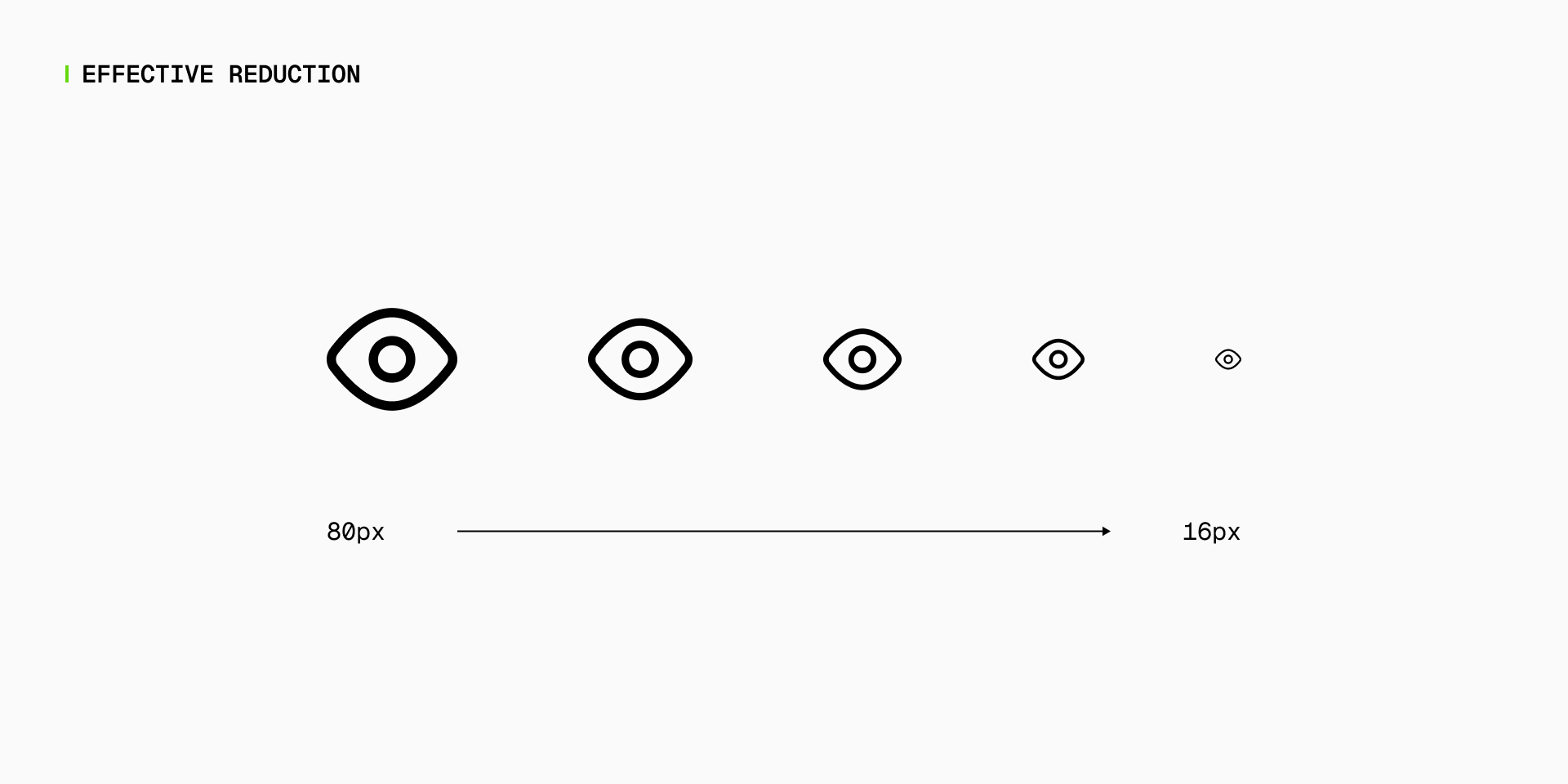
This reduction is particularly important to ensure that users can quickly and accurately interpret the meaning of an icon, even when it's displayed at a very small size or in poor visual conditions.
By enabling effective reduction icons maintain their adaptability, which is especially valuable in today's digital landscape, where icons are used in a variety of contexts from mobile apps with limited screen space to responsive web design.

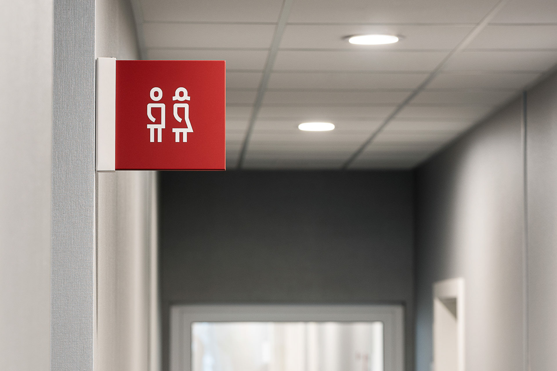
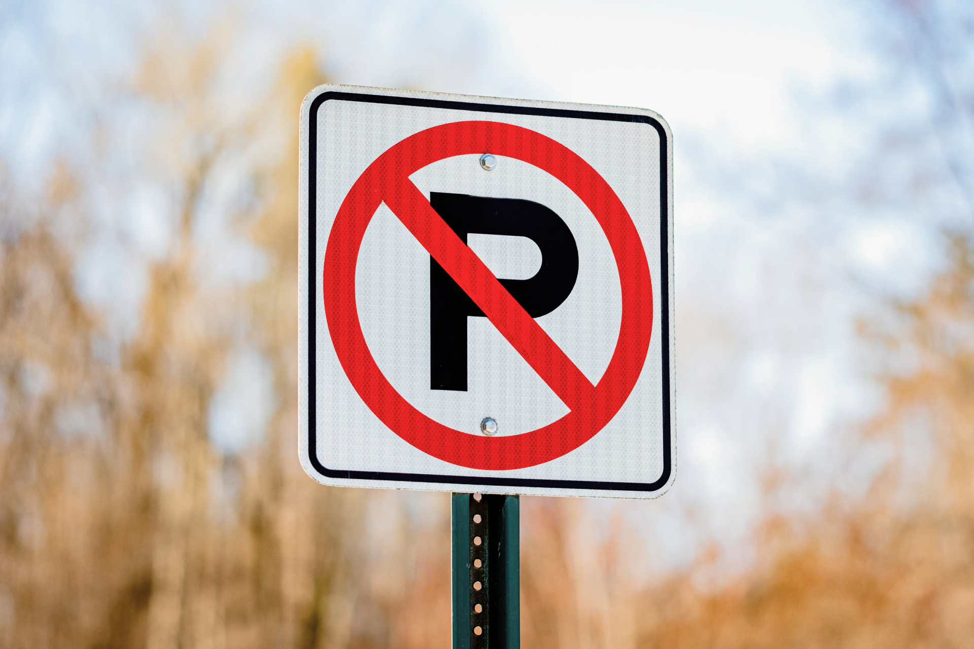
4 – Good icons are nonverbal
Overall, icons must avoid the use of alphabetic characters, since they tend to depend on a specific language and cultural context.
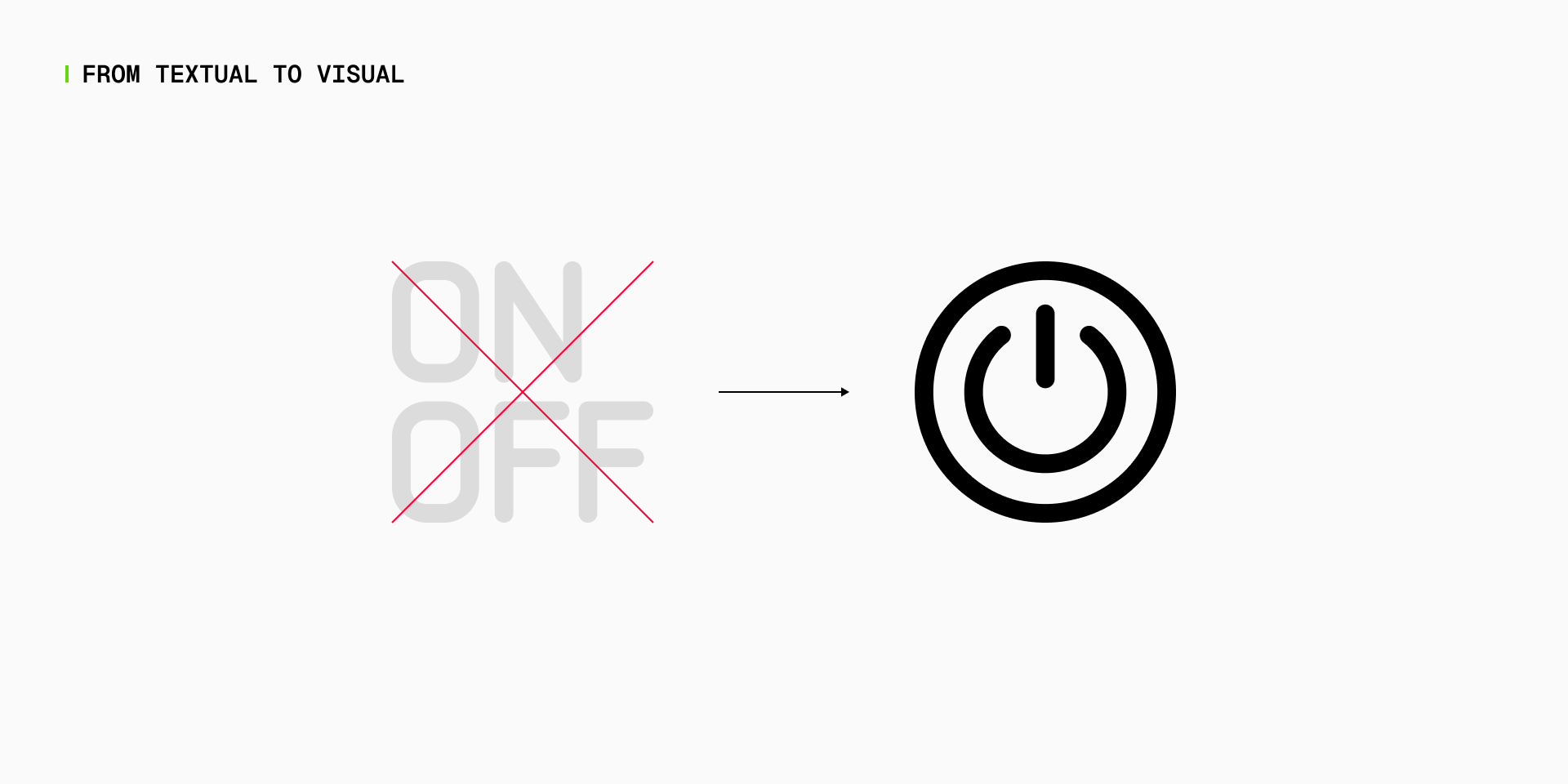
As we've seen before, icons are visual tools that transcend language barriers, allowing for a more accessible experience regardless of the user's cultural background. That's why icons have symbolic value.
However, there are some exceptions. For example, the use of the letter "P" to represent "Parking" or "I" for "Information" has become widely accepted in a variety of contexts. Even the word "STOP" is familiar enough worldwide. But in any case, these exceptions should always align to established conventions.

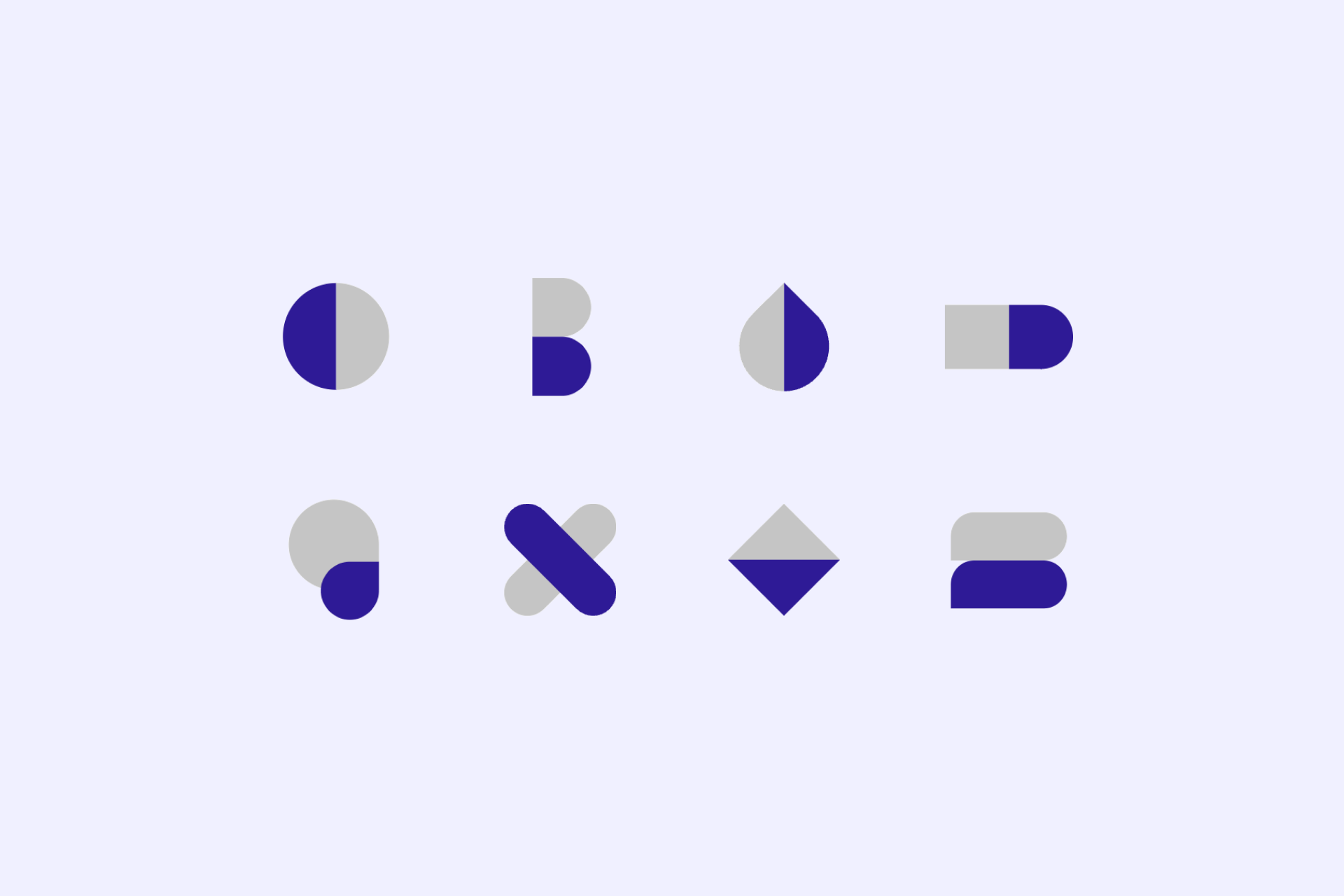
5 – Good icons are consistent
A set of icons must be designed on the basis of well-defined construction guidelines, where a uniform structure and visual constants coexist.
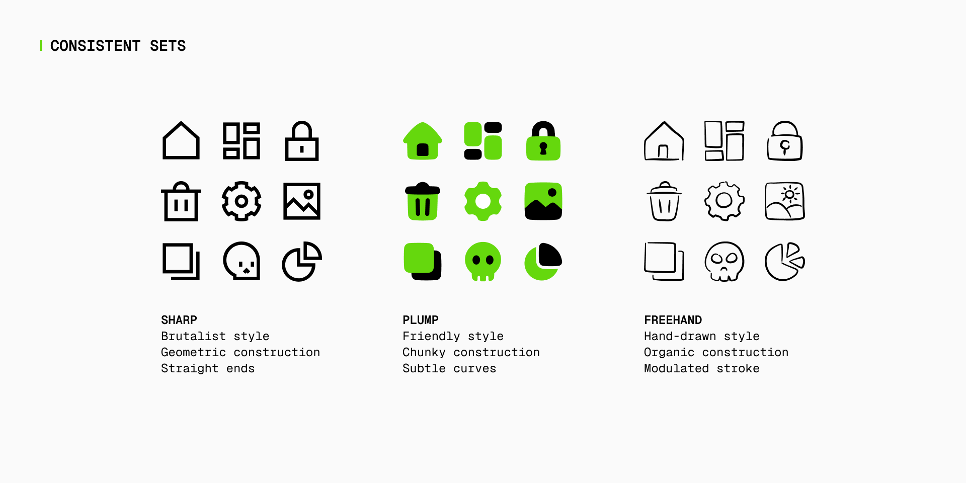
By maintaining consistency in size, shapes and overall style, users can easily associate icons with specific experiences. This uniformity provides a cohesive and intuitive language within a project, whether you're designing an interface, building a signage project or preparing a customer presentation.
In addition, consistency helps facilitate learning, as users can transfer their understanding from one icon to others within a specific set, encouraging efficient navigation and interaction.
Form follows function
And that's about it! With these basic notions you already have enough knowledge to begin your journey in icon design. At the end, it all comes down to functionality. If an icon is simple, recognizable and carries a substantial message, it will inevitably be beautiful.
At Streamline, we're committed to continue sharing our passion for this unique field, so keep an eye out for upcoming articles to delve deeper into the peculiarities and more technical aspects of icon design. For now you can continue your journey with our article on grids and key shapes.
Further reading
- Shaoqiang, W. (Ed.). (2016). Infinite Icon. Sandu Publishing.
- de Jong, C. W. (Ed.). (2021). Dieter Rams: Ten Principles for Good Design. Prestel Publishing.
- González-Miranda, E., & Quindós, T. (2015). Diseño de iconos y pictogramas. Campgràfic.
- Abdullah, R., & Hübner, R. (2006). Pictograms, Icons & Signs: A Guide to Information Graphics. Thames & Hudson.