Create consistent, harmonious icons with Grids and Key Shapes
A guide to achieving consistent proportions and visual balance with key shapes and grids, and making optical adjustments for icon perfection.
"Order is an elementary component of life — whether you rebel against it, need it or want to ignore it." — Ulysses Voelker
An introduction to rules
In the icon design field, understanding the rules is like mastering a language: you must learn the grammar before you can express yourself with ease. These rules serve as guiding principles regarding order, proportions and consistency, while laying the groundwork for effective communication. However, true mastery emerges when designers understand these rules deeply enough to knowingly bypass them. Beauty lies in balance, you might say.
The almighty grid
Grids are structured frameworks used in design which consist of intersecting horizontal, vertical and sometimes diagonal lines that guide the placement of elements to create organized compositions.
Most icons are built based on a grid, a fundamental tool that allows us to craft a cohesive language within a set of icons, ensuring formal continuity and visual rhythm while also optimizing the design phase. Although grids primarily serve as guiding frameworks, sometimes they can be very restrictive.
The not-so-well-known key shapes
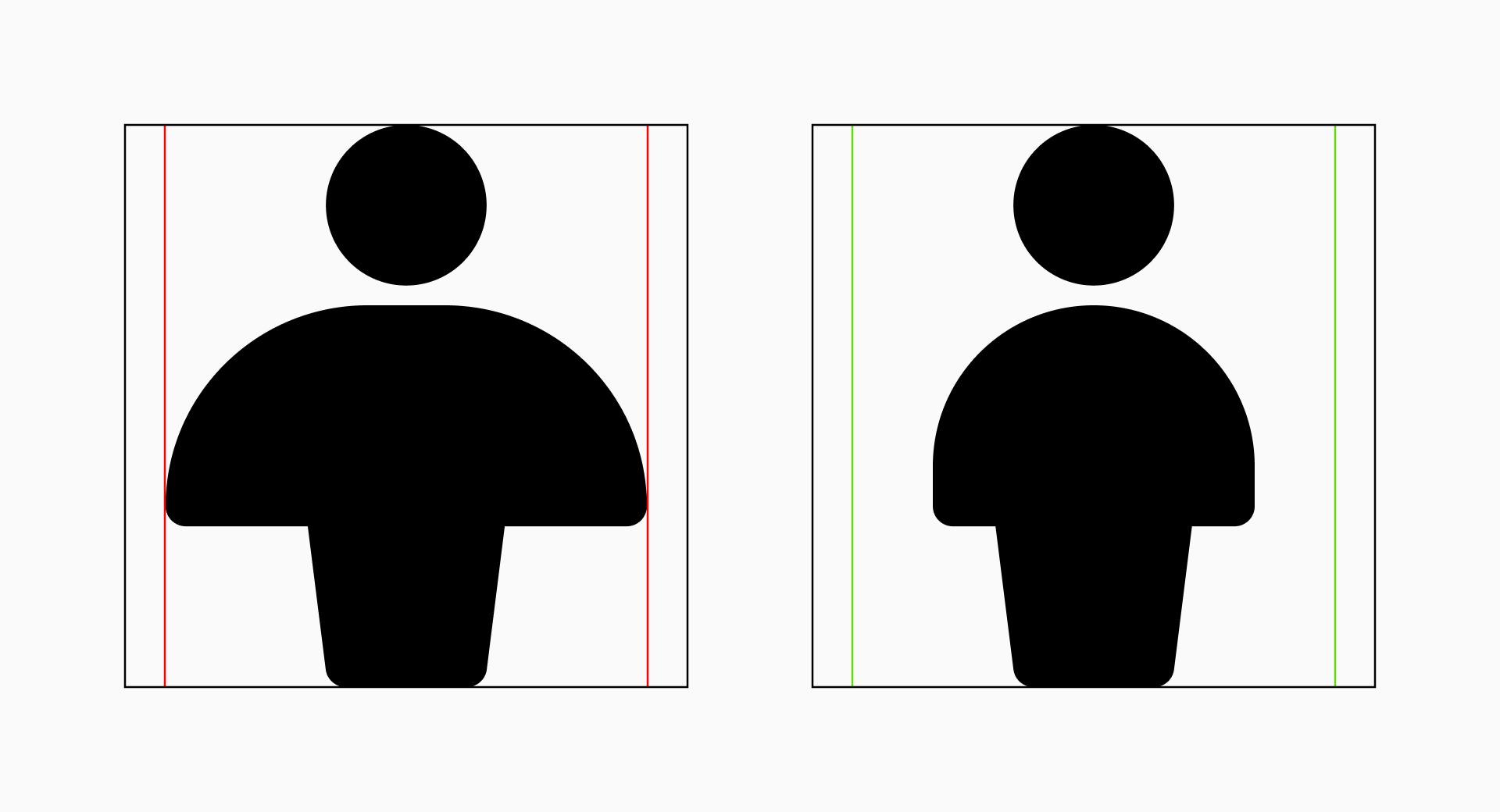
Key shapes are fundamental forms used in design to establish the foundation for visual balance. They serve as core guidelines that define the basic proportions of the elements while ensuring harmony between them.
Each icon can be molded around previously defined key shapes. These shapes, whether they're circles, squares or rectangles, play a fundamental role in maintaining visual balance throughout the whole set by ensuring that all icons occupy a similar space regardless of their peculiarities.
An aid, not a constraint
Essentially, grids help keep the icons structured and organized while key shapes play a vital role in defining the basic proportions and preserving visual balance. Both are indispensable elements in the icon design process, so they demand a clear understanding to ensure they serve as aids rather than constraints.
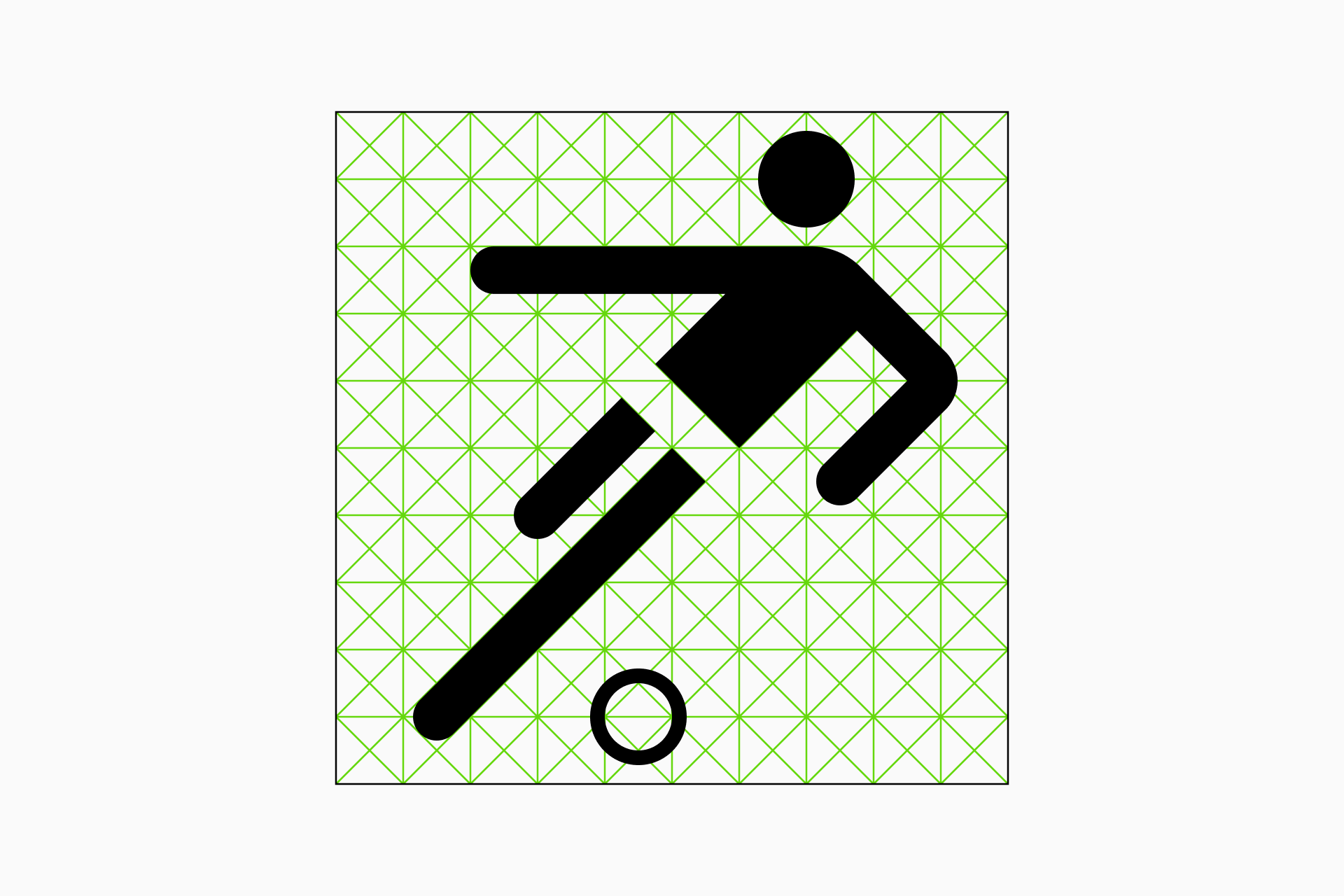
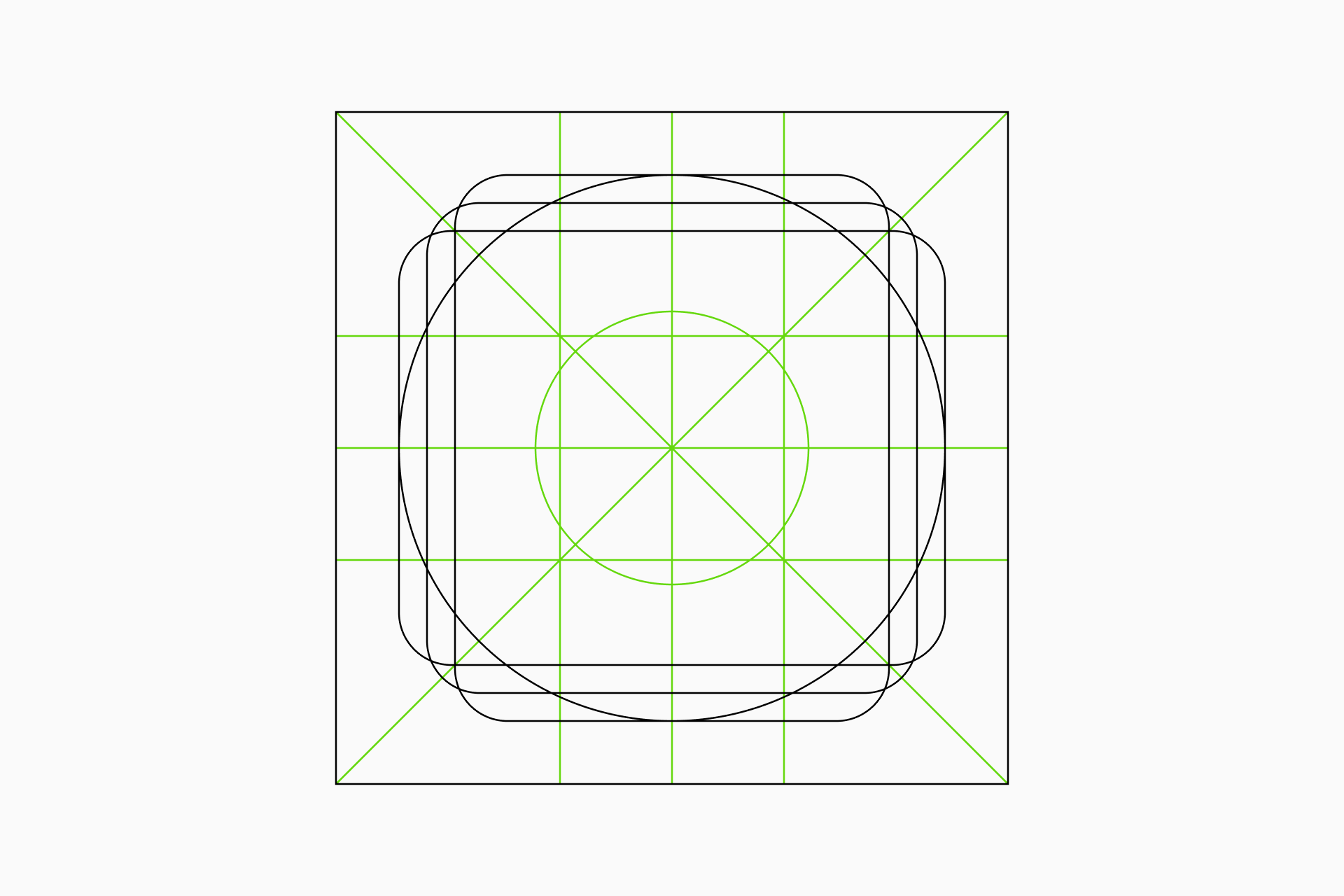
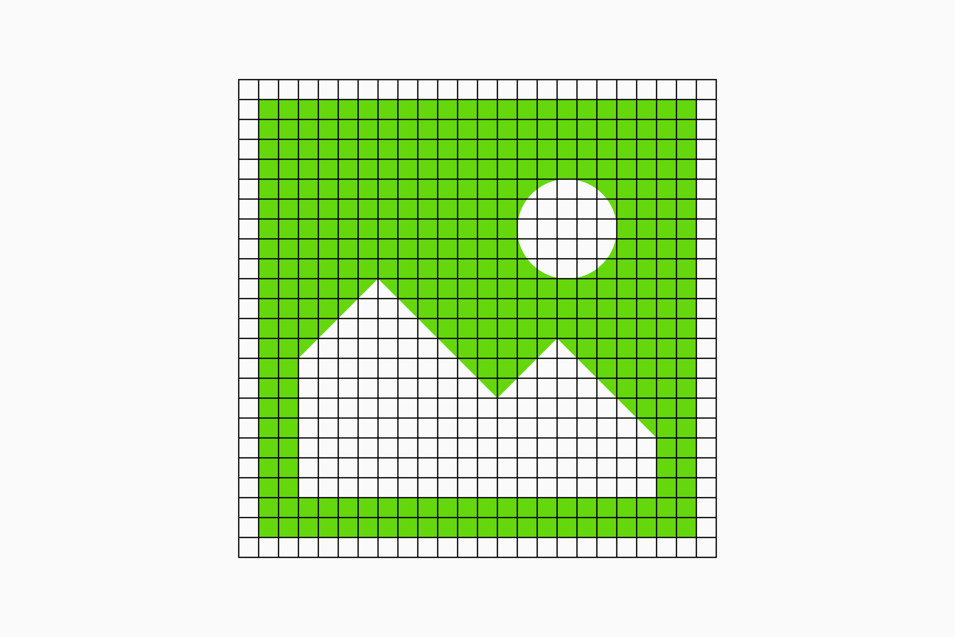
Building a grid
A grid consists of four essential parts: the frame, which marks the boundaries of our design; the safe area, a protected zone around the frame; the primary grid, which establishes the basic alignments and proportions; and the secondary grid, which adds extra structure for a higher level of detail and liberty.
Frame. In the context of icon creation, as in any other graphic discipline, the frame sets the boundaries within which the entire design exists. At the same time, it defines the format of the icons, which will be larger or smaller depending on the level of detail we need and the place where our icons will be implemented.
Safe area. Within the frame, the safe area acts as a protective zone for the essential elements of the icon. This space ensures that vital information retains its visibility regardless of the design's implementation.
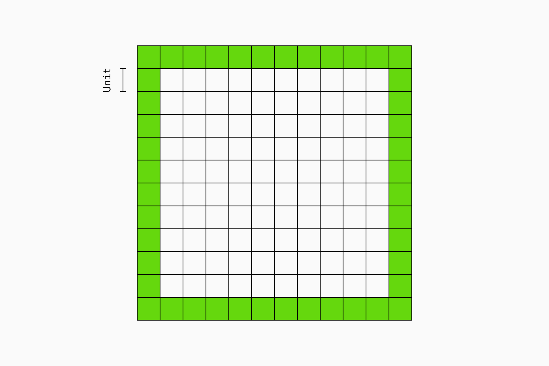
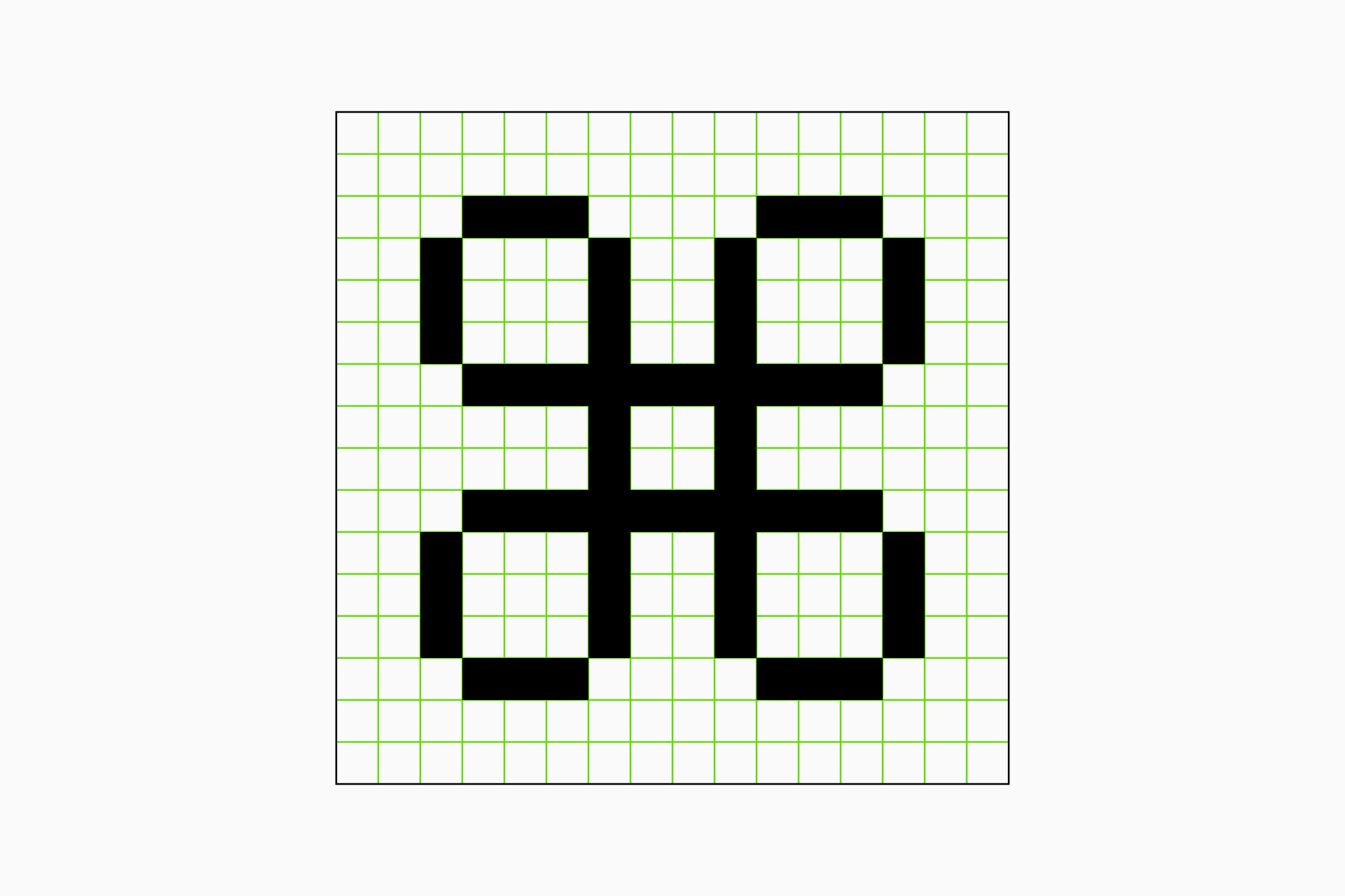
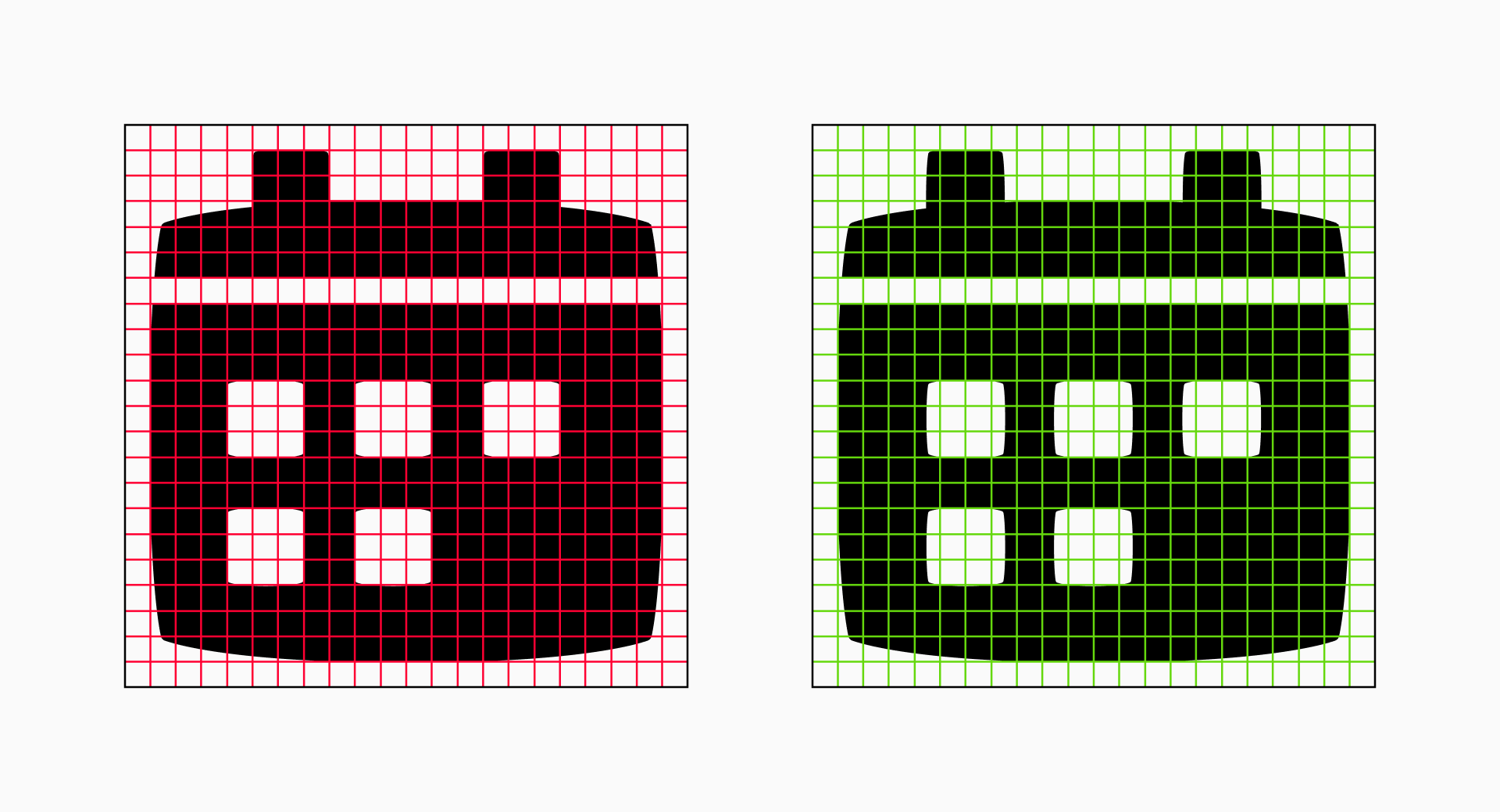
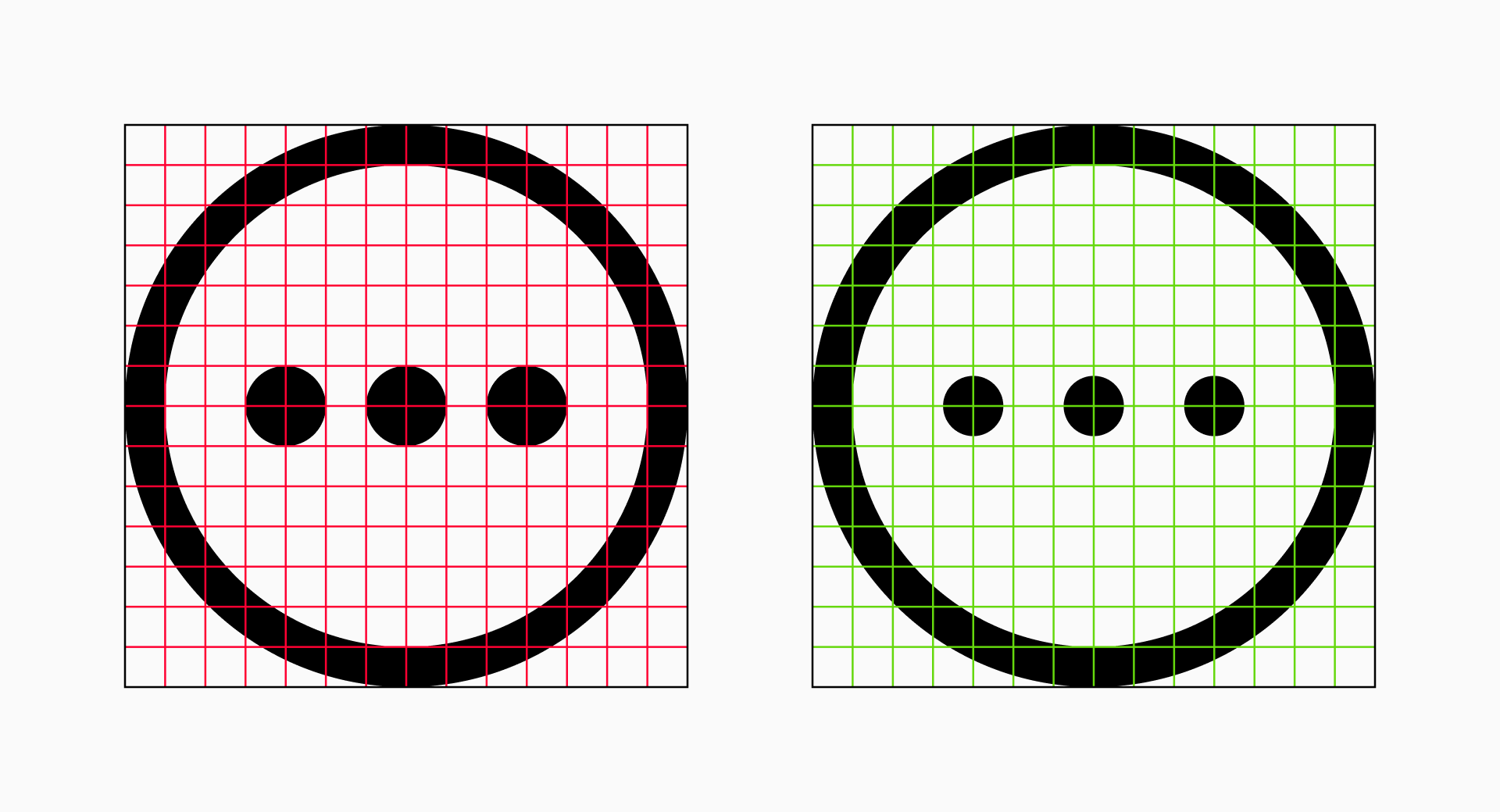
Primary grid (units). The primary grid is the basic structure that determines the overall layout and proportions of the icons, ensuring that each sign adheres to defined guidelines and contributing to the harmony across the set. The squares resulting from this division will be known as units.
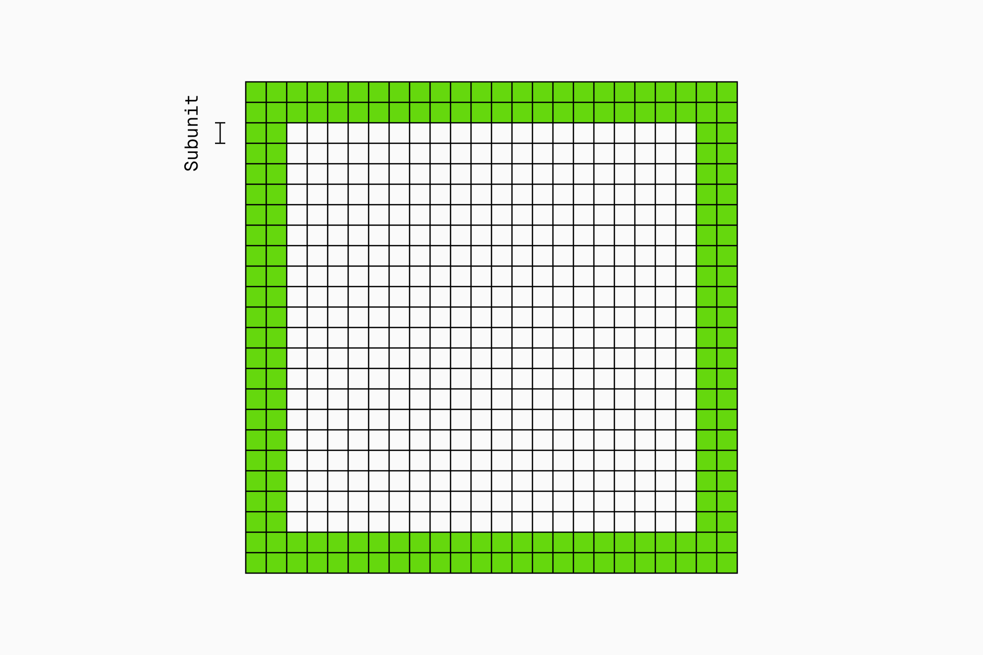
Secondary grid (subunits). Supporting the primary grid, the secondary grid provides more detailed guidelines and smaller divisions, known as subunits. These subunits improve accuracy and ease the way to achieve visual balance.
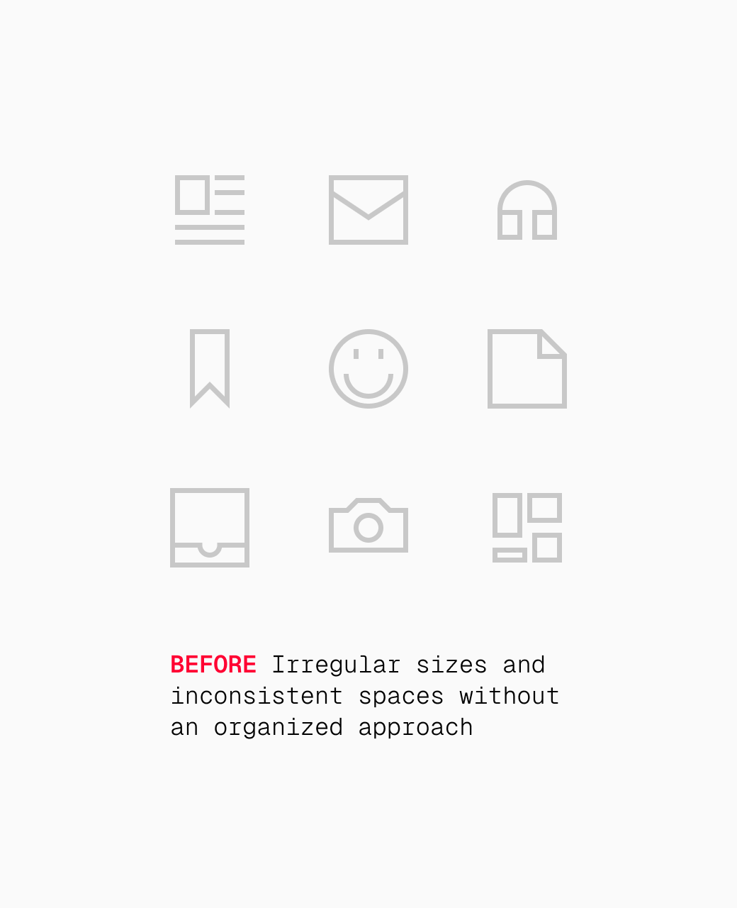
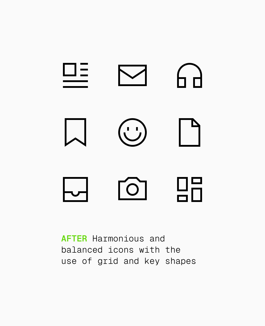
Seems pretty manageable, right? With these basic concepts, you're good to start creating a consistent set of icons. But if you're aiming for a deeper understanding and a more thorough approach, there's still more to explore.
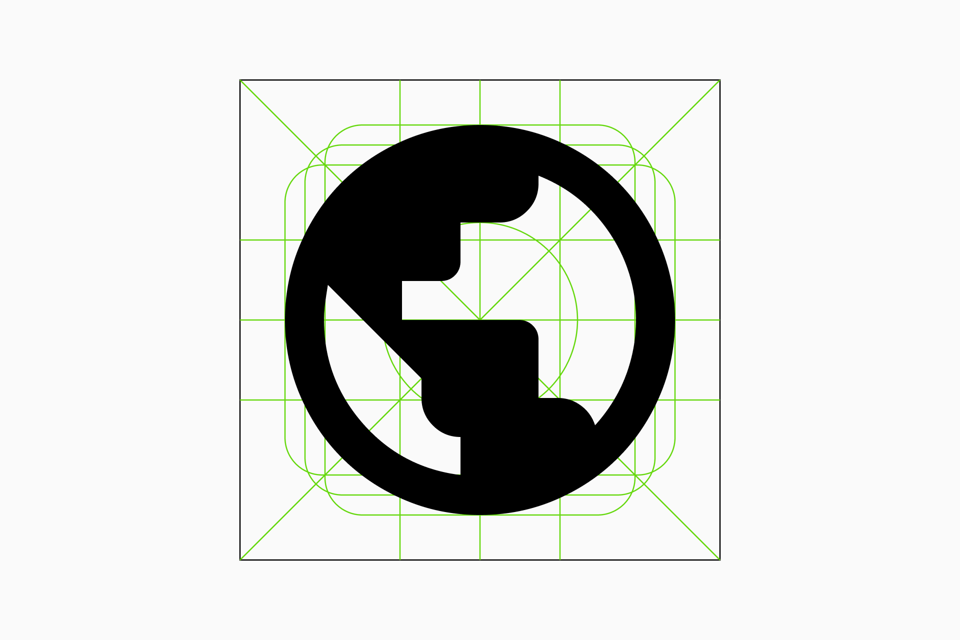
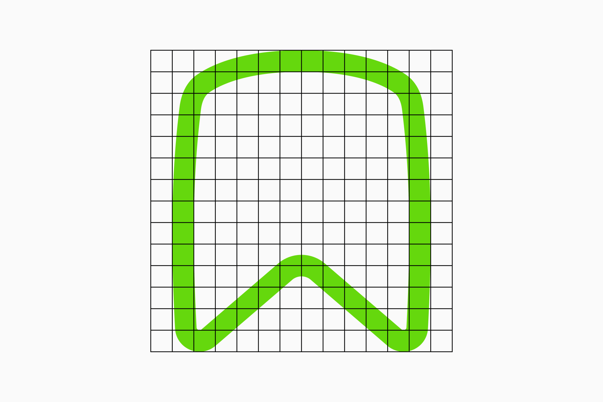
Defining the key shapes
The key shapes will set up the basic proportions of our icon system and, ideally, will adapt to our previously defined grid. Although they seem to establish very strict guidelines, the truth is that it also takes practice and visual sensitivity to know when an icon is balanced or not.
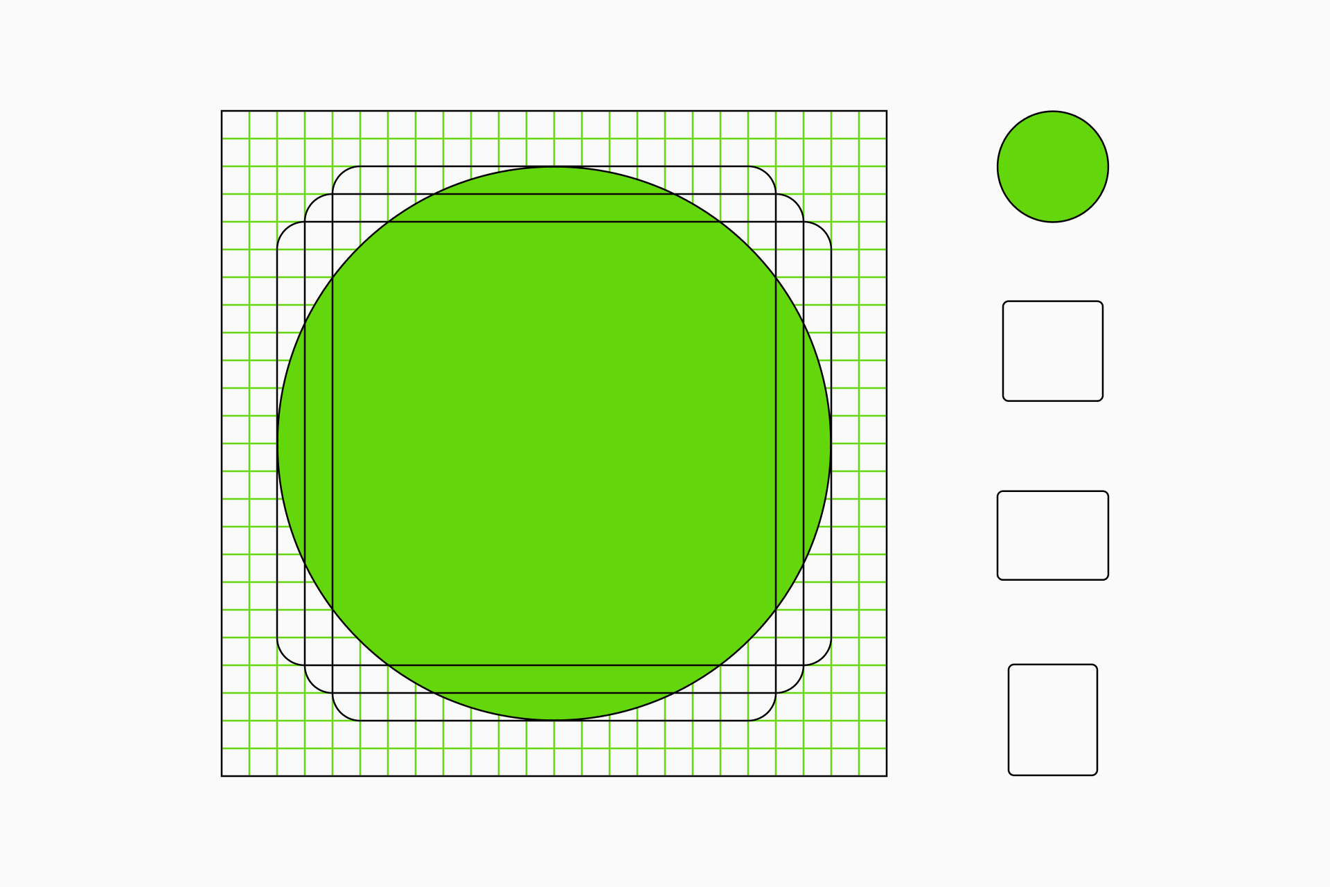
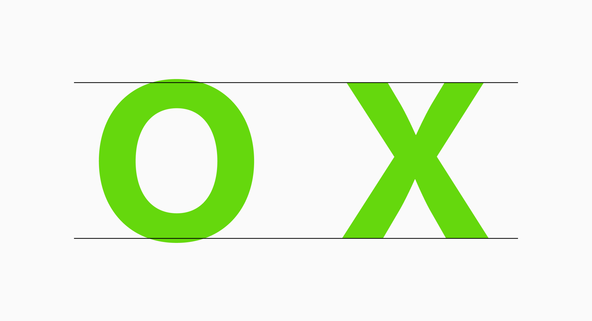
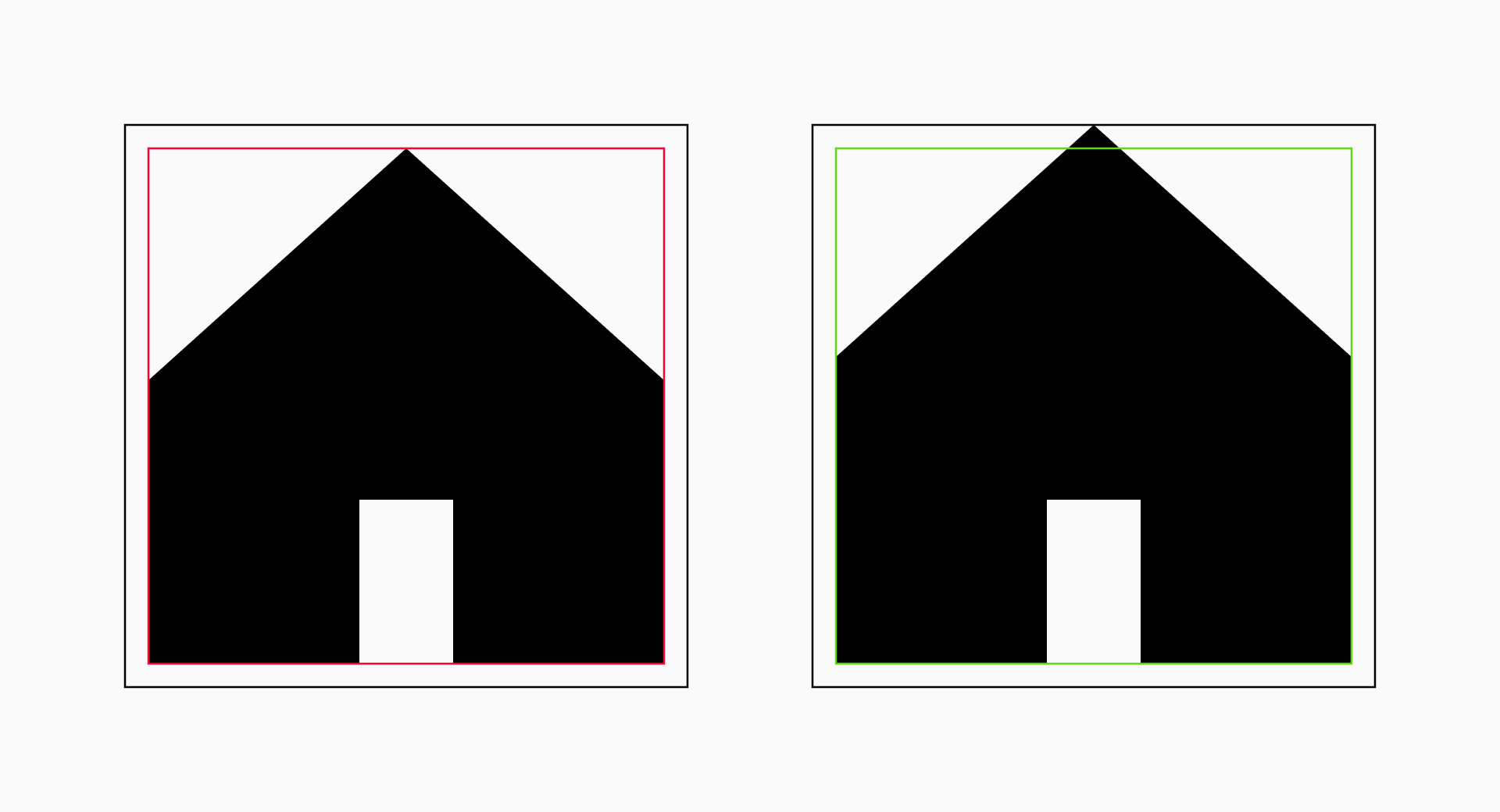
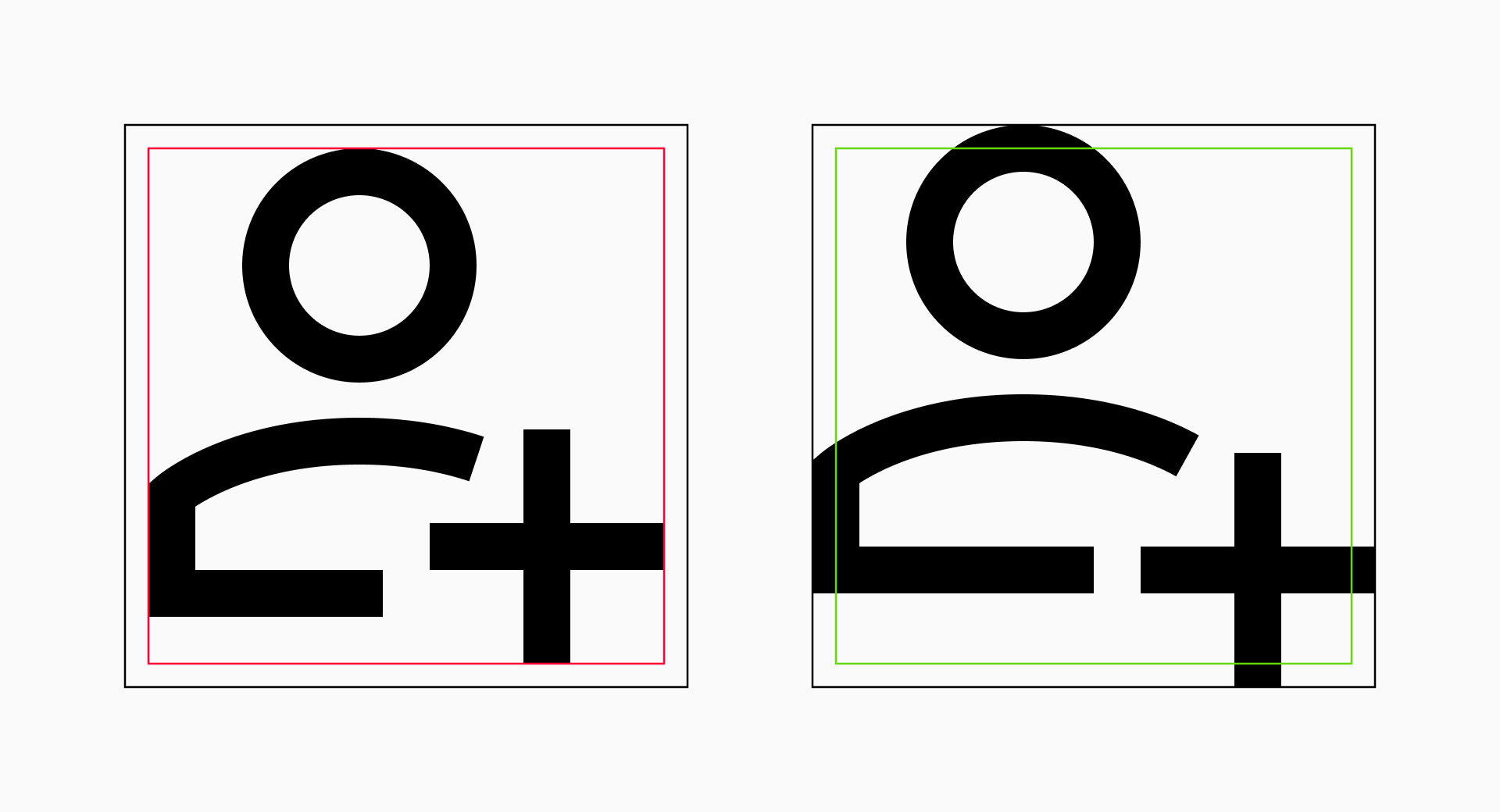
Circles and squares. Here's your usual "Did you know...?" portion for this article. Introducing a slight size difference by making the circles a bit larger than the squares can significantly influence the visual balance. It's pretty obvious in typography, for example, where circular letters such as the "O" protrude from the the height of the uppercase to provide a sense of equilibrium.
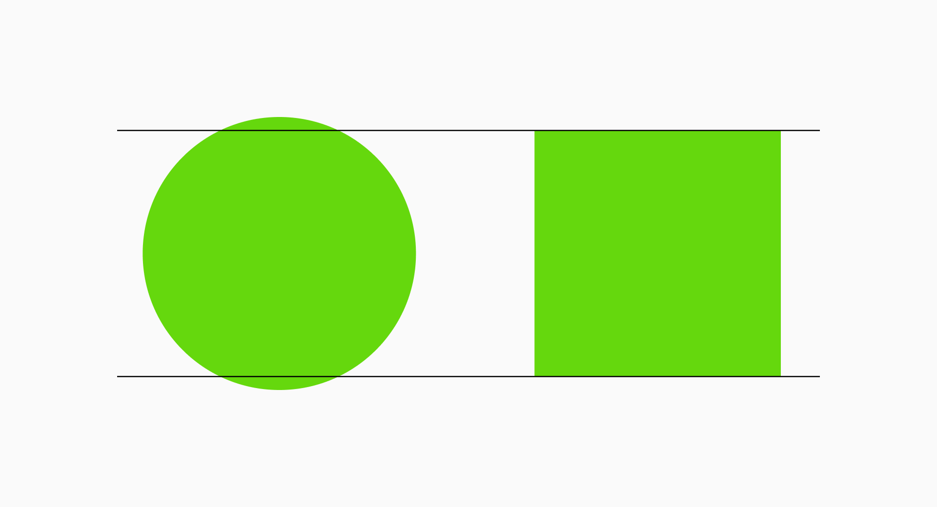
Rectangles. On the other hand, rectangles would present more "extreme" proportions. So to keep them balanced we'll normally take the width of the circle to set the width of the horizontal rectangle while making it slightly shorter than the square. Following a similar process, we'll take the height of the circle to define the height of the vertical rectangle and make sure it's a bit narrower than the square.
It may seem a bit complex at first, but this knowledge only needs to be learned once. After you've absorbed it, its use becomes almost automatic, something that will be part of your routine. So bear with me and let's dig even deeper.
Practical examples
So far you've only seen some abstract schemes and probably have a vague idea of how grids and key shapes work, but understanding their actual impact can be tricky. To clarify these concepts, let's see some real examples.
Micro is an icon set designed to work at very small sizes, that's why it was build on a 10x10px grid where the perfect placement of lines and shapes was essential to facilitate the recognition and legibility of the signs. In cases as "particular" as this, it's essential to know how a grid works and not leave anything to chance. Explore our Micro collection if you need inspiration to create tiny icons.
Sharp is a more complex set drawn on a 24x24px grid, with a very geometric construction based on simple shapes and pointy corners. This type of design makes it easier to follow the grid since the straight ends fit perfectly with the units of our structure, giving the set a brutalist and clean look. Check out Sharp's unique geometry if you're interested in this strict approach.
Flex, on the other hand, is a much more anarchic set. The use of squircles and other curved lines implies a greater difficulty in fitting these shapes within an established structure, and that's why (and for a change) we ignored the grid a little more and we focused on compensating the icons with the use of key shapes. Take a look at Flex's anarchic construction if you too want to rebel against straight lines.
And believe me if I tell you that I can talk a lot about this, because at Streamline we've been improving our main sets for months based on the use of key shapes. So what better way to grasp this new concept than through our experience?
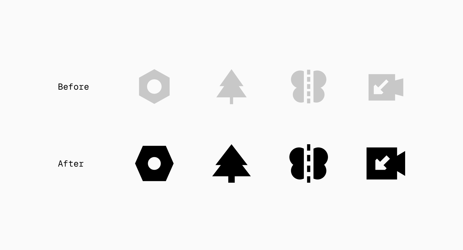
Even if an icon has logical proportions, it can always be forced a little bit to fit the key shapes if we consider that it will be implemented at small sizes and that the more spacious it is, the easier it can be to read. Besides improving legibility, it will also help keep the set more cohesive and balanced.
If you're working on a large set (which is usually our case) you'll probably find some icons where, in order to fit them with the key shapes, you'll have to force the proportions too much. But don't panic! If that happens it's better not to follow these rules and prioritize legibility over consistency.
The implementation of key shapes introduces a lasting solution for creating harmonious icon sets, significantly improving their clarity and functionality. And, as you've already seen, the inherent flexibility of these rules makes it possible to implement them even when the set is already finished, although this isn't the ideal scenario unless you're working on a particularly small collection of icons.
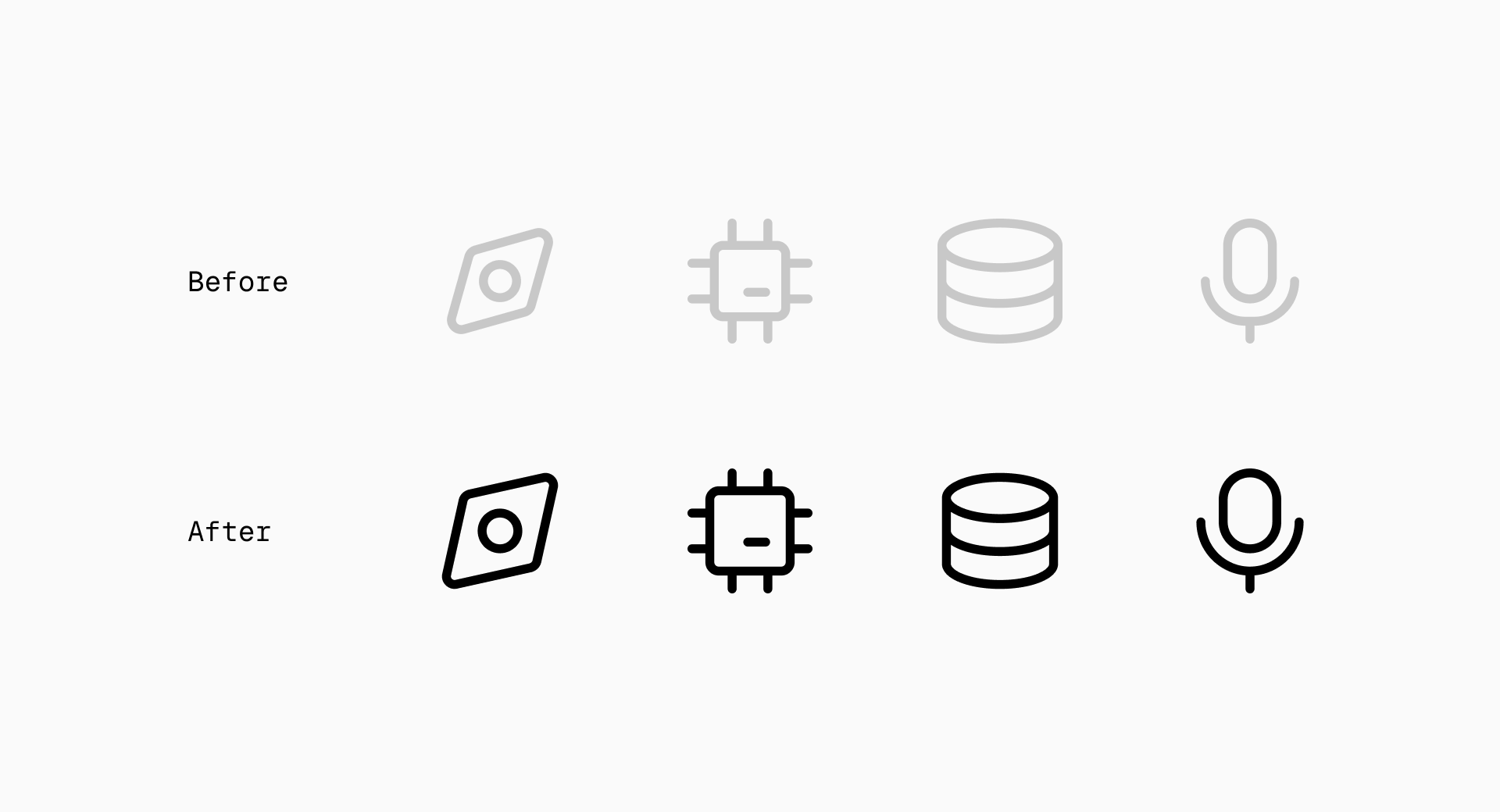
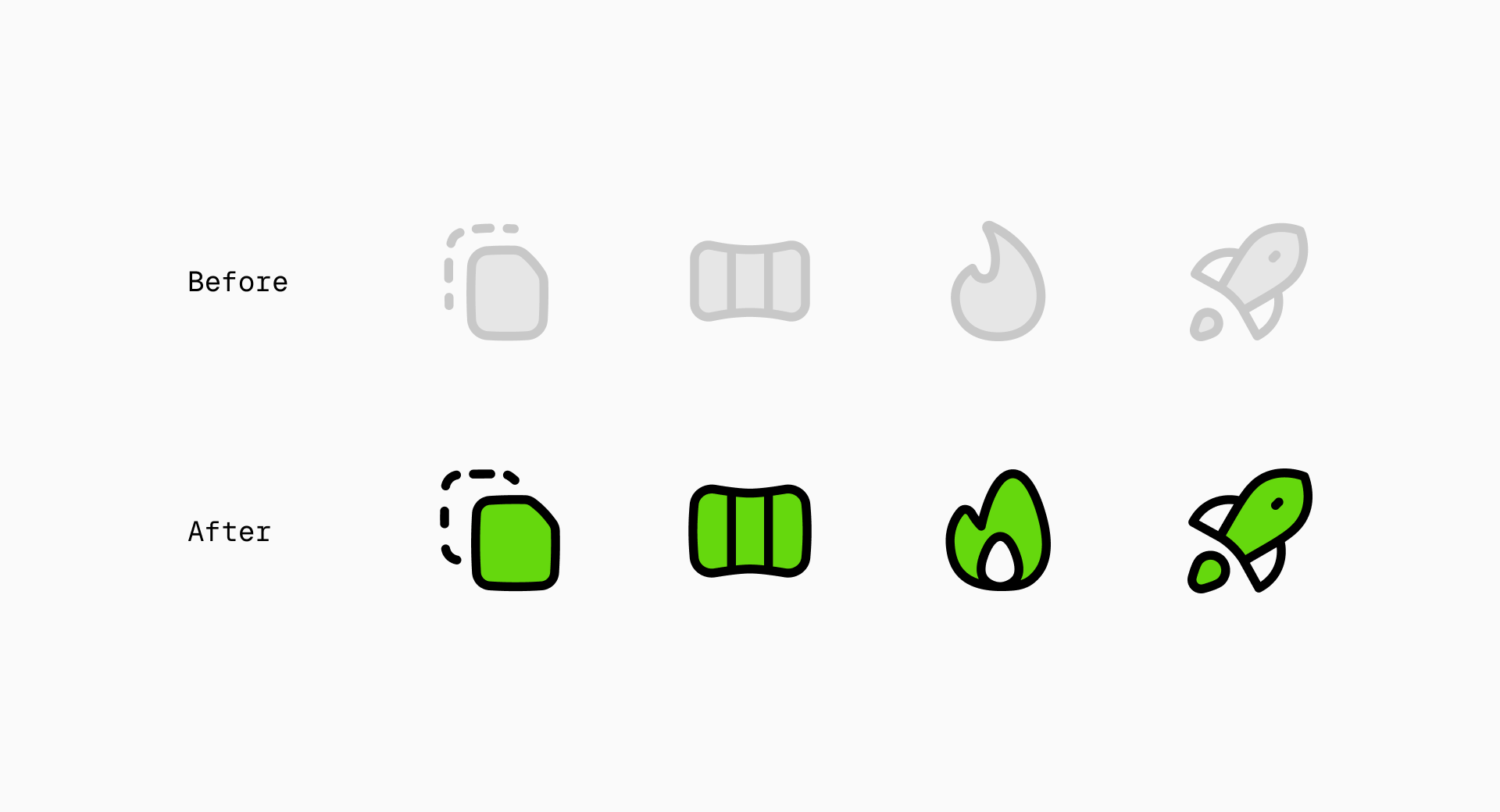
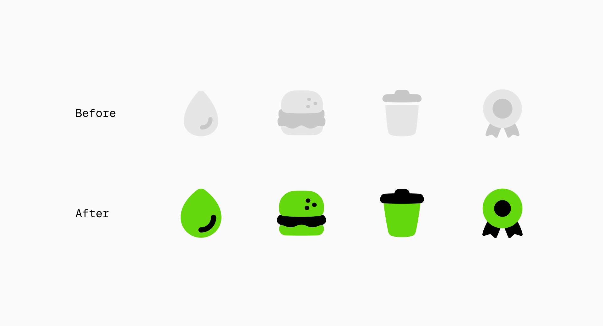
From left to right and top to bottom: some of the improvements we've made to Core, Flex, Plump and Sharp over the last few months based on key shapes
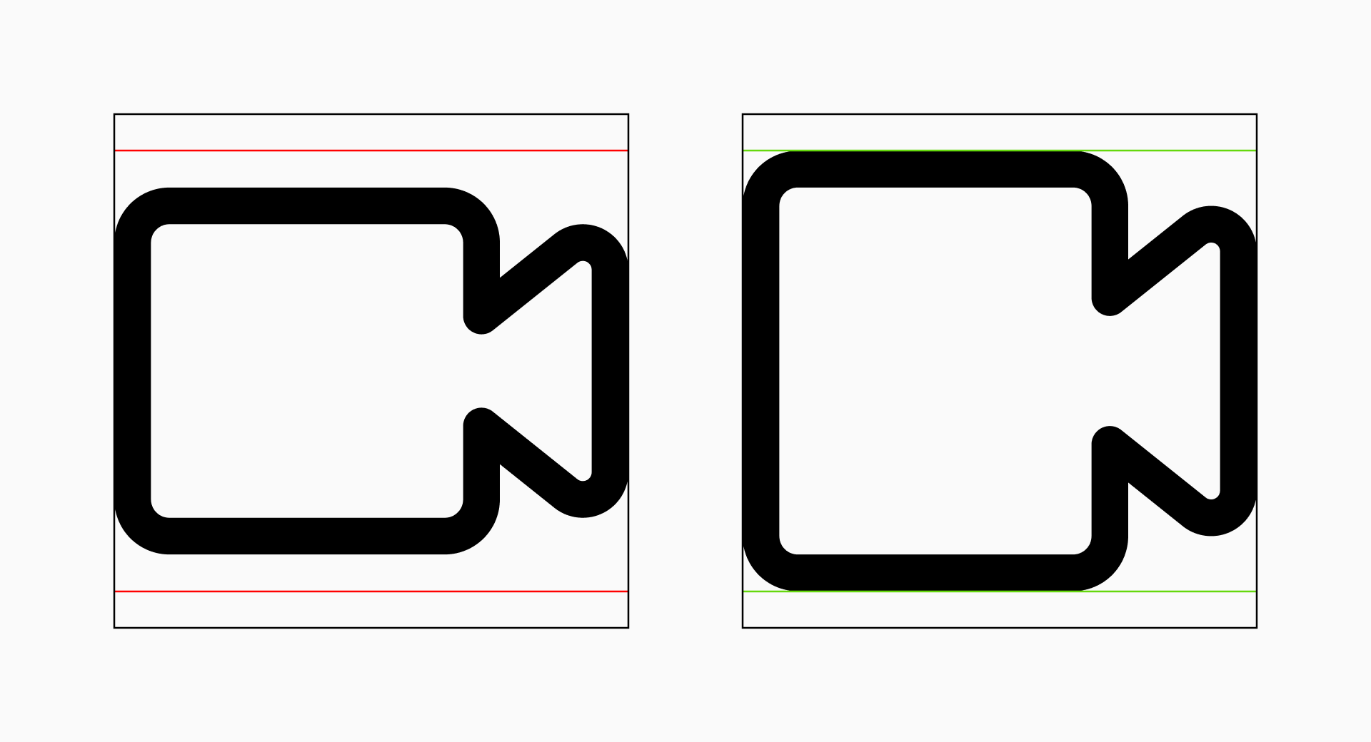
Optical adjustments
Understanding the basics of grids and key shapes in icon design is always very insightful. But now it's time to explore something a bit different: breaking these rules to make optical adjustments. Sometimes, going against the guidelines can actually create a truly balanced set of icons, so this next step involves learning how and when to break these rules while maintaining the set's visual consistency.
When to break the grid
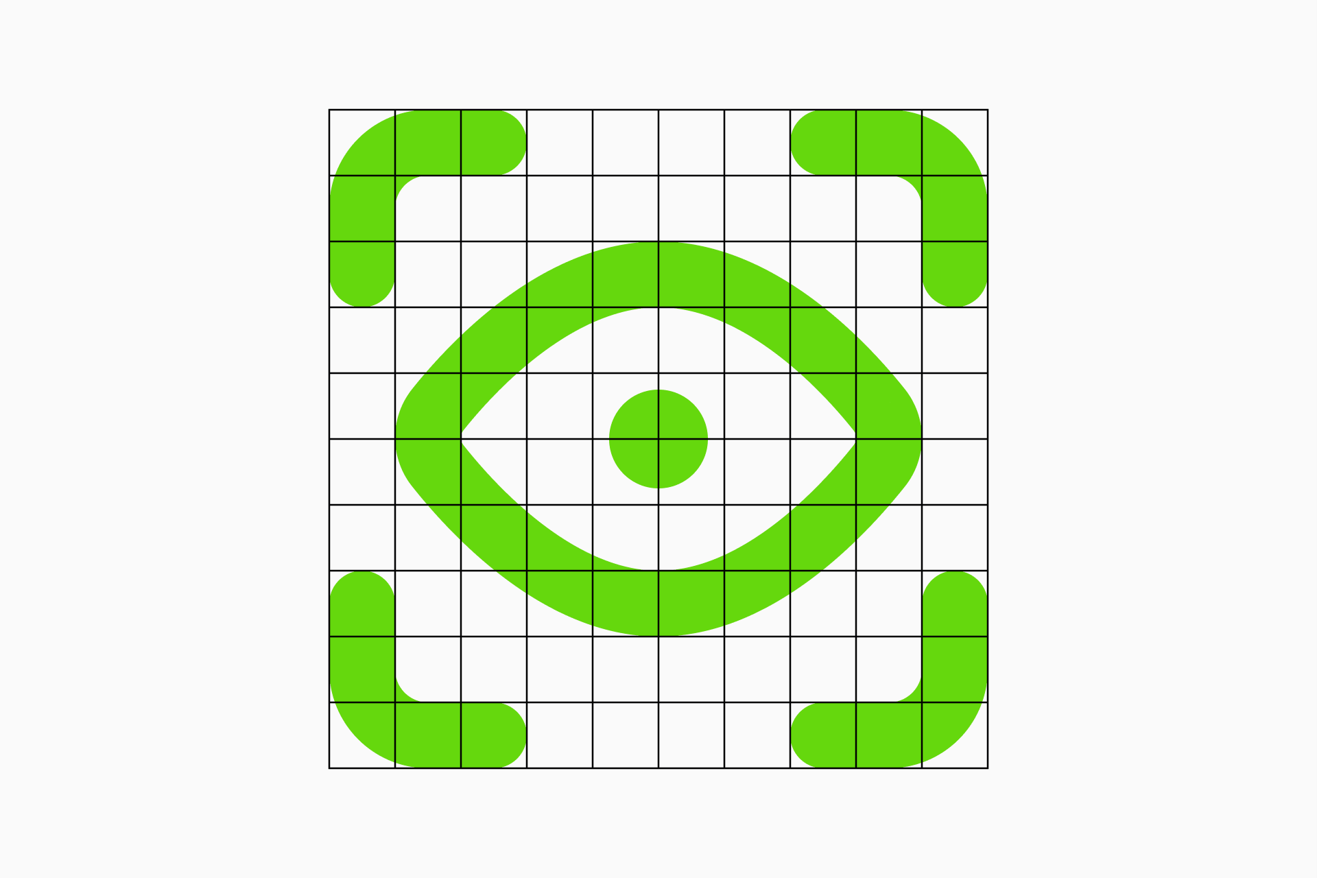
You may think that an icon that perfectly fits the grid is the ideal solution, but in most occasions it's not. Grids are just aids, you don't have to feel constrained by an organized square structure since your first goal will always be legibility.

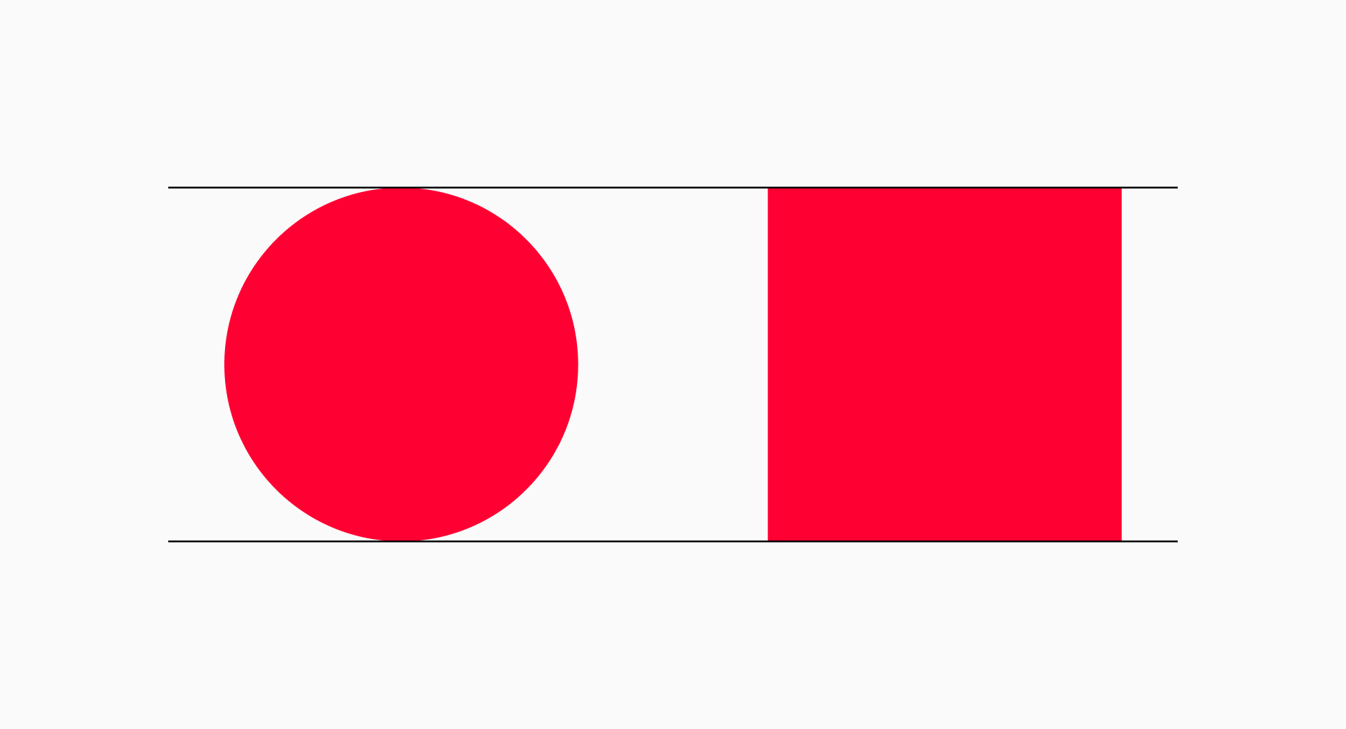
If we're working on a set of line icons we may want to use shapes such as dots, which could look too small or too large if we try to fit them to the grid. In these cases it's better to opt for something in between and ignore the unit division.

Breaking the grid is an entirely intentional process and is often used to improve legibility, add dynamism or maintain consistency in similar icons with different compositions. Besides, it's kind of liberating, isn't it?
When to break the key shapes
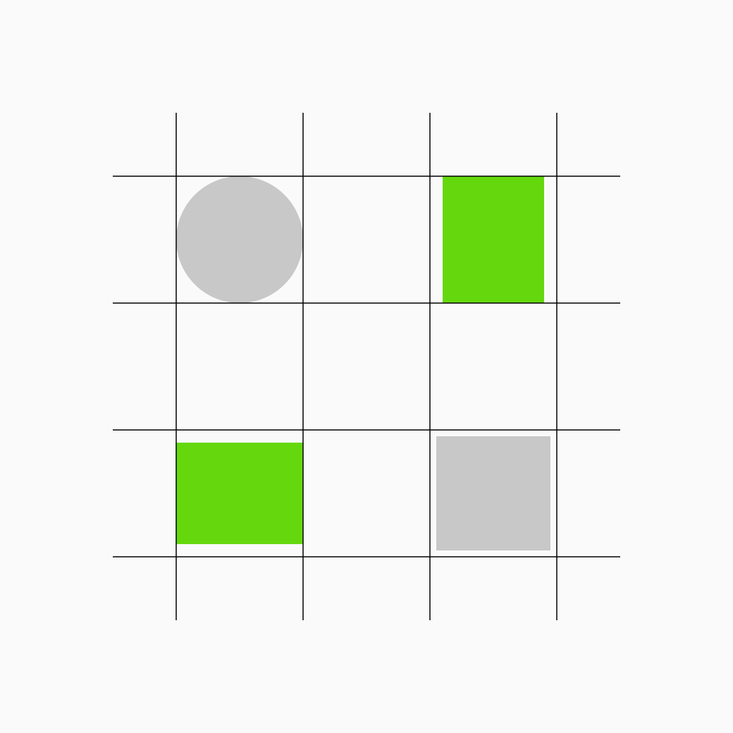
In the case of the key shapes, we must break these guidelines when the icons have too much negative space or the silhouettes are very irregular. Basically it's about ensuring that all icons take up a similar amount of space.

There will be cases where combining two icons can generate a lot of white space around. The most frequent solution here would be to break the guidelines so that the icons occupy more space than they actually do if we follow the rule.

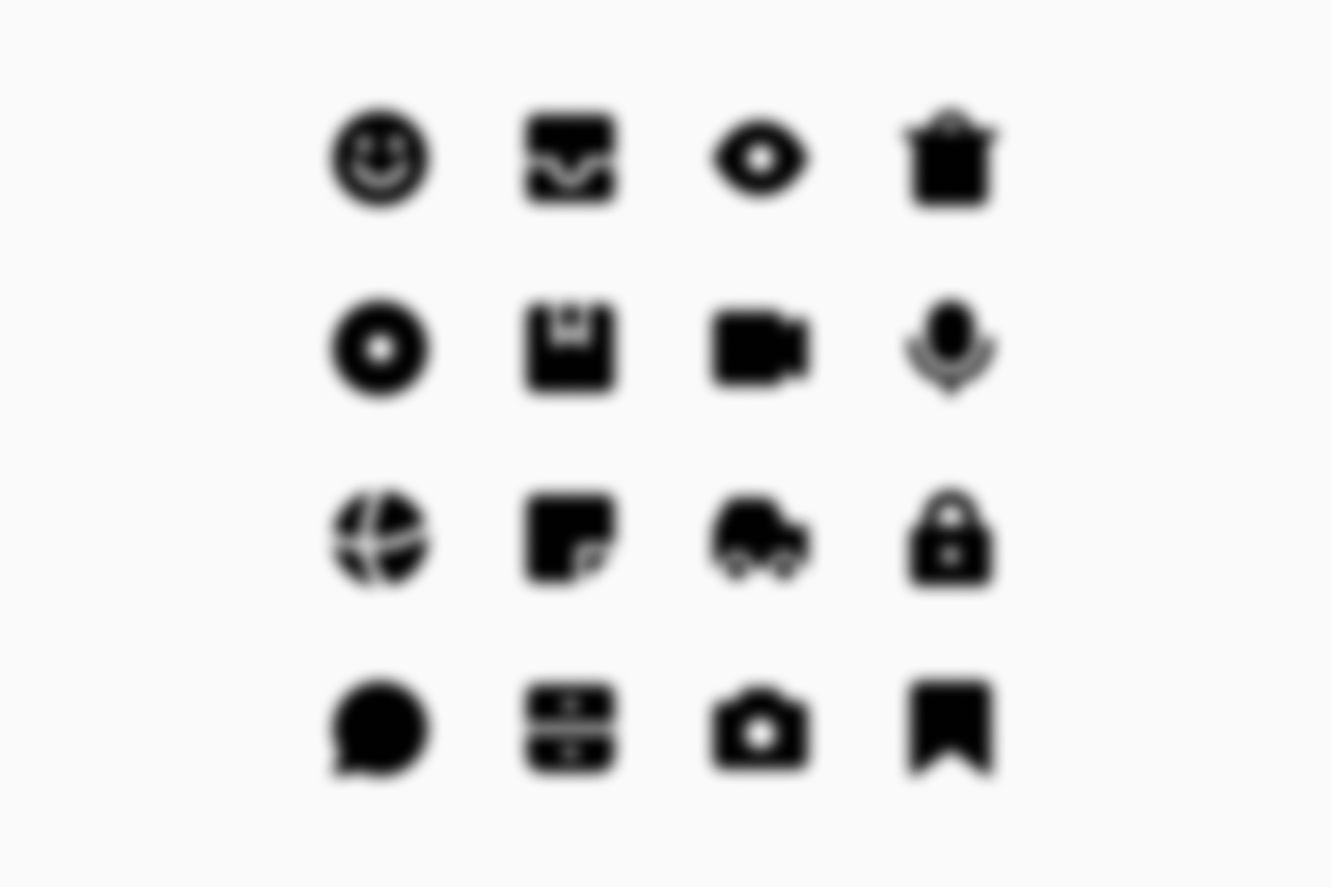
How can you make sure that the icons look balanced enough if you have to break the guidelines? An old trick is to blur the icons and check the overall stain. They all occupy a similar space? Or there’s an icon that clearly stands out in a bad way? If you’re as blind as me, you can simply take your glasses off.
Let's recap
As we've seen, grids and key shapes play a fundamental role in building an icon system. They ensure that all the signs align cohesively and use a structured approach that simplifies the design process and supports scalability.
But grids and key shapes aren't handcuffs; they're tools. Mastering them isn't just about following rules blindly; it's knowing when to free yourself from them.
So remember to be thorough, but don't forget to be a little anarchic.
A little gift before you go
Thanks for sticking with us until the end! While this text is aimed at a broad audience, we want to make sure it's especially didactic for those just starting out designing icons, so we've created a Community file on Figma with some standard grids and key shapes that might help you get your project on the right track. If you design something with it we'd love to see it, so be sure to share it with us!
Icon grids and key shapes, free templates
A collection of free templates to get you started.
Further reading
- Abdullah, R., & Hübner, R. (2006). Pictograms, Icons & Signs: A Guide to Information Graphics. Thames & Hudson.
- González-Miranda, E., & Quindós, T. (2015). Diseño de iconos y pictogramas. Campgràfic.
- Osterwalder, M. (2019). Olympic Games: The Design. Niggli.
- Voelker, U. (2019). Structuring Design. Niggli.
- Designing icons. (n.d.). Material Design.
https://m3.material.io/styles/icons/designing-icons