The Streamline Icon System
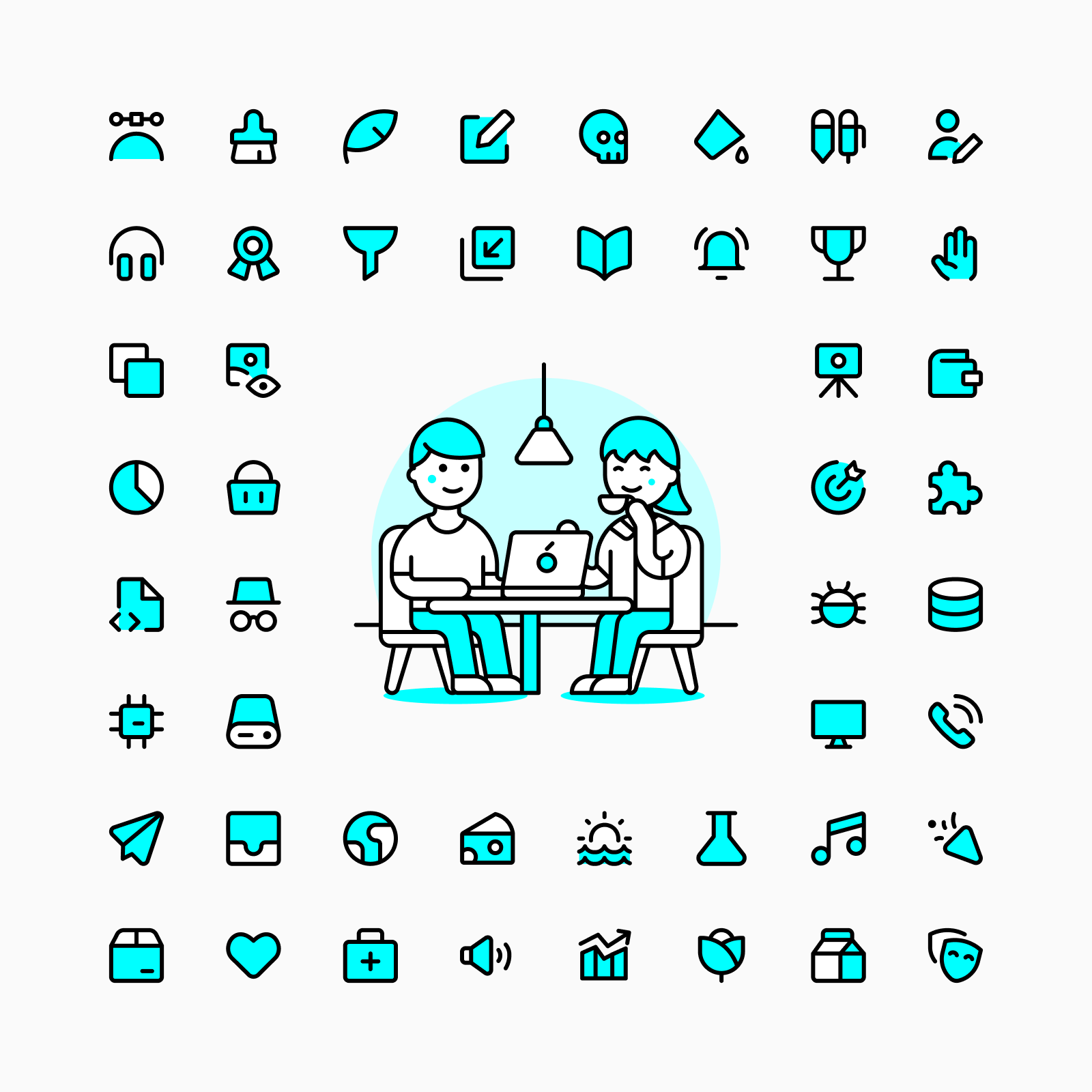
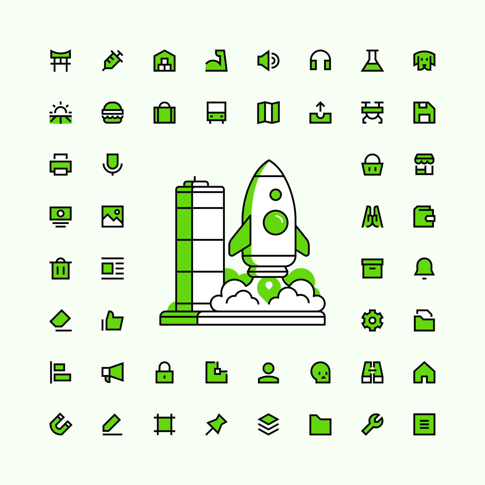
100,000 icons across 4 families and 24 variations.
All the icons you need, in every style you love.
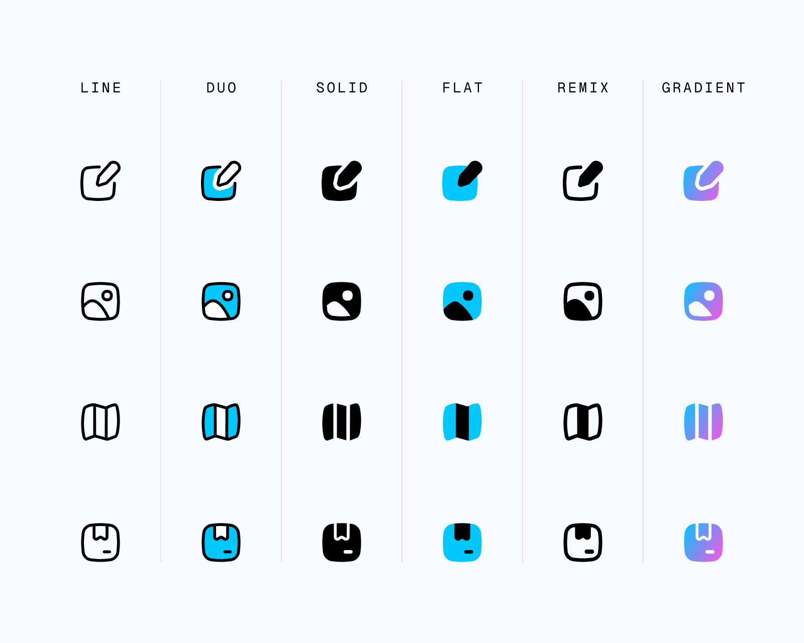
The Streamline Icon System is based on 4 big families: Core, Flex, Sharp and Plump. Each of them with a unique and strong style, from neutral to brutal.
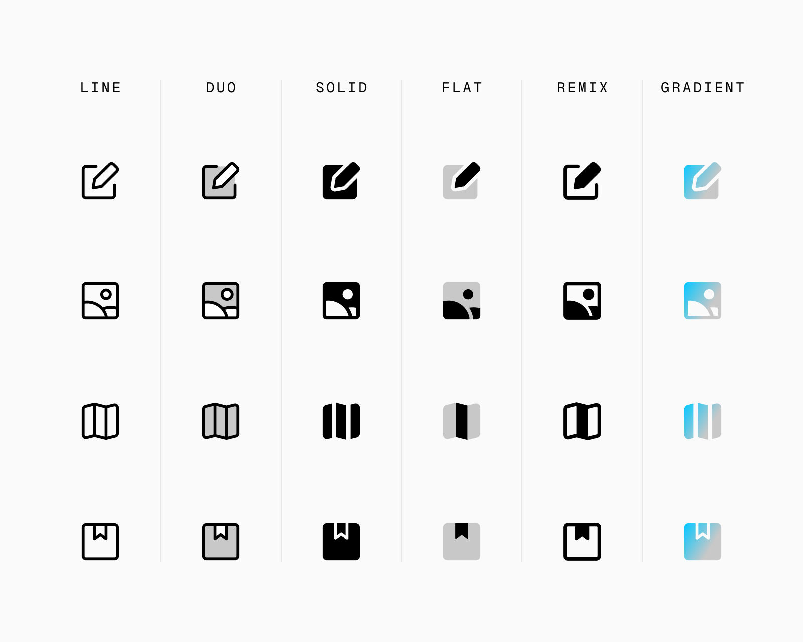
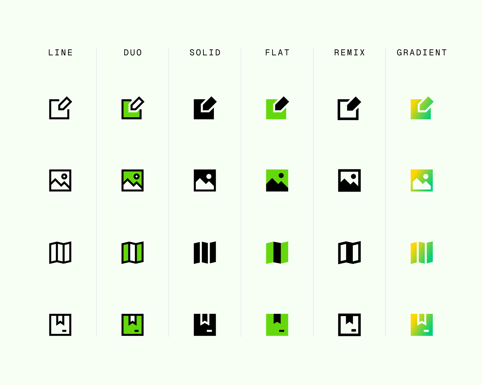
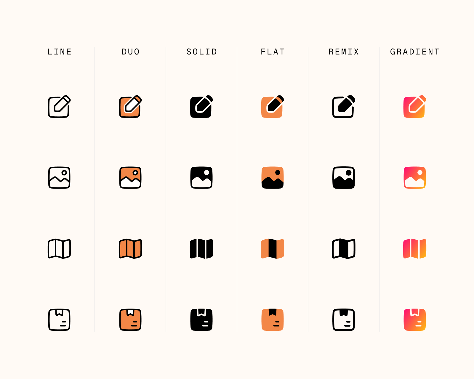
Each family comes in 6 different variations: Line, Solid, Duo, Flat, Remix and Gradient. A total of 24 different sets to suit your branding and design needs.
From top left to bottom right: Core, Flex, Sharp and Plump

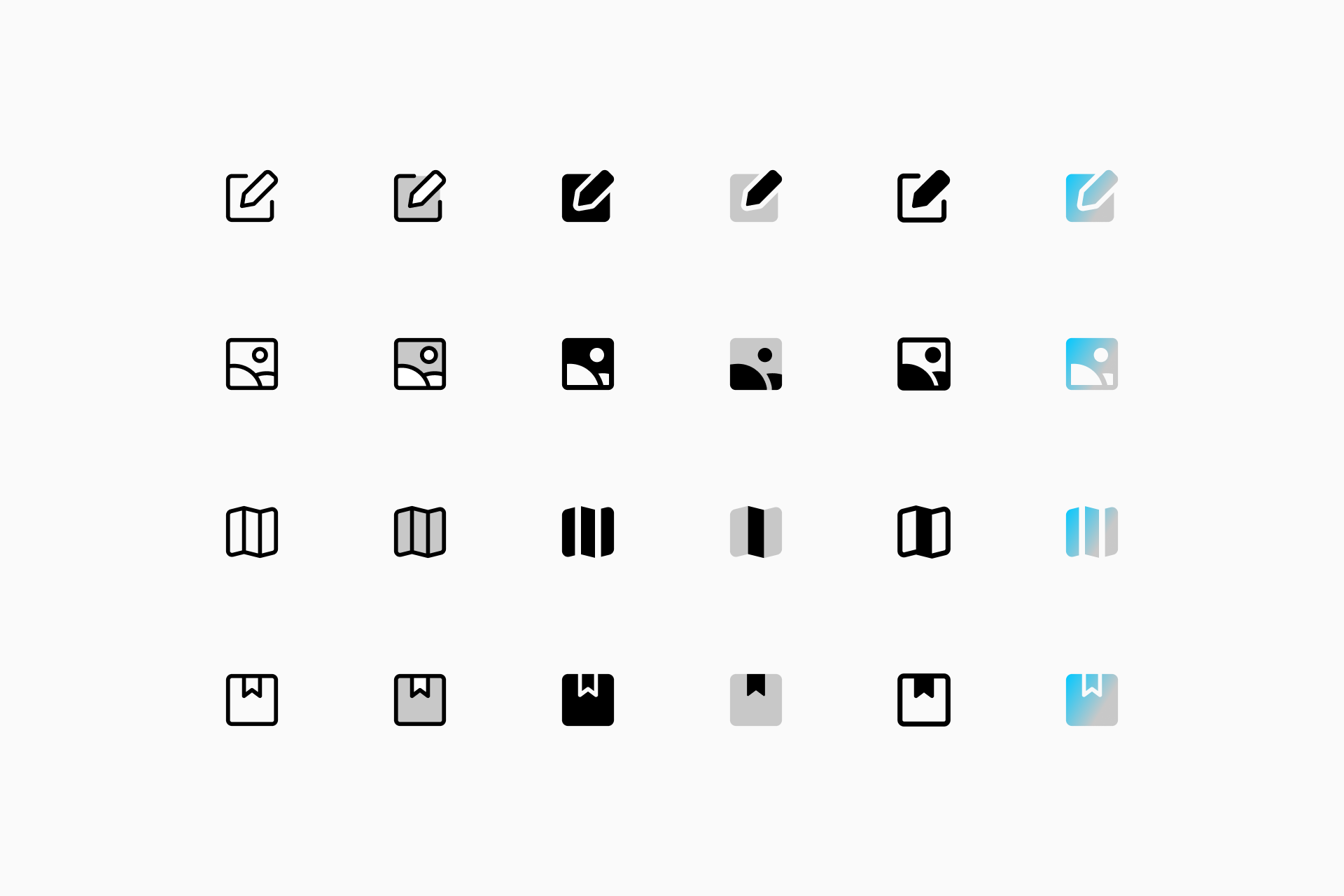
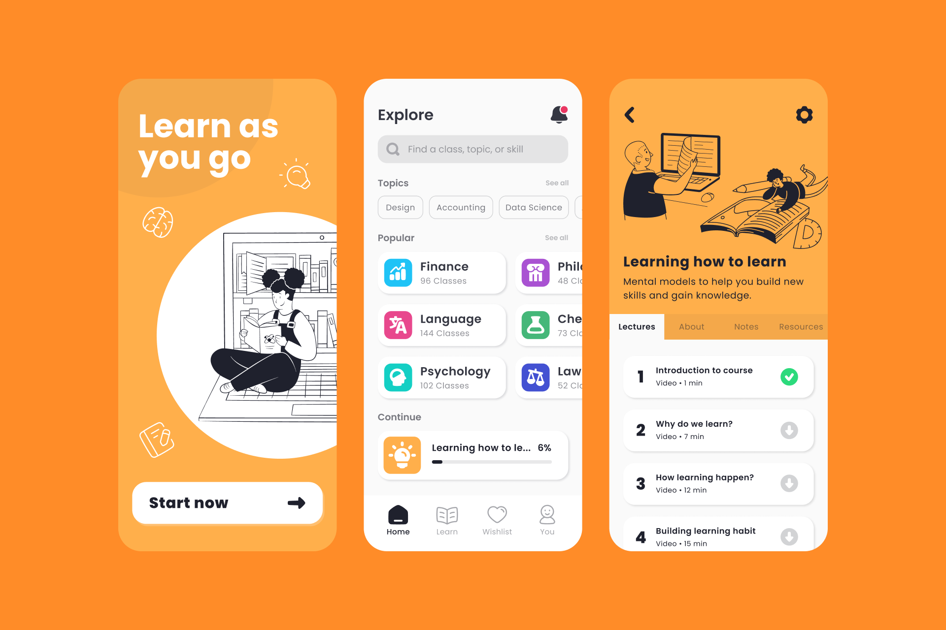
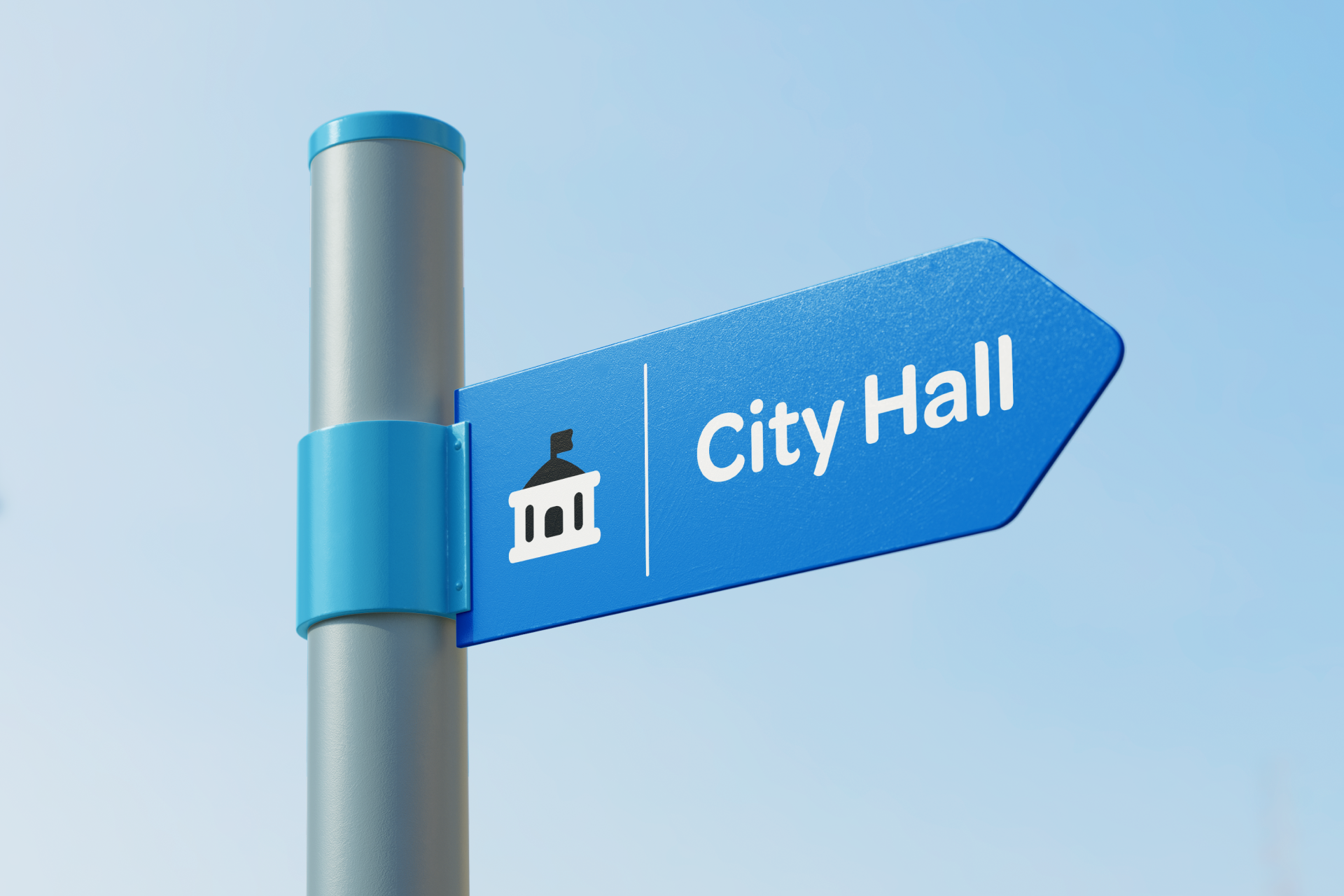
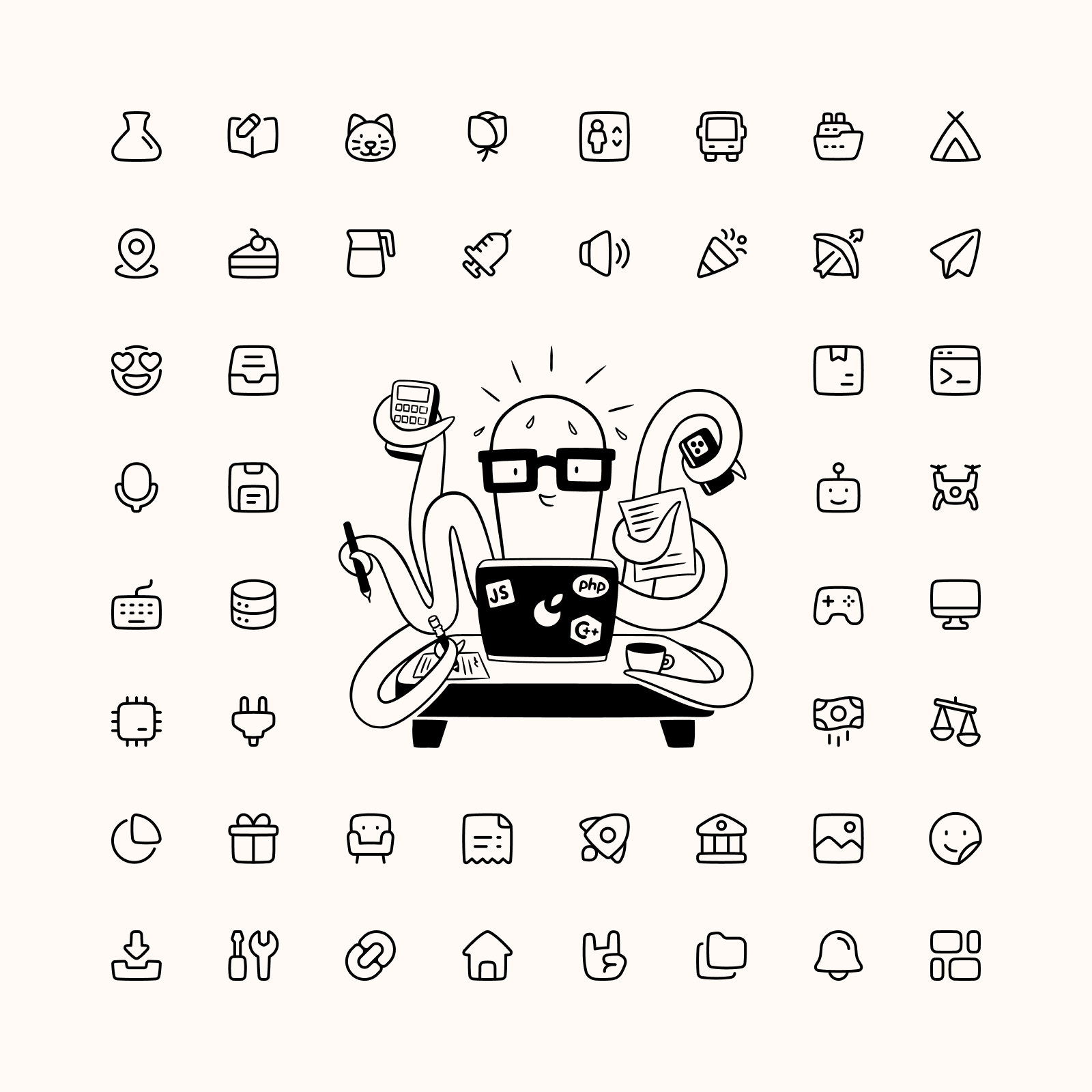
1. CORE
The Helvetica of icons
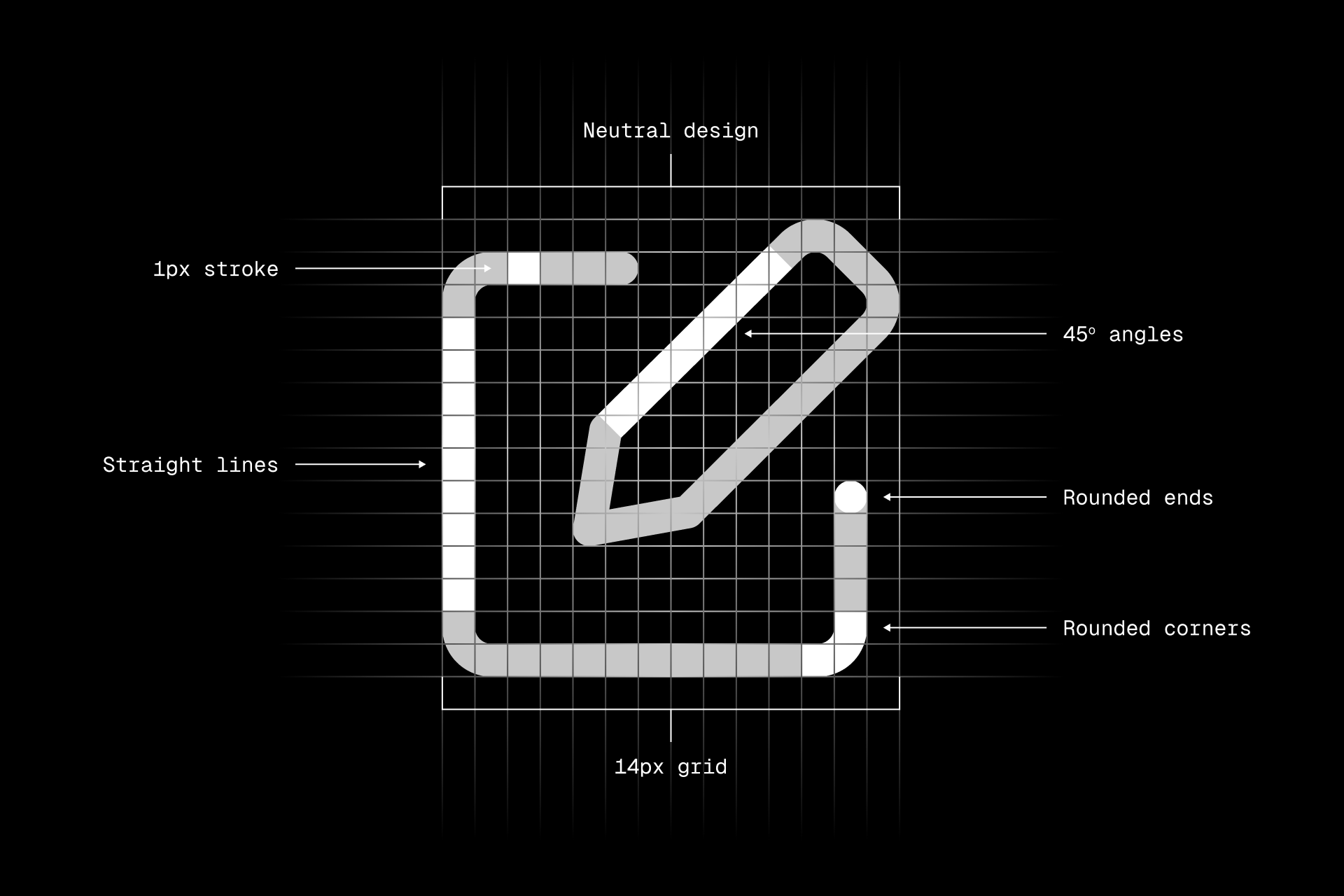
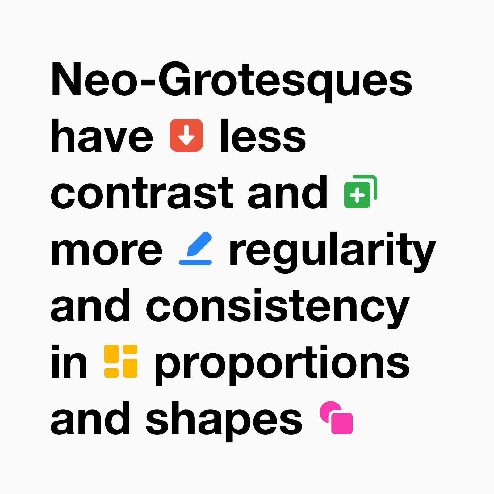
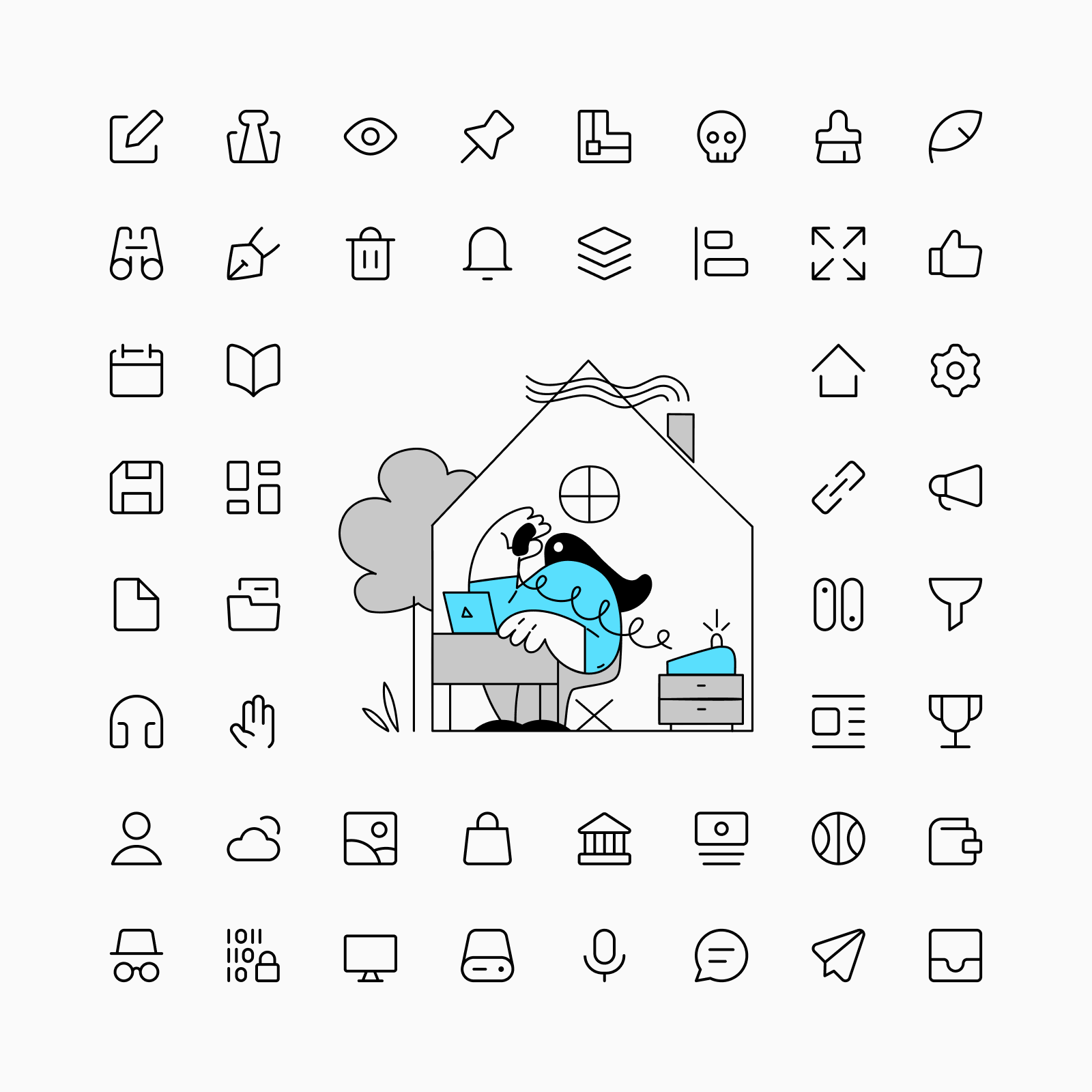
Core is a rational, versatile and timeless set that works perfectly in any context: interface, editorial, packaging, etc. Its simple construction and legible shapes make it the perfect choice to be part of a neutral and functional design.
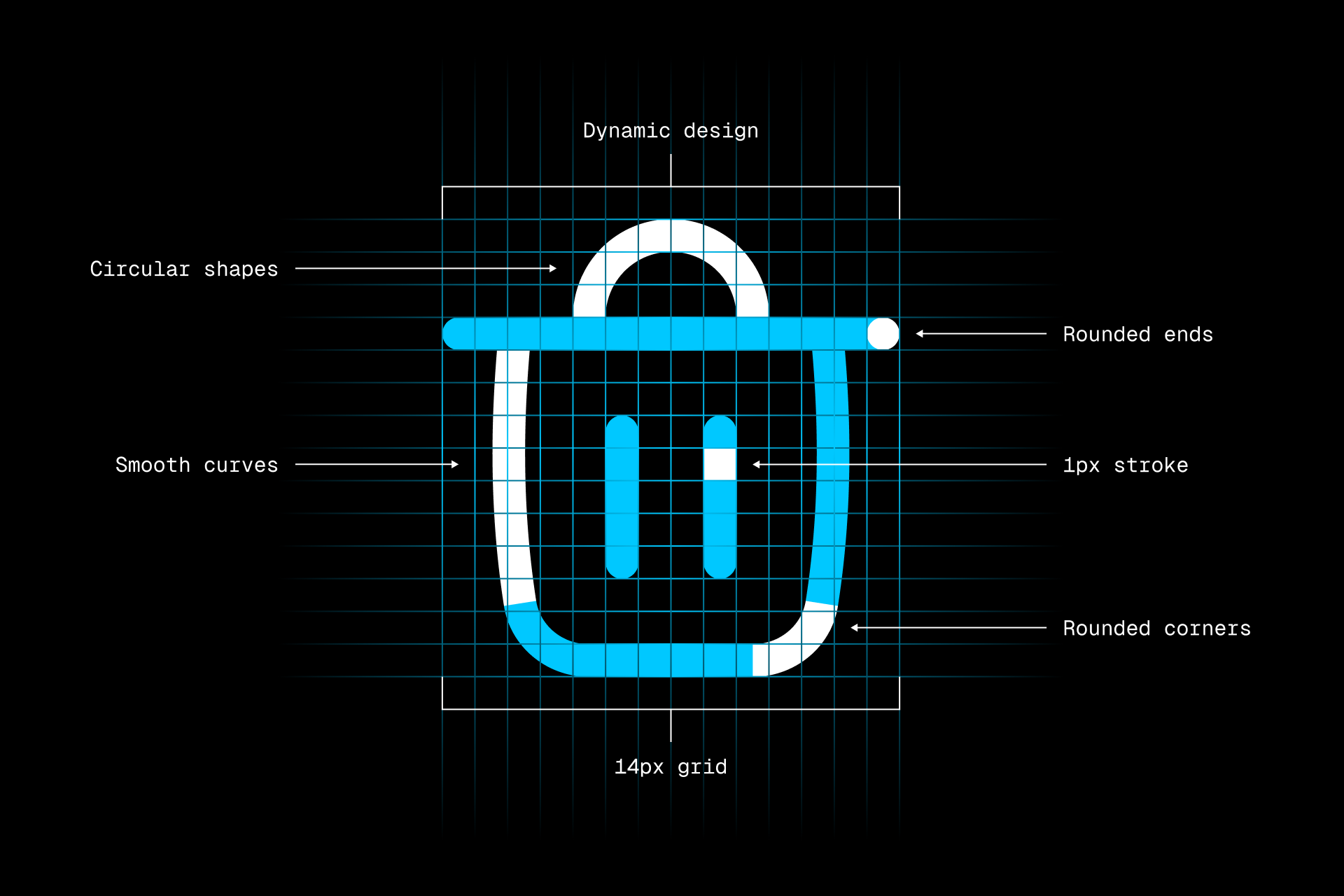
Every Core icon was built on a 14x14px grid, which allowed us to keep them simple and focus on legibility over everything else. We also used rounded corners and circular ends to give these icons a more pleasant touch.
When to use Core?
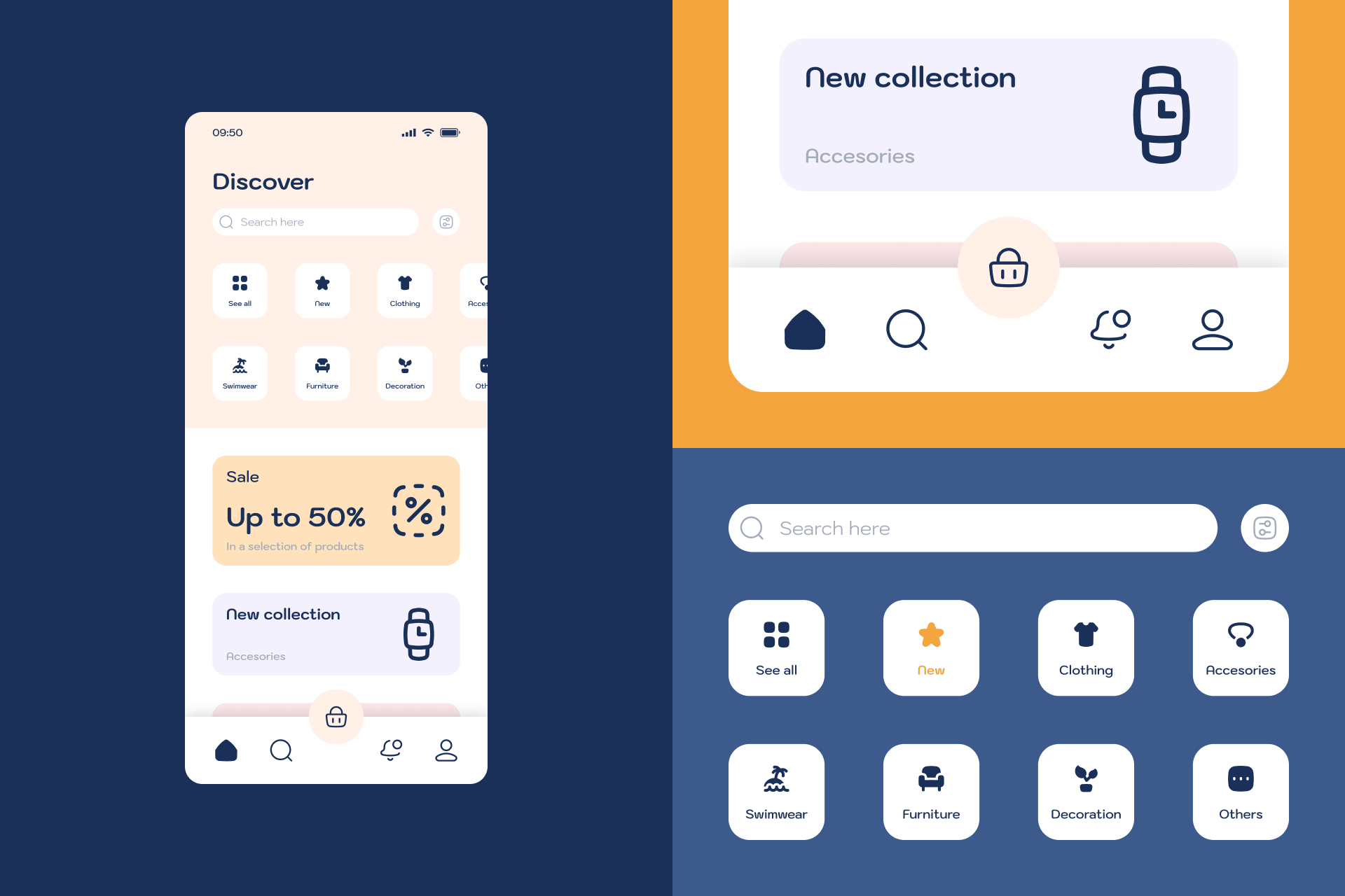
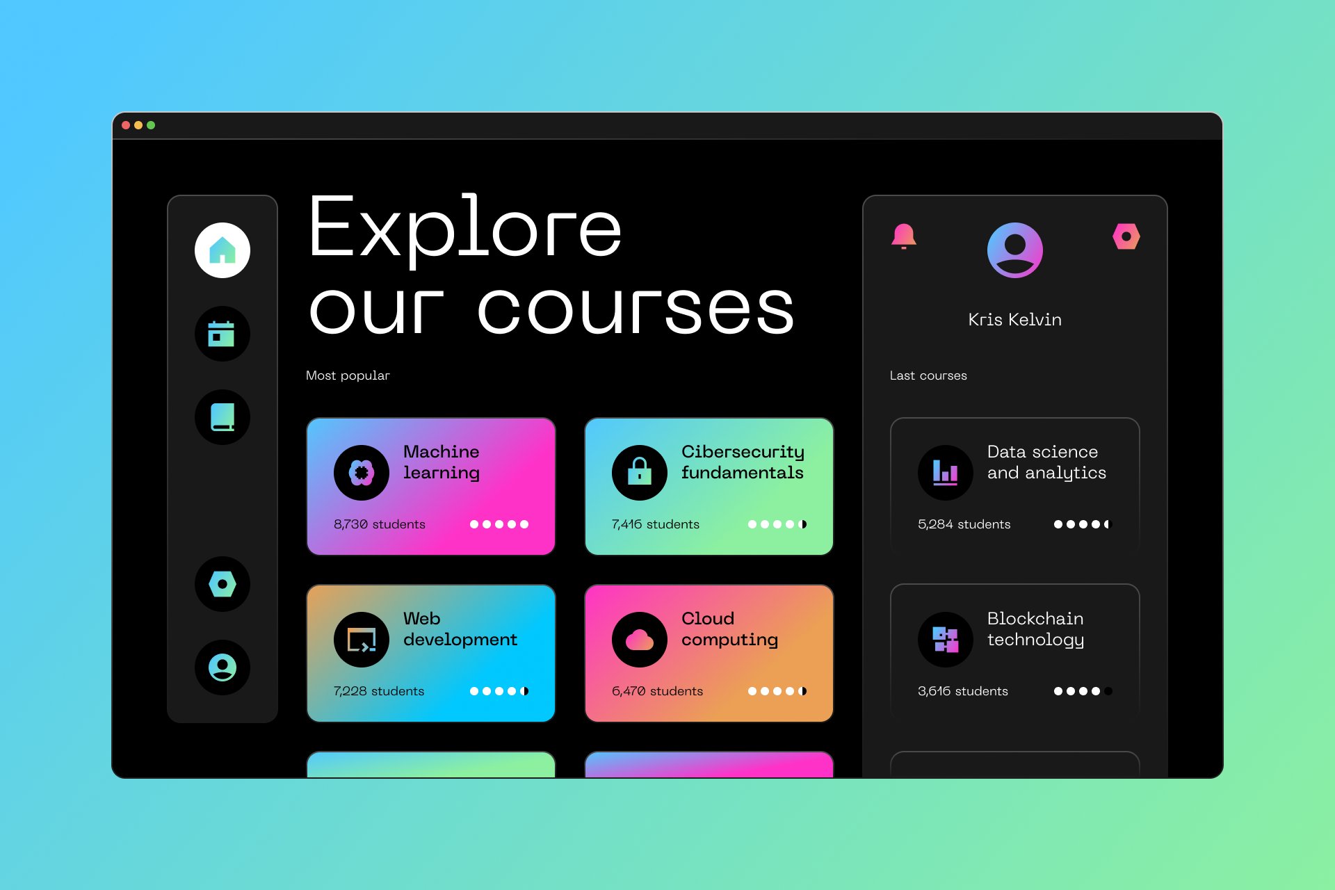
Core icons are perfect for interface design thanks to their simplified look and large inner space, which makes them extremely legible at small sizes. It's the perfect choice when you need a professional and neutral set of icons. But even if you aren't sure what your project needs, Core will make it work for you.
What typefaces should I pair it with?
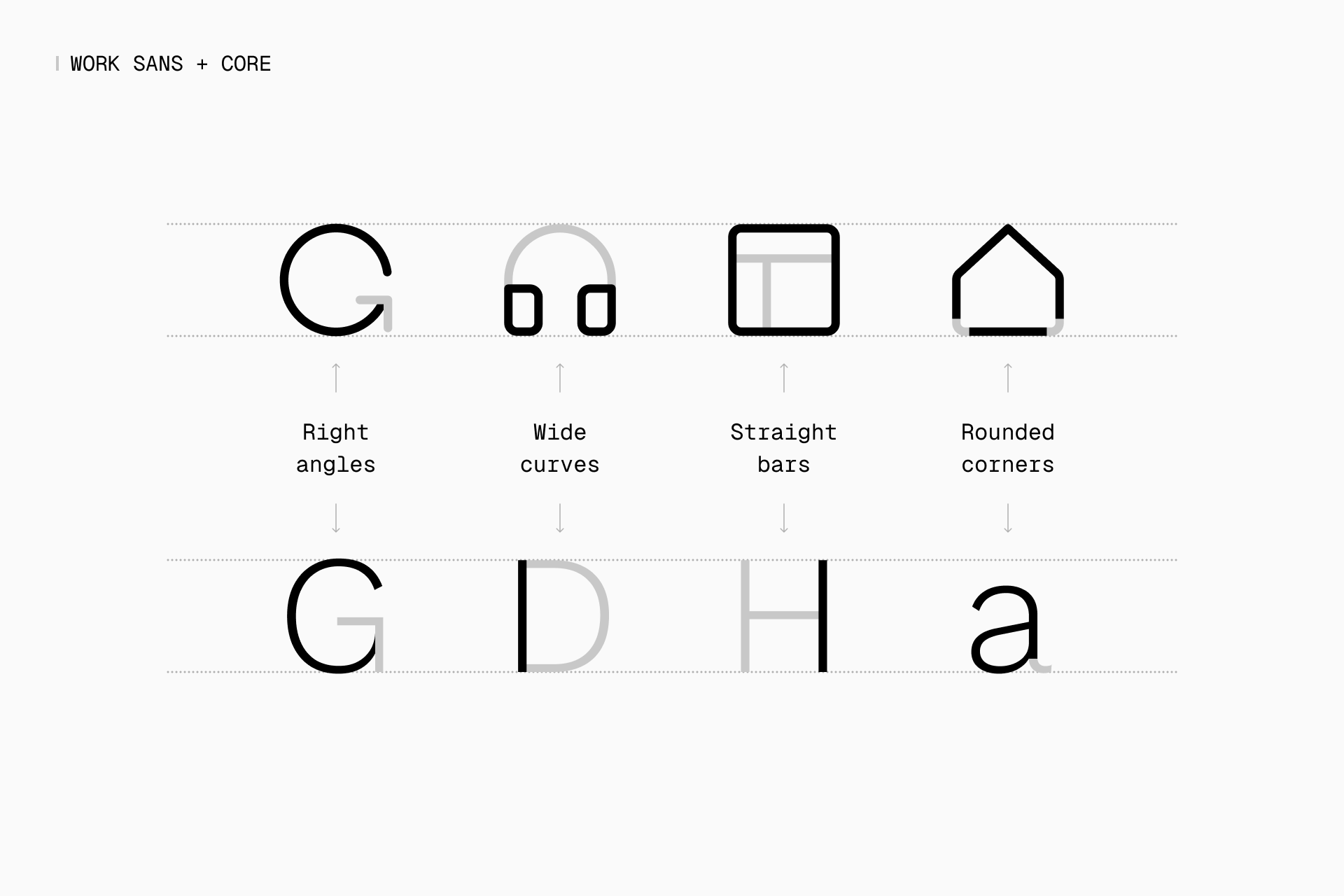
Core is the icon equivalent of Helvetica, not only for its timelessness, but also for its rational construction and adaptability.
Core icons could easily be paired with a typeface like Work Sans, which was based on early grotesque fonts and has ten different weights, offering a flexibility similar to Core. If it's not exactly your cup of tea, you can also check out typefaces like Inter, Roboto or Neue Haas Grotesk.
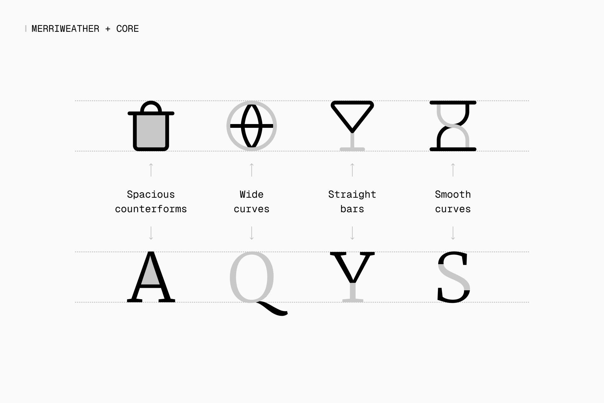
But a transitional serif typeface like Merriweather could also be suitable due to its high contrast and symmetrycal design, creating a combination that, despite its seriousness, can be perceived as modern. And you should also take a quick look at Domine, Spectral or Signifier in case you're looking for alternatives.
What illustrations should I pair it with?
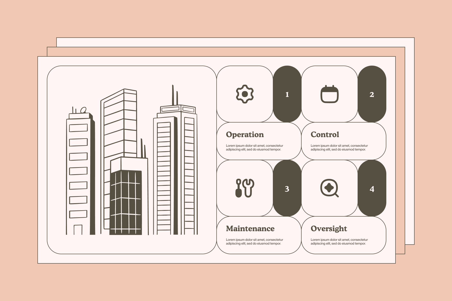
Icons and illustrations can also be paired according to the most important formal characteristics and overall tone. For Core you could use a set like New York, which has simple and abstract shapes with a large negative space, or Streamline UX, with a more minimalist and neutral approach.
Read more about Core

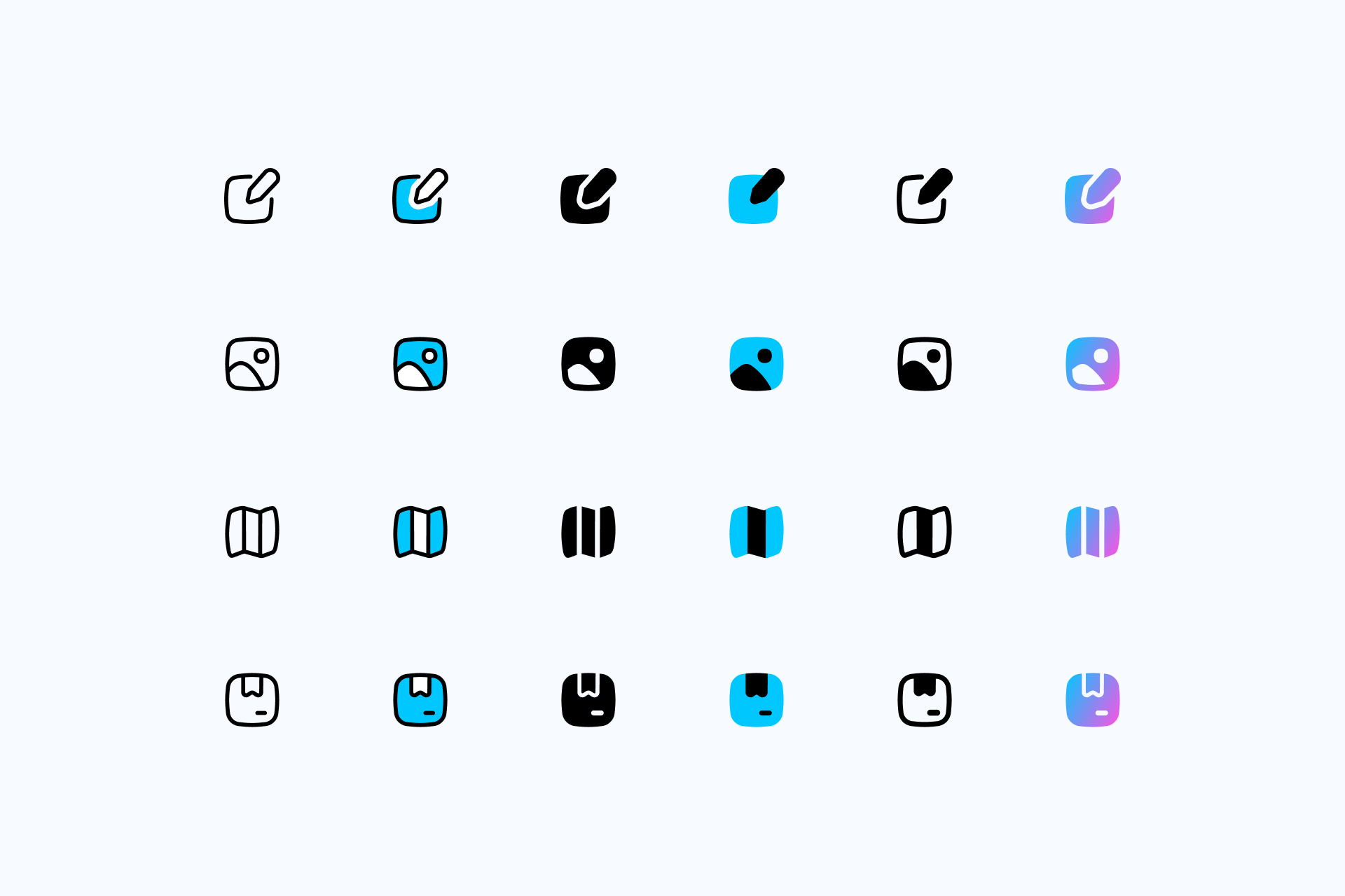
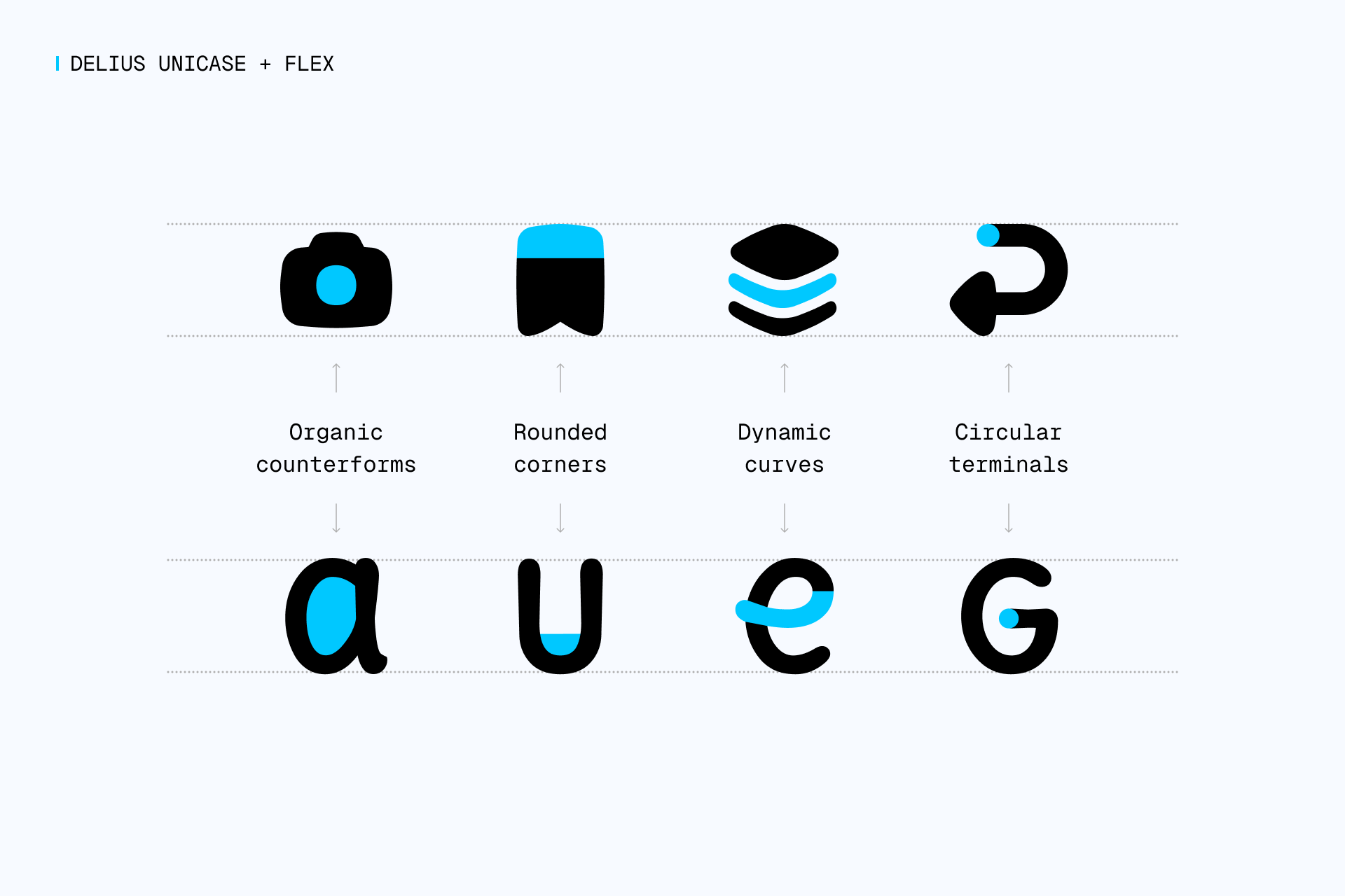
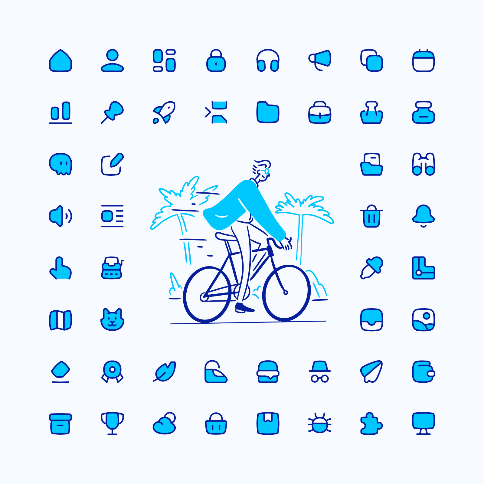
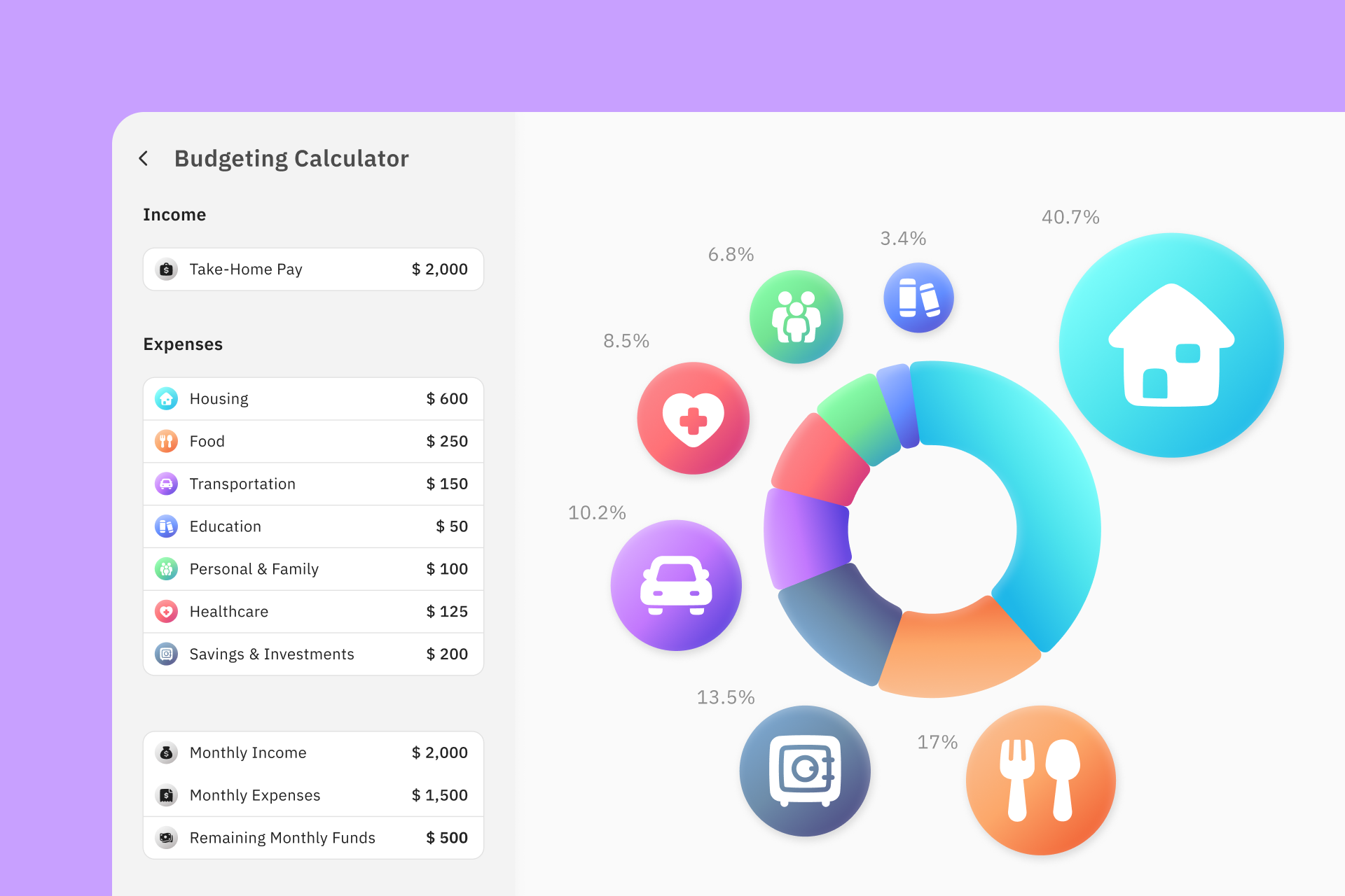
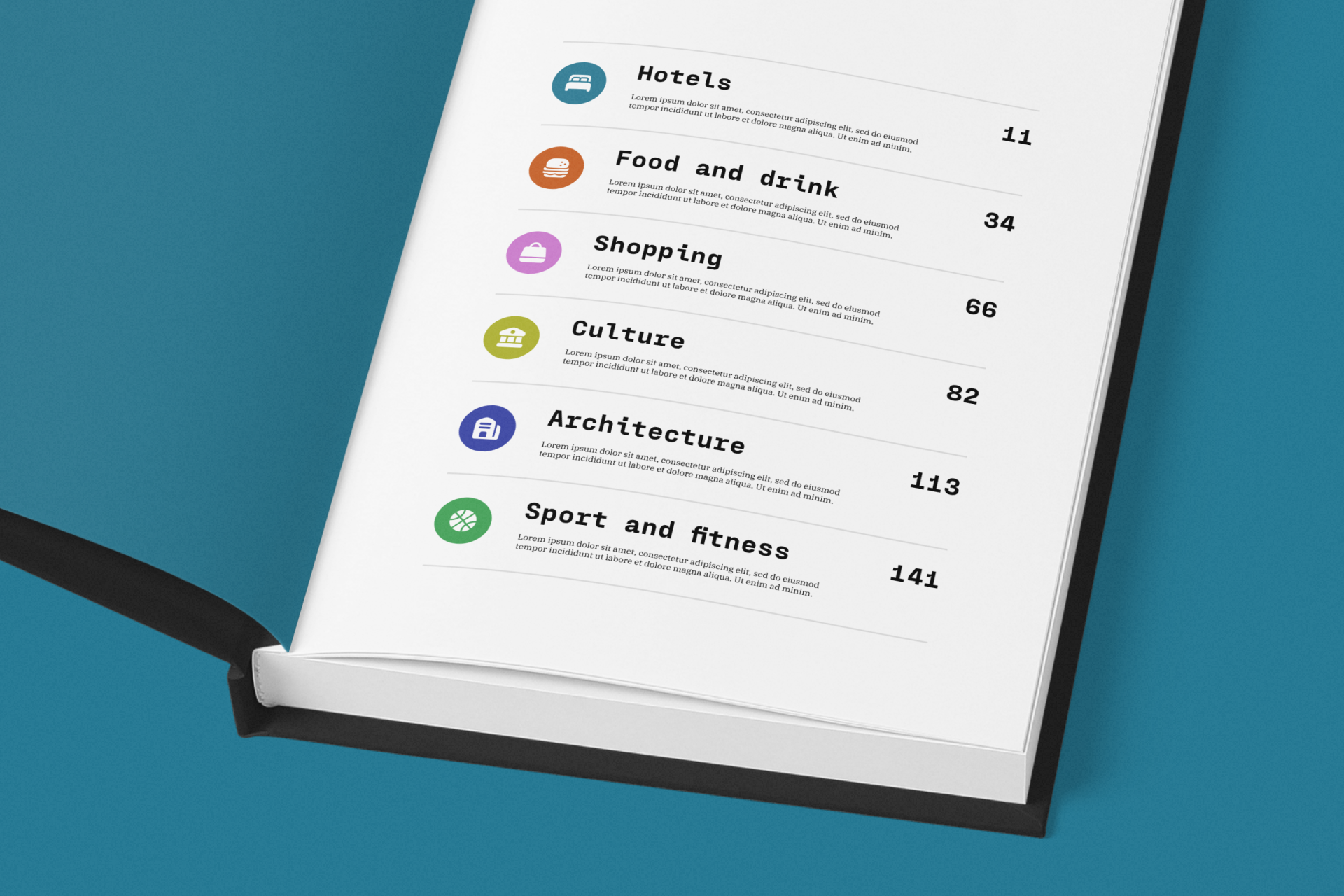
2. FLEX
Ever-flowing shapes
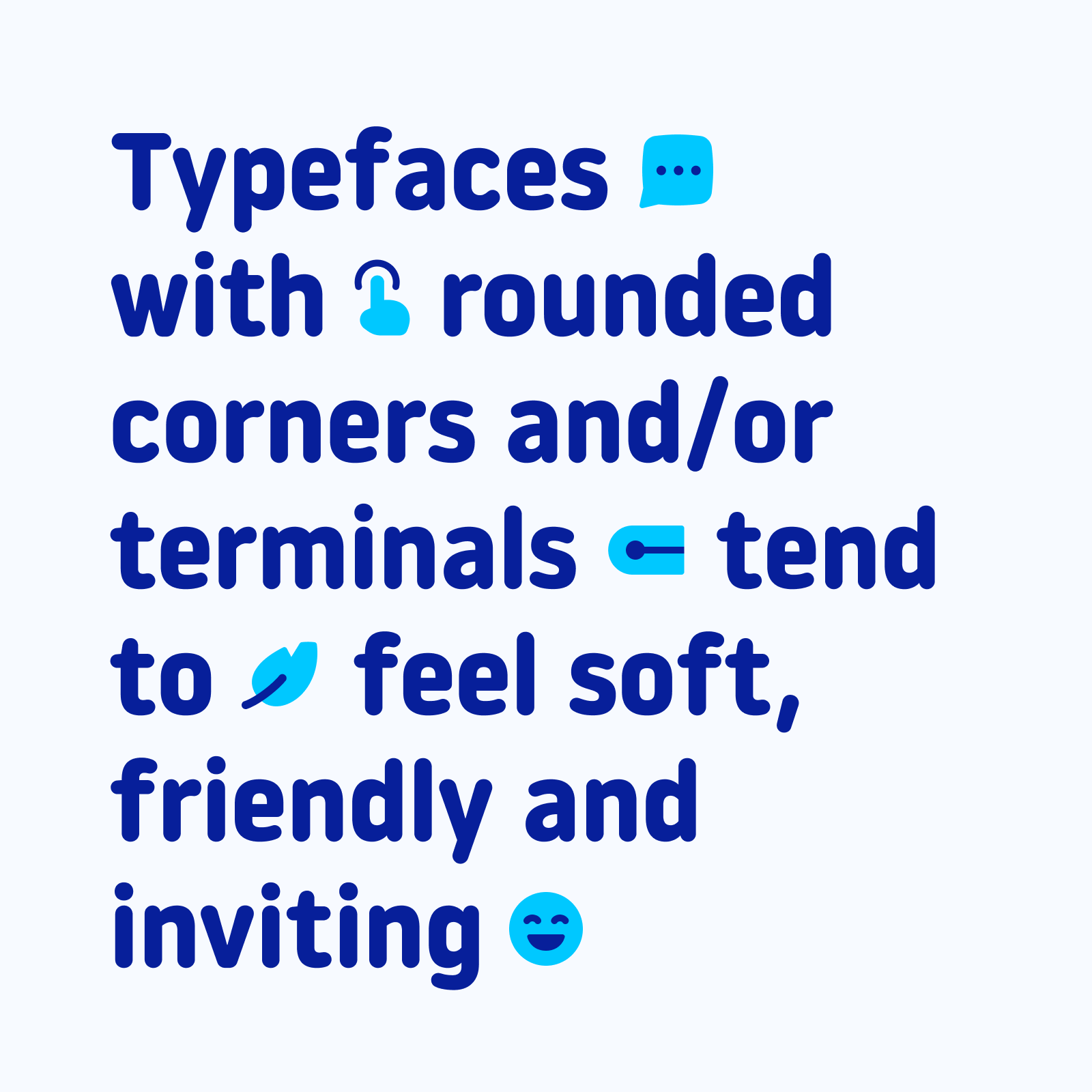
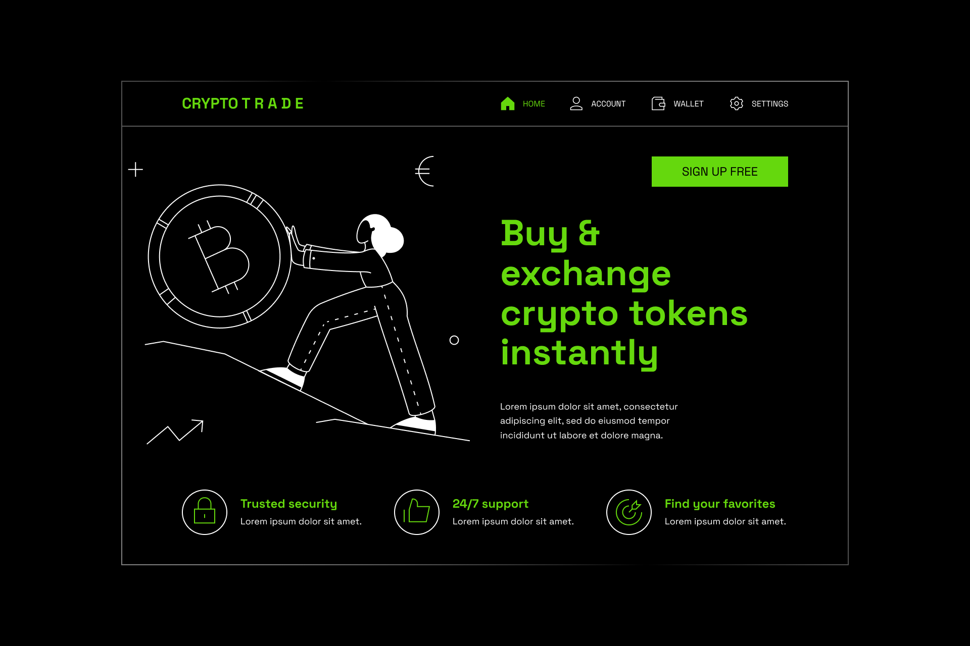
Flex is a curvy, modern and friendly set with elegant and smooth curves. This family rejects the strict and perpendicular lines traditionally used in icons. Instead, our curvilinear style brings fluidity and dynamism to your designs.
Flex icons were built on a 14x14px grid, where we used a rational construction only broken by the use of organic curves to increase the negative space inside the icons and make them more legible and unique.
When to use Flex?
Flex offers a curve and modern set to fill the need for more unique and friendly icons that remain legible and consistent. It's a great option if you're looking for a set with more personality than the usual rounded icon family without compromising the simplicity and legibility of the icons.
What typefaces should I pair it with?
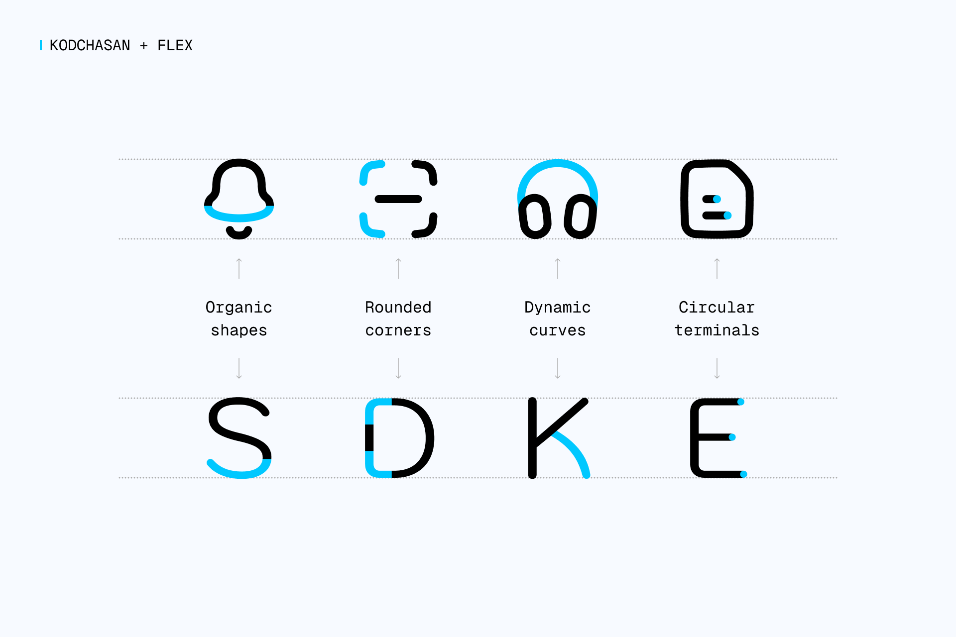
Flex icons work great with typefaces that share the same spirit of fluidity and dynamism, with smooth curves, rounded ends and large negative space.
Kodchasan is a surprisingly suitable dance partner for Flex, almost as if both elements were built based on the same construction guidelines. But since Kodchasan flirts a little bit with display fonts, you may want to try more neutral alternatives such as Rubik, Nunito or Noway Round.
Calligraphic typefaces like Delius Unicase also seem appropriate for an icon set like Flex to highlight their friendliness and organic appearance. You can also check out Sacramento for something closer to classic calligraphy or Itim if you're interested in using a more imperfect stroke.
What illustrations should I pair it with?
If we focus on Flex construction, we'll find that modern illustrations with an organic and energetic touch can fit very well with them. Within our library we can find sets like Brooklyn, a tendry style with a clever use of accent color, or Barcelona, a more familiar and naïve set with a really fun energy.
Read more about Flex

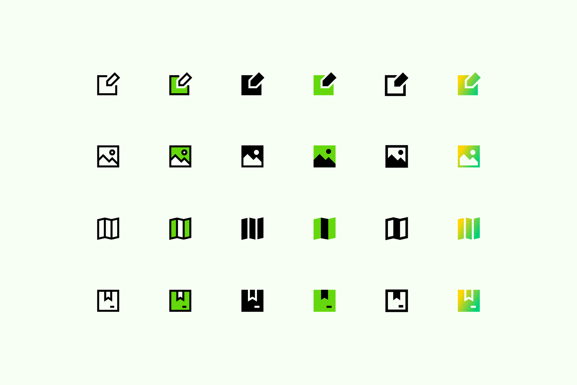
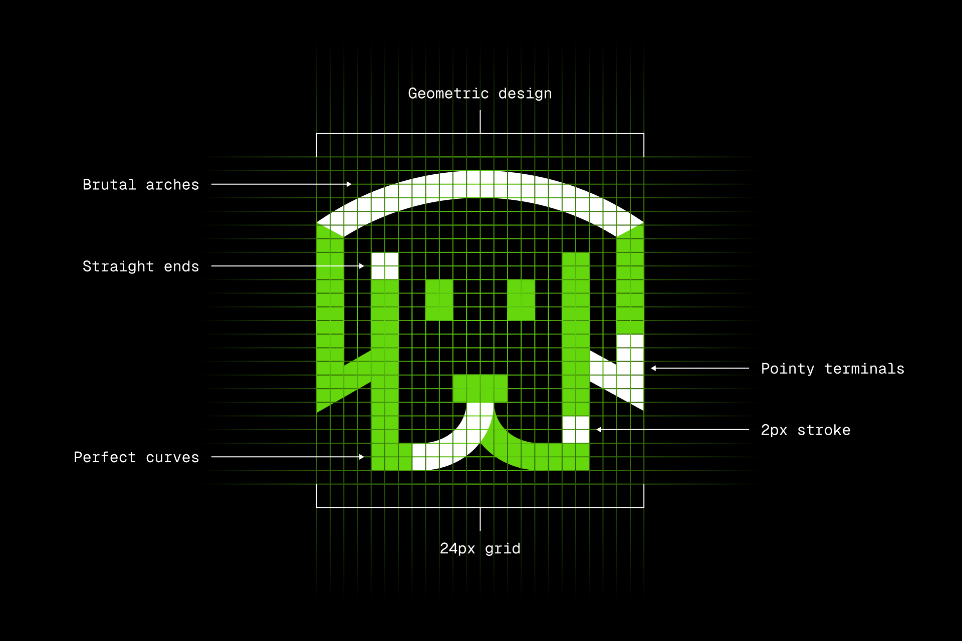
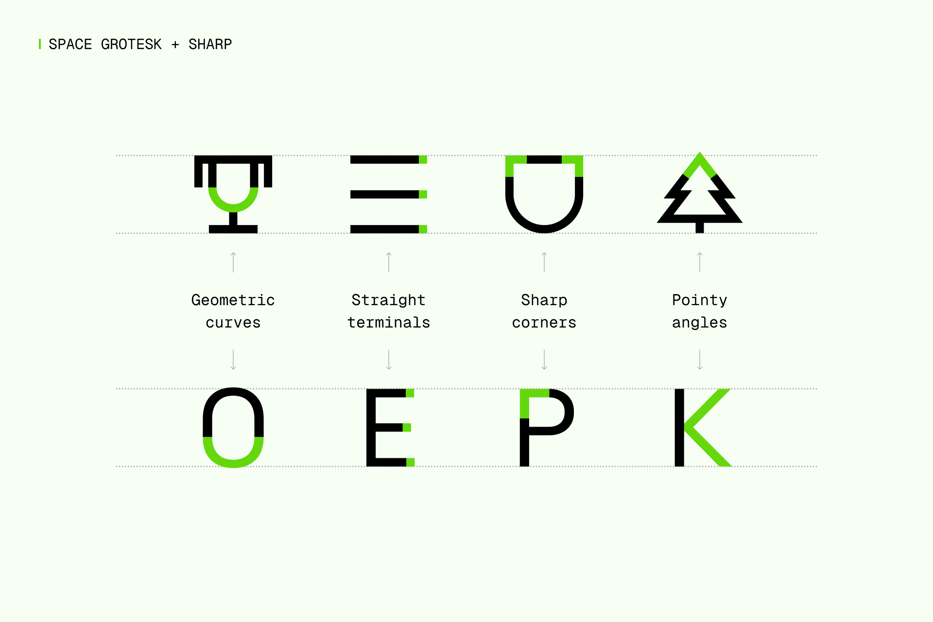
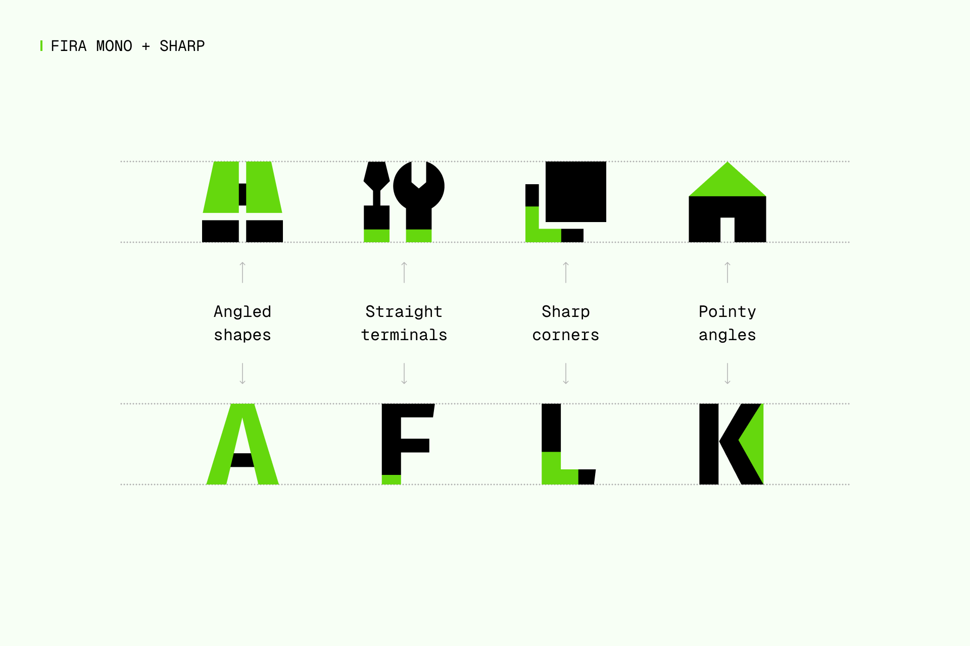
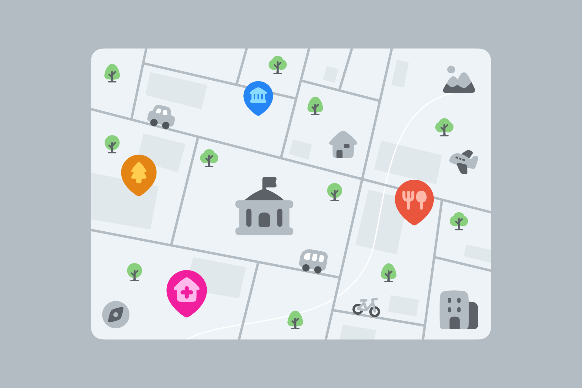
3. SHARP
Beauty by contrast
Sharp is a serious and brutal set with a strongly geometric look. This high-tech appearance makes these icons a modern, bold and classy choice to complement your designs and make them stand out.
All Sharp icons were built on a 24x24px grid where we followed a very strict geometry. Squares, circles and several angles merge to create this brutal and geometric set, which allowed us to design simple, legible and unique icons.
When to use Sharp?
The vast majority of icons you find online have rounded ends and curved corners, but what if you want a more brutal and elegant family? Sharp icons can be used in a wide variety of projects, but if you're looking for a sophisticated and bold design to complete your project, this is your set.
What typefaces should I pair it with?
The most suitable fonts for Sharp would be those that follow a geometric construction, like Futura, or have abrupt and sharp cuts, like Gill Sans.
A brutal icon set needs a brutal typeface, and that's Space Grotesk, a unique but perfectly legible font with a high-tech look. Since it might not be a foolproof combination (it never is, since the designer is always responsible for making it work), we also suggest you DM Sans, Archivo and Neue Machina.
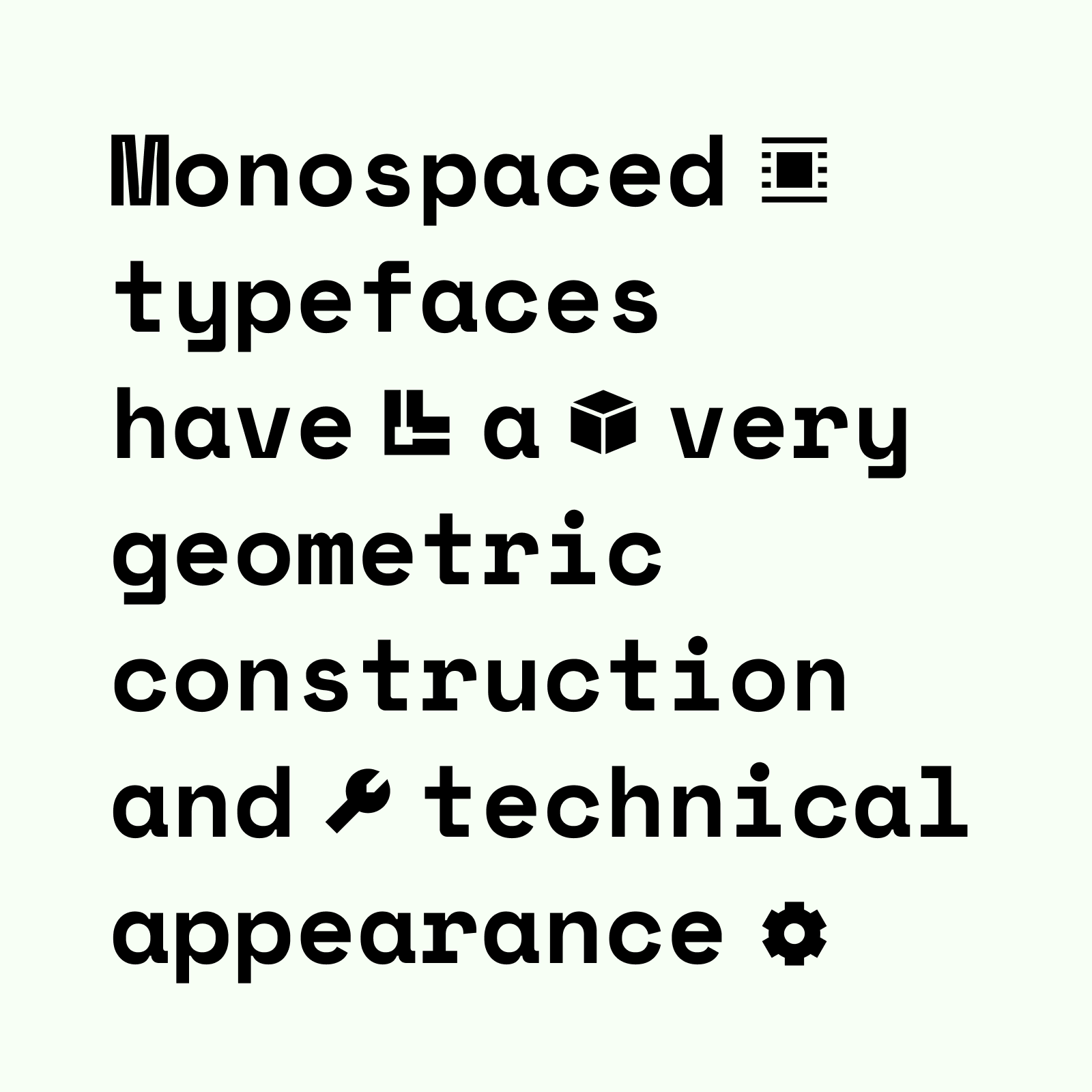
I'd say that any monospaced font would also be a great choice to combine with Sharp, but Fira Mono is as good a start as any, especially considering its angled terminations. But there are plenty of other options depending on your personal preferences, just like Space Mono or Spline Sans Mono.
What illustrations should I pair it with?
You can focus on what makes these icons unique, the geometric look and strict construction guidelines, and choose a set like Porto. A less obvious but interesting choice would be Bangalore, its elegance can be compared to Sharp icons when applied in a more sophisticated and classy design. You could even pair it with our Pixel icons for a retrofuturistic look.
Read more about Sharp

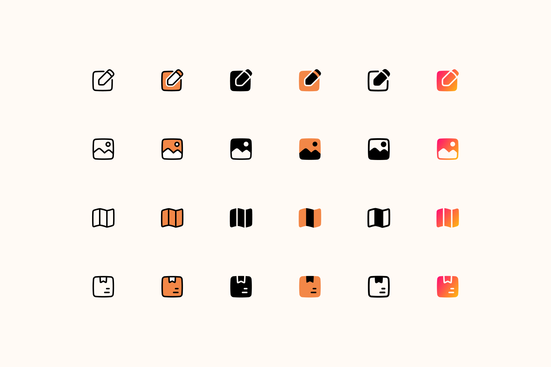
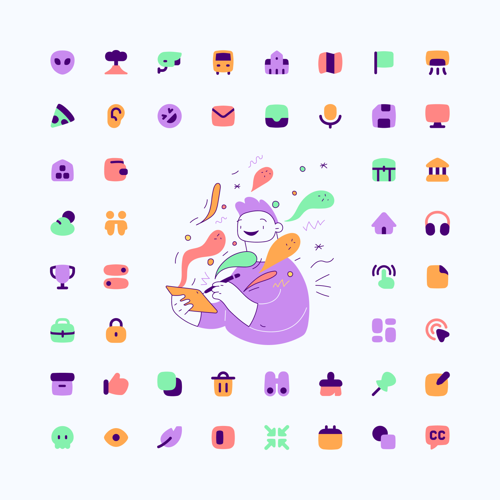
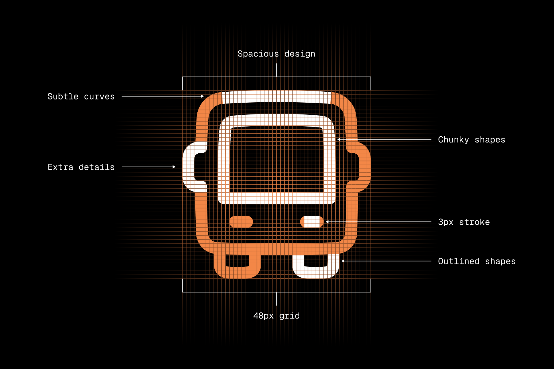
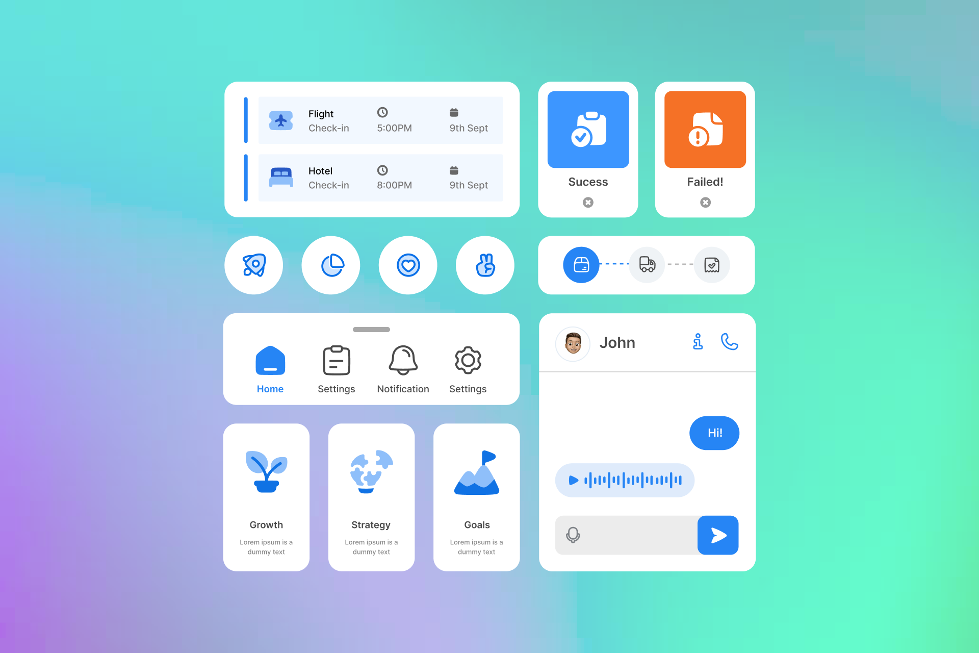
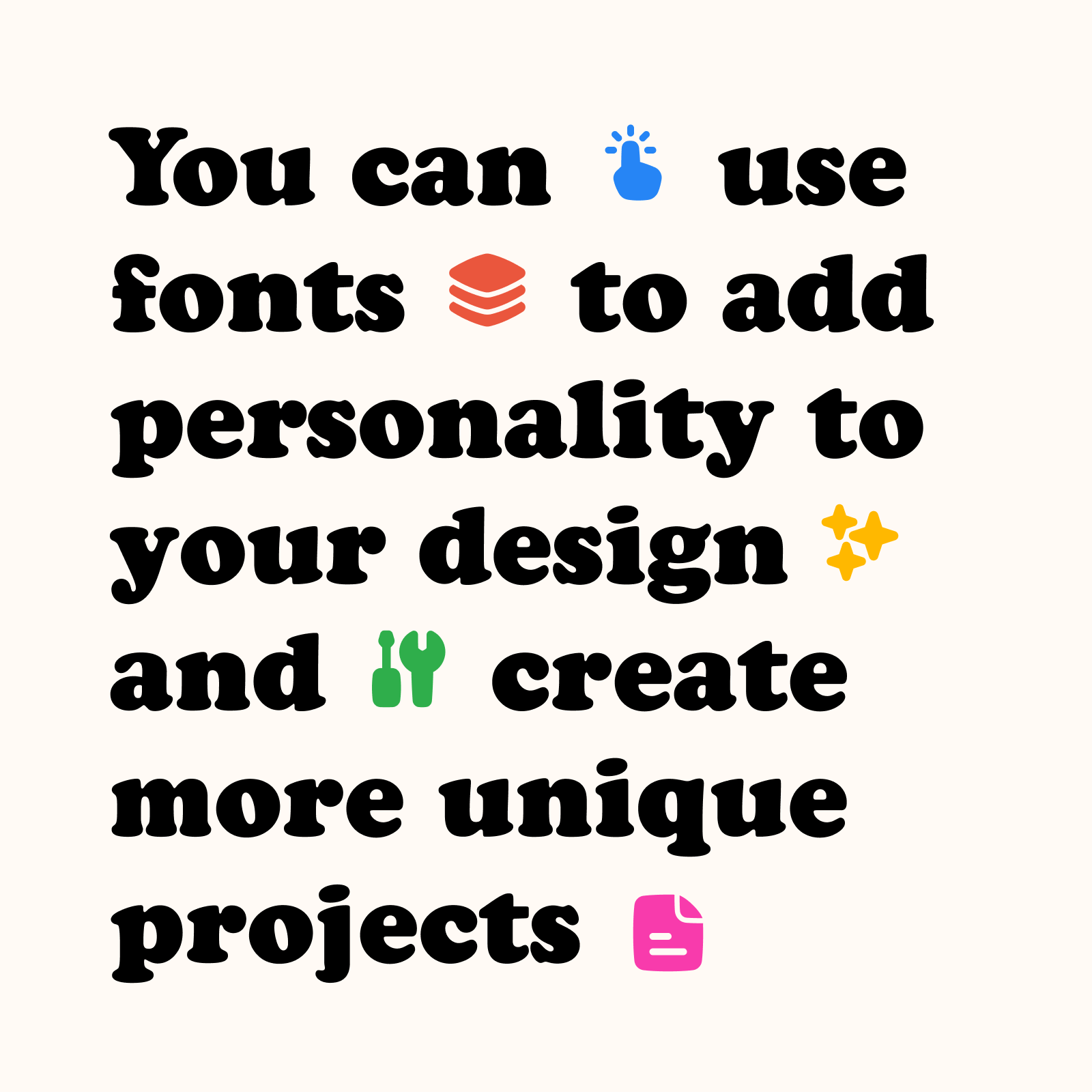
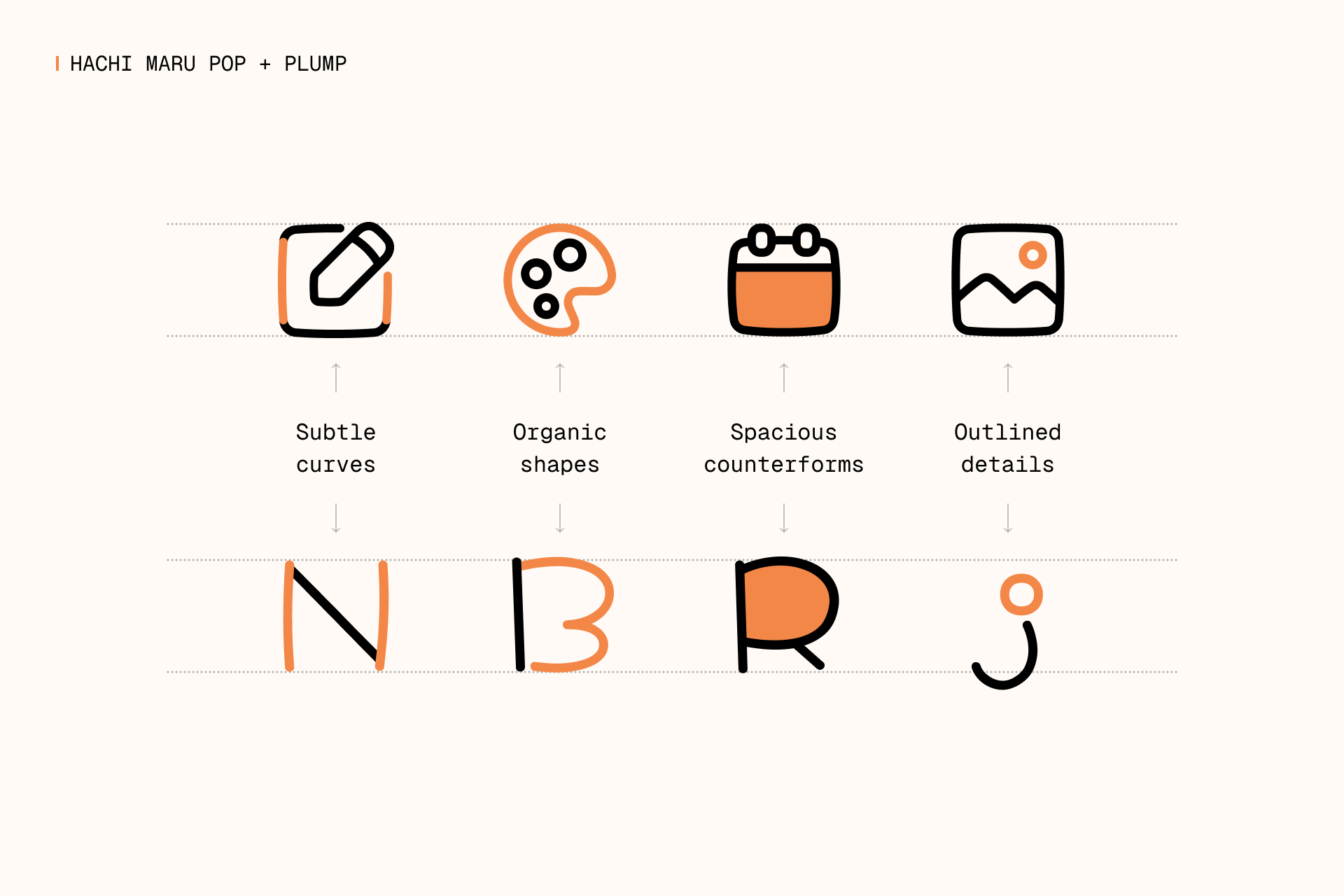
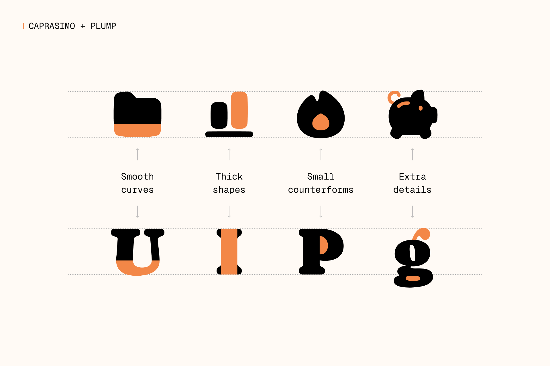
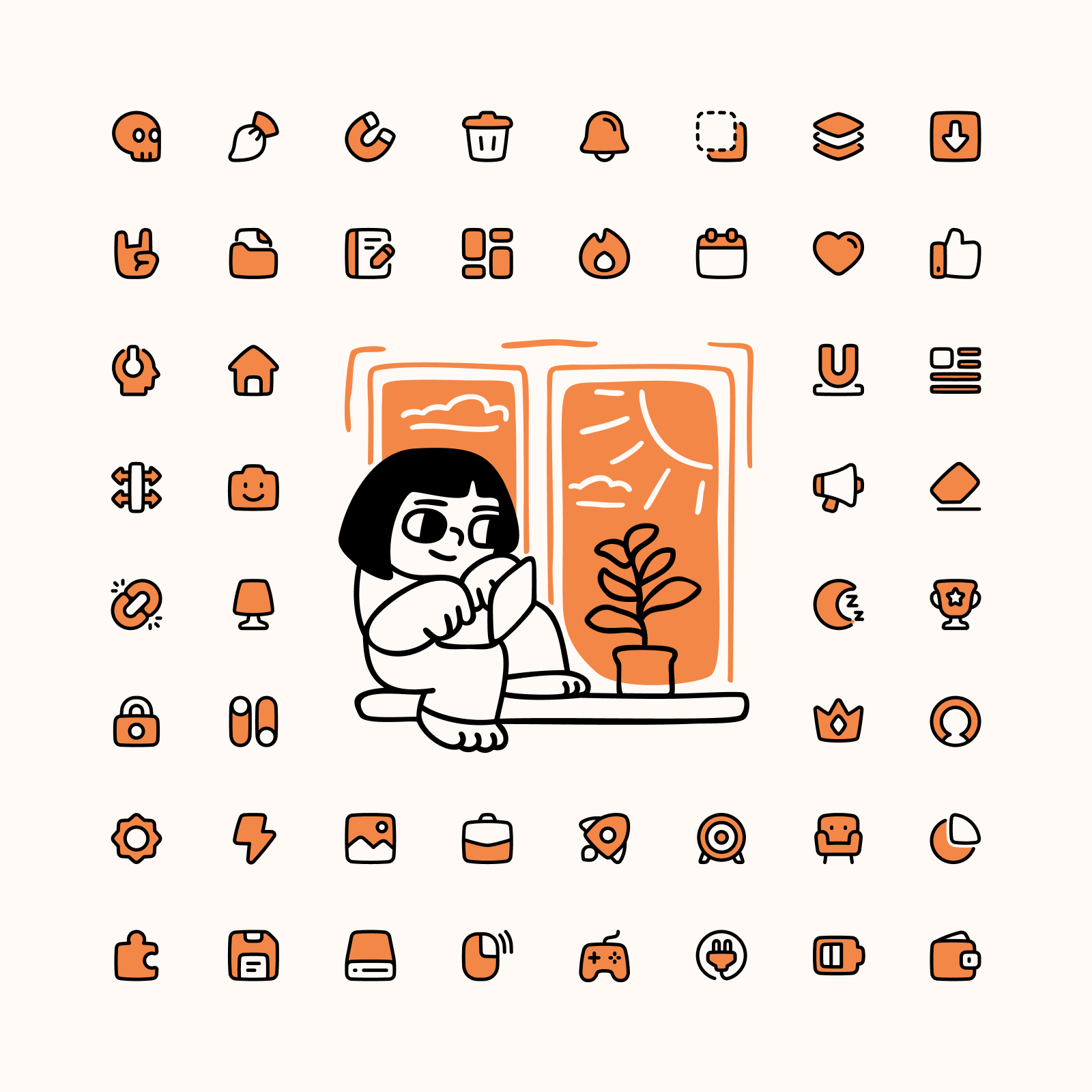
4. PLUMP
Big icons with big heart
Plump is a set of chunky icons with friendly looks and it was created using chubby pieces combined with lines. It also uses subtle curves and a hand-drawn touch in its shapes, which provide a cartoonish look.
This set was built on a 48x48px grid, allowing us to design more spacious and detailed icons compared to Core, Flex, and Sharp. The larger grid size allowed us to add these details while maintaining the legibility and clarity of each icon.
When to use Plump?
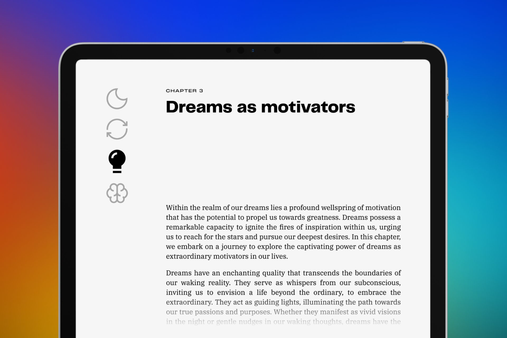
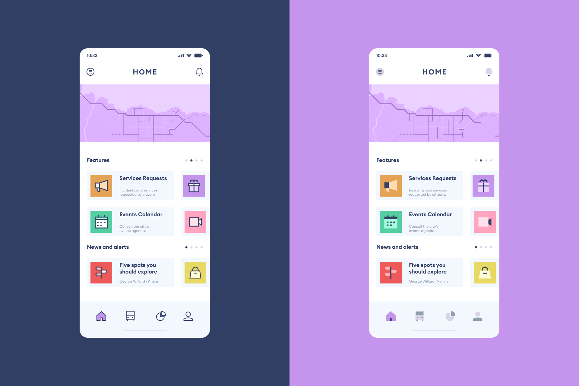
Plump is a set with a very friendly personality and probably one of the most unique styles you can find out there. These icons can easily be used for UI, but also for marketing and other illustrative purposes. Use them as buttons for your apps, to help explain your website's features or insert them into your articles.
What typefaces should I pair it with?
You can combine Plump with a typeface that has more personality than the usual sans serif font, especially if it has a chubby look.
Plump icons fit nicely with handdrawn typefaces that are a bit more cartoonish and naive, just like Hachi Maru Pro, which helps to achieve a fun and friendly design. If you're interested in this casual and quirky style you might also be interested in typefaces such as Mali or Klee One.
But if you want to use a particularly chubby typeface that shares the same formal characteristics as Plump, Caprasimo might be the best possible accompaniment. The construction similarities behind these two elements are more than obvious and, overall, they convey the same sensations.
What illustrations should I pair it with?
The hand-drawn and cartoonish look of Plump makes it very easy to combine these icons with illustration that shares the same characteristics. You can go for a fun set like Manila, with a bold style that reminds of the old letterpress printing, or choose a set like Milano, which takes a more minimalist and elegant approach.
Read more about Plump

A system for everyone
We started with 4 small icon families and now we've reached 100,000 icons across 24 styles. But that's not all, we're still expanding this system with new styles and new icons to offer an even more flexible tool. So don't forget to follow us on Twitter to keep an eye on our next creations.
Sign up to get upcoming sets in your inbox: