Sharp – Brutal icons
A unique style that combines the rawness of brutalist design with precise geometric shapes, creating an impactful visual style.
"A play between crudity and finesse."
— Le Corbusier
The "beauty by constrast" defined by architect Le Corbusier is one of our mottos for building our latest addition to the Streamline family. Sharp is a simple, serious and brutal set with a strongly geometric look. This high-tech appearance makes these icons a modern, bold and classy choice to complement your designs.
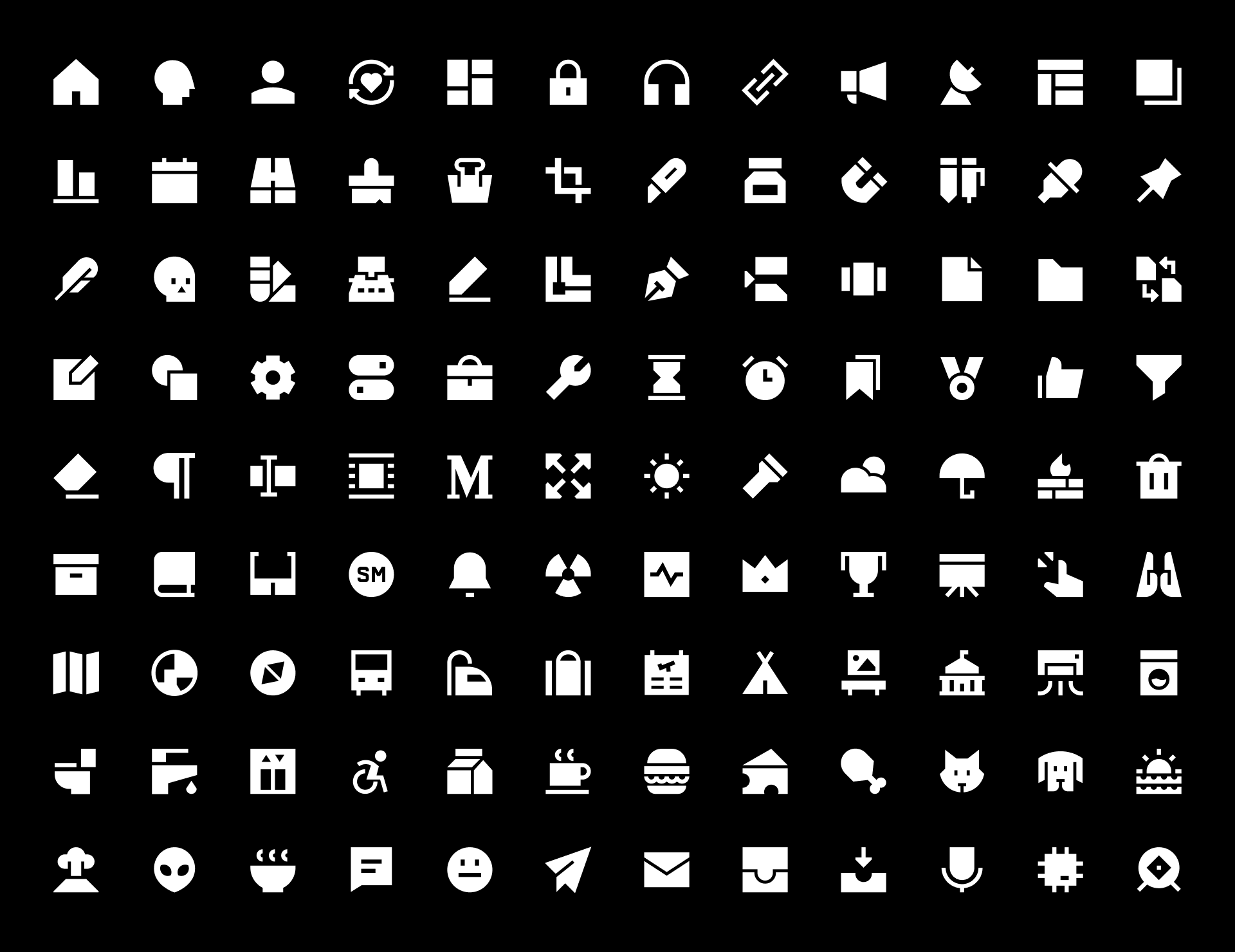
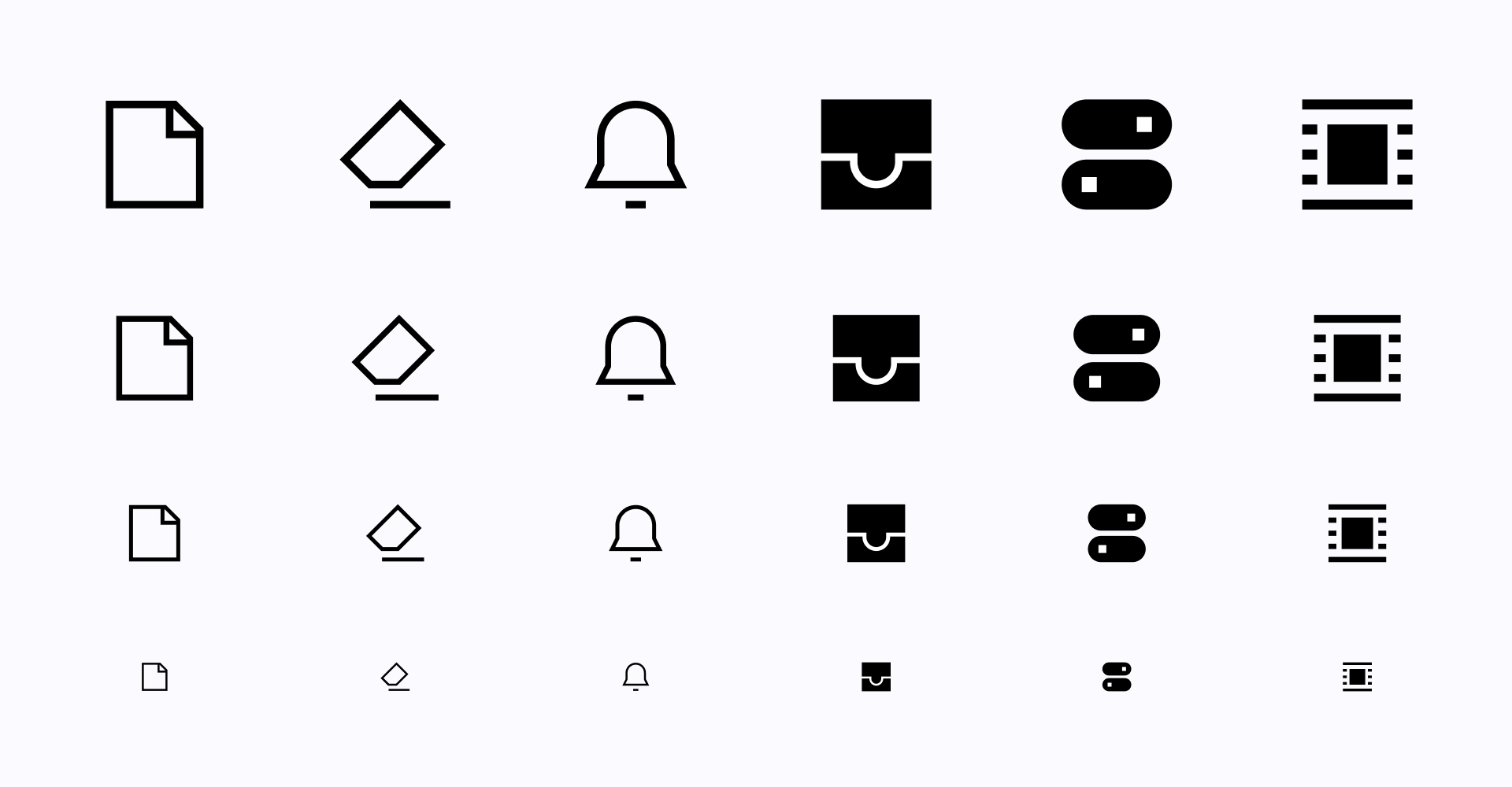
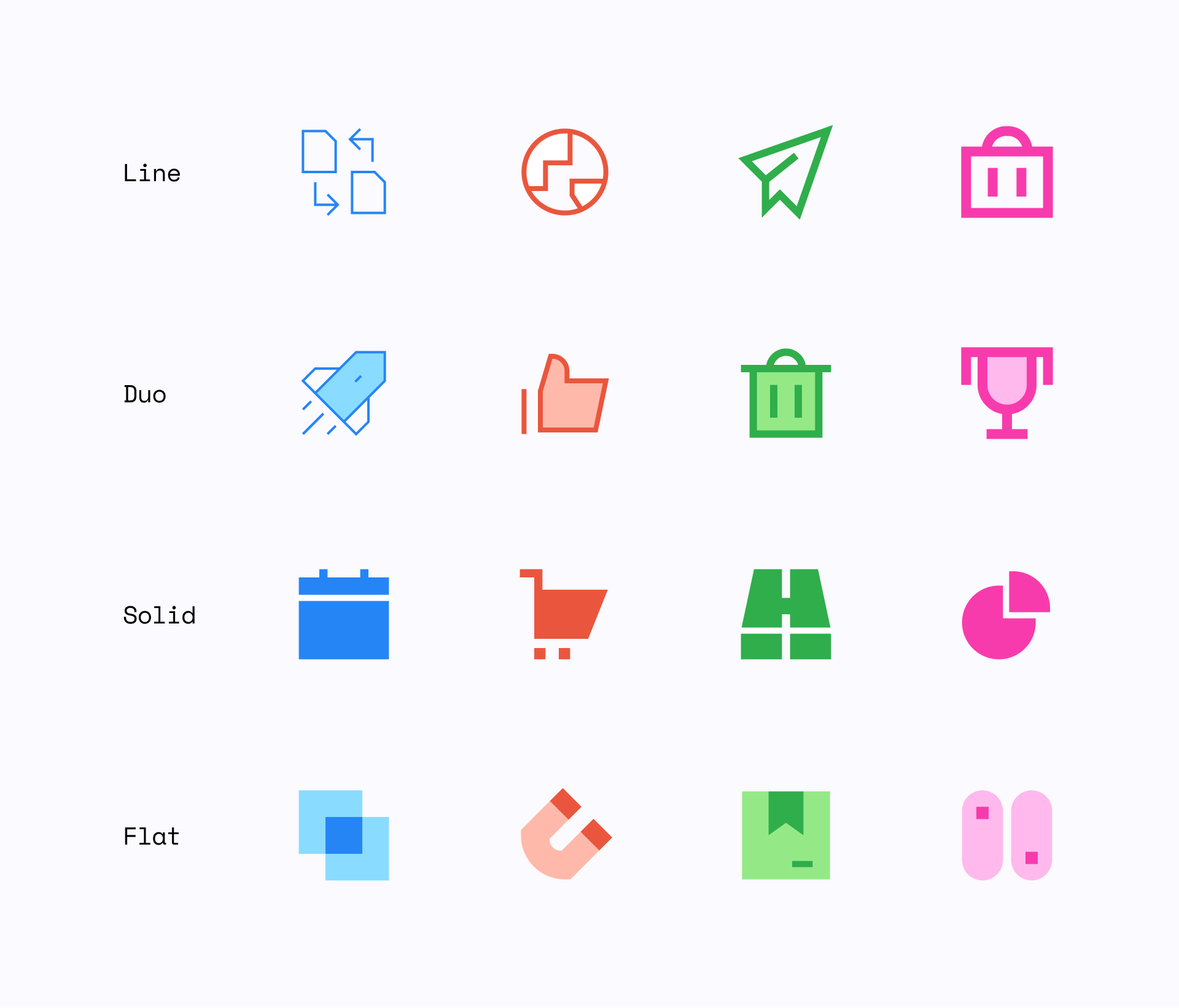
2,000+ icons in 4 brutal styles
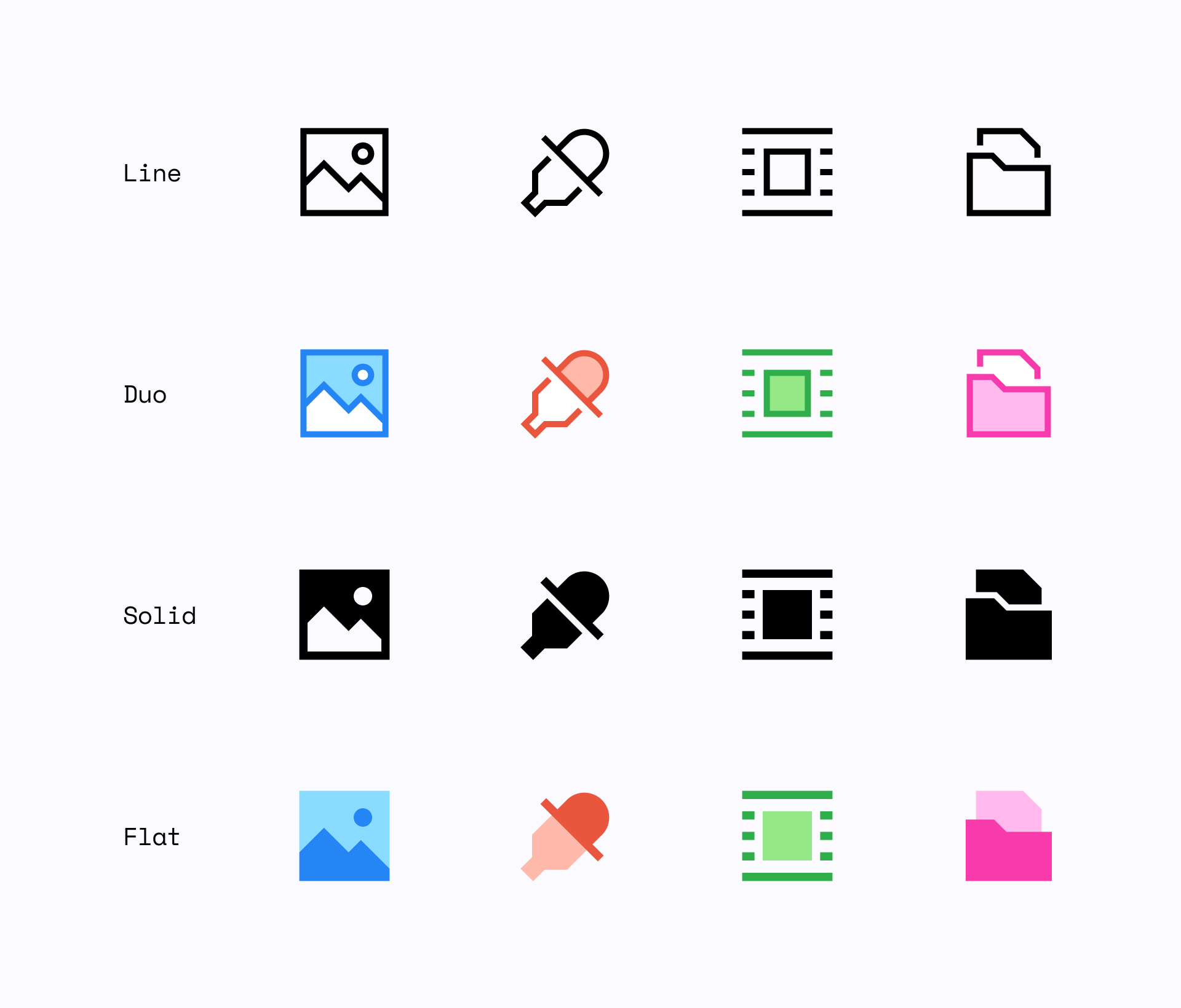
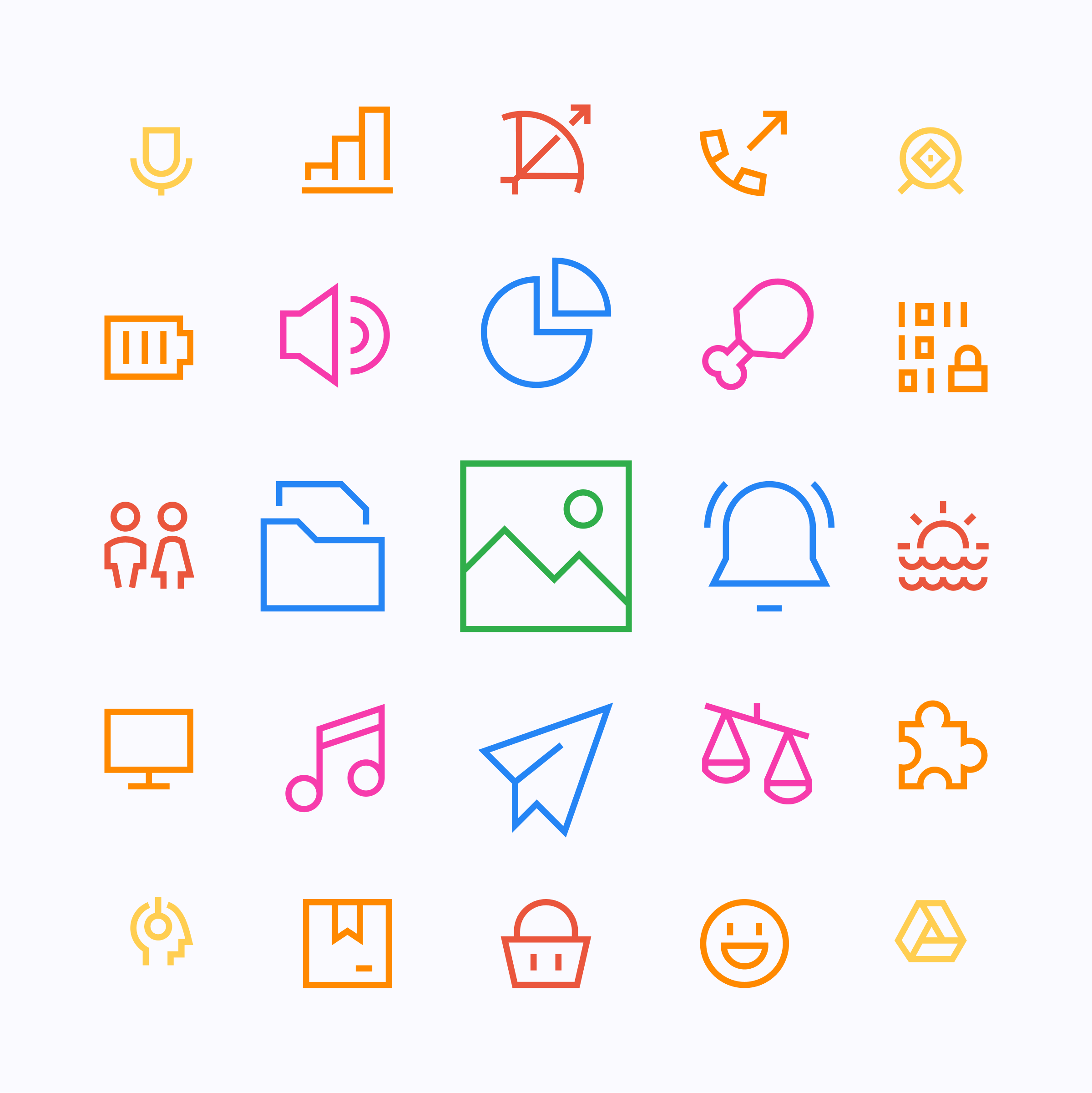
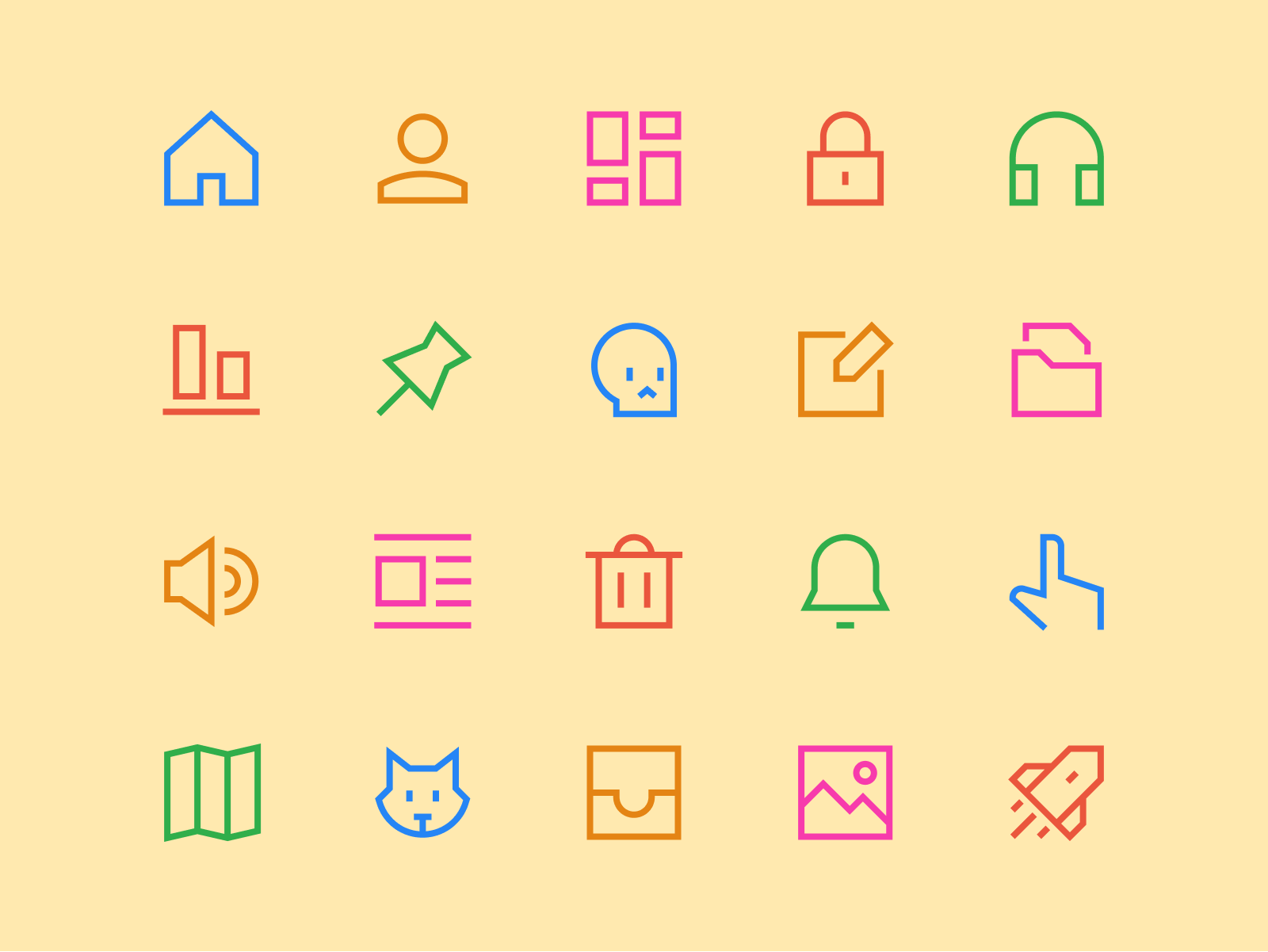
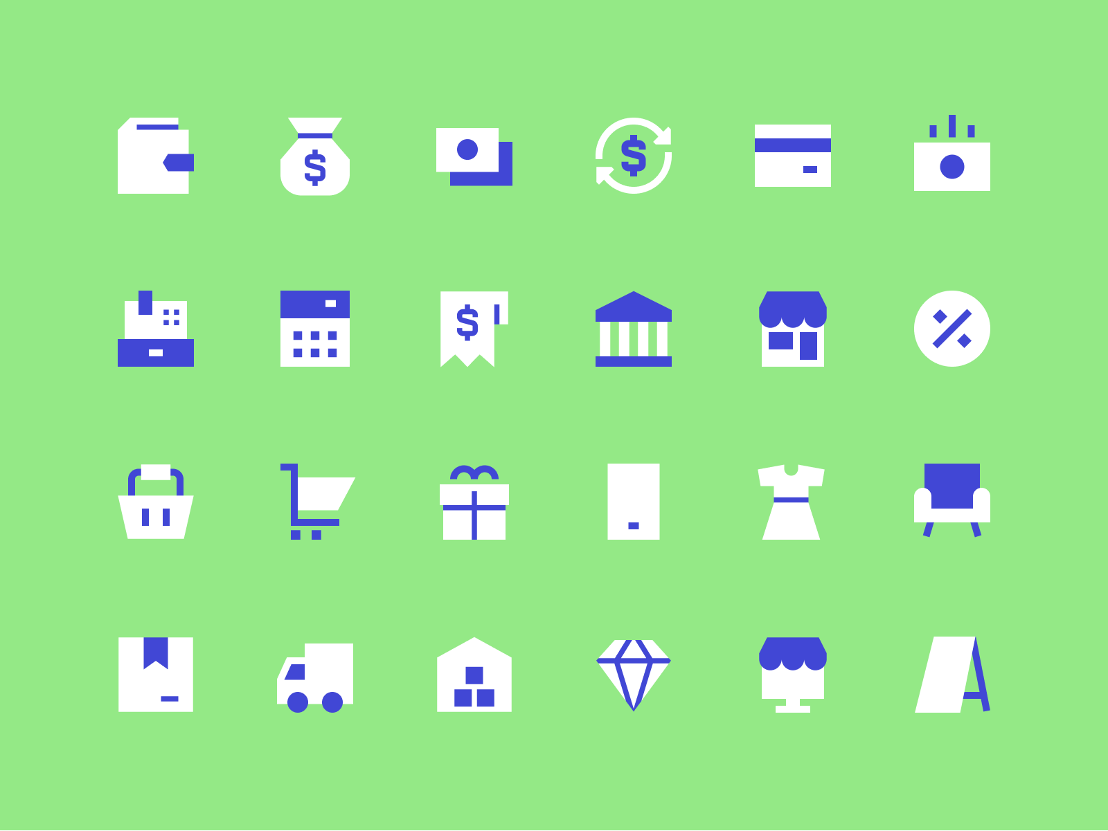
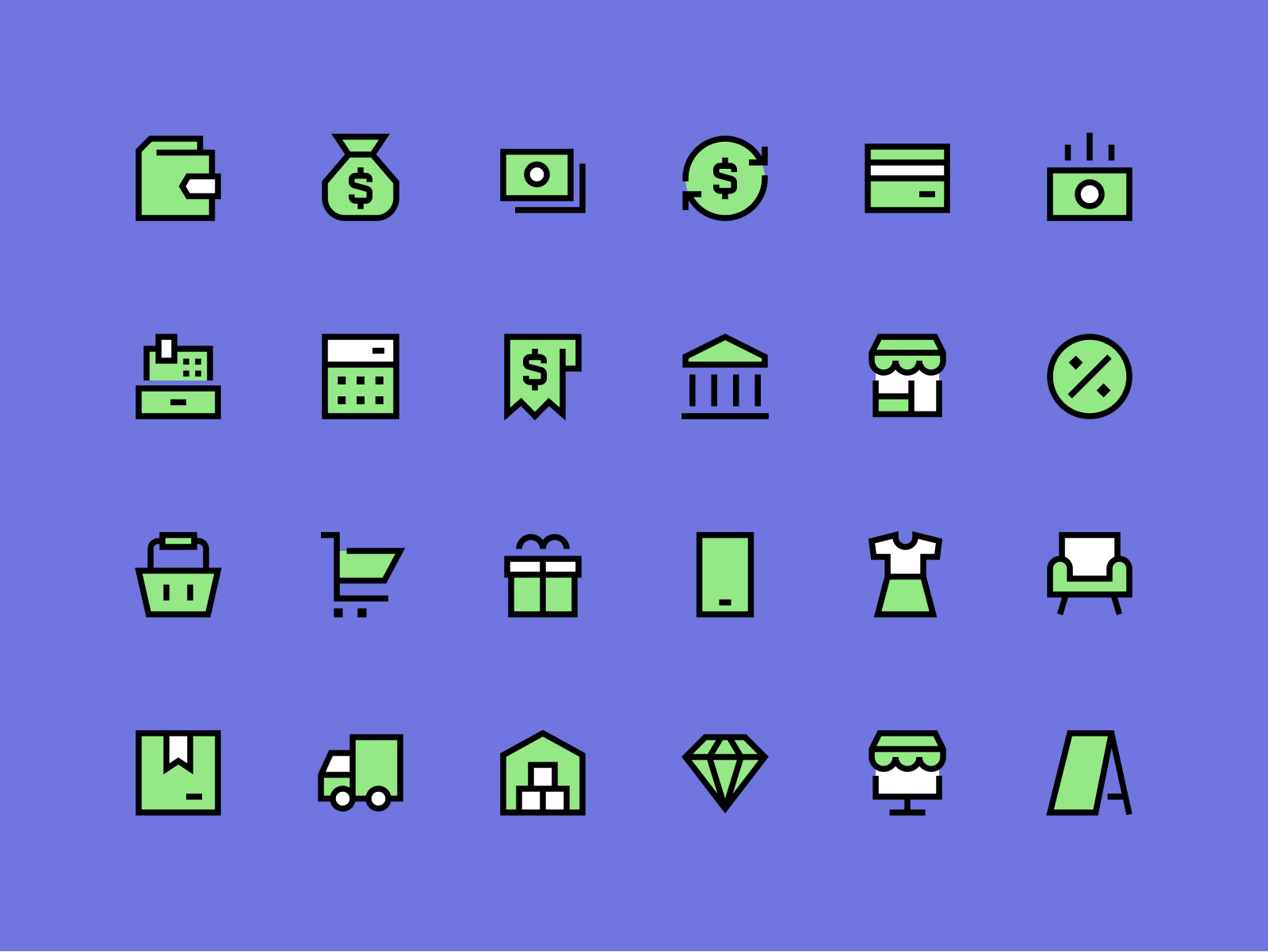
Sharp icons come in 4 different styles, Line and Solid are more functional, professional and legible at small sizes, while Duo and Flat are a colorful alternative that serves a more illustrative purpose and look particularly good at large sizes.
Geometry at its finest
To define this set we avoided looking for references within the icon industry, instead we were inspired by elements such as brutalist architecture, Tesla's Cybertruck and very geometric typefaces, like PangramPangram’s Gosha Sans.
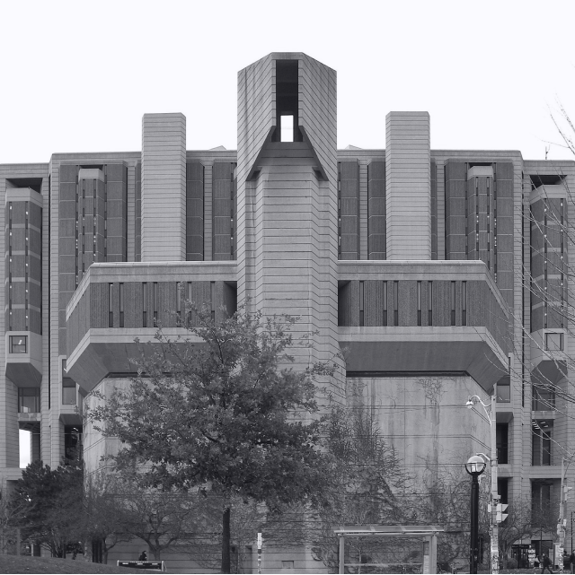
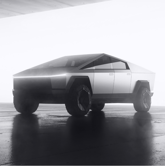
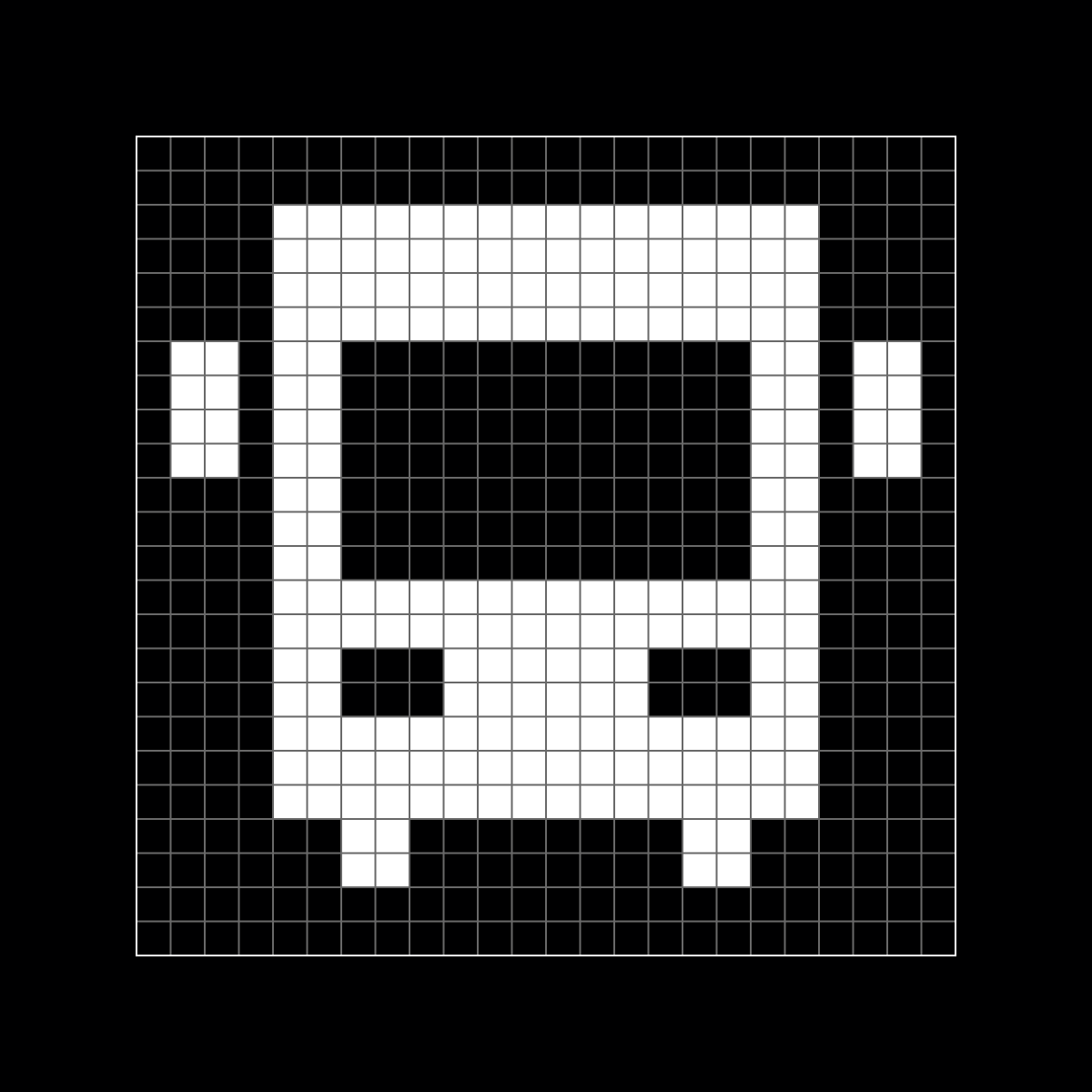
A small part of our moodboard
Unique but legible
In the first phase of the project, we experimented with shapes, gaps and the frequency with which we used curves instead of straight lines until we found the perfect style for Sharp. At first we got a little carried away with the uniqueness we wanted to achieve, but we soon realized that we had to create a usable set for a wider range of users.
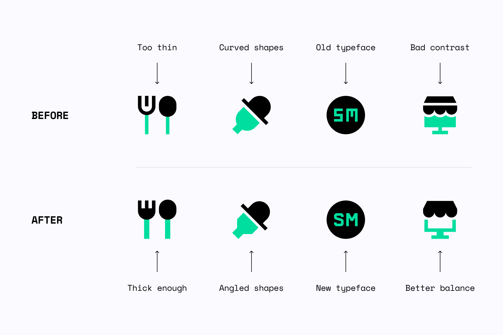
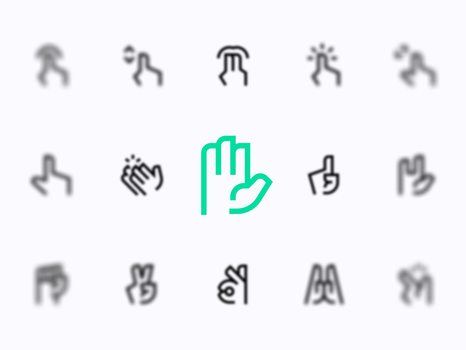
Building a pointy set 🔪
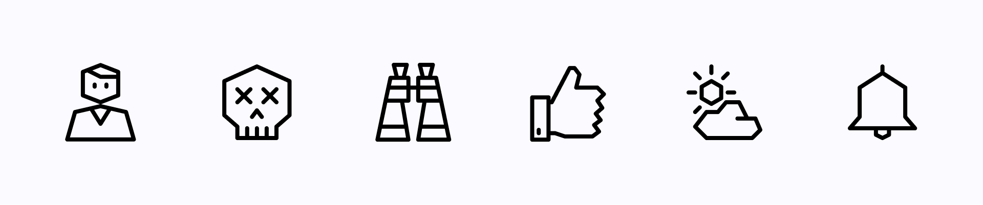
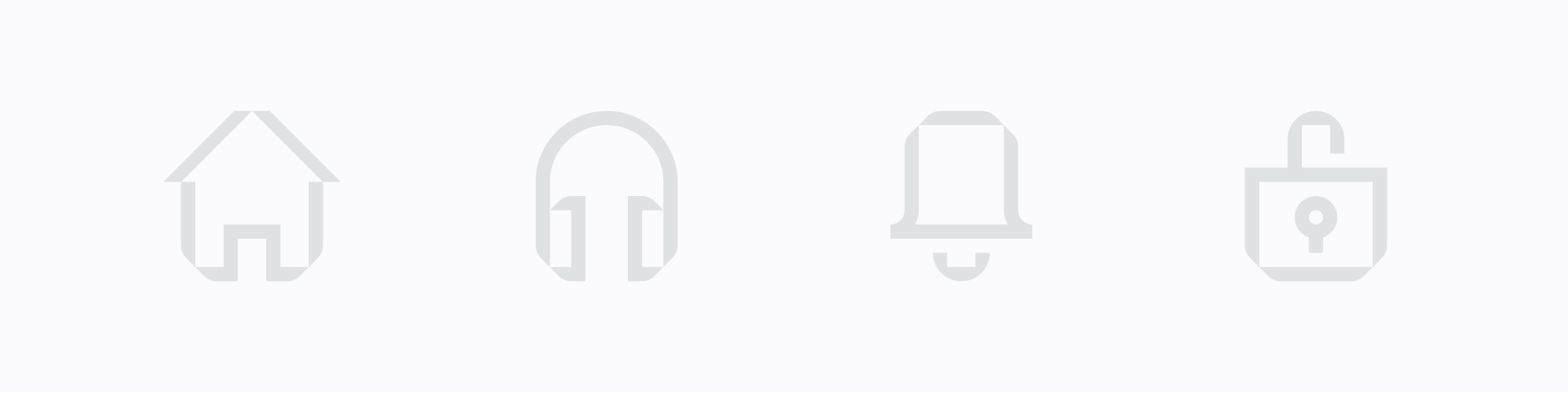
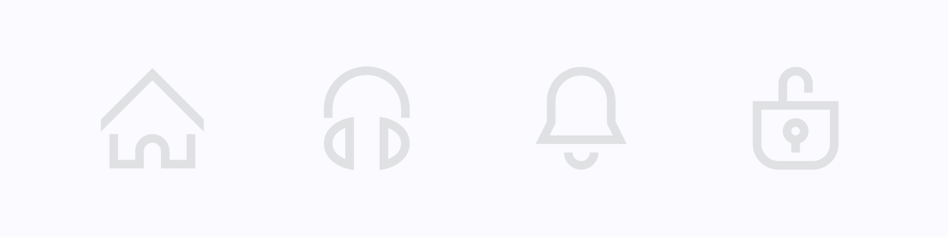
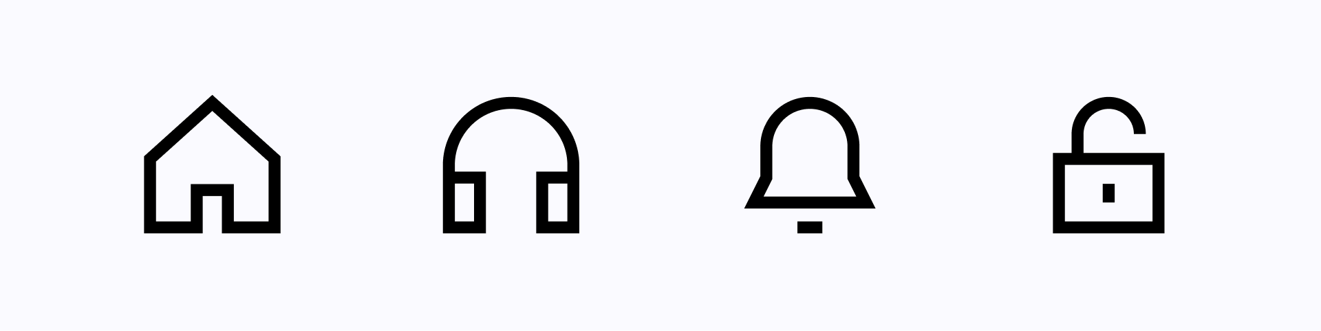
All Sharp icons were built on a 24x24px grid (with a 1px safe area) where we followed a very strict geometry. Squares, circles and several angles merge to create this brutal and geometric set, which allowed us to design simple, legible and unique icons. The Line version uses a 1.5px stroke as default thickness, which is also the minimum space we use to separate shapes in our Solid version.
Most of the icon sets you can find online have rounded ends and curved corners, which make it difficult for any user to find a sharp alternative for legible and well-built icons, until now.
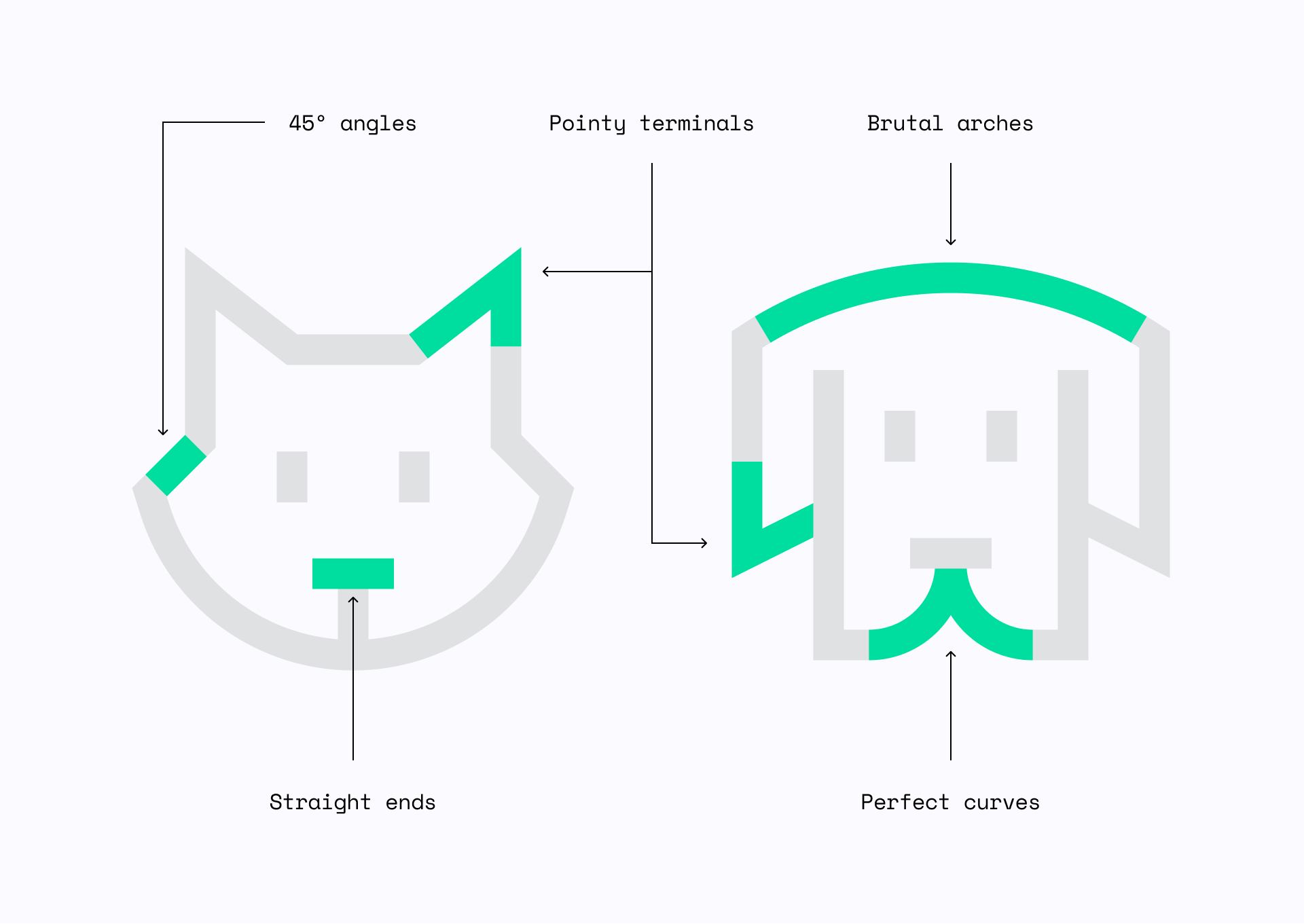
Like our Core family, Sharp is built by removing any unnecessary details, keeping the icons as simple as possible, but its uniqueness comes thanks to the very strict construction guidelines.
With great icons come great typefaces
To make this family even more consistent, we've created a variation of our new typeface to match the style of these icons and use it throughout the whole set.

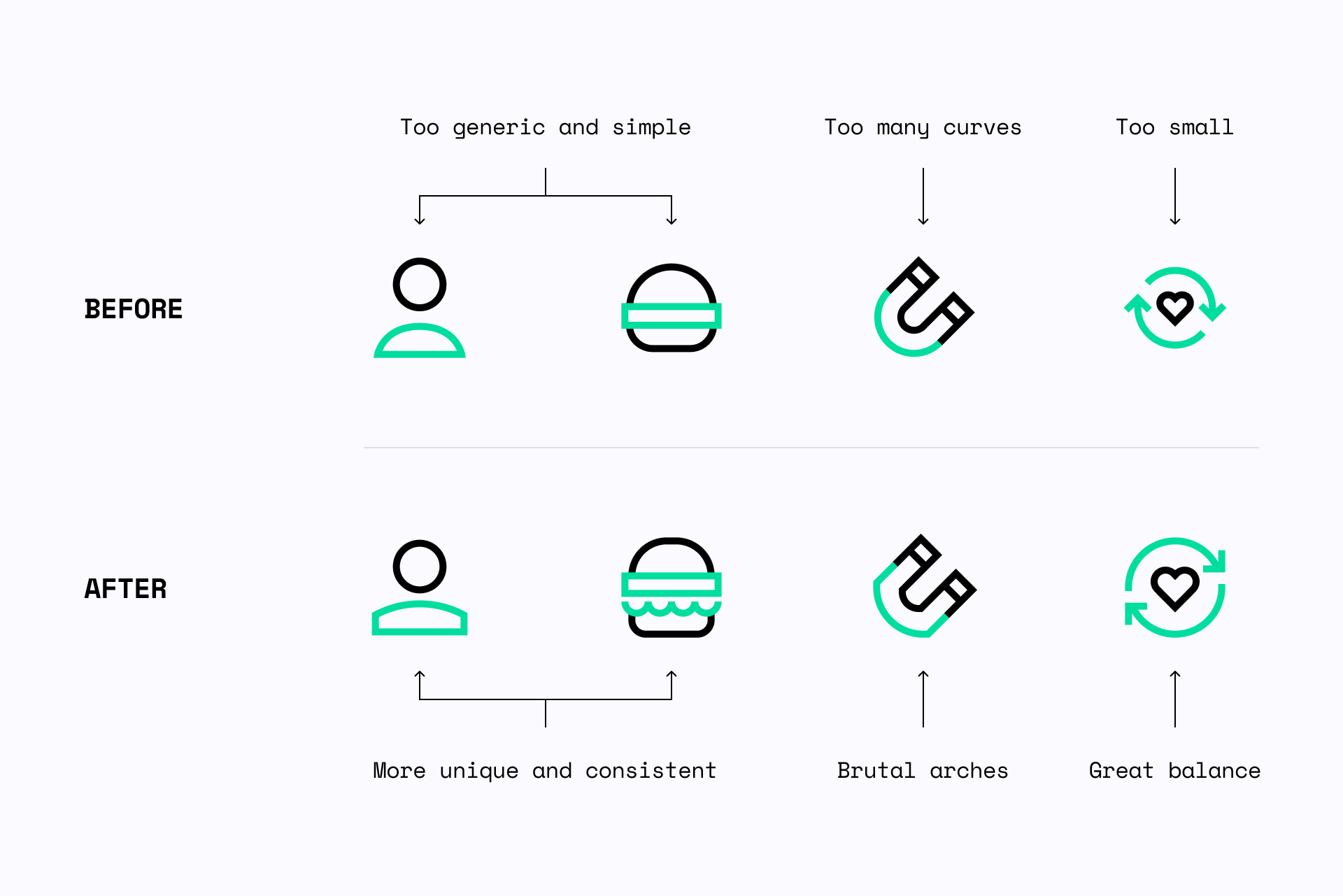
Evaluation and improvements
While creating Sharp, we spent a lot of time experimenting with shapes and improving previously designed icons to achieve a unique and cohesive set.
When to use Sharp icons?
Sharp can be used in a wide variety of projects, but if you're looking for a sophisticated and bold design to complete your interface, this is your set.
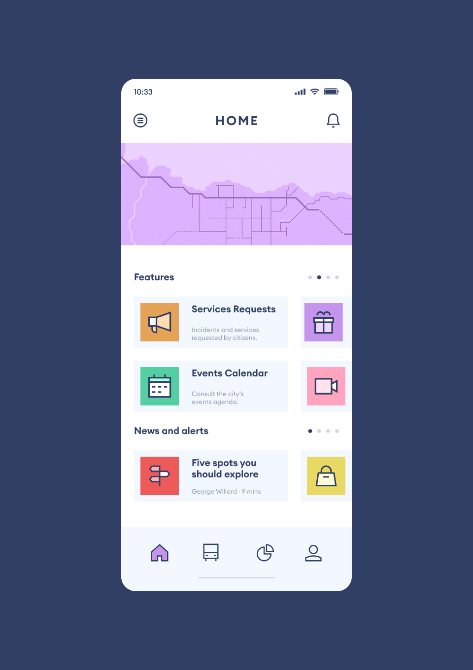
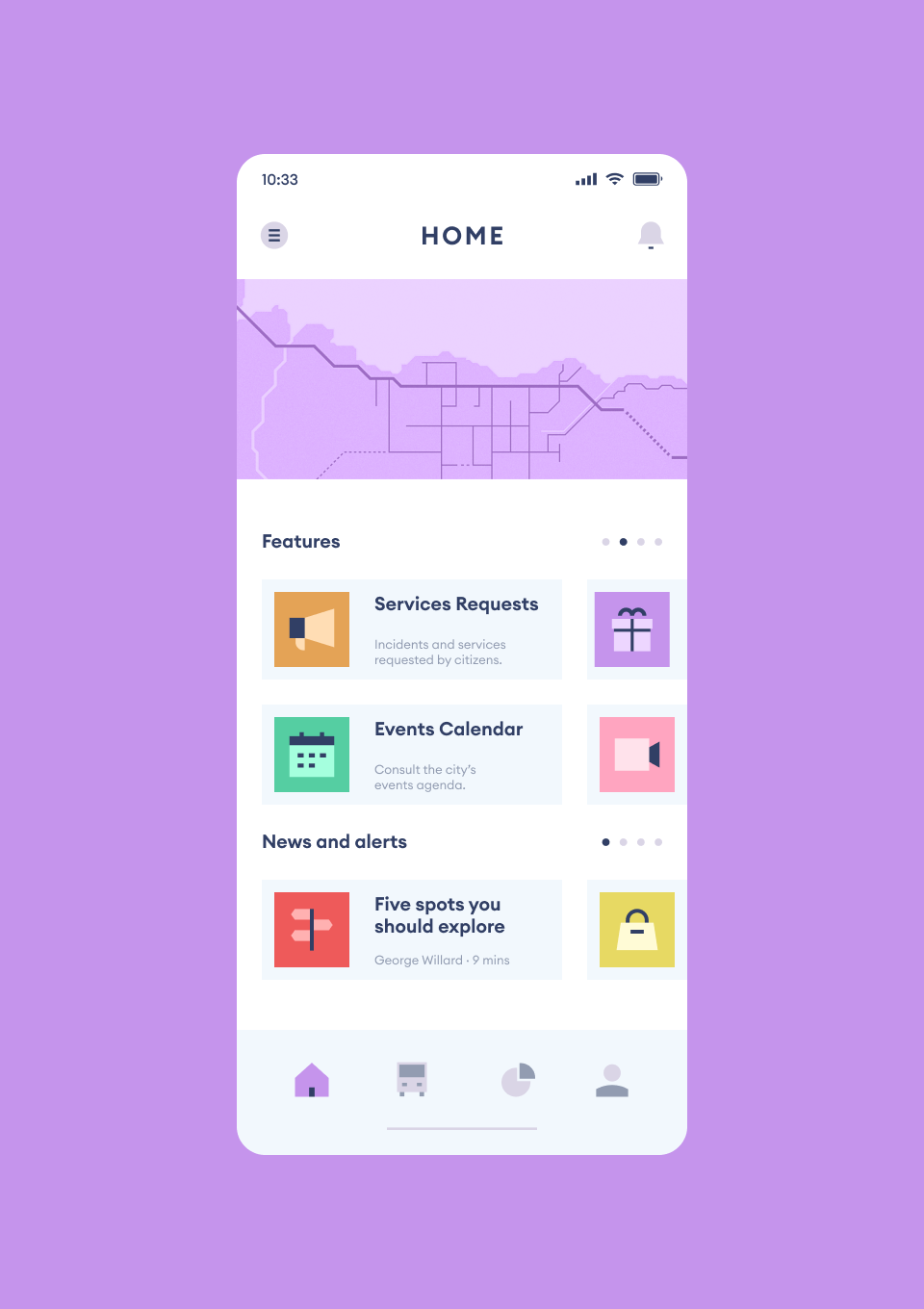
App design — Using Duo and Flat icons to create more colorful designs
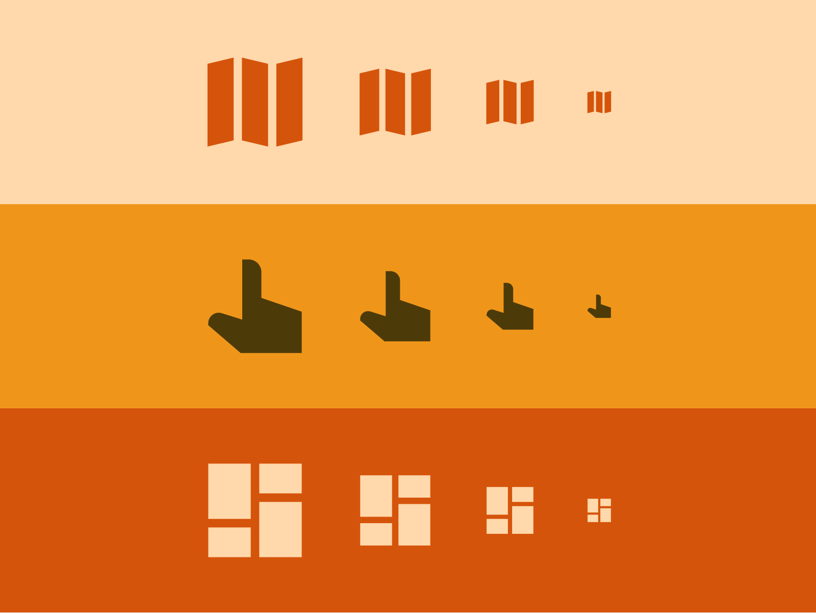
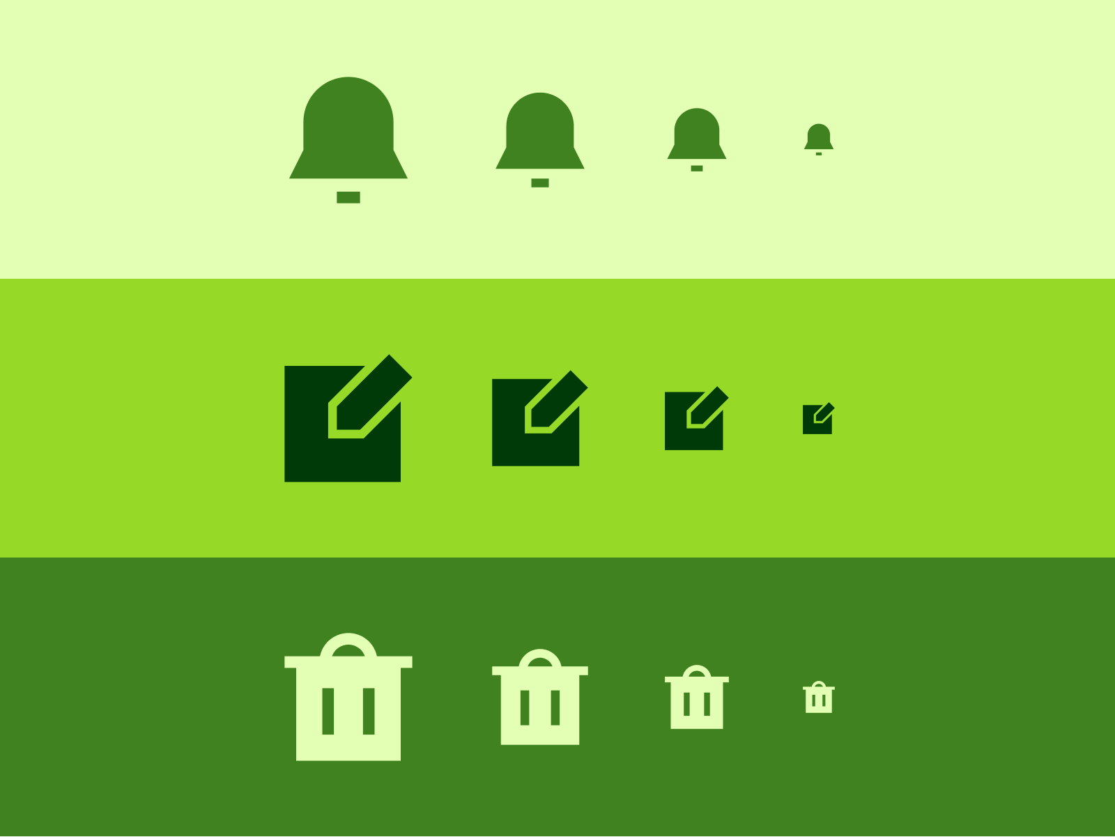
As for the different styles, Line and Duo icons are specially legible on light backgrounds (positive) while Solid and Flat shapes really stand out on dark backgrounds (negative).
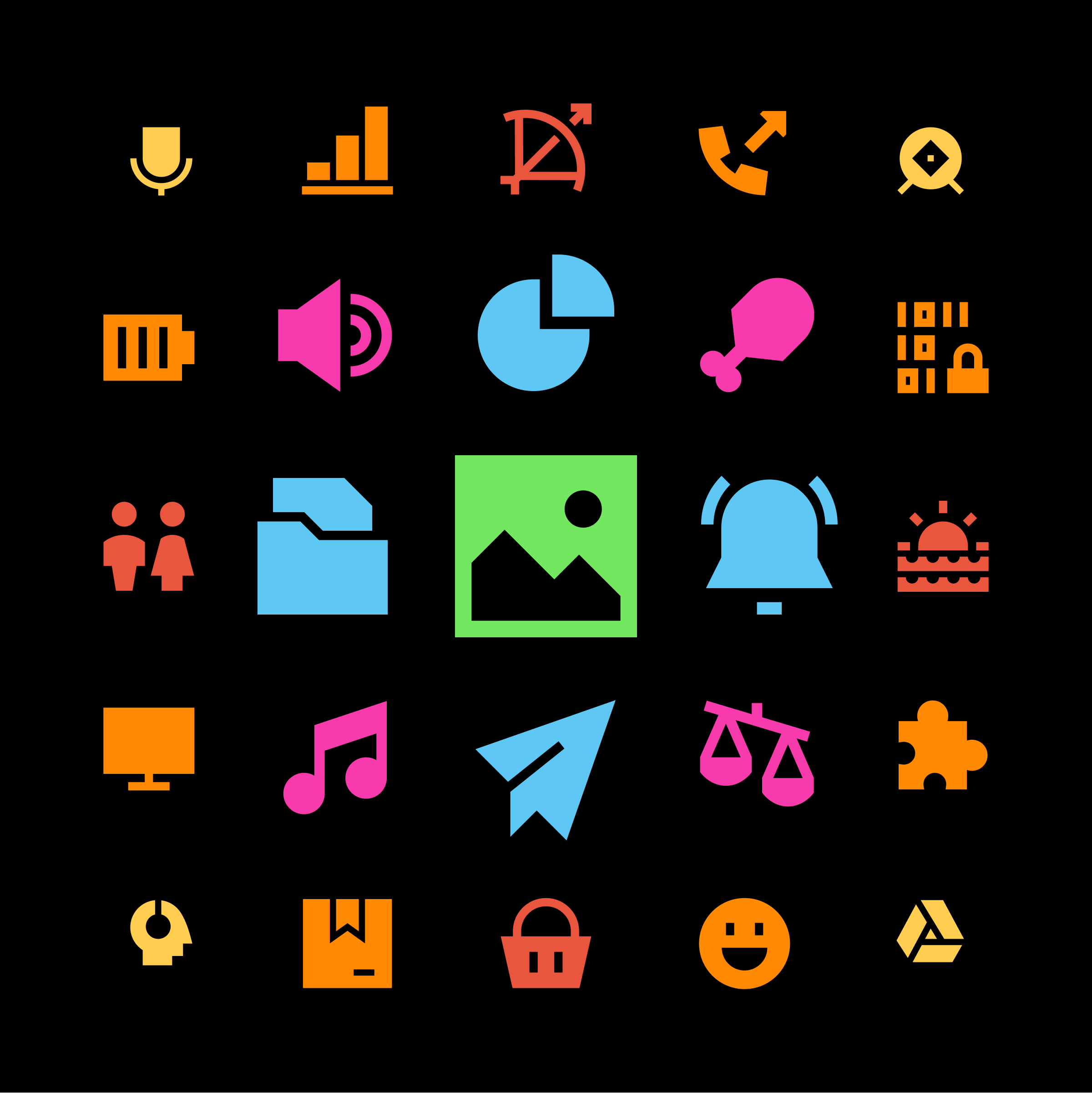
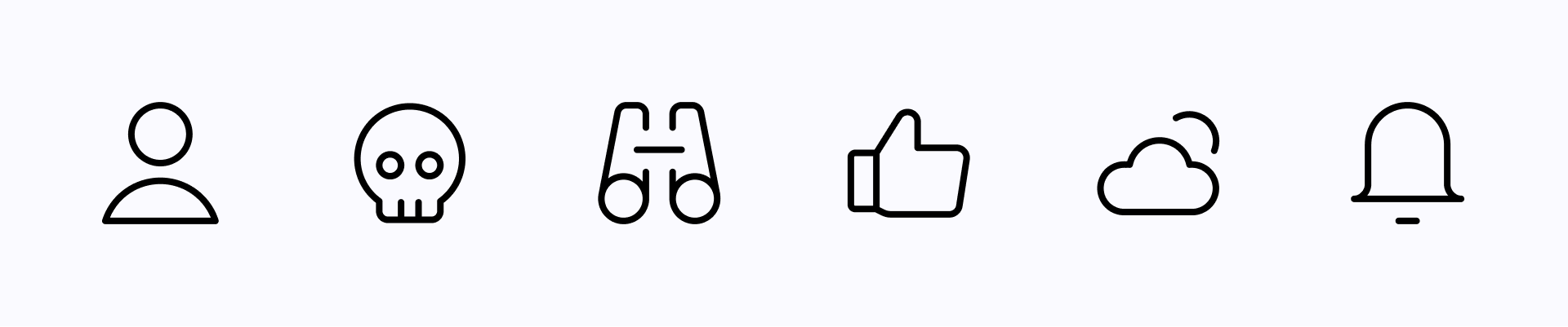
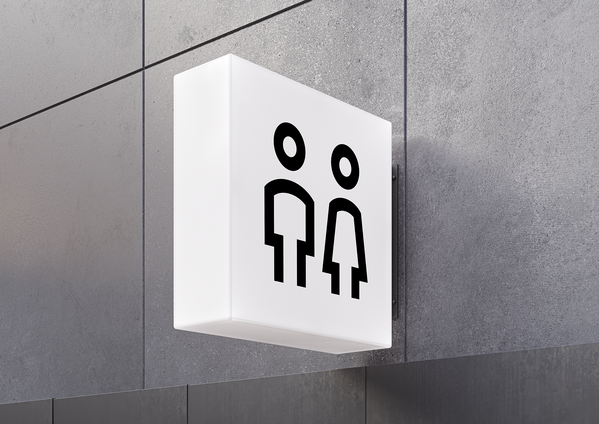
Line icons work best on a light background, while Solid icons stand out on a dark one
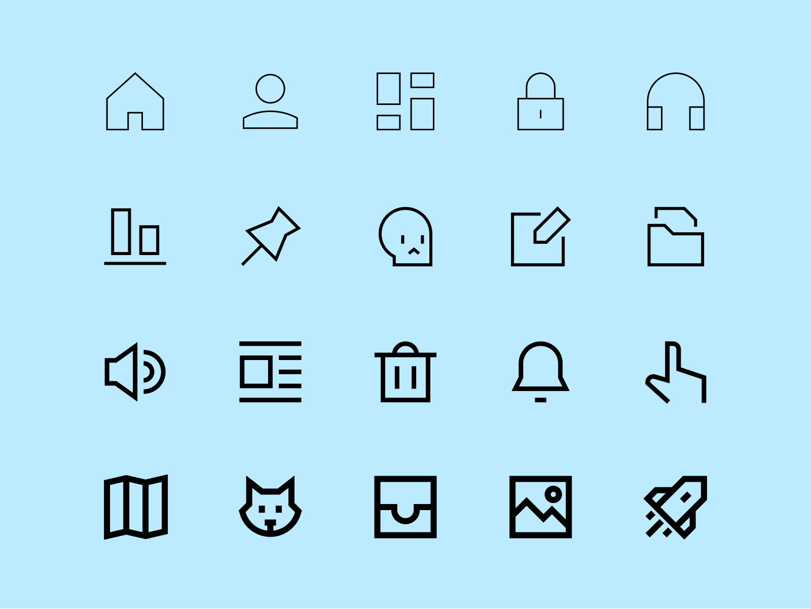
Sharp Line allows you to change the stroke thickness and color of the icons to suit your needs
Sharp Solid is incredibly legible at small sizes, but make sure there is enough contrast between the icon and the background
Once available, Flat and Duo will allow you to customize Sharp icons even more, stay tuned!
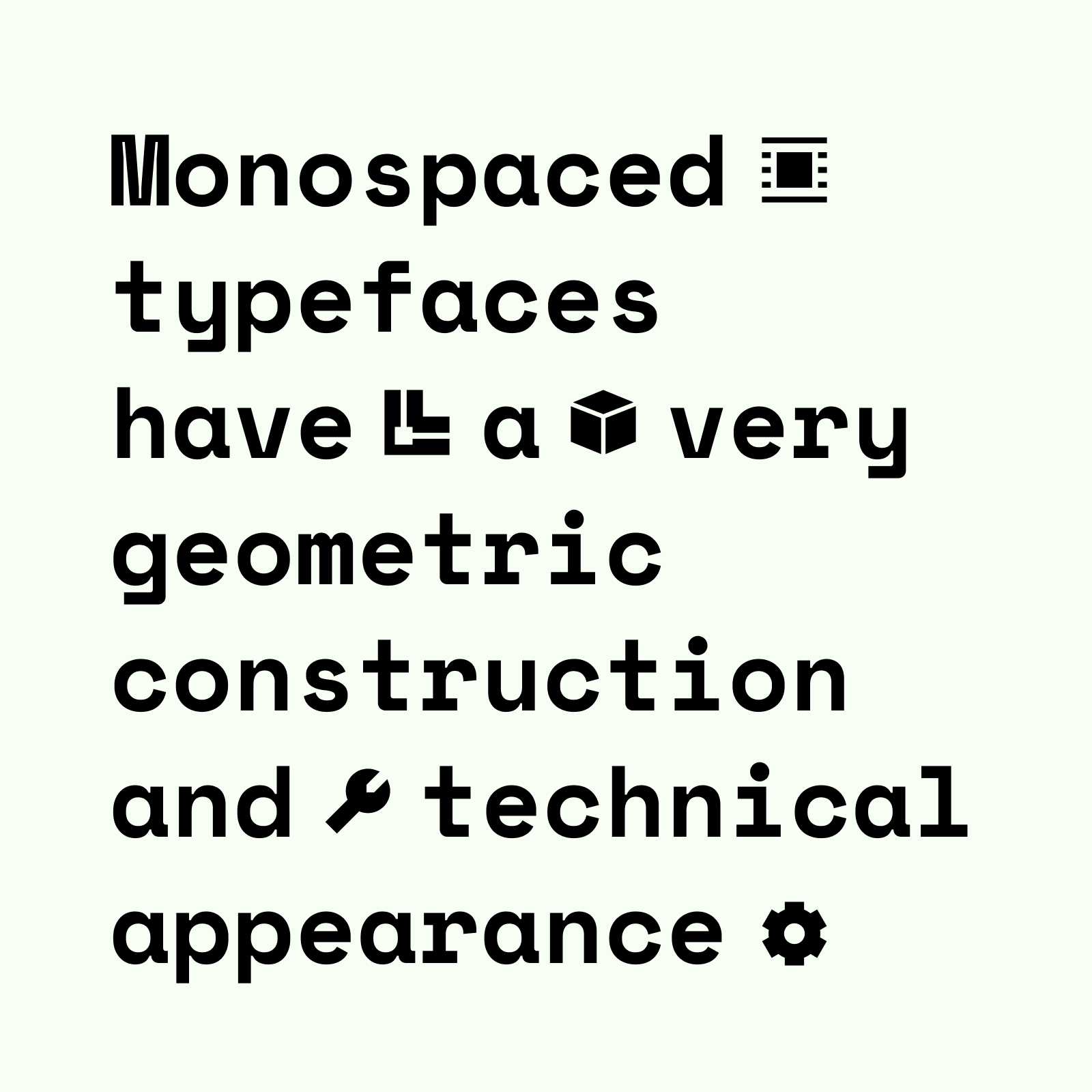
What typefaces should I pair it with?
The most suitable fonts would be those that follow a geometric construction, like Futura. They can also be combined with typefaces that use abrupt and sharp cuts, like Gill Sans or even monospaced fonts, which usually have a very technological look, as we can see with Space Mono.
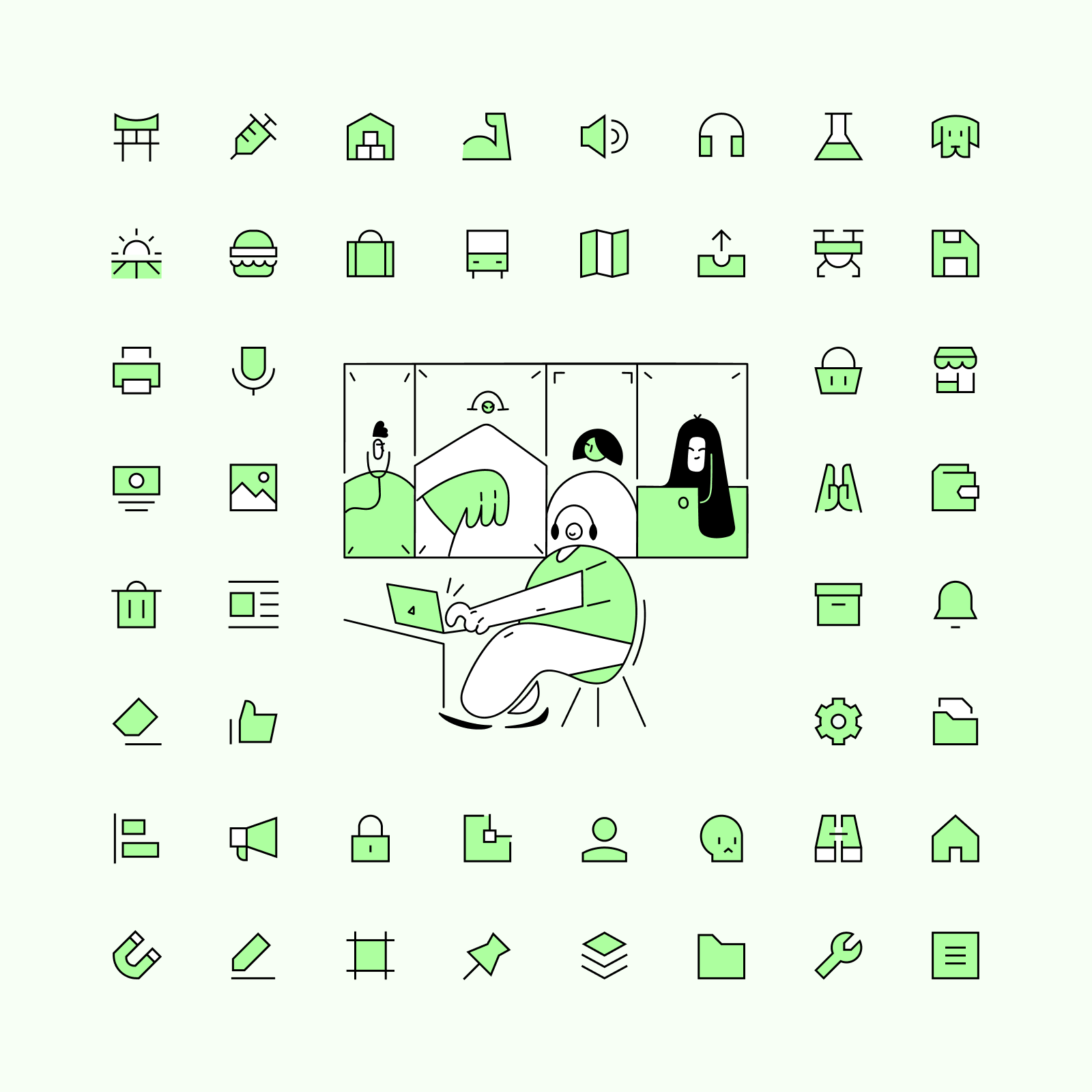
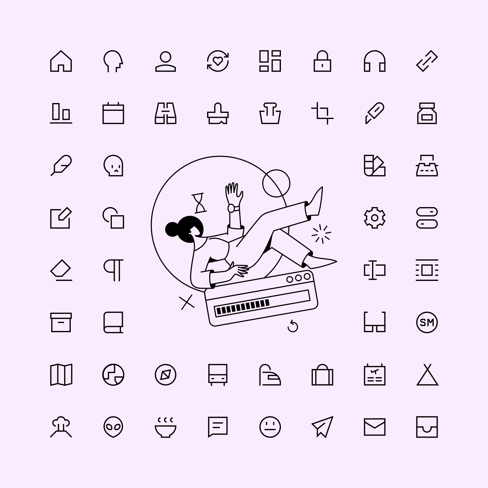
What illustrations should I pair it with?
You can focus on what makes these icons unique, the geometric look and strict construction guidelines, and choose a set like New York. A less obvious but interesting choice would be Bangalore, its elegance can be compared to Sharp icons when applied in a more sophisticated and classy design. You could even pair it with our Pixel icons for a retrofuturistic look!
Before wrapping up, let us recommend some alternatives if Sharp isn't exactly what you're looking for. If you need a neutral set with great legibility and very simplified icons, Core is your best choice. On the other hand, if you’re looking for a more personal and unique set, Cyber icons follow a very strict construction that makes them stand out like no other set.