Core - The Helvetica of icons
Neutral and discrete, its simple construction and legible shapes make it the perfect choice to be part of a neutral and functional design.
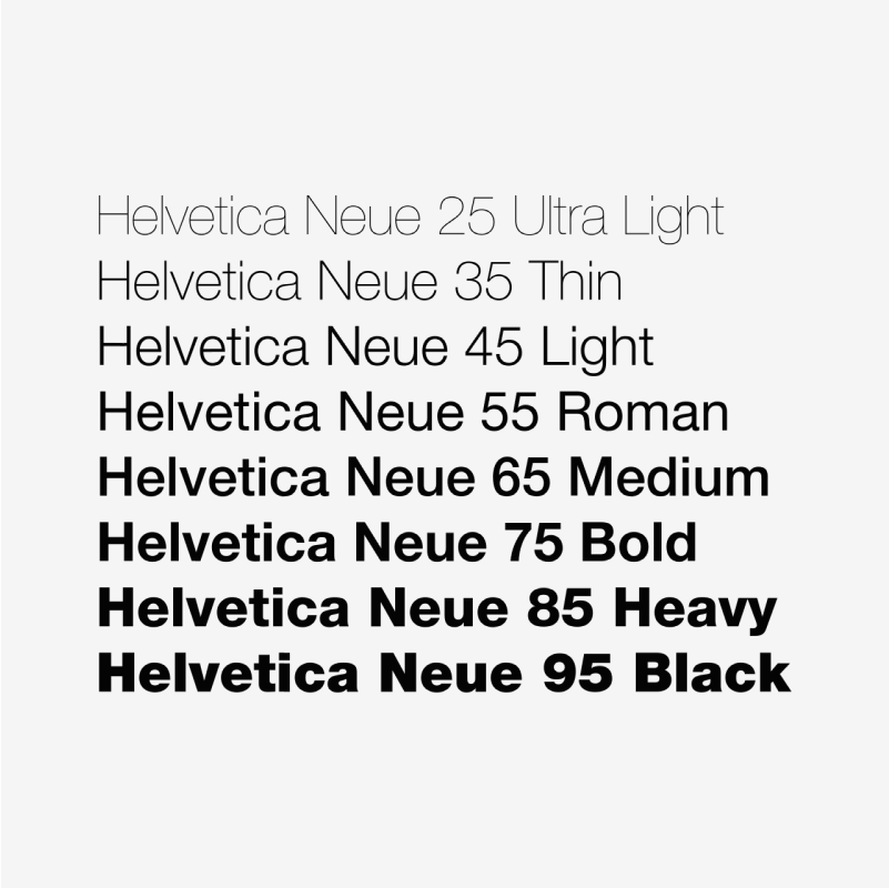
Swiss typeface designer Adrian Frutiger said that the Helvetica font, like jeans, is here to stay. Something similar happens with our Core icons, a timeless set that works in any context: interfaces, graphic design, signage or presentations. Neutral and discrete, it’s the icon equivalent of the Helvetica. Its simple construction and legible shapes make it the perfect choice to be part of a neutral and functional design.
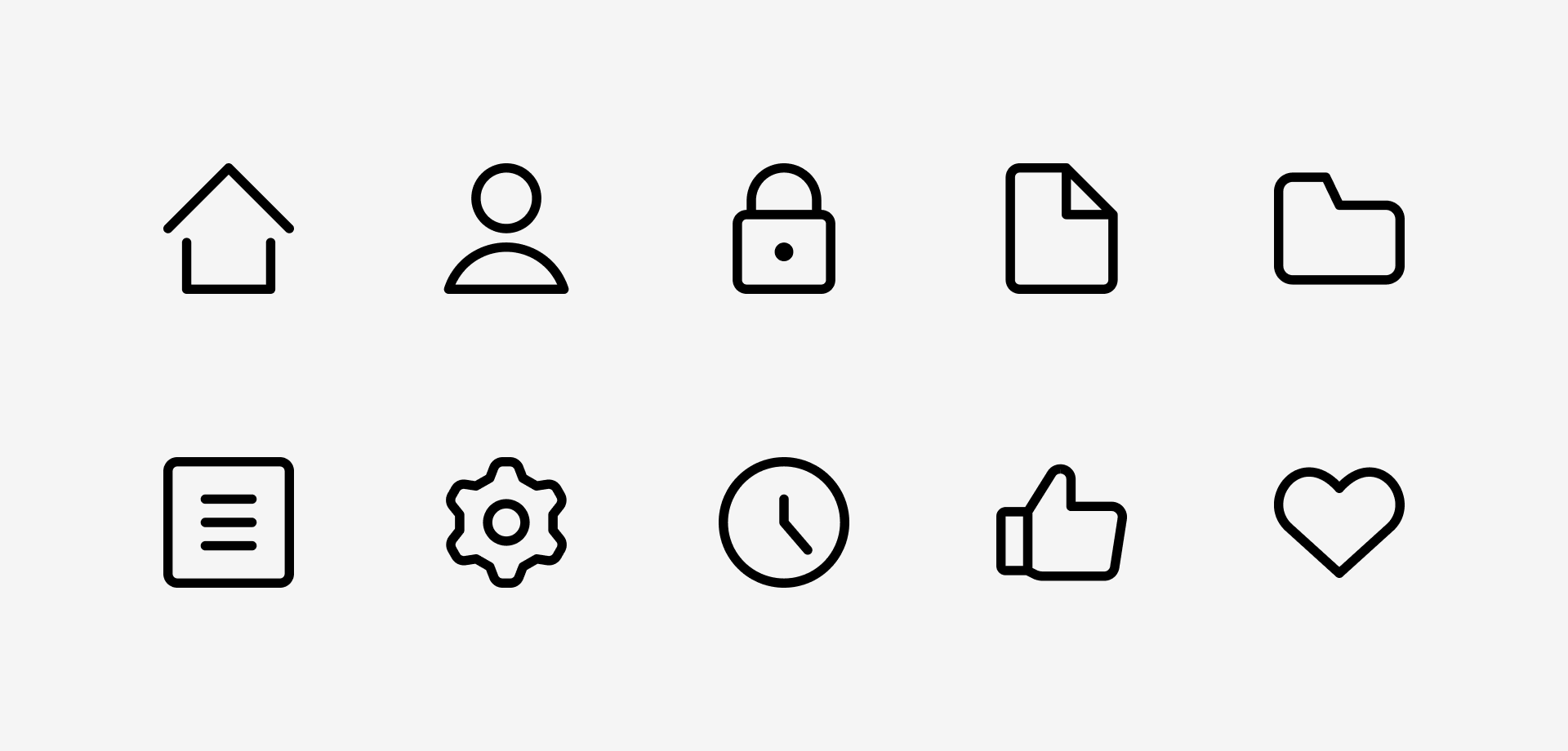
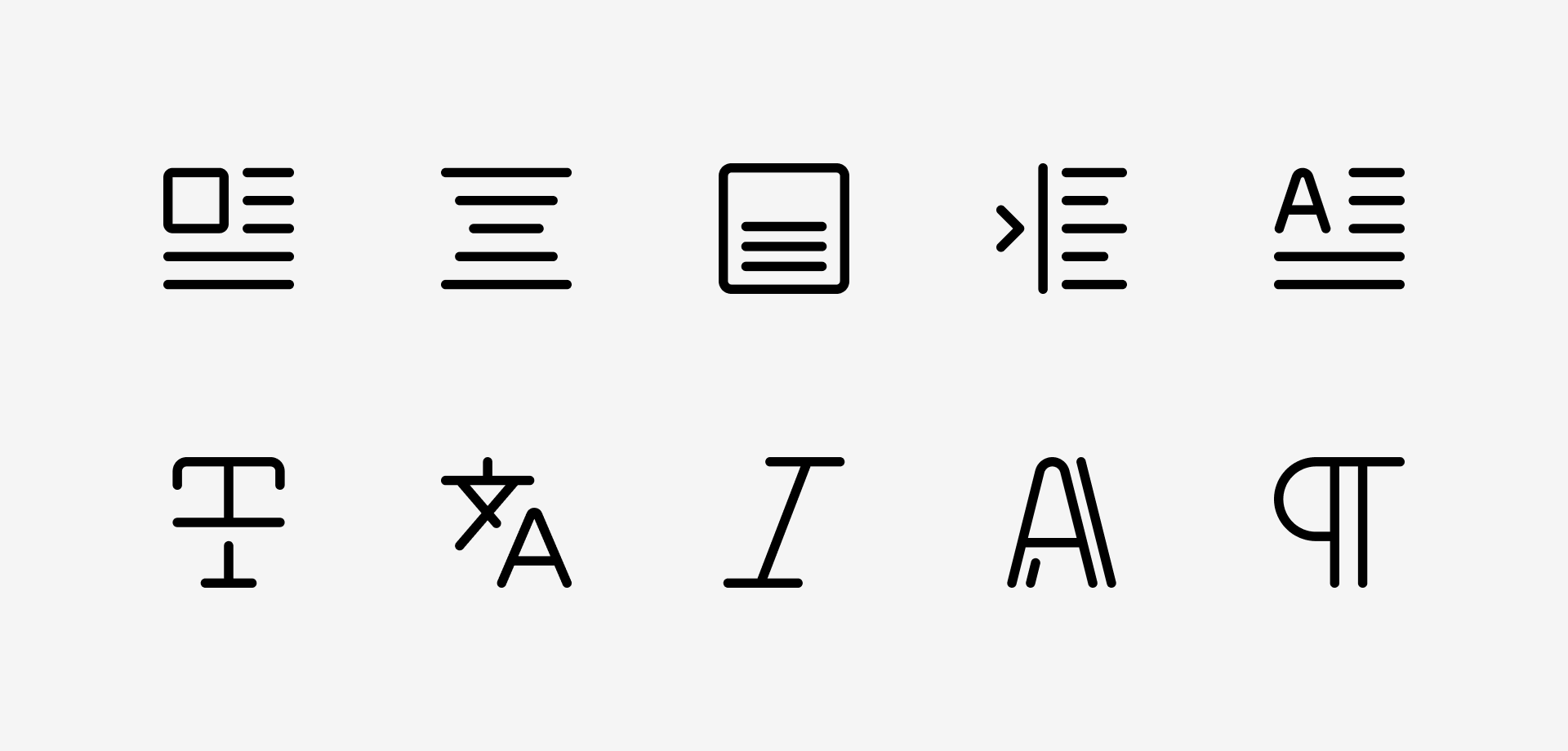
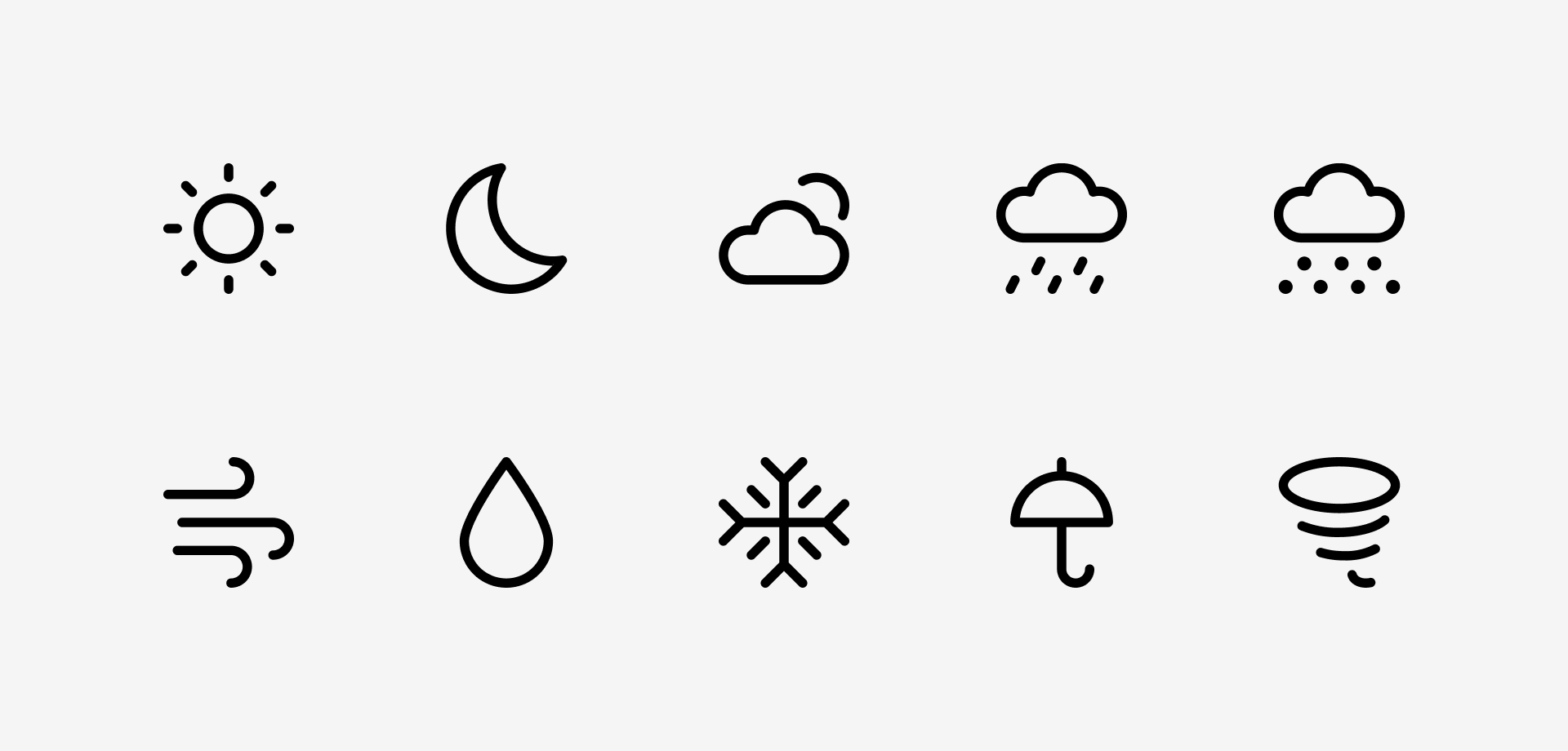
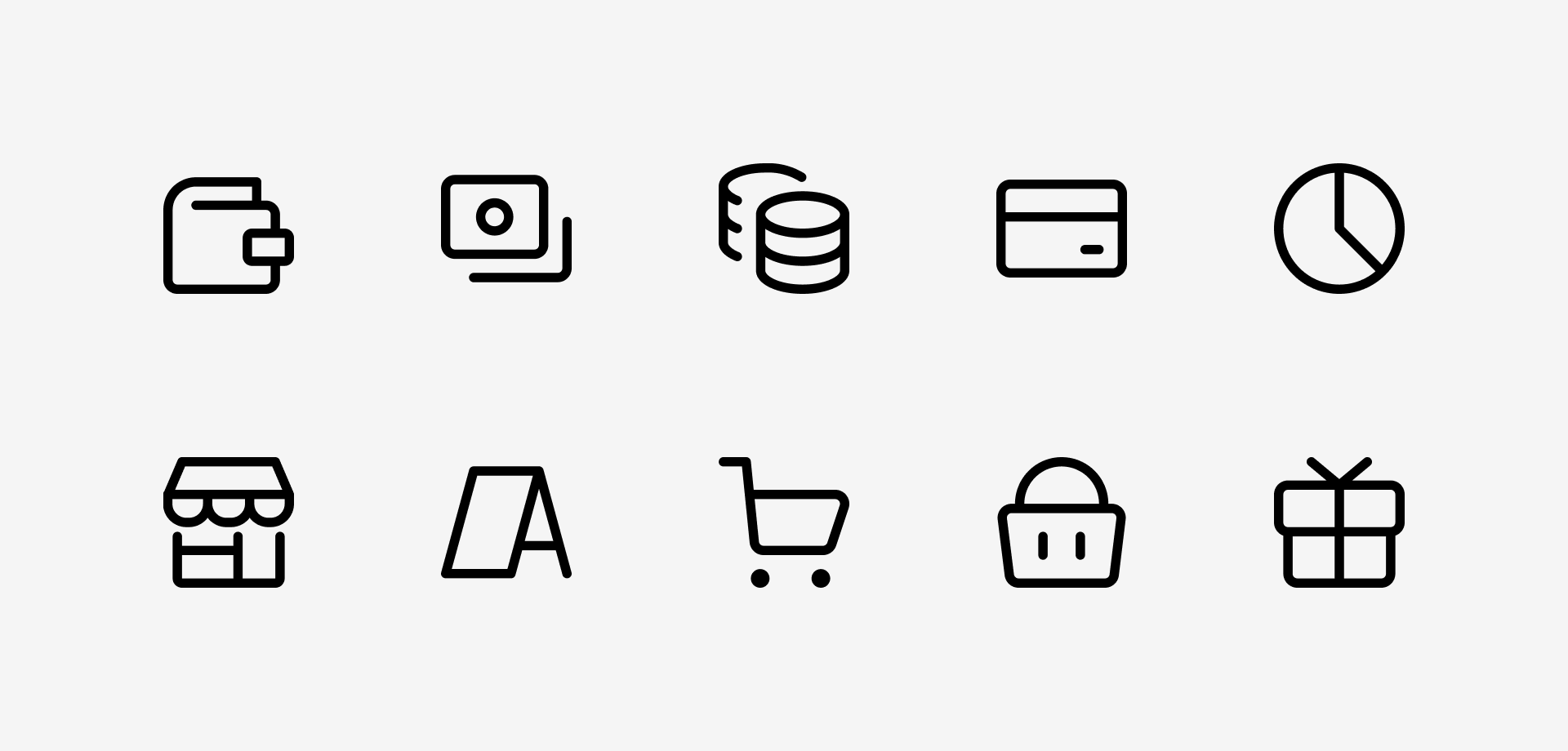
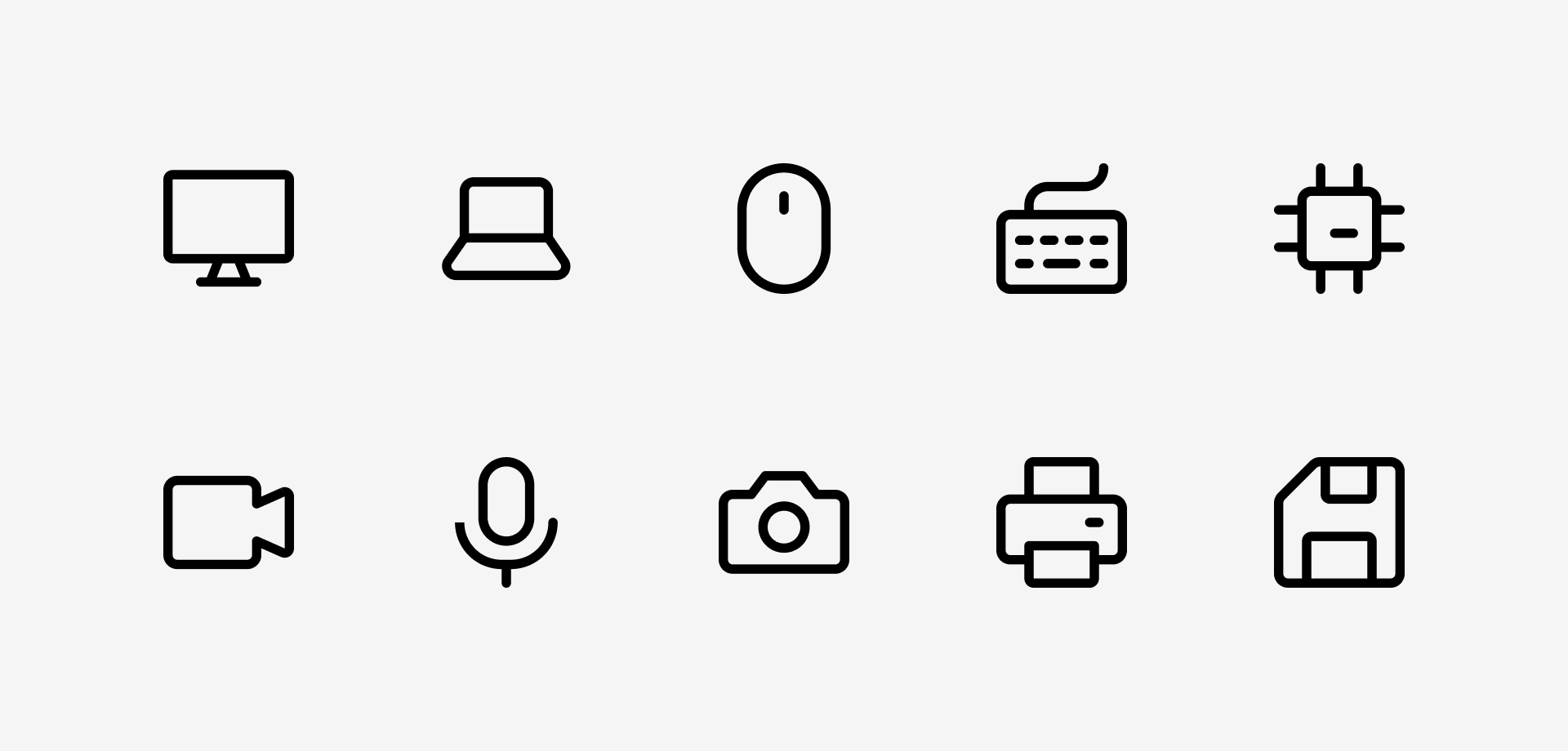
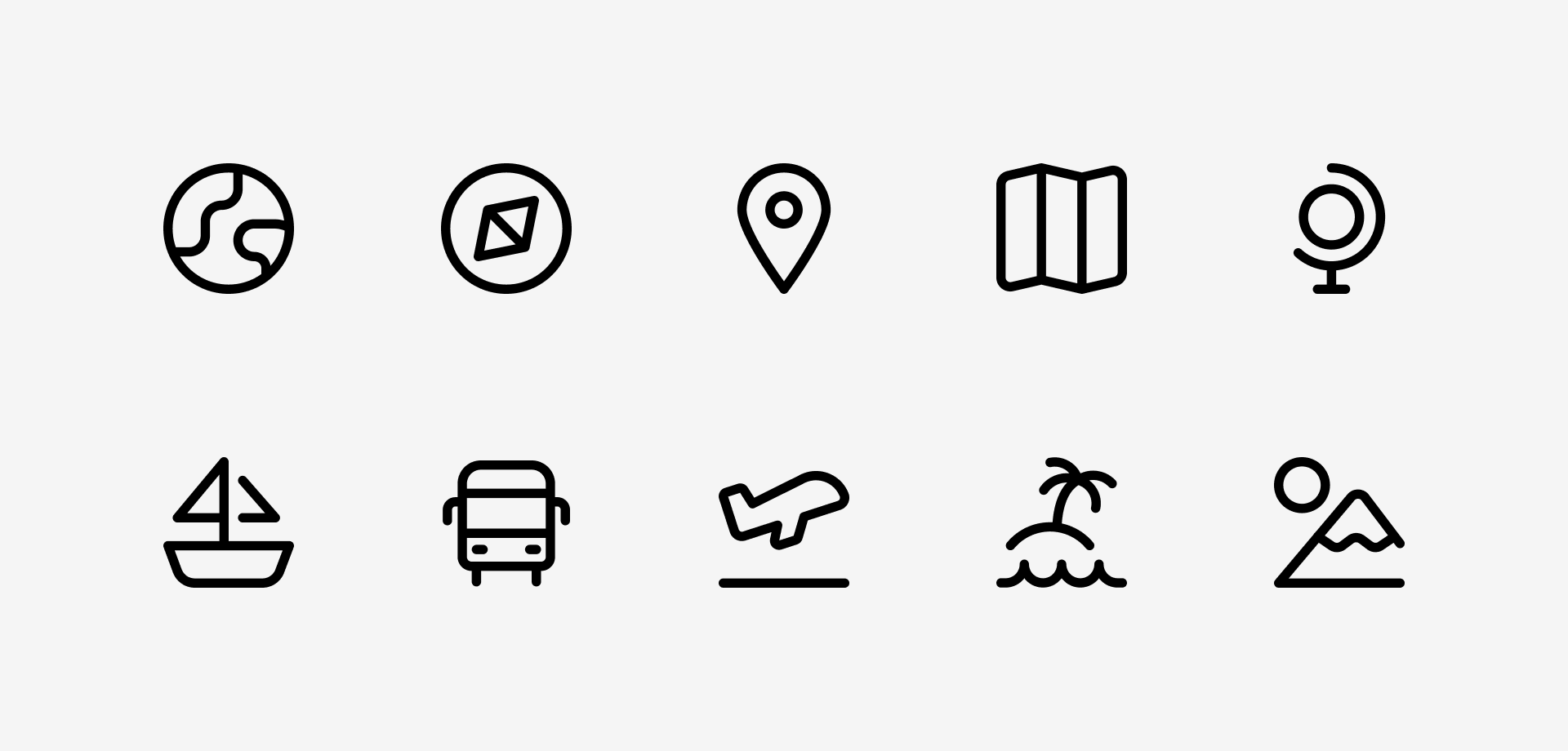
14 different categories with all the essential icons for UI
A truly chameleonic set
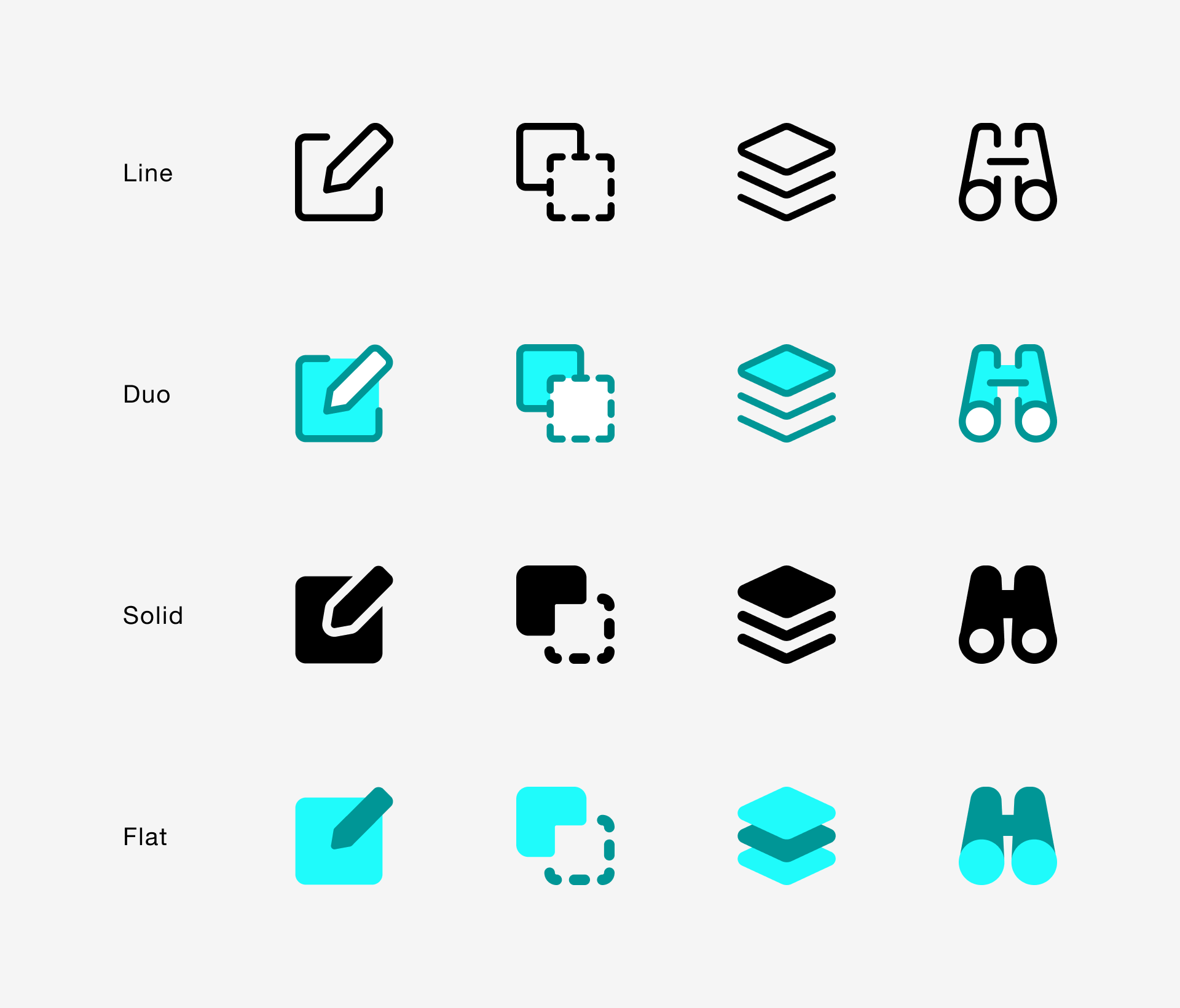
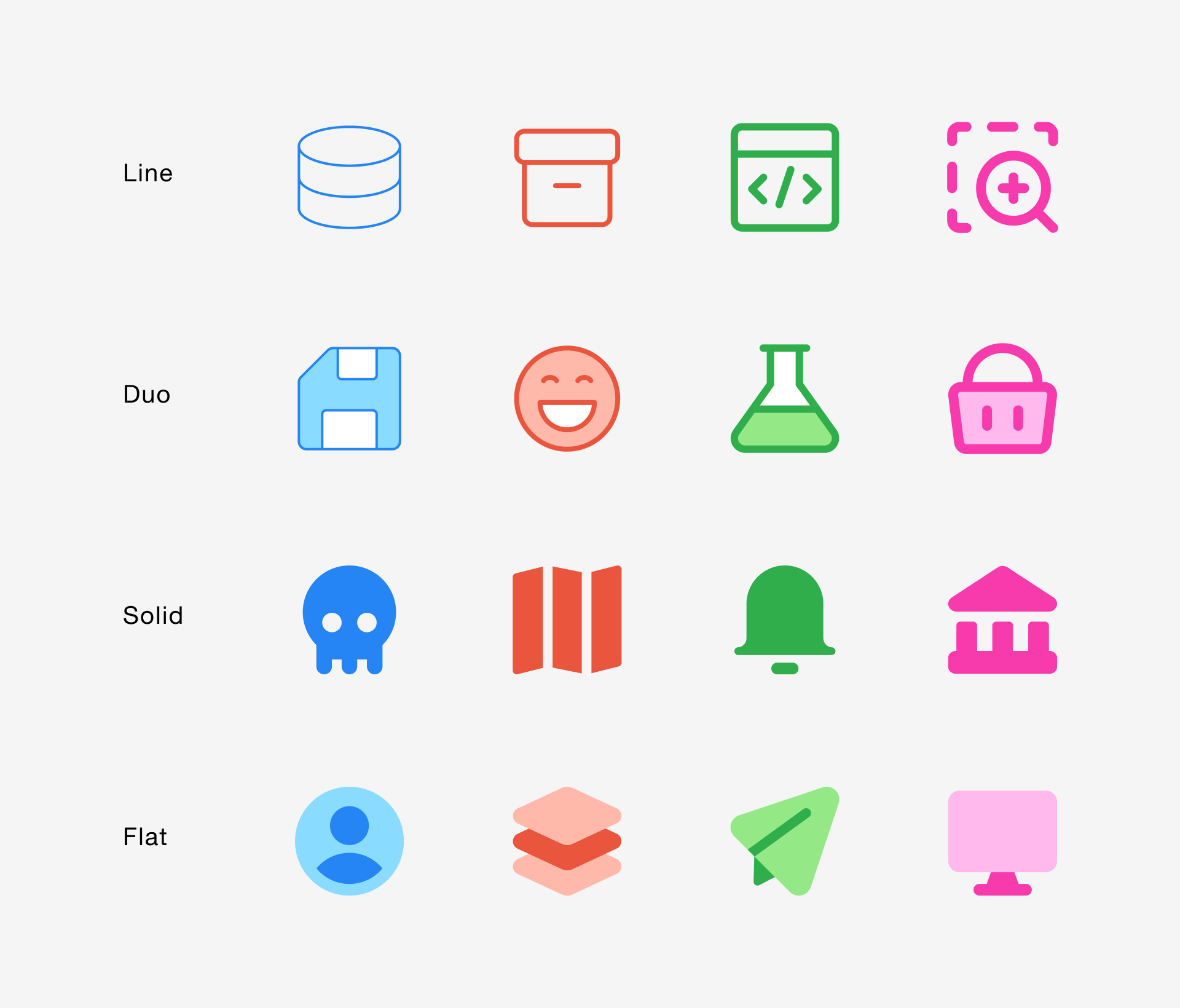
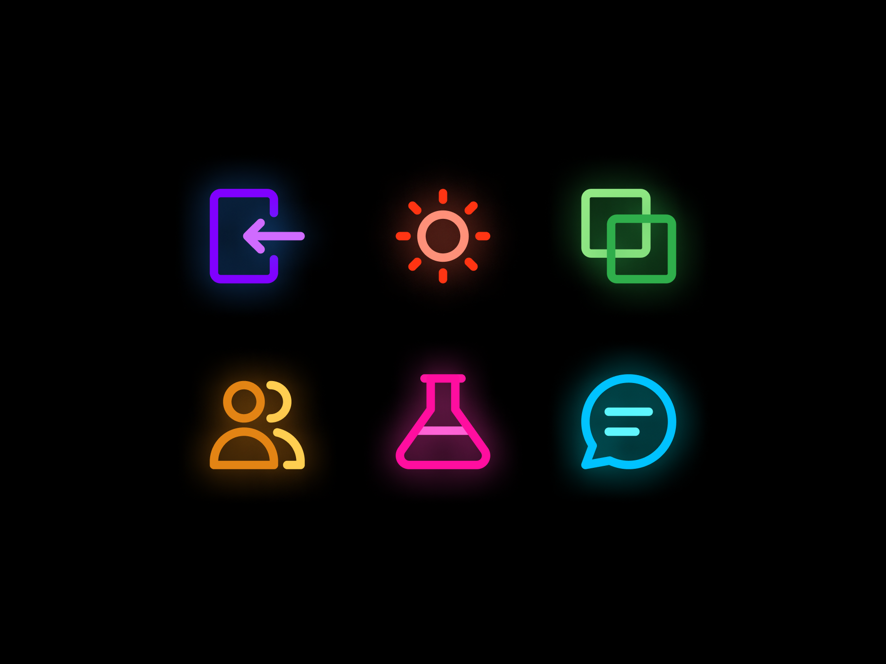
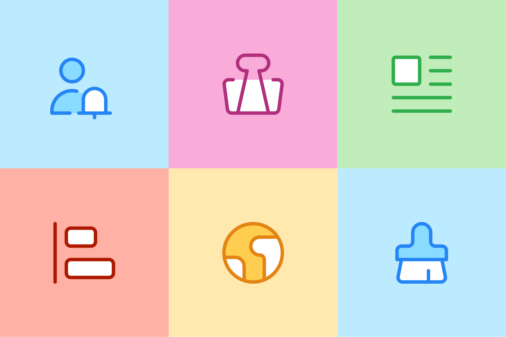
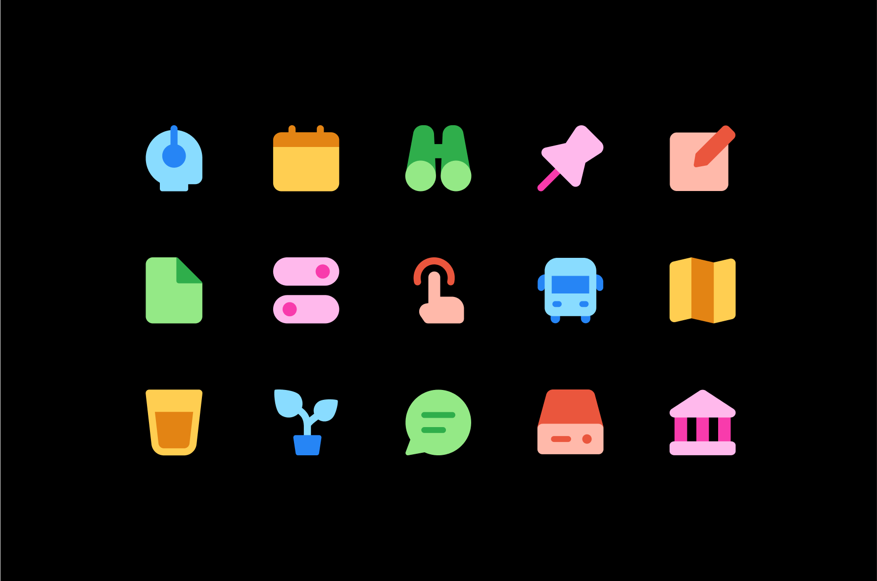
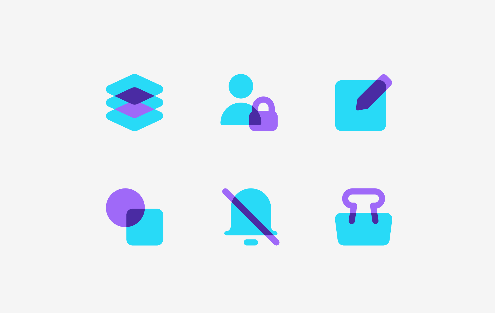
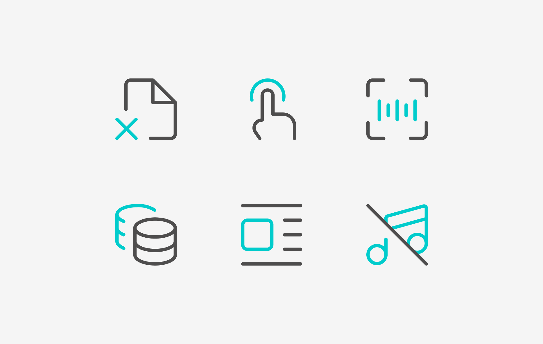
Our Core icons come in four different versions built with the same 'skeleton' structure. The Line version works great when you need a more subtle and neutral design. Solid is a more legible option and works great with light color fill on a dark background. Duo and Flat are perfect for matching your brand colors.
Everyone likes Core
We conceived Core as the set that everyone would like if they gave it a chance. As we’ve said before, Core is Helvetica, it’s also The Godfather, The Beatles, puppies, pizza, ice cream... You can’t go wrong choosing Core as your set.
Good stuff
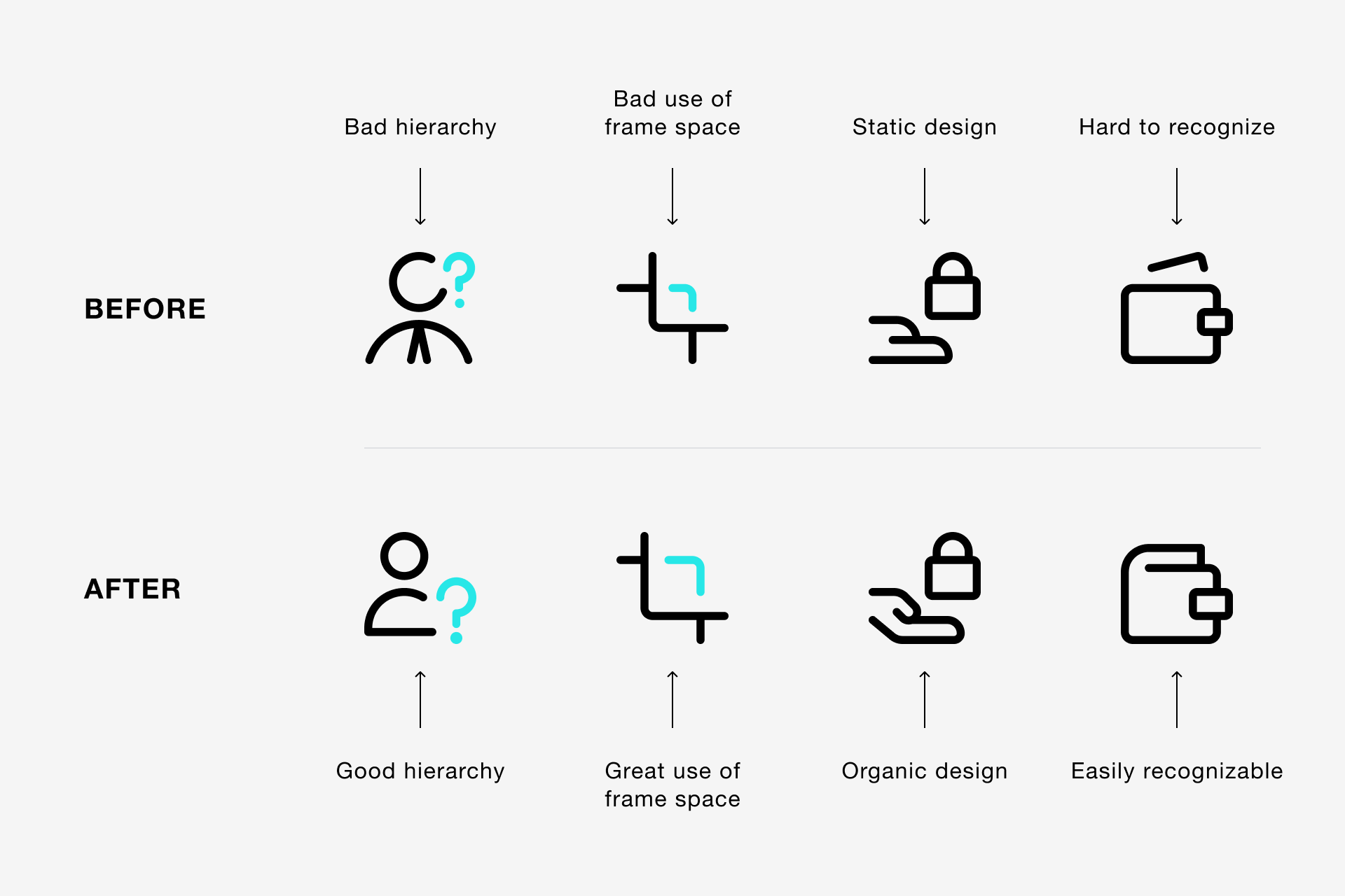
Precise messages with simple icons
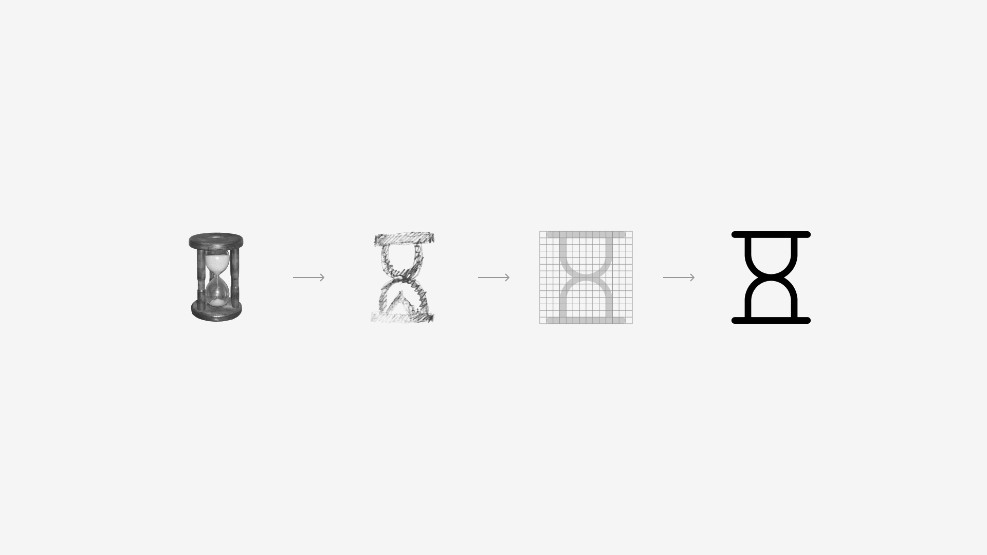
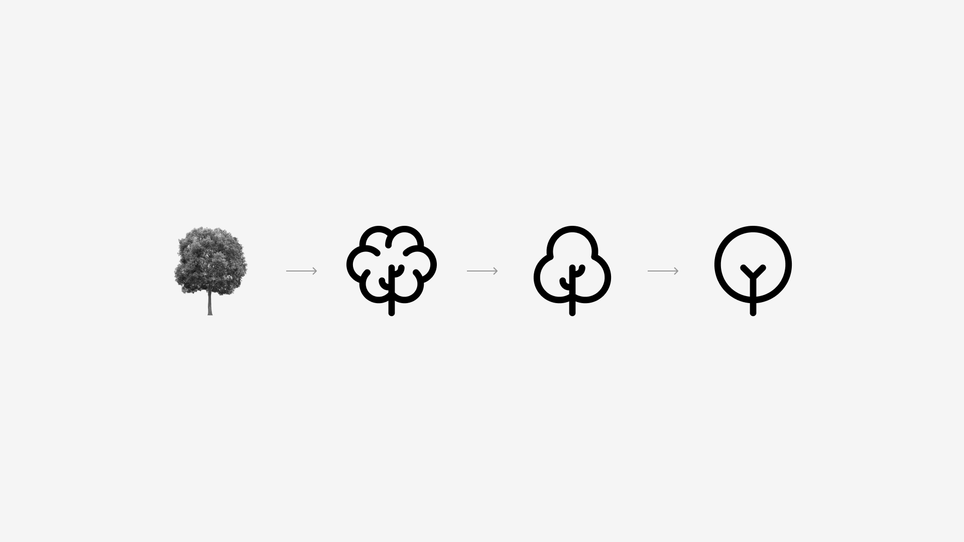
With Core it was essential to follow a very strict approach for the most complex icons, defined by the search for a visual reference, a first approach to a simplified version of that reference and the construction of the icon on the grid, which results in the final sign.
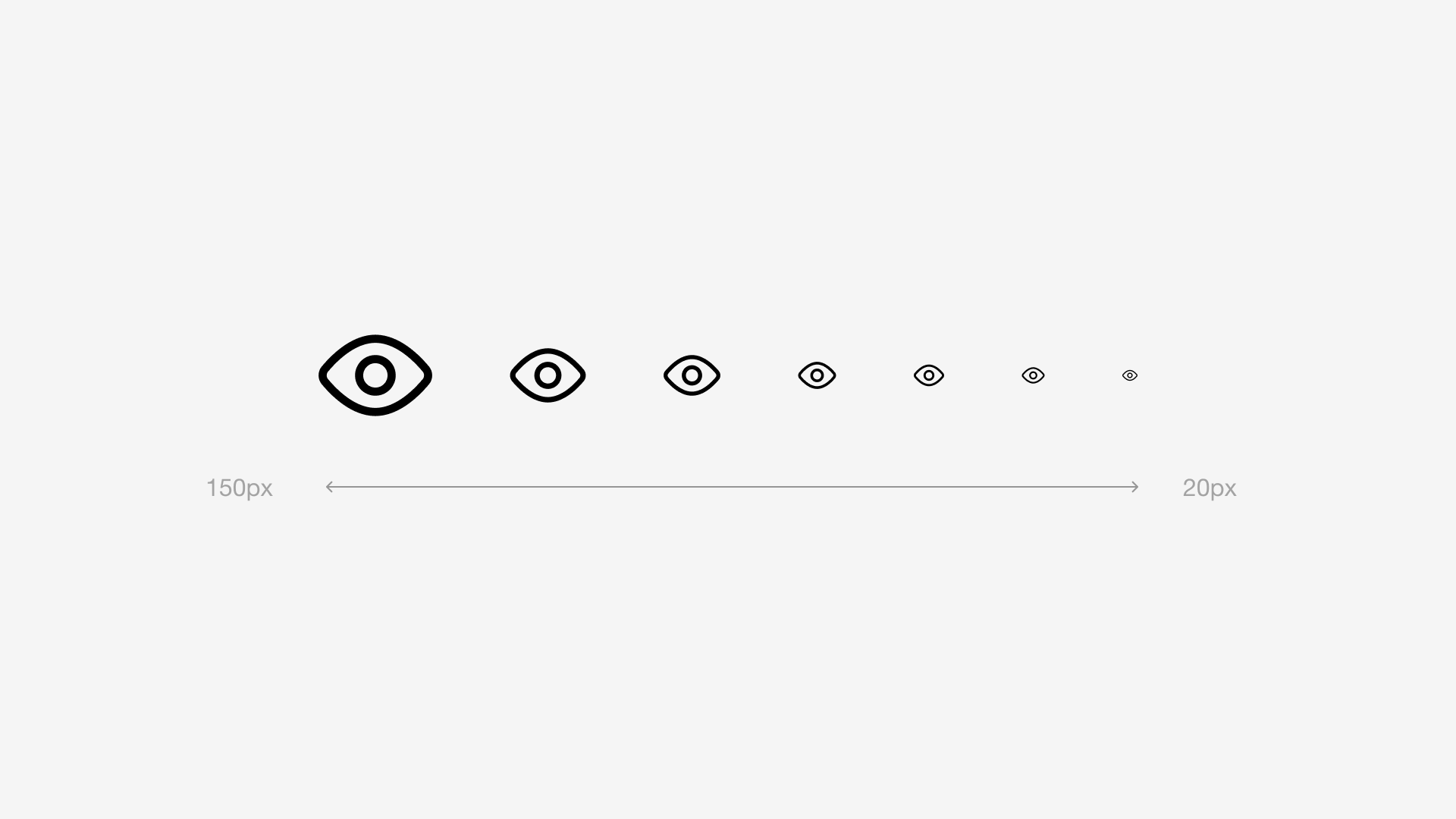
Core icons are designed as simplified as possible in order to avoid using irrelevant information, this way we make sure our icons remain perfectly legible at small sizes. Its timelessness makes it a great choice, whether it's used today or 50 years from now.
Building a neutral family
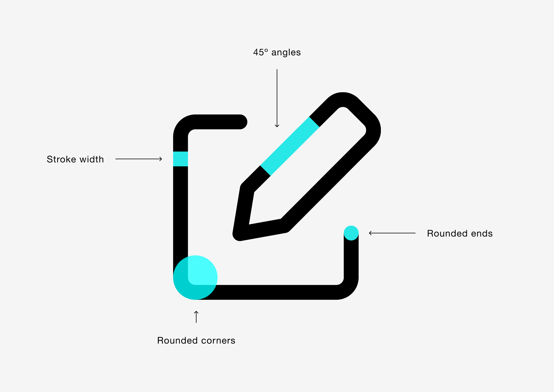
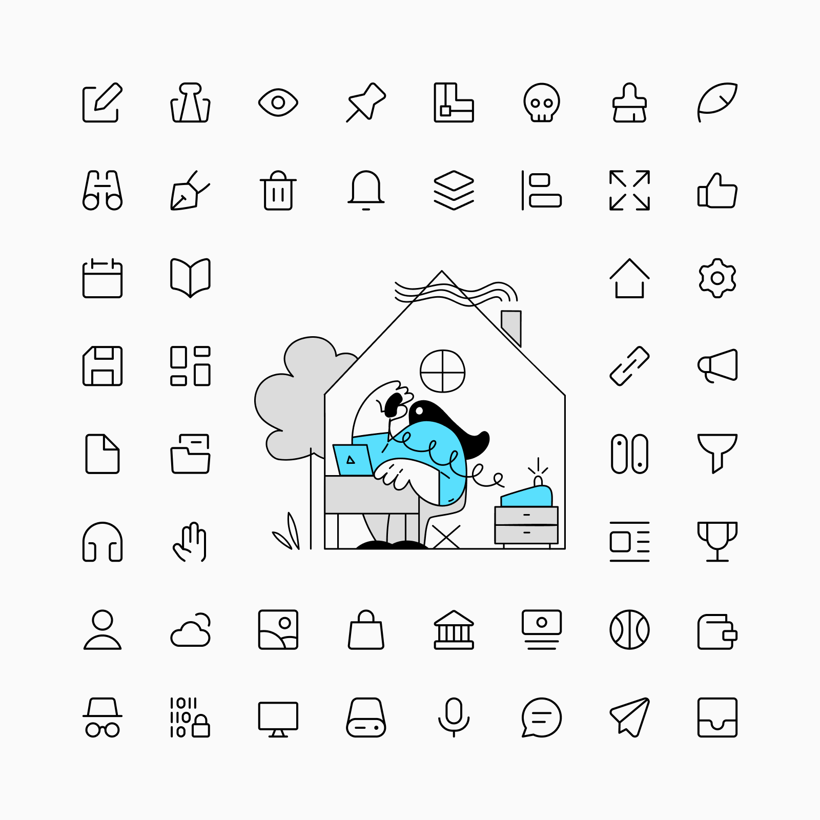
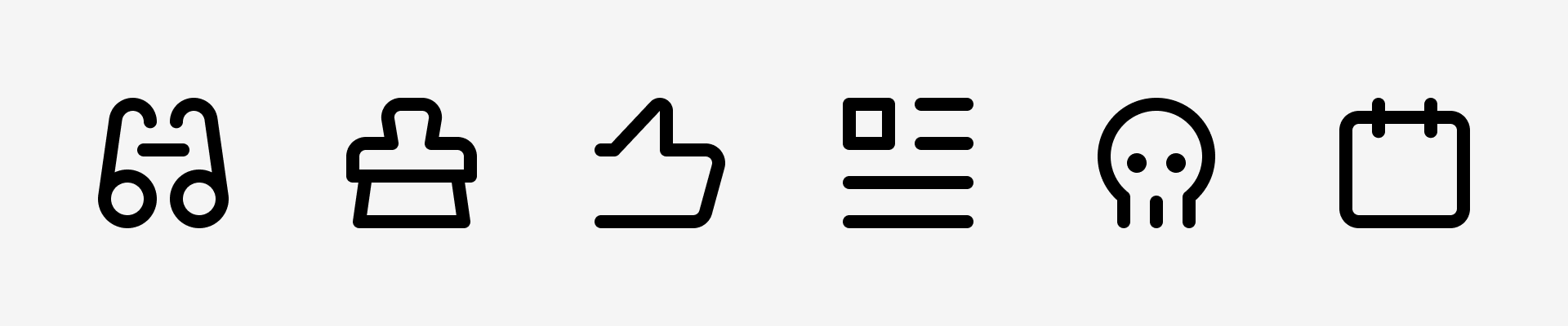
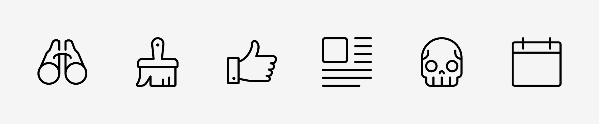
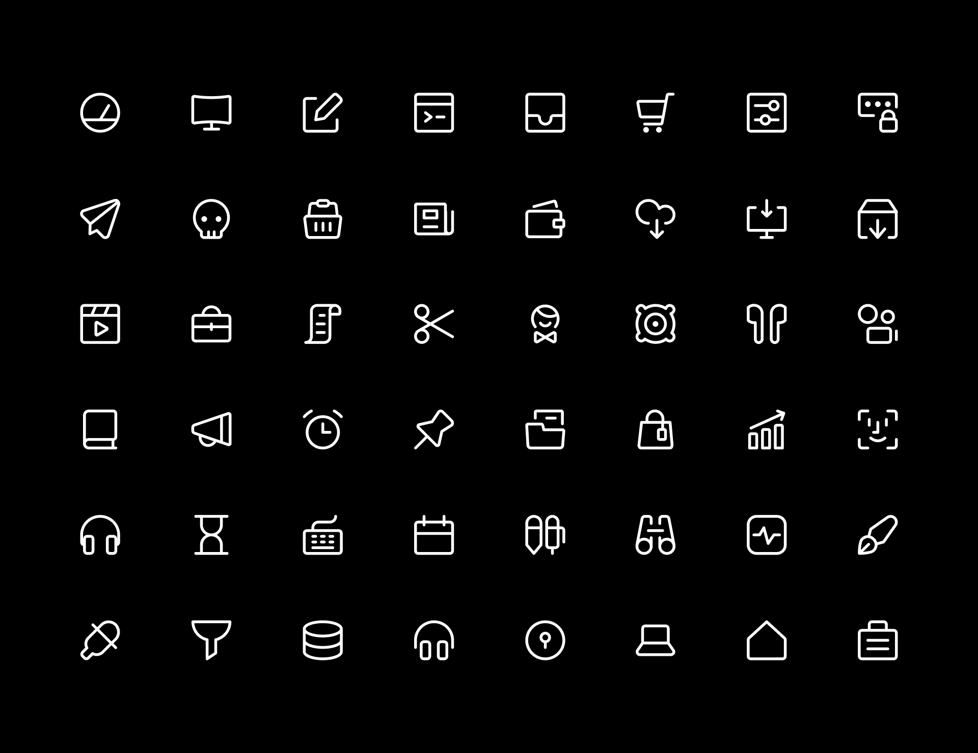
Every Core icon was built on a 14x14px grid, which allowed us to keep them simple and focus on legibility over other things. We also used rounded corners and ends to give these icons a more pleasant touch.
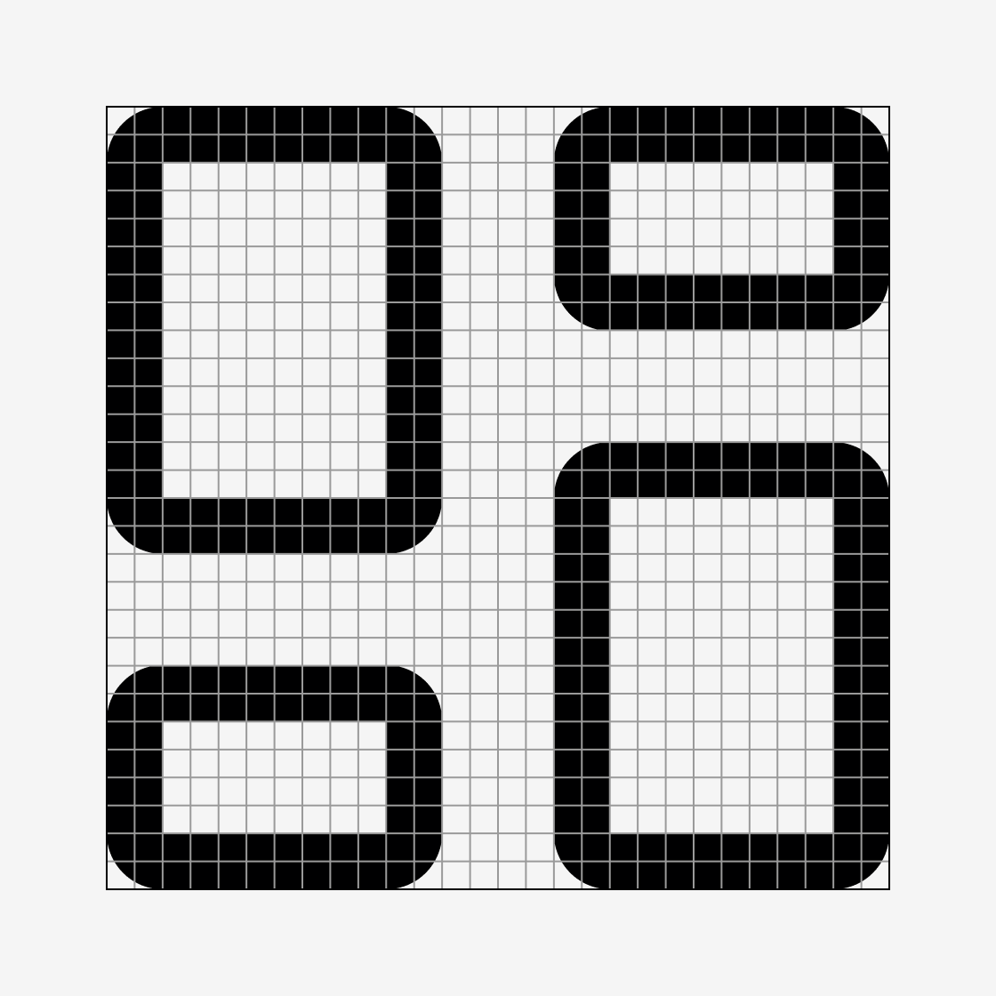
Line and Duo icons use a 1px stroke as default thickness and minimum separation between shapes while Solid use gaps to separate elements and Flat try to avoid them to achieve a, you guessed it, flatter look.
Every detail counts
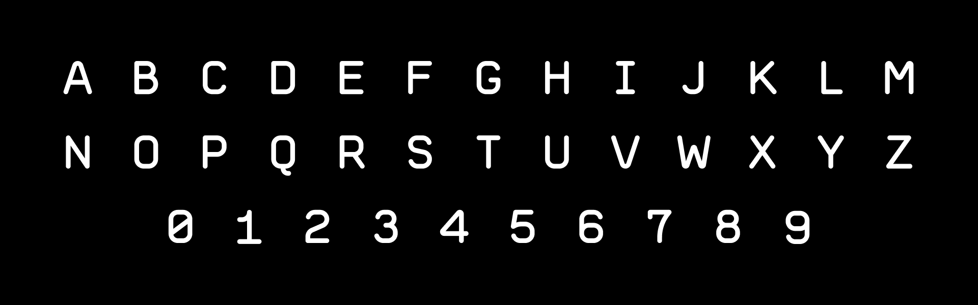
We created a typeface to use in our own icons, based on the same grid. This typeface helped us achieve maximum legibility and optimal space use.
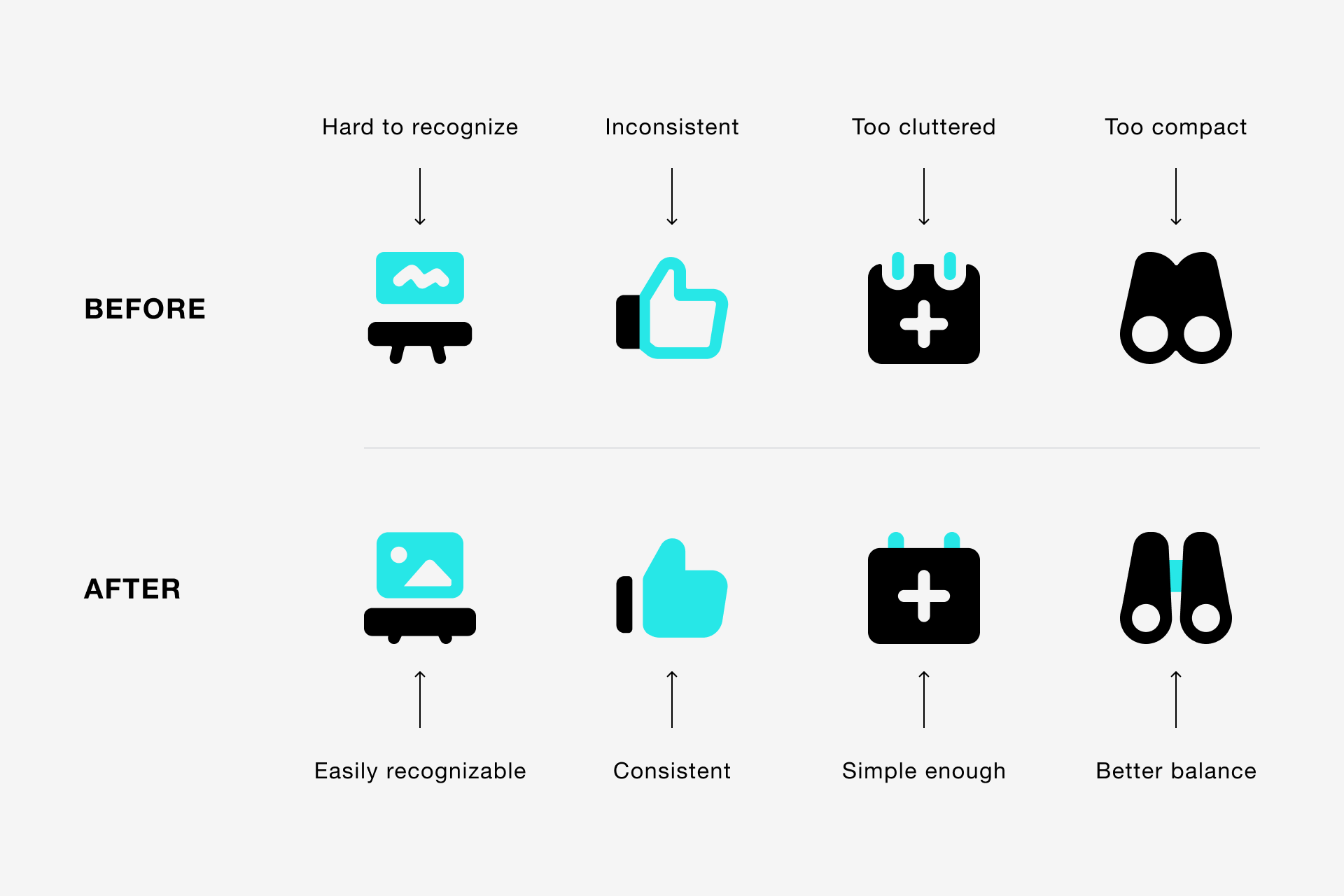
Not good enough yet
While creating new variations we realised that some previously designed Core icons weren’t legible and consistent enough, so we made many revisions to improve them before releasing the current version.
When to use Core icons?
Anytime! No, but seriously, Core is the perfect choice if you're sure you need a neutral and professional-looking set of icons, but it's also what you might want if you're not sure what your design needs, because Core will make it work for you.
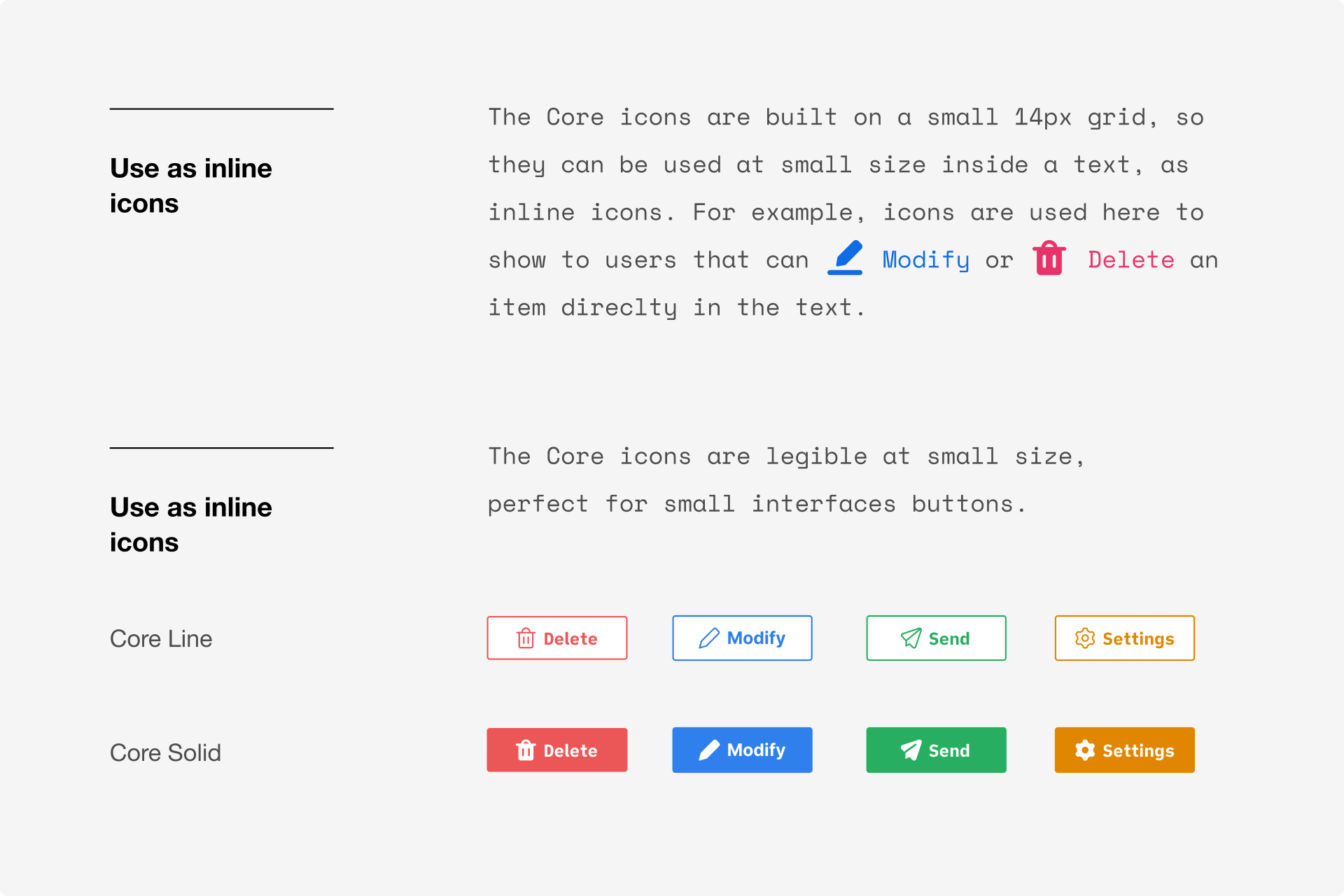
Your workhorse for interface design
They were primarily created for interface design, hence the minimum amount of detail and generous inner space, so they are quite legible at small size. Plus, they are elegant and extremely consistent: your interface will get amazing reviews!
Karma, karma, karma, karma, karma chameleon 🎵
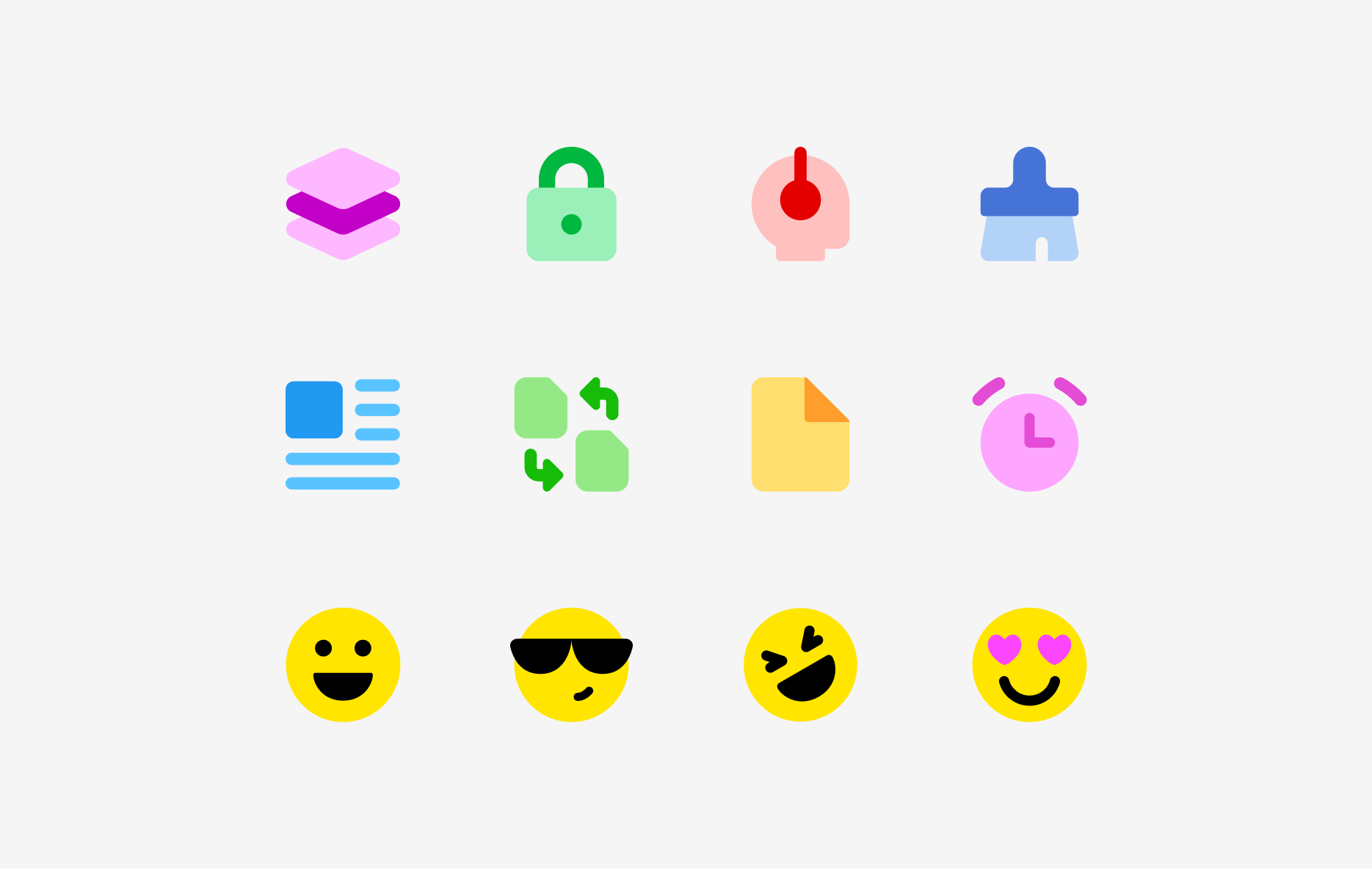
Using our Streamline app or any vector software (Figma, Illustrator, etc.), you can easily change our icons colours and adapt them to your project. By changing the colours, our icons can look dramatically different and have a unique style that can bring personality to your projects. Can you believe all these example come from the same icon set?

Color variations for Line, Solid, Duo and Flat


Core icons are versatile and playful
See them in action
Not sure how they'll work in your project? We always like to put ourselves in our users' shoes, that's why we are constantly creating use cases to test the usability of every single one of our sets.
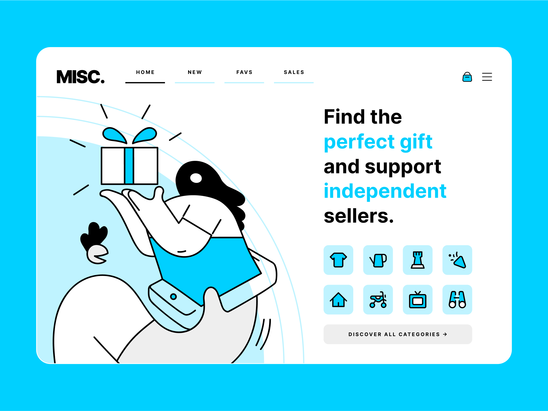
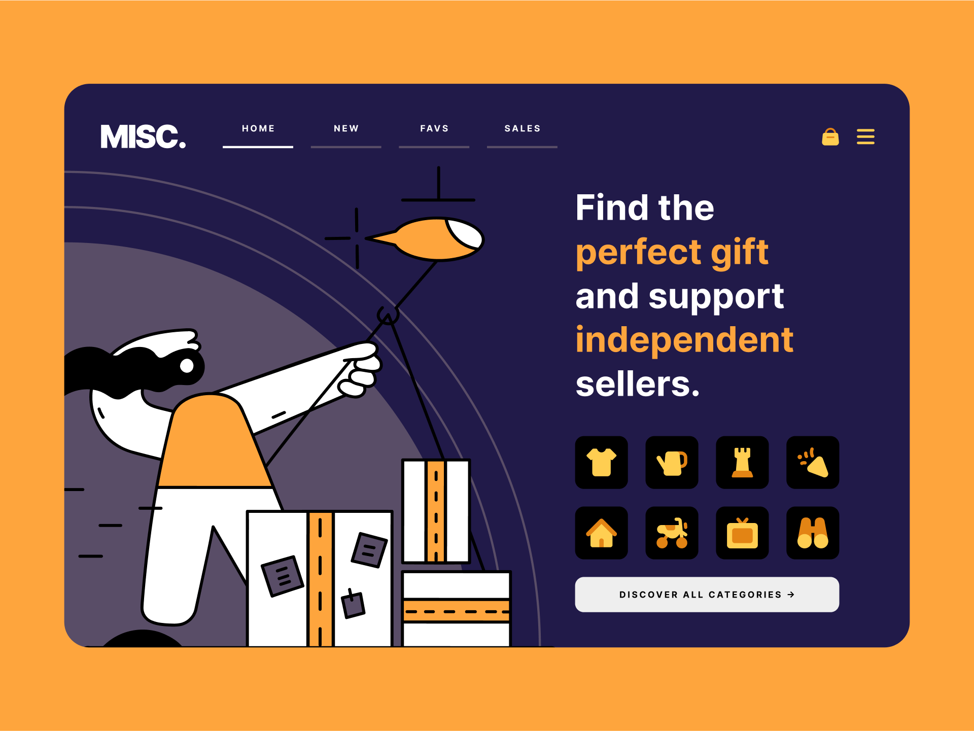
Website design — Easily adapt Core colors to match your brand
What typefaces should I pair it with?
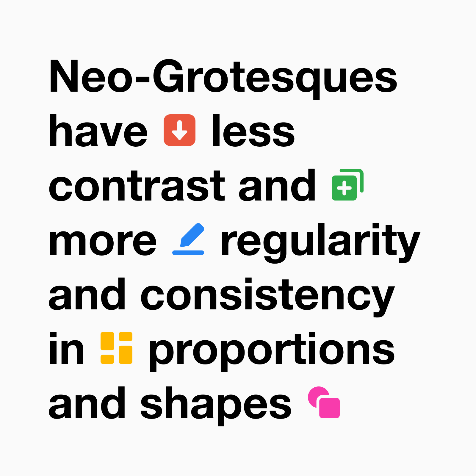
Core is the icon equivalent of Helvetica, not only for its timelessness, but also for its rational construction and adaptability. Other similar san-serif typefaces, specially the neo-grotesque ones, can be a good pairing option, such as Inter or IBM Plex Sans.
What illustrations should I pair it with?
Icons and illustrations can also be paired according to the most important formal characteristics and overall tone. For Core you could use a set like New York, which has simple and abstract shapes with a large negative space, or Streamline UX, with a more minimalist and geometric approach.

If Core is not the set you need, you might want to check other alternatives we have in our library. If you’re looking for an even simpler style that works best at really small sizes, Micro (Line and Solid) is your best option, specially if you are using a lot of icons and you want them to be quickly recognised. On the other hand, if you’re looking for a more detailed set that can work at slightly larger sizes, Streamline classic sets (Light, Regular and Bold) are a great choice.
Want to try them? Access 1,000 free vector icons and customize them in seconds ⚡️
Core Line — Free icons ✨
A rational, versatile and timeless set that works perfectly in any context. Use the vectors for free but please credit us with a link. Customize vector line width. Licensed under the Creative Commons - CC BY 4.0