Plump – Friendly icons
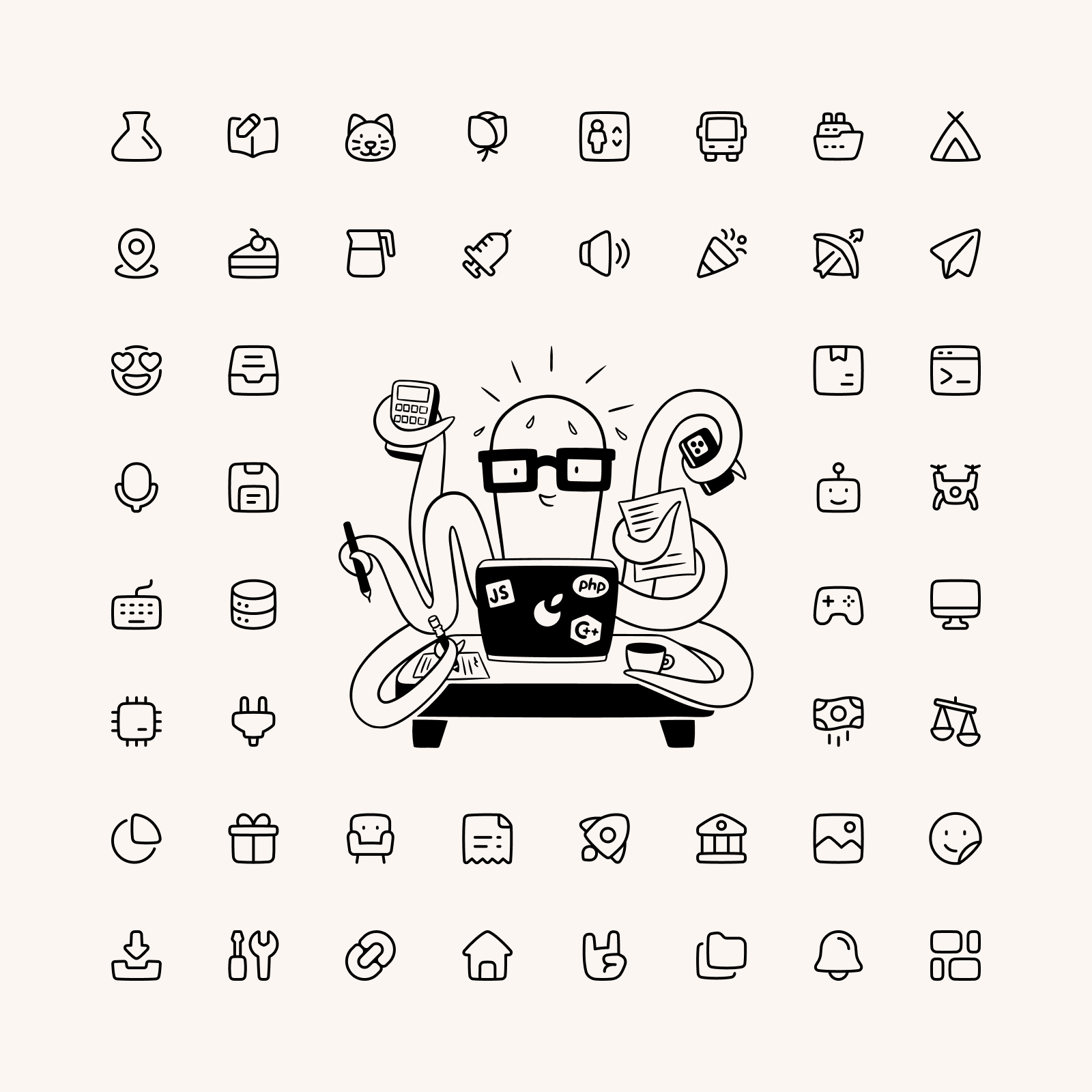
A collection of chunky icons that add a touch of friendliness to your projects, while maintaining exceptional legibility.
"Whenever someone creates something with all of their heart, then that creation is given a soul."
— Hayao Miyazaki
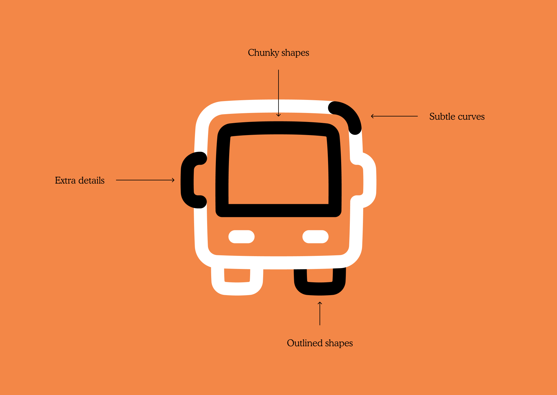
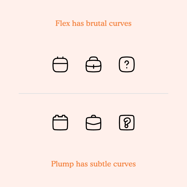
We put a lot of thought in our work, but also a lot of heart. Animation legend Hayao Miyazaki believes that creations come to life with this personal effort and we like to think that's what happened with our Plump icons. Plump is a set of chunky icons with friendly looks and it was created using chunks of shapes combined with lines. It also uses subtle curves and a hand-drawn touch in its shapes so, as a side effect, the icons have a cartoonish look.


The more the merrier
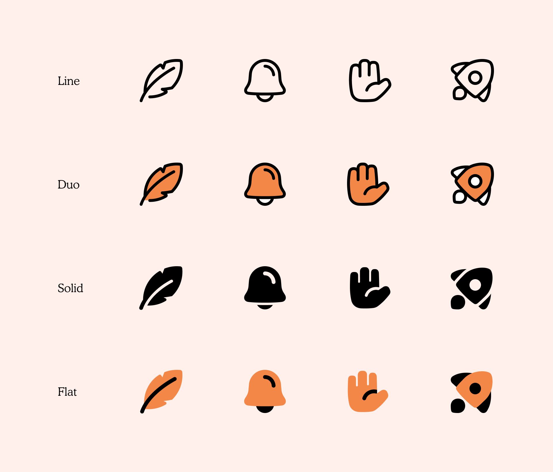
Like the other sets that are part of our Icon System (Core, Flex and Sharp), Plump icons come in four different styles. Line and Solid are especially suitable for designs where you need to use a unique set of icons but don't want to steal the interest from other elements. Duo and Flat are really useful if you want to illustrate specific features or characteristics and allow your users to understand them with a simple and quick glance at these icons.
100% Cute
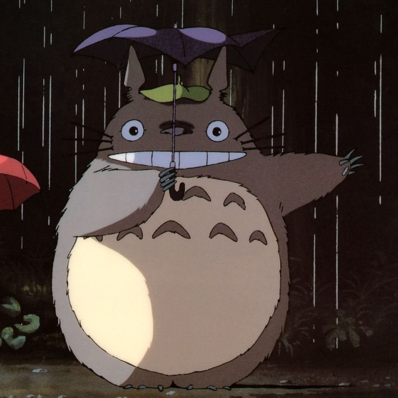
Plump was initially inspired by different icon collected before starting the project. But as we later defined Plump’s unique personality, we took some animated characters as inspiration to create these chunky and friendly icons.


Good vibes only
The search for a unique style
Plump brings out the friendly personalities of its users and it's probably one of the very few icon sets on the internet that have this chunky and curvy look, but it wasn't easy to define the style for this set. While translating the first sketches into vector graphics, we followed the grid and tried different line endings, corners and ligatures until we found the perfect style.


A spacious grid
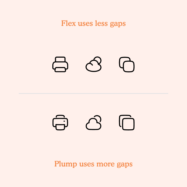
All Plump icons were built on a 48x48px grid, which helped to give the set a clear formal continuity and a visual rhythm by creating spacious and chunky signs. Line and Duo use 3px stroke and gap widths to maintain legibility of the icons inside their grid. Meanwhile, Solid variation (and some Flat icons) uses a thicker stroke (mainly 5px) with 3px gaps to keep the balance between the stroke and the solid shapes in each icon.
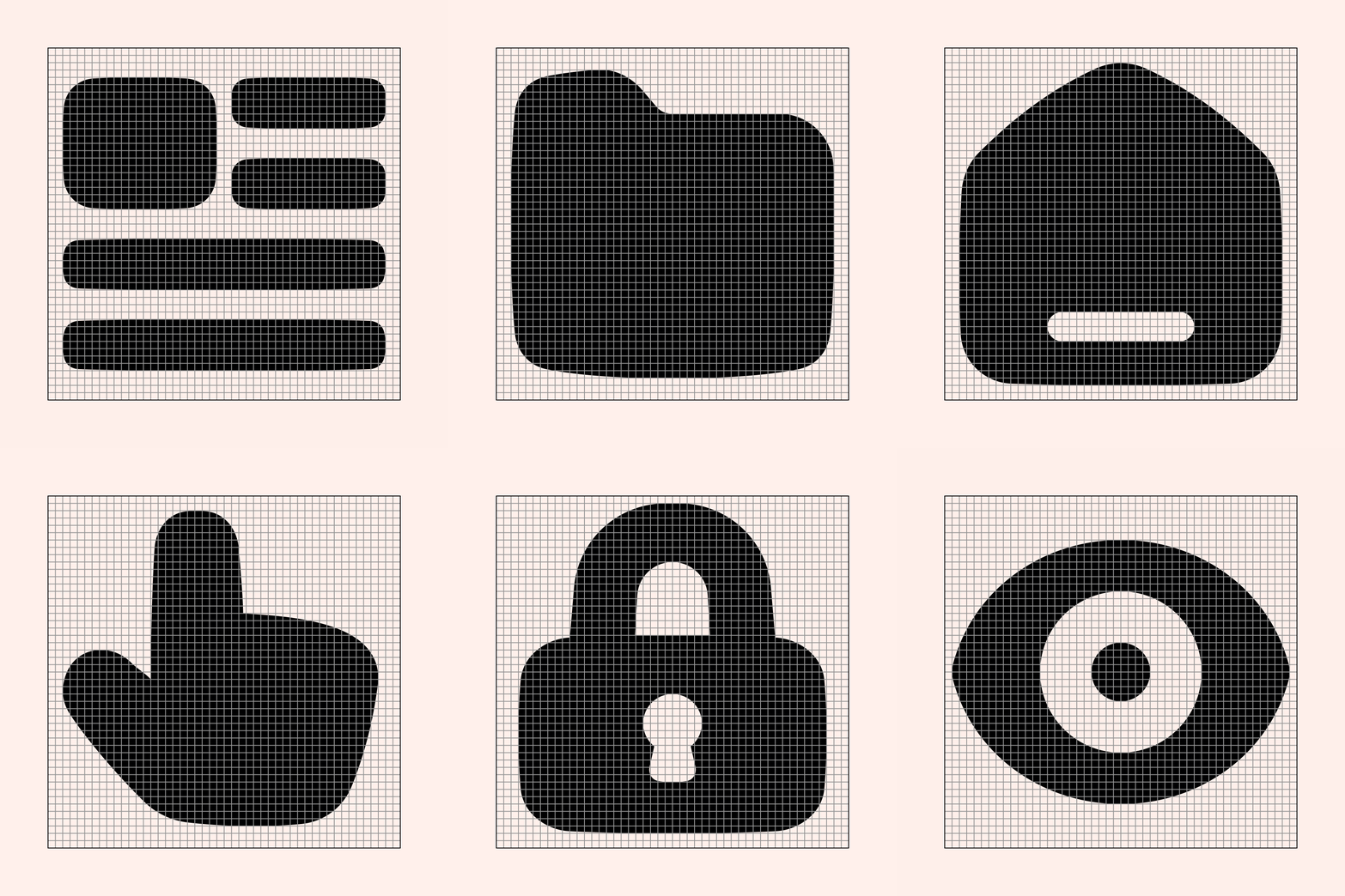
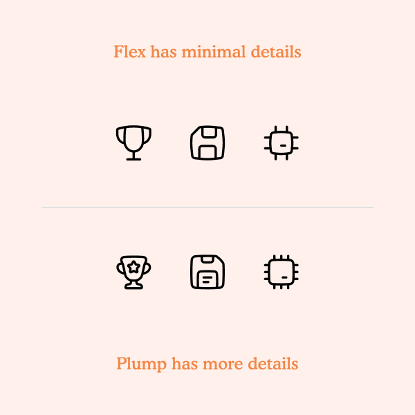
Compared to Core, Sharp, and Flex, Plump’s larger grid allows more details to be used in the icons while maintaining its legibility.
Trial and error
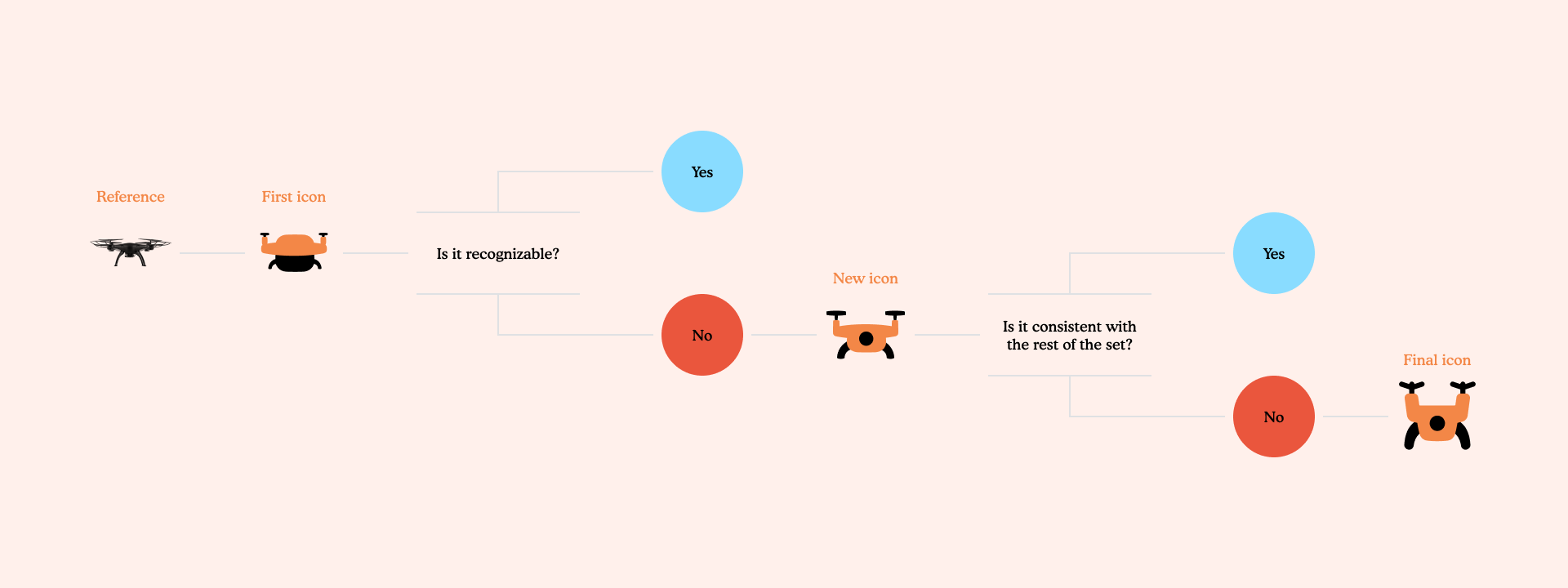
We evaluated each icon based on two aspects: the relation between the icon and what it represents (is it recognizable?) and the relation between the icon and the other icons (is it consistent with the rest of the set?). Through a feedback and redesign process, we ended up finding the best possible solution for some of the most conflictive icons.
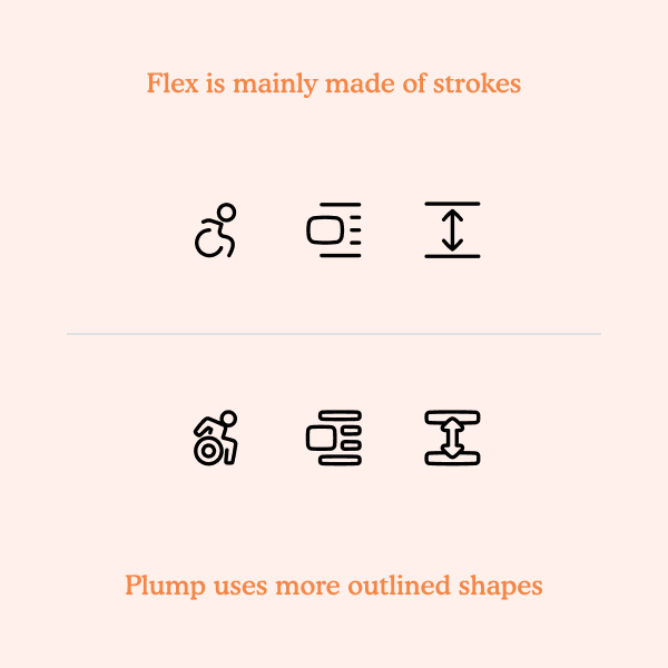
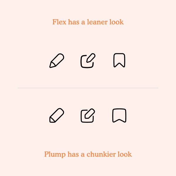
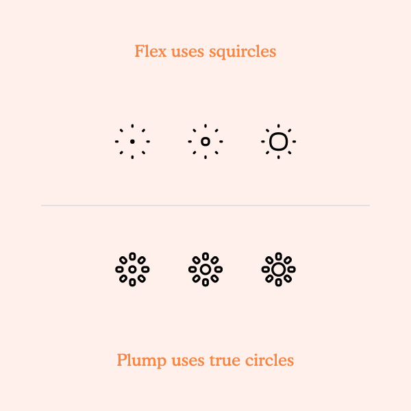
Also, at some point during the design process, we realized that Plump had some similarities with other of our sets, Flex. We then took some time harmonizing them to make sure that Plump and Flex have significantly distinct personalities while still aligned to the Streamline Icon System.
When to use Plump icons?
Plump it’s suitable not only for UI but also for marketing and illustrative purposes. People can use it as buttons in their apps, to help explain their website's features, insert it in their articles, and spruce up their marketing content. It’s also perfect for flash cards.
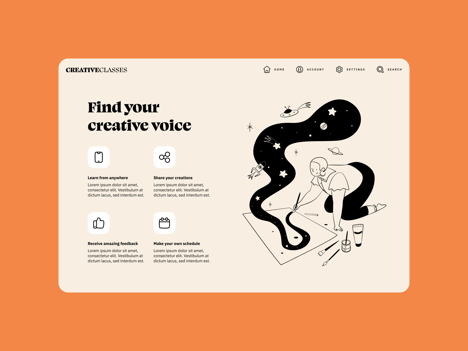
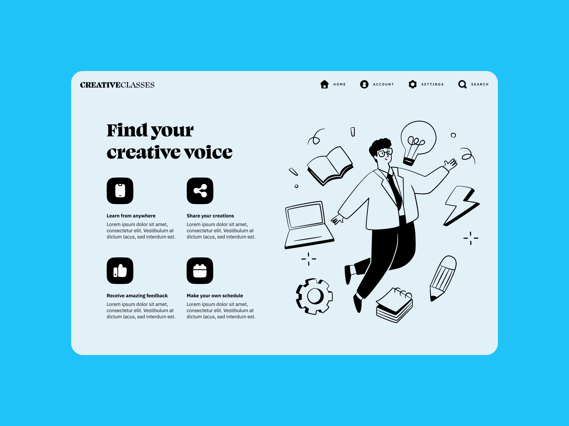
Website design — Great for illustrating features
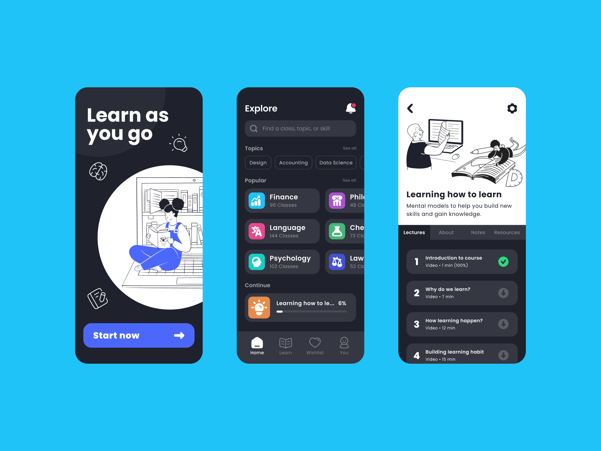
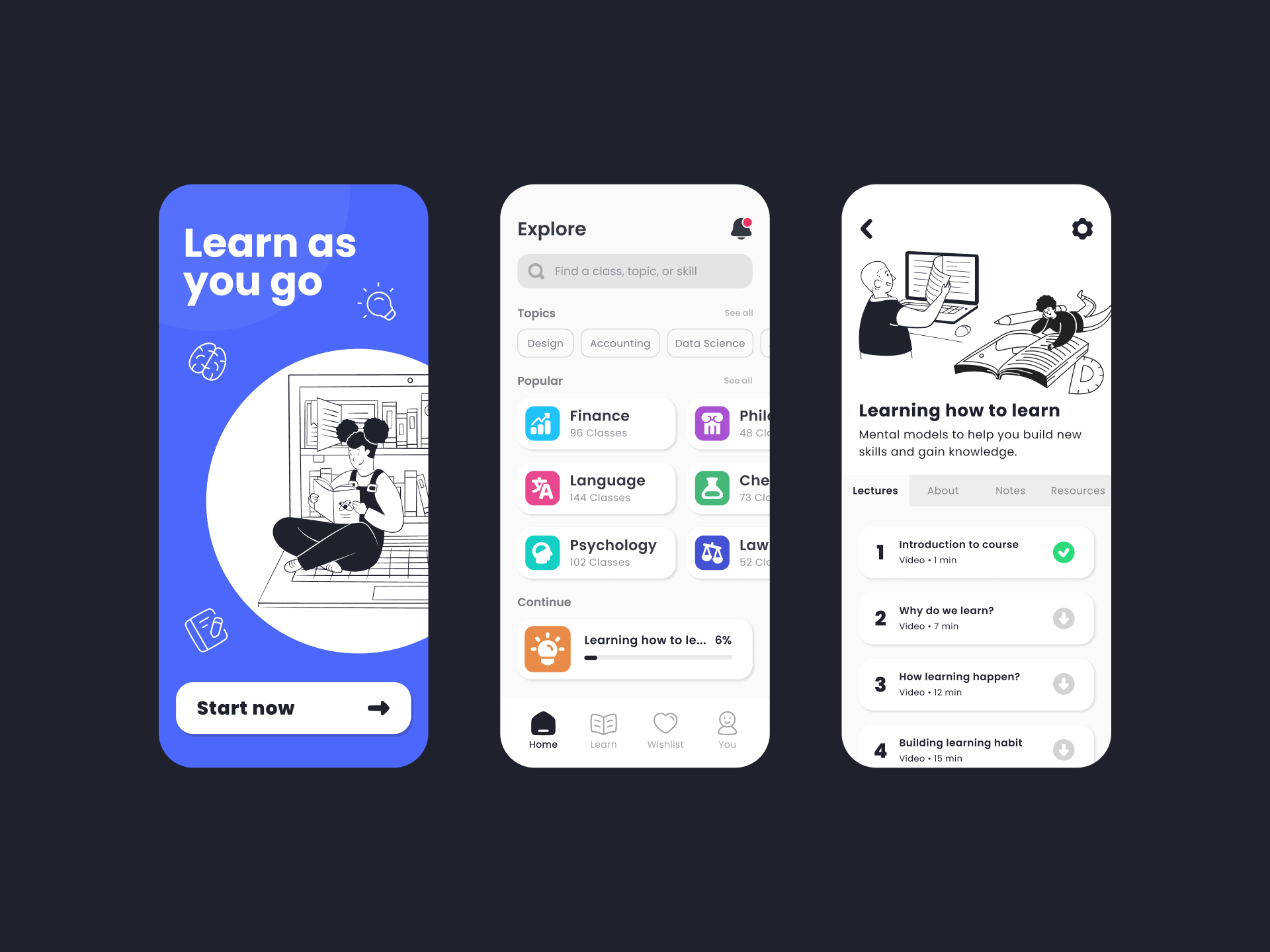
App design — For a more colorful and easy-to-navigate project

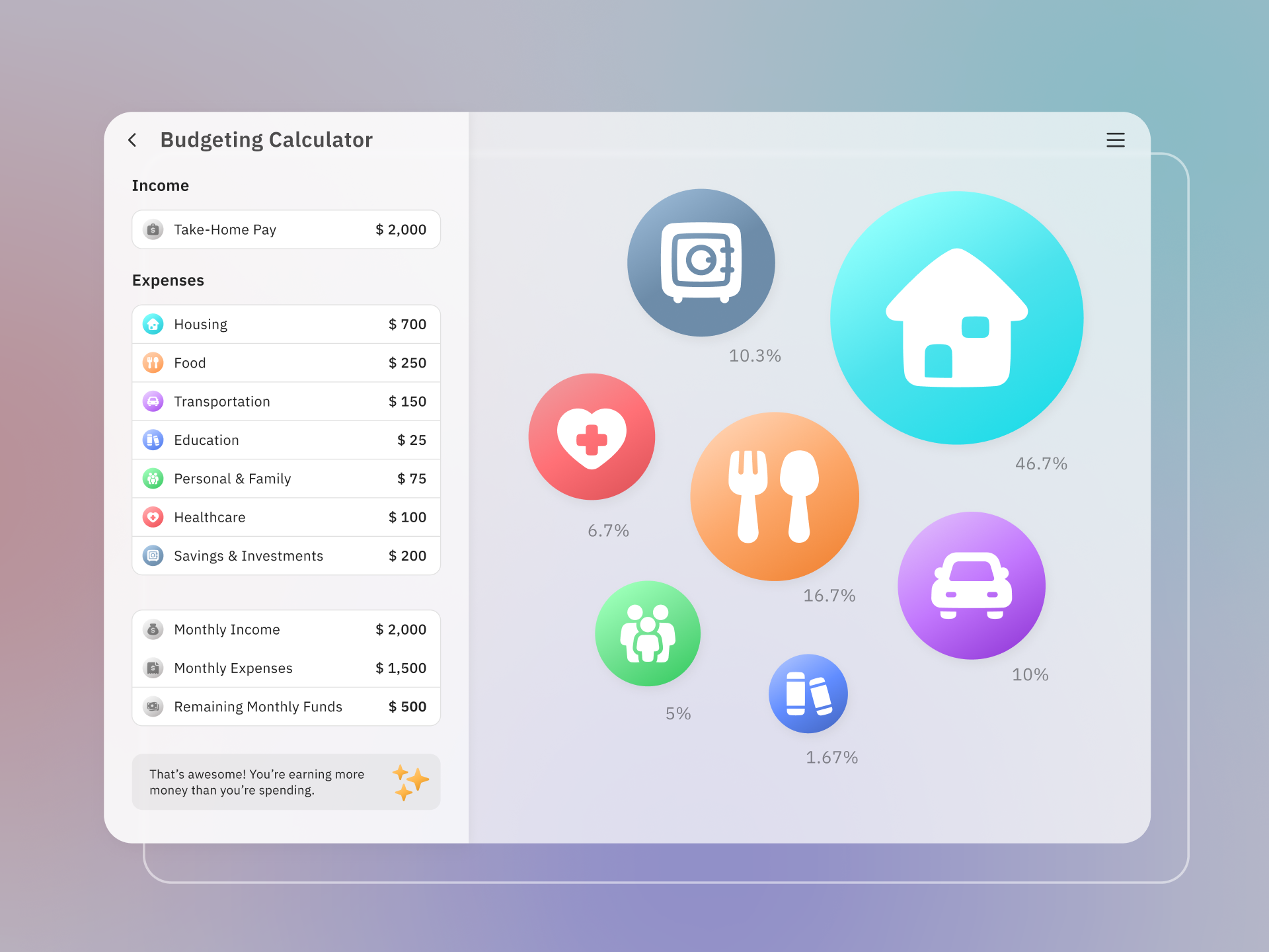
Infographic — Communicate complex information with simple icons
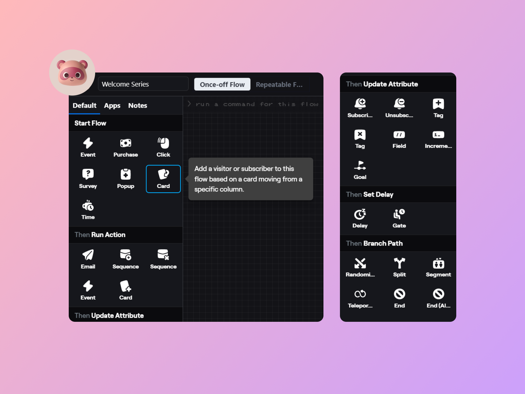
The option to customize the stroke width of the Line and Duo versions and to change the colors of all variations makes Plump a versatile set that can provide many different results with little effort.
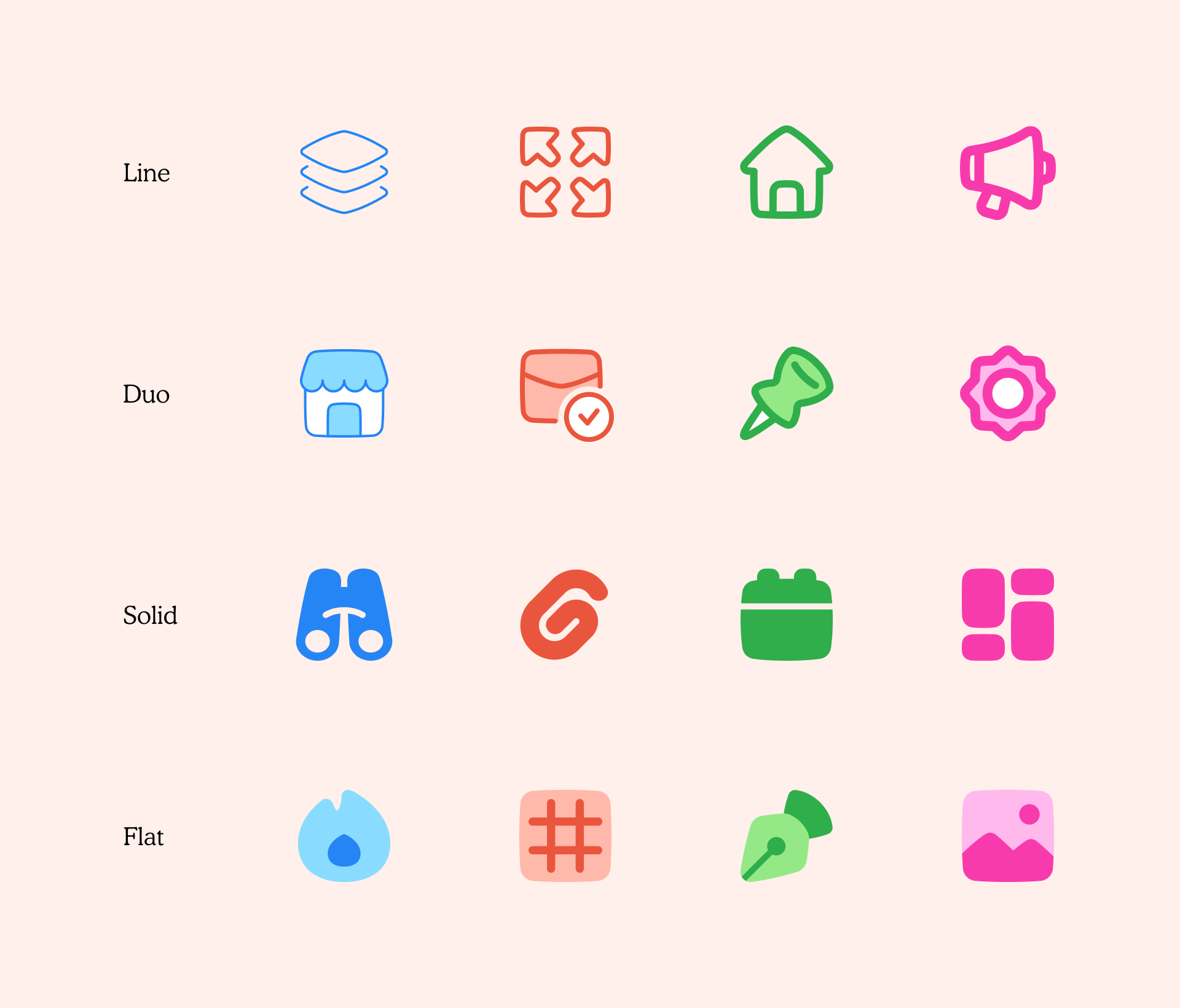
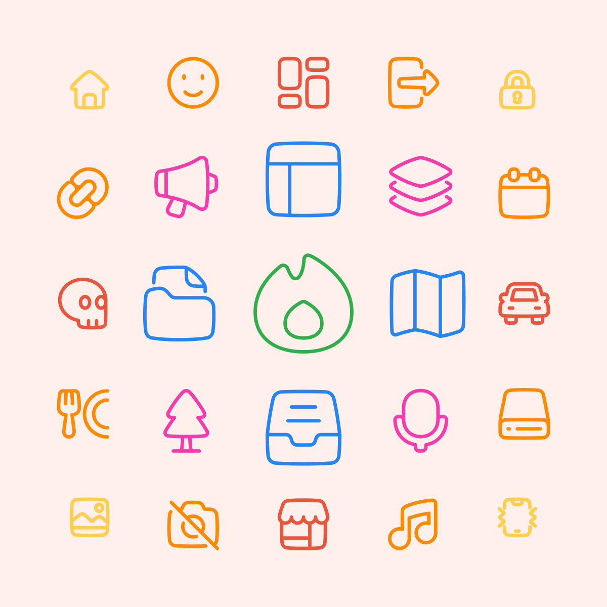
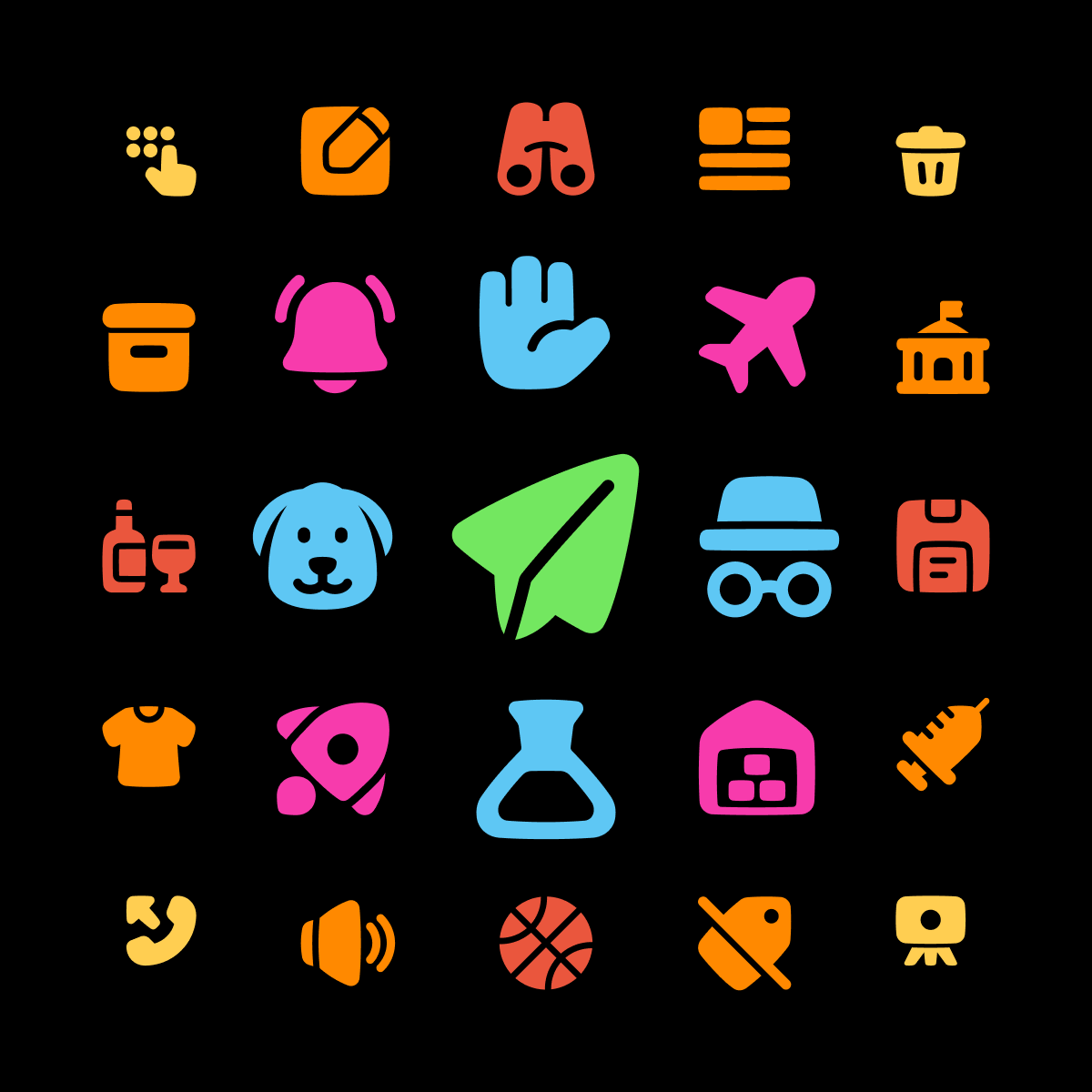
Line icons work best on a light background, while Solid icons stand out on a dark one
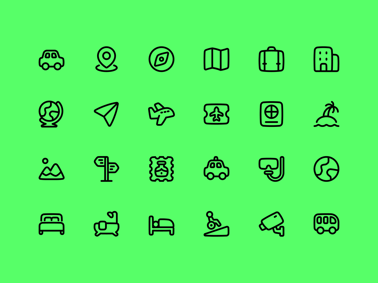
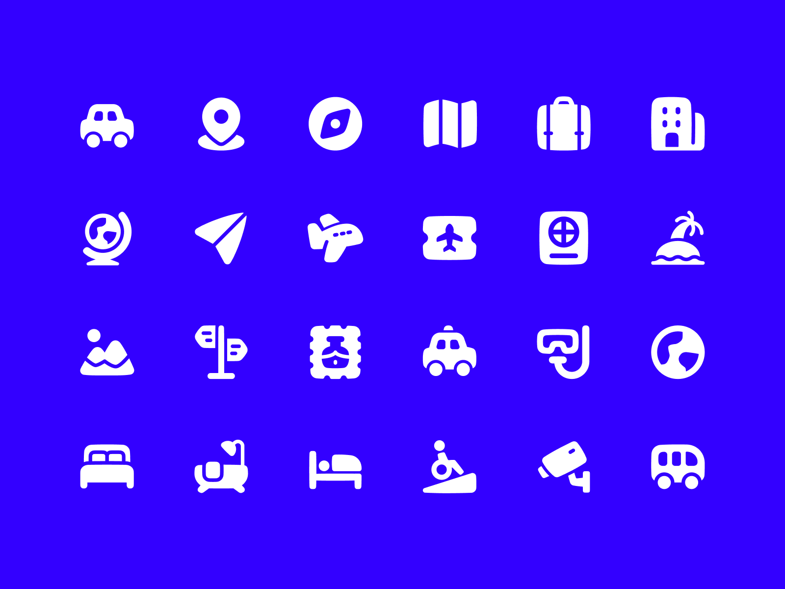
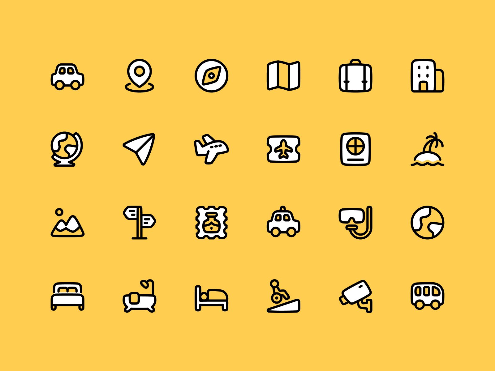
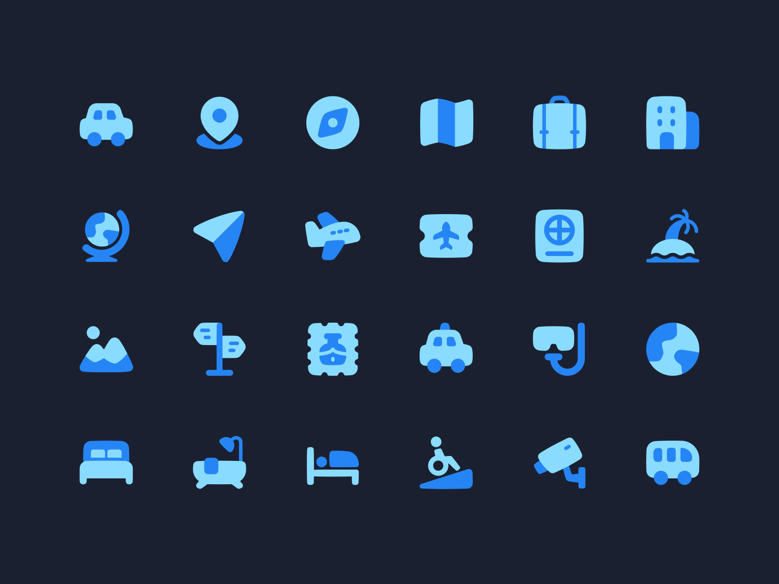
Same set, different outcomes
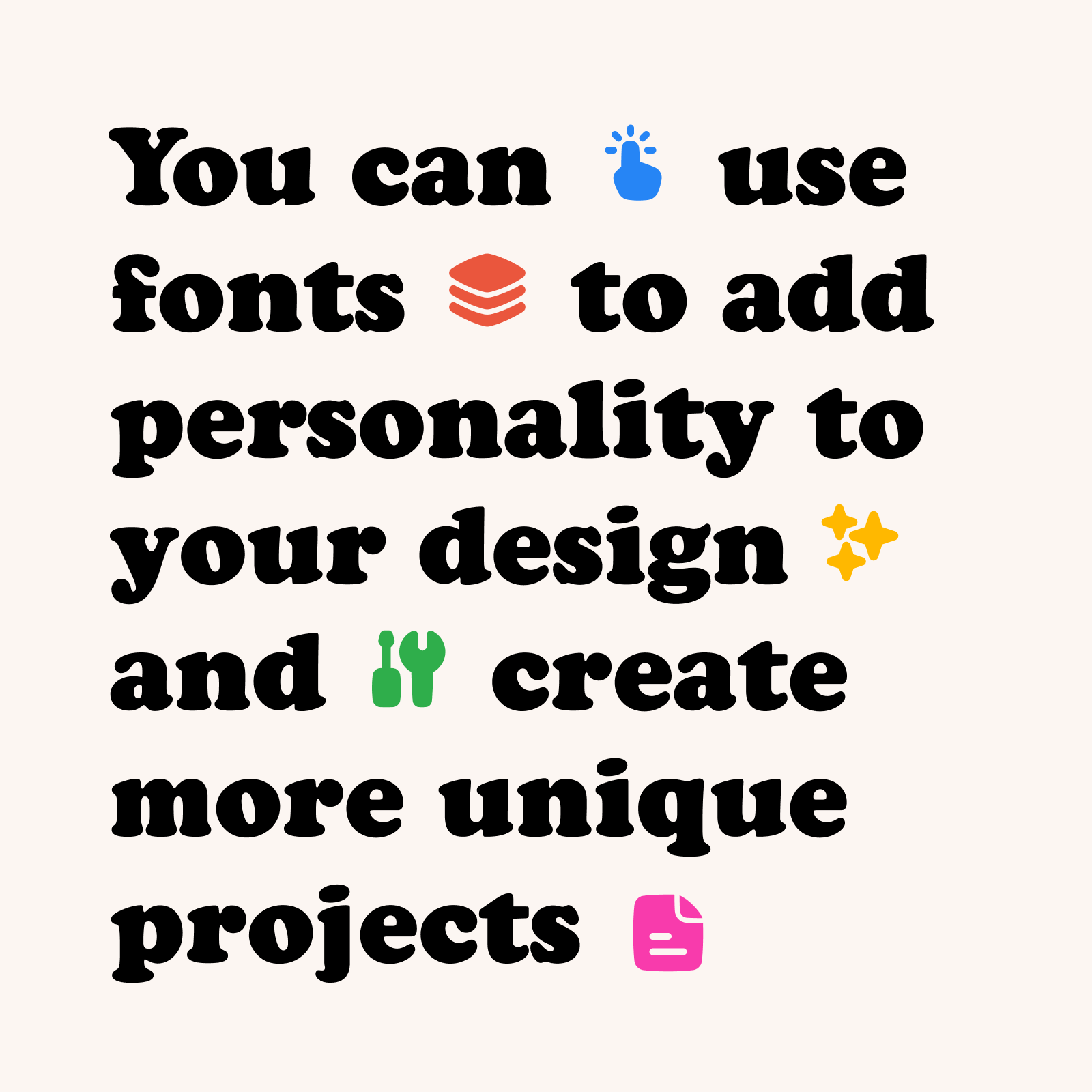
What typefaces should I pair it with?
You can combine Plump with a typeface that has more personality than the usual sans serif font. Some interesting examples would be Brice or Obviously, but you could also use a typeface like Cooper, whose soft serifs and overall chubby look can easily relate to Plump's shapes.
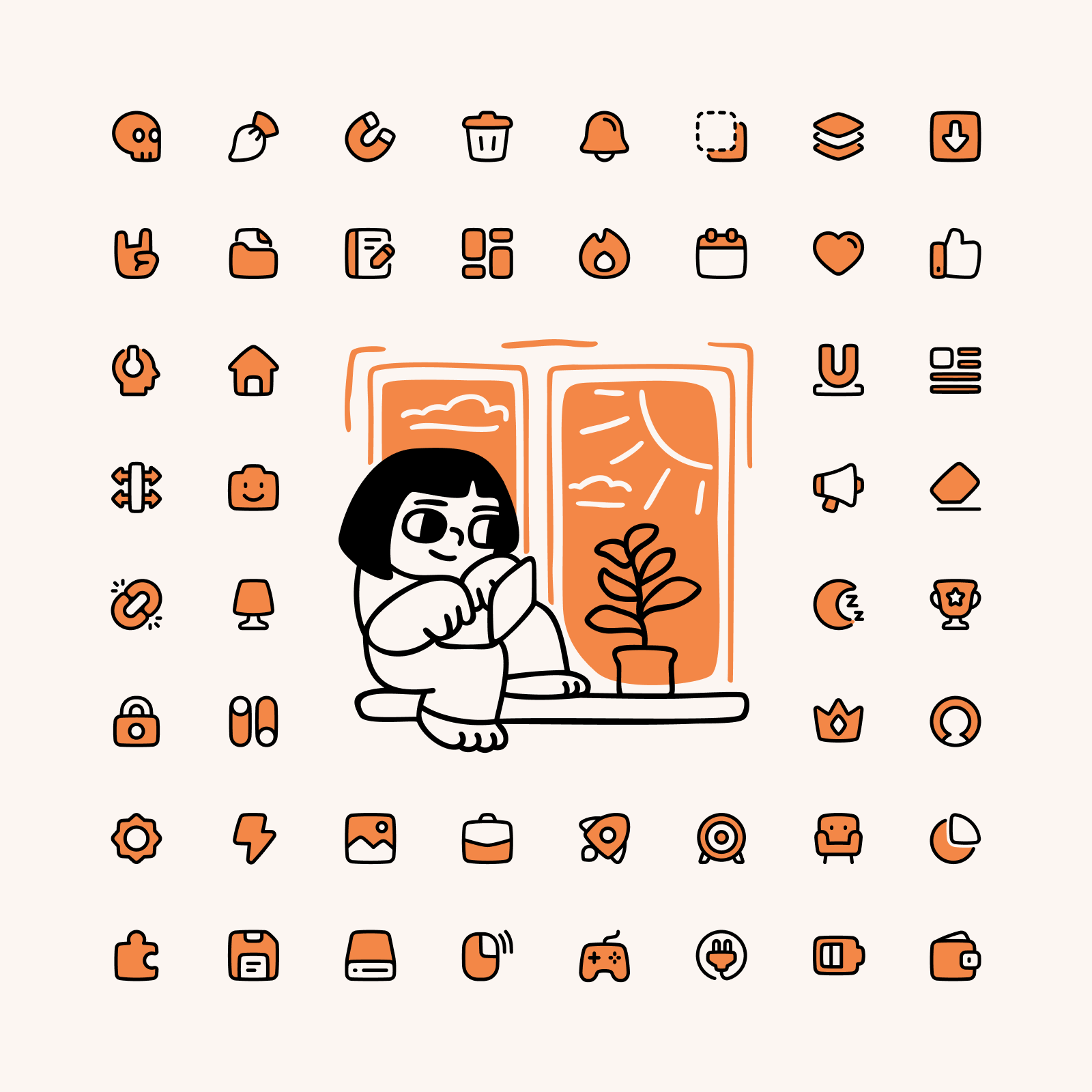
What illustrations should I pair it with?
The hand-drawn and cartoonish look of Plump makes it very easy to combine these icons with illustration that shares the same characteristics. You can go for a fun option like Manila, with a bold style that reminds of the old letterpress printing, or choose a set like Milano, which takes a more minimalist and elegant approach.
But if Plump is not the set you need, we've got you covered. If you’re looking for simpler set that works best at small sizes Flex is the best alternative, specially if you want to keep the friendly look that Plump icons provide. On the other hand, if you’re looking for a bolder option, Stickies is a set that fulfills a strictly illustrative function with its more naïve approach.


