Flex – Fluid icons
A friendly set with elegant and smooth curves. Our curvilinear style brings fluidity and dynamism to your designs.
"Nature is always more subtle, more intricate, more elegant than what we are able to imagine."
— Carl Sagan
This is how astronomer Carl Sagan refers to the complexity and beauty inherent in nature, to the shapes and landscapes that we take for granted but are generally beyond our comprehension. We've spent months creating this set that rejects the strict and perpendicular lines traditionally used in icons. Our curvilinear style brings fluidity and dynamism to your designs.
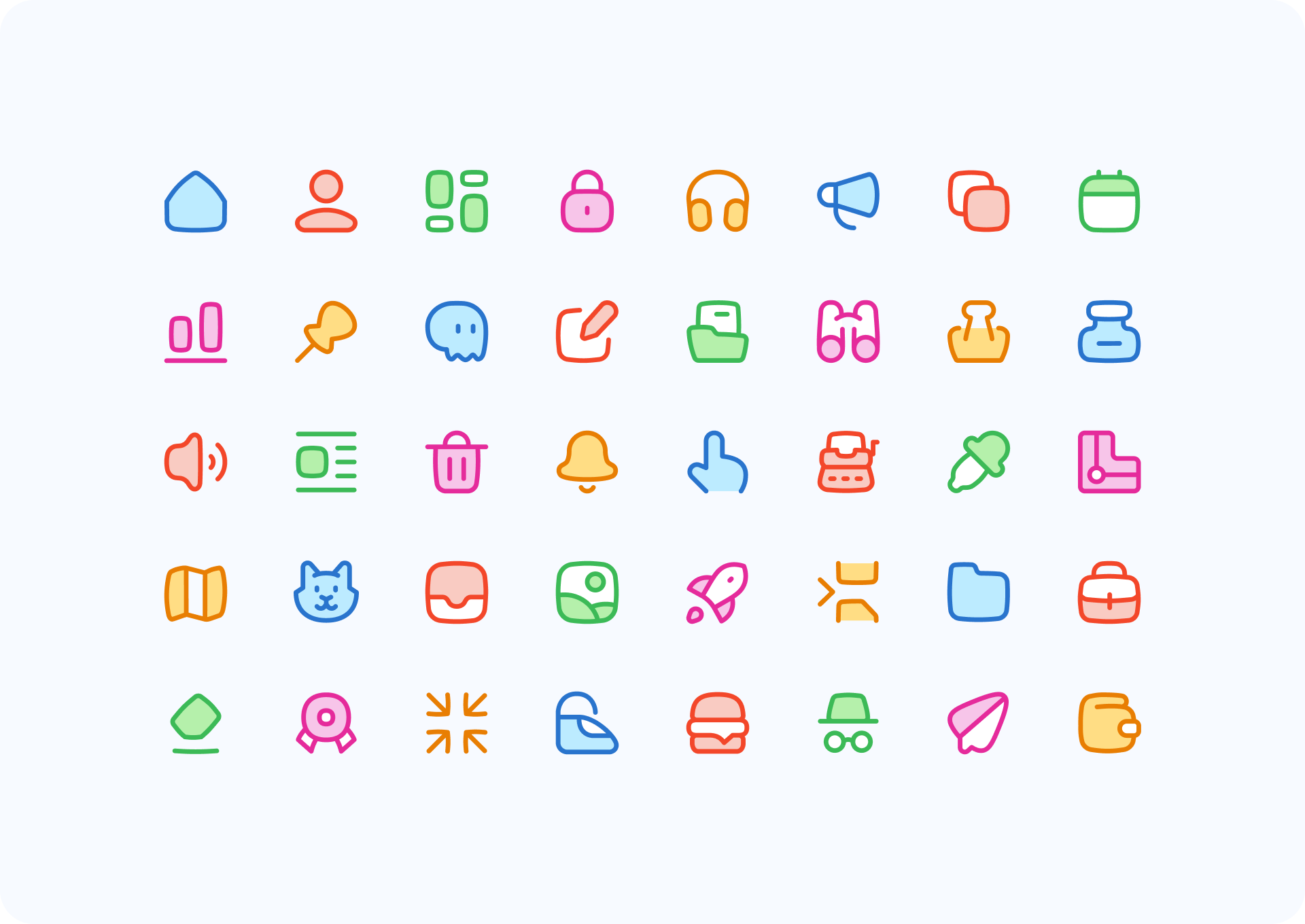
Nature comes in many forms
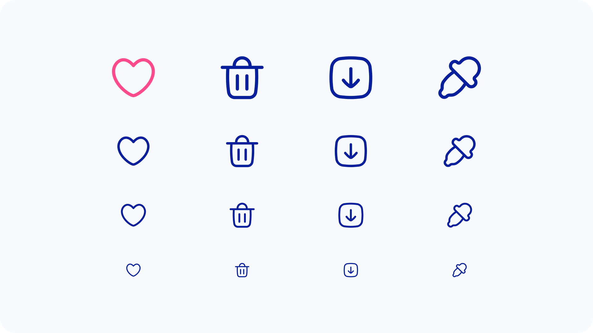
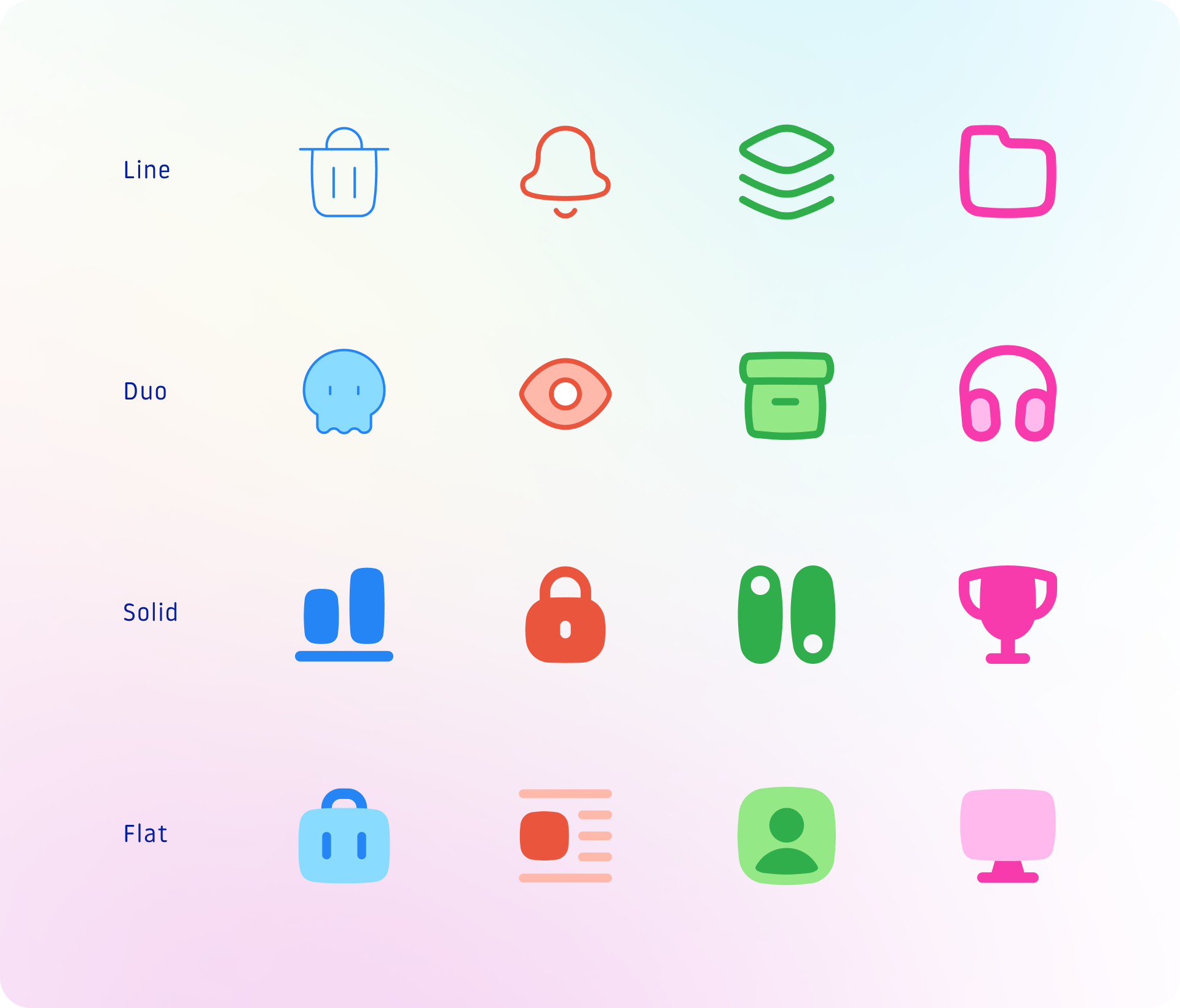
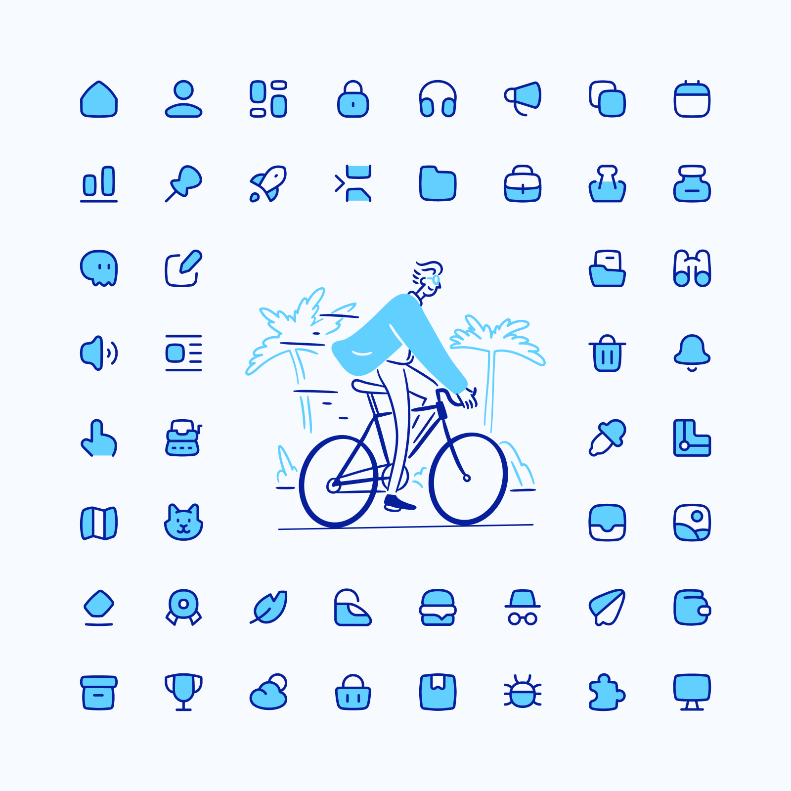
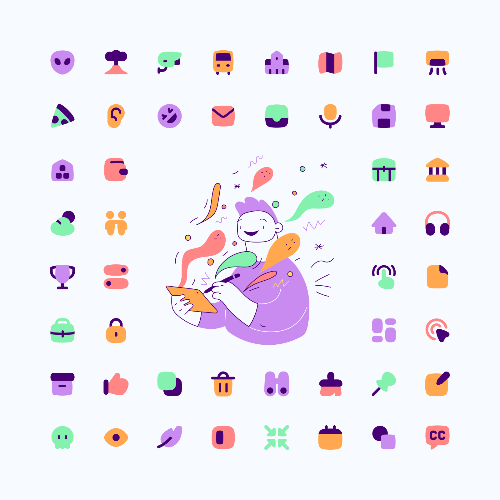
Flex icons are suitable for many contexts, and each style variation comes with more than 2,000 icons. The switch between variations (specially between Line and Solid) isn’t based on pushing a button, but on an almost handcrafted process in which we had to redraw and tweak most of the icons.
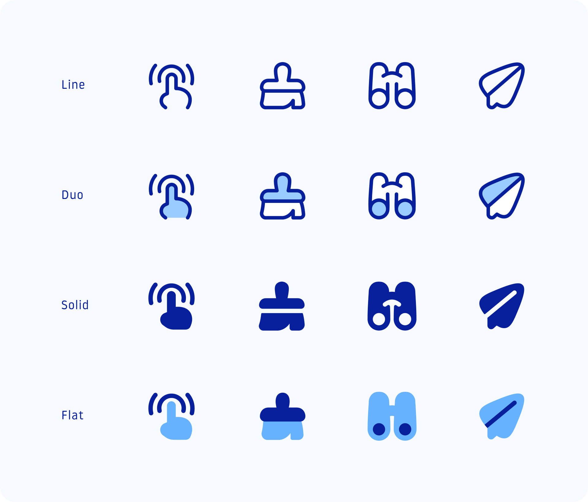
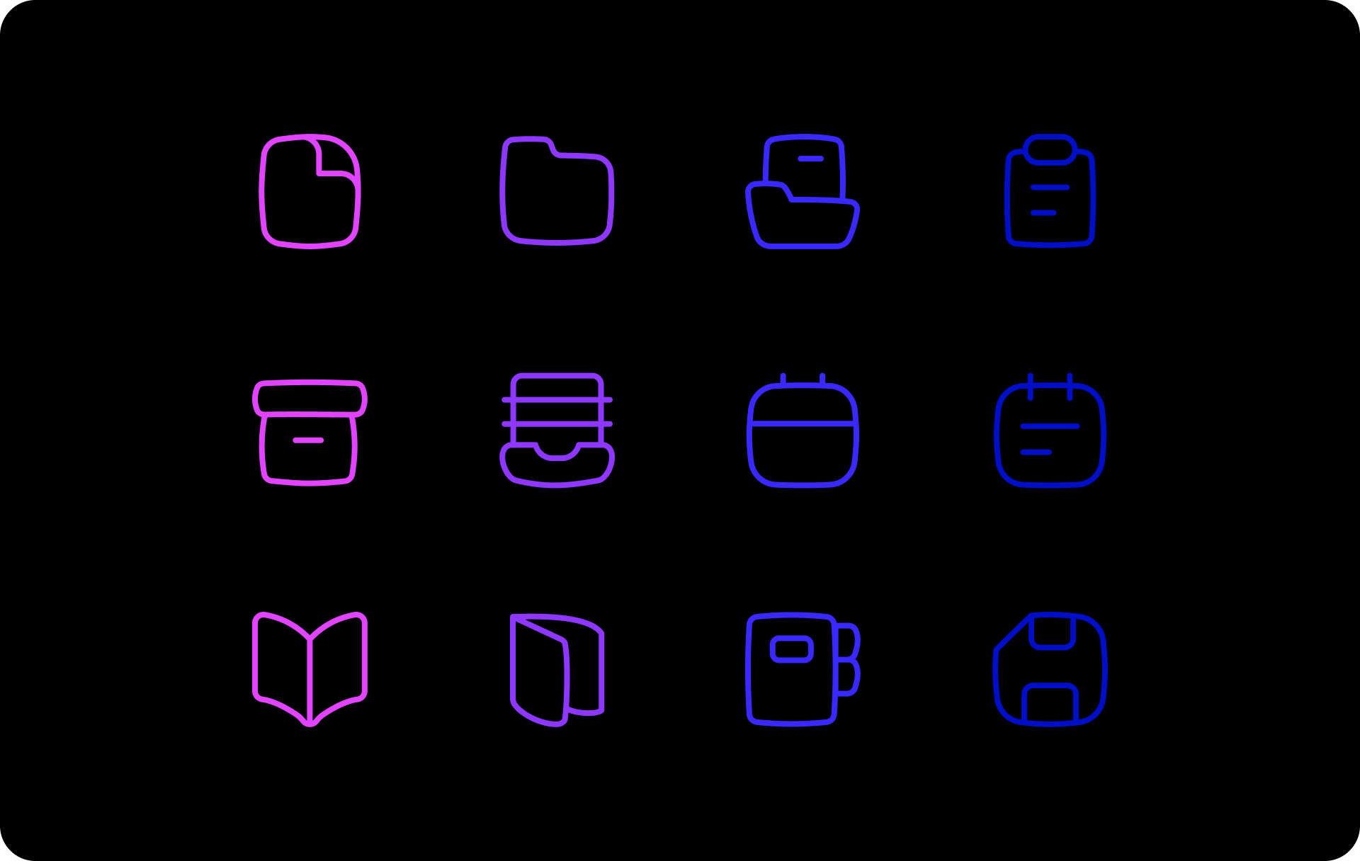
- Line is the most neutral and versatile style, it gives priority to the other graphic elements that are part of the project.
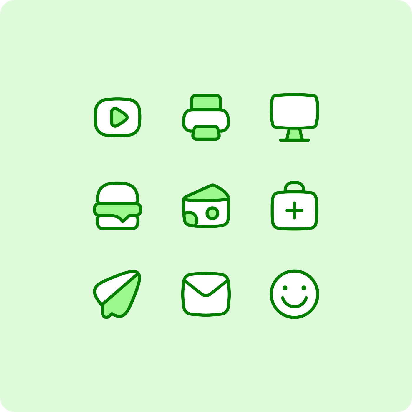
- Duo is a more joyful alternative, they are great to match your brand needs thanks to their customizable colors.
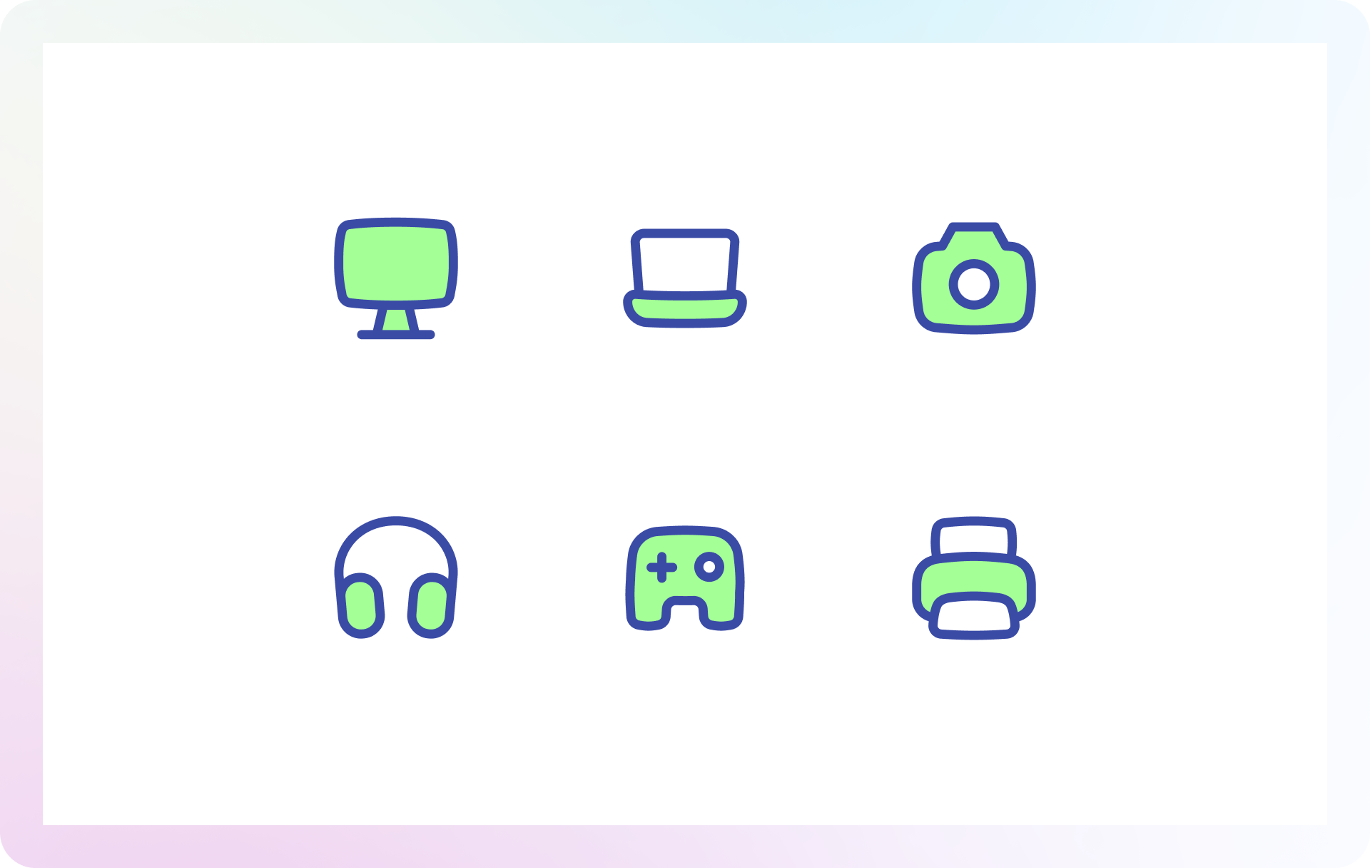
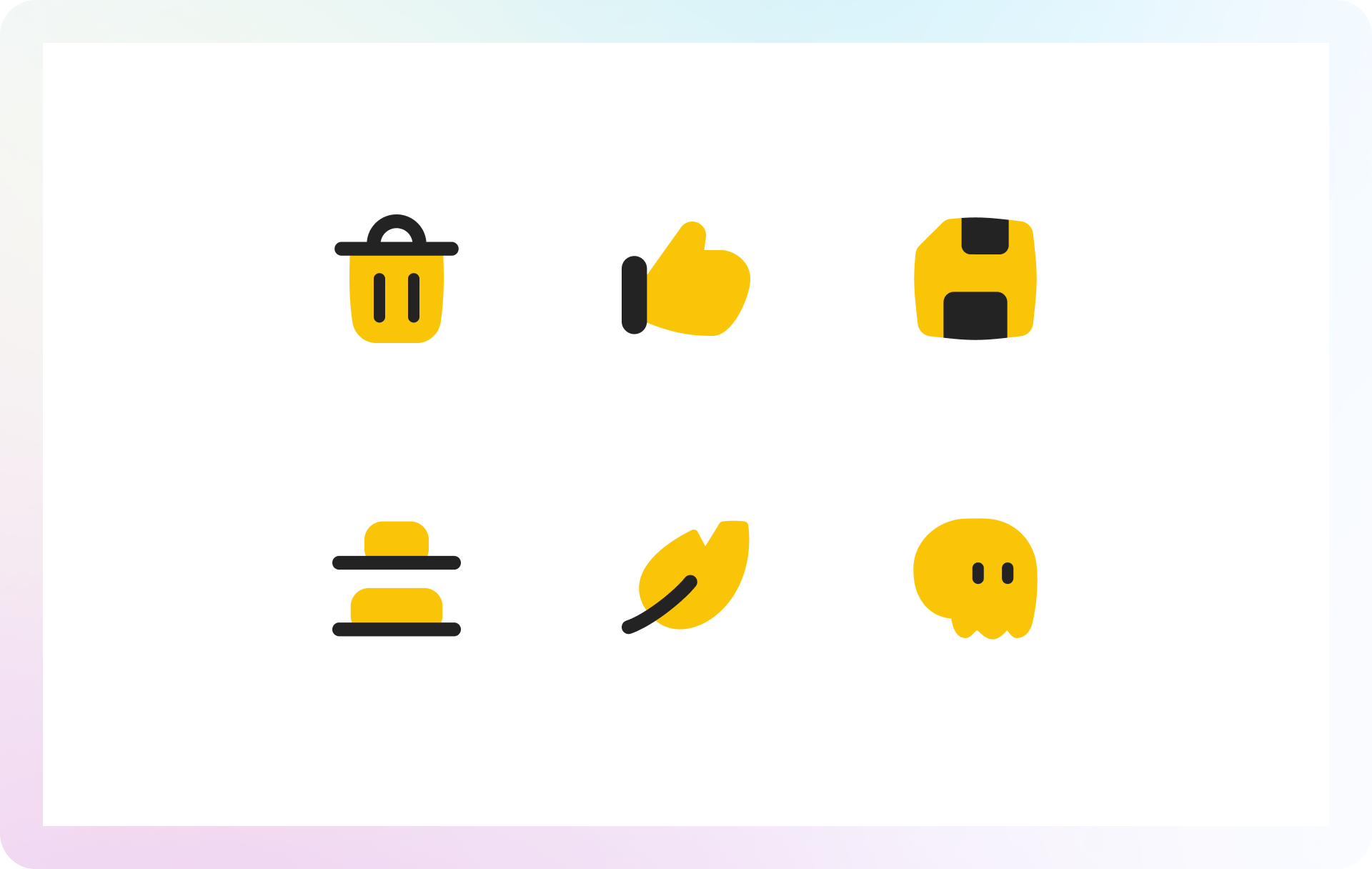
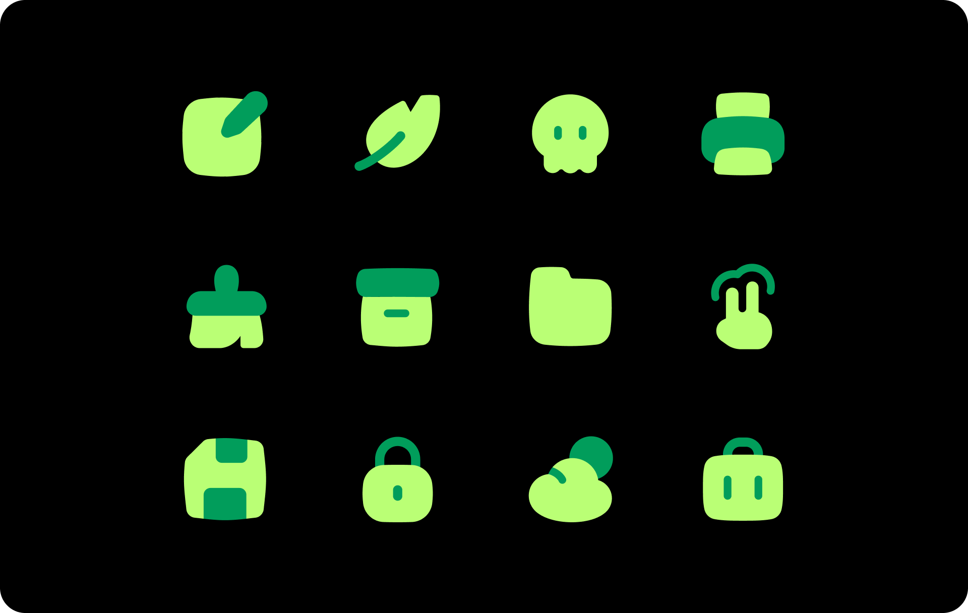
- Solid icons have a bolder look and are perfectly legible at small sizes, great option when you need to create a more impactful design.
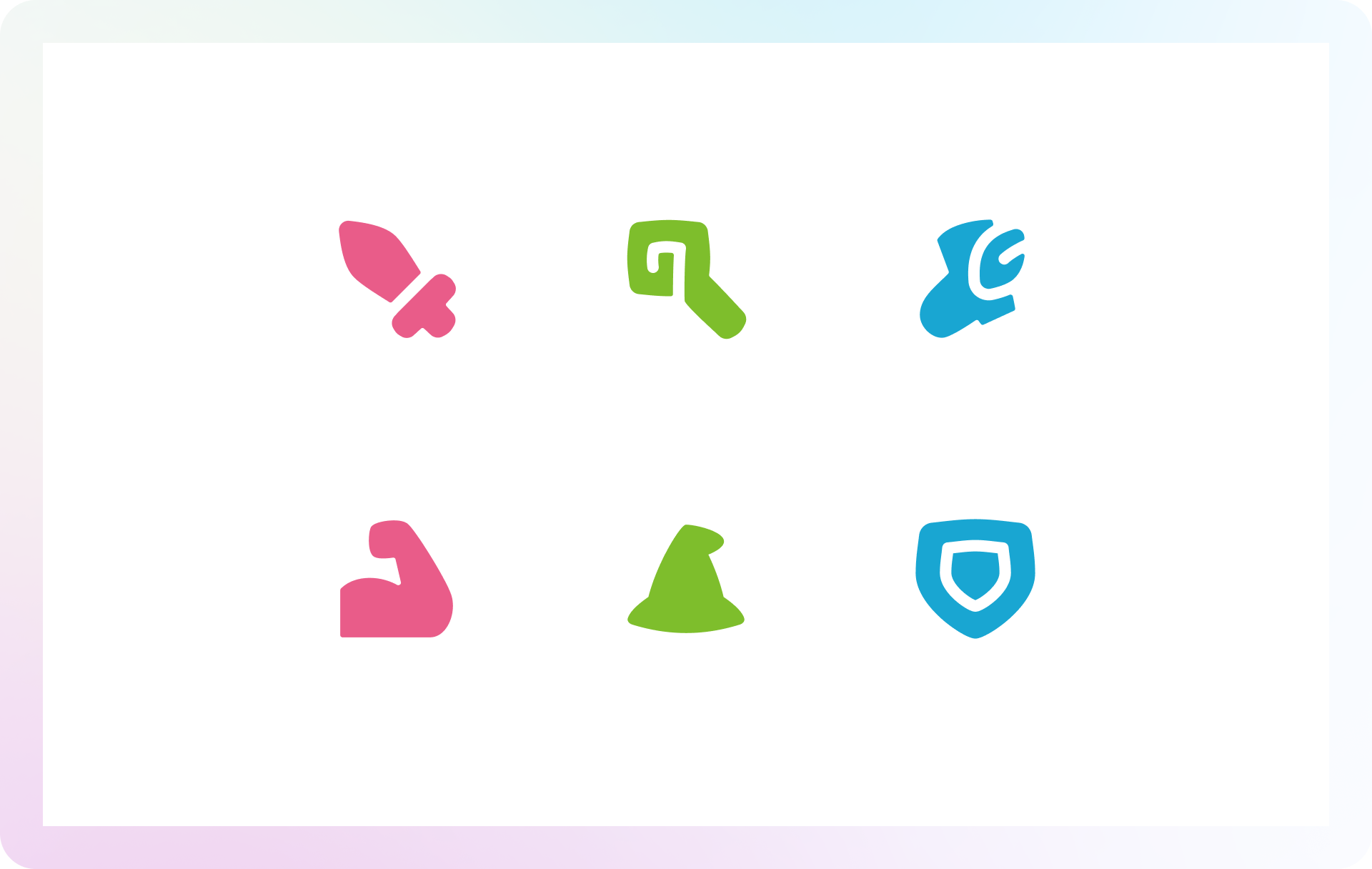
- Flat serves a more illustrative purpose and works great at larger sizes thanks to its flatter and colorful look.
Pure dynamism
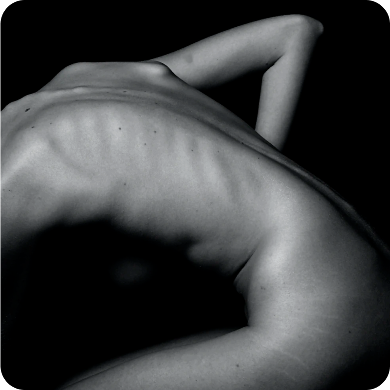
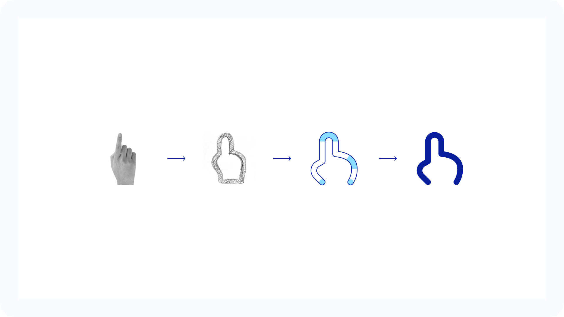
Curves have a calming and soothing effect on users, reminding them of the natural curves of landscapes or the lines of human bodies. We were inspired by nature to create these icons, they exude a sense of naturalness and friendliness.
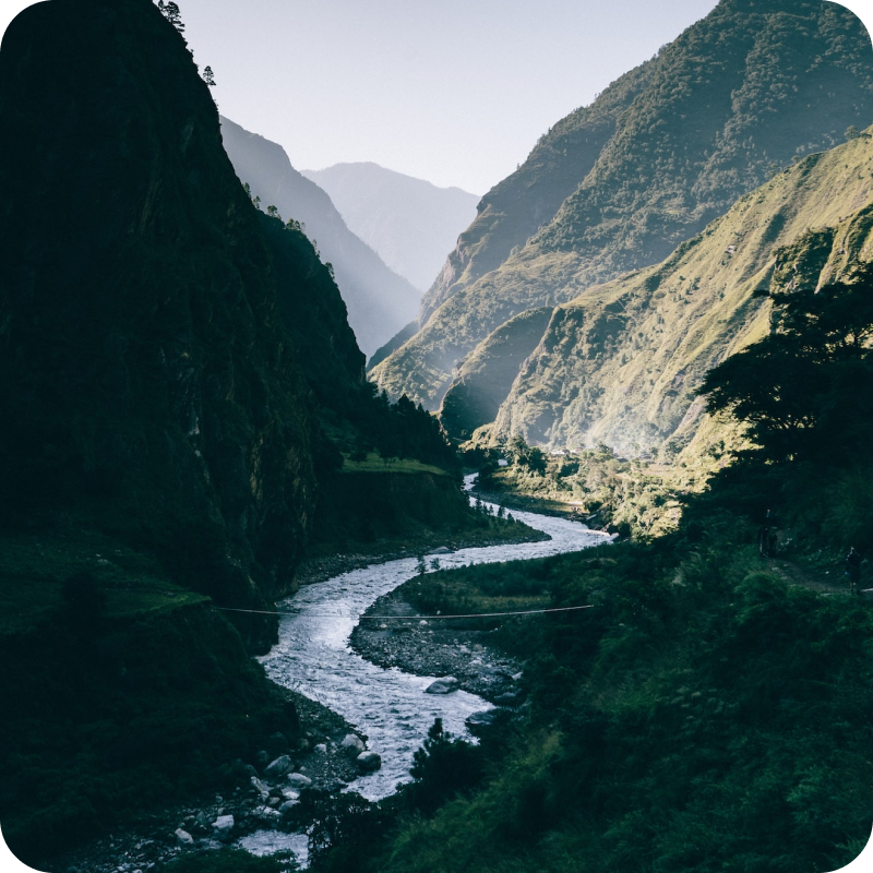
Organic shapes that inspire organic icons
Friendly and smooth
Flex icons were conceived with the purpose of offering a curved and modern set that would cover the need for more unique icons without giving up what makes our sets unique: legibility and consistency.
Flex is the perfect choice for when you’re looking for a set with a little more personality than your usual rounded icon family. Giving the set that unique look without compromising the legibility and simplicity of the icons was a difficult challenge, but the results are clearly visible.
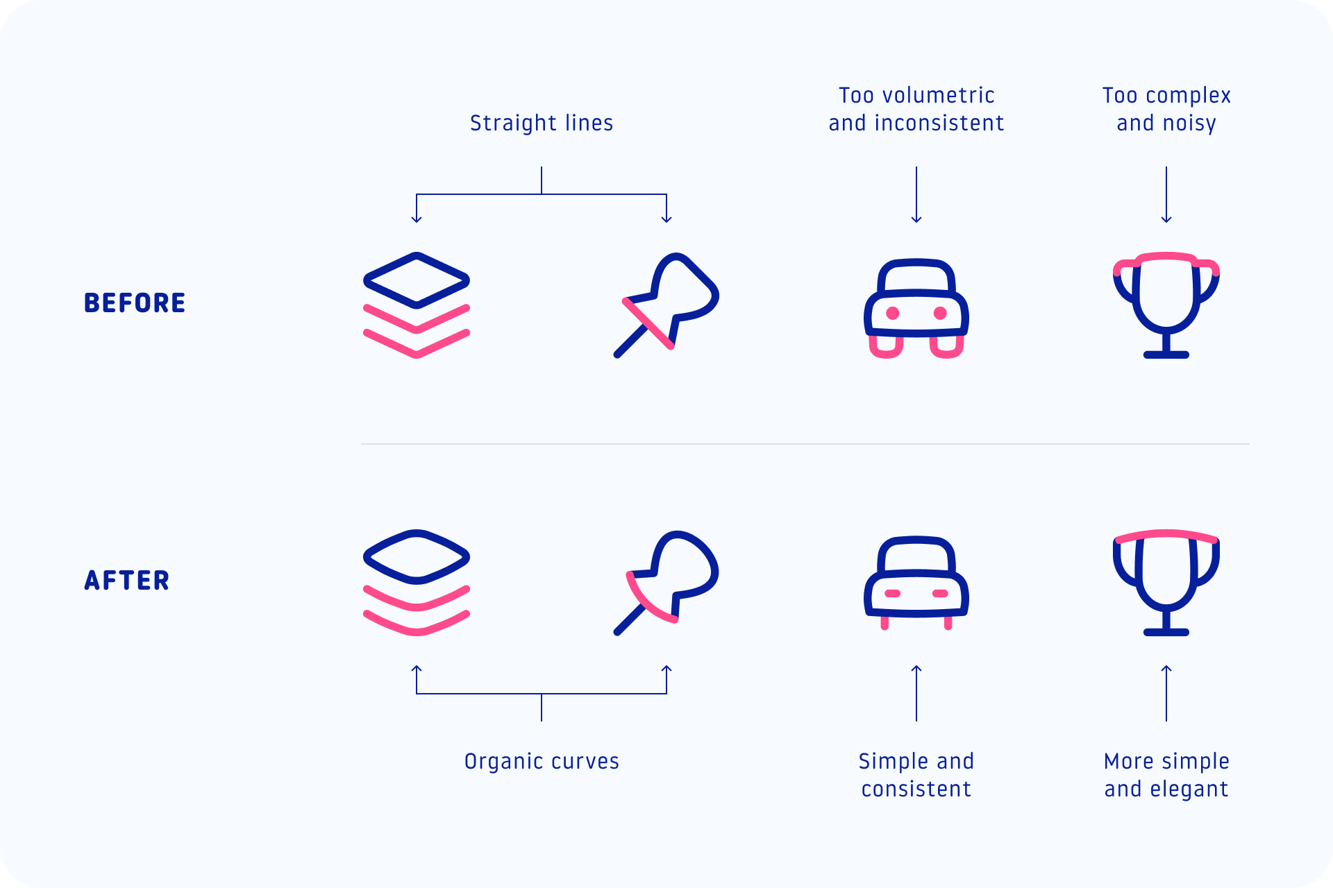
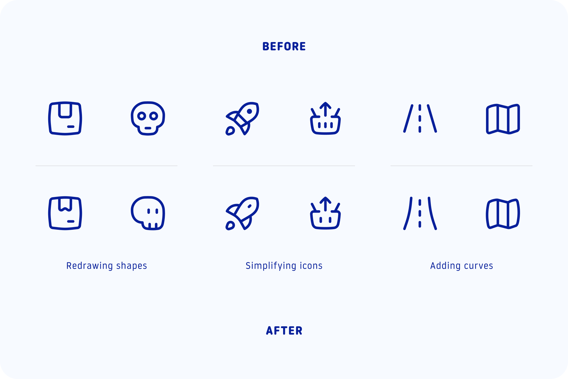
Anarchic yet rational
Although Flex icons use smooth curves, the construction of the set is still based on a rational structure to keep the icons legible and consistent. These icons don’t firmly follow the grid, instead we focused on legibility through optical corrections, which gave us an incredible freedom to built the whole set.
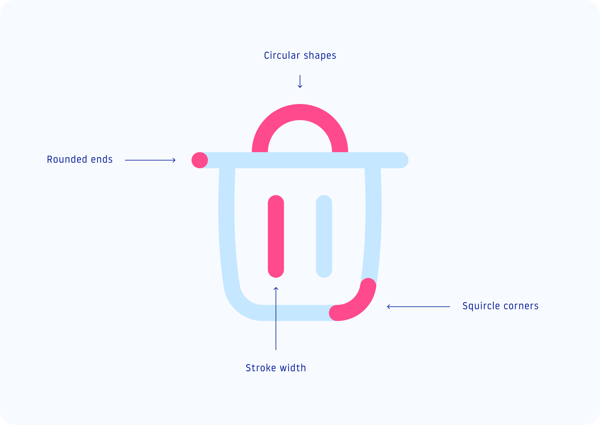
Plus, by using the swelling effect of the curves in the shapes (as if an energy were pushing the strokes outward), we increase the negative space inside the icons. This makes the signs even more legible, without looking too bulky.
Constantly evolving
Like nature itself, Flex is constantly evolving. While creating this family, we spent a lot of time experimenting with shapes and improving previously designed icons to refine the concept and create a balanced and harmonious style.
When to use Flex icons?
Although they follow the same formal rules, each Flex variation serves a specific purpose and has its own unique characteristics. You can combine line and solid icons to show active/inactive states, use color for a more eye-catching design or go simple and use black and white for a sophisticated and minimalist approach.
Customize stroke and colors in seconds
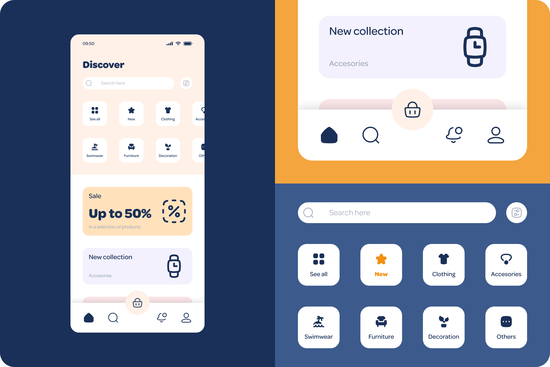
It's a joy to play with our Flex icons, you can easily modify the stroke and colors with our Streamline app or any other vector software, like Figma, Adobe Illustrator, Sketch, etc. See how you can give them a unique look with a few small adjustments.
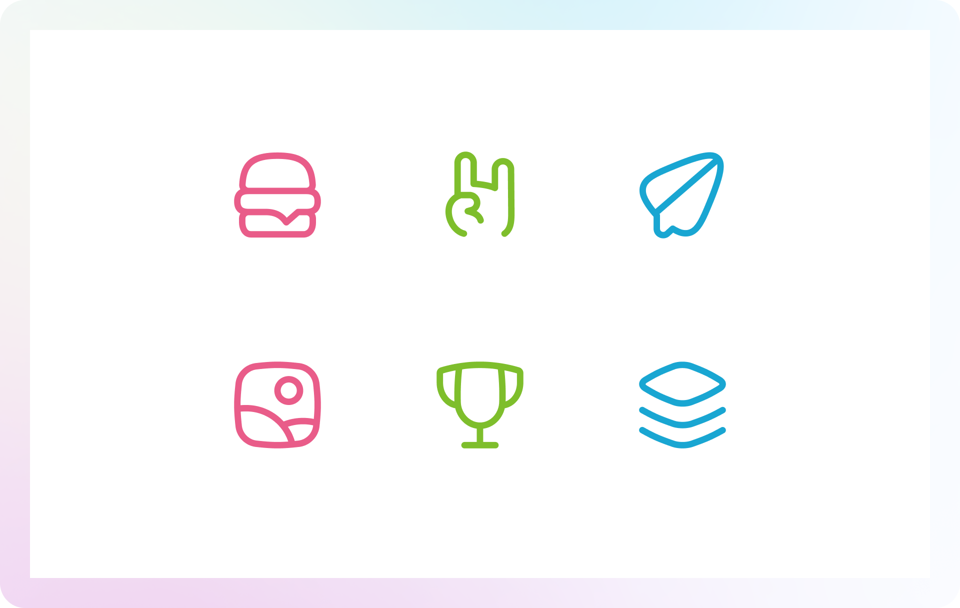
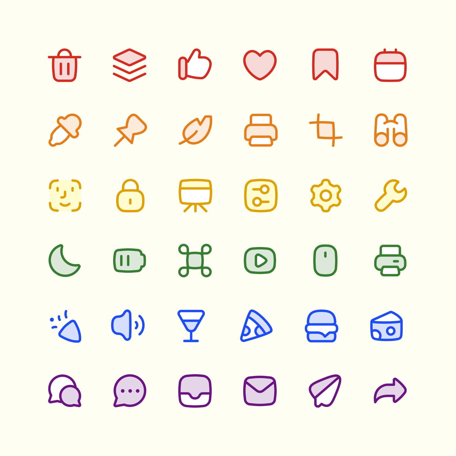
Color variations for Line, Duo, Solid and Flat

Have fun playing with these icons to find the perfect version for your project
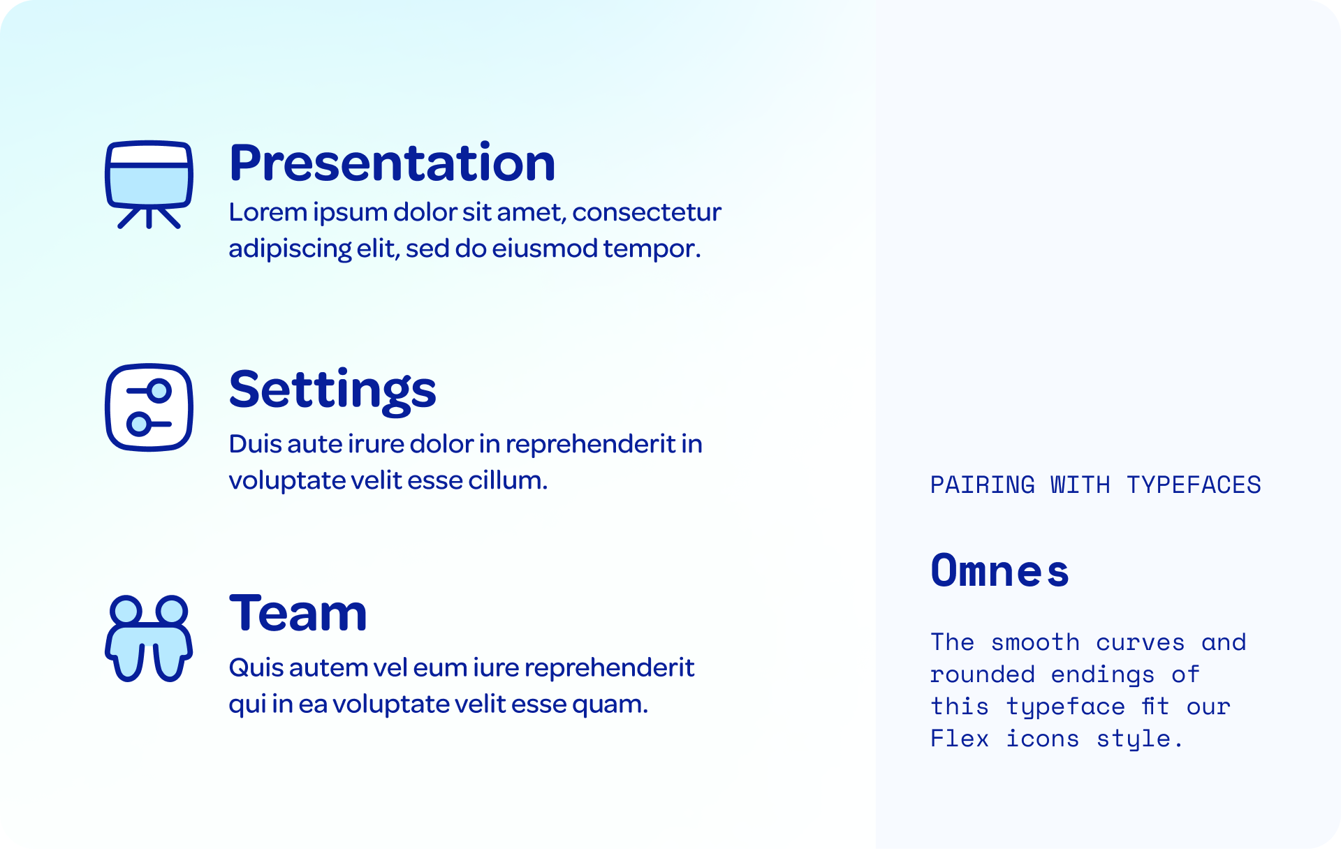
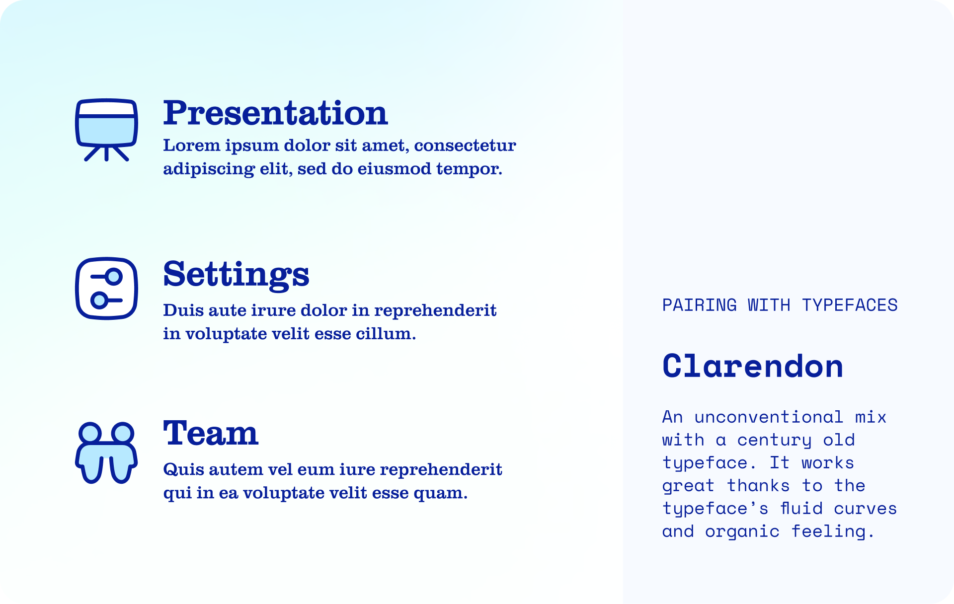
Flex 🤝 Typefaces
Flex icons work great with typefaces that share the same spirit of fluidity and dynamism. Use fonts with smooth curves, rounded ends and large negative space to create a cohesive and impactful design system.
Omnes (Darden Studio)
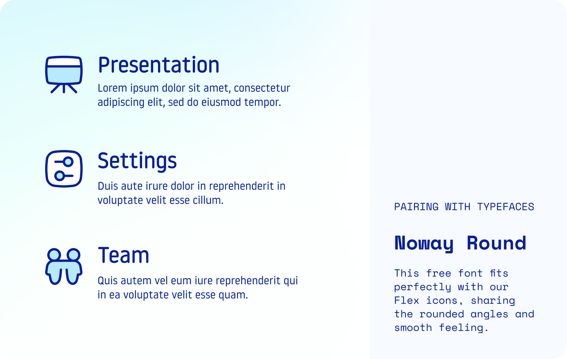
Noway Round (Atipo)
Clarendon (Linotype)
What illustrations should I pair it with?
If we focus on Flex construction we'll find that modern illustrations with an organic and energetic touch can fit very well with them. Within our assets we can find sets like Brooklyn, a tendry style with a clever use of accent color, or Barcelona, a more familiar and naïve set with a really fun energy.
And if Flex is not exactly what you need, you might want to check other alternatives we have in our library. If you don't want that extra personality, Core might be a good option thanks to its neutral and timeless look. On the other hand, if you’re looking for a more personal and unique set, Plump is a family of chunky icons with friendly looks that work better at large sizes.


Ready to play with Flex?
Flex — 500 Free icons
Try for free our vector icons. Customize stroke and colors in second. Paste them in your Figma, Illustrator or Sketch files as vectors! ⚡️
Using Powerpoint, Keynote or other content creation apps? You can paste them as high resolution images. 🙂