6 ways for coloring icons to stand out, and how to use them
Learn the techniques to customise icons colors, so they are both unique and in harmony with your projects and branding.
Color increases brand recognition by up to 80%.
Color for icons is no exception. It makes icons more distinguishable and keeps them visually aligned to brand. Problem is, most icons come with only default color. Another problem: it's not always the brand color.
There’s no uniqueness in default mode. And here’s how you can fix that in different ways that no other brands can imagine.
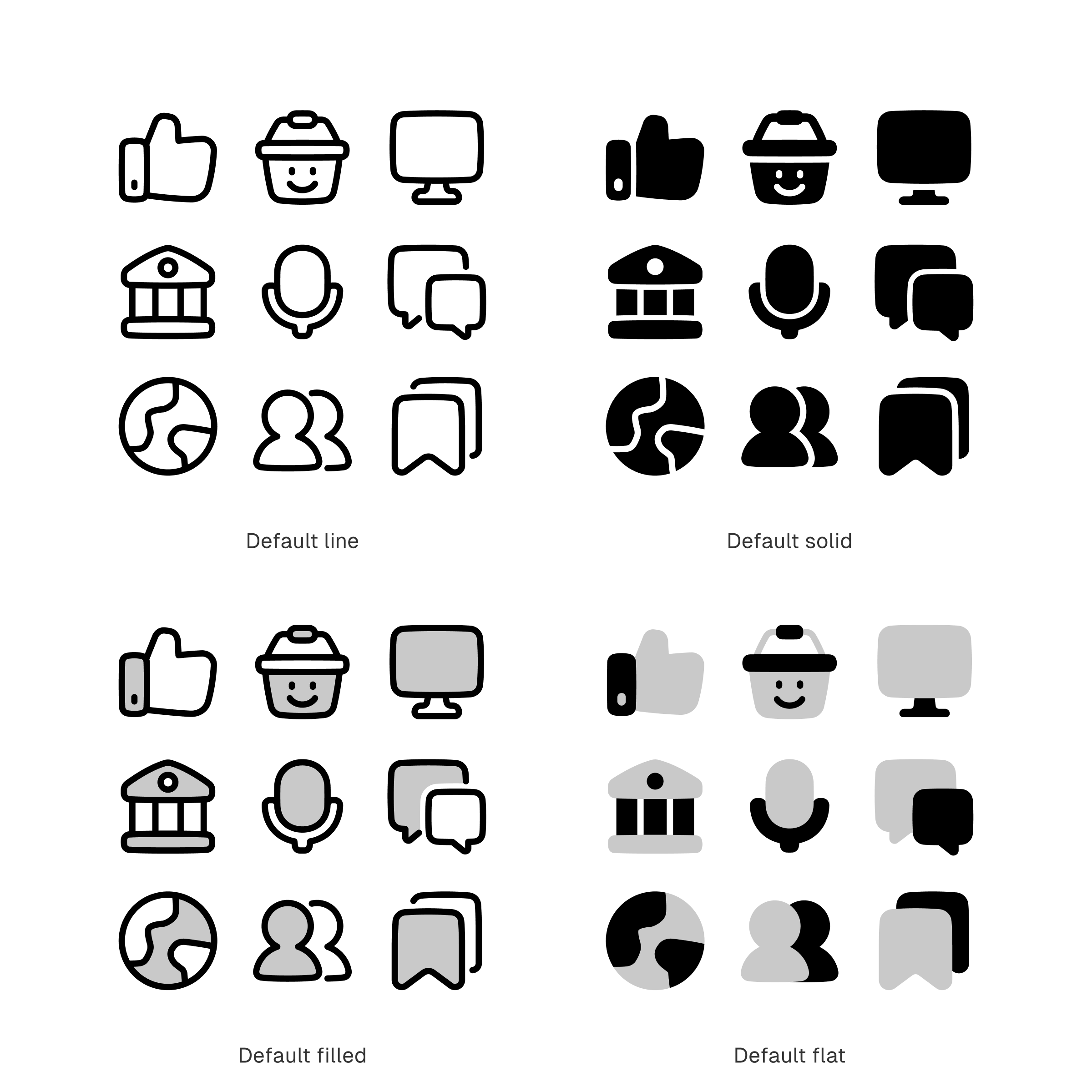
So, how does a default look like?
Most line and solid icons come in black as default. While filled and flat usually come in shades of grey, blue, purple, or any other color.
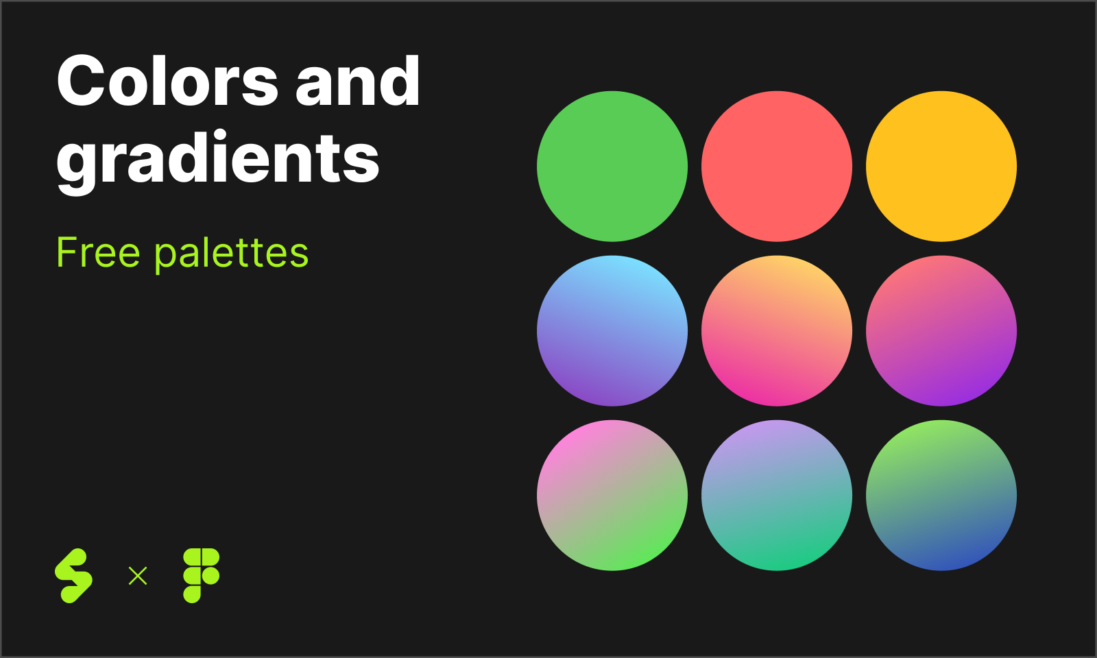
However, for this article, we’ll set our default to black (#000000) and grey (#c9c9c9) just so we could have the same idea about how a ‘default’ looks like.
Different ways to color icons
Same like resizing icons and adjusting their strokes, tweaking colors can happen if the icons are editable.
So, make sure you have what it take first. At the very basic, you will need SVG icons to be able to recolor them, either you want to do it the simplest way or take it to the next level.
1. The simplest way of coloring icons
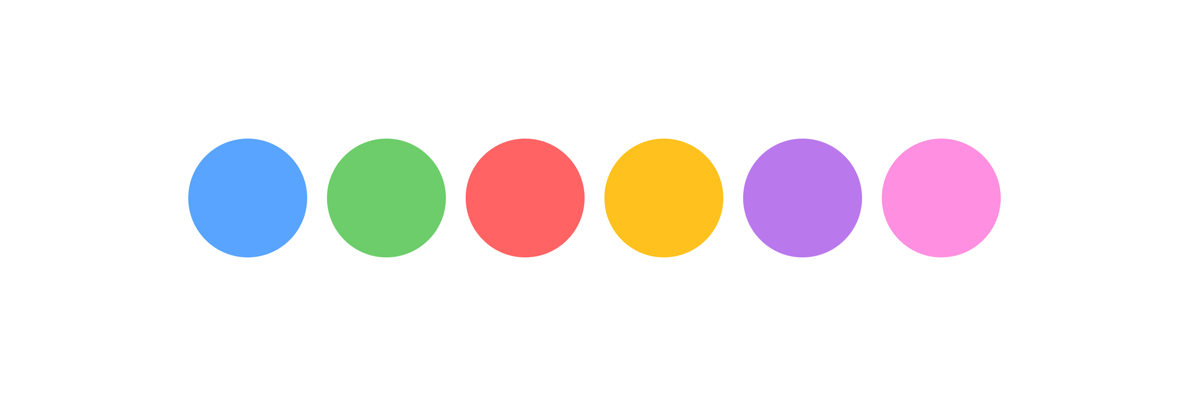
Coloring icons can be done as simple as changing default color into new colors from a different palette.
This option will especially work when you're using single-colored style like Line or Solid. It’s a fast, easy, and simple way to infuse brand color to icons.
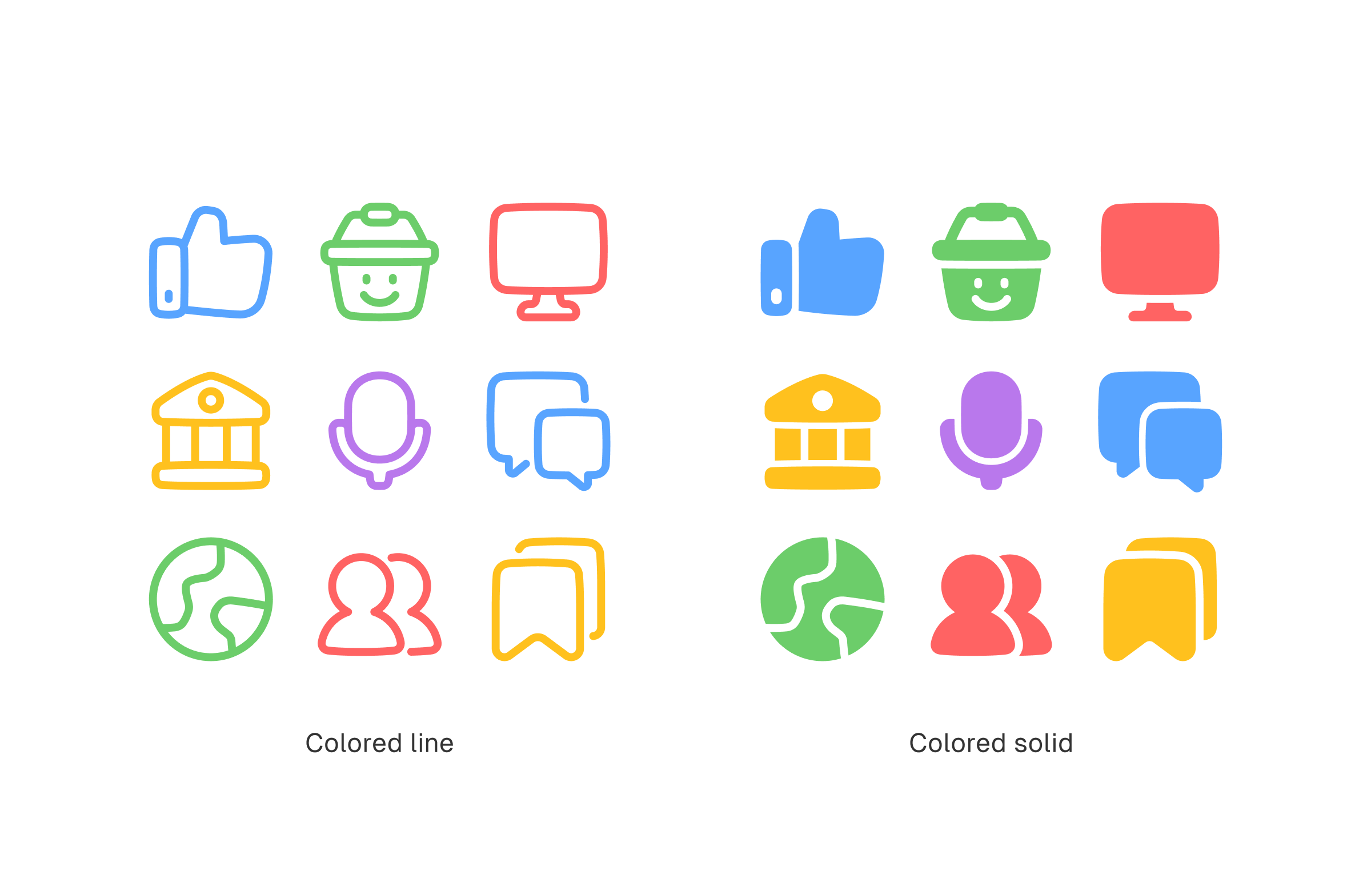
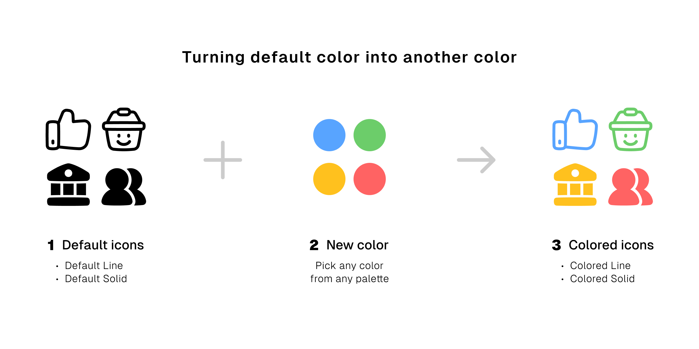
Normally you'd have to use vector graphic editing softwares like Figma or Illustrator to change icon colors. But on Streamline app, you can do it the easy and quick way without having to open any other graphic editing tools.
See how it's done 👇🏽
The hassle free way of coloring icons on Streamline app.
2. Add another color and duotone is born
The second simplest way of coloring is done using a duotone palette that consists of only two shades of colors.
You’re going to need a shade as the primary color, and another one as the secondary. Occasionally, on filled style, you may also need the presence of white to complement the two shades.
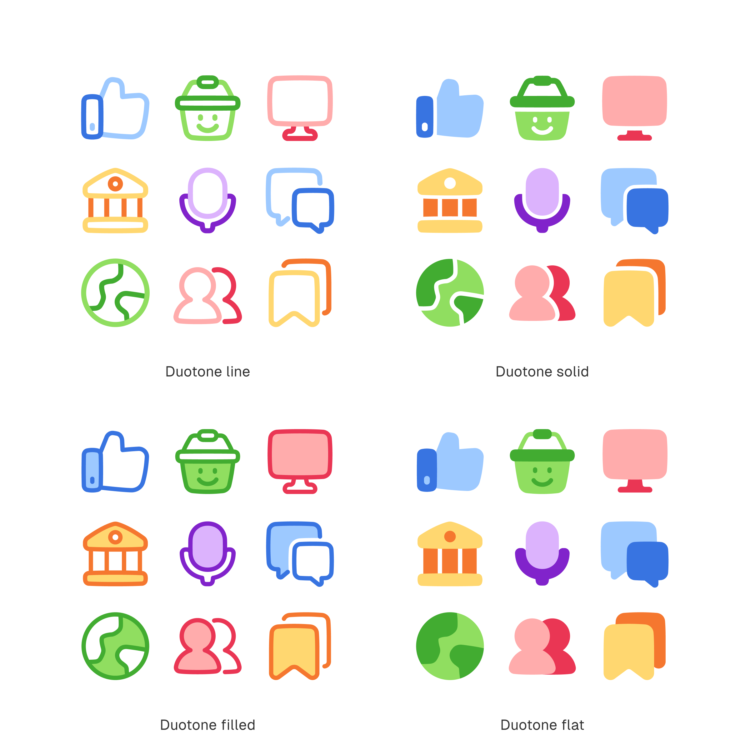
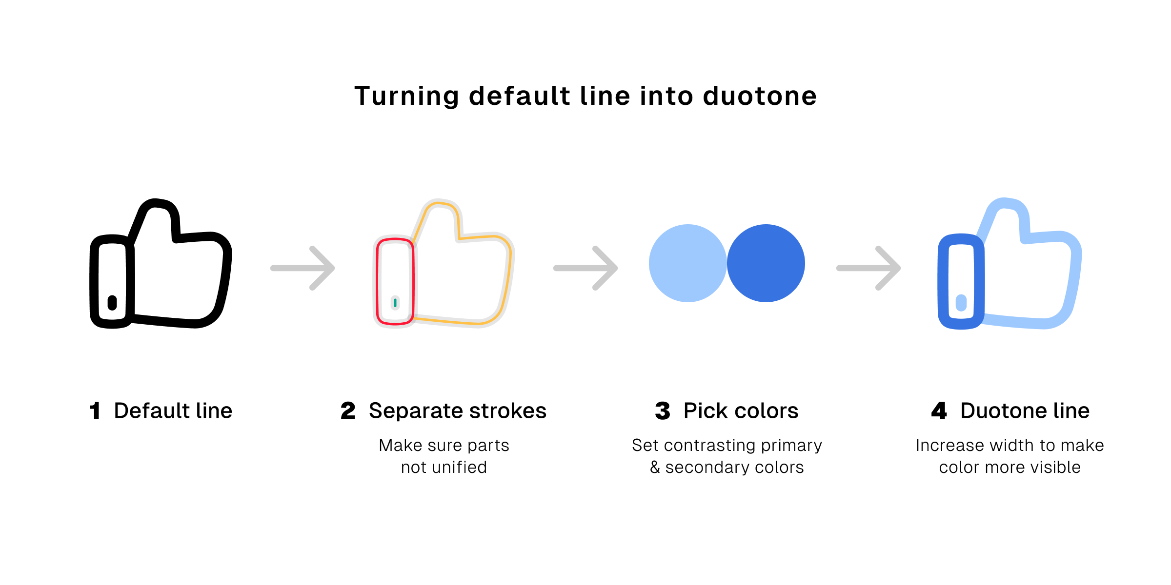
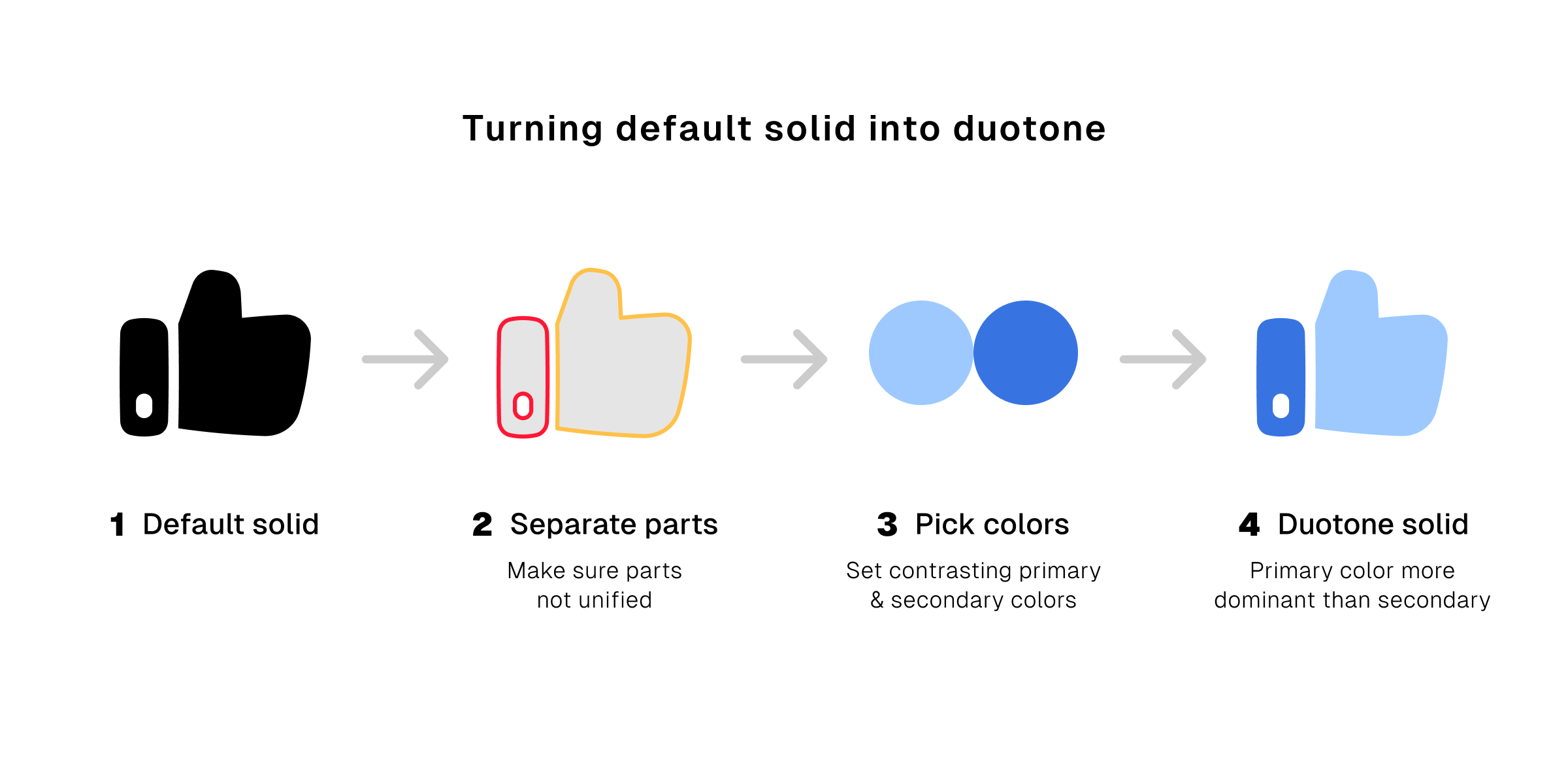
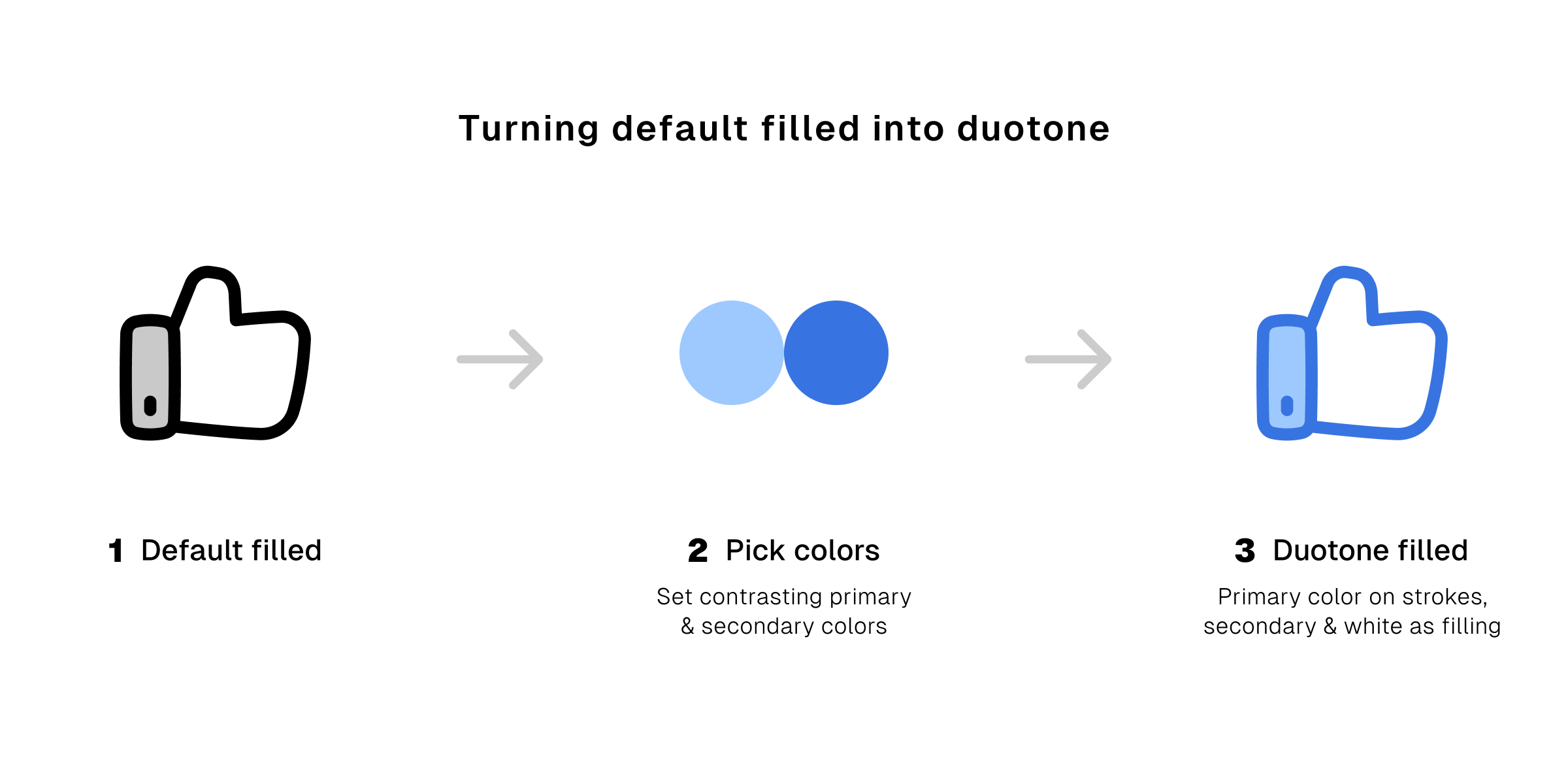
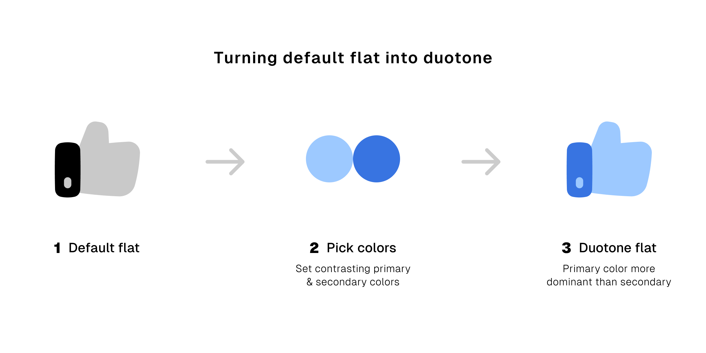
Same like single color icons, you can also instantly tweak the duotone filled and flat icons on our app without having to use additional vector graphic softwares.
Simple way of changing duotone colors on Streamline app.
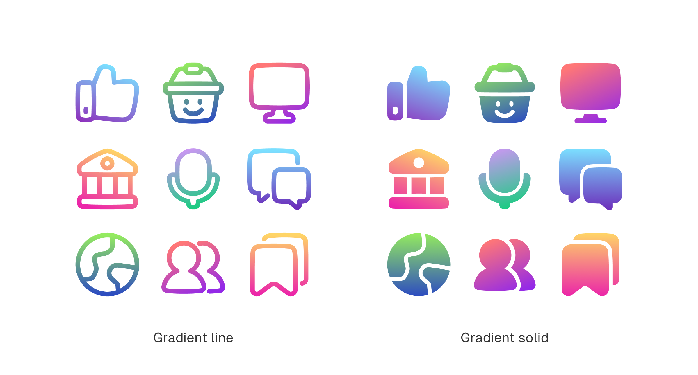
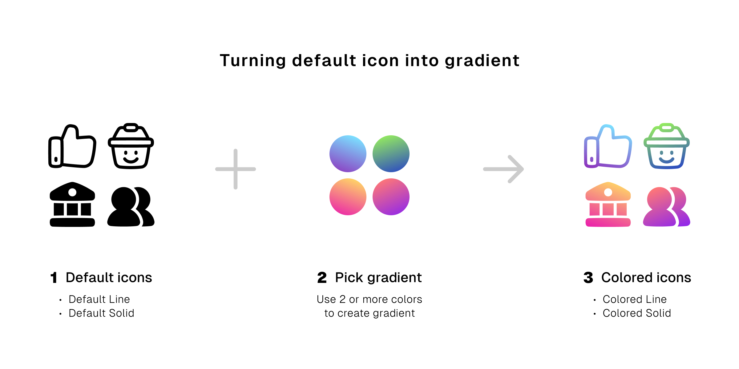
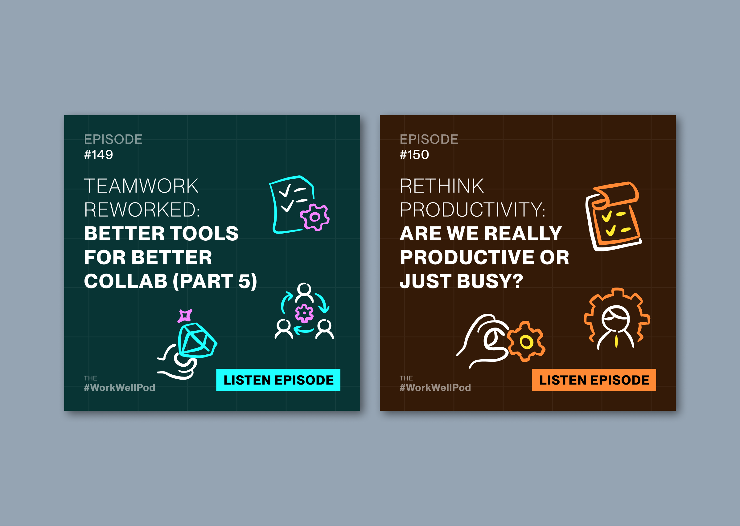
3. Enter gradient the slick and stylish
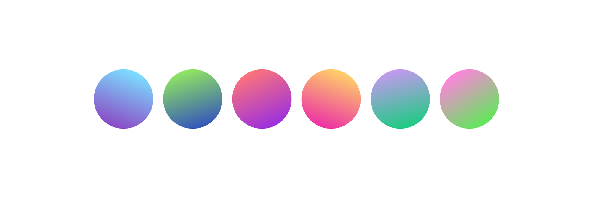
Gradient gives your icons a splash that can’t go unnoticed. Instead of a solid color, it creates a smooth blend between colors. It’s the stuff of the latest trend.
You can use two and more colors to create gradients. But even two can be tricky, more is definitely trickier. Even for us designers, gradient is always a test for aesthetic sense and taste.
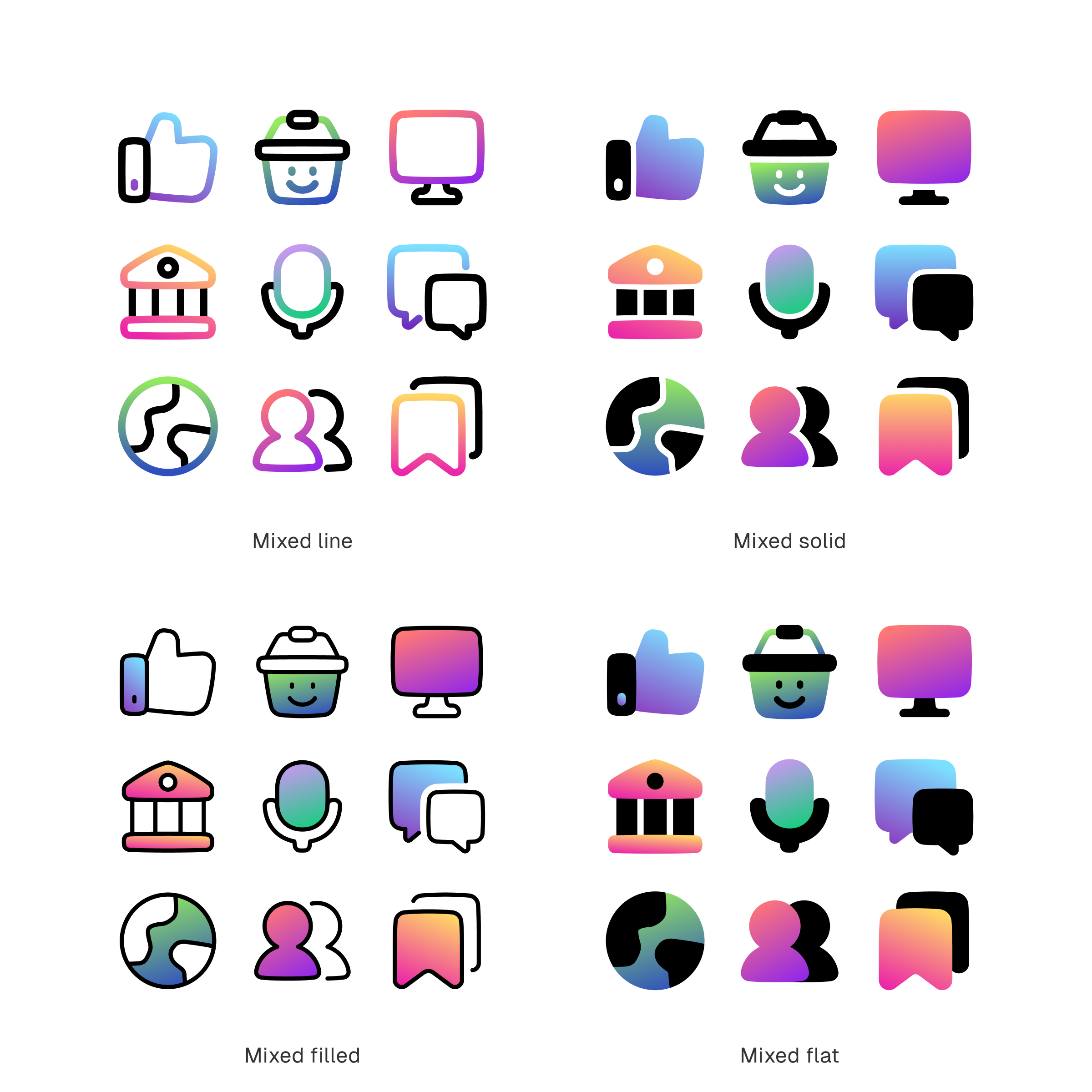
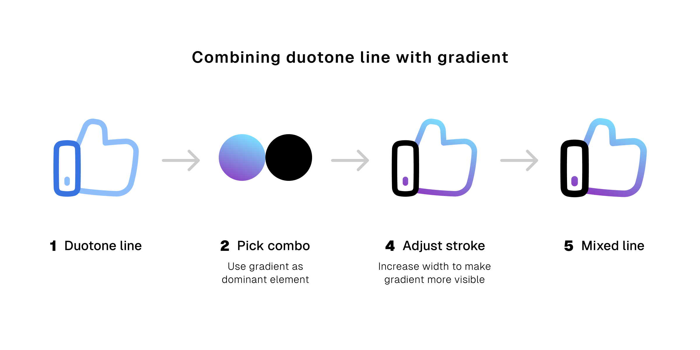
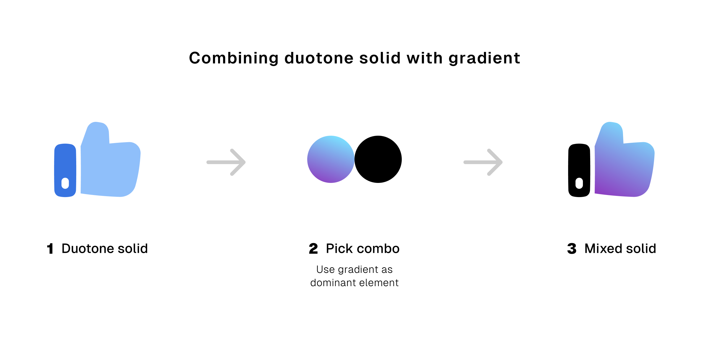
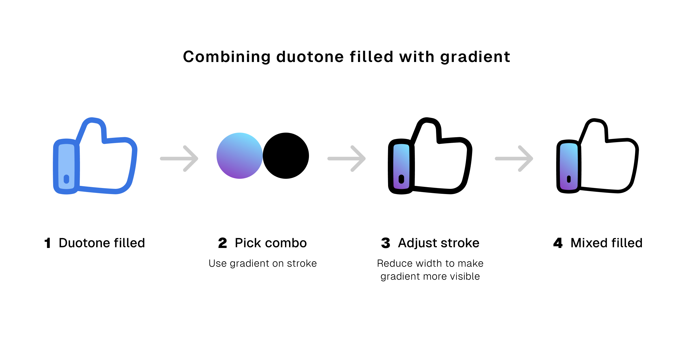
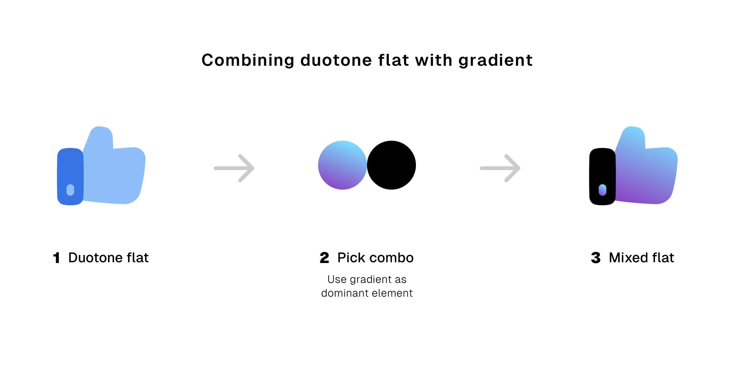
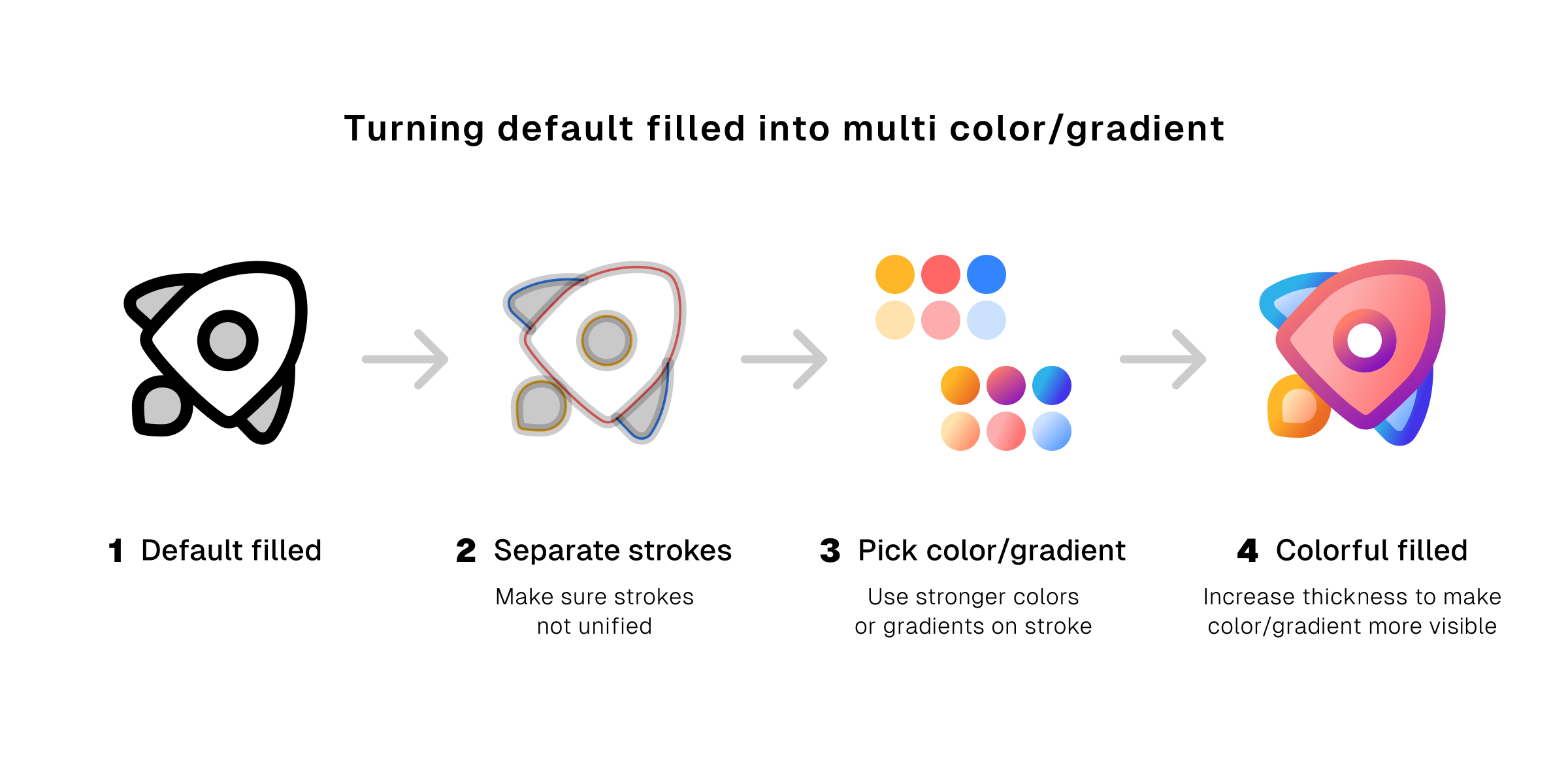
4. What if we mix gradient and duotone?
Now, we're talking. A mix between duotone and gradient will definitely give your icons a unique look.
You’re no longer just using two colors together, but you’re combining color with gradient. You’re using the same technique that gives you duotone to get a new result with a totally different aesthetic.
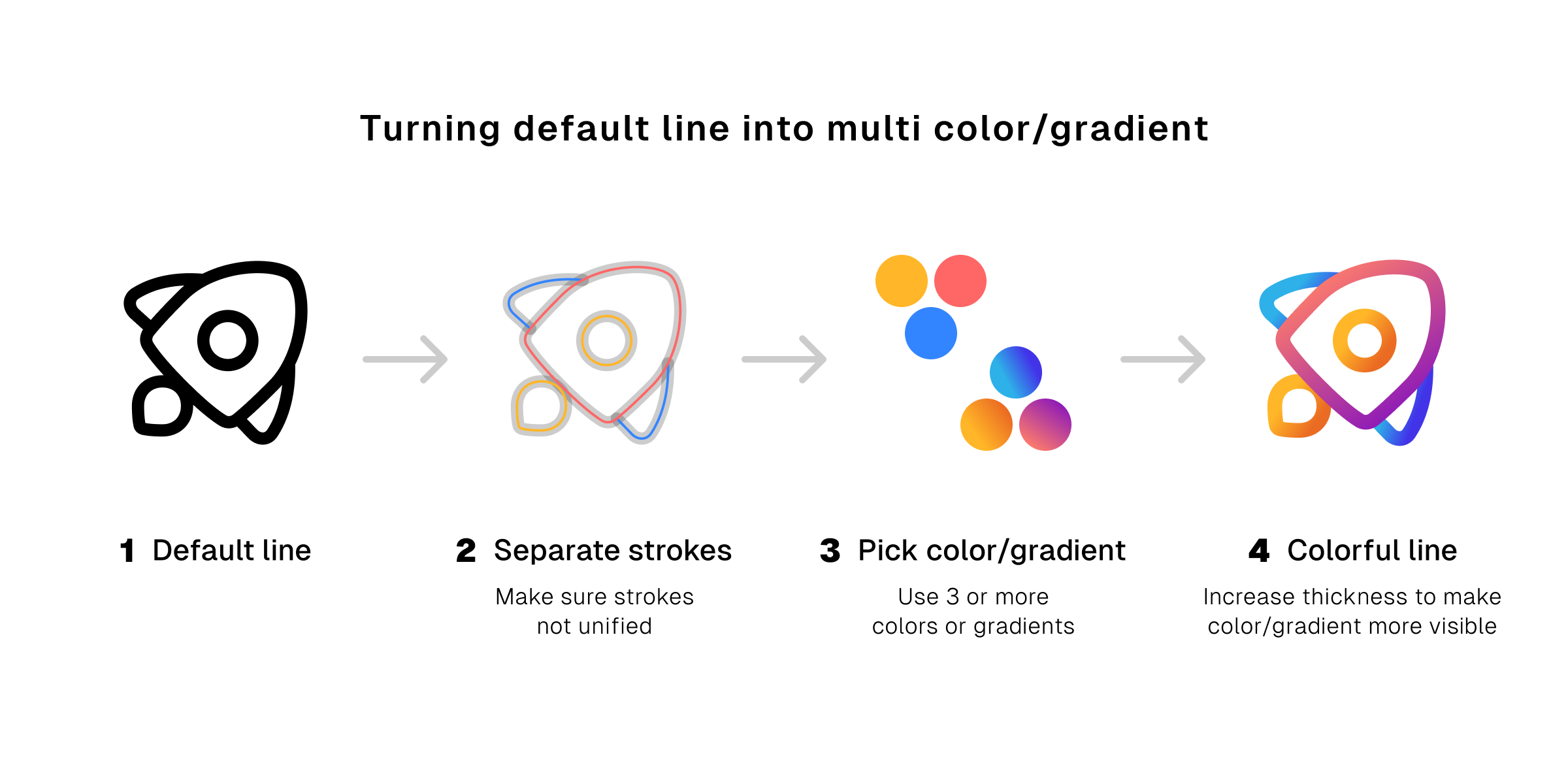
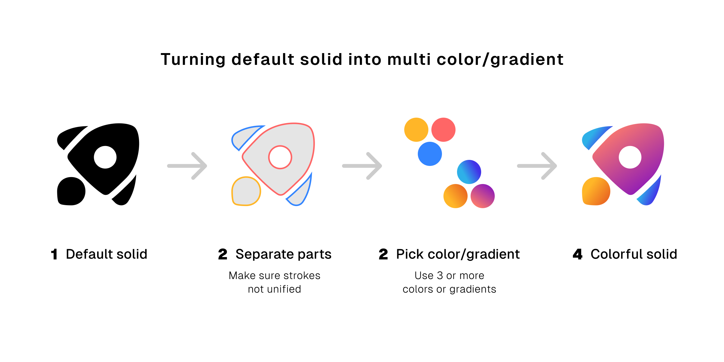
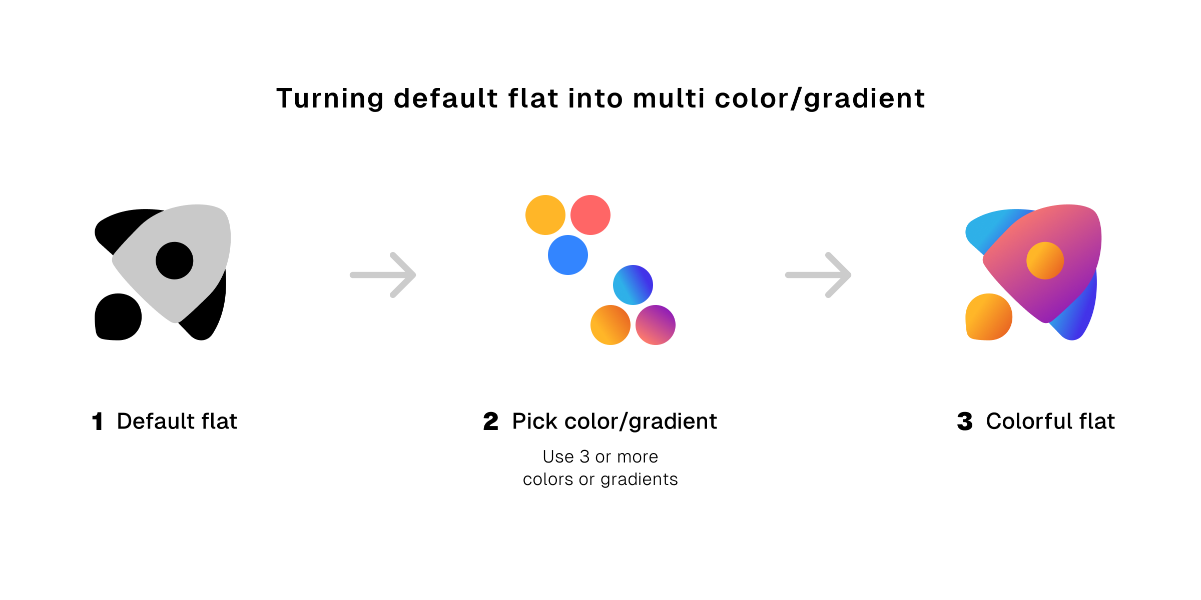
5. The more the merrier
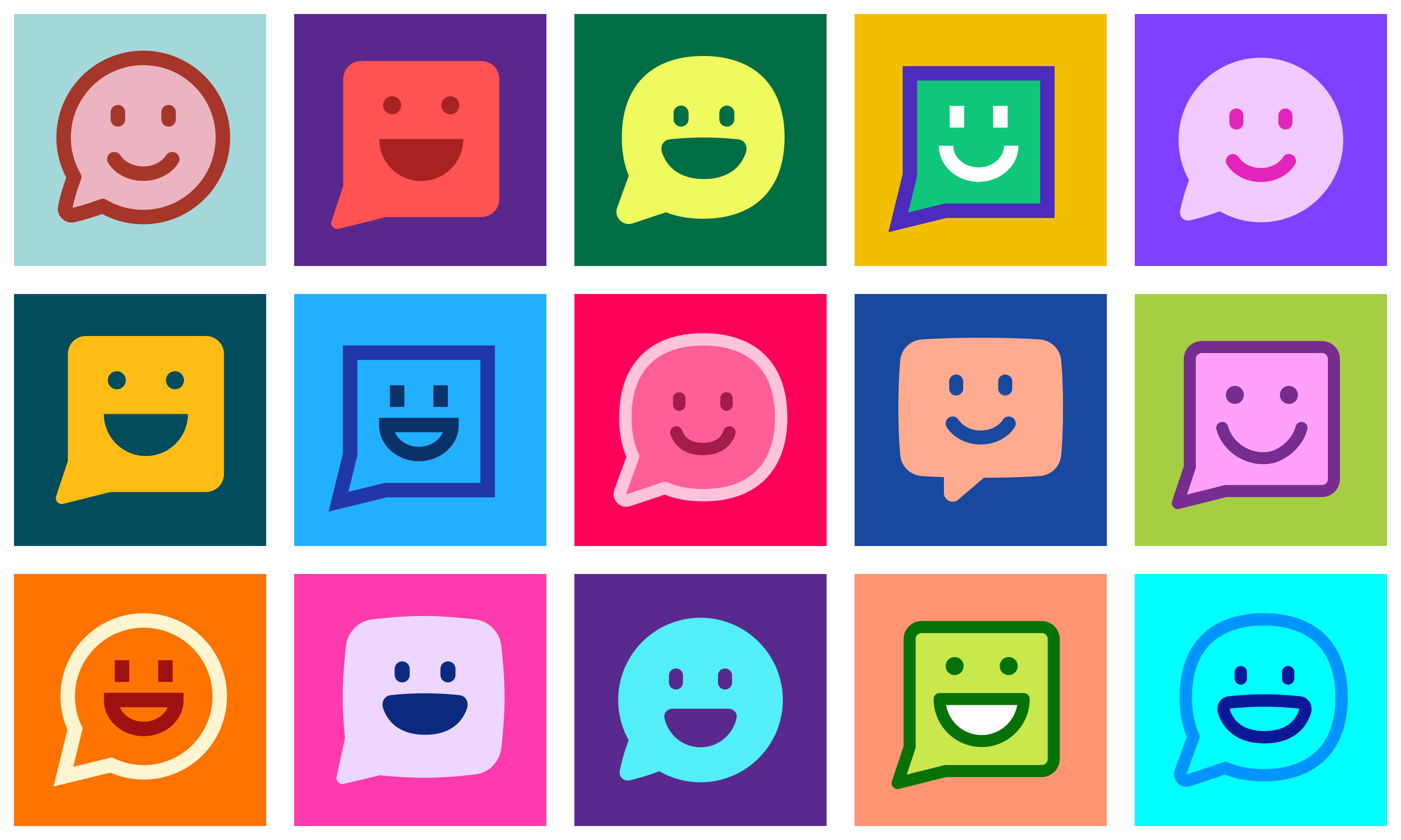
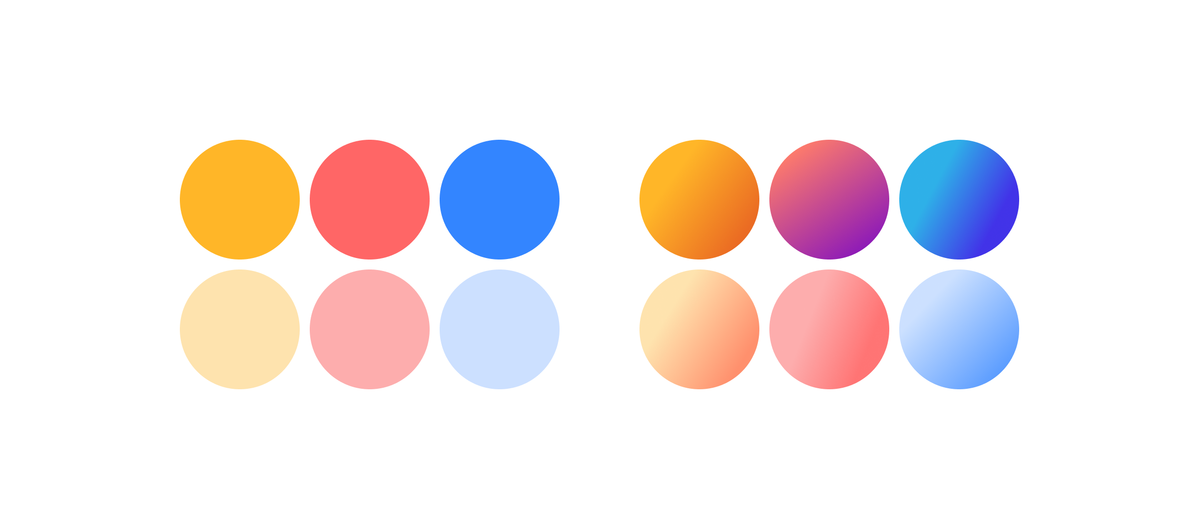
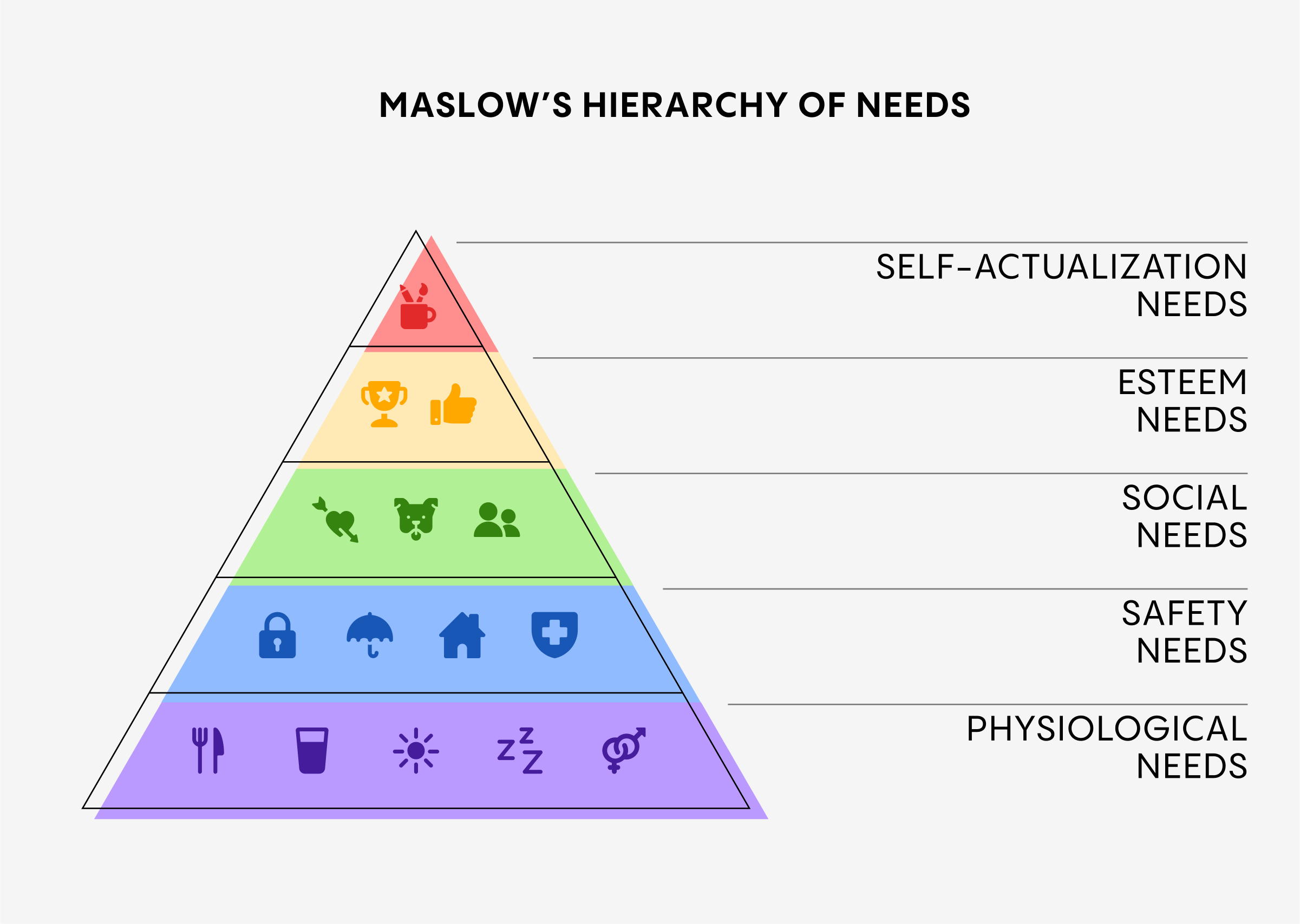
We’re talking about multi-colors and and multi-gradients. Because, well, why not? If you want some fun and eye-catching icons, more colors is a valid answer.
This trick work very effectively when the icons have more than two separate parts. Give those parts different and harmonious colors or gradients, and you're all set to ditch the boring default.
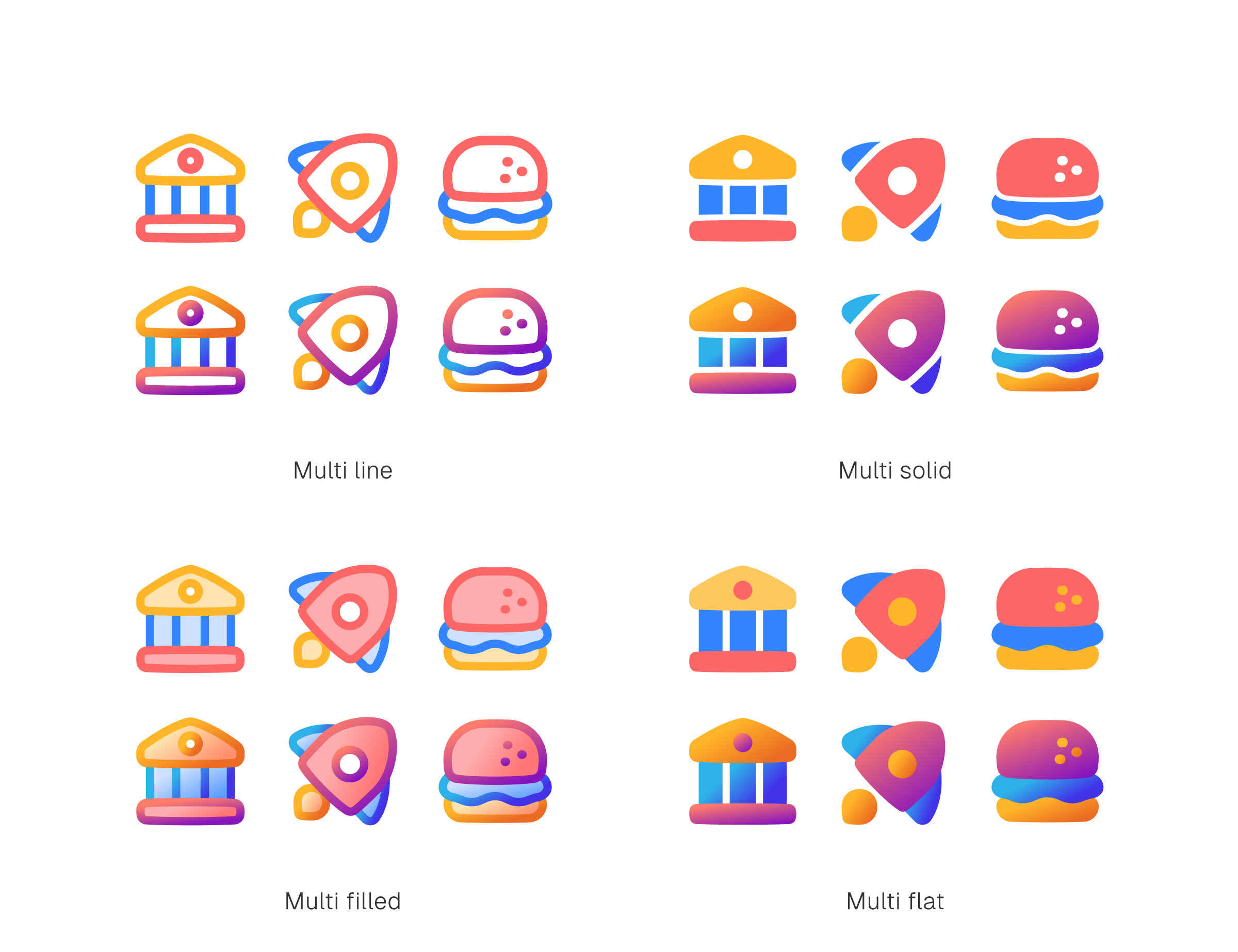
Turning default icons into multi-color and multi-gradient have similar essential steps. So, in this part, we're combining them together with more emphasize on the multi-gradient.
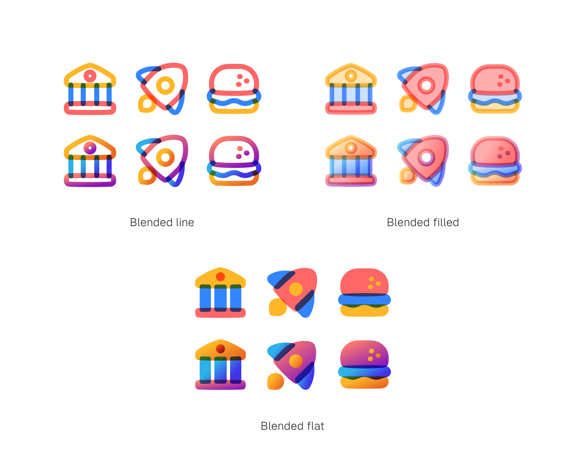
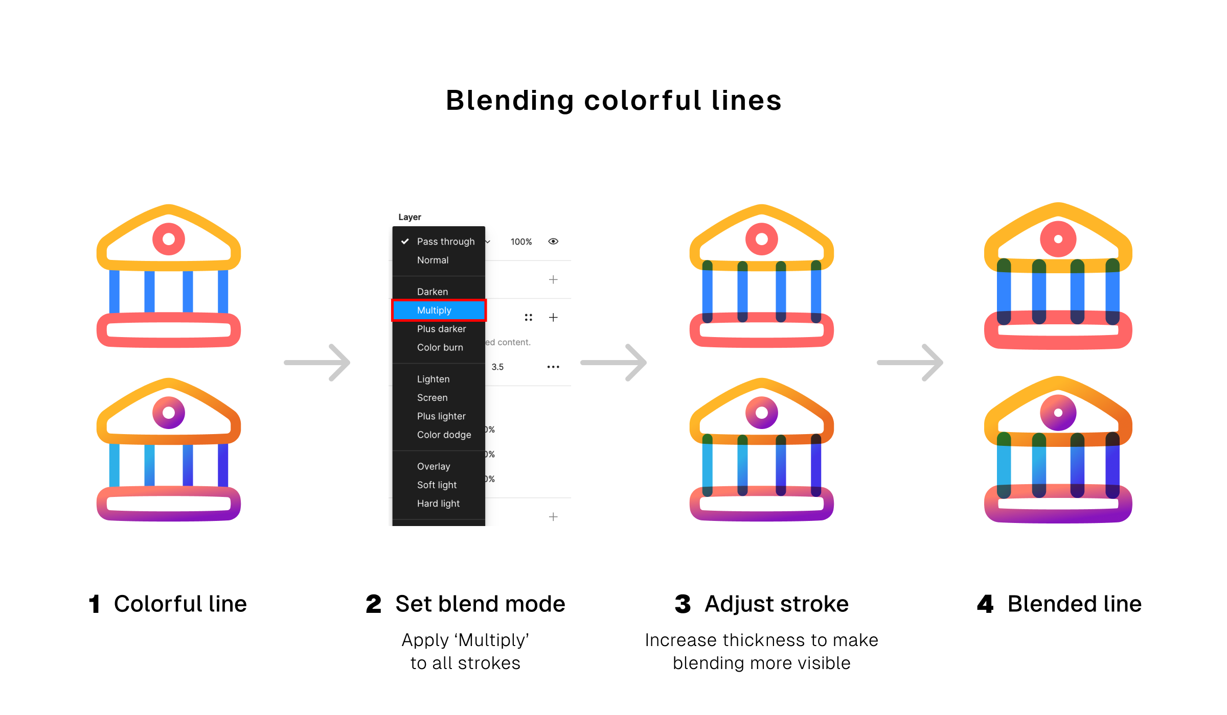
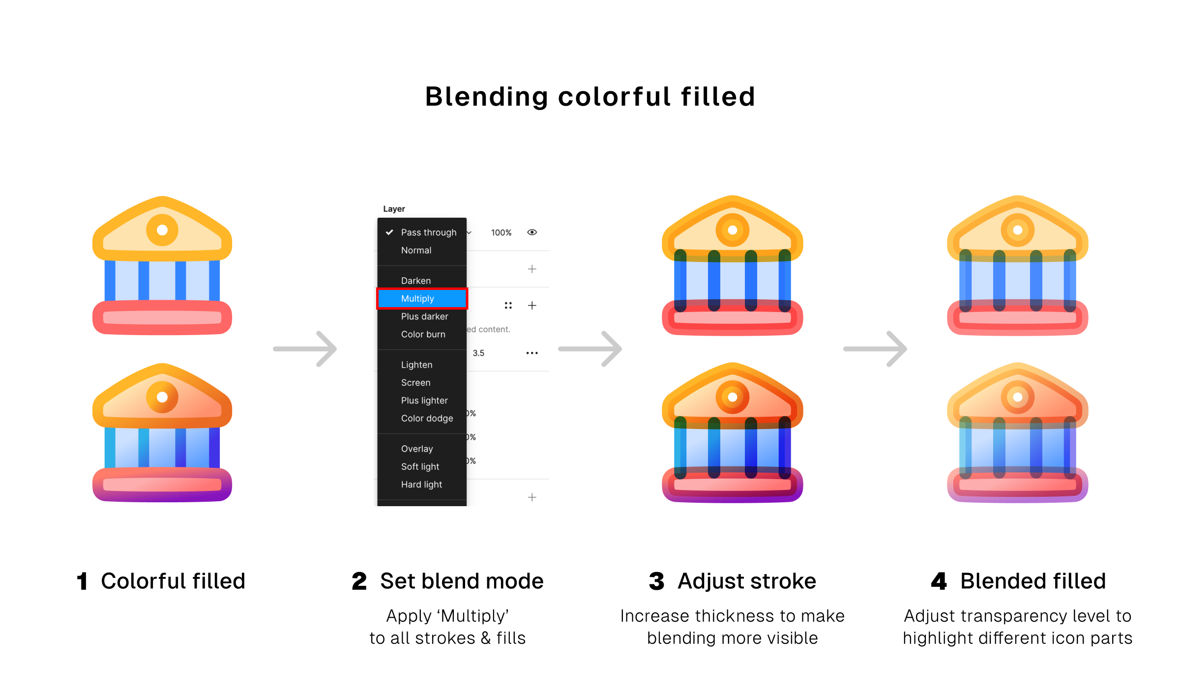
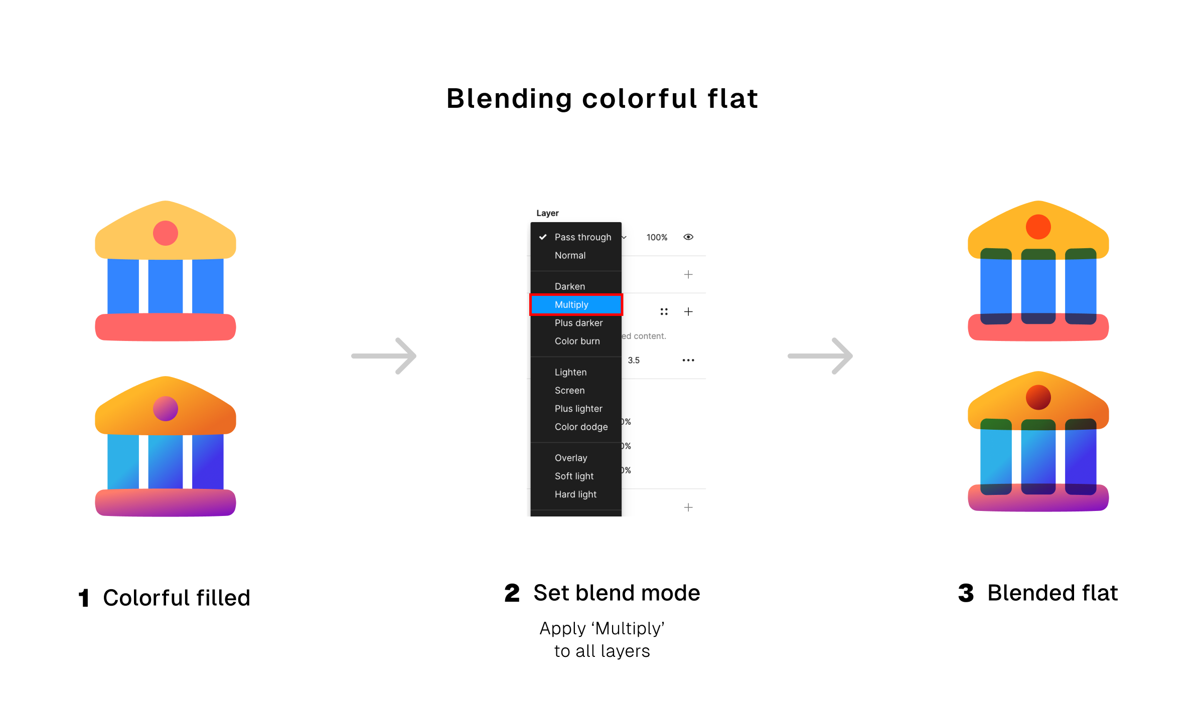
6. Blend it all the way
It's the next level of multi-color and multi-gradient icons. Instead of only using different colors for different parts of the icons, now you get to blend them too.
This trick only work on icons that have overlapping parts. Colors of those parts mix with each others, creating a new blend of colors.
Colorful icons and how to use them
Colors are effective for capturing attention, but what makes them good can also turn them into distraction. It’s an element that must be used in moderations.
You want your icons to be beautifully displayed, complementing other elements. Not robbing the attention away from important parts of your design.
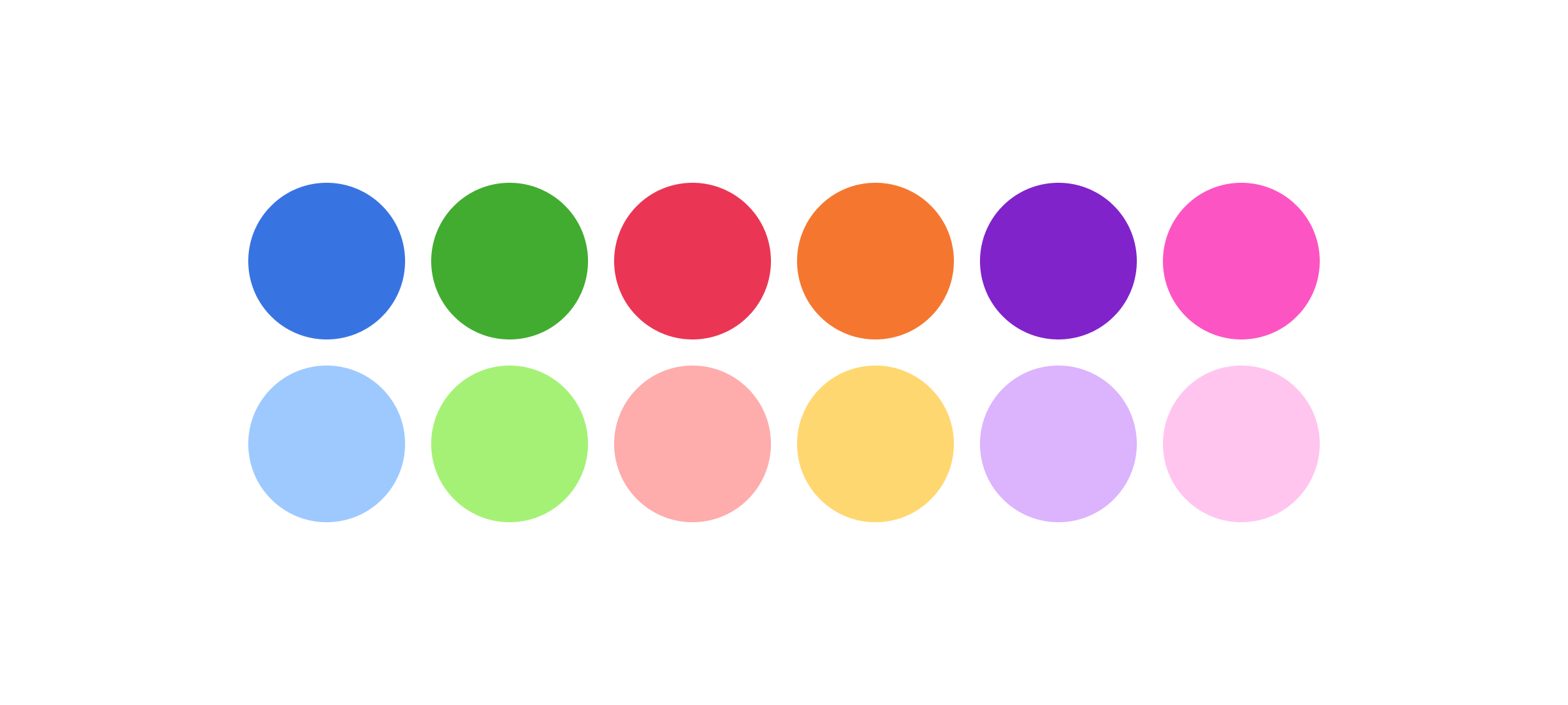
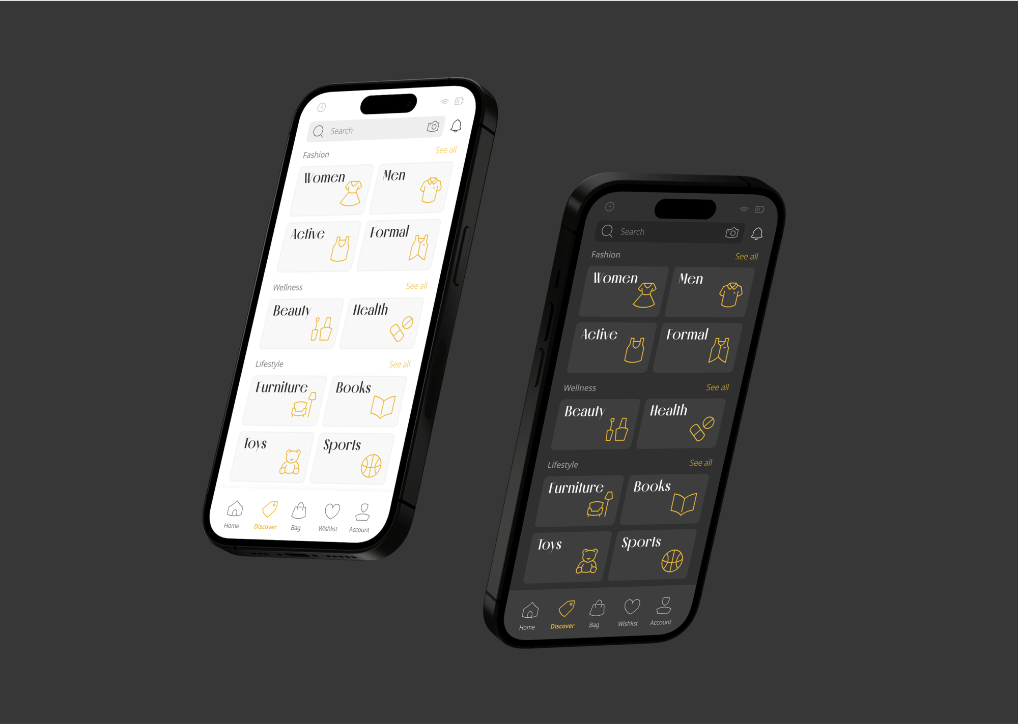
1. The minimal and subdued
What we considered minimal and subdued is either 1, 2, or 3 less intense colors in a single icon.
Icons with this palettes are more versatile. And it’s this versatility that give them a wider range of uses. They can be more noticeable but not too flashy to be disruptive to the elements around them.
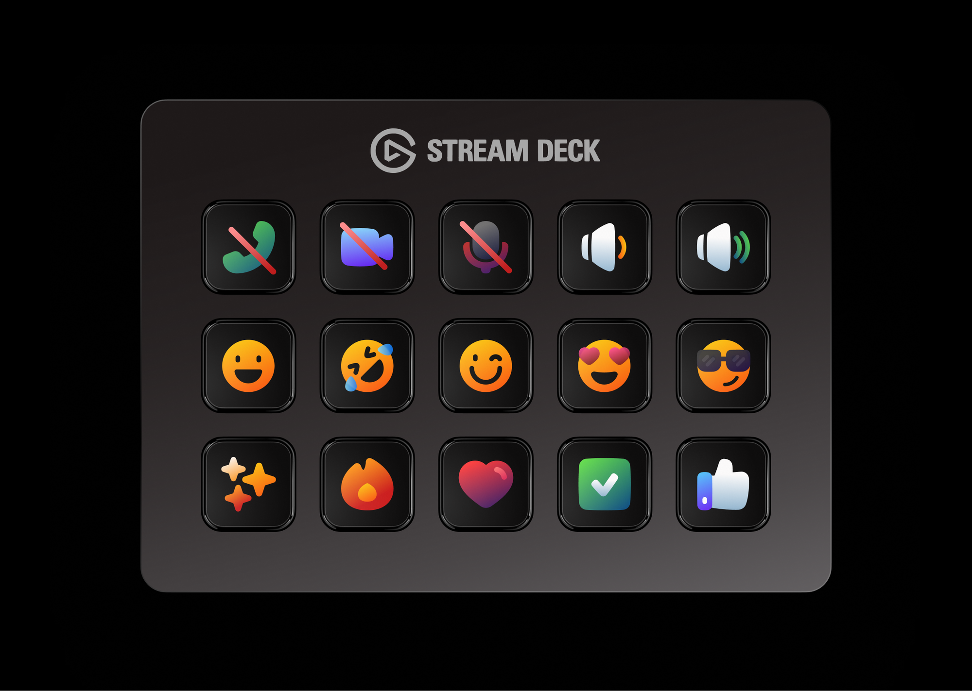
Such icons can be subtly used on navigational interfaces, prominently used as menu items or on a website displaying product features. They can also work as illustrative and branding elements on designs that are not interface-related.
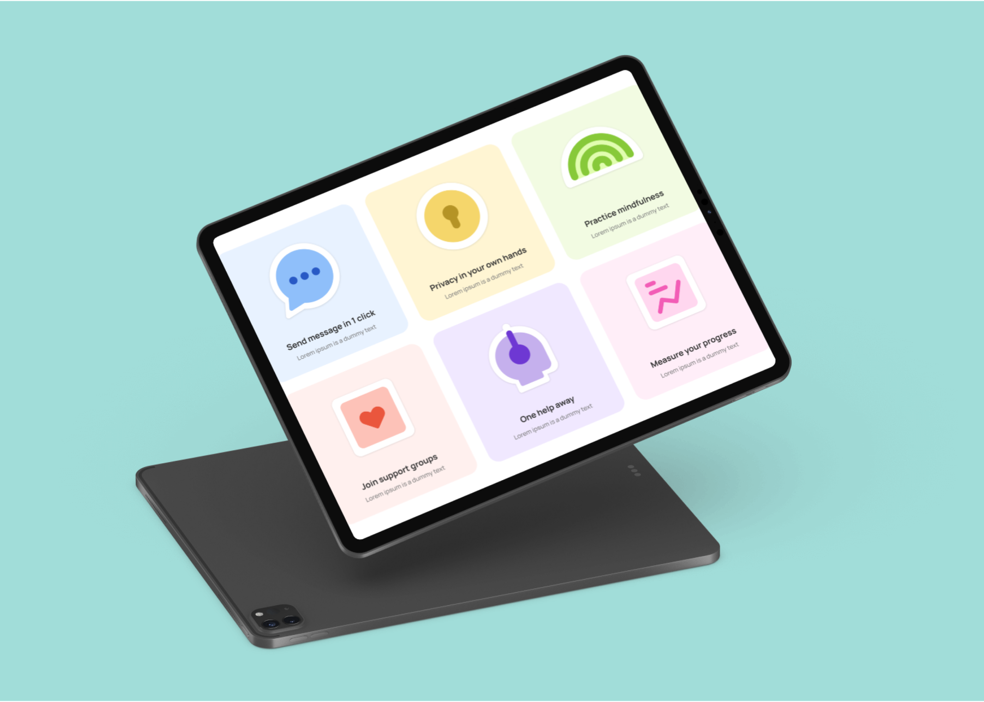
2. The rich and vibrant
While it’s true that rich and vibrant icons look more appealing, it also has a trade-off: their colors end up limiting their uses on navigational interface as their striking look becomes too distracting for other UI elements. But that's not a bad thing.
The main uses of colorful icons isn't for common navigational interfaces. Their eye-catching look makes them more recognizable, and that’s a useful advantage for for capturing viewers attention by making important information more noticeable.
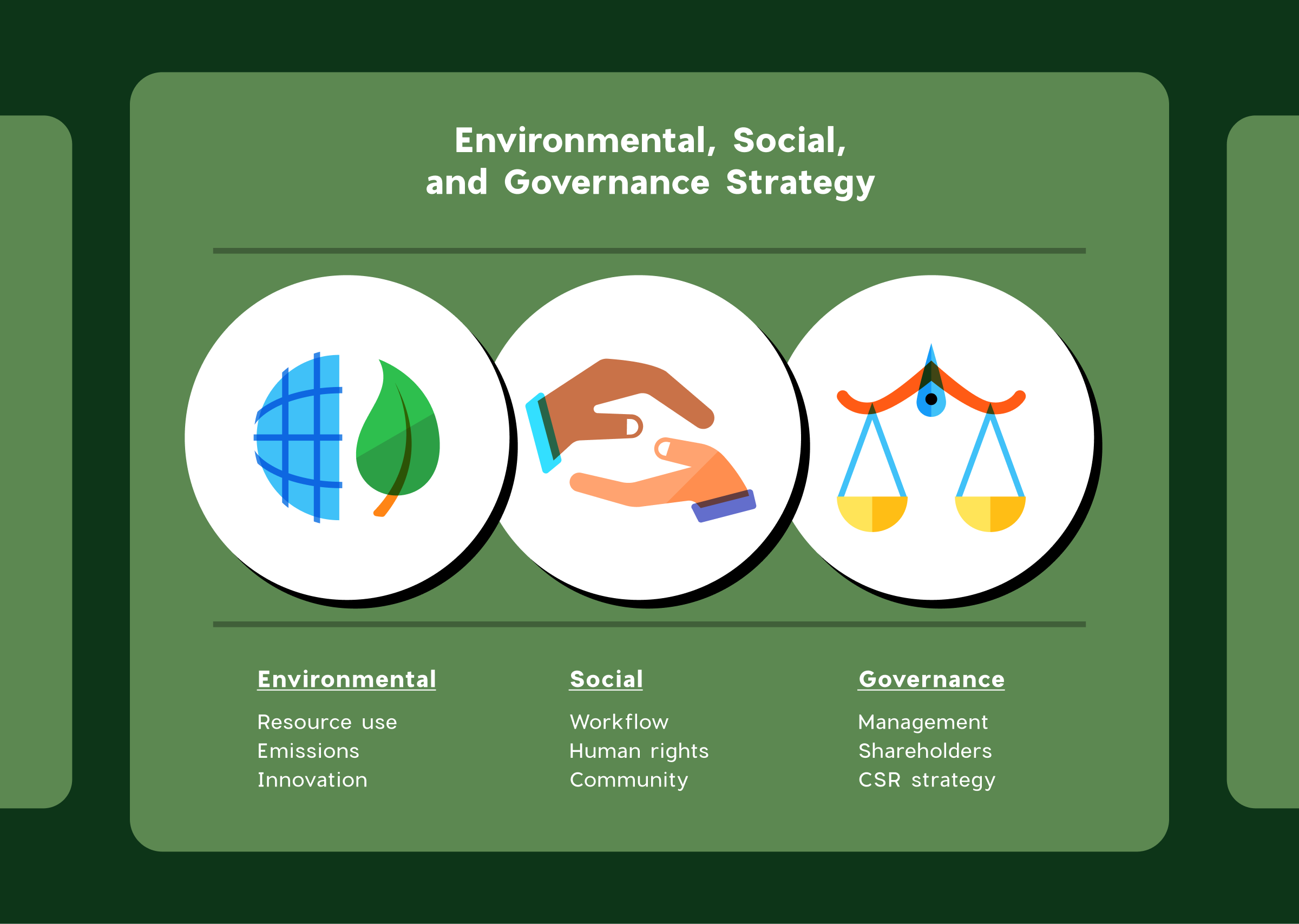
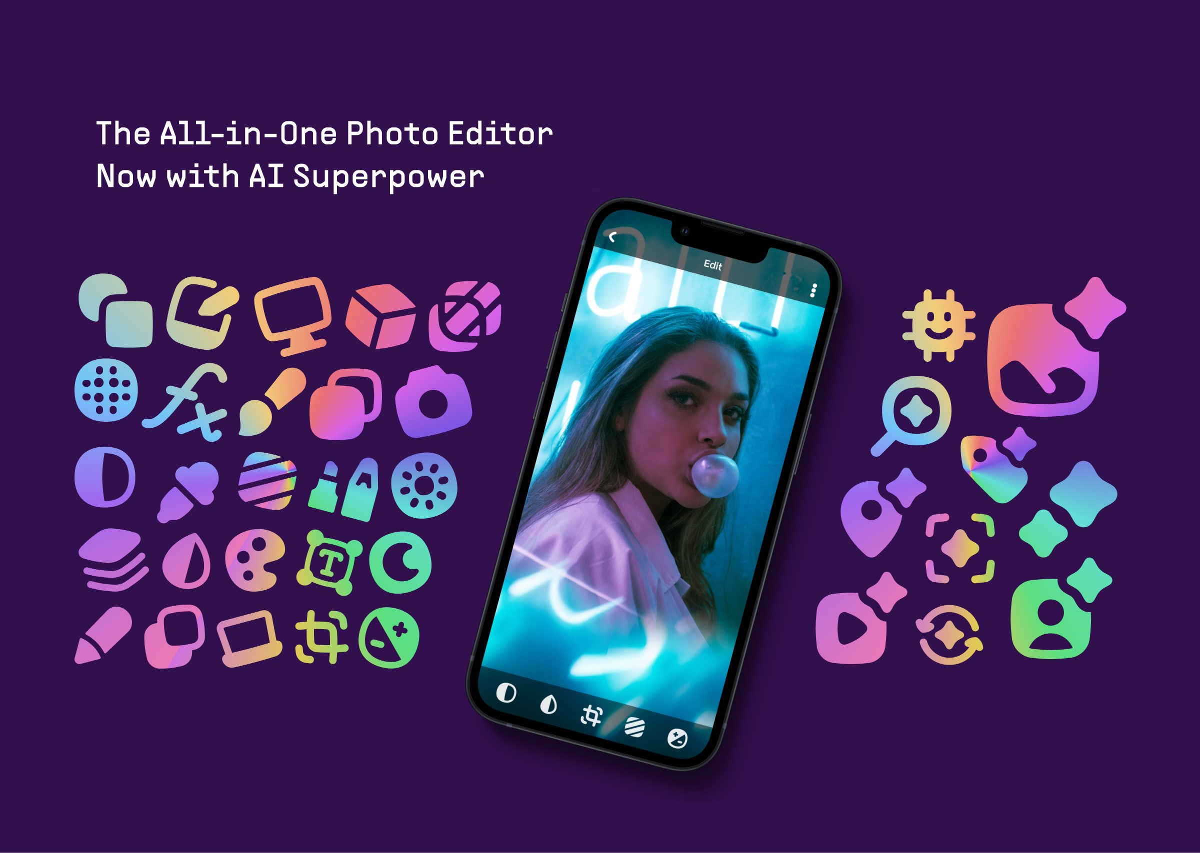
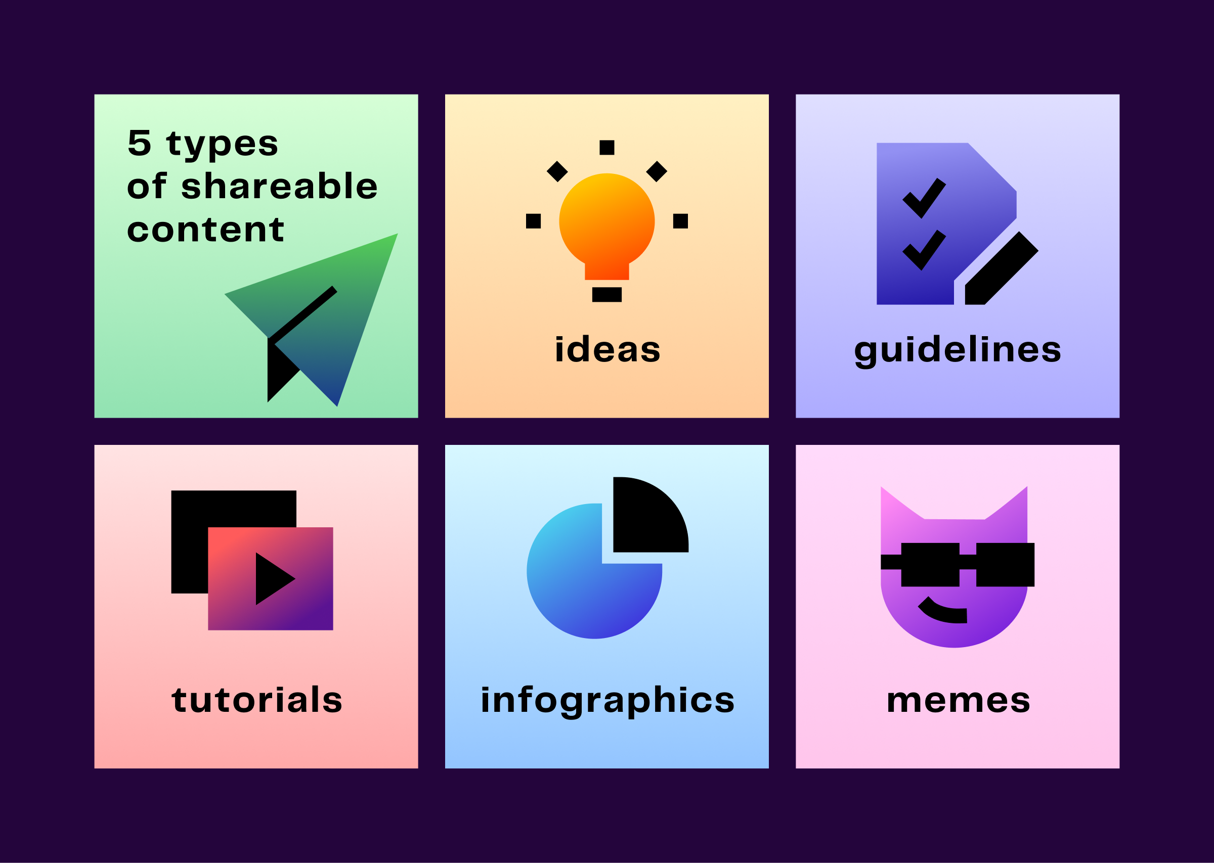
Icons with vibrant colors can be more prominently used on covers for content, social media posts, charts and data visualization, product design, on ads or marketing elements, or on a website visualizing product features.
P.S.
Experiment is the backbone of creative work. You can’t create pretty icons without trying to get it right first through countless ugly results. Practice makes anything better.
If you want to try making your own colorful icons, no need to start from zero. We've compiled the palettes and some samples used in this article on a Figma Community file. Get them now to spruce up your project.