How to resize icons without losing quality
Use the power of vectors to seamlessly rescale icons, ensuring clarity and crispness without blur or pixelation.
The best icons are legible.
Not only in their original size, you want to make them smaller and bigger and they’re still legible. You want them to look good in any size without losing any of their quality.
That’s the challenge of resizing icons, and here's how to deal with it.
The key for seamless scaling
Scalable icons are the key to scaling icons seamlessly.
They are made as scalable vector graphics (SVG), which is a format that allows you to customize, color, and resize icons without quality loss. You want to make sure that your icons are SVG.
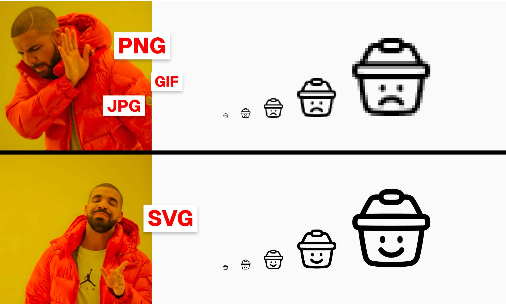
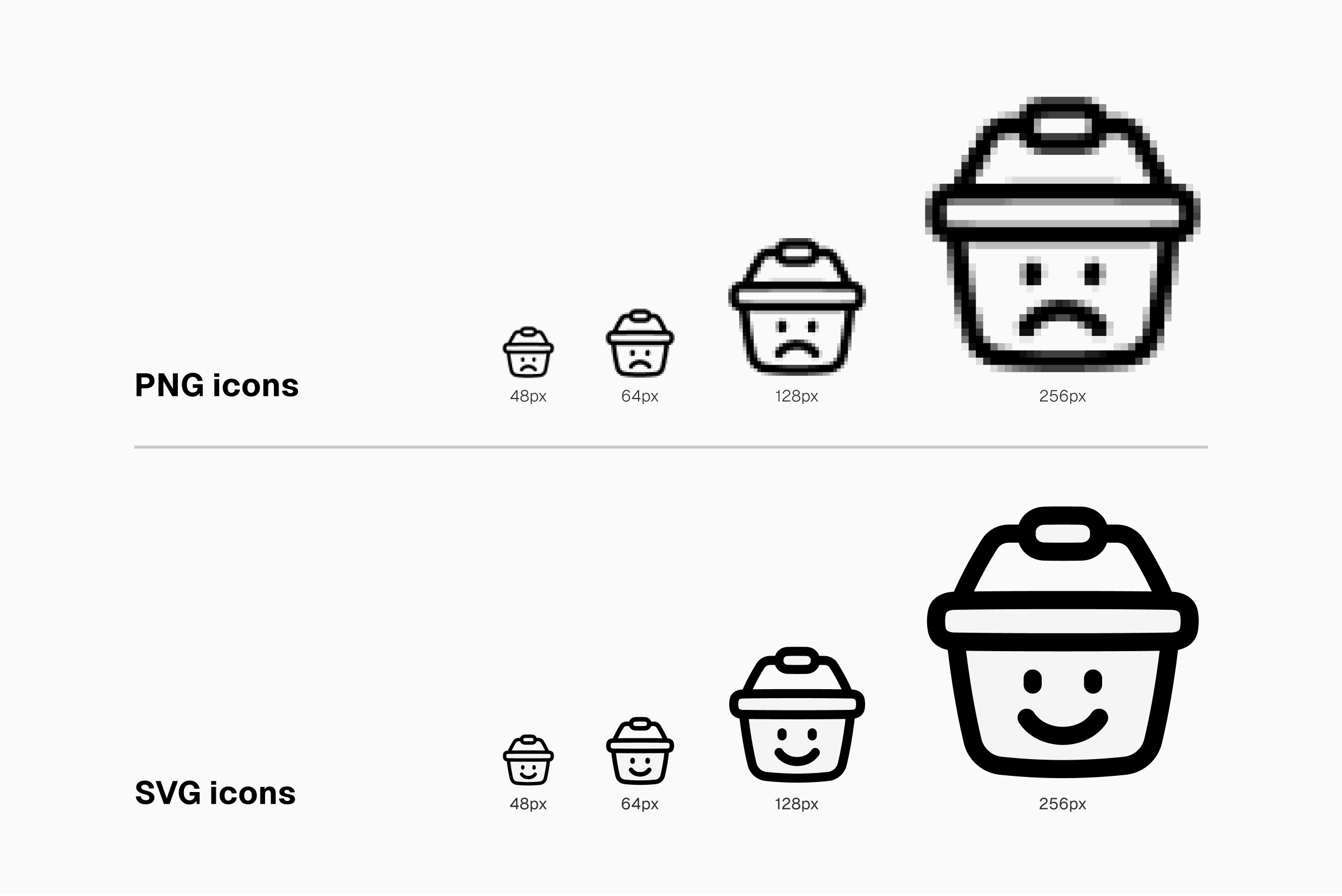
Typically, though, SVG and PNG are two of the basic formats used for icons. In a rare case when you have to use PNG, make sure you download the icons in the biggest size. But there’s a catch.
- Scaling up PNG icons will reduce their good look and legibility—they’ll get pixelated—so it’s only possible to scale them down.
- Yet even on small size, the edges of PNG icons will still look blurry due to the bitmap nature of the format (they’re made of tiny square bits or pixels).
Those two points are the exact reasons why you need to get yourself the biggest size of PNG icons. In any case, if you want to keep the good look of your icons even when they're scaled in any size, make sure they are SVG.
Watch out for the unscaled strokes
When using icons with adjustable strokes, the regular way of resizing—a simple drag to resize—might end up making the icons unrecognizable.
That happens because the process doesn't automatically adjust the stroke width. And it’s a problem since we need to keep the icons legible even in small size.
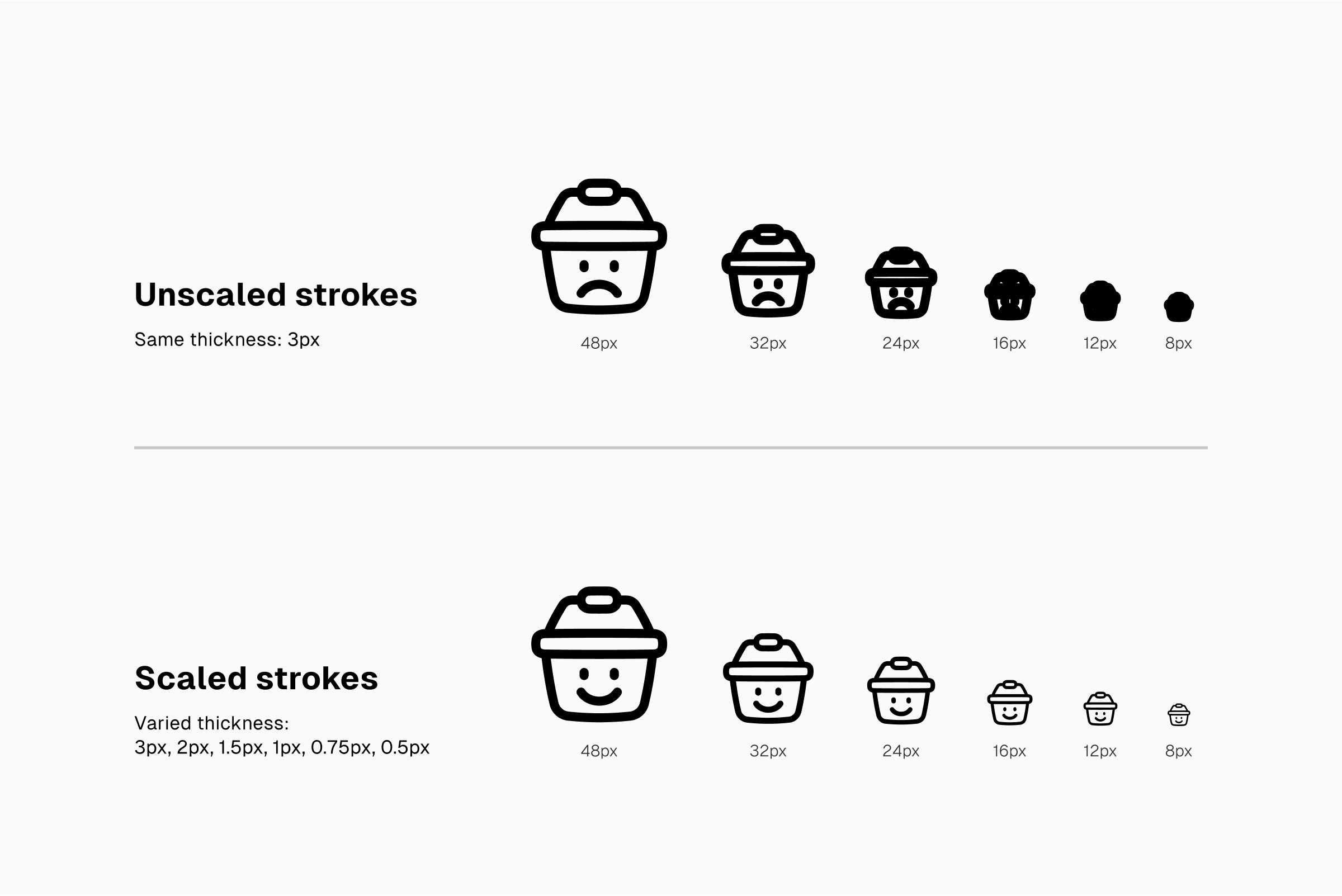
We need to make sure that the strokes are also scaled together with the size change. There are four ways to do that, and we’ve ranked them from the most cumbersome to the most convenient.
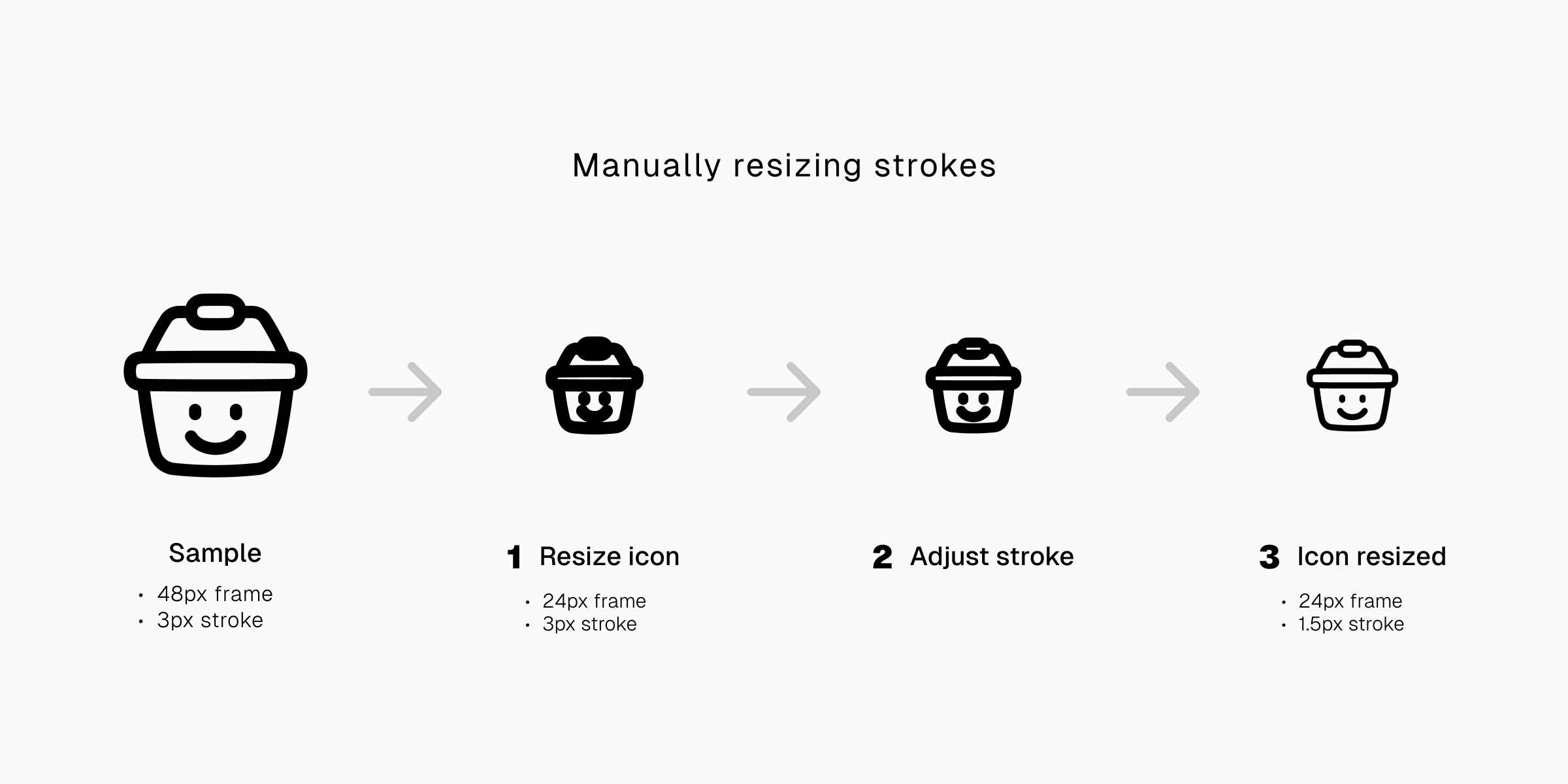
1. Cumbersome resizing
In this option, you resize the icons and then manually adjust the stroke width.
It’s a two fold process that’s not very effective. You need to figure out yourself the size for the stroke width after you resize the icons.
It's a simple thing if just for a single icon, but can be a problem if you’re dealing with a huge number of them.
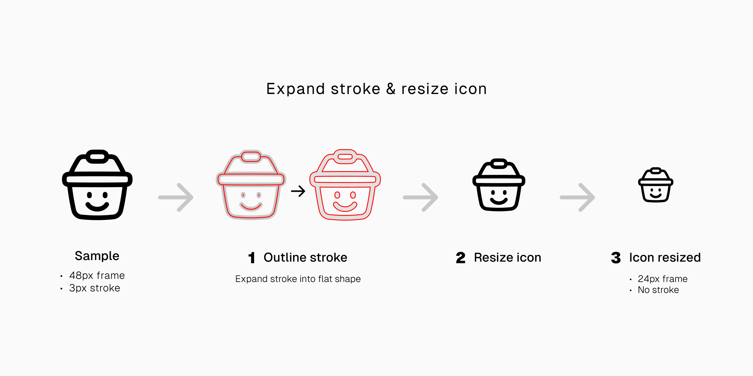
2. Irreversible downgrade
Outlined stroke won't obscure the icons as they will stay at the same fixed size. You just need to resize the icons and the job’s done. But there’s a big setback.
Outlining icons is a downgrade. Once outlined, the icons’ adjustable strokes will be no longer adjustable. You can no longer change their thickness.
The process of outlining icons is irreversible. It’s not the best option for resizing icons if you’re going to change your mind about the stroke size.
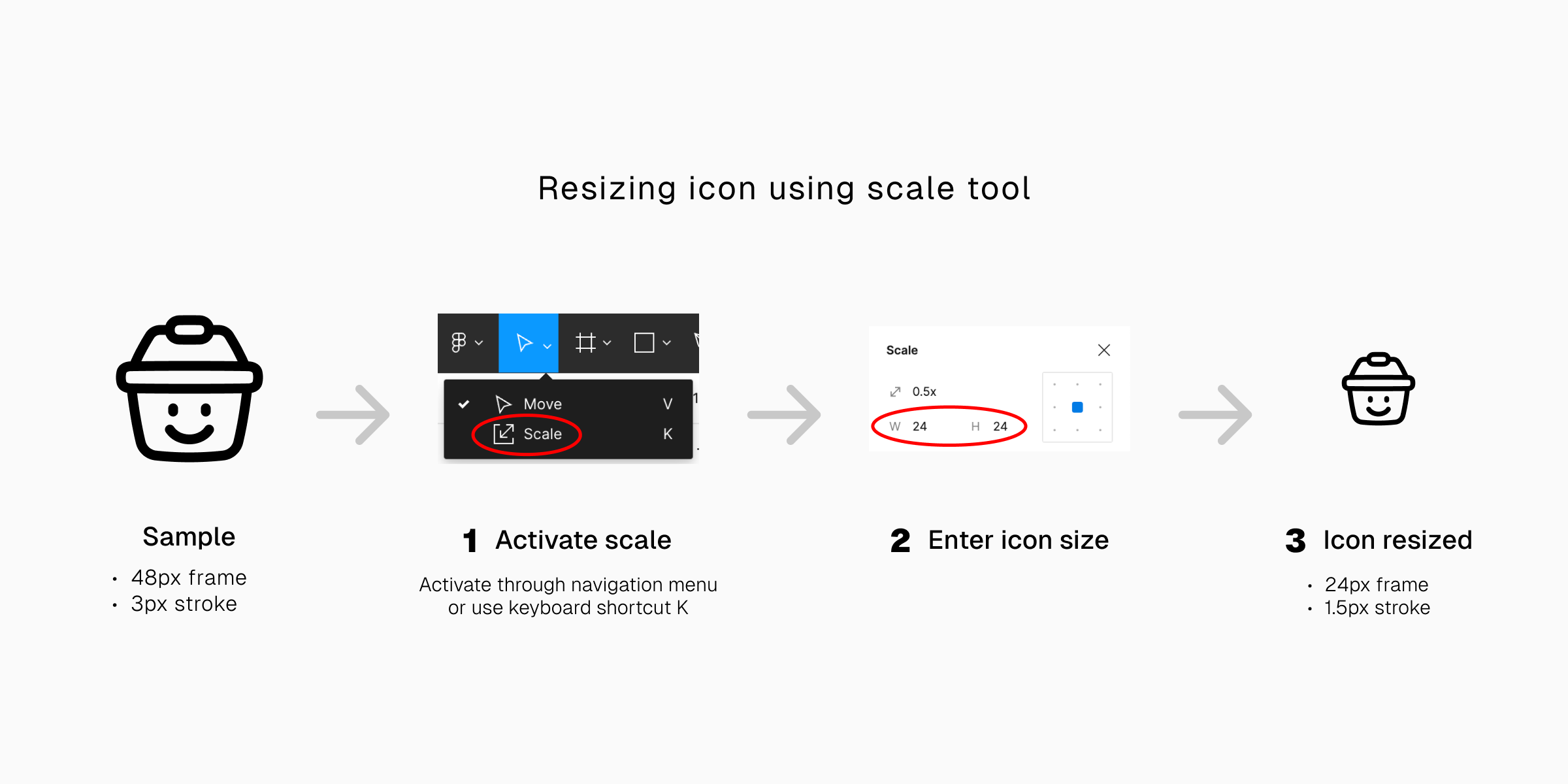
3. Expert scaling
It’s an effective way for resizing icons and scaling the strokes at the same time. You just need to type the size that you want, and the icons will be resized together with the strokes.
To do this, however, you’ll need to use the scaling tool in a vector graphic editor. In this article, we’re using Figma’s scale tool (shortcut K). Other scaling features from different apps may look and work differently even though their function is basically the same.
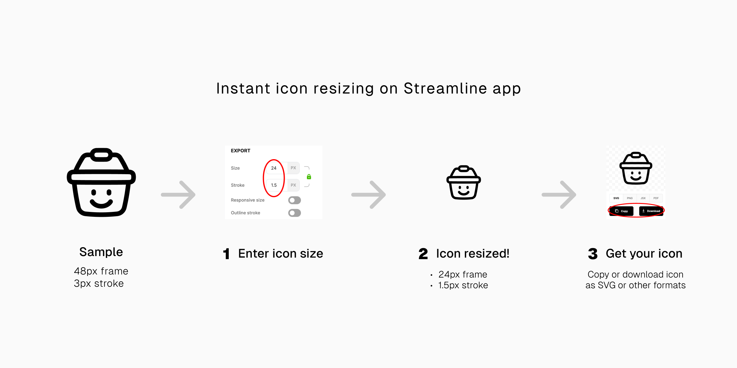
4. Instant solution
It's possible to scale icons and their strokes without opening any vector editor.
On Streamline app, you can simply type the icon size and they’re ready to be downloaded or copied directly to your projects.
Different sizes, different purposes
Different icon sizes have different roles and purposes.
By default, icons are designed for regular sized screens. Yet on certain projects, the regular size must be scaled down and the tiny icons resized multiple times from their original size.
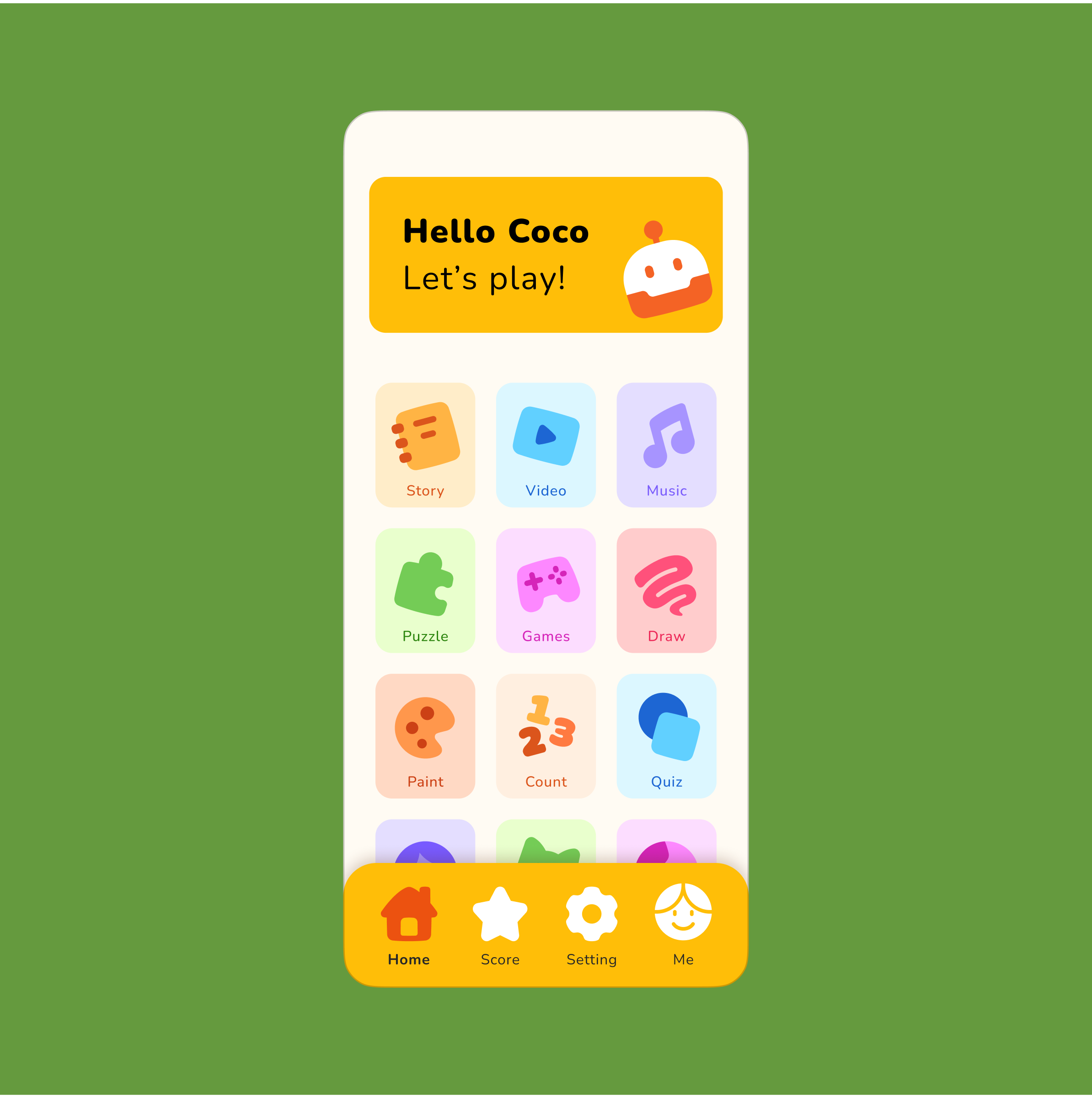
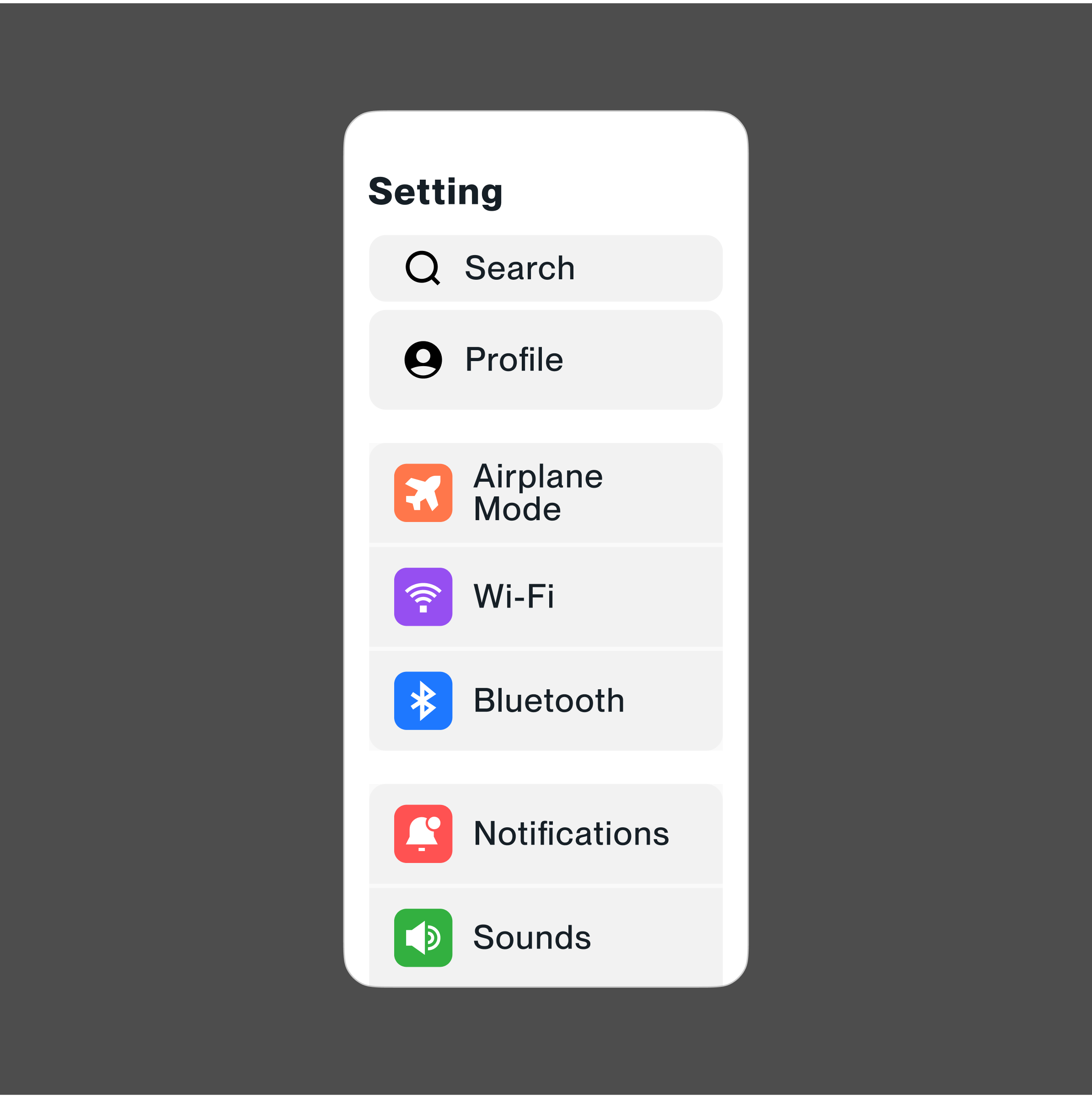
Regular size for basic interfaces
Regular sizes range between 14-32px, specifically 14px, 16px, 20px, 24px, or 32px. Icons in this size group ideally have minimum to medium level of details to keep them legible.
It is possible to scale small and big icons and use them in regular size. For big icons, though, you need to make sure that their details are not obscuring them.
You want to use regular sized icons on navigational interfaces designed for regular screen sizes either phone, tablet, or desktop.
Scaling icons within the size range helps to keep them at the right size for users to click with a cursor or tap with their fingers yet also save space for the other interface elements and not become a distraction.
Tiny icons for small screens and spaces
Any size under 14px is considered small, this includes 12px and 10px. Any icons smaller than that can be hardly recognized.
The ideal small icons have minimal details. They are designed to occupy small space in which excessive details become a liability that makes them less legible. Icons in regular and big sizes can be scaled down to be small icons as long as they're still recognizable.
You want to use small icons on small interfaces for space saving or keeping a spacious look. Bigger interfaces use them, too, but only for minor parts of the navigation.
Bigger icons for special cases
The size of big icons extends from 34px to 36px, 48px, 64px, and much bigger than that.
Bigger icons can be more illustrative than their smaller siblings. Their sizes allow for more customizations as they have space big enough for more details.
While it’s not recommendable to scale down and use heavily detailed big icons on small interface for legibility reason, it is very possible to use the least detailed small and regular sized icons in big sizes while maintaining their legibility.
At the very least, there are three cases where you need to scale up your icons and use them in bigger sizes.
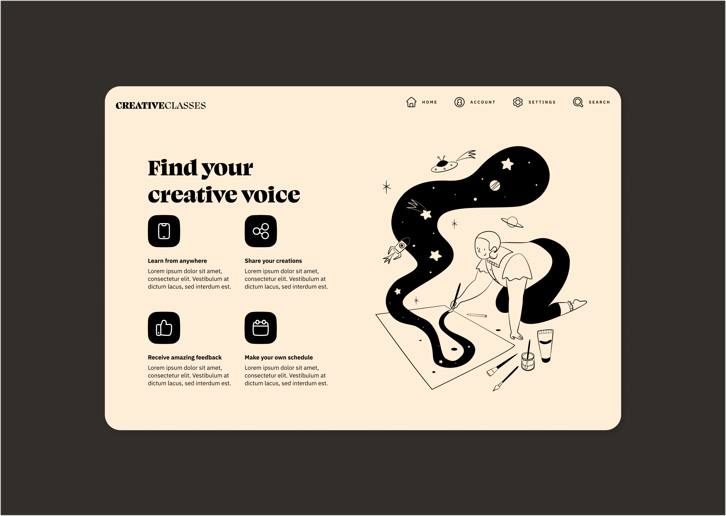
- Helpful aid on special interface
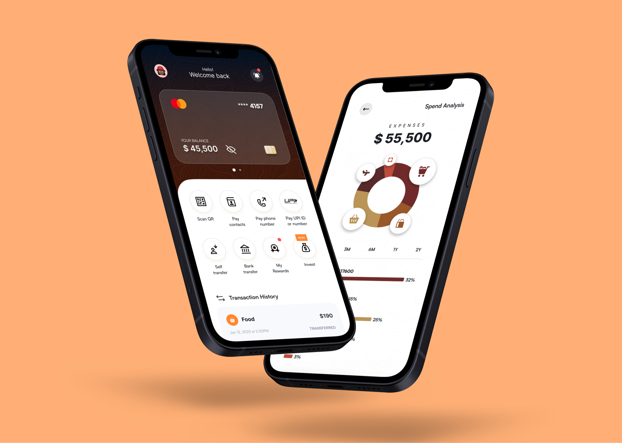
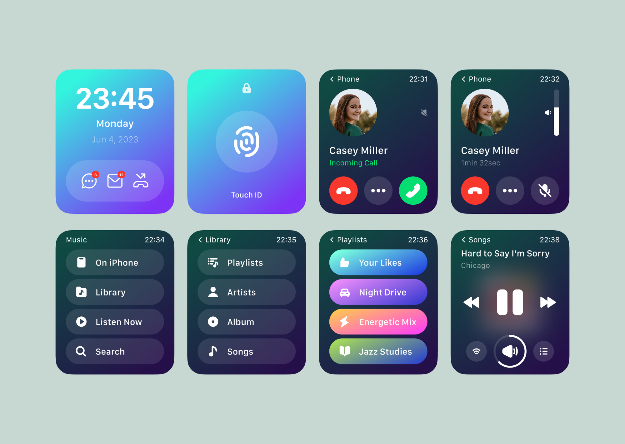
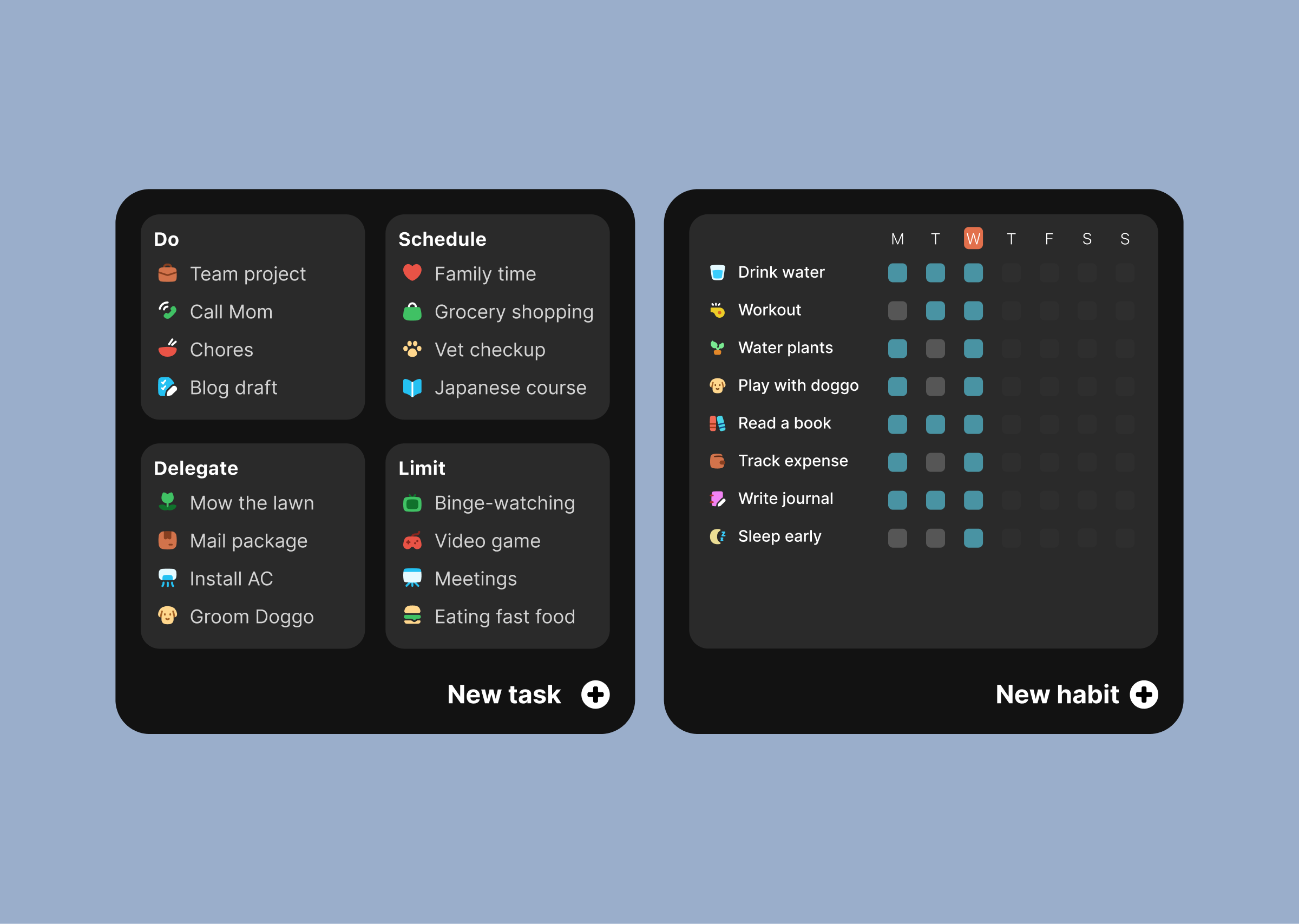
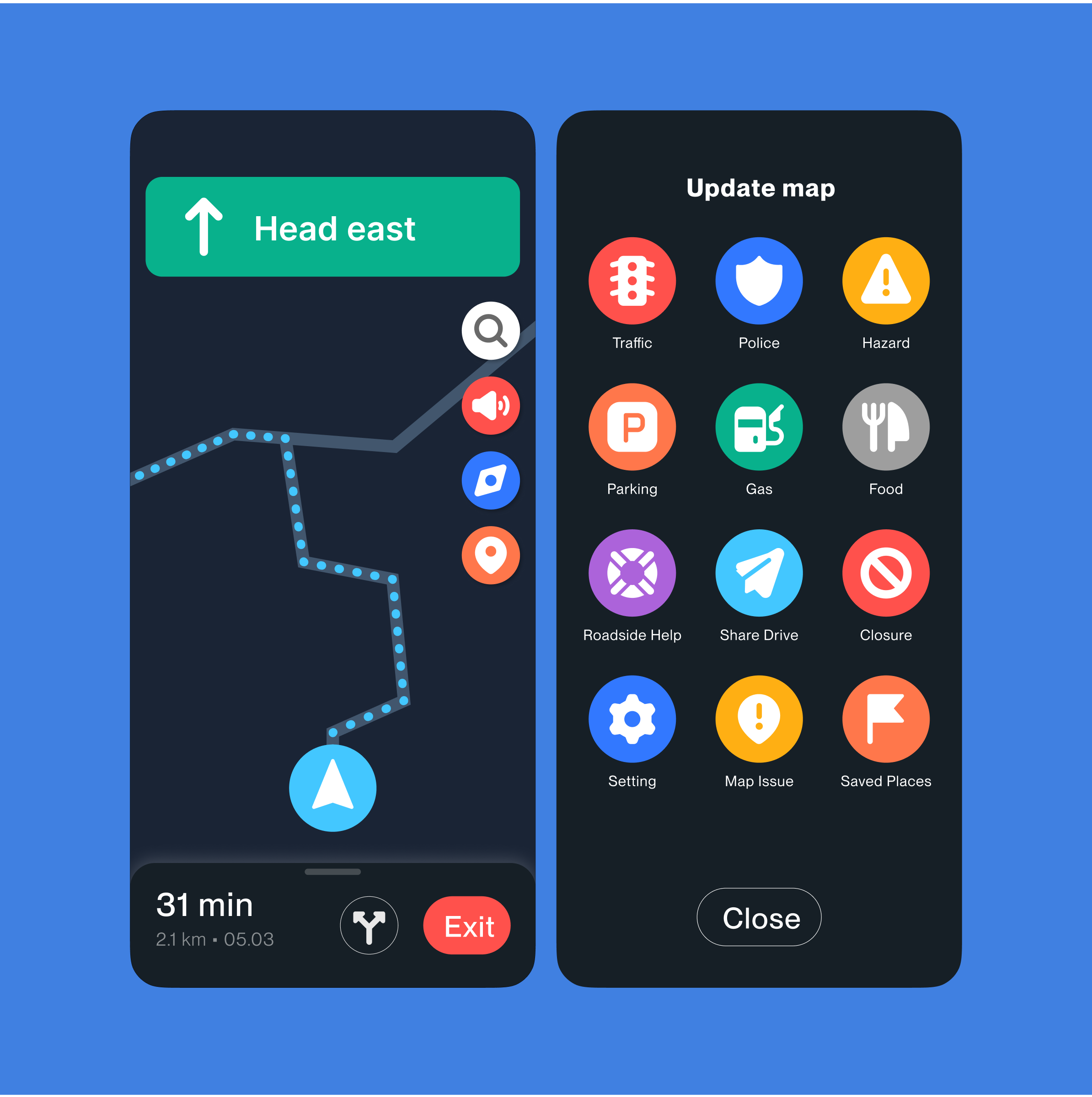
Not all interface can be designed the same way. For special cases like navigation app, kids-friendly app, and accessible interface, designers must provide users with better accessibility by using bigger icons for more visible buttons and wider touch area.
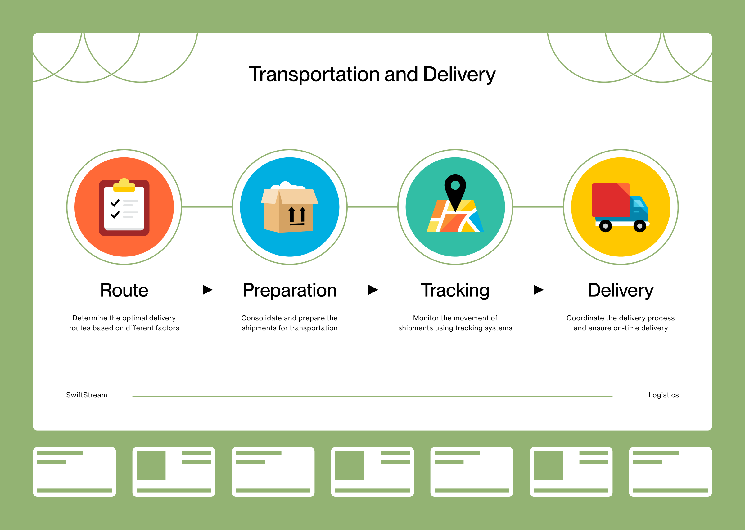
- Reliable substitute for illustration
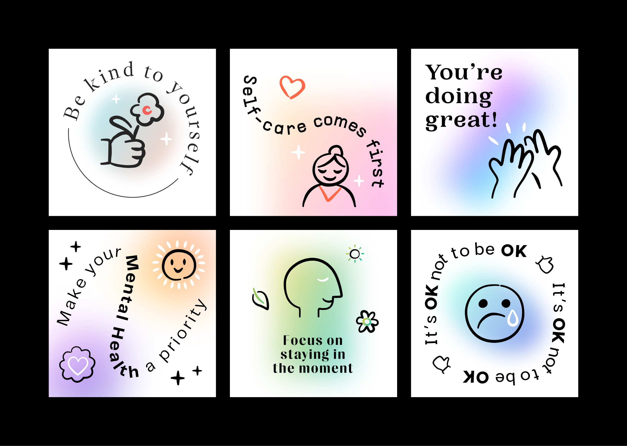
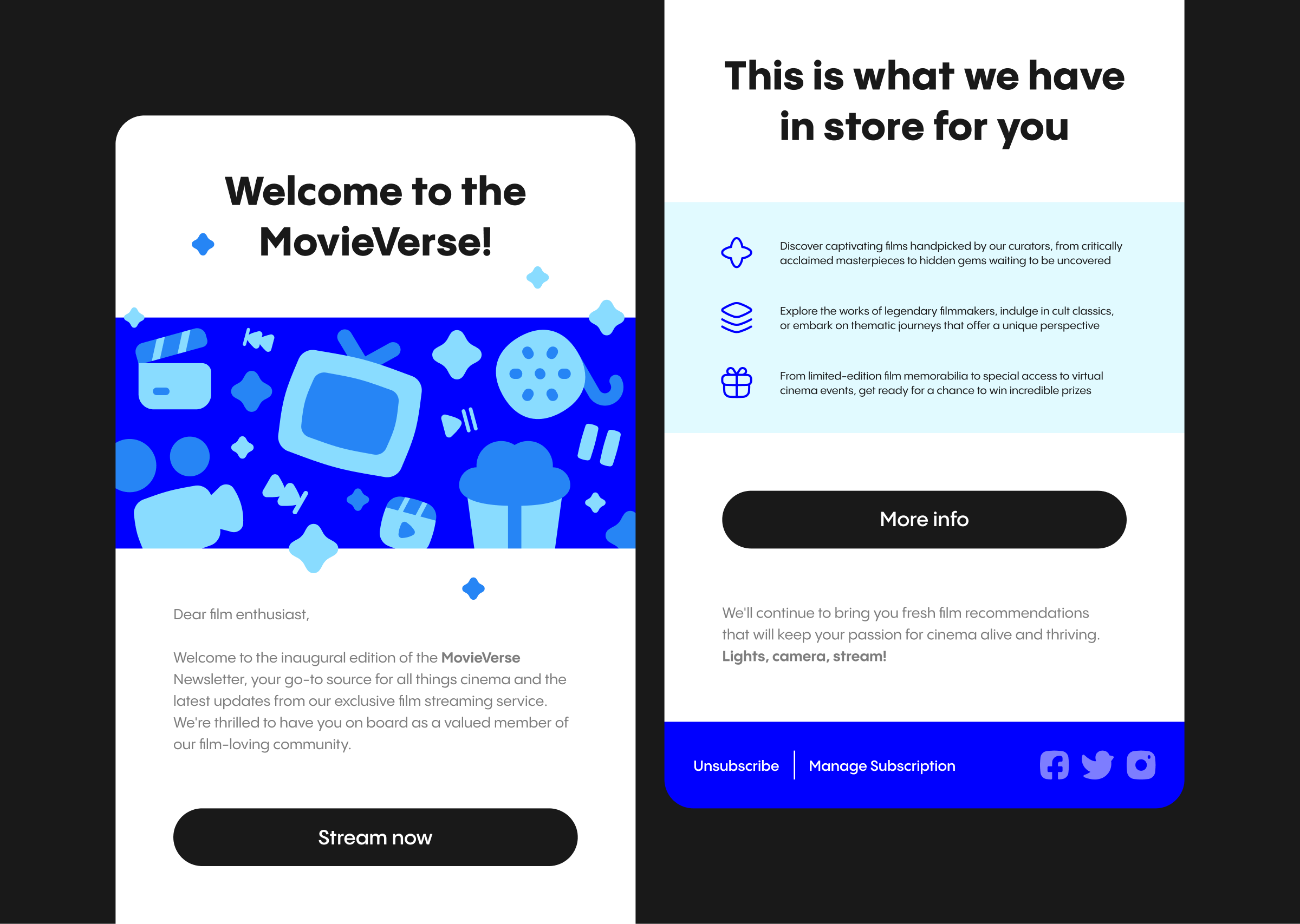
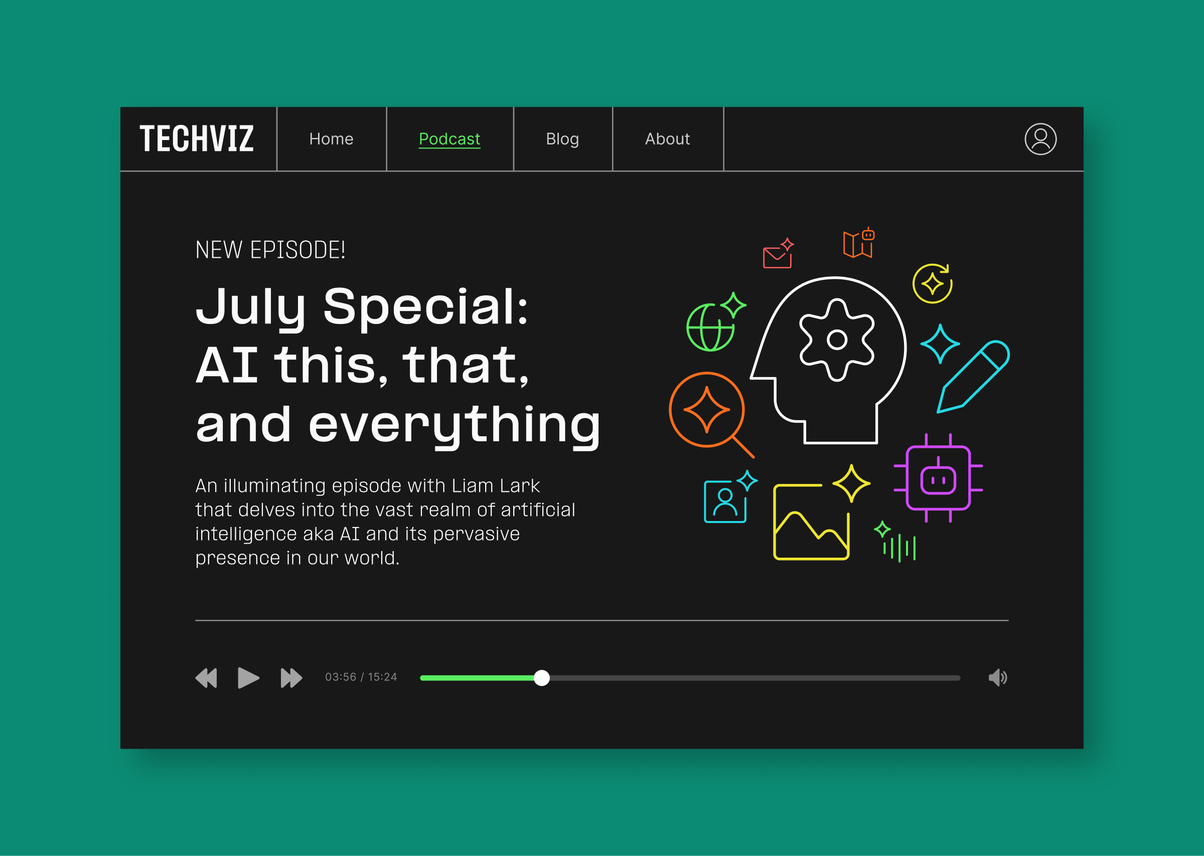
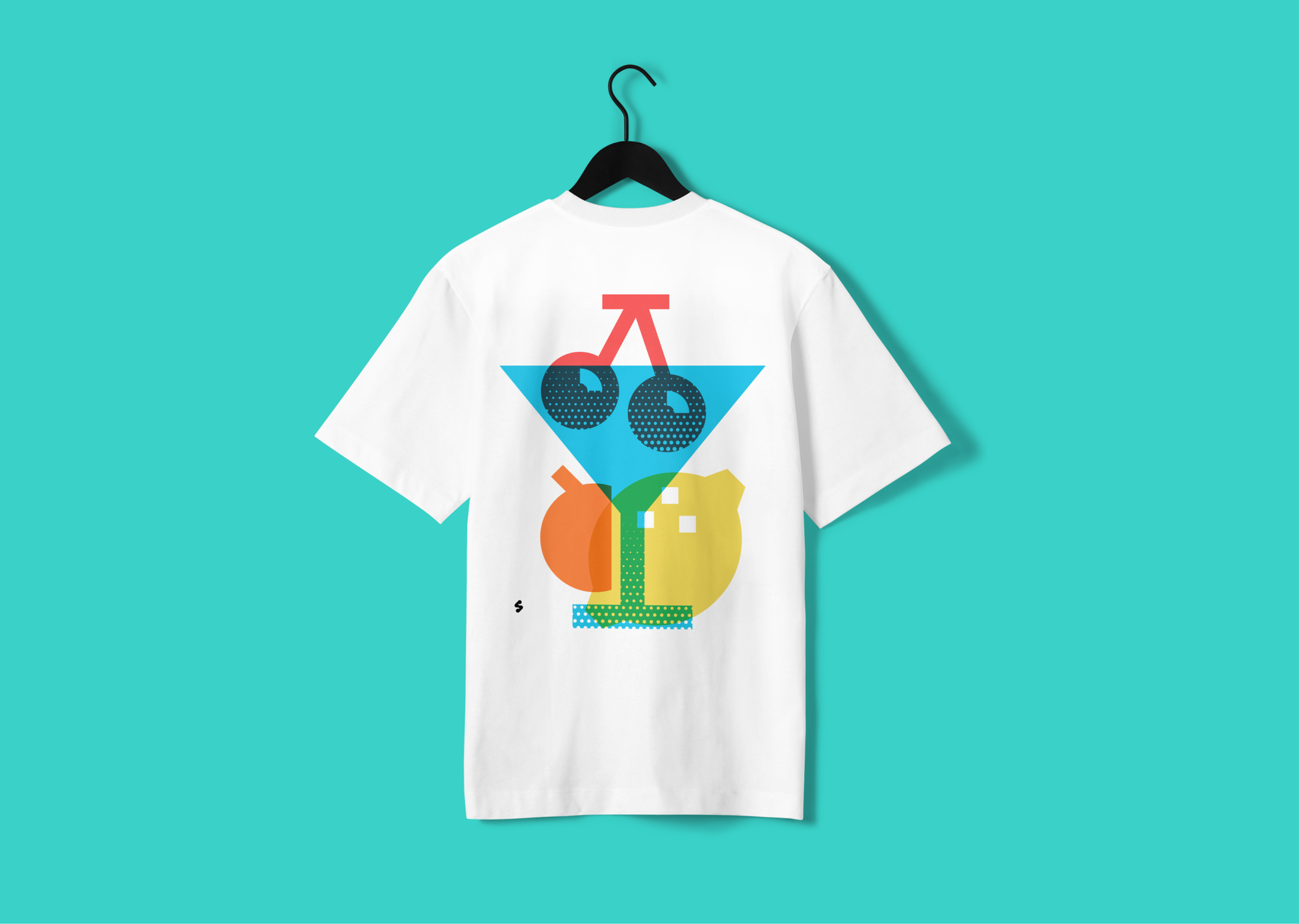
In this case, icons are scaled to the size of illustrations either it's small spot illustrations or something that takes up much more space than that.
They can become supportive elements for textual content, visual representations of concept and data, or simply just decorative elements.
Projects that use icons as illustrative elements include: product features, covers for online publication, mobile & desktop interfaces (empty space, onboarding, pop-up), social media content, infographics, diagrams, and presentations.

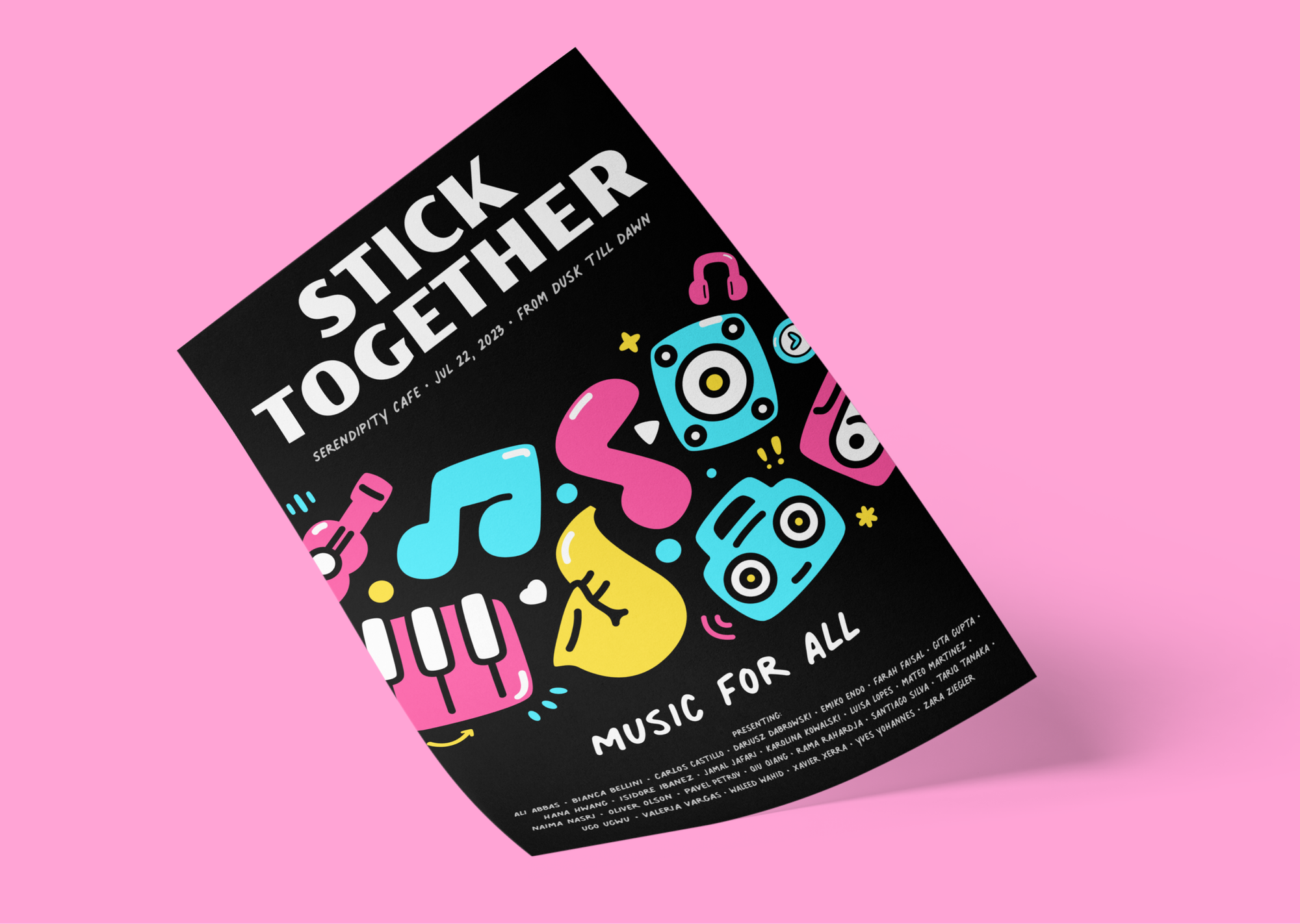
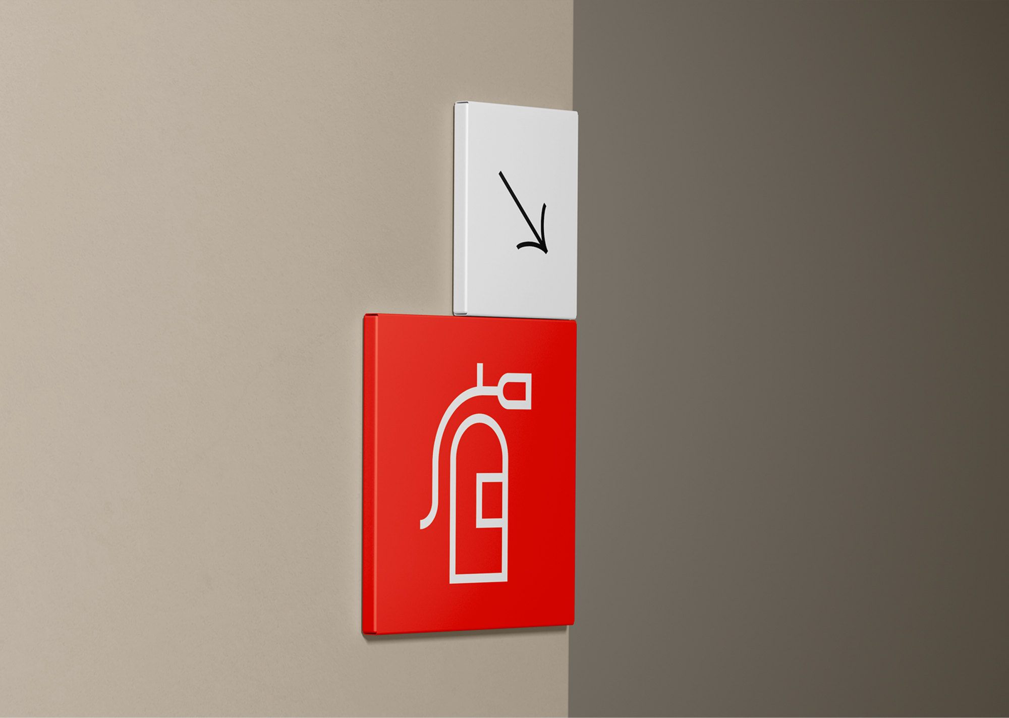
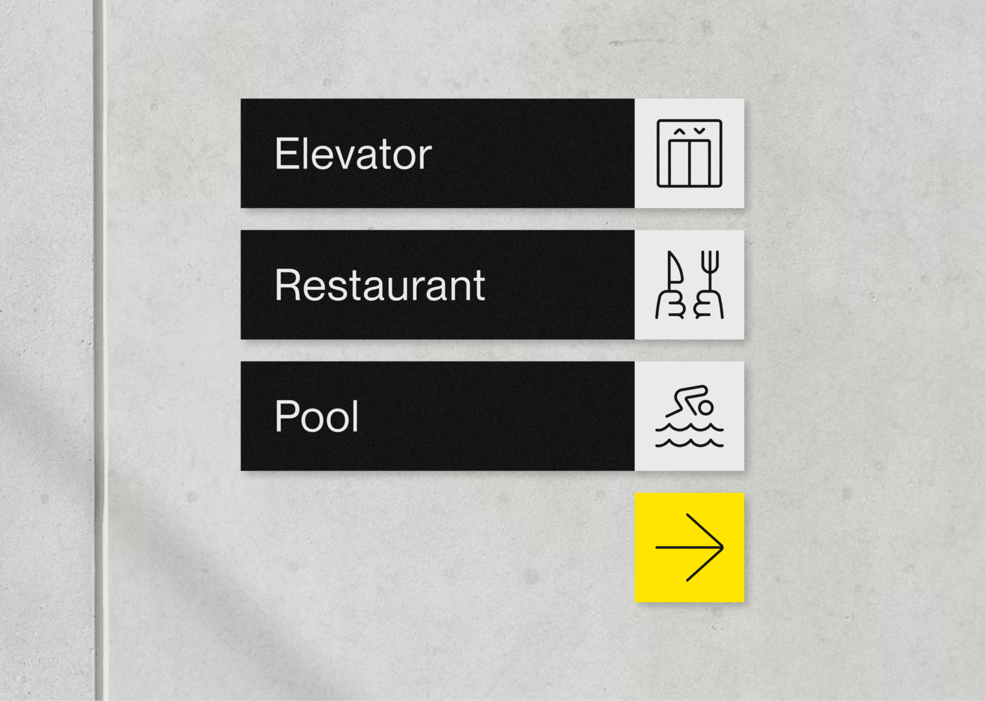
- Scalable visual for quality print
There are times when a design have to leave the screens to be printed out and used in the real world. Scalable icons, capable of retaining their legibility, will come in handy to ensure the quality of the printed products even on the biggest medium.
In the case of printed design, the icons can be on about anything. Let's say... packagings, products, stickers, apparels, accessories, book covers, posters, or maybe even... signages and billboard? Who knows?
When the icons are scalable, the limit is our imagination ;-)


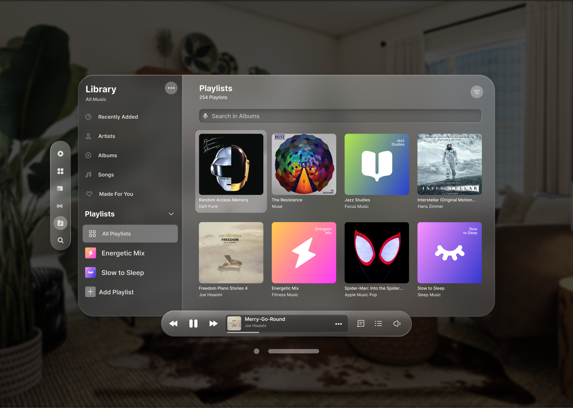
- Dynamic buttons on spatial interface
To keep content legible and interactive on this new, futuristic, and multi-dimensional spatial interface, a window will be dynamically scaled as it moves far away or closer to the user, making the size looks the same at all distance. In such case, scalable icons play an important role to keep the buttons legible in any size.
To put it in a cooler way, when you're using scalable icons, you're using a small part of the future. 😎
P.S.
Just like text headings, different sizes are useful to show hierarchy. Big icons for top priority, small icons for low priority. Another reason why scalable icons are essential for resizing icons seamlessly.
We make scalable icons ready to use for any project. Try them out and work on your project worry free.