How to customize vector icons lines for your project
Use the flexibility of vector editable strokes, to change thickness, change corners, or reshape icons.
Inconsistent icons hurt your brands and projects.
You can find icons with the right concept or metaphors, but if they’re made of line with different thicknesses that you cannot do anything about, you’re bringing in a disaster.
You want your icons to be editable so that you can customize them to your different needs and make sure they have unified look. We’ll show you how.
Know what your icons are made of
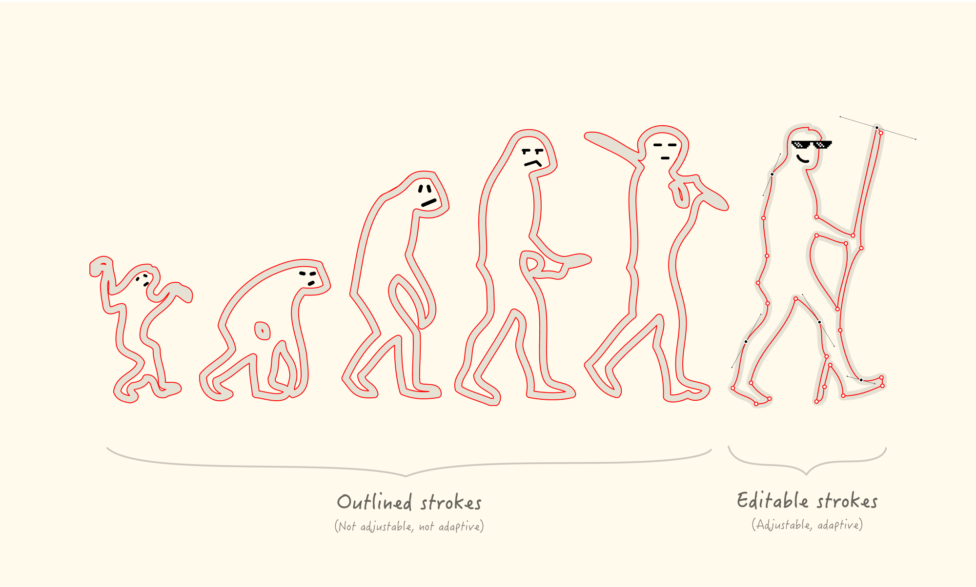
There are two kinds of strokes that make up Line icons: outlined and editable.
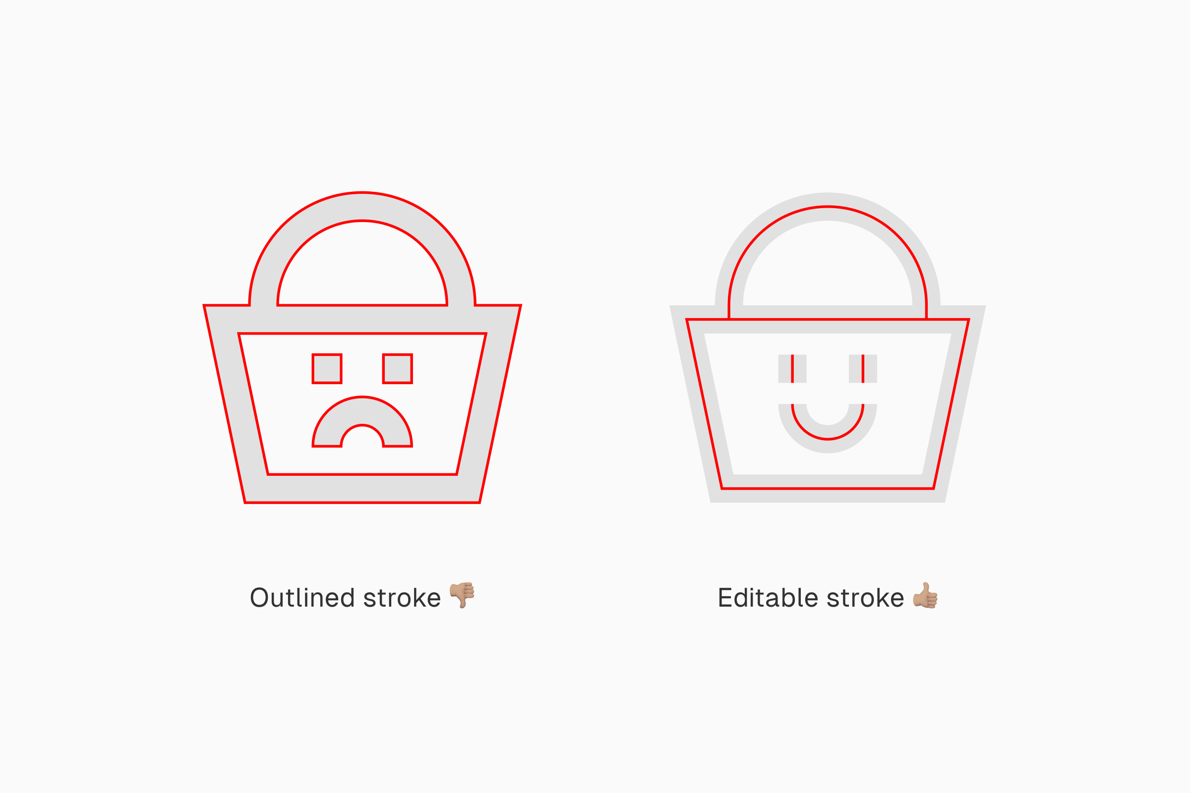
Outlined strokes have no actual stroke.
The original strokes have been expanded into flat shapes, making them much less editable. You can still resize icons with outlined stroke and change their colors, but that’ all. You won’t be able to customize the strokes because there's no stroke.
Editable strokes are flexibly customizable.
Unlike the outlined one, the strokes stay as strokes. Not just resizing and changing their colors, you can also adjust their thickness, change their ends, or turn them into curves. It almost feels like a magic compared to the outlined one.
The perks of having editable strokes
If you want to be able to customize your line icons, you need to make sure that their strokes are editable. These kinds of strokes give you more control on how your icons look. More parts of the icons become editable, making them more customizable.
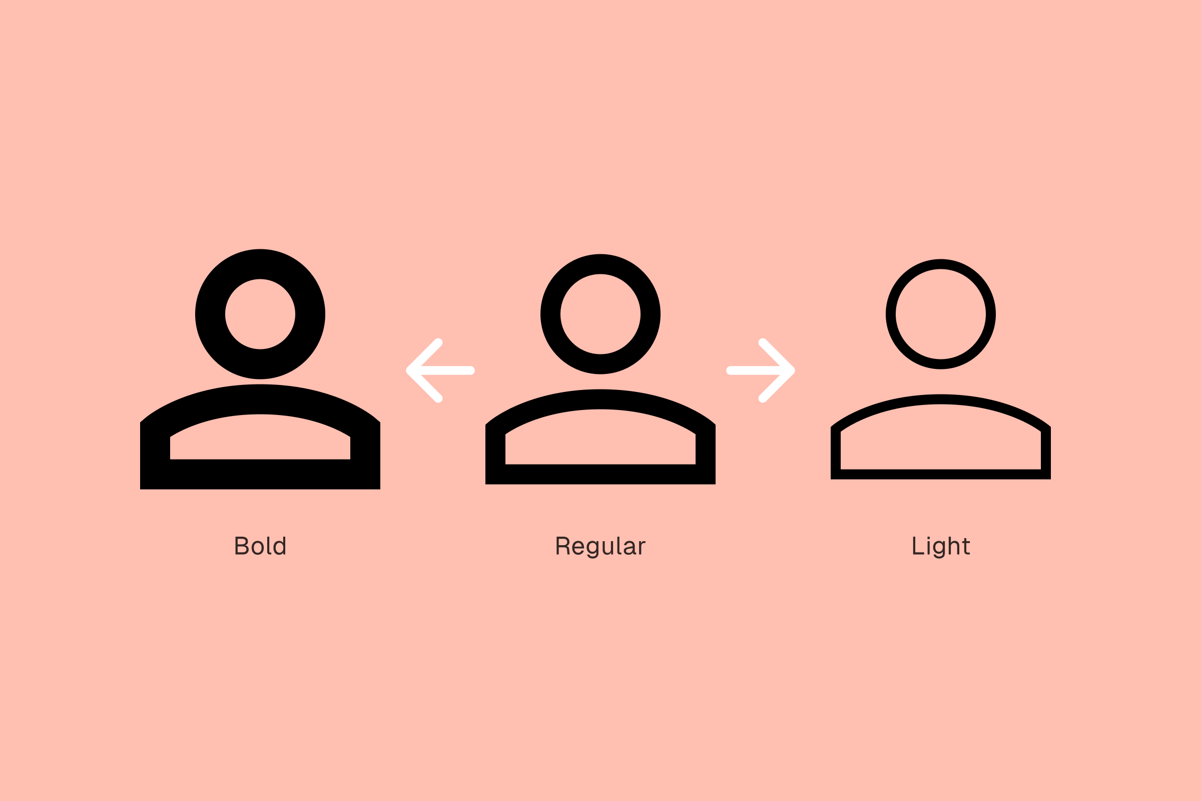
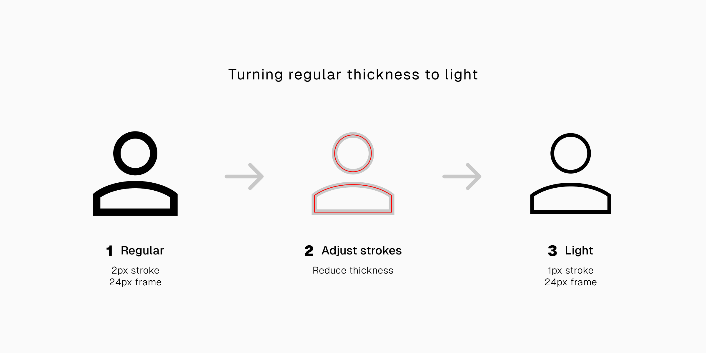
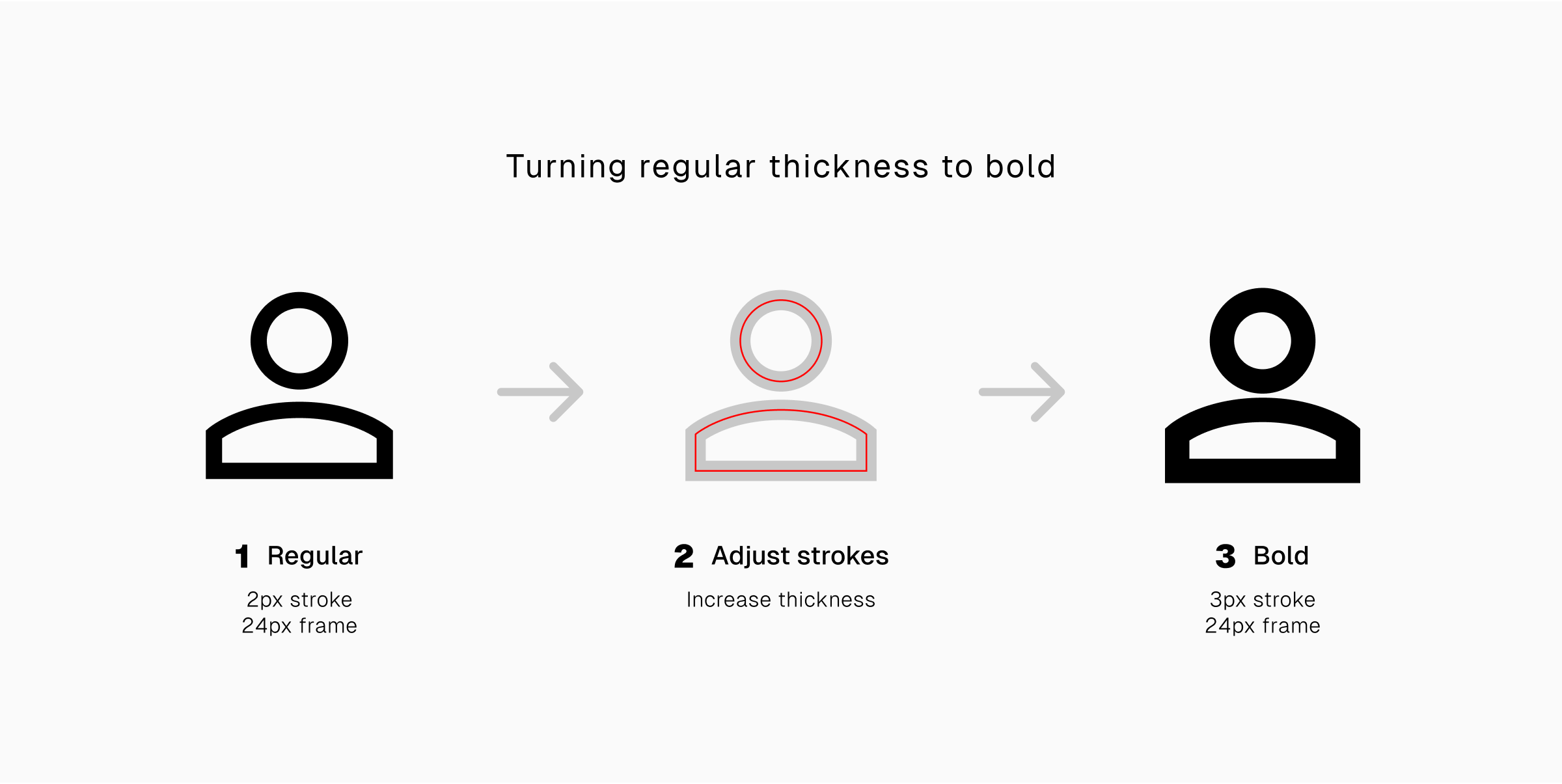
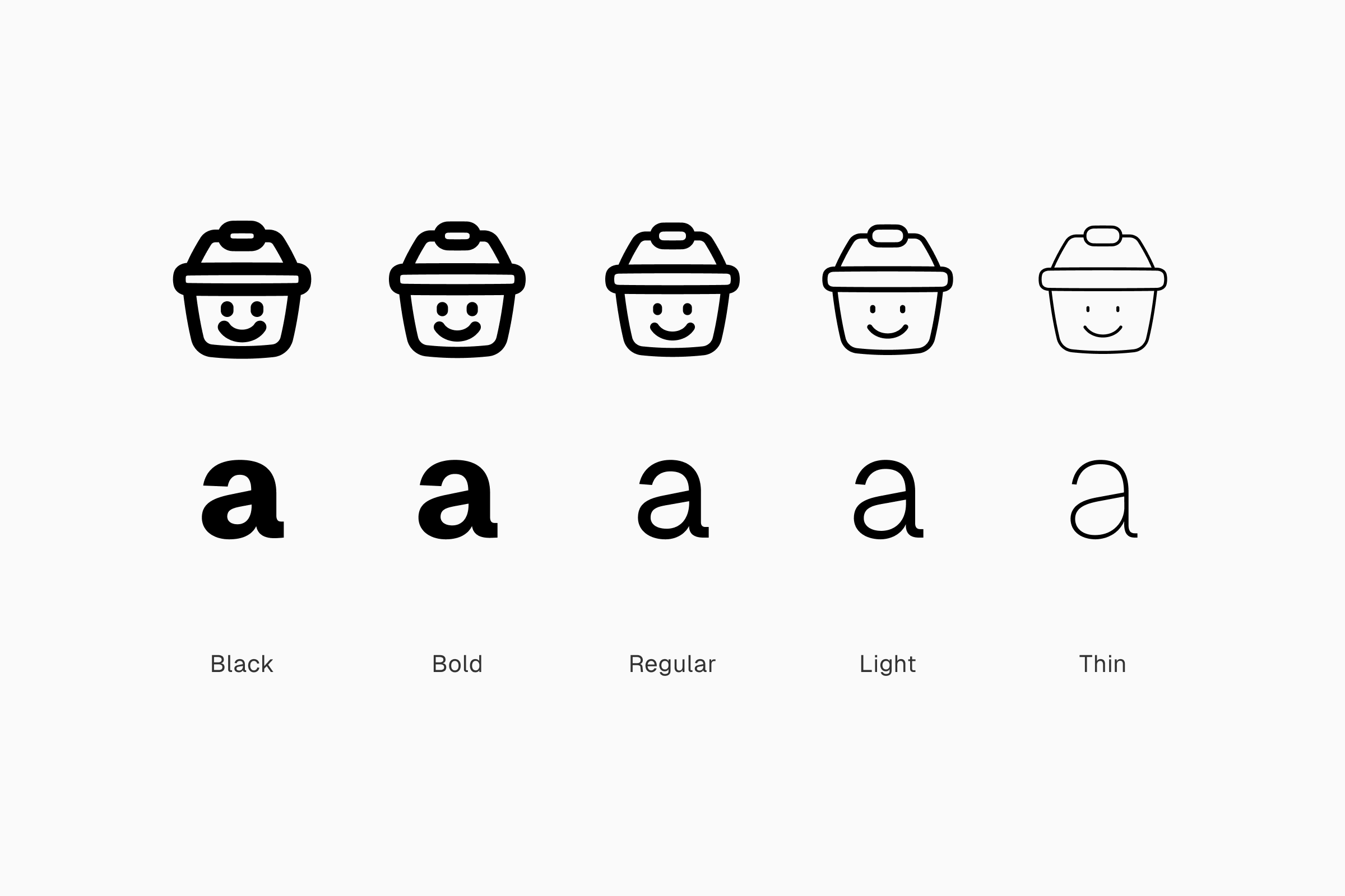
1. Adjustable thickness
The basic feature of icons with editable strokes makes it possible to adjust their thickness to your exact need. You can adjust icons with regular stroke width to have bolder or lighter look. It’s all on your fingertips.
...
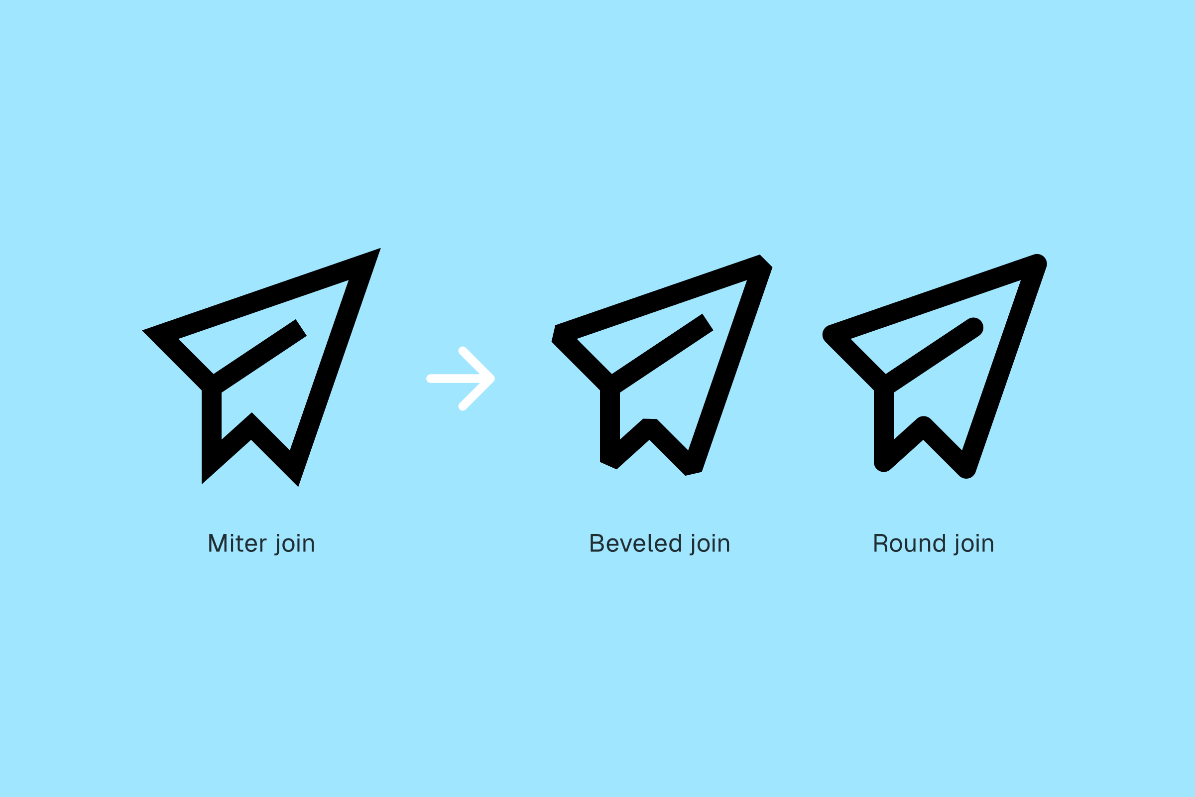
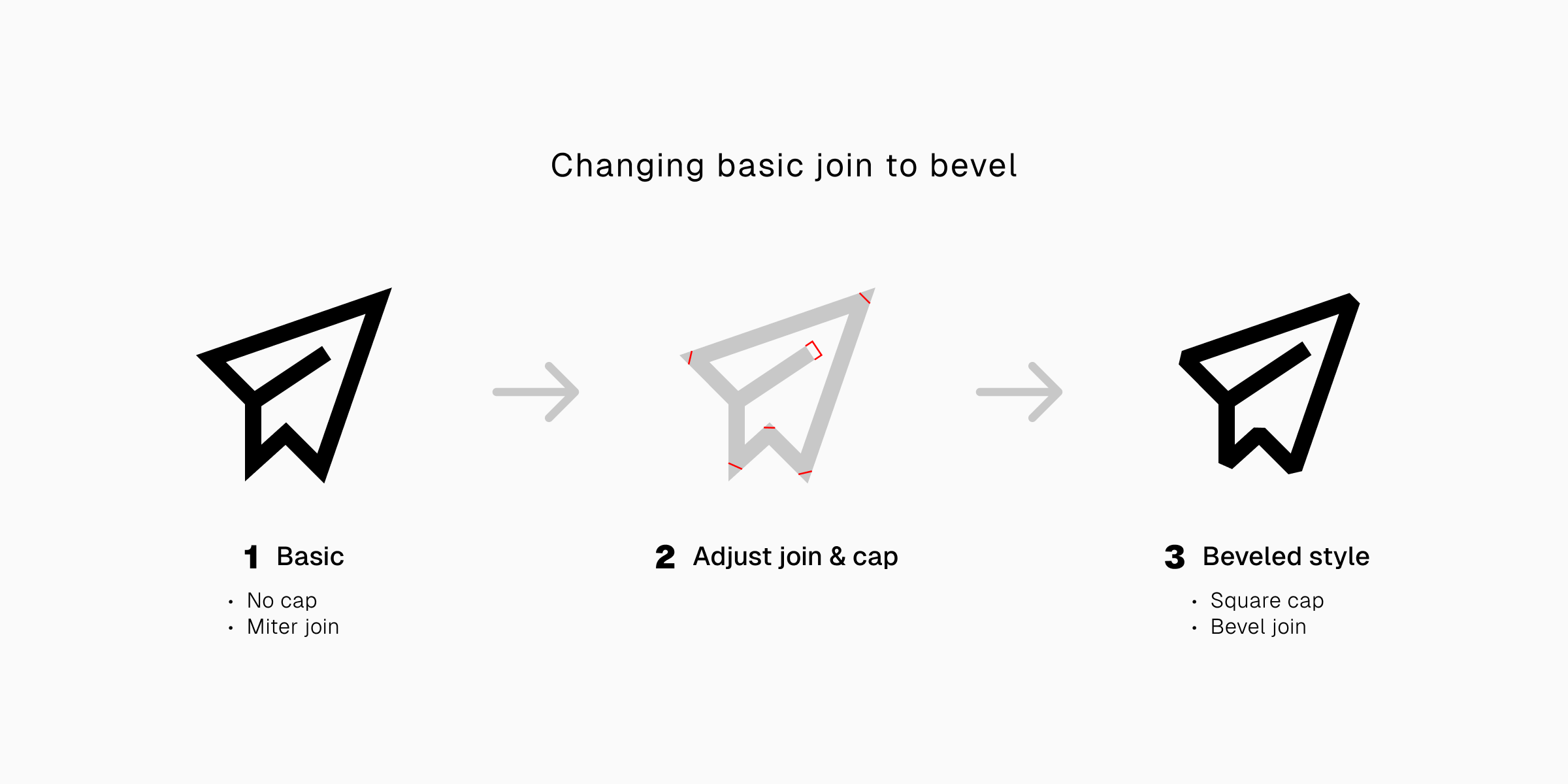
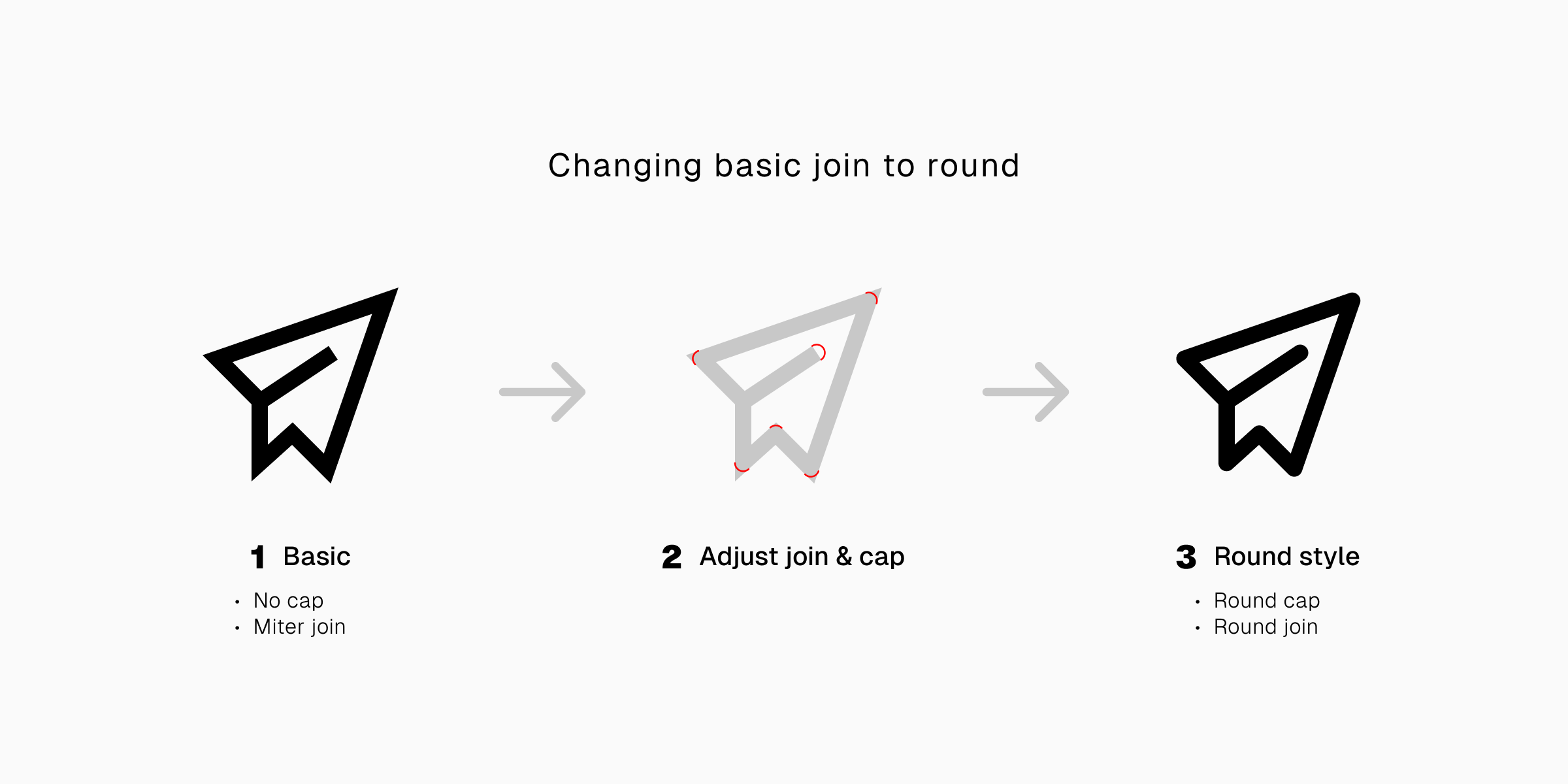
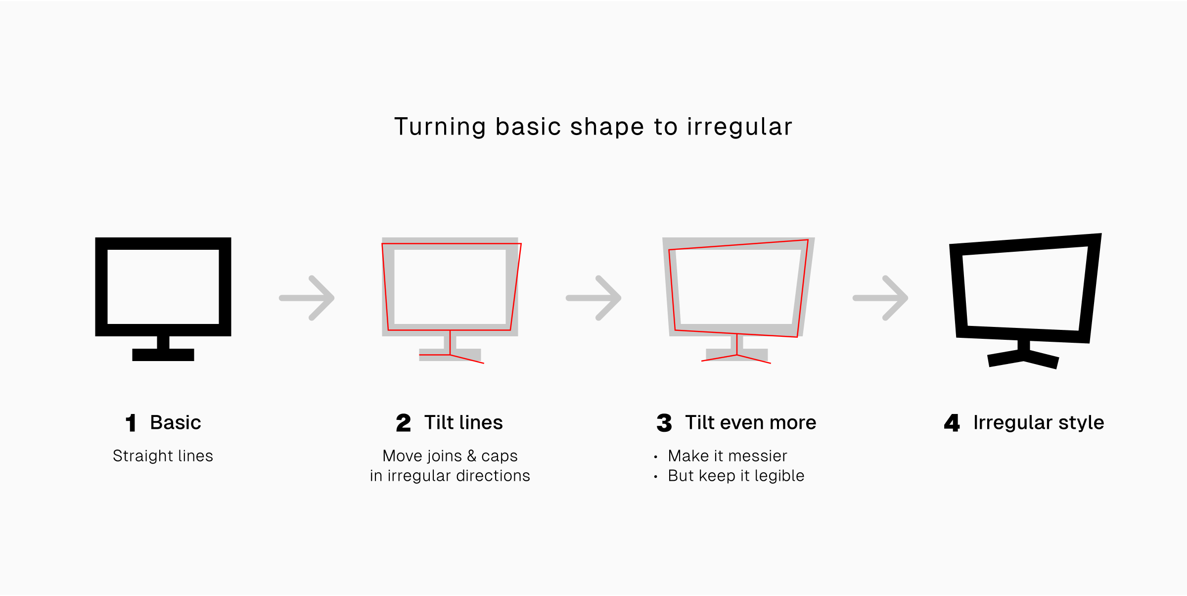
2. Changeable caps and join
When the strokes are not outlined, their caps and joins are also customizable. You can change them, turn them from round to square, and vice versa. It's tweaking your icons on atomic levels, making them unique to the smallest details.
...
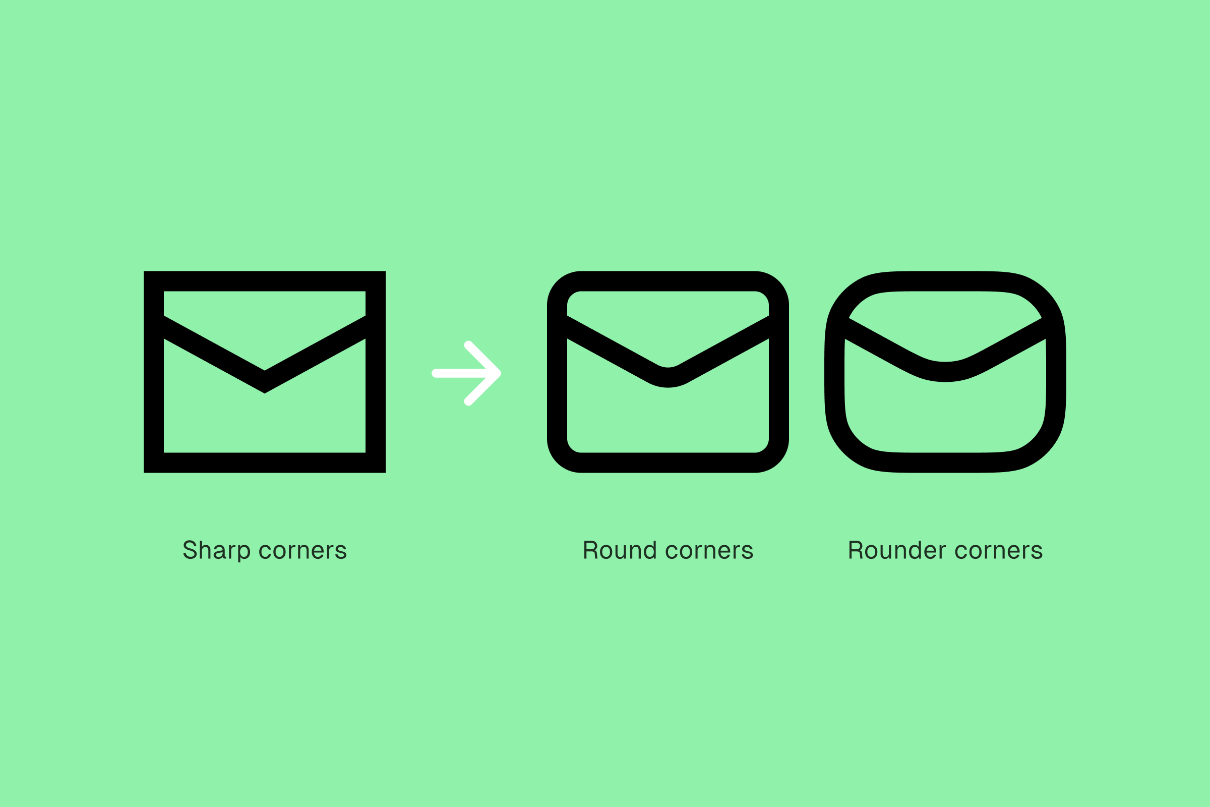
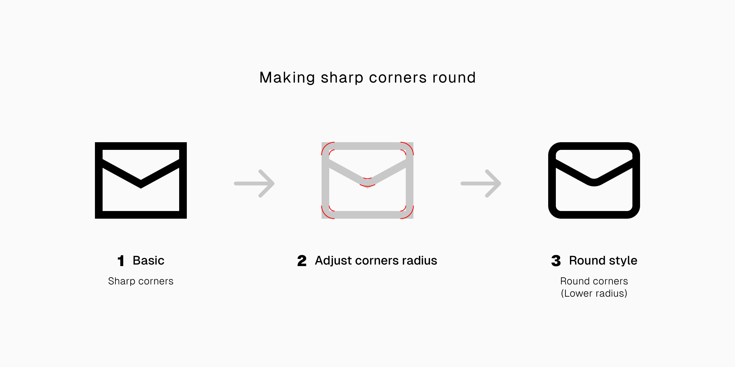
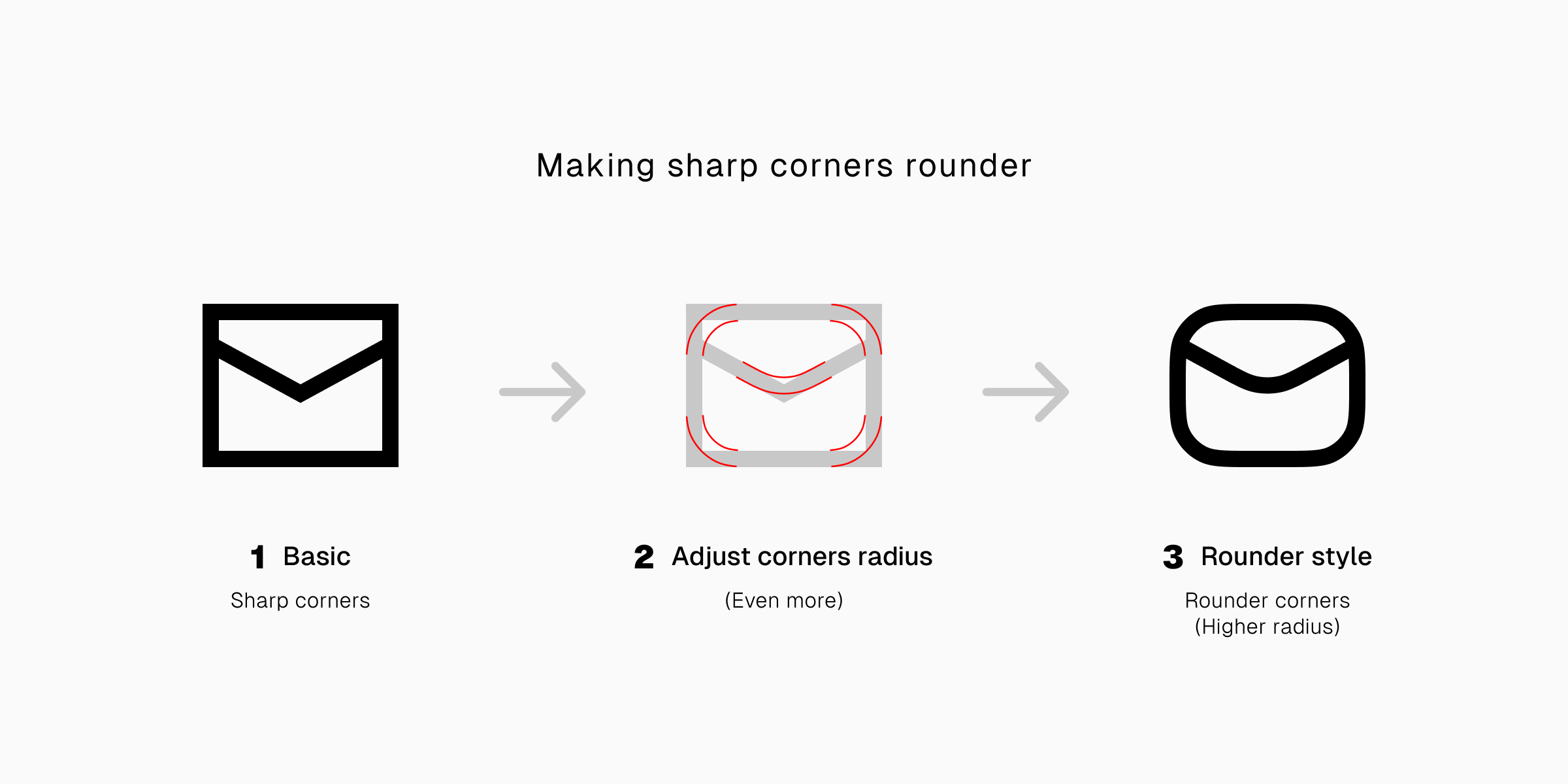
3. Customizable corners
Editable strokes also mean customizable corners, which means you can adjust the roundness look of your icons. You can turn icons with sharp corners into icons with different levels of roundness by adjusting their corner radius.
Mind you, this option to customize corners is available especially for joins that have not yet turned to curves.
...
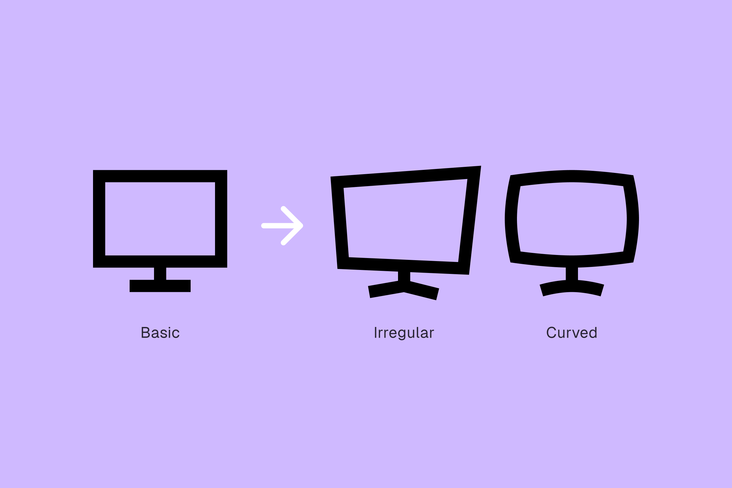
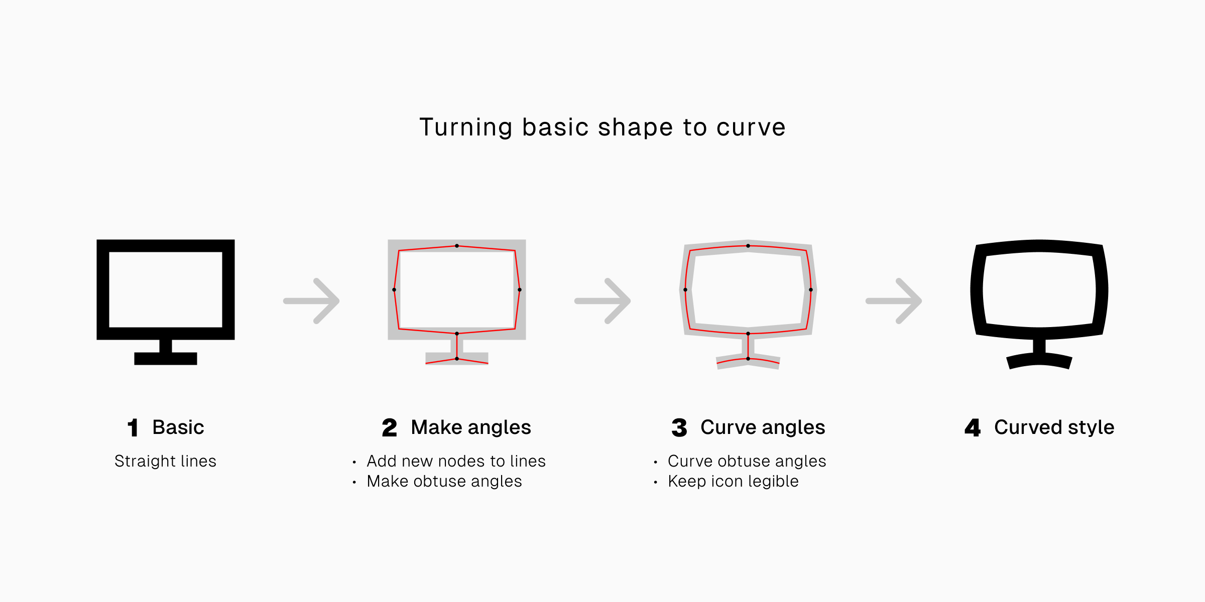
4. Easier to reshape
When the strokes are editable, reshaping the icons also becomes more convenient.
Easily turn straight lines into curves? Tweak the shape of an icon into an entirely different style? Such superpower only available if your strokes are editable.
One stroke to rule them all
A direct result from having editable strokes is a better compatibility.
Using varied stroke widths, you can give the icons different thicknesses that could flexibly fit to the unique moods or themes on different projects.
And you can really do that with a single editable stroke. There’s no need for different files just to have icons with varied thickness.
Different cases for different weights
1. The basic and neutral
Like a typeface with regular weight, it’s the basic thickness for most line icons. It’s the most compatible and most neutral. It’s the default and safe choice if you’re not sure with the other options.
Icons with regular stroke thickness are something that you want to use on a page where a lot of information is displayed like the general navigational interface, sidebar, or menu.
You want them to be clearly visible without causing any distractions. You want them to blend so well with the other design elements without making them hard to find.

2. The bold and chunky
Bolder strokes make icons more noticeable. Icons with this stroke thickness will catch your attention when displayed with other design elements that not as bold and not as visually heavy as them.
Like a bold typeface, you can use bold icons as a display element like when showcasing product details and features. They will draw user’s attention before leading it to information that comes with them.
3. The light and delicate
Thin strokes has the least visibility compared to the other widths. Yet they show the highest level of simplicity. Adjusted to the right level of lightness, they can give a touch of aesthetic and elegance to an interface.
Light icons have their own place on minimalistic interfaces that display only limited amount of information. With less information fighting for attention, you can use them either to display product details and features or put them or as navigational buttons.

P.S.
Like evolution, only the most adjustable icons will survive in different conditions. It’s survival of the fittest—the most compatible. And editable stroke is the key for better compatibility.
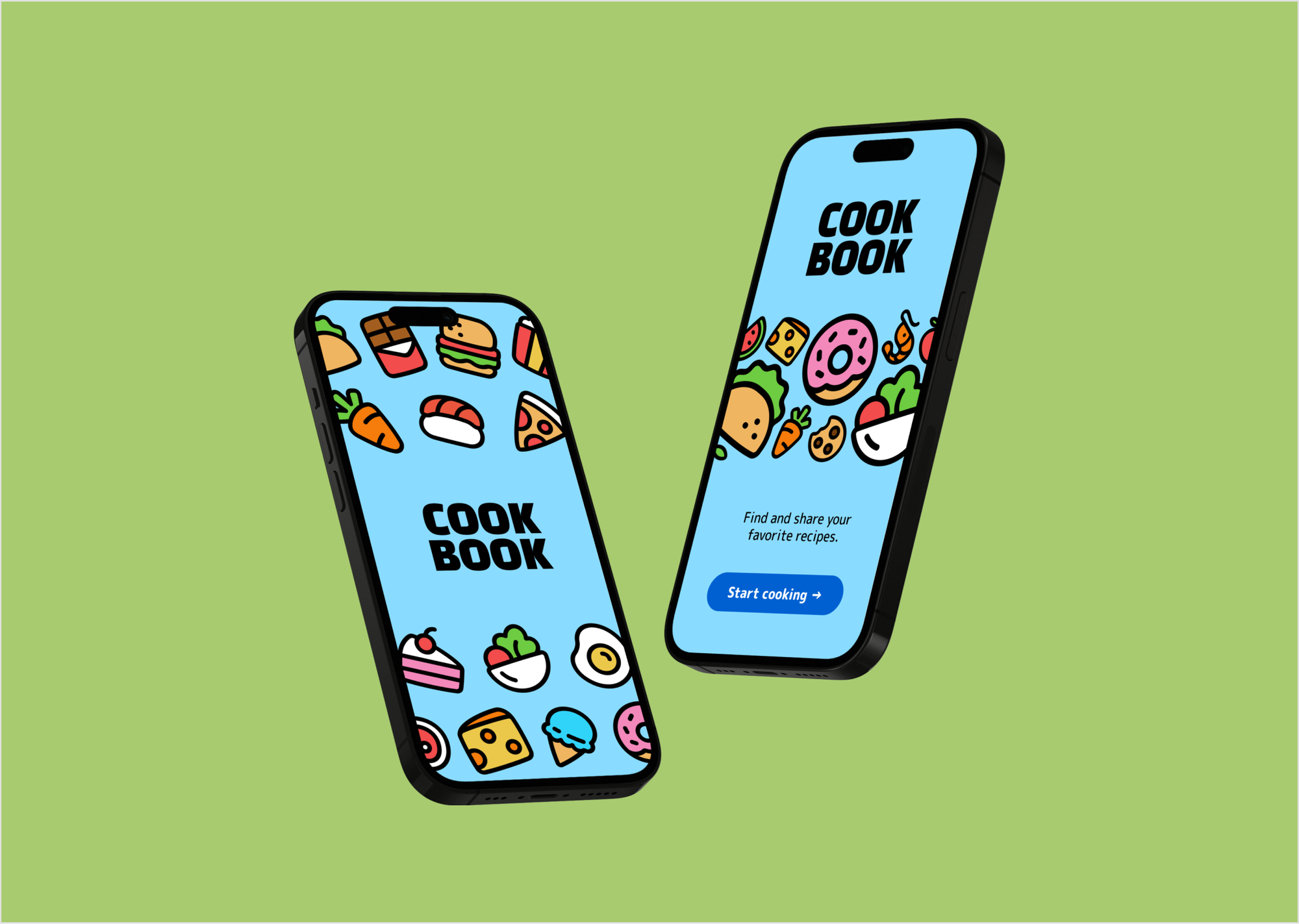
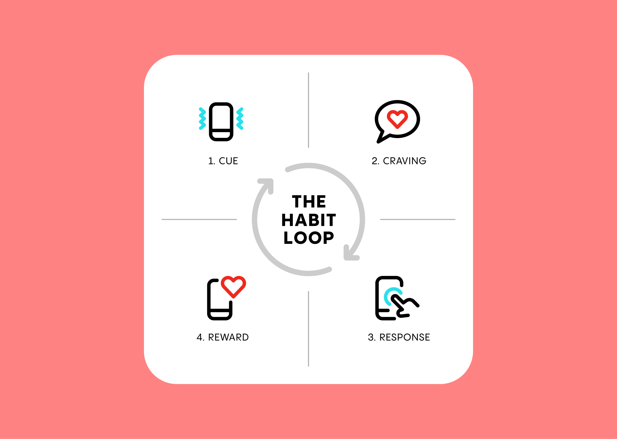
Get your icons with editable strokes on our huge library, and start leveling up your projects.