How to use the Streamline Icon System
Master a system of sixteen icon sets, with interchangeable styles. An ever-growing collection of consistent, high quality icons.

"Words divide, pictures unite."
— Otto Neurath
Otto Neurath was the inventor of the Isotype method of pictorial statistics. His vision of visual signs as a universal language inspired us to create our Streamline Icon System.
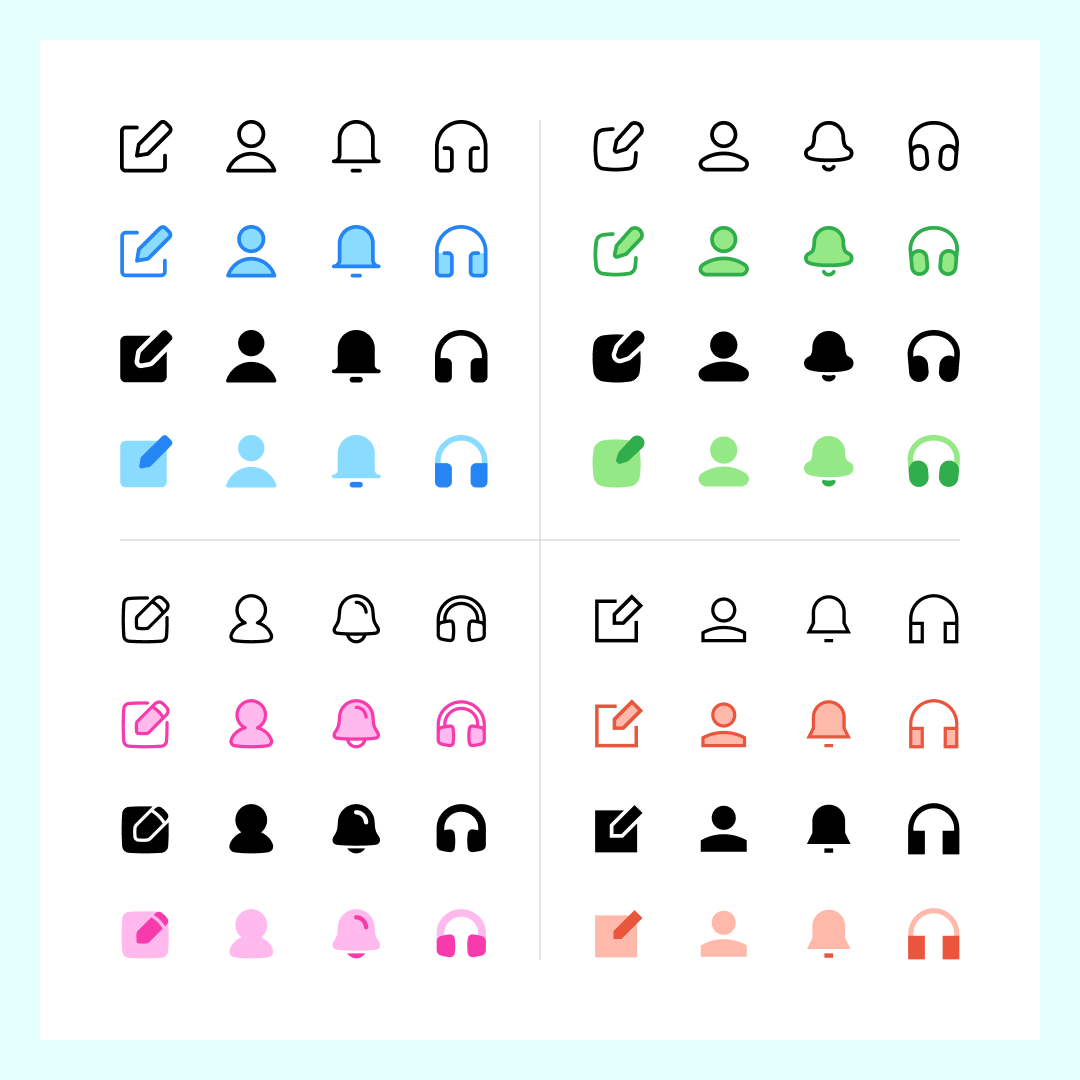
The Streamline Icon System is based on four families: Core, Flex, Sharp and Plump. Each one with a unique and strong style, from neutral to brutal!
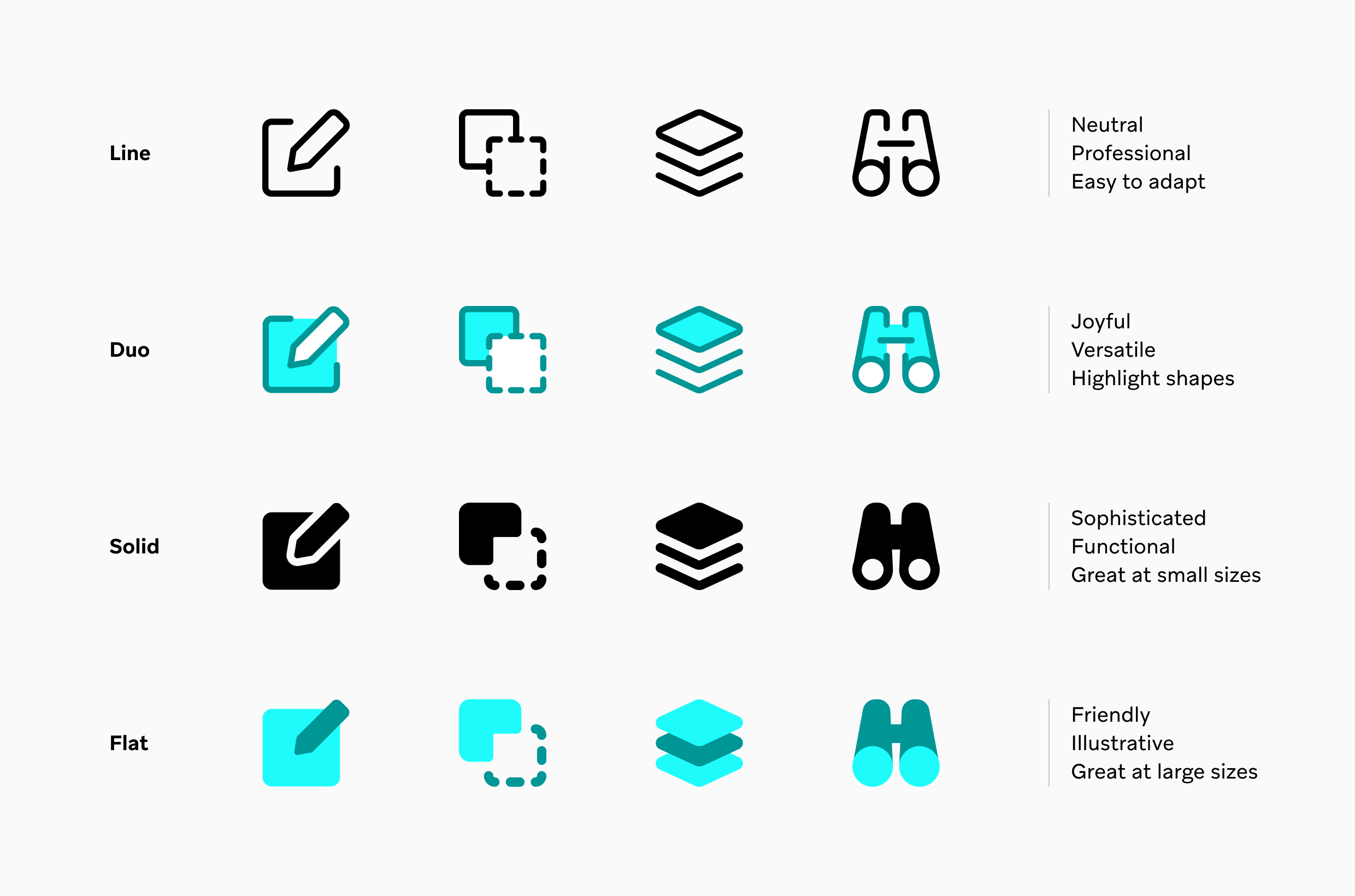
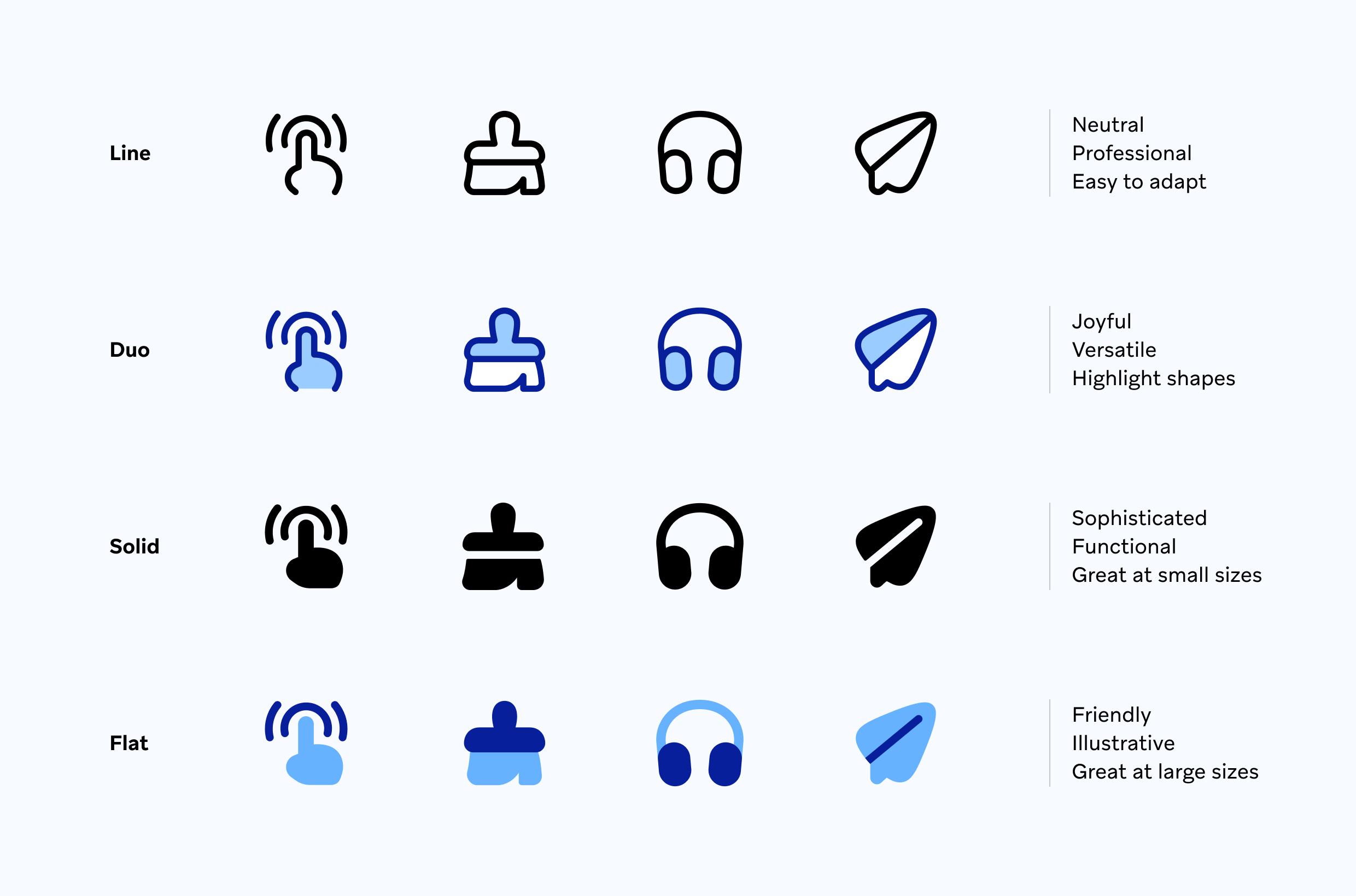
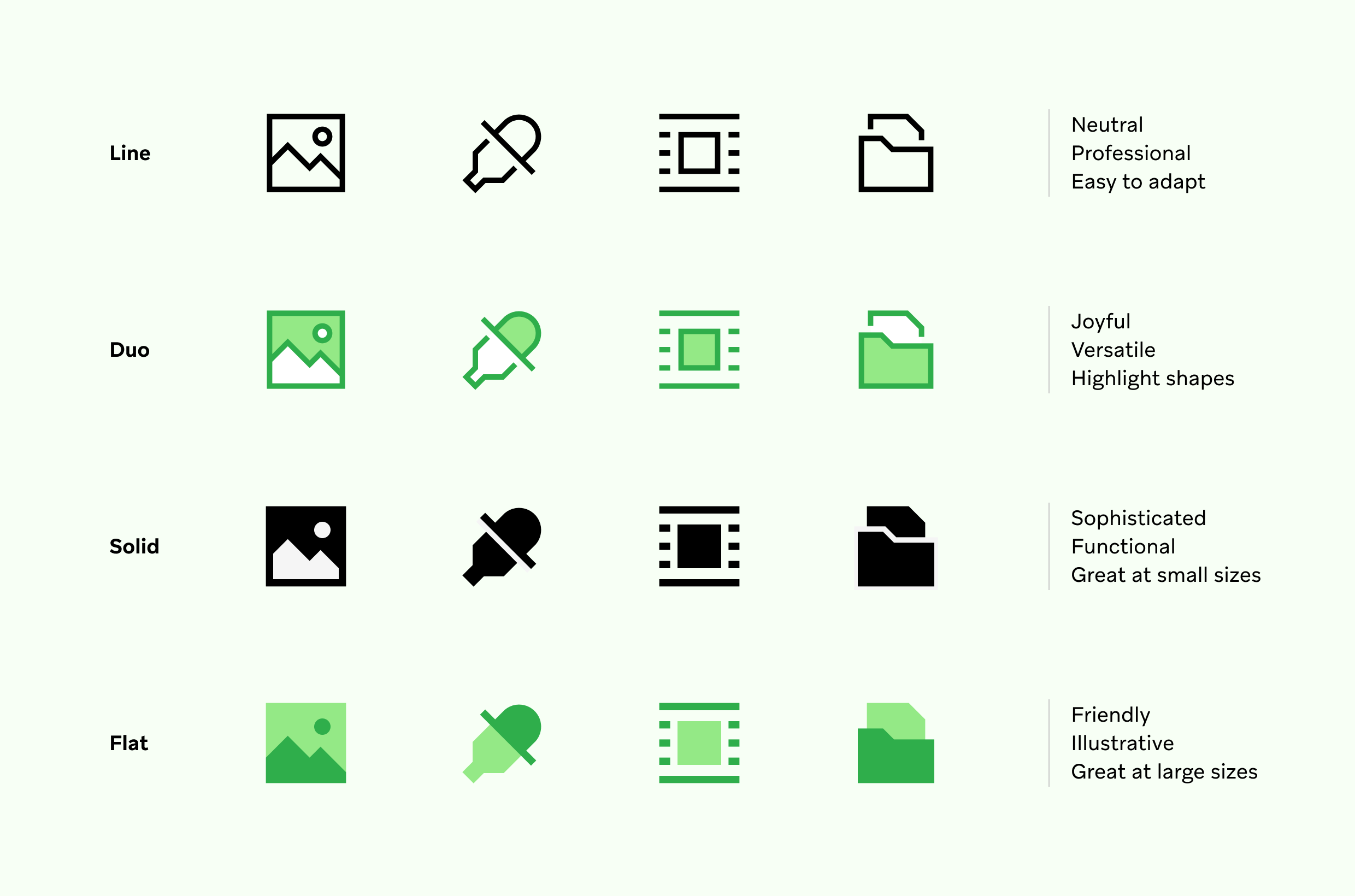
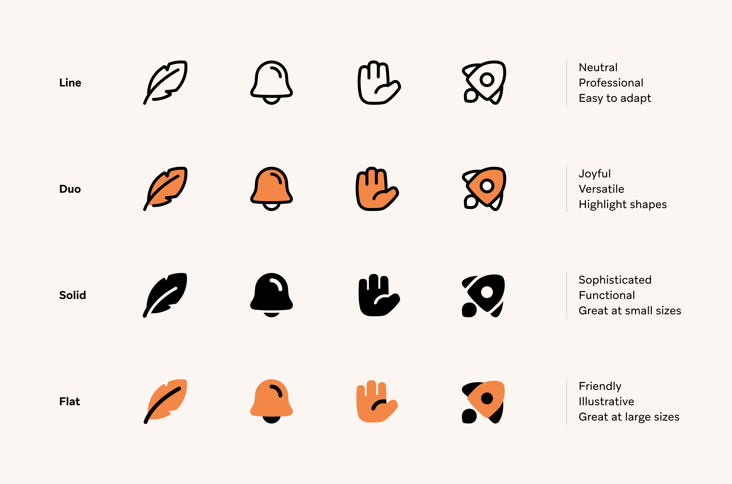
Each style comes in four different variations: Line, Solid, Duo and Flat. So, you have a total of sixteen different sets to suit your branding and design needs.
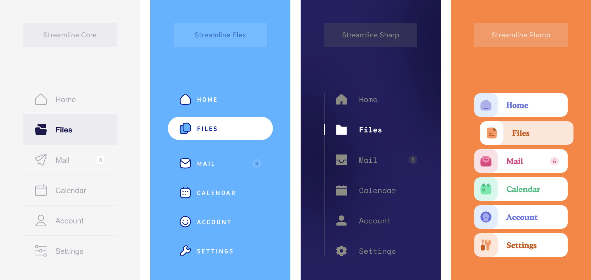
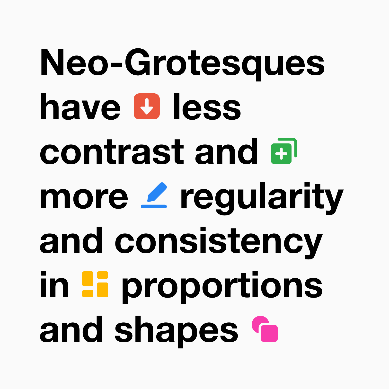
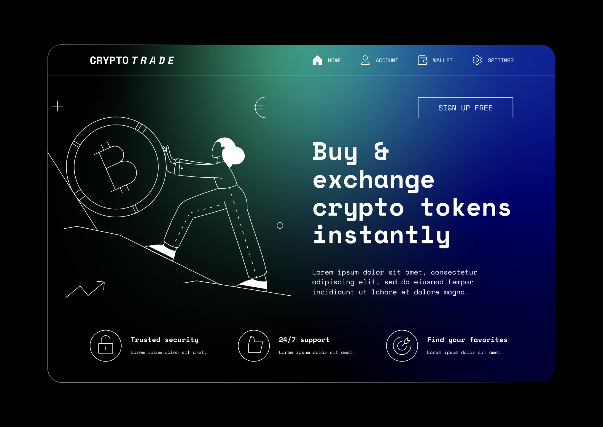
Core, the Helvetica of icons
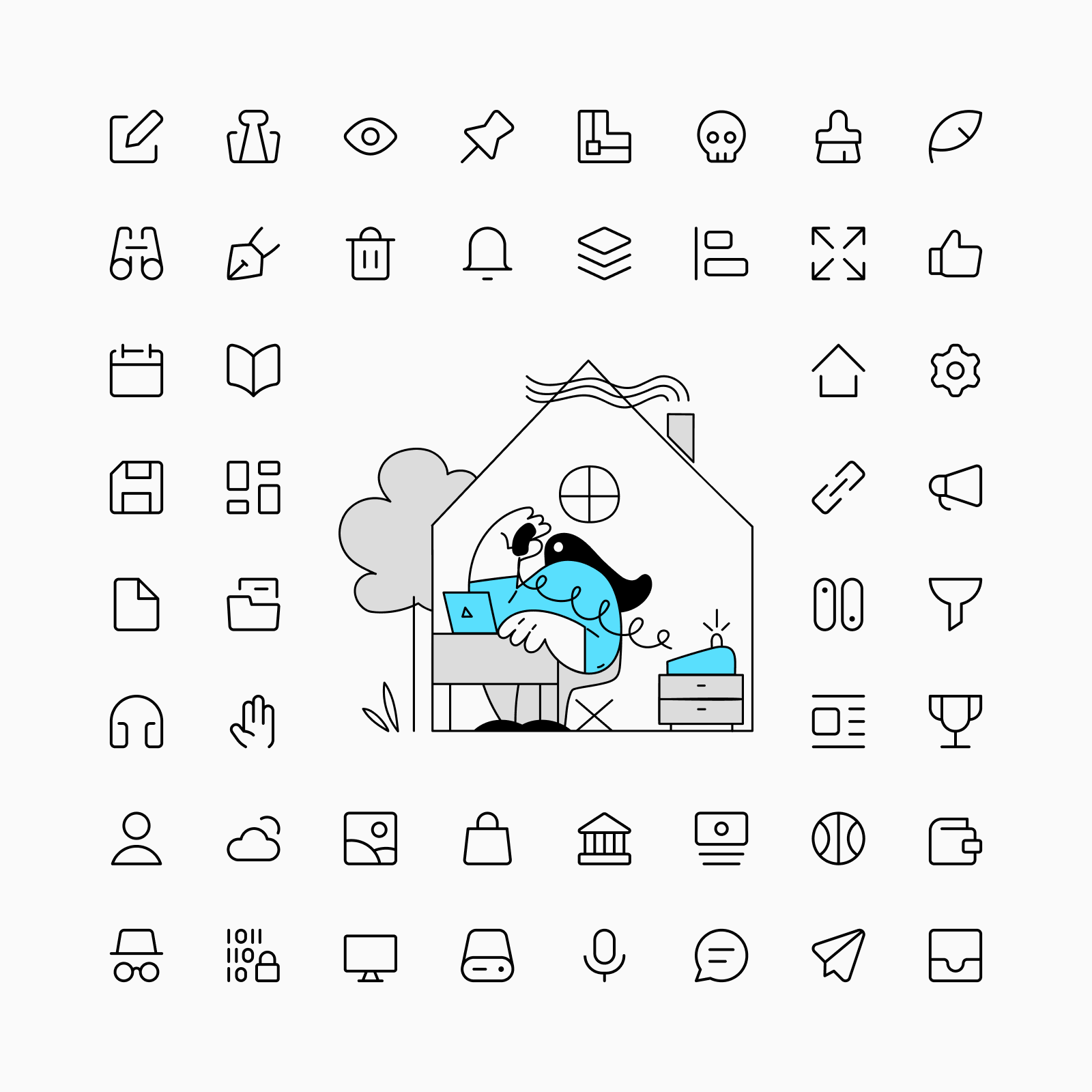
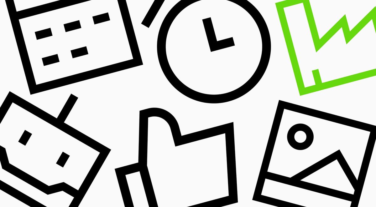
Core is a rational, versatile and timeless set that works perfectly in any context: interfaces, graphic design, signage, etc. Its simple construction and legible shapes make it the perfect choice to be part of a neutral and functional design.
When to use Core?
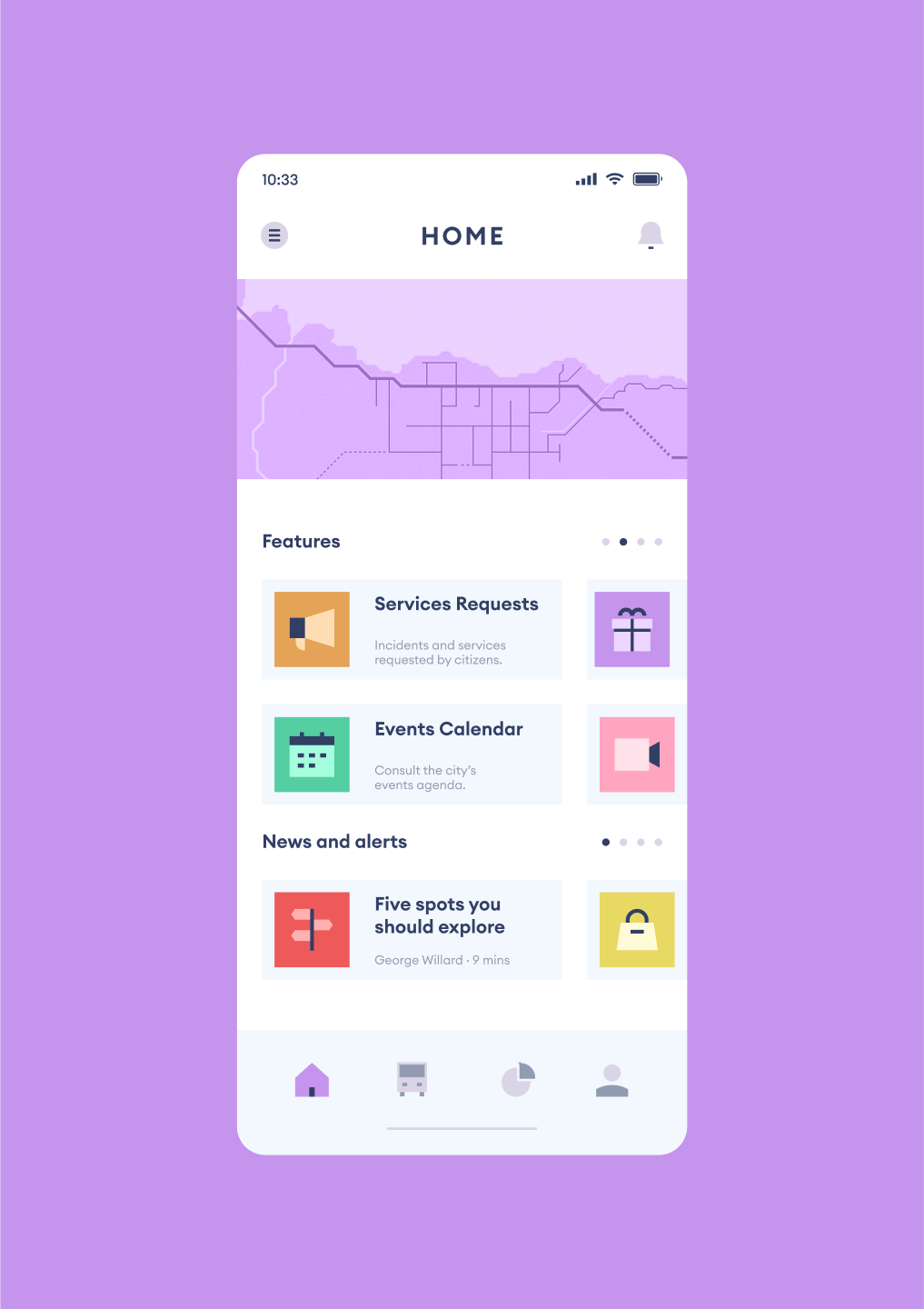
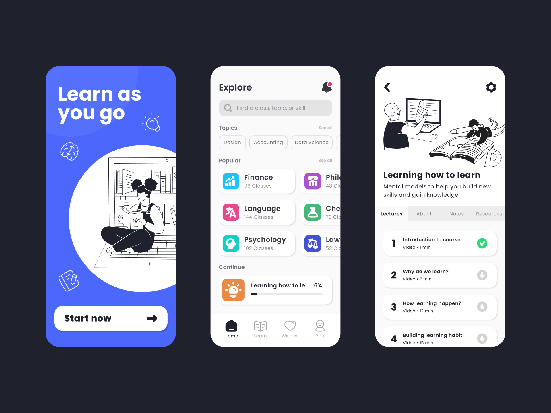
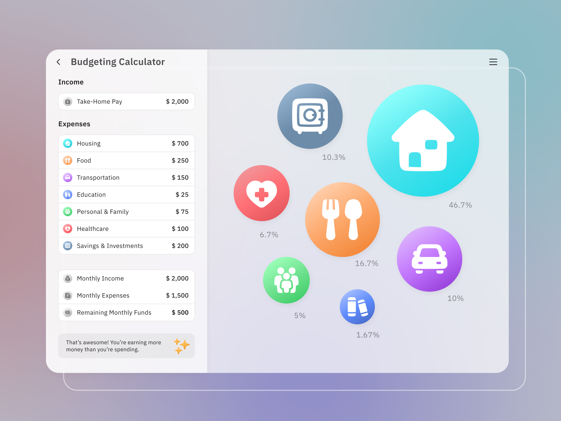
Core icons are perfect for interface design thanks to their simplified look and large inner space, which makes them extremely legible at small sizes. It's the perfect choice when you need a professional and neutral set of icons, but even if you aren't sure what your project needs, Core will make it work for you.
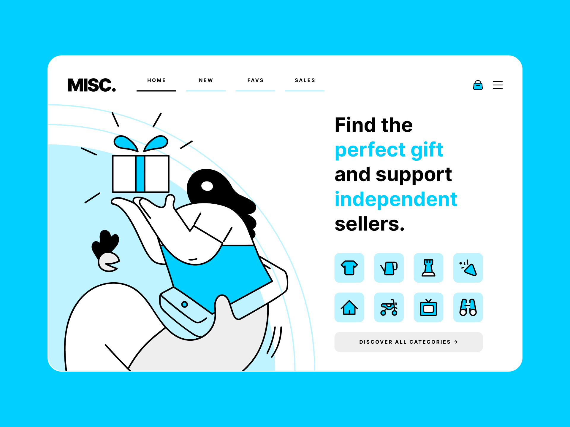
Easily adapt Core colors to match your brand
Make your UI more accesible with Core icons
What typefaces should I pair it with?
Core is the icon equivalent of Helvetica, not only for its timelessness, but also for its rational construction and adaptability. Other similar san-serif typefaces, specially the neo-grotesque ones, can be a good pairing option, such as Inter or IBM Plex Sans.
What illustrations should I pair it with?
Icons and illustrations can also be paired according to the most important formal characteristics and overall tone. For Core you could use a set like New York, which has simple and abstract shapes with a large negative space, or Streamline UX, with a more minimalist and geometric approach.
Read more about Core
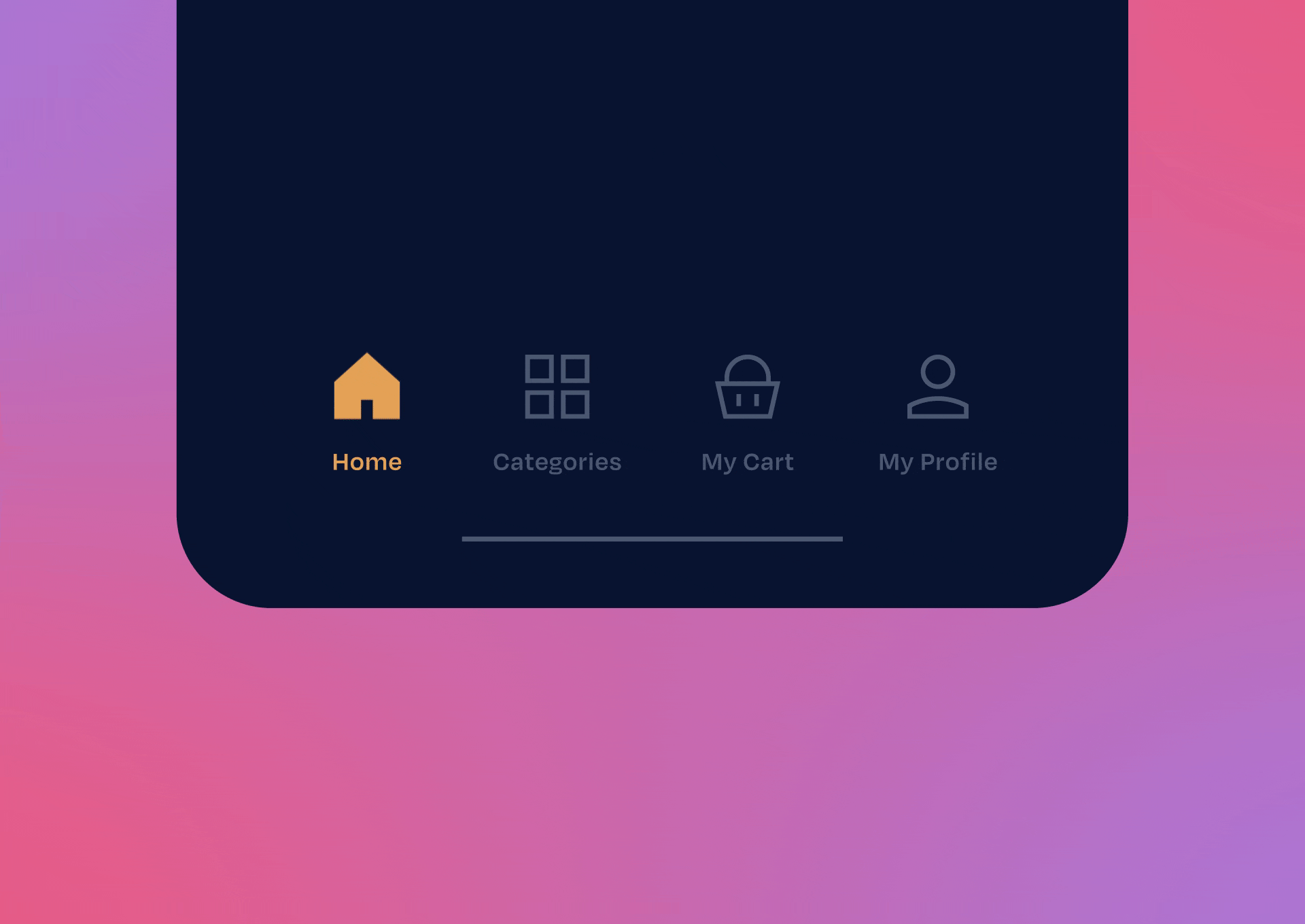
Flex icons, ever-flowing shapes
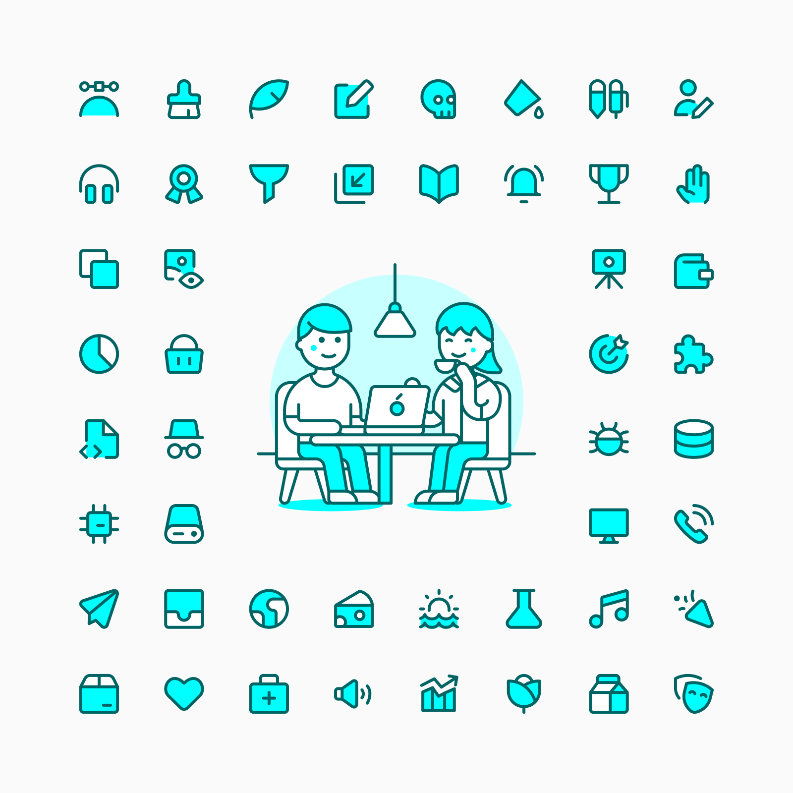
Flex is a curvy, modern and friendly set with elegant and smooth curves. This family rejects the strict and perpendicular lines traditionally used in icons, our curvilinear style brings fluidity and dynamism to your designs.
When to use Flex?
Flex offer a curve and modern icon set to fill the need for more unique icons that are still legible and consistent. It's a great option if you're looking for a set with more personality than the usual rounded icon family without compromising the simplicity of the icons.
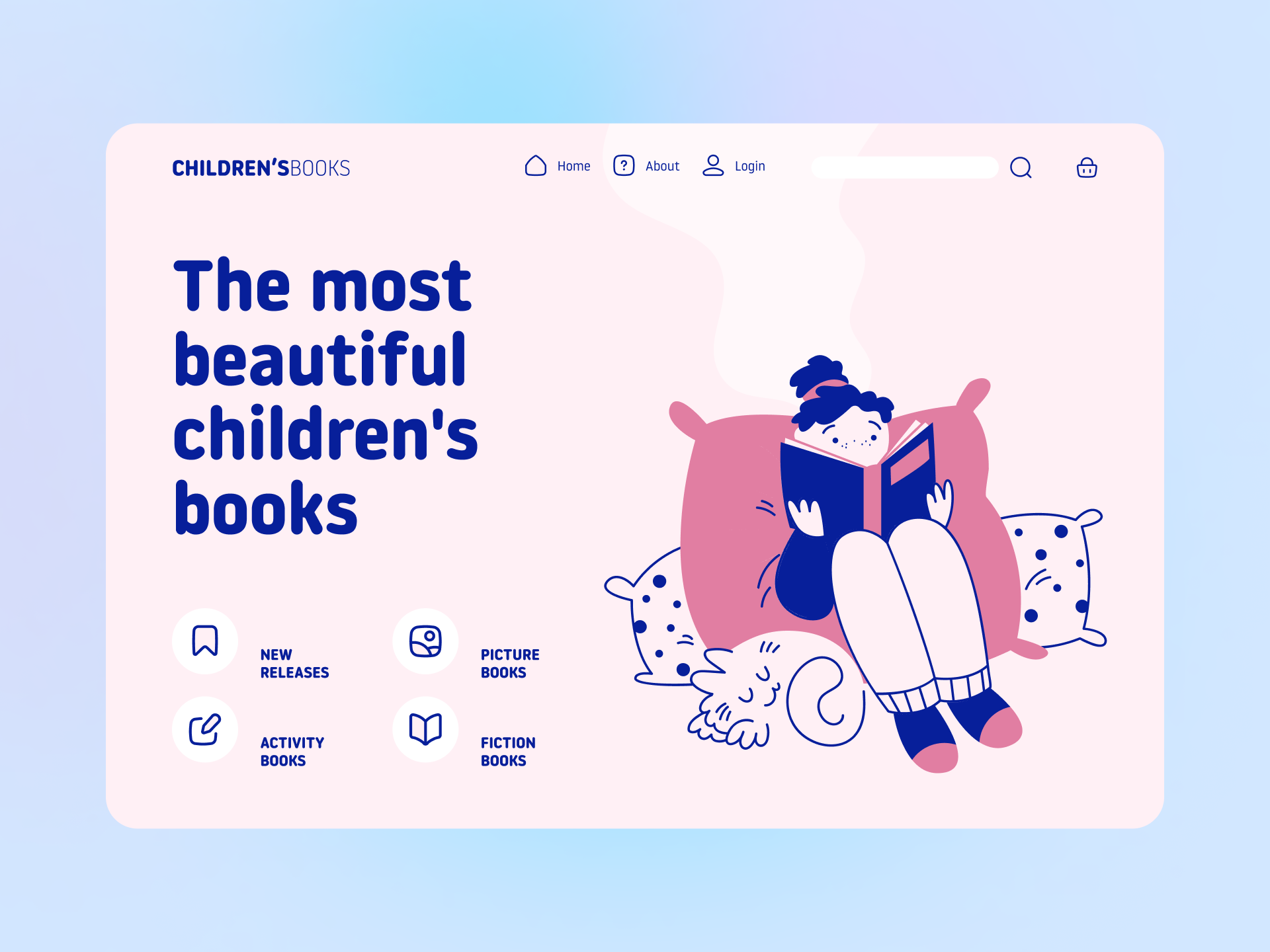
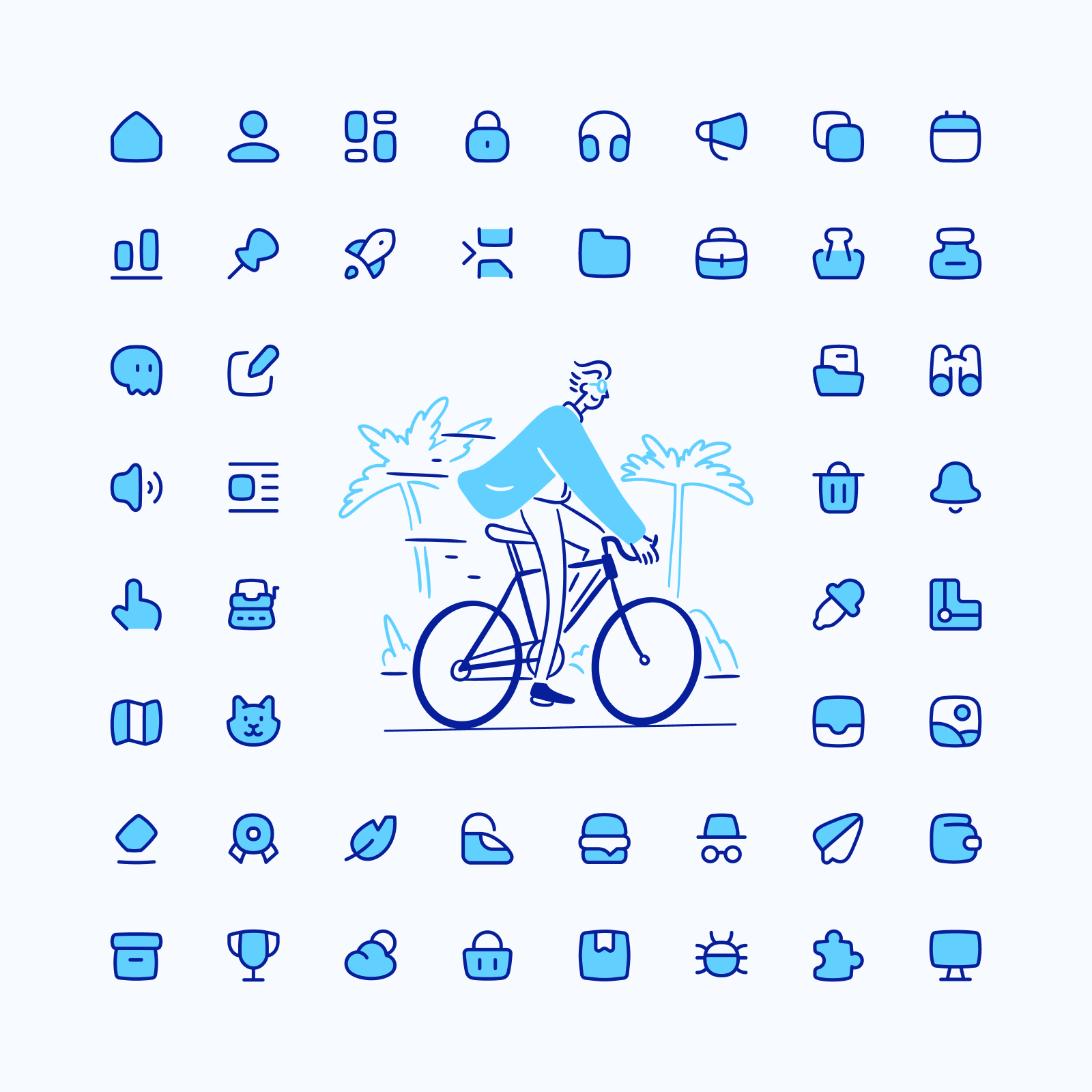
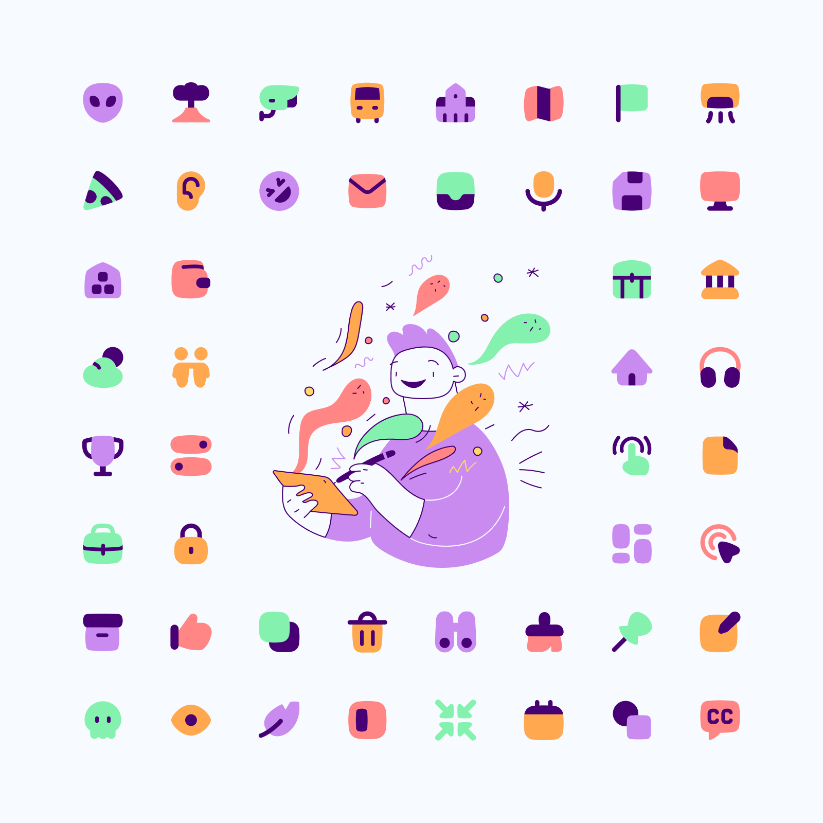
Use Flex icons for cheerful projects
What typefaces should I pair it with?
Flex icons work great with typefaces that share the same spirit of fluidity and dynamism. You can use fonts with smooth curves, rounded ends and large negative space to create a cohesive and impactful design system. Some examples could be Omnes, Noway Round or Clarendon.
What illustrations should I pair it with?
If we focus on Flex construction we'll find that modern illustrations with an organic and energetic touch can fit very well with them. Within our assets we can find sets like Brooklyn, a tendry style with a clever use of accent color, or Barcelona, a more familiar and naïve set with a really fun energy.
Read more about Flex
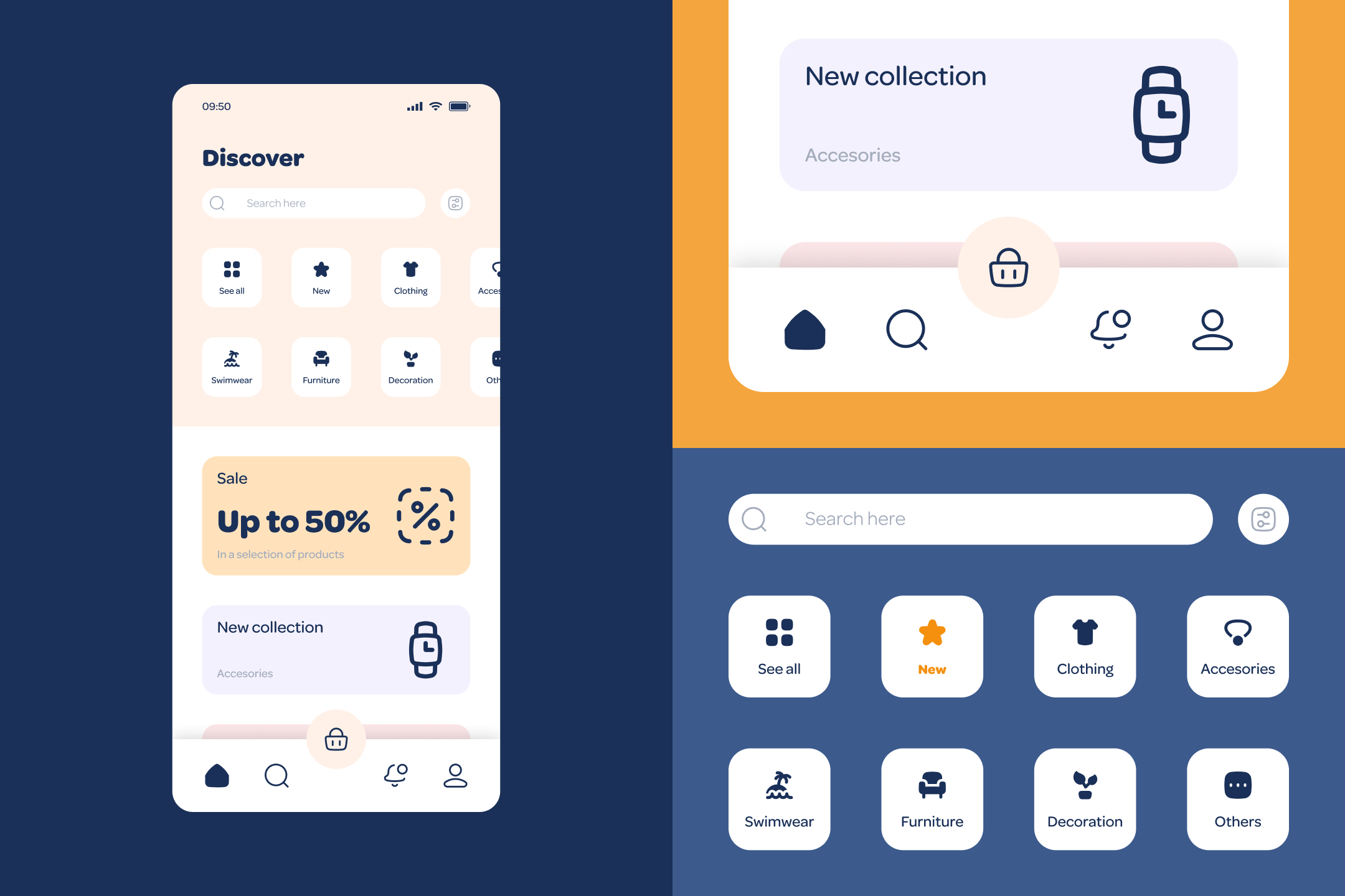
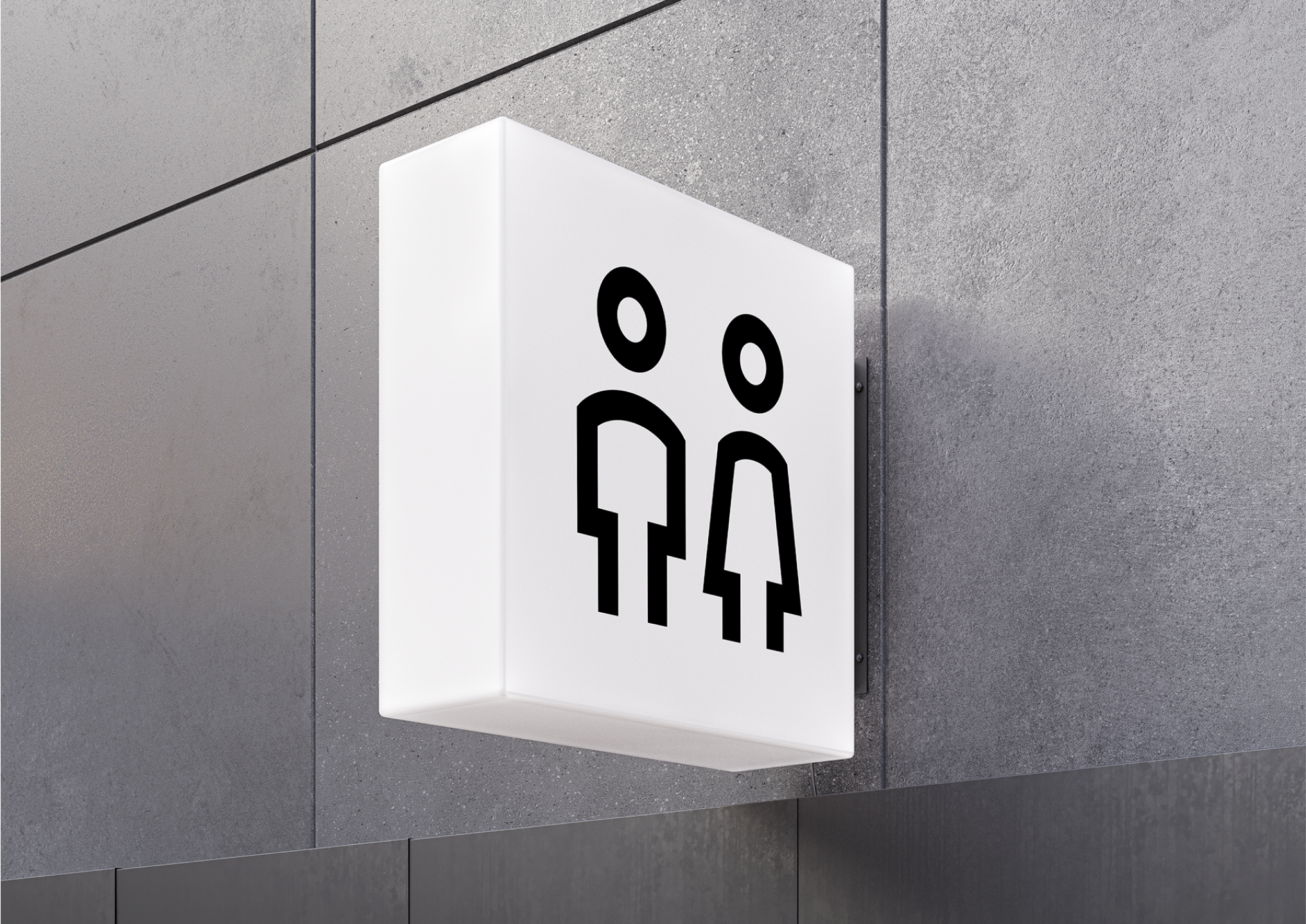
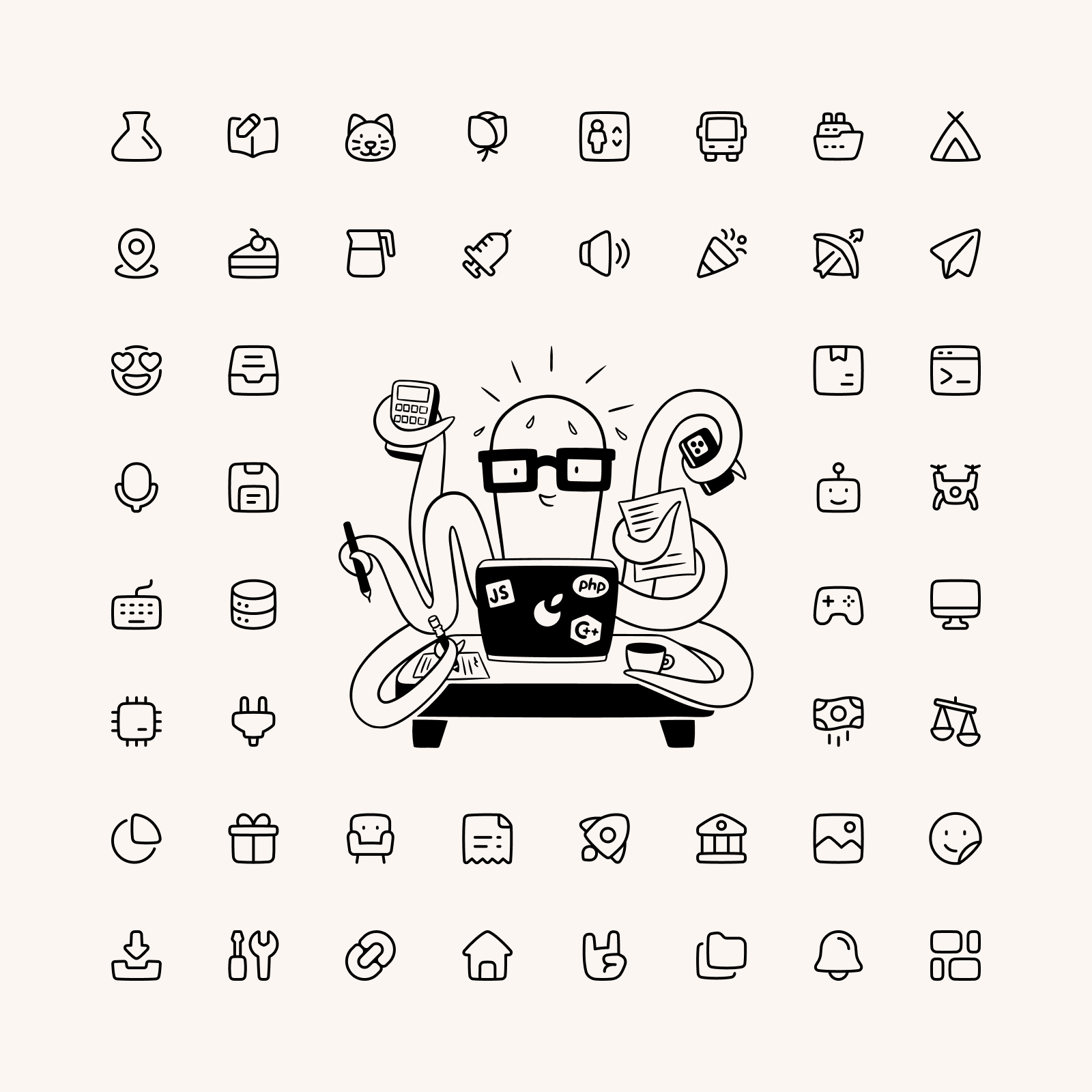
Sharp icons, beauty by contrast
Sharp is a serious and brutal set with a strongly geometric look. This high-tech appearance makes these icons a modern, bold and classy choice to complement your designs.
When to use Sharp?
The vast majority of icons you find online have rounded ends and curved corners, but what if you want a more brutal and serious family? Sharp icons can be used in a wide variety of projects, but if you're looking for a sophisticated and bold design to complete your interface, this is your set.
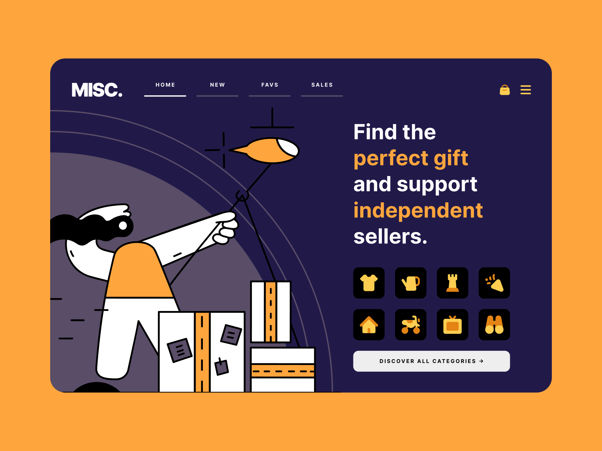
A bold and classy approach
Using Duo and Flat icons to create more colorful designs
What typefaces should I pair it with?
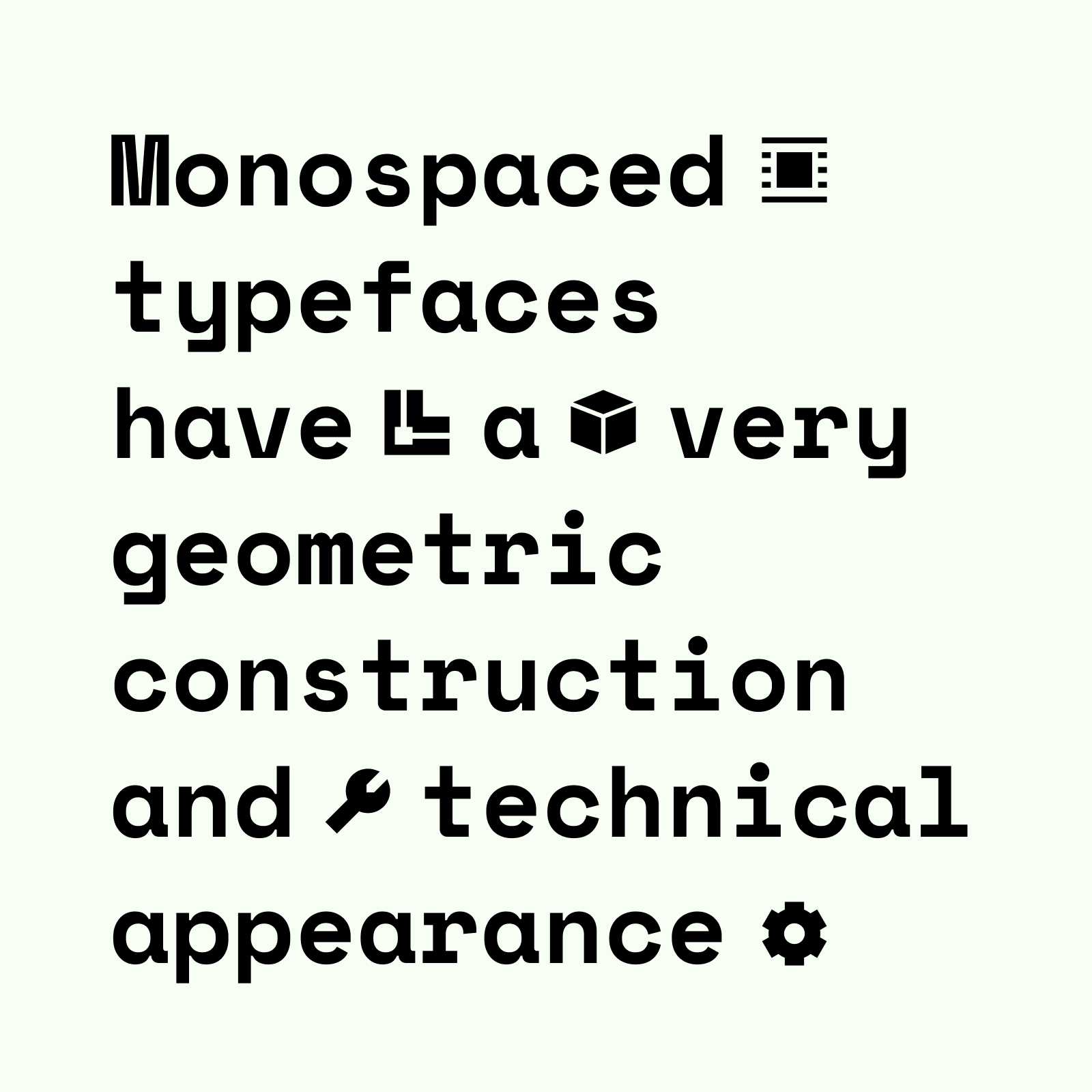
The most suitable fonts would be those that follow a geometric construction, like Futura. They can also be combined with typefaces that use abrupt and sharp cuts, like Gill Sans or even monospaced fonts, which usually have a very technological look, as we can see with Space Mono.
What illustrations should I pair it with?
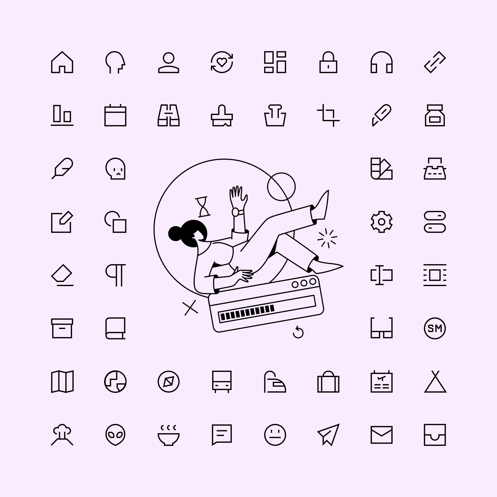
You can focus on what makes these icons unique, the geometric look and strict construction guidelines, and choose a set like New York. A less obvious but interesting choice would be Bangalore, its elegance can be compared to Sharp icons when applied in a more sophisticated and classy design. You could even pair it with our Pixel icons for a retrofuturistic look!
Read more about Sharp
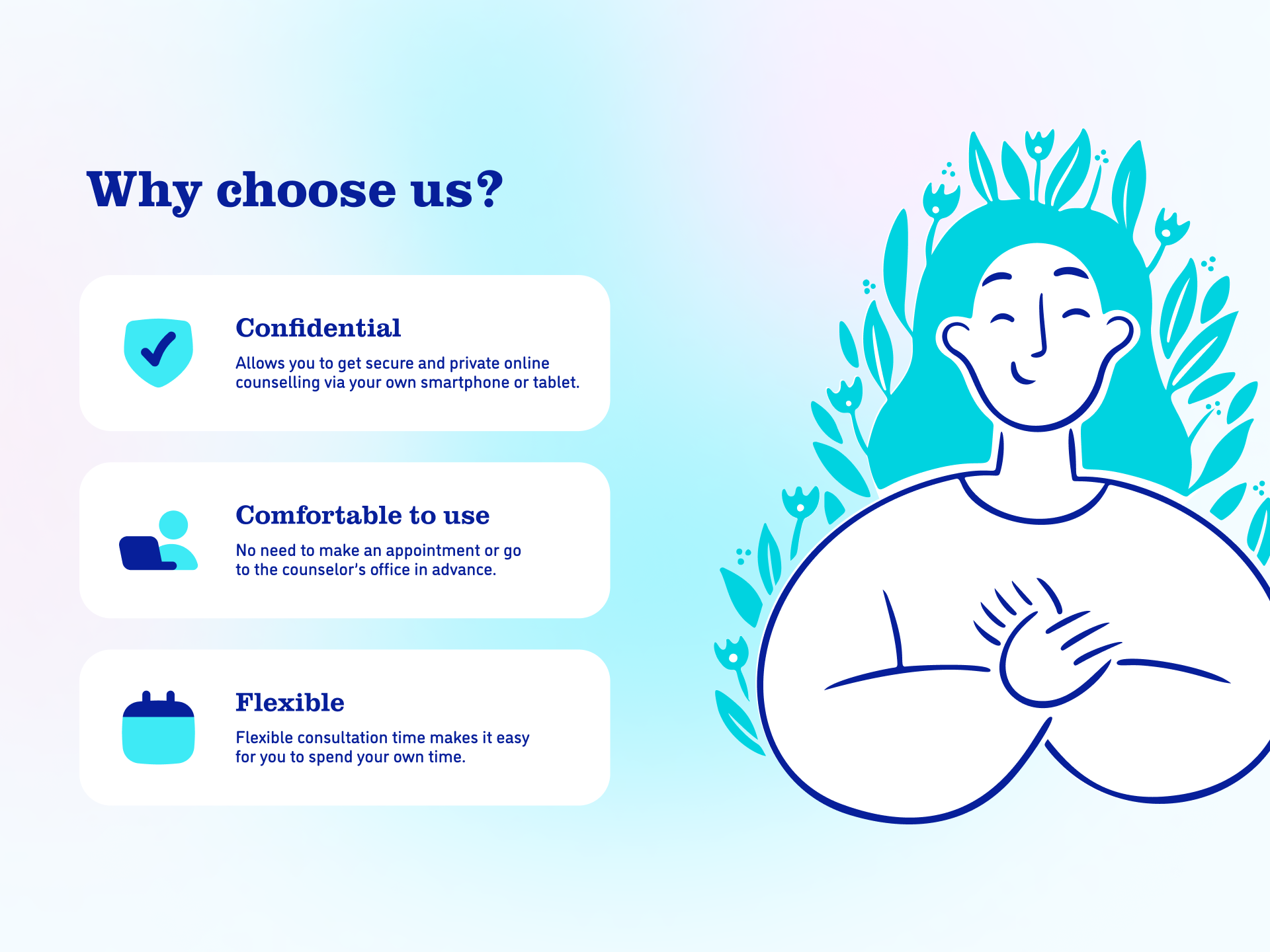
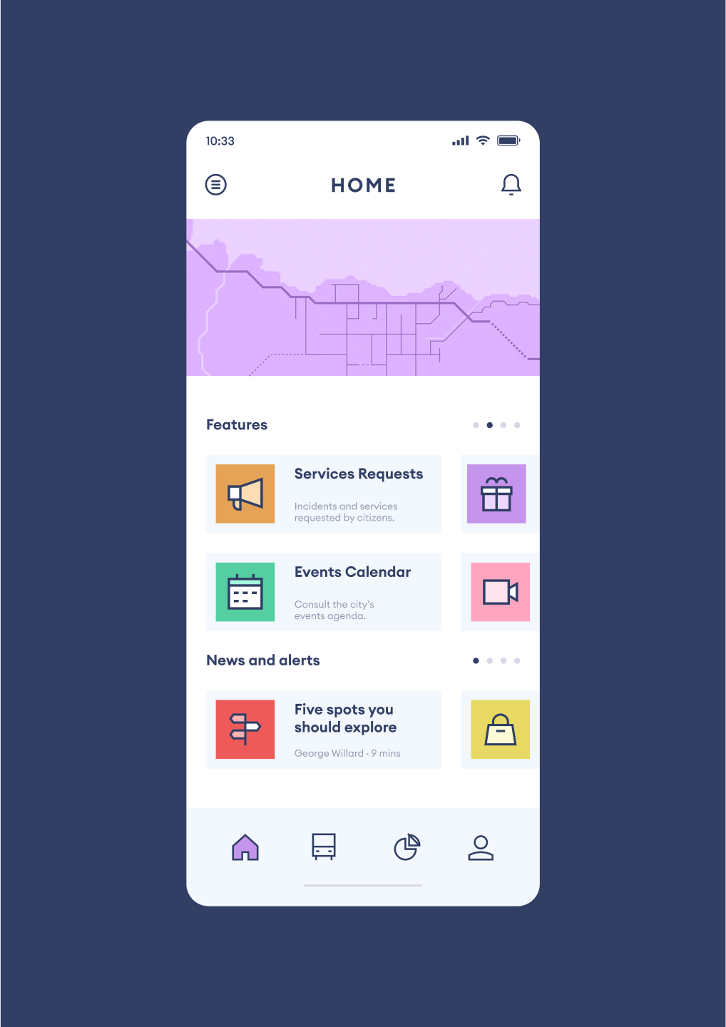
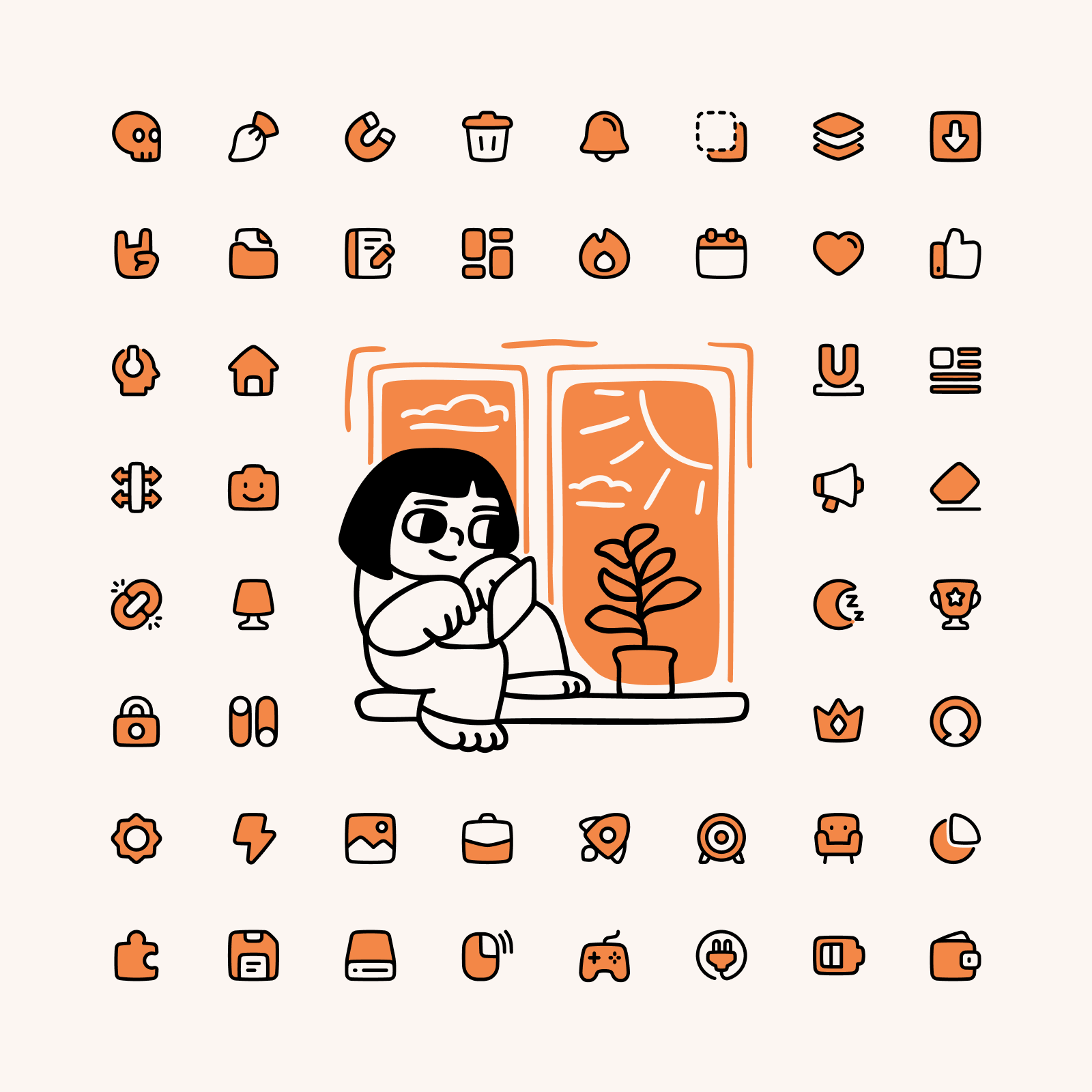
Plump, big icons with big heart
Plump is a set of chunky icons with friendly looks and it was created using chubby pieces combined with lines. It also uses subtle curves and a hand-drawn touch in its shapes, which provide a cartoonish look.
When to use Plump?
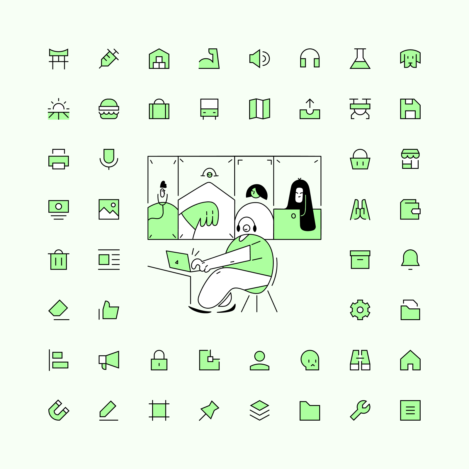
Plump is a set with a very friendly personality and probably one of the most unique styles you can find in the icon market. These icons can easily be used for UI, but also for marketing and other illustrative purposes. Use them as buttons for your apps, to help explain your website's features or insert them into your articles.
Great for illustrating features
Communicate complex information with simple icons
What typefaces should I pair it with?
You can combine Plump with a typeface that has more personality than the usual sans serif font. Some interesting examples would be Brice or Obviously, but you could also use a typeface like Cooper, whose soft serifs and overall chubby look can easily relate to Plump's shapes.
What illustrations should I pair it with?
The hand-drawn and cartoonish look of Plump makes it very easy to combine these icons with illustration that shares the same characteristics. You can go for a fun option like Manila, with a bold style that reminds of the old letterpress printing, or choose a set like Milano, which takes a more minimalist and elegant approach.
Read more about Plump
A system for everyone
We started with 4 icon families, but we will keep expanding our Streamline Icon System in the next months, to offer even more variety of styles. We are currently working on a new 'Combo' style, but shhhh.... 🤫 We'll tell more soon. Follow us on Twitter to keep an eye on our next creations.
Streamline Icon System
More than 2,000 icons, in 4 different families, with 4 different styles, for a total of more than 32,000 icons. 🤯
Sign up to get upcoming sets in your inbox