How to create unique icons styles, through the art of combination
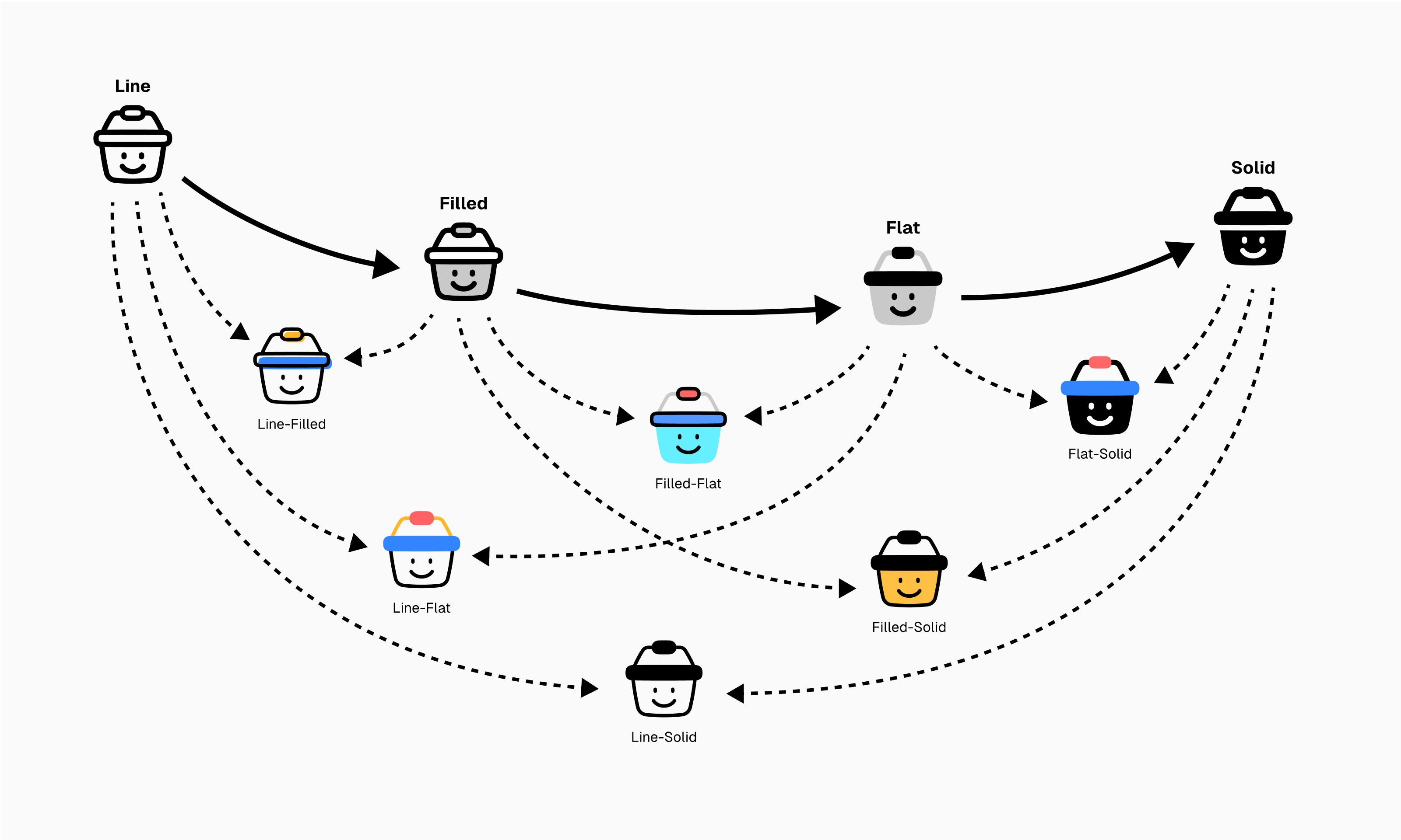
Unique brands are memorable. Undoubtedly, unique icons as well.
Icons with unique styles stick in your mind like iconic brands, and they stand out distinctively among the defaults. Creating a new style, though, can be tricky. Let alone making it unique.
But worry not, even with only basic styles, you have what it takes to create exceptional icons. Here’s how it’s done.
See icons as if they’re Lego
Instead of seeing each of them as a single vector object, notice that some icons are made of smaller individual parts. Think of those assembled parts as bricks that you can take apart into different pieces. Just like Lego.
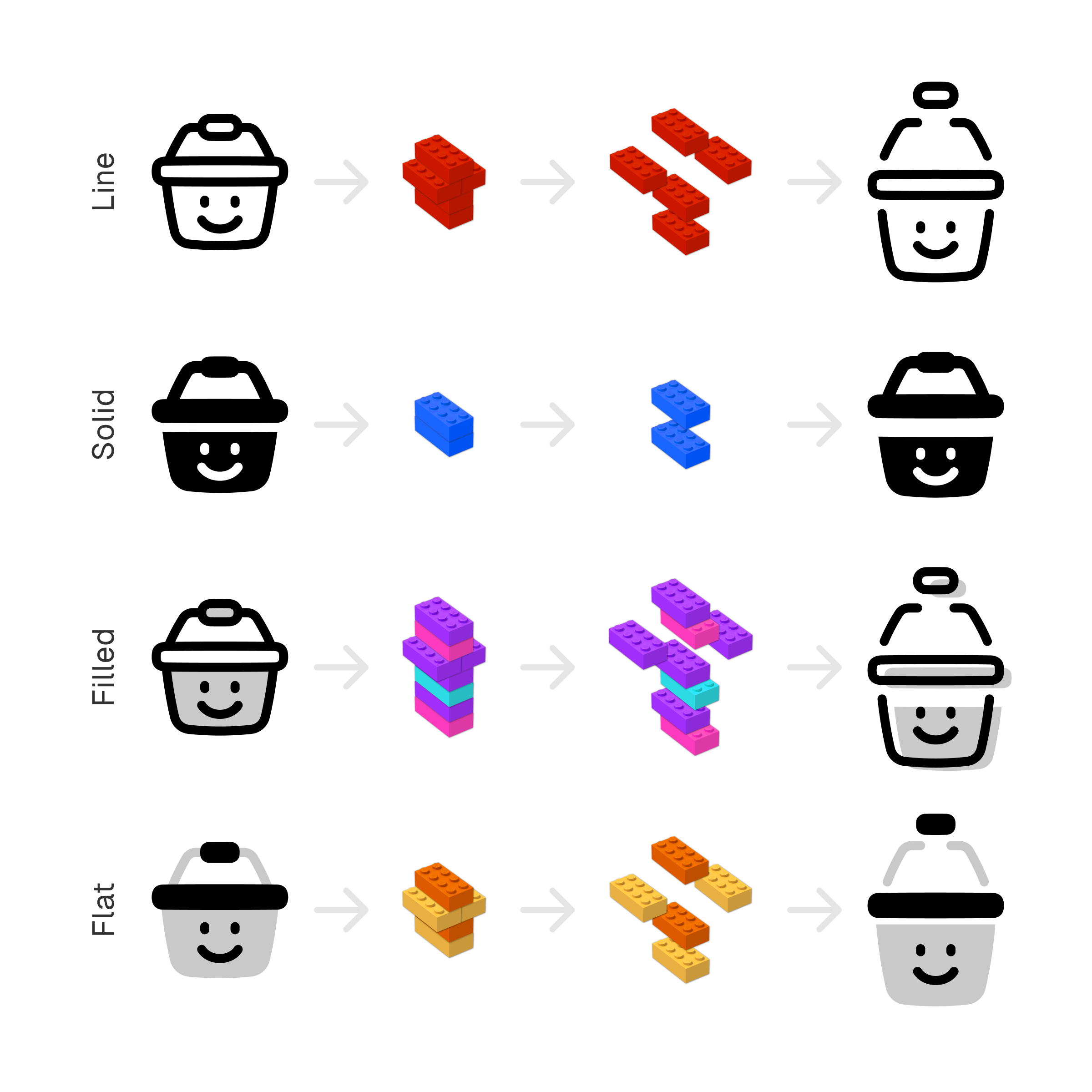
Next step is to reassemble
Noticing that your icons are made of smaller pieces is just a first step.
The next is to figure out which parts you can use to build new icons. And then you can start using those parts and combine the styles to create a combo.
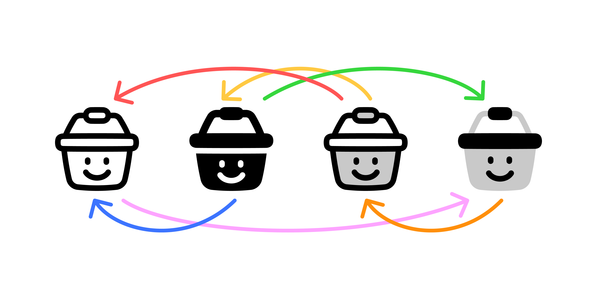
The simplest thing you can do is to take one part from an icon and replace it with same parts from another. But since each icon style is built different, the process won’t always be the same. Necessarily, you may need to do some little tweak to adjust the icons to your own taste and preferences.
Beauty in contrast
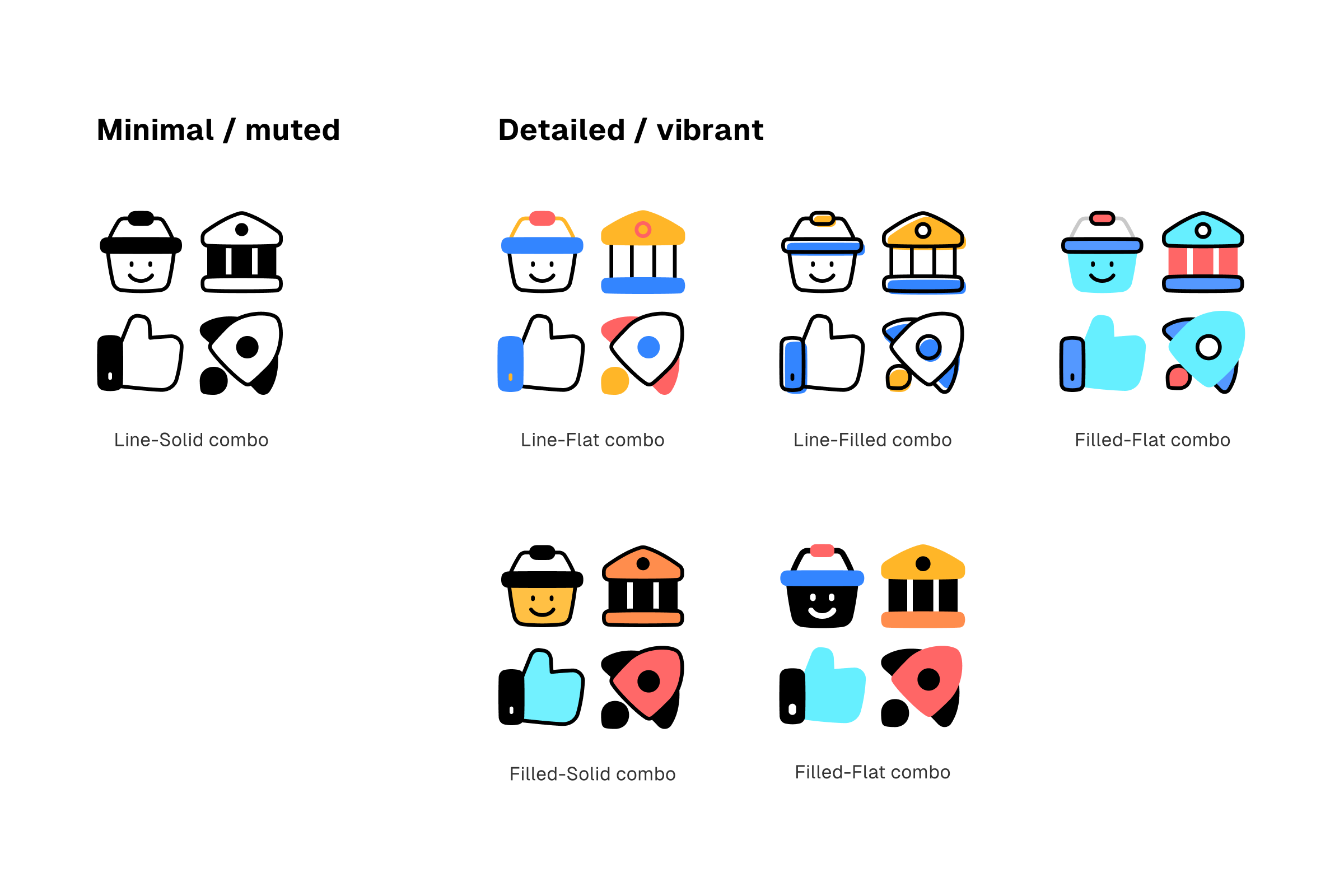
Line-Flat combo
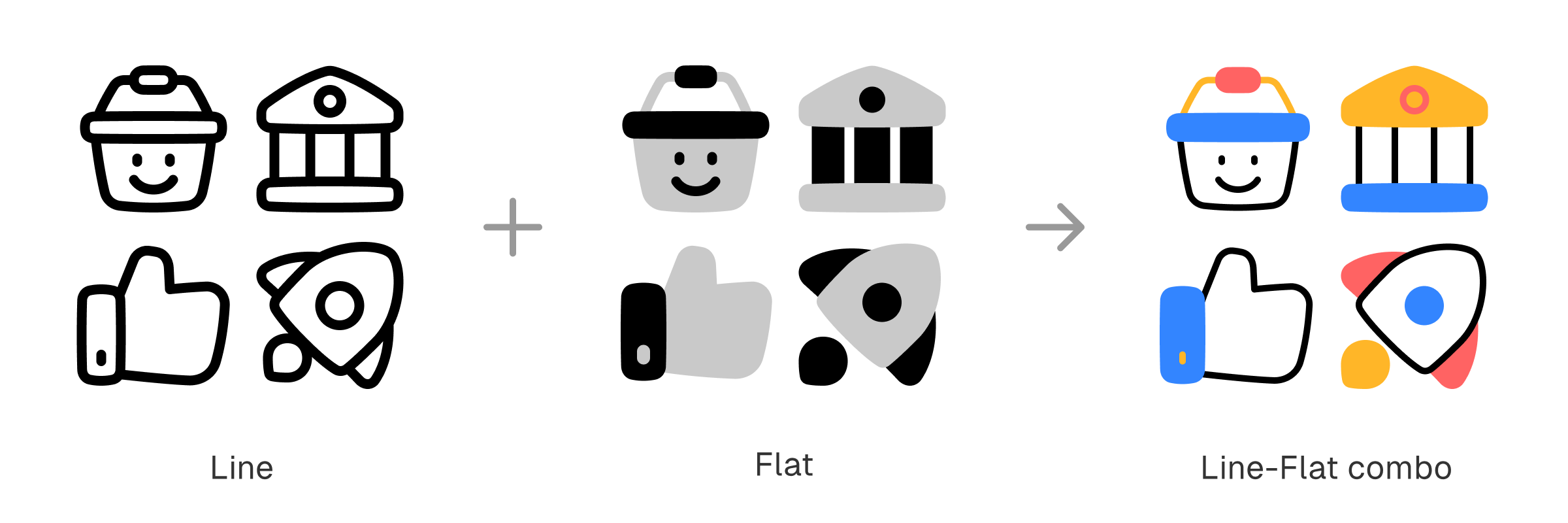
Line icons are made of strokes, it doesn’t have any flat shapes. Meanwhile, flat icons are made of flat shapes with no presence of strokes—at all.
It’s an unlikely combination. But a pair-up of those contrasting styles gives birth to an instant beauty.
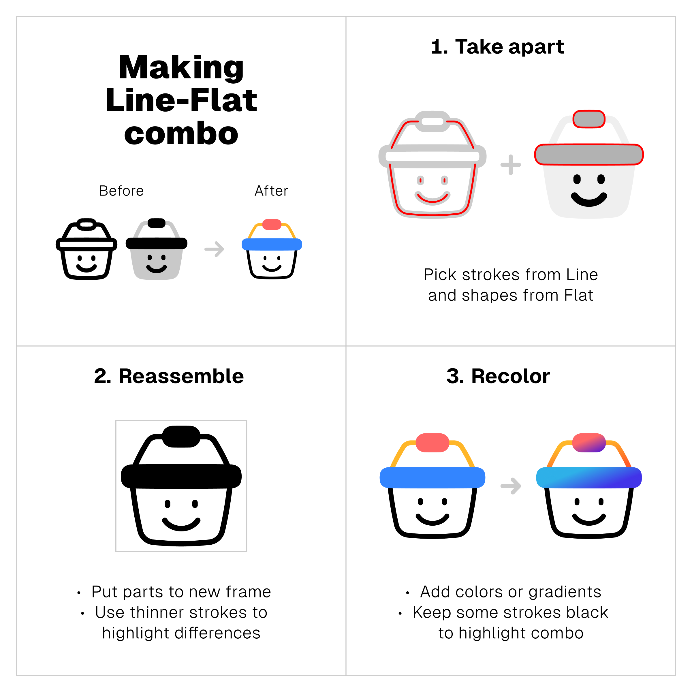
Notion-ish aesthetic
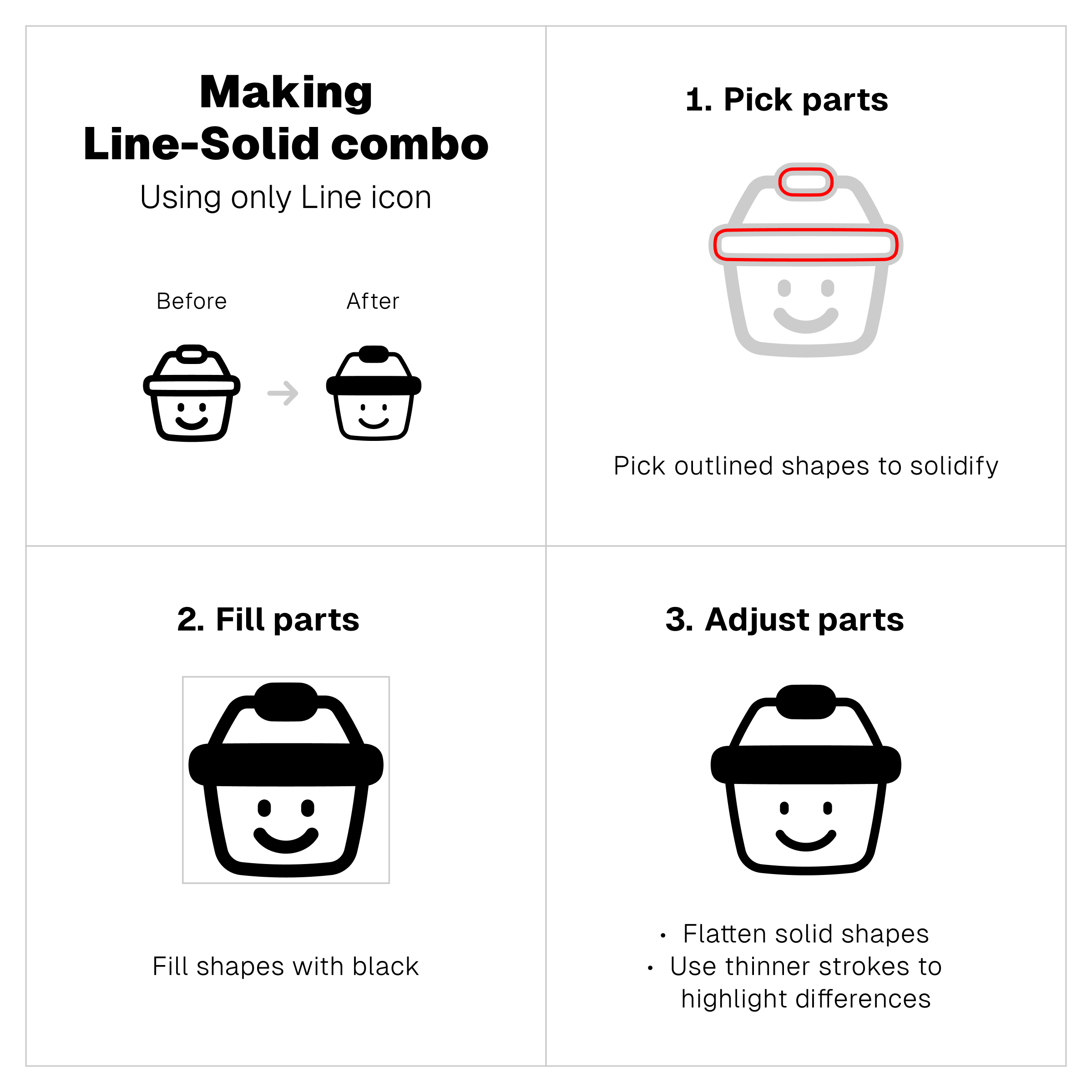
Line-Solid combo
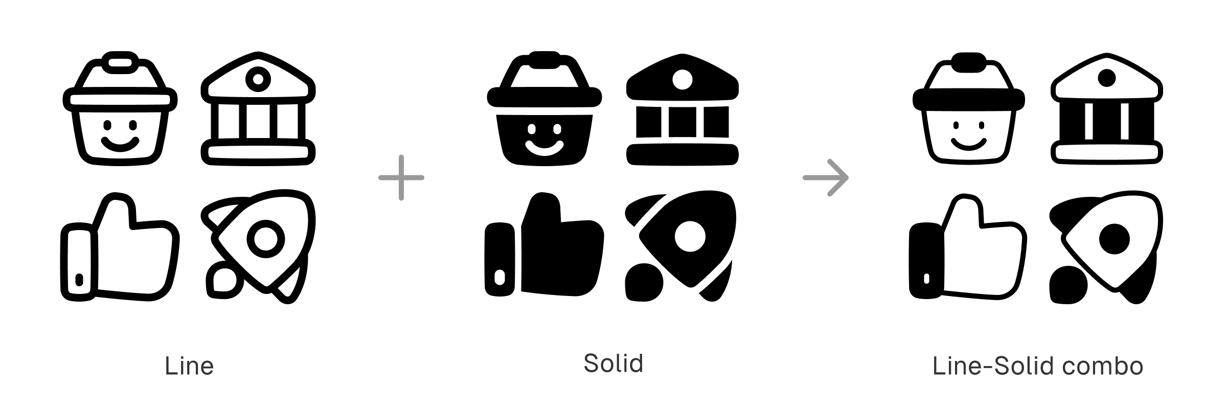
Notion’s visual branding combines the simplicity of line art with the boldness of solid shapes.
The black-and-white aesthetic gives out the impression of comic strip illustrations and vintage cartoons—remember the early version of Mickey Mouse or Charles Schulz’s Peanuts?
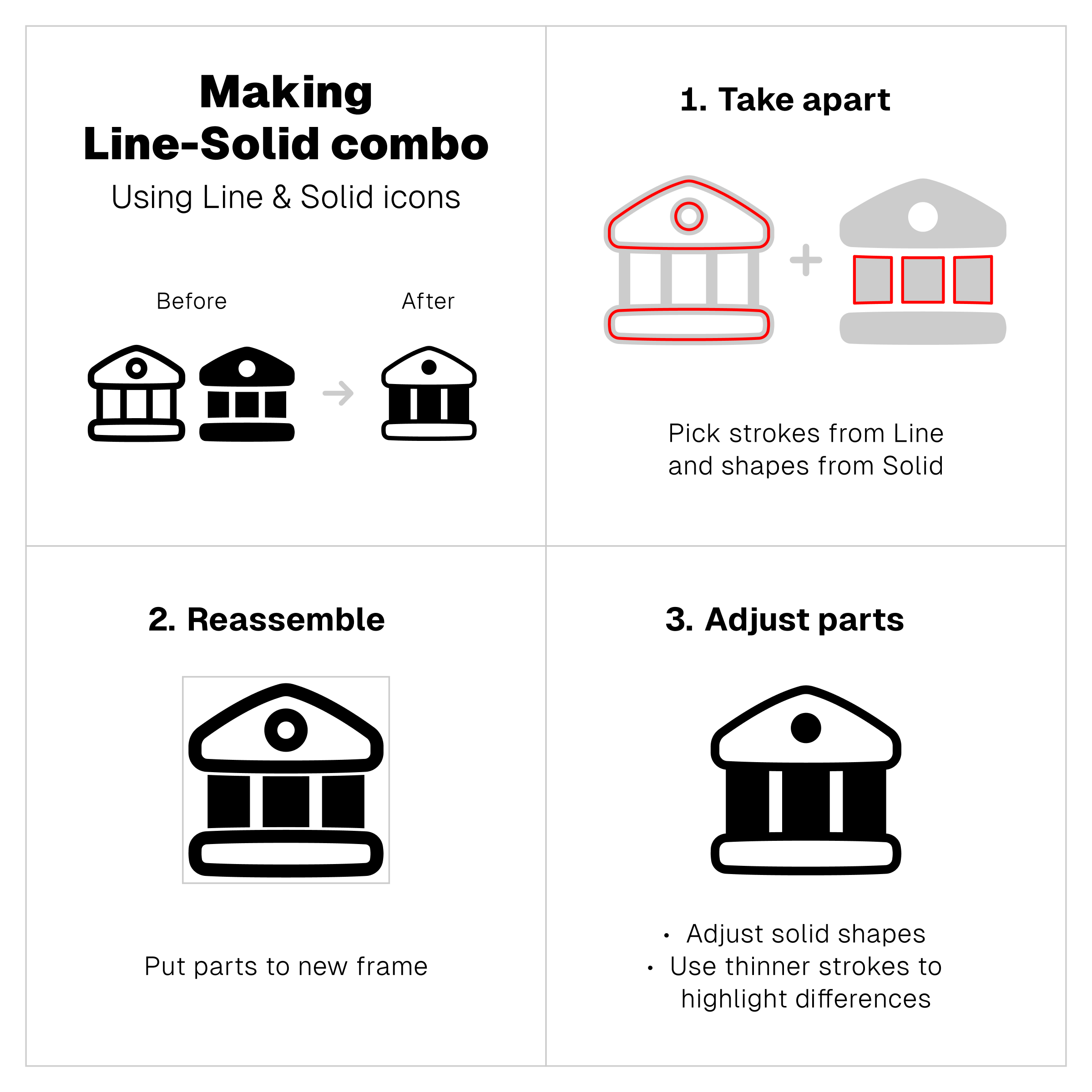
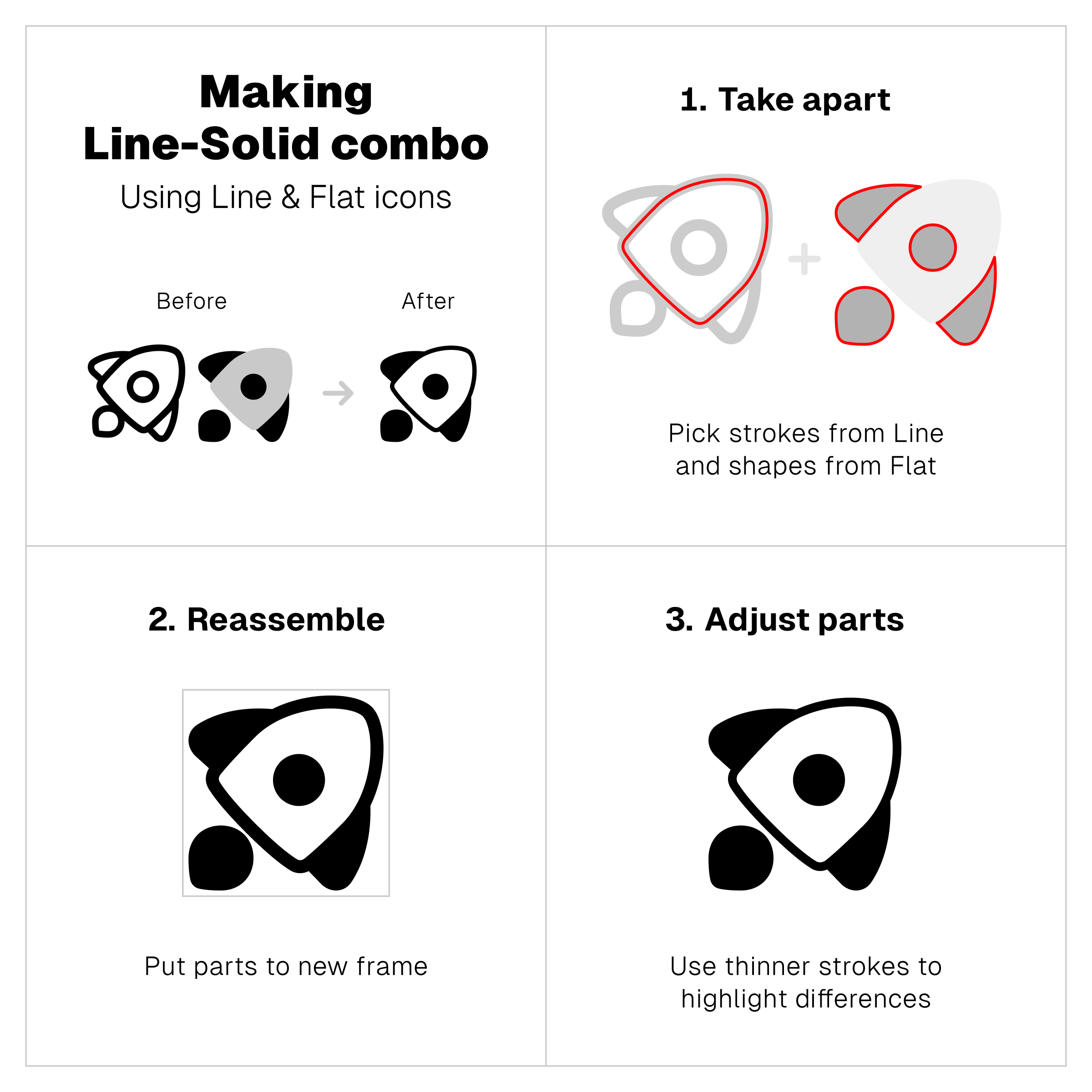
It’s a simple combo and an effective way to make icons more memorable. And there are three different ways to create it.
1. Pair up Line with Solid
2. Combine Line with Flat
3. Fill Line icons with black
Similar but not the same
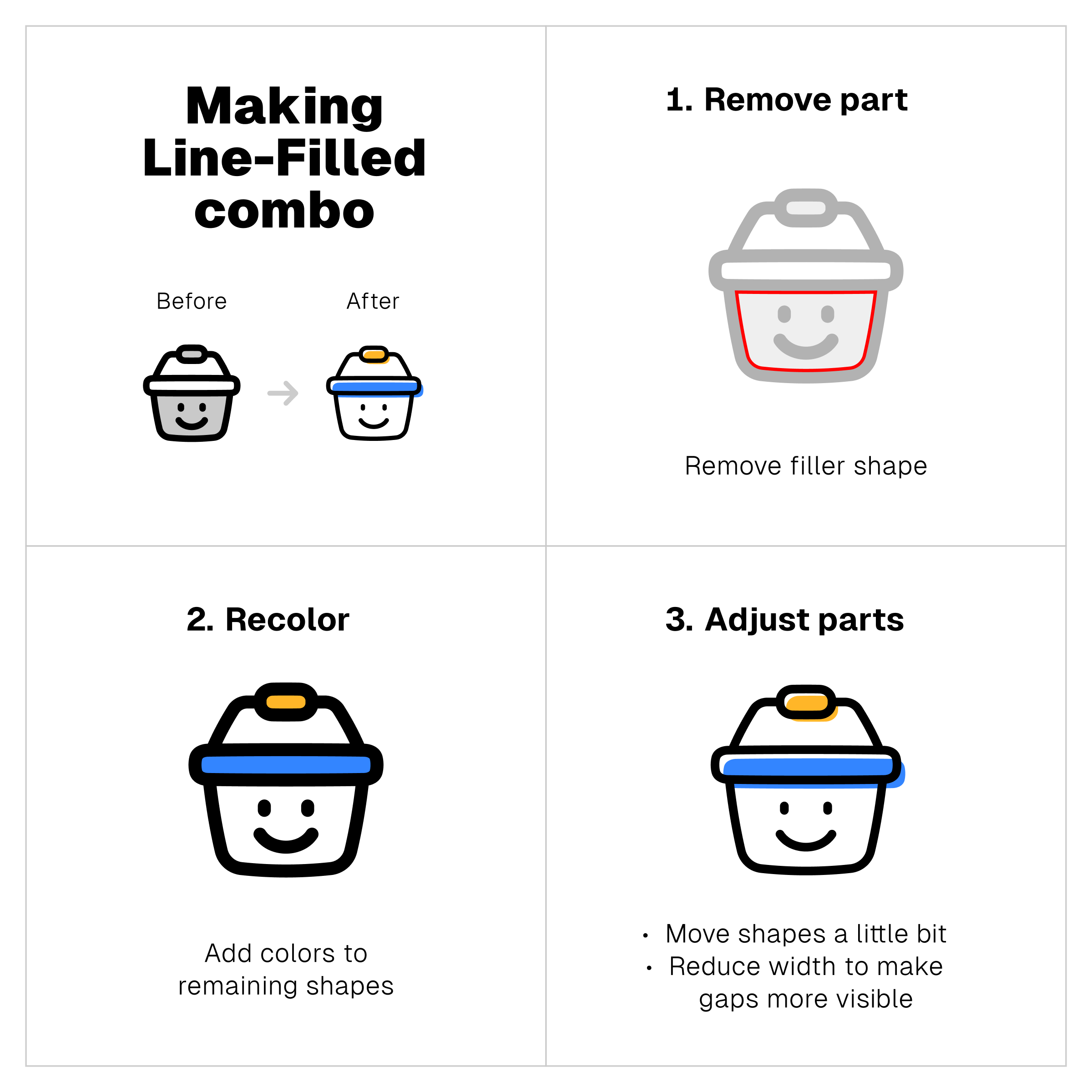
Line-Filled combo
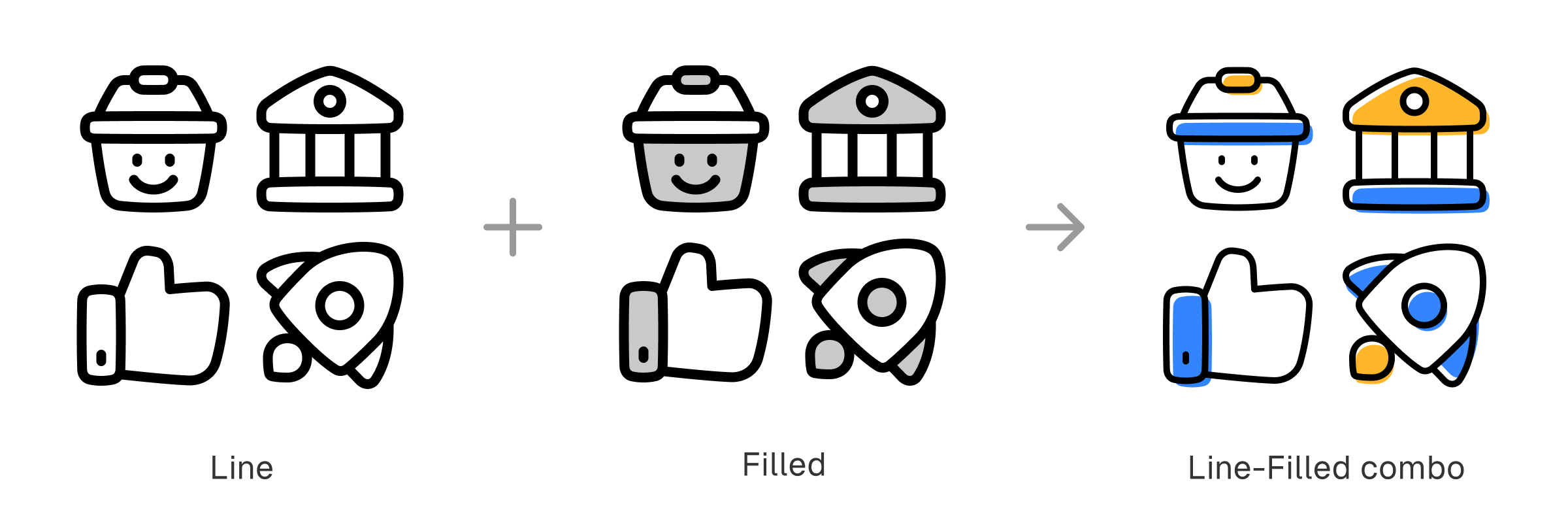
Line and Filled icons share similar traits. Both have strokes, but only Filled icons has colored shapes as their ‘fillers’. And it’s those filler shapes that work as the main differentiator for this combo.
You can either remove one of their fillers or nudge them just a little bit from their outlines. The key is to expose the line without throwing away the fillers, highlighting the difference between both elements to redefine the style.
Balance of details and simplicity
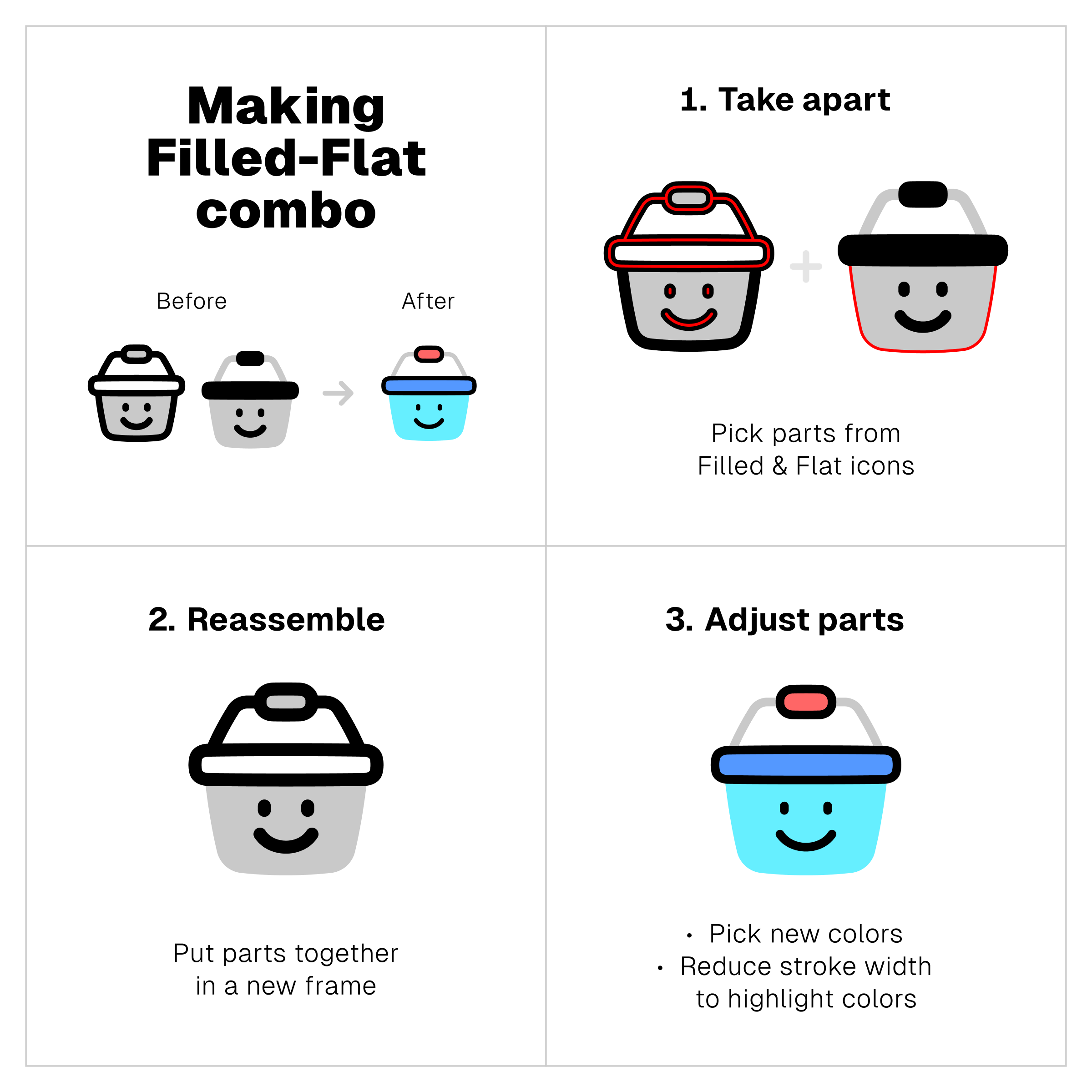
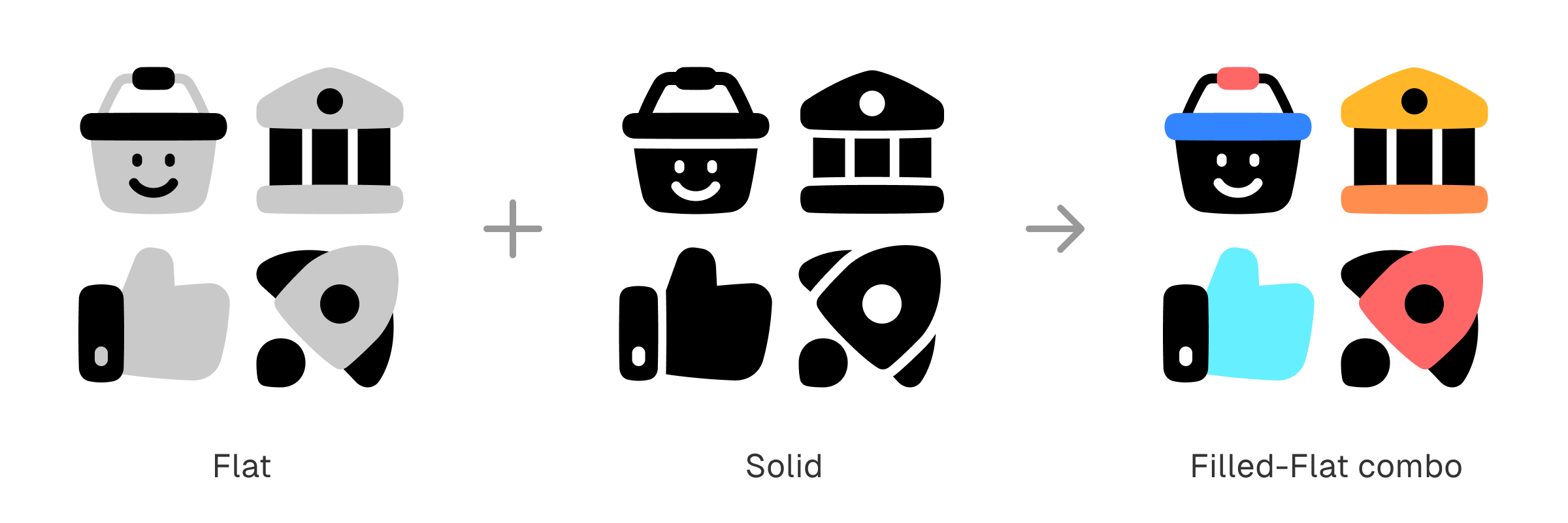
Filled-Flat combo
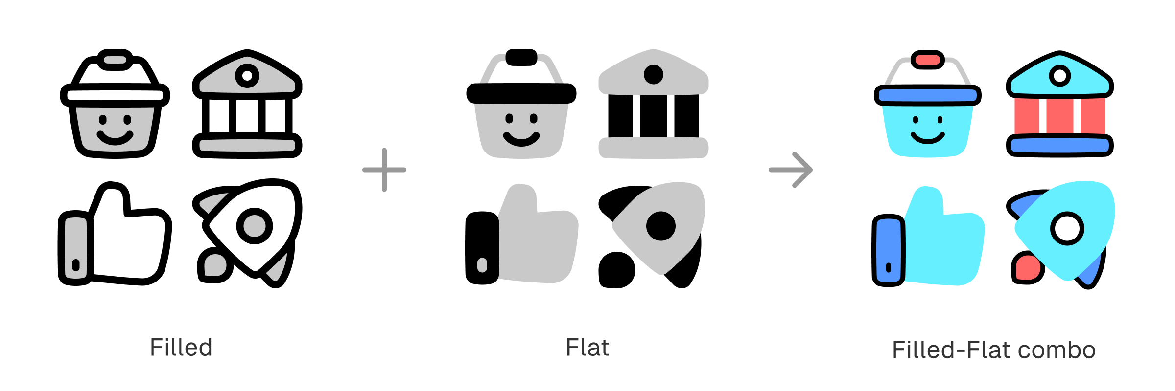
Filled icons are detailed. Flat icons are simple. And this combo is about balance between two opposite ends of icon styles.
Only Filled icons have outlines, so that would be the key difference. Meanwhile, both Filled and Flat have colored shapes, and that would be the similarity that bind them together as a new style.
A blend of richness and solidity
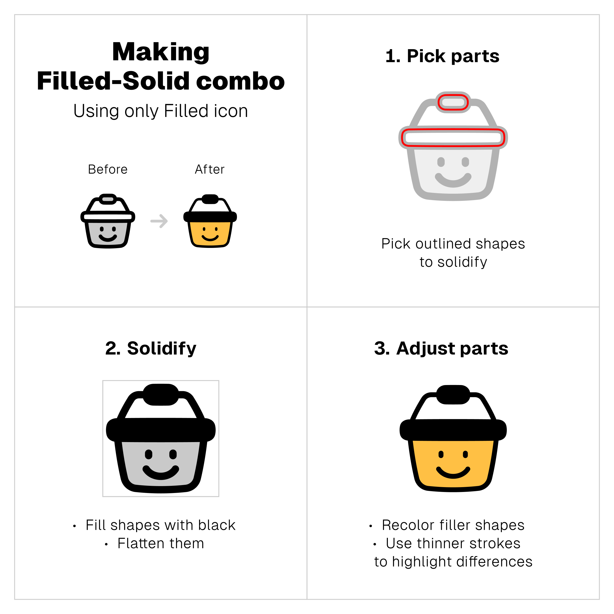
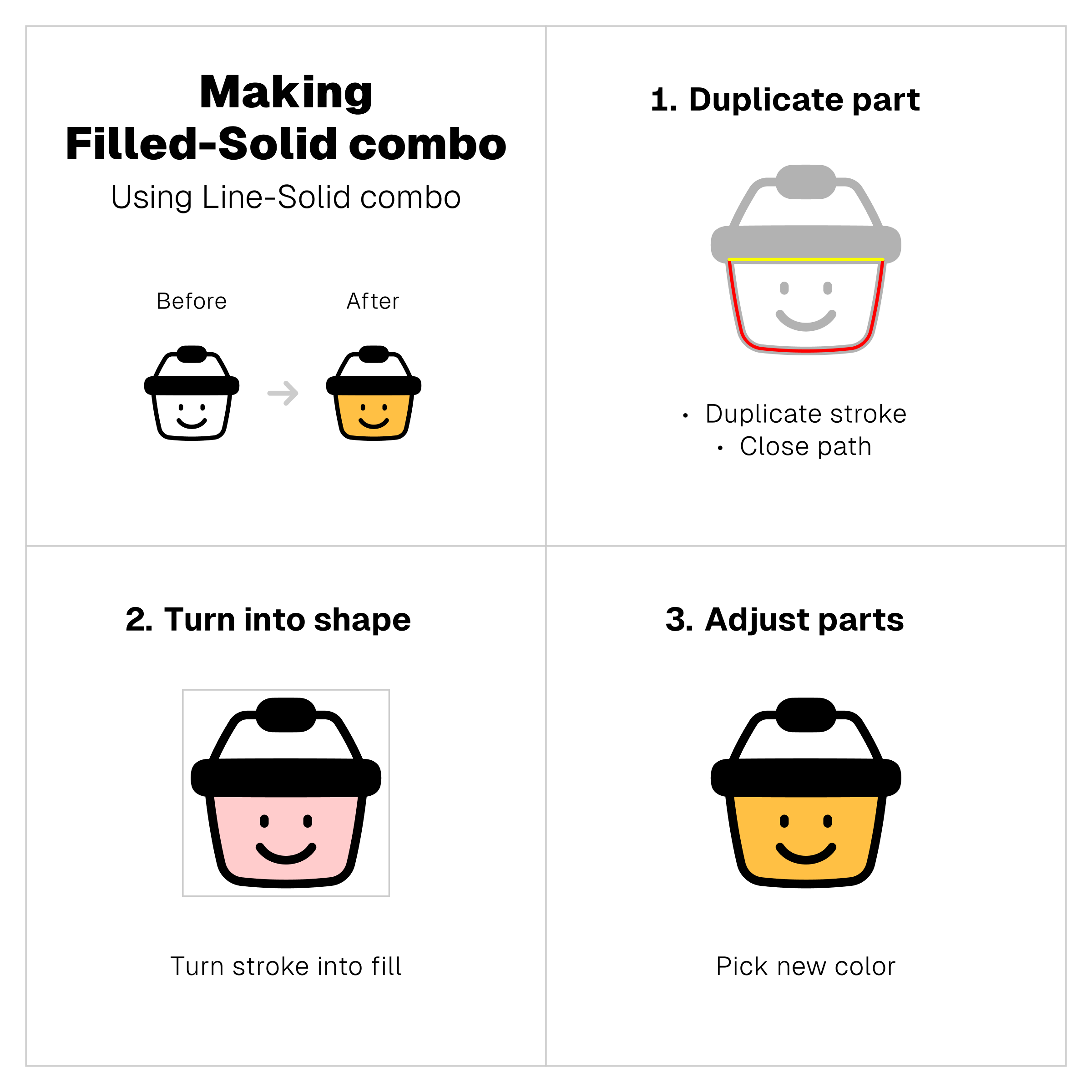
Filled-Solid combo
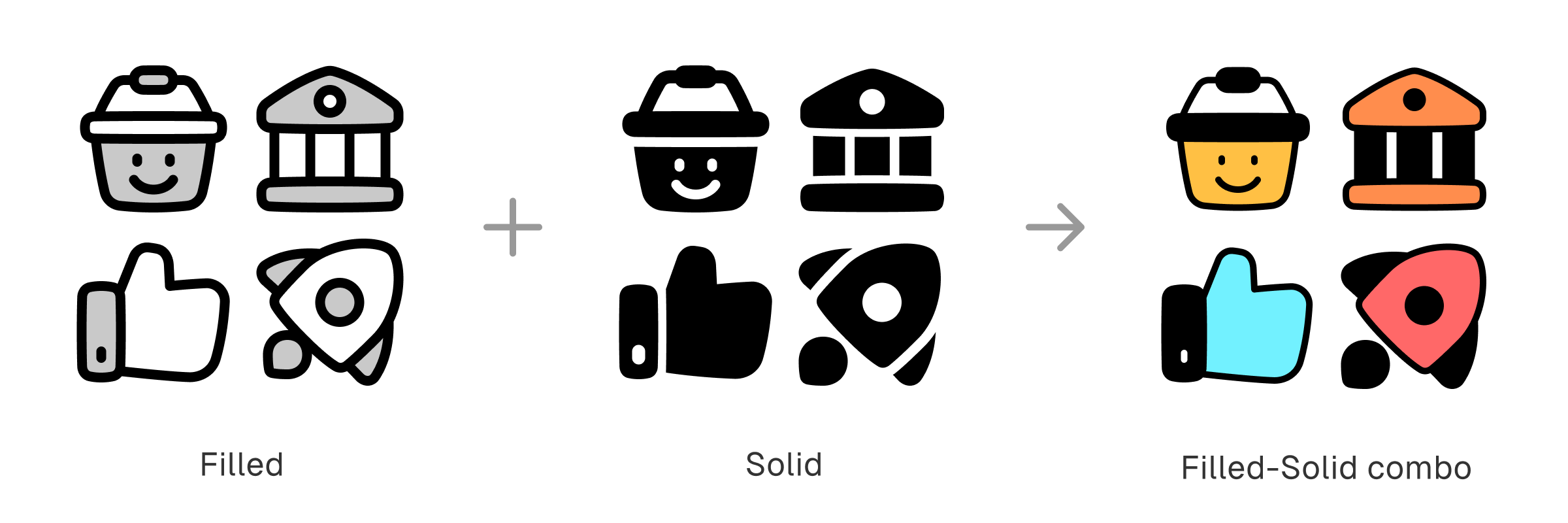
This one is pretty much like the Line-Solid combo, except now the icons have colored filler shapes. It adds the richness of Filled icons with outlined and colored shapes to the solidity of black shapes from Solid icons.
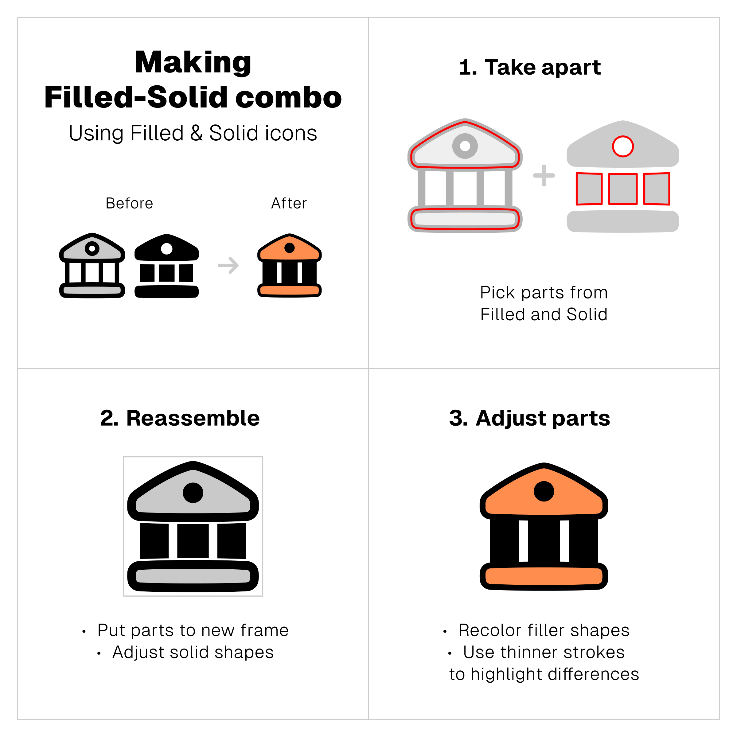
Similar to Line-Solid version, you can create it in three different ways: 1) pairing up Filled with Solid, 2) combining Filled with Flat, and 3) turning some parts of Filled icon to solid.
1. Pair up Filled with Solid
2. Combine Filled with Flat
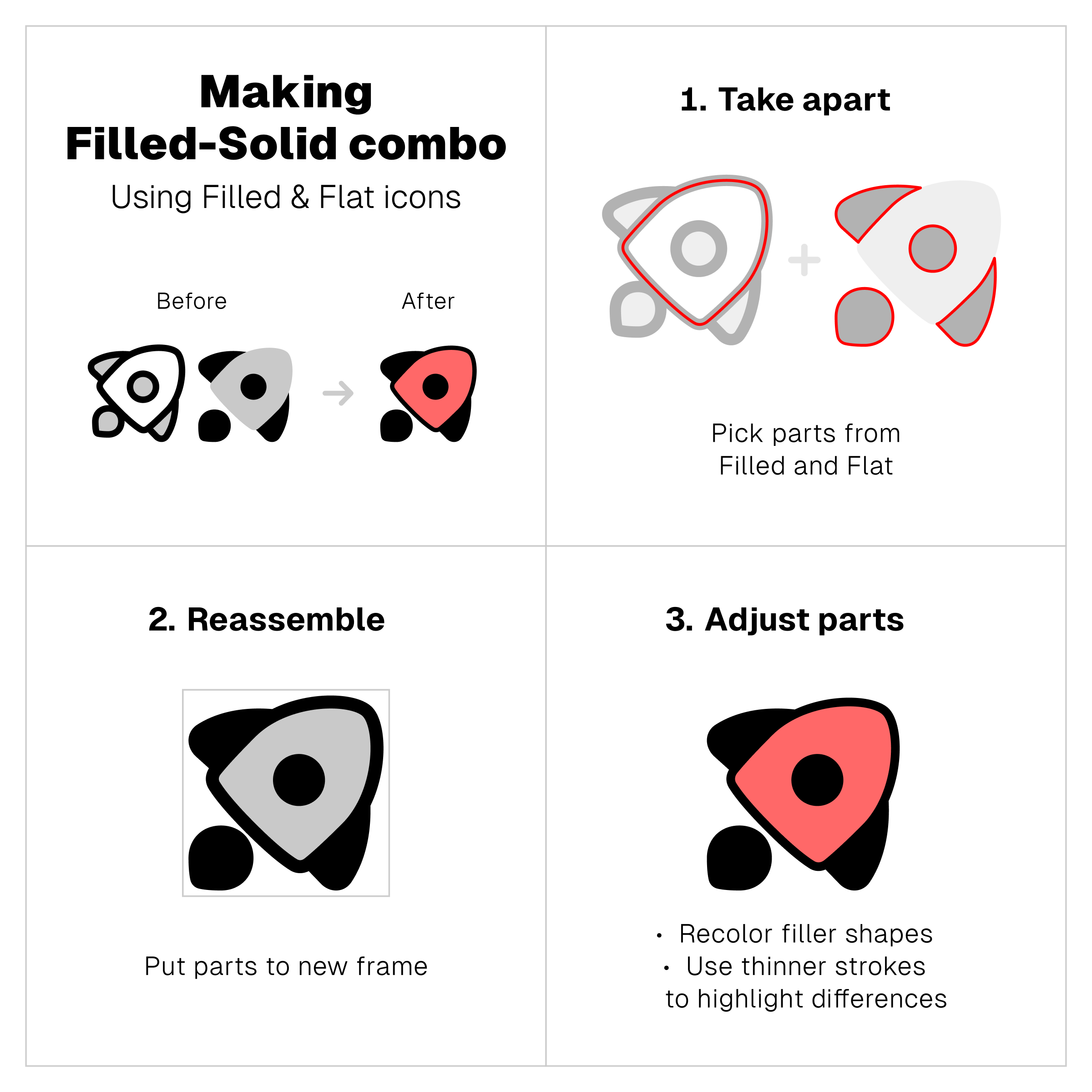
3. Turn some parts of Filled icon to solid
Additionally, if you already made the Line-Solid combo, you can turn the icon into the Filled-Solid version simply by adding filler shapes.
When boldness meets striking colors
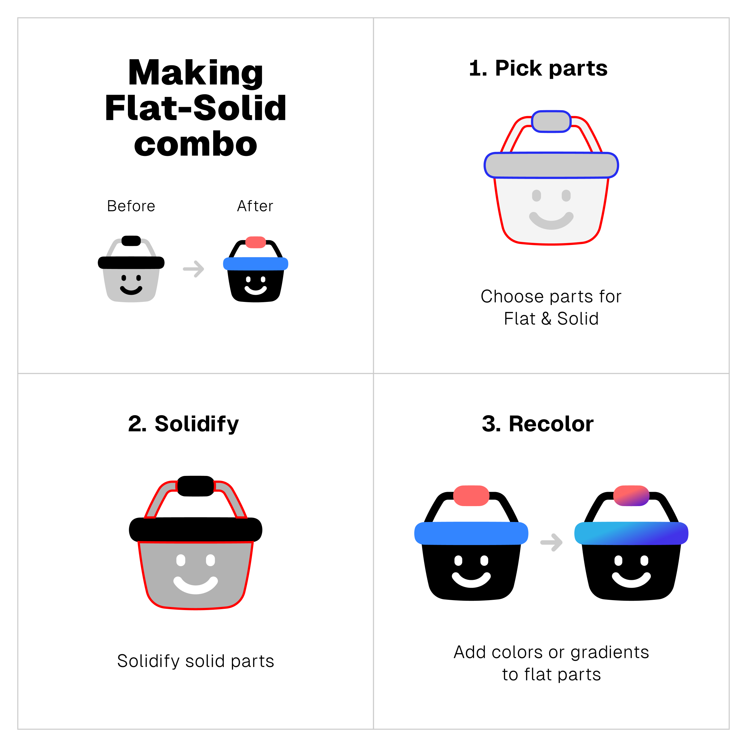
Flat-Solid combo
What if colorful icons added to the solid black counterparts?
That’s what Flat-Solid combo is all about. The boldness of Solid icons paired up with the striking colors of Flat icons, resulting in a combo that’s not only more appealing but also more recognizable.
Now, set them in action
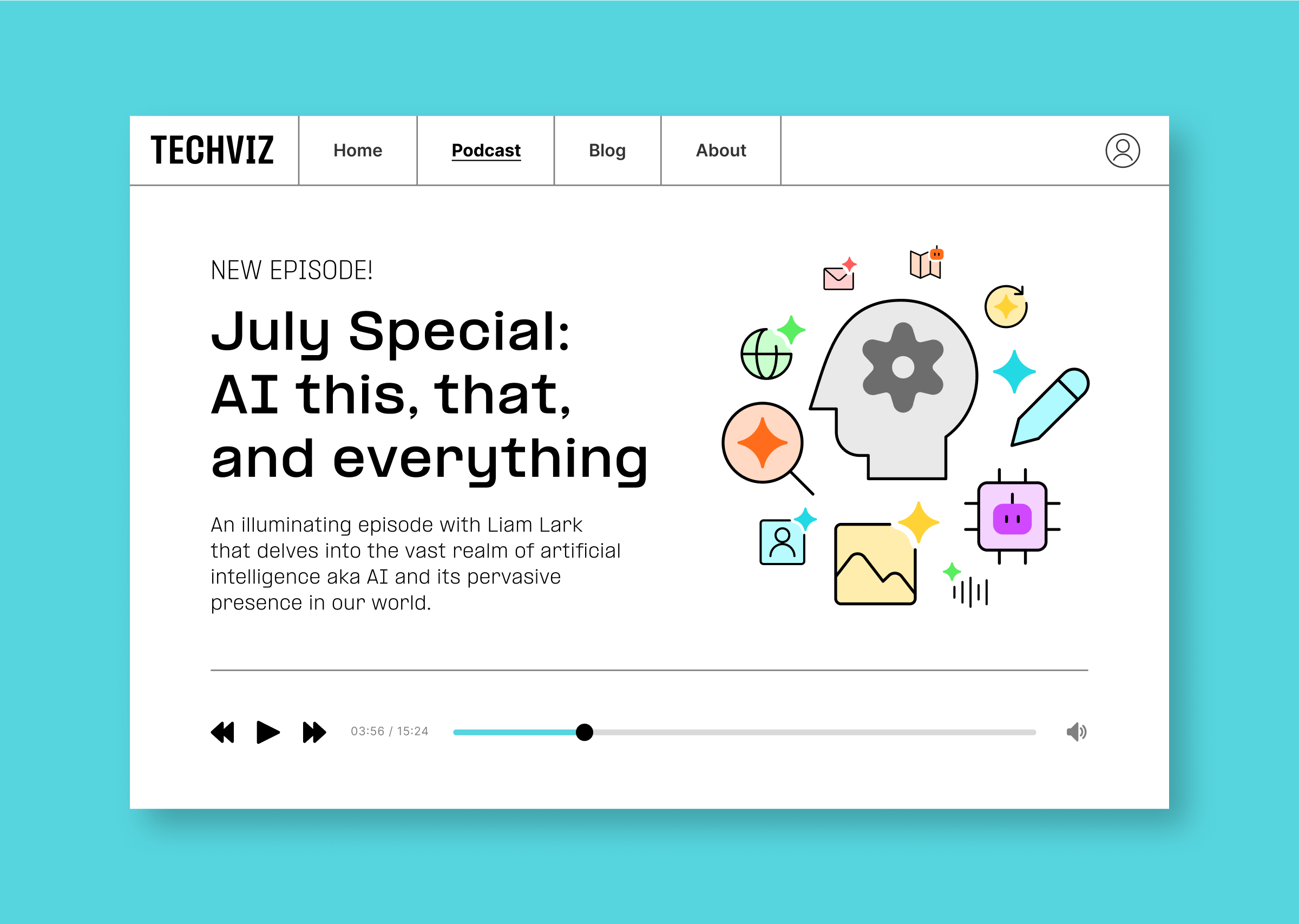
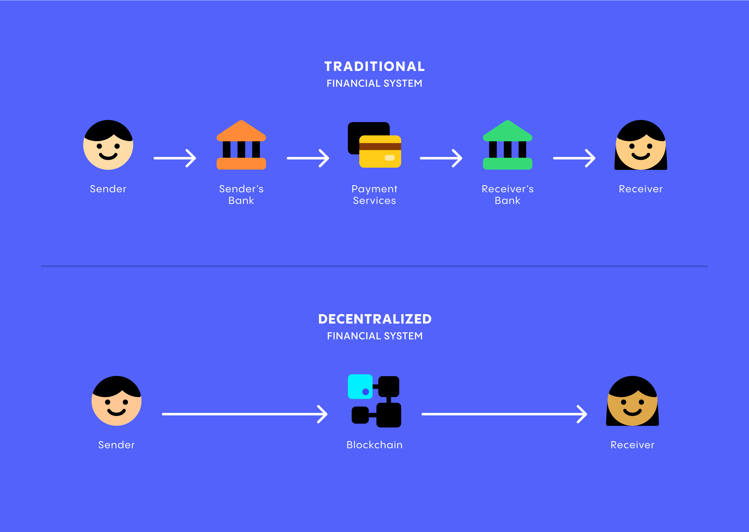
The use cases for icons with combo styles vary from navigational interfaces to branding elements.
As a rule of thumb, simple icons are more flexible than the complex ones. The more minimal or muted icons, the more suitable they are for smaller scale than the detailed or vibrant versions.
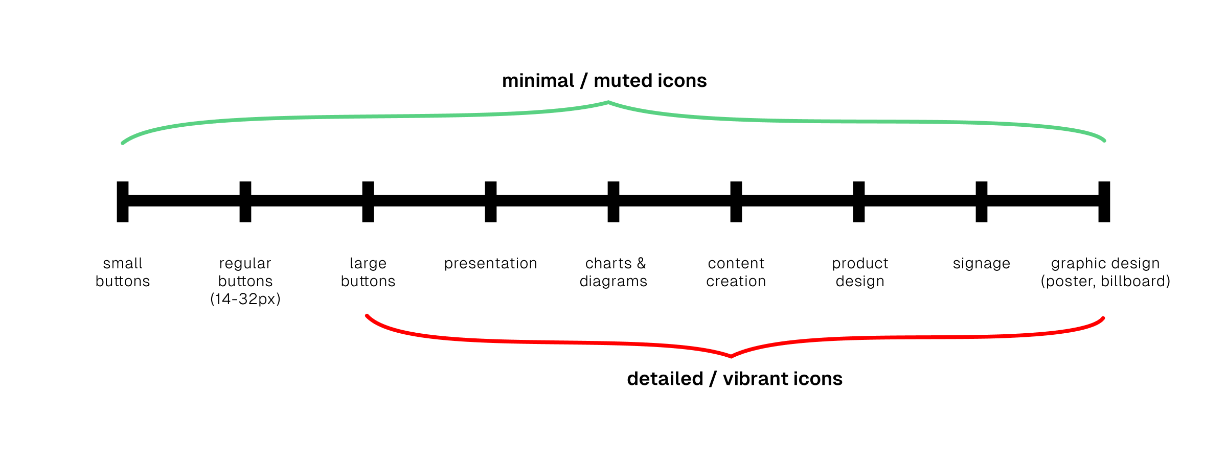
For example, from the mini tutorials on the previous section, only Line-Solid combo will be suitable for small navigational buttons. The rest is either too detailed or too vibrant for the same use cases.
Details won't be visible on small scale, and vibrant colors will be too distracting to other interface elements. And that's why only minimal or muted icons are suitable as small interface elements.
On the other hand, detailed and vibrant icons are ideal to catch attention. And that makes them more useful as branding or illustrative elements.
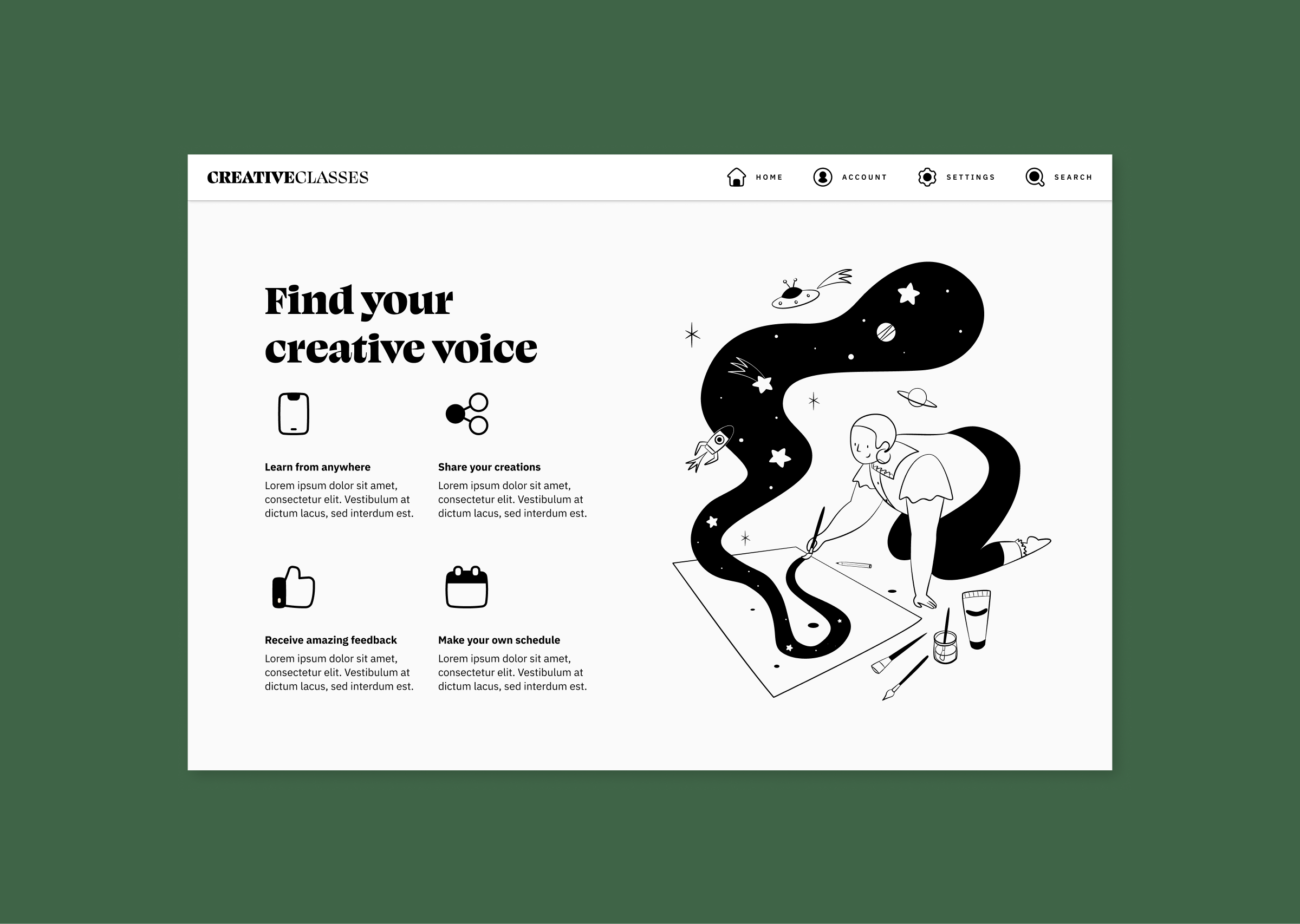
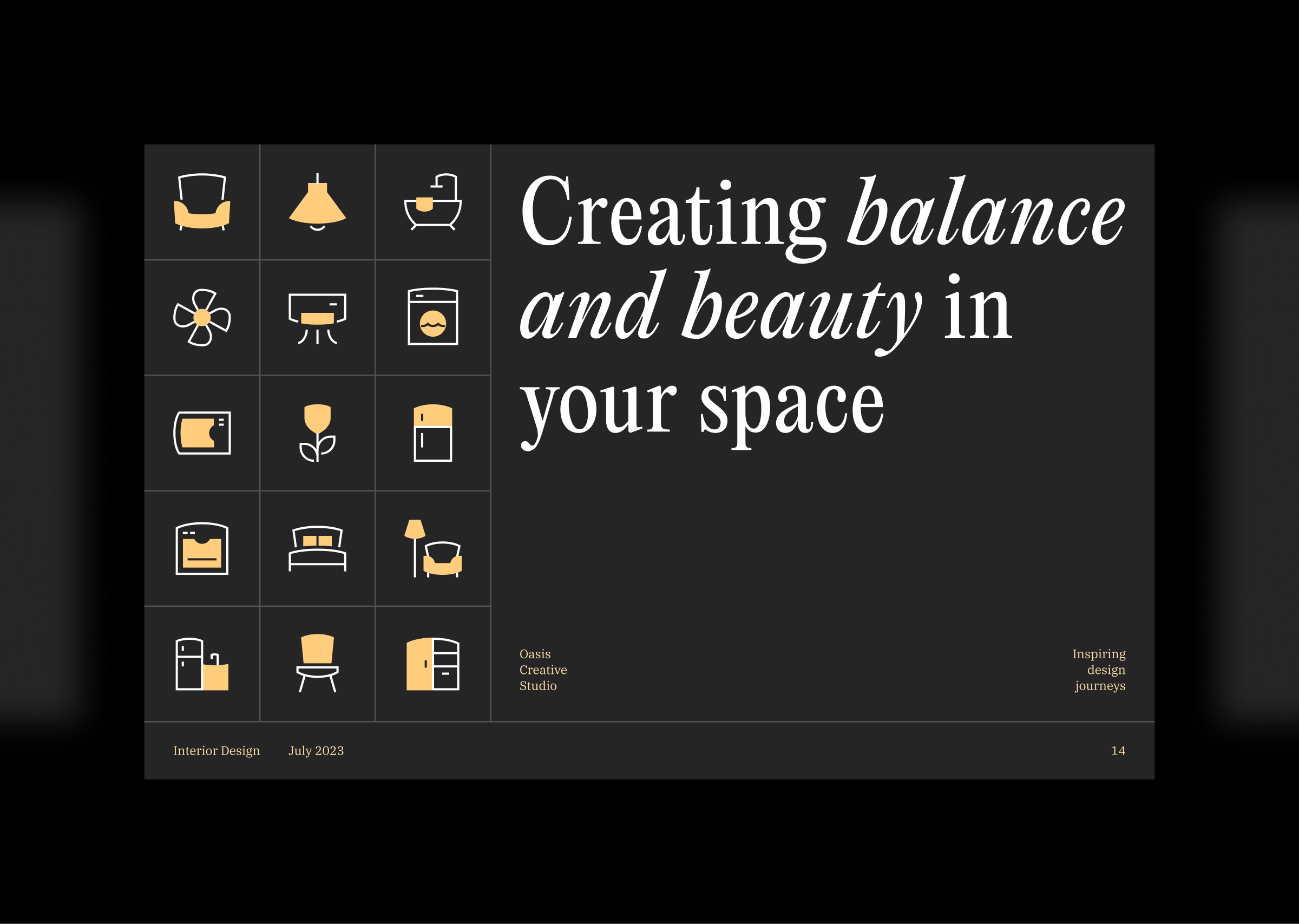
See more examples of combo icons in action 👇


P.S.
Making icons unique can be done not only by turning them into combo. You can also tweak their colors to turn them from default to exceptional. And that's exactly what we're talking about in our previous article.
Find out different ways to use colors and gradients to live up your icons in this post 👉 Color play: Exploring icons beyond default palette.