Simple steps to turn icons into mini illustrations
Figure out the tricks to turn your icons into mini illustrations to spruce up your projects.

Icon isn’t just a symbol or button.
You can use icons as illustrations to visualize your content and make it more engaging. However, the simple and minimalistic natures of icons often makes them easy to overlook. You don’t want that to happen.
You want to make sure your icons are eye-catching enough to capture viewer’s attention. And this is how you can do that.
The mini version of illustration
Not all illustrations have to be rich drawings and occupy a lot of space like feature illustrations or hero images.
Spot illustrations occupy only a small portion of space around textual content. It’s small, therefore it doesn’t need a high amount of details.

It’s the mini version of illustration and it’s so close to the look of an icon to the point that it’s possible to turn an icon into a spot illustration—which is what we’re doing here.
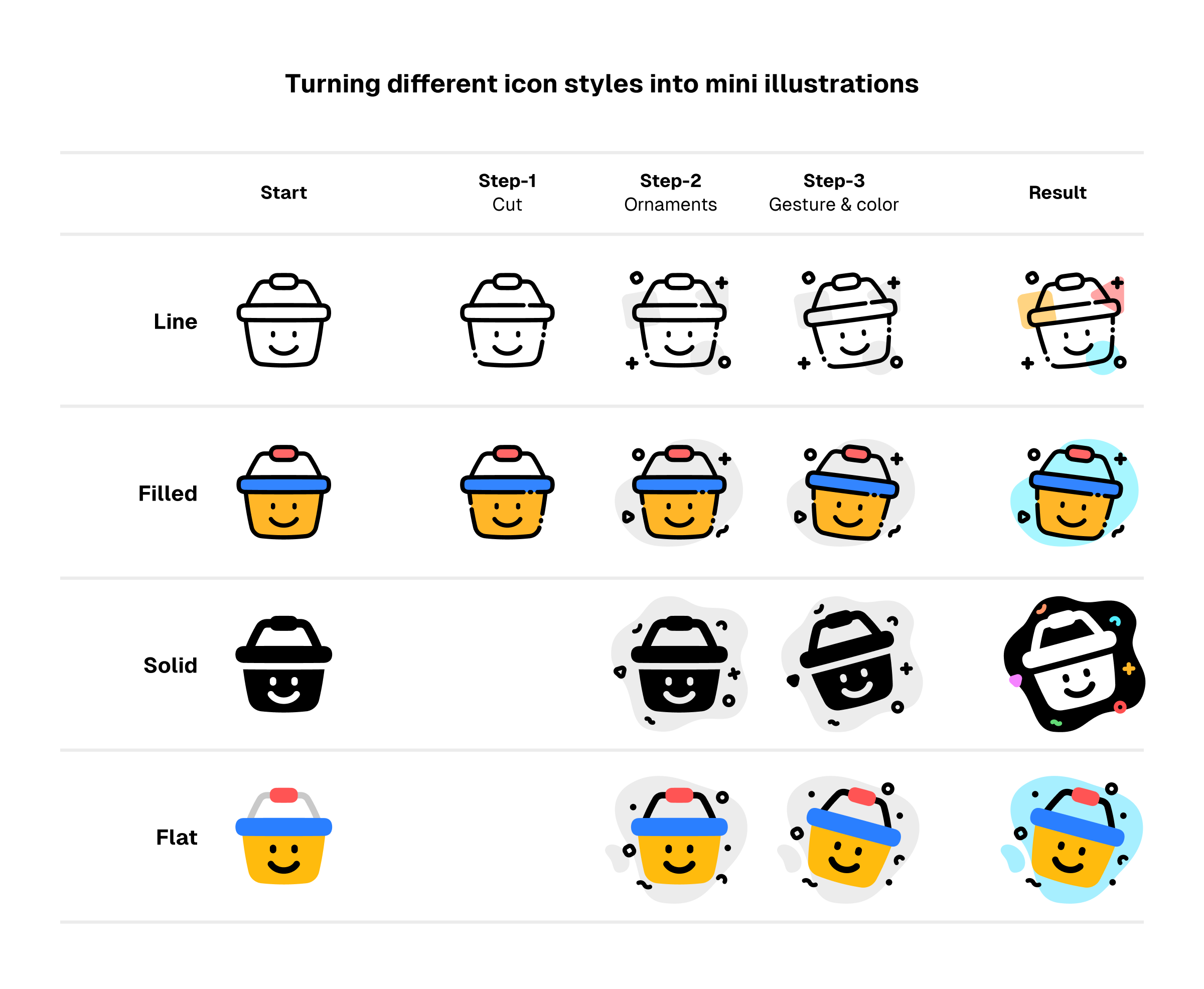
From simple icons to lively mini illustrations
You can turn any variant of line icons into mini illustrations.
The key lies in the details. While basic line icons are simple and static, the illustrative versions are merrier and more dynamic.
A simple tweak on the icons, some fancy ornaments, and colorful backgrounds will come in handy to turn them into mini illustrations.

Start with tweaking the icons
We’re going to give the icons a unique touch by... breaking them.
You read it right. We’re going to cut the icons to add some gaps and dots. It’s a way to give an ornamental look by using the icon’s own element.

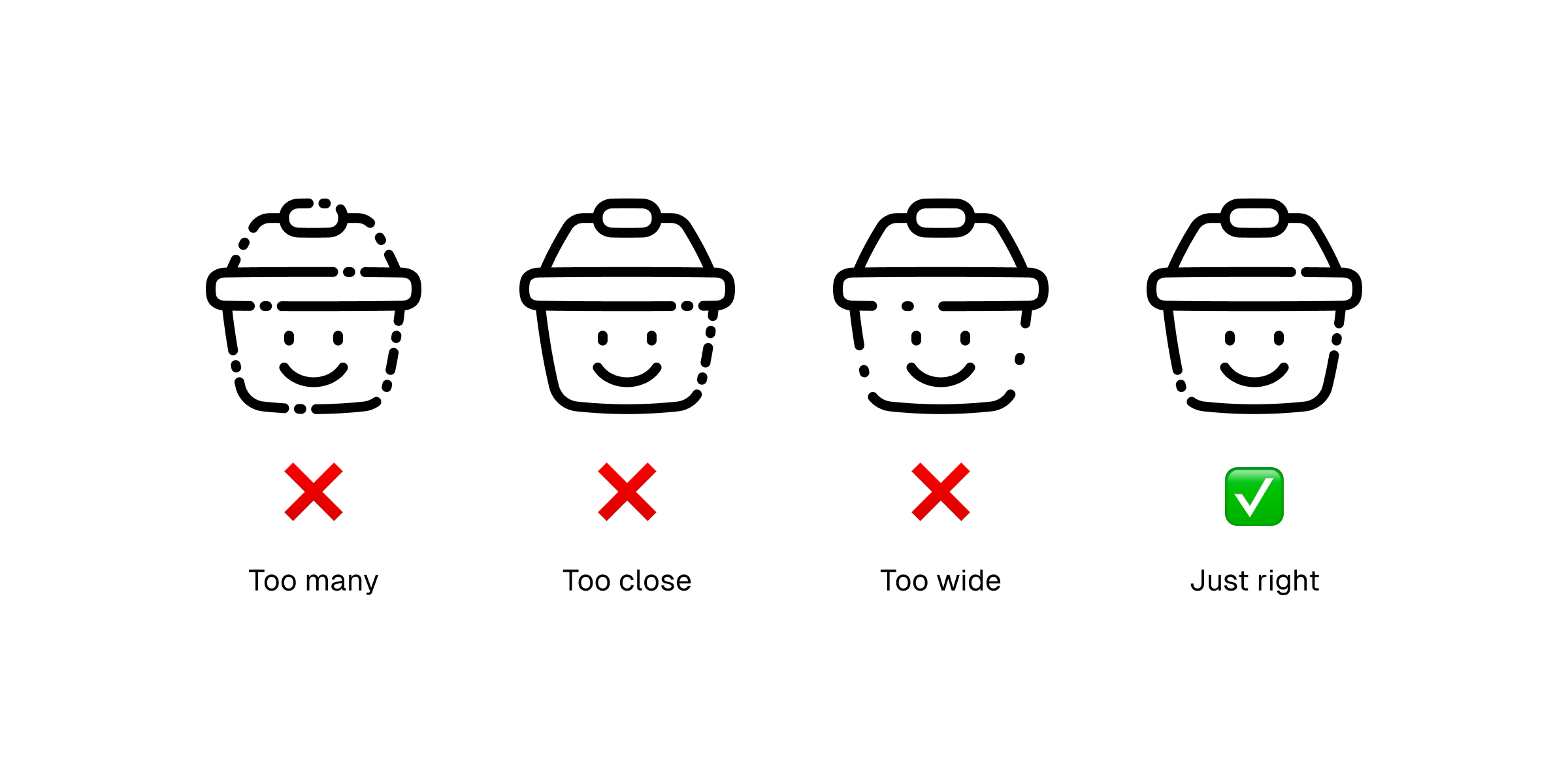
Before we do it, we need to decide where to cut the icons. A simple rule of thumb for adding gaps and dots to icons:
- Not too many. Add as few as 1-3 dots or gaps to a single icon, as too many of them will clutter the icons and eventually reduce their legibility.
- Not too close. Two dots shouldn’t be placed very closely, instead place it in a way that will give the icon a balanced look.
- Not too wide. Gaps shouldn’t be too wide as wide gaps will make the icons lose their shapes.
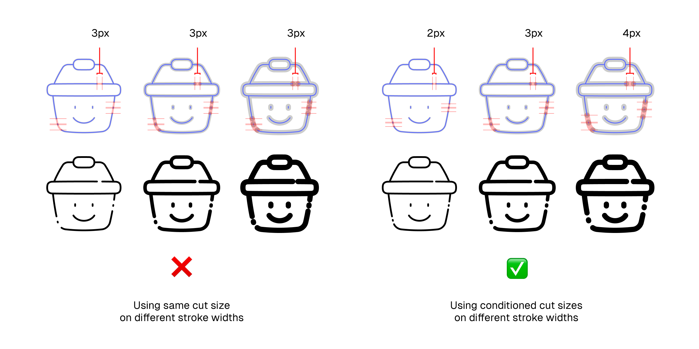
Consider also the different line widths when cutting the stroke path as they will also affect how the gap looks.
- Thinner lines use narrower cuts
- Thicker lines use wider cuts
Besides the mentioned rules above, there are no strict rules about where the gaps and dots should be placed. Any part of the icons should be OK as long as the icons are still legible and the gaps and dots are not giving out any undesired impression.
And then live them up
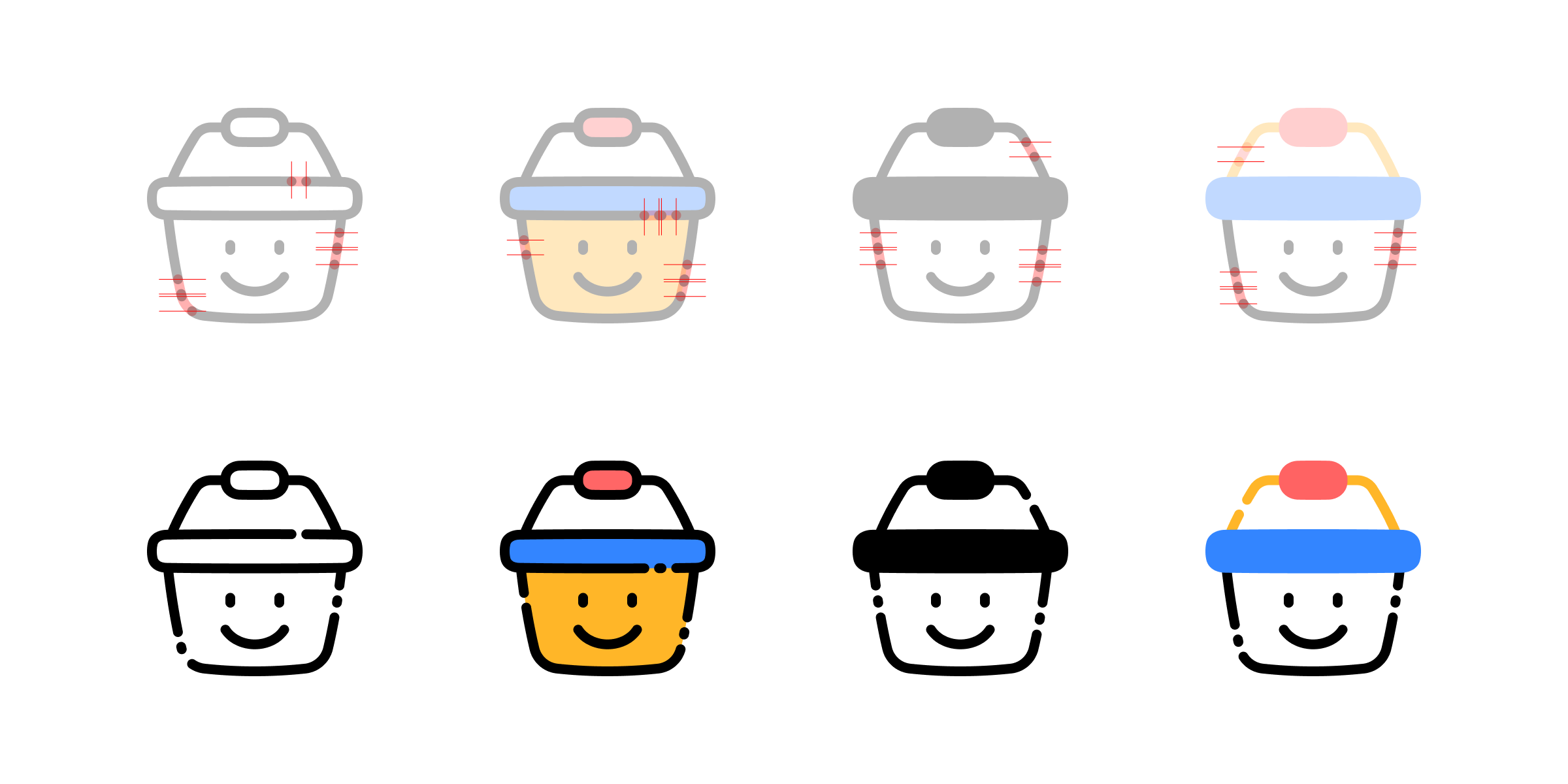
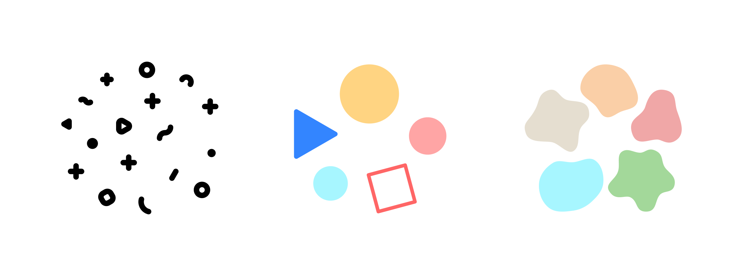
Insert ornaments to live up your mini illustration. Confetti? Geometric shapes? Blobs for background? You decide.
The only thing you need to make sure is to not let the ornament take away all the focus from the main element aka. the illustration. So, do live it up, but keep it under moderation.

For icing on the cake, you can also tilt the icons to add a little gesture. It’s a way to give the static icons a little bit of dynamic touch.

What if my icons aren't Line?
While the steps we showed above are to customize Line icons, it also can work for editing other styles. In fact, it can be much simpler.
If you’re working with styles other than Line, maybe Solid or Flat, you can skip the part of breaking the stroke and head straight to adding the ornaments.
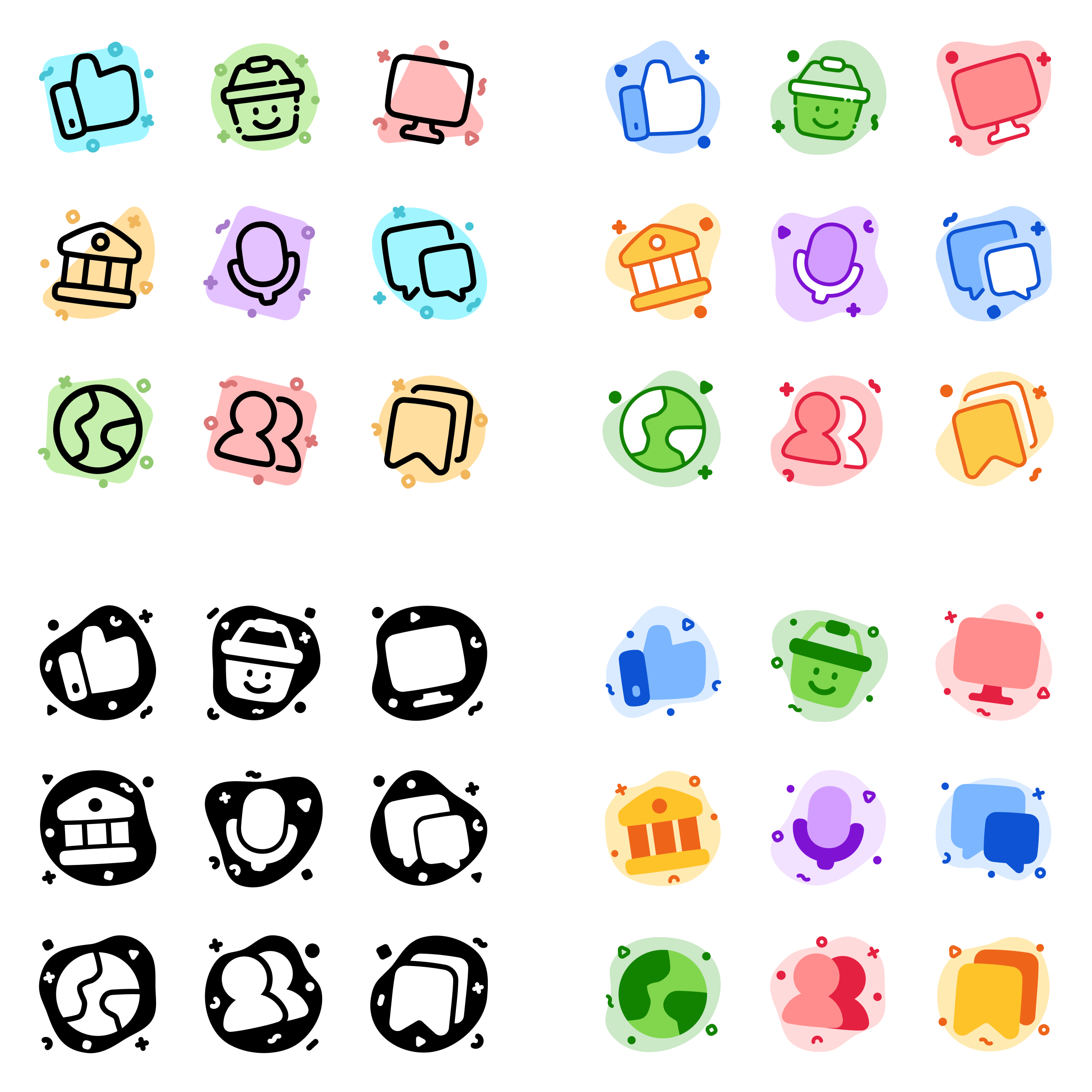
Start with one, adjust as you add more
When turning a set of icons into mini illustrations for the same project, keeping them consistent is a fundamental rule—especially when different ornaments are involved, which can be tricky.
To deal with that, you can start with customizing a single icon to see how it would fit better to your needs. When you're convinced with how it looks, start customizing more icons while keeping the door open for necessary adjustment.
Here's a few sets of icons with different styles that we developed based on the samples above.
Put them in action
As the details increased, the icons' function become exclusively narrowed to anything other that navigational interface.
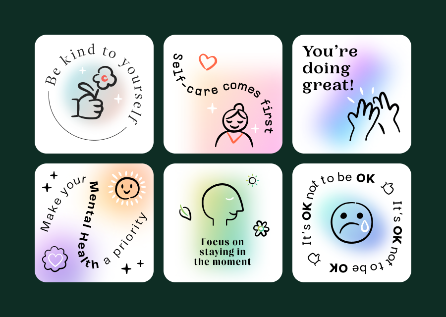
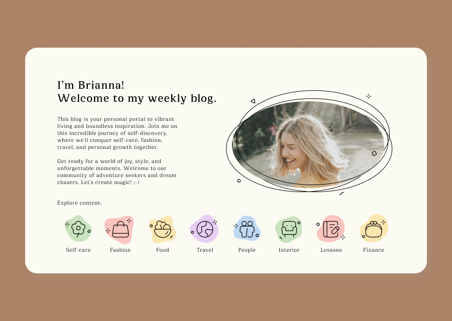
We can still use them in interface design, but not as navigational buttons. Instead, we can use them as illustrative elements on different interface states or on content accompanying texts.
Outside the interface design, they can be attention grabber on presentation, content, and graphic design.


P.S.
There are many ways to give your mini illustrations a more unique touch. Two of them are to tweak their colors and combine one style with another. And you know what, we've got them covered 😉
- 6 ways for coloring icons to stand out, and how to use them
- How to create unique icons styles, through the art of combination