The 'Creator' – Marketing archetype tips
Crafting visionary brands: elevate your design with color schemes, typography, icons, and inspirational ideas.
The creator brand archetype
Do you know your brand's personality? Brand archetypes are a very popular branding framework that classifies companies into 12 different archetypes.
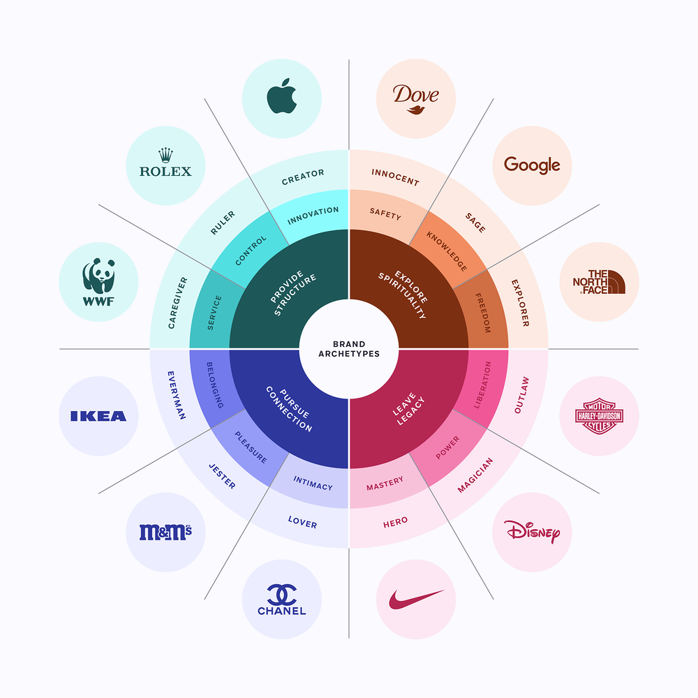
Your brand belongs to one of these archetypes and with this series of articles you’ll discover how to create an engaging message with graphics specially curated by the Streamline team.
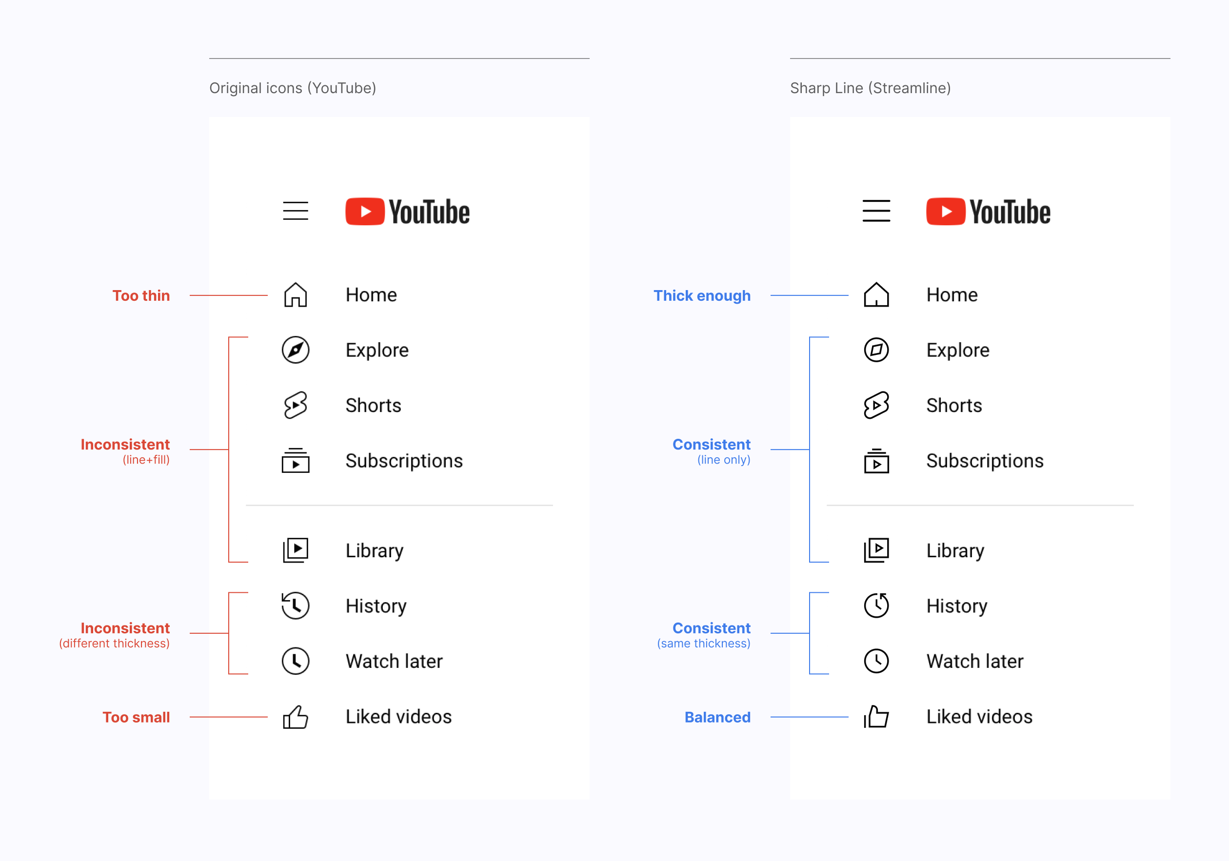
Why should YouTube use Sharp Line icons?
Keep reading to find out the best assets for the Creator archetype.
Meet the Creator
The Creator archetype represents original, visionary and daring brands. They build their own trends based on their powerful imagination and unconditional passion, with the ultimate goal of building a legacy.
Goal: Innovation
Message: If you can imagine it, you can create it
Voice: Creative, perfectionist and professional
Brands that are part of the Creator archetype design high-value products for a customer who is looking not only for the product itself, but also for an experience. Far from being pretentious, these brands use their immense creativity to solve real problems and show great commitment to their users.
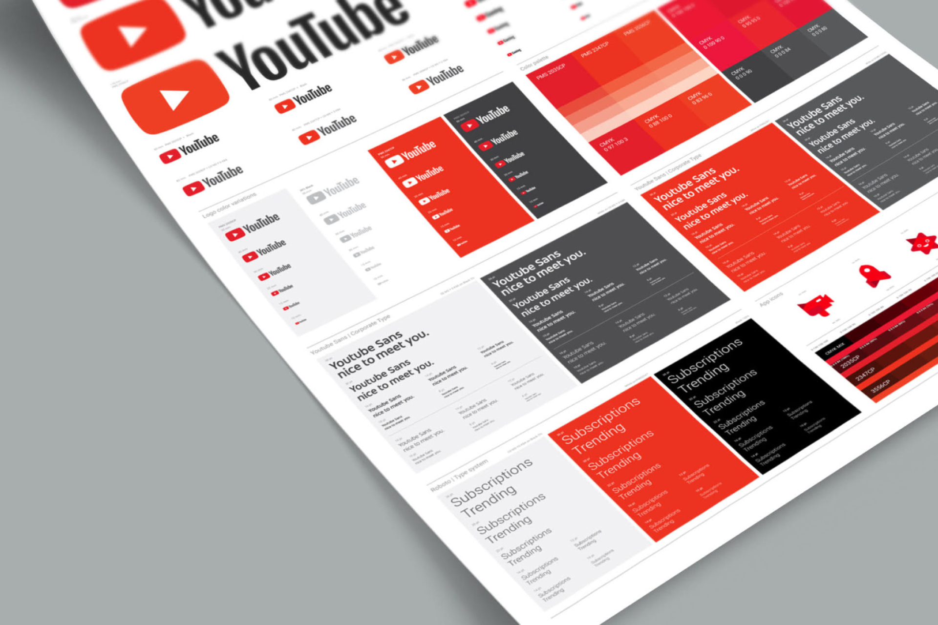
YouTube, Apple, Lego, Adobe or Crayola are all perfect examples of the Creator archetype. Brands like Lego not only uses creativity and imagination to build its identity, but encourages these values directly to its audience. They are creators helping to make creators.
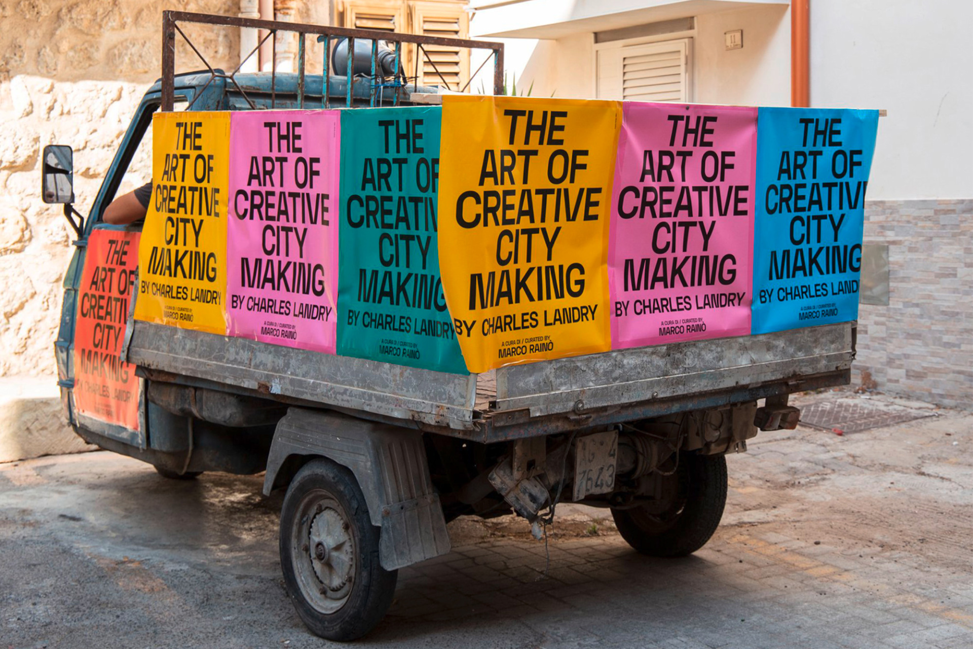
The joy of design
Design cannot be understood without creativity, just as creativity cannot be understood without joy. Paula Scher is probably one of the most creative and expressive designers of all time and she understands this notion perfectly:
"My work is play. And I play when I design."

"Have fun designing" should be the first rule of the Creator. There's no point in communicating concepts like "creativity" or "imagination" if we don't apply them to ourselves. So let's have some fun, starting now.
Bold ideas require bold colors
A high-contrast color scheme, like black and red (or other warm colors), can create a bold and striking visual impact. This can be suitable for creators who want to stand out from the crowd.
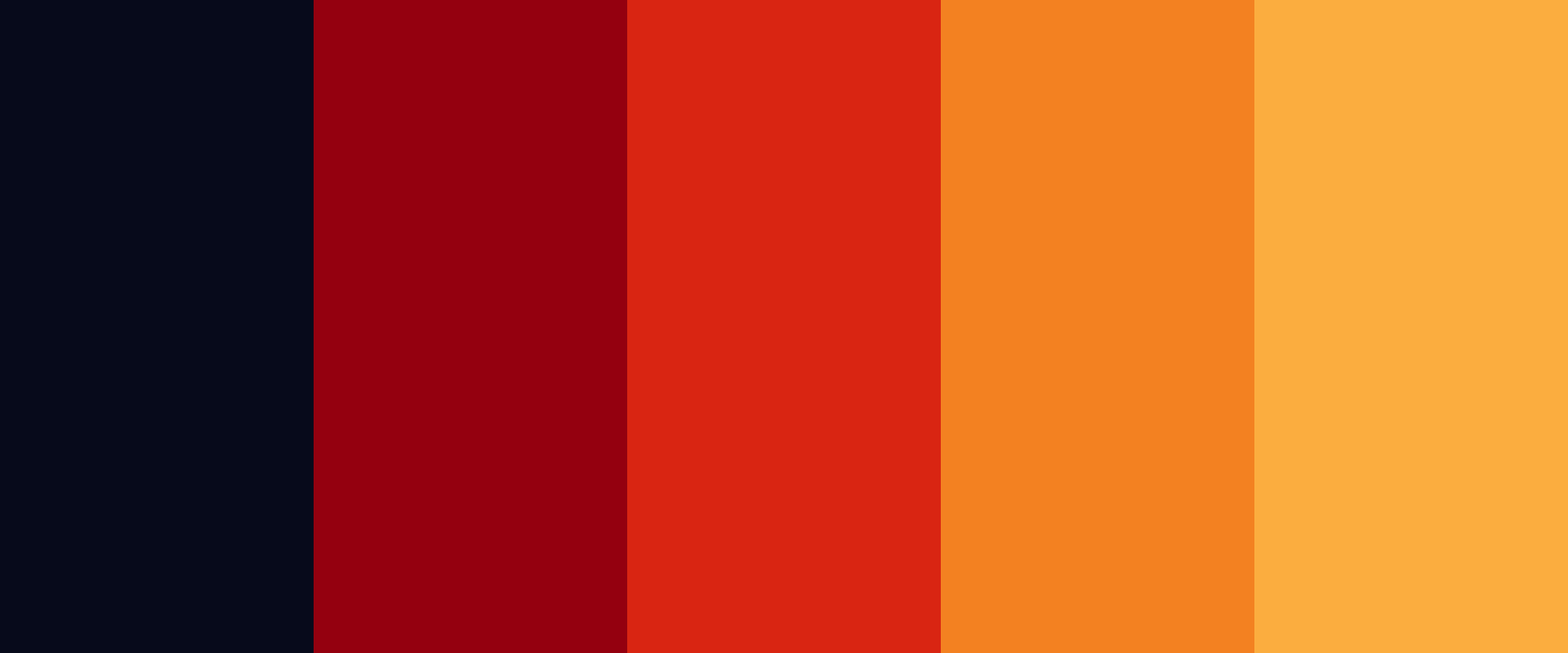
A palette of bright and bold colors like pink, yellow and blue can also help communicate creativity, excitement, and innovation. These colors are often associated with energy and enthusiasm, which is perfect for this archetype.

If you are looking for something more professional and sophisticated, a cool and calm color palette with muted tones can offer a soothing and refreshing effect to your design while still looking creative.

Color is a very powerful tool, make sure you make the right decision before moving forward. In the end it's up to you to choose and justify the reasoning, this is nothing more than a pure recommendation based on such abstract concepts as "creativity" and "imagination".
Be trendy by being timeless
We already recommended some sans serif fonts in our Everyman article, which were based on the principles of neutrality and simplicity. We could apply the same notion here, but in this particular case we're looking for something a bit more personal and modern.
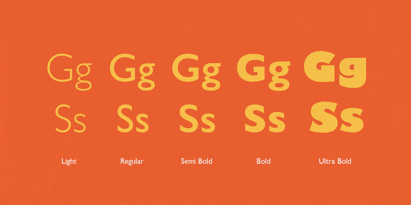
Compared to the Everyman, here we have a wider range of possibilities. Humanist fonts like Gill Sans could be a great fit, specially recognizable by its sharp cuts.
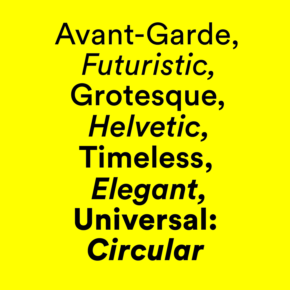
Circular is a geometric alternative, a popular and well-regarded font thanks to its simplicity, versatility, and legibility. Completely timeless.
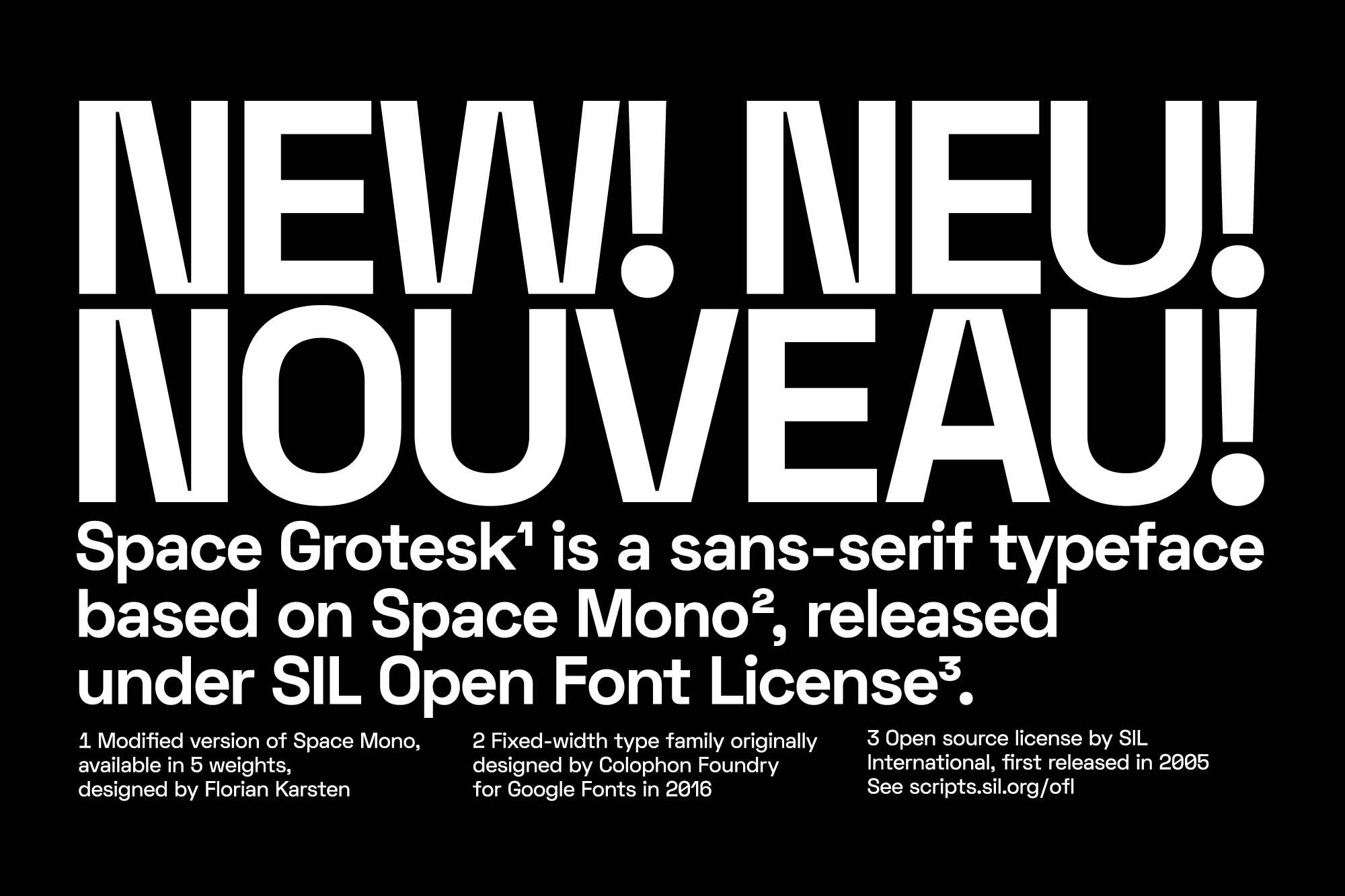
We also have plenty of free alternatives that fit these criteria. Like Space Grotesk, designed by Florian Karsten, with lots of nice details that make it a unique and perfectly legible font.
Creativity at small sizes
It's probably difficult for some designers to think of icons as a very creative field, but believe me if I tell you that we haven't yet seen the full expressive potential of these signs that have been with us for more than five thousand years.
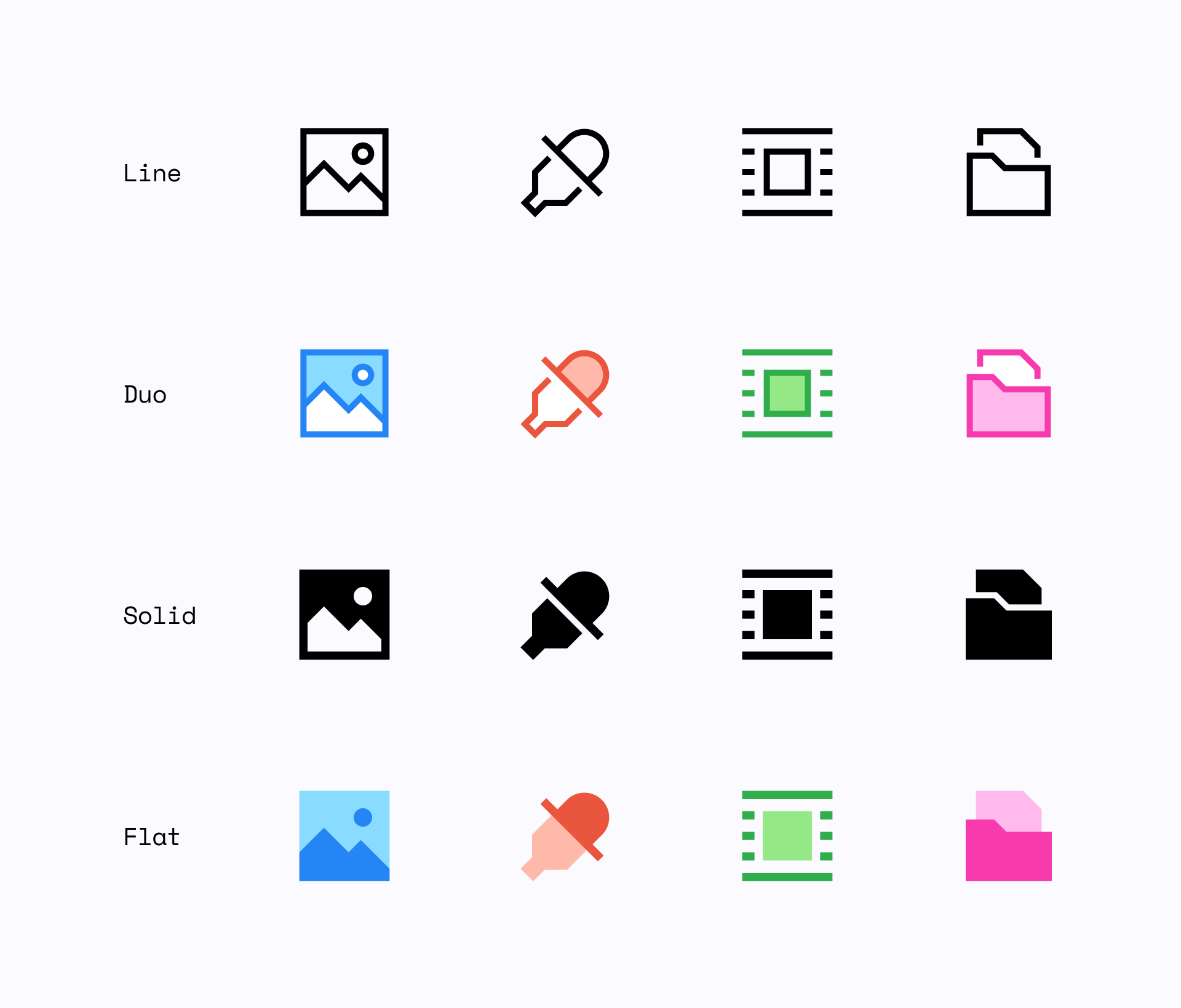
At Streamline we try to experiment with icons, but without losing sight of legibility. That's what we did with Sharp, a simple, serious and brutal set with a strong geometric look.
Sharp icons come in 4 different styles, Line and Solid are more functional, professional and legible at small sizes, while Duo and Flat are a colorful alternative that serves a more illustrative purpose and look particularly good at larger sizes.
Stay classy
We've talked a lot about having fun while designing, but this doesn't necessarily imply creating a naïve or super playful visual language. Creative brands often use this innovative approach to achieve sophisticated and professional designs.
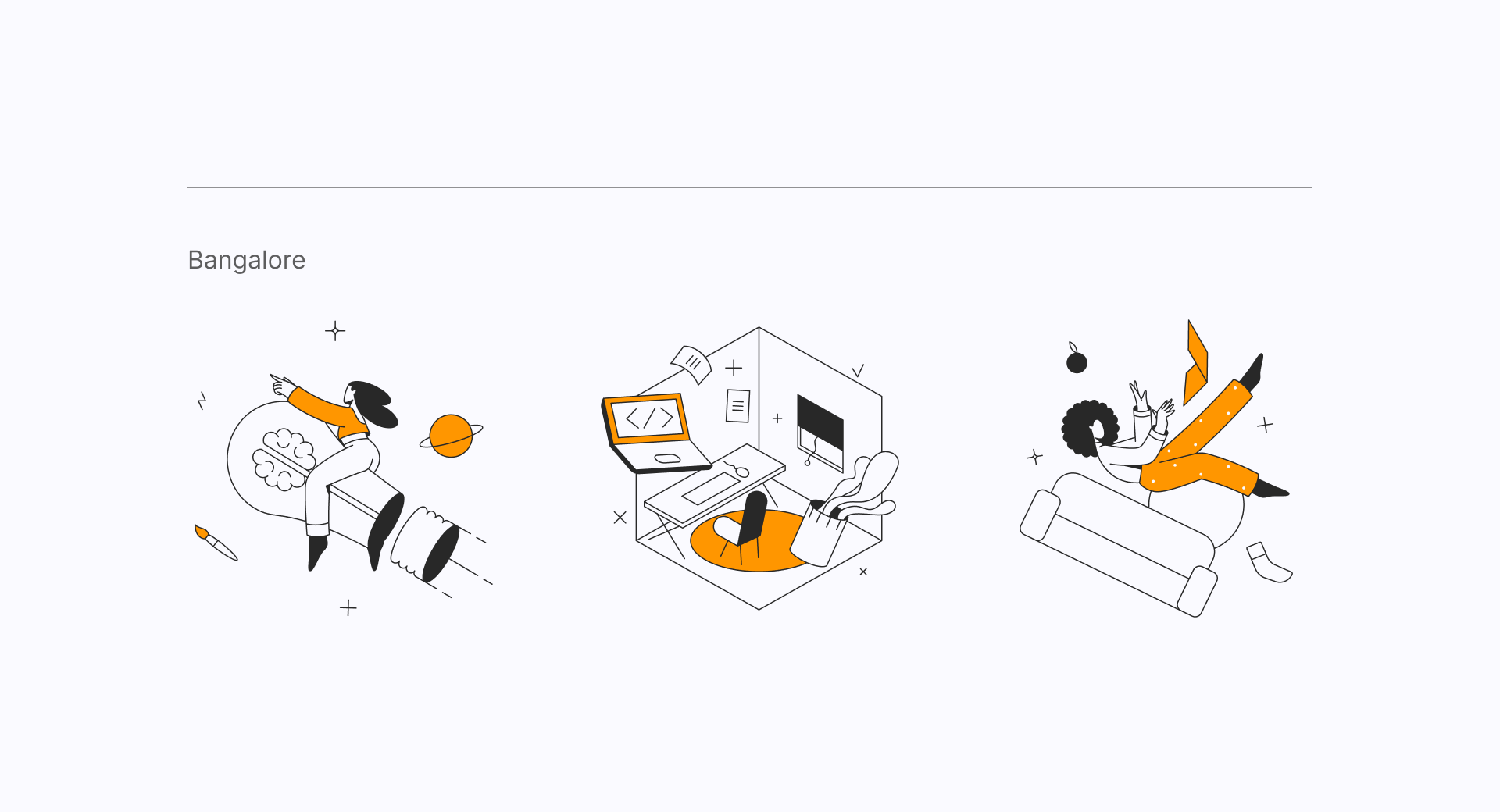
That's why we recommend an illustration set like Bangalore, an airy and abstract style that is as minimalist as it's sophisticated. Plus, with the use of only two colors, it's very easy to adjust it to your brand guidelines.
Need to spice things up?
Who doesn't like geometric shapes? They're simple, versatile and a great example of assets that could go with a Creador brand. We offer a wide variety of abstract elements, but both our Geometric and Dimension shapes would be a fantastic choice to complement your designs.
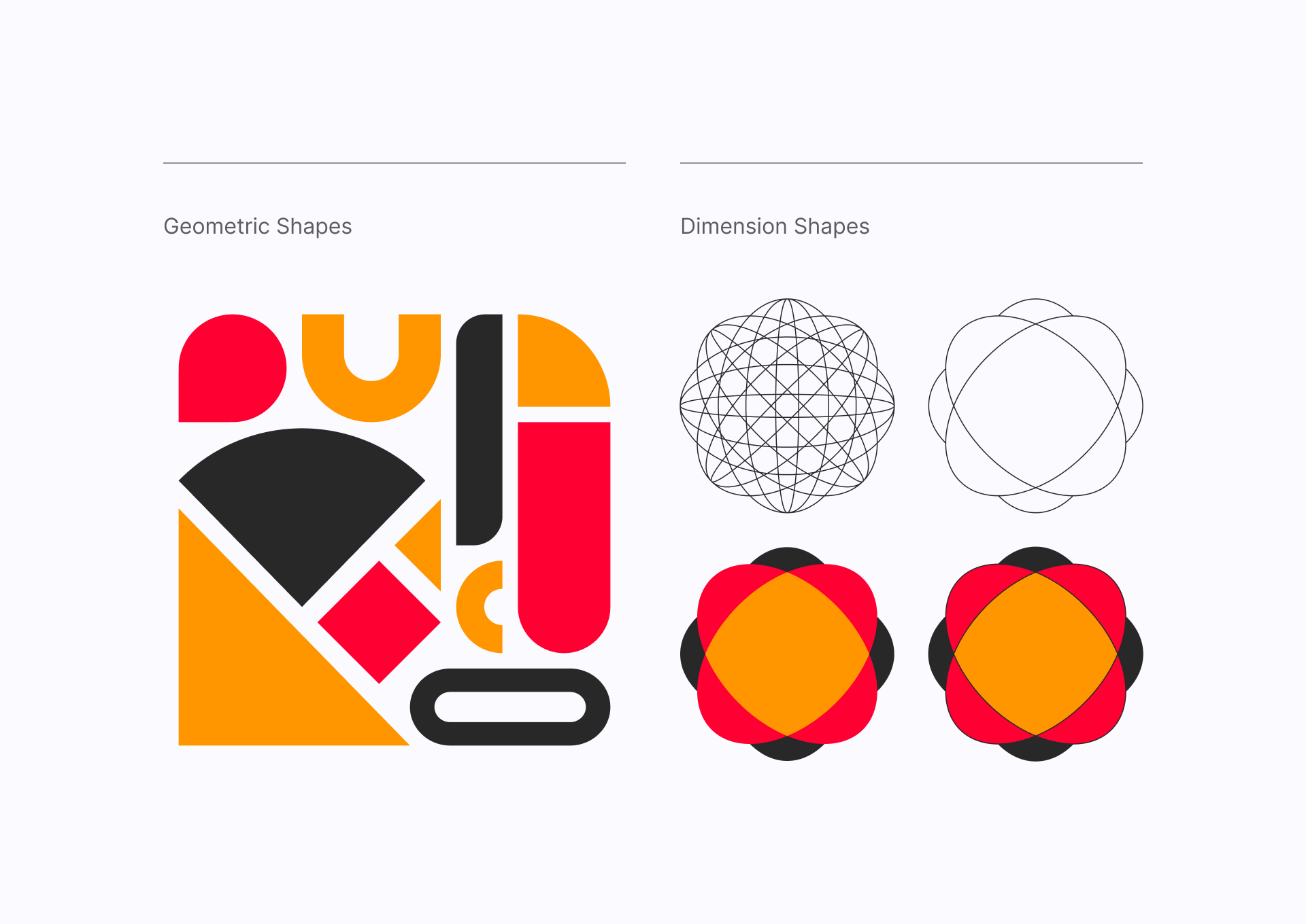
At first they might seem like very prominent shapes that would take the spotlight away from the rest of your design, but not even close. You can use these elements in a very subtle way, almost like textures that blend in with your background and help you achieve a more elegant design with a lot of personality.
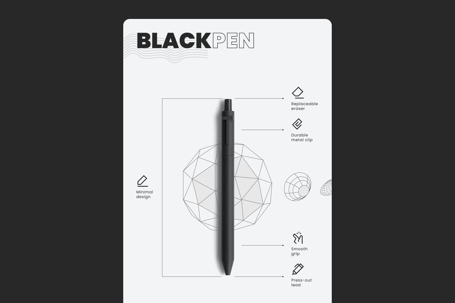
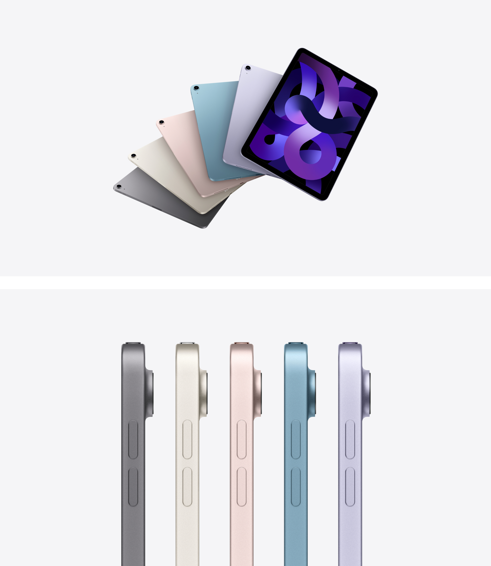
More than a product
The use of photography in Creator brands is essentially product-oriented, but doesn't necessarily waive the option to show users enjoying that product or experience. However, these brands try to go a step beyond the usual product photography and create something more expressive, either through the use of color, complementary visual elements or a more creative composition.
Parkour!
Brands that are part of this archetype have the same approach to the creative process, which is very similar to parkour: they try to go from Point A (the problem) to Point B (the solution) as creatively as possible. They try to communicate their passion and inspire their audience, a potential generation of new creators.
Here's a good start! 👇
Sharp icons
Access unlimited downloads for this mixed set that includes a total of 500 icons. Is Sharp a good fit for you?
Sign up to get upcoming sets in your inbox