The 'Everyman' – Marketing archetype tips
The art of approachability: design tips to give a sense of belonging and familiarity.
The Everyman brand archetype
Do you know your brand's personality? Brand archetypes are a very popular branding framework that classifies companies into 12 different archetypes.
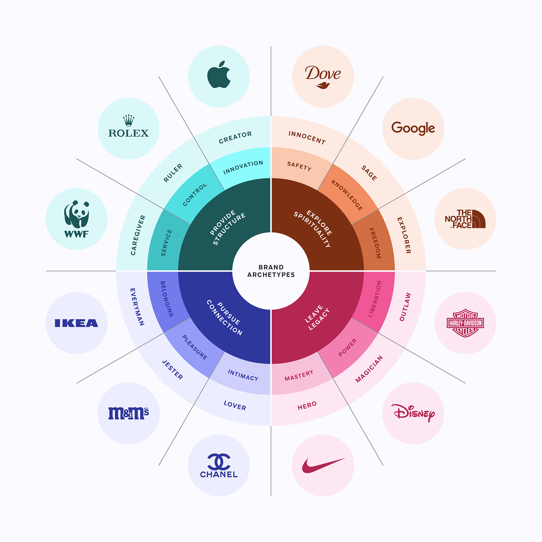
Your brand belongs to one of these archetypes and with this series of articles you’ll discover how to create an engaging message with graphics specially curated by the Streamline team.
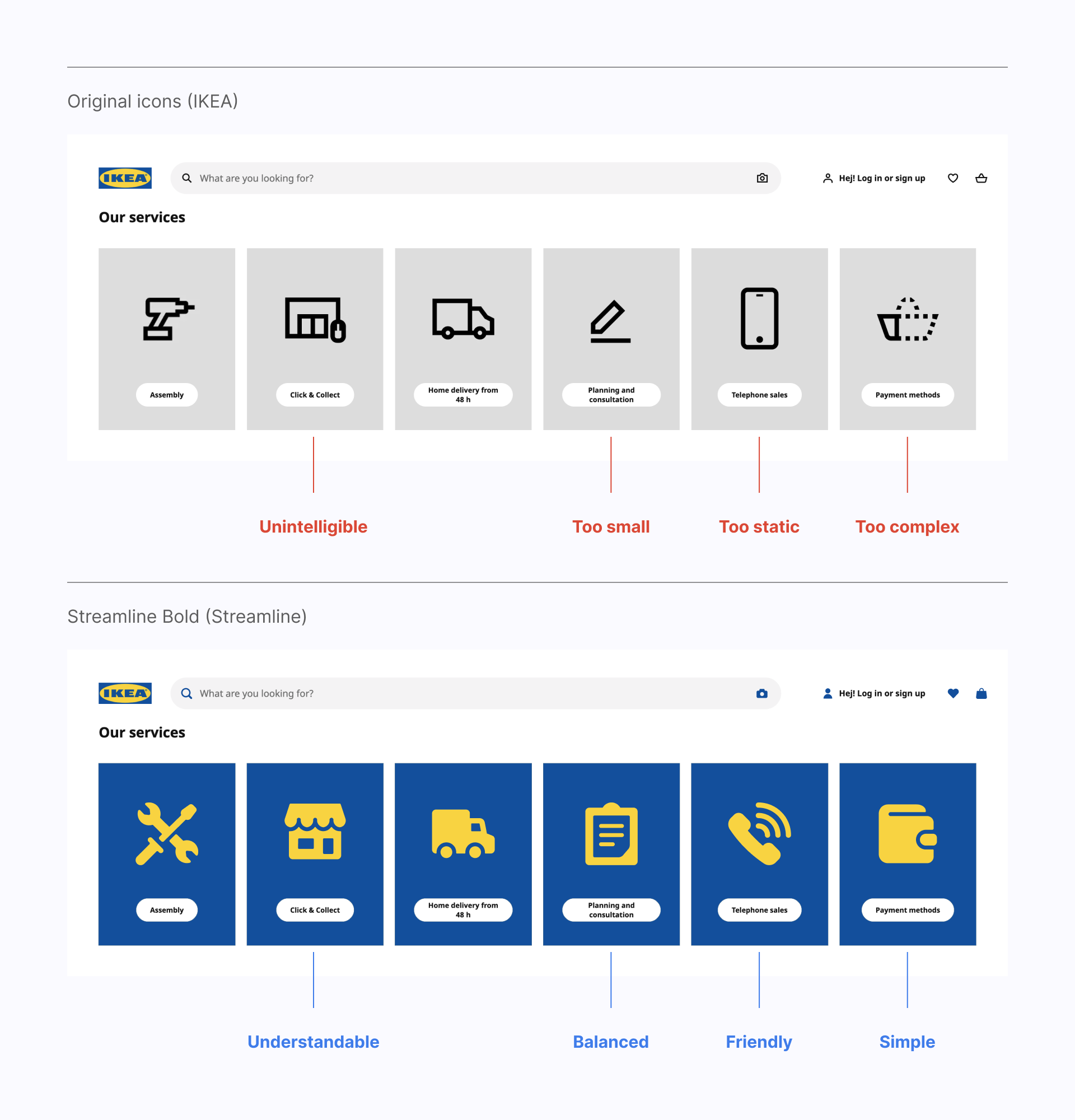
Why should IKEA use Streamline Bold icons?
Keep reading to find out the best assets for the Everyman archetype.
Meet the Everyman
The Everyman archetype represents humble, authentic and simple brands. They don't want to be transgressive, but focus on the beauty of everyday life, which anyone can enjoy.
Goal: Belonging
Message: Live together in harmony
Voice: Authentic, pragmatic and inclusive
Brands of the Everyman archetype offer practical products that appeal to a broad audience. Their brand image is simple and warm, they are close to their users and try to create a sense of belonging.
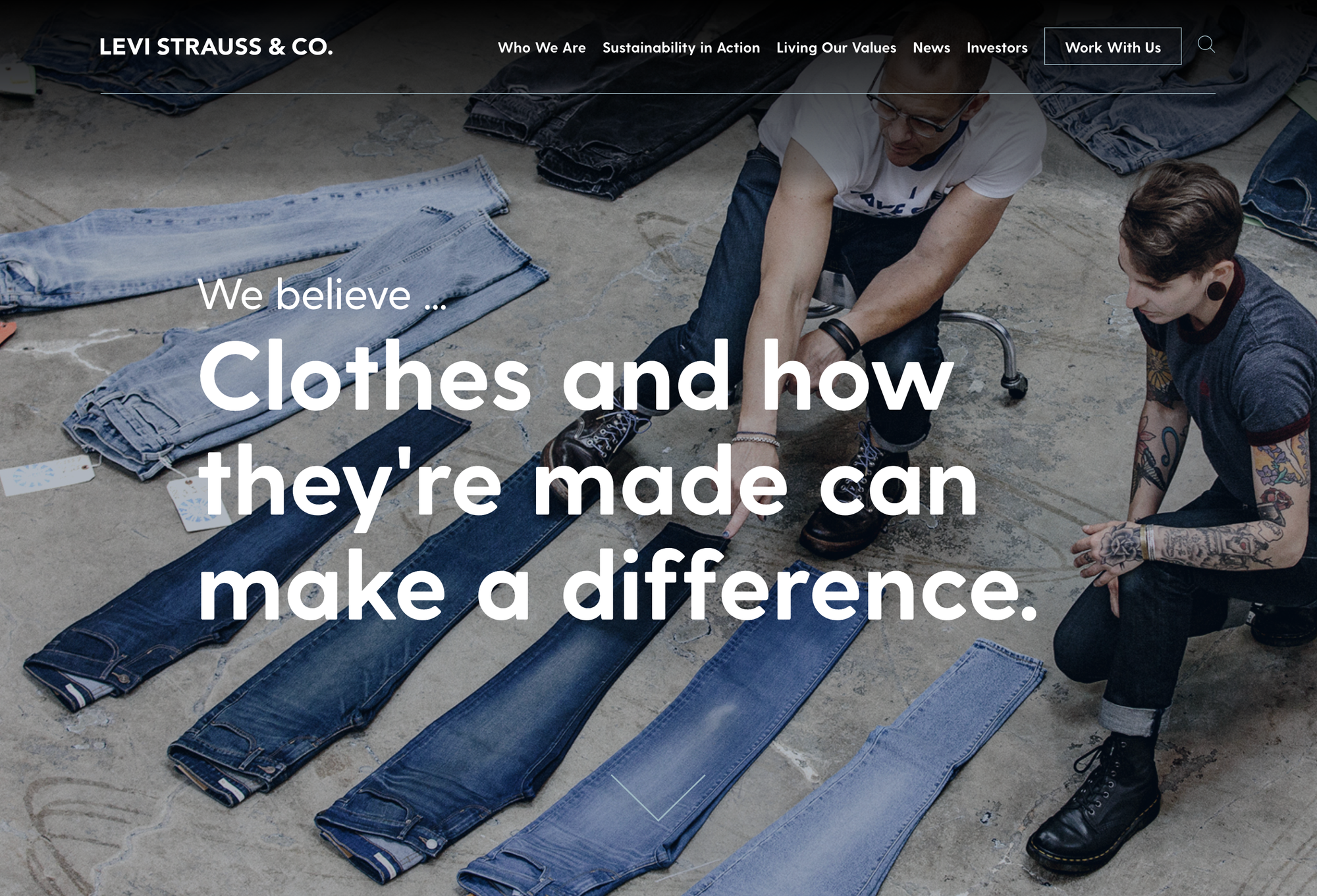
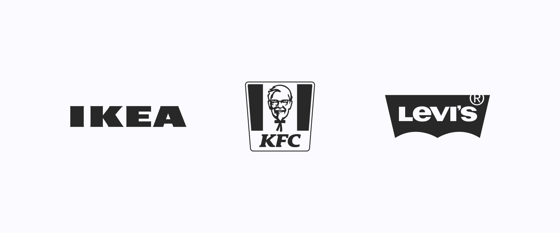
Brands such as IKEA, KFC, Levi's, eBay or Target are great examples of the Everyman archetype. IKEA in particular has built the perfect Everyman image, as it offers functional and affordable products for the everyday person, without targeting a specific audience.
Good design is invisible
There’s a certain notion that good design is invisible, that its mission is to blend in rather than stand out. German industrial designer Dieter Rams established this as one of its famous Ten Principles for Good Design:
"Good design is as little design as possible.
Less, but better.”
This could be our motto for creating a design system based on the Everyman archetype. Let's break down the elements that could be part of this language.
Don't be shy with color, be cautious
Blue (+ accent color) is the perfect choice to represent the confidence, integrity and neutrality of the Everyman brand archetype. Complement it with a touch of yellow for a more friendly and energetic approach.

Using a monochromatic palette can result on a cohesive and harmonious look, very suitable for these brands. This could be achieved using shades of colors like blue, gray, or green.

This last palette consists of warm, earthy tones that evoke a sense of comfort and reliability. Colors such as olive green, terracotta, taupe or mustard yellow are great options to represent a humble brand.

But don't take this reference as a restriction, colors can connote many different virtues and it's important to experiment with them before making a final decision.

Sans serif fonts are your best ally
It’s important not to use very expressive fonts for this archetype, we need a typeface that can coexist with the rest of our visual elements, a neutral sans serif.
Neo-Grotesques are the specific category we are interested in. They are a refined version of the Grotesques typefaces, which appeared as the first form of sans serifs, and are based on the principles of neutrality and simplicity.
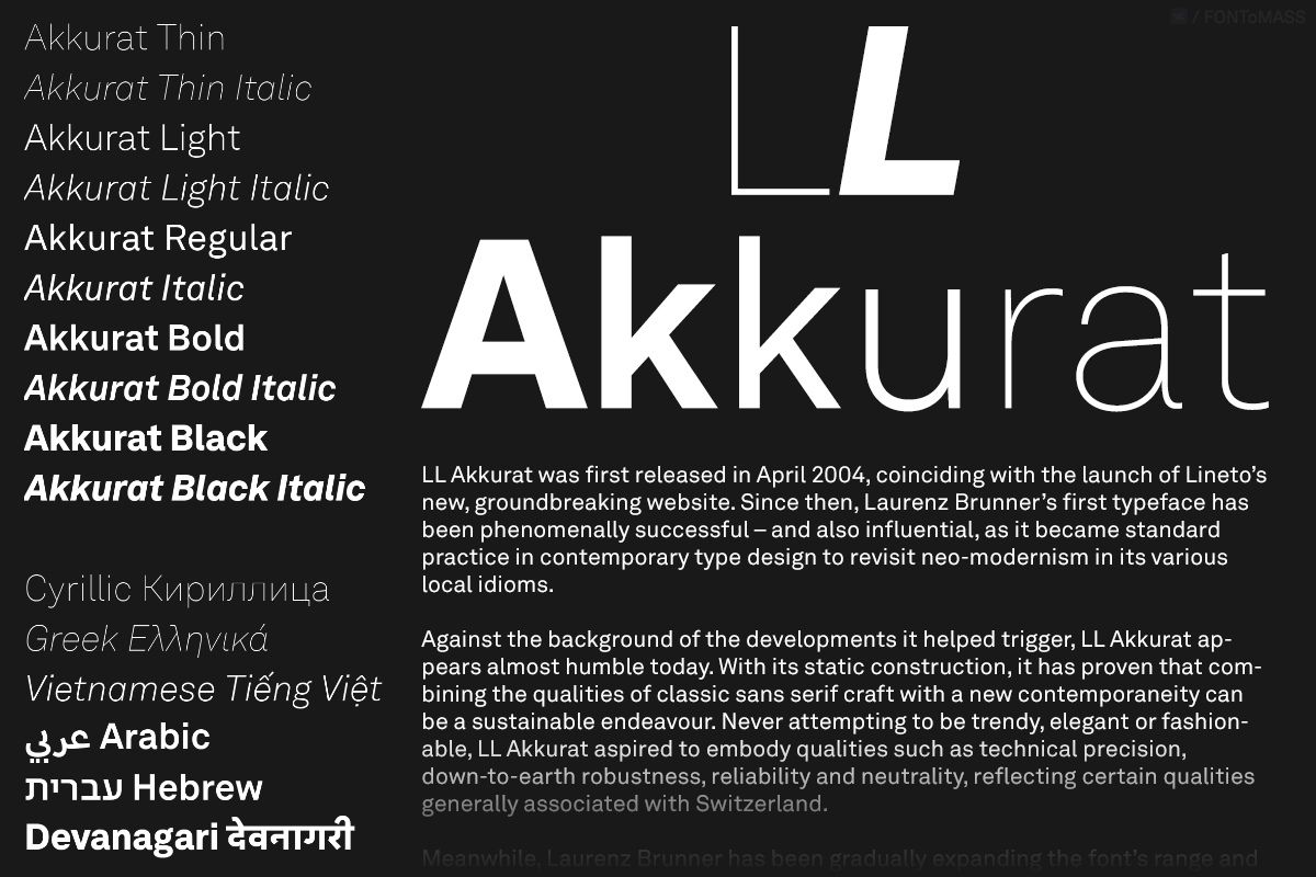
Akkurat is a very modern typeface with a clean and minimalist design, perfectly legible at small sizes and often used in editorial design, branding and signage.
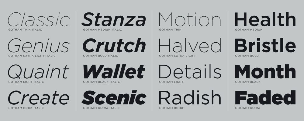
If you're looking for a more geometric alternative, Gotham has a very distinctive design. It’s particularly popular in branding and advertising projects.
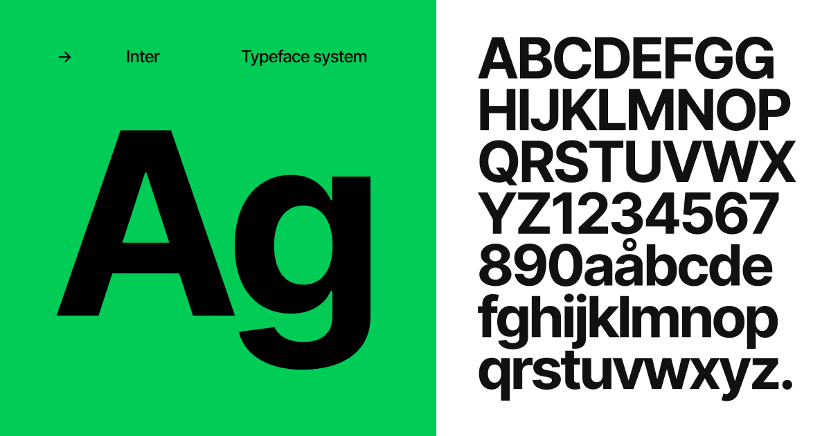
What about free alternatives? You should definitely choose Inter, designed by Rasmus Andersson. It’s a very versatile font that has become widely used in UI.
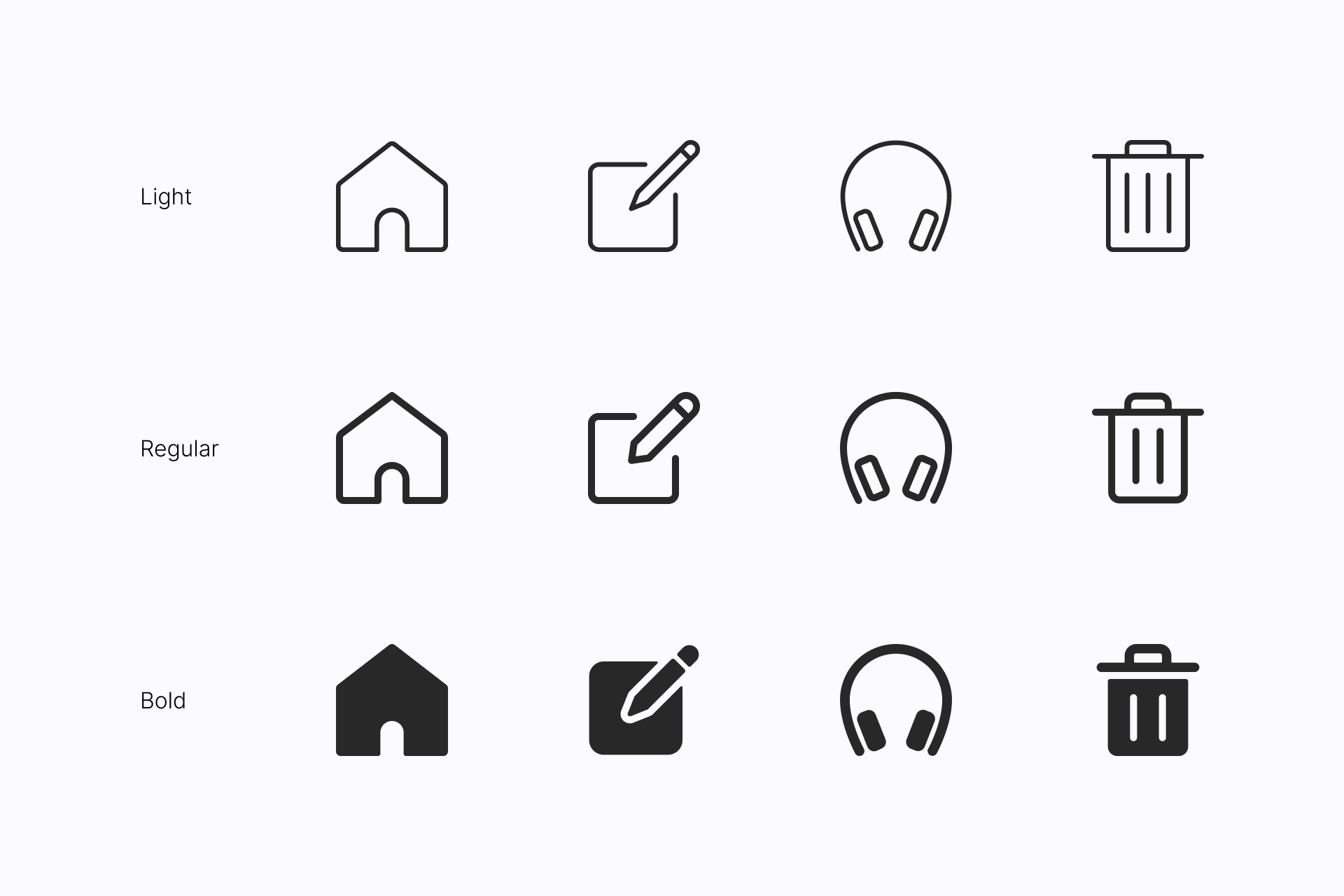
Go for simple icons
Streamline (Light, Regular and Bold) is the perfect example of an honest, pragmatic and inclusive icon set. They blend perfectly with any type of design thanks to their simplicity and lack of pretension.
Streamline icons are built on a 24x24px grid to ensure legibility at small sizes and are available in three different styles: Light, Regular and Bold. Plus, Streamline classic sets are insanely large, with almost 15,000 icons in which you'll surely find any concept you need to represent.
Streamline Light uses a thinner stroke and has a higher level of detail for those who want slightly more complex icons. Streamline Regular uses a thicker stroke and is a more minimalist alternative. Streamline Bold is a solid variation of Regular that offers great legibility at small sizes thanks to the high contrast of the shapes with the background.
Don't try to reinvent the wheel with the illustrations
We don't need to look for a unique style or abstract images, we need descriptive illustrations that help users understand our message.
UX is a simple set that will easily adapt to your brand and help you communicate what you need without diverting too much attention from the rest of the content.
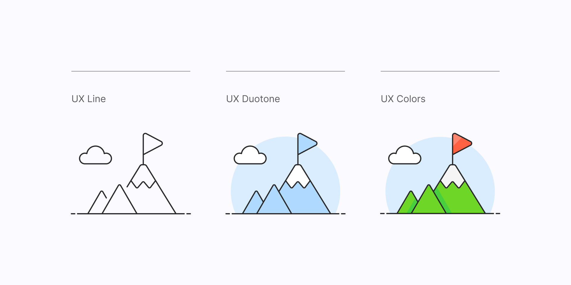
UX Line is a simple and light style that easily adapts to any context, whether it's used with a light or dark background. UX Duotone uses two colors, allowing you to match them to your brand guidelines without any additional effort. UX Colors is a more joufyl alternative for those who want more colorful and friendly illustrations.
Use other elements for a more personal look
Graphic Elements are a great resource of versatile assets that can be applied to many different contexts. Adjustable Stroke Elements are a series of scribbles, arrows and shapes with customizable strokes that you can make thinner or thicker depending on your needs.
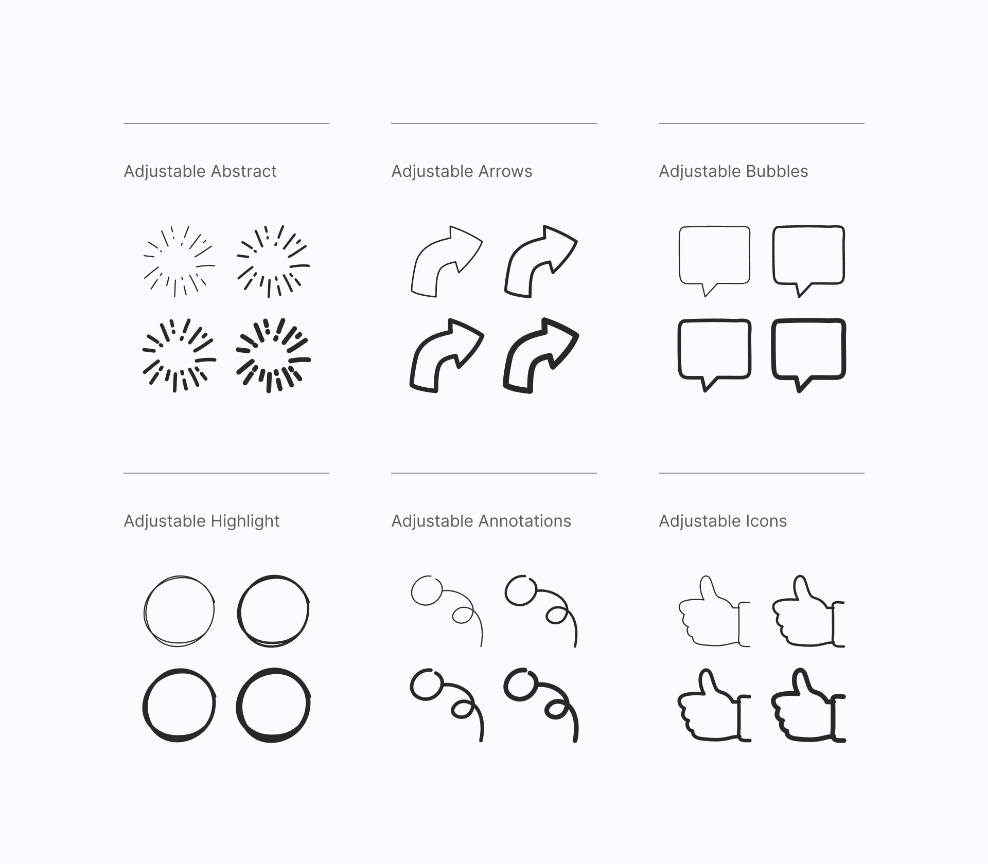
These scribbles will give a more personal touch to your designs thanks to their handmade look, helping to complete your project without taking too much attention away from the content.
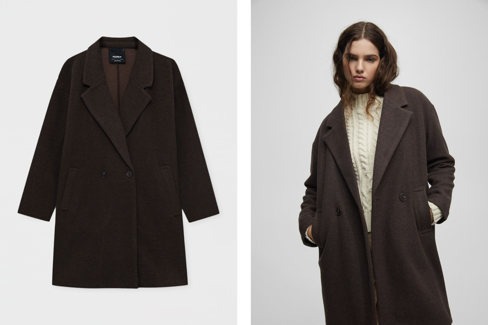
True to reality
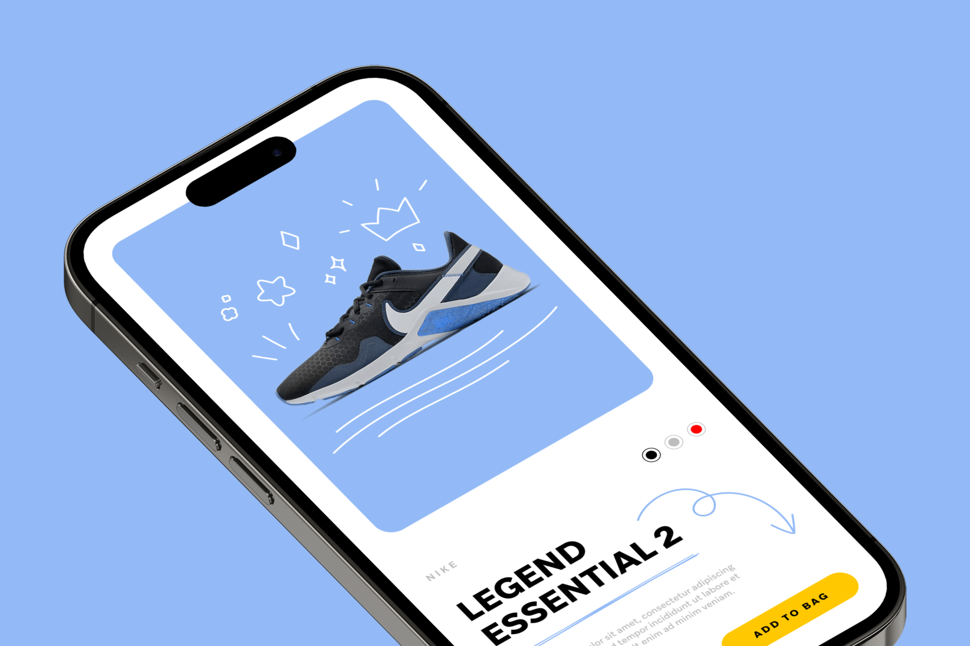
Photography can also be an important part of our visual language, specially if we are building a brand based on friendliness and honesty. In this case, we should use photographs that describe our values (if not directly our product) without a lot of embellishment or digital editing. This is what we show you, this is what you get.
A very likeable brand
As you can see, the Everyman archetype is everything that unites us. Brands that fall into this archetype are considered very likeable thanks to the use of a pragmatic and inclusive message. Communication is the same on a visual level, using neutral shapes and simple images that reach everyone without any risk.
Here's a good start! 👇
Streamline icons
Access 10 free vector samples for each of these sets. Is Streamline a good fit for you?
Sign up to get upcoming sets in your inbox