What makes icons feel professional
The choices that separate a professional icon set from an ordinary one.
An icon set can be clear, consistent, and perfectly usable, and still feel ordinary.
The best icon sets leave a different impression. They seem thoughtful, distinctive, and complete, even to people who couldn't explain why. That impression doesn't come from one technical feature. It comes from the judgment behind the work.
Consistency is where it begins
A good icon set needs consistency. Its icons have to feel like they belong together, whatever they depict. We explored what that takes in Why icon consistency is harder than it looks.
Consistency makes icons match. Professional quality goes further. A set can meet its consistency guidelines and still feel generic, stiff, or slightly unfinished.
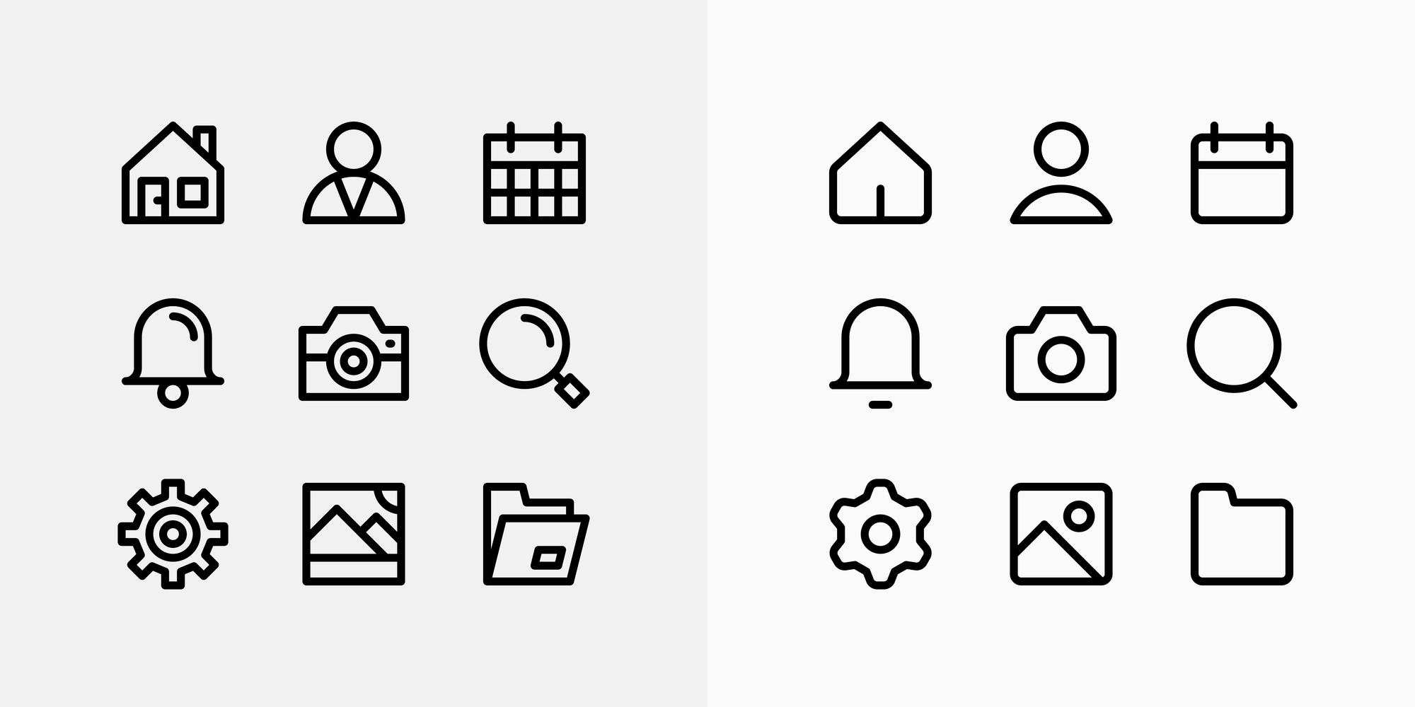
The qualities below are what make the difference.
Good icon sets have a point of view
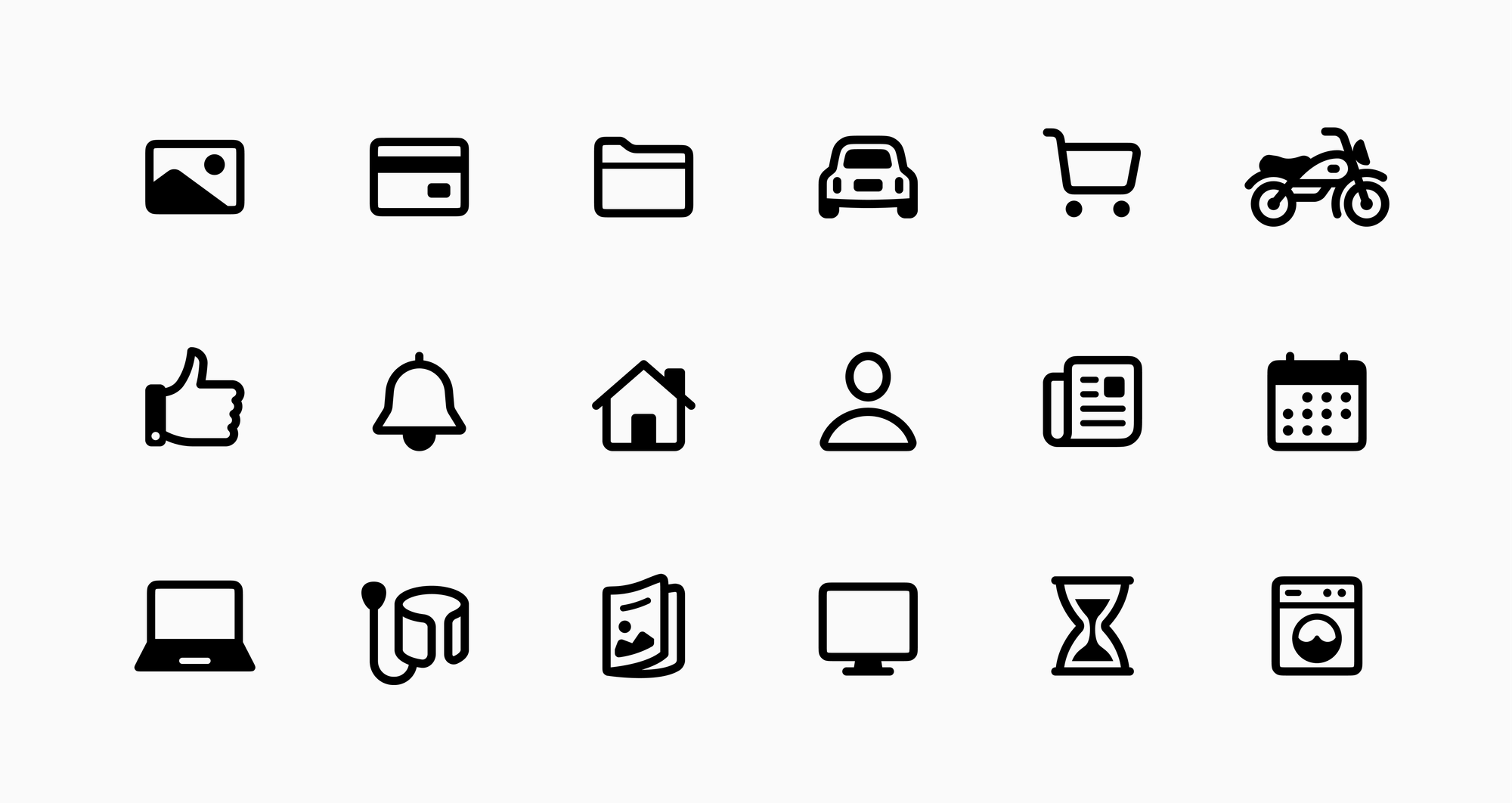
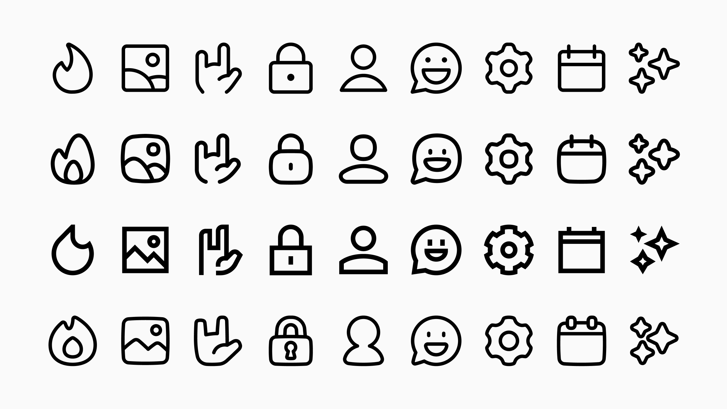
Every set in Streamline's library is consistent and legible, but no two feel the same. Put them side by side and the difference is immediate.
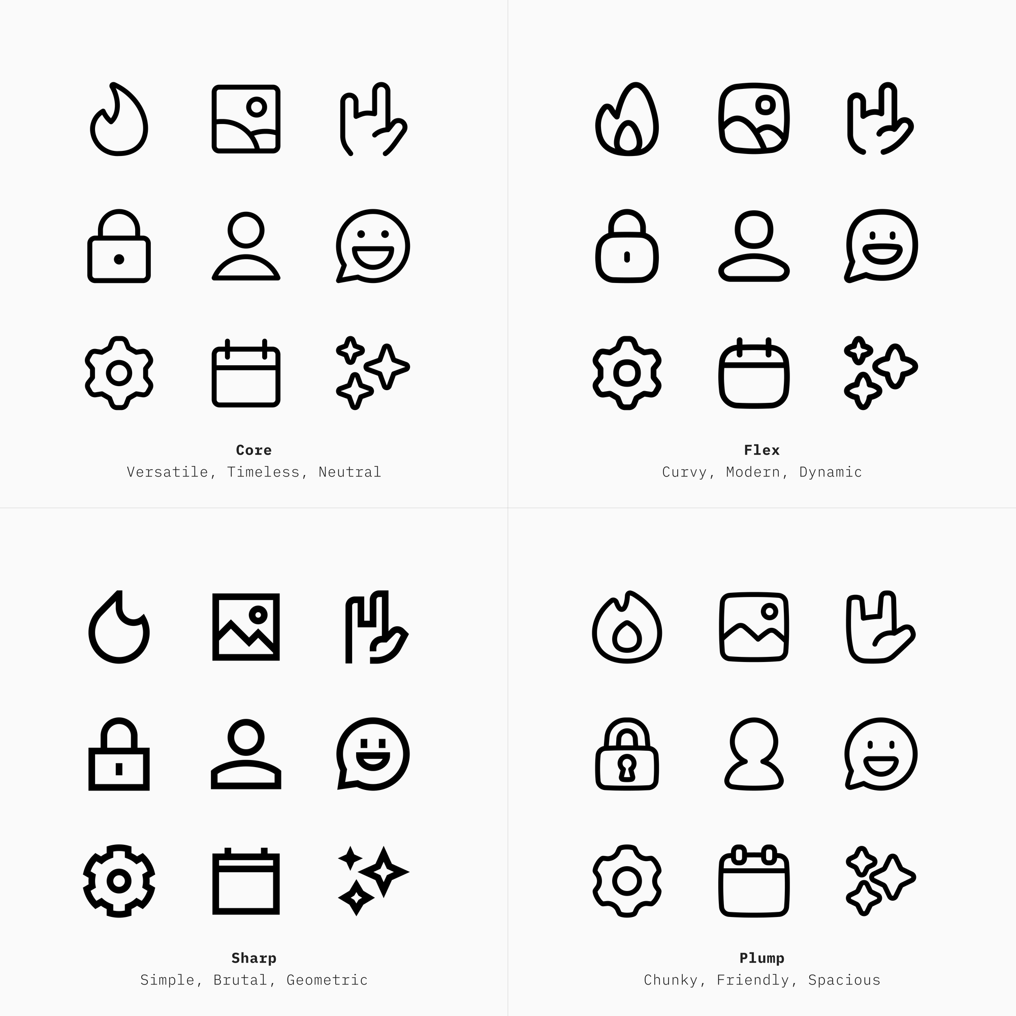
Each set's identity doesn't come from the construction guidelines, like stroke weight, corner radius, or the grid. It comes from the idea behind each set, decided before any guideline was written: what the set should feel like, and who it's for.
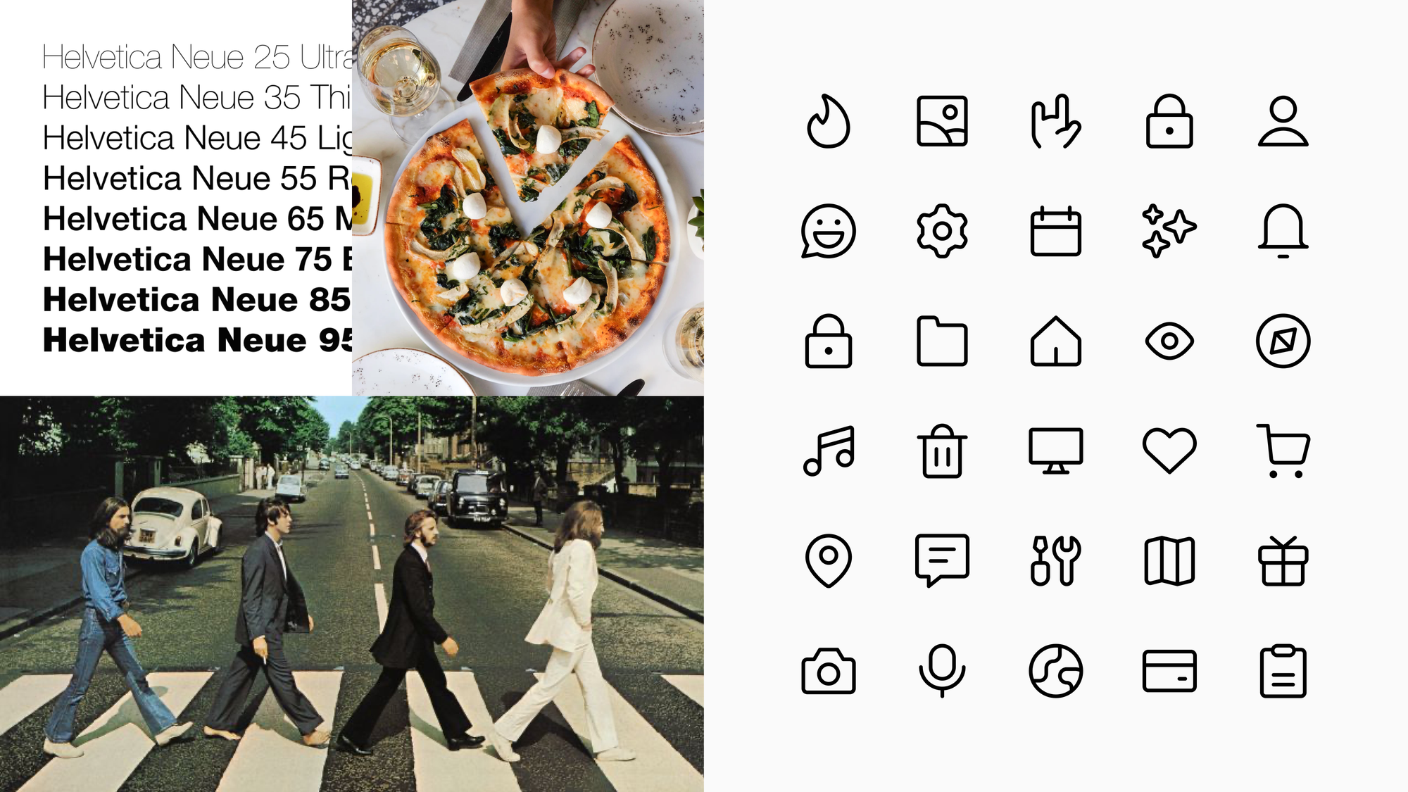
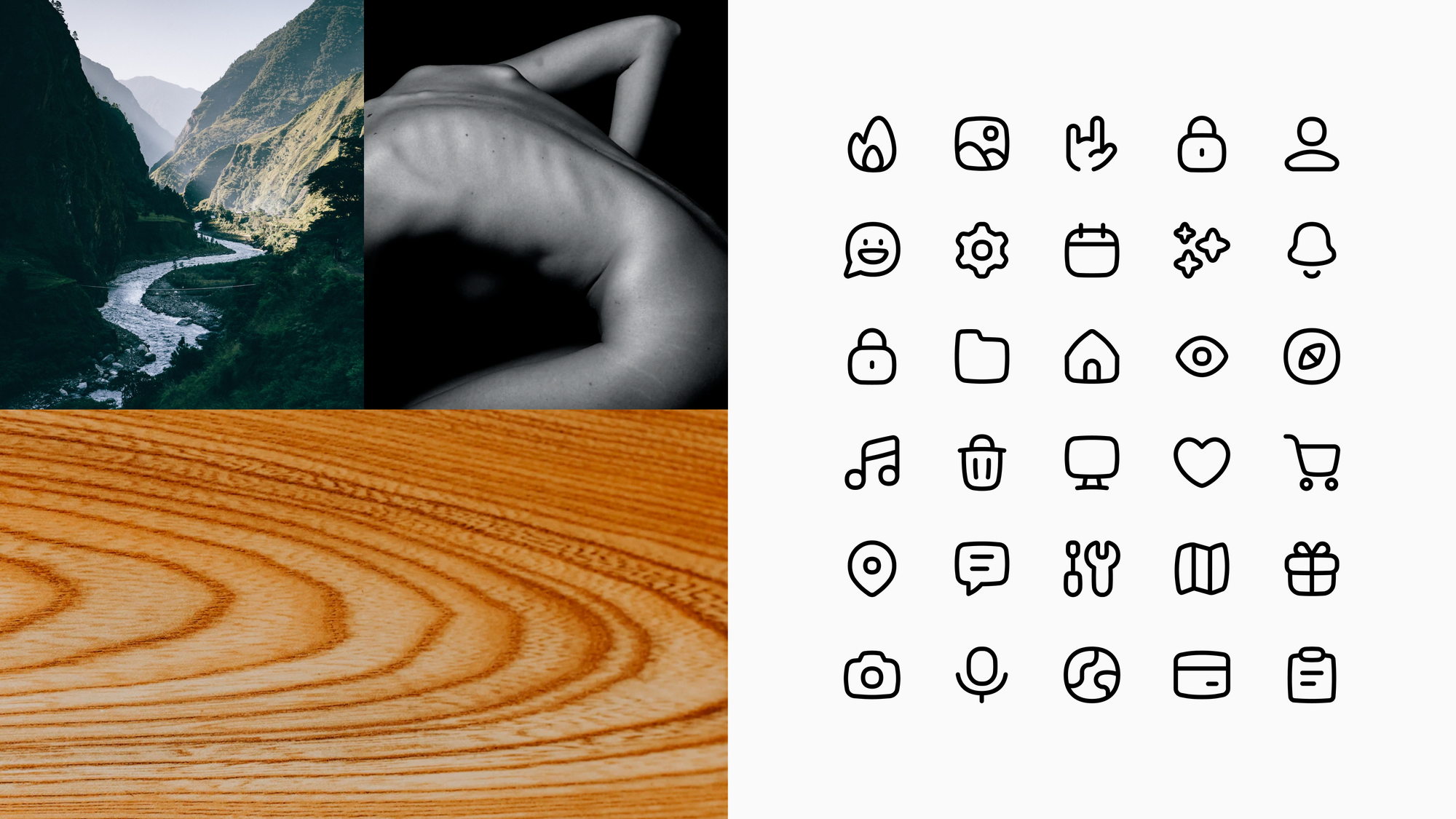
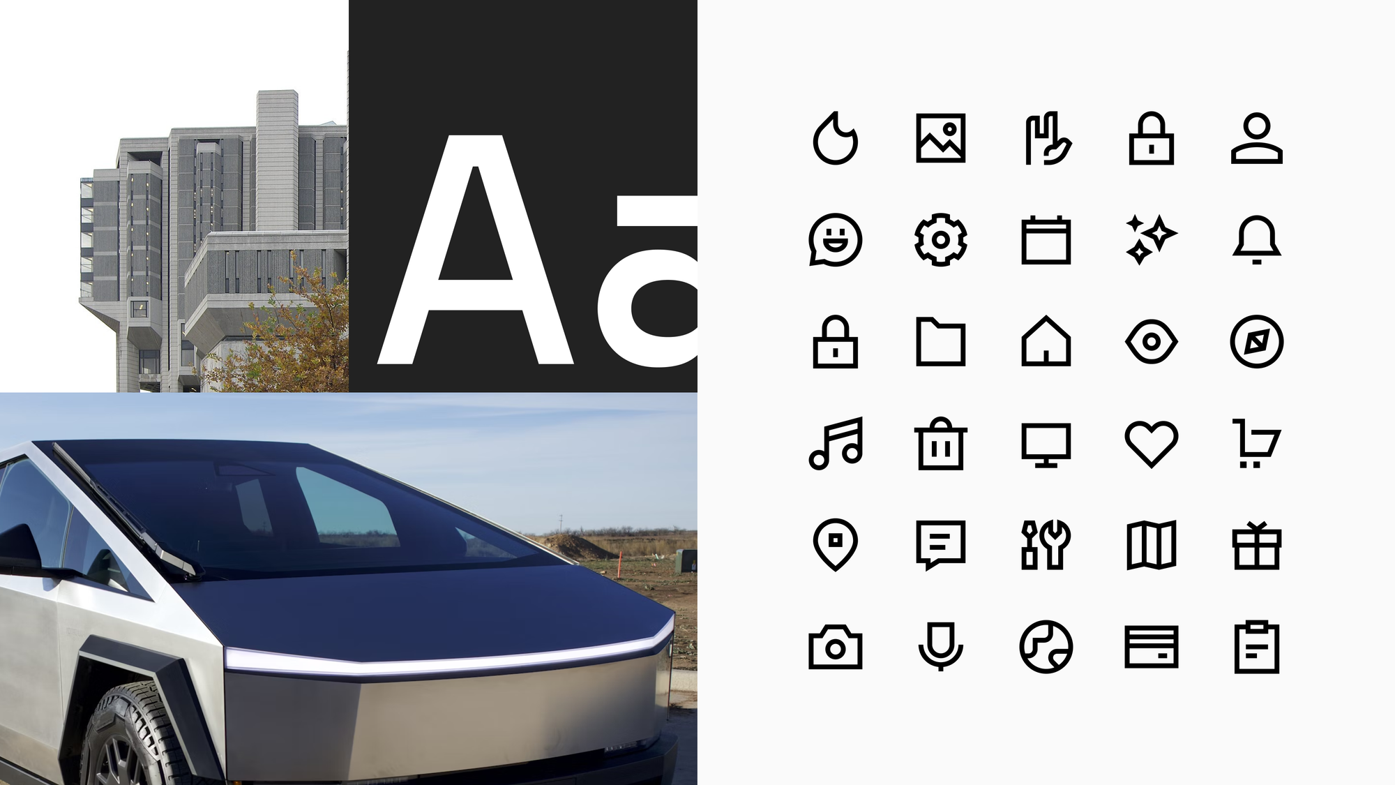

The guidelines then exist to protect that idea. Without that idea, a set can be perfectly ordered and still feel anonymous, like a collection of correct answers with nothing to say.
A point of view doesn't need to be loud. Core is proof of that. Its idea was to feel familiar and widely liked, and that neutrality was as deliberate a choice as making Sharp brutal or Plump friendly.
Well-designed icons know when to stop
A rocket can carry a lot of detail: motion lines, a flame, a porthole with a highlight, a few sparkles. In illustrations, those details make the scene. In icons, they compete with each other and turn a symbol into a small picture that asks for more attention than the action it labels.
Because Streamline designs both, the team has to decide where each detail belongs. The illustrations keep them. The icons keep only what makes a rocket recognizable at a glance.

The urge to make every icon a showpiece is hard to resist, especially for skilled designers. But a library full of showpieces is tiring to use. In an interface, icons work best when they support the content rather than compete with it.
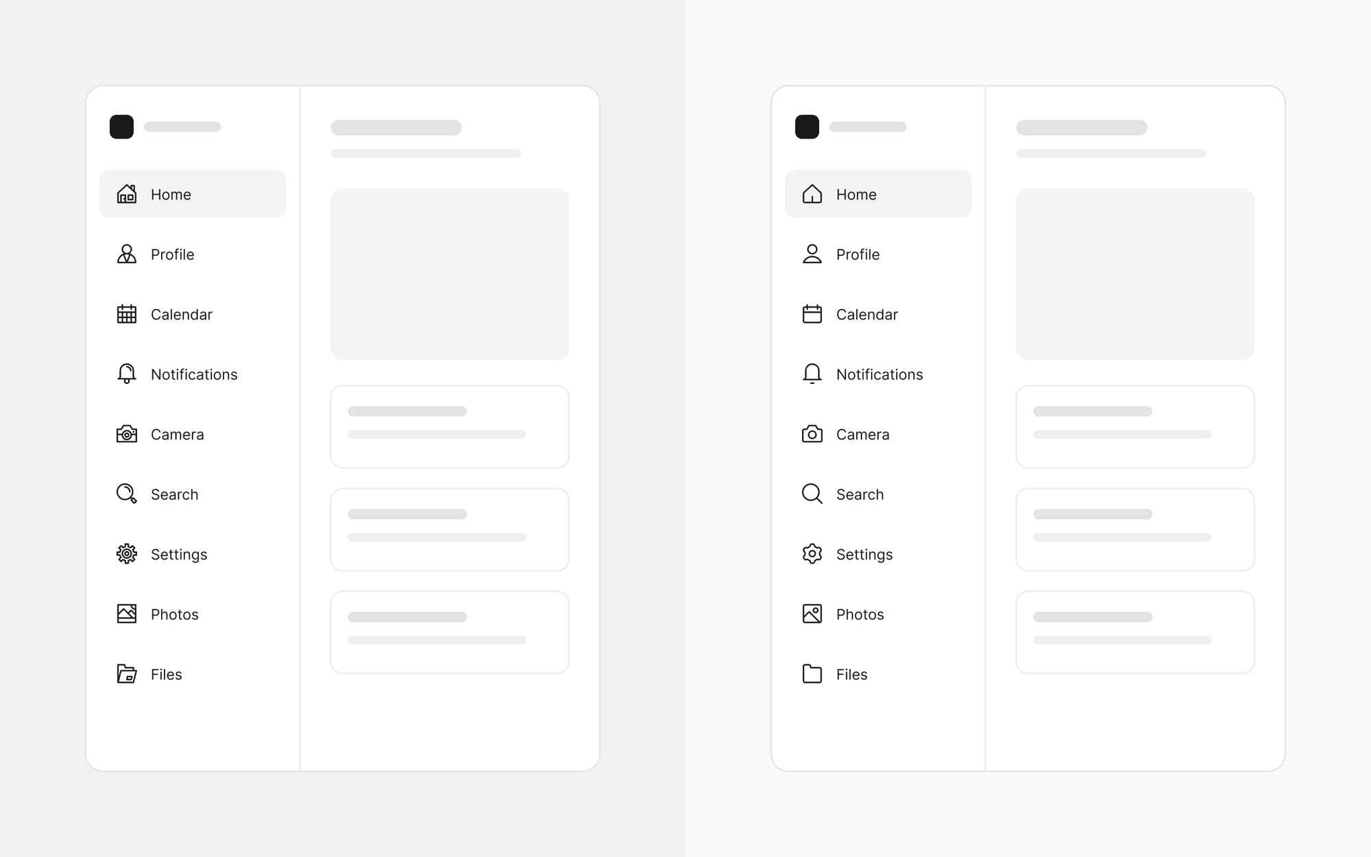
A good icon doesn't show how much work went into it. It just works, and looks effortless doing so.
A complete icon isn't always a finished one
A complete icon has all the information it needs. A finished icon also feels resolved. The difference is in small things: a curve that looks a bit stiff, shapes with no room to breathe, a detail that makes the icon harder to read.
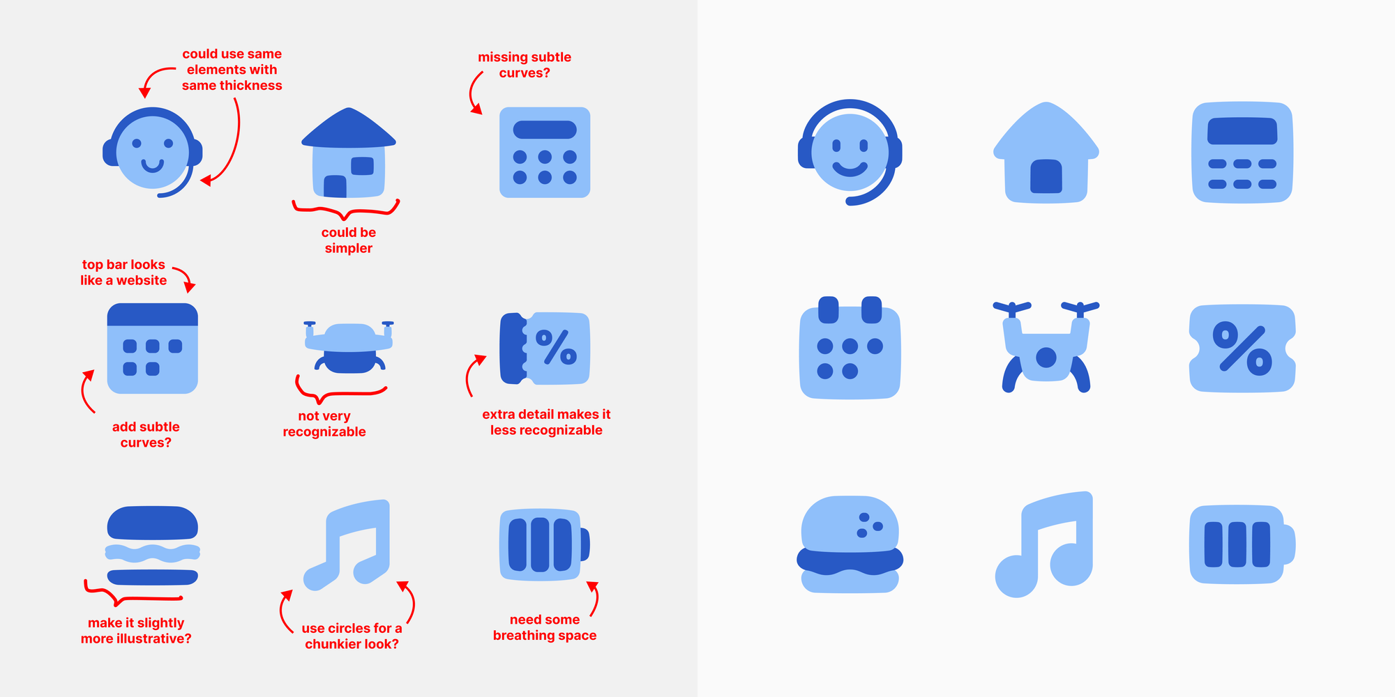
A basic consistency check may not catch these. The icon still works, but something about it feels unsettled, as if the drawing stopped a step too early. One of these alone is easy to miss. Across hundreds of icons, they add up to a set that feels rushed.
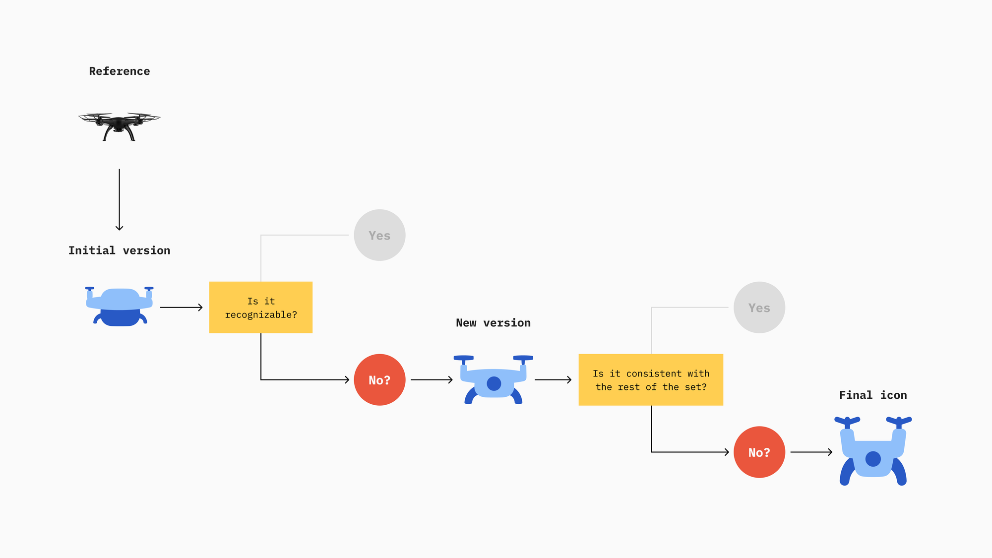
Finishing means stepping back to catch those moments: looking at an icon zoomed out, flipped, or after a day away, and refining it until nothing pulls at the eye. At Streamline, that happens in review, where the same in-house team checks each other's work before an icon ships.
People rarely notice these flaws consciously, but they can sense them. They're signs that corners were cut and a drawing stopped at "good enough." A professional set avoids those signs by taking every icon all the way to finished.
A professional icon library is one you can rely on
A designer building a product will eventually need something unexpected: a more specific action than "edit," a concept the original brief never mentioned, or a variant that matches the rest of the interface. When the library has no answer, teams start compromising. They stretch a near-match to fit, redraw an asset in-house, or borrow from another set. Each workaround is small, but together they erode the quality the library was chosen for.
A style for every brand
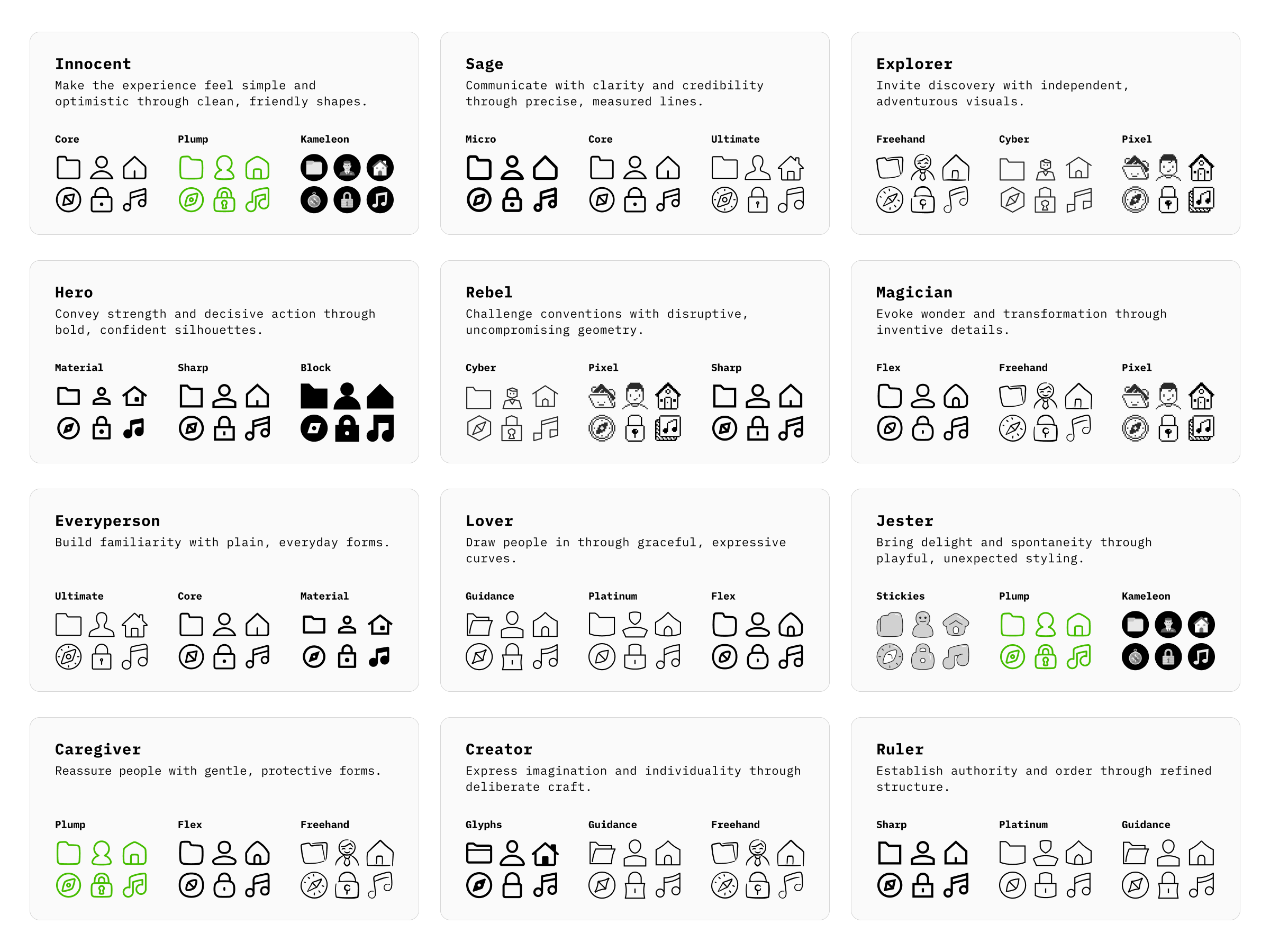
Streamline’s sets cover all 12 brand archetypes. Each archetype can be expressed through several sets, and many sets suit more than one archetype.
Plump, for example, fits Innocent, Jester, and Caregiver. Teams can pick icons that match their brand instead of bending their brand to fit the icons.
Missing icons can be requested
When an icon isn’t in the library yet, users can ask for it, and the team designs it in the same style as the rest of the set.
New concepts get new icons
Icons are added as new ideas emerge, like AI orchestration, and existing icons are adapted from one style to another so every set stays current.
The new AI Agent & Orchestration icons across all eight Core styles. Sharp, Plump, and Flex are next.
Older icons get another look
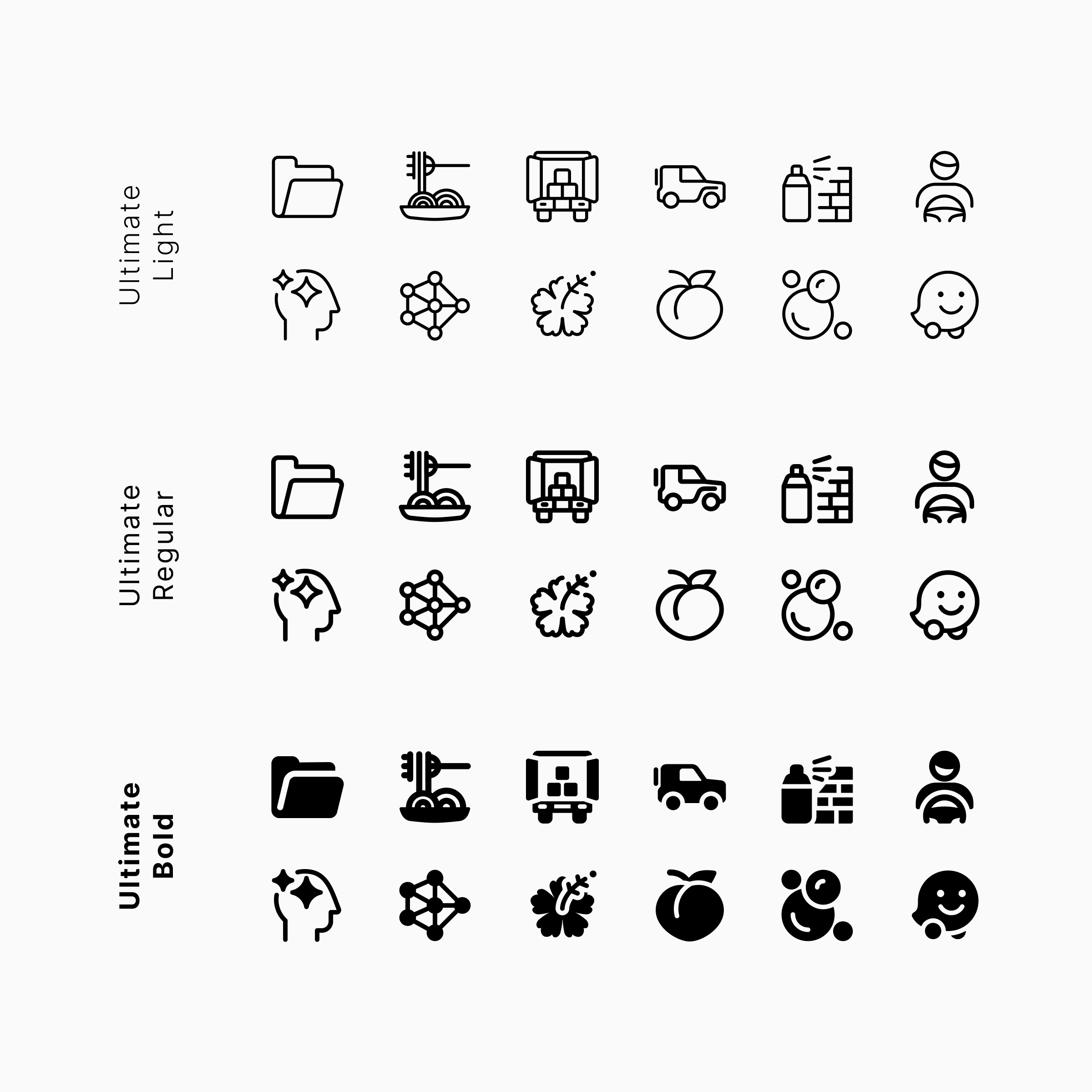
Some are modernized, others harmonized with updated guidelines, as with Ultimate.
Ultimate’s Light, Regular, and Bold icons, harmonized so each one keeps the same design across all three weights.
New styles join the library
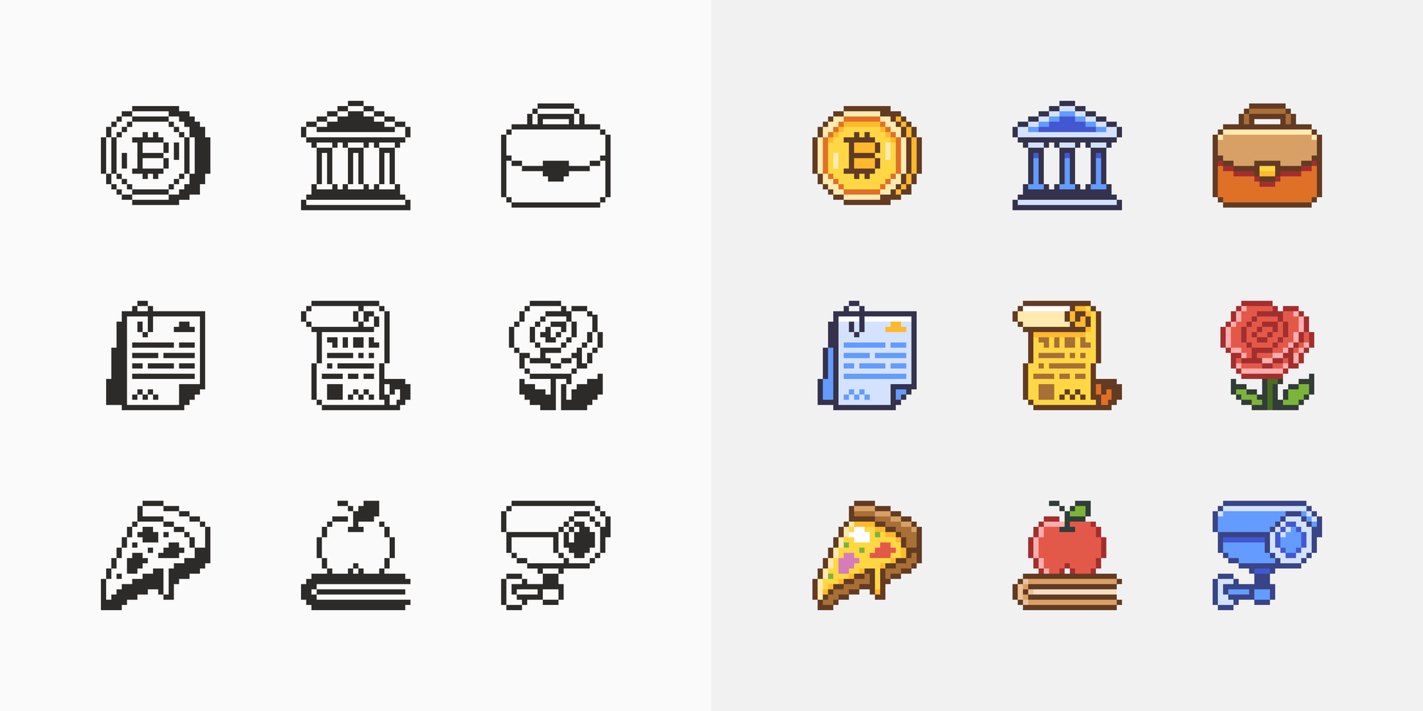
Some free sets grow into full Pro sets. Pixel became Pixel Pro, with more icons in the original Pixel Mono style, and a new Pixel Colors style is on the way.
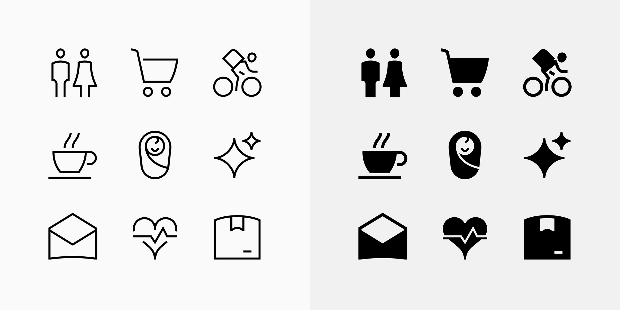
Guidance is getting the same treatment. Guidance Pro will add more icons and a new Solid style alongside the original Line.
Occasionally, a whole new set arrives
The latest is Streamline Material, a rebuilt and upgraded version of Google's Material Symbols. Streamline Glyphs, designed in the spirit of Apple’s SF Symbols, is also on the way.
All of this serves the same purpose
Icons are rarely seen alone. They live in navigation, buttons, empty states, settings panels, and onboarding flows. A professional library gives teams confidence that whatever they need next will already be there, or will be soon.
Professionally designed icons feel deliberate
None of this depends on complexity or heavy styling. A professional set can be minimal and quiet, like Core. What sets it apart is the thinking behind it: an idea that shapes every icon, details left out when they don't help, flaws caught in review, and a library that keeps growing with the products that use it.
Consistency gives a library coherence. What makes it professional is the judgment applied to every icon, including the choices people never notice.
Find a set that matches your brand, and see these decisions up close.