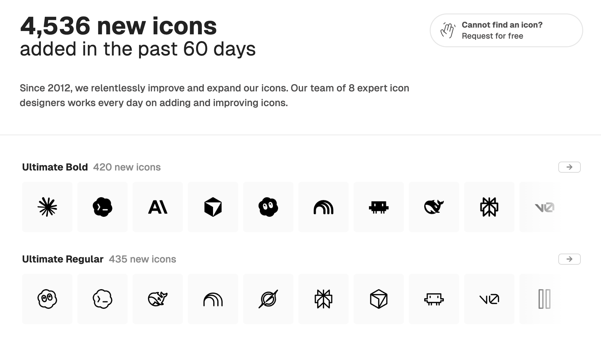
More than 400,000 icons. Still designed by the same team.
Most icon libraries eventually face the same challenge: how do you continue growing without compromising quality?
As libraries become larger, many companies turn to freelancers or open their platforms to outside contributors. Others become marketplaces where anyone can publish icons, allowing the collection to expand much more rapidly. These approaches certainly make it easier to scale, but they also make it increasingly difficult to maintain a coherent visual language and a consistent level of quality over time.
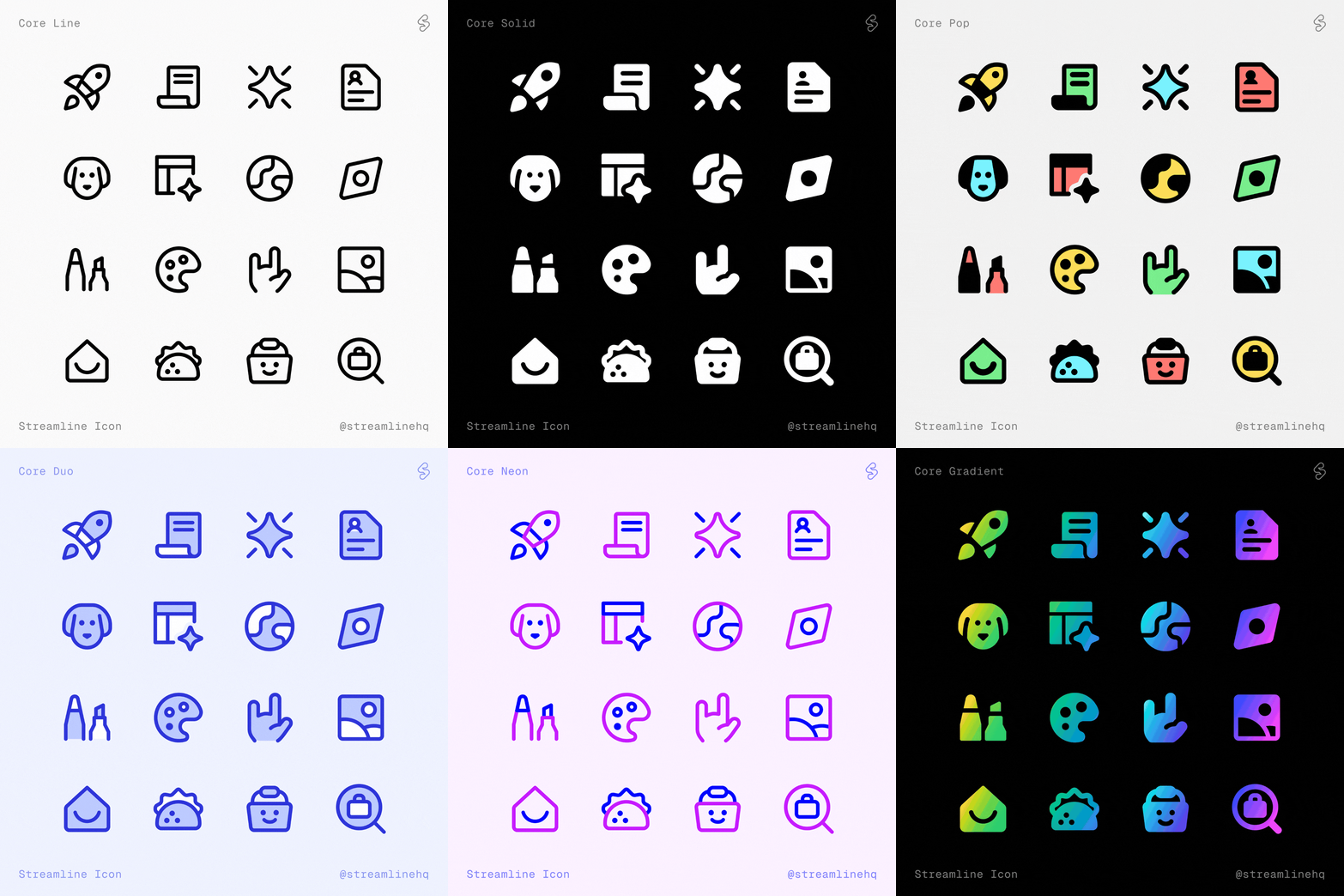
At Streamline, we chose a different path.
Today, our library contains more than 400,000 icons, spanning a wide range of design systems including Core, Flex, Sharp, Plump, Micro, Freehand, Pixel, Ultimate, and more…
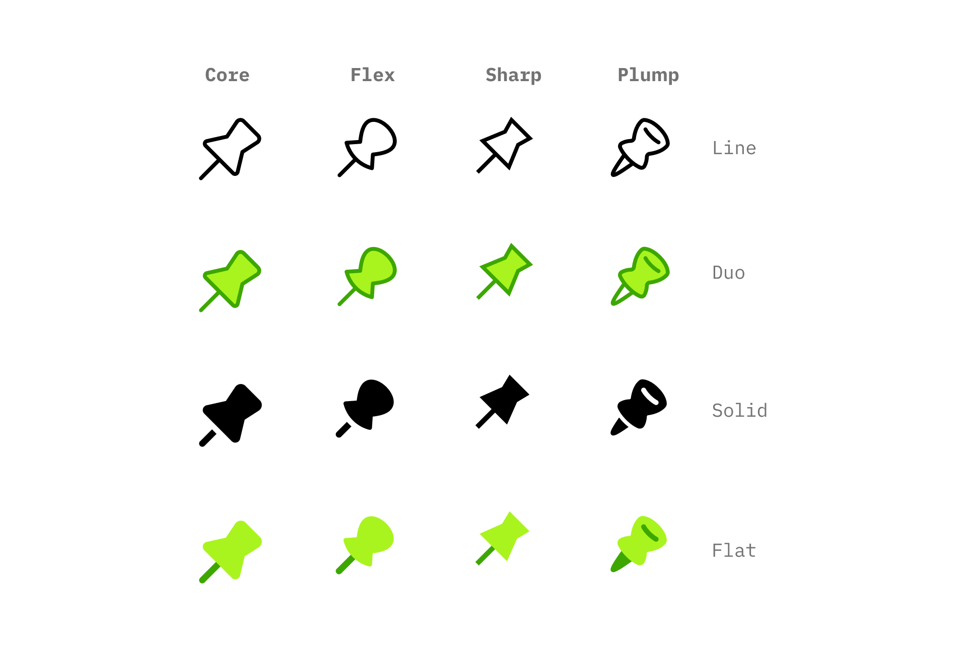
Despite that scale, every icon is still designed by the same in-house team of seven icon designers. It is undoubtedly a slower and more demanding way of building an icon library, but after many years, we remain convinced that it is the best way to create a product that designers can trust.
An ecosystem of icon families
Streamline has gradually evolved into an ecosystem of independent design systems, each with its own personality, geometry, proportions and construction principles. Core, Sharp, Plump, Micro or Freehand are not different visual treatments applied to the same drawings.
Each family was designed independently, with its own philosophy and its own way of solving visual problems while remaining internally coherent.
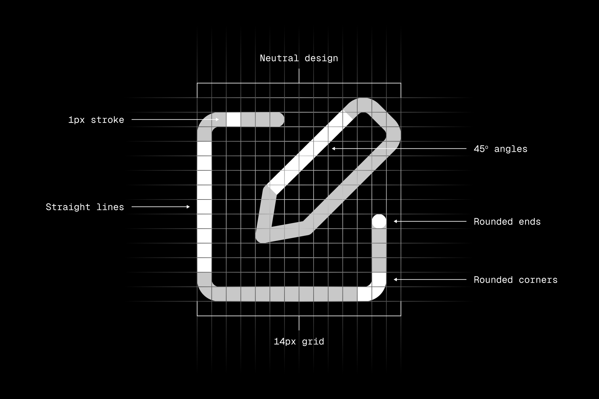
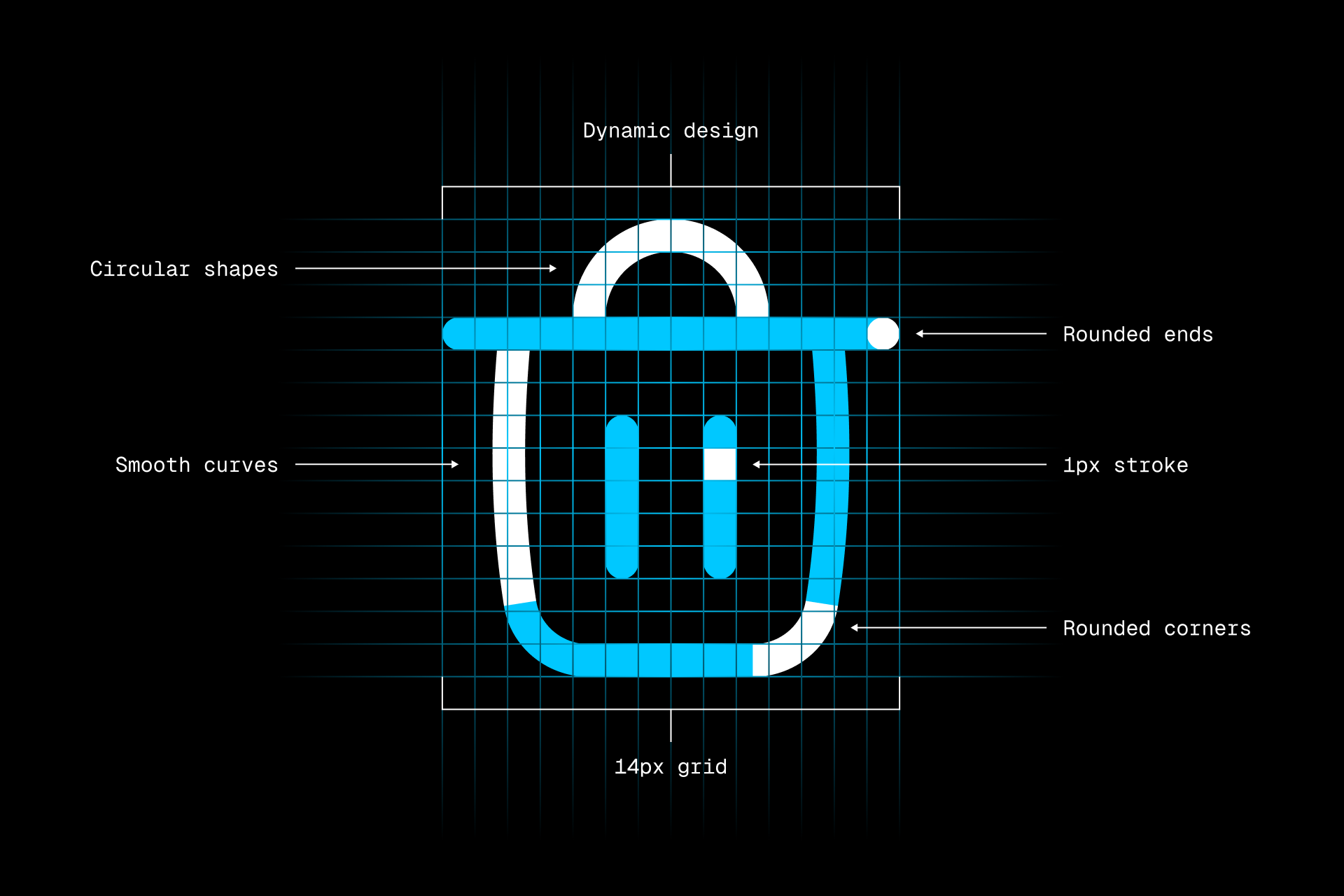
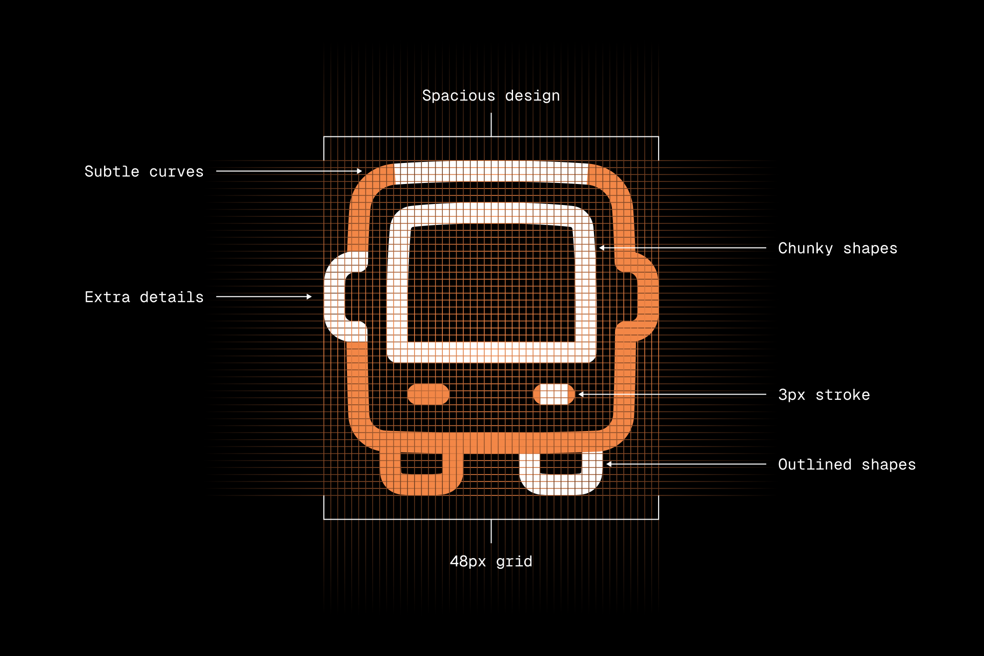
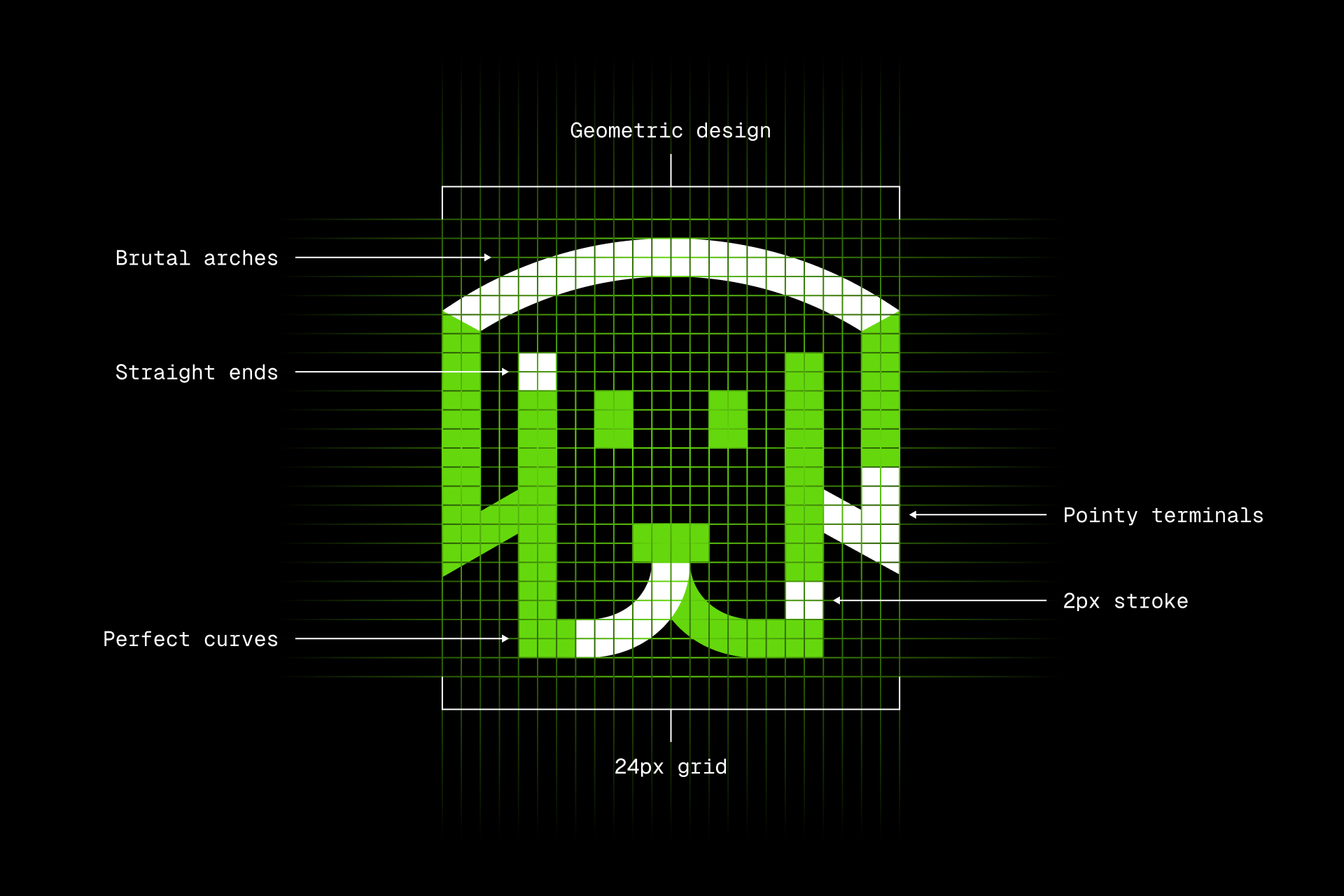
Icon construction across four icon styles: Core (top left), Flex (top right), Plump (bottom left), and Sharp (bottom right), showing the grids, stroke weights, geometry, and defining design principles behind each icon set.
Many of these families are themselves available in several weights, fills and stroke variations, resulting in dozens of complete icon sets. Designing one coherent icon system already requires an enormous amount of discipline. Designing many of them simultaneously while preserving each family’s identity requires continuity. Something only possible when the same team continues to evolve every design system.
Consistency is something we cultivate
People often imagine that consistency comes from establishing a set of rules at the beginning of a project. In reality, consistency is something that must be cultivated continuously. Every icon we draw teaches us something. We discover better proportions, clearer metaphors, simpler constructions or more balanced silhouettes. As our understanding of each family matures, the design system itself becomes more refined.
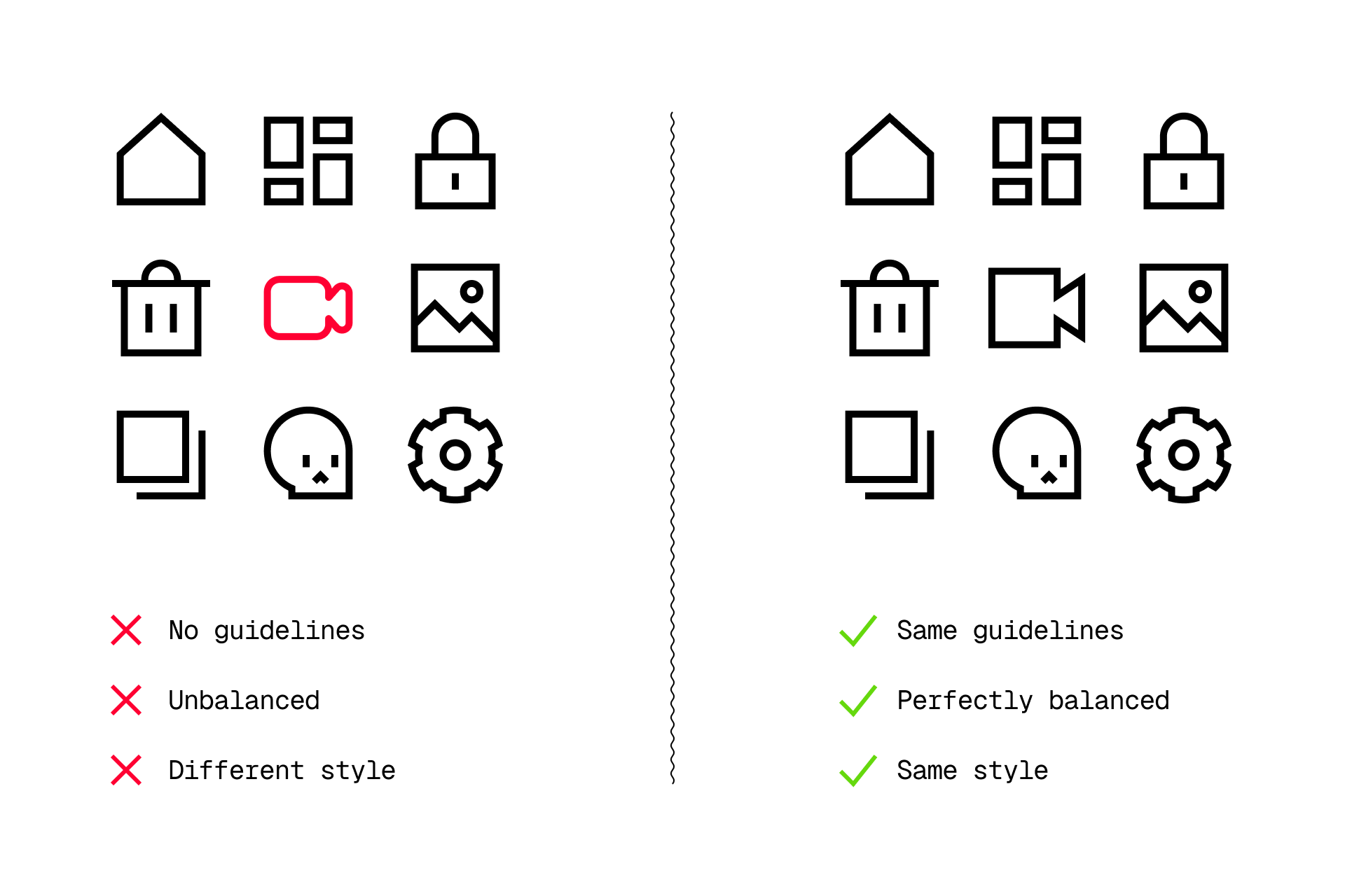
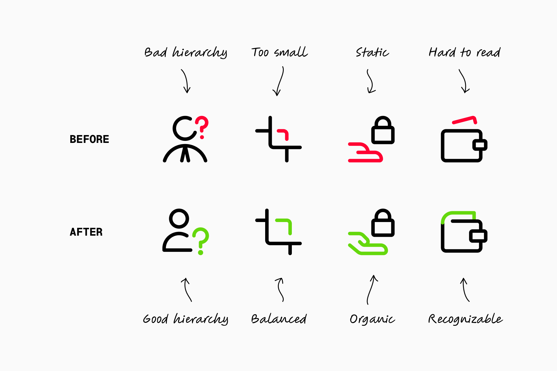
Those lessons should not only benefit future icons. They should benefit the entire library. This is why we regularly revisit icons that were created years ago, carefully harmonizing them with everything we have learned since. Our objective is not to redesign the library for the sake of novelty, but to ensure that an icon designed today feels perfectly at home alongside one designed several years earlier.
Every icon belongs to a much larger system
Adding a new concept to Streamline rarely means drawing a single icon. More often, it means designing that concept across multiple families and multiple stylistic variations, each of which has its own visual language. The challenge is not to reproduce the same drawing over and over again, but to understand what makes a concept immediately recognizable while allowing every family to express it according to its own principles.
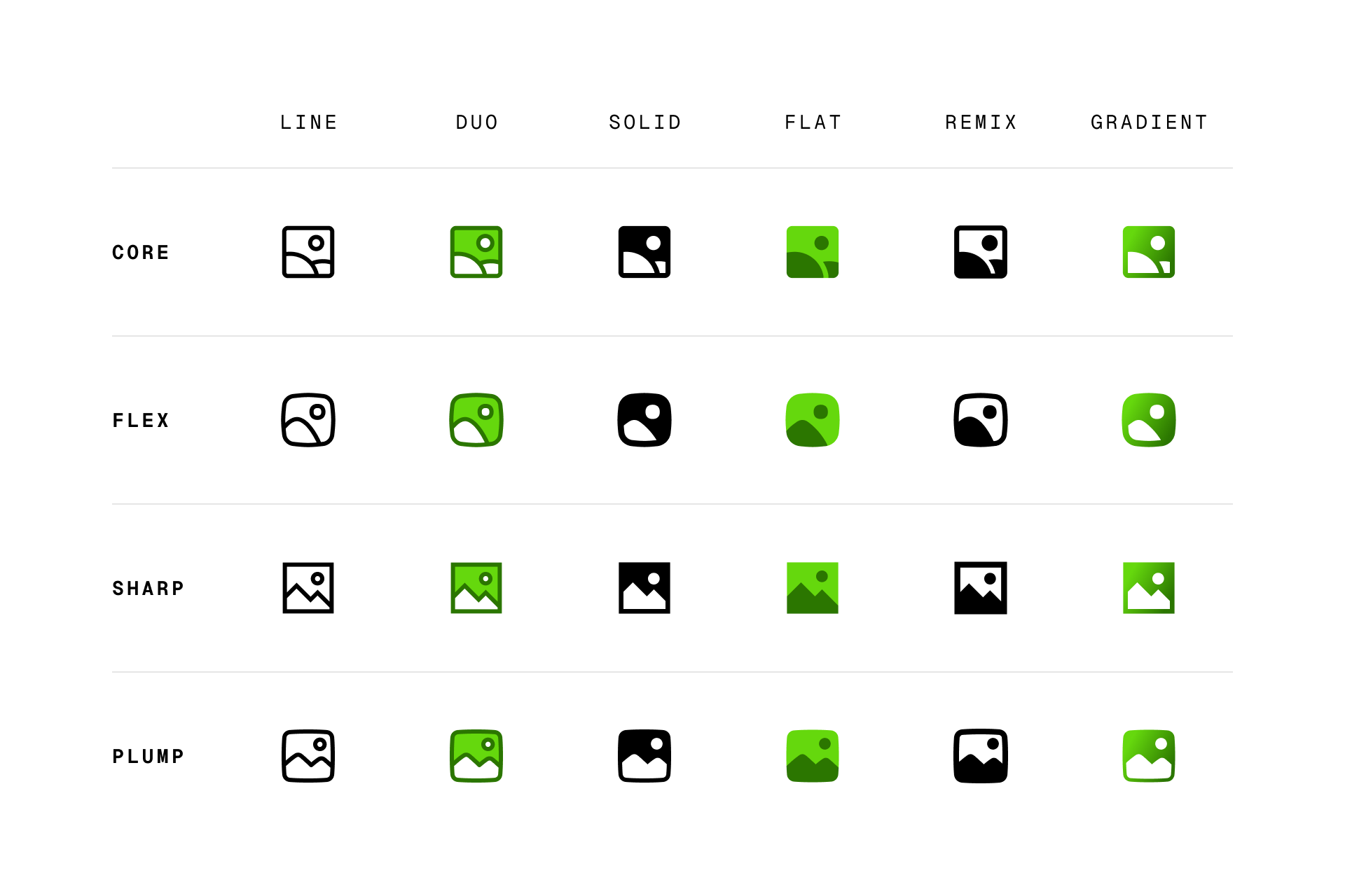
An icon that feels perfectly balanced in Core may feel awkward in Sharp. A metaphor that works naturally in Freehand may need to be completely reconsidered for Micro. Every family solves the same problem differently, and every solution must feel native to that particular design system.
Because our designers work across the entire library, they are able to make decisions that strengthen both the individual family and the coherence of Streamline as a whole.
Design knowledge cannot be outsourced
The design language of an icon family cannot be reduced to a style guide or a list of construction rules. Much of it exists as tacit knowledge accumulated over years of practice. Our designers know instinctively why a particular radius feels more balanced, why one perspective works in Nova but not in Core, or why a certain metaphor communicates more clearly than another. These are decisions that become intuitive only after drawing thousands of icons together.
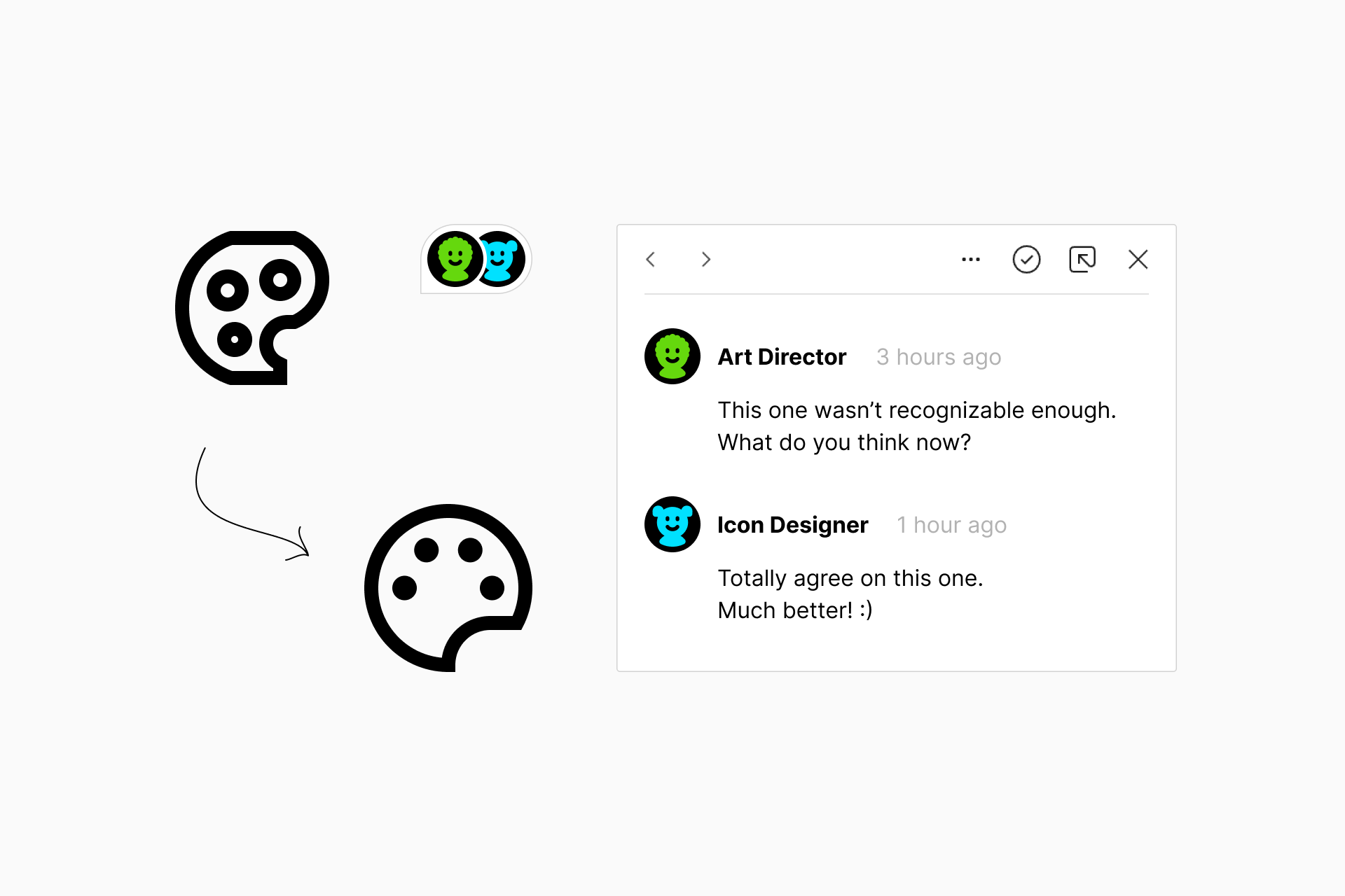
That shared understanding grows with every project. It becomes part of the culture of the team and continuously influences future work. This is one of the main reasons we have never outsourced icon production. Preserving that collective knowledge allows every new icon to benefit from everything that came before it.
Designed by designers, for designers
Our perspective is shaped by the simple fact that we use icons ourselves. We know what it feels like to search for the right metaphor and discover that it doesn’t exist, or to find an icon that almost works but feels visually inconsistent with the rest of a project. Those experiences influence not only how we draw icons but also which concepts we decide to add to the library.
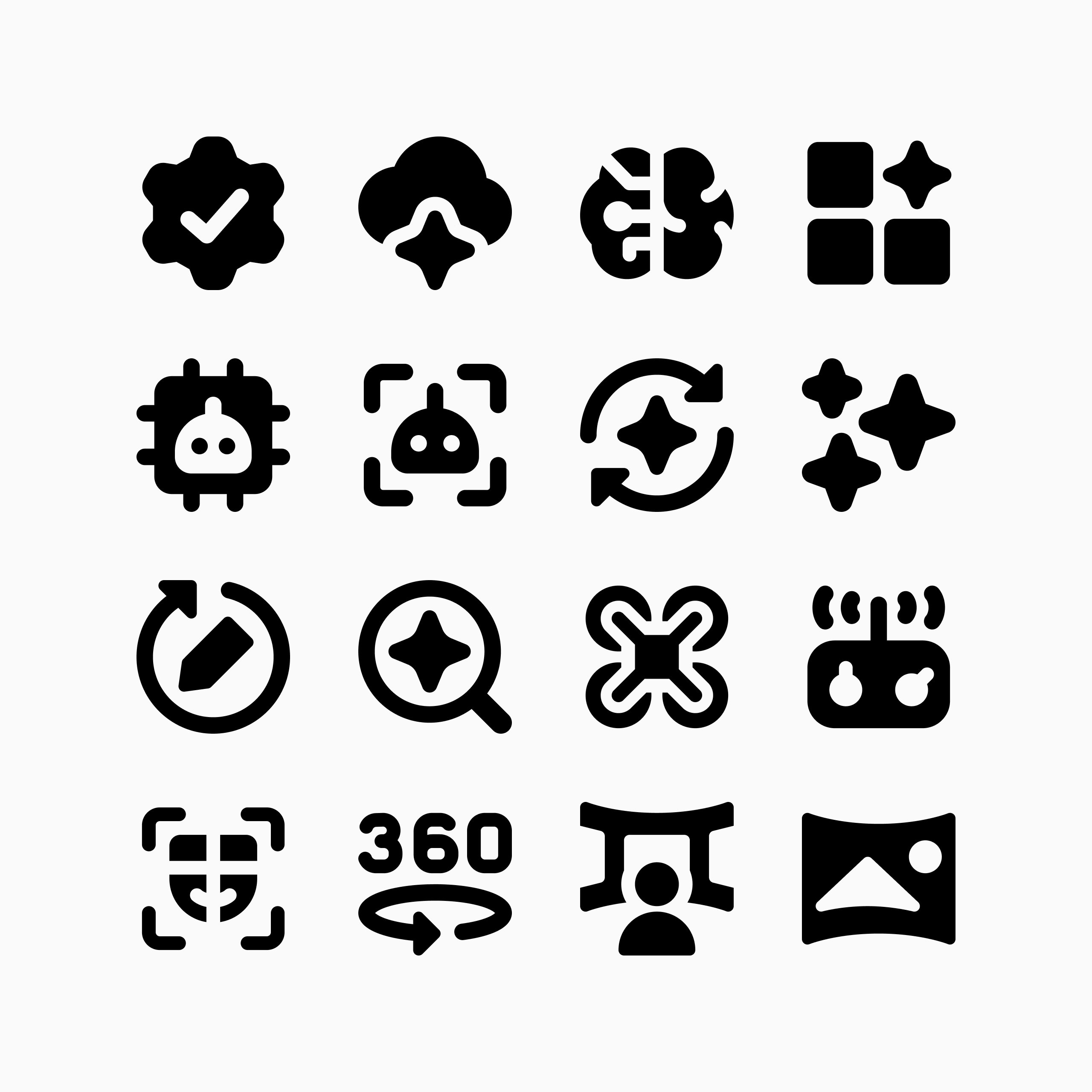
We constantly observe new technologies, emerging products, evolving interfaces and changing design patterns, asking ourselves how these ideas should be represented visually. Choosing what deserves to become an icon is often just as important as designing the icon itself. Our ambition has never been simply to create the largest collection available. It has always been to create the most useful one.
Quality before scale
It is tempting to measure an icon library by the number of icons it contains, but we believe the real measure is something less visible: trust. Designers should be able to trust that every icon follows the same principles, that every family remains internally coherent, and that an icon chosen today will still feel consistent with future additions years from now.
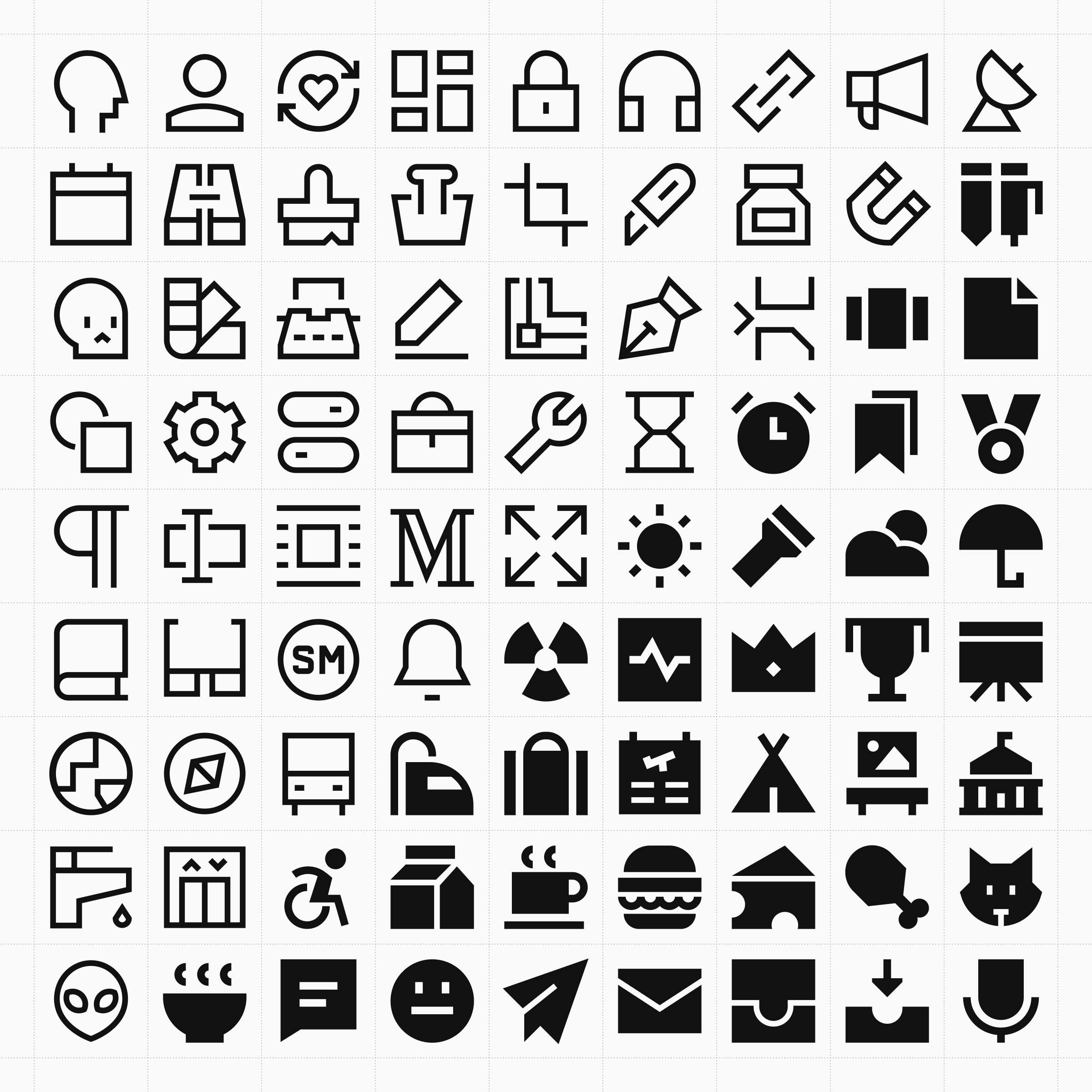
This is why every Streamline icon continues to be designed by our own team. Not because it is the fastest approach, nor because it is the easiest, but because after designing more than 400,000 icons, we still believe that building an exceptional icon library is less about producing individual drawings than about patiently cultivating a coherent design system over time.
See these principles in practice
A recent example of this process can be seen in our Ultimate icon family, where our team revisited and redrew 3,249 existing icons across Ultimate Light, Regular, and Bold.
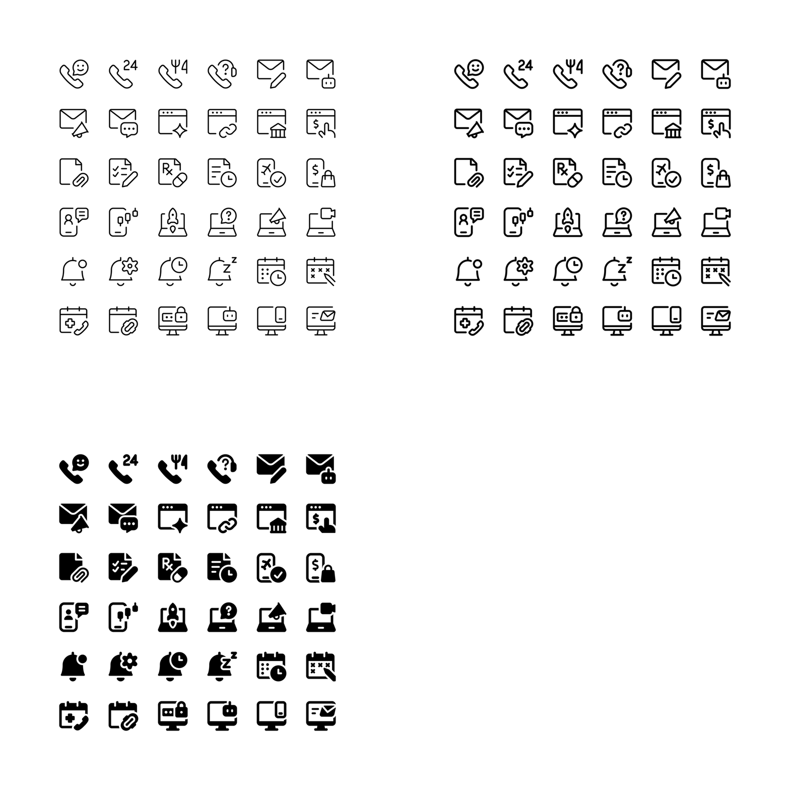
Rather than updating individual icons in isolation, we reviewed entire icon series together, refining their metaphors, proportions, use of space, and consistency across different weights. It is a good example of how the principles above translate into the everyday work of maintaining and improving a large icon system over time.
Continue exploring Streamline
Our library continues to grow every week through both our own research and suggestions from the design community. Explore the latest icons to discover the newest additions across our different families and see how Streamline continues to evolve, one carefully crafted icon at a time.