Massive update: 3,249 improved “Ultimate” icons 🚀
Ultimate is our most popular and best-loved icon family. Over the past few weeks, our in-house iconographers redrew 3,249 icons across Ultimate Light, Ultimate Regular, and Ultimate Bold.
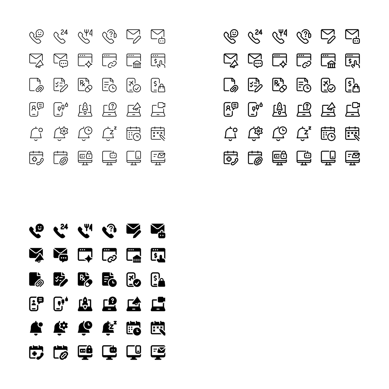
This was not about changing icons one by one. We revisited whole icon series, focusing on the everyday interface icons people use most. The aim was to make their metaphors feel more modern, their forms easier to recognize, and the overall family more consistent.
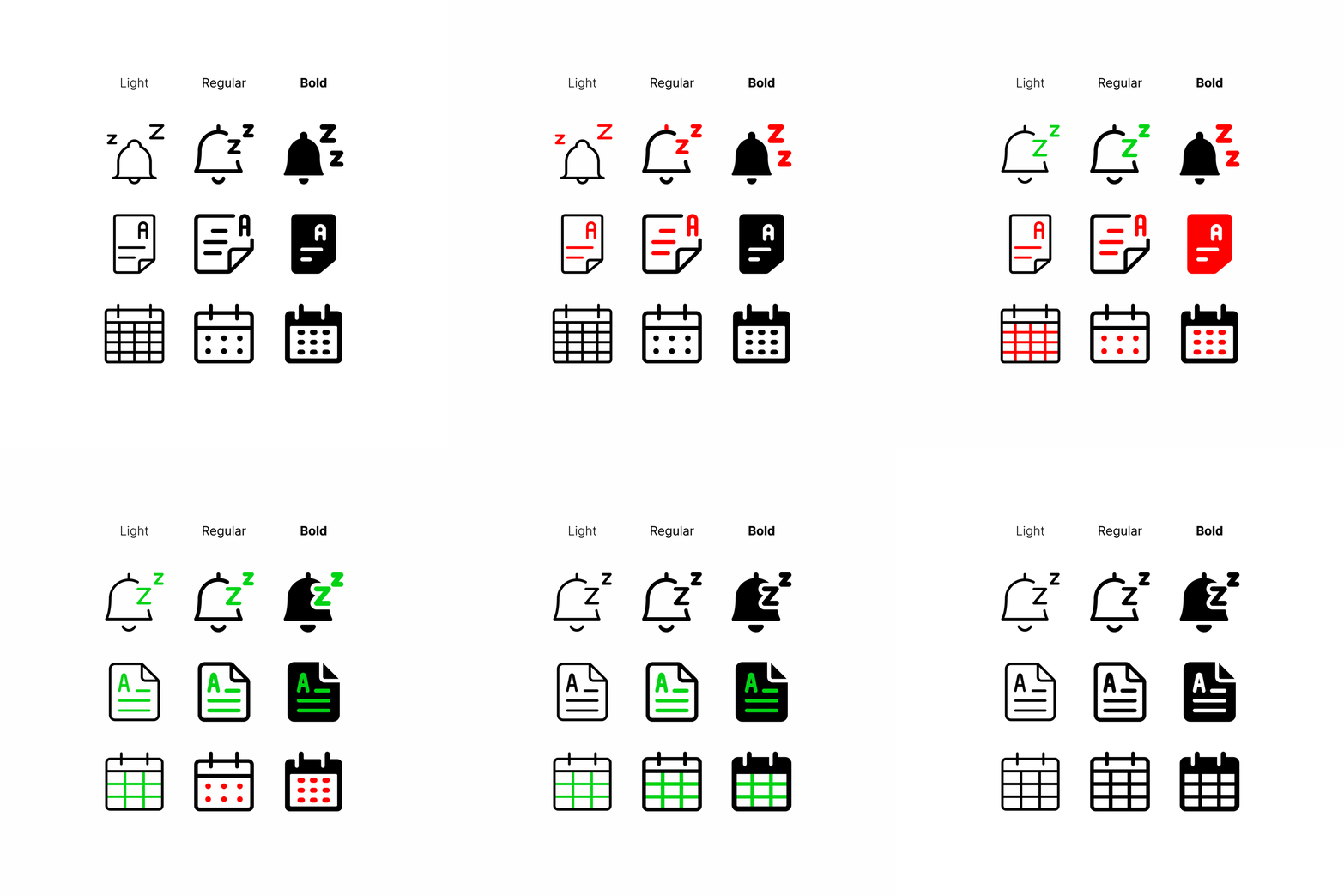
Here is a closer look at what changed, why we made those changes, and how the three Ultimate weights work together.
✨ What’s new
This update brings five key improvements to Ultimate. The changes span multiple series, including mail, smartphone, document, computer icons, and more.
1. Modernized metaphors
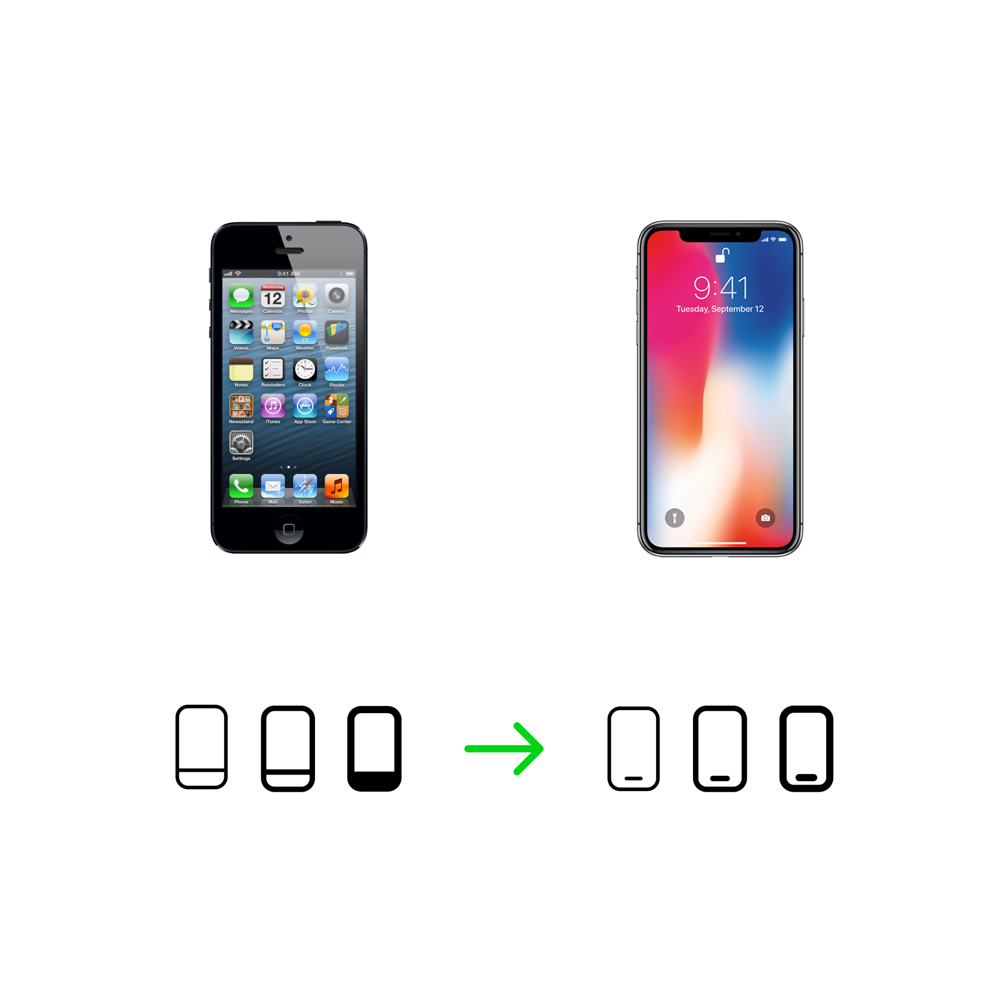
Some familiar icons no longer reflect the devices they represent. For the smartphone series, we updated the base phone shape to better reflect current smartphone design.
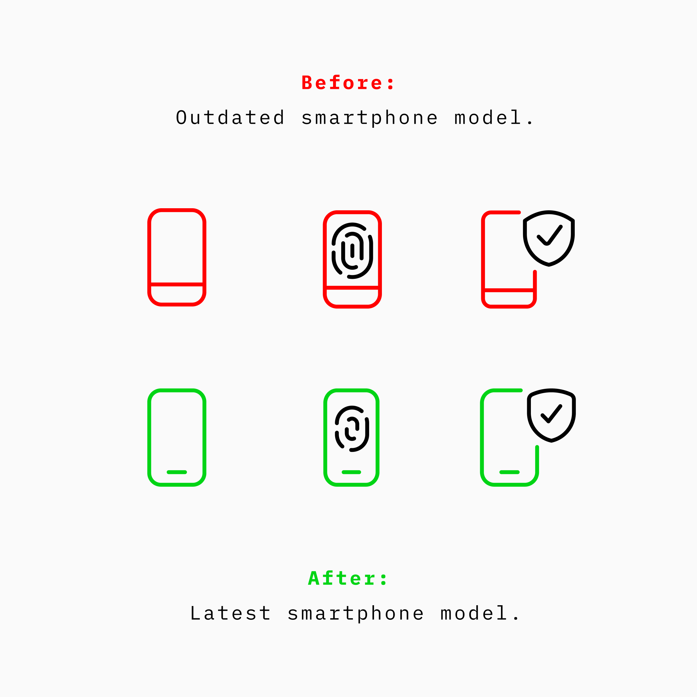
This gives related icons a more modern starting point while keeping their meaning clear.
2. Clearer, more recognizable shapes
Recognizable shapes make familiar icons easier to understand at a glance. We refined the main icons across the updated series so they read more clearly before you even notice the details.
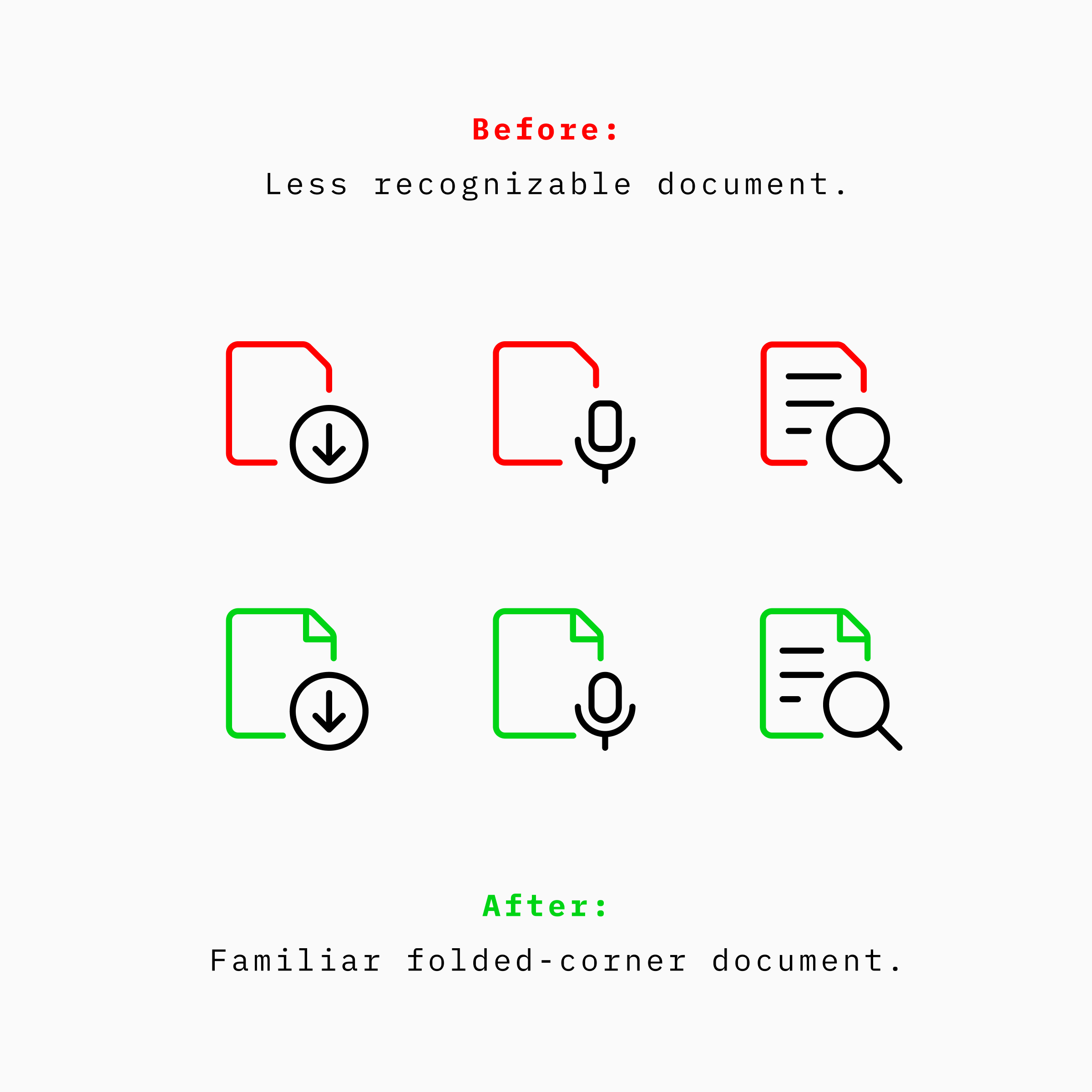
For the document icons, we replaced the less recognizable outline with a familiar folded-corner shape. That small change makes the document easier to recognize while giving related icons a clearer shared foundation.
3. Better use of empty space
Empty space helps an icon breathe, but too much of it can make the main icon feel small or leave the supporting symbol doing too much of the work.
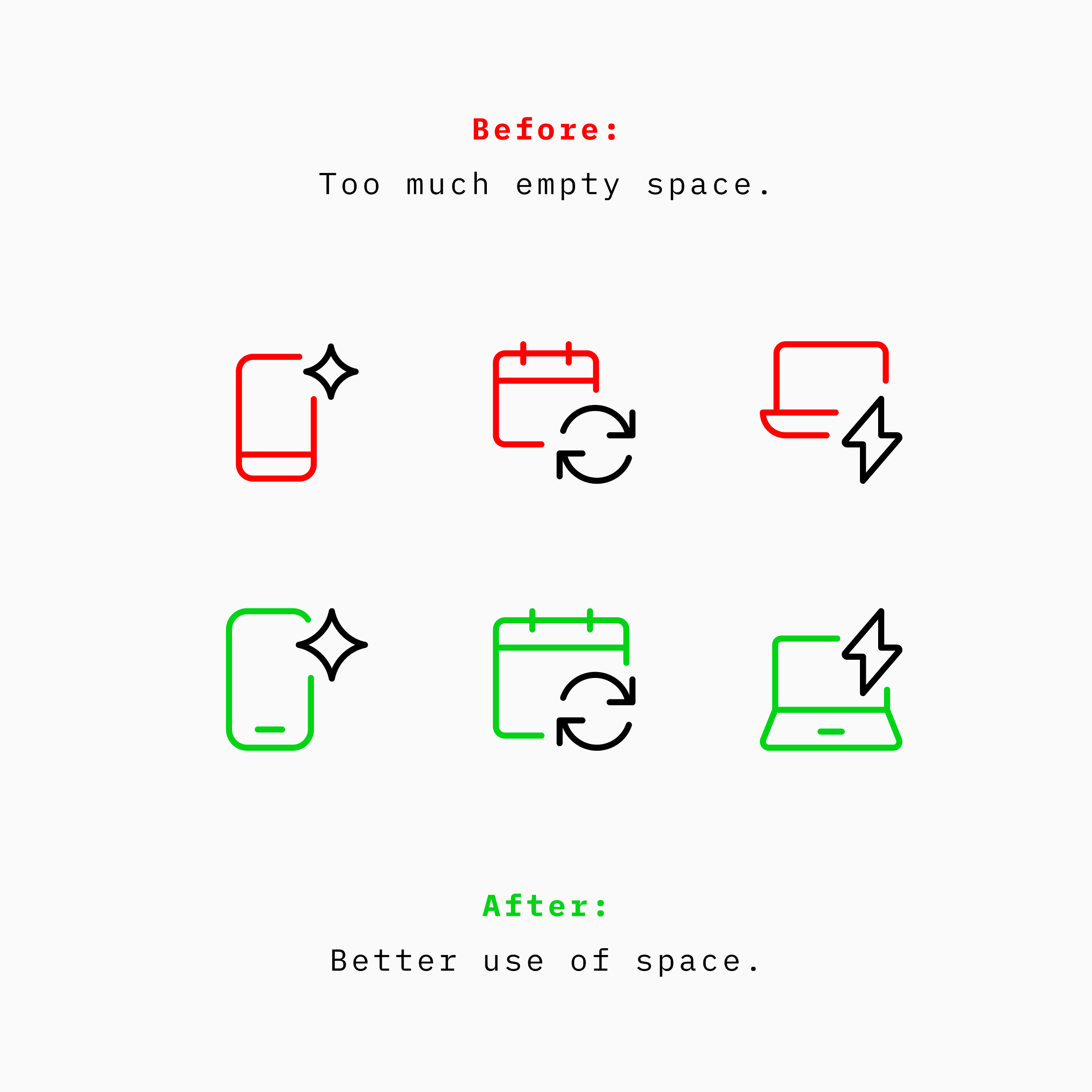
We rebalanced how each icon uses its available space, giving the main component and its supporting symbol a clearer, more even relationship. The result feels more legible and better balanced.
4. More consistency across styles
Ultimate is a family of three styles, so the same icon should retain its identity from Light to Regular to Bold.
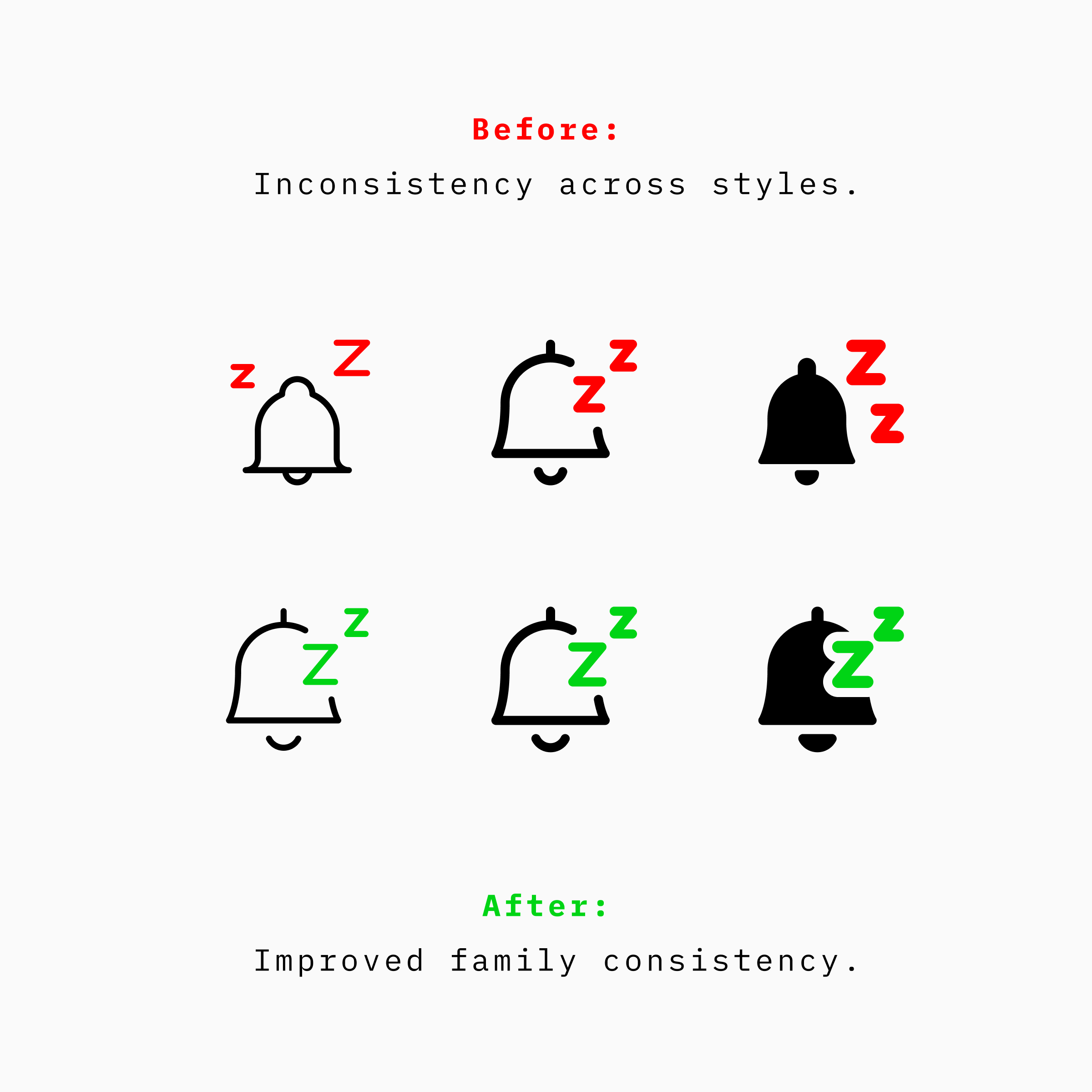
We refined how icons translate across the family, keeping their detail, proportion, and composition consistent. The weight changes, but the icon’s core design stays the same.
5. A more unified icon system
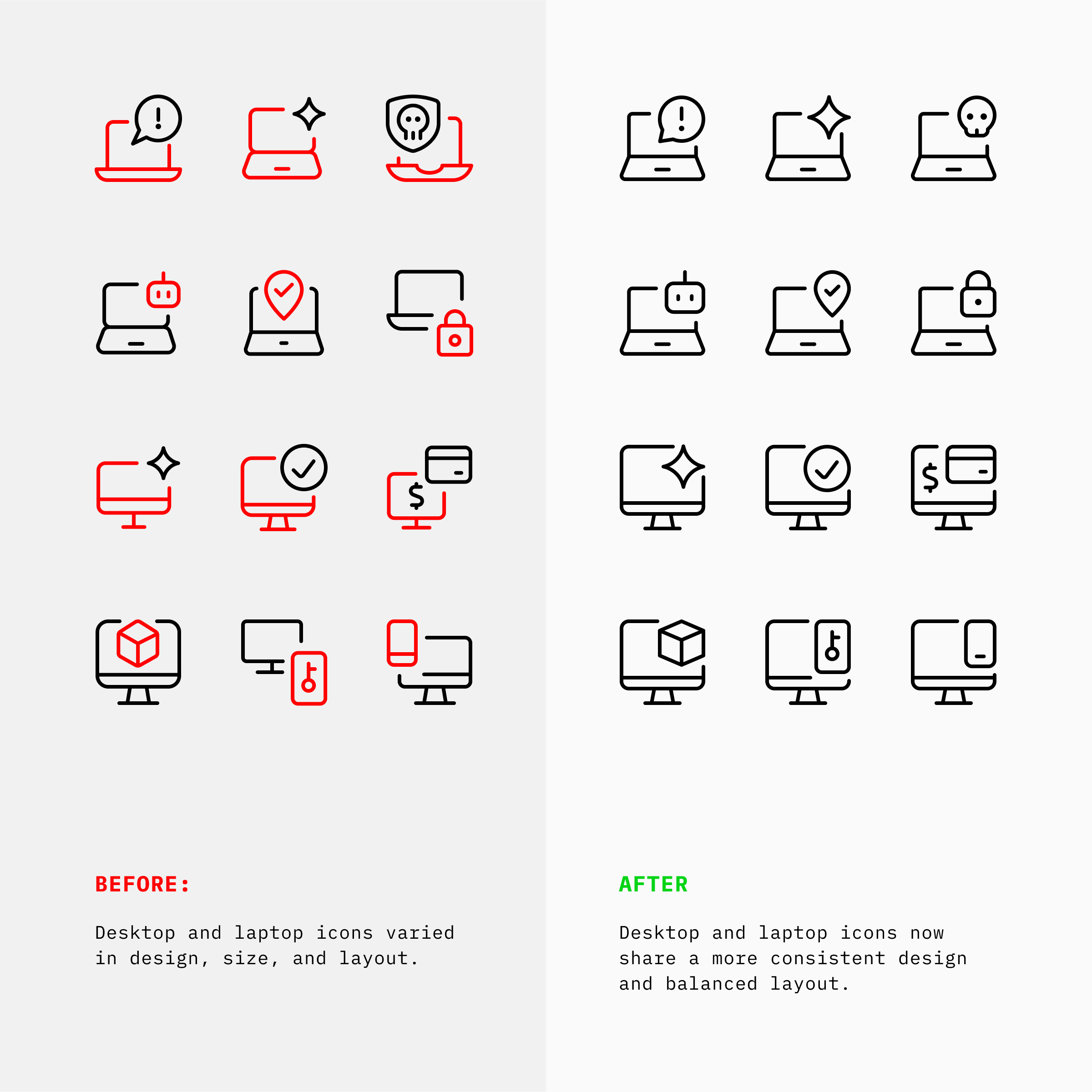
An icon series is a group of related icons built around the same base icon. As the set evolved, some of those series developed with different proportions, levels of detail, and placements for supporting symbols.
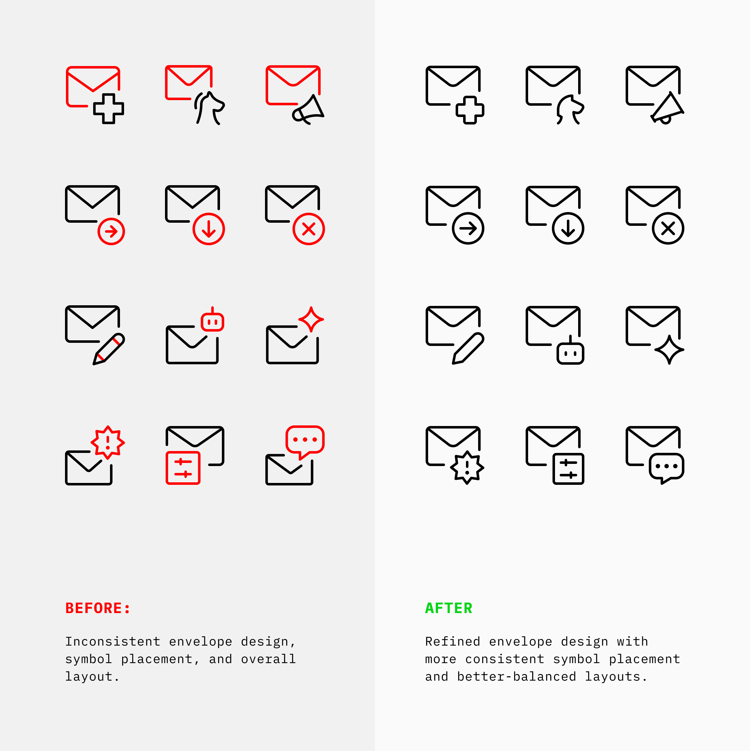
We redrew them as groups, not as isolated icons. Each series now shares a more consistent base design, with supporting symbols placed and scaled in a way that feels balanced across the whole group.
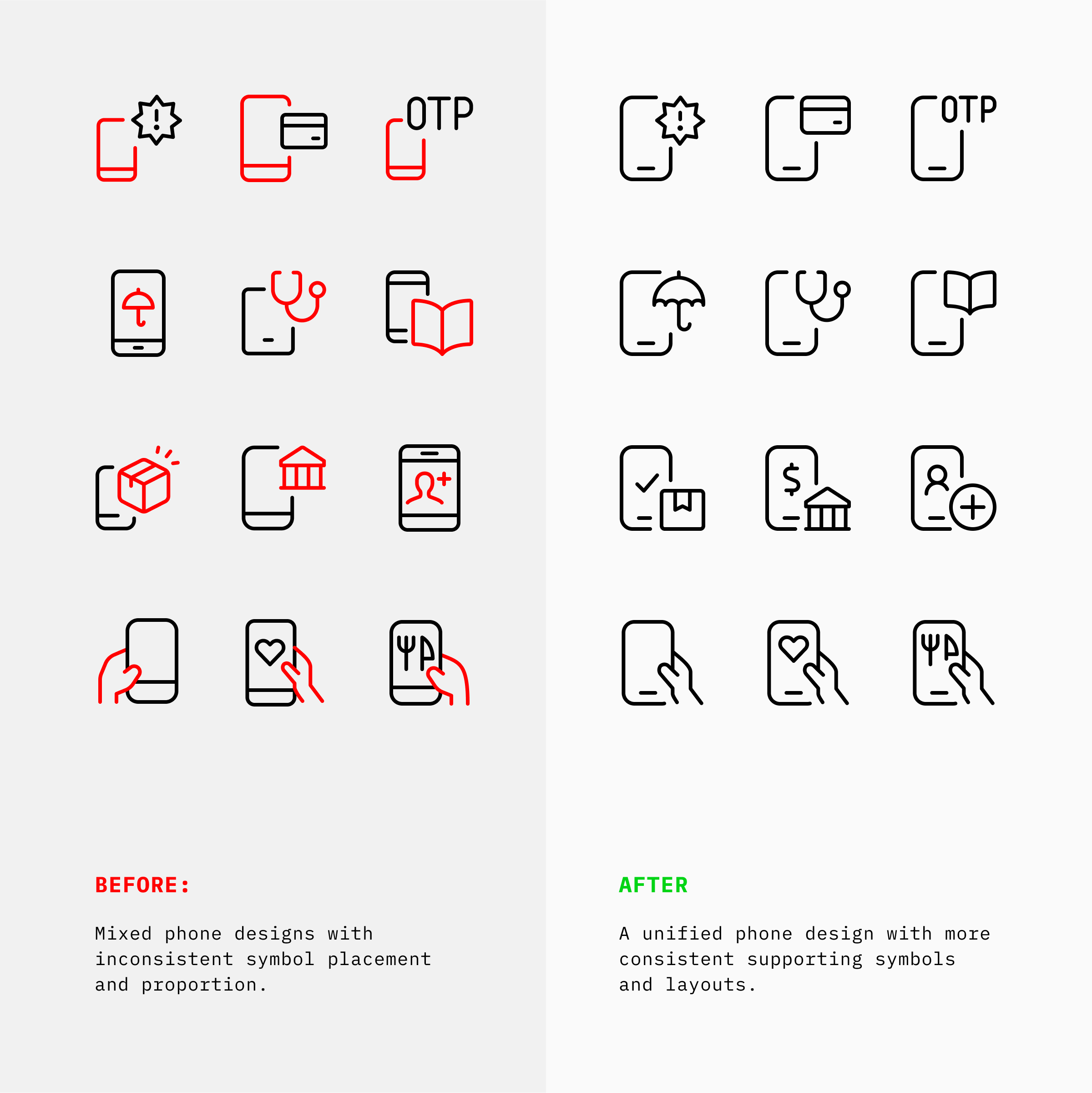
Together, these changes make the icons easier to recognize and the Ultimate family more consistent.
✅ Why we made the change
The five changes above solve three practical problems: keeping familiar symbols current, improving legibility in real interfaces, and helping a large icon family stay consistent.
To keep familiar symbols current
The devices and services people recognize change over time. Updating icon metaphors helps familiar symbols, such as smartphones, remain clear and relevant in modern interfaces.
To improve legibility
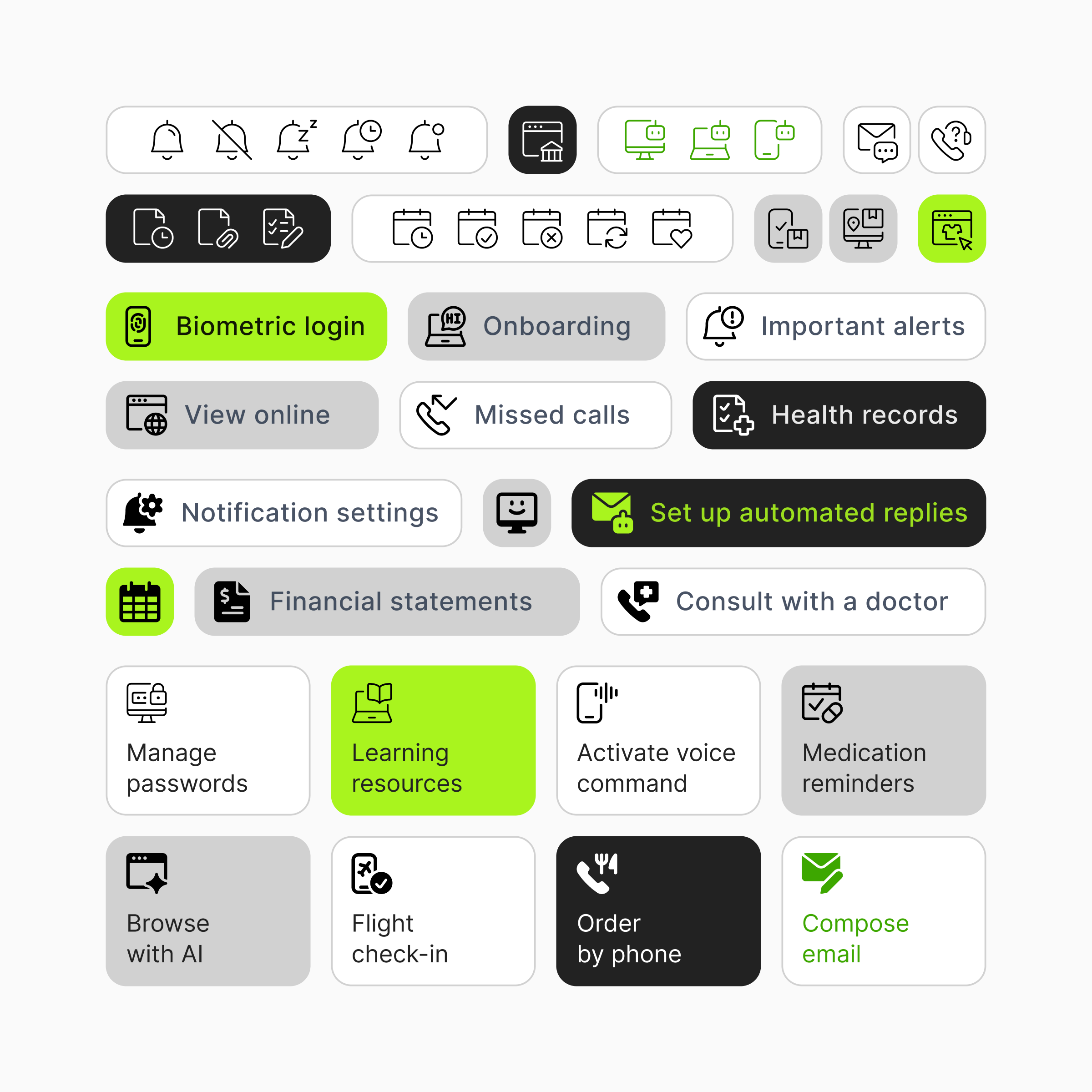
Icons often appear at small sizes in navigation, toolbars, tables, and other dense interface areas. Clearer forms and better-balanced space help them remain easy to recognize beside text and other icons.
To keep Ultimate consistent
A large icon family is most useful when its icons work together. By aligning related series and the three Ultimate styles, we make it easier to mix icons across a project without the set feeling disconnected.

That same approach carries across Ultimate Light, Ultimate Regular, and Ultimate Bold, each designed for a different kind of interface.
📦 One Family, Three Weights
Ultimate is one family, not three separate icon sets.
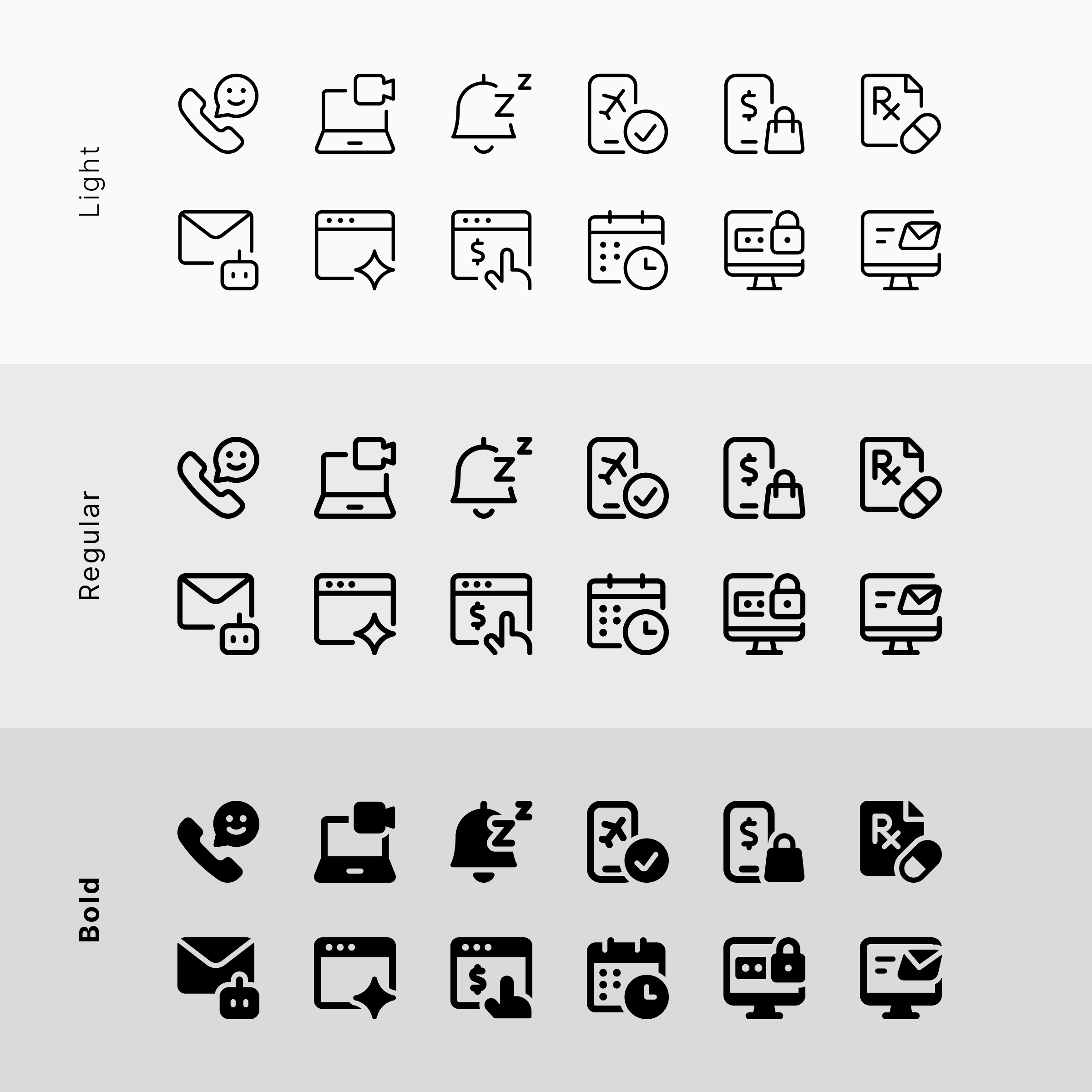
Each weight has its own character, but the same icon should feel natural in Light, Regular, and Bold. Making that work requires consistency at two levels.
Consistency within a style
Each icon series within a style needs a common approach to size, proportion, detail, and supporting-symbol placement.
Consistency across different styles
When the same design is translated to Light, Regular, and Bold, it needs to retain the same composition and identity.
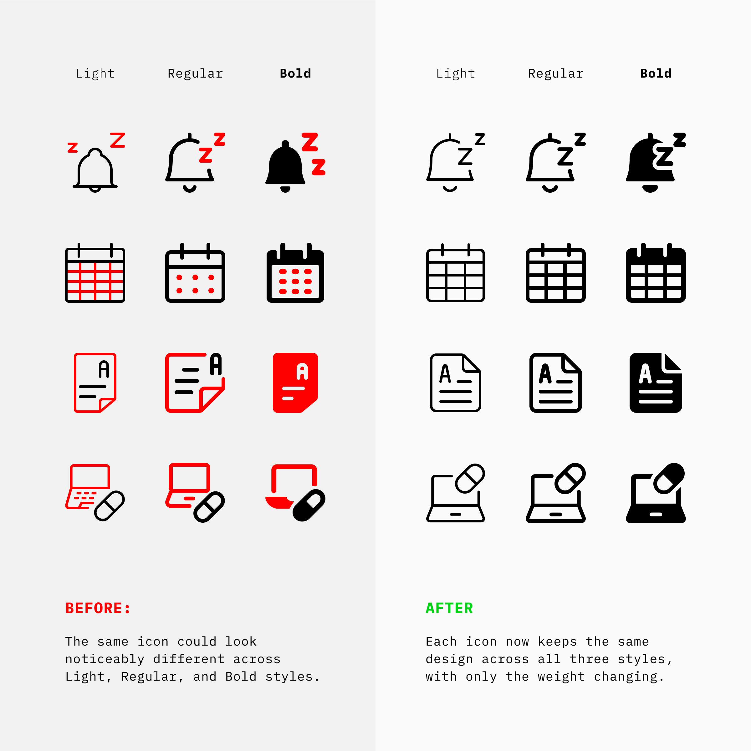
That is where harmonization matters. It brings related series into line within each style while preserving a design’s identity as it moves between them.
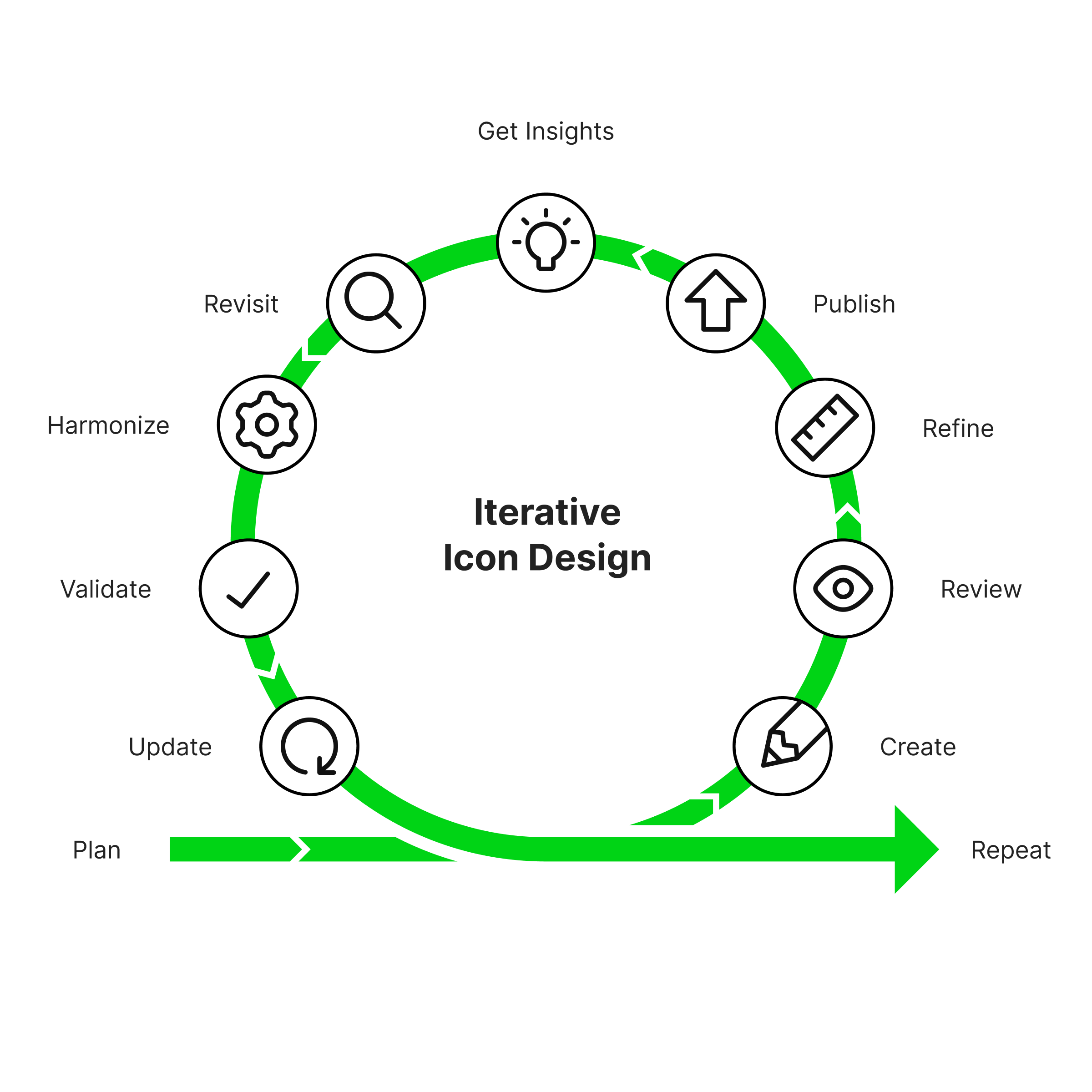
The result is a more consistent Ultimate family, whether you need an airy outline, a versatile everyday weight, or a stronger filled icon.
🚀 Find the right weight for every interface
Not every screen asks for the same visual voice. That’s why Ultimate comes in three carefully balanced weights, each designed for different situations.
- Ultimate Light brings airy spacing, intricate details, and a refined 1px stroke, making it ideal for spacious interfaces and illustrative moments.
- Ultimate Regular strikes the balance between clarity and versatility, staying comfortable across both light and dark surfaces.
- Ultimate Bold prioritizes instant recognition with strong silhouettes and excellent legibility, especially in dense interfaces and dark themes.
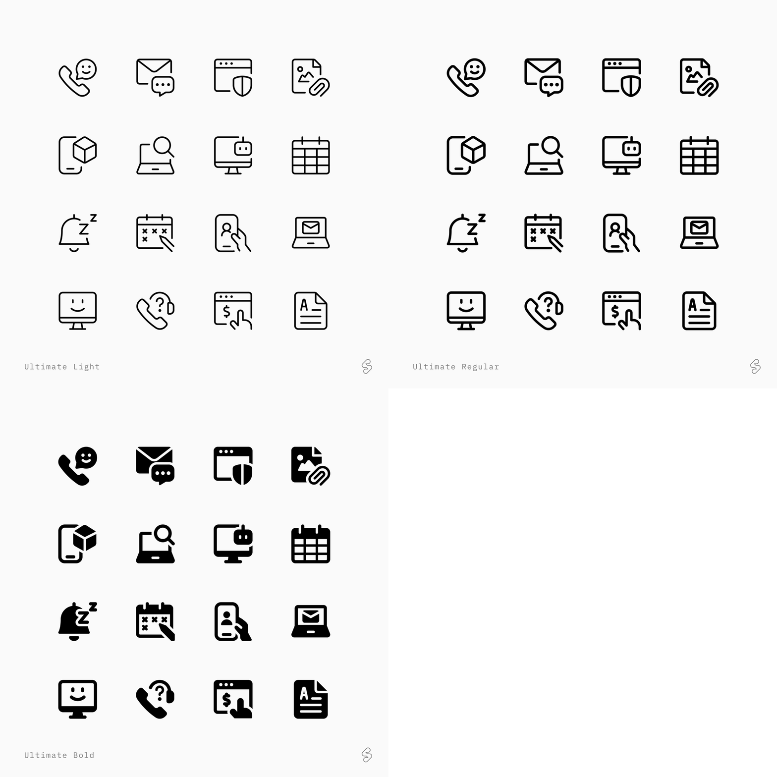
Explore all three and choose the weight that fits your project best.