How to design hand icons
The most difficult icons, hands down
Hands are notoriously challenging to design in the iconography field. That's why we decided to share our process with you, to turn a seemingly complex task into a much more accessible one.
Throughout history, from classic artists to medical illustrators, many have attempted to capture the complexity of representing hands in two dimensions. However, icon design isn't about anatomical accuracy; it's about synthesis.
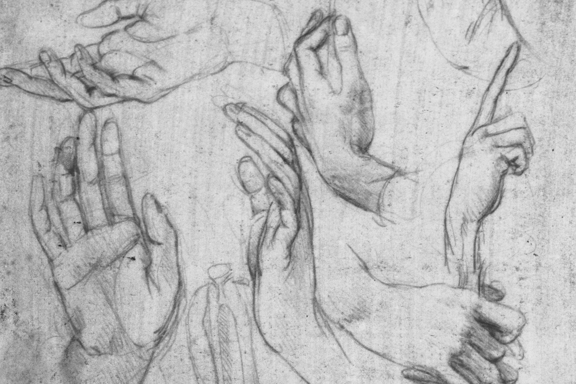
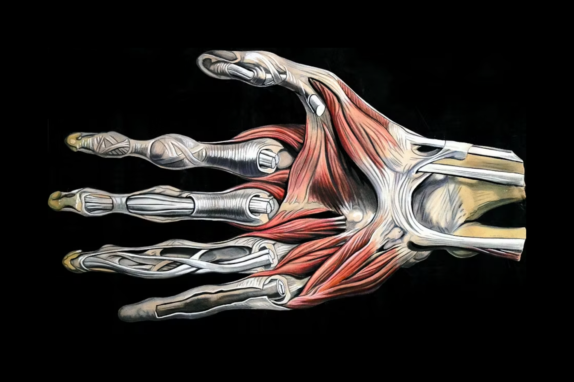
Left: Studies of hands by Leonardo da Vinci; Right: Anatomical illustration by Elisha Schorn
👉 The importance of sketching
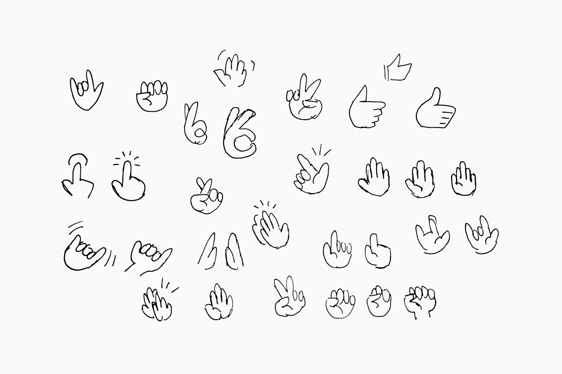
It's advisable to begin this process with a series of sketches. This not only helps us learn how to simplify the design of a hand but also allows us to quickly evaluate how these simplifications will impact the consistency within the same series.
👉 Synthesis and digitalization
As icon designers, we have the freedom to explore various creative alternatives when designing and simplifying a hand icon. In any case, it's crucial to include just enough elements to ensure the icon remains perfectly recognizable.
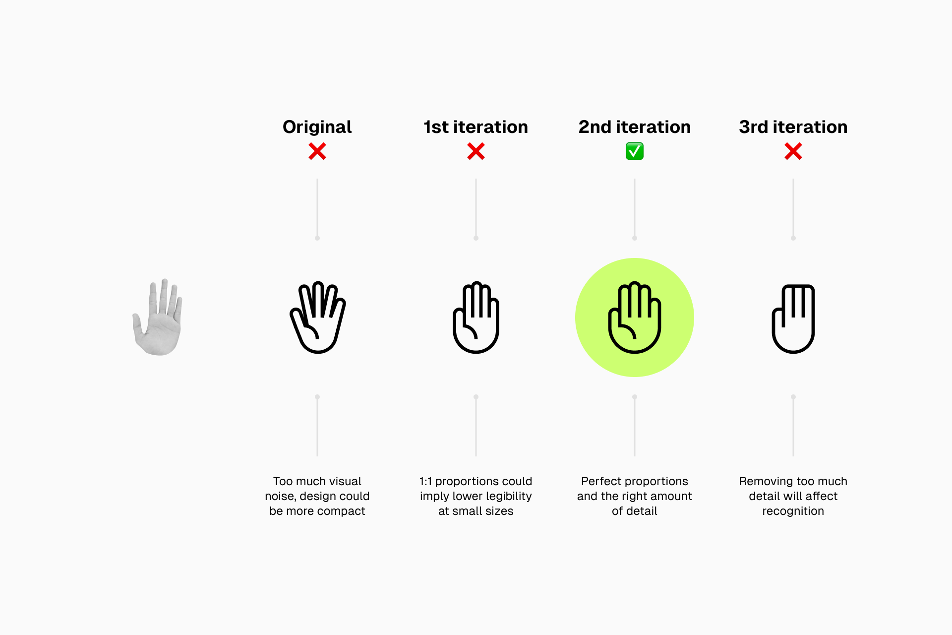
Designing hands is tricky for several reasons since we have to make sure that:
- The hands remain recognizable after the synthesis process
- The hands align perfectly with our previously defined guidelines
- The hands are legible at small sizes despite their complexity
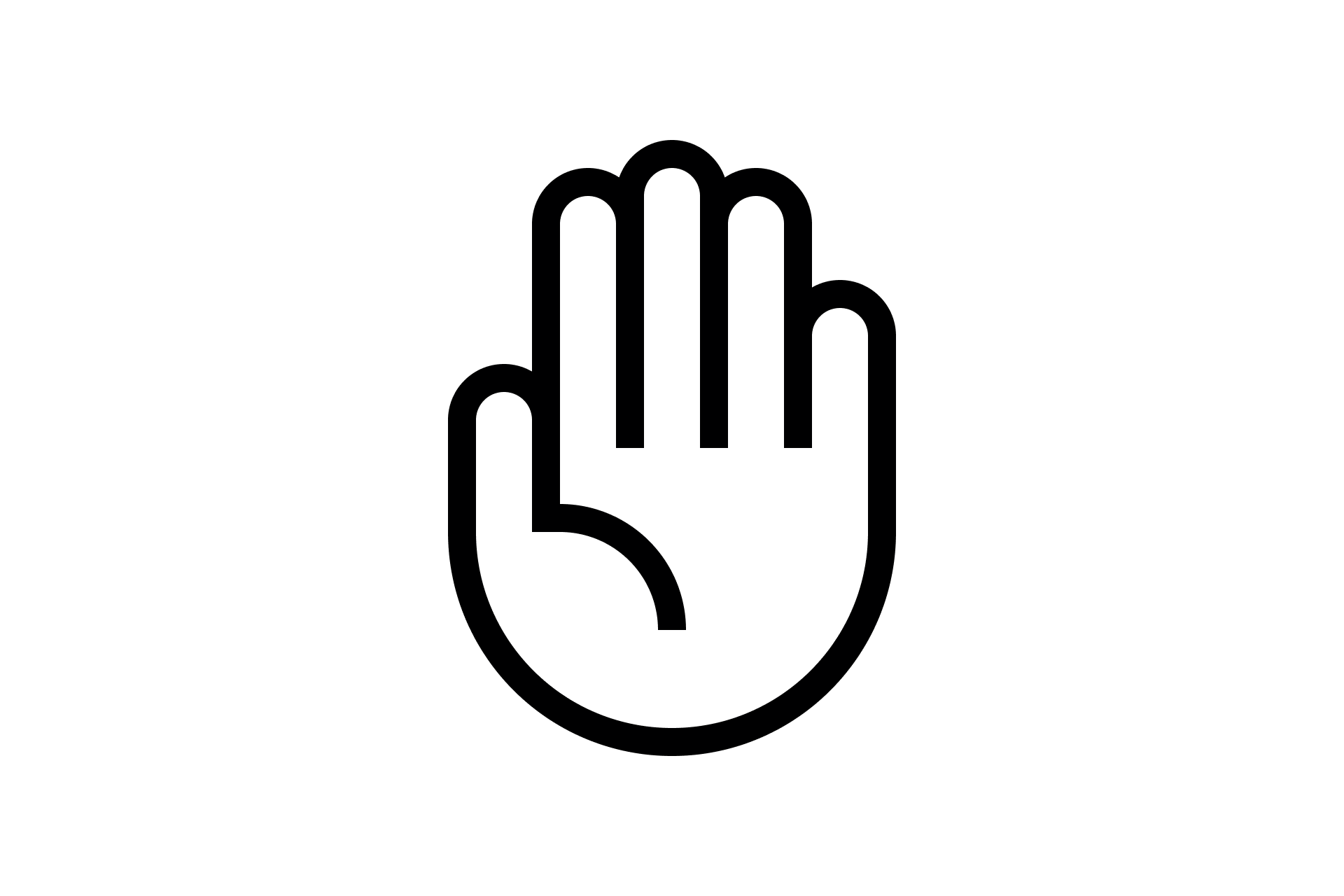
Preferably, we'll start by designing an open hand that will serve as a reference for the rest. Once we've established the basic proportions, the different heights of the fingers and any other details we want to add, we'll be ready to design others.

The next hand we need to design is a fist. Why? By doing so, we'll establish the two basic states for our series: open and closed. This will simplify the process of defining all the intermediate hand positions.

Learn more about how to design icons in Figma. 👇
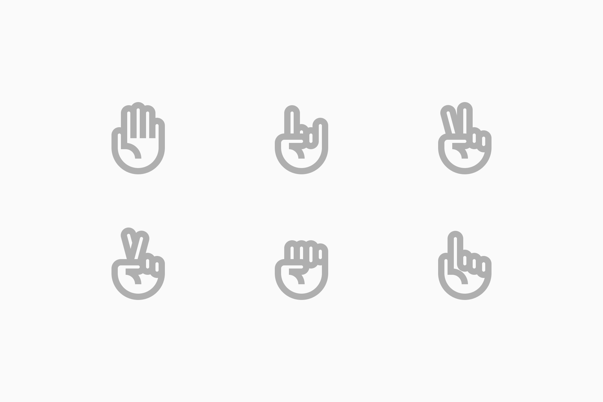
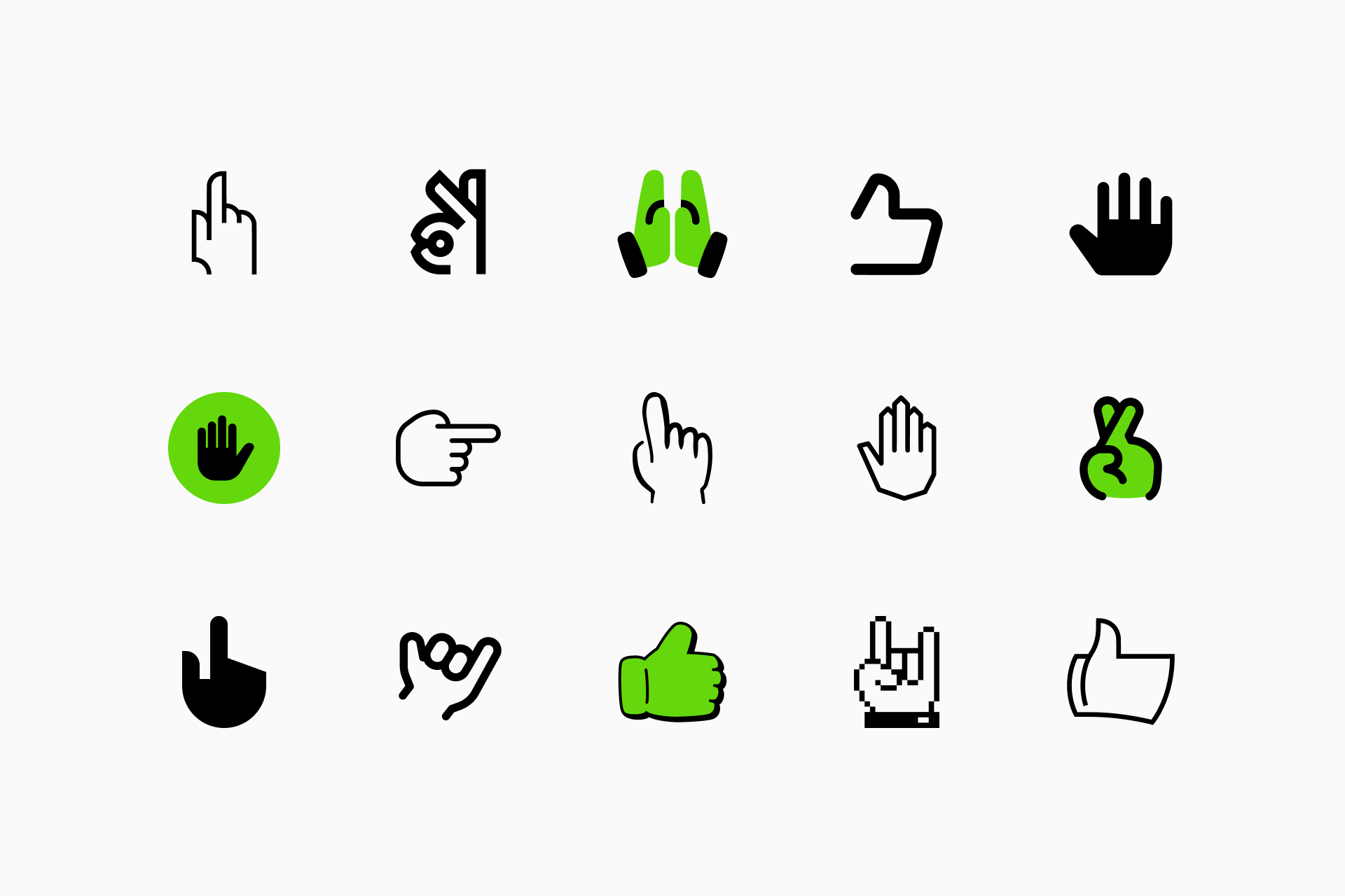
👉 Keeping the set consistent
We need to pay special attention to consistency: corner radius, ends, and overall shapes used for these icons. Fortunately, when designing a set of hand icons we can reuse elements with relative ease to maintain a sense of visual harmony.
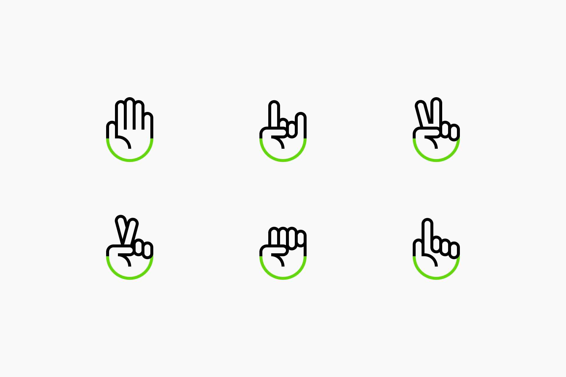
The orientation and repetition of shapes helps us maintain formal consistency within the set
Following well-established construction guidelines from the very beginning will allow us to design a perfectly harmonious set that will make each icon easily identifiable as part of a whole.
Learn more about grids and key shapes. 👇
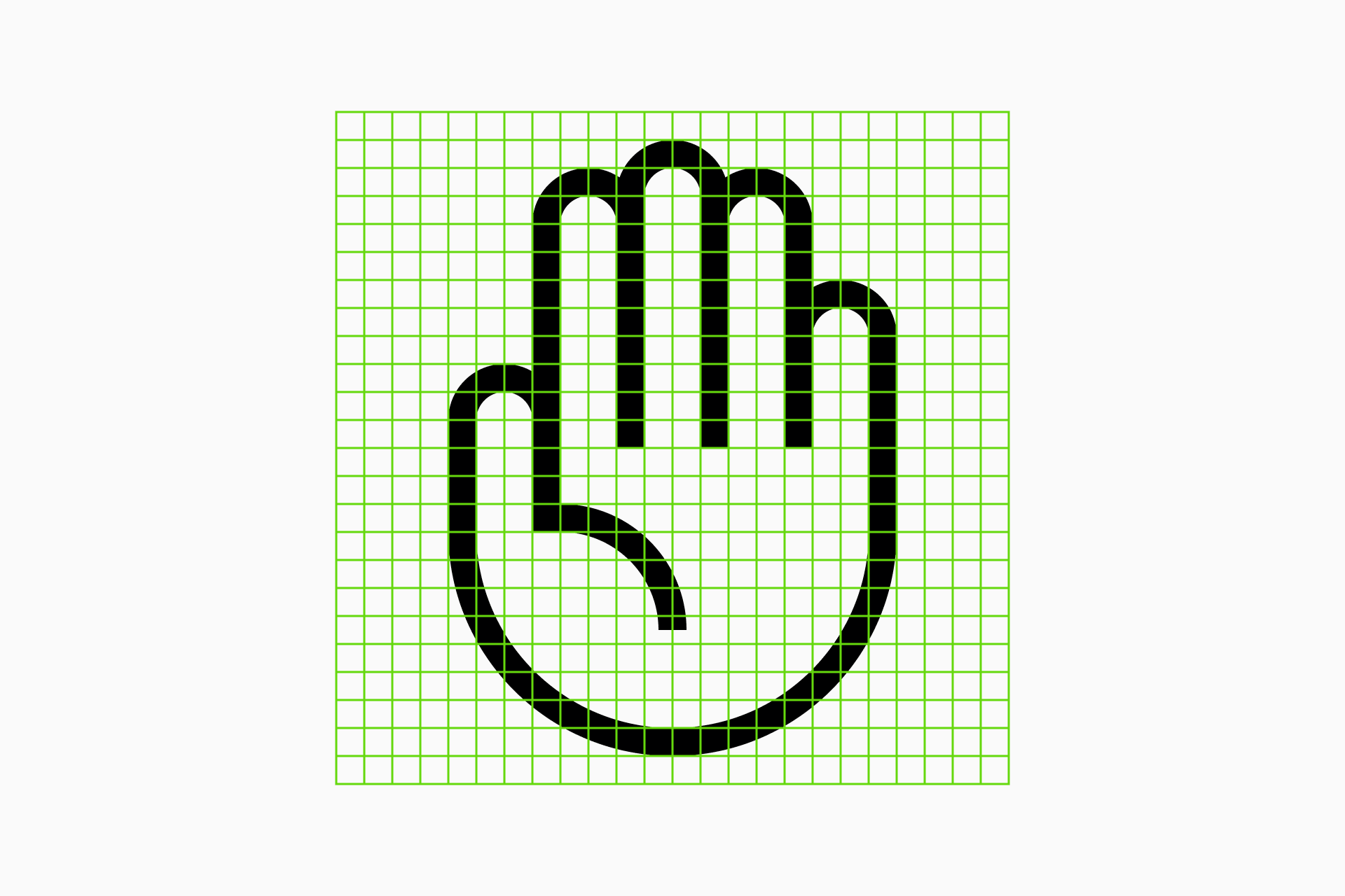
👉 What if the grid is too small?
A smaller grid will make the synthesis process even more challenging, as details are harder to capture. However, hands can use a technique borrowed from cartoons: draw four fingers instead of five.
While excessive simplification can hurt recognition, hands are surprisingly forgiving when it comes to reducing detail.
In some cases it's advisable to even remove the fingers that don't contribute to communicate the meaning
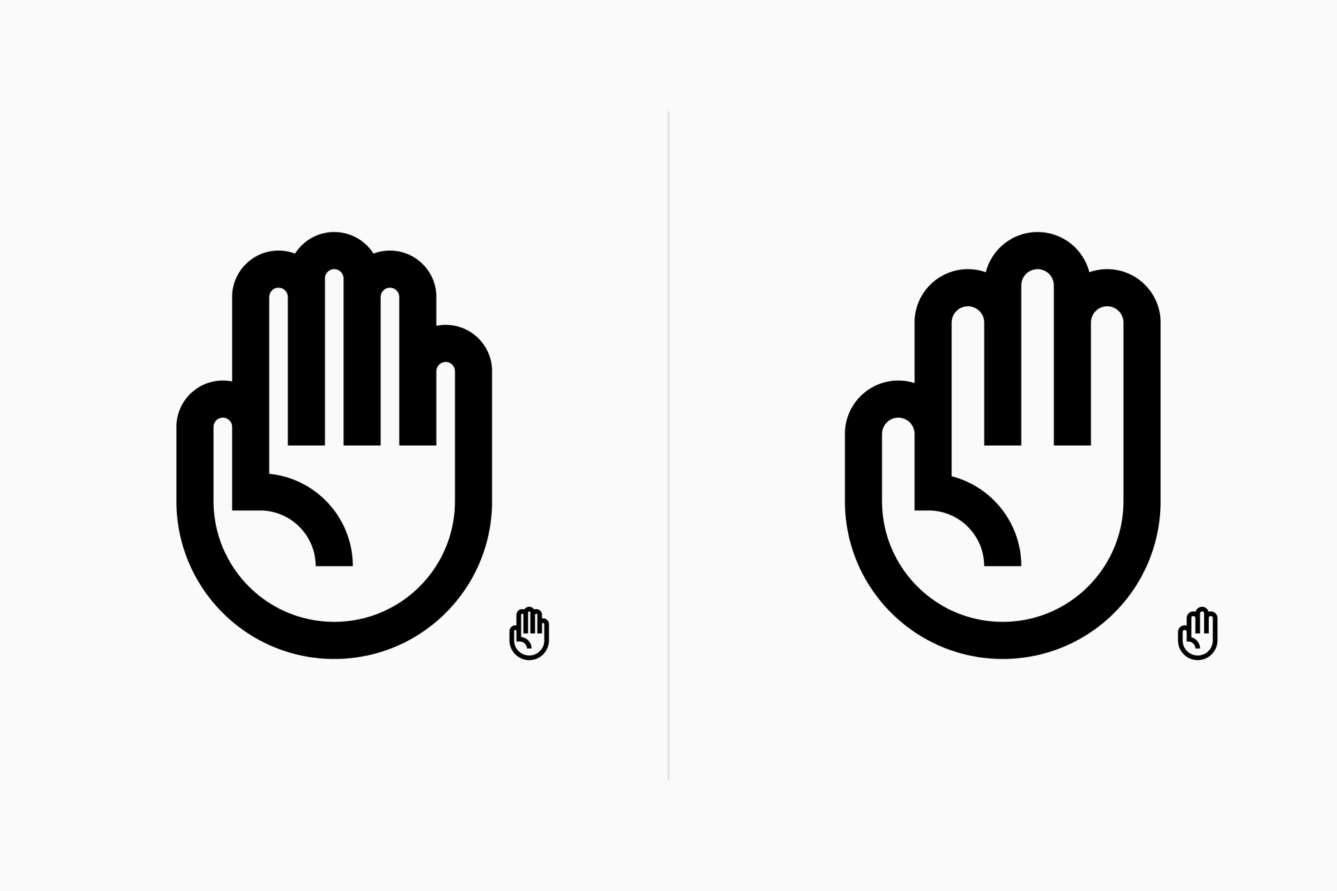
👉 How to create style variations
Another important aspect to consider is how the hands function across different styles. So far, we’ve only designed them in Line, but creating them in Solid is much more complex. Therefore, it’s advisable to start these icons in Line and then convert them to Solid. But there are several ways to do that.
1st method
The first method consists of using a single stroke as basic structure for the icon (which we'll call vector master) and use it for both Line and Solid.
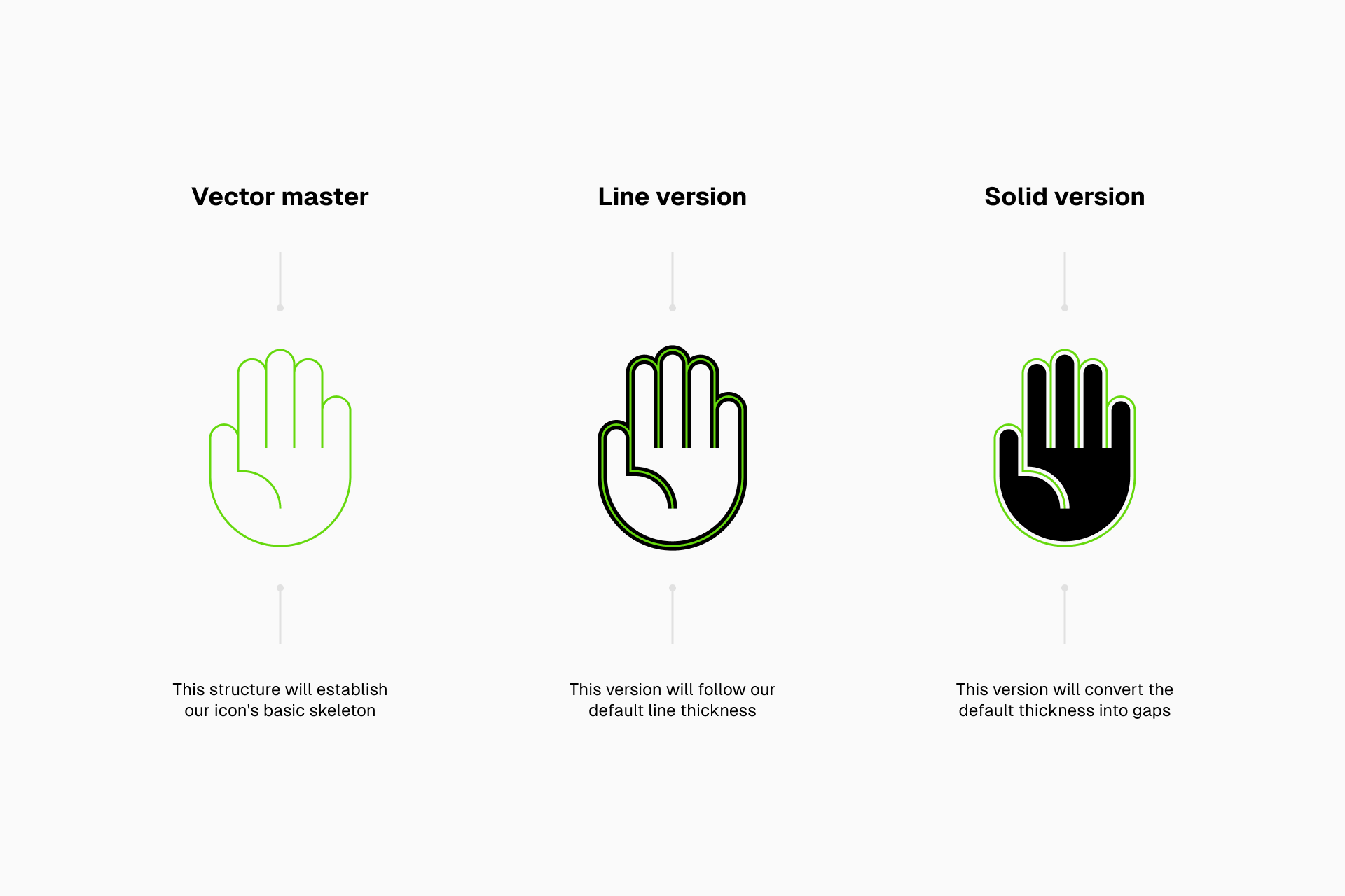
This method allows us to make quick conversions, the only drawback is that the Solid version will be slightly smaller since the stroke will be converted into gaps.
2nd method
The second method consists of redrawing the hands in Solid, but always with an eye on Line to ensure consistency between the two variations.
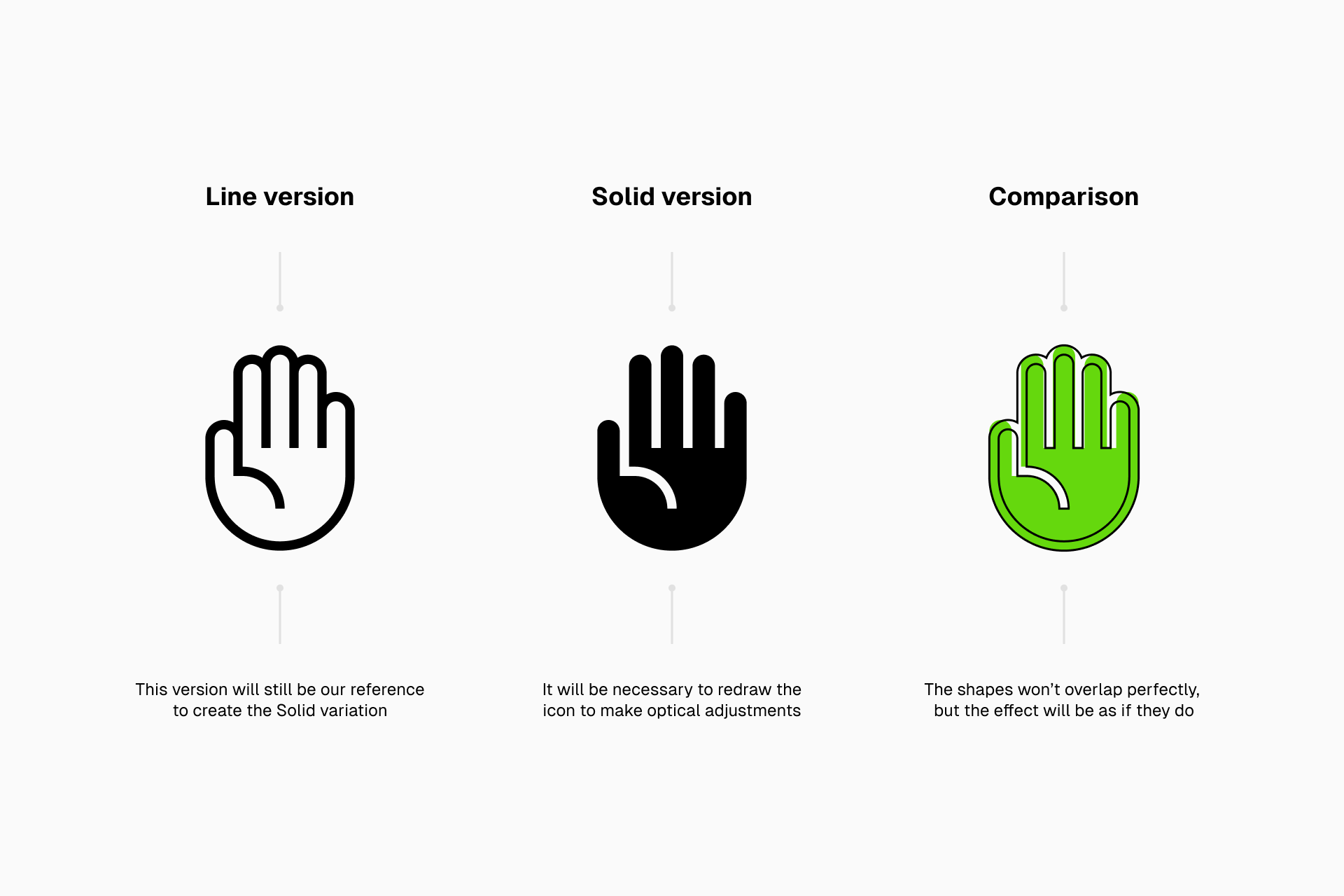
The obvious problem with this method is that it requires much more work on our part, but it's the system to follow if we want the transition from Line to Solid to be smoother (especially if we want to incorporate active/inactive states to our design).

Learn more about how to convert icons from Line to Solid. 👇

Obviously, these are just some of many possible solutions, icon design isn’t an exact science and the process varies for each designer. Plus, the style of our set will be a major influencing factor. However, the principles of synthesis and consistency should be applicable to any set, regardless of its unique formal characteristics.
If you’ve designed your own set of hands following this little tutorial, don't forget to give us a shout. We'd love to see it!