How to convert icons from Line to Solid style
It's more difficult than just filling shapes with solid colors – learn about optically adjust, increase gaps, tweak negative space, and more.
Icon systems are dynamic tools that allow the design of a flexible visual language with multiple variations. Just as each glyph in a typeface plays a vital role in crafting a harmonious whole, every sign within an icon system serves a specific purpose and contributes to the creation of a cohesive experience.
But how to design an icon system? In this article we'll explain how to create a set of Solid icons based on Line icons, including some early considerations and a few practical examples. But first, let's clarify some basic concepts.
The icons
Before delving into the more technical aspects, we should discuss the basic distinctions between Line and Solid icons. Not only in formal terms, where the difference is pretty obvious, but also in terms of legibility and usability.
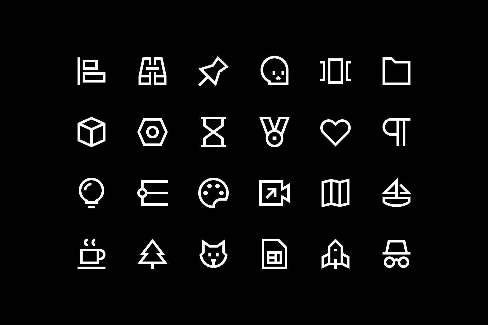
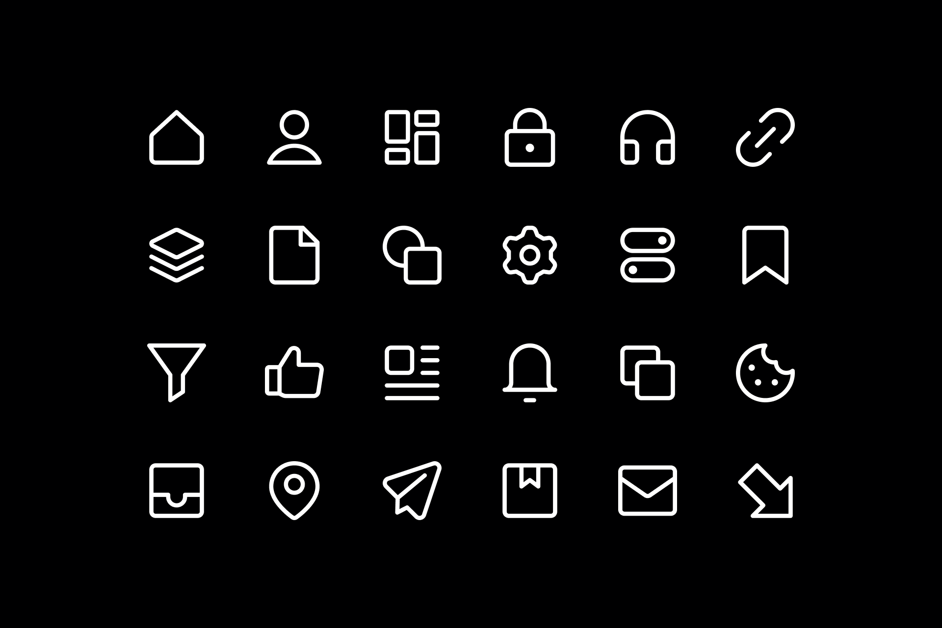
Sharp Line icons
Line icons are well known for their minimalist design, which effectively conveys simplicity and clarity in a wide variety of contexts. Their sleek and subtle appearance tends to work great on clean and modern products. However, when these icons are used at extremely small sizes or dark backgrounds, their subtlety can compromise visibility, potentially hurting user comprehension.
Solid icons, on the other hand, are far more legible, especially when displayed at smaller sizes or dark backgrounds. Their filled appereance significantly improves their distinctiveness, making them more easily recognizable. But this visual prominence might steal attention from other design elements, breaking the balance and visual hierarchy within our project.
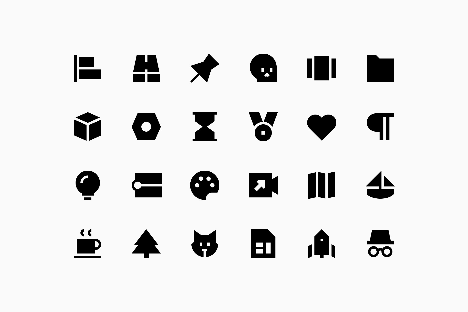
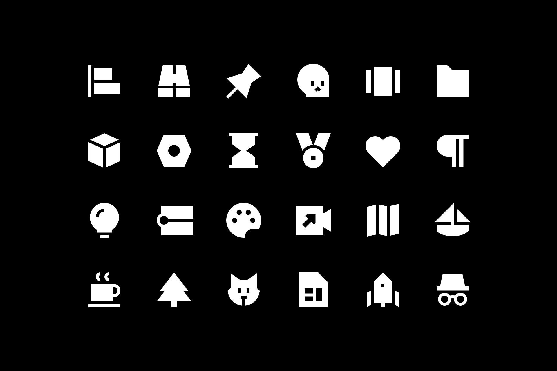
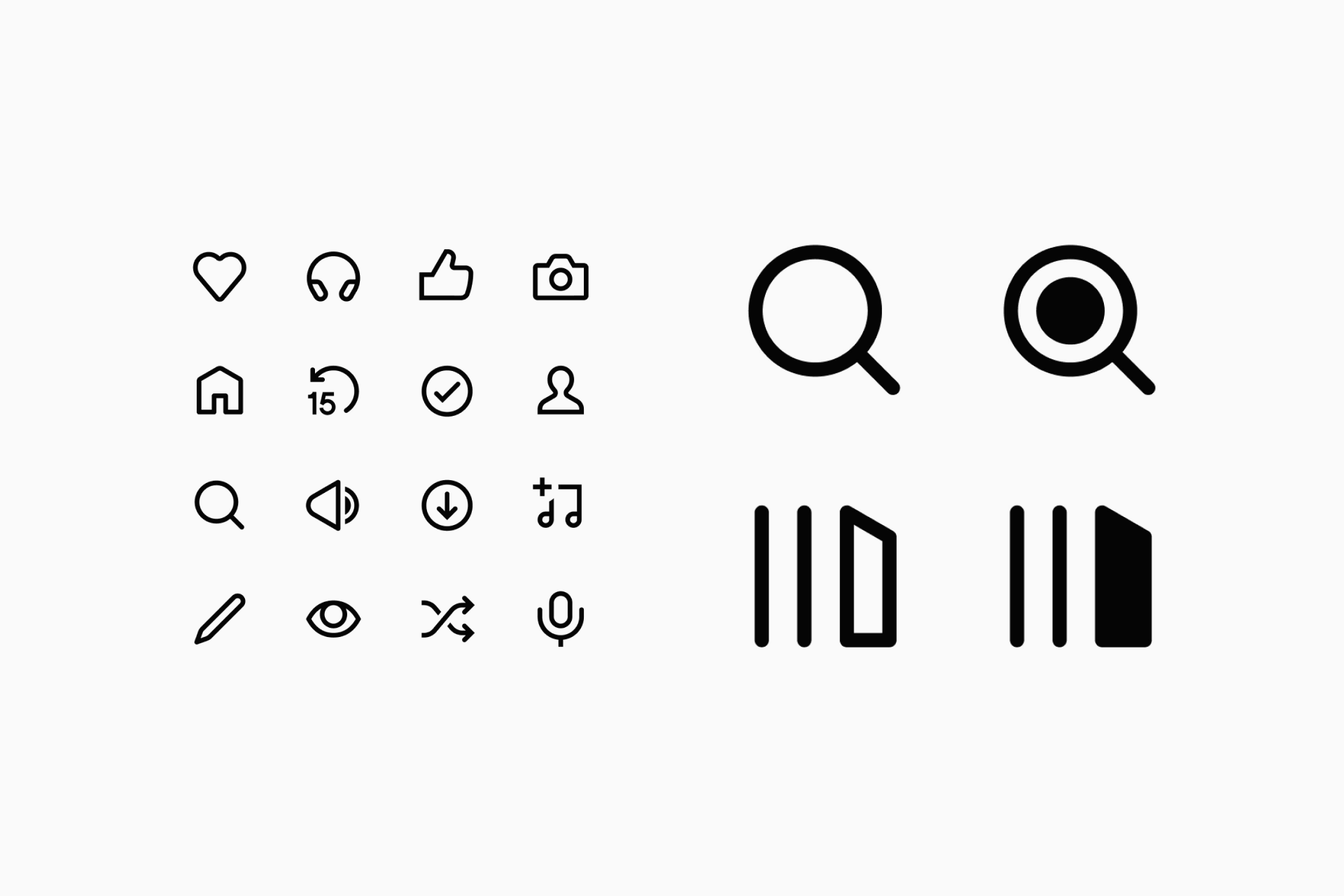
Sharp Solid icons
So why might it be useful to create an icon system that includes both styles? Employing multiple variations allows designers to balance simplicity or emphasis depending on the context. This approach also enhance visual hierarchy and helps expand a brand's visual language without loosing consistency.

Sharp icons indicating active/inactive states
It's the harmonious fusion of Line and Solid icons that allows for a comprehensive, user-centric and visually compelling design system. Having understood this notion, let's explore how to create such a system.
The system
There are some steps that we'll skip for the sake of this text but will eventually explore in other articles, such as the basic principles of icon design or how to plan an icon project. Here we'll focus on the conversions between Line and Solid icons.
Early considerations
Building an icon set in both Line and Solid is something we must decide in advance. There will always be room for improvisation, but the sooner we know the problems we're going to face, the better.
- It's essential to know where the icons will be implemented, not only to make sure that it makes sense to develop a set in both styles but also to know the context in which each one will be used. It may be worthwhile to design a system for a digital product, but not so much for signage.
- In addition, we must consider the visual language into which these icons will be integrated to ensure consistency: brand, shapes, color, typeface...
- We also need to outline guidelines to ensure the scalability of the project. This set should be easily replicable in the future, so keeping track of our progress in some sort of user manual can really make the difference.
Starting with Line
When planning an icon system it's important to follow a thorough process, so we recommend you read our article on grids and key shapes to find out how to build icons from scratch.
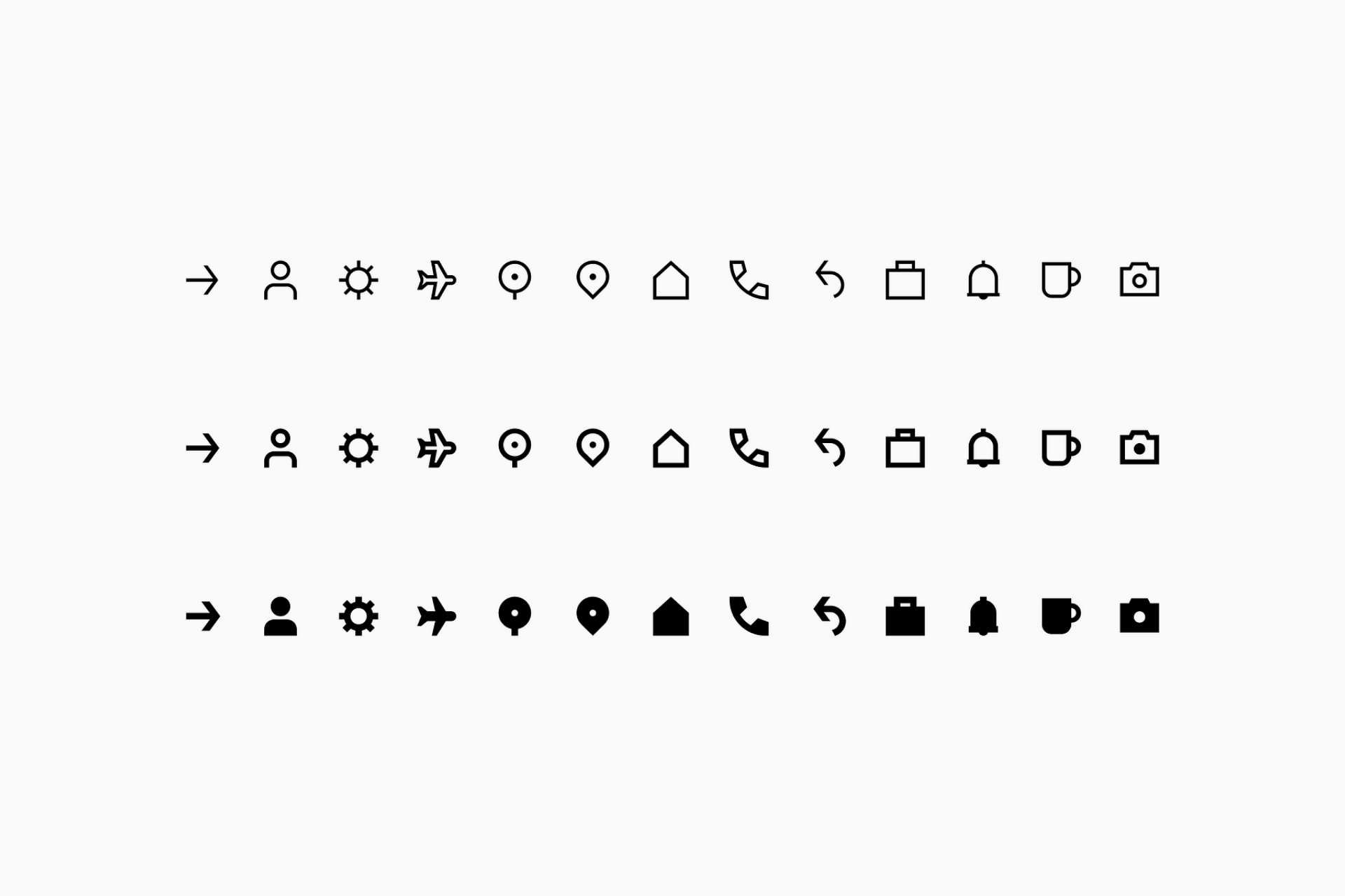
Ideally, we'll start by designing the icons in Line, as they're easier to convert. We can either alternate (create a Line icon, convert it to Solid, repeat the process) or design them all in Line and convert them to Solid afterwards. It's up to you.
Converting to Solid
Now let's get to the tricky part. Converting icons from Line to Solid isn't just a matter of filling them (not always at least), it's an almost handcrafted process in which we have to consider how each icon works individually (legibility), how it works in comparison to its original Line version (Line-Solid consistency) and how it works in comparison to the rest of the icons (overall consistency).
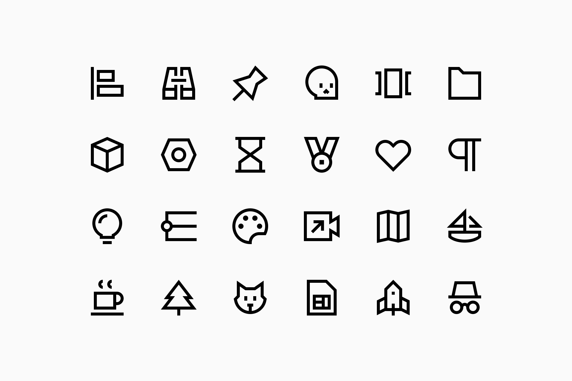
Throughout the design phase we'll encounter many different cases, some very simple to solve, others a bit more complex. So let's break down a few examples to better understand how it works, step by step.
···
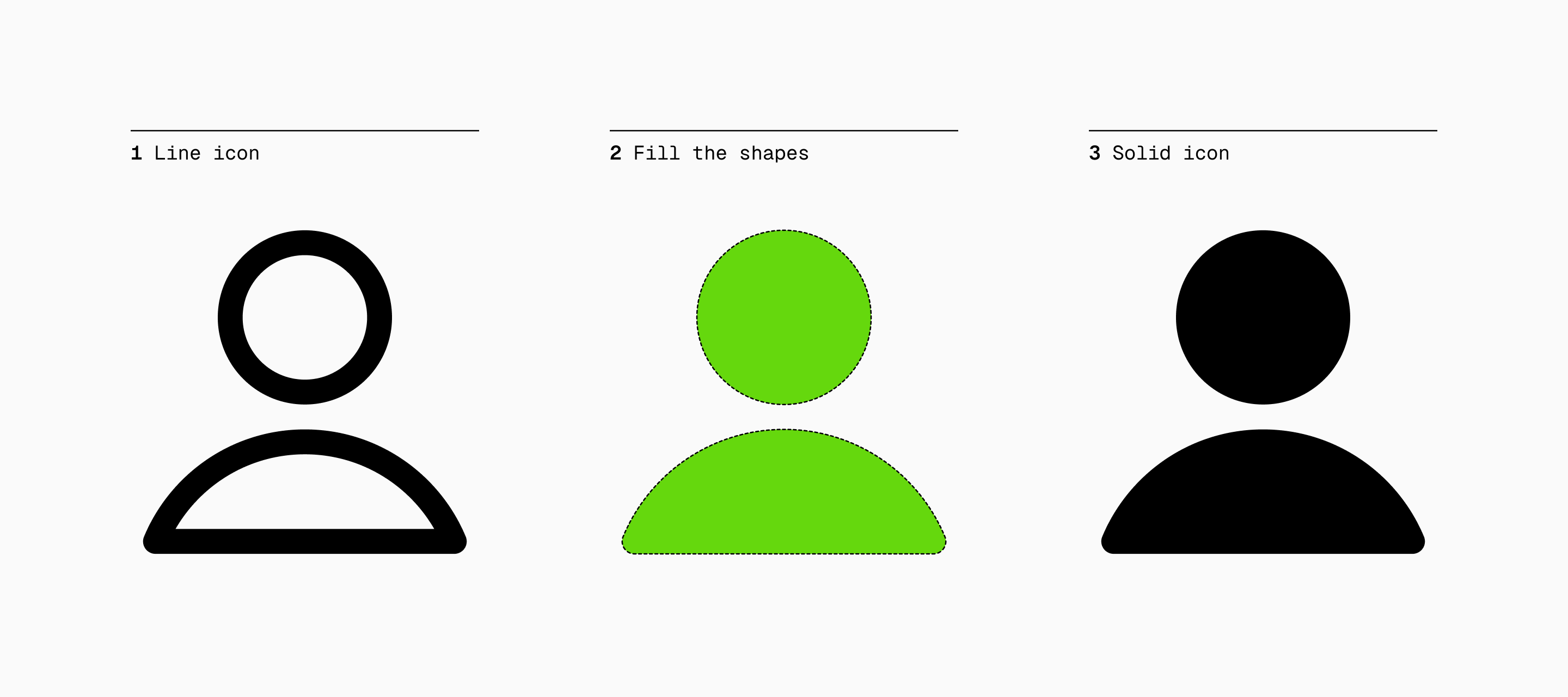
Fill the shapes. Luckily there will be cases where you'll just have to fill the shapes in order to get a nice Solid icon. Overall, any perfectly silhouetted shape without details should be able to work just by adding a simple fill.
···
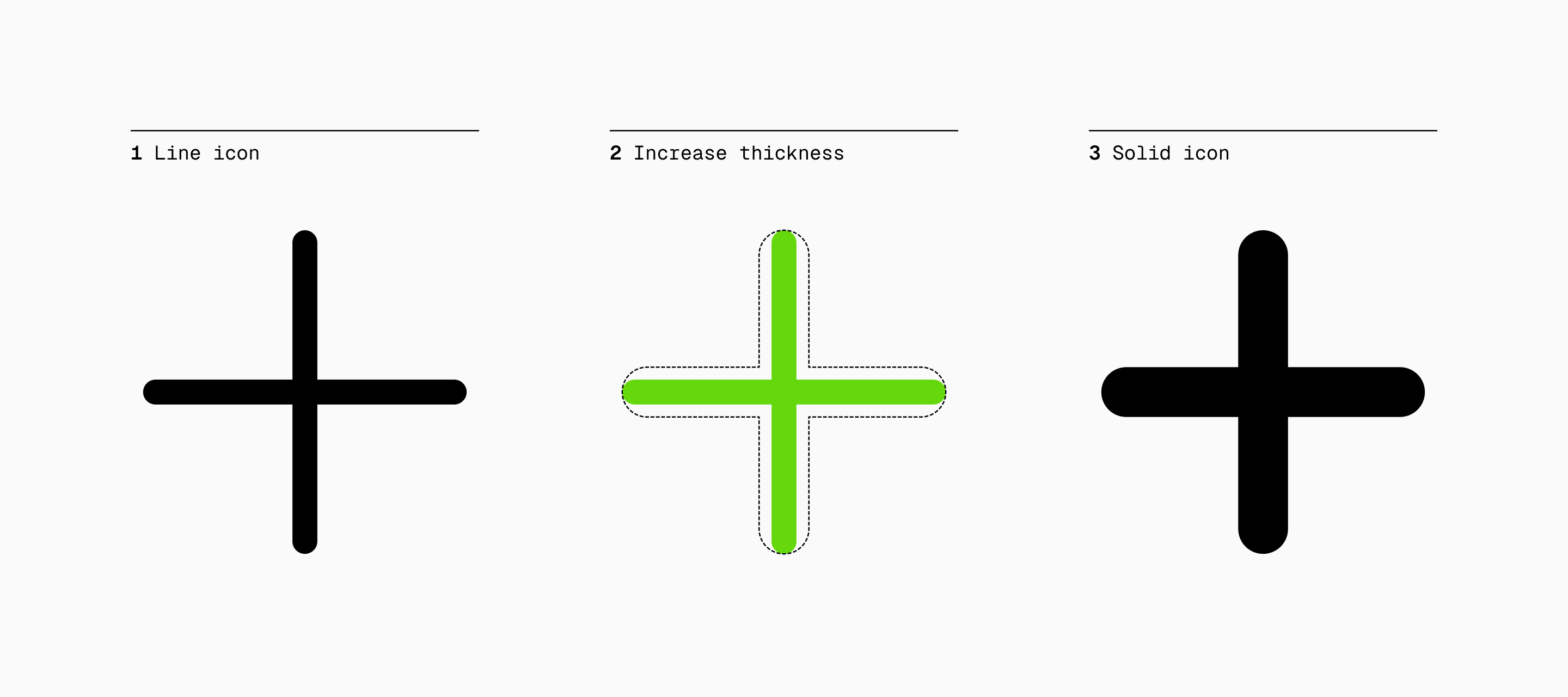
Increase thickness. A completely opposite case is the one in which we don't have a silhouetted shape, but a single stroke. Here it would be convenient to increase the thickness outward so that the icon has more presence, making it more consistent with the rest of our Solid icons.
···
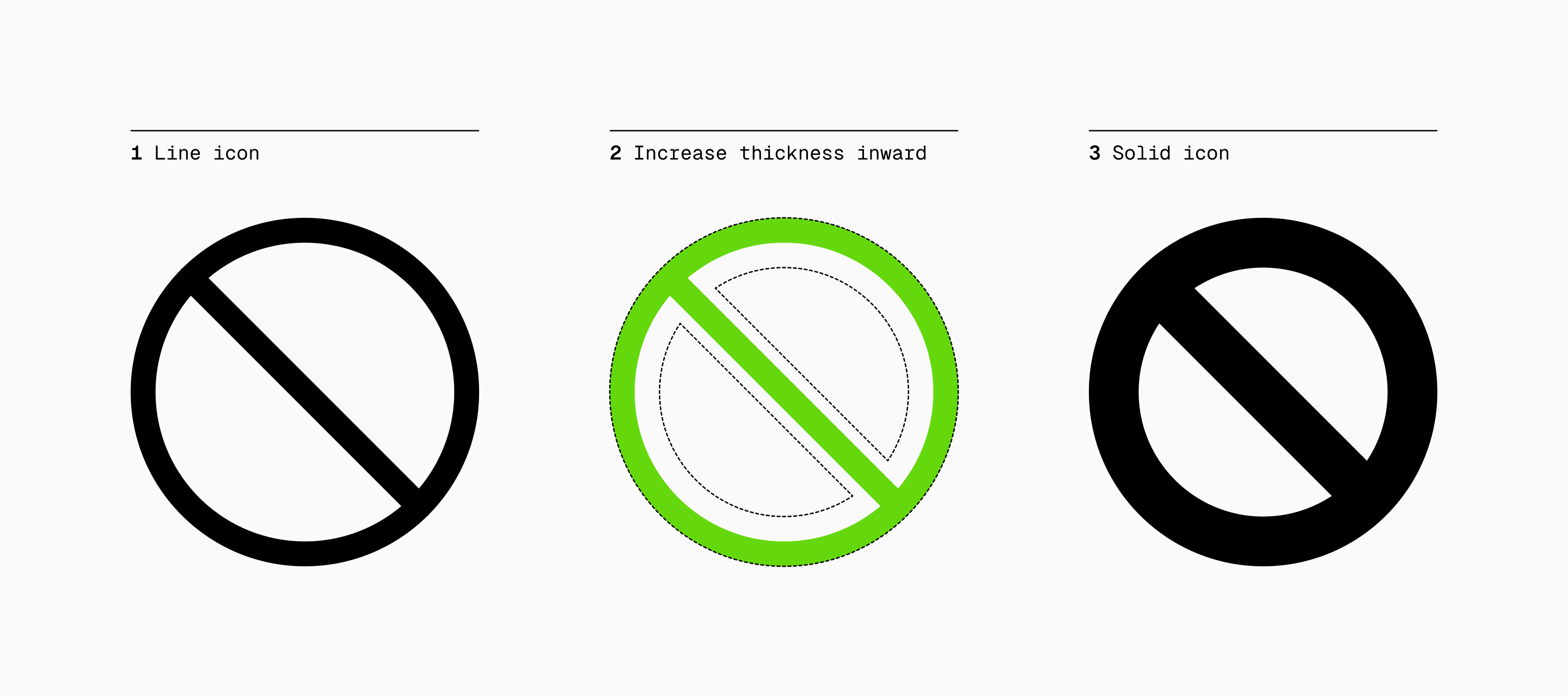
Increase thickness inward. But what if we encounter an icon in which we have a closed shape that also uses a single stroke? Simple. We'll follow the same process of increasing the thickness, but we'll do it inwards so that the shape of the Solid icon isn't bigger than that of the Line icon.
···
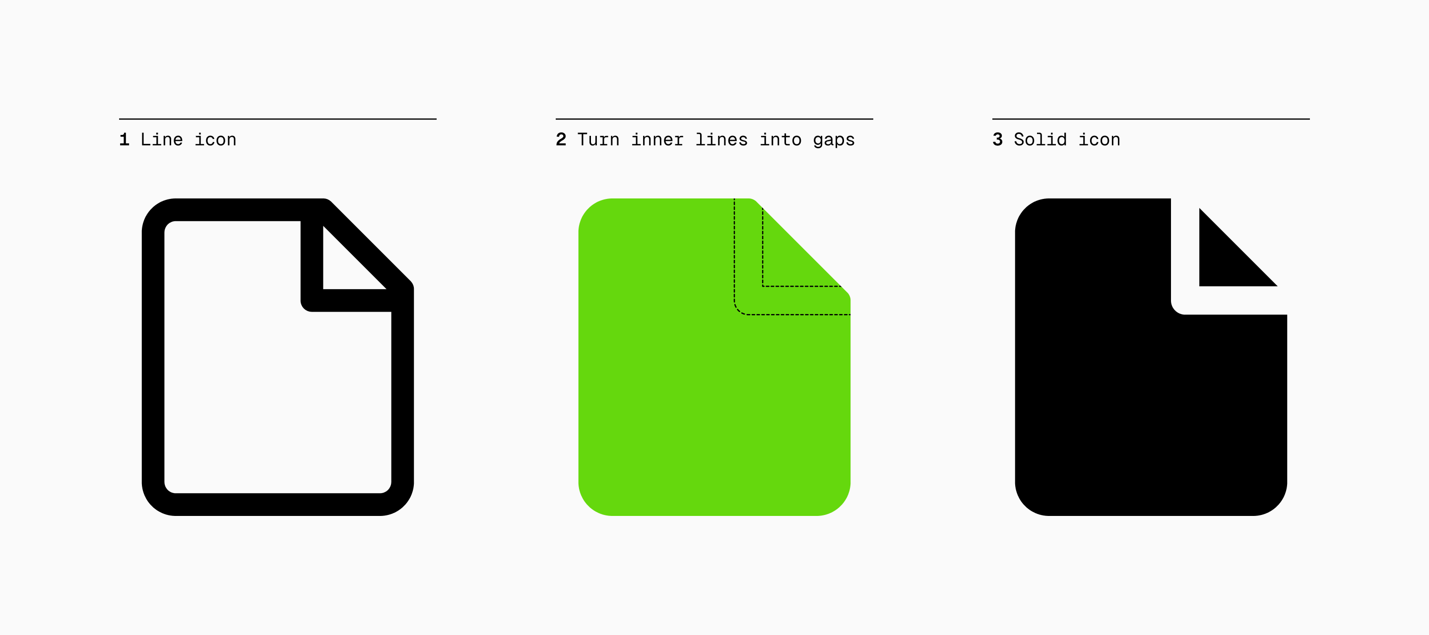
Turn inner lines into gaps. Things start to get complicated when internal details come into play. What in Line were additional shapes, in Solid become gaps. Also, in this particular case, our Solid gaps are slightly thicker than in Line to further ensure legibility at small sizes.
···
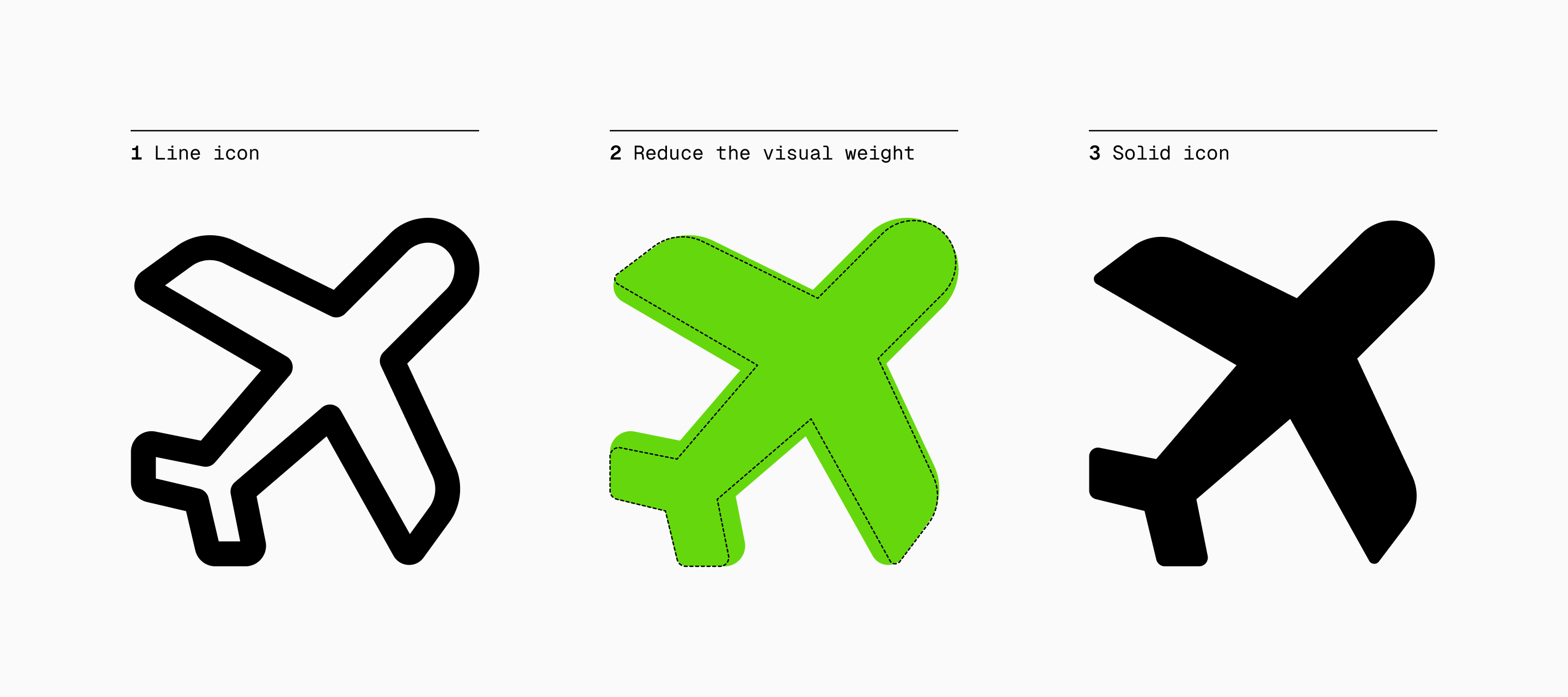
Reduce the visual weight. Solid icons tend to have a heavier appearance due to filled shapes, so reducing the visual weight helps prevent some icons from looking too dense or disproportionate. This ensures that the icon remains easily recognizable without necessarily giving up the consistency of the set.
···
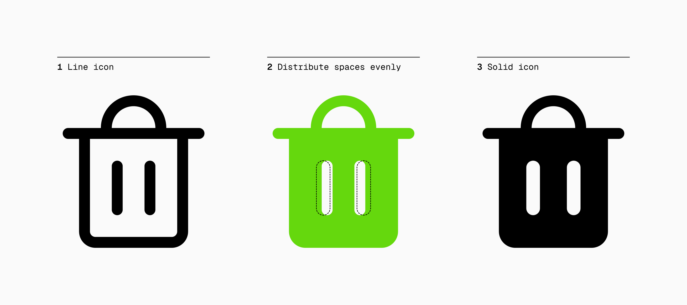
Distribute spaces evenly. Considering that Solid icons possess a larger area, sometimes it will be necessary to move some of their details to make them look balanced. For the garbage can, as you can clearly see, we had to separate the two inner lines so that the distribution of the spaces would be equal.
···
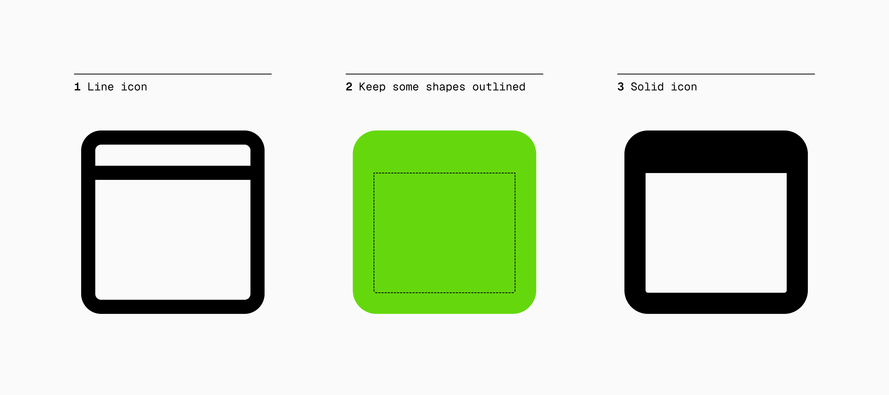
Keep some shapes outlined. In other cases we may be interested in leaving a shape outlined if that makes the icon more legible, always bearing in mind that the stroke should be slightly thicker than in the Line version.
···
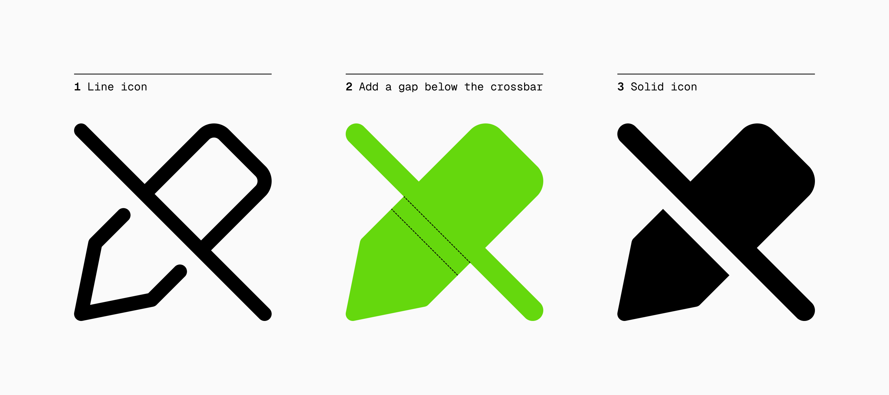
Add a gap below the crossbar. Another important case to consider would be the prohibition icons, where a gap should be placed under the crossbar to separate the elements that are part of the icon and increase legibility. This subtle separation is also recommended for Line, so it should be obvious when converting to Solid.
···
These tips should cover most of the scenarios you'll encounter while designing icons, but let us know if there's anything important we might have missed!
Now it's your turn
So there you have it! As we've just seen, mastering the conversions from Line to Solid icons contributes significantly to the versatility of a system. While it may seem daunting at first, the process of creating these variations becomes more intuitive and fluid with practice.
In any case, none of what you've read here has to be an absolute truth, everything is subject to change and you'll find many exceptions along the way. In icon design there may be a number of notions that seem unquestionable, but the only truth is that every project is unique.
And if you need a little inspiration, you can always check out our icon library.
Further reading
- Refreshing our Icon System. (2022, Jan). Spotify Design.
https://spotify.design/article/refreshing-our-icon-system-the-why-and-how-behind-the-changes - Nguyen, V. (2020, Jun 11). The journey to Uber’s iconography. Medium.
https://medium.com/uber-design/where-to-the-journey-to-ubers-iconography-bf8efd2be446 - Liu, T. (2017, Jul 24). Hollow icon vs. Solid icon. Medium.
https://medium.com/@tristaljing/hollow-icon-vs-solid-icon-which-is-more-friendly-for-recognizing-3cf032849263 - Designing icons. (n.d.). Material Design.
https://m3.material.io/styles/icons/designing-icons