How icons enhance your graphic design projects
Exploring the use of icons beyond UI to create impactful and engaging graphic design projects.
Icons can help us create unique brands and communicate impactful ideas through graphic design, whether as the main element of a logo, to easily represent complex infographics or simply as a decorative element for a package. Here's how.
Branding
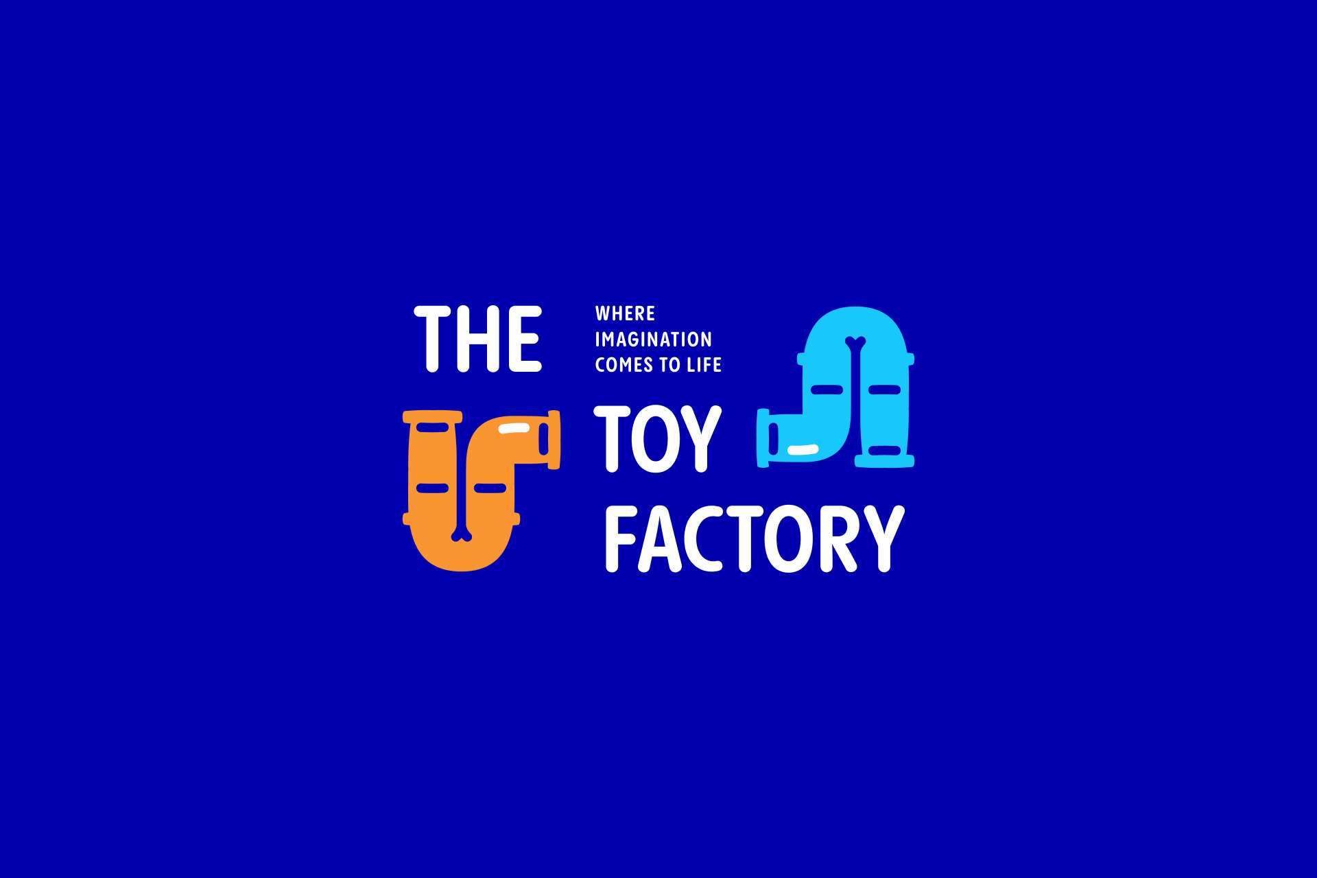
Branding is about creating a unique visual identity for a company, and icons play a crucial role in encapsulating its essence and conveying its values clearly. These icons can often become recognizable symbols associated with the brand, increasing its visibility and memorability over time.
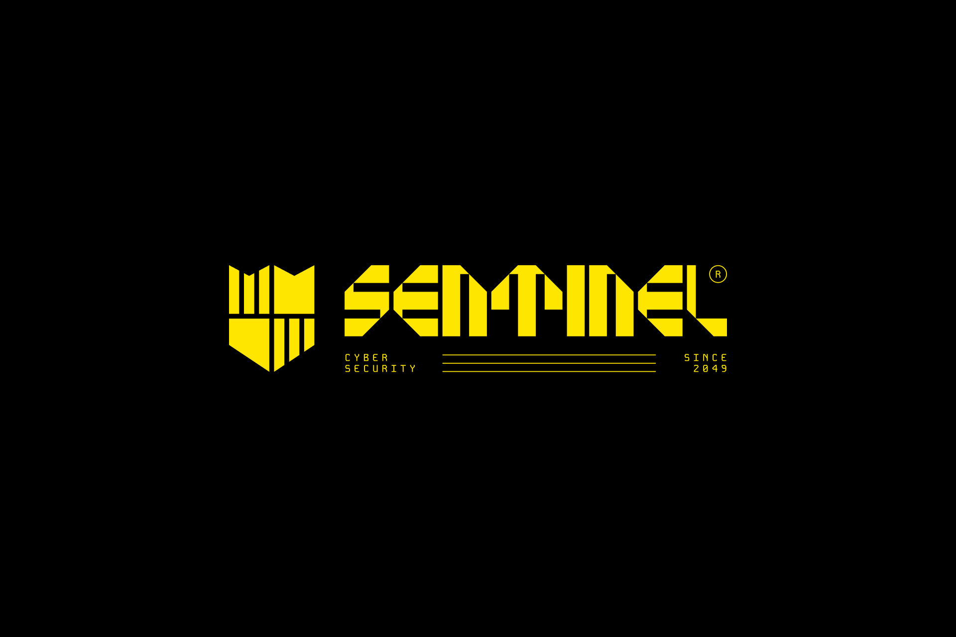
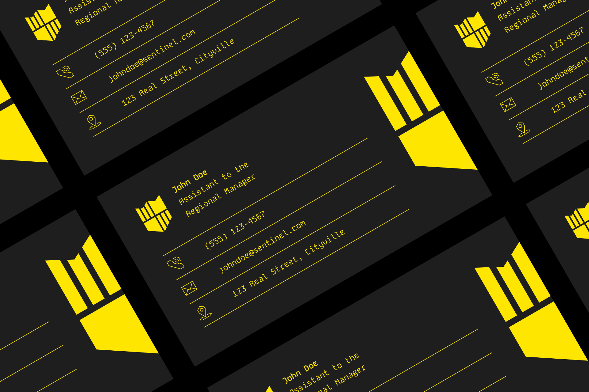
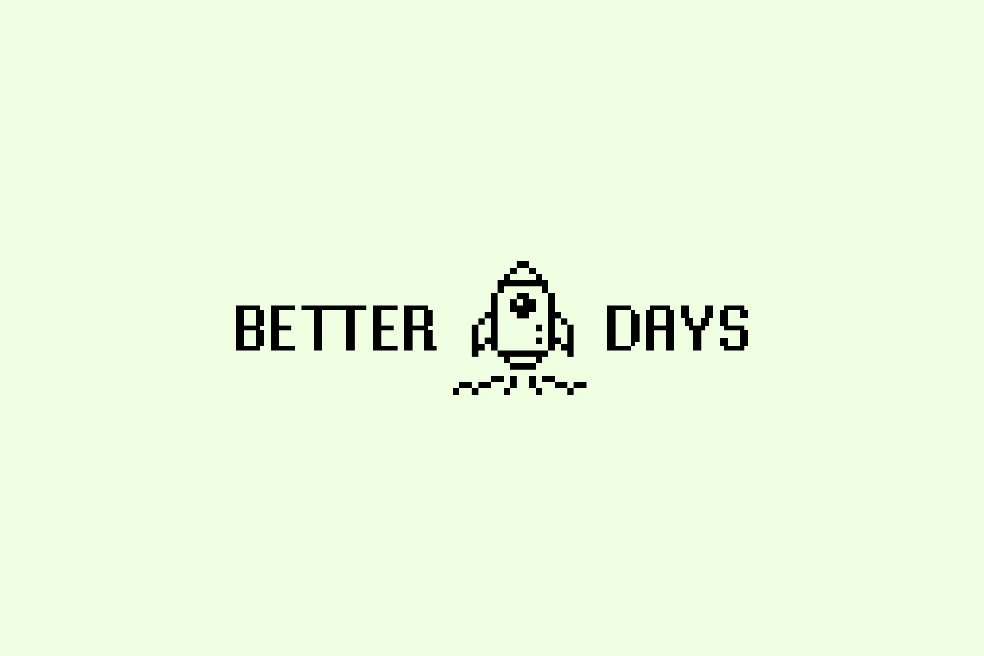
This icon, which also acts as a mark, is the most basic brand element. But it could also be replicated on other pieces such as business cards or social media posts to increase memorability and create a cohesive visual language.
Although the previous logo example had a very classic structure, icons can also be used to create more fun and original compositions that can later be recycled as complementary graphics for the rest of the identity.
The way we present the icons in a logo can condition the rest of the brand. For example, the logo above uses icons not only as a visual or decorative element, but also as a compositional tool that affects the typeface. This could be a reusable gesture in other pieces such as websites, motion graphics or business cards.

Overall, icons have always served as the immediate recognizable element for a brand, but this classic use is shifting towards flexible identities and visual systems where not only this mark is fundamental, but also using consistent icon systems that ensures the creation of a harmonized visual language.
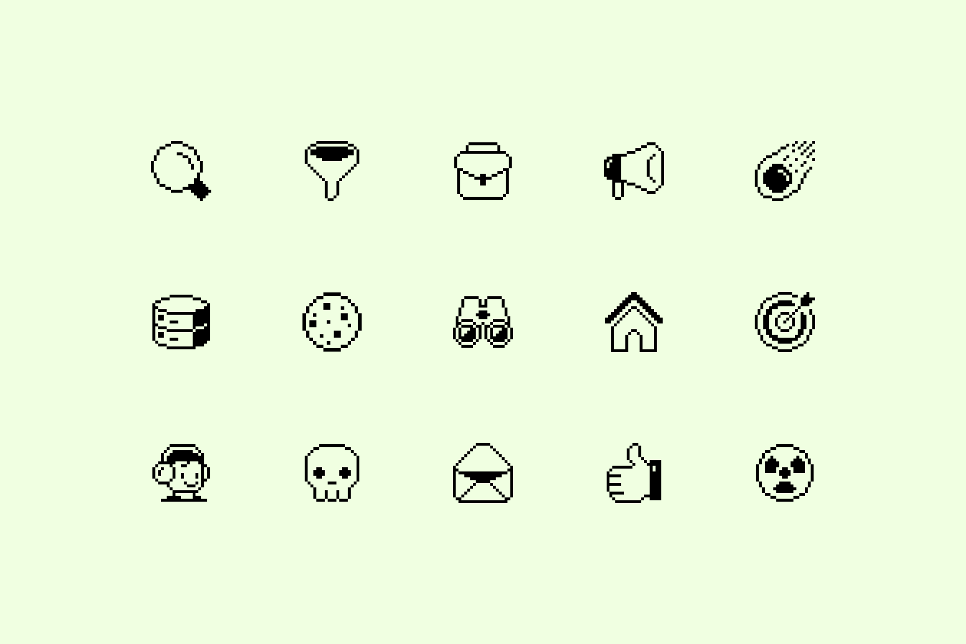

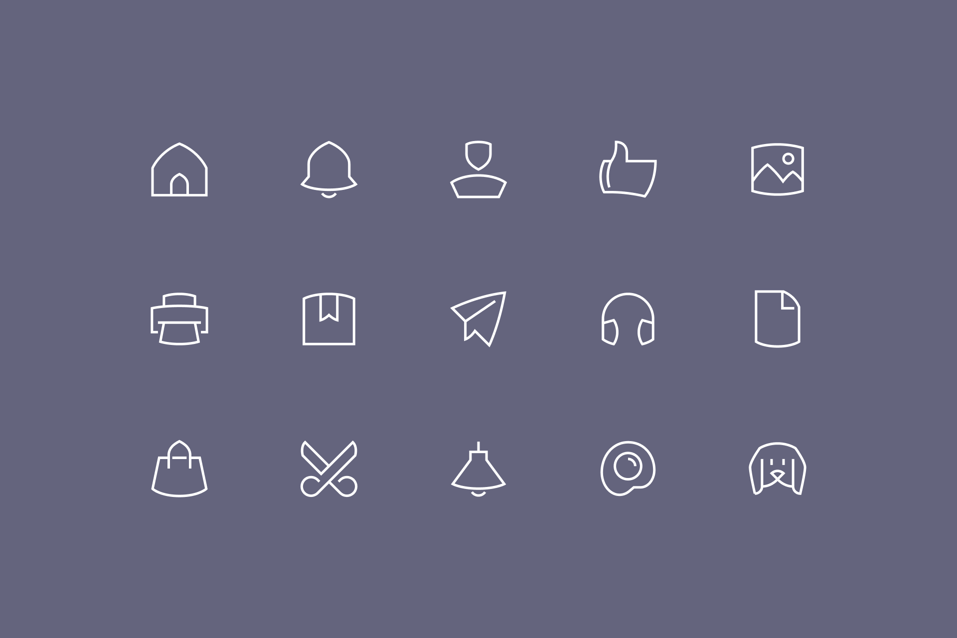
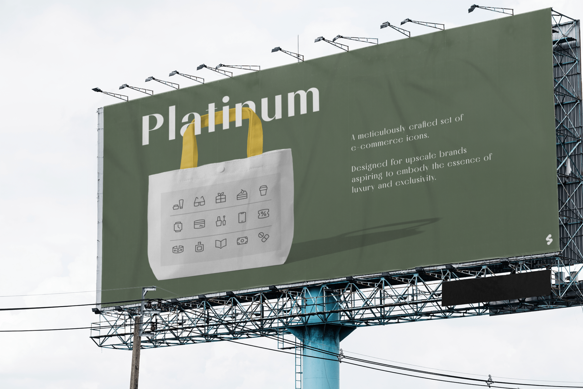
Modern graphic design is based on visual systems, where brands and icons are part of the same language, like these brands and their iconography: Pixel and Platinum
Packaging
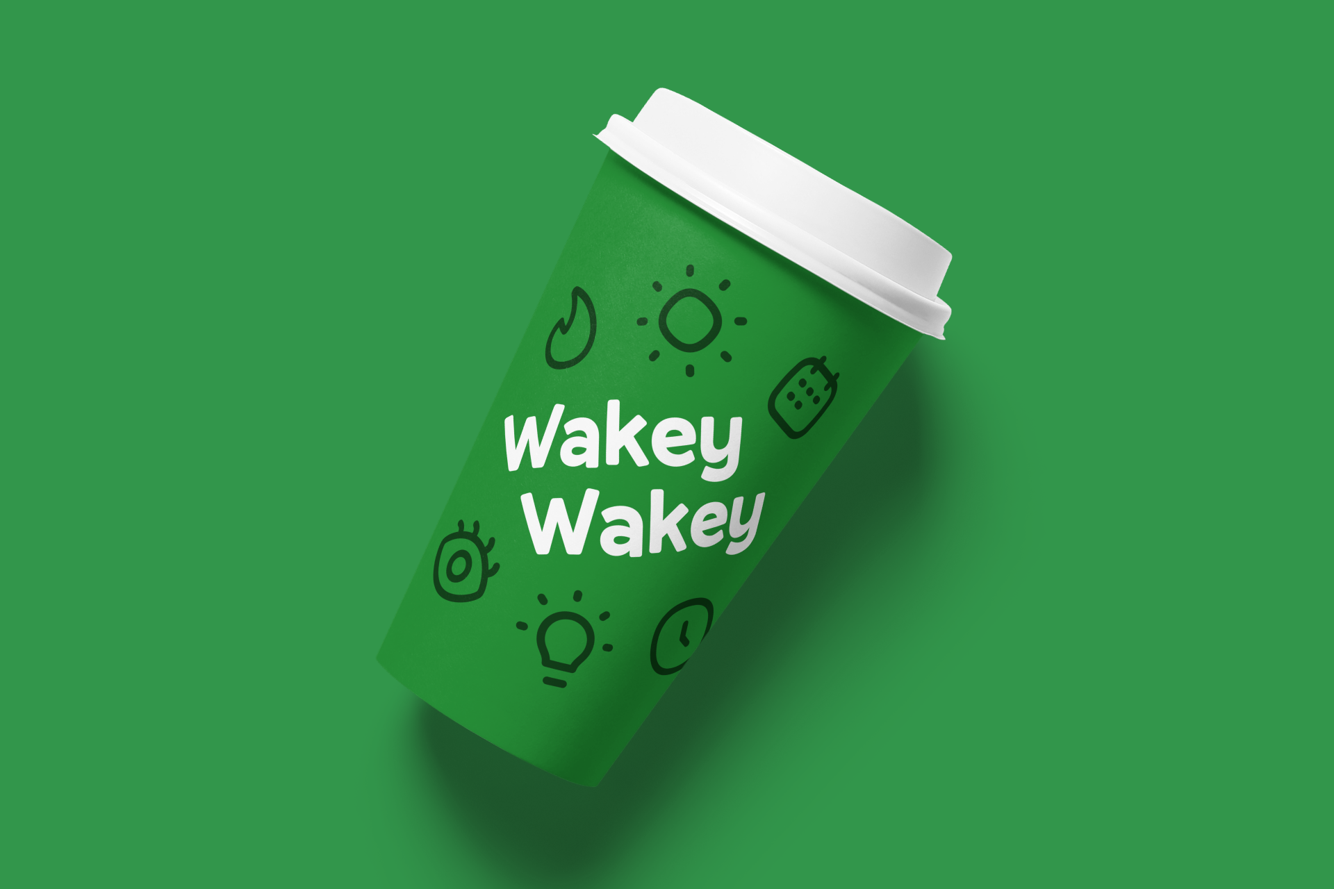
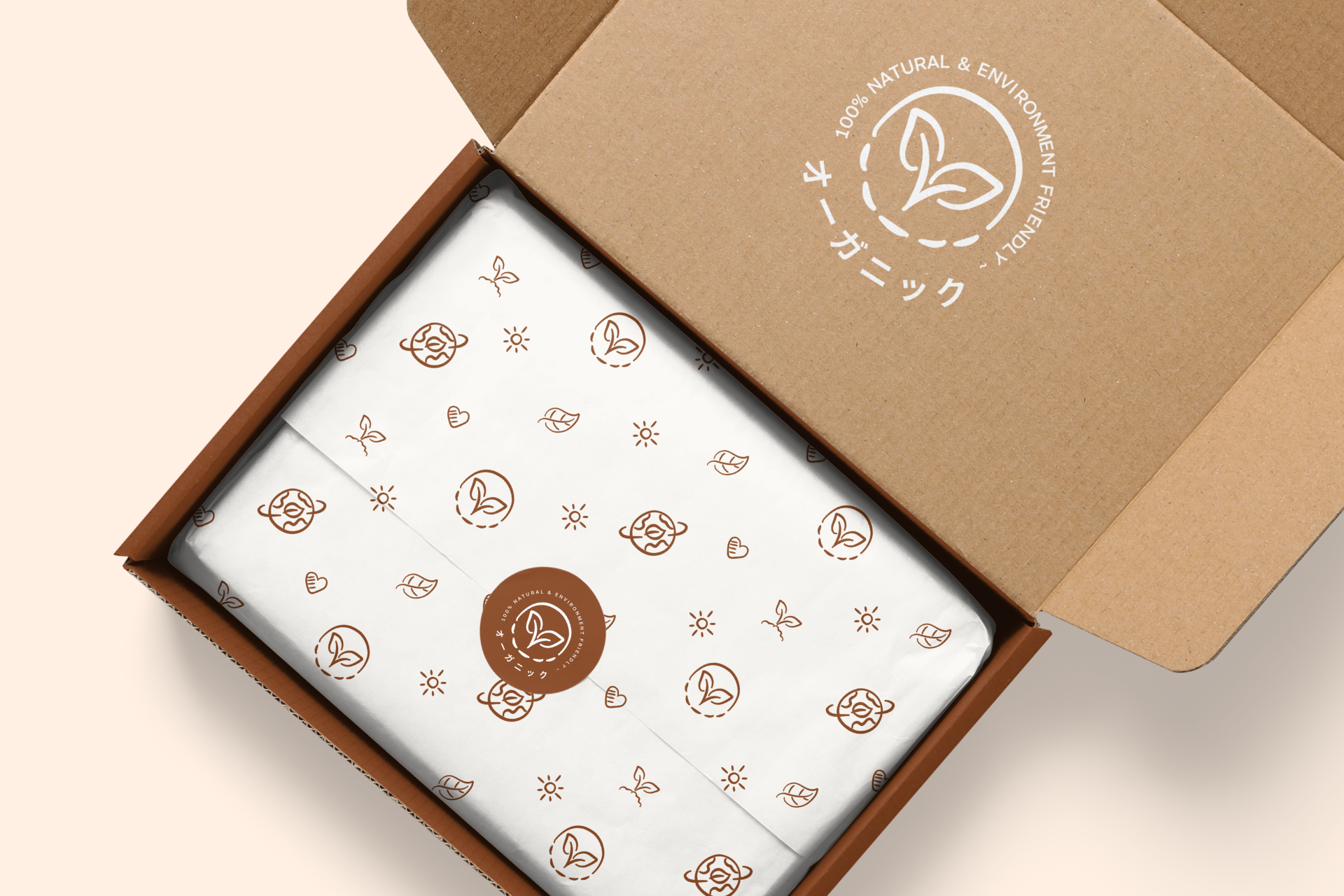
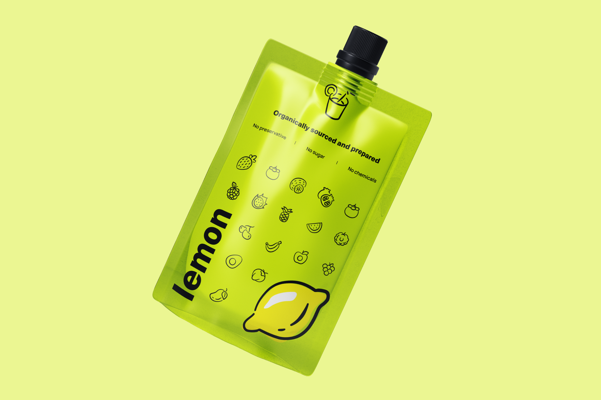
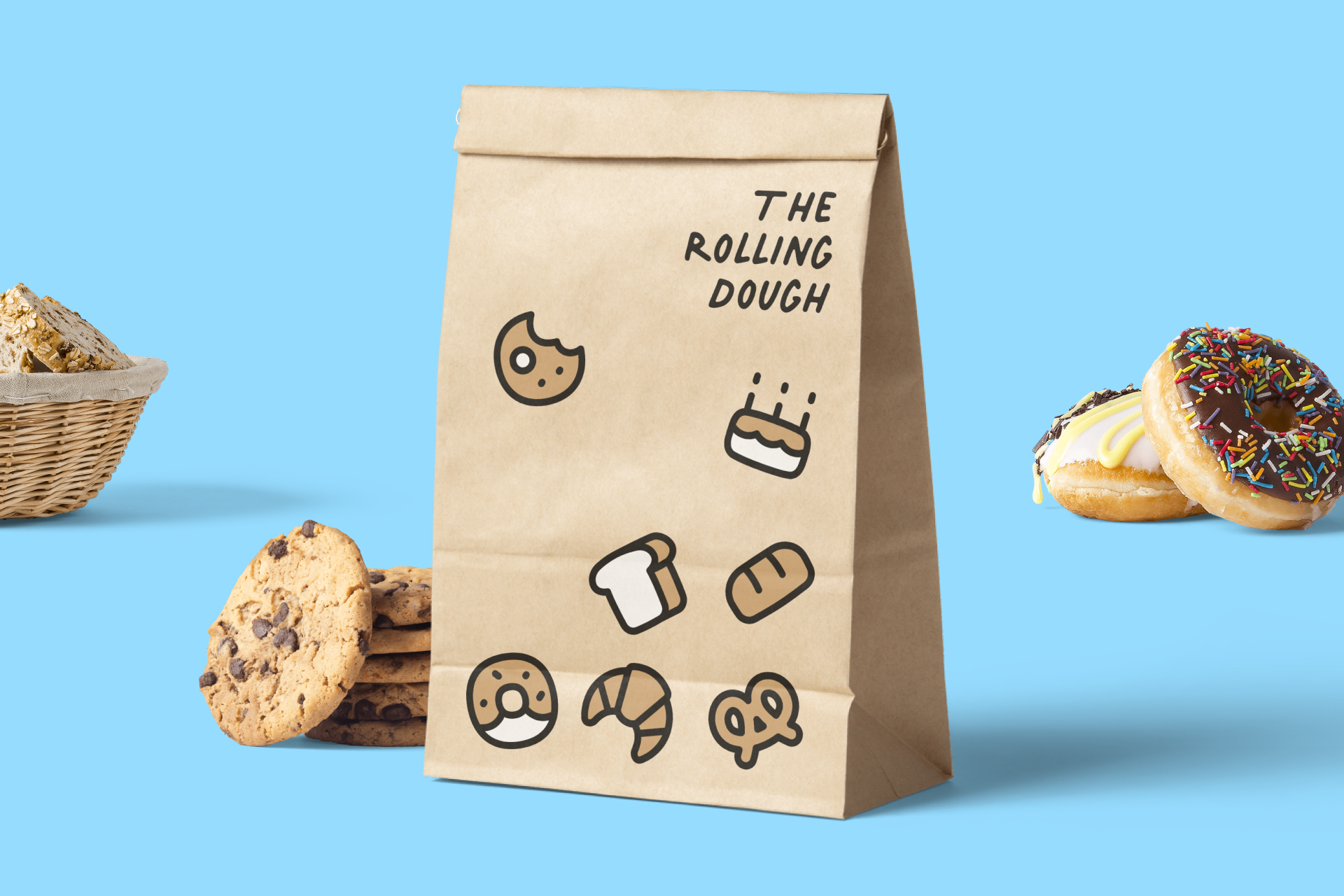
Packaging is all about grabbing the consumer's attention and communicating essential information. Icons are invaluable in this context, helping to transmit messages quickly or simply enhancing the visual appeal of the product, breaking up text-heavy sections or making the design more attractive.

Regardless of the more noble and functional use that icons can have in the packaging field (such as shipping boxes or medicines), they can also be used for purely decorative purposes that are directly related to the brand's tone.
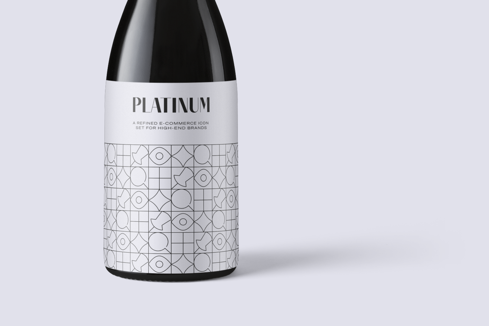
Icons can also be part of the main design even if they require more work from us. As in the following wine label, where a series of icons create a graphic pattern that conveys the image of elegance and sophistication desired by the brand.
Packaging design is a wide and varied enough field where the use of icons has a place in many different ways, from indicating the content of a product to taking the brand image to whole new levels in visual terms.

From indicating a product's content to boosting a brand's image, icons like Freehand, Flex or Plump can be the ideal solution for a packaging project
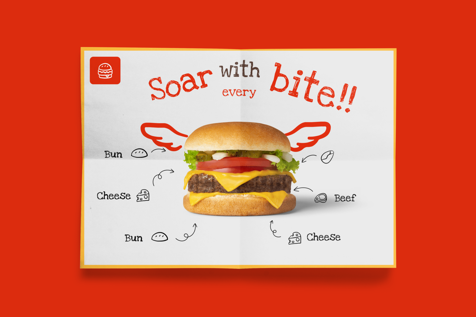
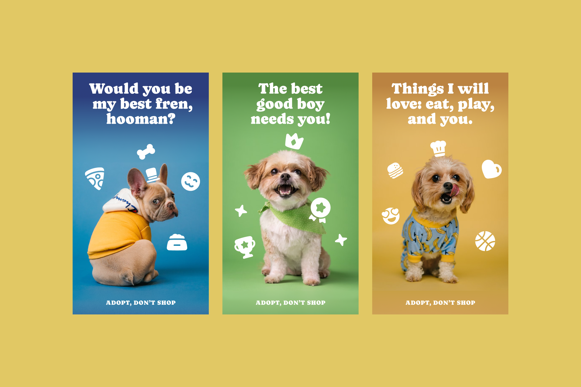
Advertising
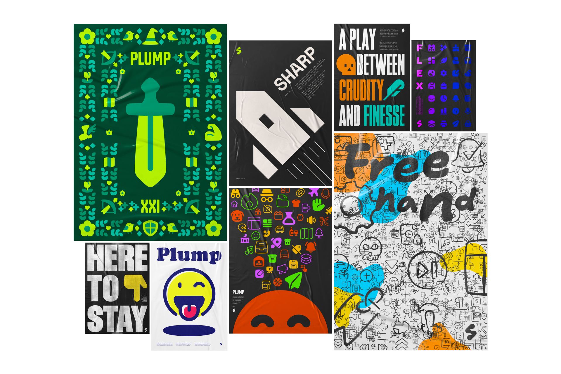
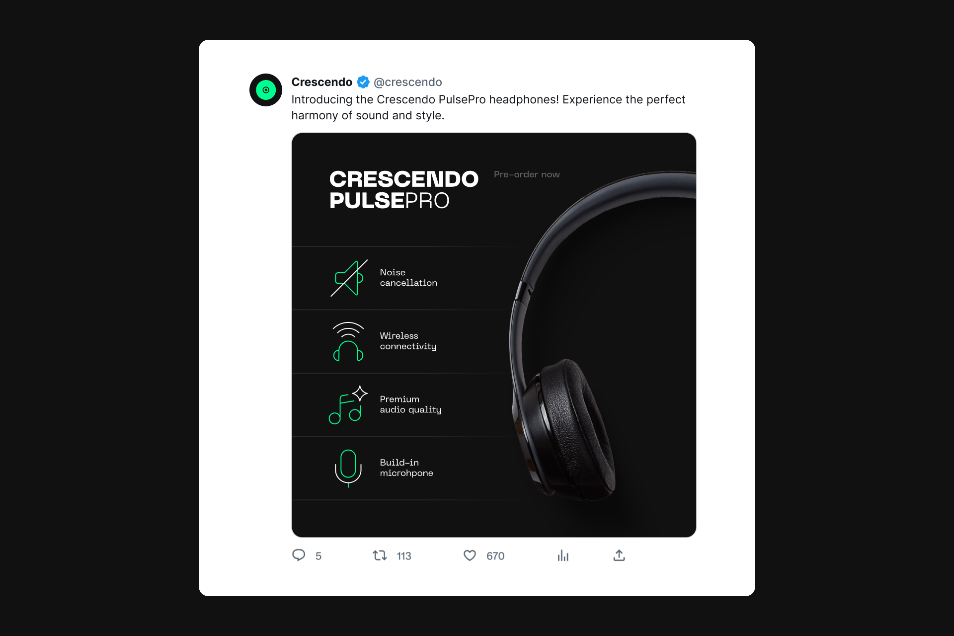
In advertising, the goal is to communicate an effective message in a short space of time, and icons are powerful elements that help achieve this purpose. Whether used in print ads, flyers or posters, icons help simplify complex concepts, reinforce brand messages and create memorable images that resonate with an audience.
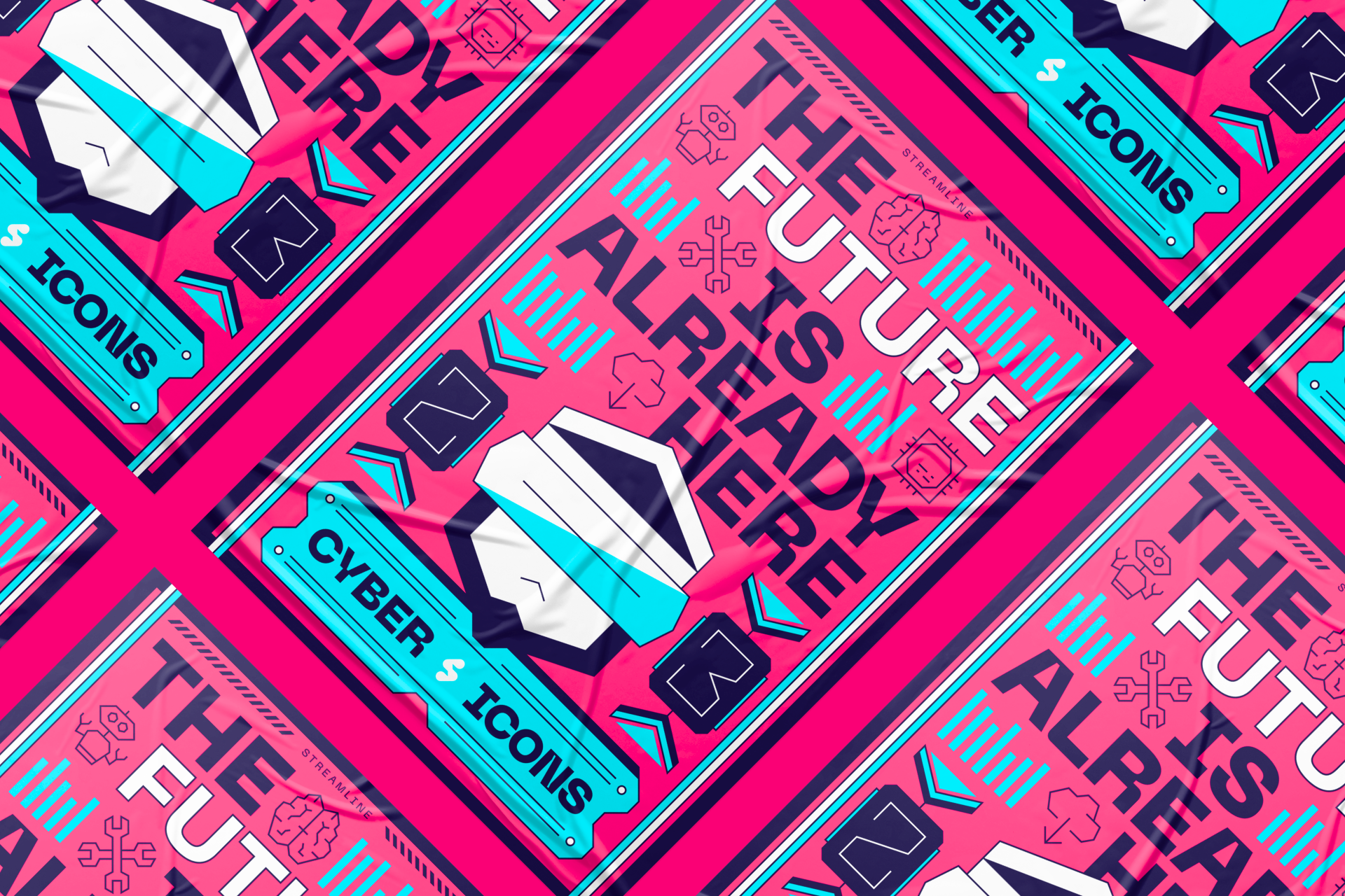
Poster design is one of the most experimental fields in the creative world, but even here icons can have their own place. Obviously, they fulfill a much more illustrative purpose than the one they fulfill in UI or signage. Here, expressiveness is prioritized to create striking images.
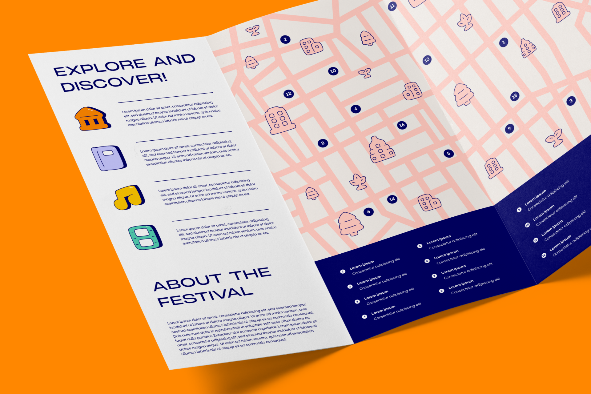
But icons are still icons, and in items like flyers or brochures they can recover that functionality for which they're usually known to help users digest the information more easily while helping brand recognition.
And the good thing is that icons don't understand size when it comes to advertising. The possibilities offered by formats such as billboards and outdoor ads only increase the creative possibilities and the ways we can use icons to communicate ideas.
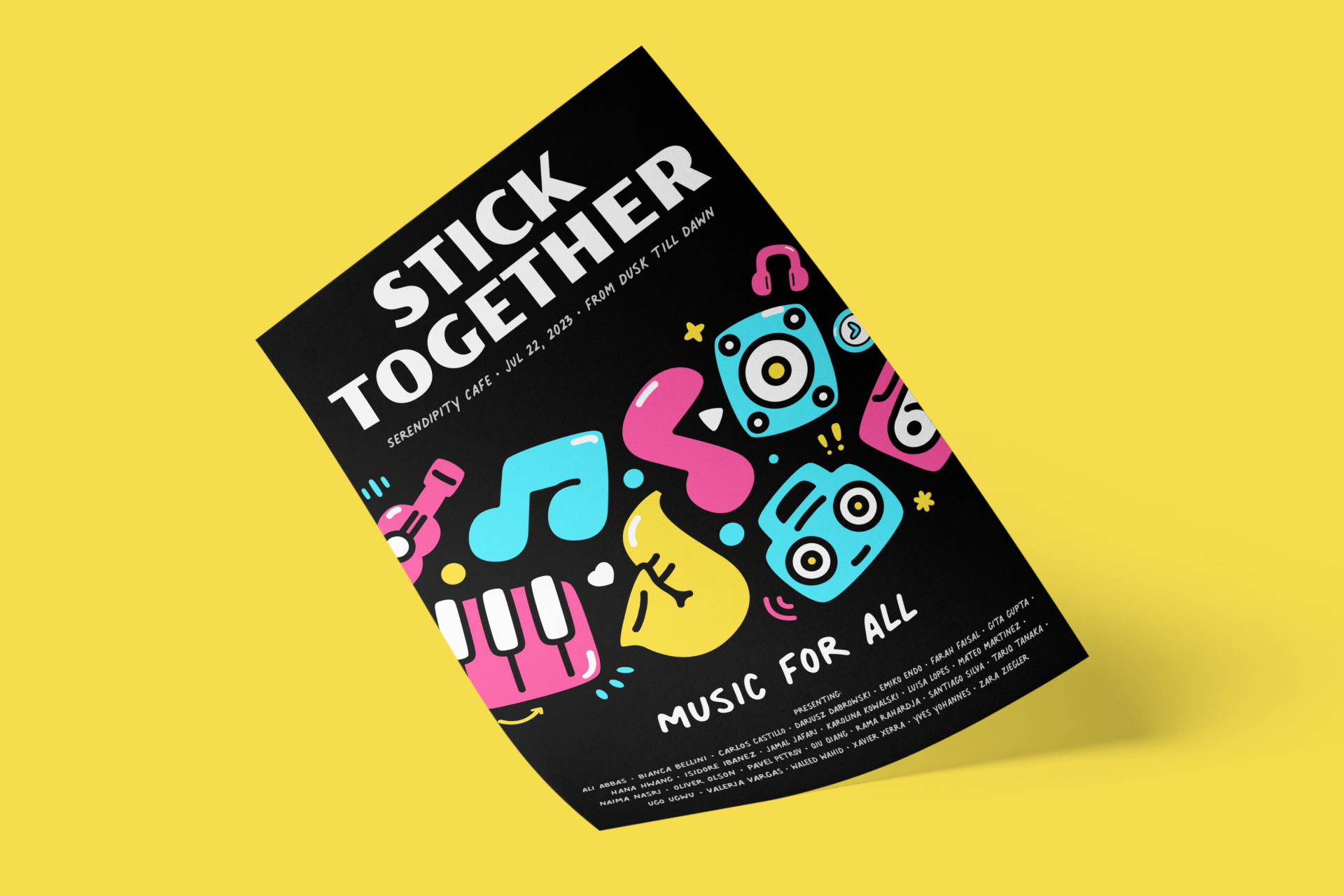

Icons with personality and a higher level of detail such as Plump, Stickies or Freehand are perfect options for advertising projects
Editorial
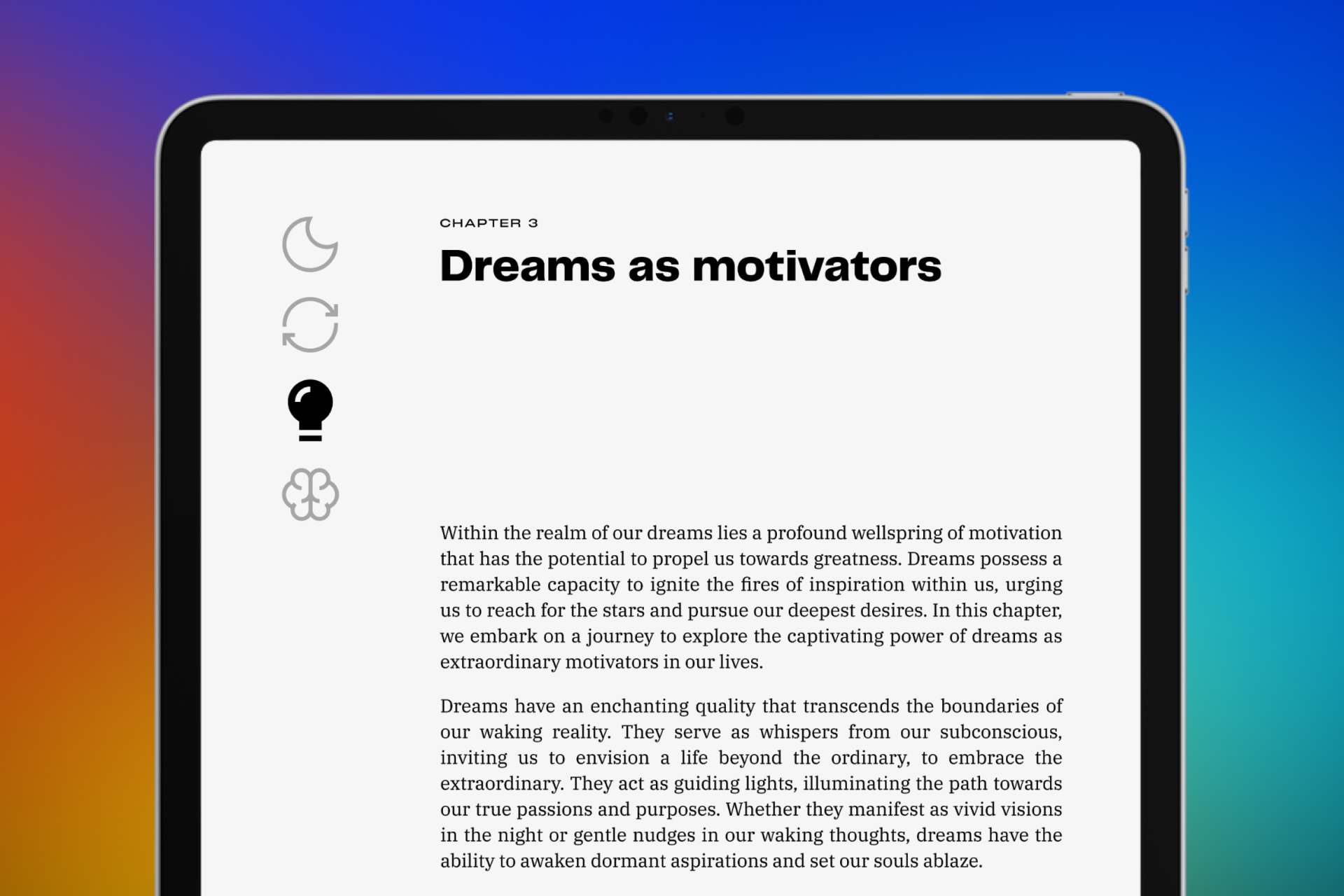
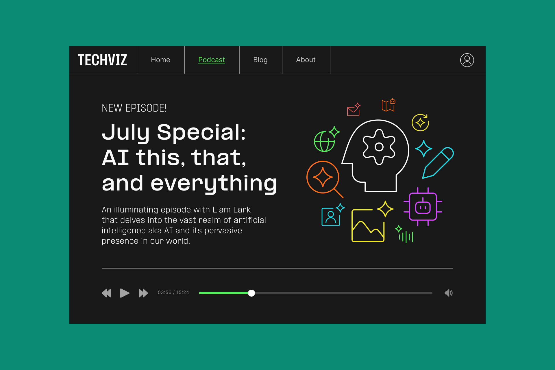
Editorial design is the layout and presentation of content in magazines, newspapers or books, where icons are used to enhance legibility. They're often used to navigate, indicate sections or topics, highlight key points or add visual interest to articles, making information more accessible and engaging.
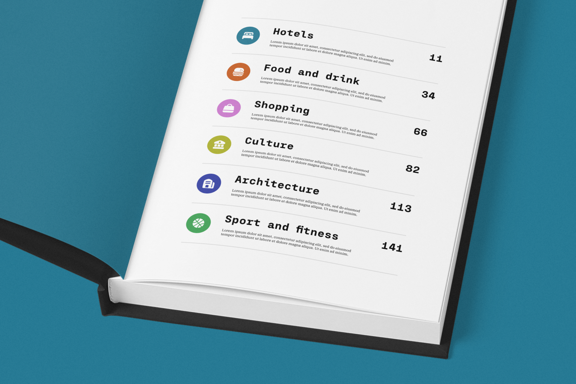
A common use of icons in the editorial world is to indicate the different sections that constitute the content, allowing the users to navigate easily and letting them know at a quick glance which section they're in. In the end, this use isn't very different from the one signage icons fulfills.
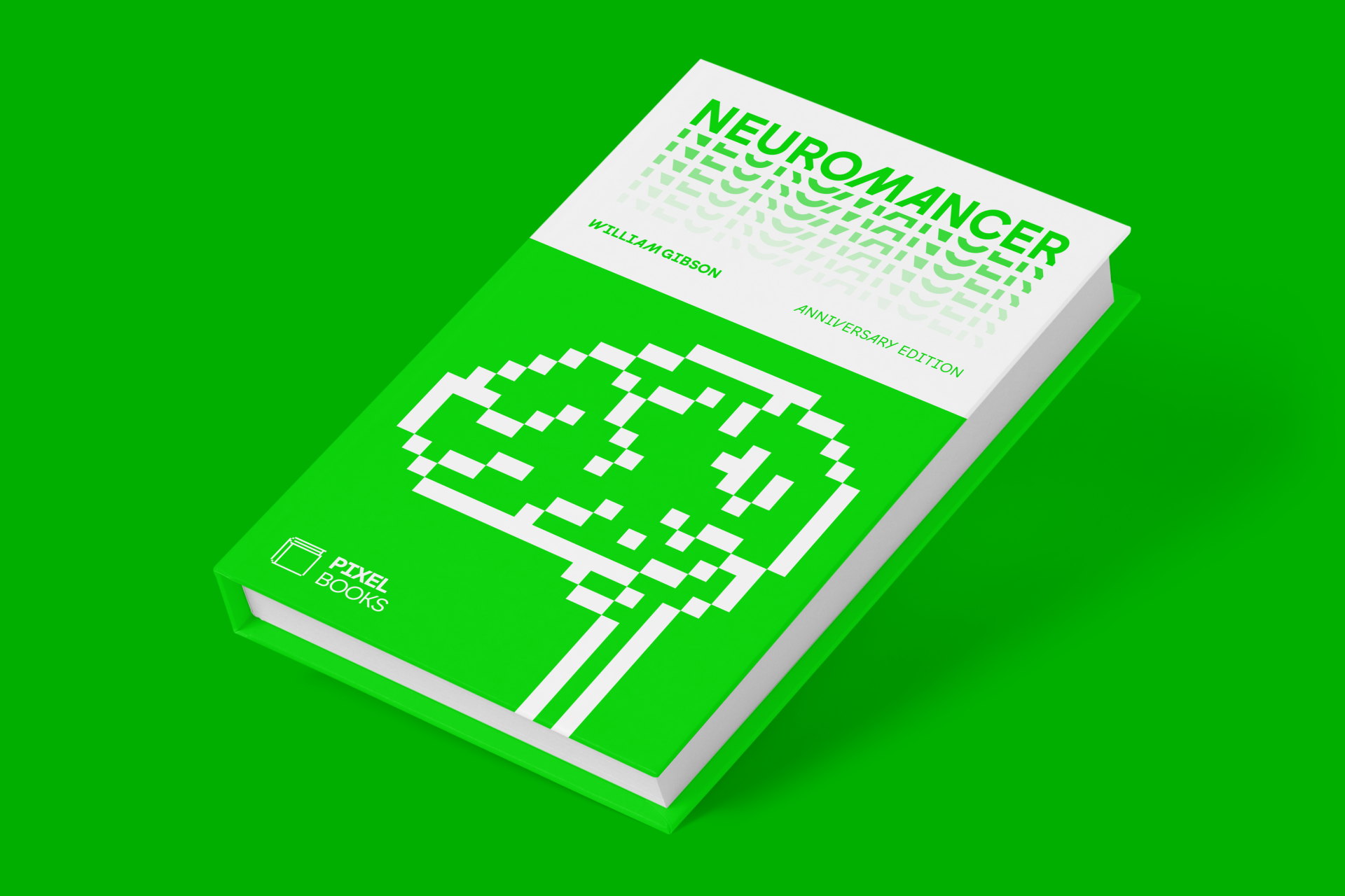
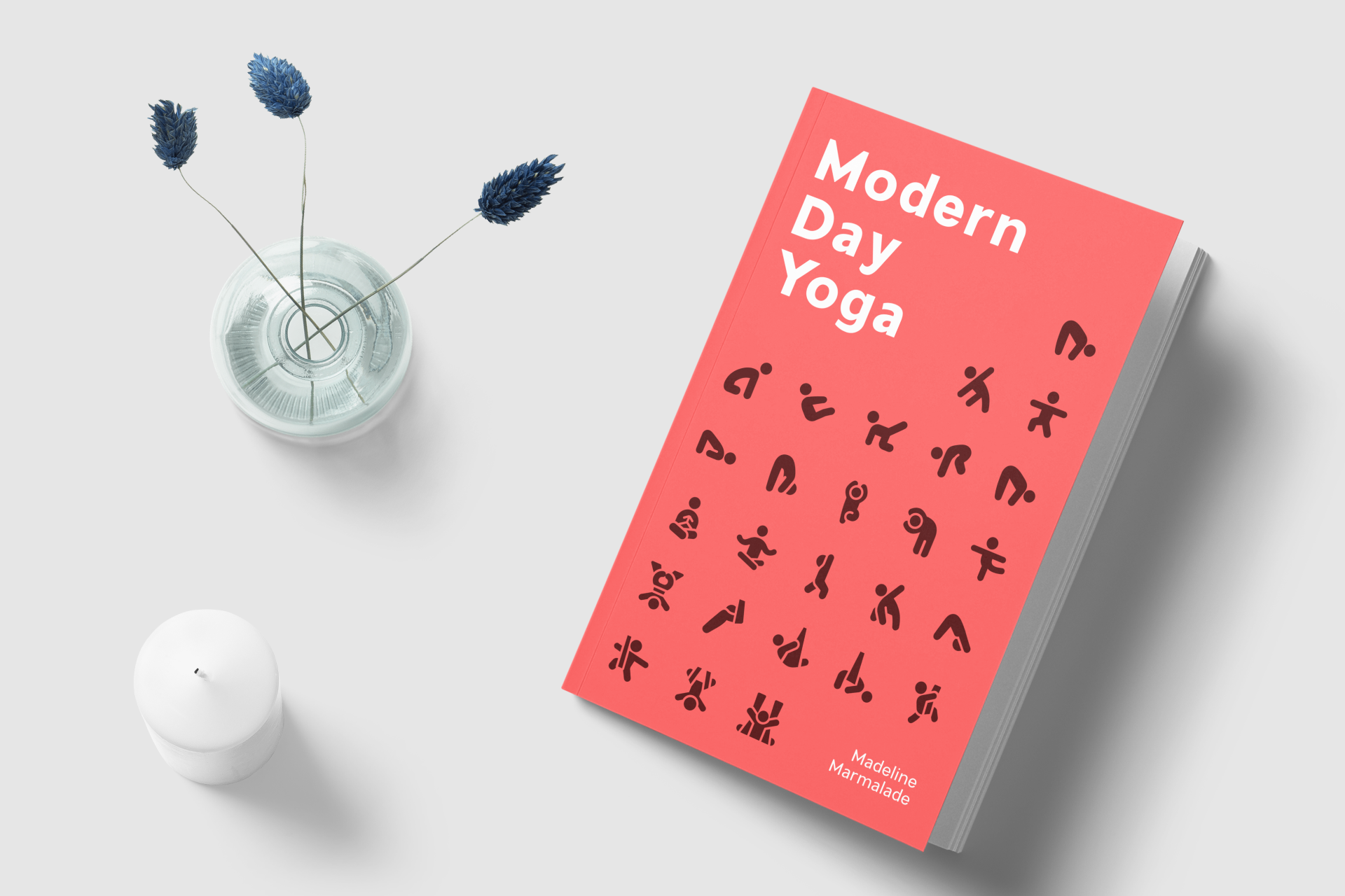
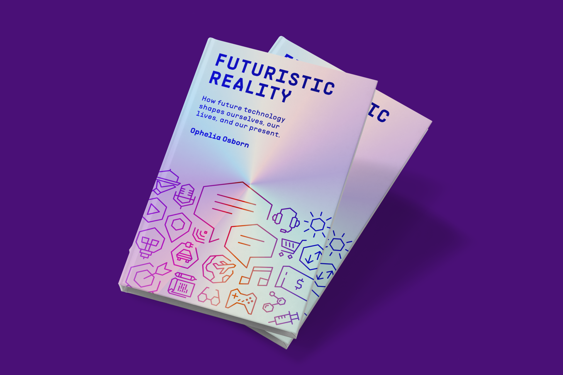
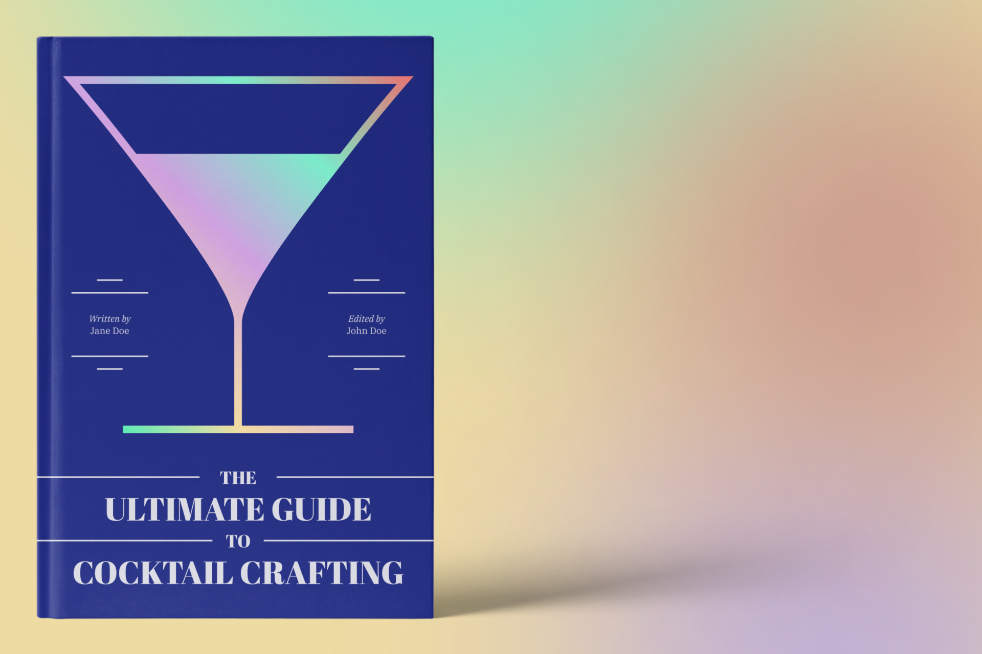
A more illustrative use of icons in editorial can be seen in book covers. Here, the icons should be directly related both formally and conceptually to the book's theme in order to support the rest of the design and create a cohesive whole.
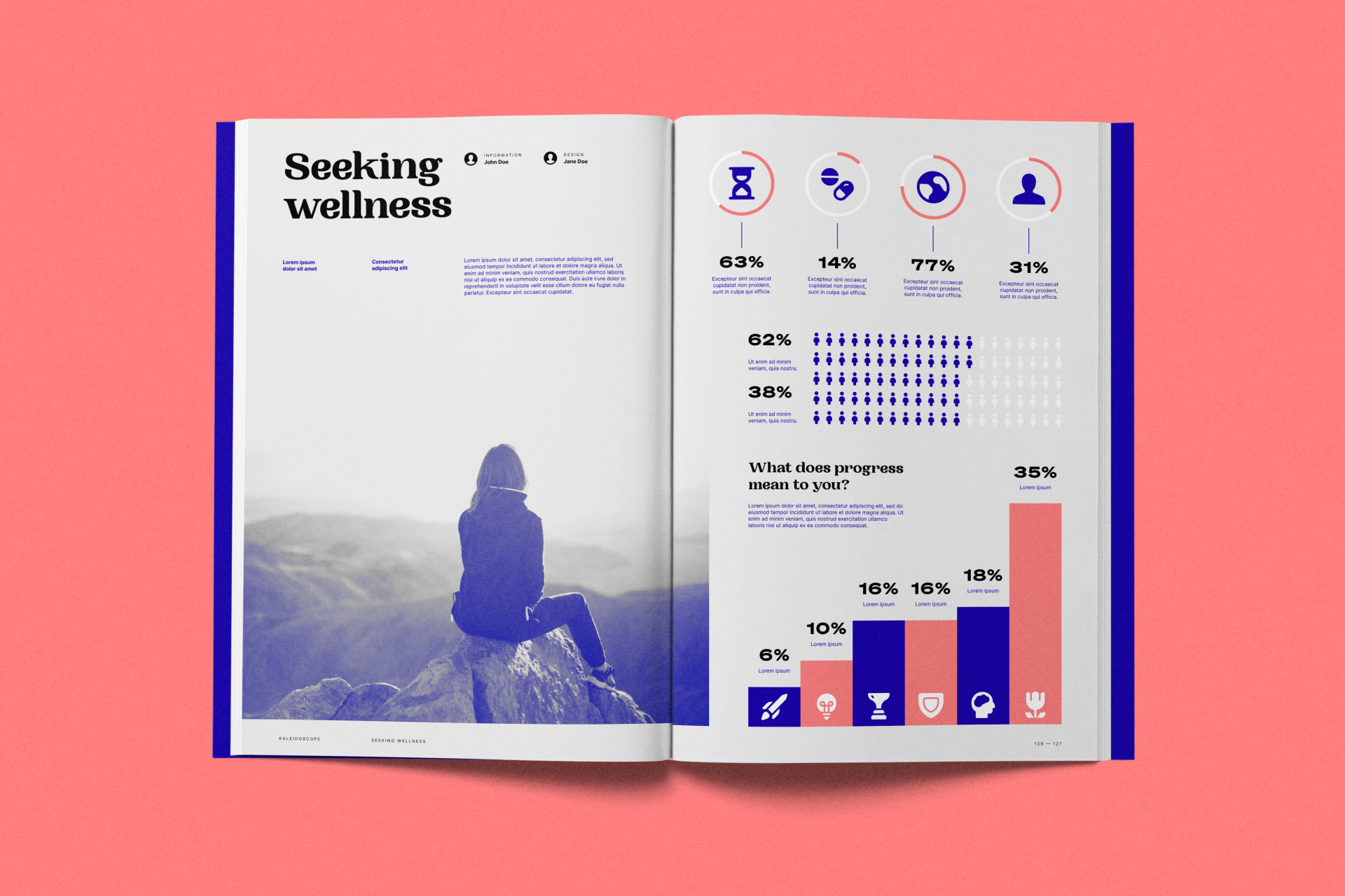
However, when we move from books to magazines or newspapers, the possibilities multiply. Icons can be used in this medium for different purposes including data visualization, which allows the user to understand complex data in a simple way.
Any editorial project could benefit from the use of icons such as Ultimate, Sharp, Cyber or Platinum
Content creation
Content creation encompasses a wide range of media, including social media posts, blog articles and videos. The use of icons is even more flexible here, helping to communicate ideas quickly and attract attention in an increasingly crowded digital world while helping to reinforce a brand's identity.
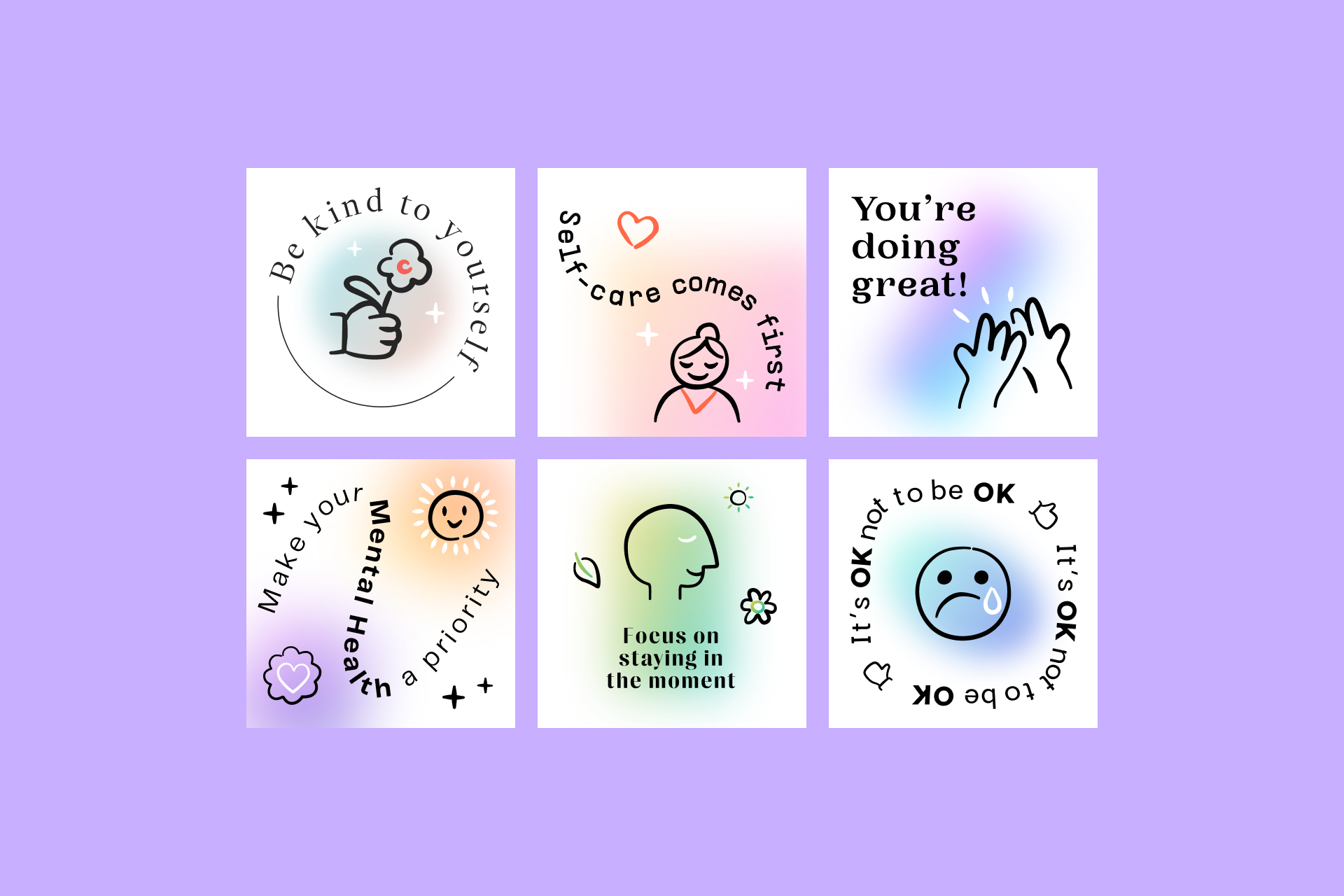
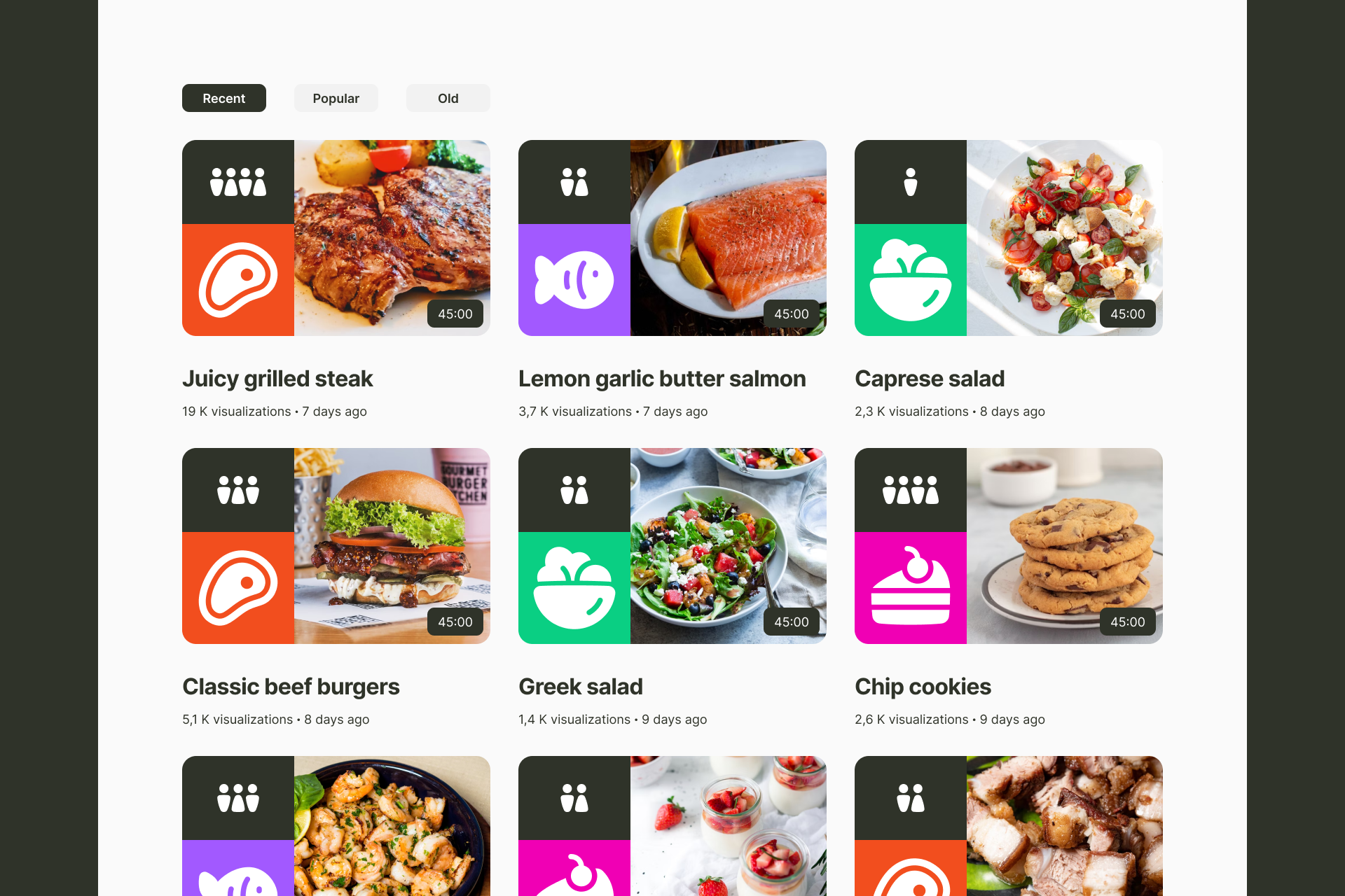
The most frequent in this field is the creation of posts for social media, whether they're Instagram carousels, Twitter posts or Facebook publications. In this case, it's essential to have a large and consistent icon system to make these publications appear dynamic and non-repetitive, forming part of the message and helping to communicate the brand voice in a clear and coherent way.
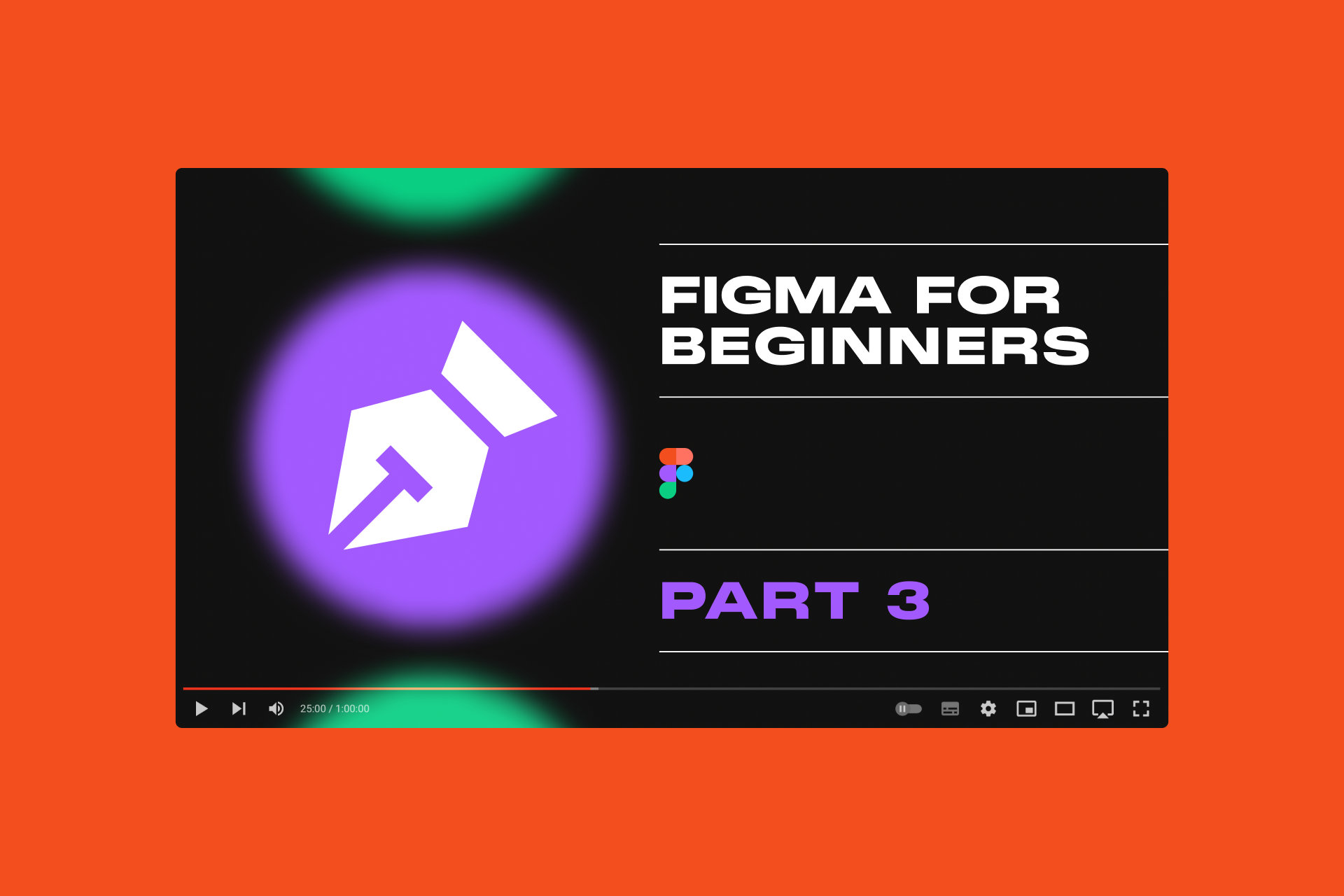
The creation of audiovisual content is also a good space for the use of icons. Not only for video thumbnails (which can help in the hierarchy and organization of the content), but also for the videos themselves, helping to separate sections or as strictly decorative elements.
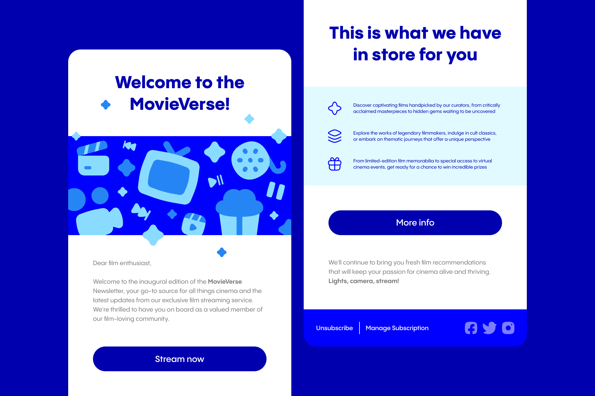
Icons can once again play a dual role (functional and illustrative) in newsletters, where they can be used as purely visual elements that help reinforce the brand's image as well as explanatory cues that indicate the features of a product.
Whether you want to create social media posts, visuals for your podcast or video thumbnails, wide and flexible sets like Ultimate or Plump will be your best allies
As we've seen, icons aren't just small directional elements, they can be a much more creative and substantial part of a graphic design project.
So one options is to design your own icons, for which we already wrote an article that gathers everything you need to know to create them in Figma.
The other option is to access an icon library like Streamline, where you'll have instant access to hundreds of free icons in a huge and varied collection of sets.
Streamline Icons
Discover over 180,000 icons, all of them meticulously designed with a consistent style by our team of eight icon designers.