Redefining interfaces: The icon evolution
How icons have adapted to UI transformations and trends, from the first Xerox icons of the 1970s to the modern Apple Spatial icons.
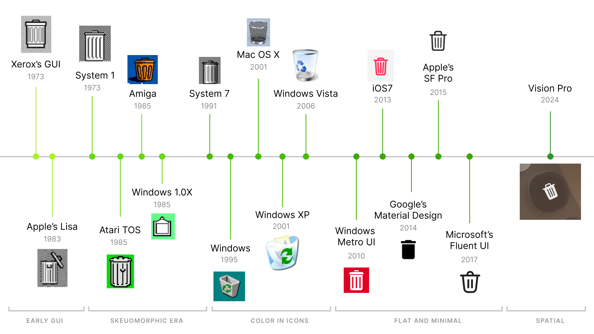
Part 1: Introduction to GUI (early 1970s)
Launch of GUI
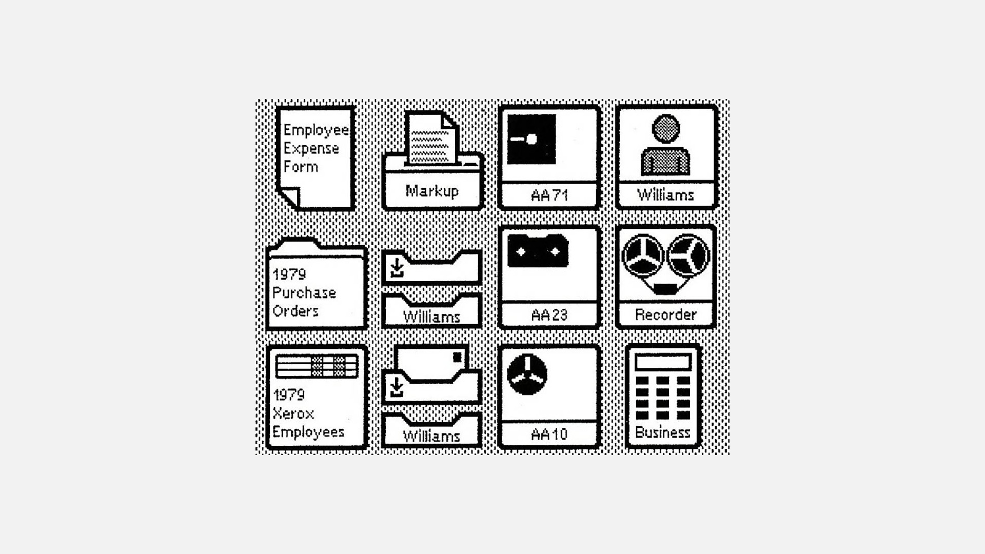
The icon interface originated with Xerox, who introduced GUI. Before GUI, using personal computers was cumbersome, requiring text commands in a command-line interface. However, in the early 1970s, GUIs emerged, led by Xerox PARC's introduction of desktop icons in the Xerox Star system. These early icons, though primitive and pixelated, marked the beginning of a transformative era in user interface design.
Steve Jobs: New kid in the block
Upon the introduction of computer screens, consumers were unenthusiastic about text-based interfaces and command line inputs.
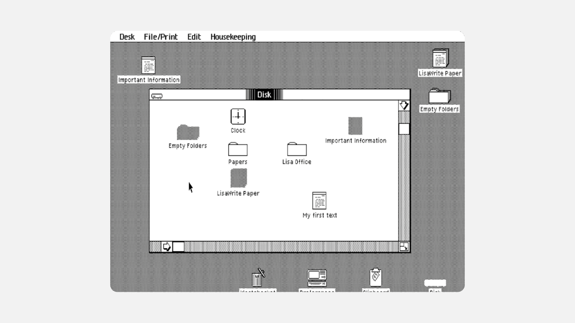
Steve Jobs' visit to Xerox's R&D department in 1979 left him impressed by their basic graphical user-interface. In 1983, Apple launched Lisa, which shared similarities with Xerox's system. Lisa aimed to simplify navigation for new users by incorporating drop-down menus, folder-based directories, and movable "Desk accessories". The icons looked primitive but familar at the same time.
Part 2: The era of Skeuomorphism (1980s - 1990s)
Skeuomorphic icons marked a departure from the flat design trend by incorporating realistic textures and details to mimic real-world objects. This approach aimed to provide users with a sense of familiarity and make digital interactions more intuitive and engaging.
Apple and Susan Kare: The Iconic Duo

In 1984, Apple hired Susan Kare, a graphic artist, to design icons for its first Macintosh. The goal was to enhance user-friendliness and bolster their position in the commercial market.
"I believe that good icons are more akin to road signs rather than illustrations, and ideally should present an idea in a clear, concise, and memorable way. I try to optimize for clarity and simplicity even as palette and resolution options have increased." - Susan Kare
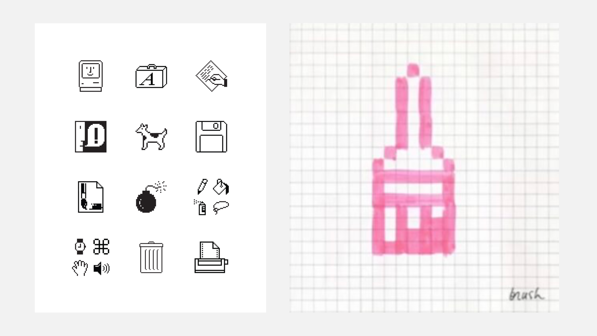
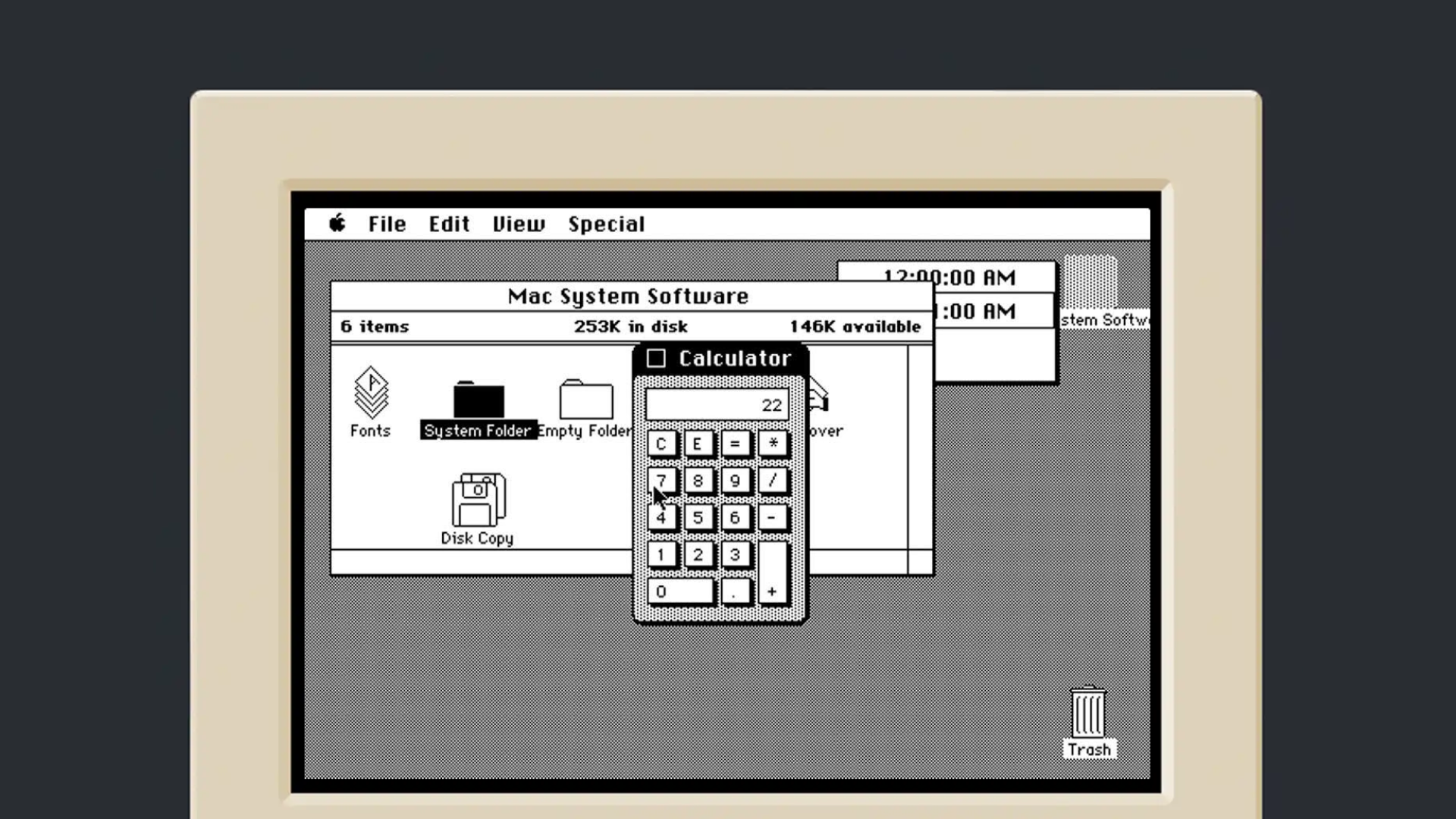
The Macintosh introduced clear metaphors from the physical world, such as the desktop, which remains a fundamental concept today. Icons like the trash can, folders, and printers were easily recognizable. Skeuomorphic design was evident in elements like raised buttons on the calculator, providing a sense of depth. The display was positioned above the buttons for intuitive use.
The lesser known: Atari TOS and Amiga Workbench
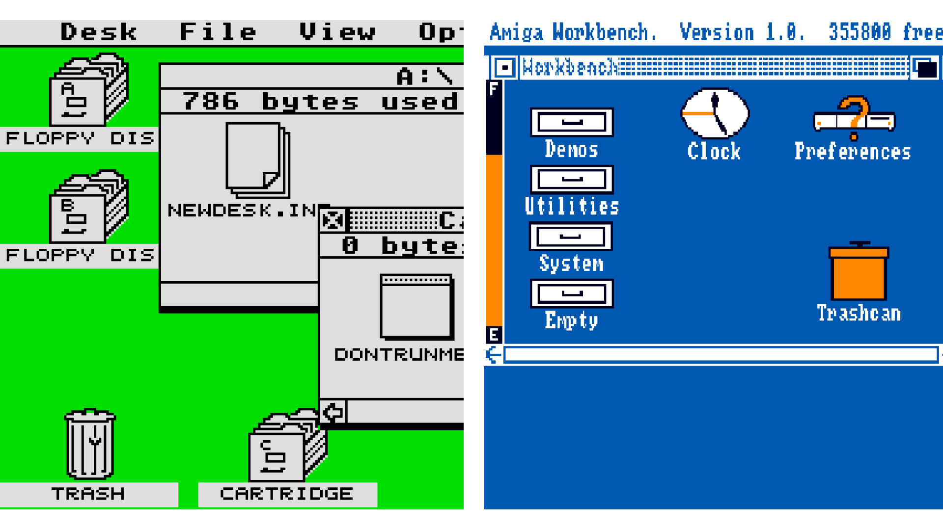
In 1985, both Atari and Amiga were established. The Atari ST introduced TOS, its operating system, featuring a minimal interface with a desktop metaphor, which had become a computer standard. Notably, TOS included isometric disk icons.
Meanwhile, the Amiga Workbench, designed for the Amiga 1000, was ahead of its time despite its crudely designed icons. It offered customizable mouse cursors, four-color graphics, and multi-state icons, breaking from the desktop convention by using a workbench with drawers instead of files.
Microsoft followed the Skeumorphic trend
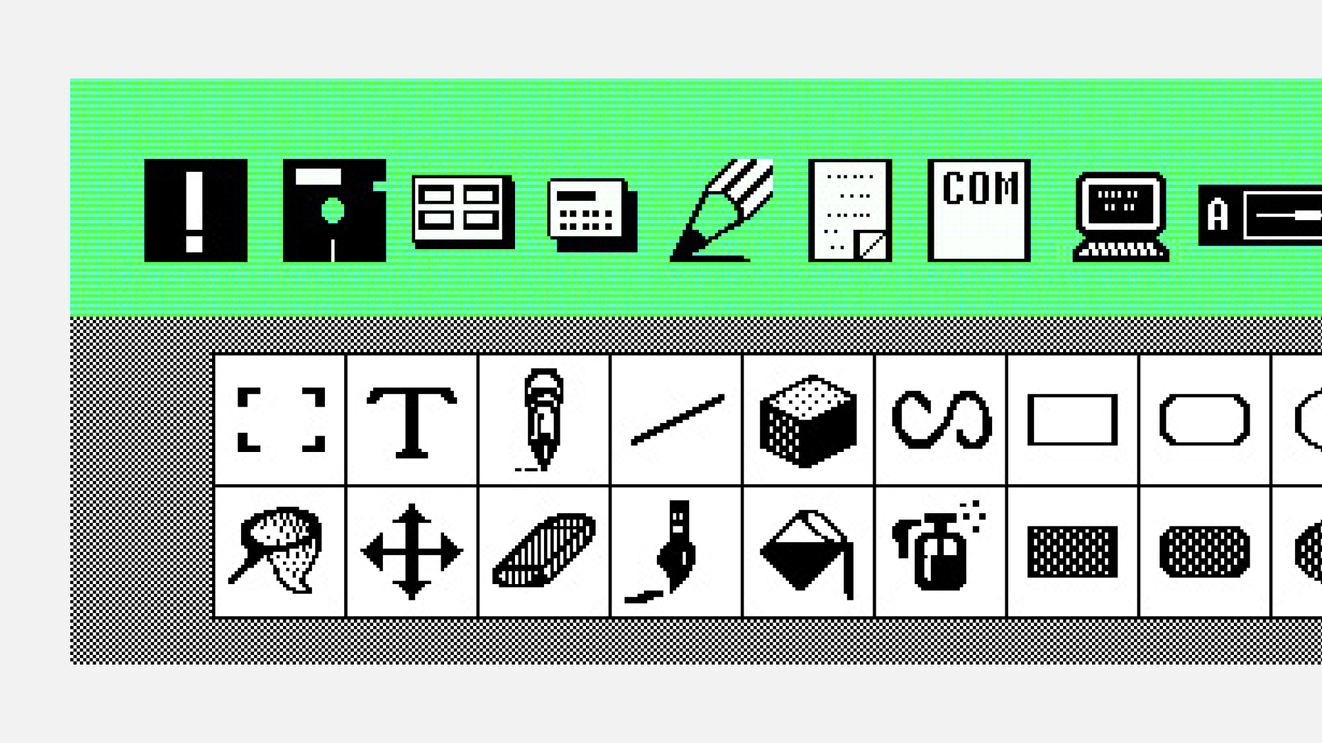
Windows first launched its Windows 1.0x in 1985. The icons closely resembled Xerox's icon style. The icons were pixel style and looked symbolic to real objects.
Part 3: Use of Color in Icons with Technological Advancements (1990s-2000s)
The turn of the millennium witnessed a surge in color and texture within icon design, signaling a new era of visual aesthetics.
Apple adds colors to their interfaces
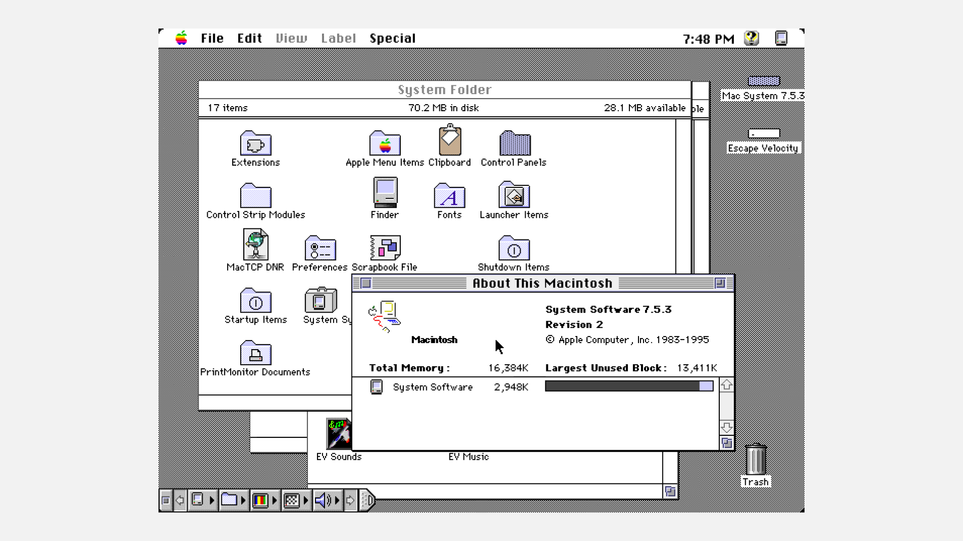
System 7, codenamed "Big Bang," debuted on May 13, 1991.
Notably, it marked the introduction of color to the Mac OS, and its icon images underwent slight changes to appear more dimensional, with a subtle raised effect. This update signified a pivotal moment in Mac's evolution, aligning with the advancements in computer graphics during that era.
Microsoft gets Susan Kare to work her magic
Microsoft enlisted Susan Kare to enhance icon design in Windows 3.0, refining both colors and designs to resemble real objects.
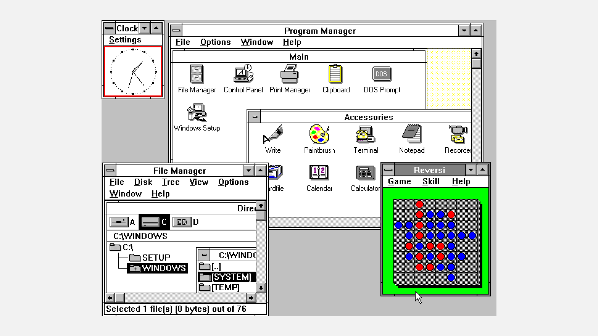
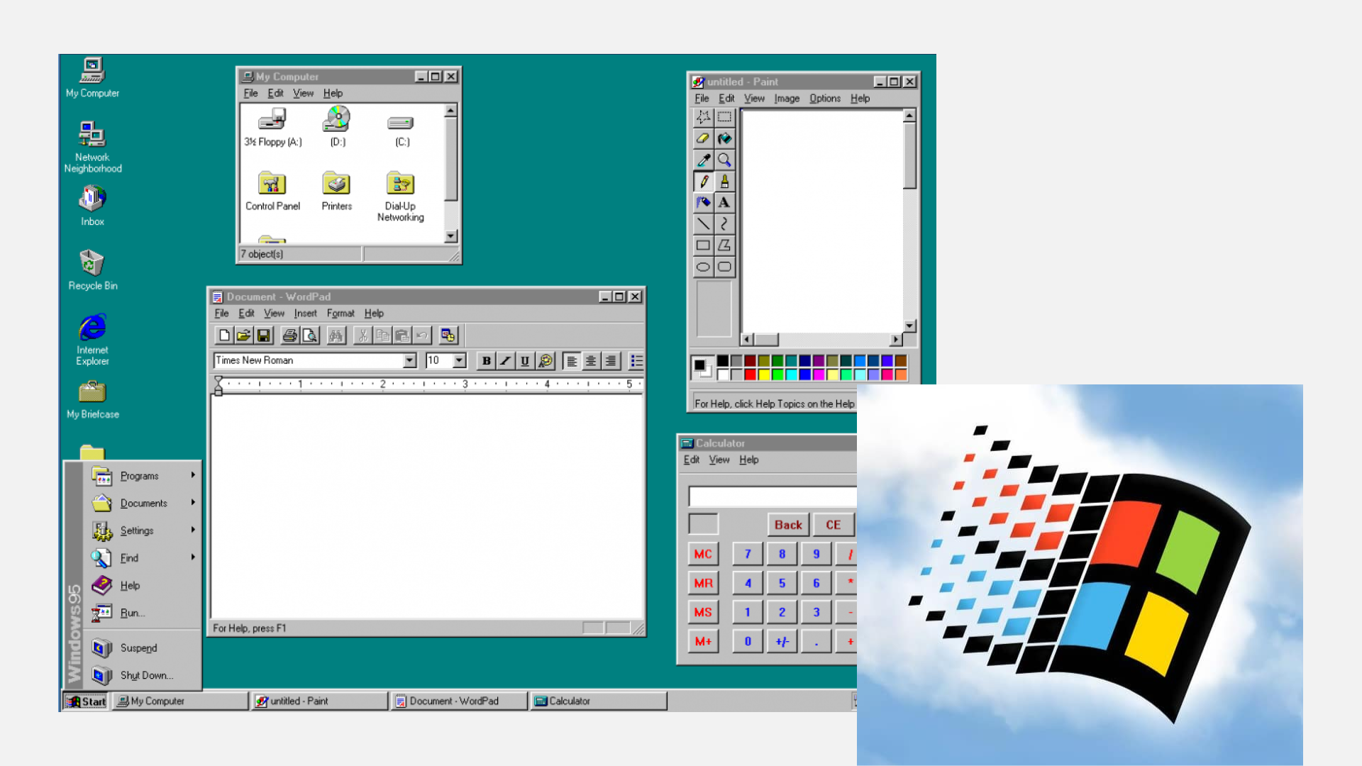
In 1995, Windows 95 introduced a comprehensive design overhaul that included elements still present in modern Windows designs. The debut of the Start button marked a significant feature of Windows 95, accompanied by icons featuring enhanced color and depth.
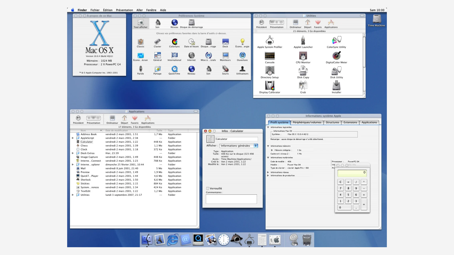
Mac icons started using reflections and textures
Apple introduced its first "Jelly Mac", featuring ultra-shiny and jelly-like finished icons, marking a significant design leap from previous Mac OS versions. Additionally, the introduction of the Dock rendered icons from either a straightforward or slightly elevated viewpoint, showcasing reflections and textures that were highly appealing to users.
Windows came up with its own glassy aesthetic
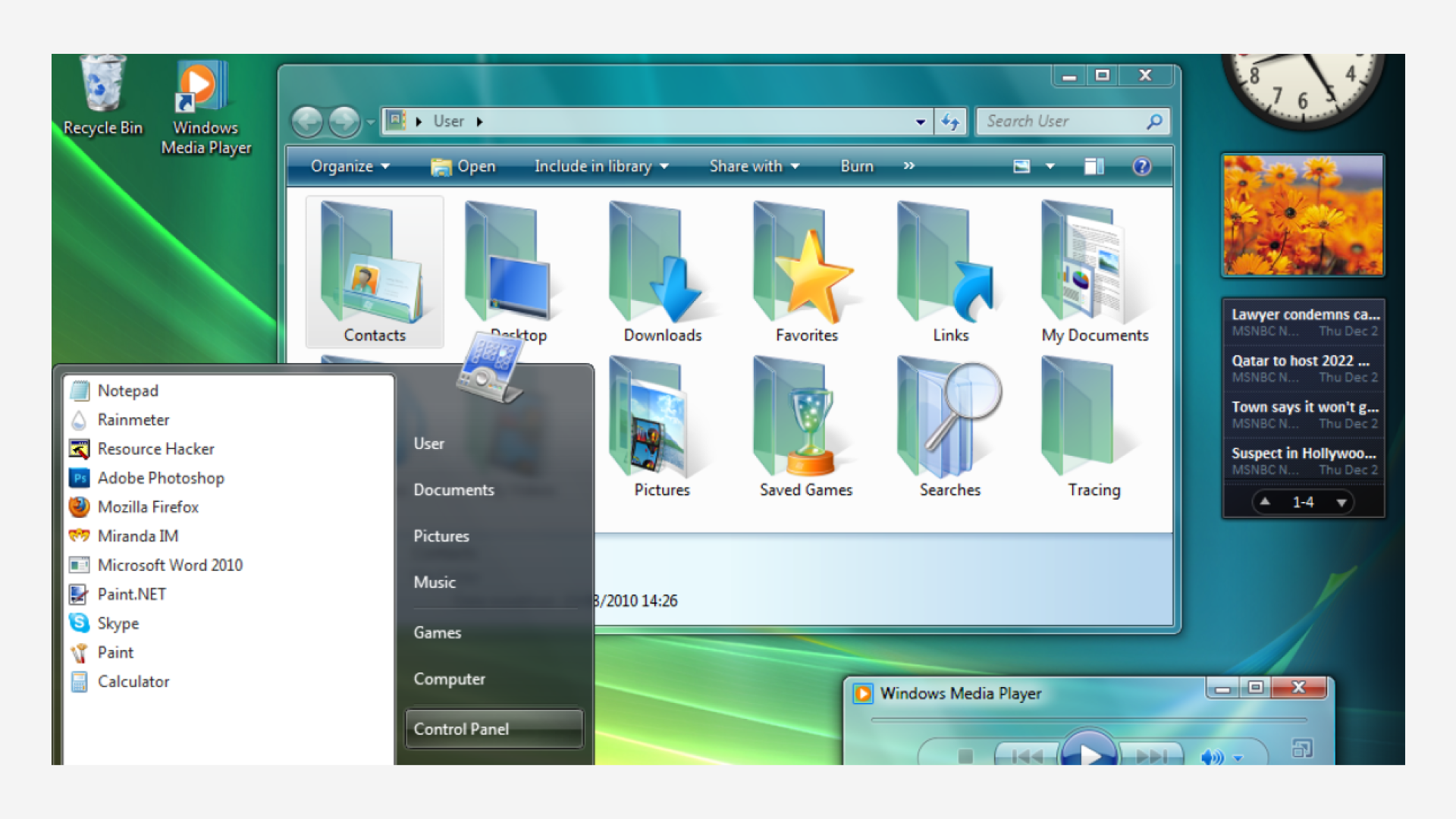
As Windows progressed from XP to Vista and Windows 7, Microsoft sought to enhance their icons with a more reflective style, possibly in response to Mac's advancements.
Vista introduced glossy, three-dimensional icons with vibrant colors and lifelike textures, aiming for a modern and visually attractive appearance. These icons were crafted to convey depth and dimension, aligning with the overall design philosophy of the Aero Glass operating system.
Part 4: Minimal flat interfaces (2010s - Present)
Shadows and reflections were once used to mimic the depth of real-world objects, but minimalism has shifted the trend towards simplicity.
The industry leaders going minimal
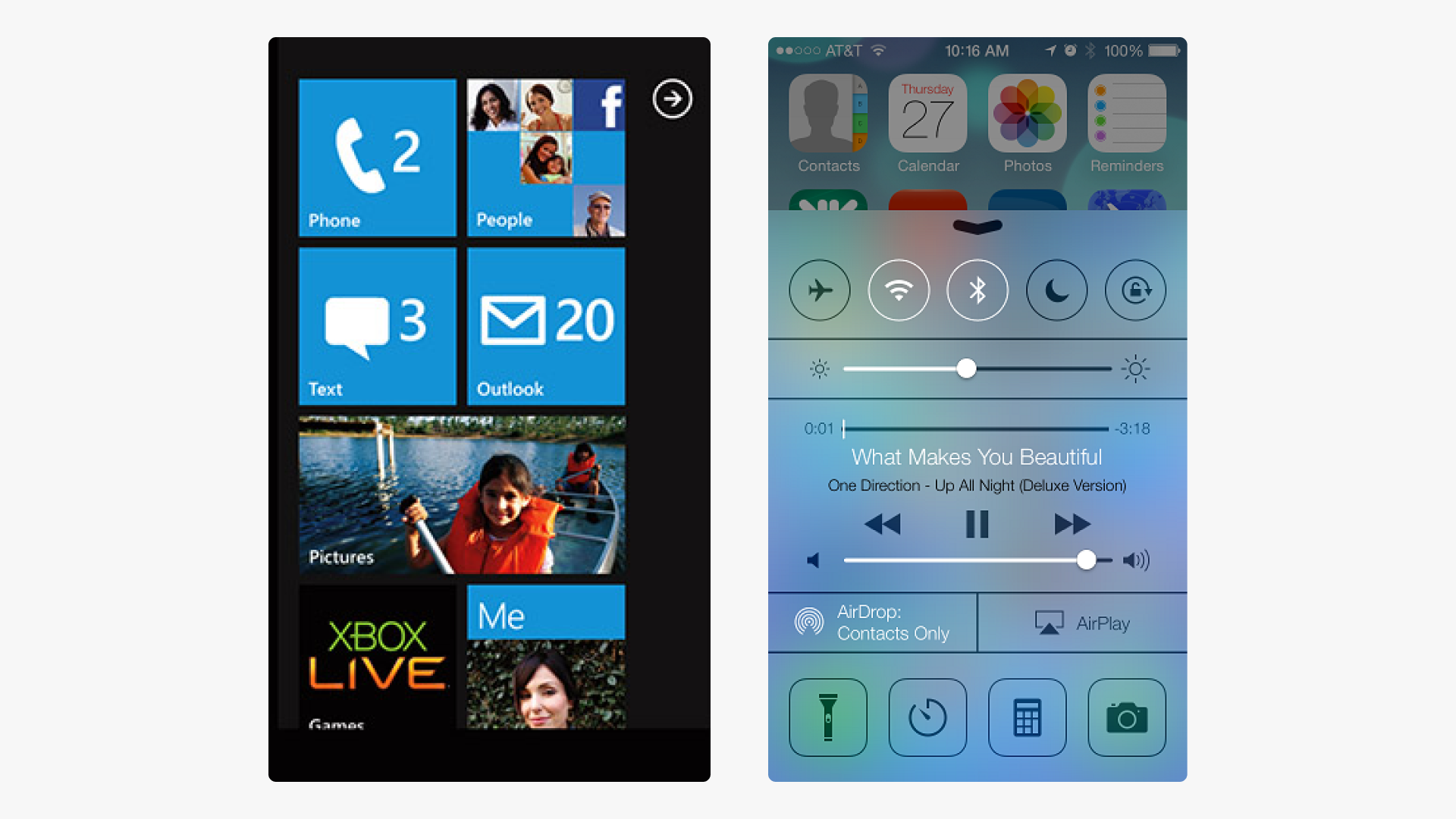
Microsoft shook things up with its "Metro" design language, initially launched in Windows Phone 7 but later renamed "Microsoft Design Language" or "Modern UI." This approach prioritized clean typography, simplified icons, and a user-centric focus on content and functionality. It soon spread to other Microsoft products.
Meanwhile, Apple adopted the flat design bandwagon with iOS 7 in 2013. iOS 7 fully embraced the flat design aesthetic throughout the interface.
Modern interfaces need modern styles
In the ever-changing world of tech, interface designs are getting more diverse, leading to a rise of a wide array of icons tailored to different styles and interface types. But no matter how stylised they get, the basic meaning of icons stays the same over decades.
Nowadays, modern interface icons prioritize simplicity, clarity, and consistency, enhancing usability across various platforms and devices. Plus, thanks to softwares and tech upgrades, interface icons are now created as vectors using design tools by iconographers, or crafted in 3D rendering software, aligning with the expanding capabilities of AR, VR, and gamified interfaces.
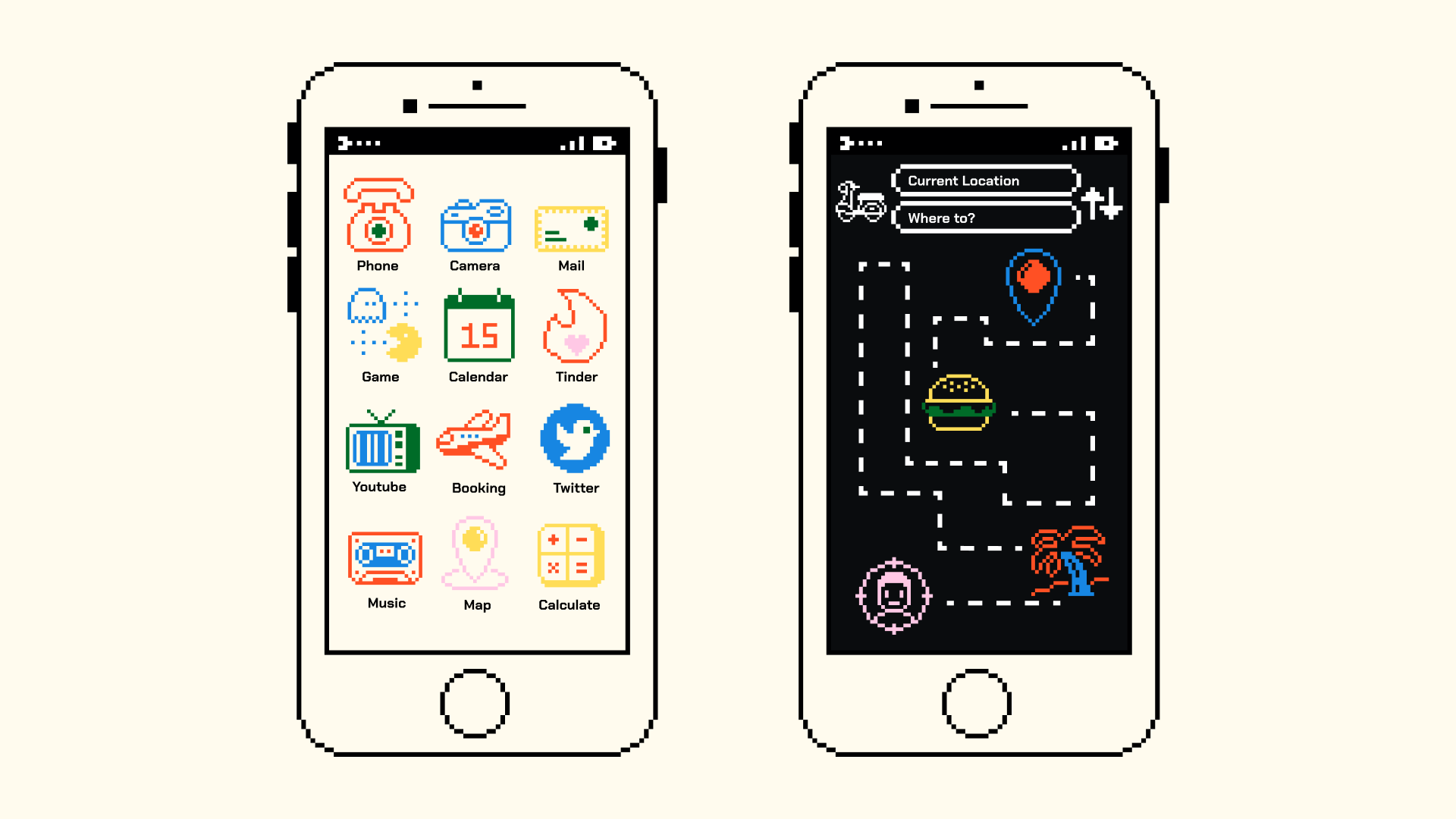
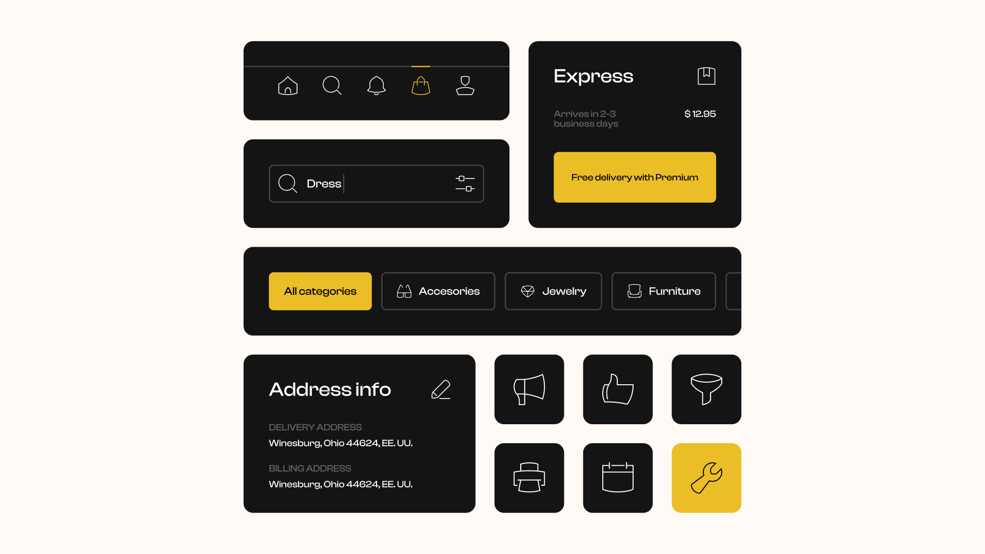
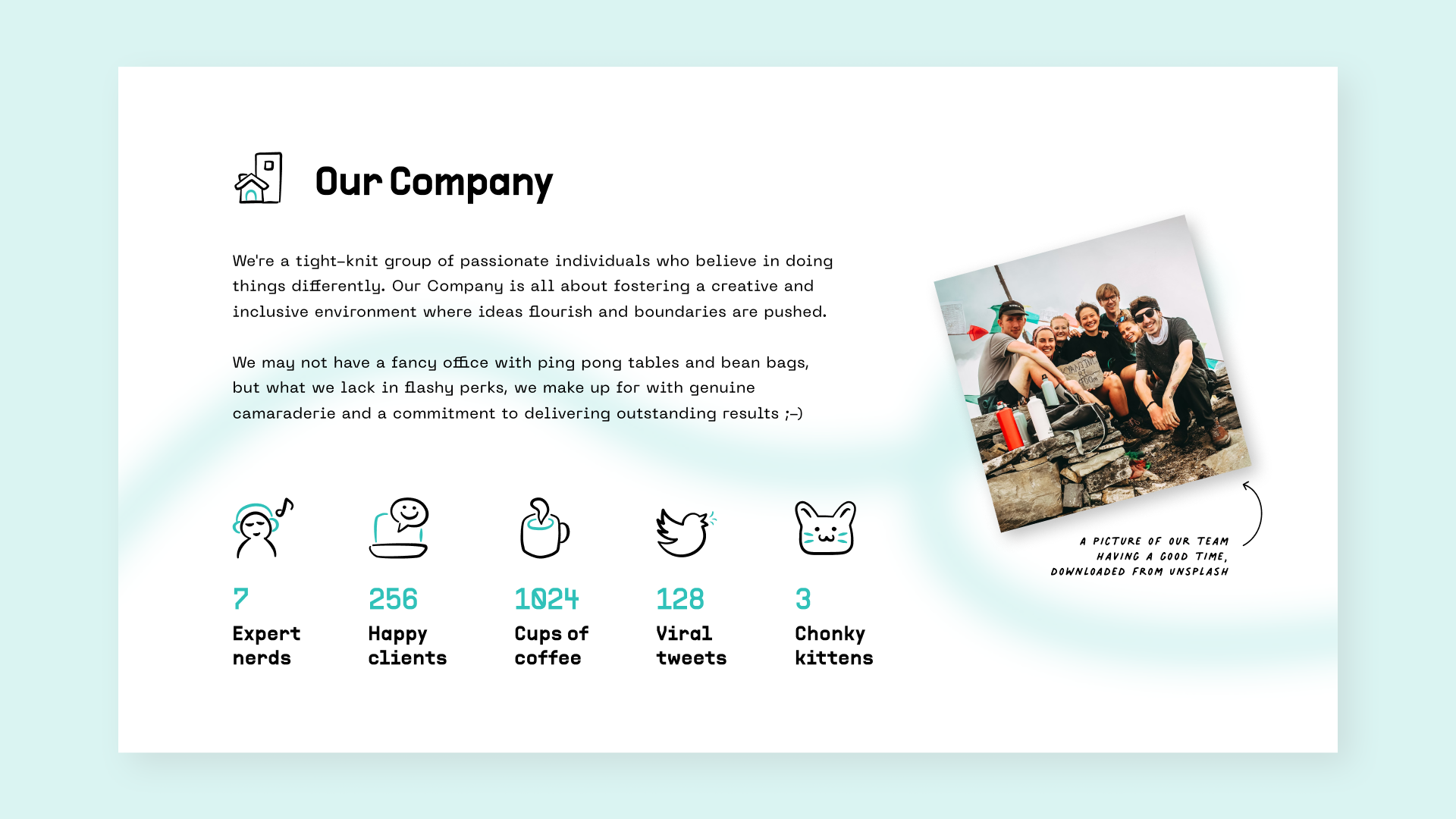
Streamline showcases a plethora of UI icon variations, each designed to cater to specific interface needs:
- Bold for dynamic interfaces
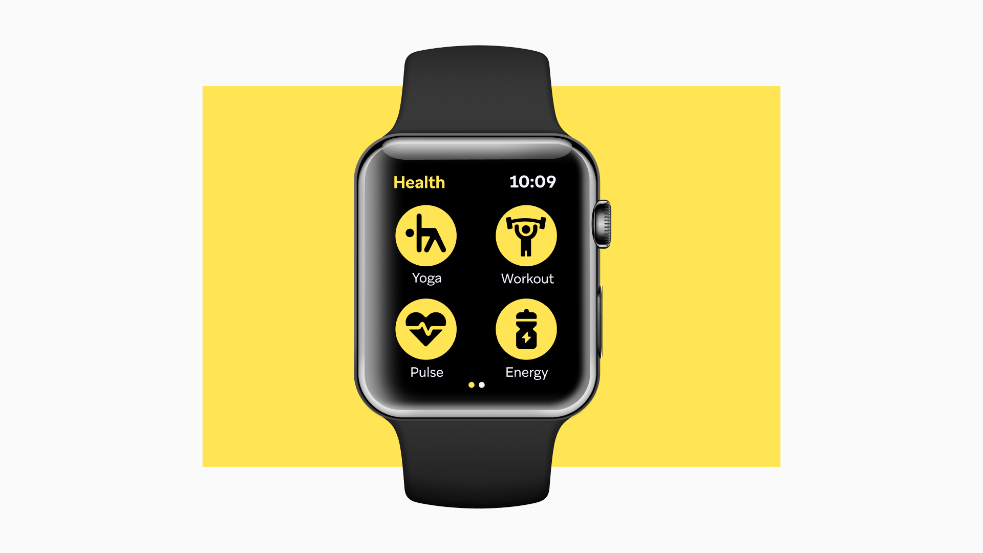
- Sharp for brutal interfaces

- Playful for lively interfaces
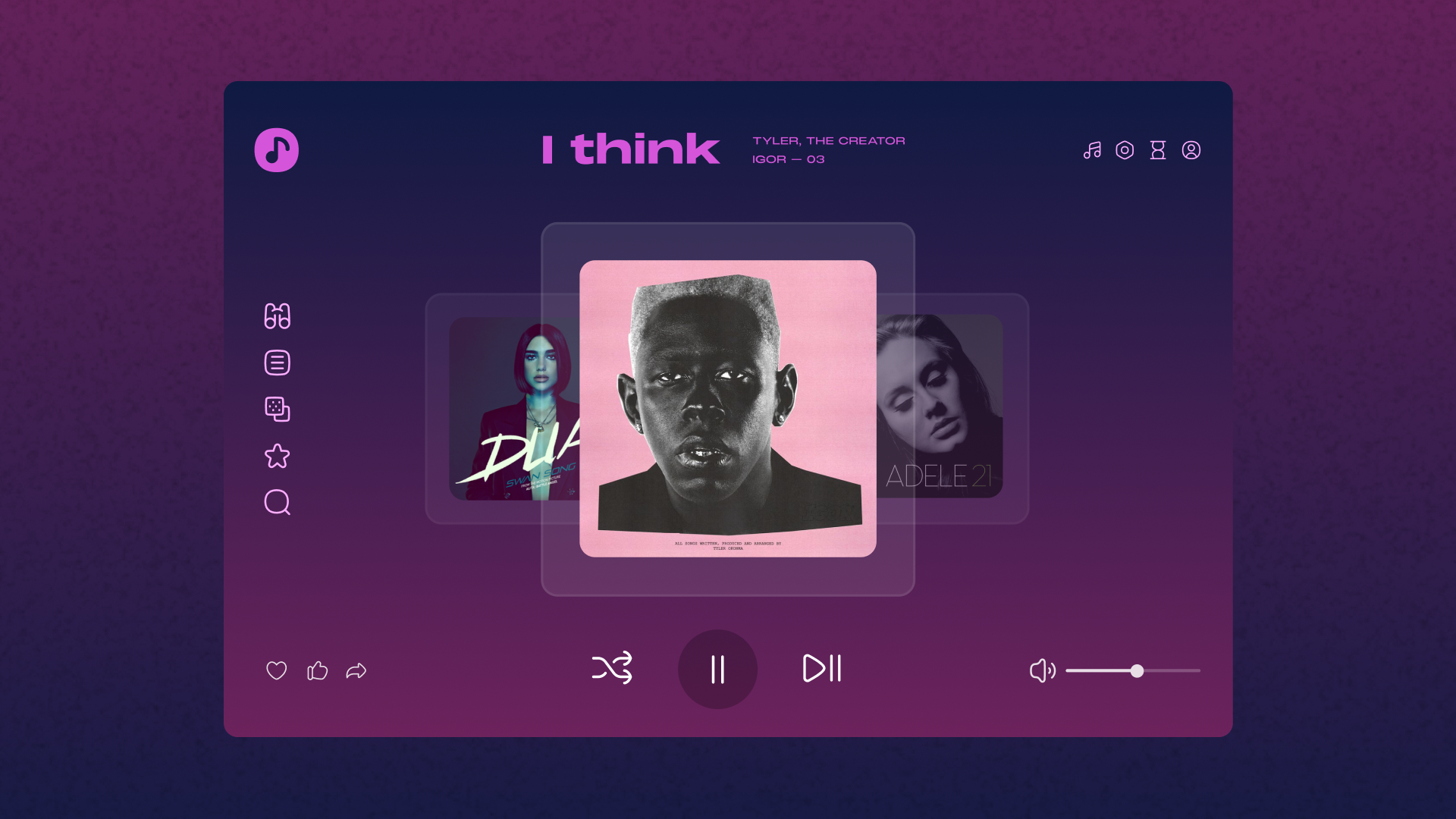
- Curvy for friendly interfaces
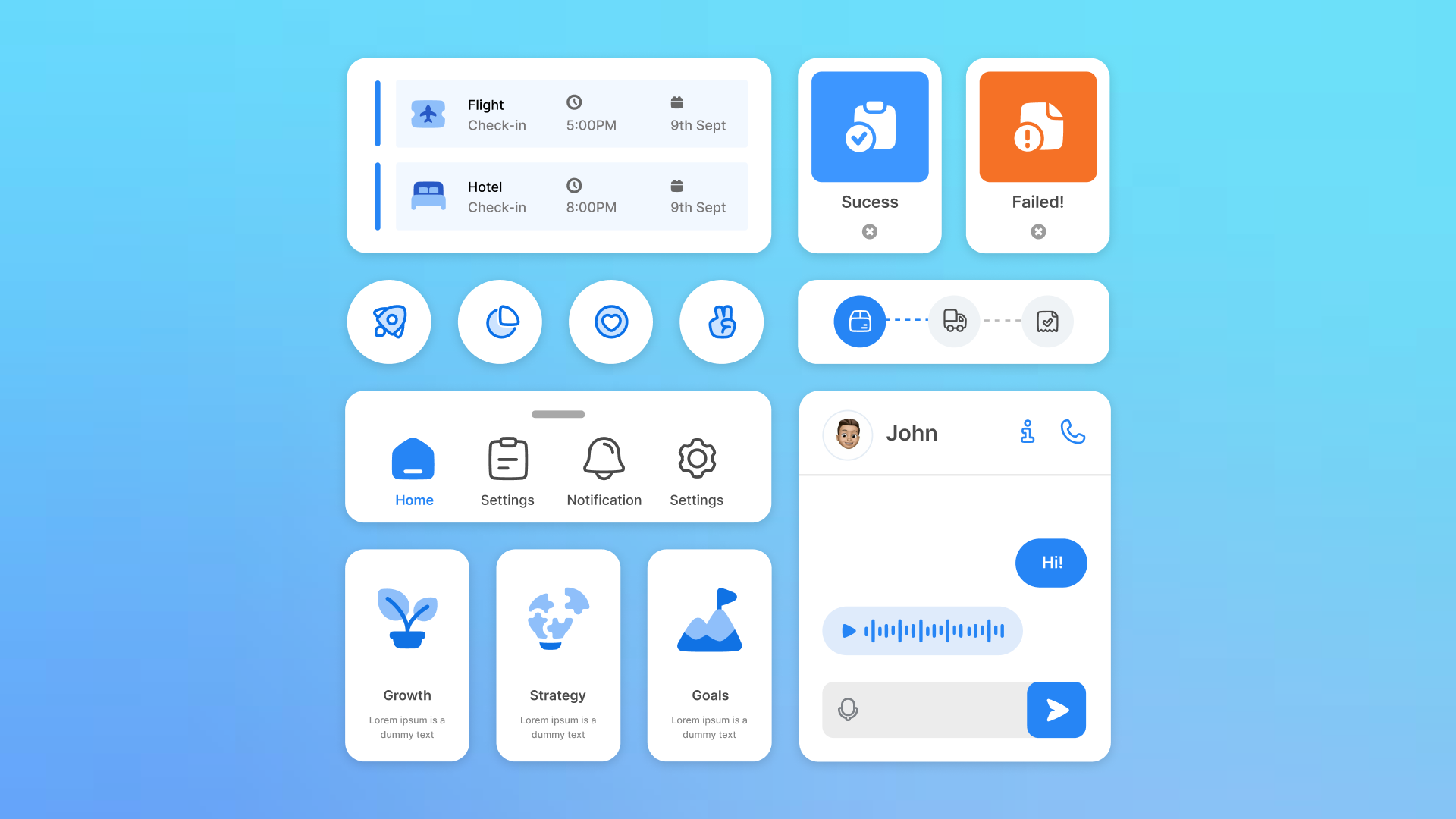
- Neutral for classic interfaces

- Pixel for primitive interfaces
- Elegant for sophisticated interfaces
- Hand-drawn for organic interfaces
Part 5: Spatial is the new future? (2024)
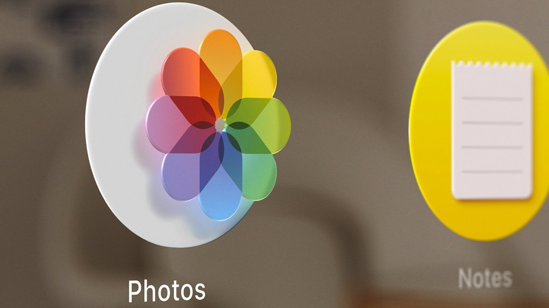
Apple's spatial user interfaces revolutionized icon design by integrating specular highlights and shadows, adding depth and motion. Icons responded dynamically to user interactions, improving the overall user experience. Additionally, techniques like parallax, reflections, and layered designs were employed to enhance realism.
Iconic way forward
In the ever-evolving world of user interfaces, icons continue to play a crucial role in shaping our digital experiences. As technology progresses, icons will evolve further, becoming more realistic and immersive (skeumorphic much?) while still retaining their symbolic significance. Whether its through minimalist flat icons or immersive spatial designs, icons will continue to serve as the visual language of technology, bridging the gap between humans and machines in profound ways.