How to create the perfect icons
All the insights from our 12-year-experienced icon design team
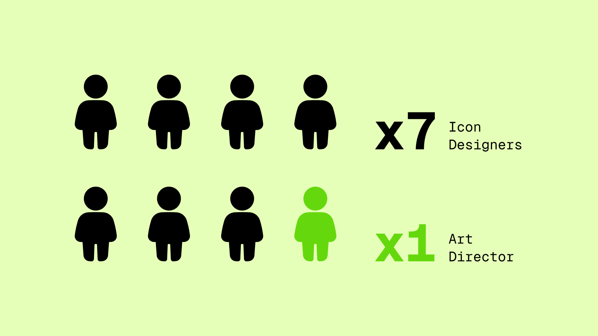
At Streamline, our dedicated team of eight designers is consistently crafting new icons and refining old ones. This iterative cycle is fundamental to guarantee the recognition, consistency and legibility of every single icon we produce.
Here's our recipe for a foolproof system.
How to evaluate an icon
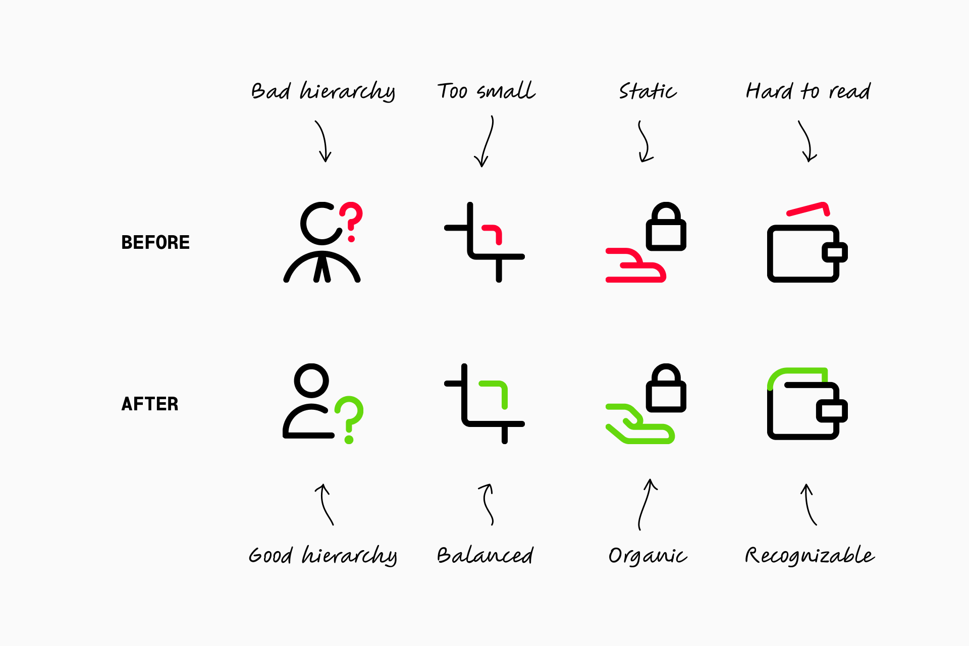
Is it recognizable?
Evaluating the icon based on its meaning
First we must ensure that the icon is easily understood by the user. To confirm this, we should be able to answer the following questions affirmatively:
- Does the icon convey a clear message?
- Can its meaning be understood by people from different cultures?
- Will the icon be durable over time?
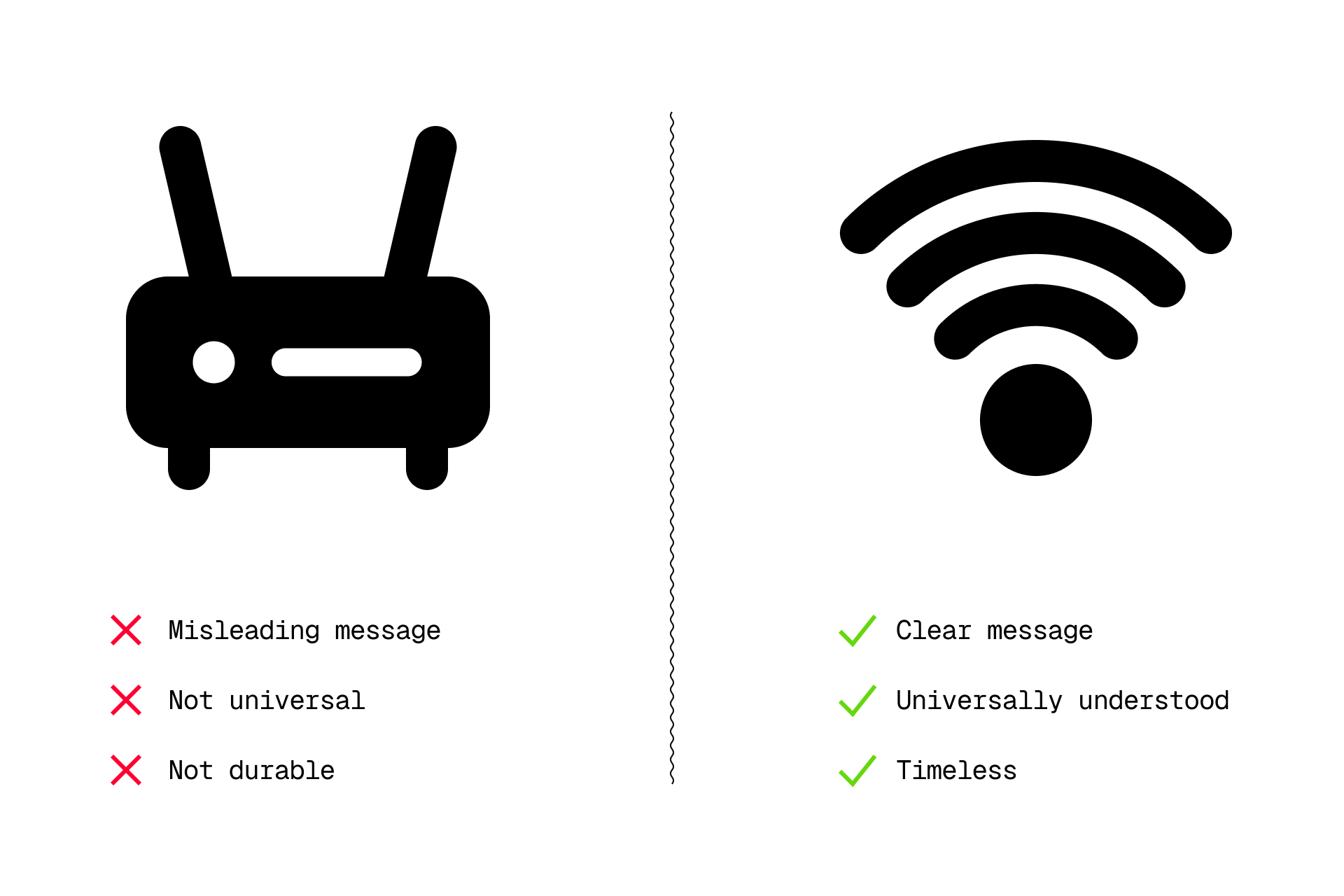
For example, the Wi-Fi symbol is easily recognizable and universally widespread, whereas a router could cause confusion, as well as being tied to a specific and outdated model. It's not about being conventional, it's about being functional.
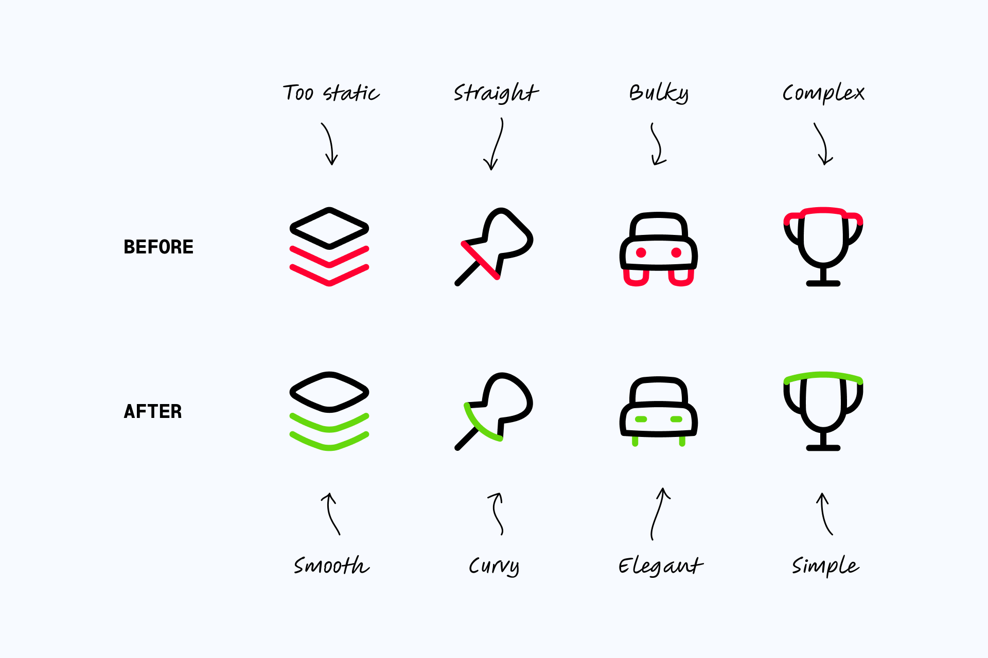
Is it consistent?
Evaluating the icon in comparison to other icons
Then, from a formal point of view, we must confirm whether the icon is consistent with the rest of the set. These are the criteria we'll have to consider to evaluate it:
- Does the icon follow the same construction guidelines as the rest?
- Does it look visually balanced compared to them?
- Does it share the same stylistic features?
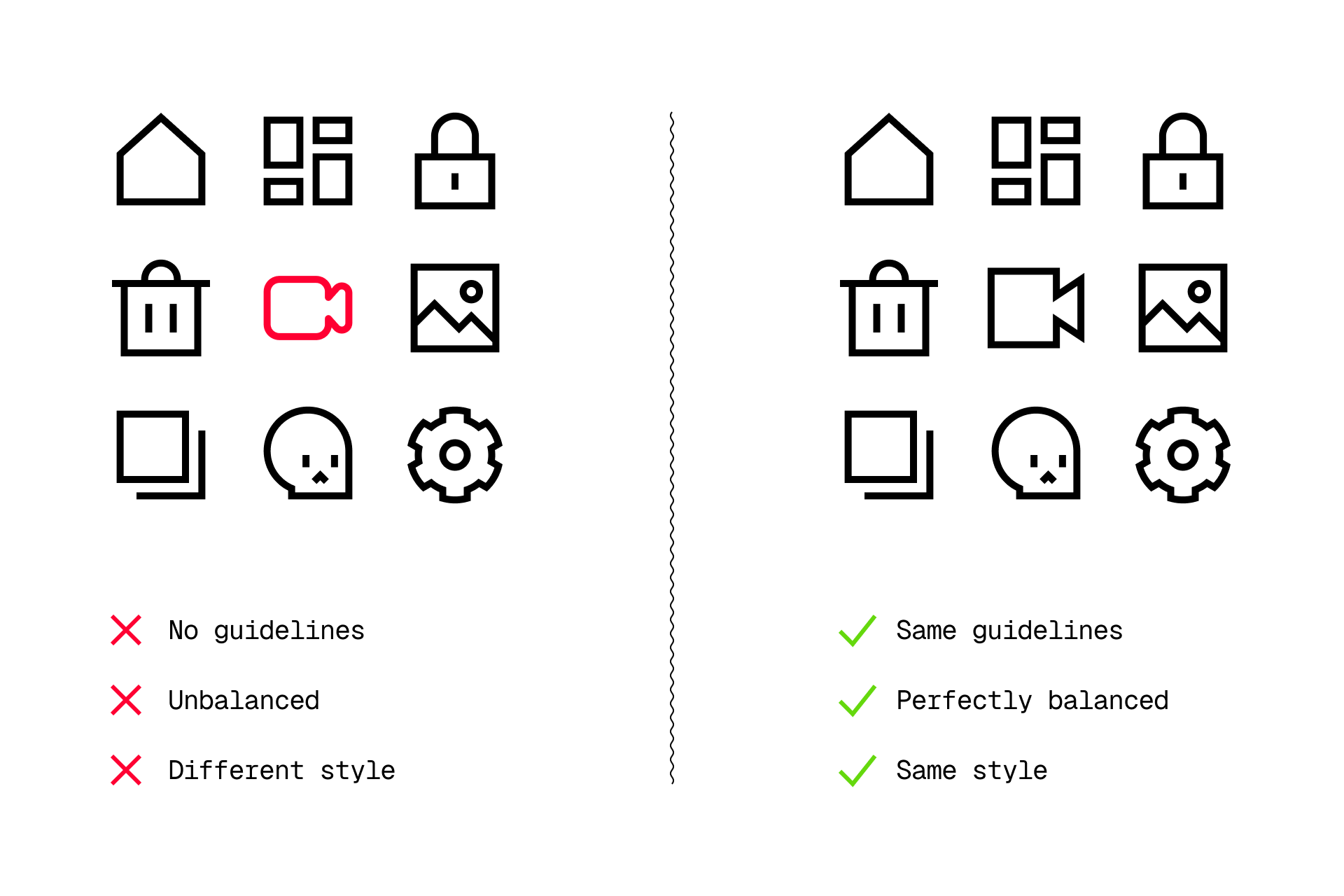
The icons above are clearly characterized by their brutalist and geometric style, using straight ends and pointy corners. So a curved and friendly icon like the video camera would have no place here, since it doesn't follow the same guidelines.
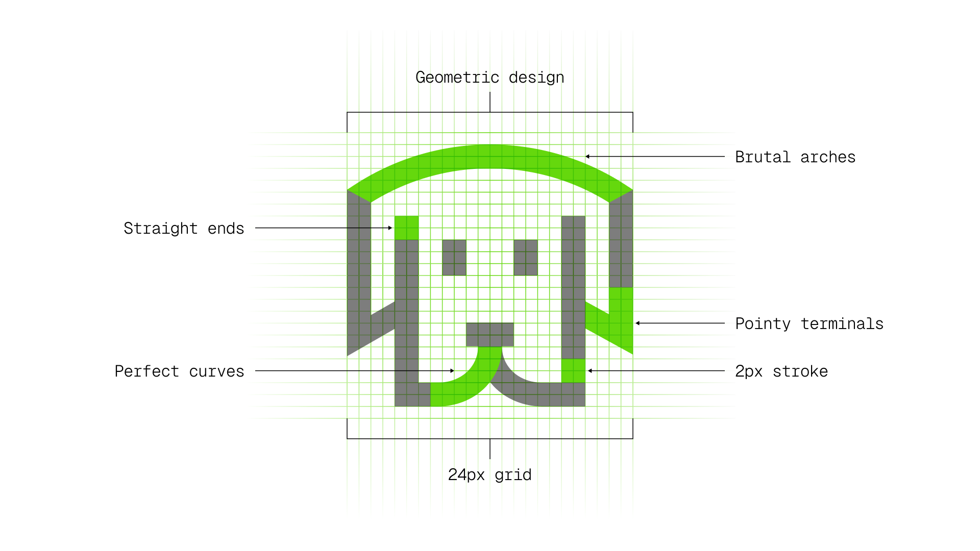
We've already explored some icon guidelines in this article, focusing on the grid and its key shapes. But there are a lot of formal characteristics inherent to each set that determine the overall style of our icons while keeping them consistent.
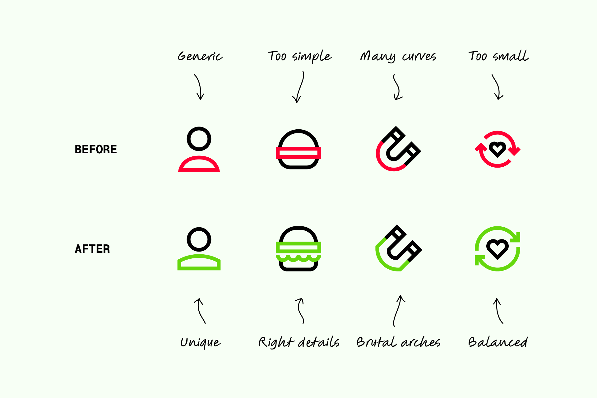
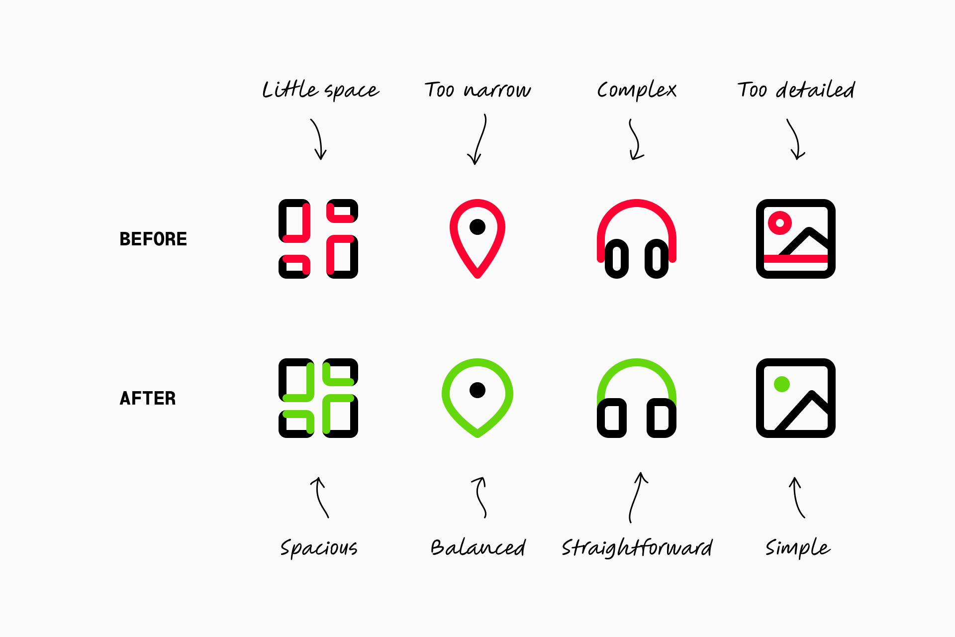
Is it legible?
Evaluating the icon based on its use
Finally, we must evaluate if the icon is legible in the context in which it's applied. To do so, we'll need to ask positively to the following questions:
- Does the meaning remain clear?
- Does the icon reduce well?
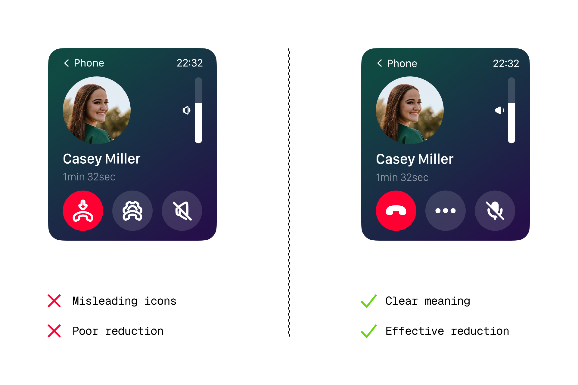
For instance, line icons with excessive detail and a thick stroke such as those on the left wouldn't be legible enough at these sizes. However, simple solid icons like the ones on the right work perfectly in this specific context.
Our team's experience
Every designer in our team evaluates the design of their icons according to the questions mentioned earlier. But, in addition, we also have an Art Director who oversees daily tasks, provides essential feedback and fosters a collaborative approach where everyone has a voice.
This process ensures that everyone's perspective is valued, contributing to the creation of the best possible product.
The feedback loop
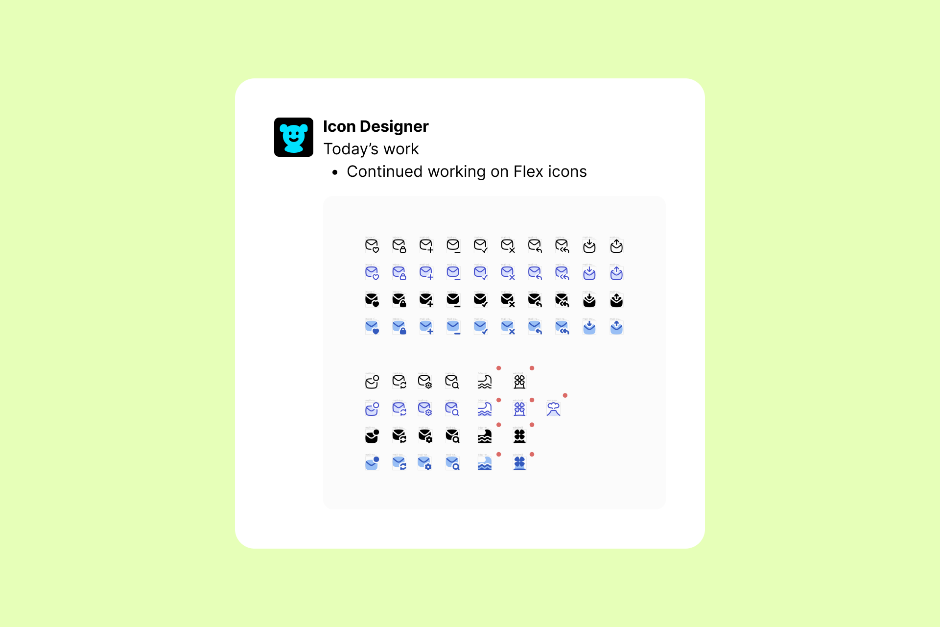
We use Figma to design all our icons, but Slack is the place where we give feedback. Why? Basically because we like all team members to have easy access to this process in one place, without having to jump from one file to another. This is how a smooth feedback session usually goes:
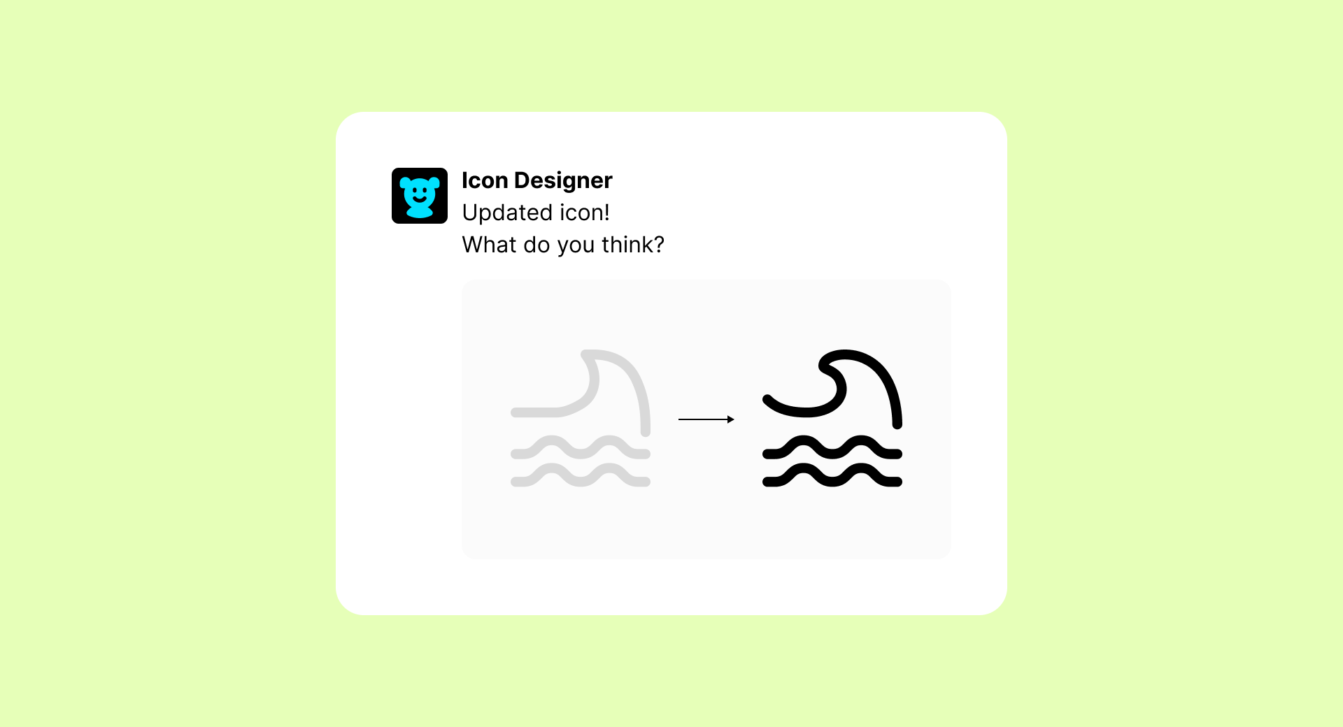
1. Designers share their work via Slack
Each day, the designers submit their work via Slack for evaluation by both the Art Director and other teammates who want to join the conversation.
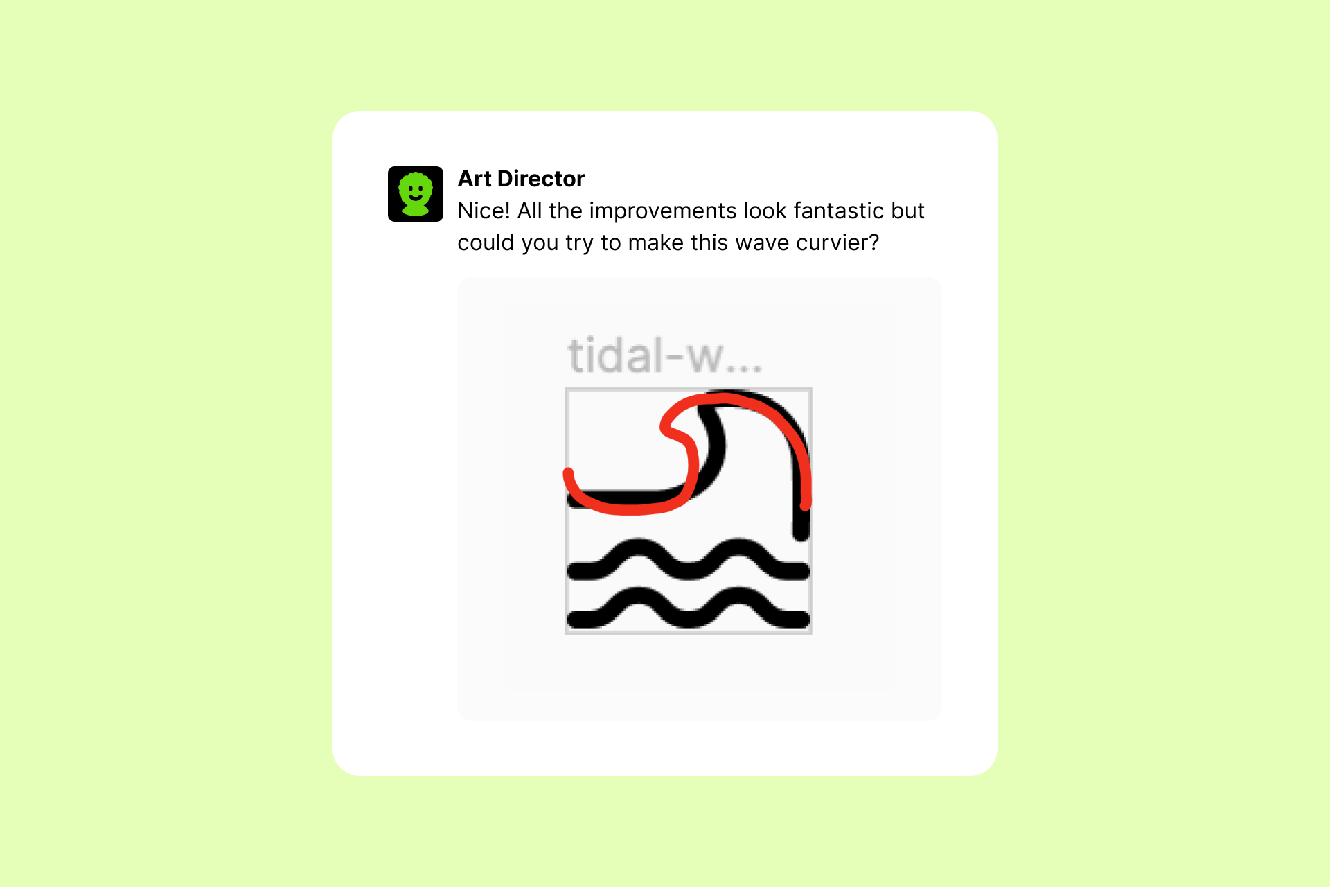
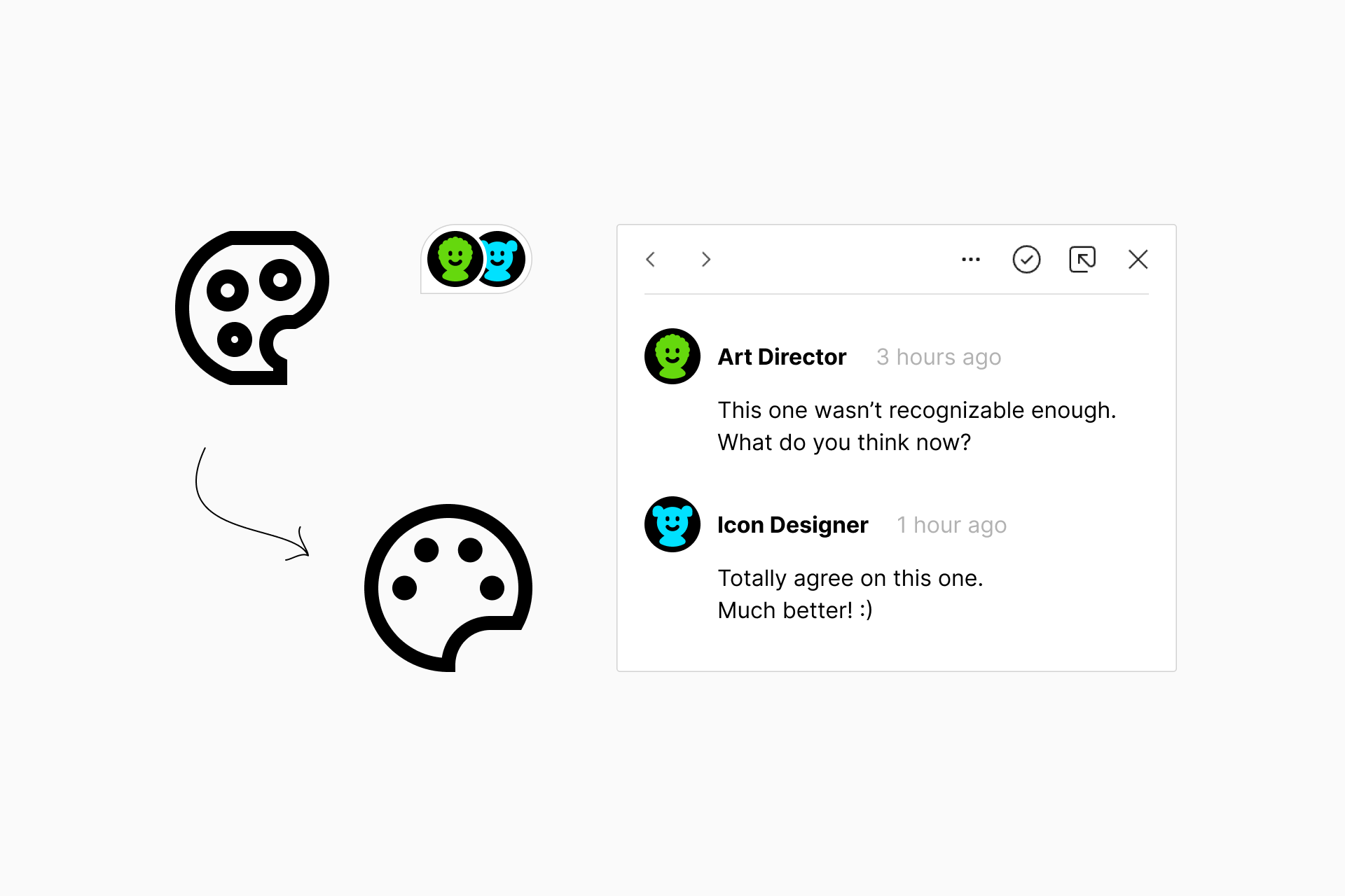
2. The Art Director and/or other teammates give feedback
Anyone on the team can give feedback or make suggestions, because we like to benefit from always having a fresh pair of eyes reviewing our work.
3. Designers share the updated version
The following day, the designer incorporates these suggestions and presents the revised version to determine if the improvements have really enhanced the icon.
4. The Art Director gives the final approval
If someone has additional suggestions we continue this iterative process as many times as needed until we achieve the desired outcome, no matter how long it takes. If not, the Art Director gives the final approval to ship these changes.

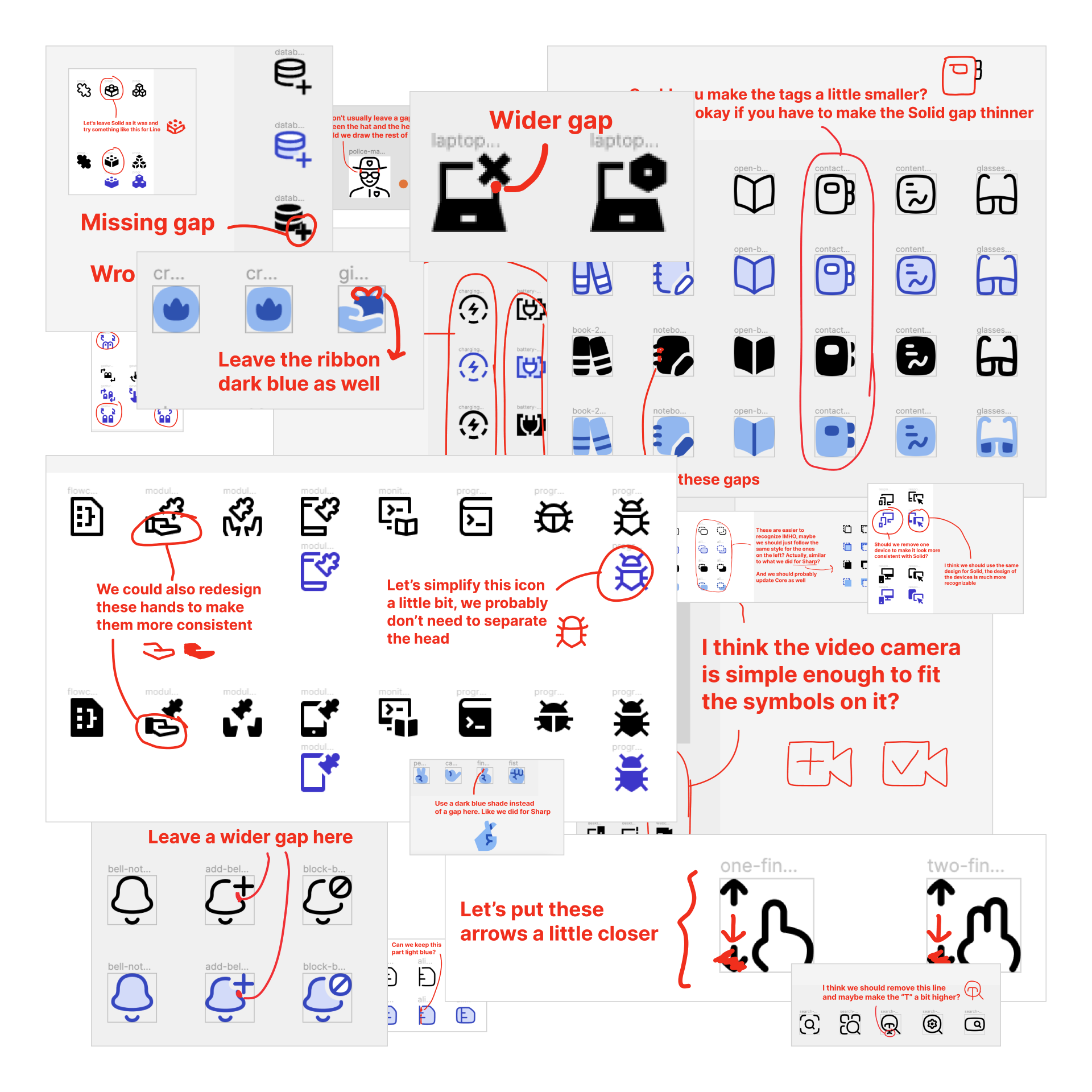
But it's not always so simple and clean, the feedback process is dirty and messy. This is how an Art Director's feedback really looks like:
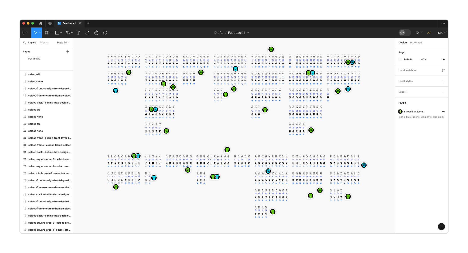
The super review
Once in a while the Art Director reviews entire sets directly in Figma to ensure they're ready for release. We're talking about checking thousands of icons in just a few weeks, which obviously requires a dedicated and focused team.
We leave comments directly in the file so that a maximum of two designers can make the necessary corrections and let the Art Director know that they've applied these changes. Once approved, the icons are ready to be exported and published.
Always improving
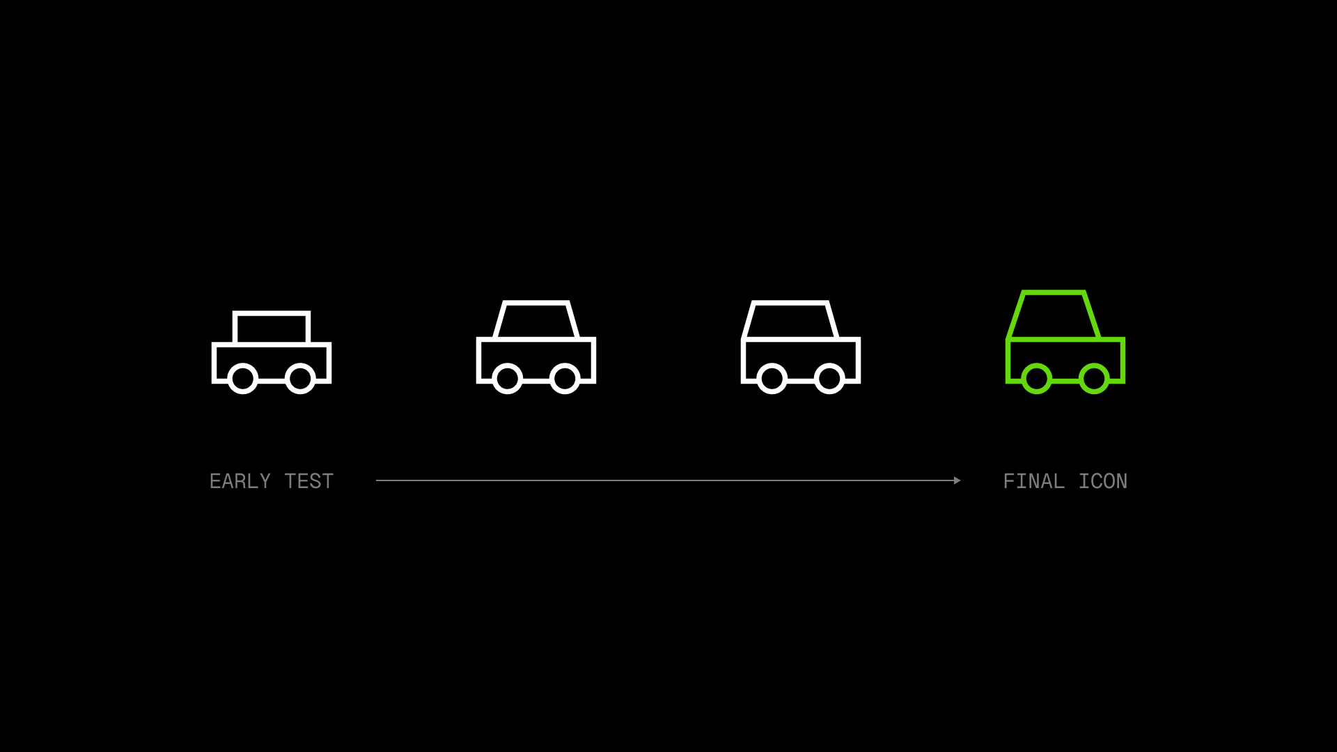
Many times, these changes might not be so obvious or substantial until we compare them with previous versions. So that's what we try to do with every single set, because we love to see how far we've come.
Core. Neutral and timeless icons
A set like Core must be durable over time, so all the improvements we've applied to it over the years have been strictly based on the legibility of the icons.
Flex. Curvy and friendly icons
For Flex, there was a moment when we realized that the icons lacked personality and consistency, so we spent months improving them to achieve a unique style.
Sharp. Brutal and geometric icons
Something similar happened to Sharp as we designed some generic icons that we later had to improve to give them a much more brutalist and consistent look.
Plump. Chunky and detailed icons
Plump is a set that has varied a lot throughout its development, but ultimately we always wanted these icons to be the chubbiest in our library.
Micro. Simple and legible icons
Micro icons are designed on a tiny grid (10x10px), so whenever we go back to this set to improve it our goal is very clear: minimum details and maximum legibility.
The only way we can ensure that each of our icons is perfectly recognizable, consistent and legible is thanks to this constant and meticulous process. Of course, having a large team is also helpful to ensure that there's always a fresh pair of eyes that can evaluate your work.
So, besides following our recommendations, be sure to share your icons and be open to the feedback process. Actually, would you like to share your icons with us?