The 'Caregiver' – Marketing archetype tips
Designing with empathy. Unlock the secrets to creating a warm and generous brand, from color palettes and typefaces to icons and illustrations.
The Caregiver brand archetype
Do you know your brand's personality? Brand archetypes are a very popular branding framework that classifies companies into 12 different archetypes.
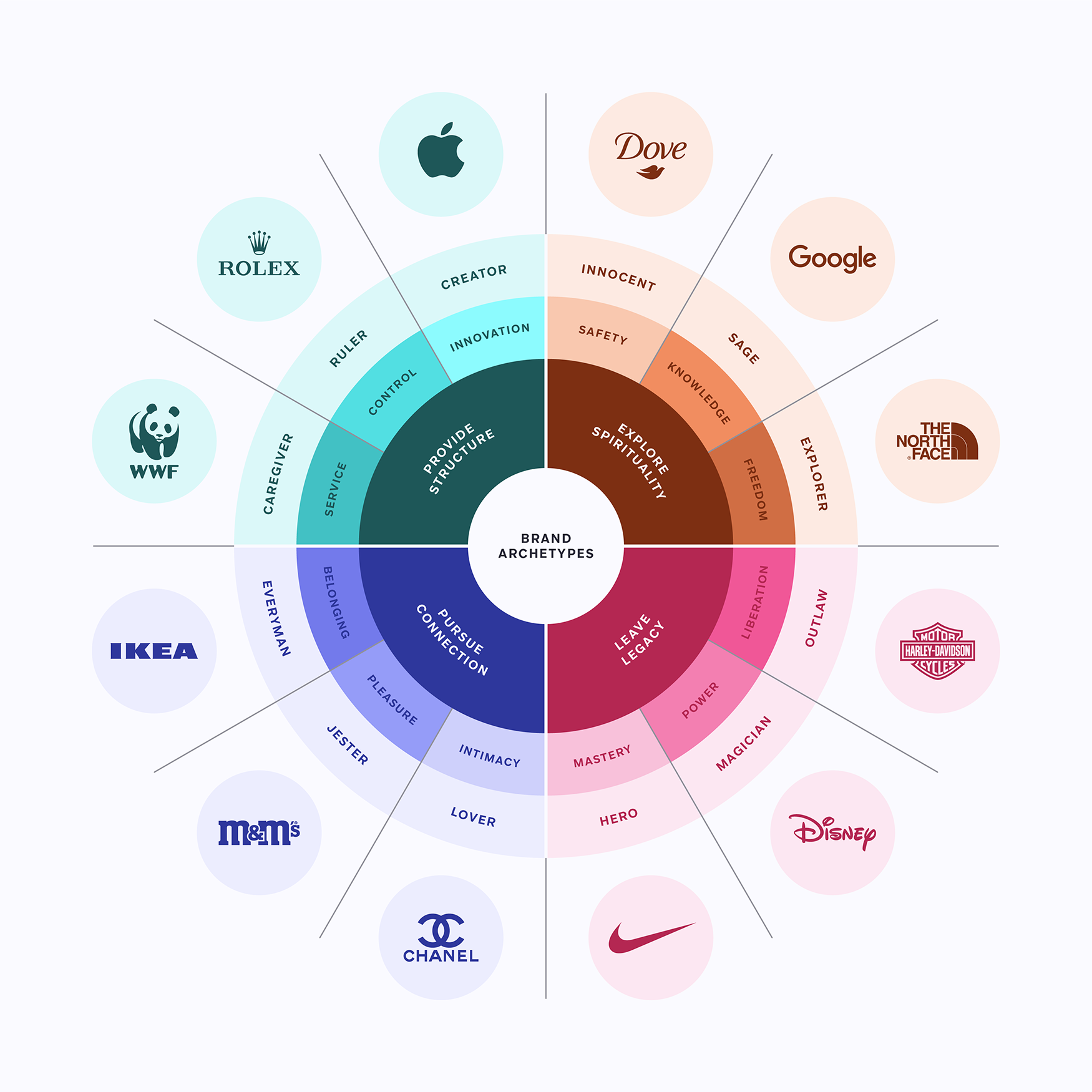
Your brand belongs to one of these archetypes and with this series of articles you’ll discover how to create an engaging message with graphics specially curated by the Streamline team.
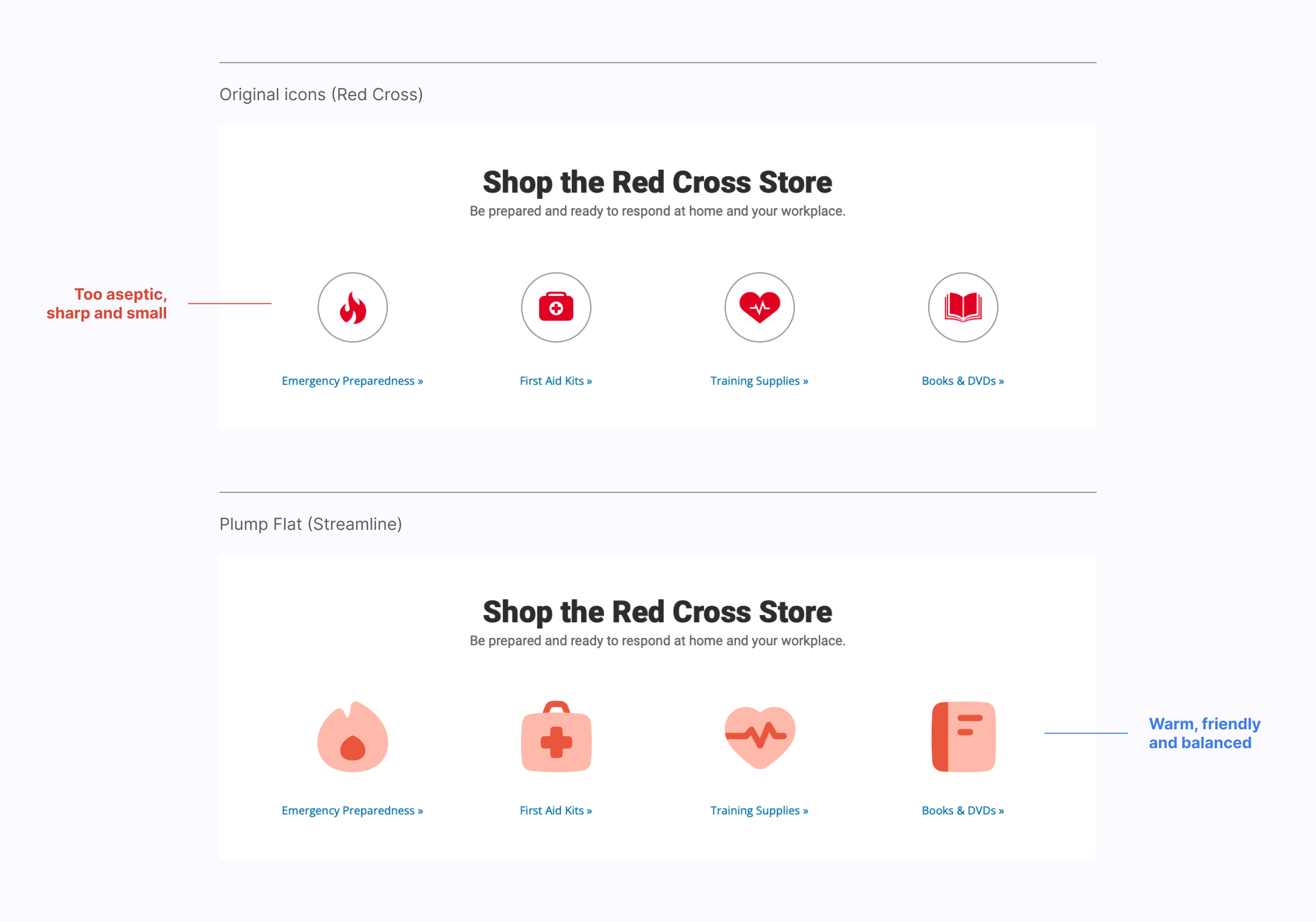
Why should the Red Cross use Plump Flat icons?
Keep reading to find out the best assets for the Caregiver archetype.
Meet the Caregiver
The Caregiver archetype represents caring, warm and generous brands. They want to be supportive and protect their audience with a message based on love and honesty in a completely selfless way.
Goal: Help others
Message: Love your neighbour as yourself
Voice: Reassuring, gentle and supportive
Brands of the Caregiver archetype are often found in the education, charity or specially healthcare sectors. Their brand image is delicate and friendly, trying to be close to their users with an optimistic message.
Some good examples of the Caregiver archetype would be brands like WWF, Pampers, TOMS, Actimel or Johnson & Johnson. The reason a brand like WWF is the perfect example of this archetype is because it shares the exact same values of integrity, respect and love.
Design helps you help the world
Graphic design and ethics are two concepts that should go together. In the end, design should solve a problem and make our lives easier. Argentine designer Ronald Shakespear defines it as follows:
"If design is not good to improve people’s lives, it is not good at all."
If there's a specific type of brand that should follow this rule, it's the one within the Caregiver archetype. Let's take a look at some of the graphics that can help us communicate this idea.
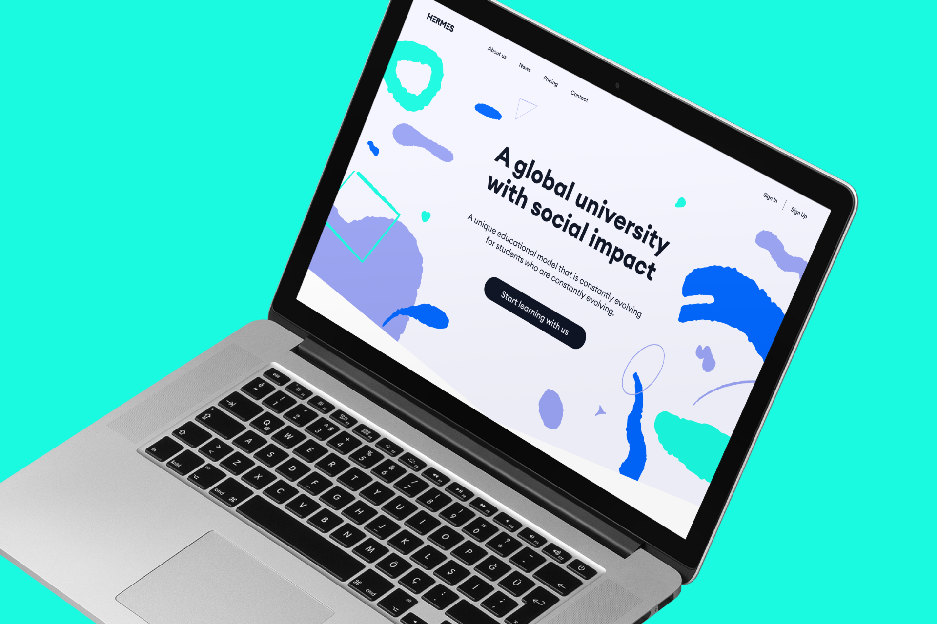
Fresh colors to light up your day
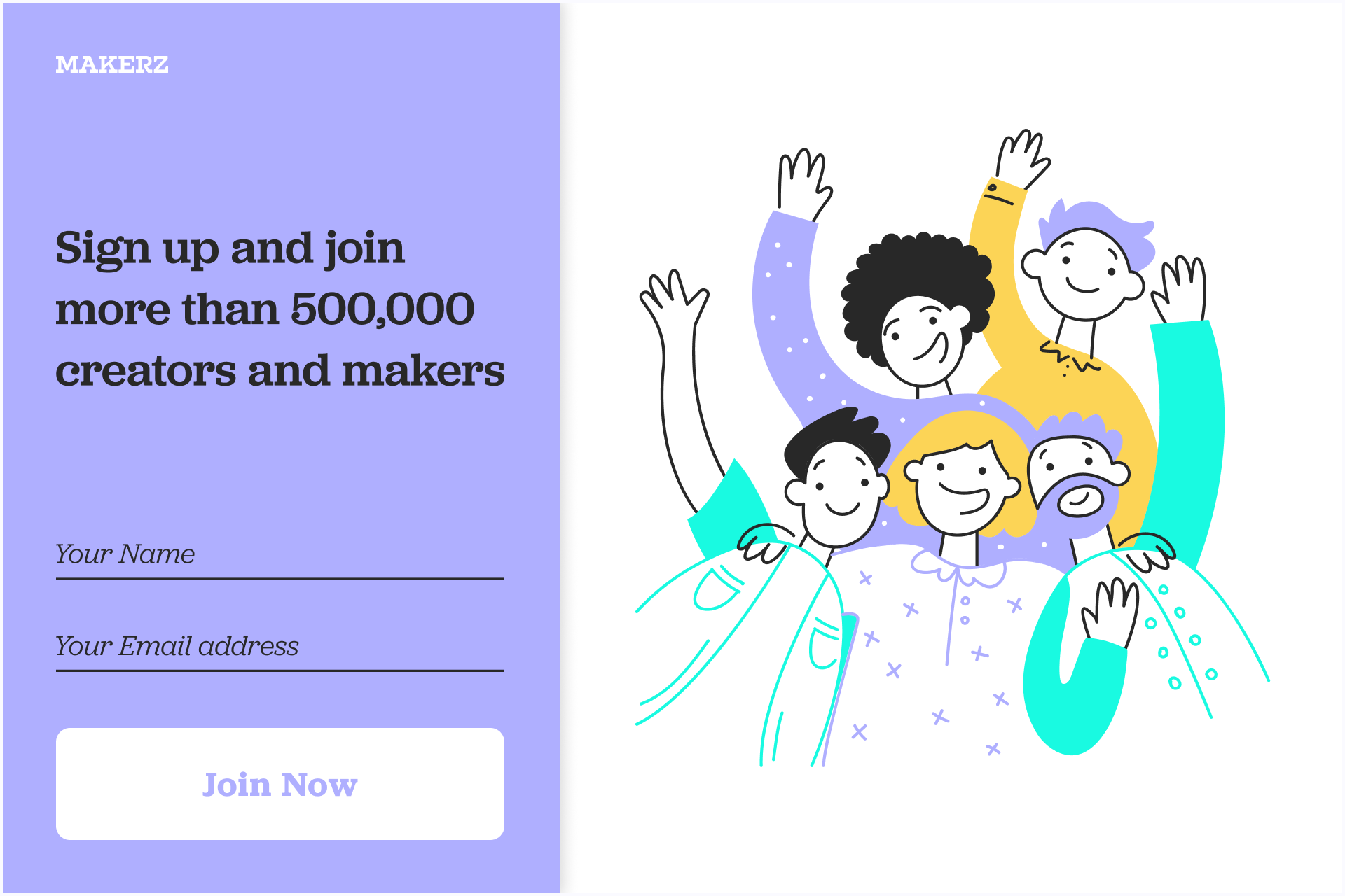
Blue and green is always a safe choice, specially if we want to communicate values of calm and security so present in this archetype. But don't forget to make good use of white to complete a clean and fresh color scheme.

A selection of pastel colors can evoke a serene atmosphere (specially if we use blue, green or pink tones) and convey a sense of safety and gentleness.

Using warmer pastel colors can enhance this effect even further, as they can evoke feelings of friendliness and approachability, making it easier for people to connect with the brand on an emotional level.

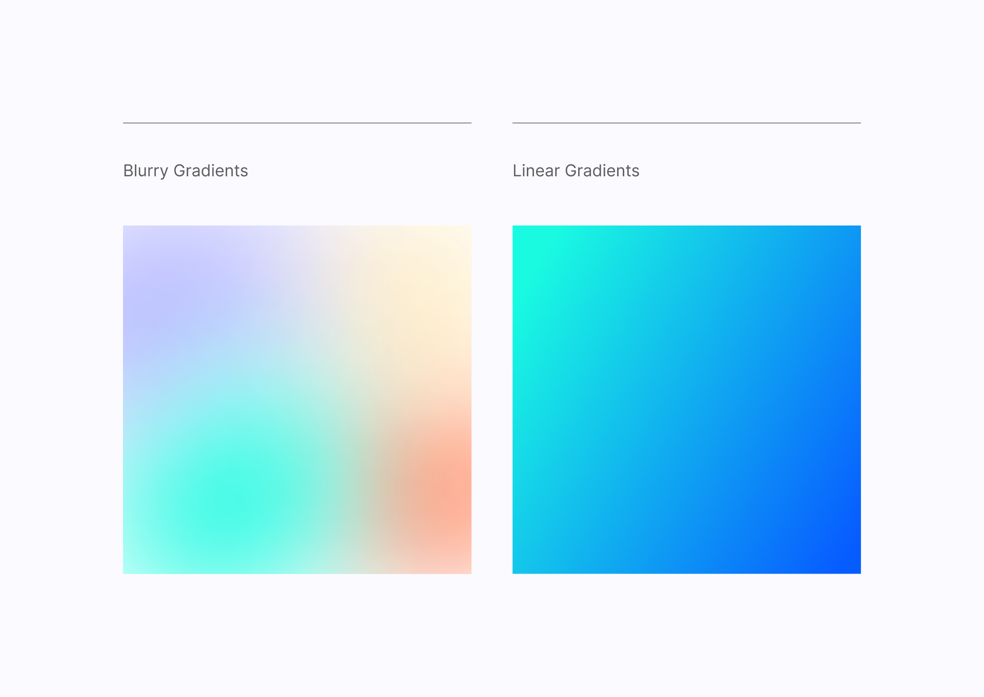
Even better if we use gradients, which can help us achieve a more fluid look. Blurry gradients are specially useful for creating complex backgrounds while Linear gradients have a more classic look.
There is room to experiment and decide the best color palette for each project, so you don't need to follow these recommendations strictly, draw your own path with these examples as a simple reference.
Rounded fonts can't hurt you
Fortunately, we can count on a wide range of typefaces that can be used for a Caregiver brand. In general, they share the same formal features, characterized by the use of smooth curves, rounded ends and the fluidity they entail.
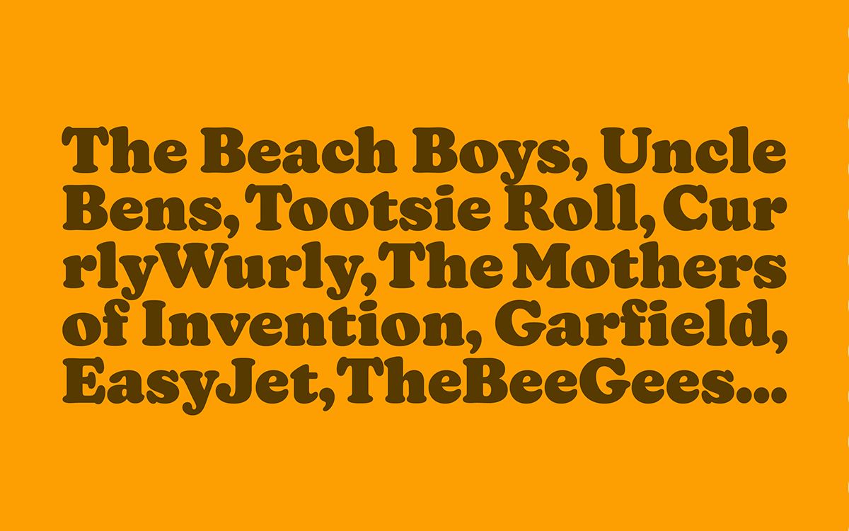
We could start with a typeface that needs no introduction, a serif font with a chubby and almost cartoonish look called Cooper. If it's not chunky enough for your project you can always try Cooper Black.
We could even use a script typeface like Nickainley if we are looking for a more personal option and prefer the warmth of hand calligraphy.
But we might want to try a more neutral option like Pilcrow Rounded, which has the look of a sans serif but uses rounded ends, making it much friendlier than the typical Helvetica (hey, I'm not judging). Plus, it's free!
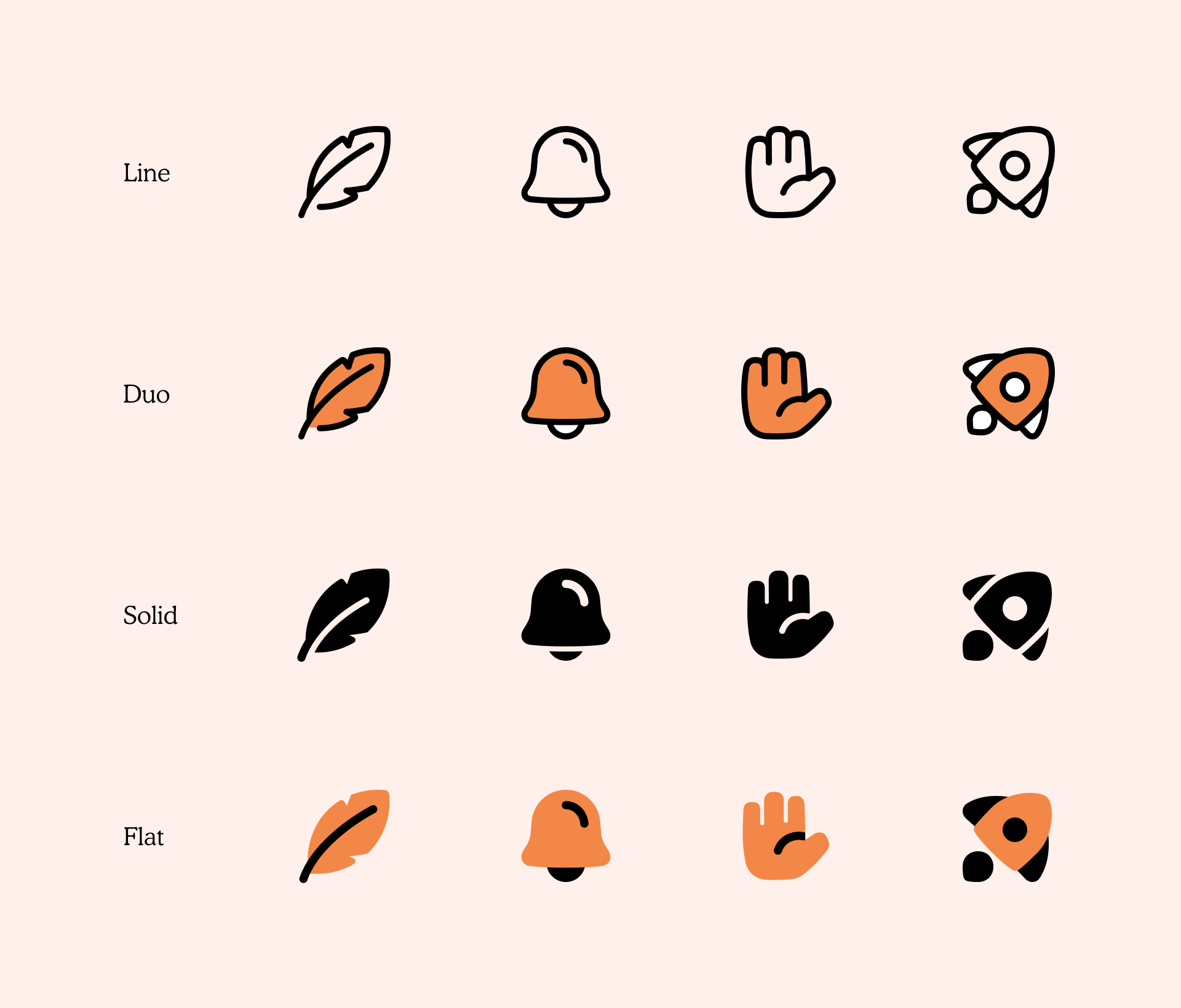
Can icons be kind?
It's no easy task to find icons with enough personality to be perceived as "warm" or "generous". But that's the idea behind Plump, a set of chunky, friendly-looking icons that uses subtle curves and a hand-drawn touch in its shapes.
All Plump icons were built on a 48x48px grid, which helped to give the set a clear formal continuity and visual rhythm by creating spacious and thick signs. Plus, they come in 4 different styles (Line, Duo, Solid and Flat) with over 2,500 icons in each, for a total of over 10,000 different icons.
Plump Line is the most versatile option, it gives priority to the other graphic elements that are part of the project. Plump Solid has a bolder look and is more legible at small sizes, they look gorgeous on a dark background. Plump Duo and Plump Flat are more joyful alternatives, they are a great option to match your brand needs thanks to their customizable colors.
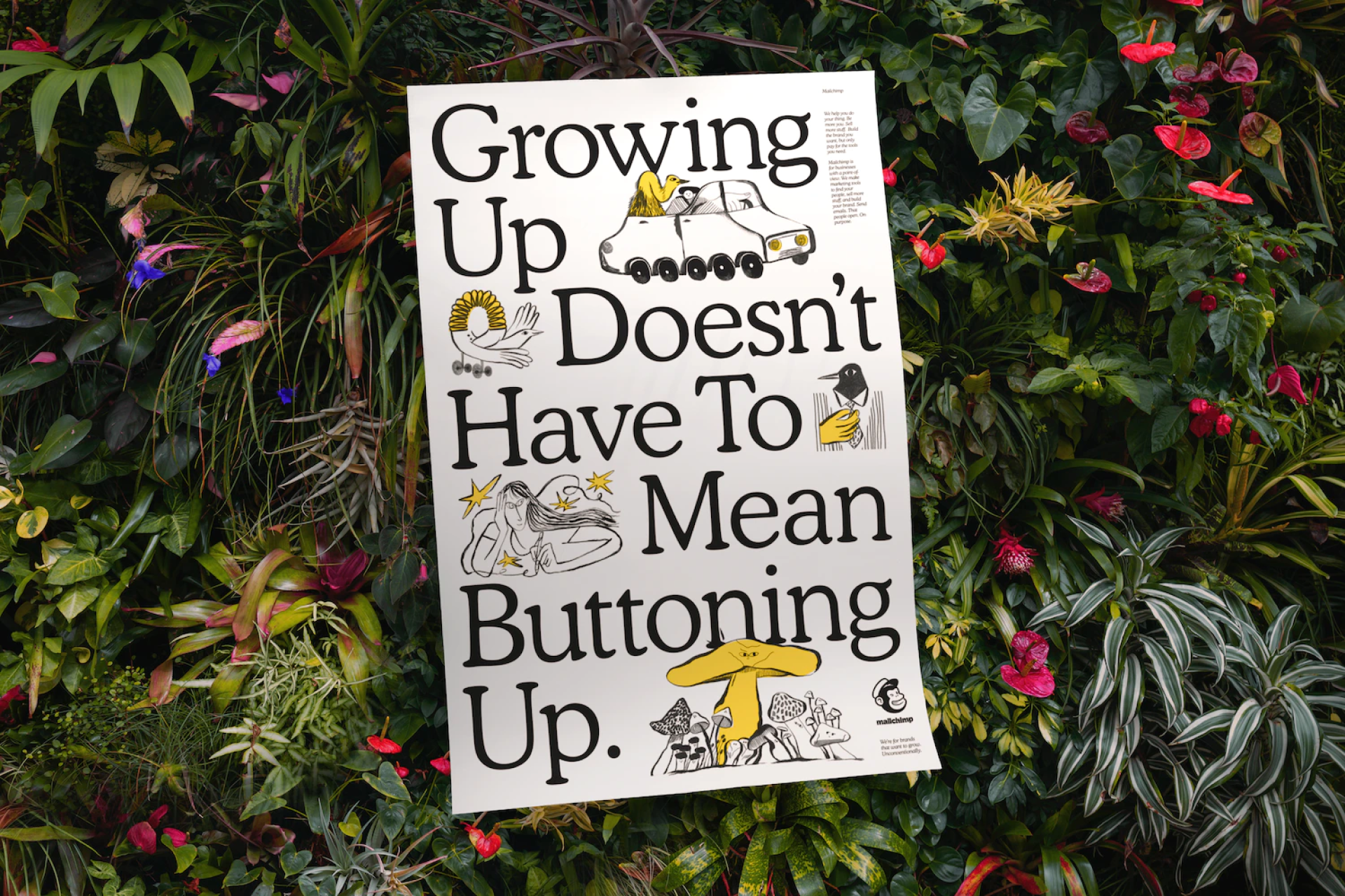
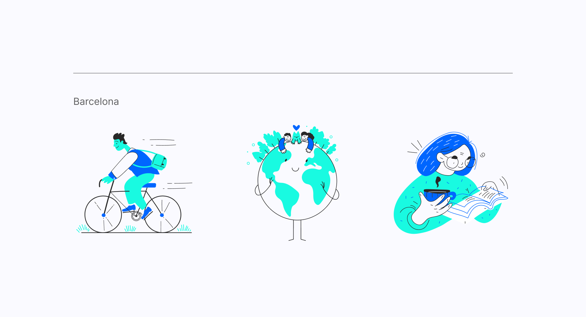
There's nothing wrong with being a little naïve
In recent years, when it comes to illustrations, it's not hard to find styles that are more naïve and playful, which is exactly what we need here.
Barcelona is an illustration set full of energy that uses curvy shapes and vivid colors (which are fully customizable) to help you build a friendly and reliable brand.
But if you need something specially trendy and a more sophisticated look without losing the friendly vibe, a set like Brooklyn is the perfect alternative for you.
Make the difference using organic shapes
As we've seen, it's important to create a fluid and dynamic visual language to be perceived as a Caregiver brand. Some graphics that can easily help us achieve this goal are the Organic Shapes, a collection of abstract elements, patterns and textures that can bring a lot of personality to your design.
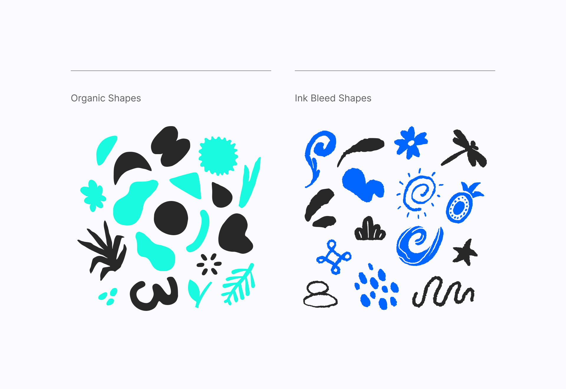
You can also check out the Ink Bleed Shapes, which share the same fluid style as the previous elements, but in this case they try to simulate the manual effect of the ink being absorbed by the paper. This roughness can add some texture to the overall look of the design and generate a more unique outcome.
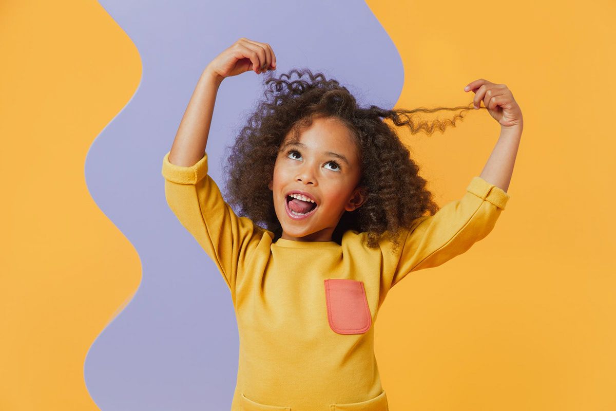
Feeling identified
Photography is the closest visual representation we have to reality and the brands of this archetype pursue such altruistic goals as representing diversity or raising awareness of social issues. Plus, these photographs can use some complementary graphics (like the ones above) to have a more friendly appearance without contradicting the importance of the message.
A maternal figure
The Caregiver archetype can be easily related to a maternal figure thanks to its kindness and selfless love. The way brands can communicate this visually is through the use of rounded shapes and handmade elements that evidences the closeness they have with their audience, as if they were their own children.
Here's a good start! 👇
Plump icons
Access unlimited downloads for this mixed set that includes a total of 500 icons. Is Plump a good fit for you?