Tiny, sharp, and now bigger than ever: 1100 new Micro icons
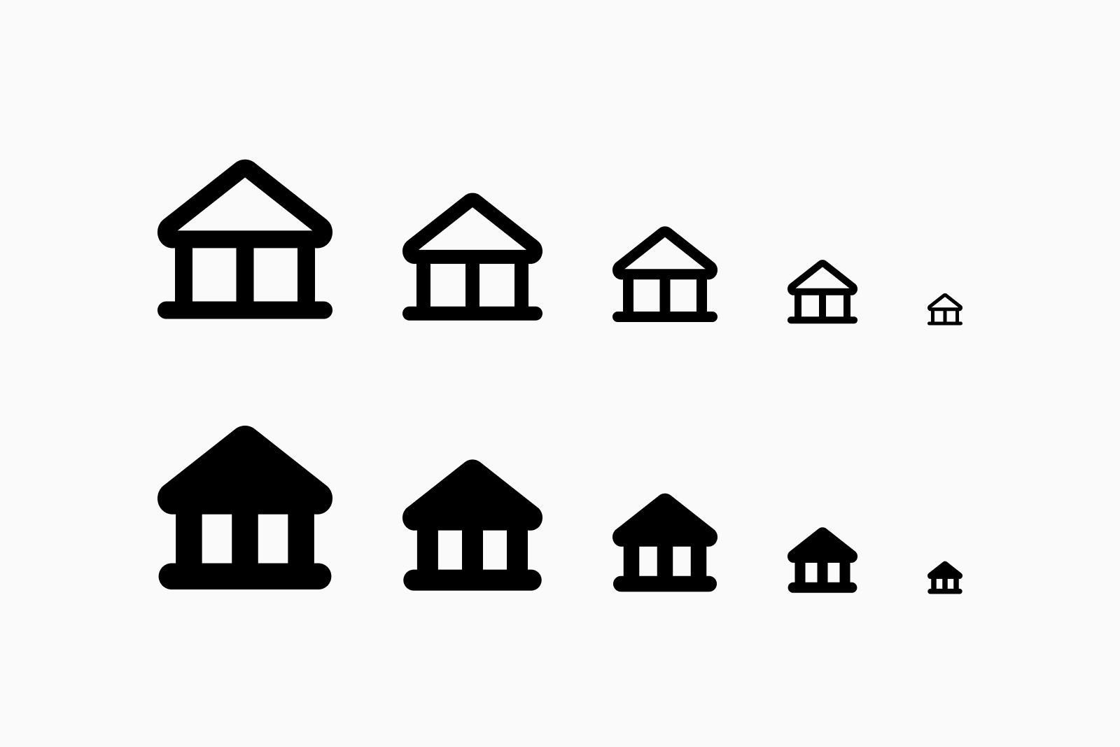
Most icon sets struggle at small sizes. They’re too detailed, too busy, too hard to read. Micro is built different: ultra-minimal, purpose-designed for compact interfaces.
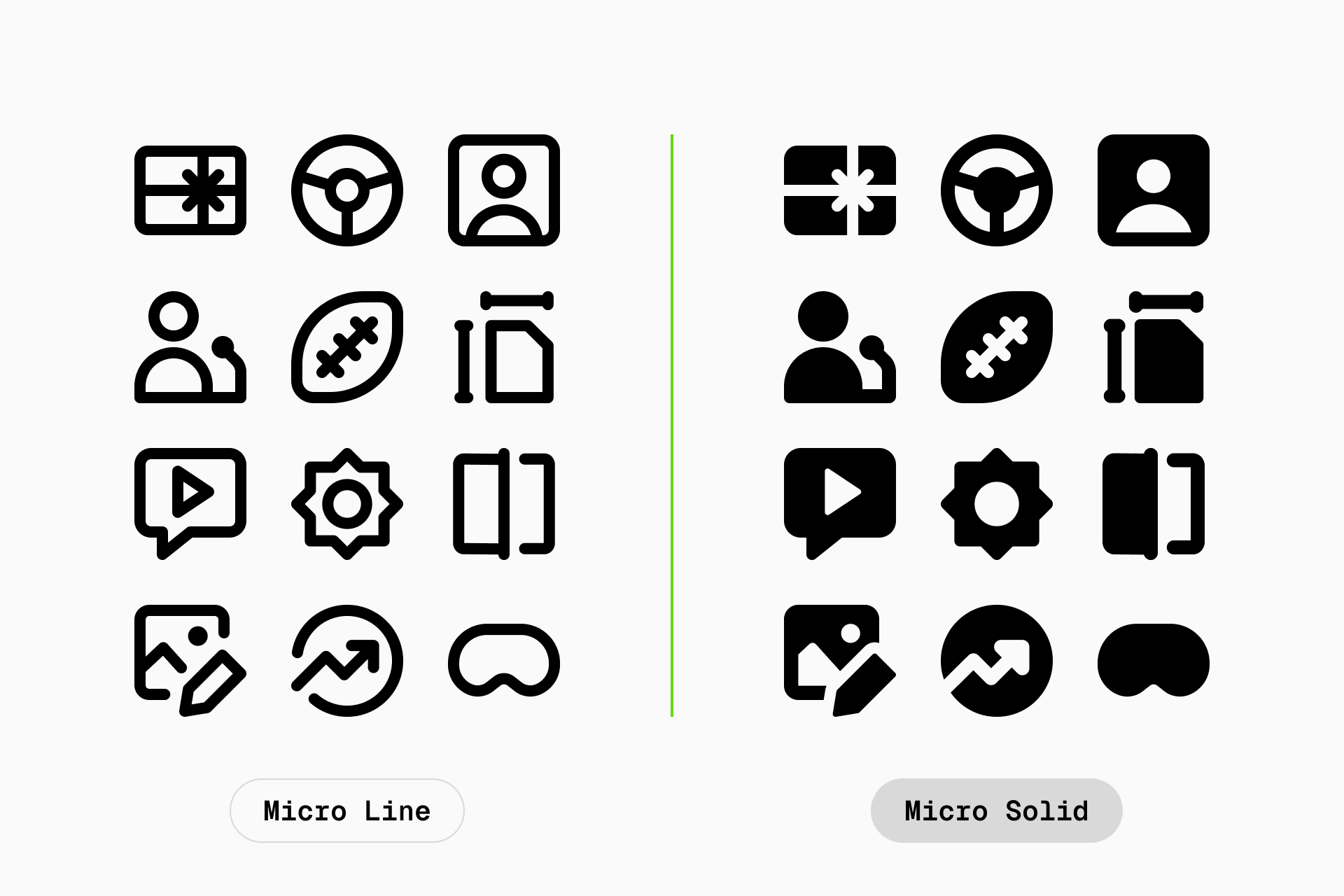
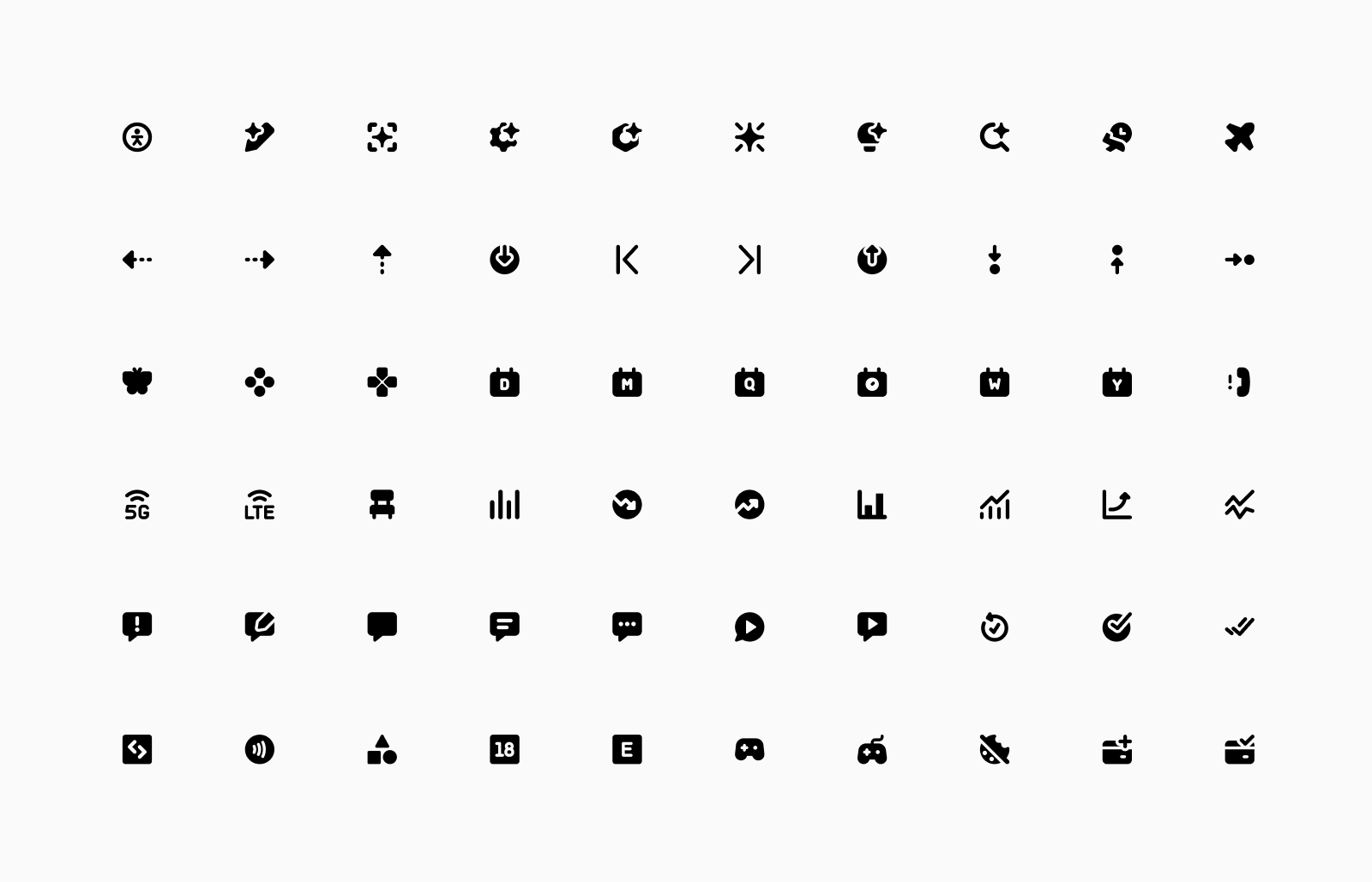
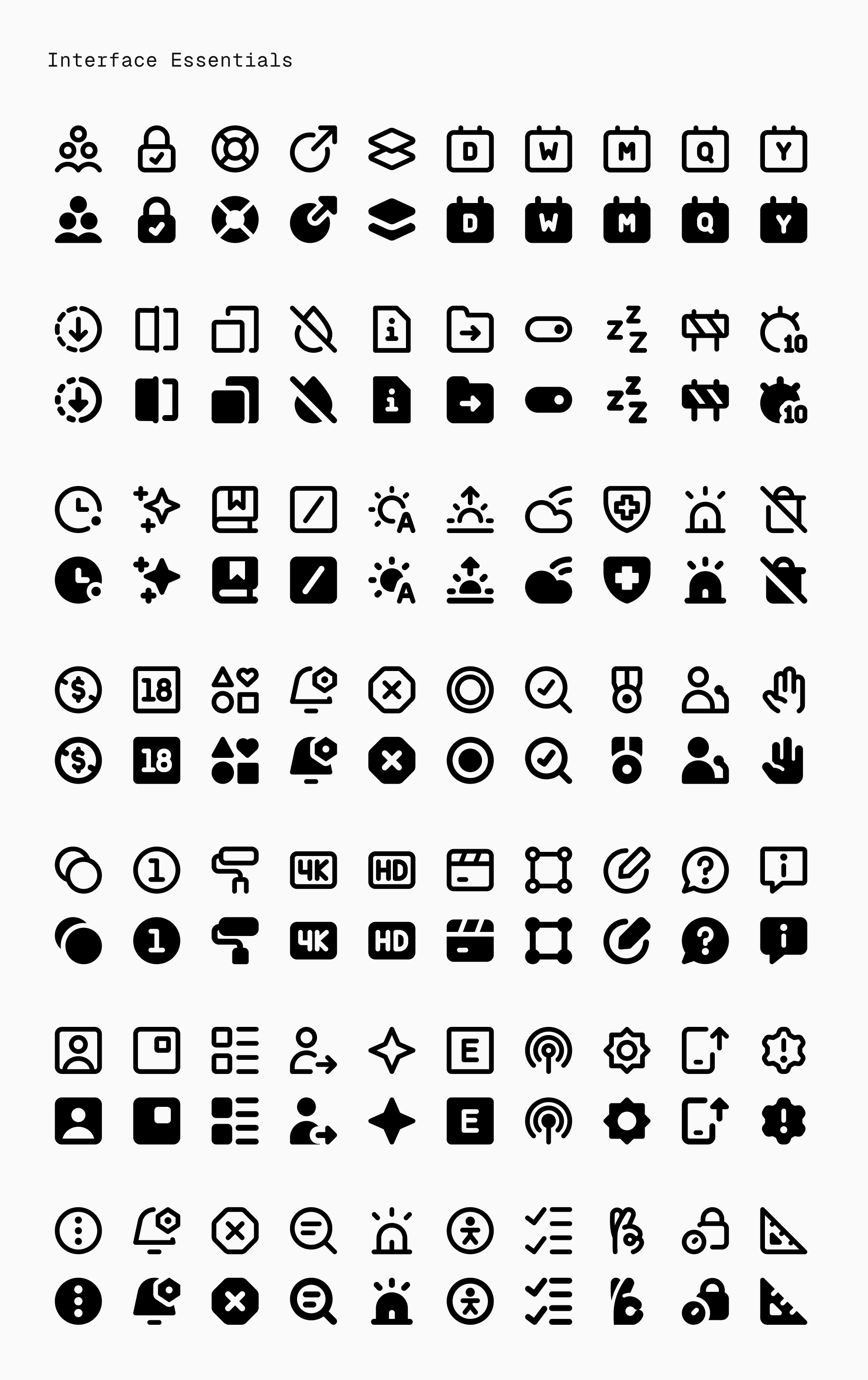
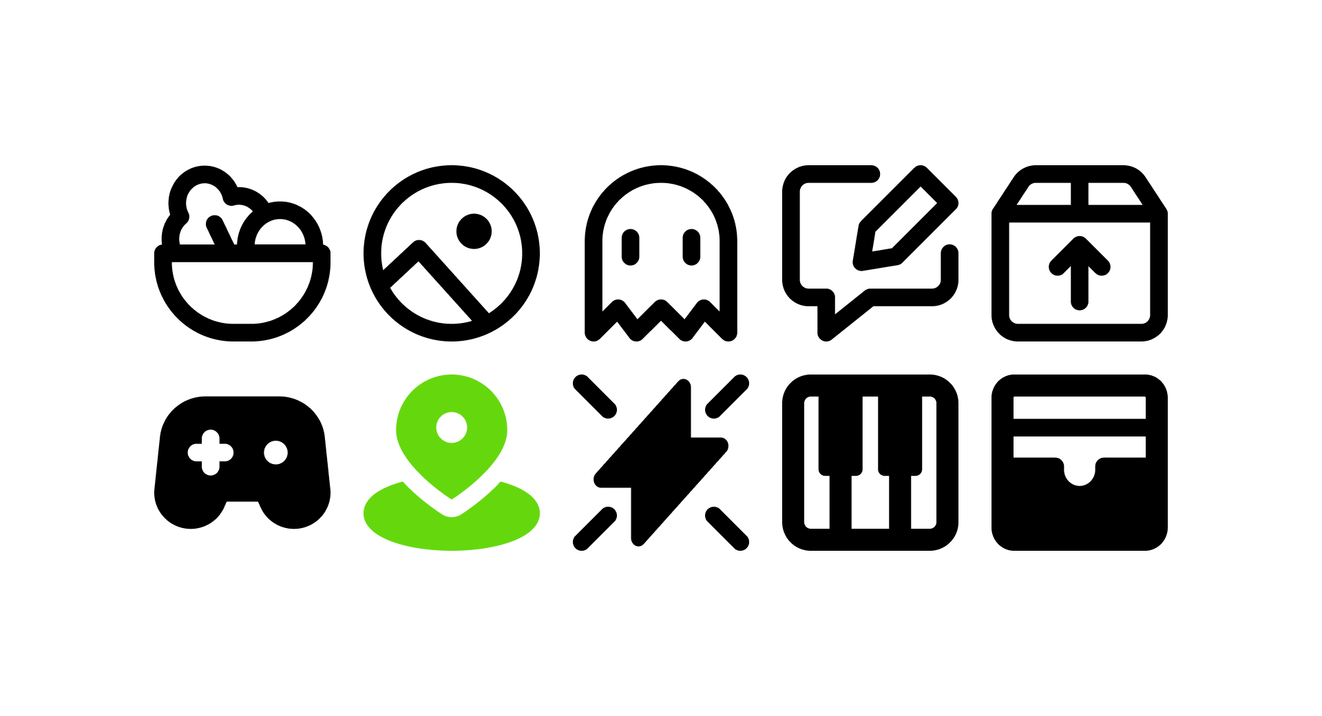
Now with 1100 new icons (550 Line and 550 Solid), Micro is more complete, flexible, and ready for today’s dense, mobile-first UIs. Other sets get messy in tight spaces. Micro stays clear, sharp, and perfectly readable, even at the smallest sizes.
About Micro icons
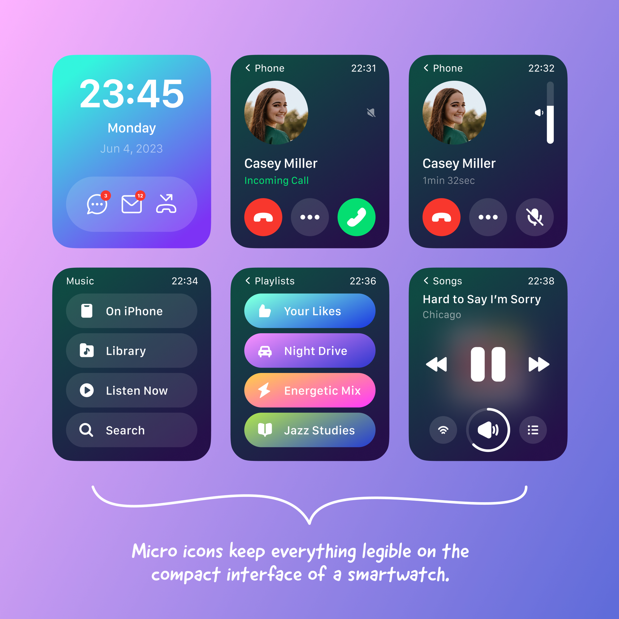
Built for the smallest spaces
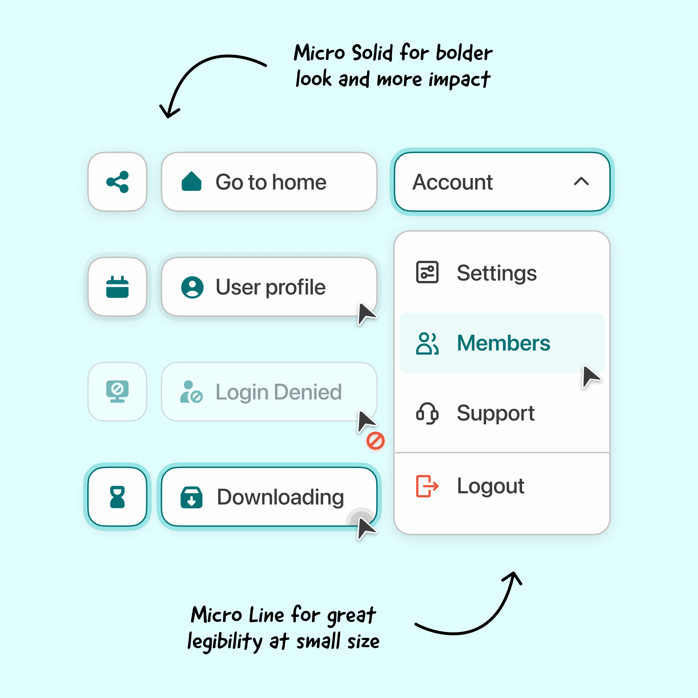
Unlike larger icon sets, Micro icons are designed specifically for tight UI spaces: inline text, toolbars, footnotes, small action buttons, or dense layout where clarity is critical.
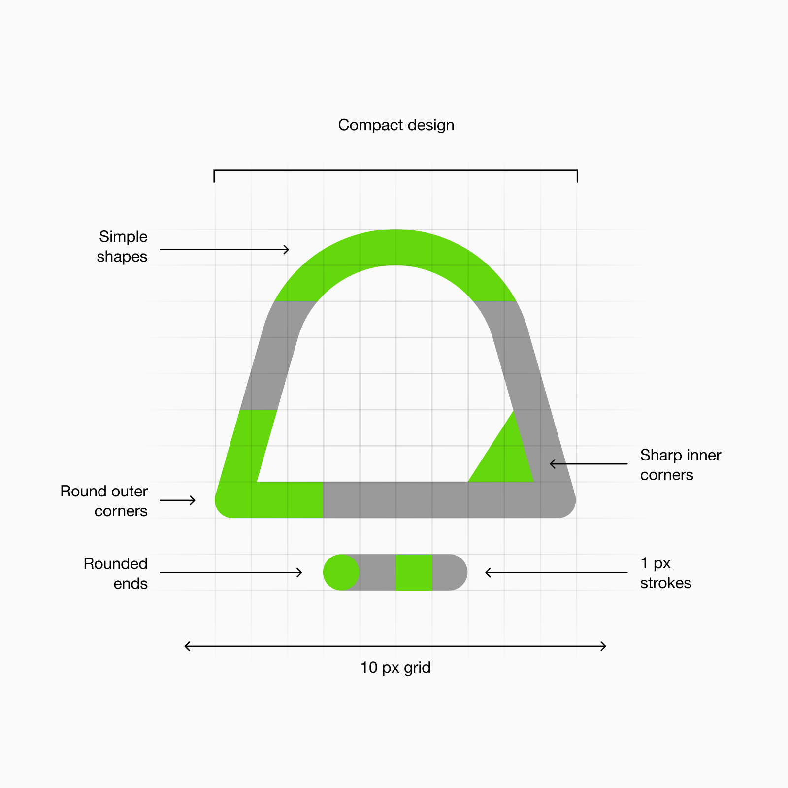
Every icon is crafted on a 10x10px grid, our smallest yet, using a rational construction system with rounded ends and minimal detail. The result is an icon that’s crisp, legible, and space-efficient, even at the smallest sizes.
What makes Micro different
Traditional icons often break at small sizes: too detailed, too complex, too noisy. Micro solves this by stripping down to the essentials, making icons usable where other sets fail. It’s the answer to frustrating, unreadable visuals in compact layouts.
If you’re already using other sets but struggle with size constraints, Micro ensures your visuals remain clear and readable without visual clutter.
About the expansion
Why we expanded Micro
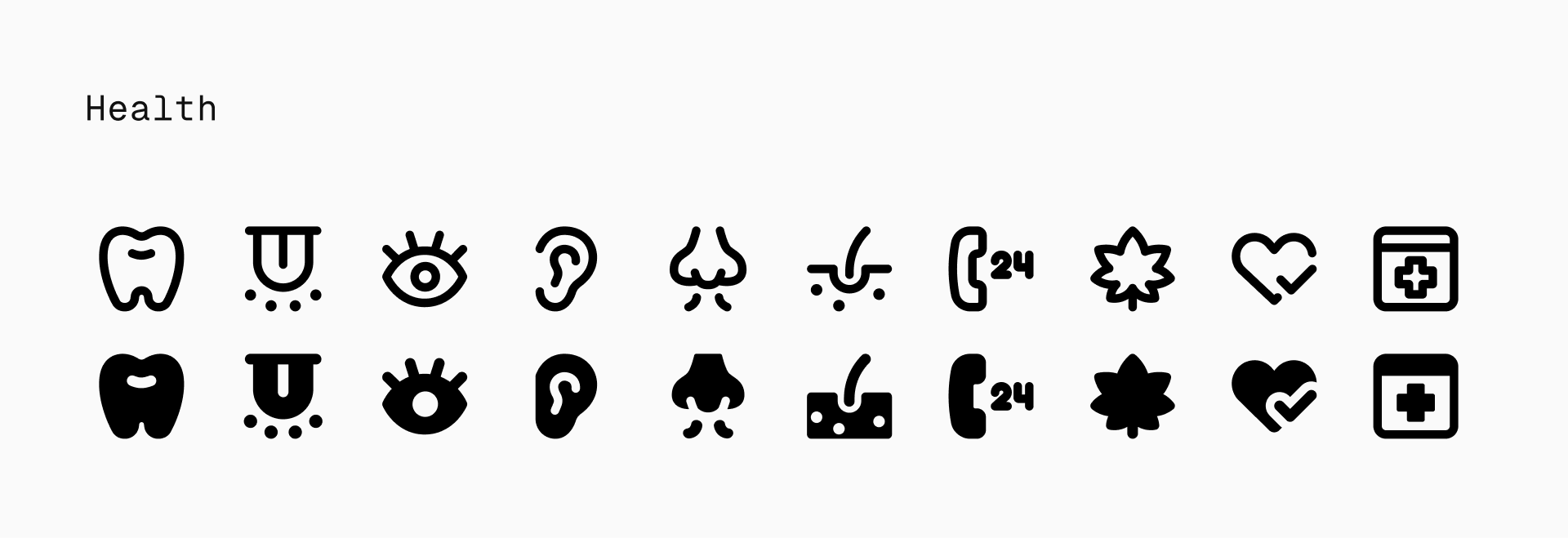
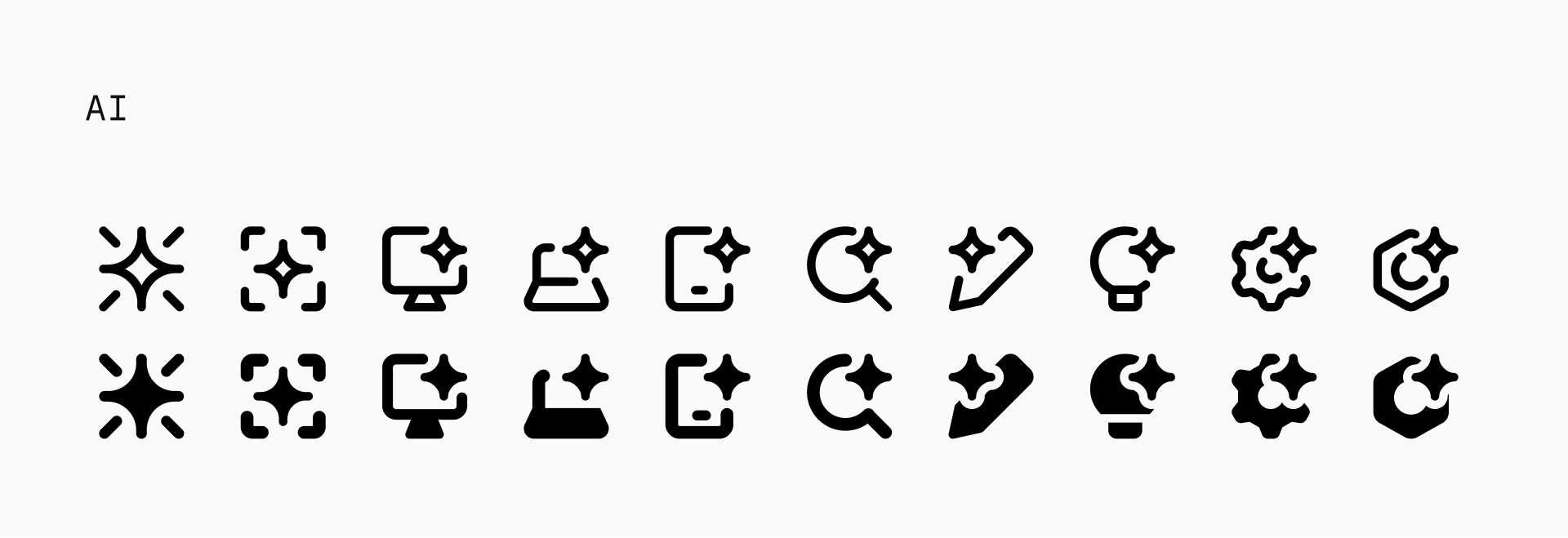
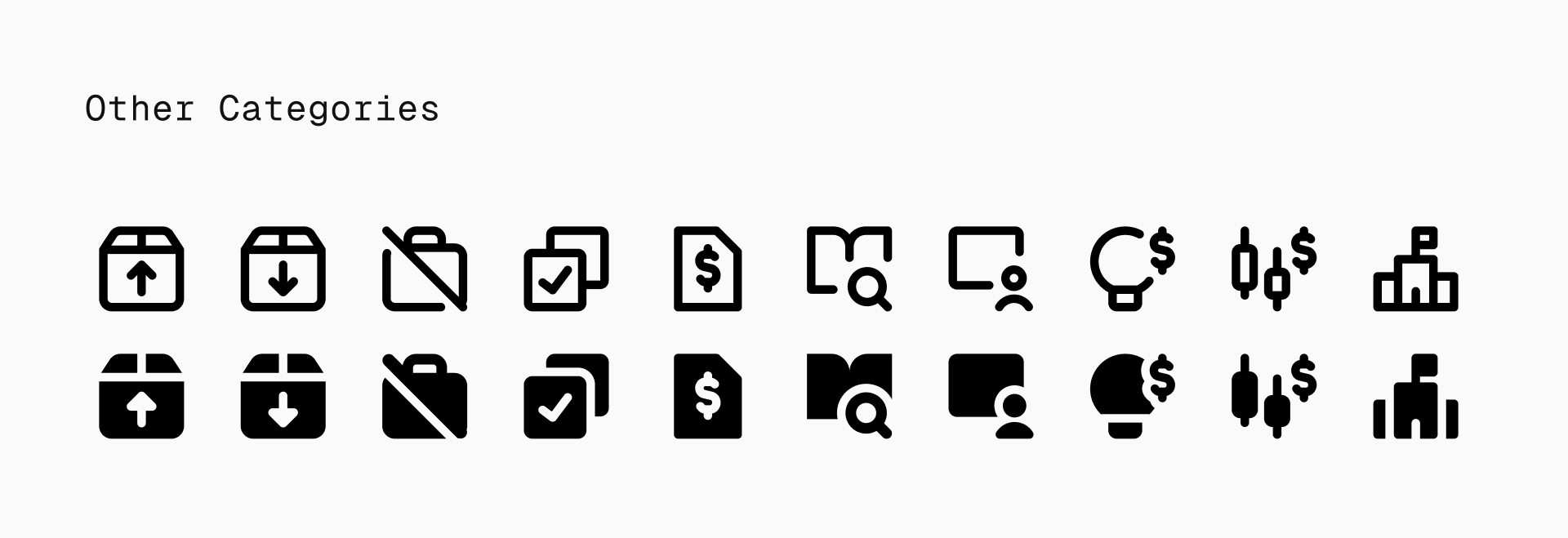
Interfaces are getting denser, and design needs are becoming more complex. Themes like AI, business, healthcare, and project management are no longer niche—they’re essential. To keep up, Micro needed to expand.
The challenge of expansion
Designing within a tiny grid isn’t forgiving. Expanding Micro meant translating complex, modern concepts into simple, readable forms without compromising clarity or visual balance. Every pixel had to serve a purpose.
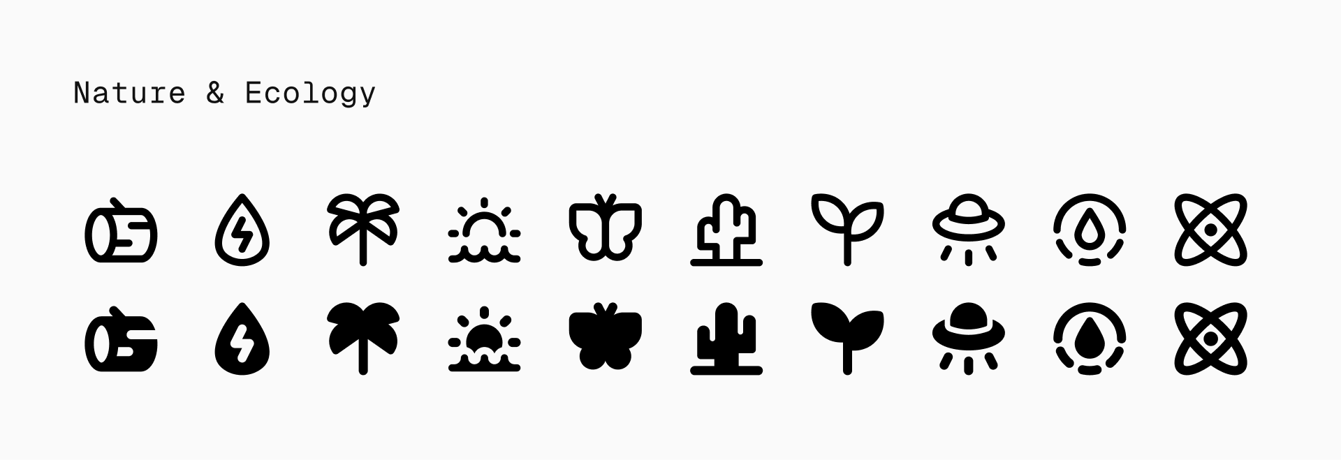
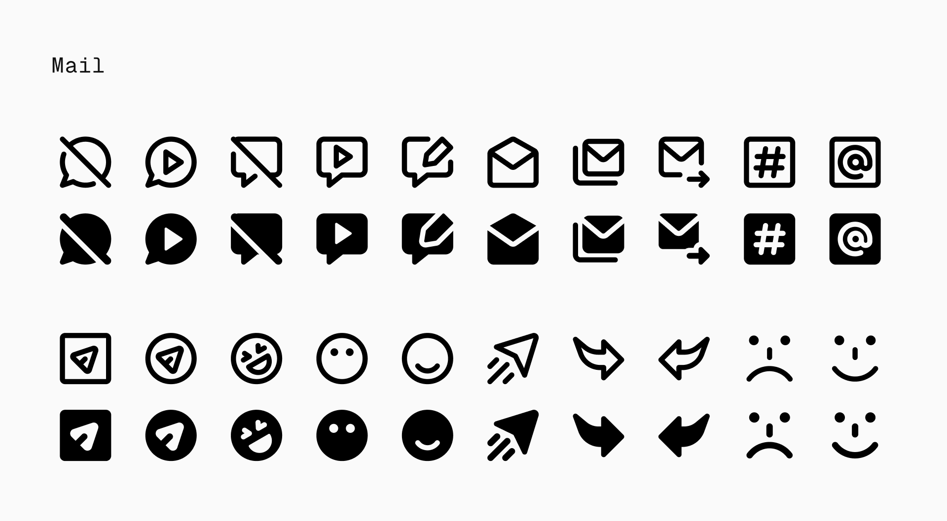
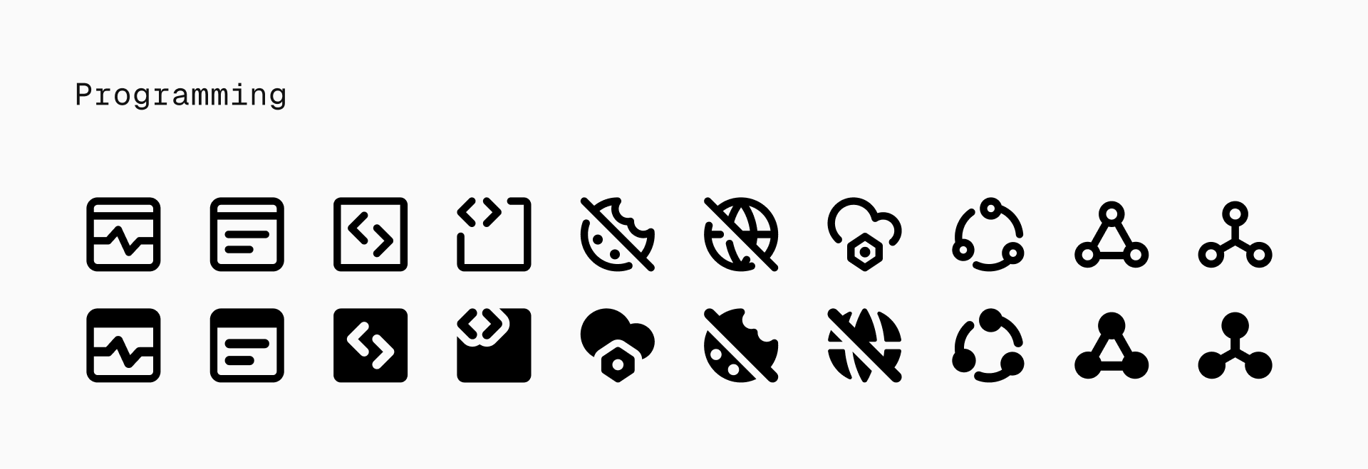
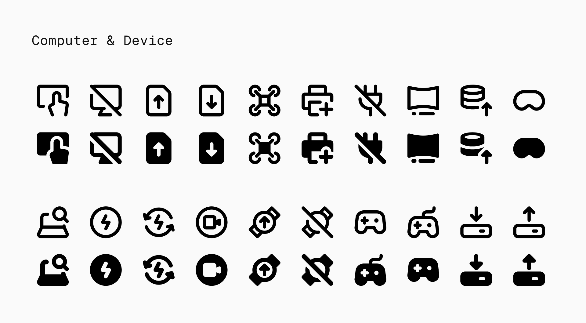
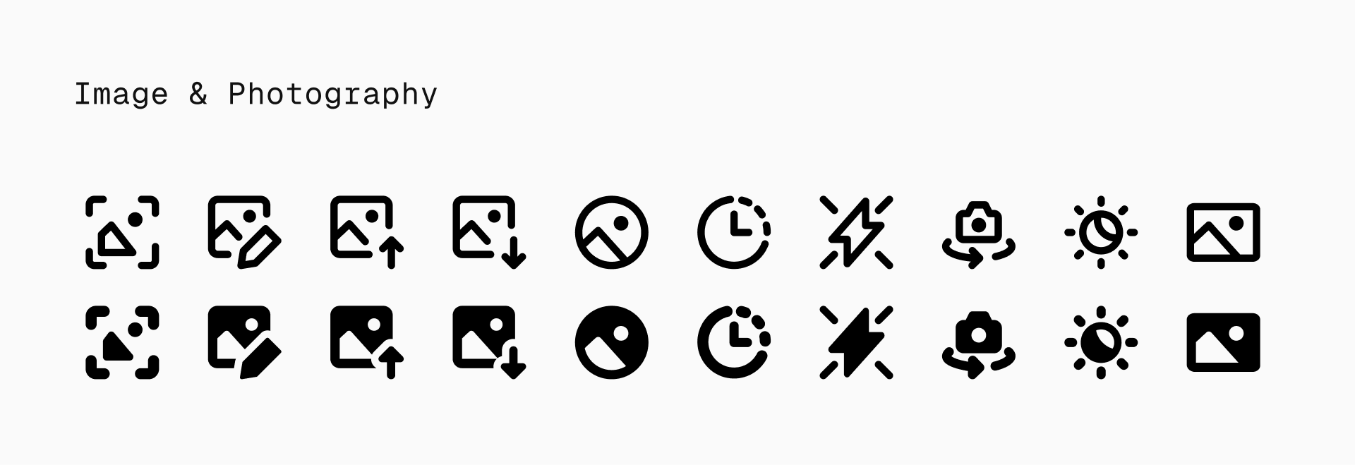
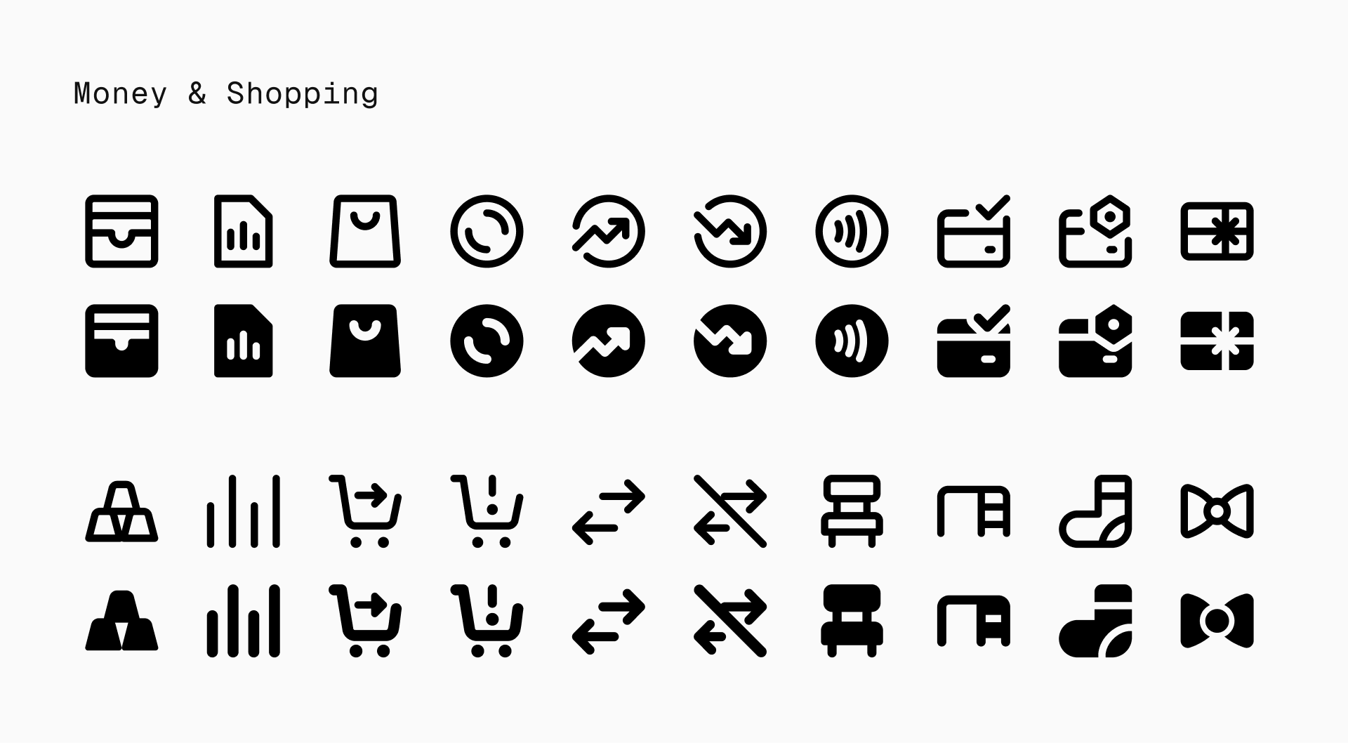
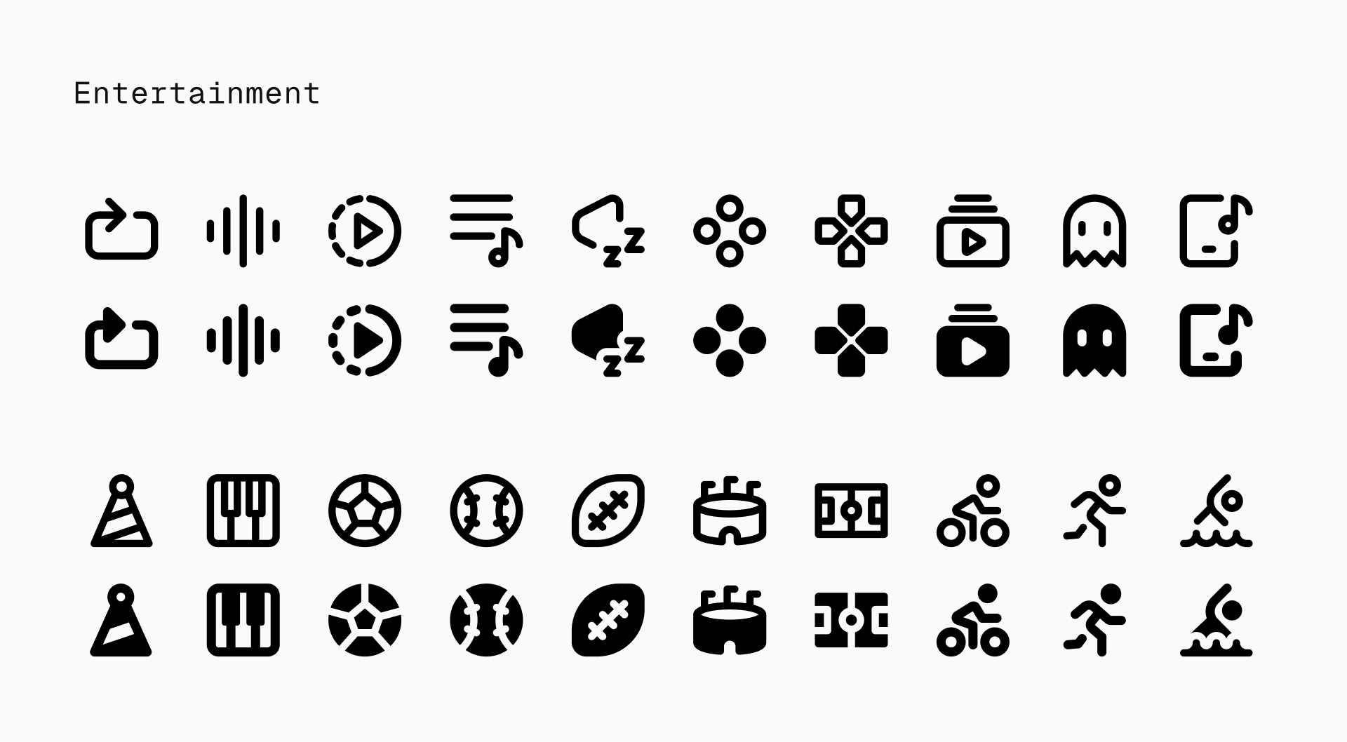
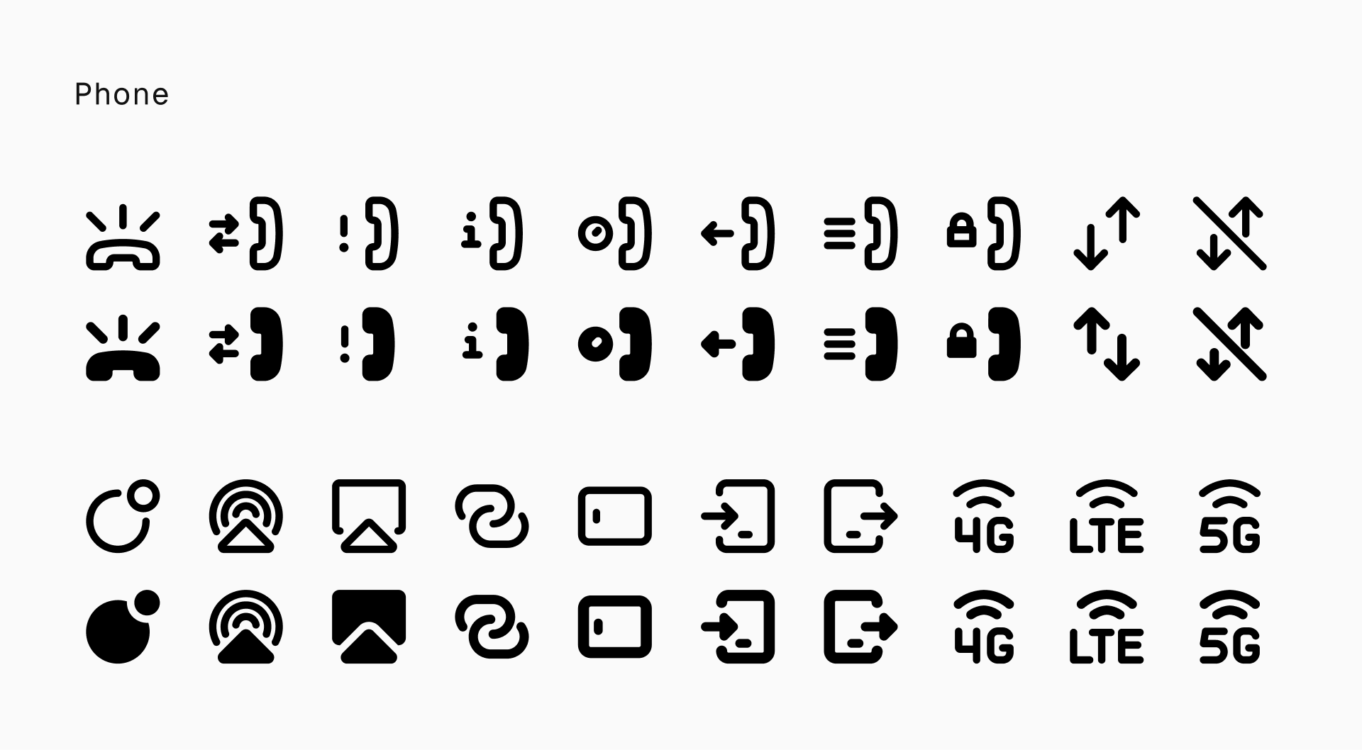
What's new
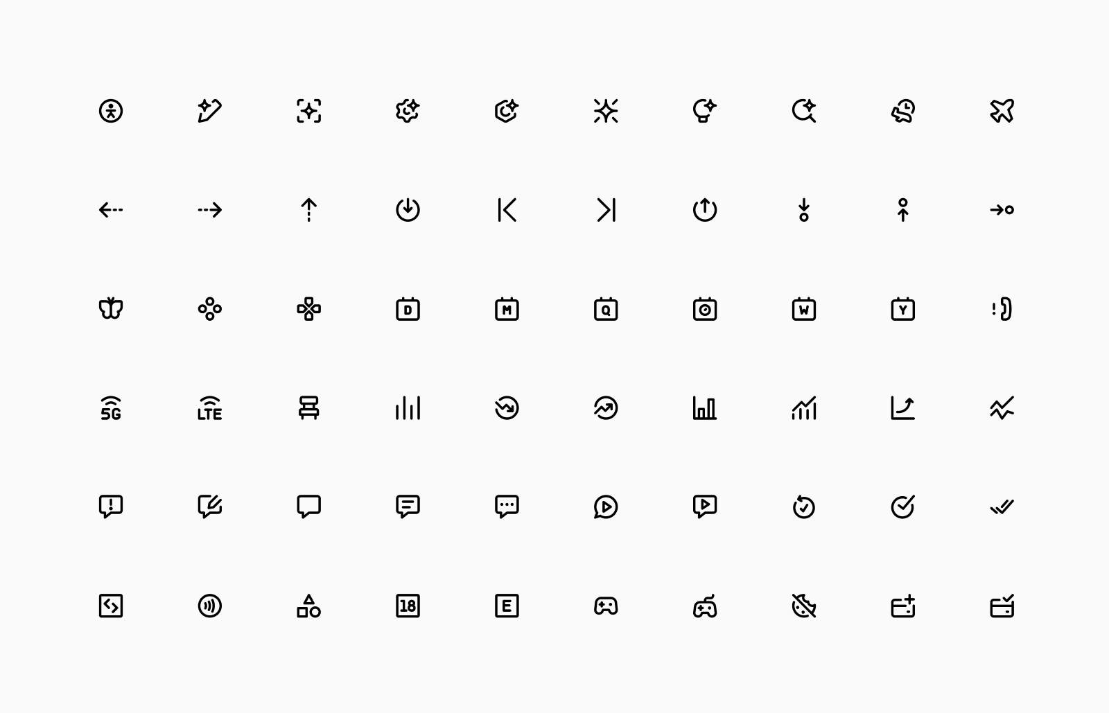
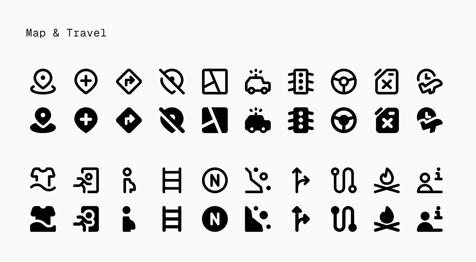
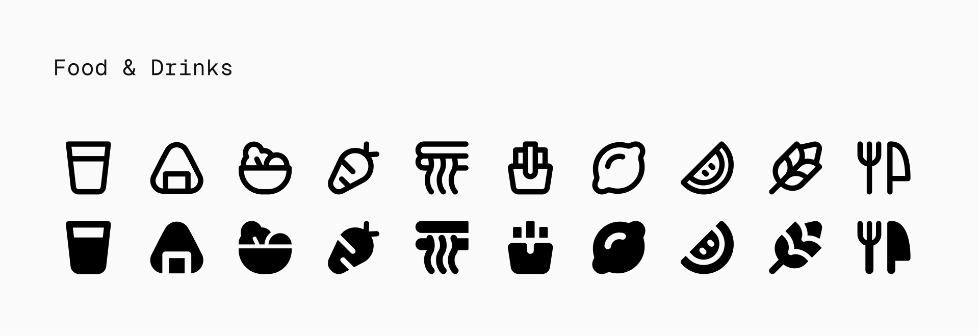
This update brings broad coverage across new and emerging themes like AI, business, project management, healthcare, travel, and essential UI elements. It ensures that Micro remains complete, relevant, and ready for modern design.
Smart pairings and use cases
Pairing Micro with illustrations
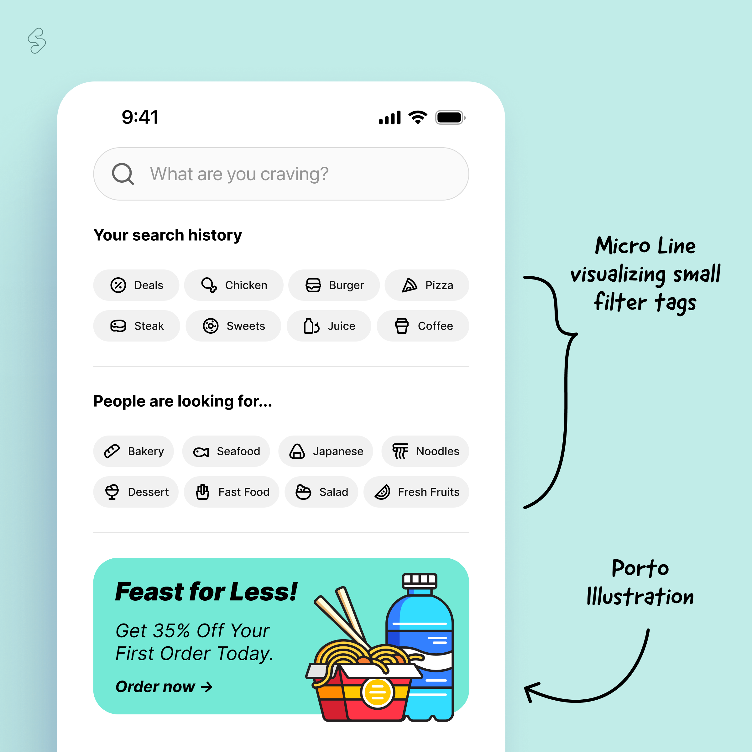
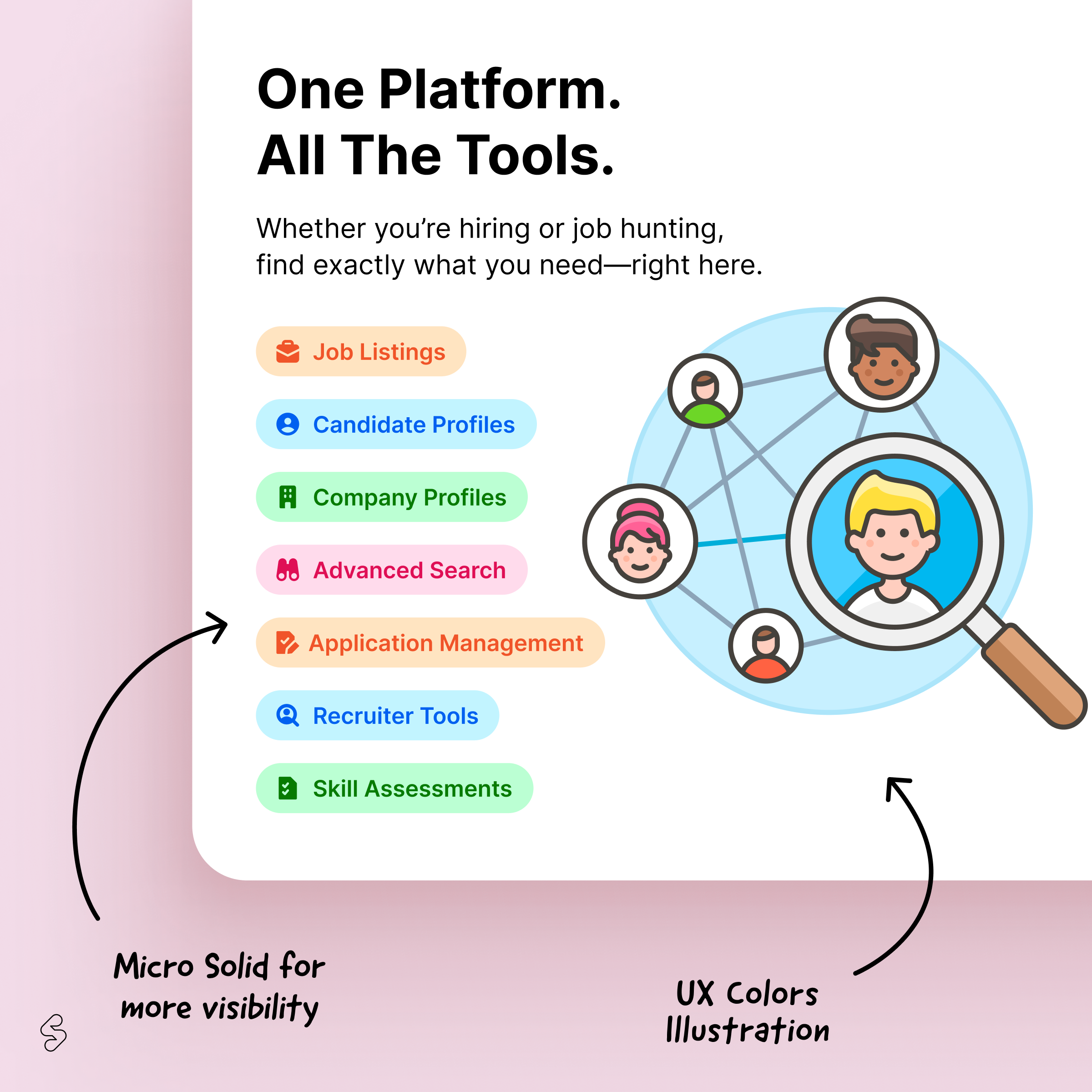
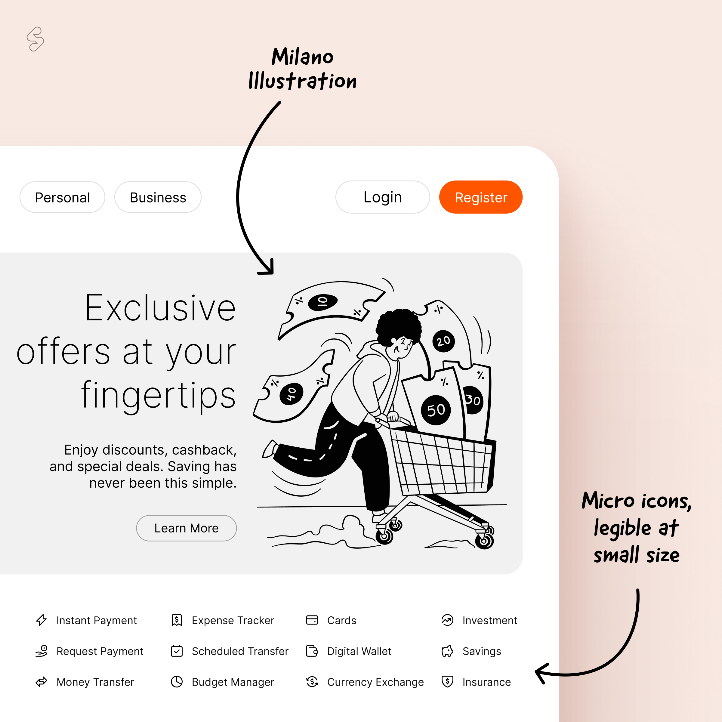
Micro works beautifully on its own, but also pairs well with a range of illustration styles. Its neutral look makes it versatile, able to complement clean, minimal visuals or balance out more expressive, detailed artwork. This set is visually compatible with:
- Milano (shares a minimal color palette and clean line work)
- UX set (aligns through geometric structure and neutral styling)
- Porto (offers a similarly minimal and modern feel, making it a natural match for Micro)
Pairing Micro with other icon sets
Combine icon sets thoughtfully and let each one play to its strength. Use Micro for secondary elements, like toolbars, footnotes, or dense UI blocks, and reserve standard sets for main navigation or prominent actions. It pairs especially well with:
- Core (shares a neutral, timeless, and minimal design language)
- Ultimate (complements Micro’s simplicity while covering a wider range of themes)
🔥 Designing for small spaces? Start here.
Micro just got its biggest update yet with 1100 new icons and counting. With more updates on the way, this is just the beginning.