Micro icons – Hyper legibility
Minimum details for a maximum clarity of your interface
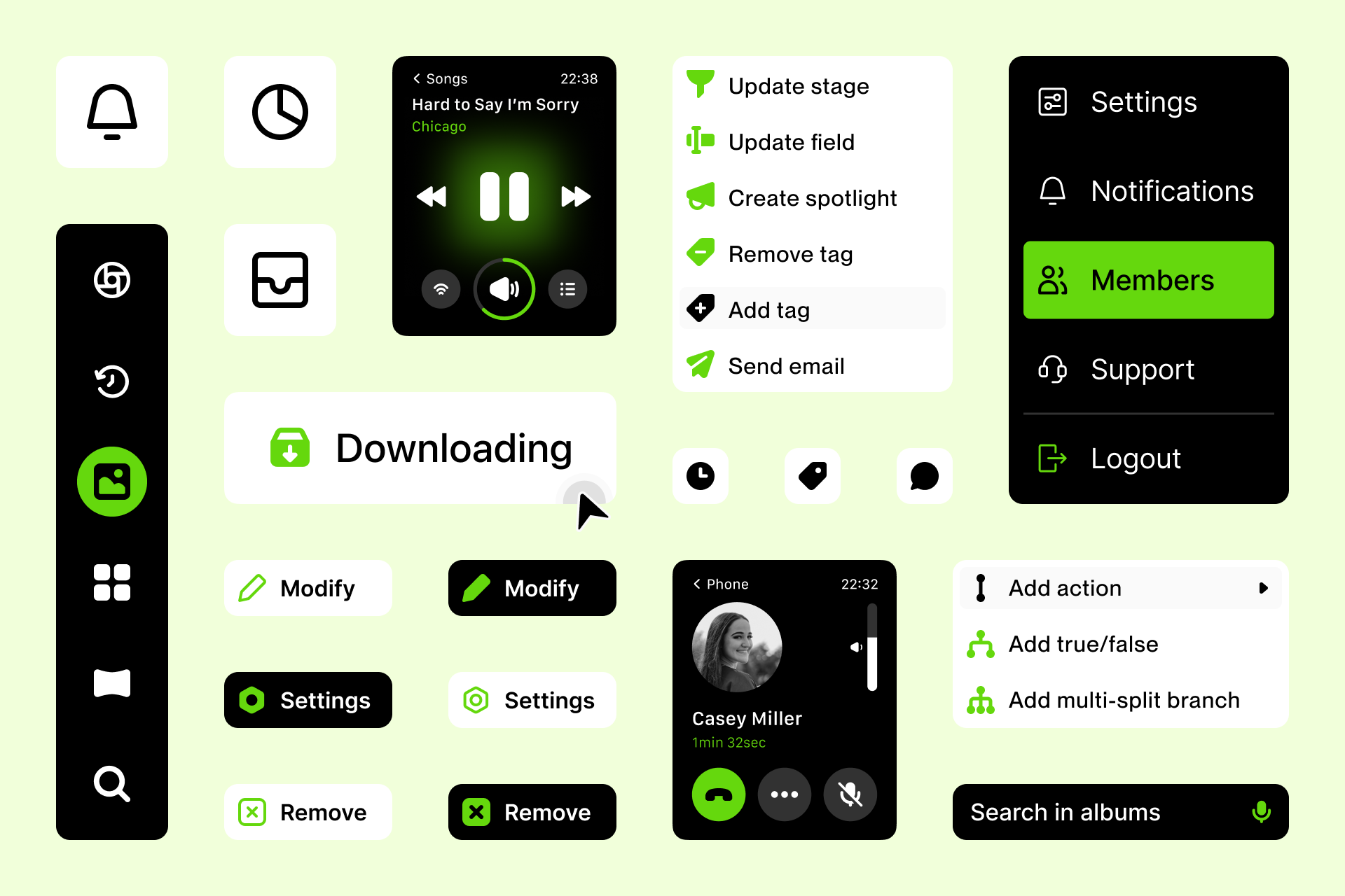
Micro is a collection of icons specifically designed to excel on a very tiny scale, designed using simplified shapes to ensure legibility at the smallest possible sizes.
It's the perfect choice for those looking for neutral and timeless icons that prioritize functionality above everything else.
The smallest grid ever seen
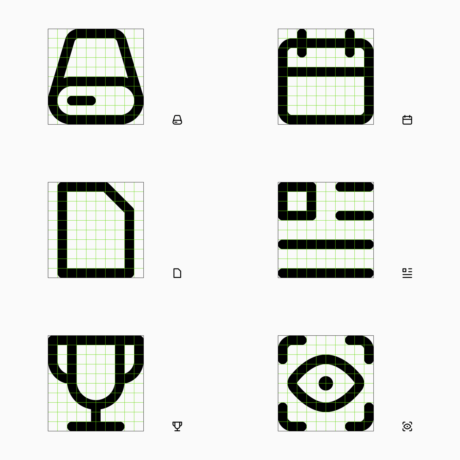
Micro icons were designed in a tiny 10x10px grid to avoid using unnecessary details. It's the ideal set to improve the usability of your projects thanks to its rational and simple construction guidelines.
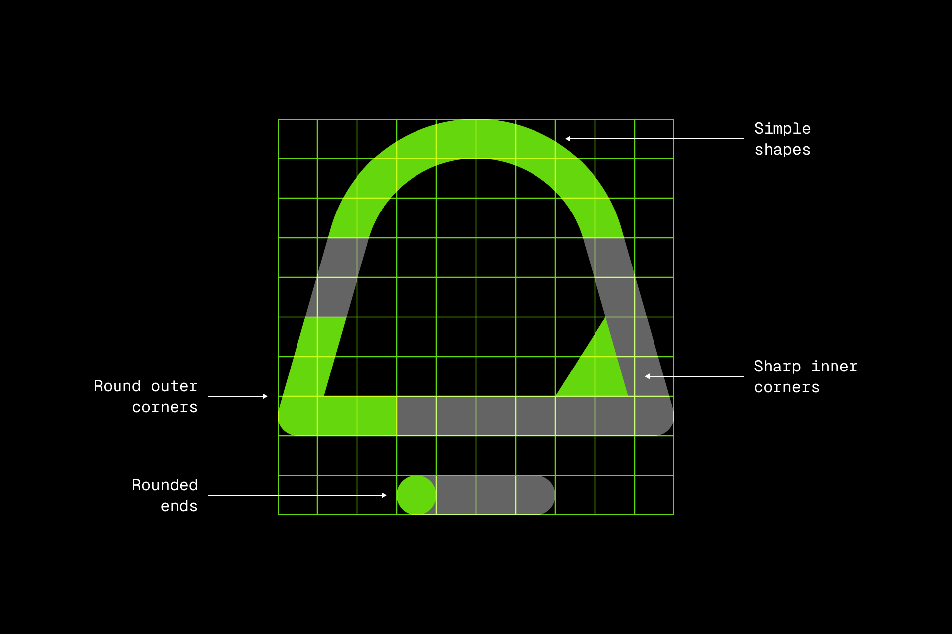
The combination of simplified shapes, rounded ends and a restrictive grid is what gives the set its neutral and timeless style.
Efficient design
Micro is all about efficiency, minimum detail for maximum legibility. This allows each icon to be easily recognizable in places where size can be a constraint.
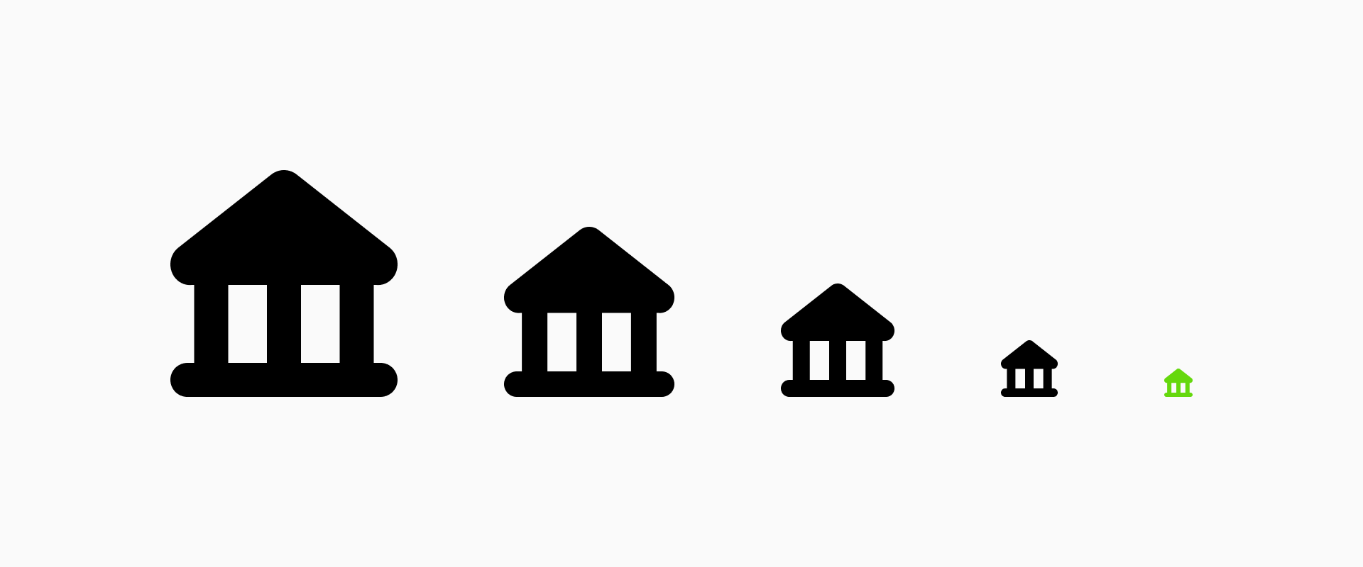
If you need your icons to be easily recognized and not interfere with the other elements in your design, this collection is for you.
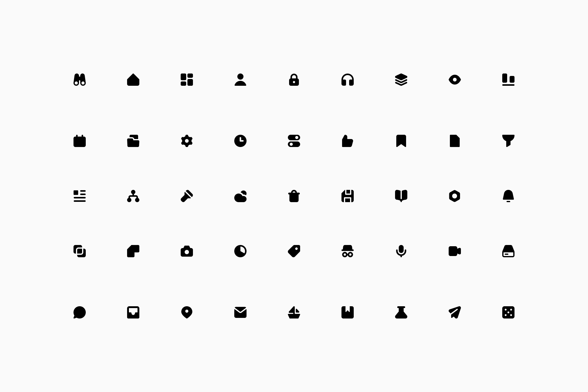
Nearly 3,000 icons in 2 different styles
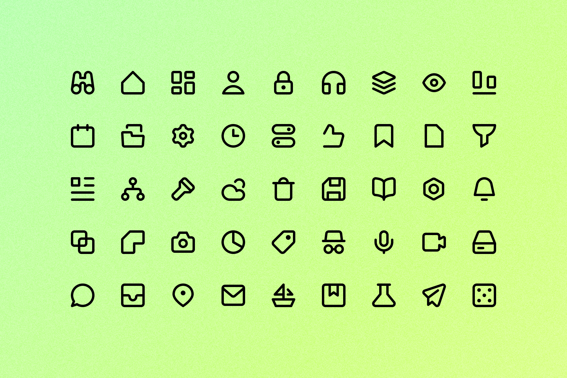
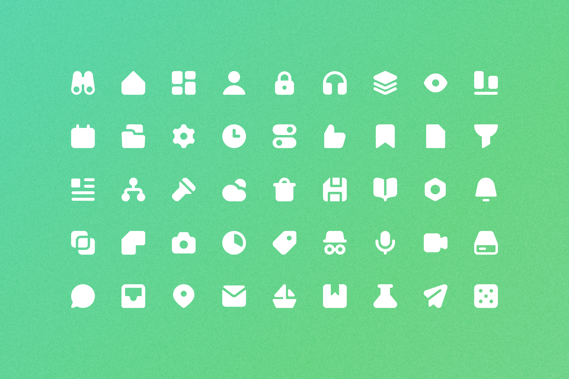
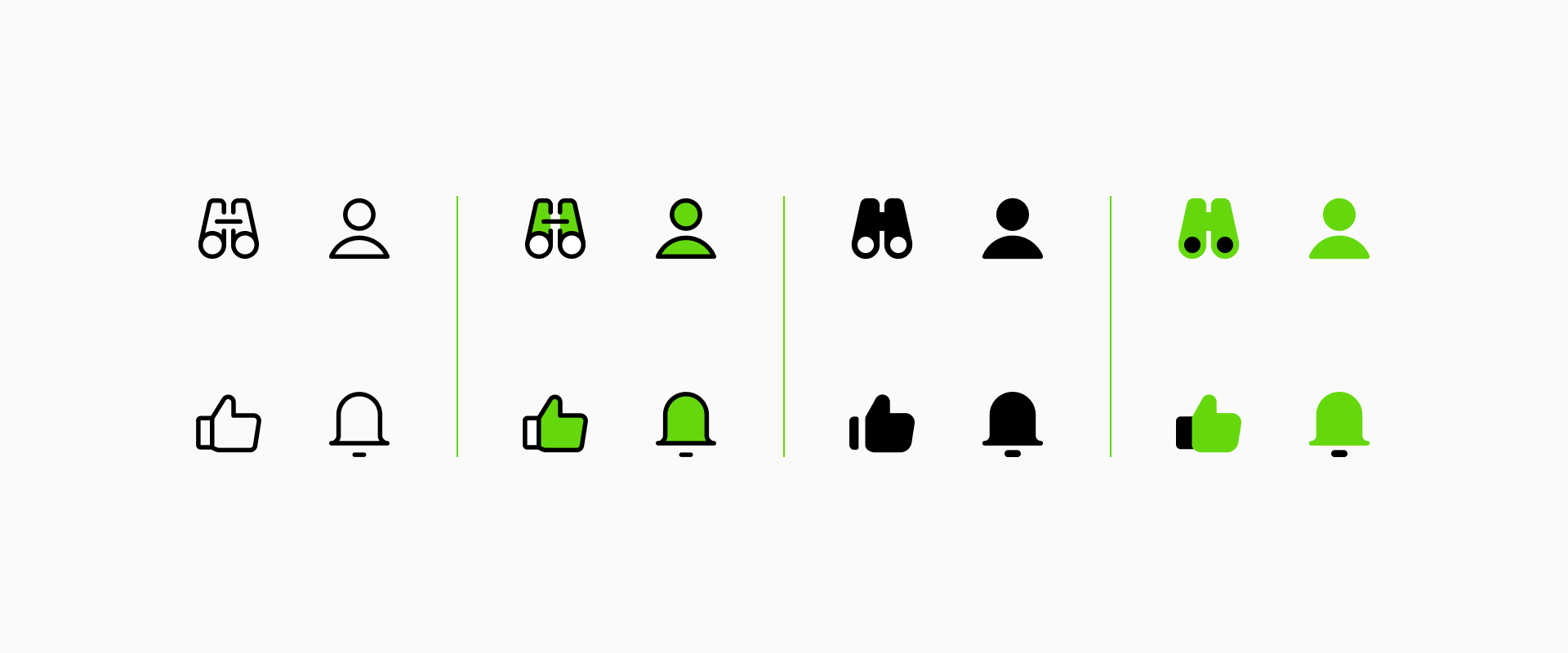
Micro icons come in two different styles: Line and Solid, each of them with almost 1,500 essential icons. Micro Line has a more elegant and versatile look, perfectly adaptable to your project needs, while Micro Solid has a more prominent and bold appearance, making it more legible at smaller sizes.
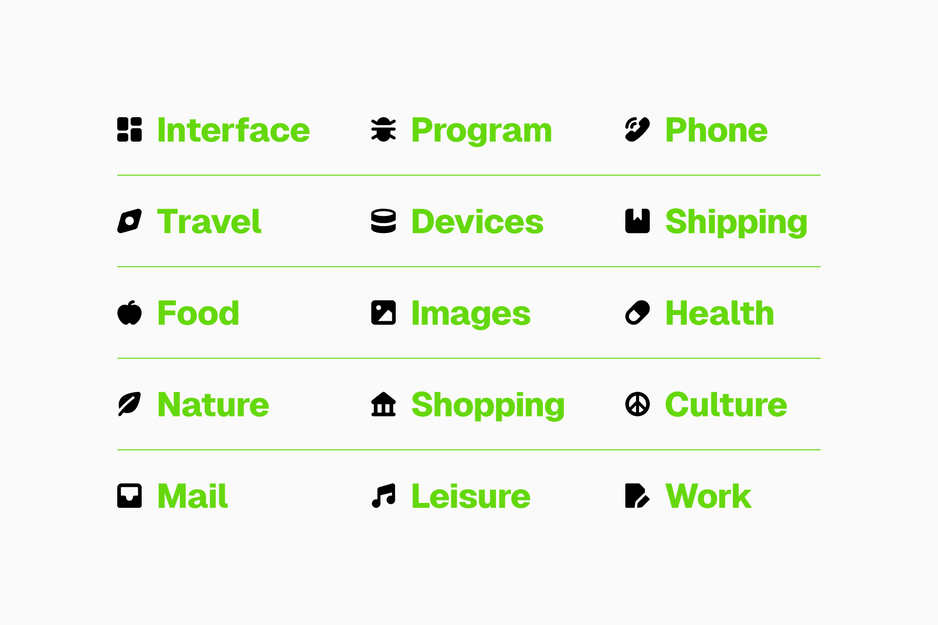
This set is divided into 15 different categories that cover all the basic needs of any project, from Interface, Mail and Shopping to Food, Shipping and Health.
Improved and expanded
Originally Micro had 1,800 icons, but we’ve spent the last few months redesigning them based on two principles: reduce the level of detail and create more spacious and legible shapes. Can you see the subtle improvements?
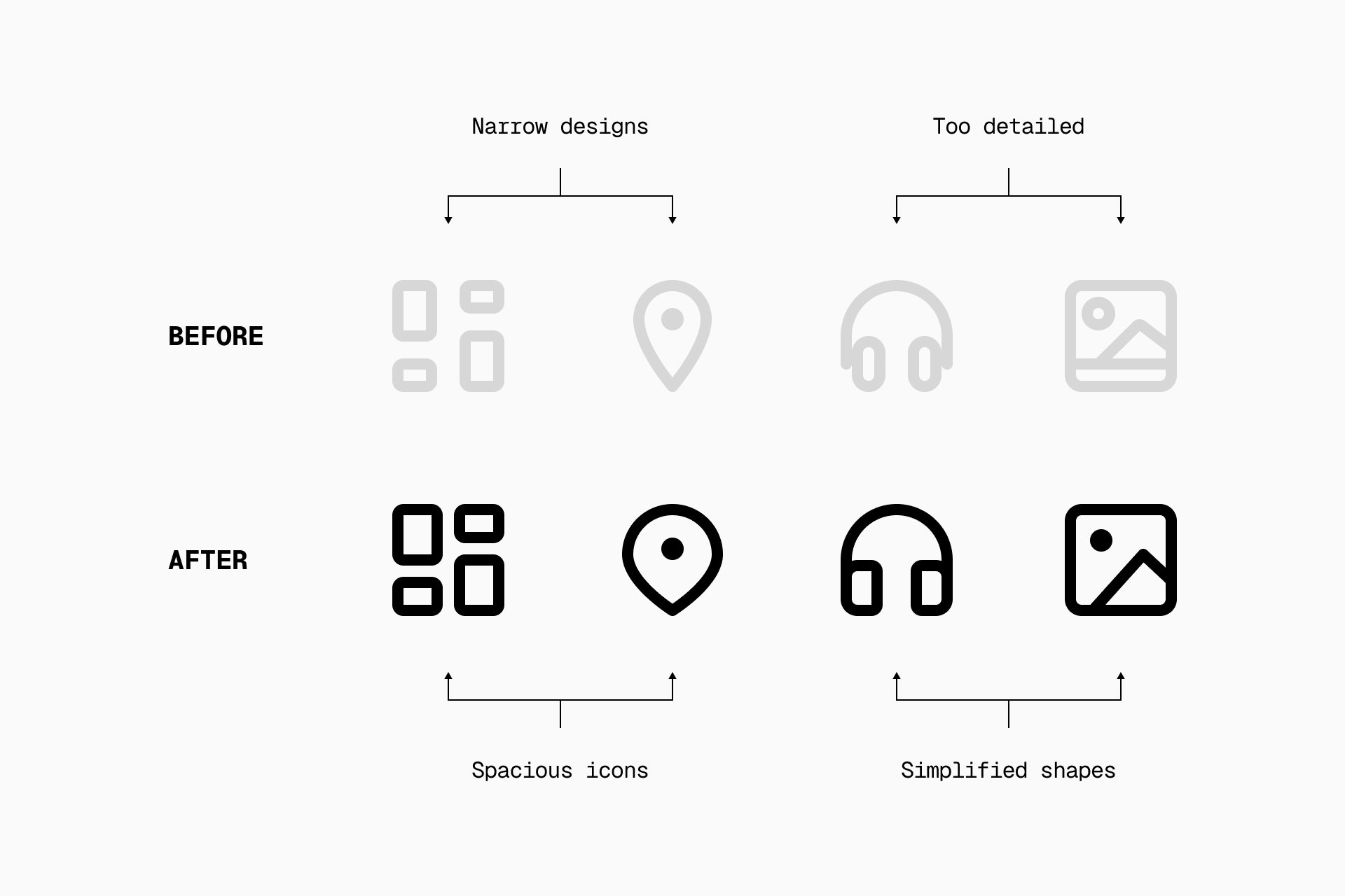
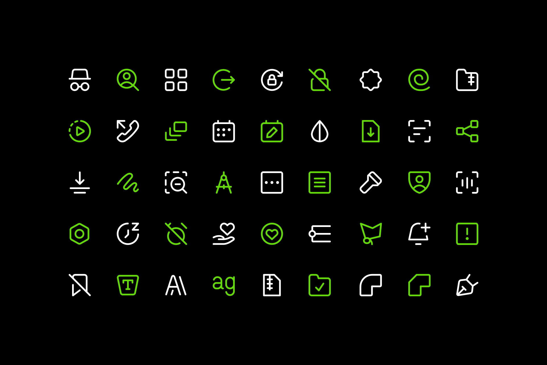
Besides improving what we already had, we've also refreshed this set with the inclusion of over 1,000 icons, with special attention to the Interface category.
When to use Micro?
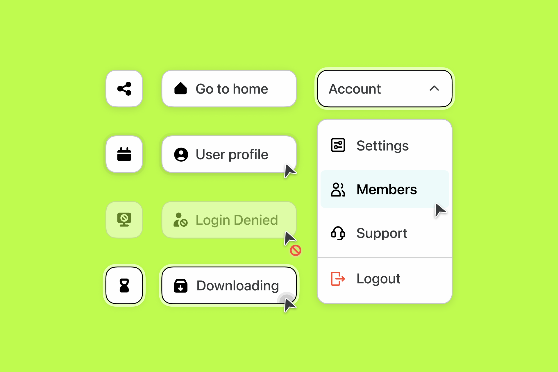
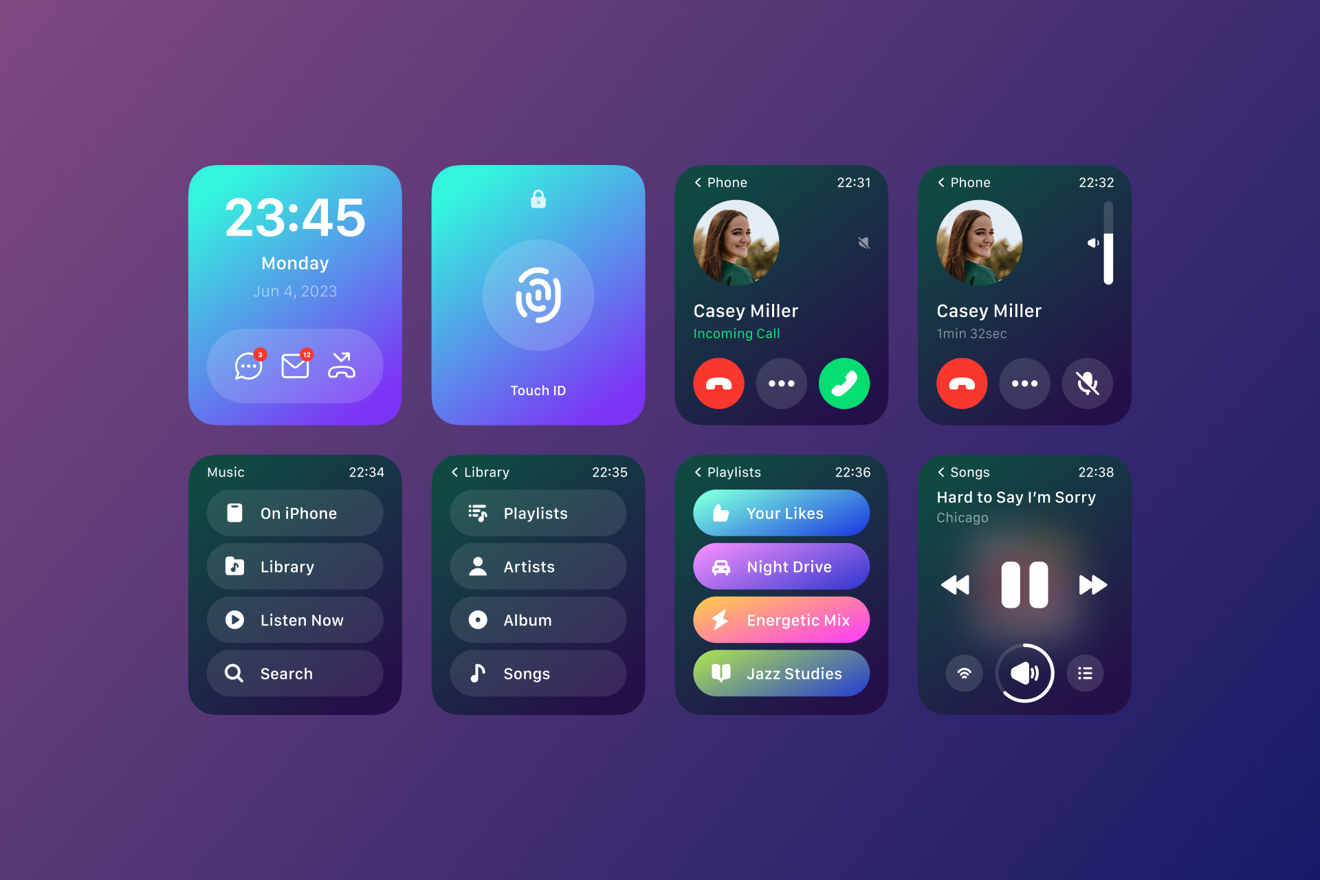
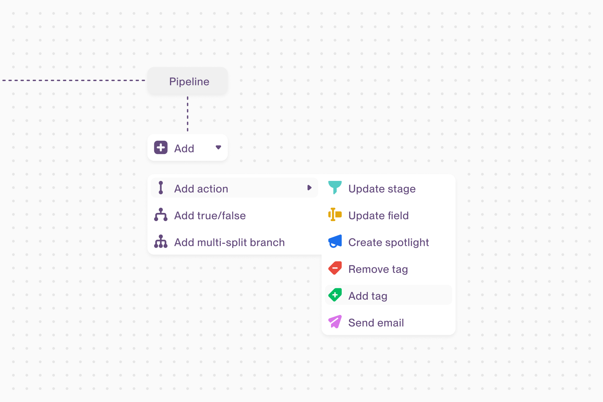
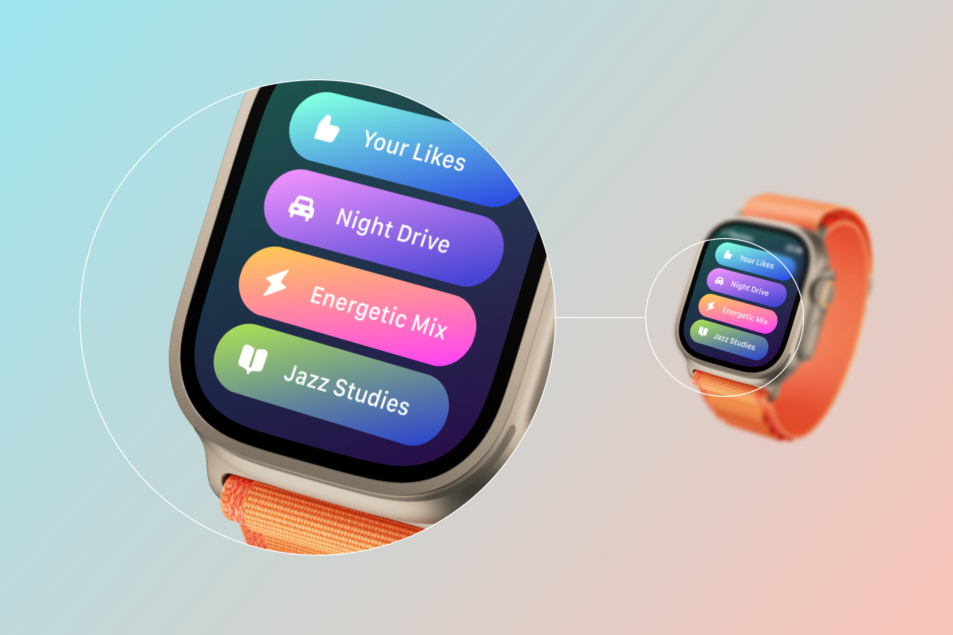
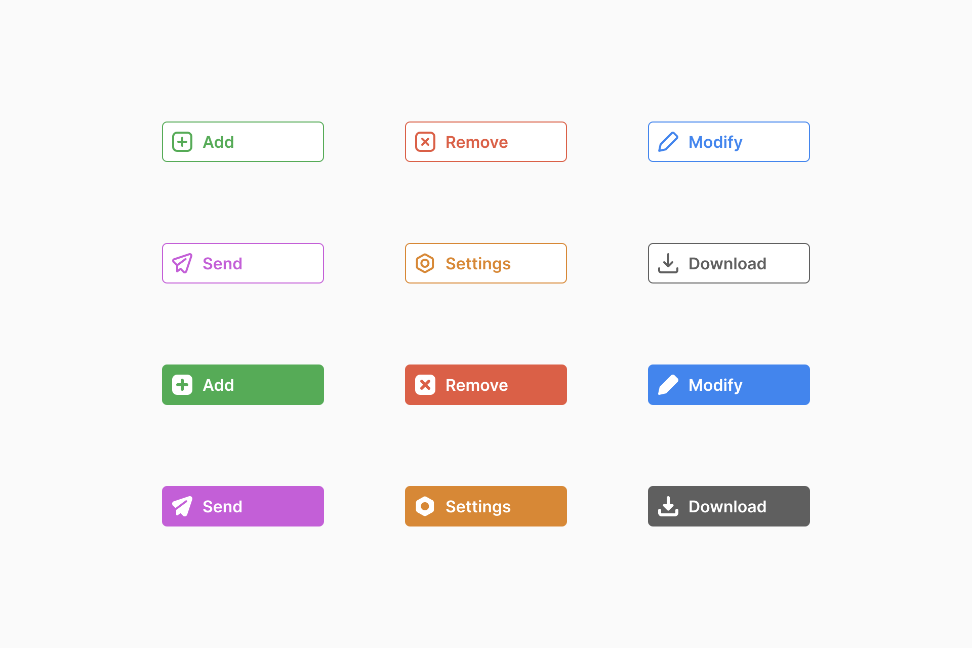
Micro icons are perfect for inline text, small navigation buttons and, overall, for projects where you need icons to simply help communicate efficiently without drawing too much attention. They're perfect for user interfaces or diagrams.


Versatility over restrictions
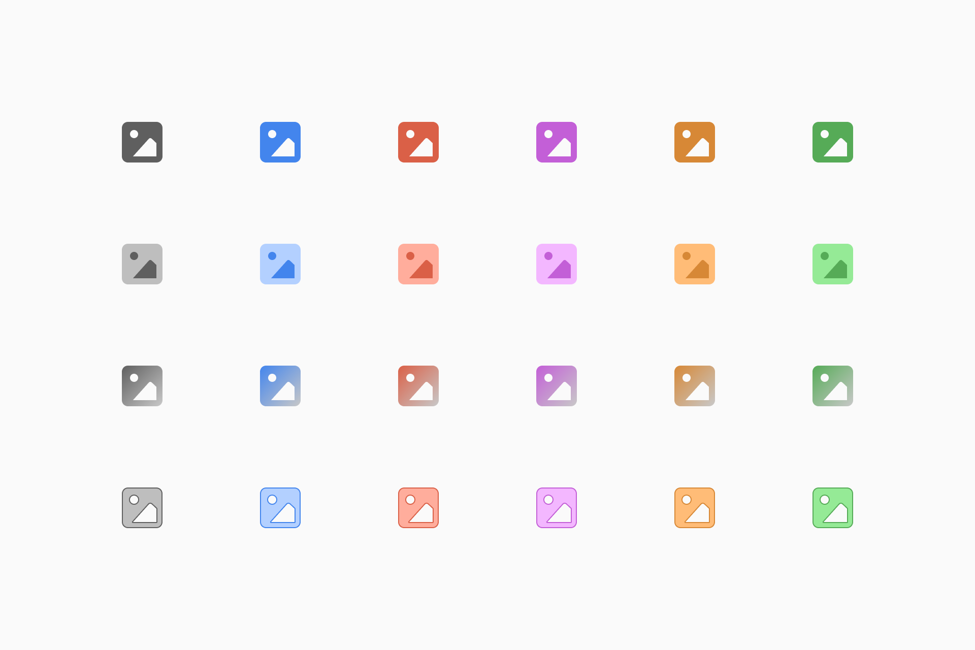
Using our Streamline app or a design software like Figma you can easily change the colors of the icons and adapt them to your project's needs. You can add fill, include gradients or even create an extra stroke to the shapes.
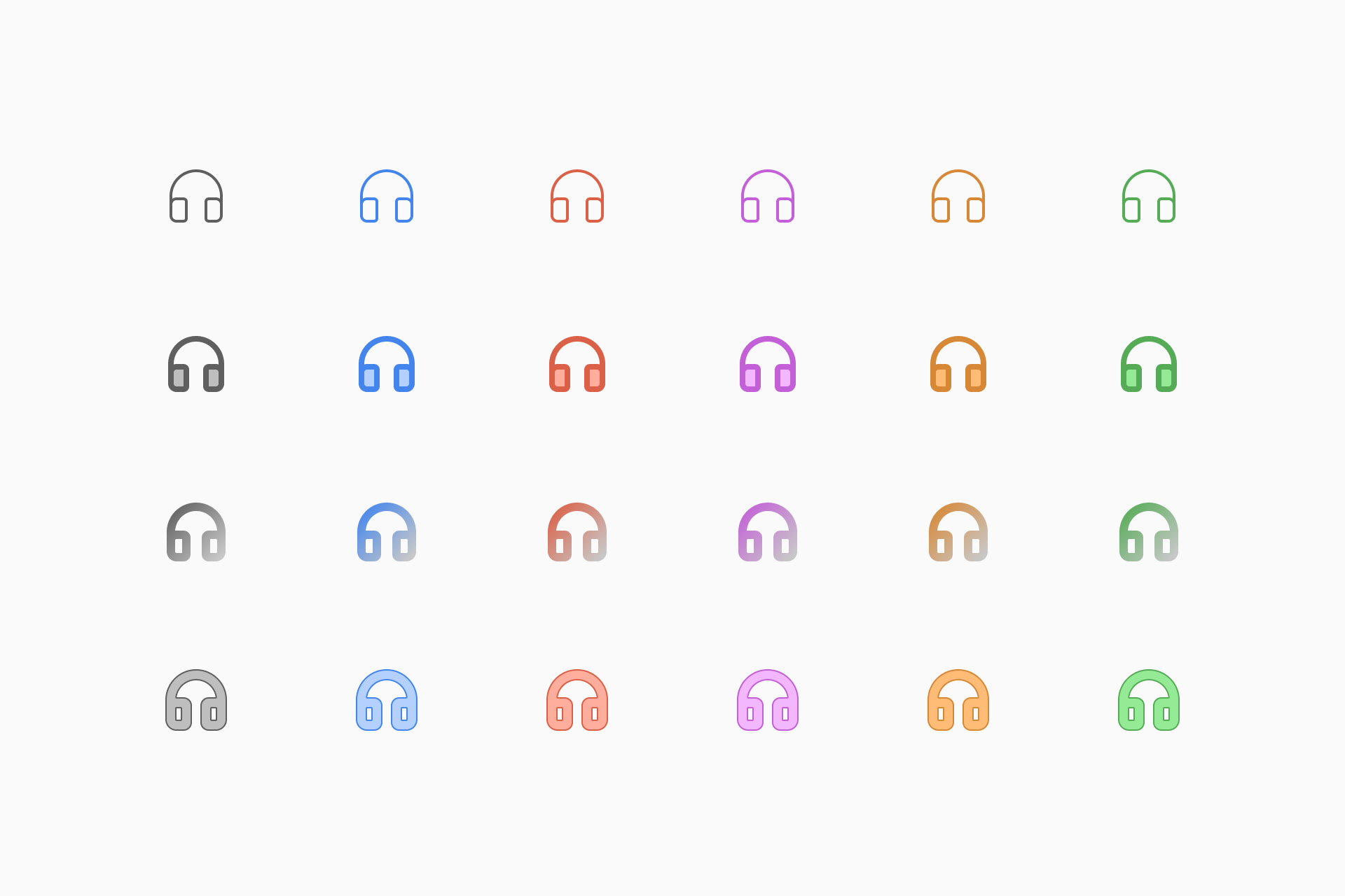
Micro Line icons also offer the possibility to adjust the stroke thickness, making them easily adaptable to any visual identities, whether they're subtle and elegant or rough and bold. A truly chameleonic set.
What typefaces could I pair it with?
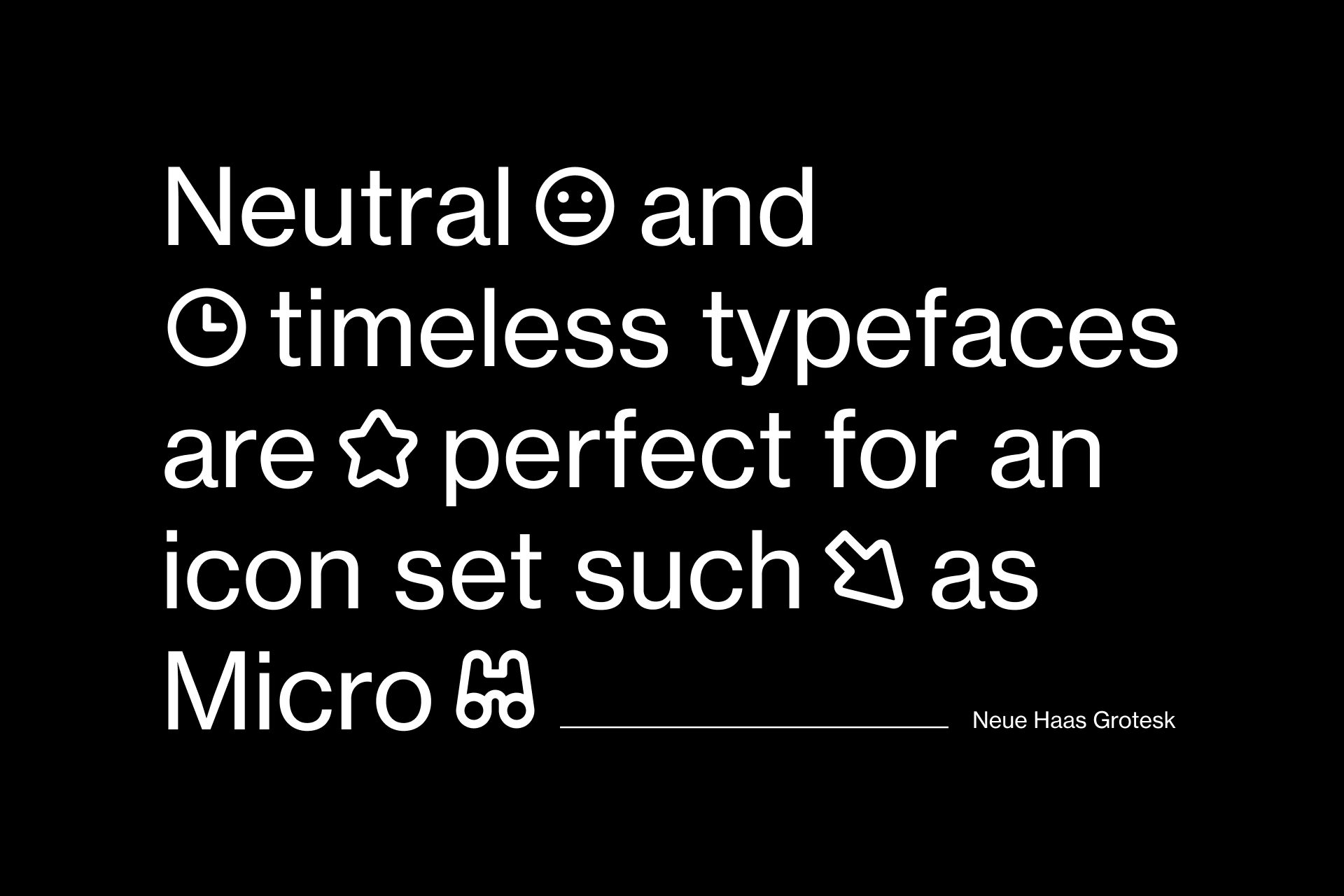
This set is ideal for use with san-serif typefaces that share the same qualities of legibility and timelessness such as Helvetica or Neue Haas Grotesk. Want some free alternatives? Then take a look at Inter or IBM Plex Sans.
The alternatives
If Micro isn't exactly the set you were looking for, we can also recommend a couple of alternatives. On the one hand, Core is a larger set that shares the same neutral features as Micro, but is built on a less restrictive grid. In addition, it comes in 4 different styles (Line, Duo, Solid and Flat) for greater flexibility.
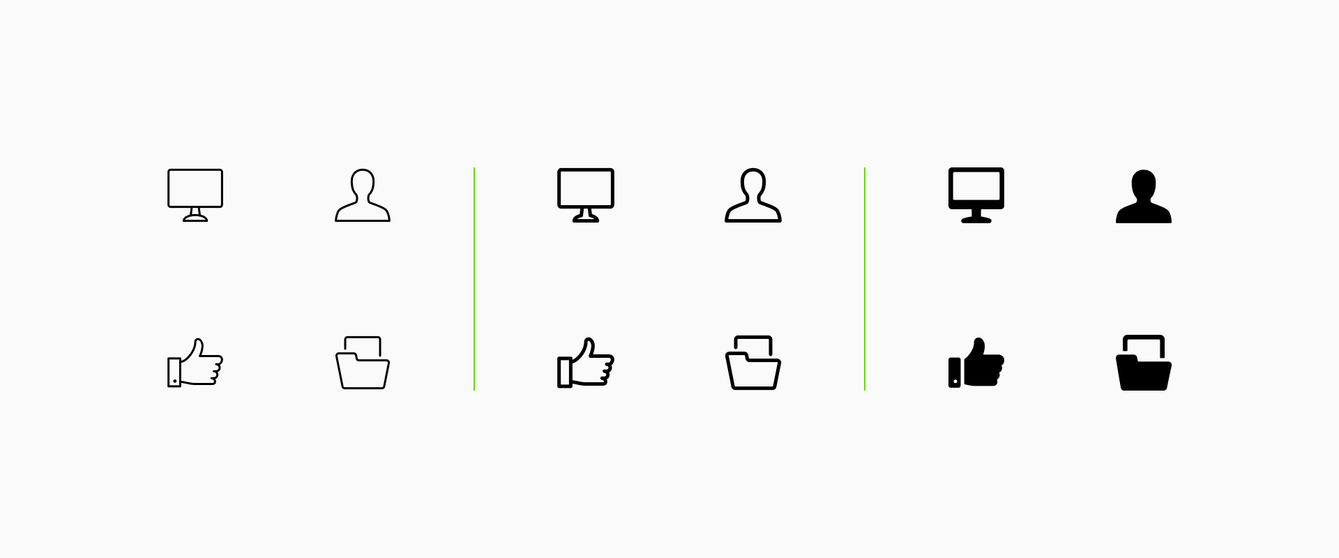
On the other hand, there's also Ultimate, an icon encyclopedia with thousands of signs presented in three different styles (Light, Regular and Bold). These icons are built on a larger grid for a more illustrative and friendly appearance.
Time to try Micro
This is just another example of the variety we want to offer in our library, thinking about the problems our users may face and looking for effective solutions. Like Micro, an icon set that remain perfectly legible at reeeeally extreme sizes.
Want to try them out? Check our Figma file with 1,000 free Micro icons.
If you want to access the full collection, go ahead and take a look at it in our app.
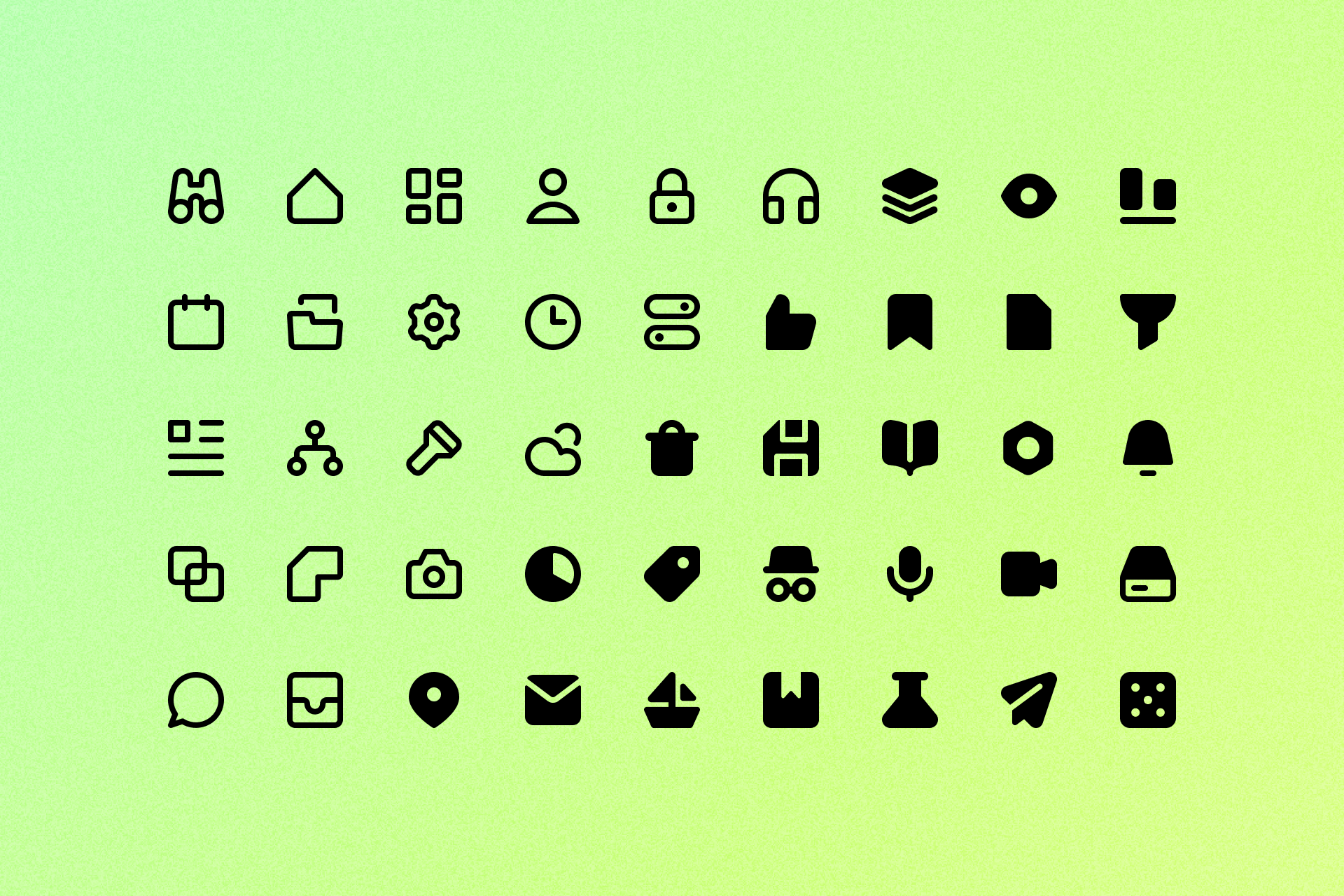
Micro
An icon set that excels on a very tiny scale and ensures legibility at the smallest possible sizes.