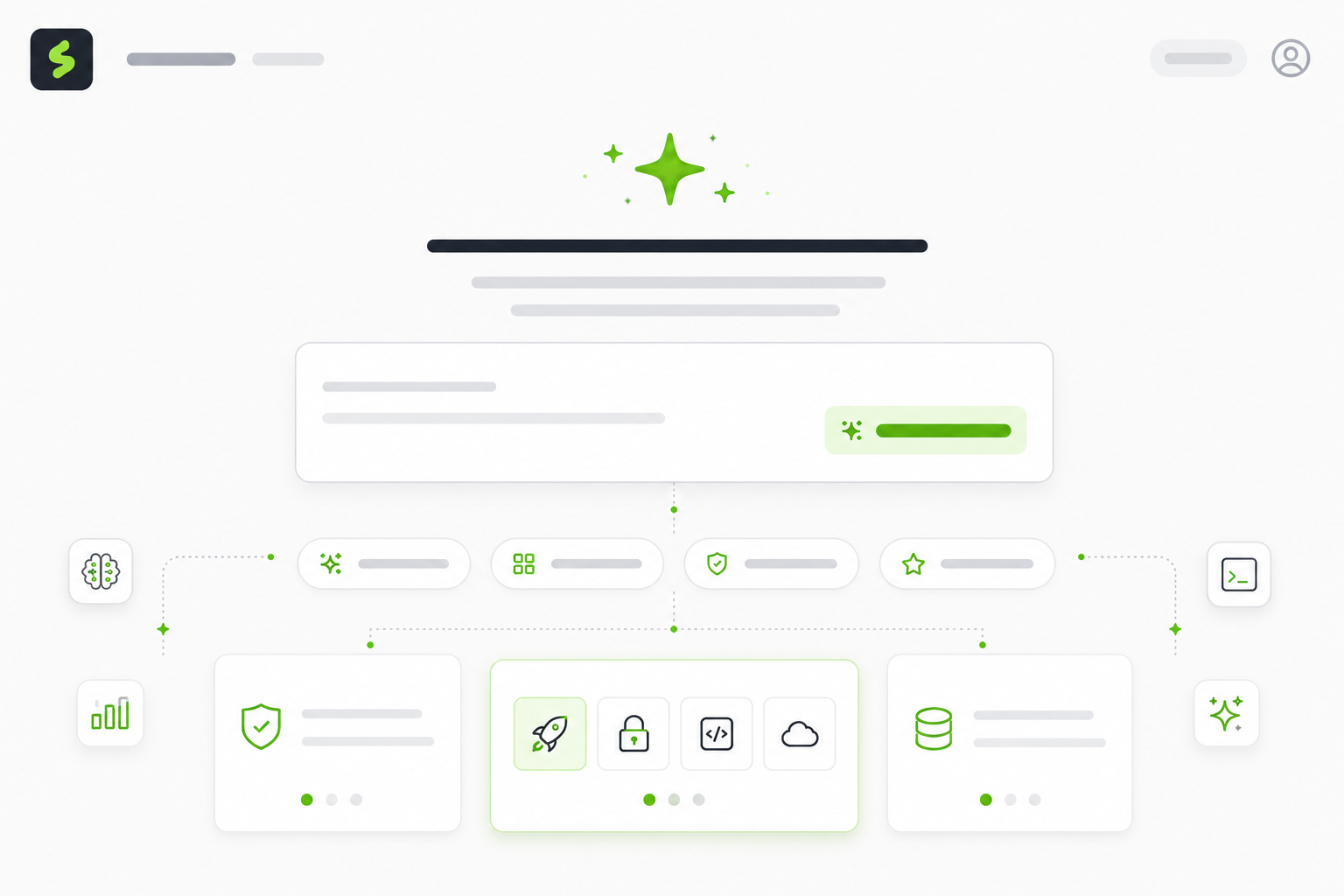
Introducing Expert
Expert is an icon decision tool for designers and developers working in the Streamline library. Describe what you're building. Expert returns a family that fits, with reasoning you can defend to your team. The decision-making part of icon work moves faster, and you stay focused on the work that actually moves the product forward.
What Expert offers
Keyword search works well when the right word comes to you. Icon decisions often start before a word forms. You might already have a feeling about how the product should land and an audience in mind. Sometimes that is hard to turning into a search query.
Just describe a product context. Expert returns a recommendation. When you're stuck between two families, Expert weighs the tradeoffs in your situation and gives you a verdict in one turn. A brand reference can also be the starting point, and Expert finds the closest Streamline family to match it. Each prompt covers ground that used to take rounds of trial and error.
Tips for using Expert
Expert handles six kinds of icon work.Each one solves a different problem.
1. Style and family recommendations
Tell Expert about your product. Get a family that fits, with reasoning you can take to a team meeting.
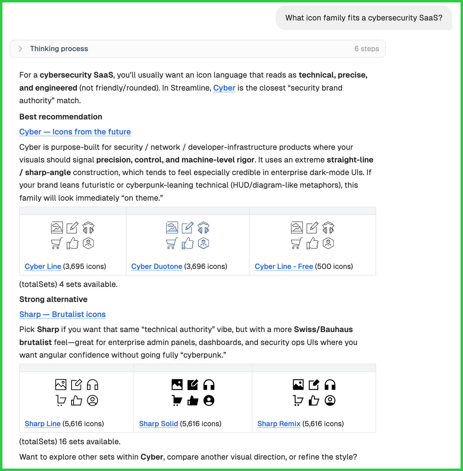
"What icon family fits a cybersecurity SaaS?"
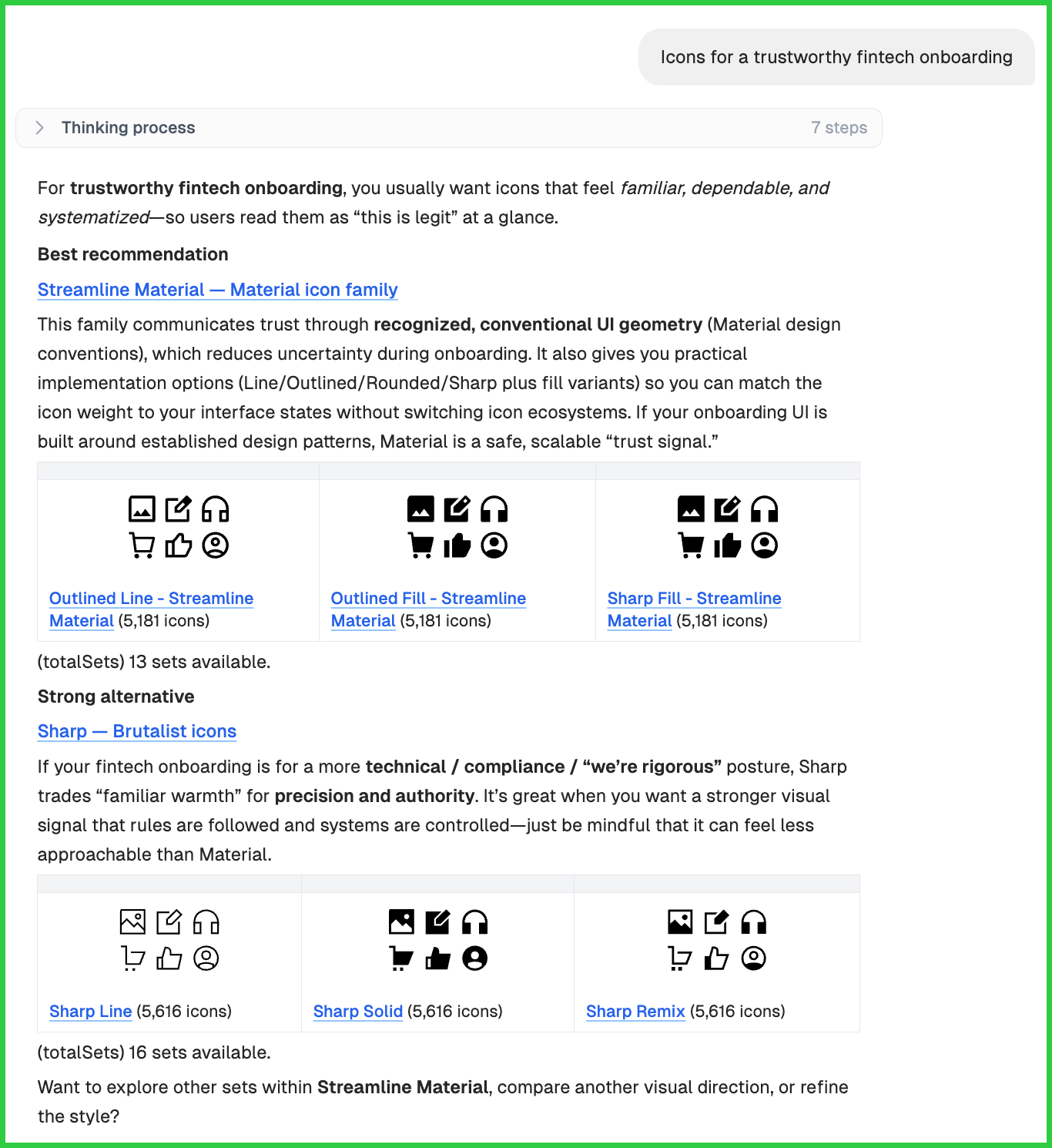
"Icons for a trustworthy fintech onboarding."
"Playful but professional dashboard style."
2. Individual icon suggestions
You need a specific icon. You want it to feel native to your existing system.
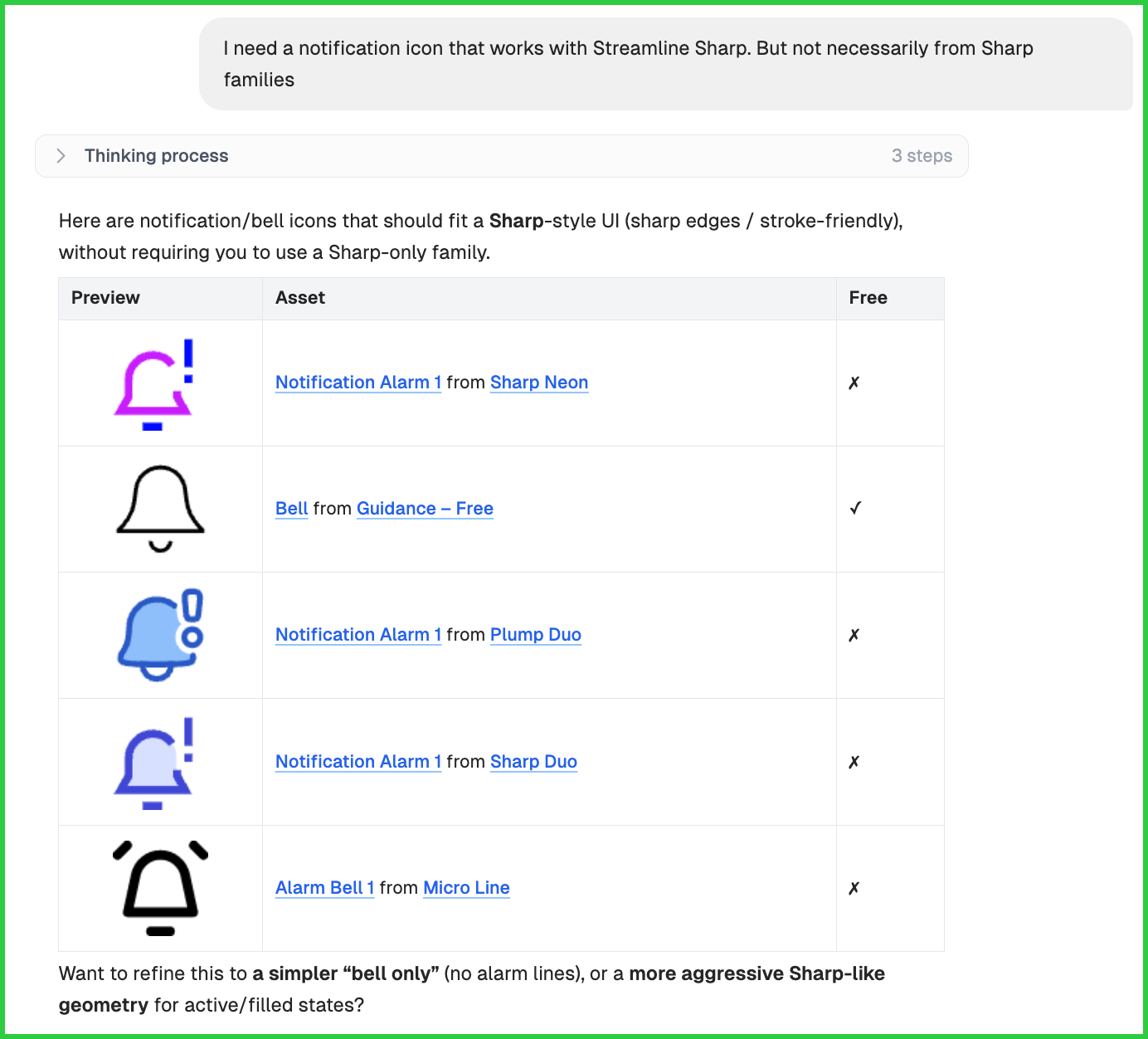
"I need a notification icon that works with Streamline Sharp. But not necessarily from Sharp families"
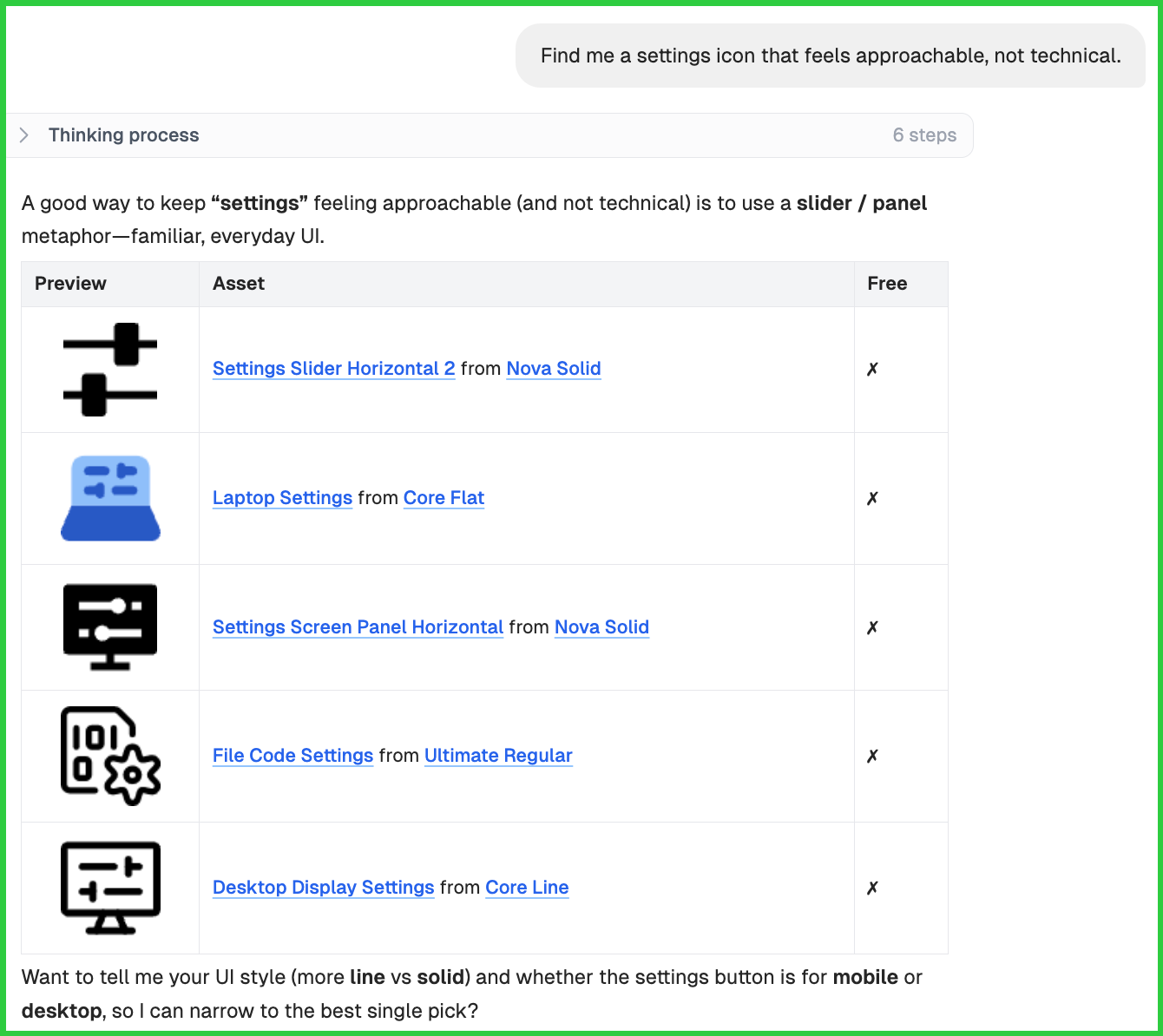
"Find me a settings icon that feels approachable, not technical."
3. Design questions answered in metaphor
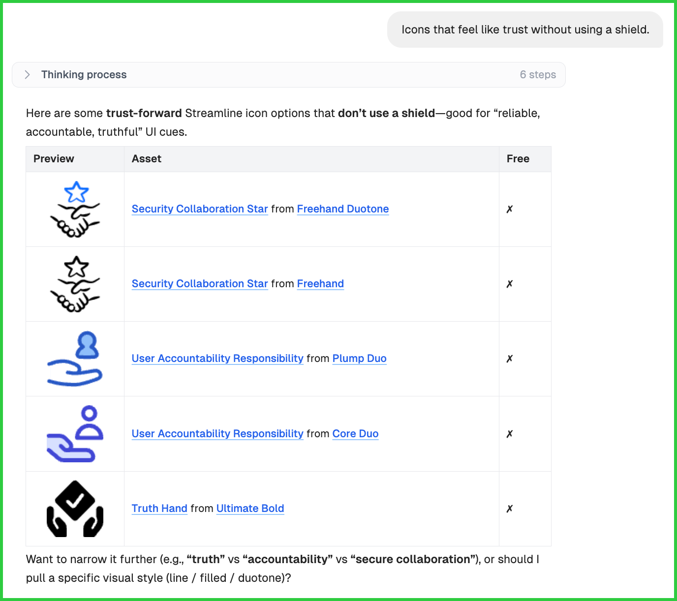
A prompt like "trust without using a shield" opens up real options. Expert might suggest a handshake. Or a signed document with a soft outline. Each one carries the idea of trust through a different shape, and Expert picks the version that suits your product instead of the most common one.
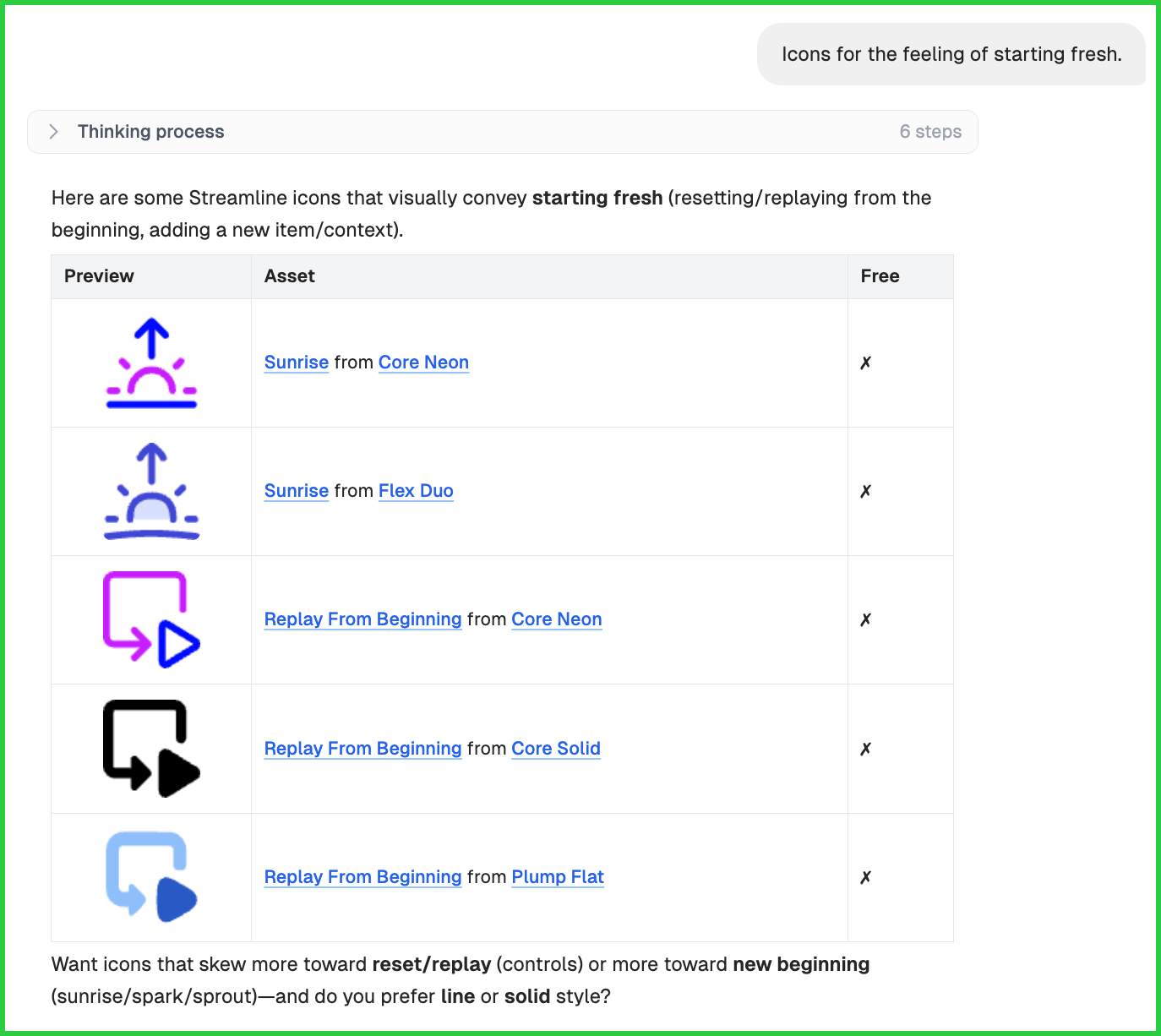
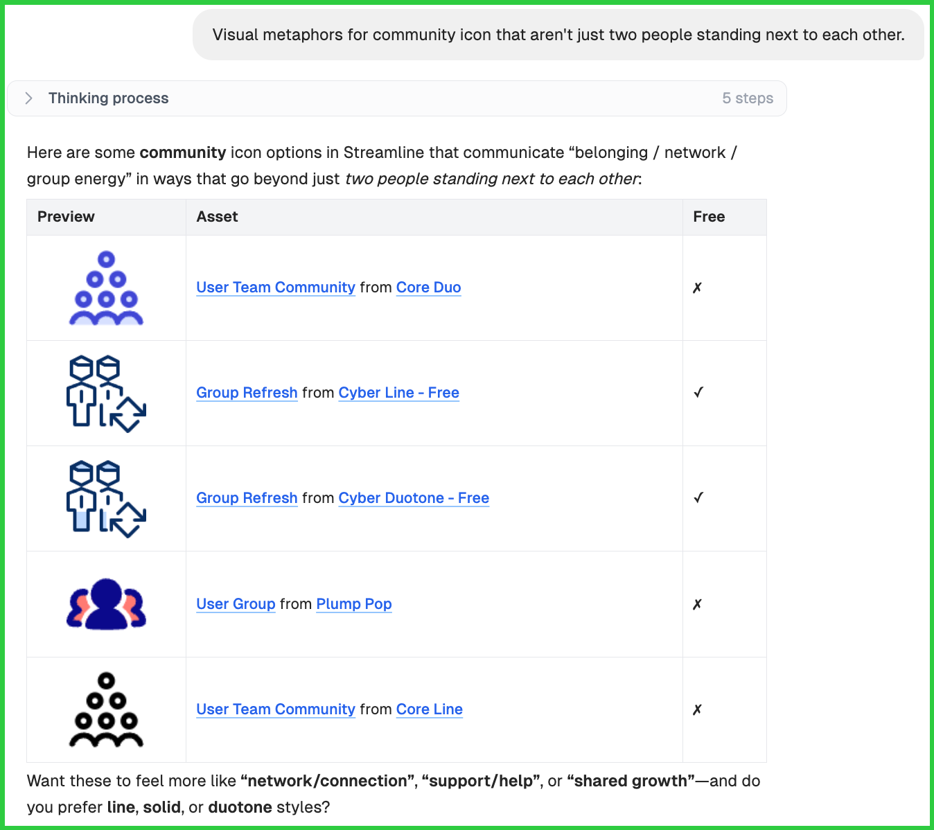
When literal icons aren't working, switch to feeling. Describe what users should feel when they see the icon, and Expert finds the shape to match.
"Icons that feel like trust without using a shield."
"Icons for the feeling of starting fresh."
"Visual metaphors for community that aren't just two people standing next to each other."
4. Family-vs-family comparison
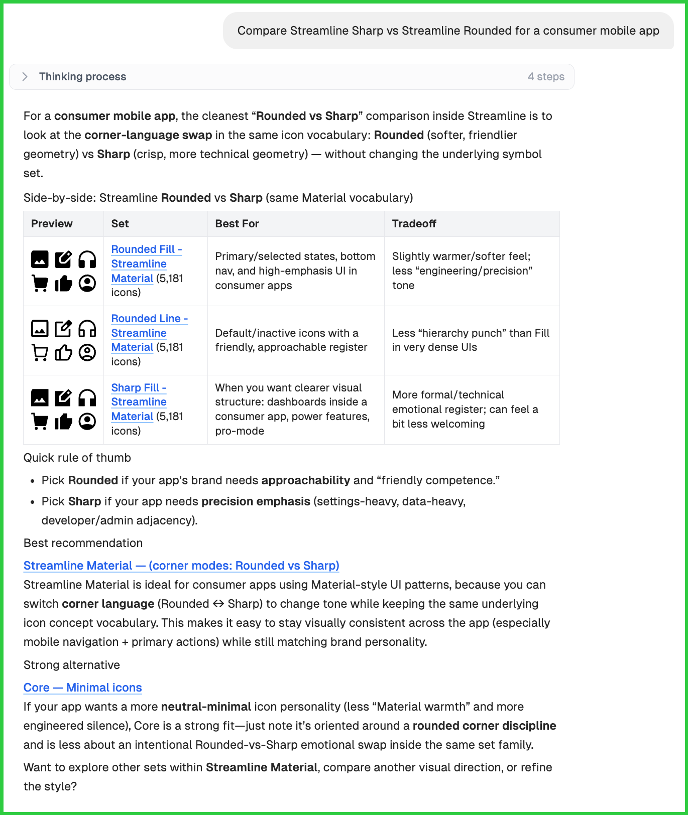
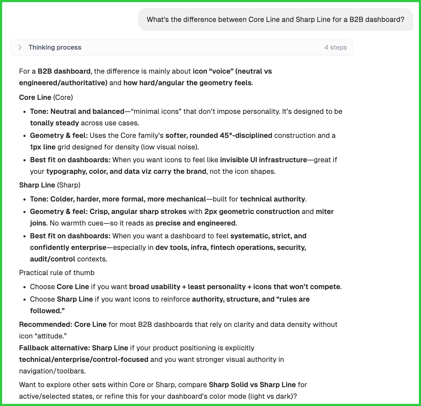
You're stuck between two directions. Ask for a head-to-head. Expert explains the tradeoff in your context. You get an answer, instead of two descriptions side by side.
"Compare Streamline Sharp vs Streamline Rounded for a consumer mobile app."
"What's the difference between Core Line and Sharp Line for a B2B dashboard?"
5. Side-by-side icon comparison
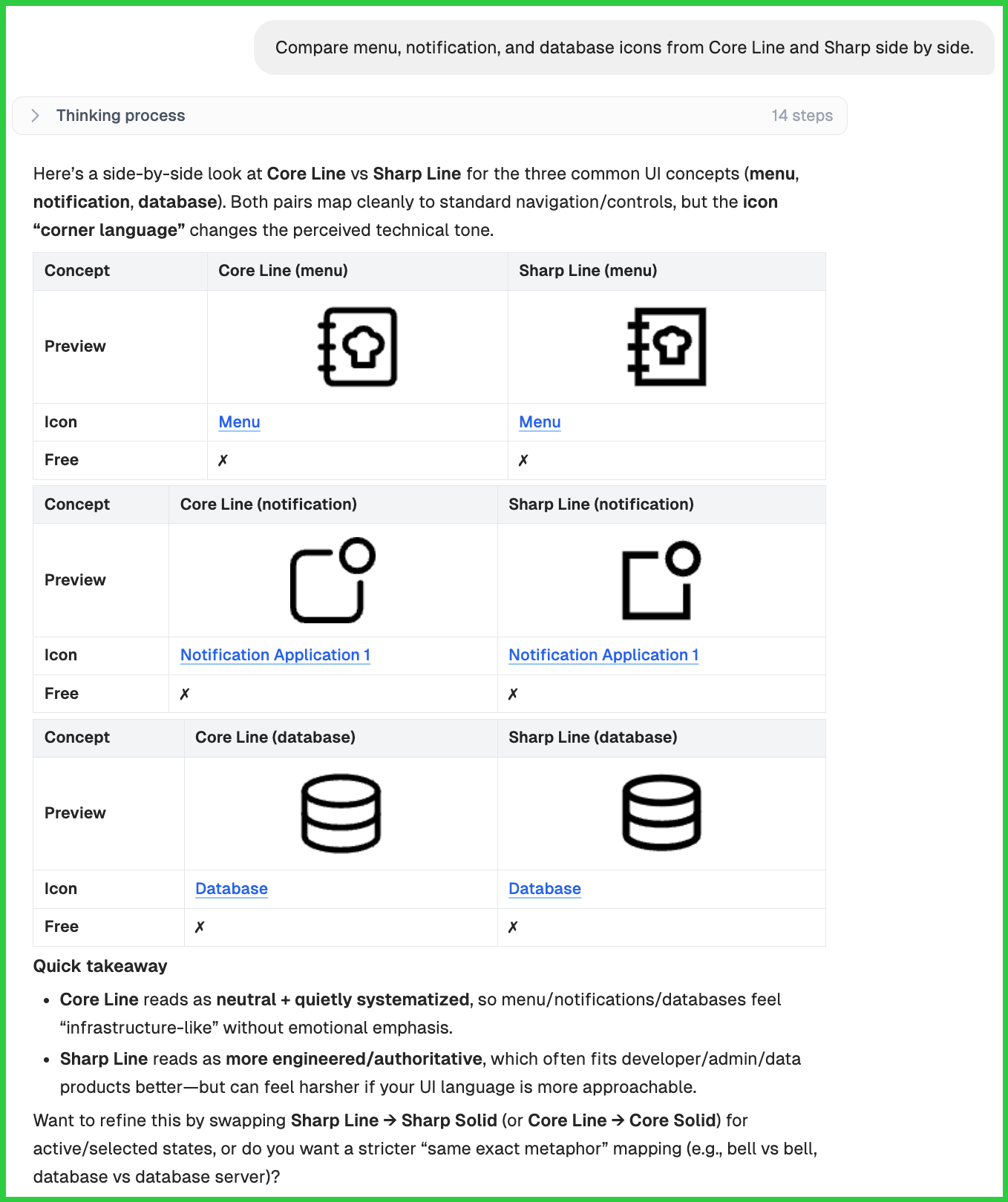
You need to see the same concept across two families before committing. Expert pulls them up next to each other so you can compare the geometry directly.
"Compare menu, notification, and database icons from Core Line and Sharp side by side."
6. Brand and library reference matching
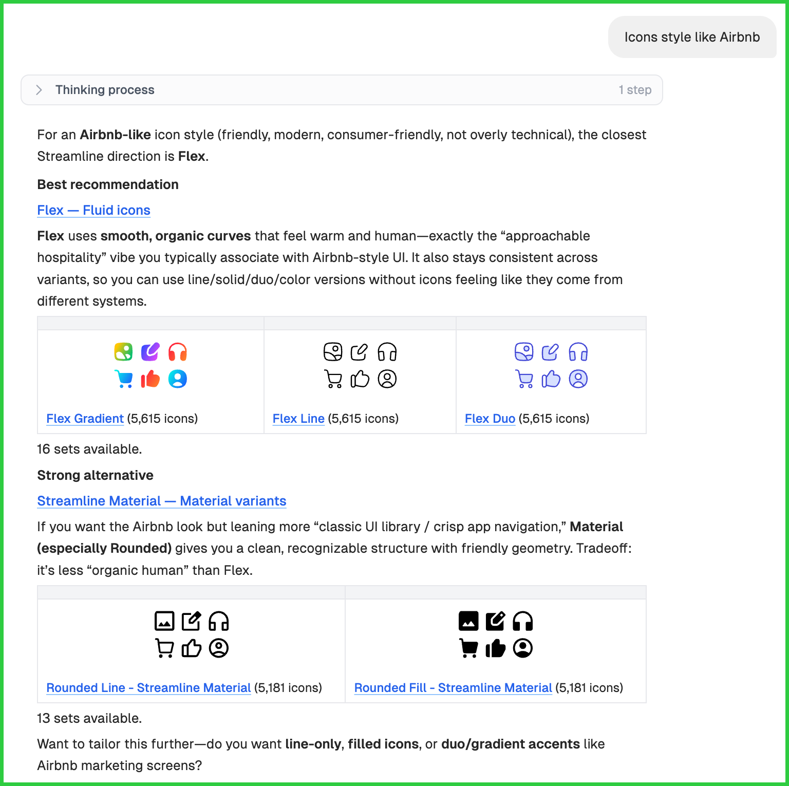
You have a visual benchmark in mind. The hard part is finding the Streamline family that resembles it. This is useful for design system constraints, or for working from a brand you're inspired by.
"Icons style like Airbnb."
"Icons that work with Streamline Core."
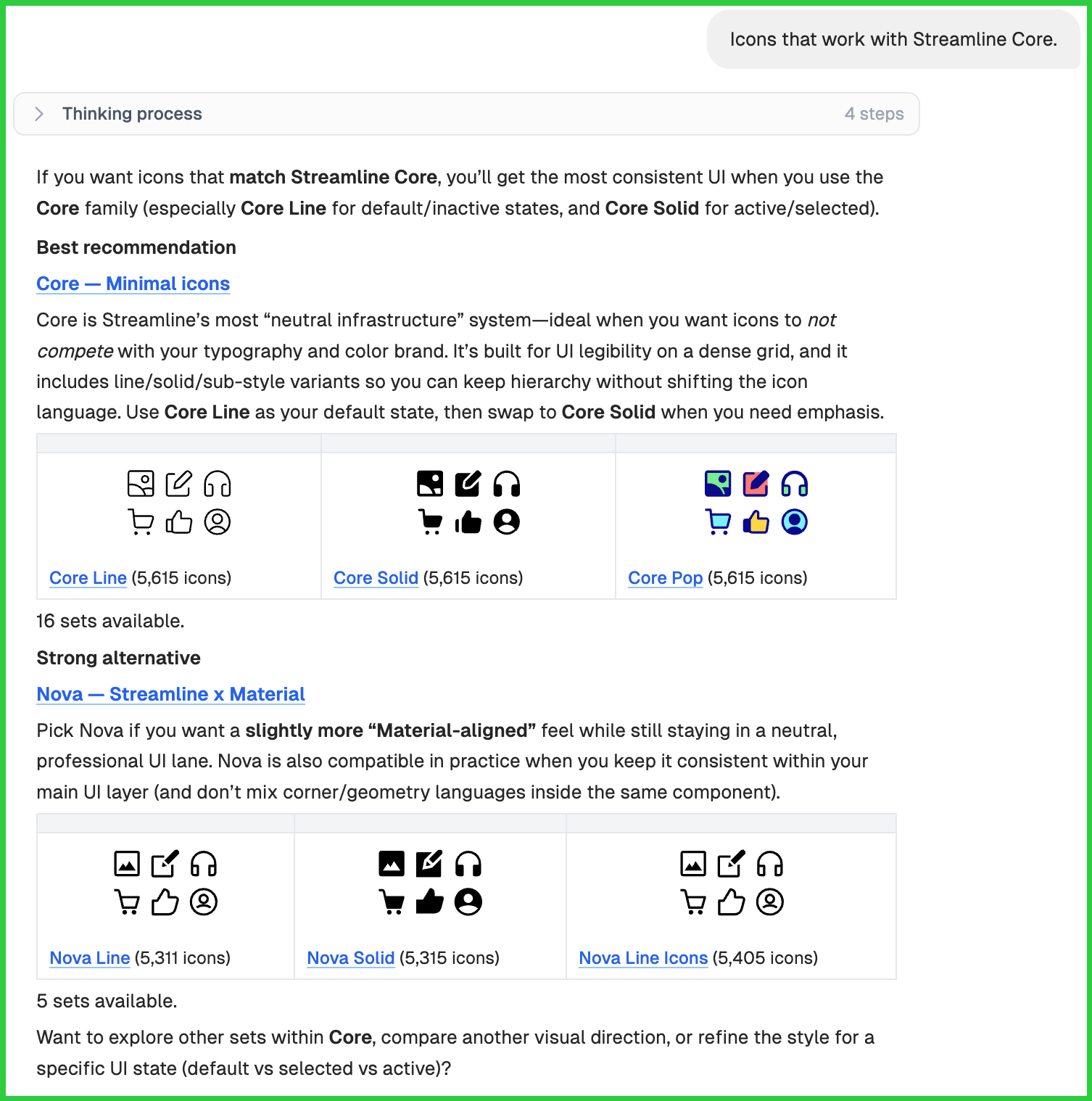
This category also unlocks finding families that look good together. Sets that pair well when you need different layers in one UI without things clashing.
Two Rules for Prompting Expert
Expert is only as sharp as the context you give it. Two rules cover most of what makes a prompt land well, and getting them right means fewer back-and-forth turns to your answer.
Rule 1: Lead with product context.
A category name alone doesn't carry enough signal. What matters most is who the audience is and how the product should feel when they use it. The same product type with different audiences needs different visual languages. A mental health app for teens looks nothing like one for clinicians. A fintech app for first-time investors looks nothing like one for professional traders. The more product context you give, the closer the recommendation lands on the first try.
Less useful: "icons for a health app"
More useful: "icons for a mental health journaling app, soft and private-feeling, not clinical"
The first prompt could mean anything from a hospital system to a fitness tracker. The second tells Expert who the user is and what the app should feel like.
Rule 2: Start broad, then narrow.
Early in a project, the direction is still forming. That's the right time to ask Expert what's available before locking in specific icons.
Stage 1 (Broad): "What icon styles work for a wellness product? What are my options?"
Stage 2 (Comparison): "Between Flex and Material Rounded, which fits a wellness app for women in their 30s?"
Stage 3 (Specific): "From Flex, give me icons for: onboarding, profile, journaling, mood tracking, settings."
Each stage builds on the last. By the time you're picking specific icons, Expert already knows what you're building and who it's for. The answers get sharper at every step.Only three prompts might help you cover what browsing alone would take a long time to surface.
Making the Decision and Moving On
Icon decisions feel small until they aren't. Get them right at the start and the rest of the product work picks up speed, because nothing has to come back to be fixed later.
Use Expert when you want a recommendation that holds up to a team meeting, or when you need someone to actually decide between two families. Describe your interface and Expert gives you back the right visual system. Use the time you save on the parts of the product that actually need it.
Meet your icon decision partner
Streamline Expert helps you move from “What should we use?” to a confident icon direction faster. Describe your product, compare families, and get recommendations made for your interface.