Why do we need icons in user interfaces?
Icons help us understand things clearly and acts us a guiding light. Discover how icons help us shape user interfaces and tips to keep in mind while choosing your icons.

Imagine using your favourite app or website without any icons - just walls of text with links and buttons. It would feel sterile and dull, making everything harder to navigate and understand.
Icons are far from just decorative elements in user interfaces. They serve important functions that profoundly shape the user experience.
If you've read the article on icon evolution, you would already be aware that icons have been present in interfaces for as long as memory serves. However, their presence isn't as extensive as one might think! It emerged only about 43 years ago if we were to do the math. So, what prompted the sudden need for icons in interfaces?
Icons are like road signs
"I believe that good icons are more akin to road signs rather than illustrations, and ideally should present an idea in a clear, concise, and memorable way." - Susan Kare
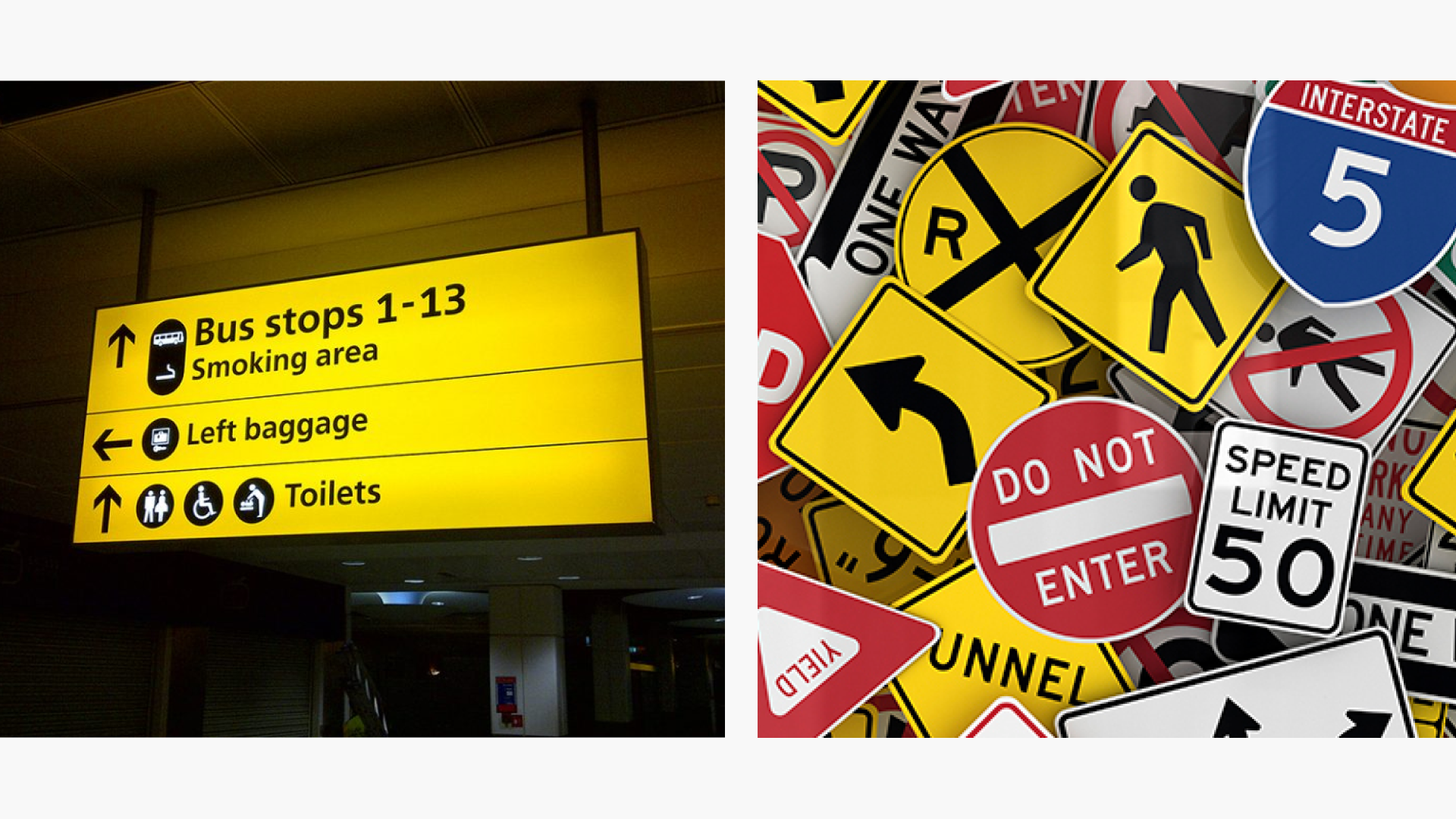
Icons, like road signs, help in conveying information quickly and universally in a concise and memorable manner.
Icons leverage our brain's ability to rapidly process visual information. Studies show that our visual cortex can interpret images in as little as 13 milliseconds. The use of familiar and relatable visual metaphors allows icons to tap into existing neural connections in our brains.
Why you should use icons in your interface?
Let's get straight to the point:
1) It helps in visual communication
Icons serve as visual cues to convey meaning quickly and efficiently. They can represent complex concepts, actions, or objects in a compact and highly recognizable symbolic form. Well-designed icons are able to communicate meaning at a glance through their visual appearance alone, without the need for explanatory text.
For example, an icon of a magnifying glass immediately brings to mind the concept of searching without the need for the word "search", whereas without icons it looks like a text field.
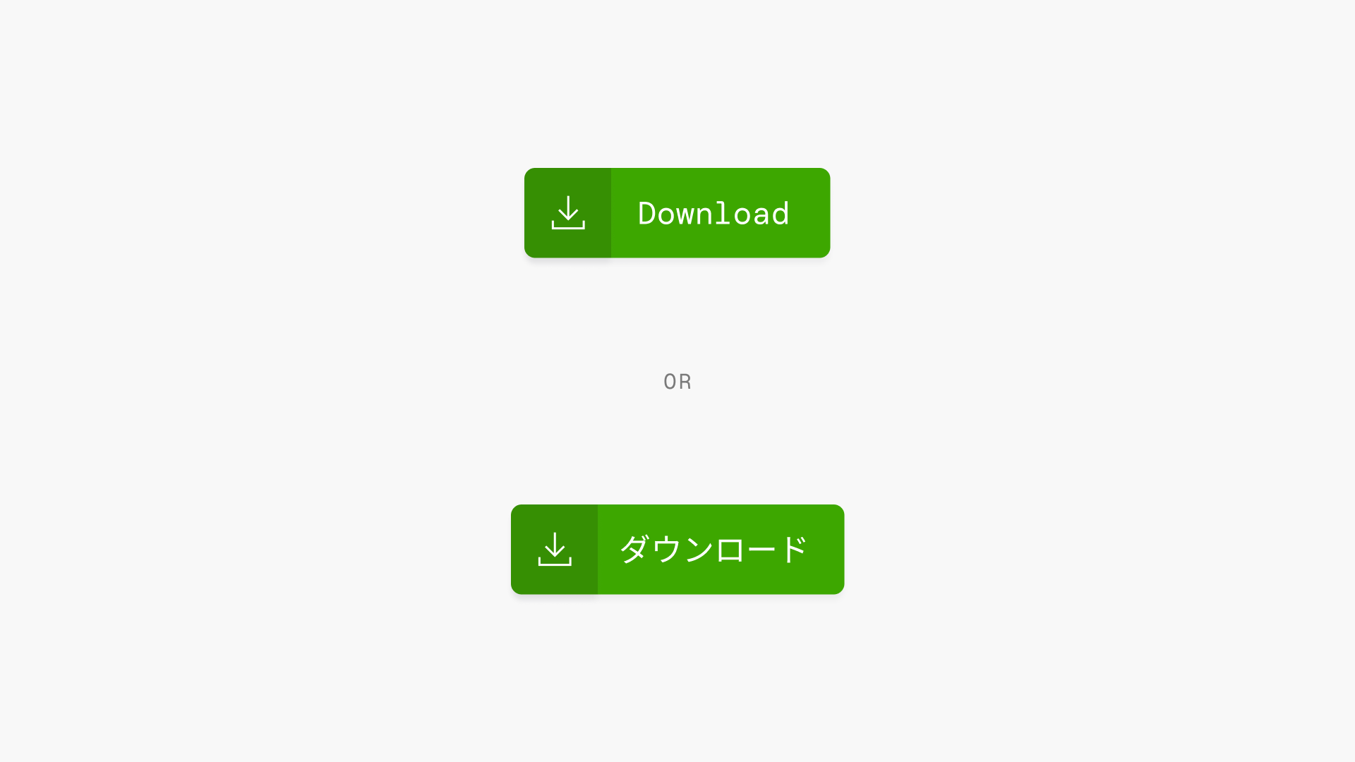
2) Icons act as an universal symbols of communication
Icons transcend language barriers, serving as a universal language understood globally. They trigger rapid recall of associated meanings or functions due to the brain's quick processing of visual information. This stands in contrast to text, which often requires translation and takes longer to comprehend.
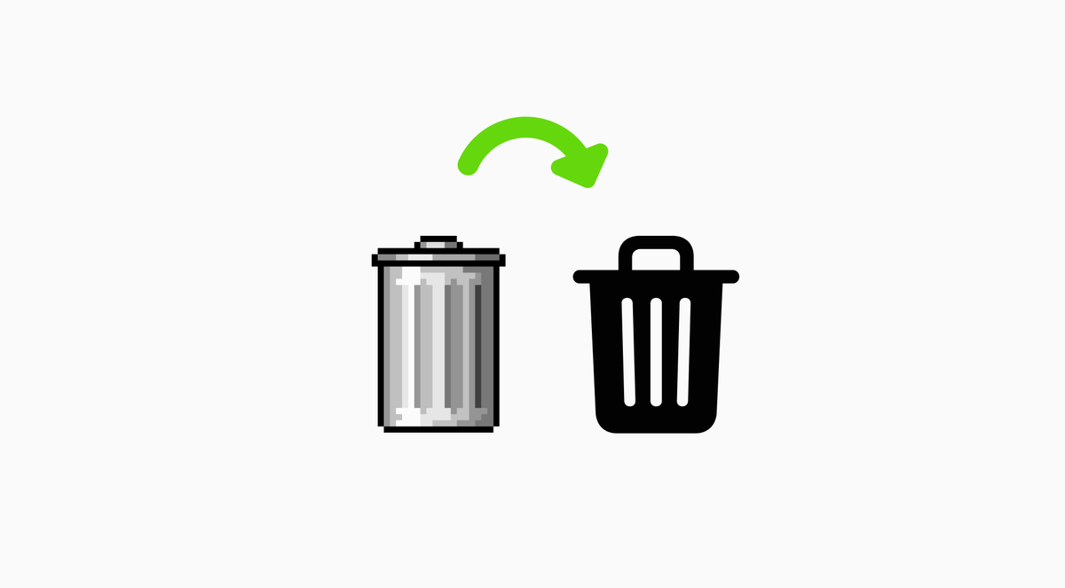
For example, the download icon is universally recognized as meaning “download” even though the word for “download” is different across languages. Users do not need to speak the same language to grasp what familiar icons represent.
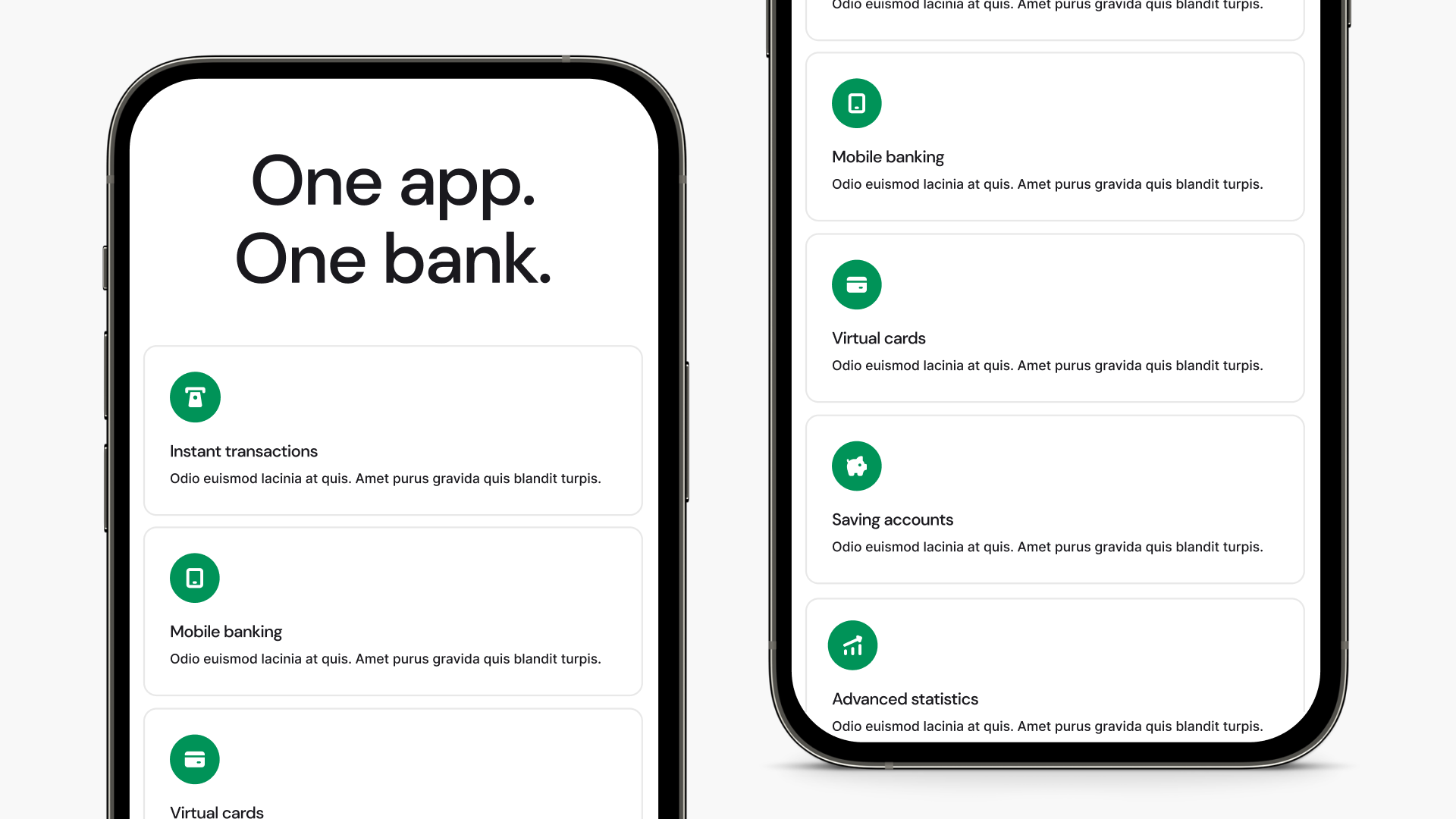
3) It helps to create a strong sense of brand
Carefully crafted icons enhance interface cohesion and visual appeal, serving as integral components of the overall design rather than just functional elements. When aligned with proper guidelines, icons can reinforce a brand's visual identity.
Consistently using branded icons across various products and touch-points increases recognition, as users become acquainted with and associate these icons with the brand, ultimately fostering loyalty over time.
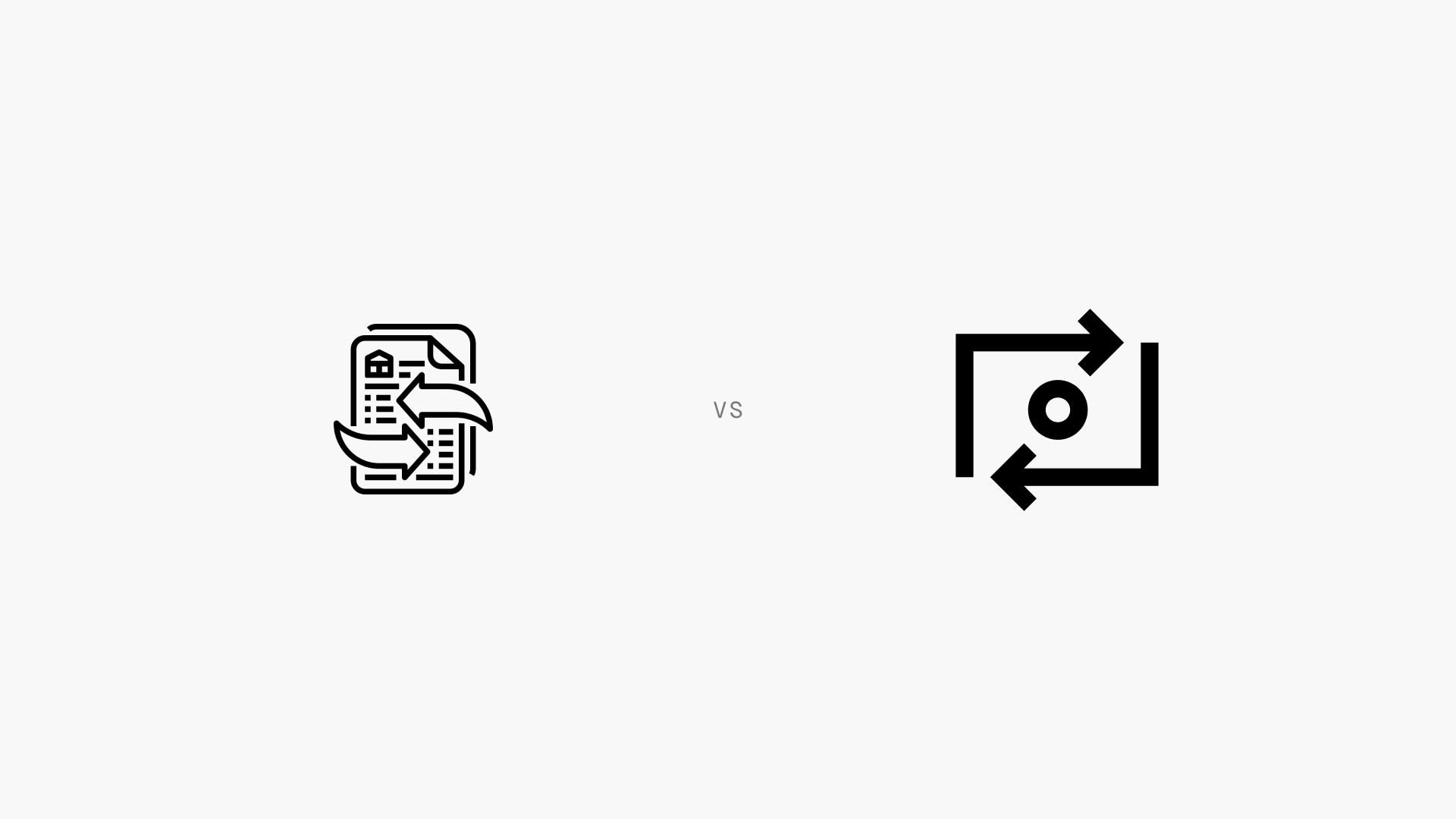
Can you identify which brands these icons belong to?
4) Icons make interfaces more accessible
Icons can provide an alternative means of navigation and understanding content for users with disabilities or impairments, such as those who may have difficulty reading text. The visual and symbolic nature of icons allows them to convey meaning without relying solely on written words.
Someone with dyslexia, for example, may find an icon easier to recognize than reading a word. For users with visual impairments, icons can be designed with helpful attributes like high contrast to maximize visibility.
5) Helps users scan and read faster
Icons also aid in the scannability of a user interface by enabling users to swiftly identify key features or actions, thanks to their compact, visual nature.
Recognizable shapes and imagery stand out from text blocks, guiding the eye and allowing users to grasp meaning at a glance, reducing the need for extensive reading.
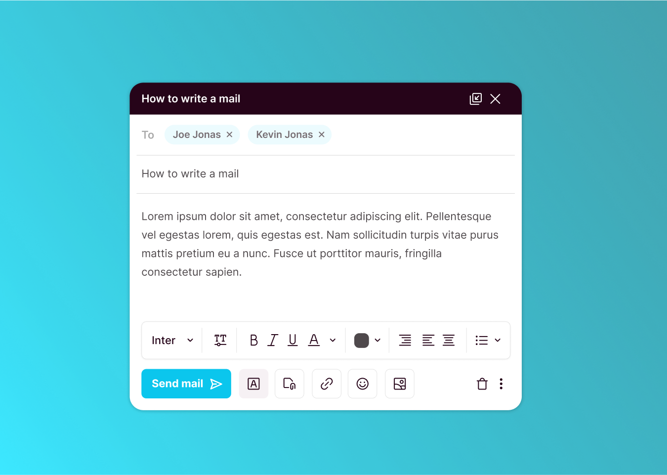
6) It makes interfaces compact
Icons condense functionality and meaning into a compact visual form, conserving space compared to text labels, which is crucial in UI design for smaller screens like mobile devices.
They enable designers to maintain accessible interfaces with key features without clutter or tiny text, ensuring clean, efficient, and usable experiences across all devices and screen sizes, particularly beneficial for small screens where space is limited.
Leading interfaces with icons
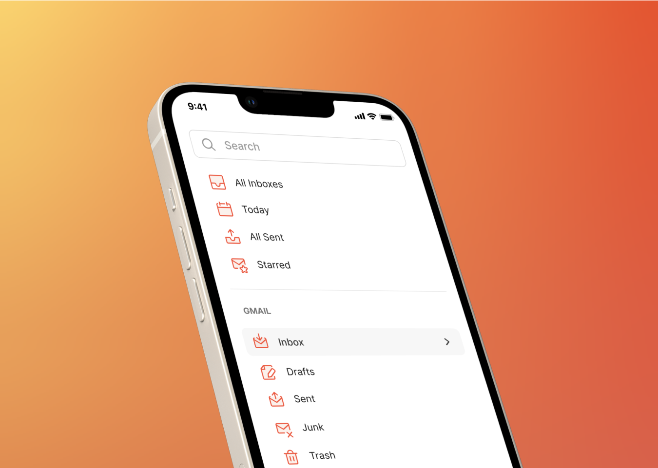
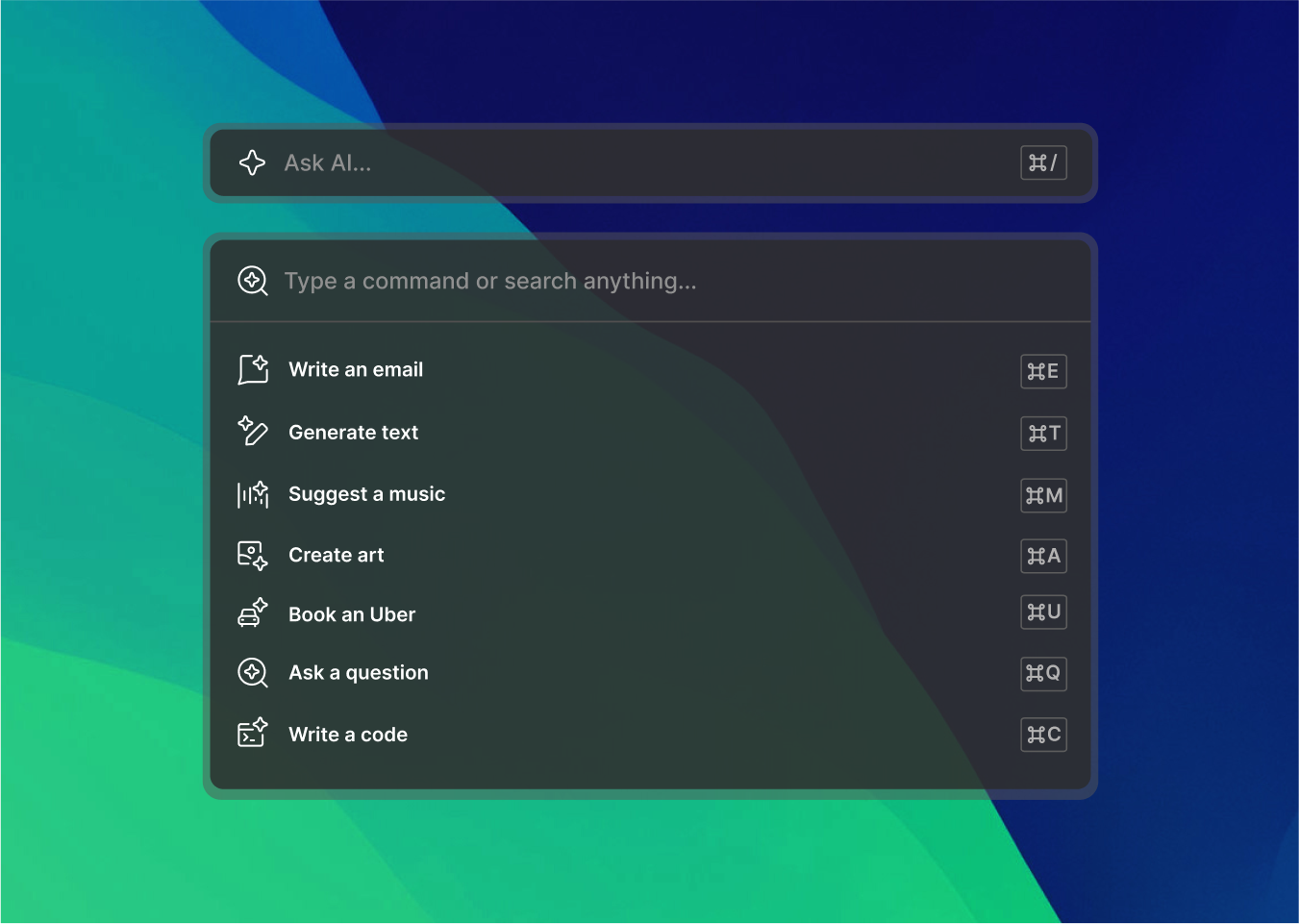
In the world of design, we're witnessing a fascinating trend where companies are putting their trust in icons to communicate without relying on text. Think about it: When you see a little cogwheel icon, you immediately know it's about settings.
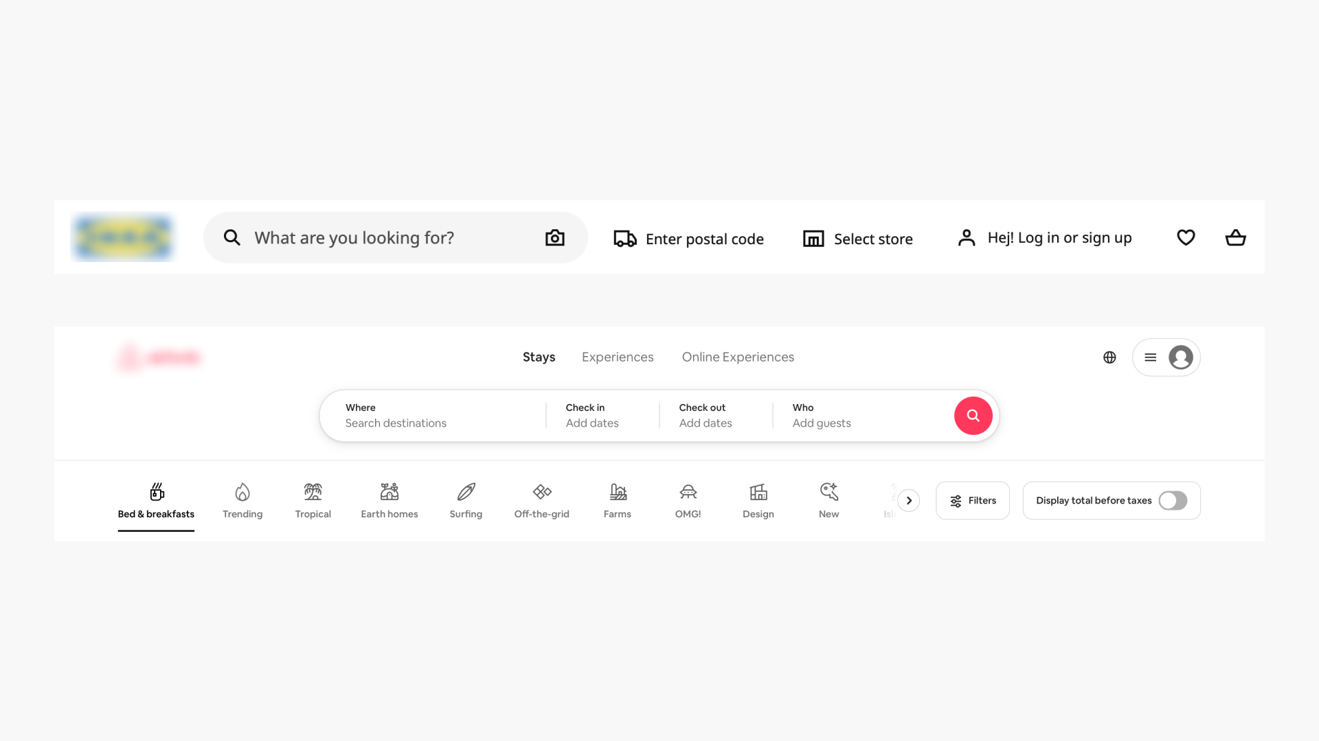
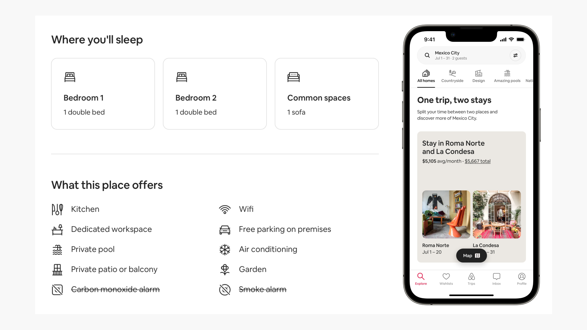
- Airbnb: They've integrated icons seamlessly into their interface to explain various features and listing details, each one carefully crafted to reflect their brand.
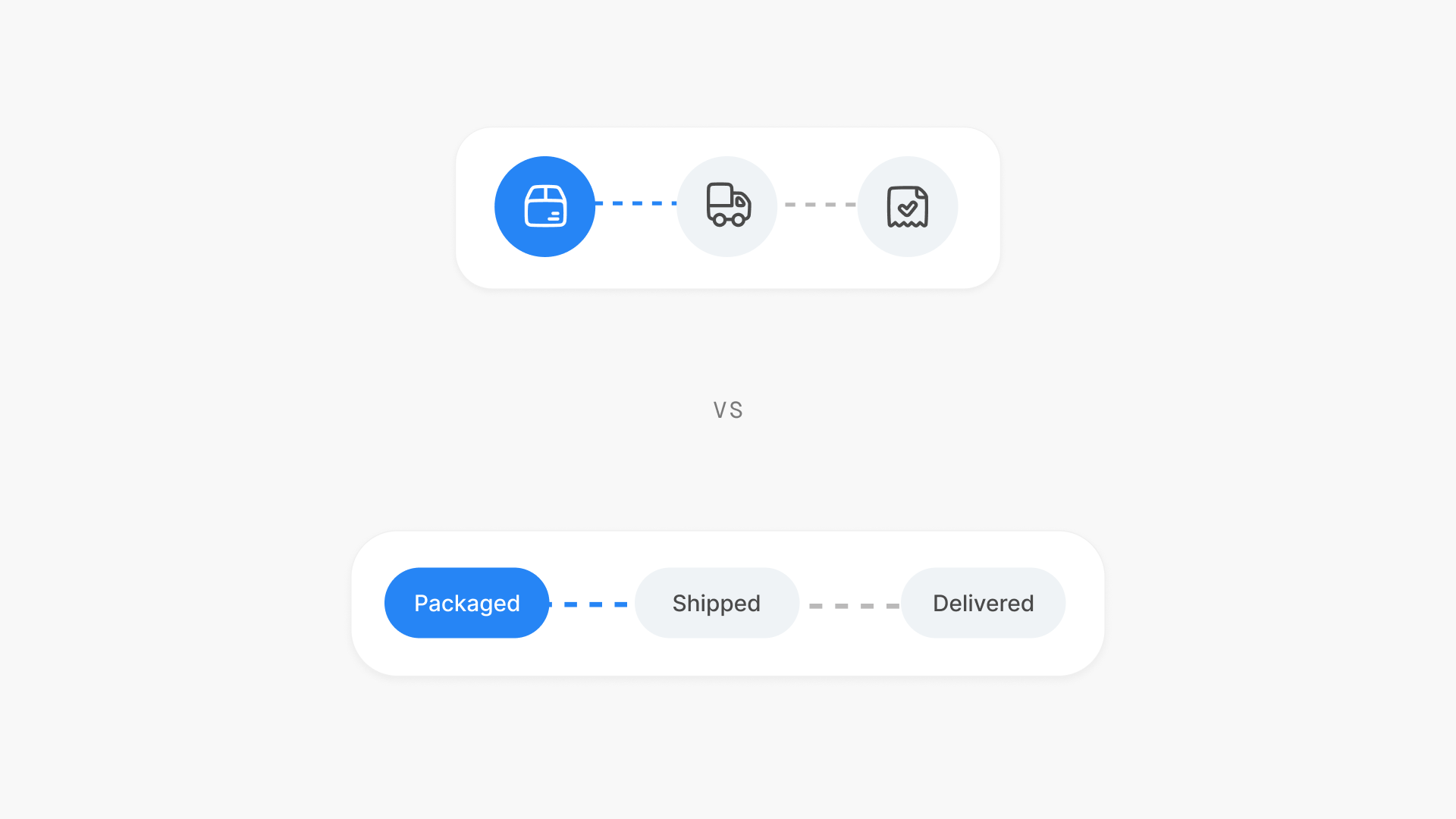
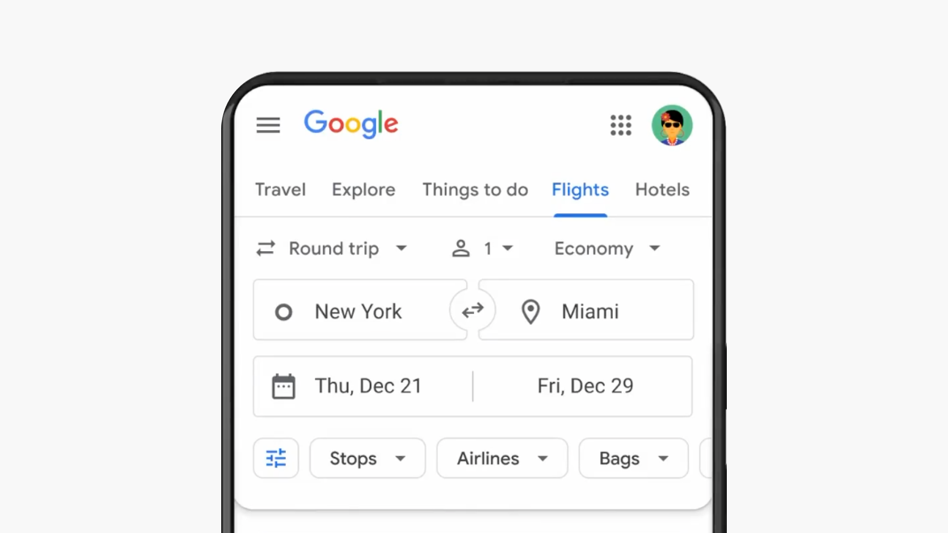
- Google Flights by Google: Using icons to convey trip details, traveler count, and even departure and arrival locations, all with just tiny, intuitive symbols picked from Material Design.
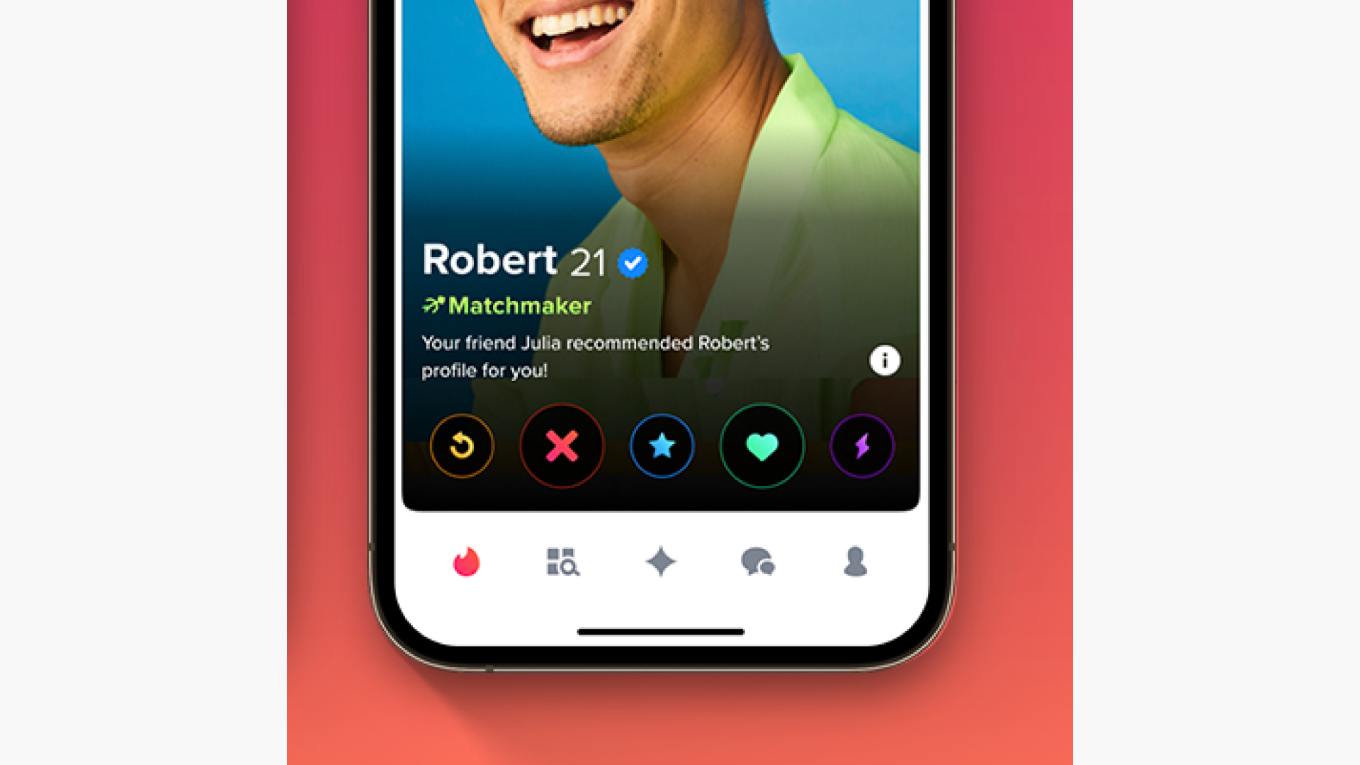
- Tinder: The famous dating and social app takes a bold approach by letting users take core actions primarily through icons, showing a real confidence in their users' understanding.
So, what kind of icons should you use in user interfaces?
Things to keep in mind while choosing icons for interfaces:
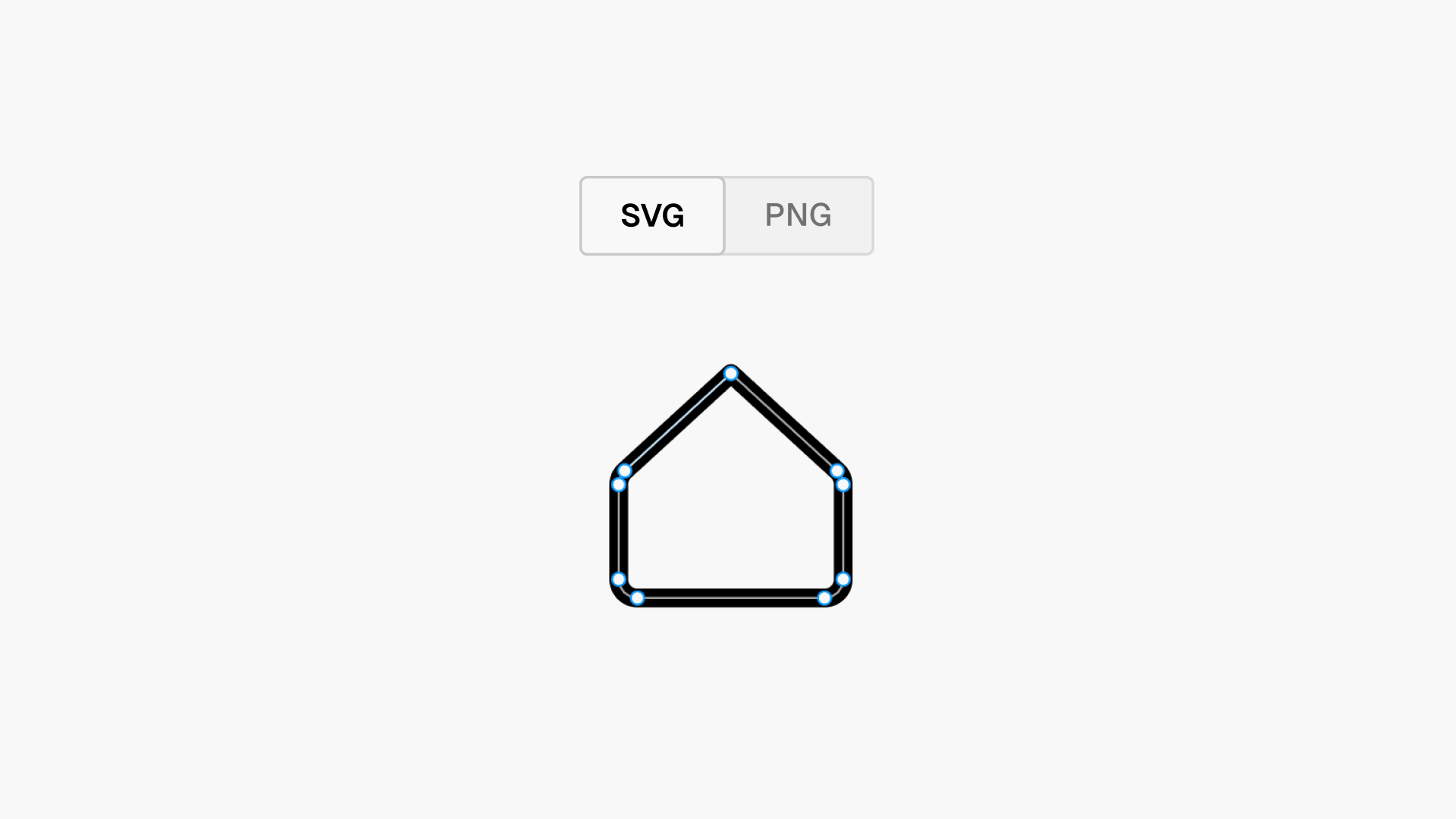
- Scalability: The ability to maintain visual clarity and integrity when resized to different dimensions without loss of quality or comprehension.
- Simplification: Involves reducing visual complexity to essential elements, enhancing clarity and comprehension while maintaining their representational integrity.
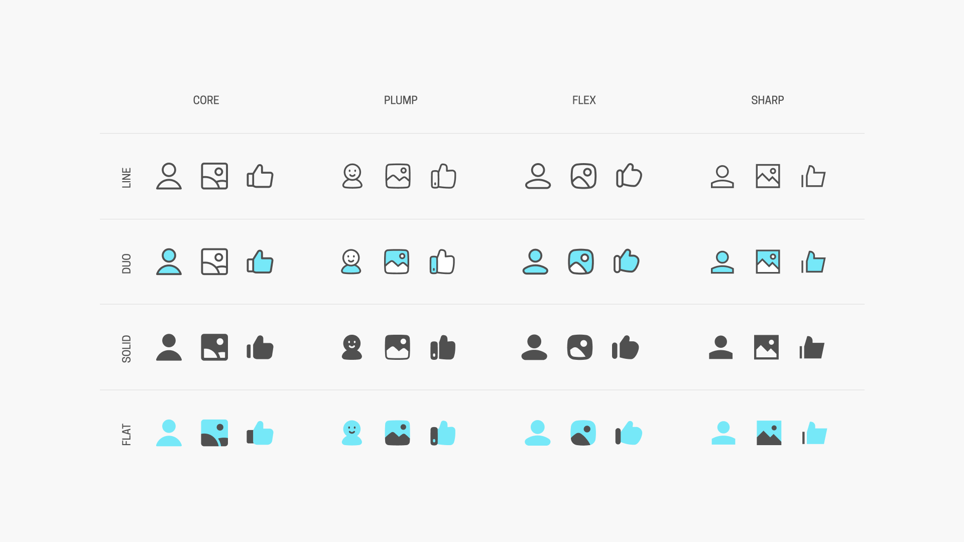
- Diversity: It encompasses a broad range of styles, quantities, and variations, including different weights (such as light, regular, bold) and variations in design (such as line, solid, duo, flat) , ensuring adaptability to various contexts and user preferences.
- Formats: The file types and specifications used for storing and displaying icons, typically including vector formats like SVG for scalability and raster formats like PNG.
Create iconic interfaces!
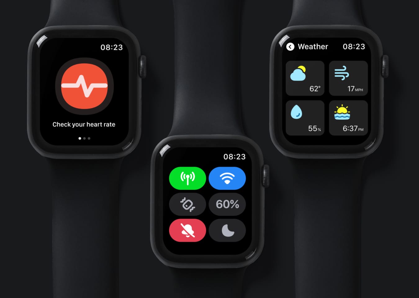
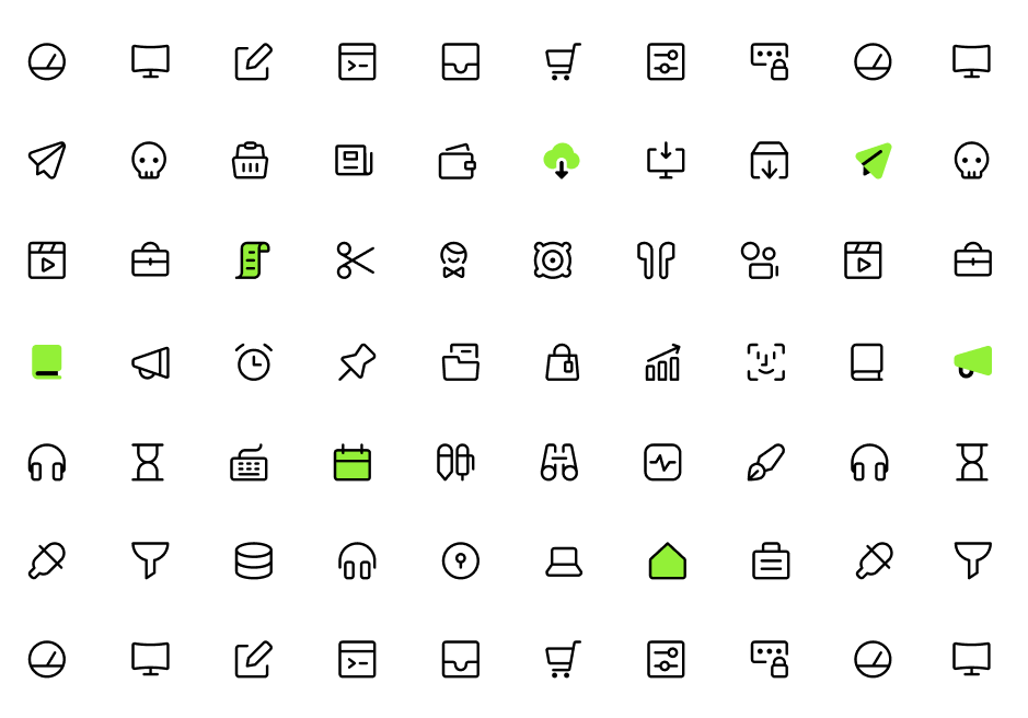
Samples of Streamline icons used in various interfaces
Core
All the essential vector icons for user interface, based on a tiny 14px grid for maximum legibility.
- Access open source vector icons in Figma - 1,000 free vector icons
- Copy/Download free vector icons - 4,000 free vector icons
- Copy/Download the full icon set - 16,064 pro vector icons
Ultimate
A vast collection that serves as an icon encyclopedia, featuring every concept you may need and presented in five versatile styles for maximum adaptability.
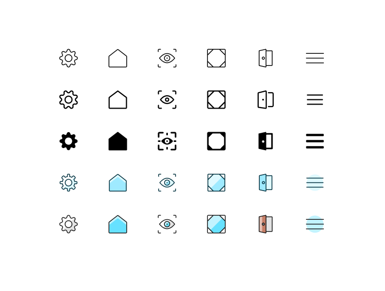
Ultimate - The Encyclopedia Of Icons
74,828 icons | Light, Regular, Bold, Duo, Colors
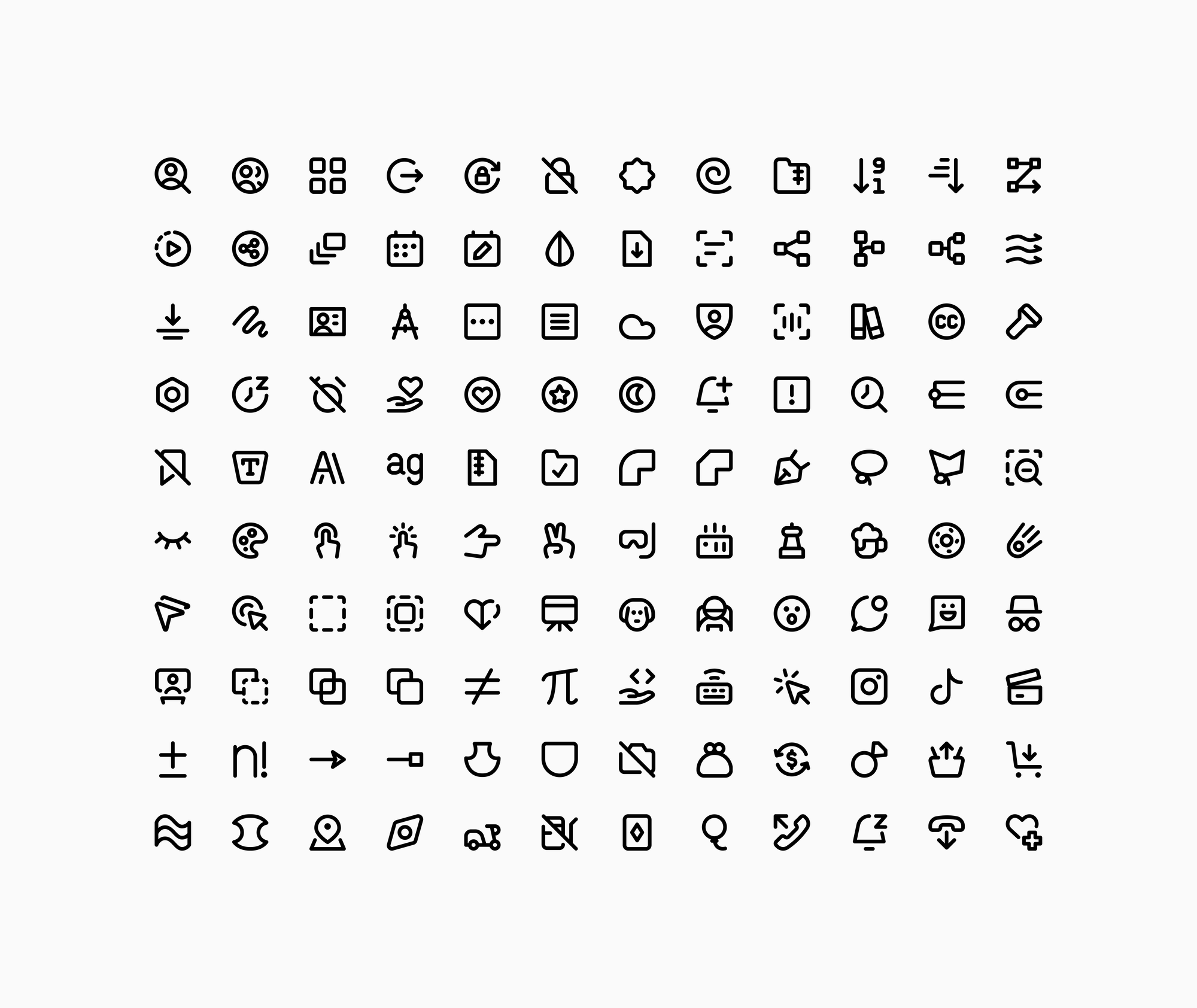
Micro
A collection specifically designed to excel on a very tiny scale, designed using simplified shapes to ensure legibility at the smallest possible sizes.
Sharp
A serious set with a geometric and high-tech look that makes these icons a modern, bold and classy choice to be part of a more professional looking project.
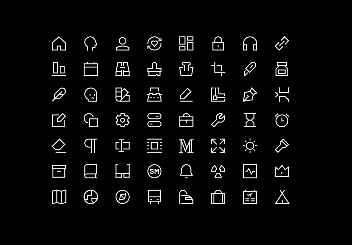
Sharp - The Brutalist Set for Bold Interfaces
17,952 icons | Line, Solid, Duo, Flat
Use Streamline icons and share your creation with us @streamlinehq — we would love to repost them on our Twitter page. Happy creating!