Icon update: More legible AI sparkles
We’ve refreshed the AI sparkle icon across all four styles in our Icon System—Core, Flex, Sharp, and Plump. It’s a small tweak with a big impact—especially in tight layouts where clarity matters most.
🚀 What’s new
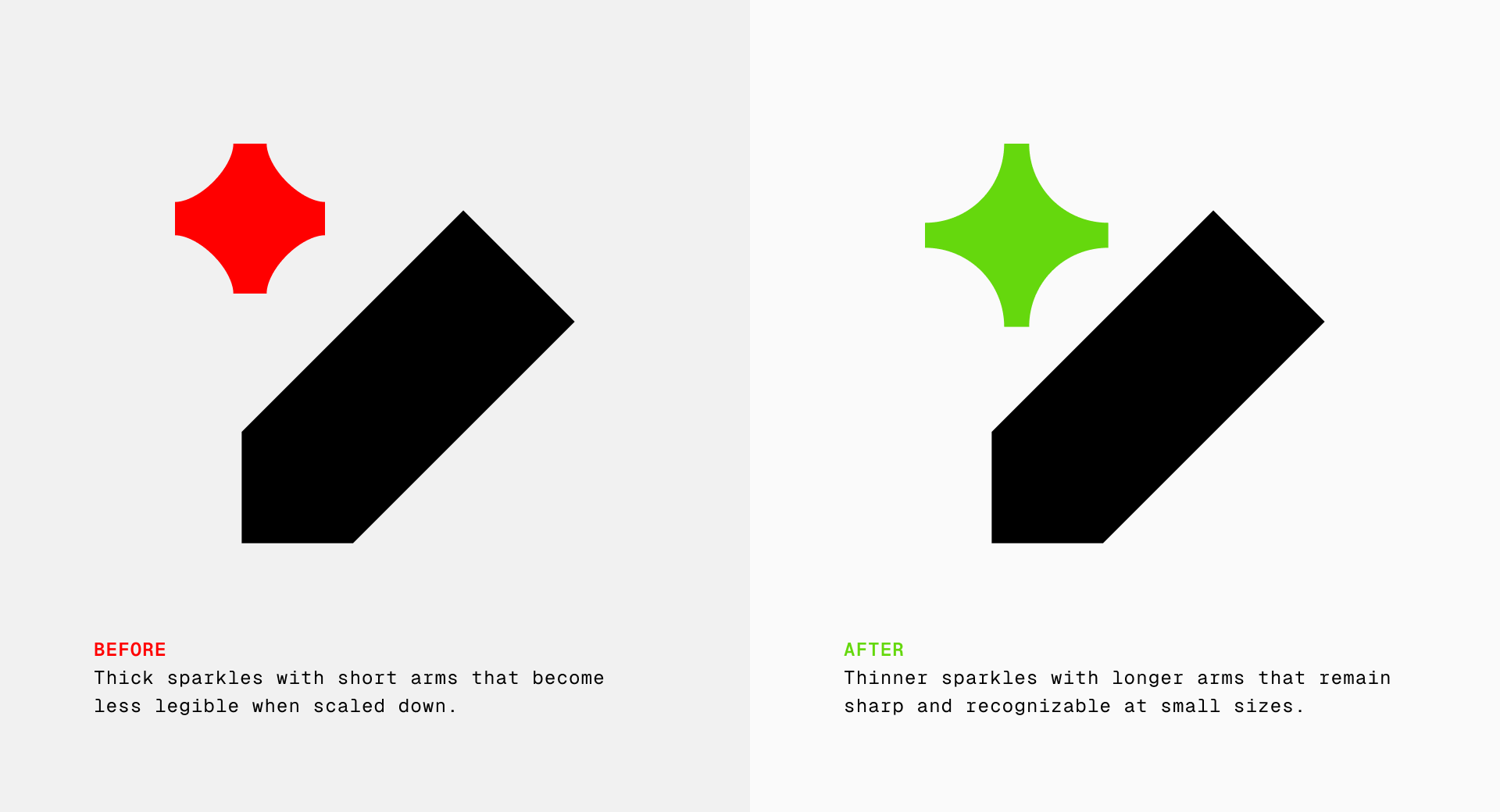
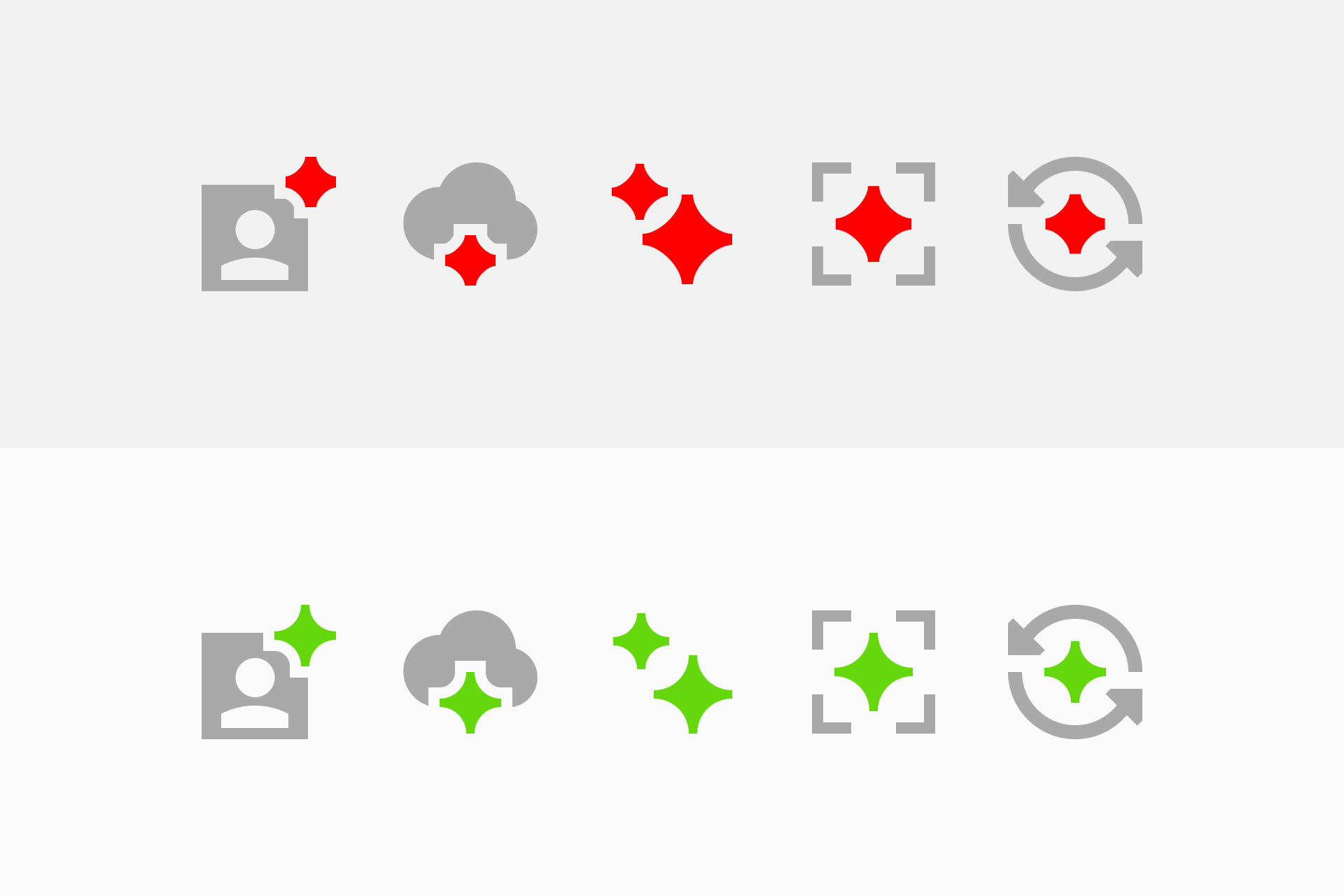
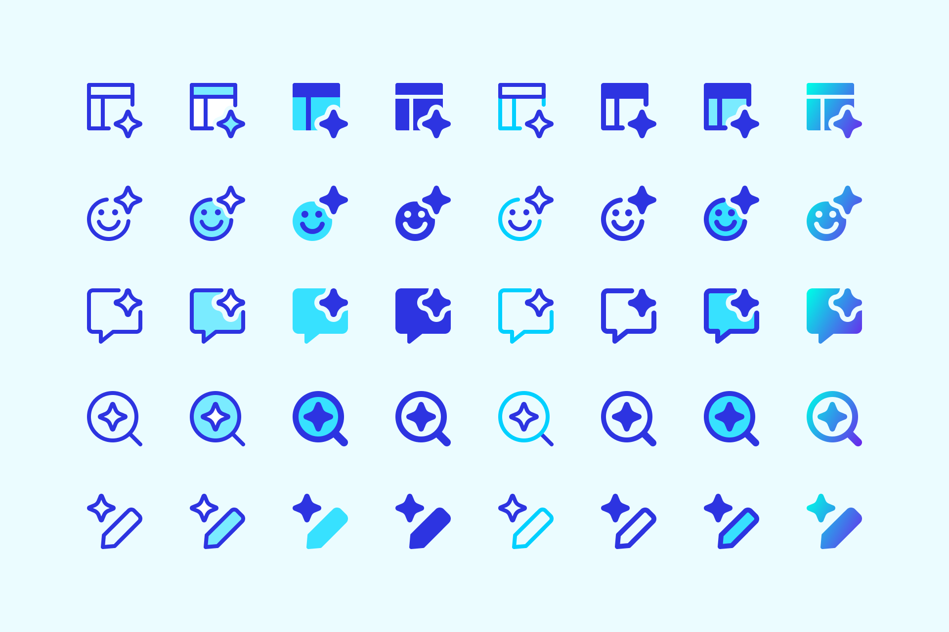
The new sparkles feature longer, pointier arms that replace the older, stubby shapes. This gives them a sharper, more elegant presence without losing their charm. They now look like actual sparkles—not just little stars with short arms.
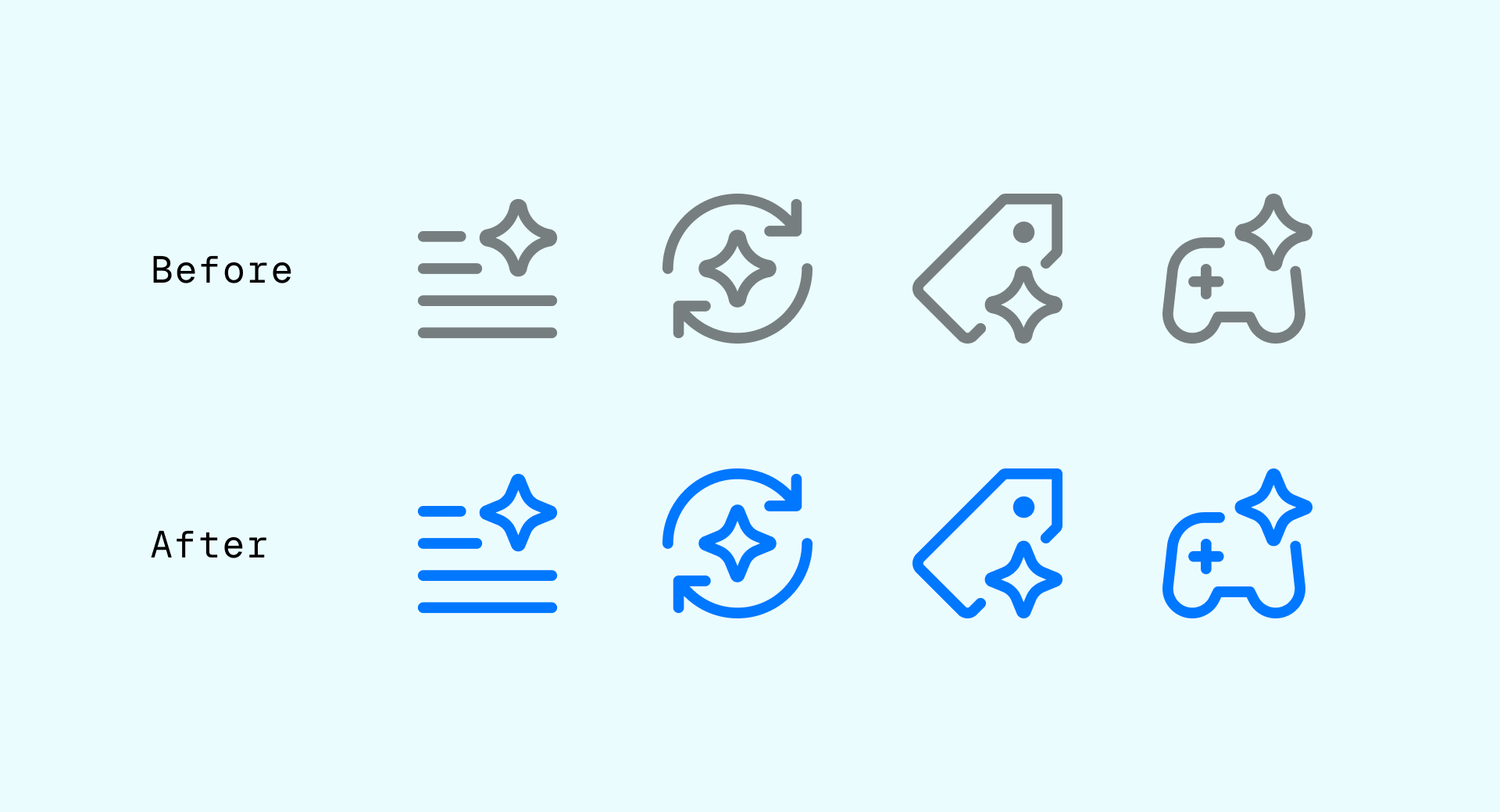
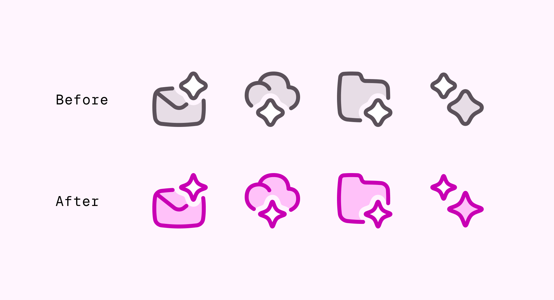
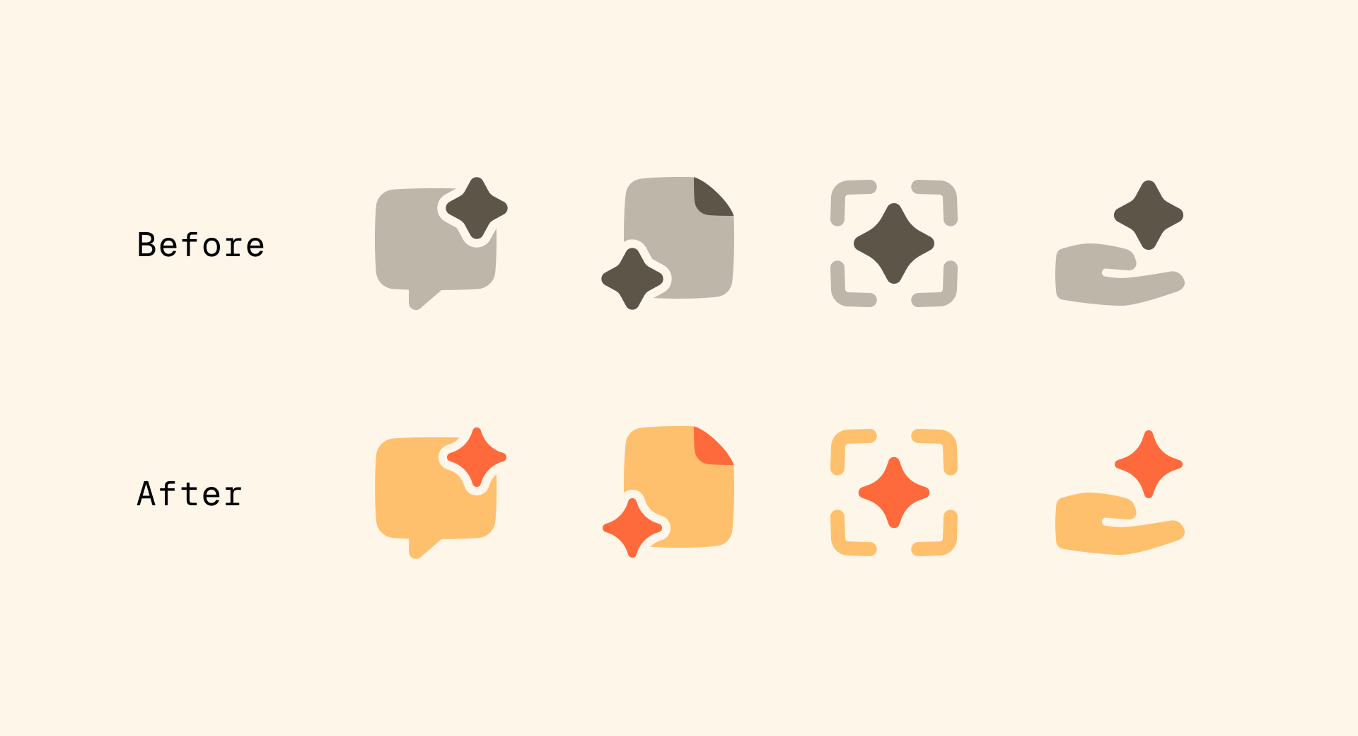
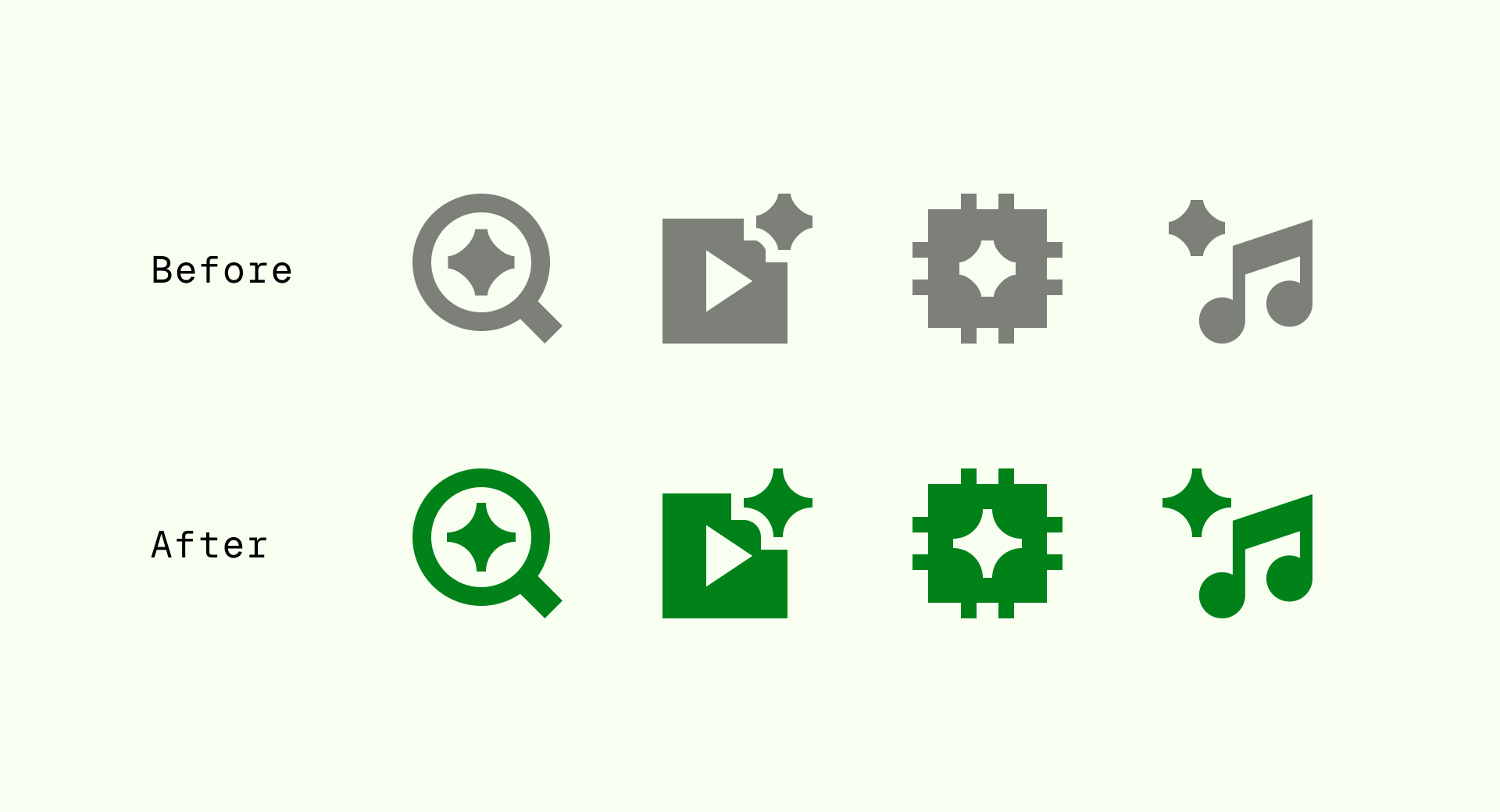
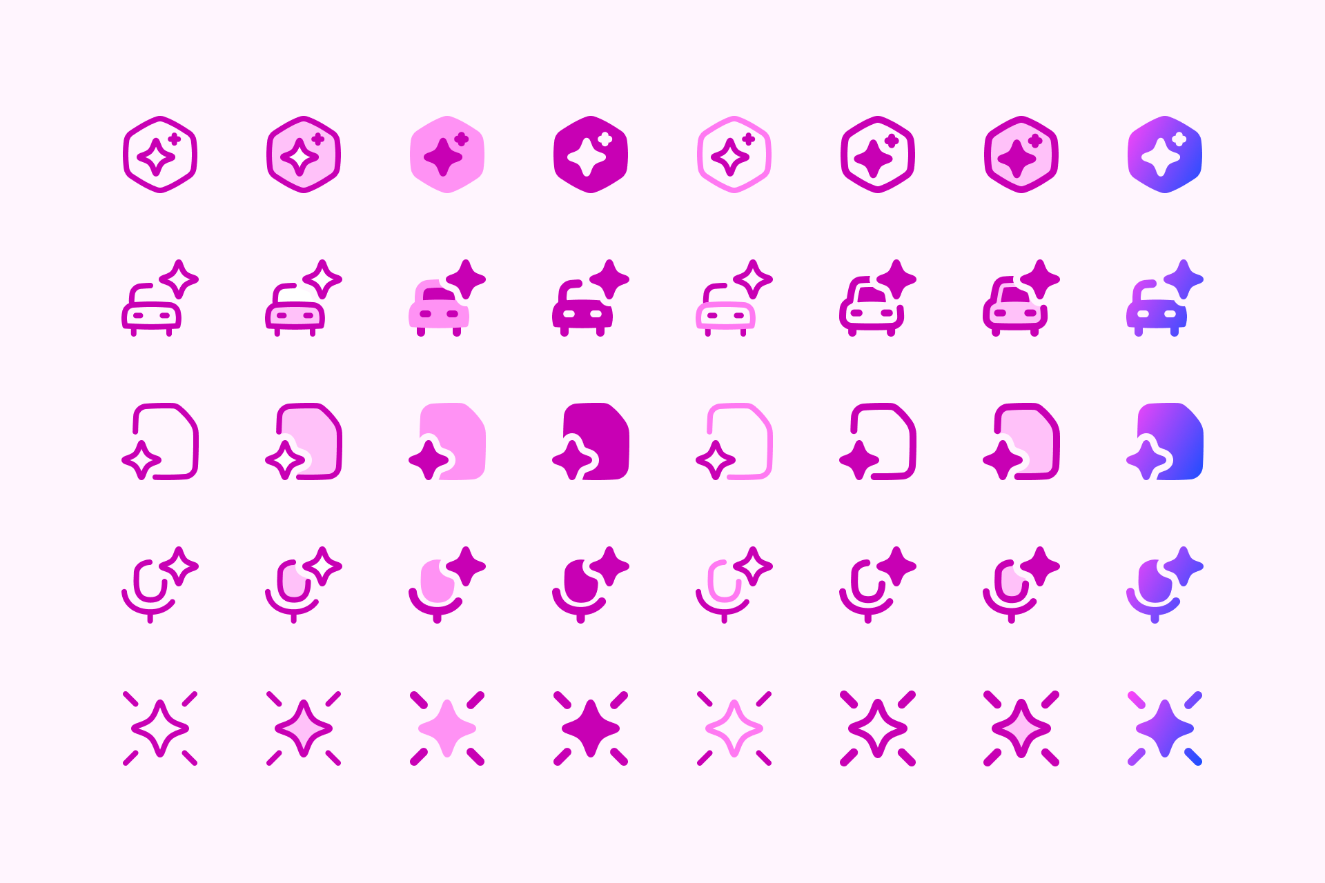
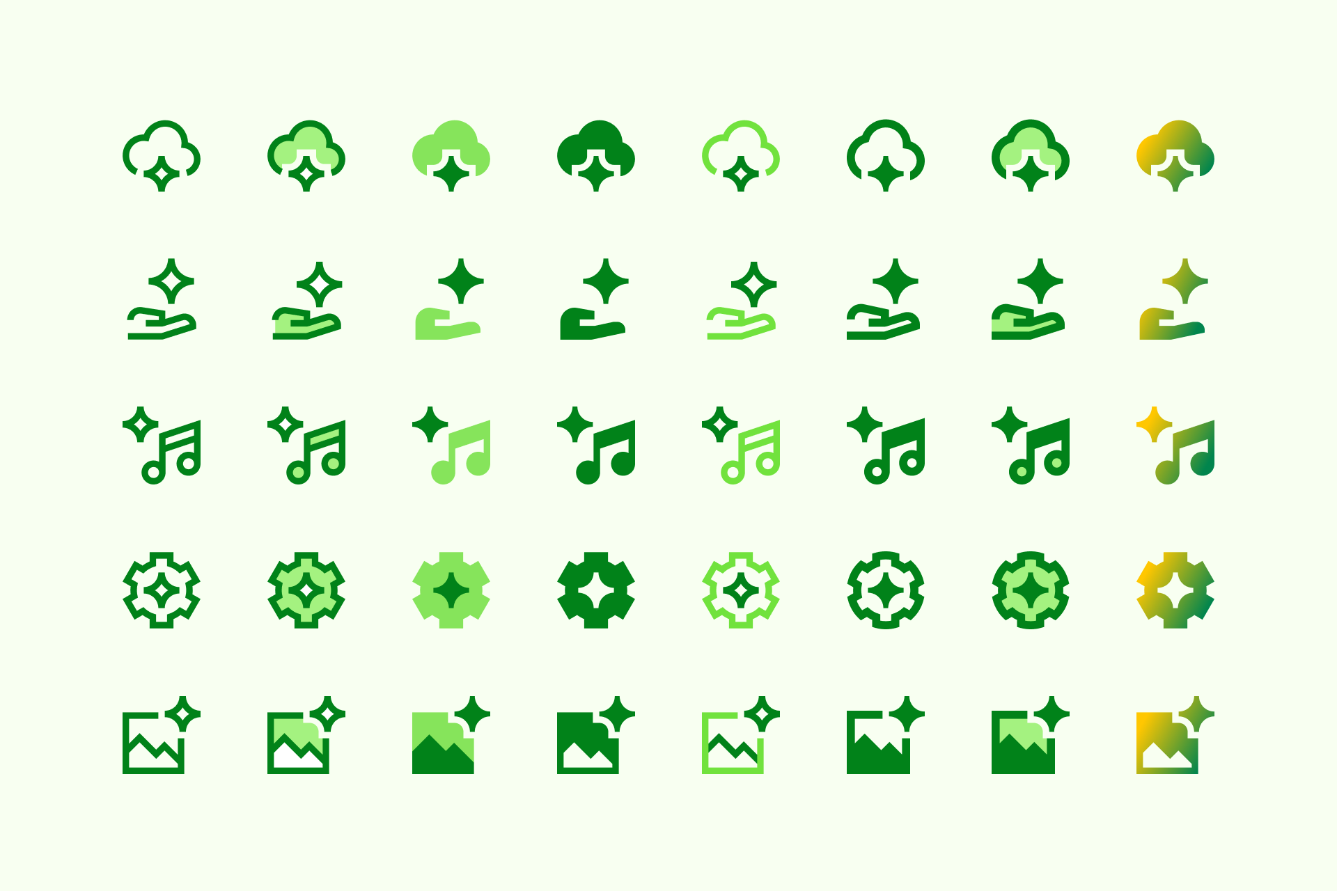
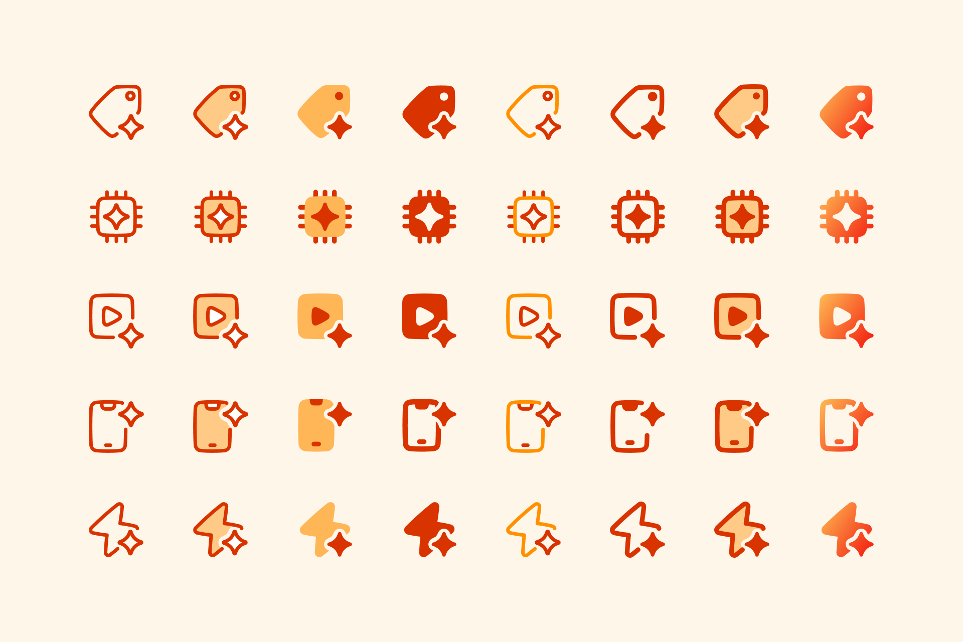
From top left to right bottom: improved sparkles shown in icons from Core Line, Flex Duo, Plump Flat, and Sharp Solid sets.
✅ Why we made the change
Clearer at small sizes. Thicker details added visual clutter at small sizes. The refined points help the icons stay clean and recognizable, even in compact UI elements.
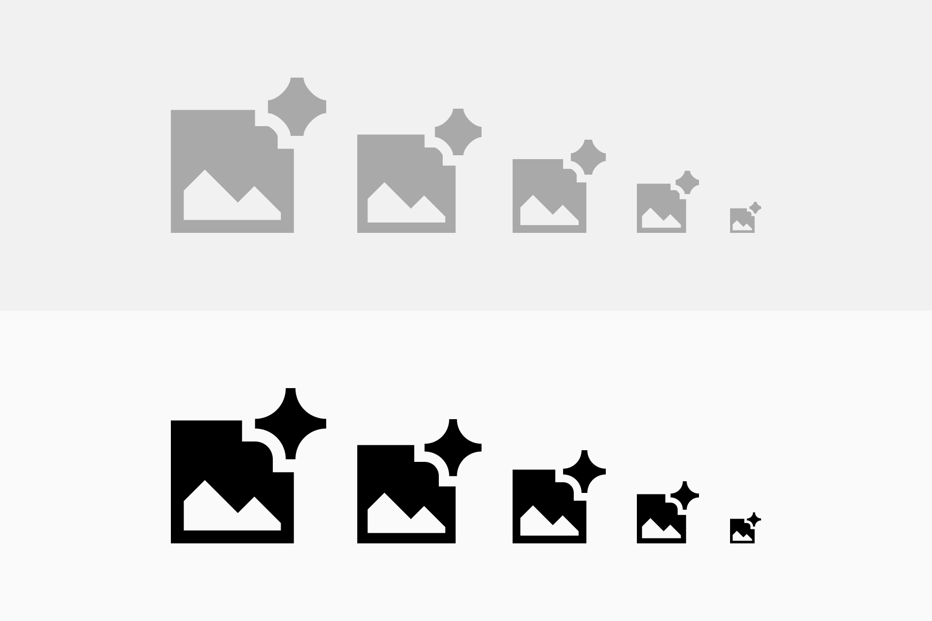
Improved balance and consistency. This update fixes uneven weights, misalignments, and inconsistent sparkle shapes—resulting in a more polished, unified look across all icons and styles.
✨ Ready to sparkle?
Update your icons and bring a little more magic to your UI.
Core icons
A timeless, minimalist icon set, like Helvetica—neutral yet friendly.
