Icon update: Improved speech bubble style
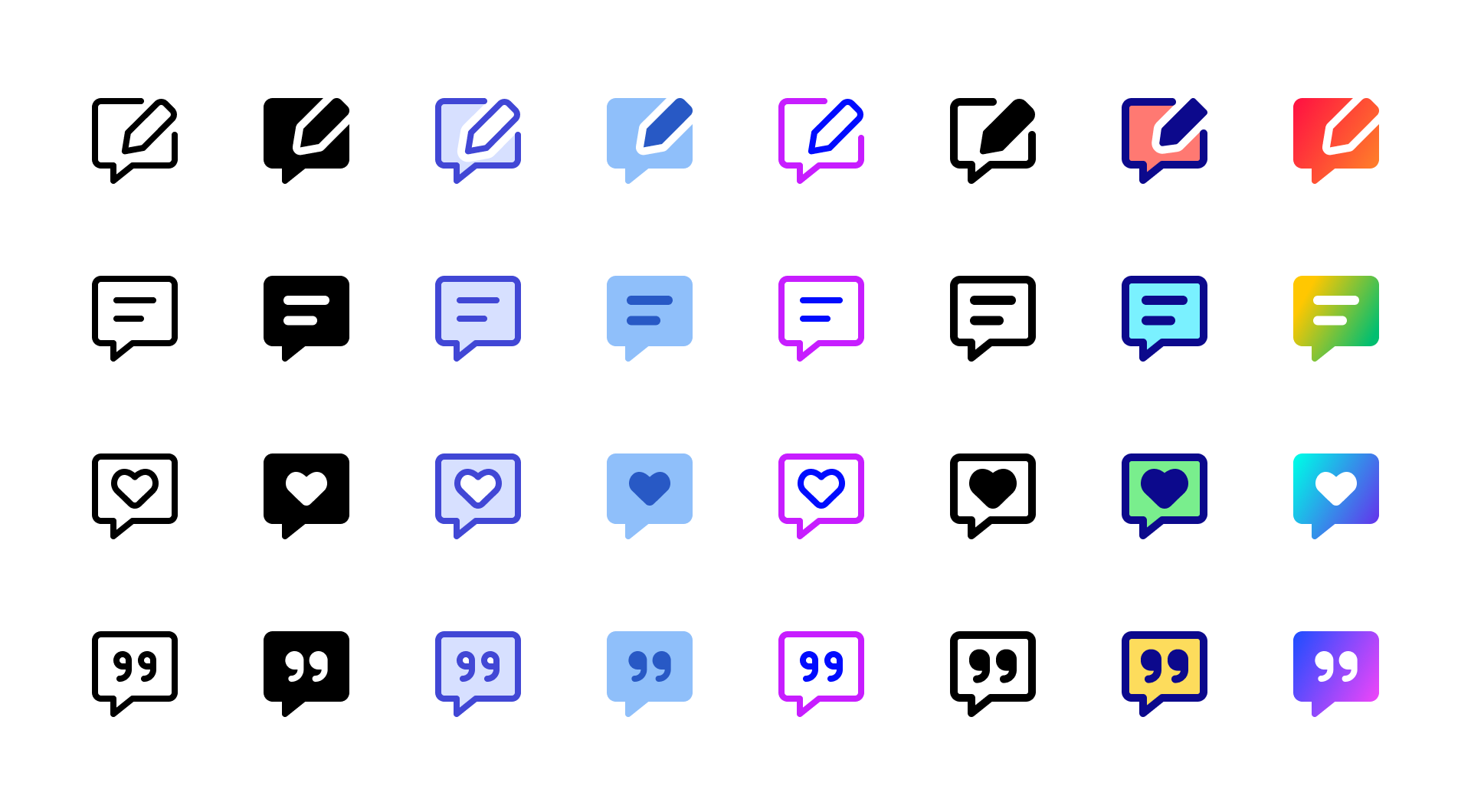
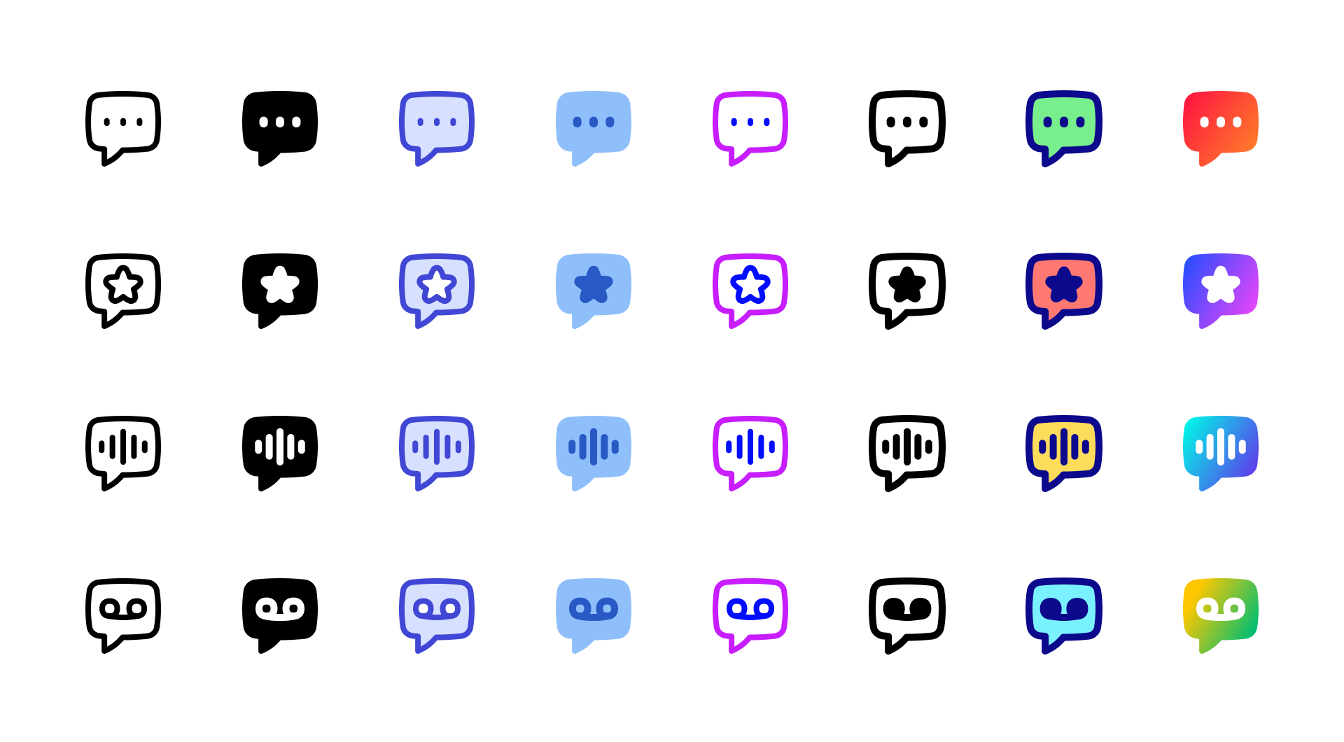
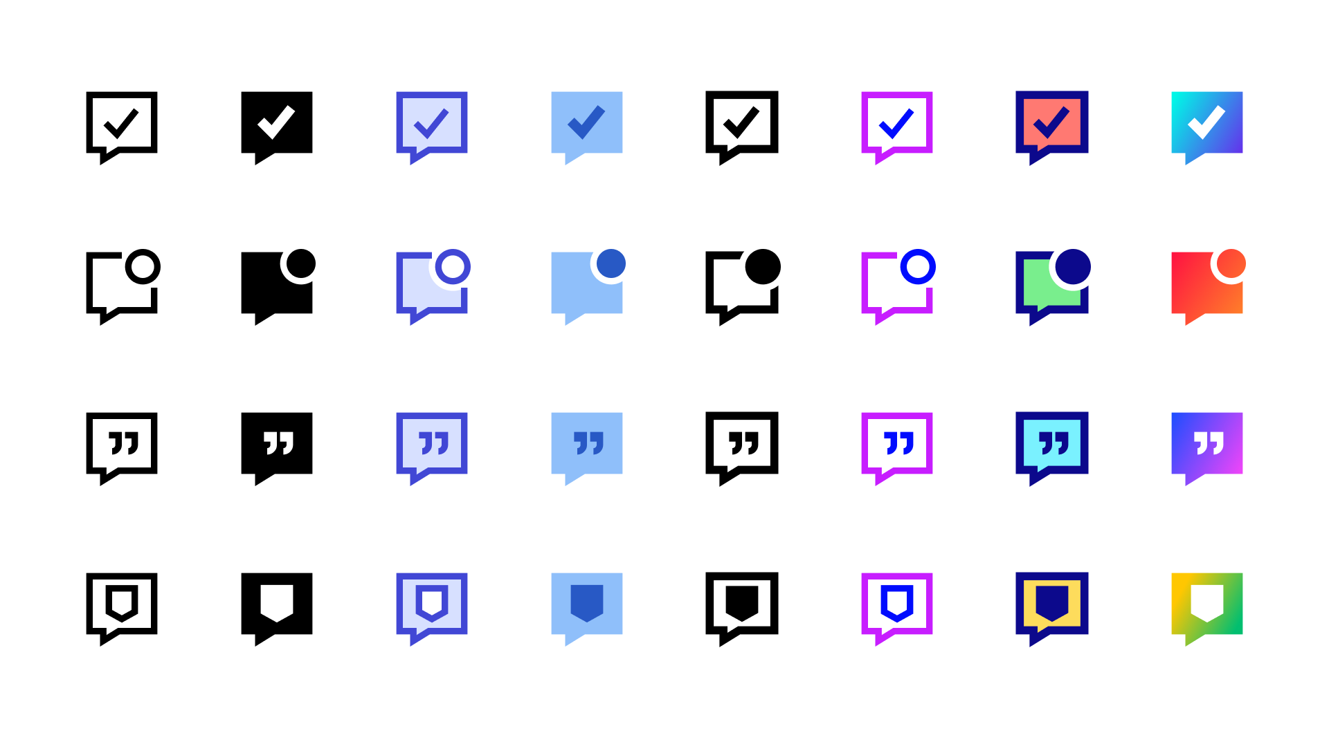
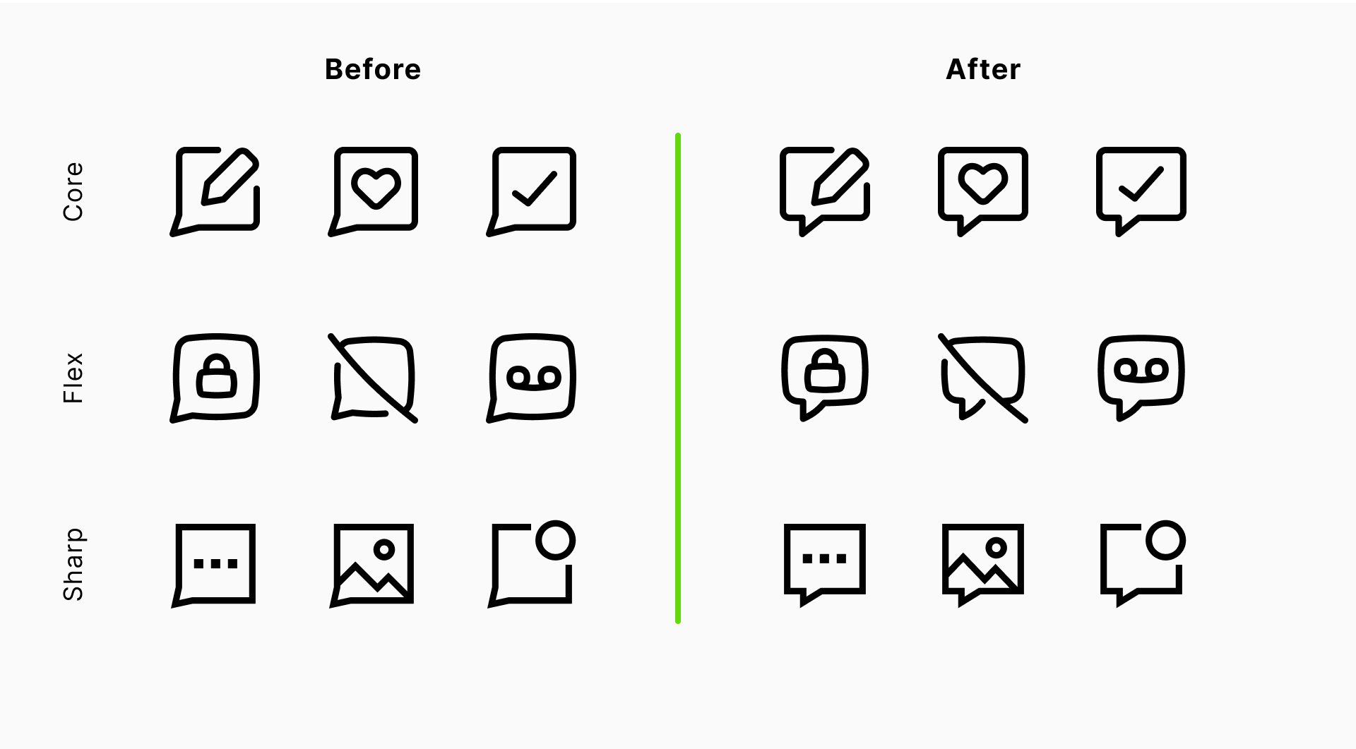
We’ve updated the design of the speech bubble icons across three sets in our Icon System—Core, Flex, and Sharp. While the change may seem subtle at first glance, it improves both clarity and consistency.
✨ What’s new
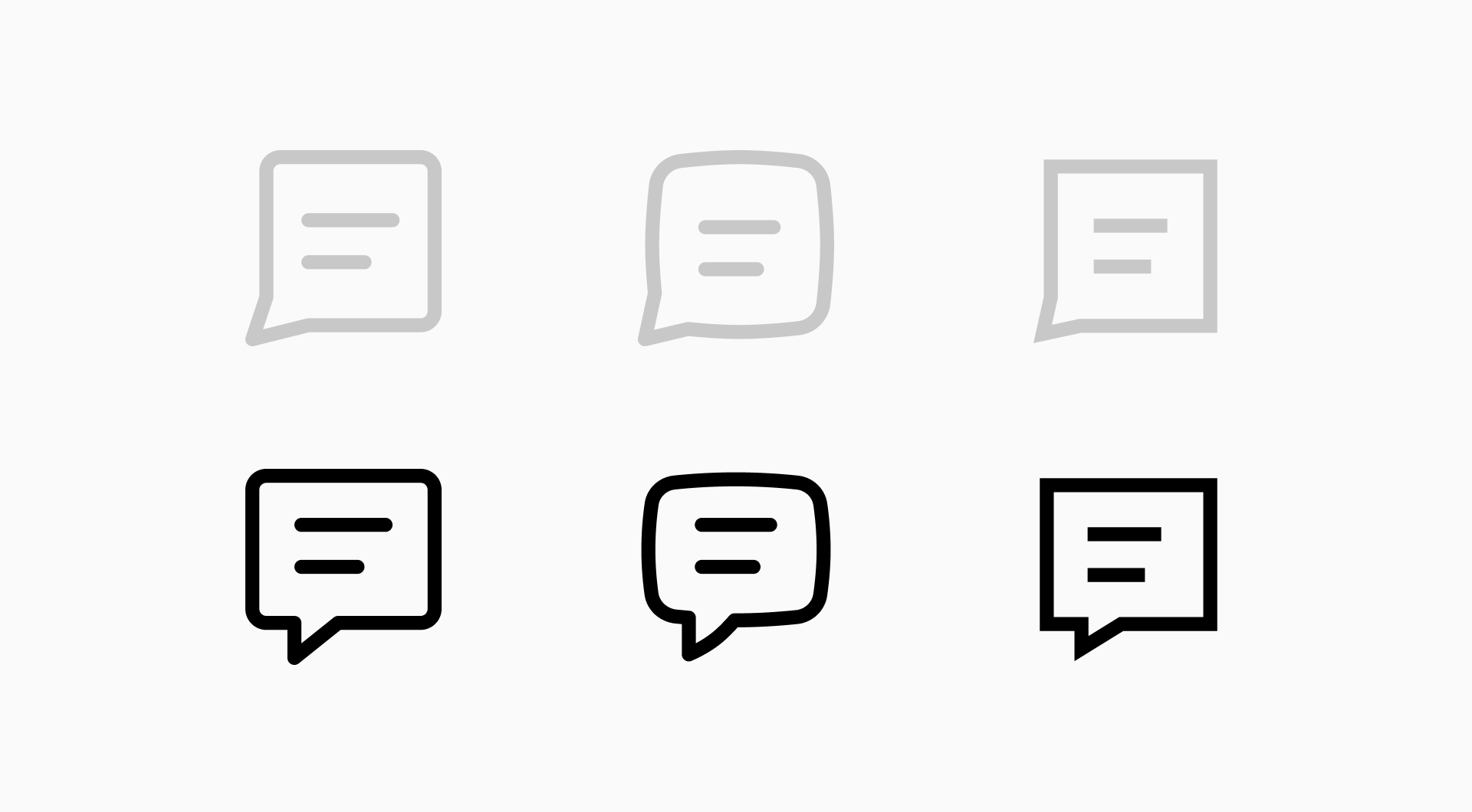
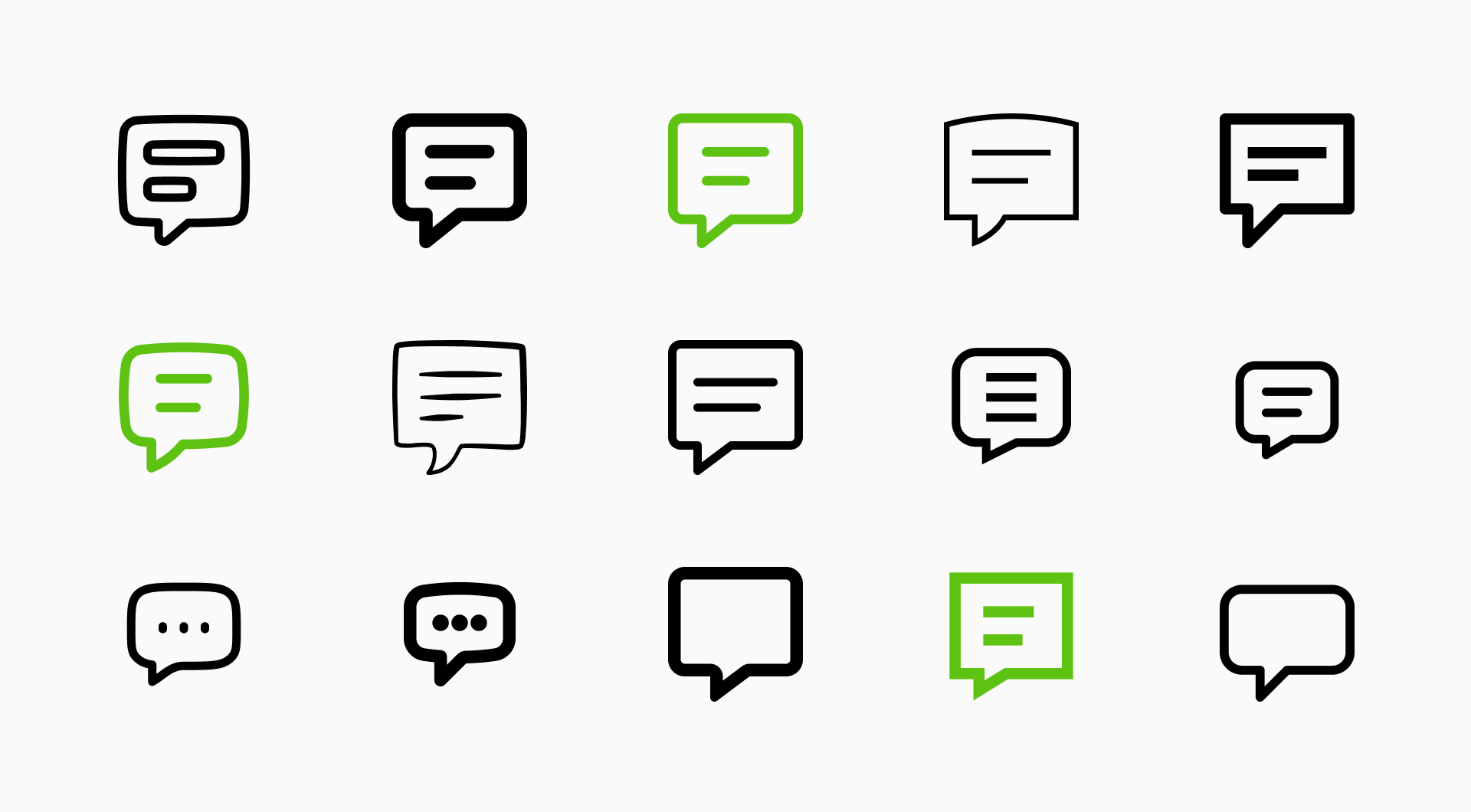
The most noticeable update is the position and shape of the tail. Previously, the speech bubble had a sharp, angled tail pointing from the bottom corner. In the new version, the tail is centered and more geometric, giving the icon a more balanced and familiar shape. The inner symbols—whether it’s text lines, a heart, or other symbols—remain unchanged.
✅ Why we made the change
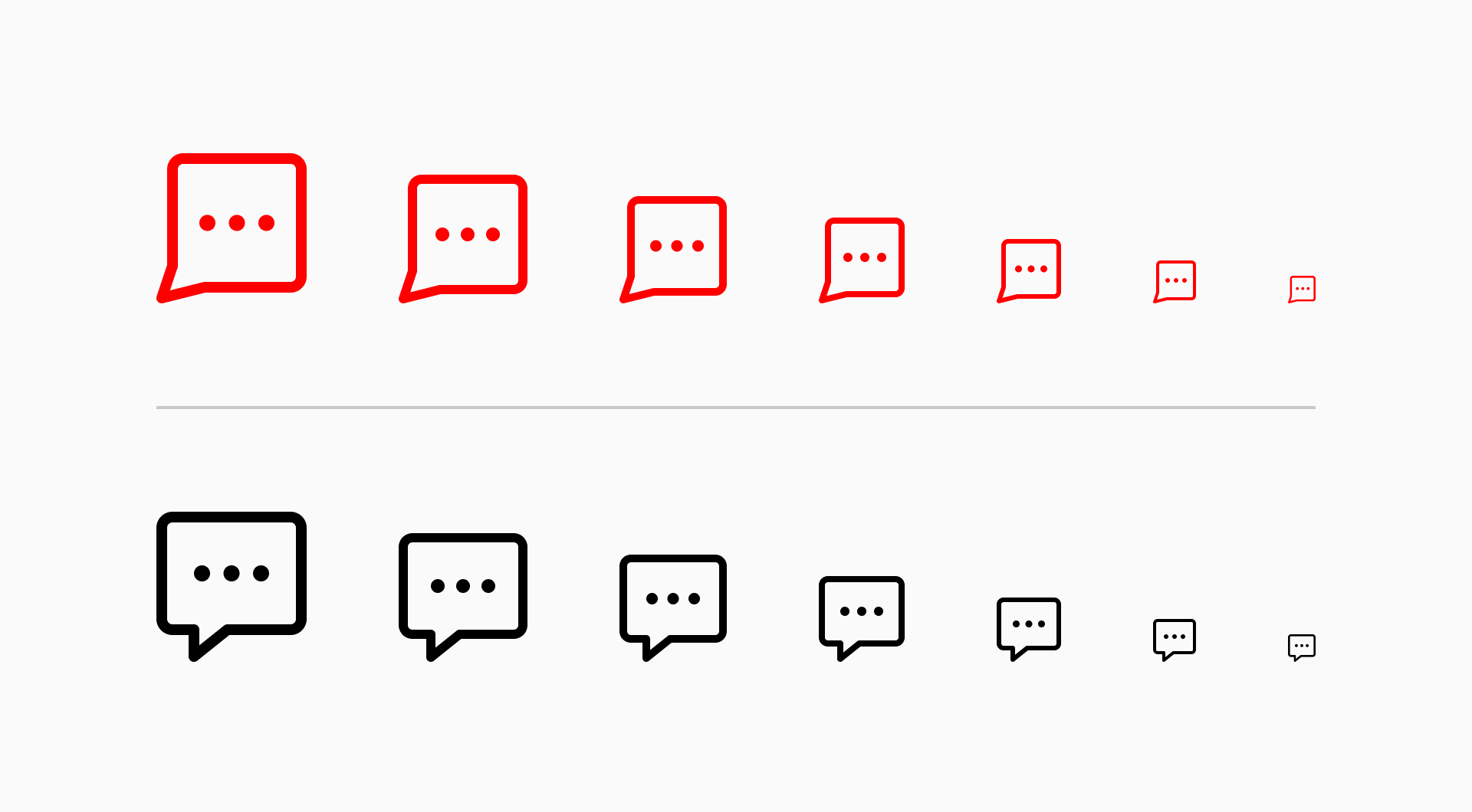
Improved legibility at smaller sizes. The new tail shape holds up better when the icon is scaled down, which is essential for interfaces where space is limited.
More universal visual language. The updated shape reflects the most widely recognized form of a speech bubble, making it more intuitive for users.
Greater visual harmony. The centered tail creates a more symmetrical and stable form, especially when placed alongside other icons in a set.
🚀 Use them in your next project
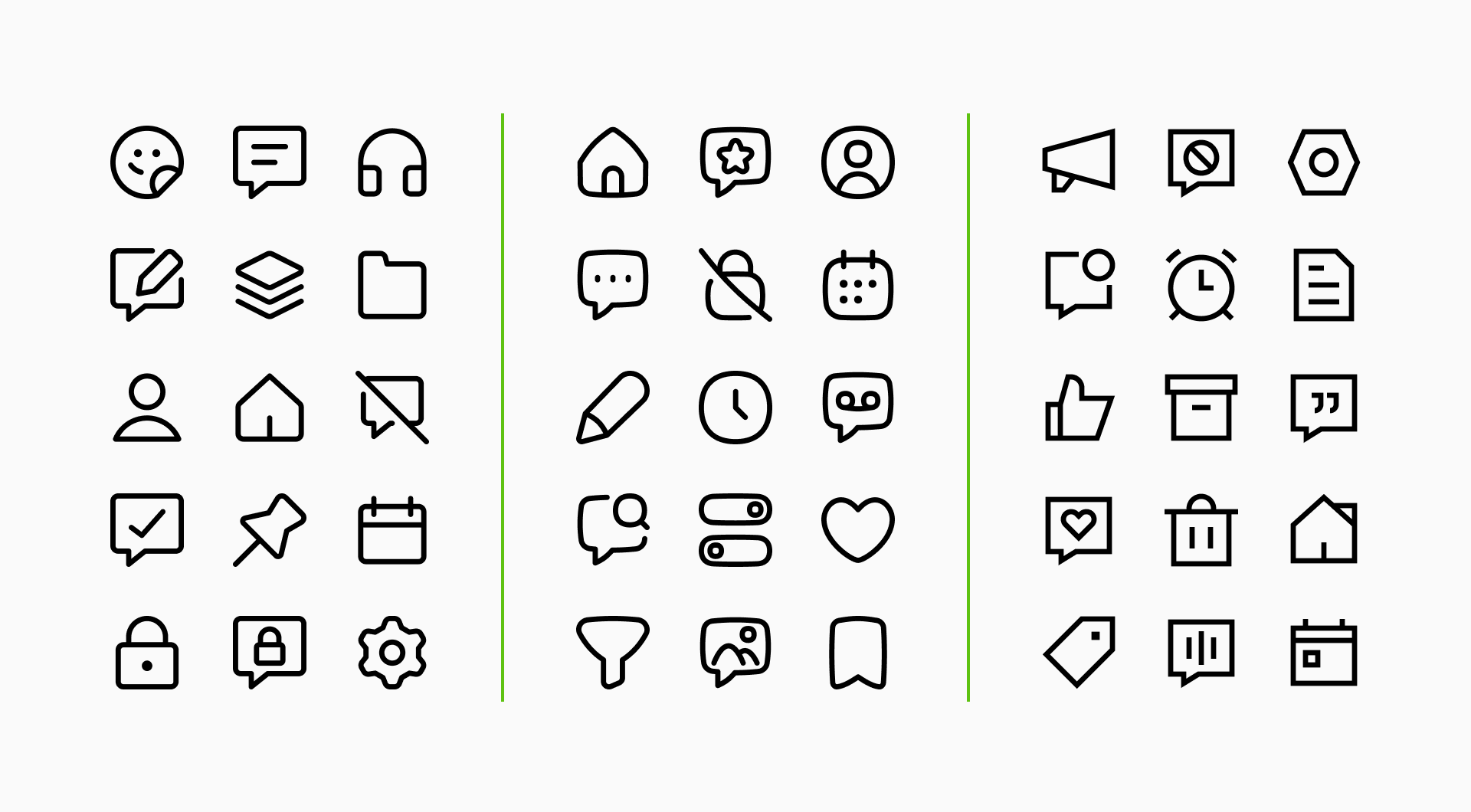
Whether it’s used to represent a comment, message, or quote, the updated icon is designed to feel more polished and functional across all contexts. Get them now.