Icon Design System: Larger, Consistent Sets
An icon library is easy to start and easier to abandon.
That's because every new icon makes the next one harder to design.
It has to respect all the decisions made before it: stroke weight, proportions, corner radius, and visual balance. It requires someone to care about icon #17,742 more than icon #1.
Scale requires creative precision and commitment.
At Streamline, we've made the hard decision to make massive sets. That are also consistent, legible, and harmonious.
So that you won't have to settle for something that's mediocre. Or waste time drawing your own icons.
With that, we have 3 updates for you.
1. Icon Design System
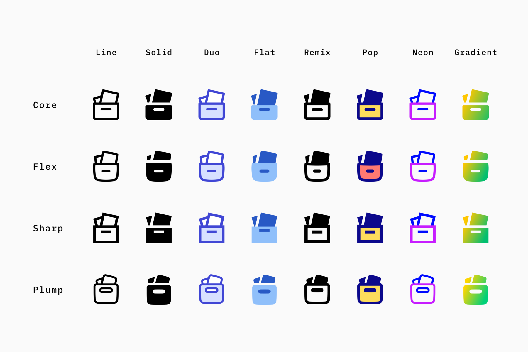
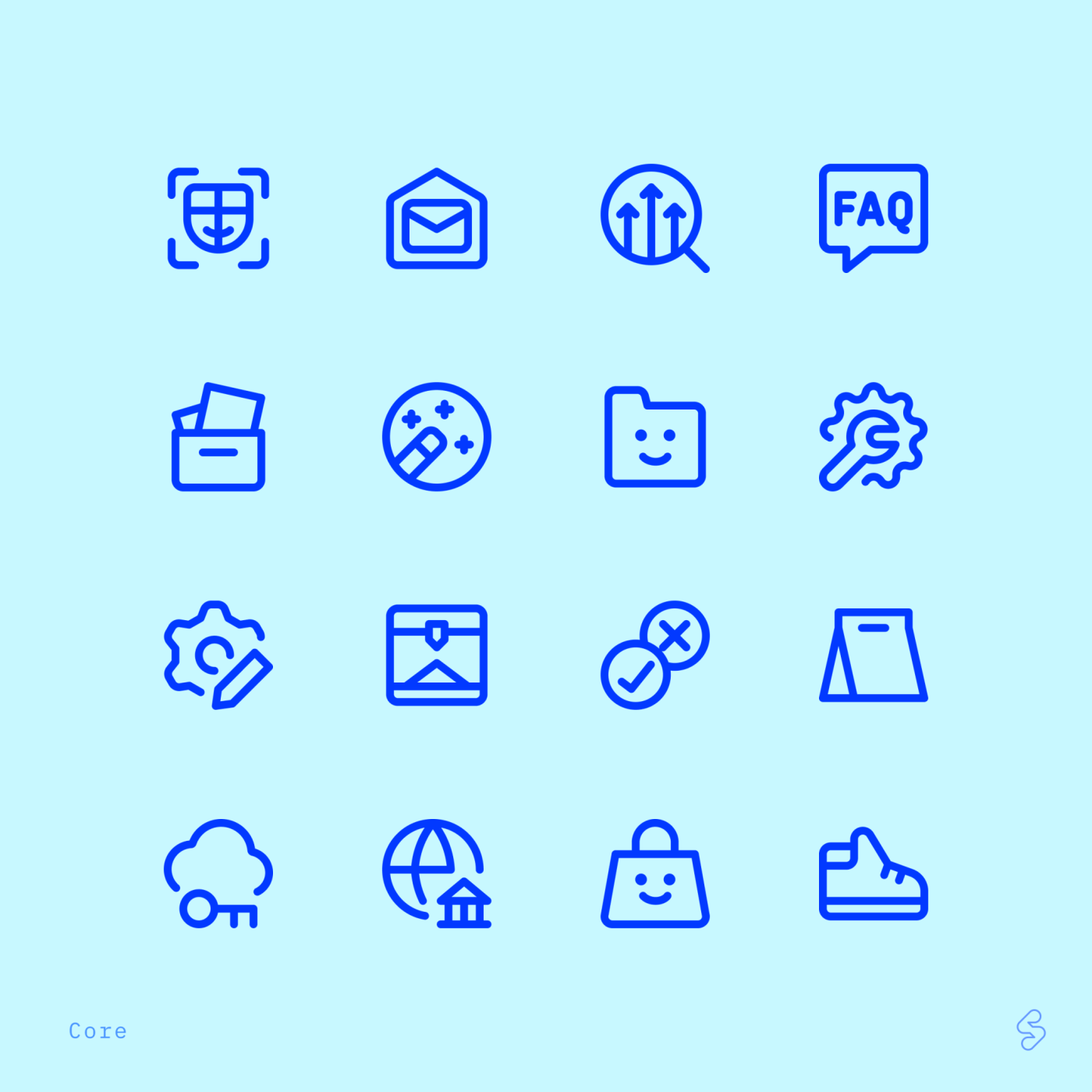
We’ve been building an icon design system from the ground up. It’s the first of its kind, with four cohesive families: Core, Flex, Plump, and Sharp.
Nearly 2,500 icons have been added to each family in the last 3 months, with Plump on the way. Each family has 42,000 icons.
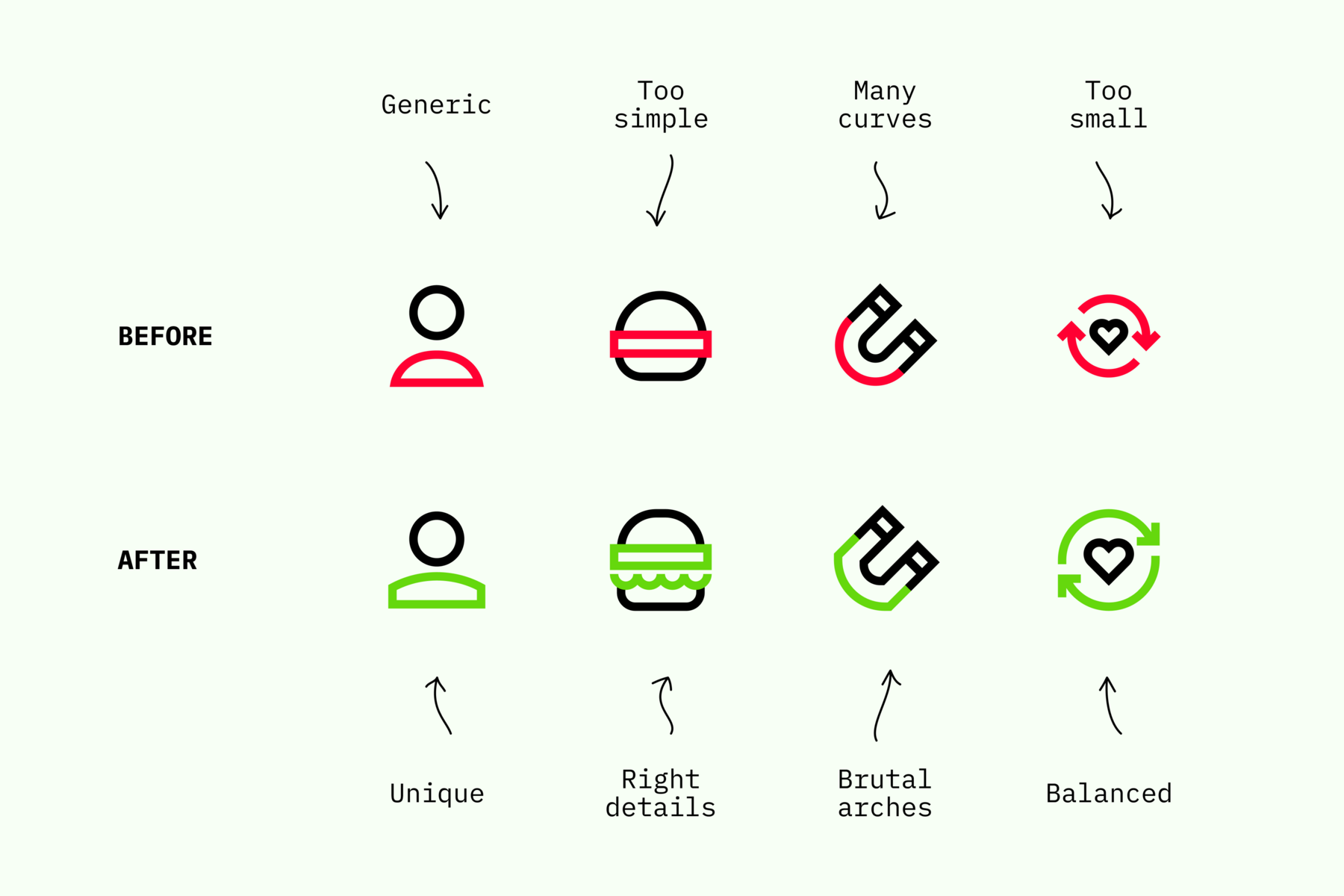
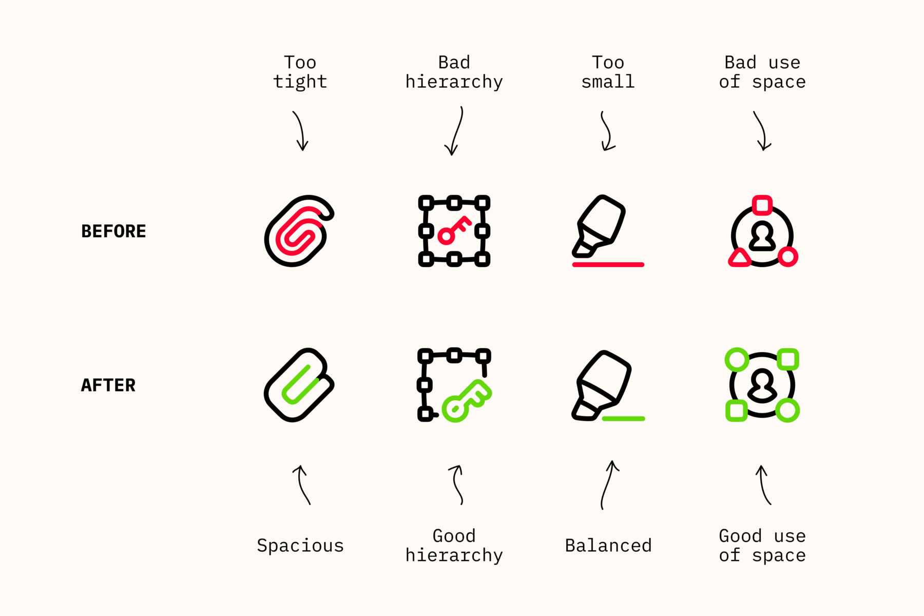
2. Improvements
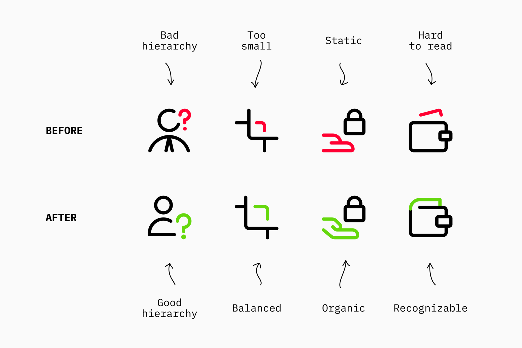
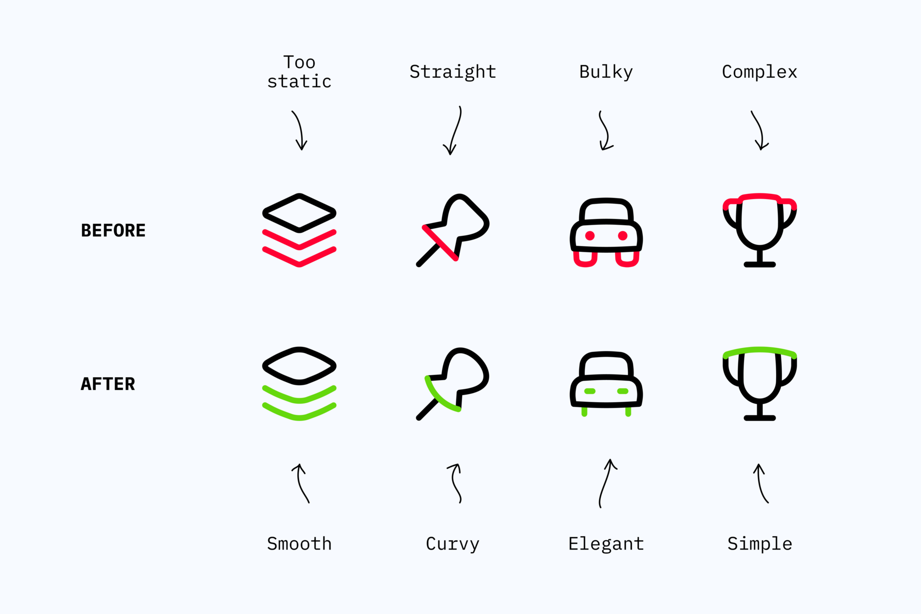
As a set grows, older icons need to be revisited and harmonized. Improving hierarchy, legibility, and more.
Streamline isn’t a static ZIP file you download. It’s a living, continuously improving icon library. No one else has even attempted to do this.
3. Custom Icons
Even with large sets, some icons may still be missing. When that happens, our in-house design team creates them for you. Free of cost.
In the past six months, we’ve fulfilled 75% of all requests sent our way, helping keep the sets complete and consistent.
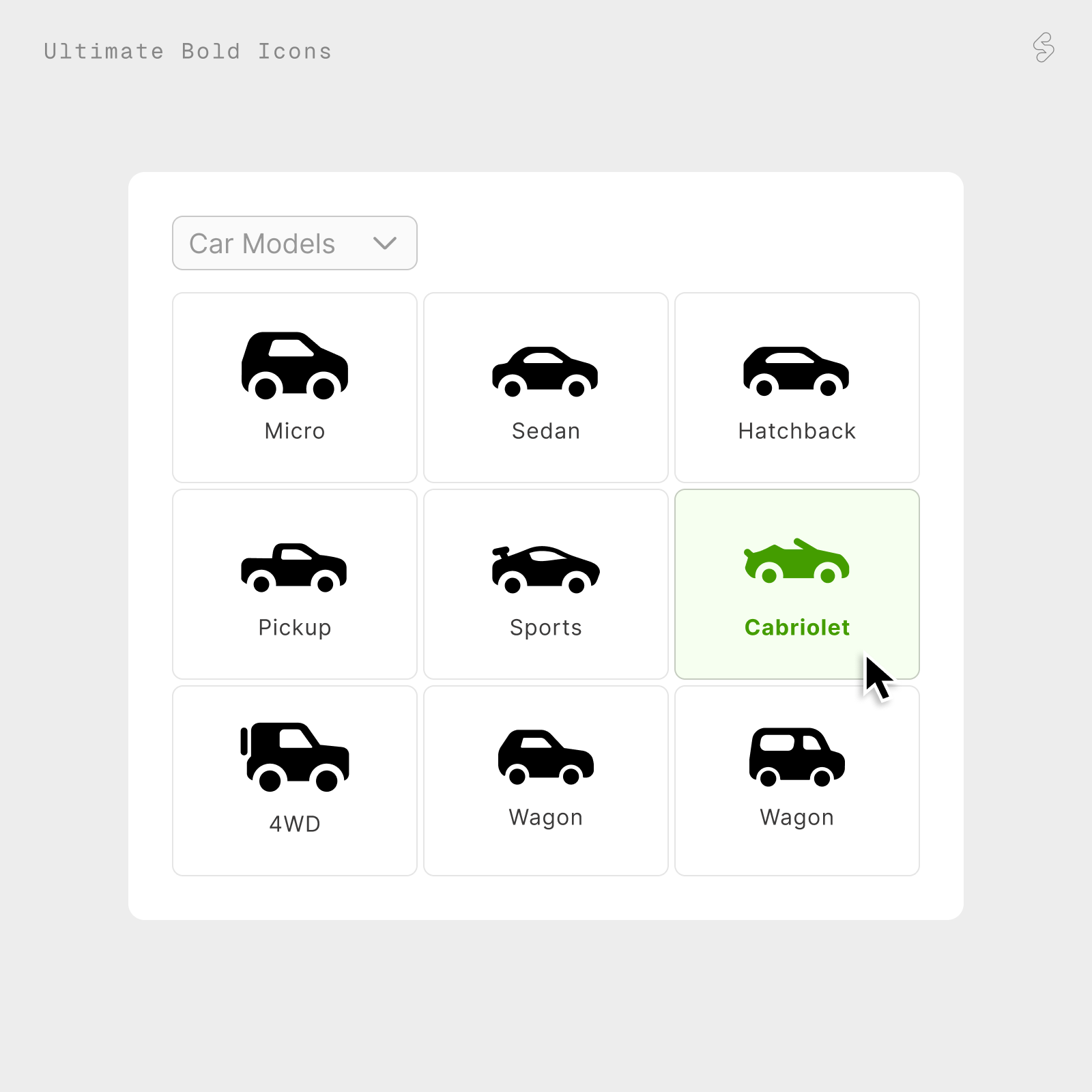
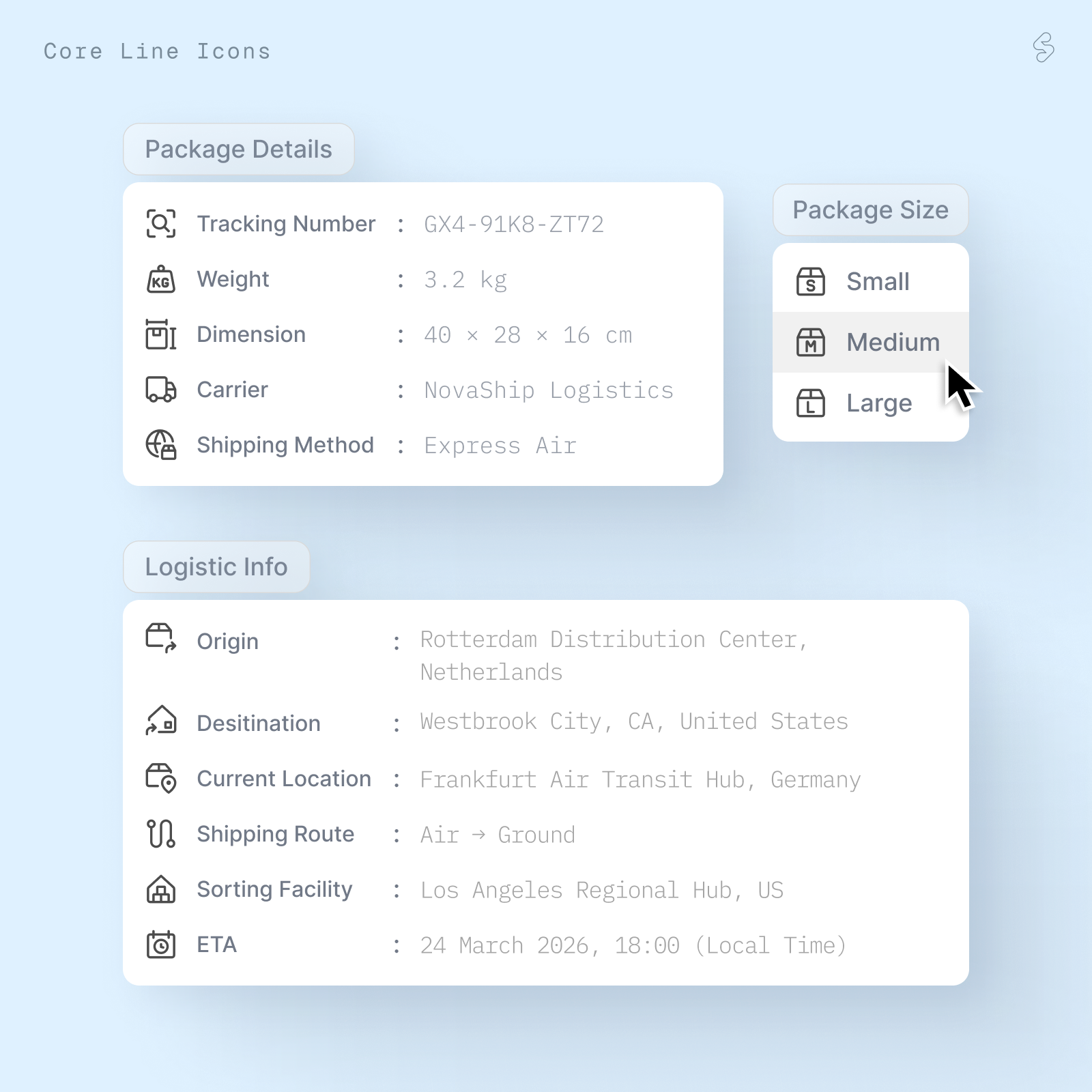
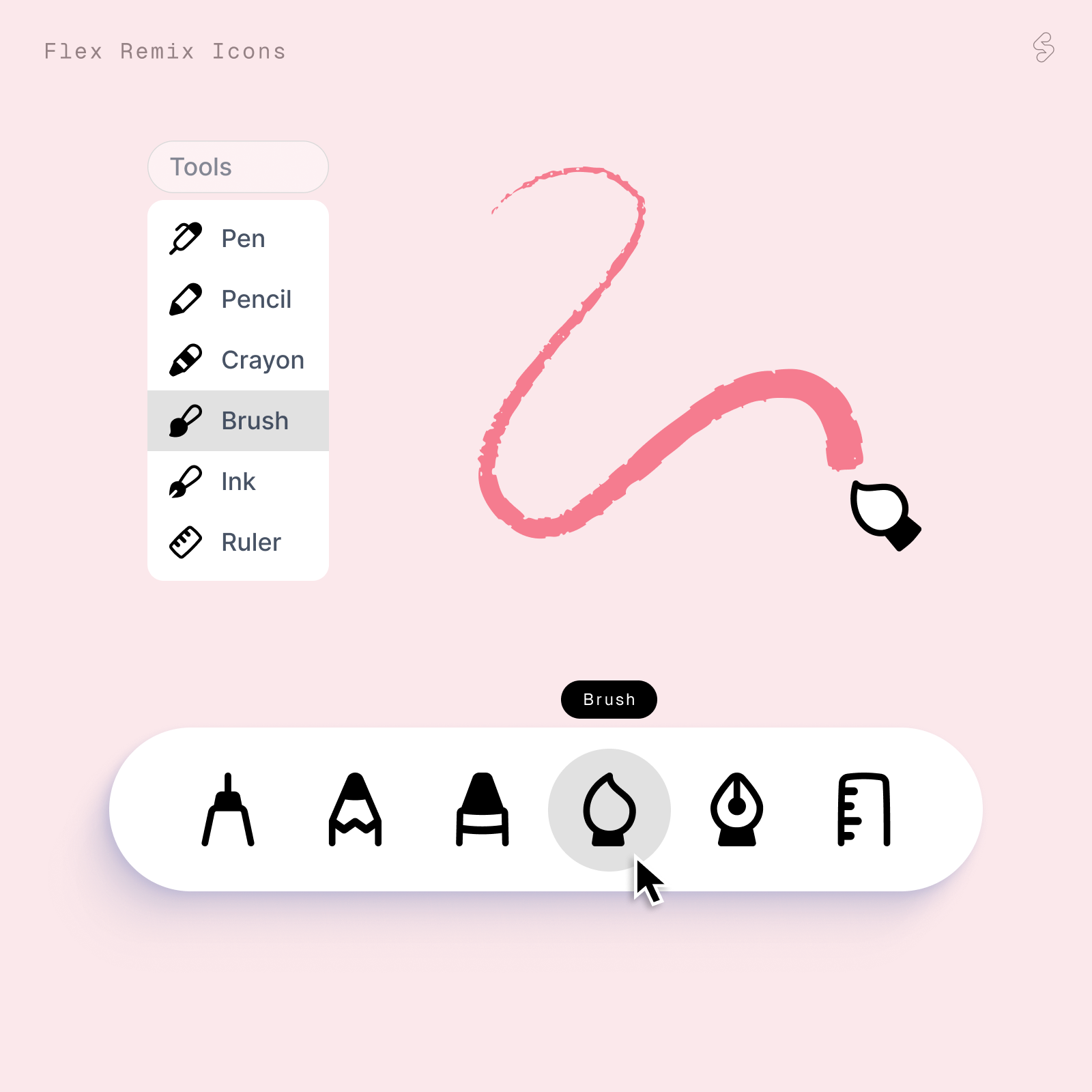
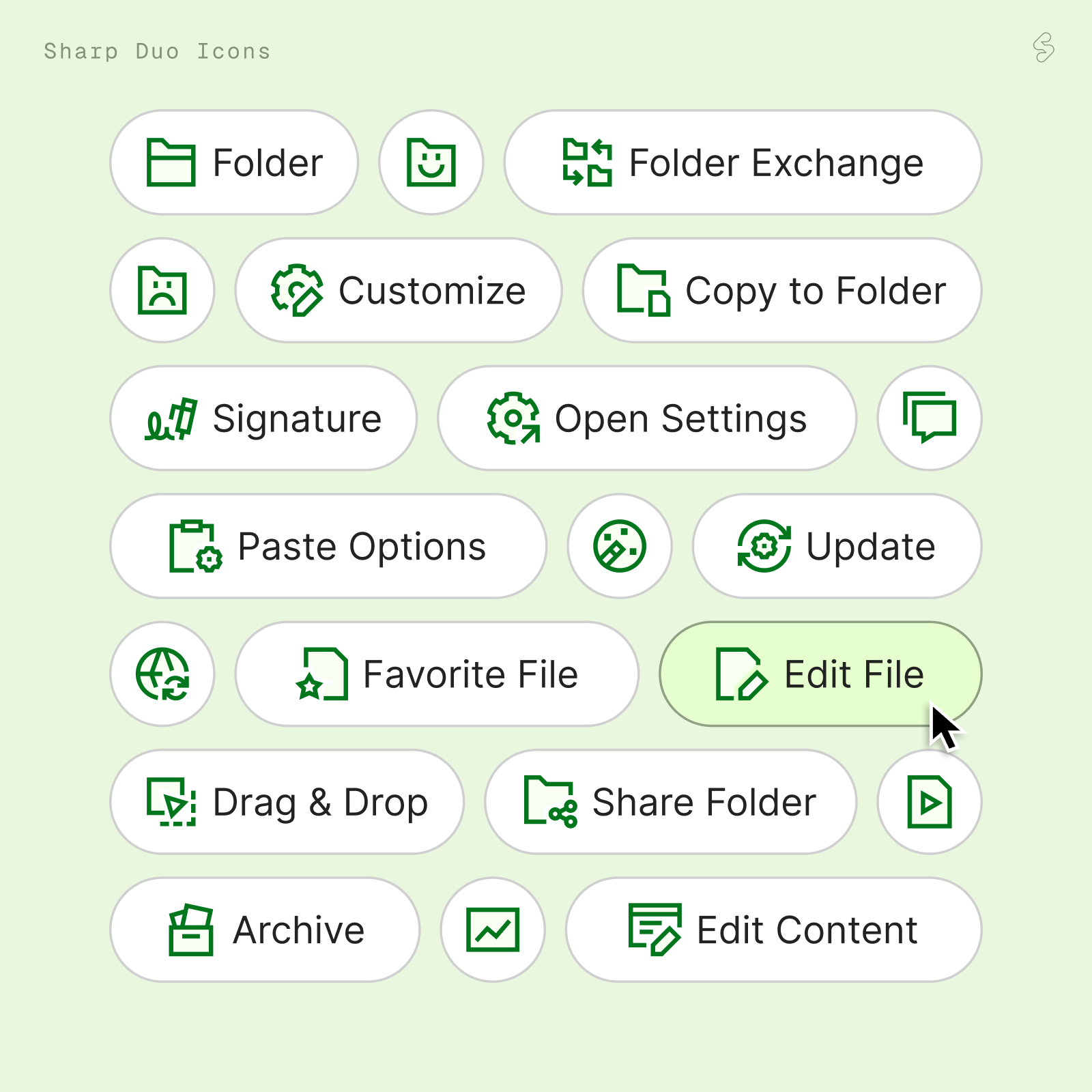
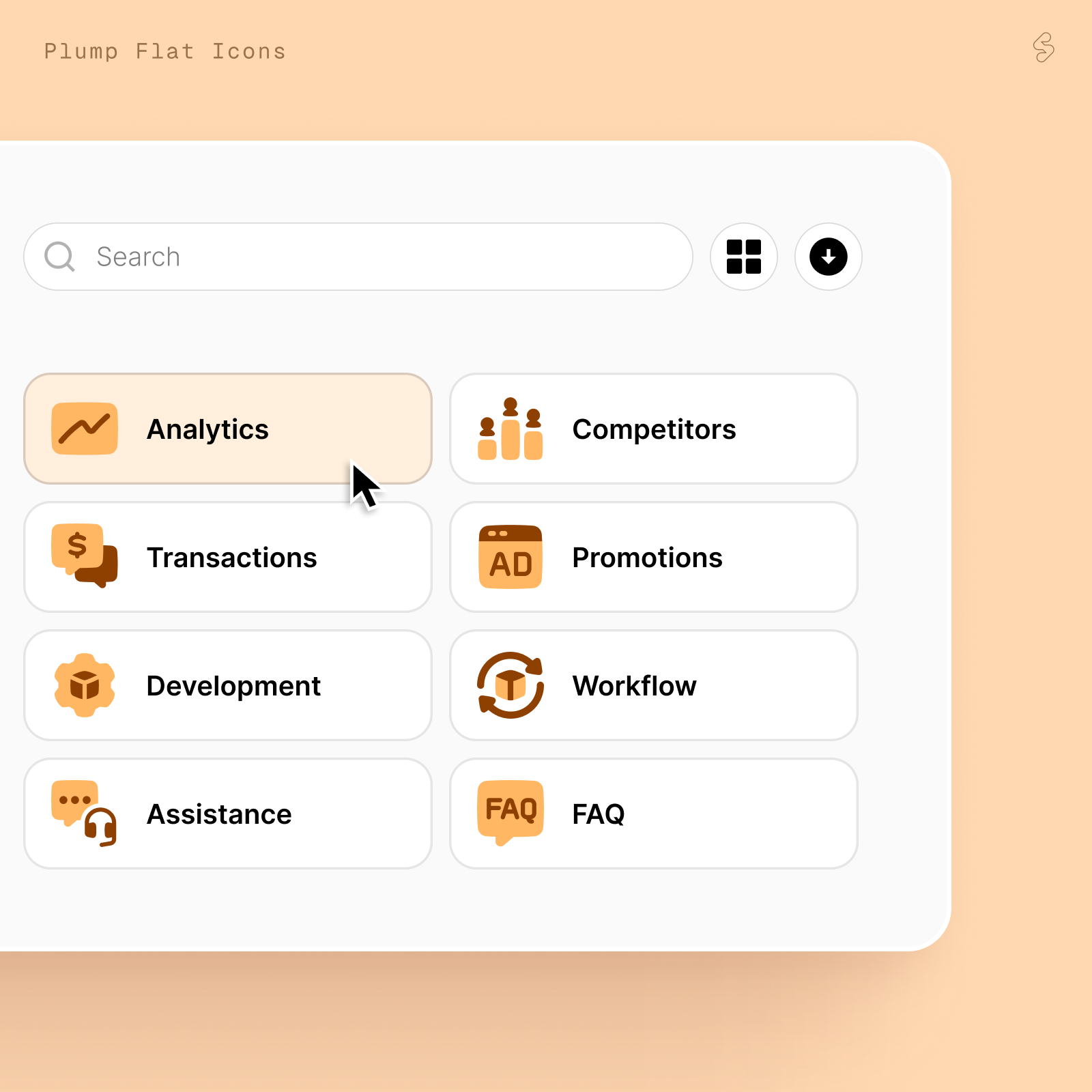
✅ How to Use
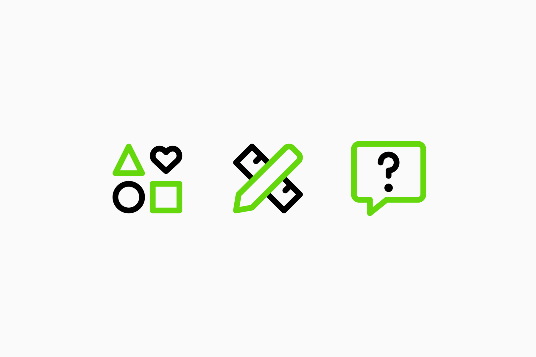
We've designed some mocks for you to get inspired. These are designed using our new and improved icons.
Thanks for choosing Streamline! If you have any feedback, suggestions or ideas for us, please reply to this email. We'd love to hear!