How to Choose and Download White Icons (Free and Pro)
White icons live on dark backgrounds. And dark backgrounds are unforgiving. Thin strokes can fragment at small sizes, and light shapes tend to appear heavier than they actually are. What looks balanced in black can lose its proportion when flipped to white.
At Streamline, we have spent twelve years designing icon sets with a team of eight veteran designers. We have thought carefully about how every set behaves across backgrounds, sizes, and screen types. This guide shares what we have learned, and points you to the sets that work best in white.
The Irradiation Illusion
White shapes appear larger than dark shapes of the same size. This is called the irradiation illusion, and it affects every icon you use in white.
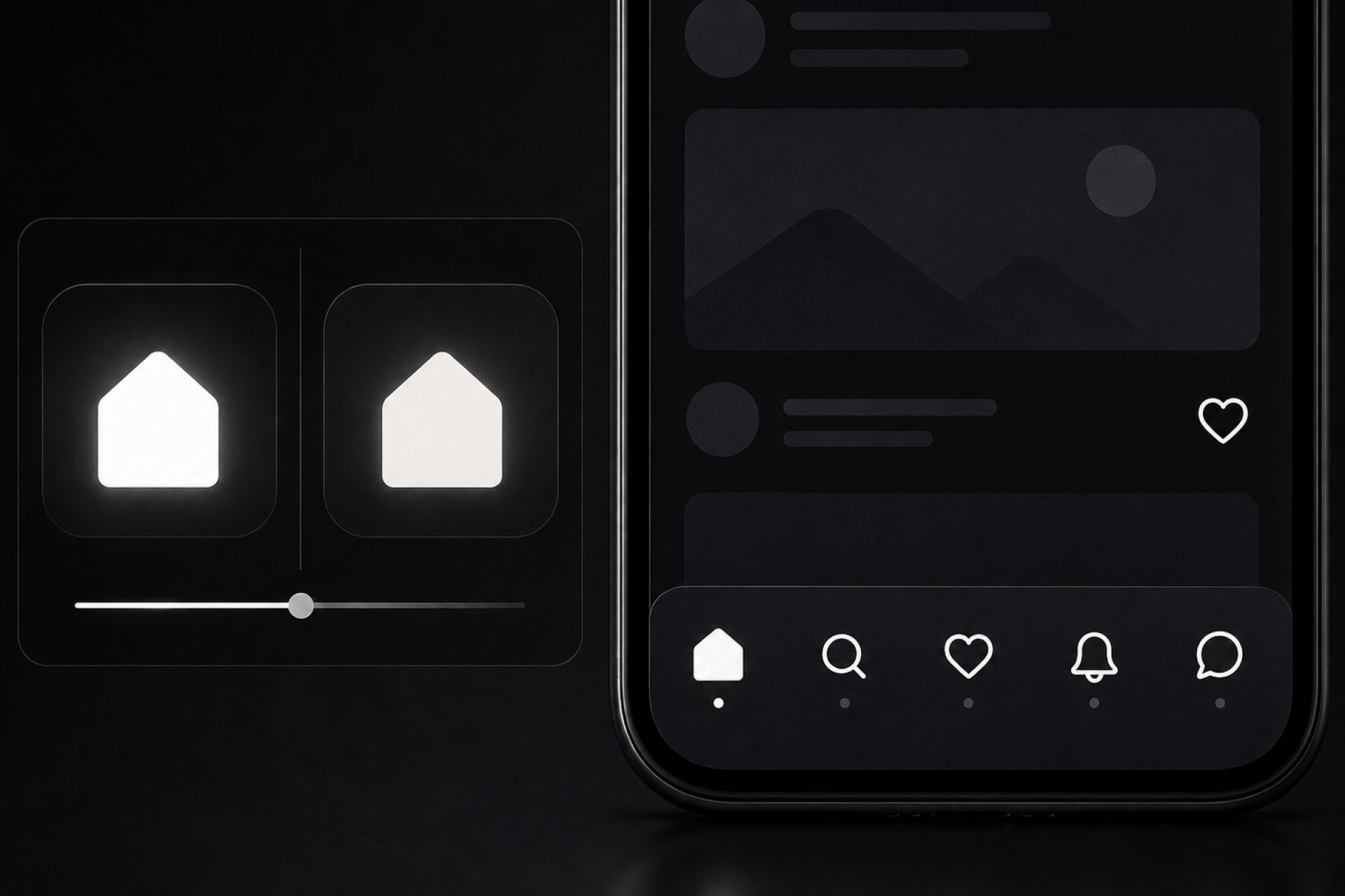
Our eyes perceive light radiating outward from white shapes on dark backgrounds, which makes them look heavier than they actually are. A perfectly proportioned icon in black will look subtly bloated in white at the same size.
The sets that handle this well are built with slightly tighter shapes and more considered negative space. It's not obvious when you browse an icon library but you'll definitely notice it when it's in the UI.
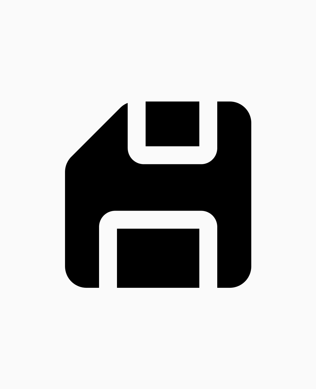

Same icon in black on white vs white on dark, showing the weight difference
Solid or Line?
The style of your icon set matters more on dark backgrounds than anywhere else.
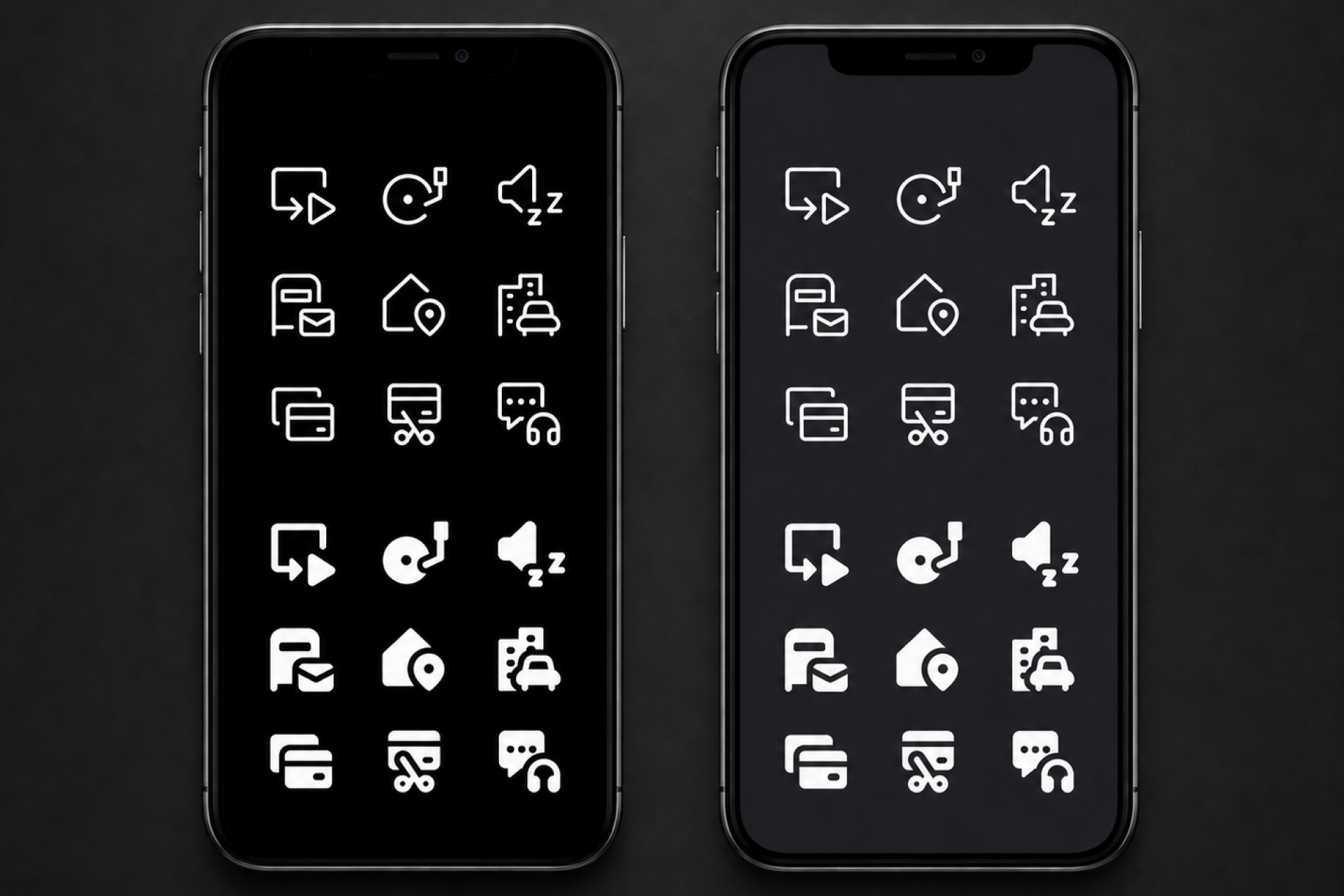
Line icons carry all their visual weight through open strokes. At larger sizes they hold up well. At 16px and below, those strokes can become too fragile to read clearly as white icons on dark backgrounds.
Solid icons use filled shapes. The fill maintains contrast at any size, which is why Google's Material Design recommends Solid as the preferred style for dark backgrounds. For navigation bars, buttons, and dense interfaces, Solid is the safer choice.
Line still works in the right context. At larger sizes, with a medium stroke weight, a good Line set can look elegant in white. The key is knowing where your icons will actually live before you commit to a style.
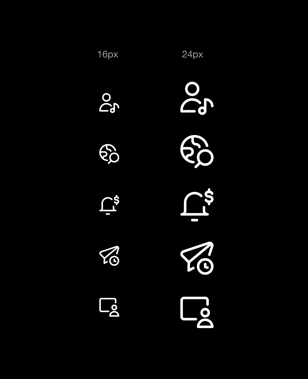
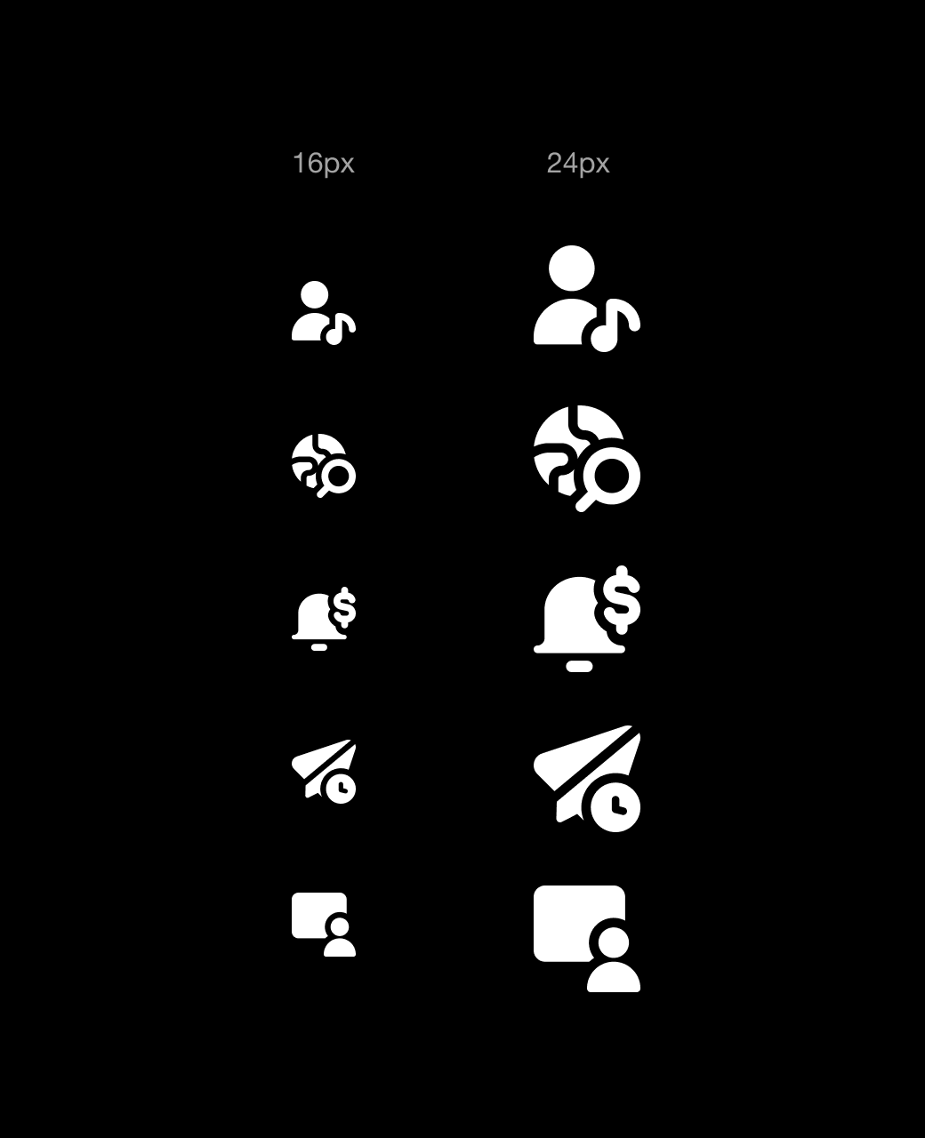
Core Line vs Core Solid, white on dark, at 16px and 24px
Stroke Weight
Stroke weight is one of the most important things to check before downloading a white icon set.
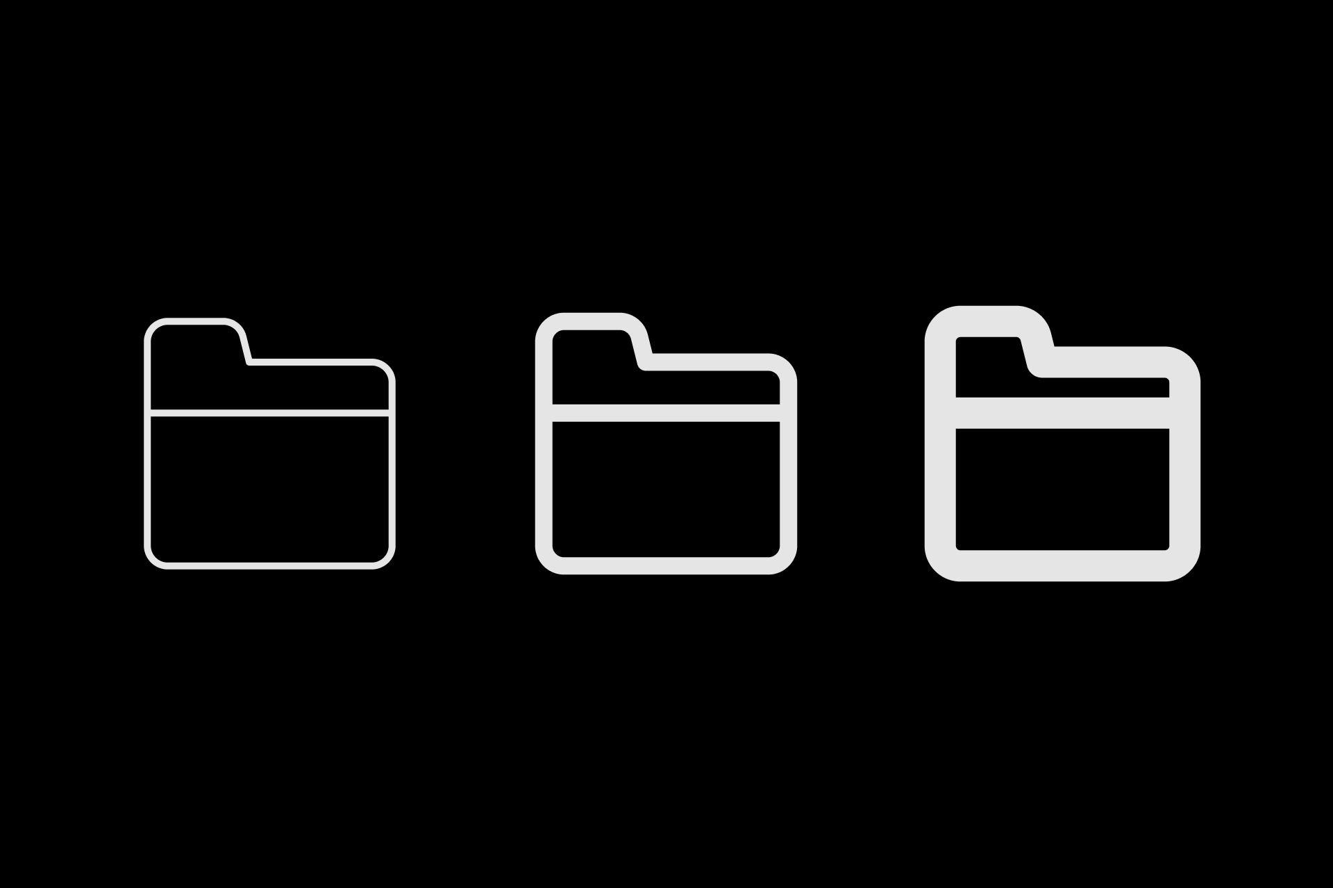
Thin strokes tend to disappear on dark backgrounds, especially at small sizes. Thick strokes can blur. Medium stroke weight is what holds up consistently across sizes and screen types. A good rule of thumb is to download a sample, drop it at 16px on your darkest background color, and see if the shapes still read clearly.
Most well-built icon sets use a default stroke of 1.5px to 2px at a 24x24px grid size. That range tends to work well for white icons across both OLED and LCD screens.
OLED and LCD
If your product lives on mobile, it is worth understanding how different screens affect white icons.
On OLED screens, each pixel switches off completely when displaying black. White icons sit against true black, which creates extreme contrast. Thin strokes feel this the most. On LCD screens, a backlight illuminates the entire panel, which means black is never fully black. The contrast is slightly softer.
Solid icons behave consistently across both screen types. If your audience is primarily on flagship smartphones, assume OLED.
Color and Opacity
Pure white (#FFFFFF) is rarely the best choice for white icons. It creates harsh contrast and can appear blurry on most screens, particularly on OLED. Off-white values like #E8E8E8 or white at 87% opacity tend to feel more refined and easier on the eye.
Opacity is also your best tool for hierarchy. Google's Material Design recommends 100% white for active icons and 50% for inactive ones. This creates a clear visual hierarchy without introducing a second color into your dark UI.
Which White Icon Sets to Download
Streamline has over 120,000 free SVG icons available, and most pro sets have free PNG icons you can test right away. The full library is available on a subscription or one-time purchase.
These are our sets that work best as white icons, organized by use case.
For Most UI Projects: Ultimate Bold
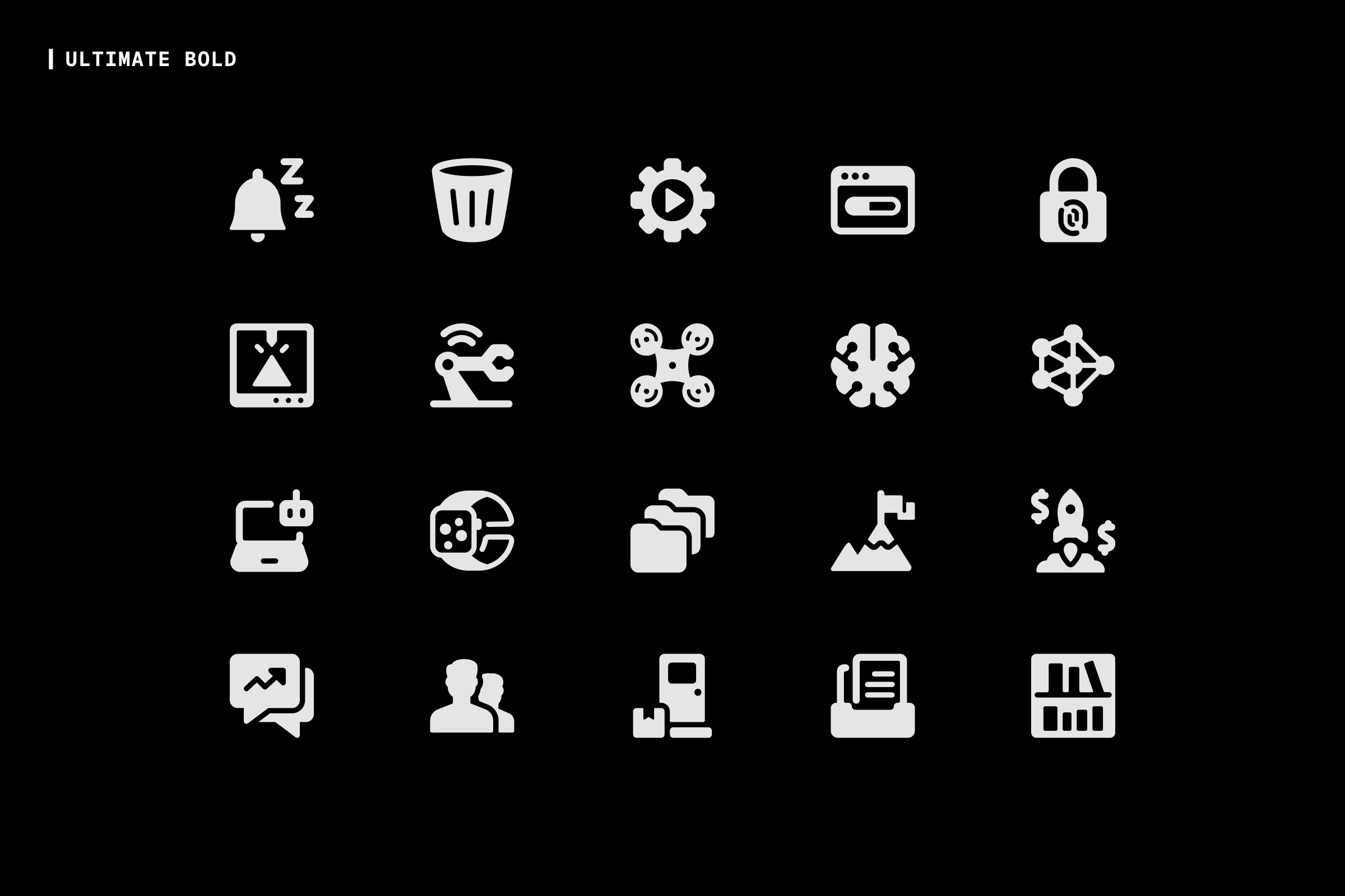
Ultimate Bold is the workhorse white icon set for dark backgrounds. The shapes are solid and filled, which means they hold their visual weight in white at any size. The 24x24px grid gives each icon enough room to stay legible whether you are using it as a large hero icon or a small navigation element. It also covers an enormous range of concepts, so you are unlikely to find yourself missing an icon mid-project.
Download Ultimate Bold (Free, Pro)
For Dense Interfaces and Small Sizes: Micro Solid
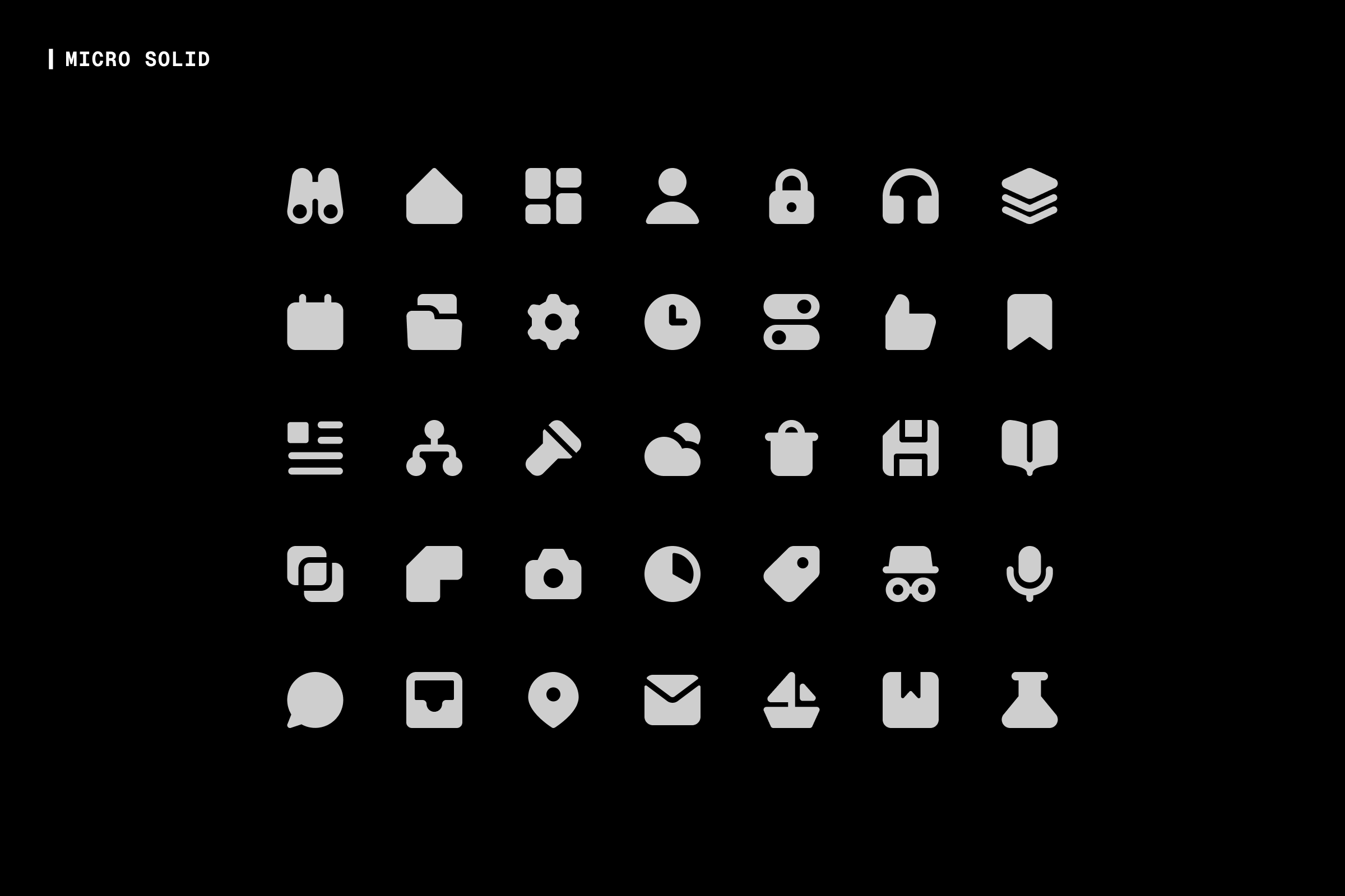
Micro Solid was designed specifically for small sizes. It is built on a 10x10px grid, which is smaller than Core Solid at 14px and Ultimate Bold at 24px. That smaller grid means every stroke is there for a reason, with no room for decorative detail. In white, on a dark background, it stays legible at sizes where detail is hardest to maintain. It is the go-to white icon set for navigation bars, inline buttons, and any interface where space is tight.
Download Micro Solid (Free, Pro)
For Technical and Brutalist Designs: Sharp Solid
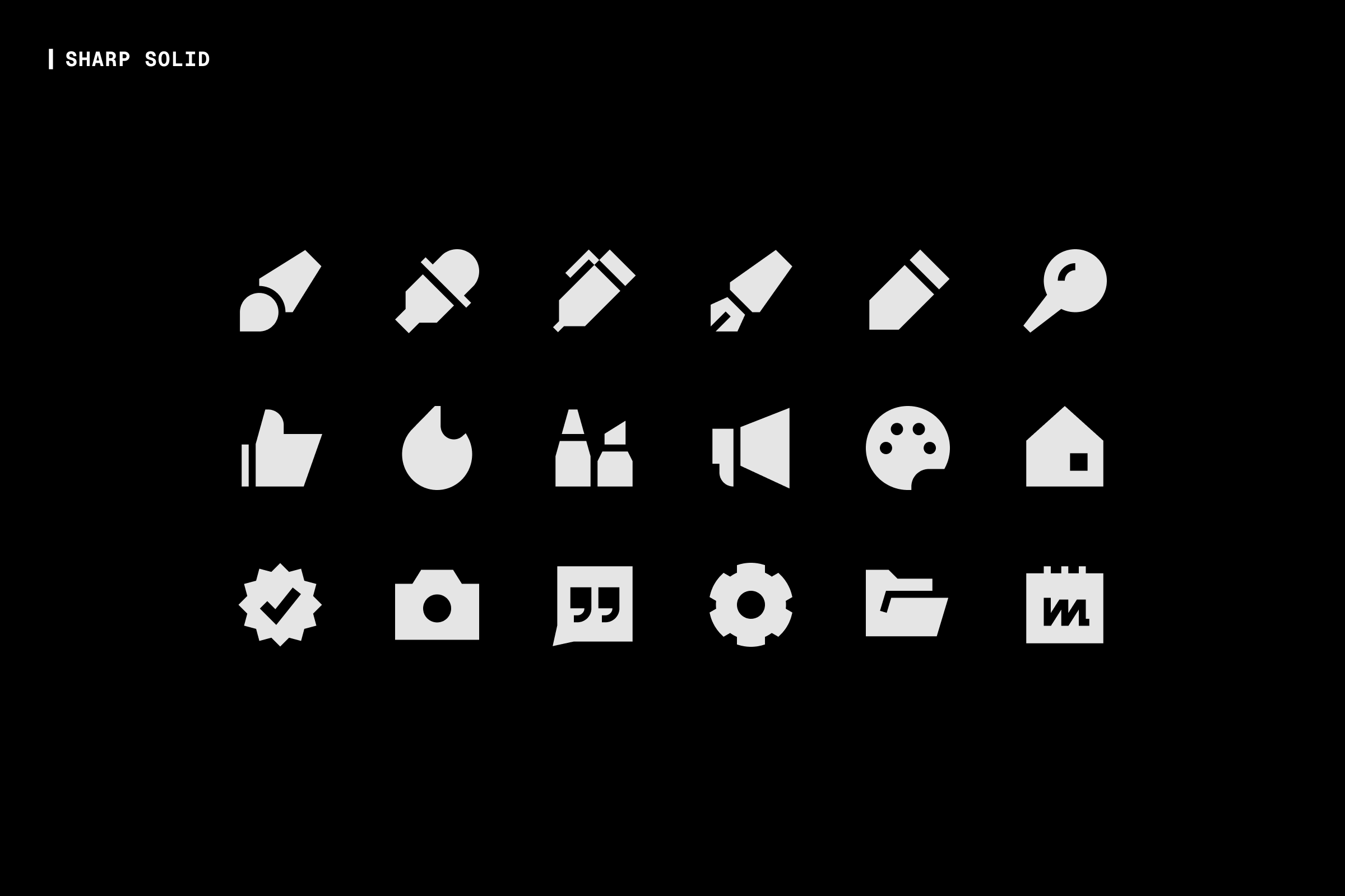
Sharp Solid is built entirely from geometric shapes. The Solid variant has strong visual weight, which in white translates to clear, confident shapes on dark backgrounds. If your product has a high-tech or brutalist visual language, Sharp Solid reads exceptionally well as a white icon set.
Download Sharp Solid (Free, Pro)
For a Neutral All-Rounder: Core Solid
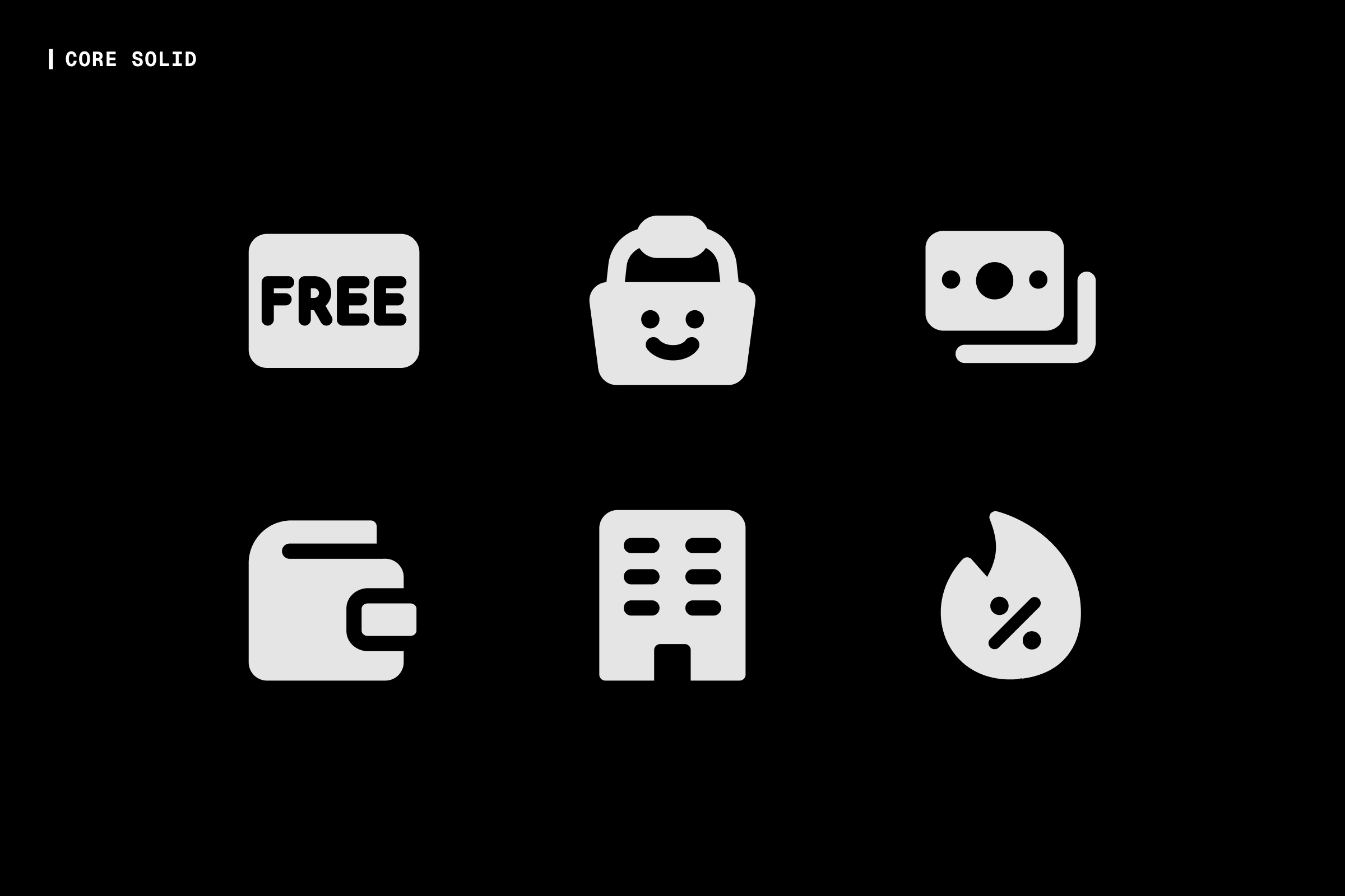
Core Solid is a timeless choice for white icons. It is built on a 14x14px grid with generous inner spacing, which keeps the icons legible even at small sizes. The shapes are stripped to their essentials, which means they work across almost any design context. If you are not sure which white icon set fits your project, Core Solid is a dependable starting point.
Download Core Solid (Free, Pro)
For Friendly and Playful Brands: Plump Solid
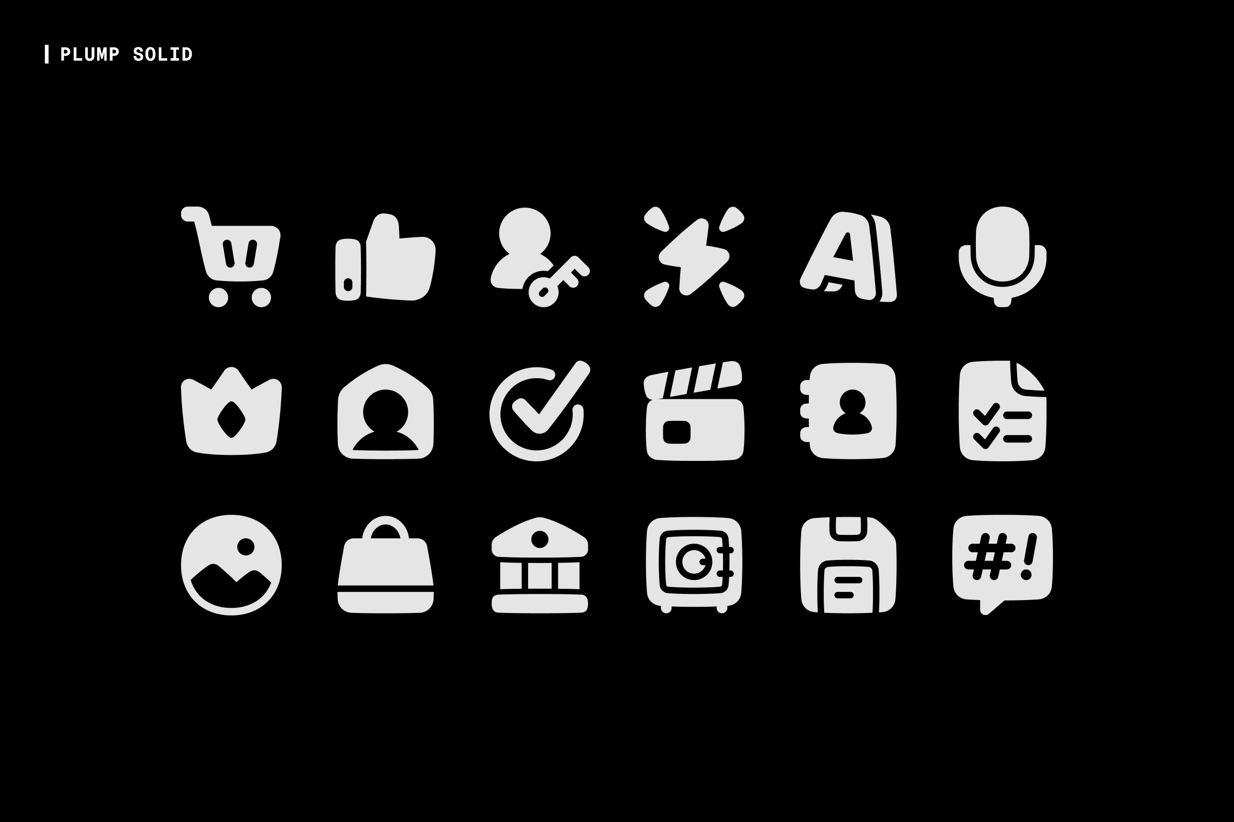
Plump Solid was inspired by animated cartoons. The shapes are chunky with subtle curves, which gives the icons a warm and approachable character. In white, those shapes stay legible at larger display sizes. It works well for consumer apps, onboarding screens, and marketing pages where the tone needs to feel welcoming.
Download Plump Solid (Free, Pro)
For Dark UI With a Modern Edge: Sharp Neon
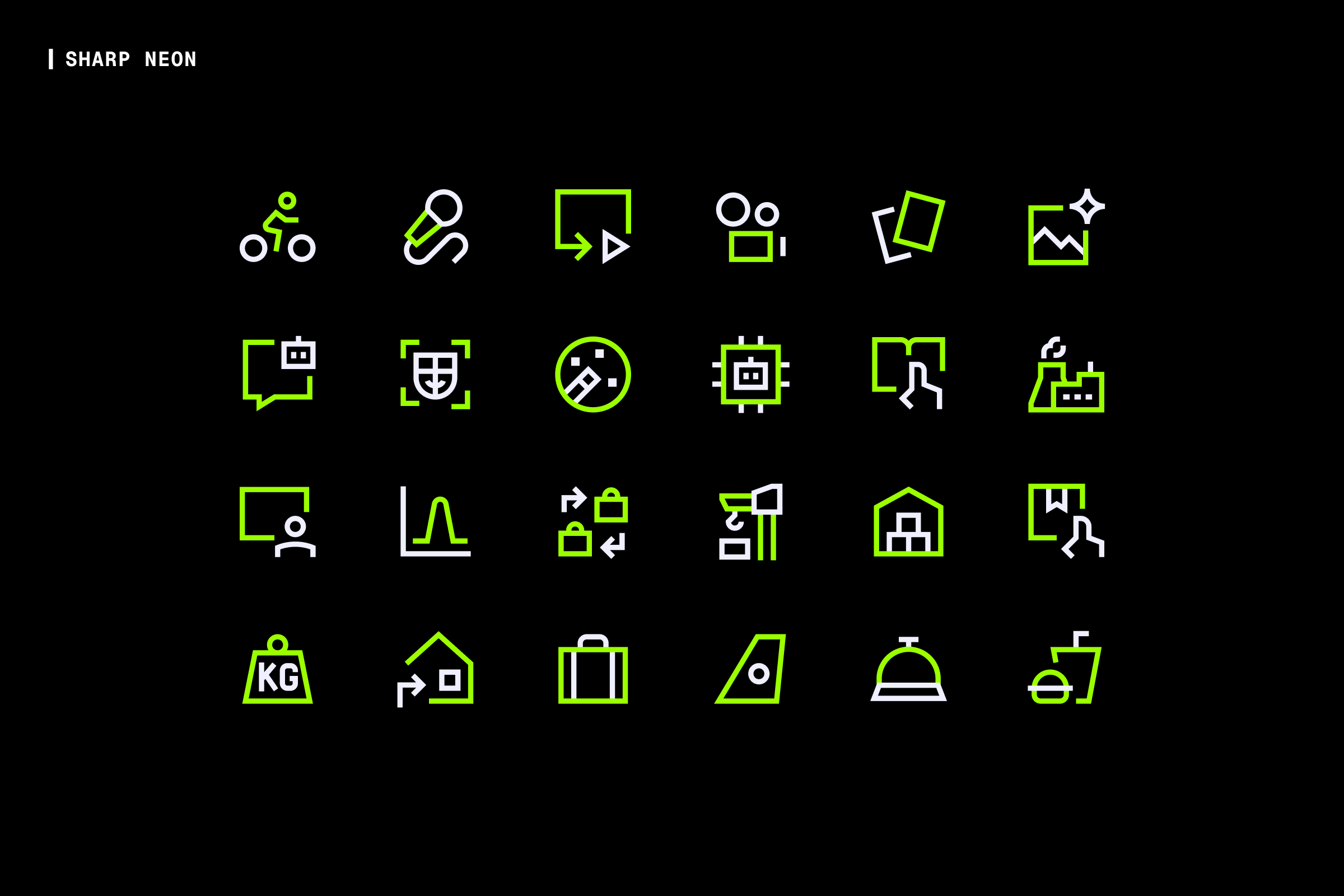
Sharp Neon was designed specifically for dark interfaces. The geometric shapes are strong and precise, and they hold up well as white icons even though the set is built around color by default. If your dark UI calls for a modern, high-contrast feel, the underlying shapes make Sharp Neon a strong white icon option worth exploring.
Download Sharp Neon (Free, Pro)
For Marketing and Landing Pages: Stickies Duo
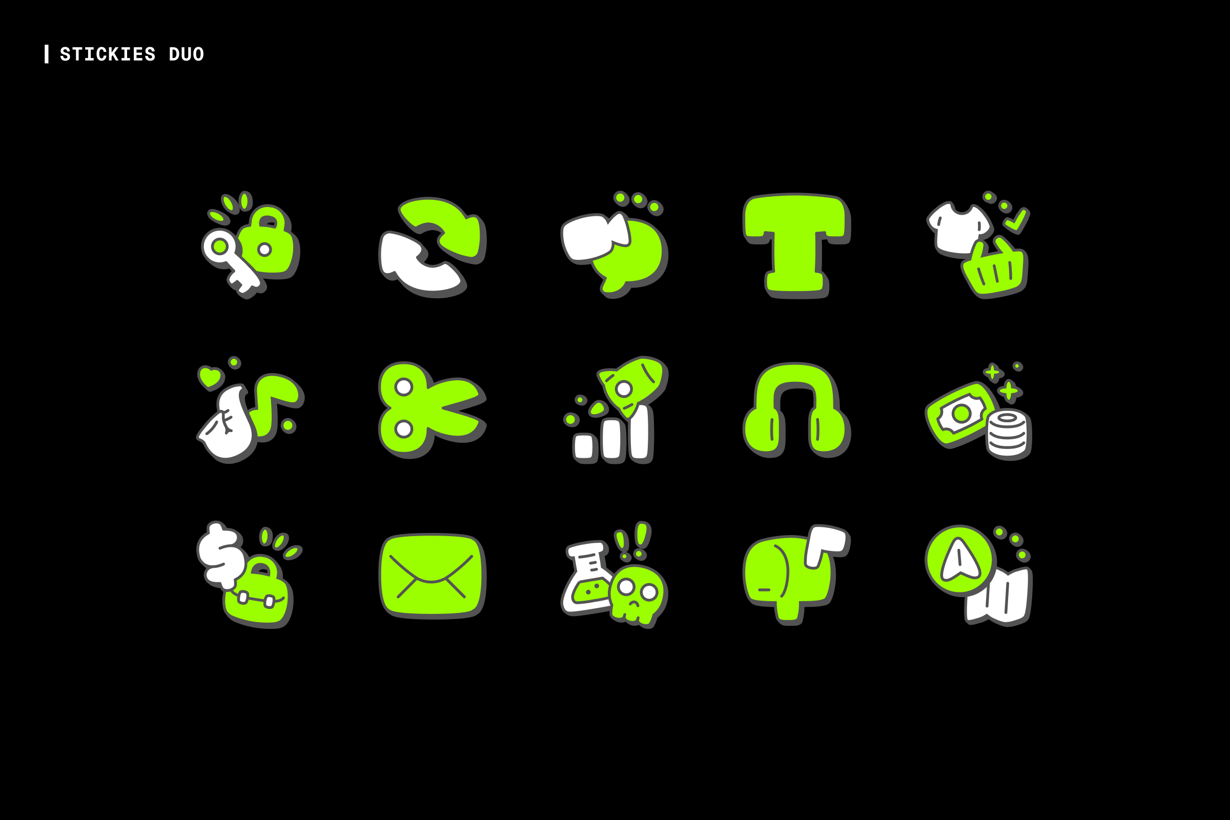
Stickies Duo has a playful character that translates well to white icons at larger display sizes. It is less suited to dense UI, but for feature sections, landing pages, and marketing content where personality is part of the design, it is a strong choice in white.
Download Stickies Duo (Free, Pro)
For Google Material Design Systems: Material Pro Outlined Fill
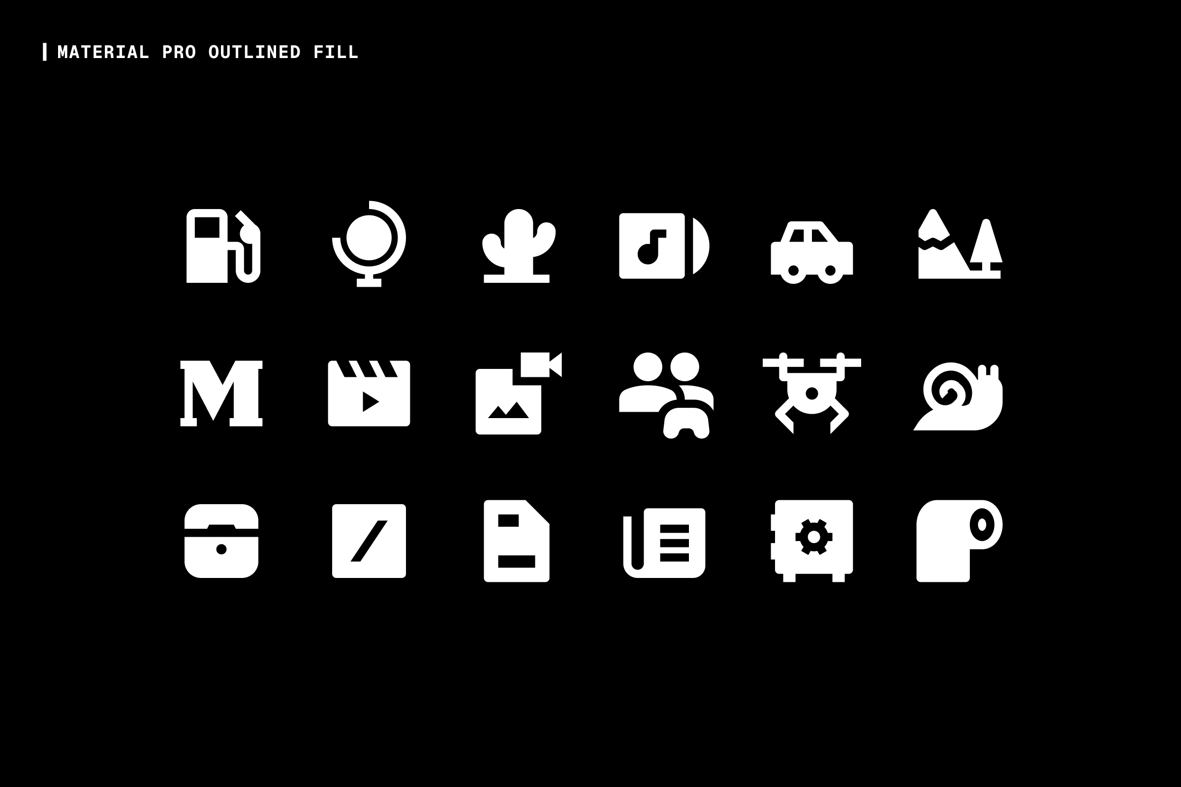
Material Pro Outlined Fill follows Google's Material Design system. We redrew every icon from scratch to improve consistency and add thousands of concepts missing from the original set. The filled variant holds up cleanly as white icons and integrates naturally for designers already working within Google's Material Design system.
Download Material Pro Outlined Fill (Free, Pro)
For Larger Display Icons: Nova Solid
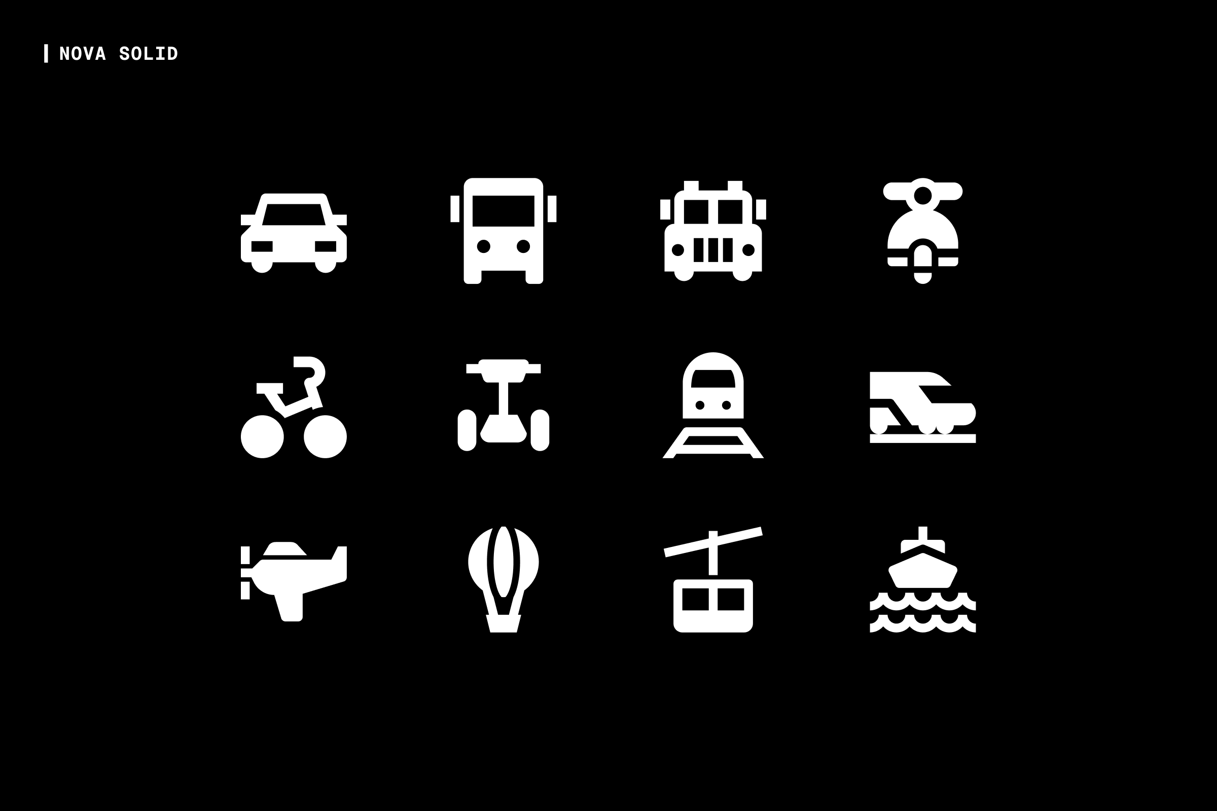
Nova Solid sits between Streamline and Material in its design language. Because the icons have no padding, they appear larger than equivalent sets at the same grid size. In white, that larger visual presence works well for hero sections, onboarding flows, and anywhere white icons need to make a strong impression at display size.
Download Nova Solid (Free, Pro)
For Bold Brands Going Monochrome: Kameleon Colors
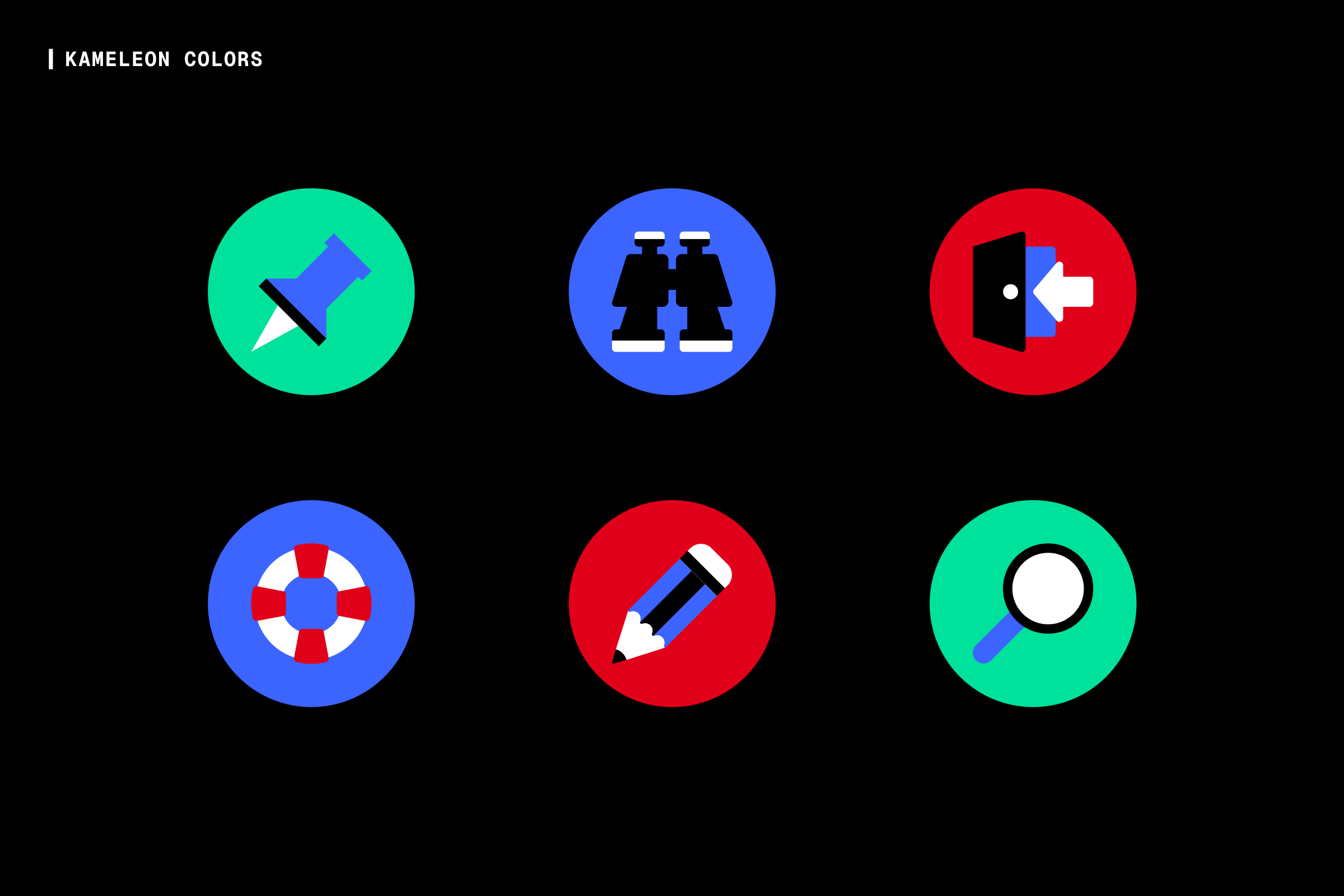
Kameleon Colors is built around flat, solid shapes. When used as white icons on a dark background, that solid construction holds up cleanly. It is a good option for brands with a bold visual identity that need a monochrome white version for dark backgrounds.
Download Kameleon Colors (Free, Pro)
A Quick Checklist Before You Download
Before committing to a white icon set, run through these:
- Is the stroke weight medium, not hairline and not chunky?
- Does the set use a standard grid: 16x16px, 20x20px, or 24x24px?
- Does it still read clearly at your smallest use size?
- Does it pass a 3:1 contrast ratio against your darkest background?
- Does the style match your brand's visual language?
- Does the license cover your use case?
Thanks for reading!