The essential guide to matching icons with typefaces
A complete guide on how to pair icons and typefaces to create a consistent visual language.
Choosing the right icon set to complement a specific typeface is crucial for maintaining visual consistency in a project. This ensures that all the elements work together to create a recognizable brand and improve the overall user experience.
Here's what you need to know to make the right choices.
Early considerations
When selecting icons to pair with a typeface, we should consider some early factors that will help us make the best possible decision.
- Purpose and context. Consider the audience, message and overall tone of the project. Both the typeface and the icons should align with these ideas to convey the intended meaning effectively.
- Style and aesthetic. Assess the visual style of the project and look for typefaces and icons that match or complement this aesthetic.
- Scalability and adaptability. Evaluate the scope of the project so the icons can adapt to various contexts if required. You may need icons with more than one style or even with different weights, just like a typeface.
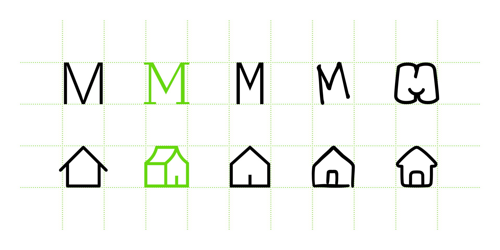
When selecting icons to match a typeface it's useful to consider the design principles associated with that specific font, since icons share a lot of similarities. To do so, let’s explore a little guide on how to choose the right icons based on a standard typeface classification and their anatomy.
Sans serif
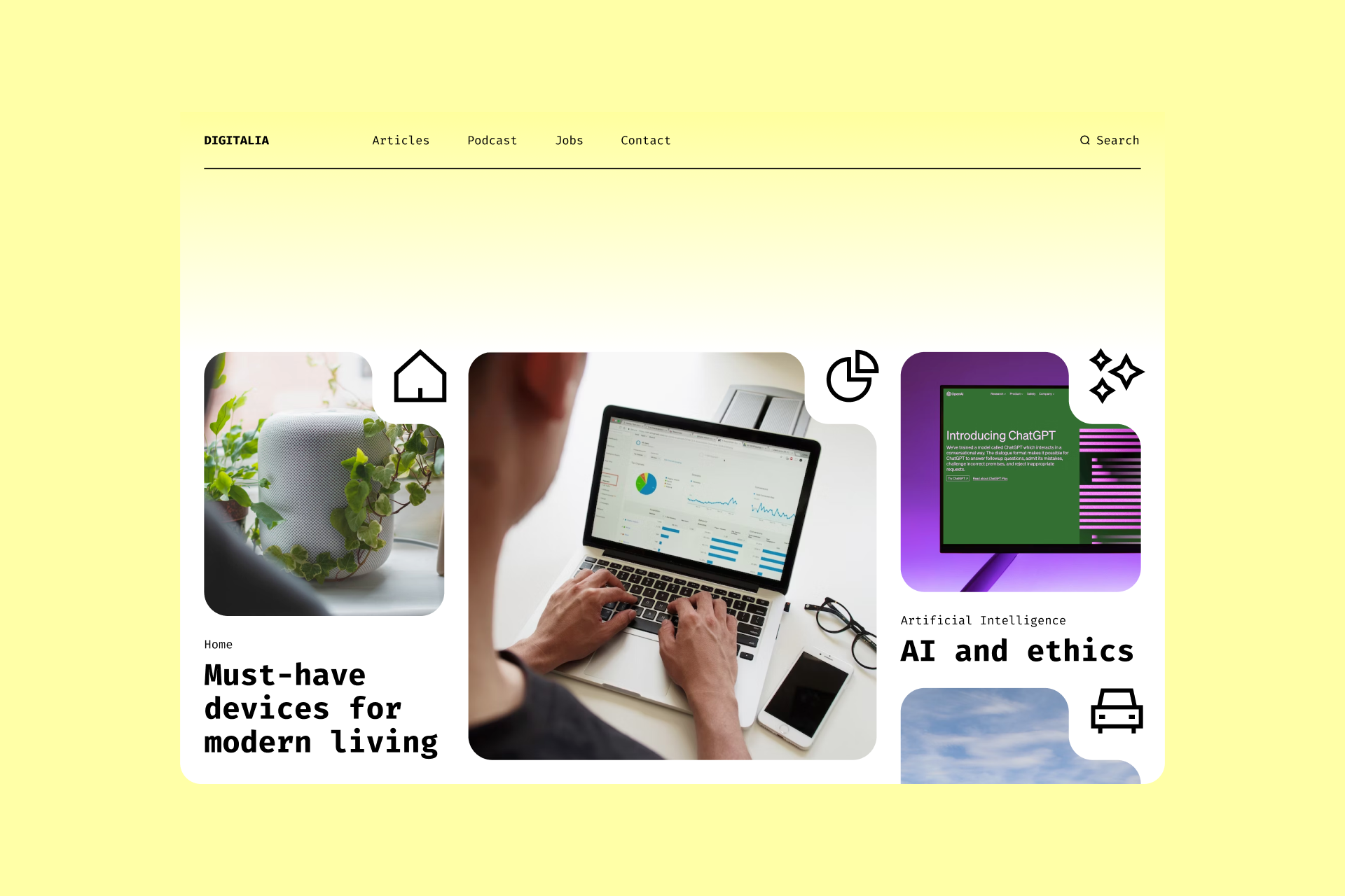
Sans serif typefaces are characterized by their clean appearance, often seen in digital interfaces, signage and other graphic design projects.
We've always defined Ultimate as the icon encyclopedia, not only because it has an abysmal amount of signs, but also because it has a neutral look and a great variety of styles (Light, Regular, Bold, Duotone and Colors), all of which can perfectly fit with a sans serif typeface.
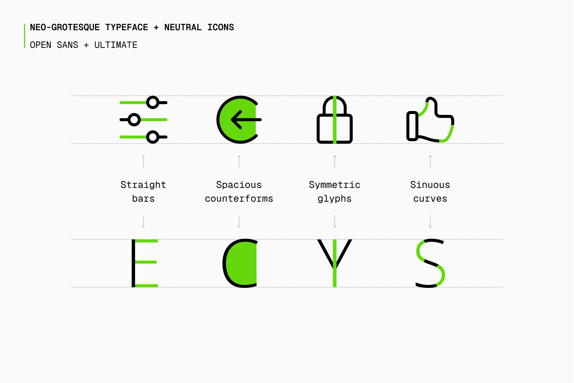
A great typeface choice to combine with Ultimate would be Open Sans, a humanist font with wide counterforms and great legibility. But there isn't only one correct answer, there are many alternatives that could perfectly be paired with Ultimate icons, such as Noto, Lato or Gill Sans.
A similar icon set, but with an even simpler and more timeless approach, would be Core. This set comes in four styles (Line, Solid, Duo and Flat) and is the best option to combine with a sans serif typeface thanks to its enormous adaptability.
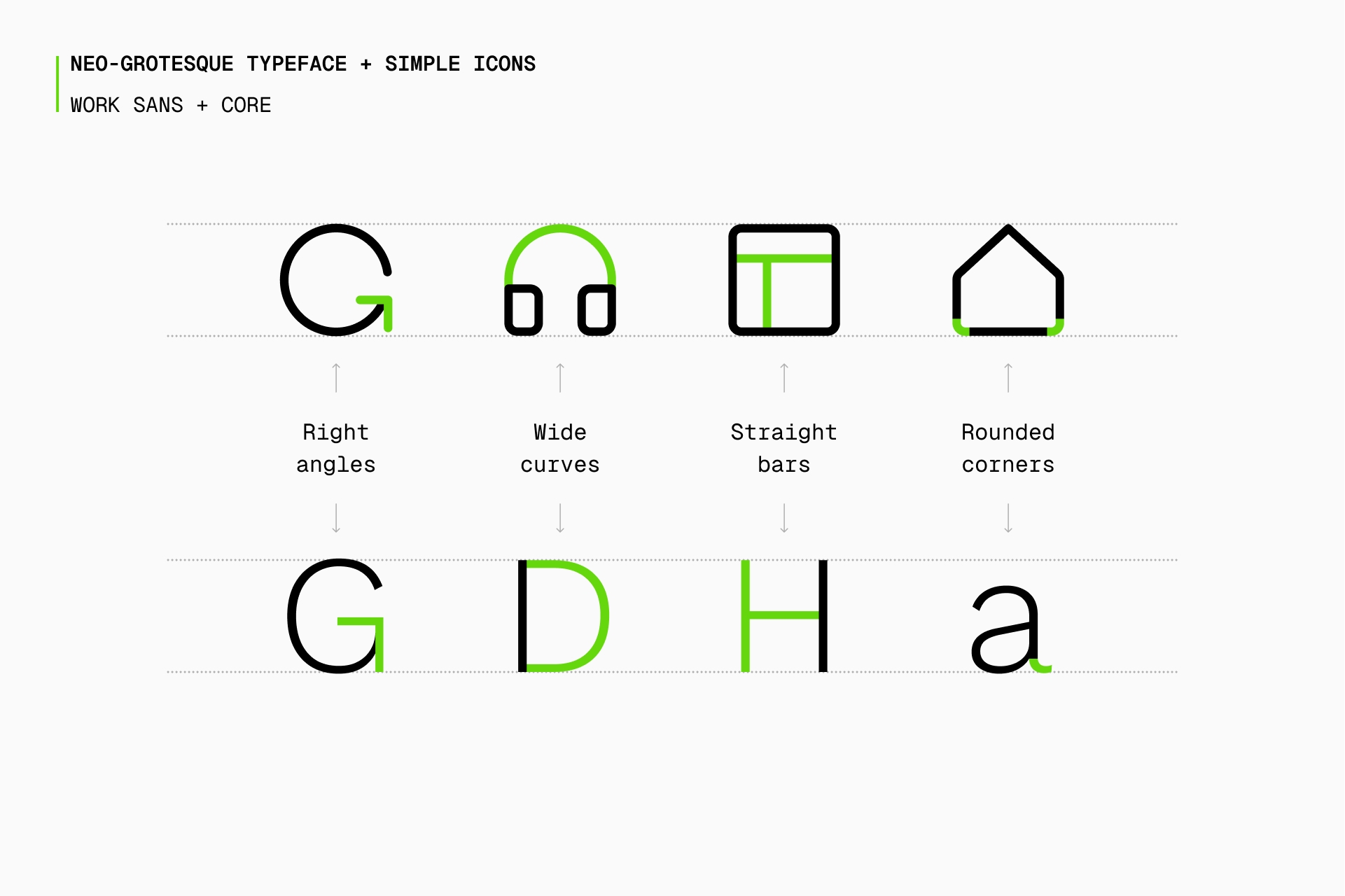
Core icons could easily be paired with a typeface like Work Sans, which was based on early grotesque fonts and has ten different weights, offering a flexibility similar to Core. If it's not exactly your cup of tea, you can also check out Inter, Roboto or Neue Haas Grotesk.
But if you need an icon set that works at more extreme sizes, Micro is the most natural choice. It follows the same formal characteristics as Core but with a smaller grid and, therefore, a lower level of detail and a higher legibility.
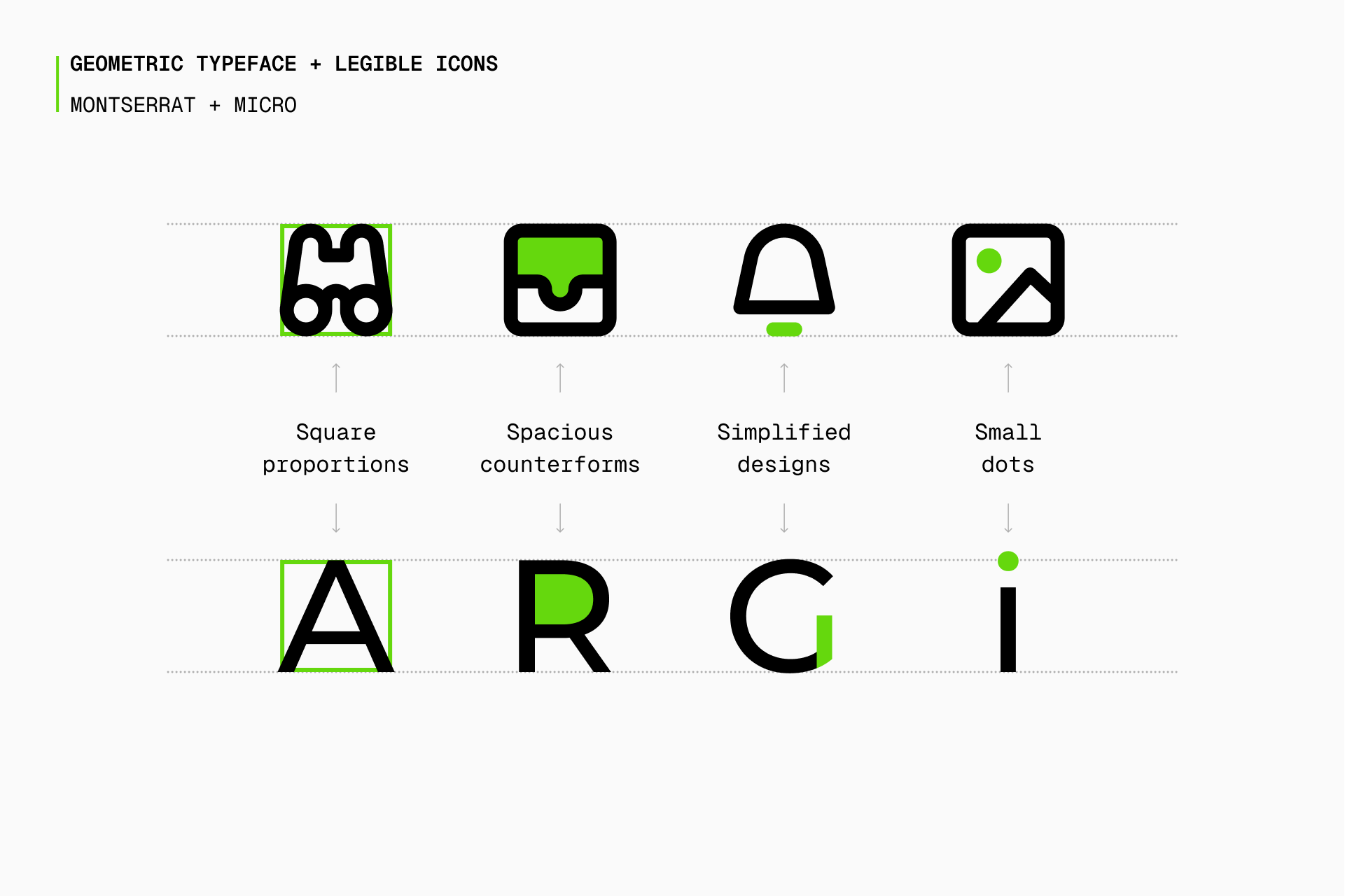
In this case, a more geometric font such as Montserrat would be a great pairing option, especially thanks to its wide and spacious letters. Once again, if you're looking for alternatives, don't miss fonts like Poppins, Raleway or Gotham, all of them sharing many of the formal characteristics that define Micro.
And if you're looking for something with personality, there are still more options. If you want to use a typeface with rounded ends (or at least with a large presence of curves), Flex is a no-brainer due to its organic, elegant and spacious shapes.
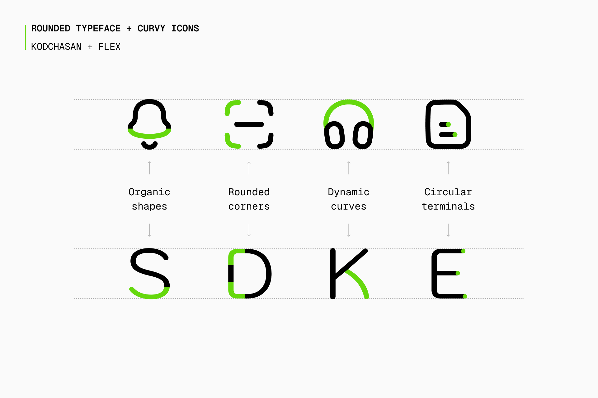
Kodchasan is a surprisingly suitable dance partner for Flex, almost as if both elements were built based on the same construction guidelines. But since Kodchasan flirts a little bit with display fonts, you may want to try more neutral alternatives such as Rubik, Nunito or Noway Round.
If, on the other hand, you're going to use a sans serif typeface with a more industrial and architectural appearance, Sharp would be the most logical choice thanks to its geometric, brutalist and static construction.
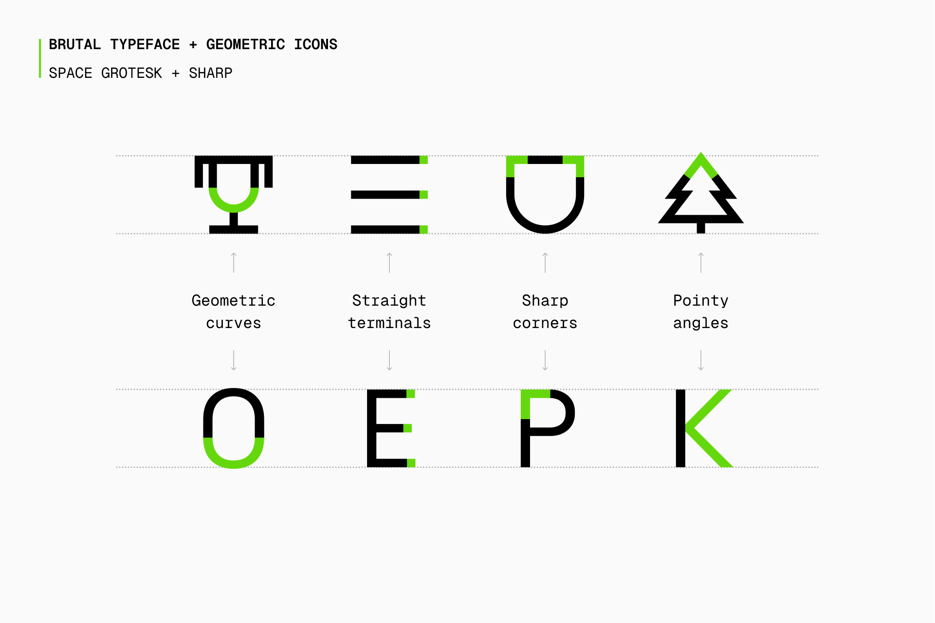
A brutal icon set needs a brutal typeface, and that's Space Grotesk, a unique but perfectly legible font with a high-tech look. Since it might not be a foolproof combination (it never is, since the designer is always responsible for making it work), we also suggest you DM Sans, Archivo and Neue Machina.
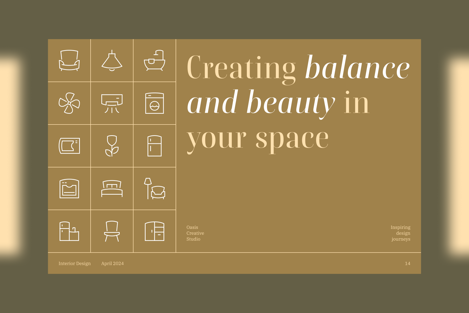
Serif
Serif typefaces emphasize traditional craftsmanship and formality, commonly used in body text for books, newspapers and magazines.
Following the same logic previously described, Ultimate and Core would still be perfectly valid options to combine with a serif typeface due to their great versatility. In this case, the aim would be to draw attention away from the icons in favor of the project as a whole.
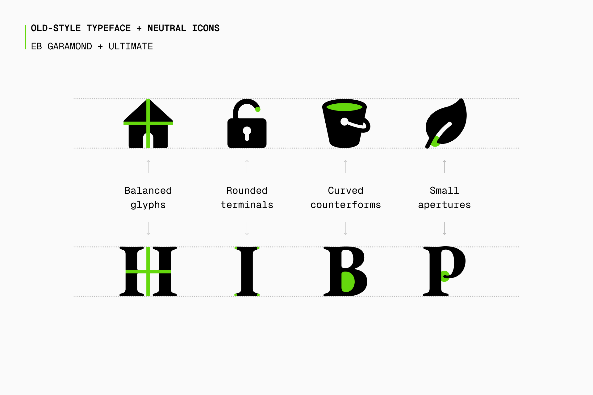
In the case of Ultimate, an old-style serif typeface such as EB Garamond would a very good choice to convey that sense of tradition. But even with a seemingly more limited style, we still have great alternatives that can help us achieve the reliability we're trying to communicate, like Cormorant, Cardo or Sabon.
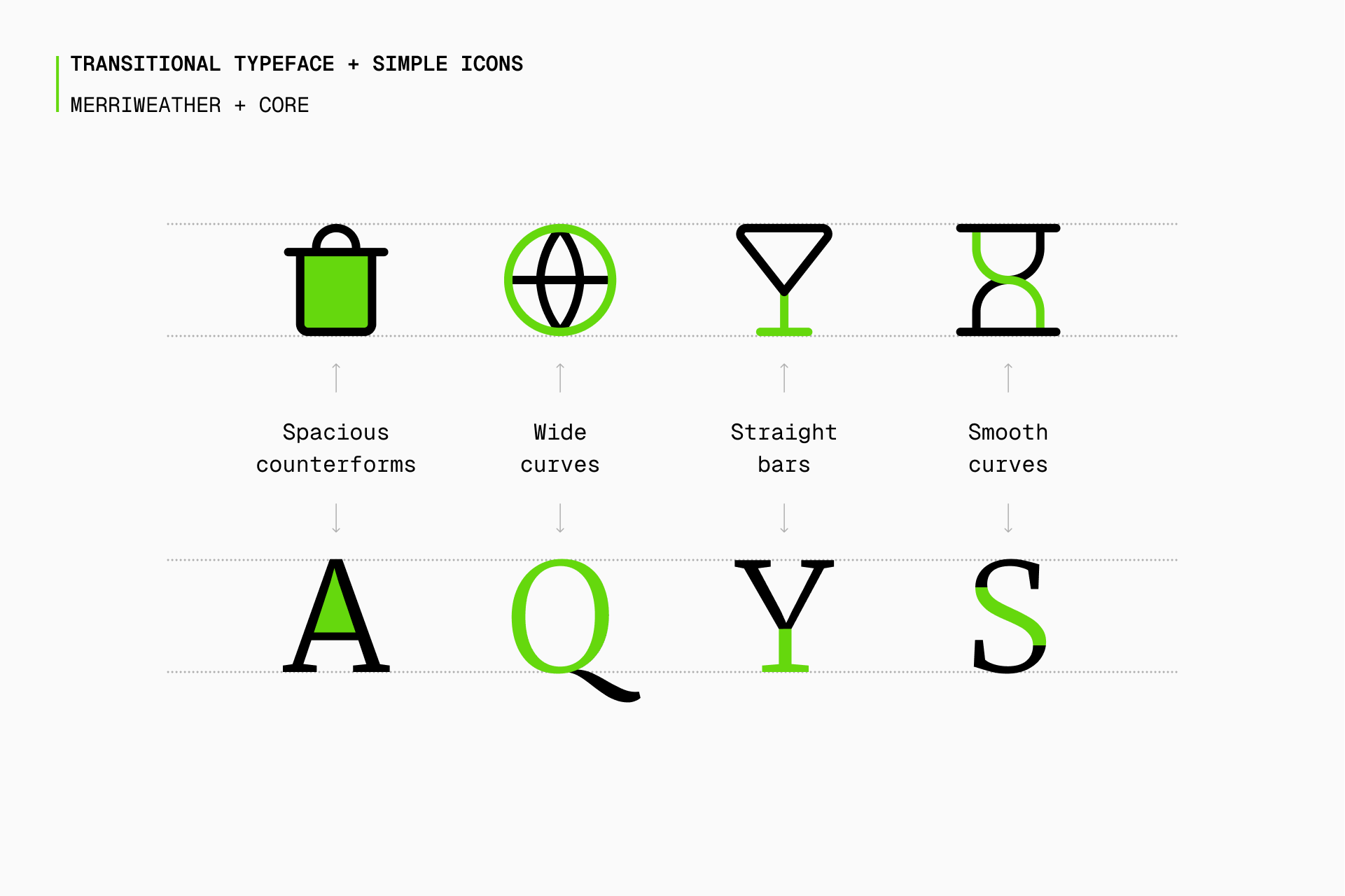
As for Core, a transitional serif typeface like Merriweather seems more suitable due to its higher contrast and more symmetrycal design, creating a combination that, despite its seriousness, can be perceived as modern. And, as usual, take a quick look at Domine, Spectral or Signifier in case you're looking for alternatives.
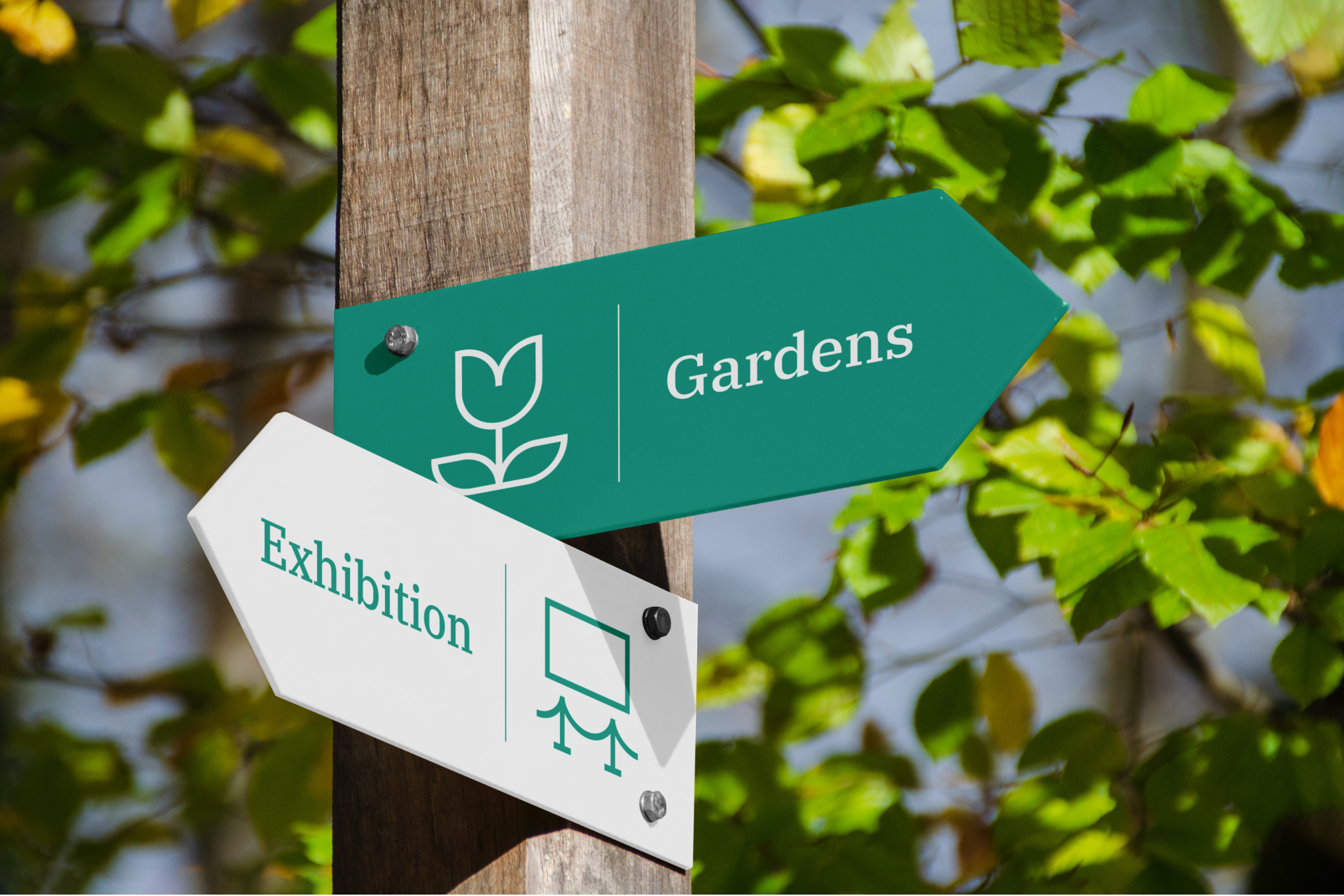
But we also have sets that not only might be more suitable, but were originally conceived to work with a serif typeface. Like Platinum, which was especially designed for high-end brands and it's characterized by the use of a thin stroke, concave curves and pointed arcs, which gives it an elegant and classic look.
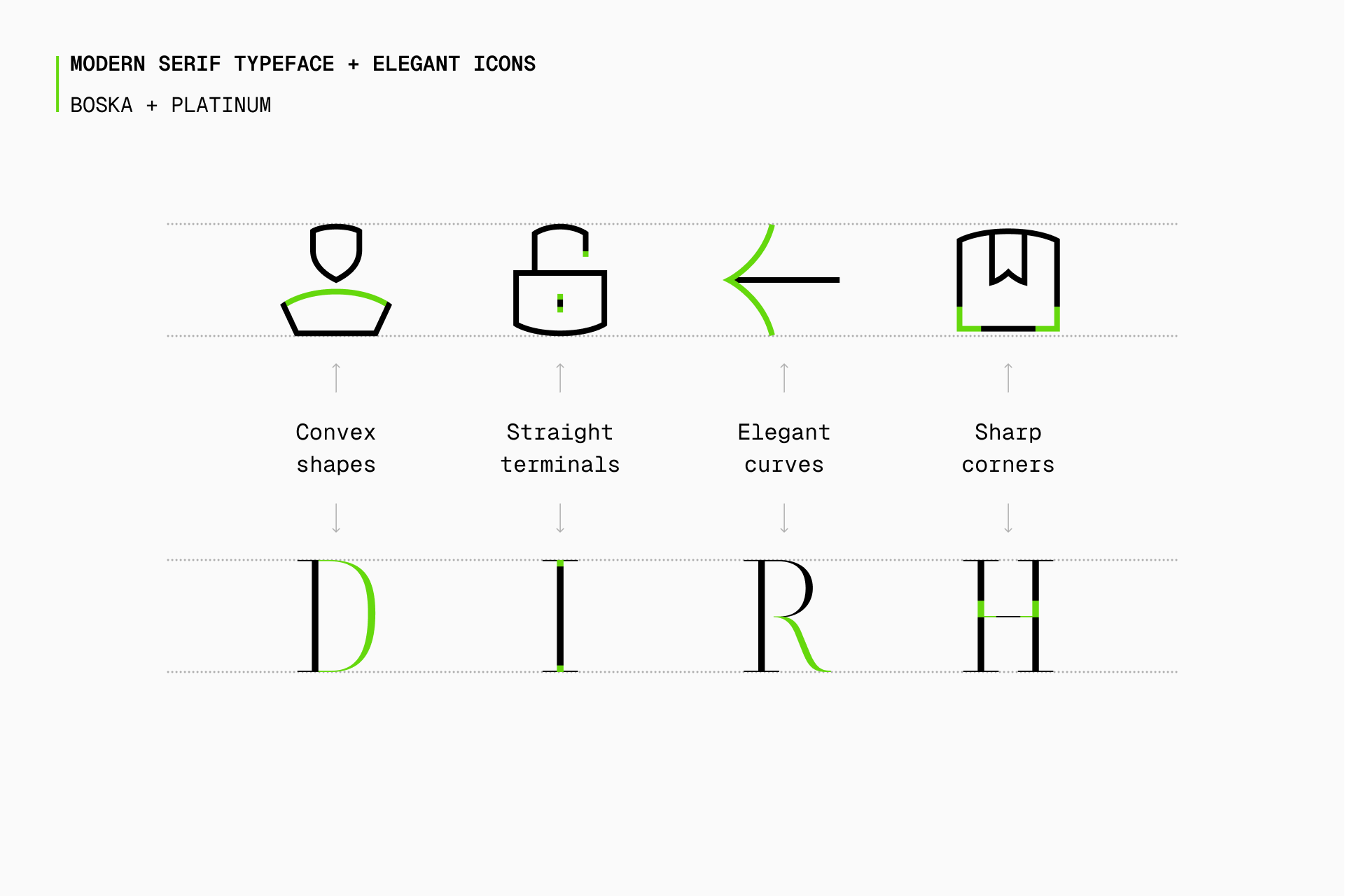
Platinum is a more versatile icon set than it might seem at first glance, but didone typefaces like Boska are a perfect match due to their inherent sophistication. If you want to follow this high-end concept, you might also want to take a look at Prata, Marcellus or Domaine.
Guidance is Platinum's sibling, but it uses convex curves instead of concave and there's a greater contrast between these and the straight lines. In addition, it's a set intended for use in signage projects. You never know when it might come in handy, especially considering that it's completely free.
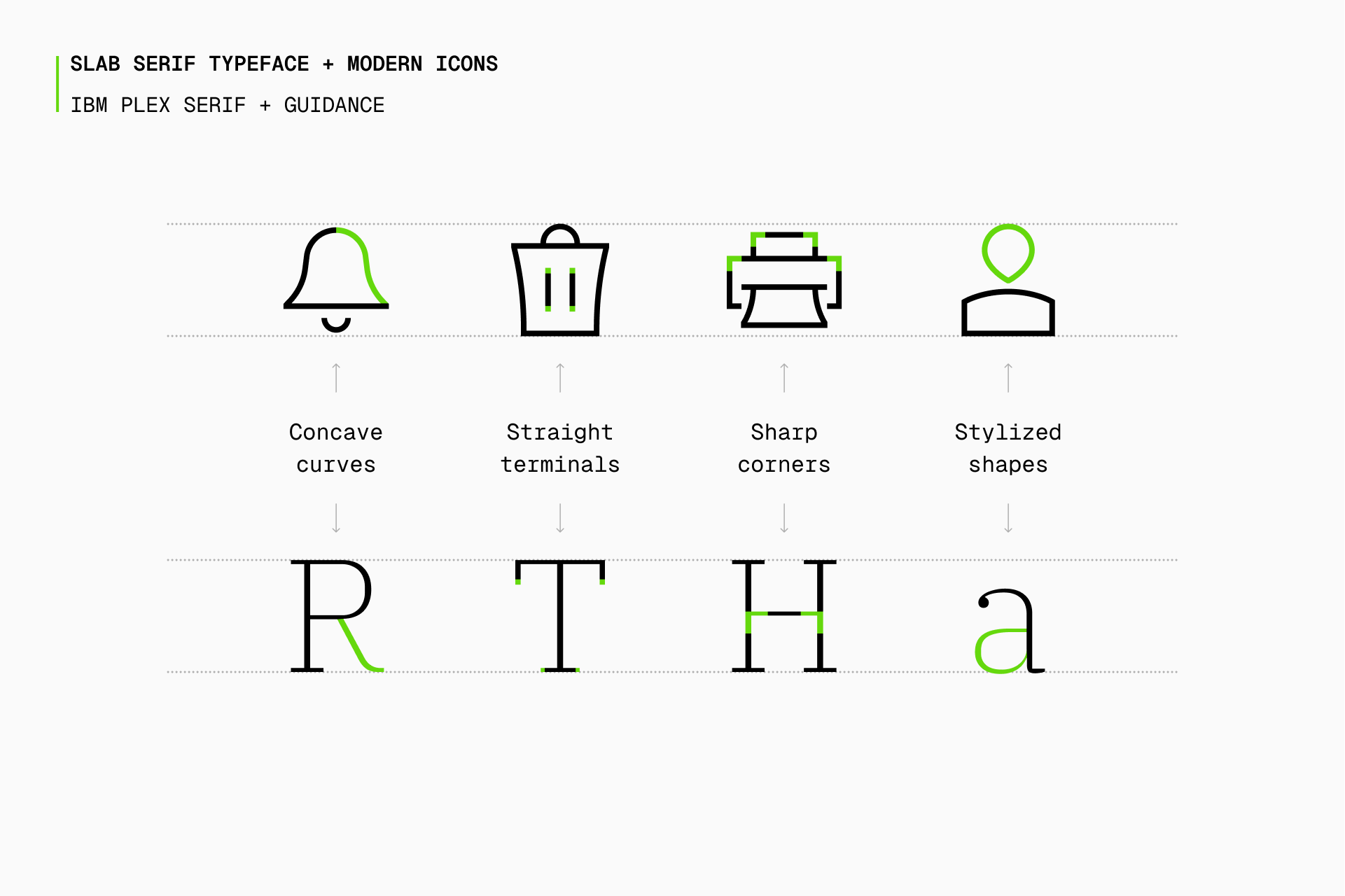
Here we should be looking for fonts with a little less contrast and a more uniform structure, something contemporary but classy at the same time, just like IBM Plex Serif. Slab serif typefaces such as Arbutus Slab or organic designs like those of Alice or Woodland could also be great alternatives.
Monospaced
Monospaced typefaces have fixed-width characters, that's why they're widely used in coding and often associated with the digital world.
Here it's mandatory to mention Sharp again, as it's basically a set that was built with the intention of achieving the technical look mentioned above. Like Core, it comes in four different styles (Line, Solid, Duo and Flat), which allows us more freedom of choice.
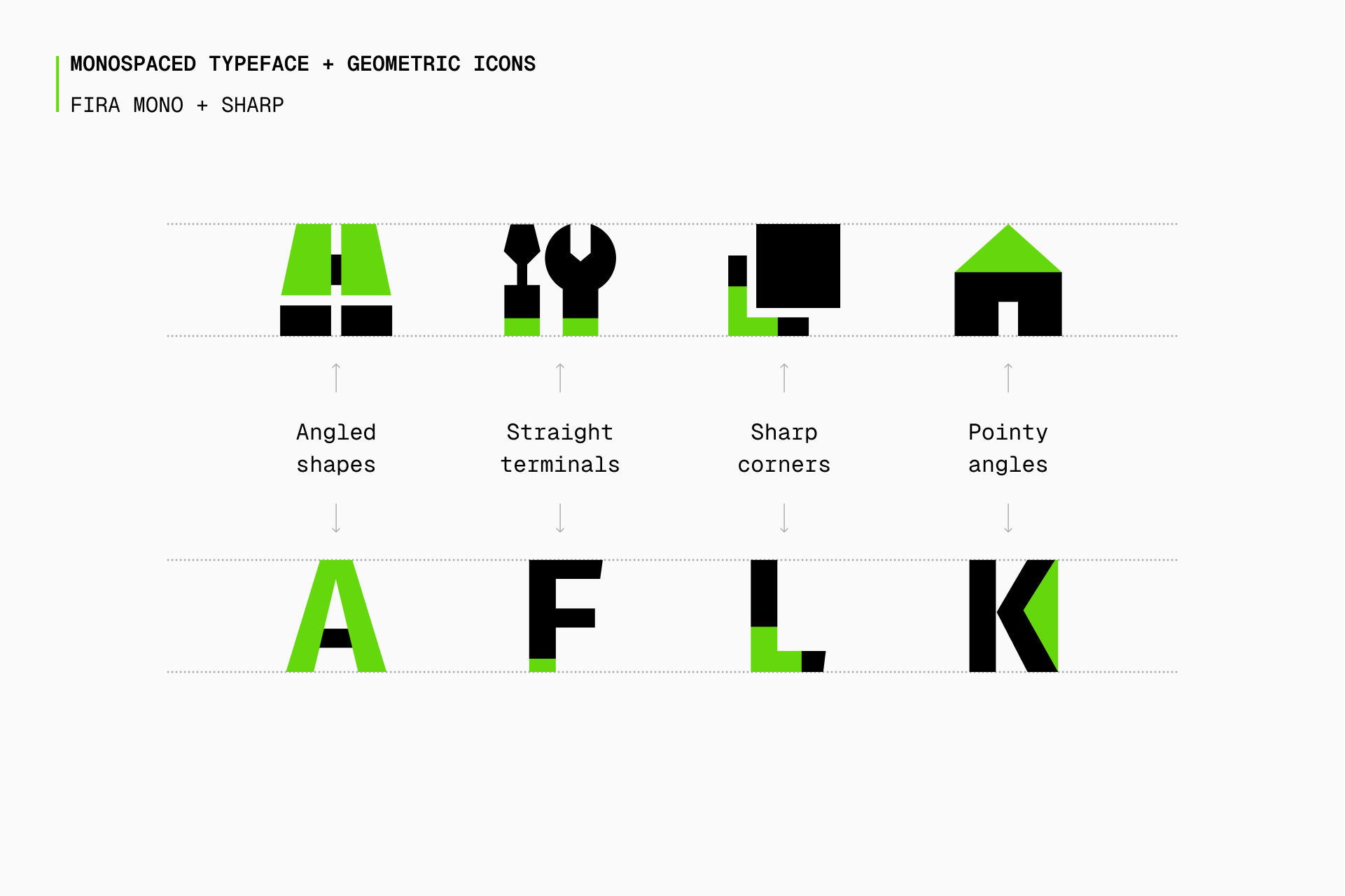
I'd venture to say that any monospaced font would be a great choice to combine with Sharp, but Fira Mono is as good a start as any, especially considering its angled terminations. But there are plenty of other options depending on your personal preferences, just like Space Mono or Spline Sans Mono.
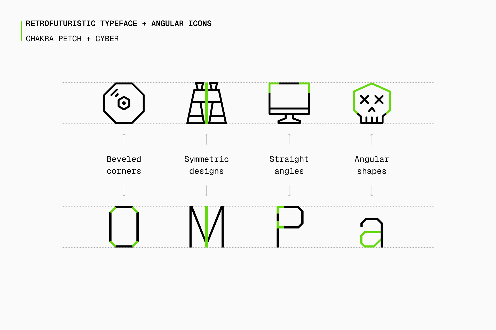
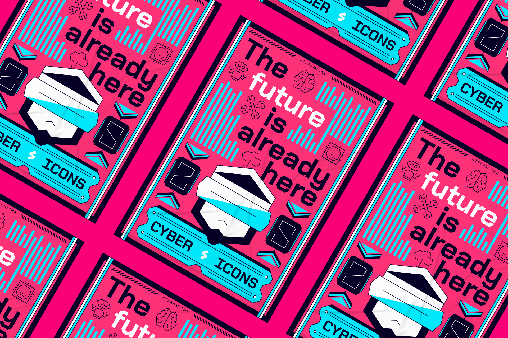
But if you really want to enhance the retro-futuristic look of these typefaces, you could go for a set like Cyber. This is a very particular set that strictly uses straight lines and sharp angles, giving the icons a very unique touch for those looking to go a little further in terms of personality and brand recognition.
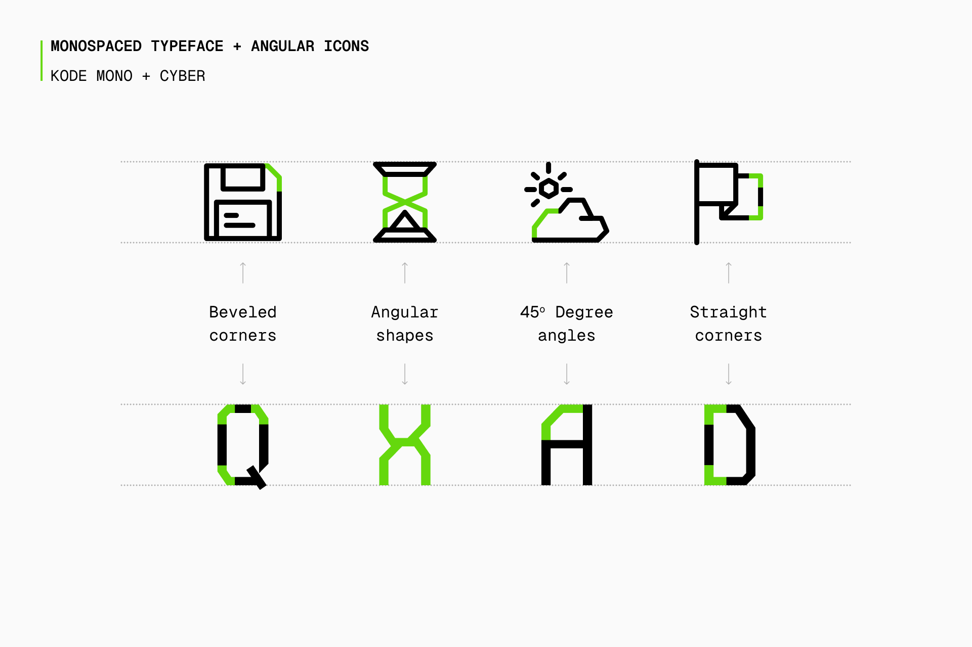
A monospaced typeface suitable for Cyber would require a little more personality, that's why Kode Mono seemed such an obvious choice with those beveled angles and intricate details. Check out Azeret Mono for a more neutral option and Share Tech Mono for something a bit more retro.
Script
Script typefaces mimic handwritten characters and they're mostly used to evoke a sense of personality, making them popular for invitations and greeting cards.
Freehand is a warm and personal icon set that is completely hand drawn. Despite the uniqueness of this set, it still features over 10,000 icons, all of which are perfectly consistent. So if you're using a script typeface you should definitely consider using Freehand icons with it.
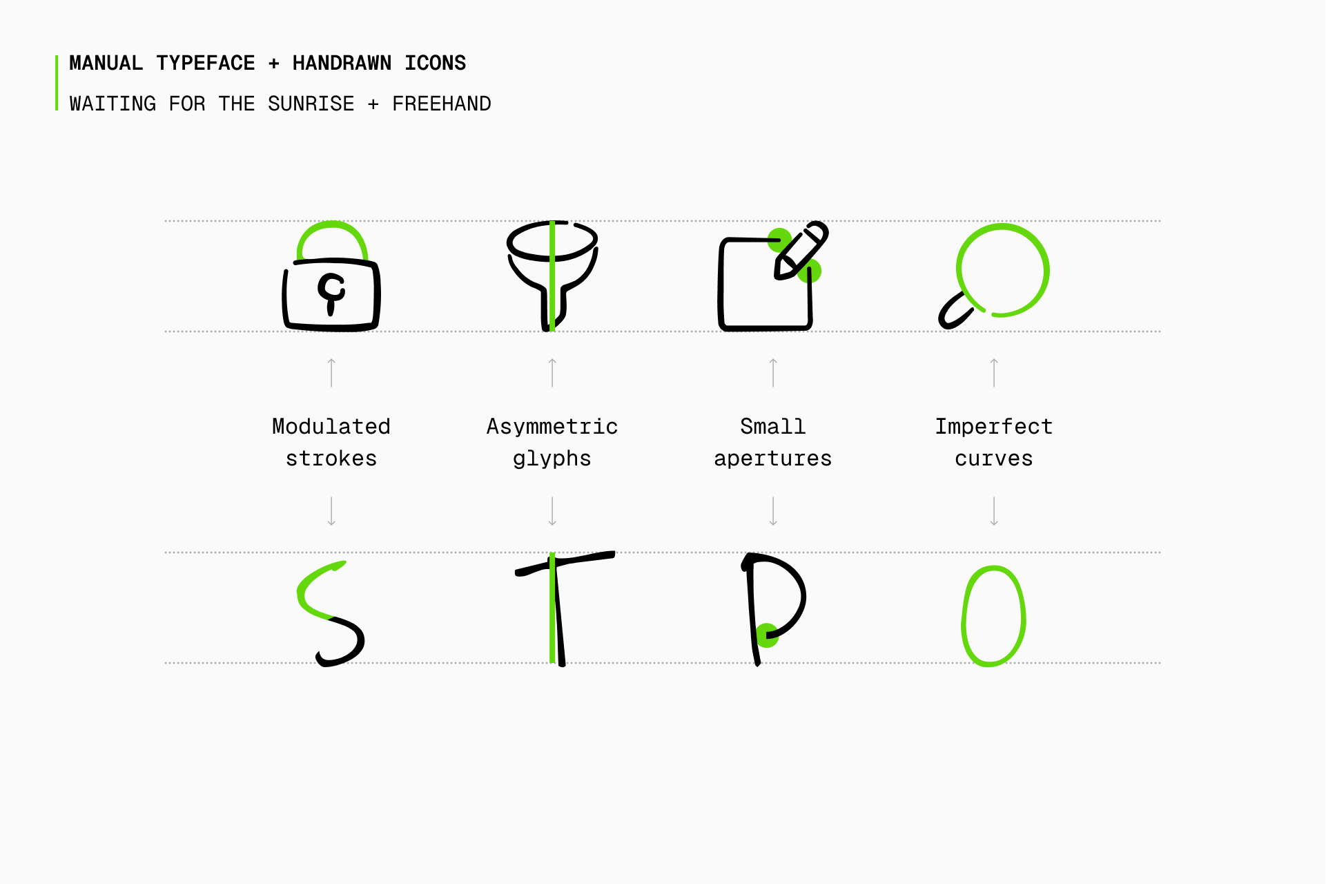
Freehand offers more freedom when choosing a script font, as we're basically looking for a more personal touch that can be easily found in any handwritten typeface, like the one in Waiting for the Sunrise. You can still look at Caveat or Indie Flower to consider other options.
If you don't want to seem too redundant using a manual typeface and manual icons at the same time, we also have a set like Flex, whose strokes are reminiscent of calligraphy but in a much more subtle and elegant way. Just like Core and Sharp, it comes in four styles (Line, Duo, Solid and Flat) for maximum adaptability.
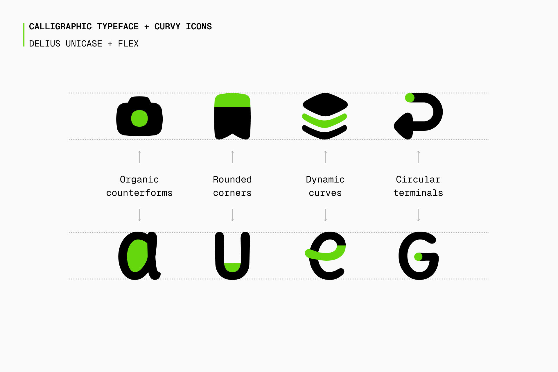
Calligraphic typefaces like Delius Unicase seem more appropriate for an icon set like Flex to highlight their friendliness and organic appearance. You can also check out Sacramento for something closer to classic calligraphy or Itim if you're interested in using a more imperfect stroke.
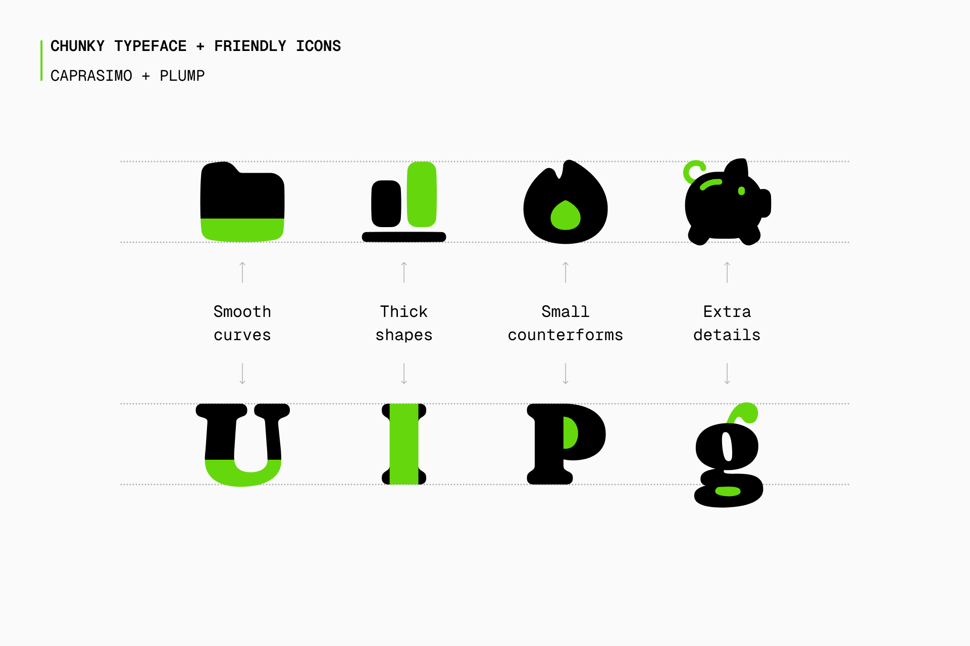
Following the same reasoning, but with a more cartoonish and detailed appearance, Plump is a perfect option to accompany script typefaces that are more voluminous or even naïve. And, once again, it also comes in four styles (Line, Duo, Solid and Flat) to offer more flexibility.
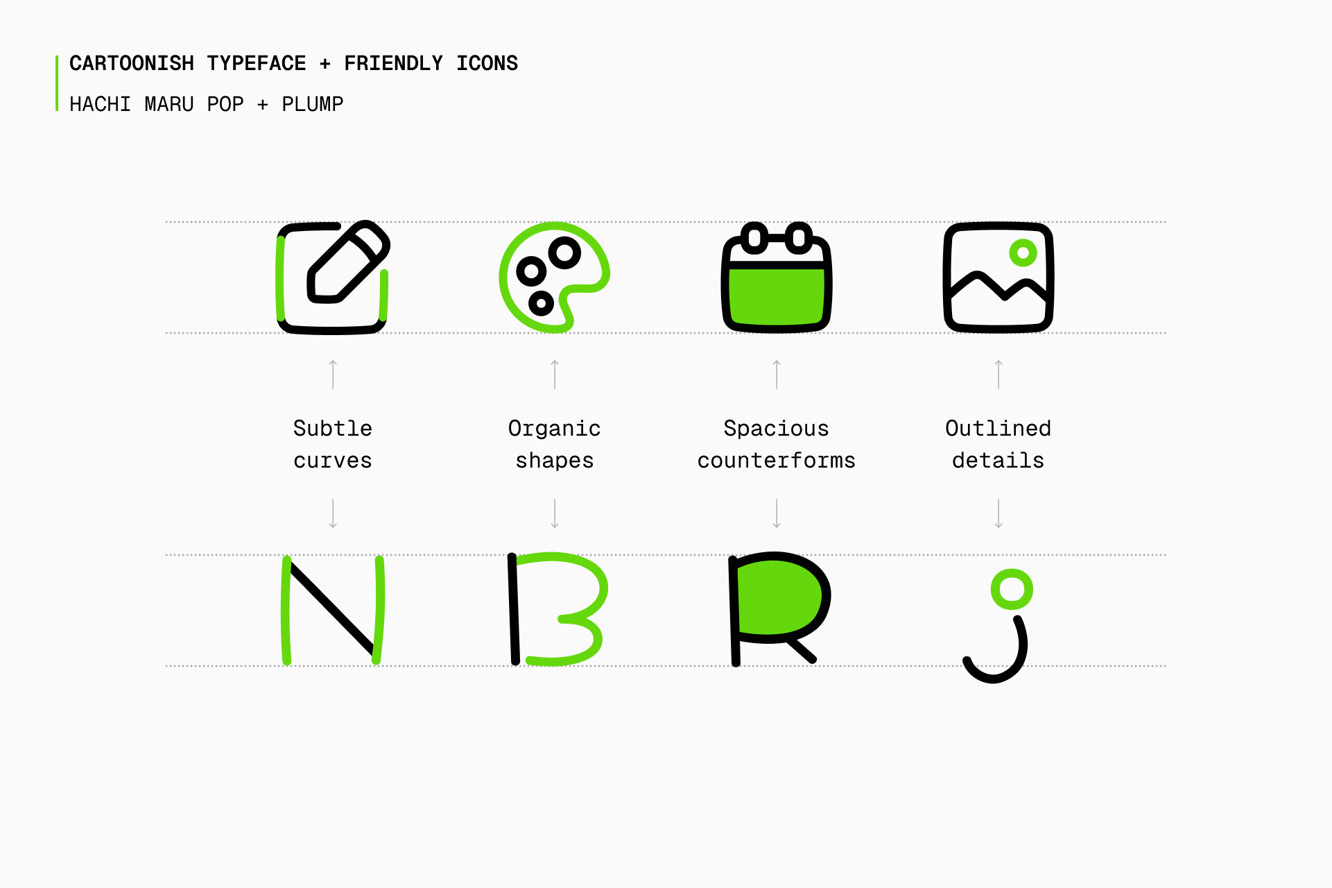
Plump icons fit nicely with handdrawn typefaces that are a bit more cartoonish and naive, just like Hachi Maru Pro, which helps to achieve a fun and friendly design. If you're interested in this casual and quirky style you might also be interested in typefaces such as Mali or Klee One.
Display
Display typefaces are designed for use at large sizes, prioritizing creativity over legibility and used in logos, posters and wherever drawing attention is crucial.
For example, if you want to use a particularly chubby typeface such as Caprasimo, a set like Plump might again be the best possible accompaniment. The formal similarities between these two elements are more than obvious and, overall, they convey the same sensations.
If the project needs a pixel art typeface like DotGothic16, we have a delightful icon set called Pixel. This obvious combination can allow you to achieve a retro and nostalgic appearance, highlighting not only the visual aspect of the project but also the brand values and its overall tone.
On the other hand, if it's an industrial and brutalist typeface such as Chakra Petch the one you want to introduce into the project, Cyber (which comes in two styles: Line and Duotone) would be the best icon set for it. The greater the personality, the more unique the project will be as a whole.
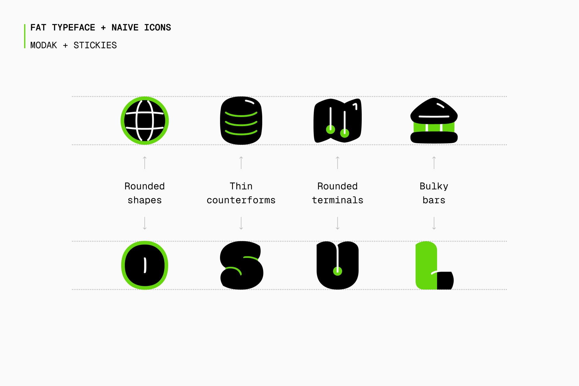
If what you're looking for is something a bit more quirky and casual, Stickies is a perfectly suitable icon set to combine with typefaces that share a similar charisma. Just like Modak, which uses fat shapes and thin counterforms to create a unique and volumetric design that further highlights the appearance of the icons.
Creating icons directly from a typeface
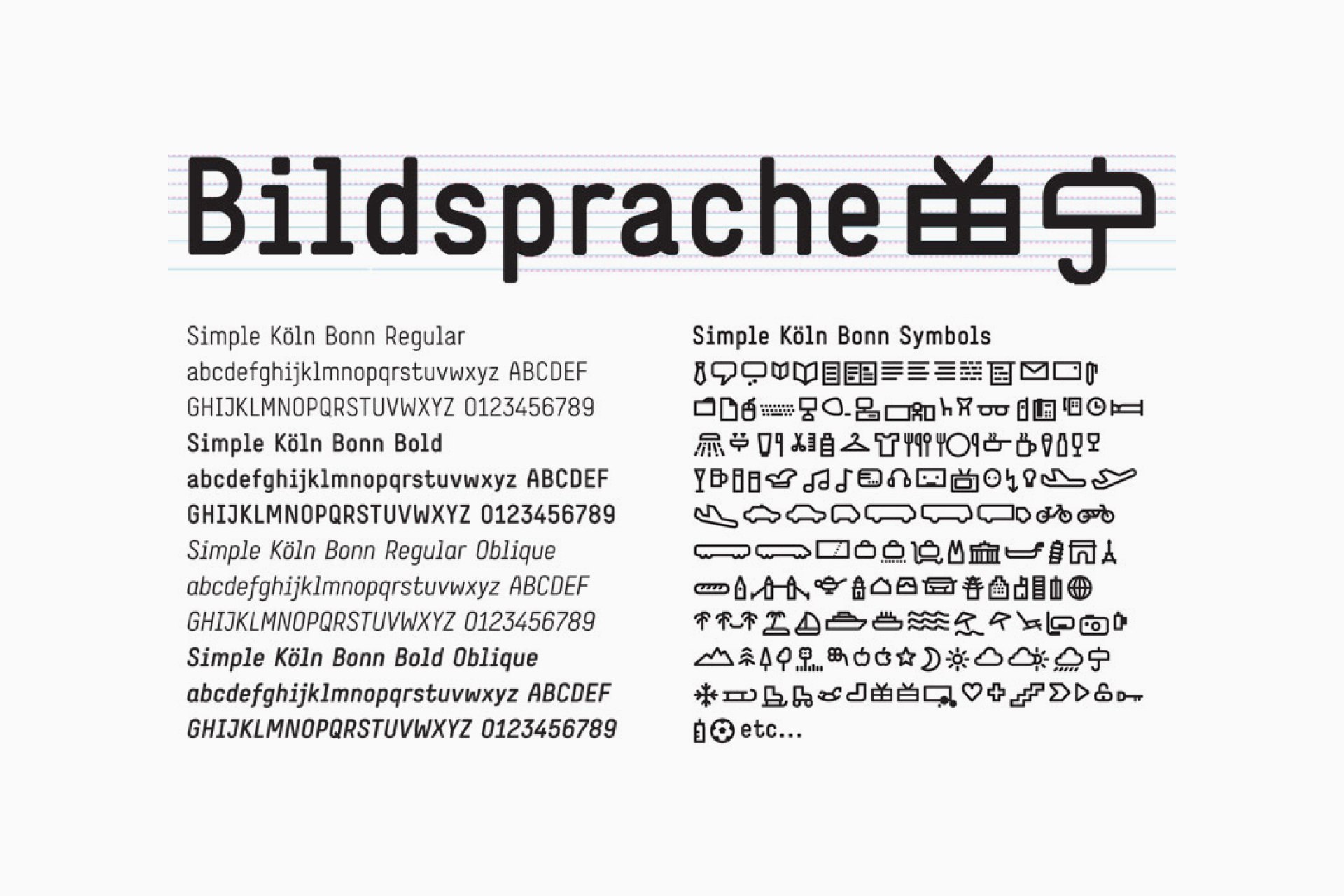
It's also possible to directly create a set of icons based on a typeface. This requires a lot of technical knowledge and we'll probably explore it more in a future article, but there are great and successful projects that can show us the harmony that this option offers. Like the signage project for the Köln-Bonn Airport or the icons designed by Daniel Utz for the Netto typeface.
To sum up, typefaces and icons are part of the same language. Both share similar construction guidelines and are essential to achieve visual harmony.
By understanding the basic characteristics of these elements, designers can carefully integrate them to create impactful and timeless designs.