Best icon designers directory
A list of the most creative, prolific and influential iconographers
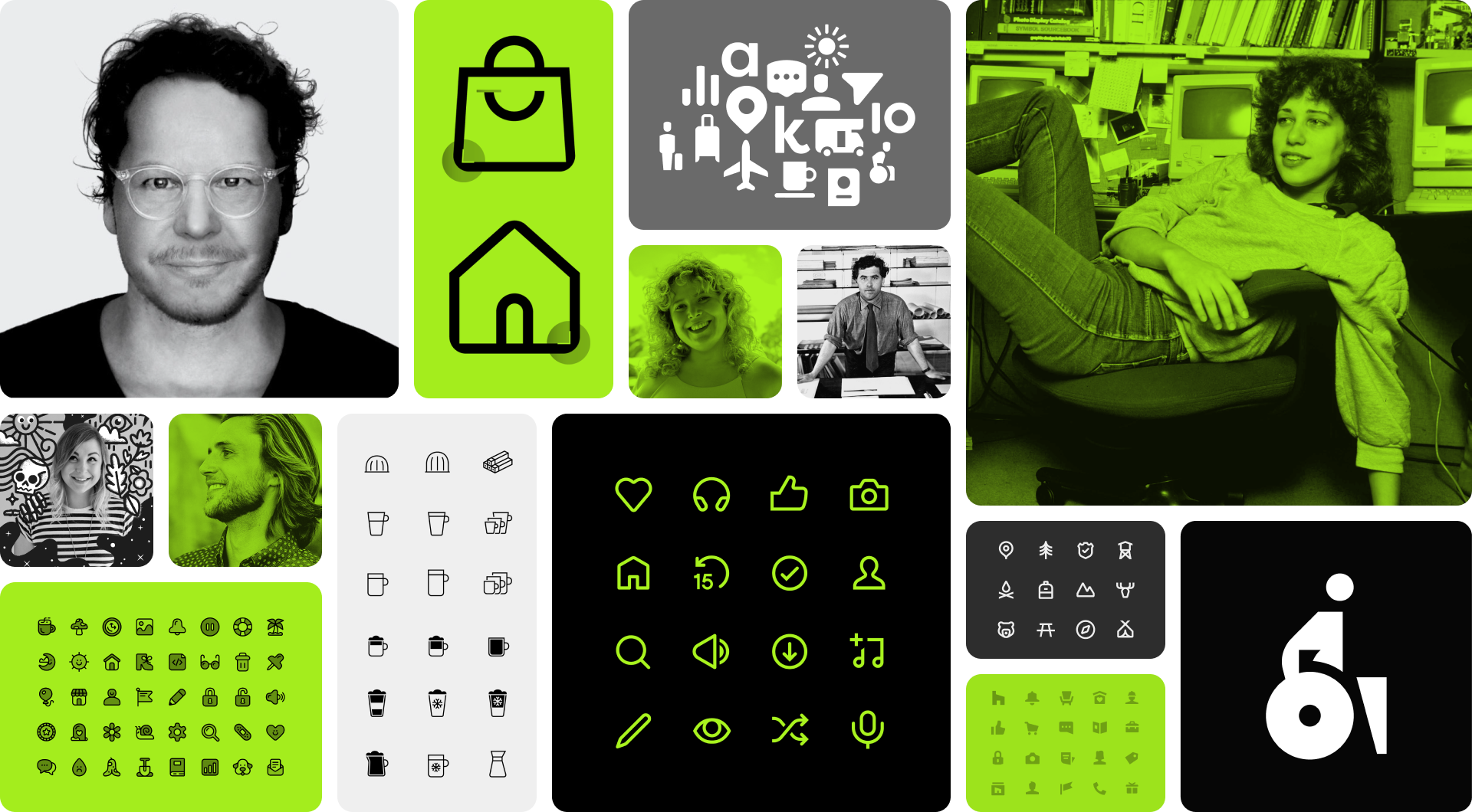
Icon design is a field that requires time and dedication, as only a few have reached the level needed to be considered masters. From legends like Gerd Arntz and Susan Kare to some of today's most recognized designers like iconwerk and Evgeniy Artsebasov, here you'll find only the best of the best.

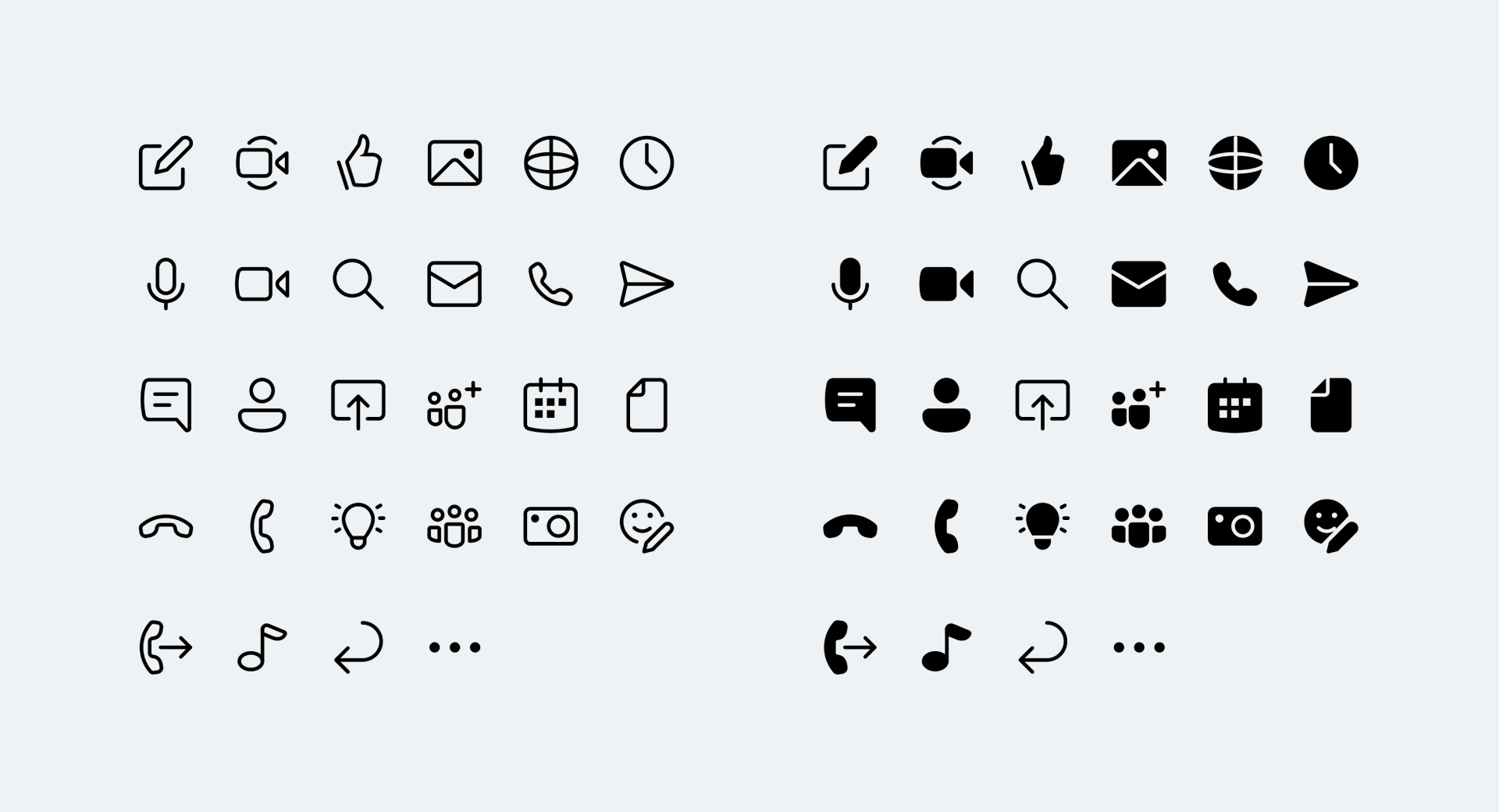
Stefan Dziallas, better known as iconwerk, is a true reference in the icon design field. He's a very meticulous designer who always likes to share little tips or creative curiosities via Twitter while also outlining his design process for each project published on his website. All the icon designers that have emerged in recent years owe a lot to iconwerk. Plus, he has worked for such impressive clients as Google, Ikea, Braun and Microsoft.

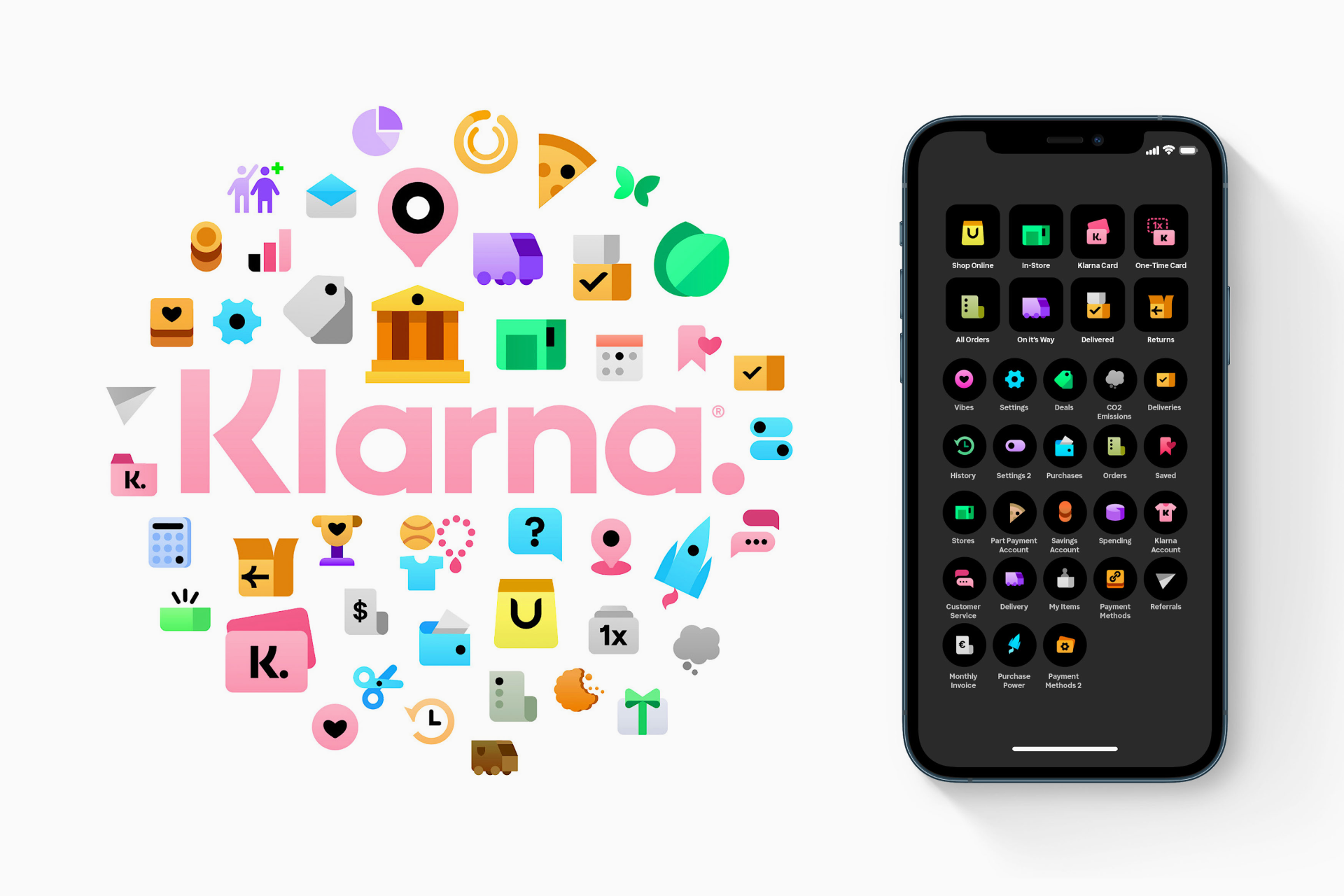
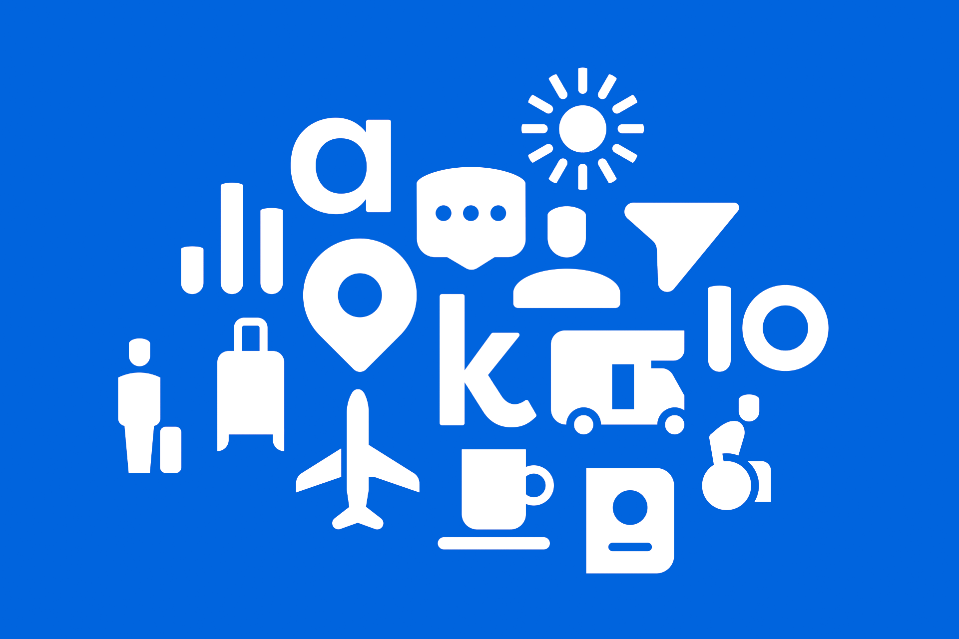

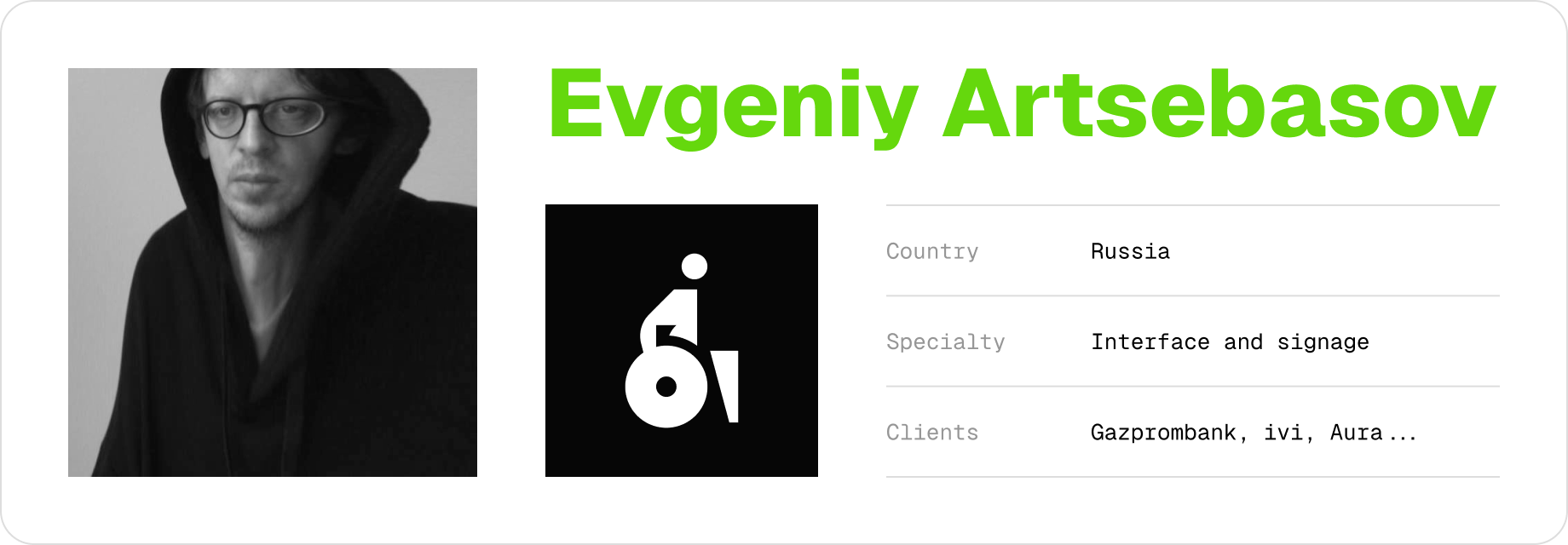
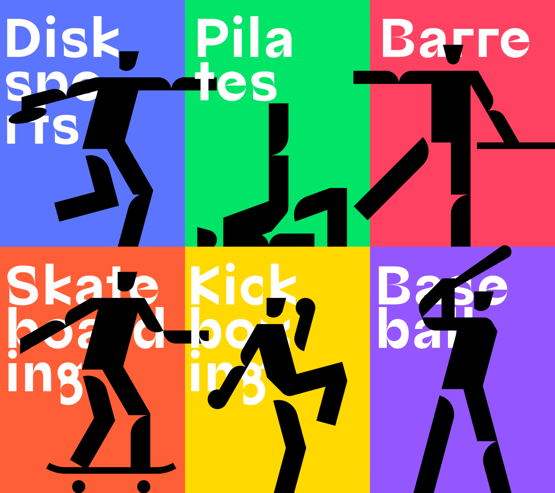
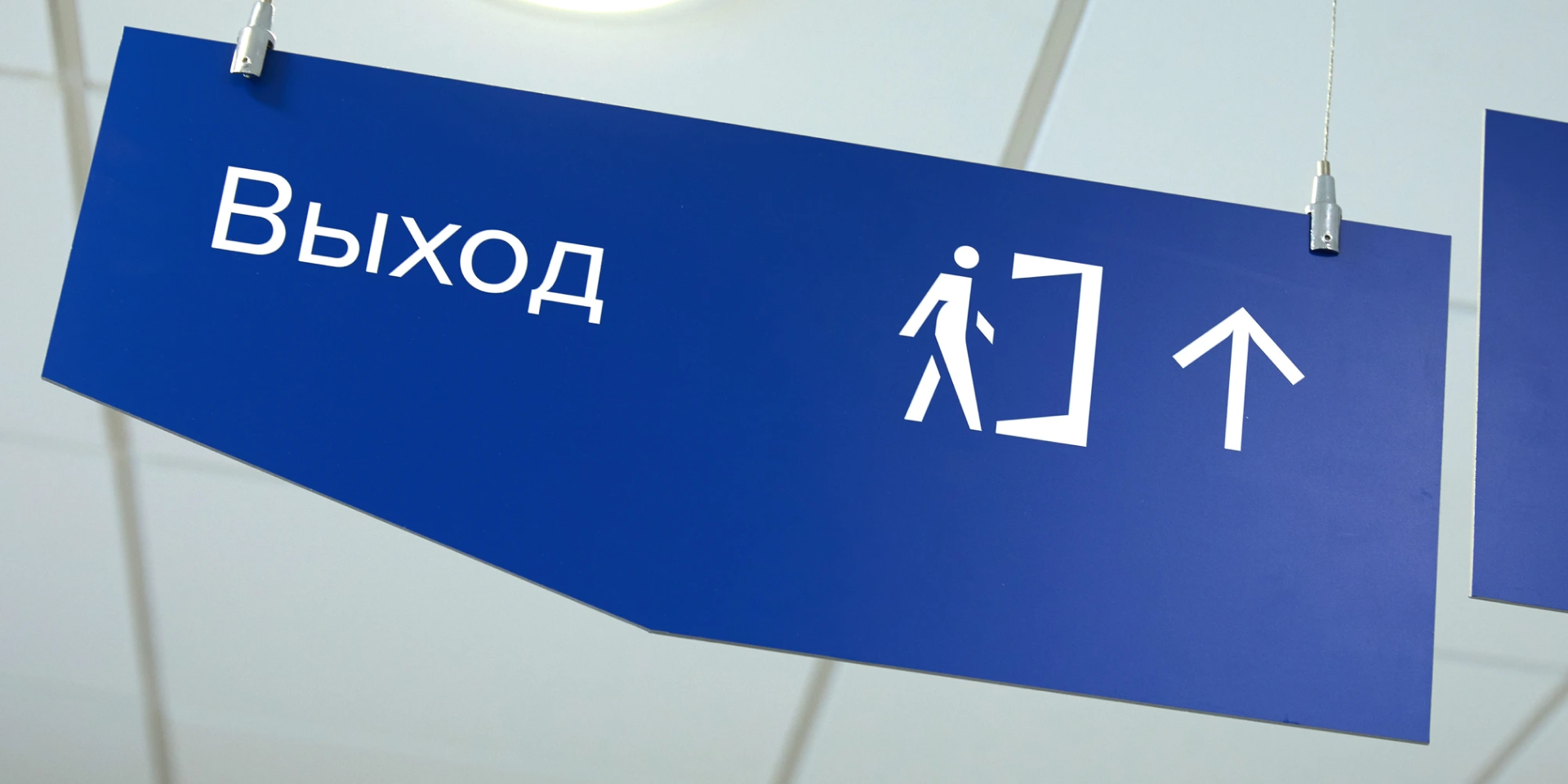
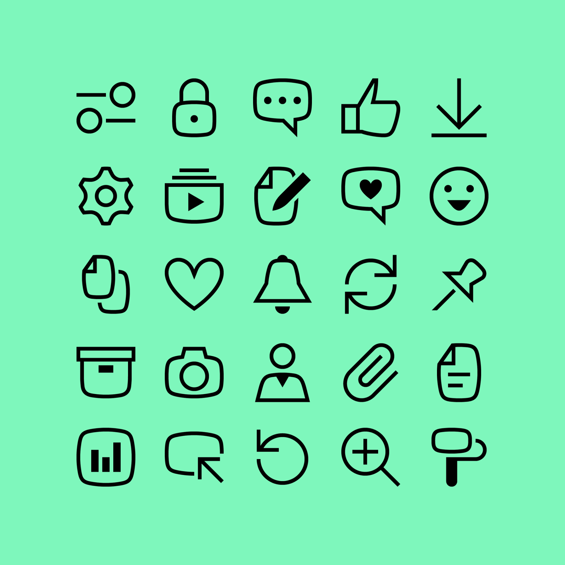
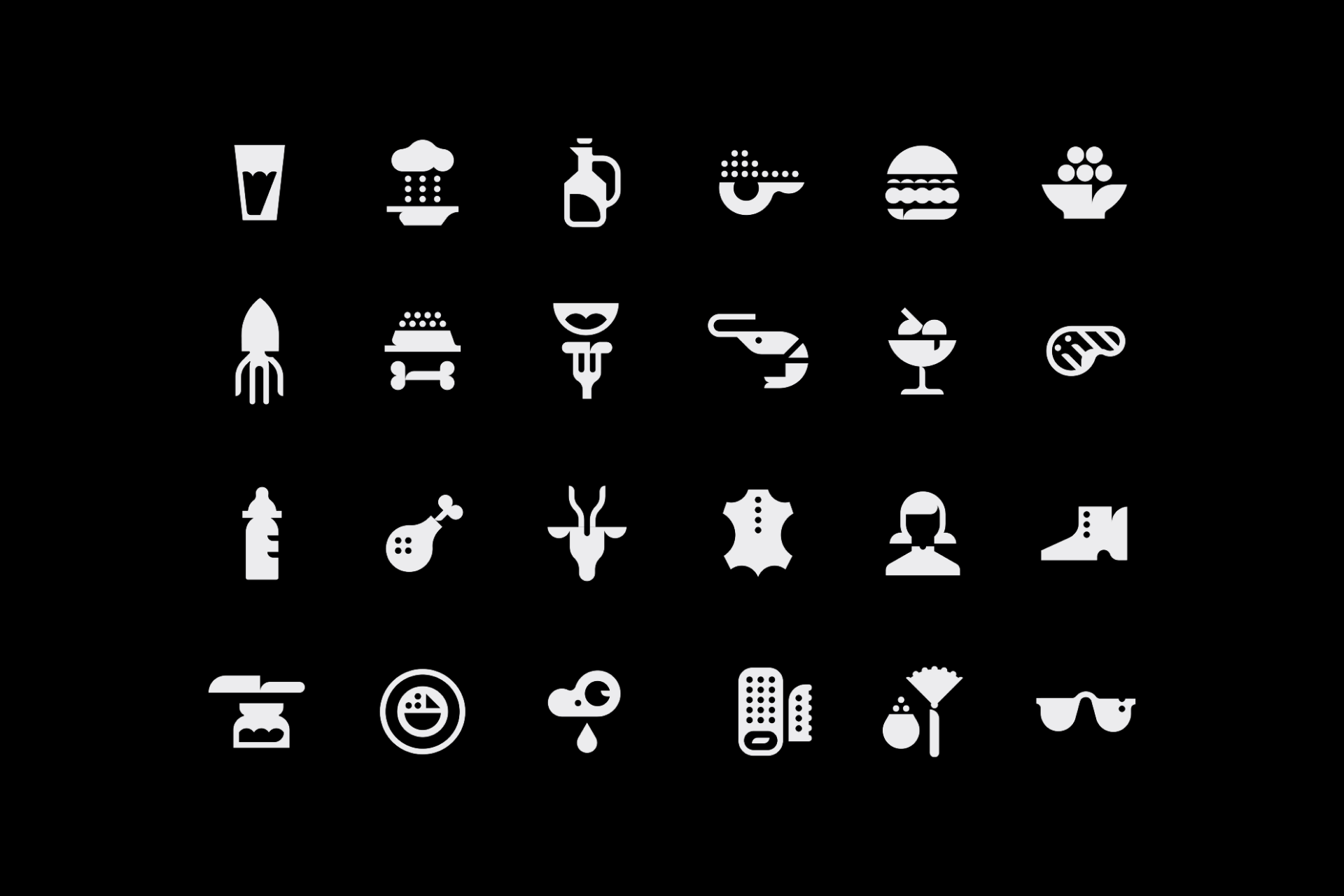
Evgeniy Artsebasov is an incredibly creative icon designer and author of some of the most unique projects I've come across in recent years. His approach is based on the purest experimentation, but without giving up the rational and systematic constructions that define this creative field. Even some of his more seemingly neutral icon sets always have a little twist that relates them directly to the brand for which they've been designed.


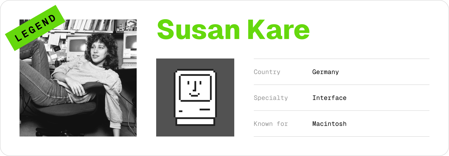
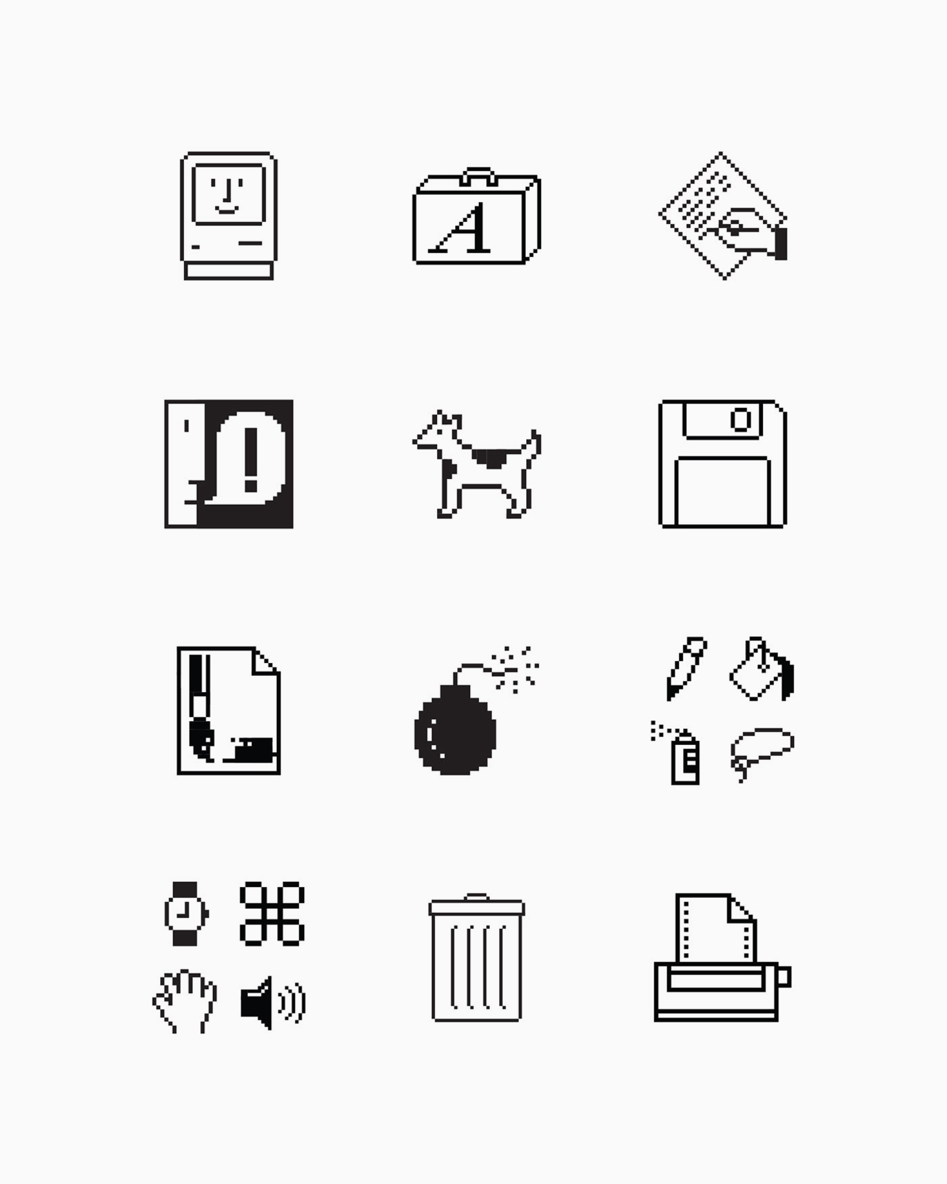
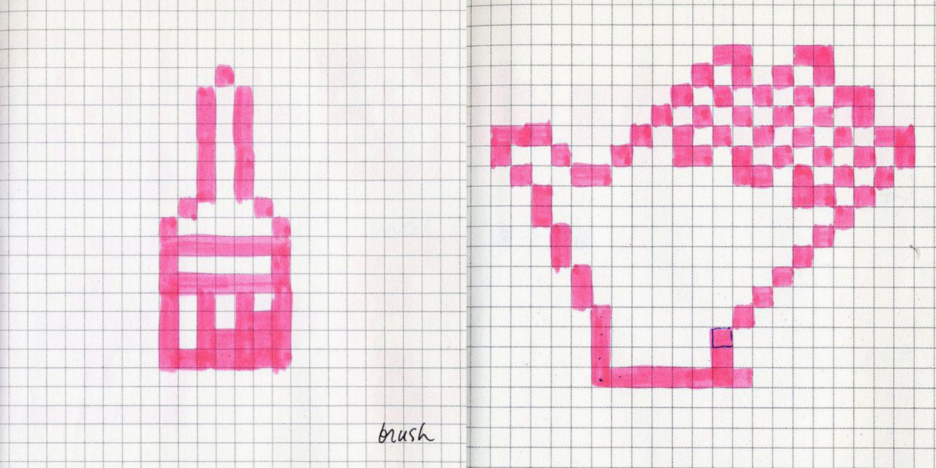
Susan Kare is an American designer best known for her pioneering work at Apple in the 1980s. She designed many of the original icons and interface elements for the Macintosh computer, including the creation of iconic symbols such as the trash can, the paint bucket and the happy Mac, which contributed to making computer interfaces more intuitive and user-friendly. Kare's designs helped set the standard for modern user interface icons.
Further reading:
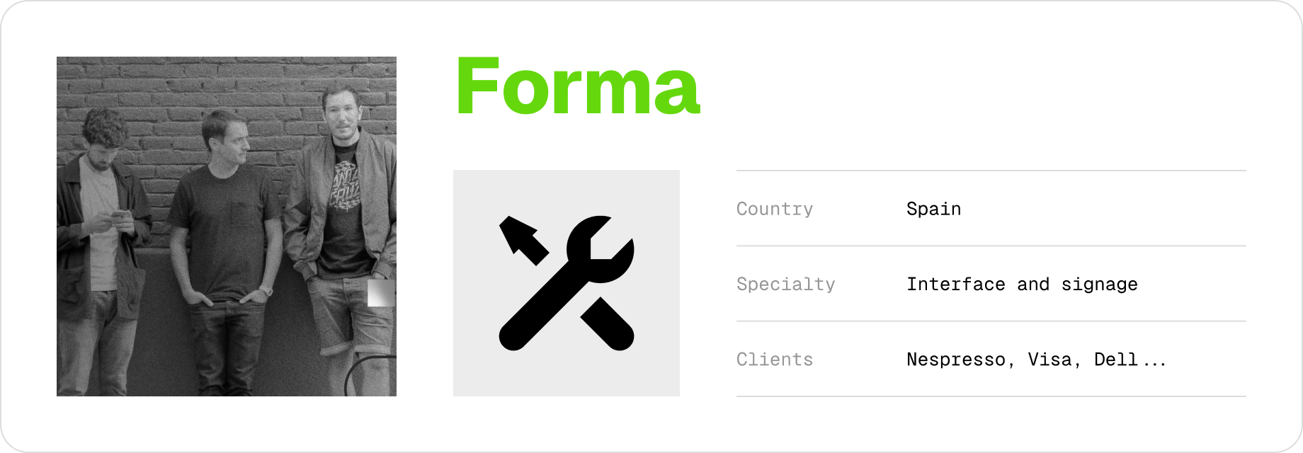
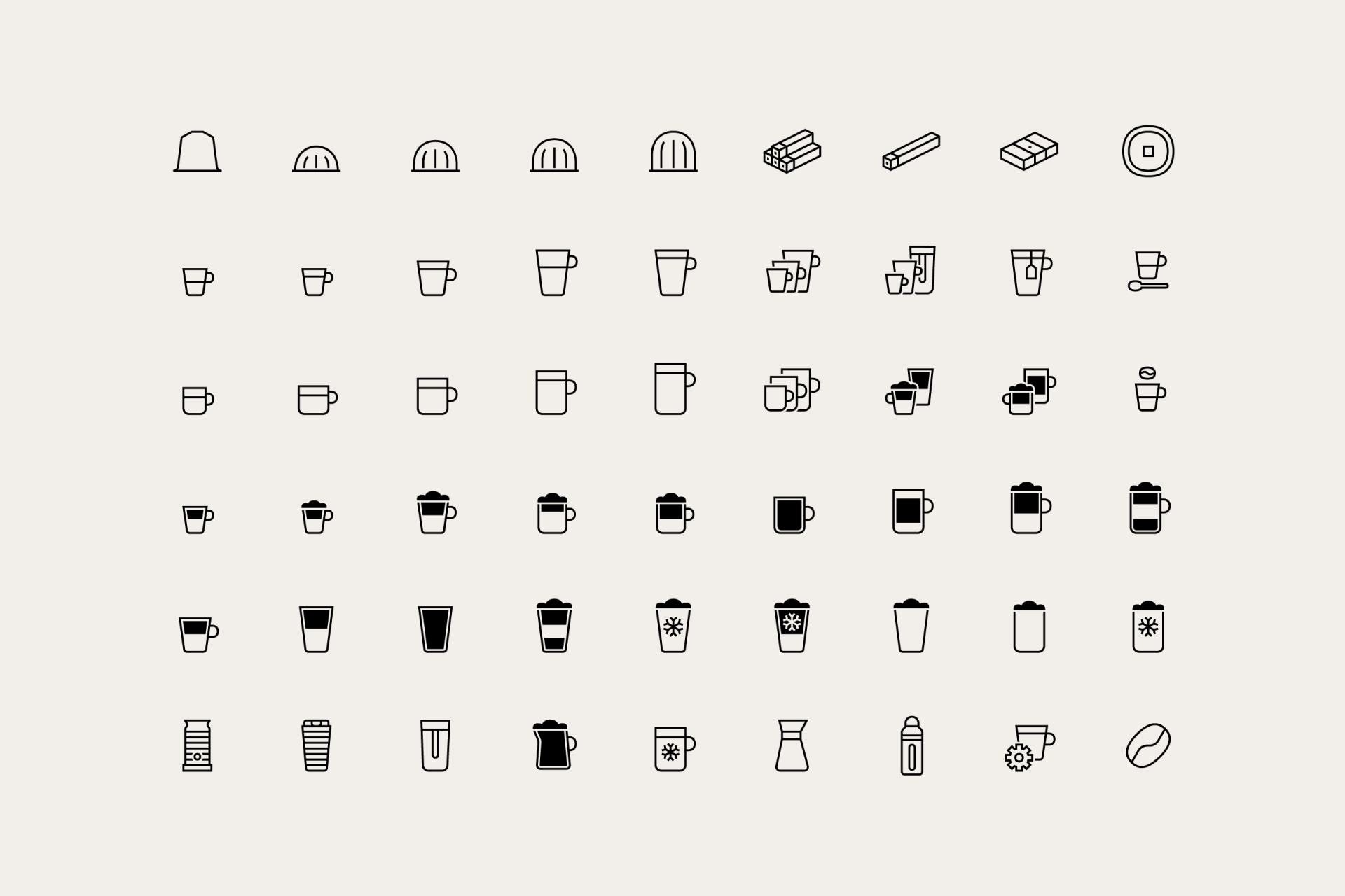
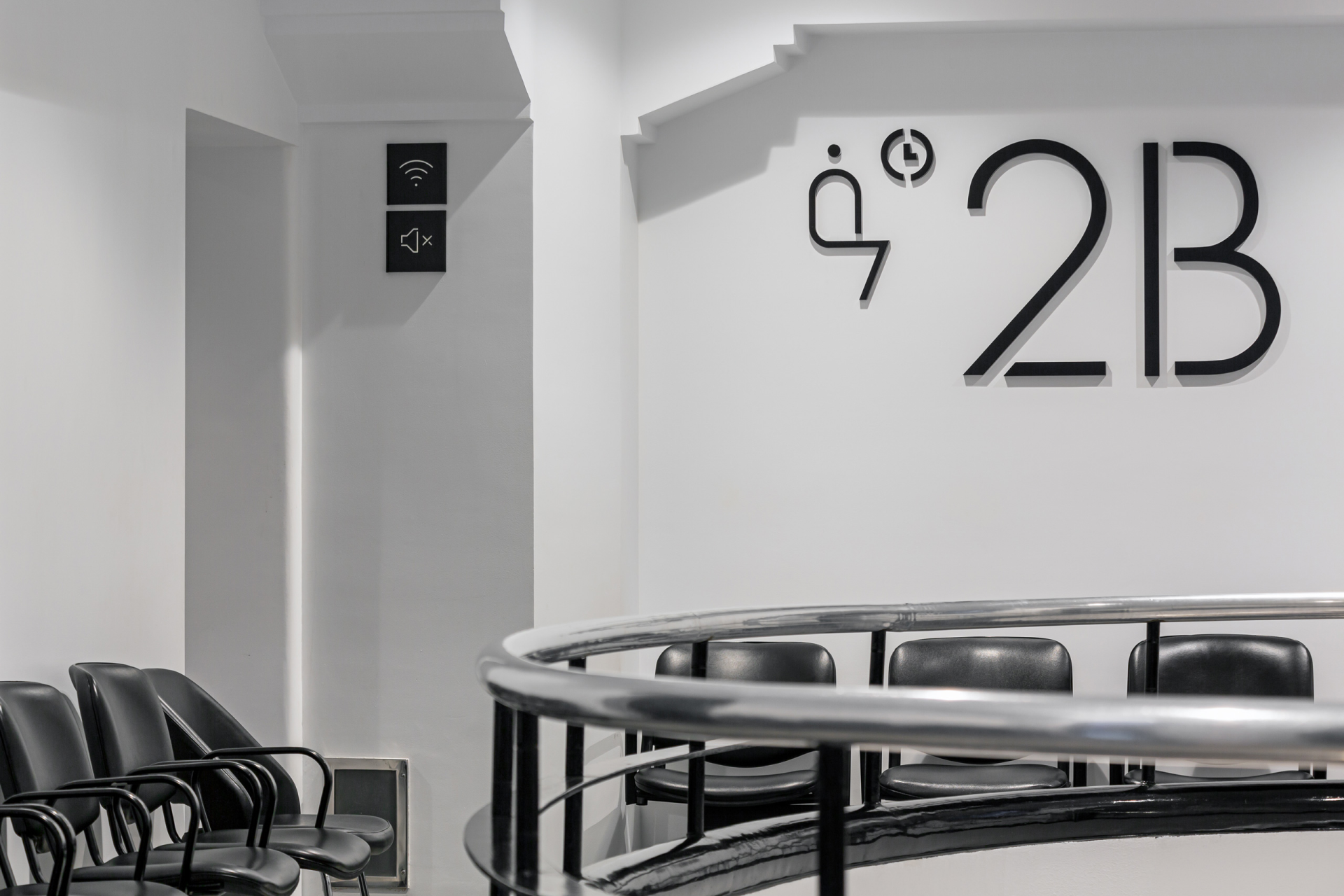
Forma is a graphic design studio based in Barcelona that has its own icons division, a field in which they've been specializing over the years. What stands out the most when you analyze their work is the versatility in their projects, how they're able to adapt seamlessly to different brands (Nespresso, Visa, Nike, Dell...) and different contexts (user interface, editorial, packaging, signage...) to create unique and harmonious icon systems.
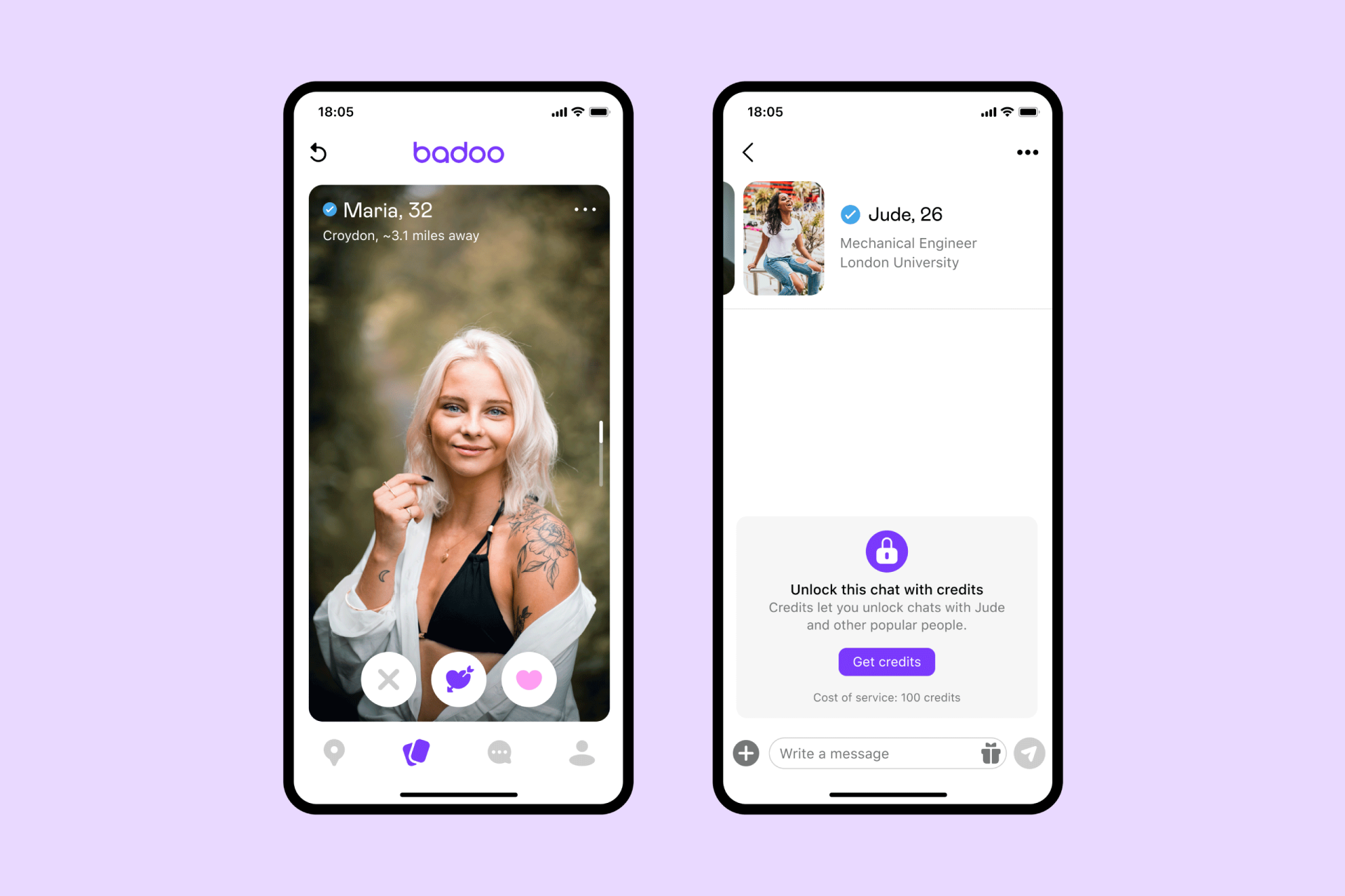
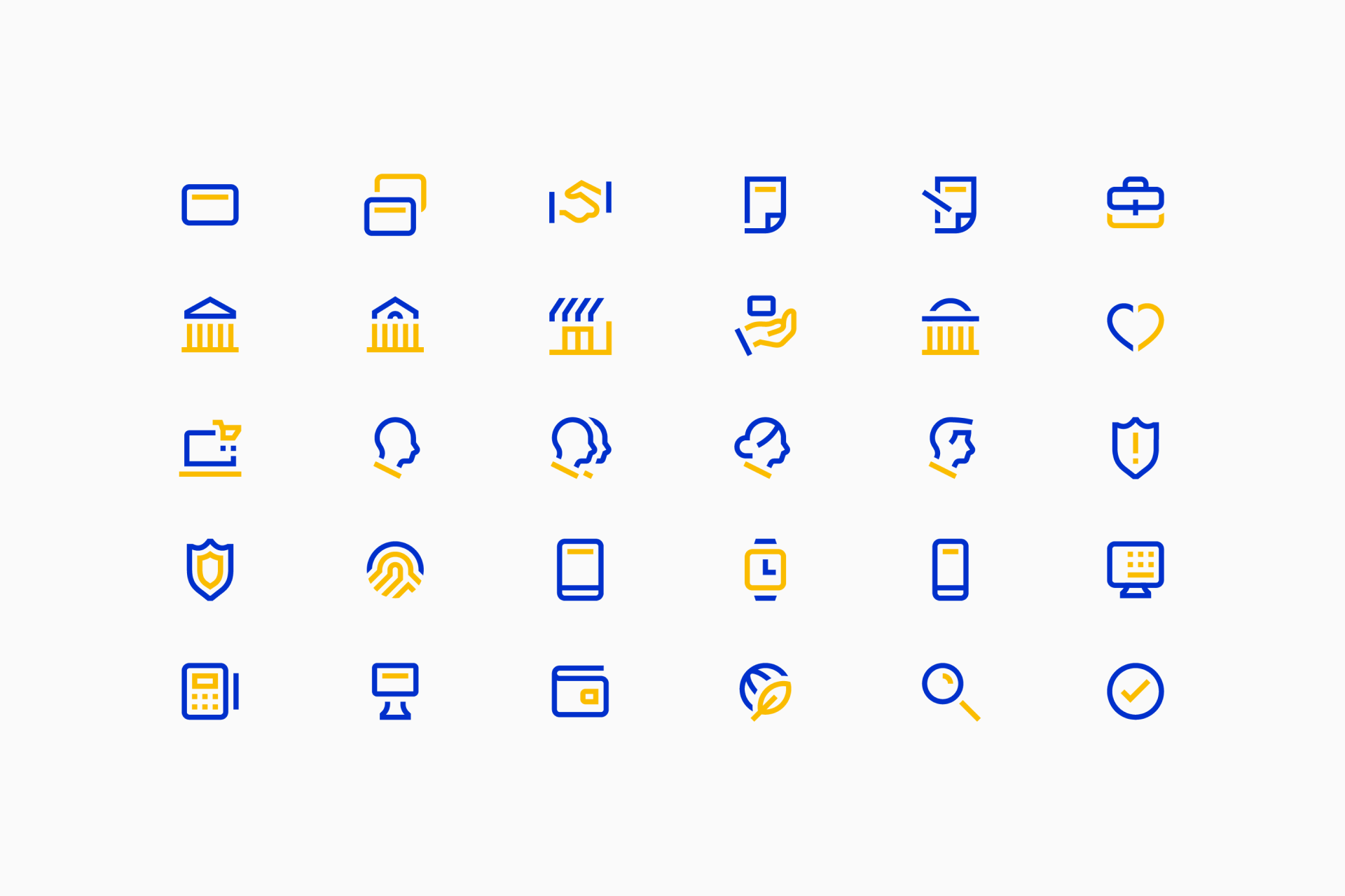
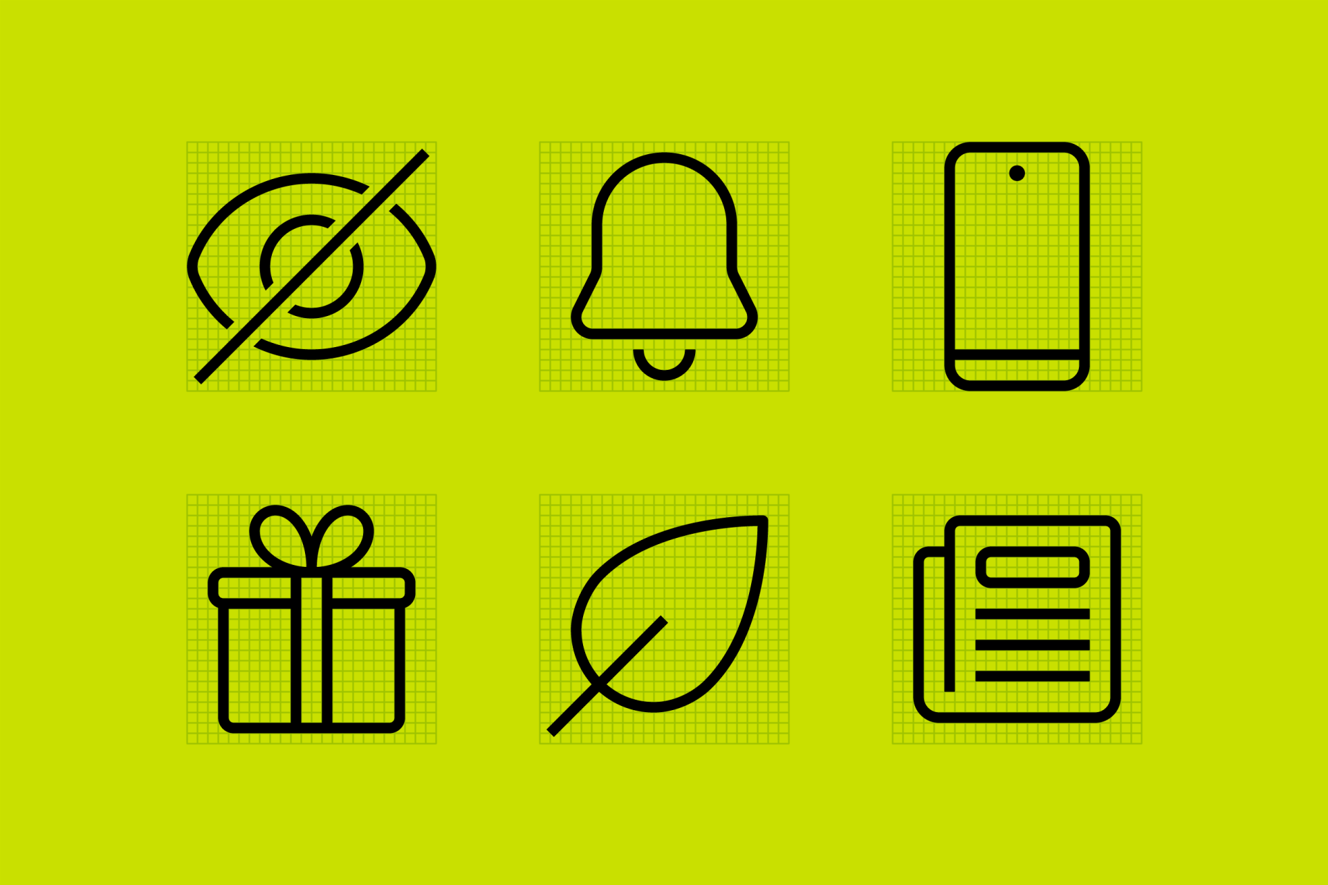

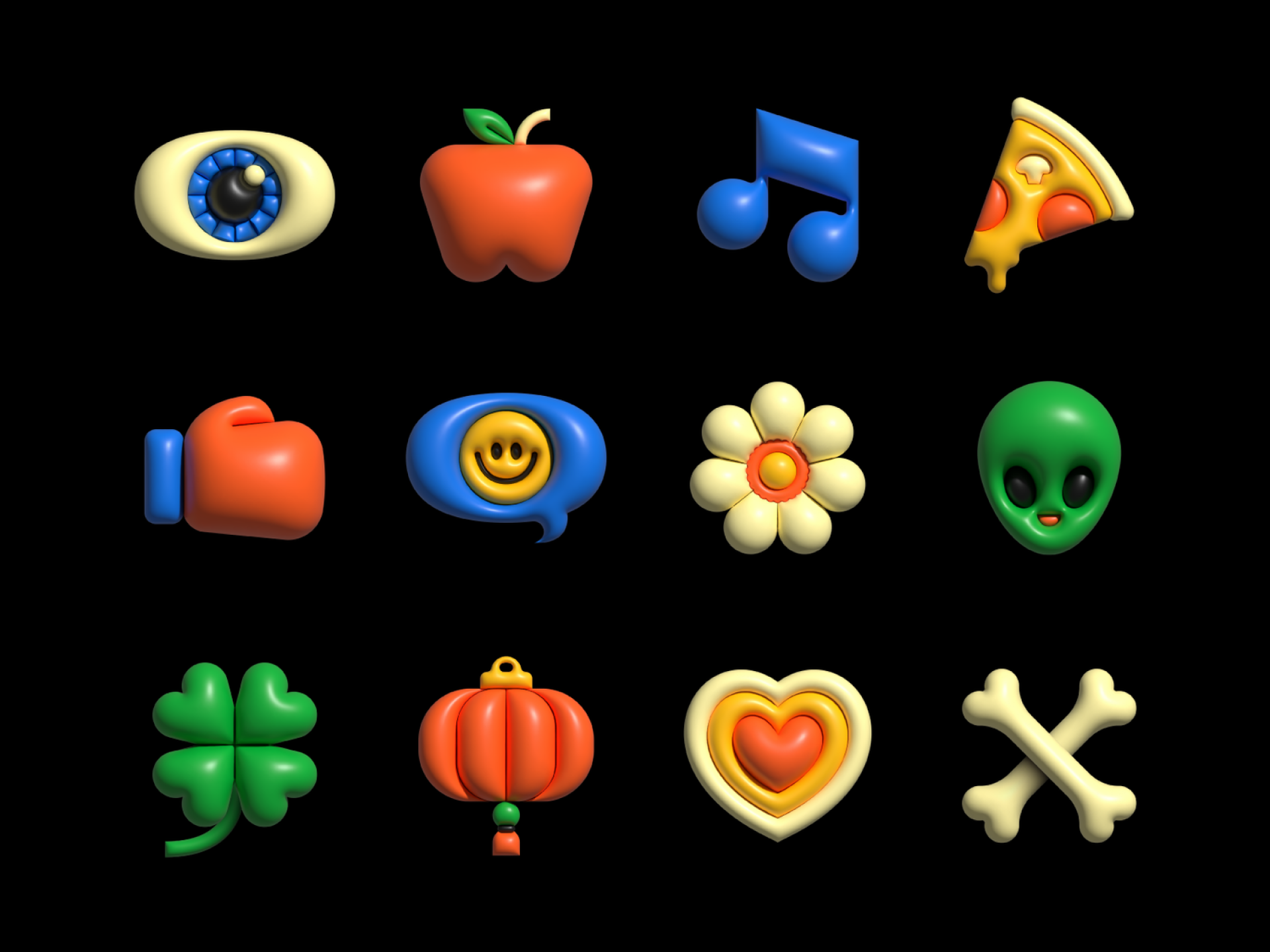
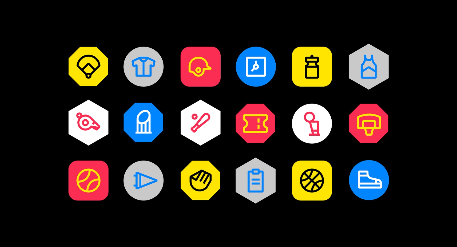
Although he may be better known for his illustrations, Jordon Cheung is one of the most interesting icon designers nowadays. It's precisely this background in the illustration field that has allowed him to have a total mastery over the forms and not lose a bit of personality or recognition in his designs. Line, solid, black and white, full color, animated, static, simple, detailed... Jordon has made icons in every possible way and all of them with excellent results.

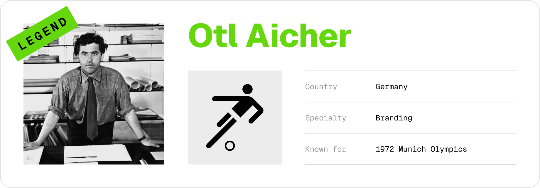
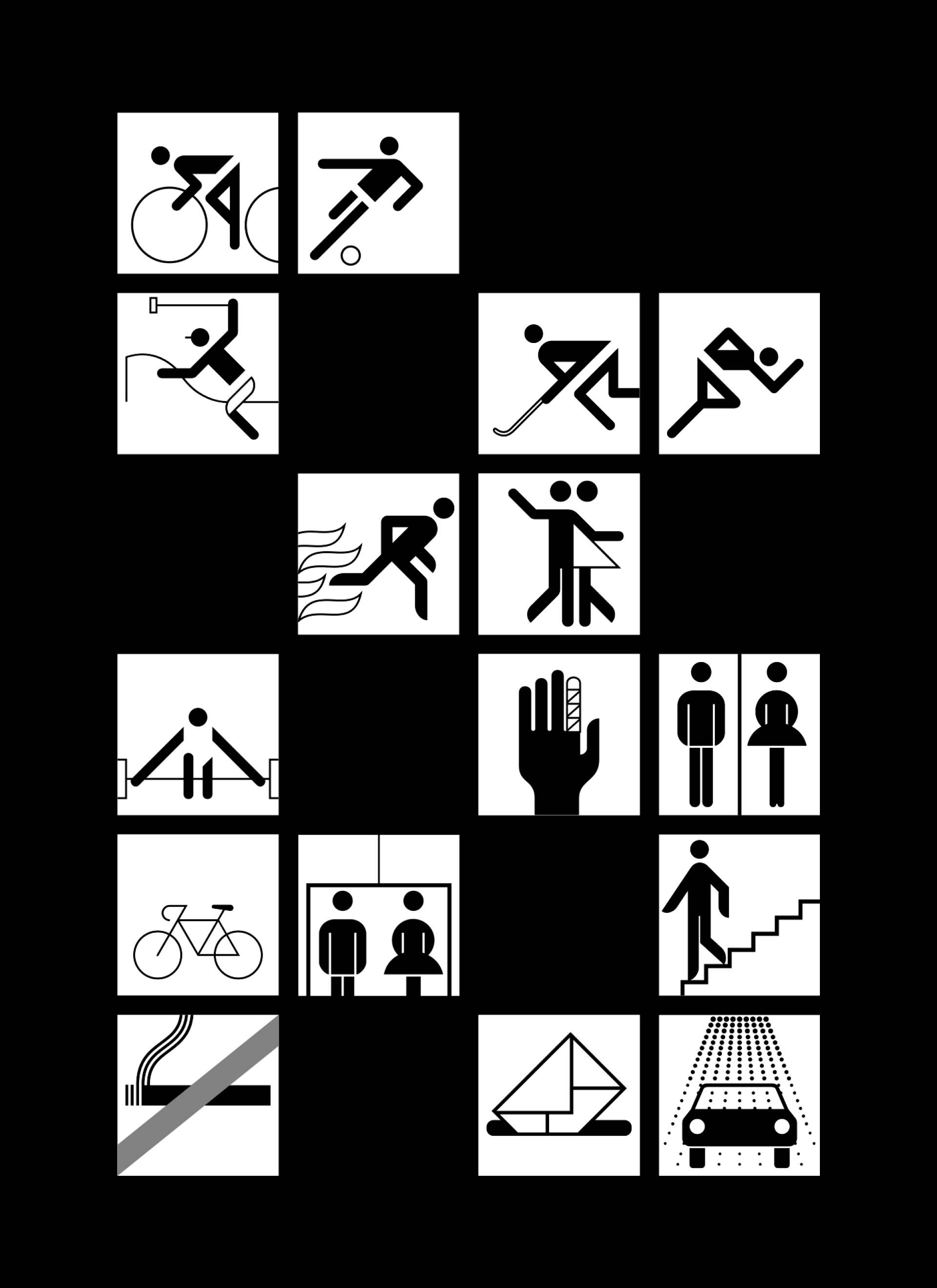
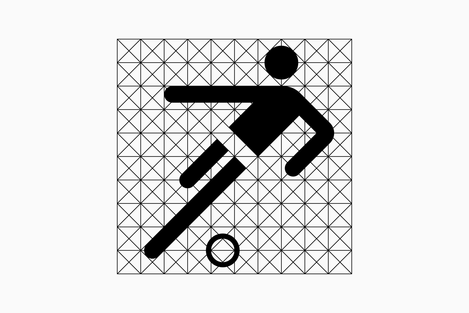
Otl Aicher was a graphic designer renowned for his work on the visual identity of the 1972 Munich Olympics. He created a comprehensive pictogram system for the event specifically designed to communicate information effectively to a diverse international audience. Aicher's icons were notable for their geometric simplicity and formal consistency, influencing future generations of designers in creating cohesive and universally understandable visual systems.
Further reading
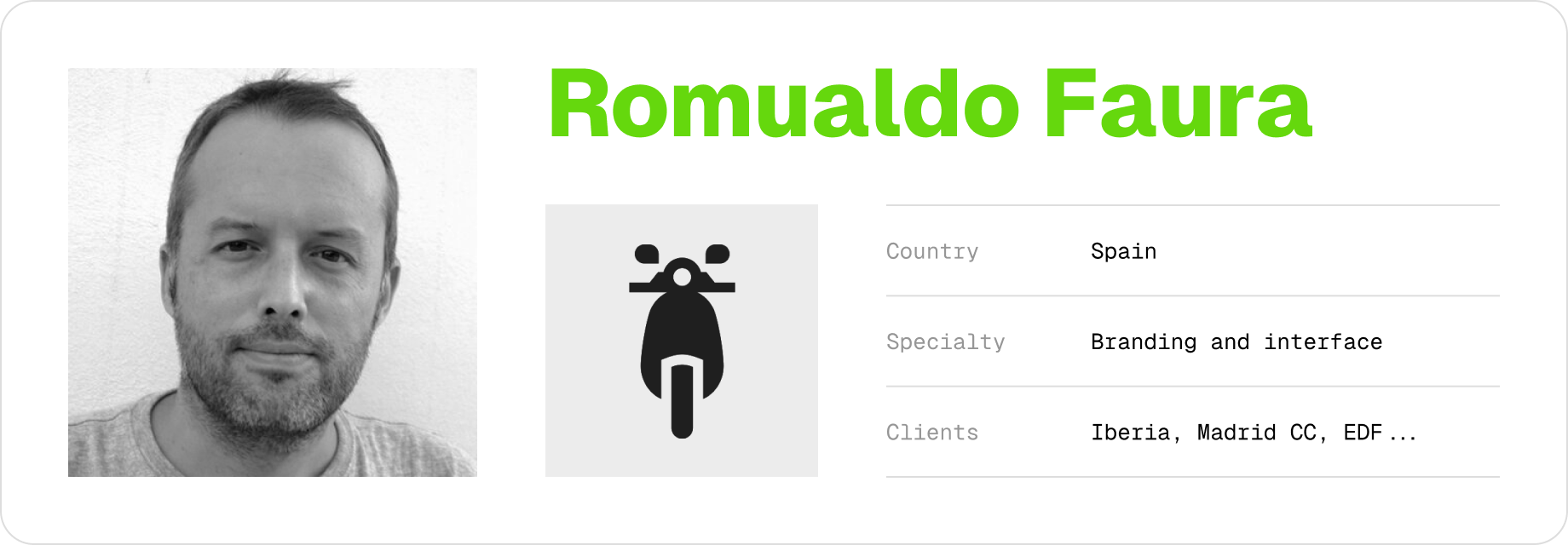
Romualdo Faura is a graphic designer and illustrator with a prolific career in icon design. He understands icons as a reflection of a brand's voice that must be complemented and reinforced by these small visual signs. Therefore, his mastery is demonstrated by the incredible versatility of his projects, from tiny minimalist icons to more complex and illustrative systems. In addition, his clients include Iberia, the Madrid City Council and EDF among many others.
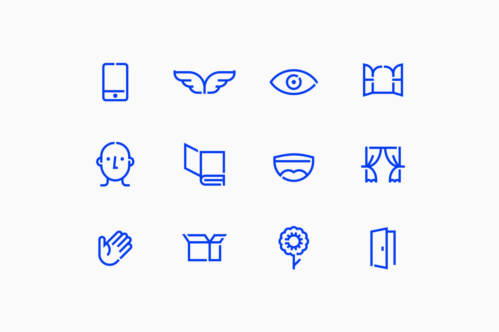
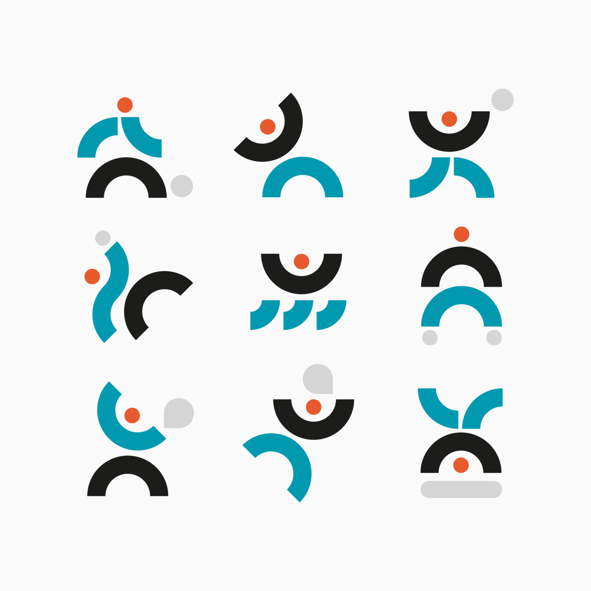


Tim Boelaars' work is especially known for the use of vibrant colors and geometric compositions. He also applies these skills to icon design, where he excels in the use of clean lines and unparalleled formal consistency. But the quality that stands out most about his icons is the ability to make seemingly complex yet completely harmonious constructions, every single stroke is there for a reason. And that's what makes him a true vector virtuoso.

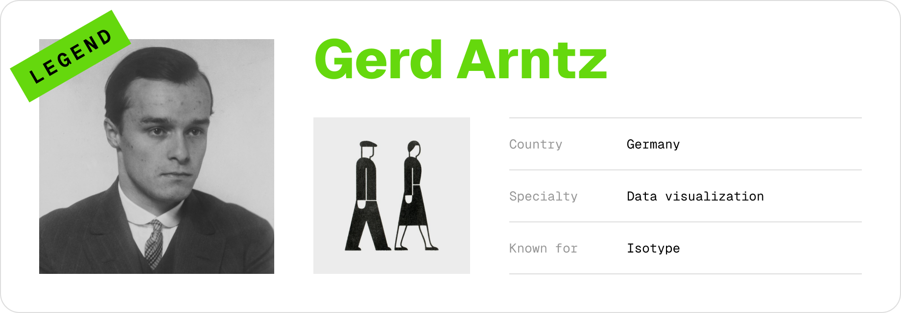
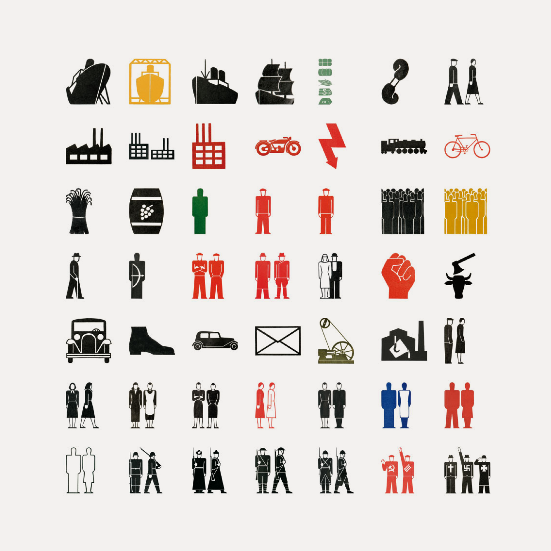
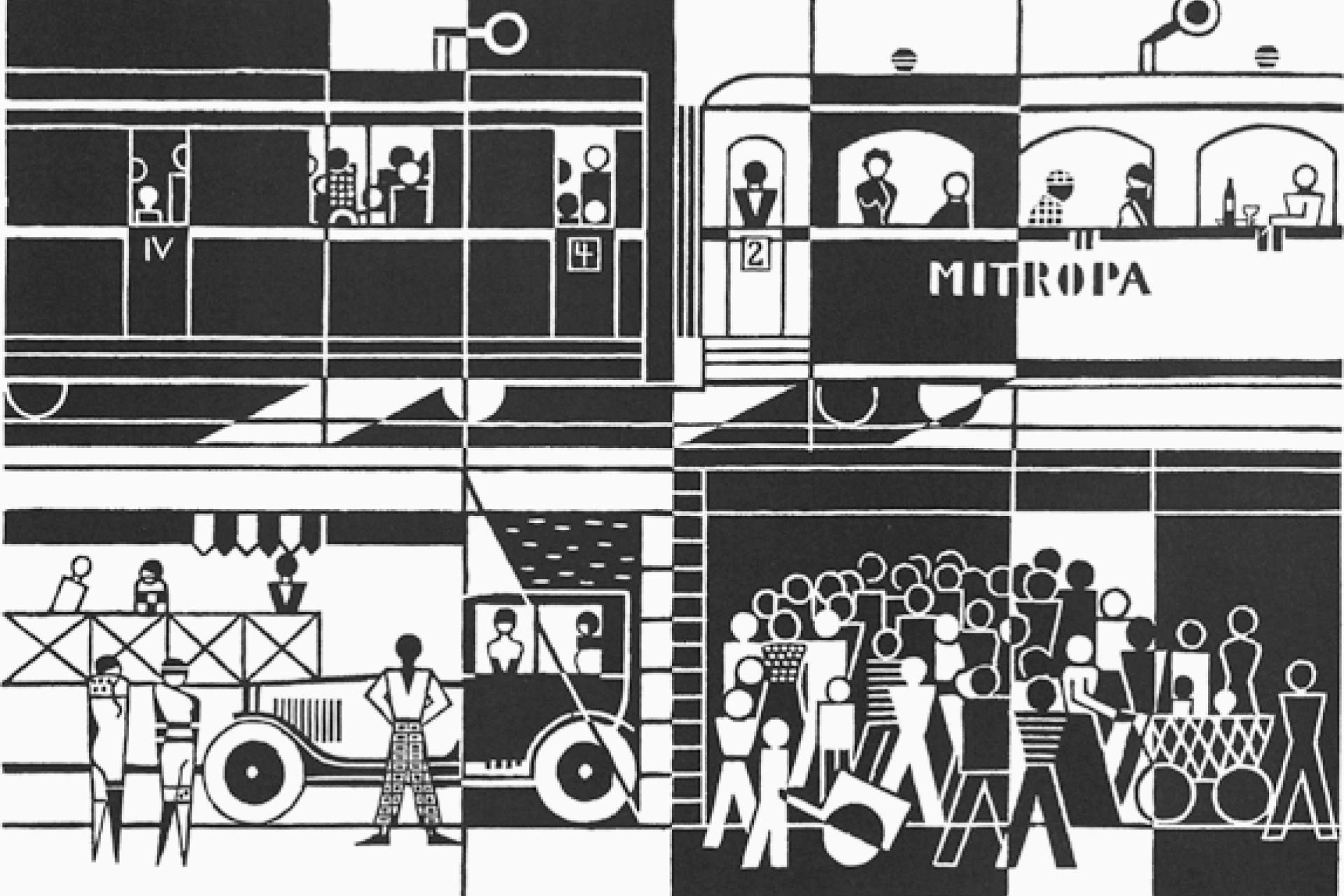
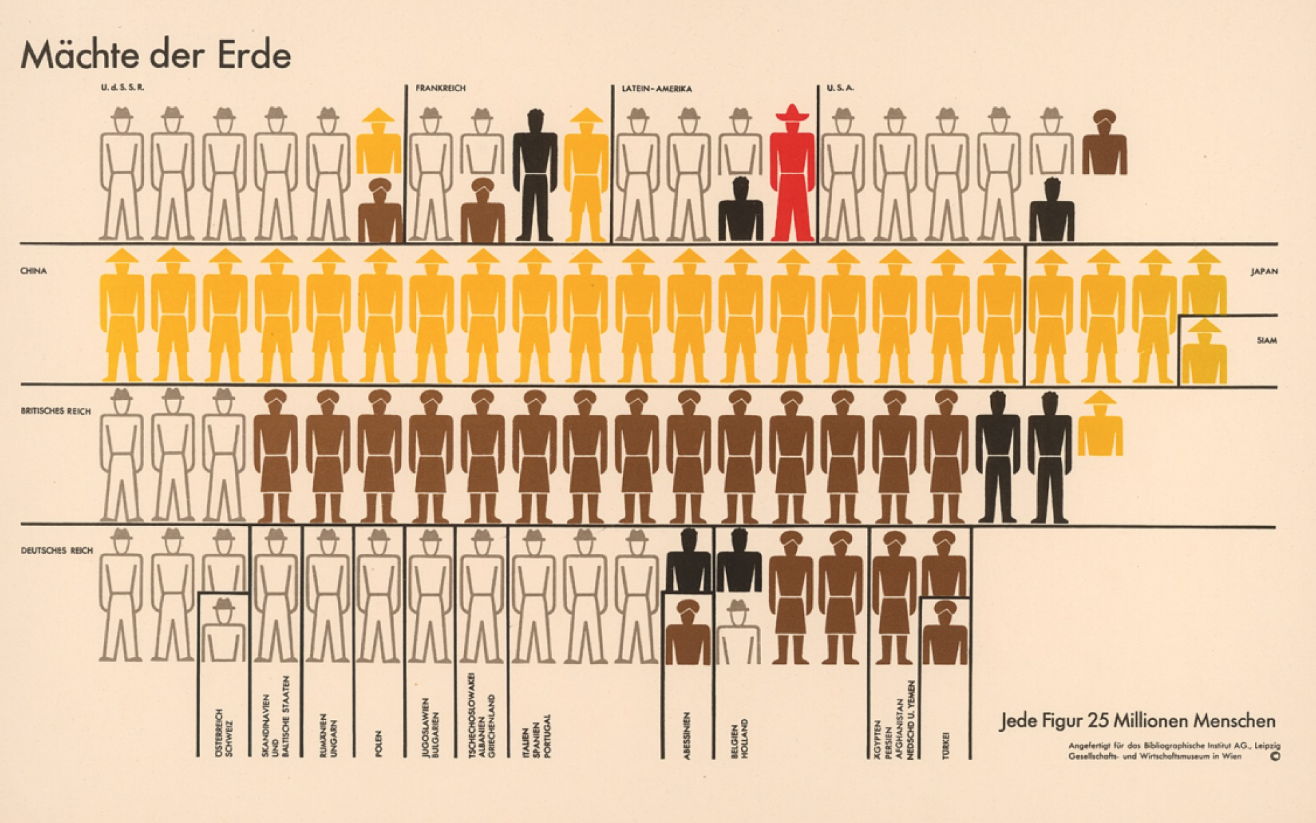
Gerd Arntz was a German artist known for his work in creating clear and concise pictograms. He collaborated with the sociologist Otto Neurath to develop Isotype (International System of Typographic Picture Education), a method of visual communication that uses simple images to convey complex information. Arntz created over 4,000 pictograms which were used to represent statistical data visually, making information accessible to a broader audience.
Further reading:

Laura Bee is another of those designers specialized in the illustration field but with a lot of incredible icon sets in her portfolio. It's impossible for her work to leave anyone indifferent, as she always tries to use original and creative shapes that separate her work away from the average icon project with a neutral and boring style. Laura's work is a breath of fresh air in the world of icon design that also helps each brand to achieve a voice of its own.
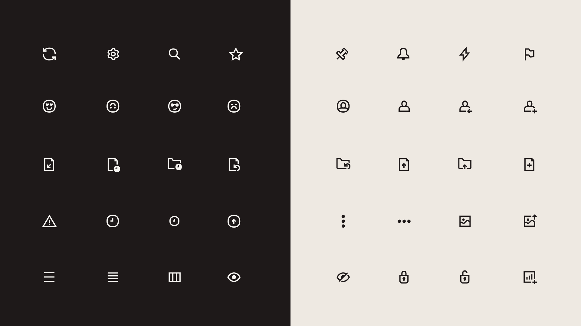
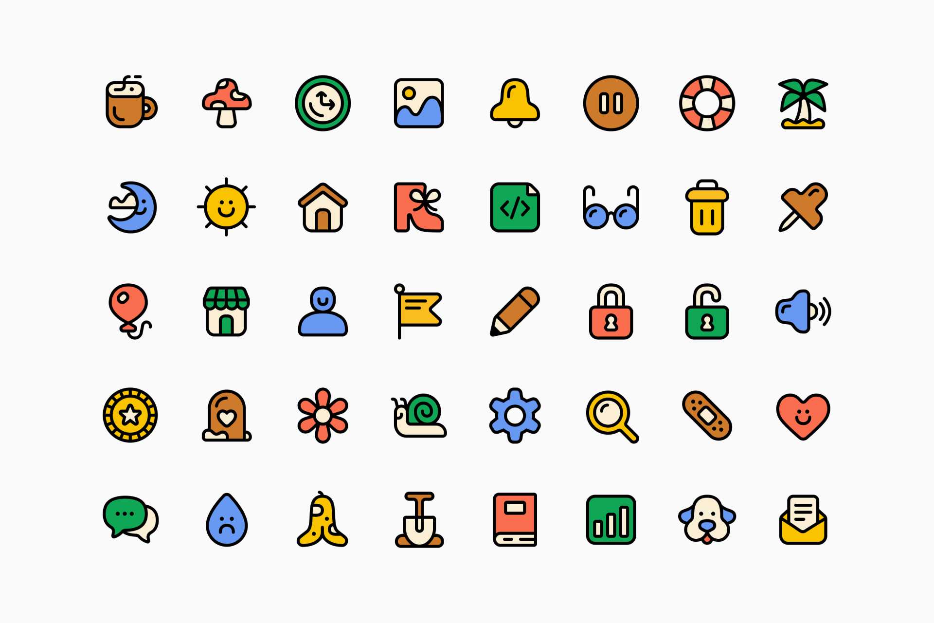


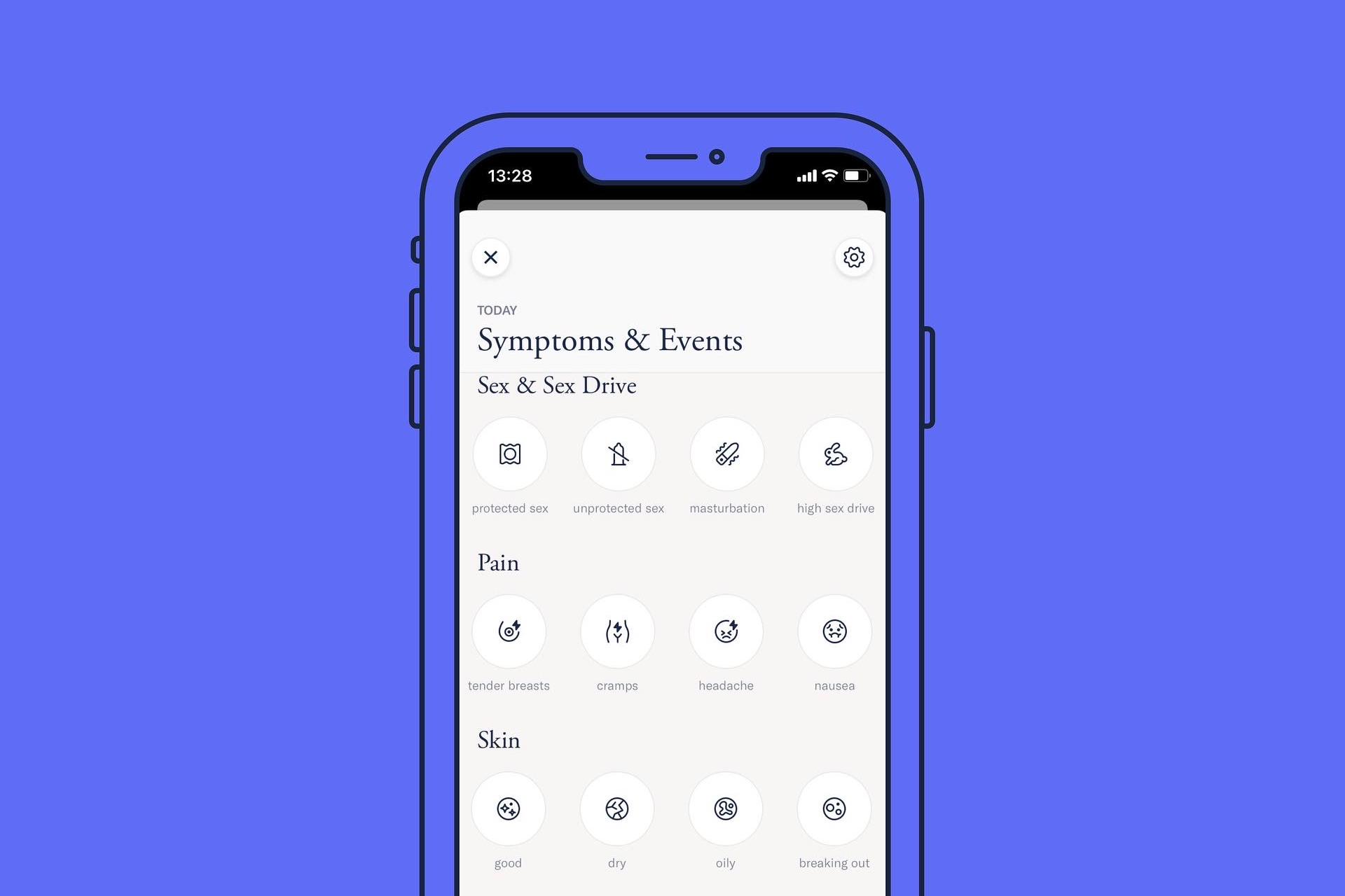

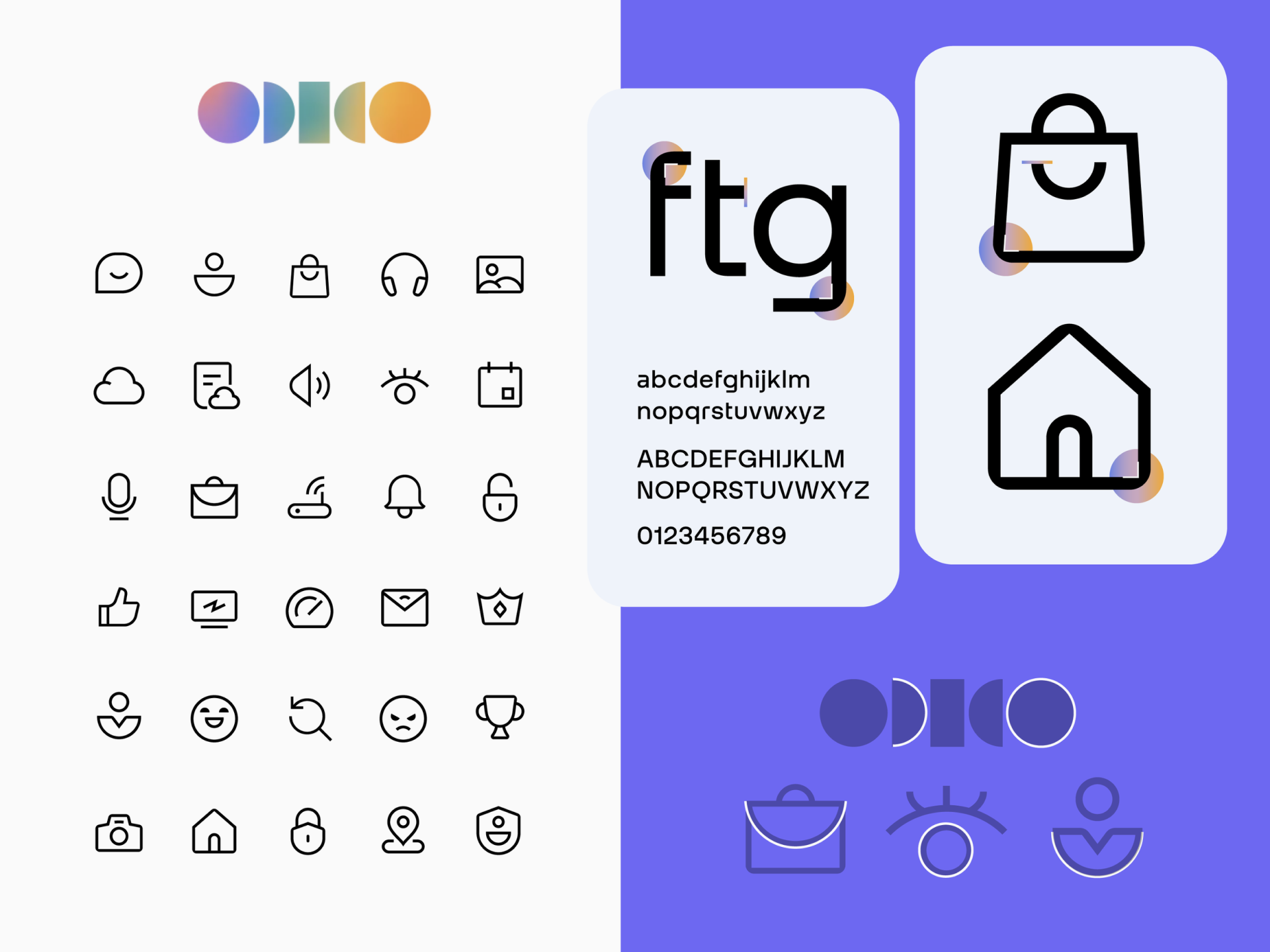
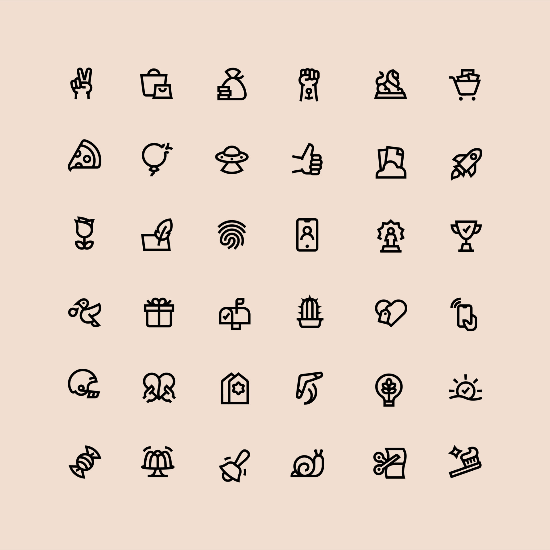
Zach Roszczewski is a meticulous icon designer who always seeks the harmony between style, form and function. You only need to take a quick look at his website to realize the love and passion behind each project, from the construction of the grid to the smooth conversions between Line and Solid icons. Among the clients who have trusted Zach's expertise are Odido, Airbnb, Facebook, Klarna, Bose, GoPro, Salesforce... And the list goes on and on.


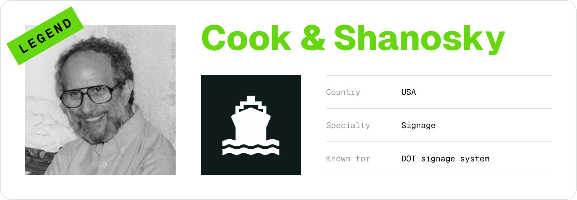
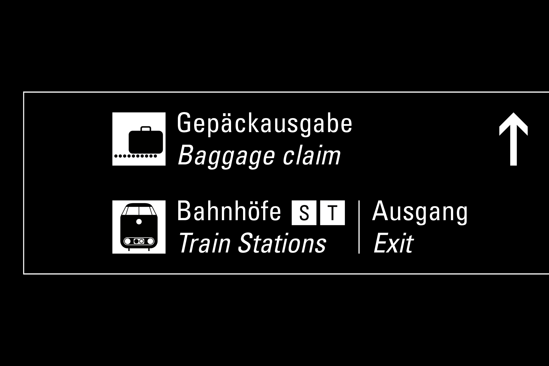
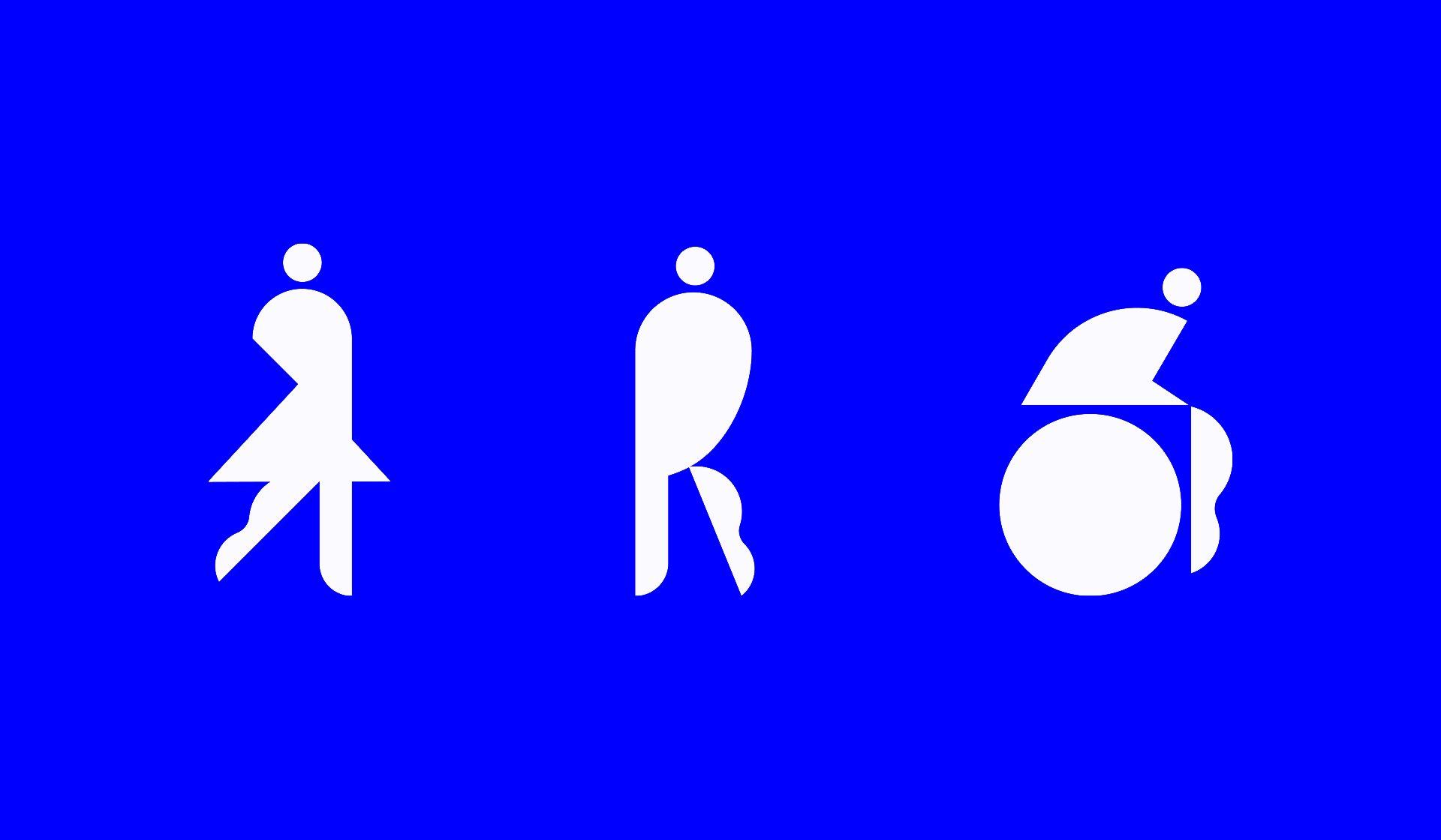
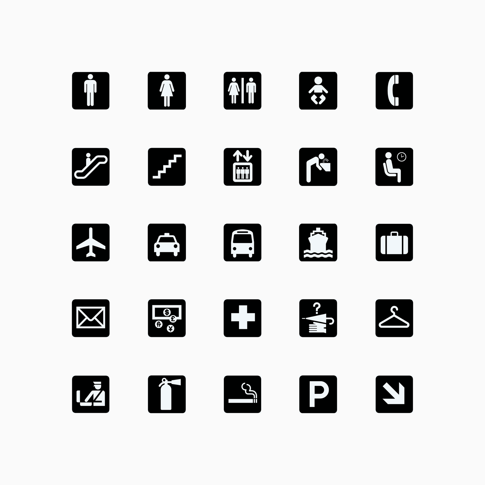
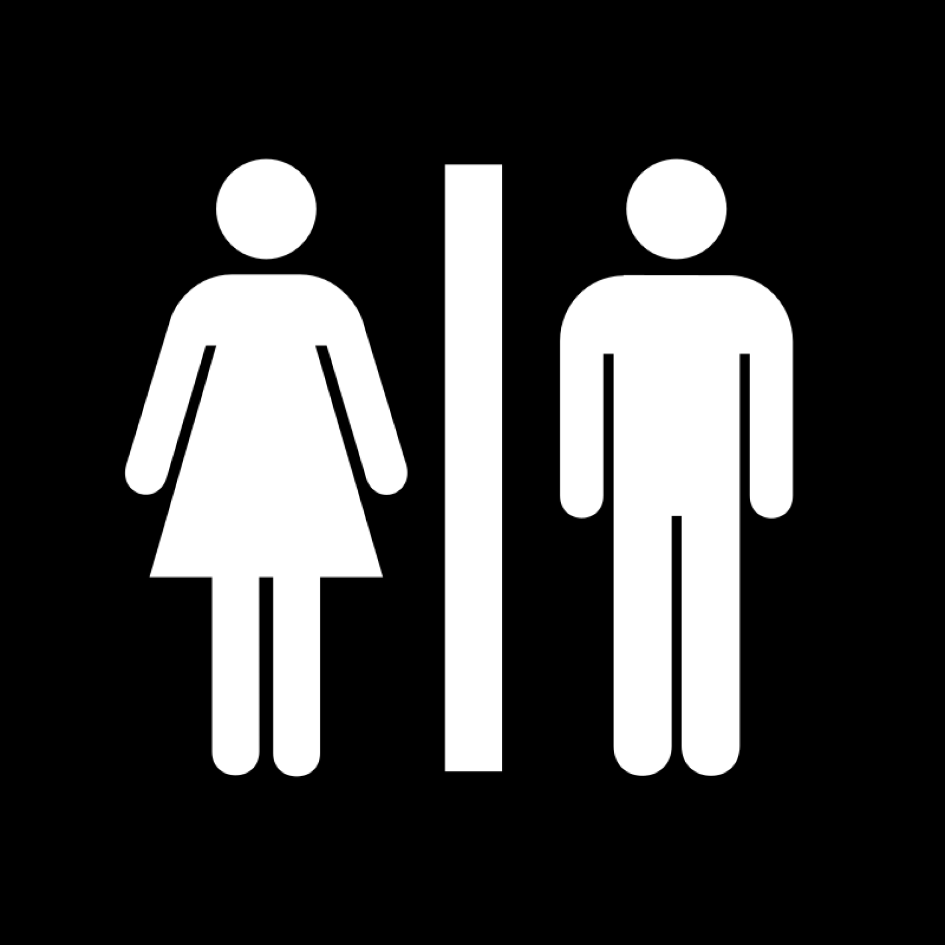
Roger Cook and Don Shanosky were the designers who developed the symbols for the United States Department of Transportation in 1974. Their work included icons for various public services and facilities such as airports, restrooms and parking, all of them designed to be instantly recognizable and easy to understand, regardless of language or cultural background. Incredible as it may sound, to this day they're still a standard in public signage.
Further reading
- How the Universal Symbols for Restrooms, and Transport Were Designed
- DAO Design Spotlight: Rajie Cook

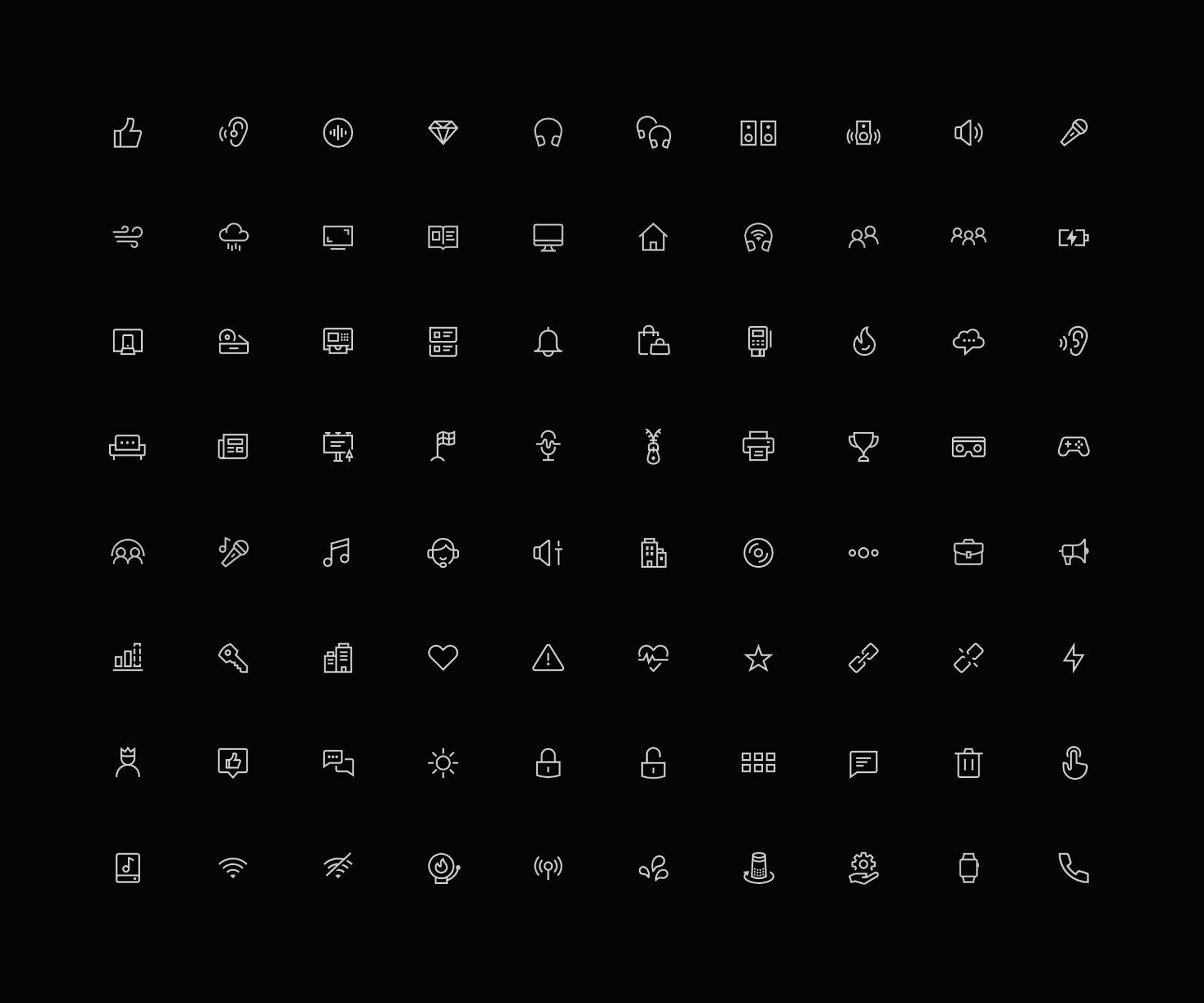
One of the modern references in the icon design field is clearly Bonnie Kate Wolf, a designer and illustrator who always thinks of icons as part of a much larger visual language. With each project she seeks to reinforce a brand's image through its iconography without losing sight of its functionality or giving up what makes each set unique. This icons-as-systems mentality has allowed her to work for huge clients such as Discord, Stripe, Meta and Netflix.
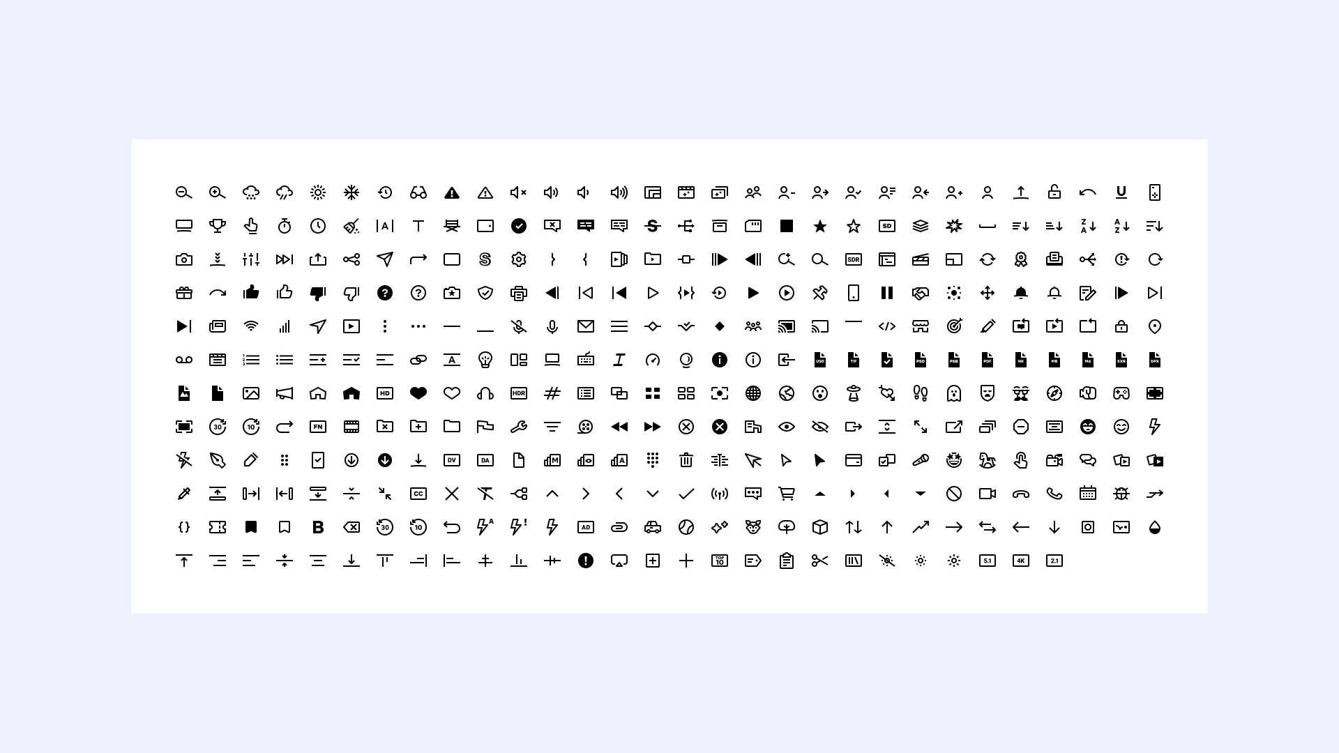
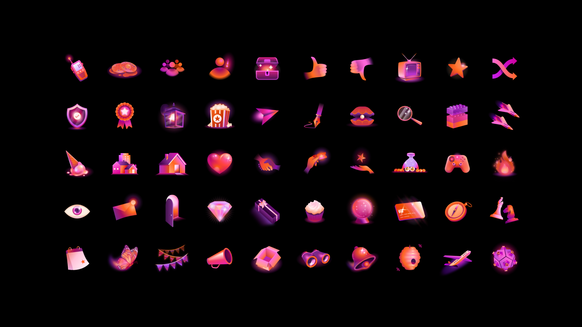
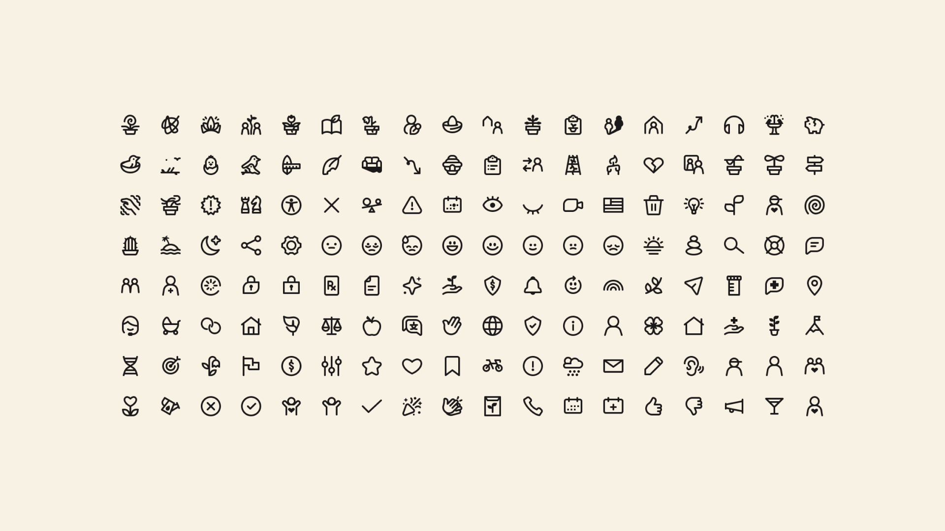
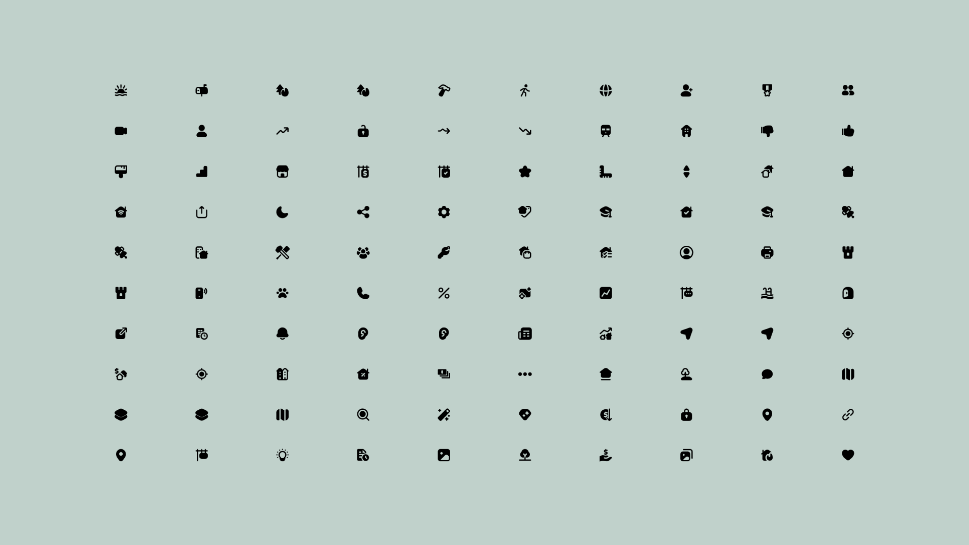
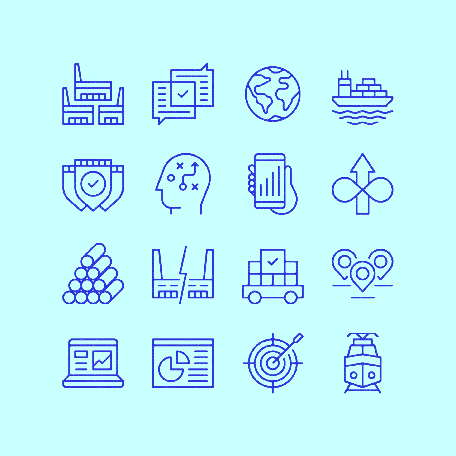
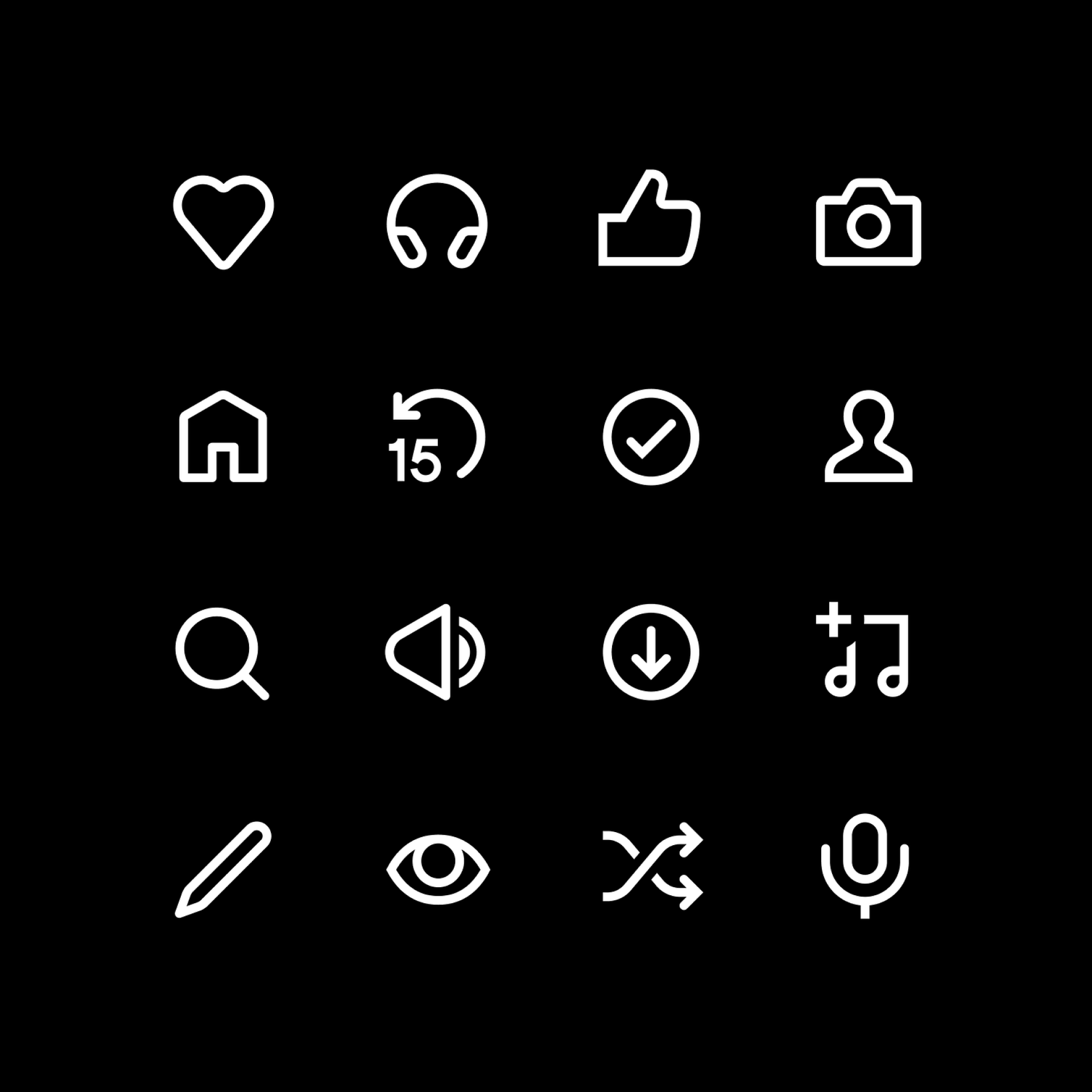
Rob Bartlett has been involved in iconography projects for over 15 years and has even established and shared his own three-phase design process: definition, design and delivery. He's a meticulous iconographer committed to responsible design and has worked for brands such as Spotify, Electrolux, Nissan and Nokia. His icons are characterized by their perfect consistency and bold construction, representing very complex concepts in the simplest possible way.
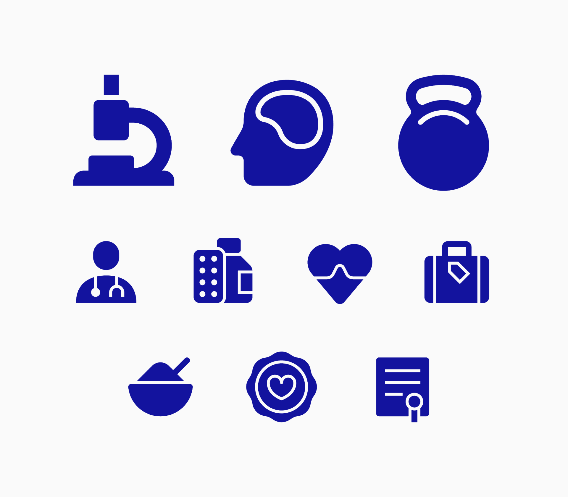

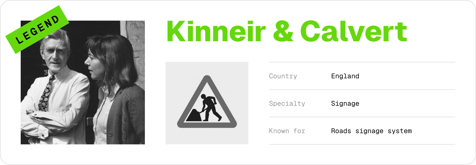
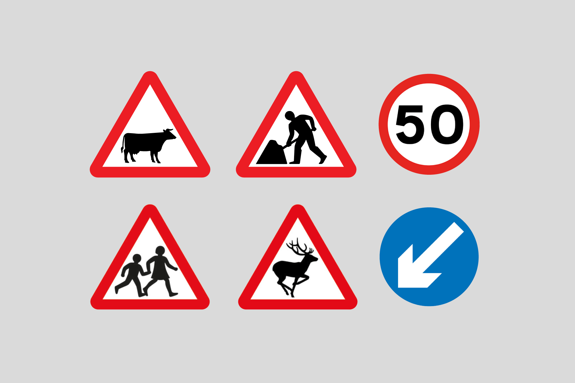
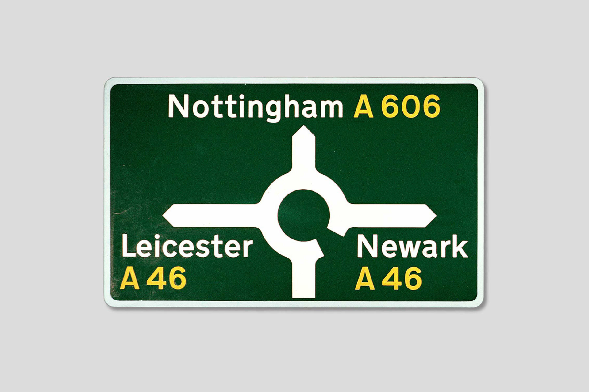
Jock Kinneir and Margaret Calvert were British graphic designers responsible of creating the signage system for Britain's road network in the 1960s. Their designs included a set of clear and consistent pictograms (and typefaces) that improved the legibility and comprehension of road signs. The system they developed is still in use today and has influenced road signage systems around the world. Their work is celebrated for its practicality, clarity and contribution to road safety.
Further reading

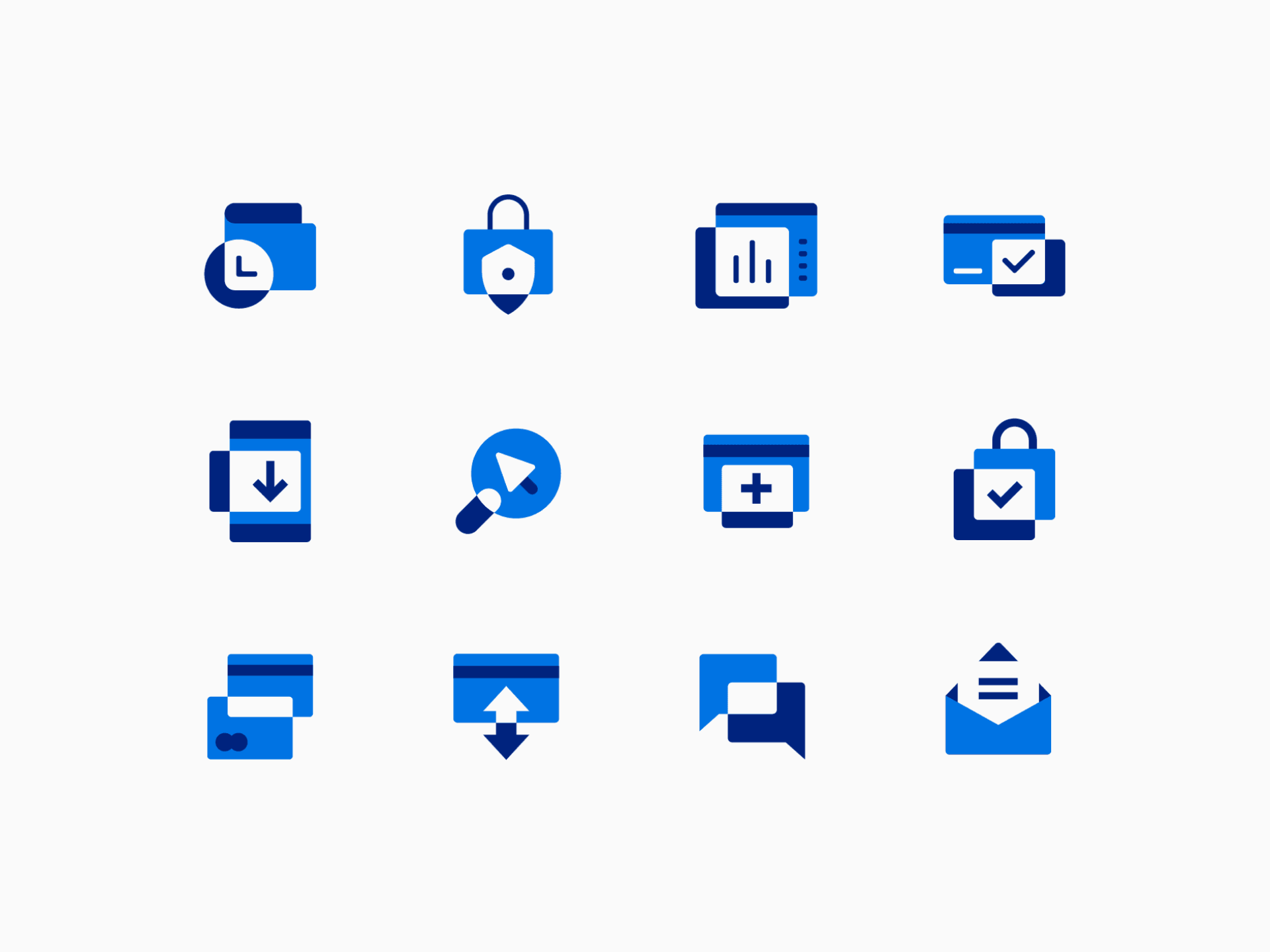
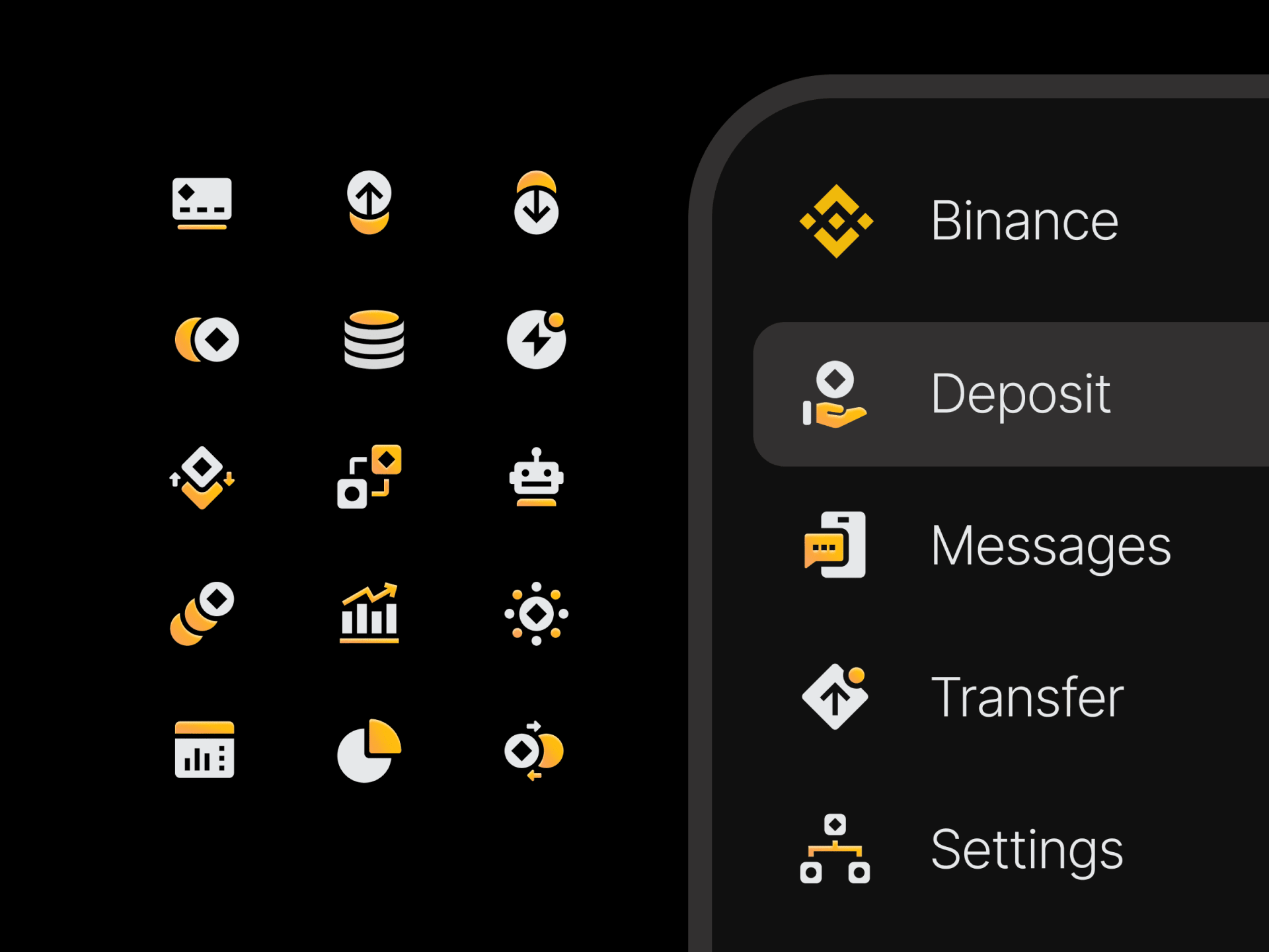
Collecting some of Dmitri Litvinov's work has made me realize how truly versatile he is, it's hard to believe that all these icon styles were designed by a single person. You can tell he approaches each project in a unique way, adapting to the virtues and formal characteristics of each brand to develop a set of icons that suits and reinforces the overall image. Not surprisingly, his clients include companies such as PayPal, Binance and Airtable.
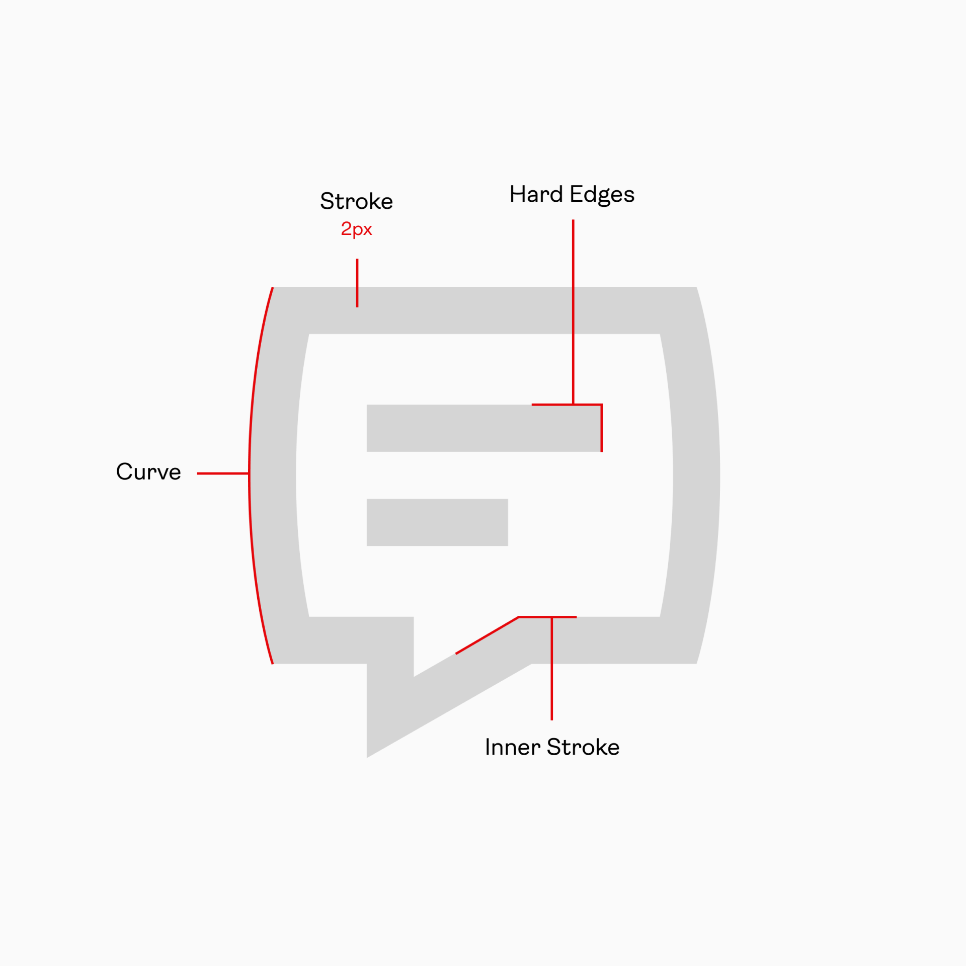
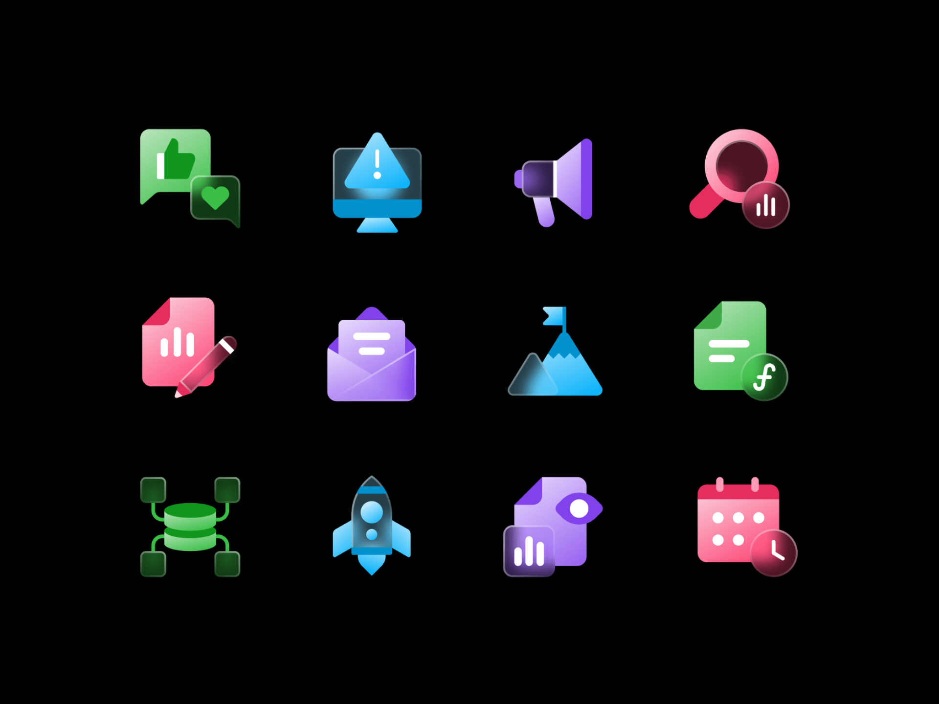
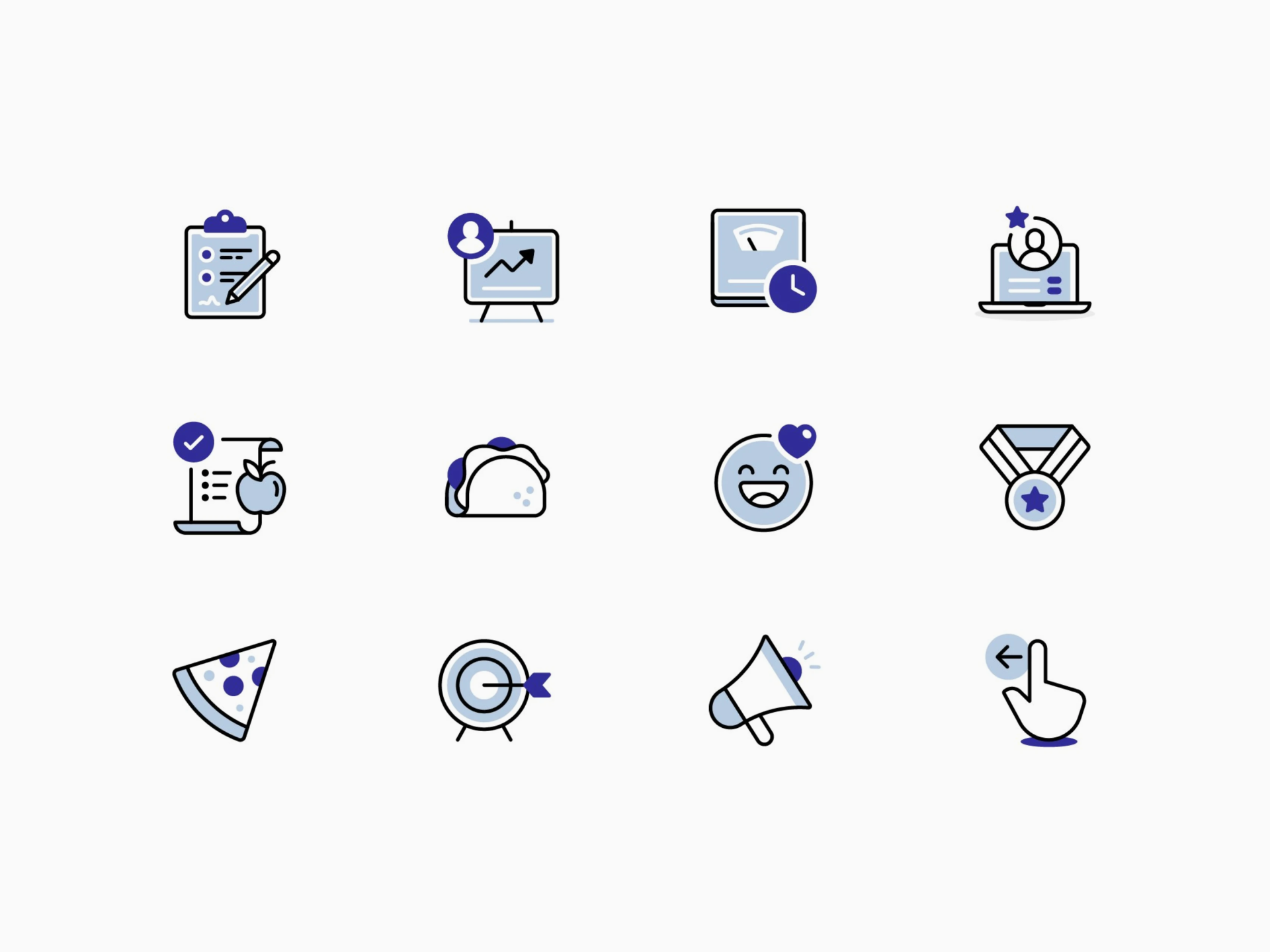

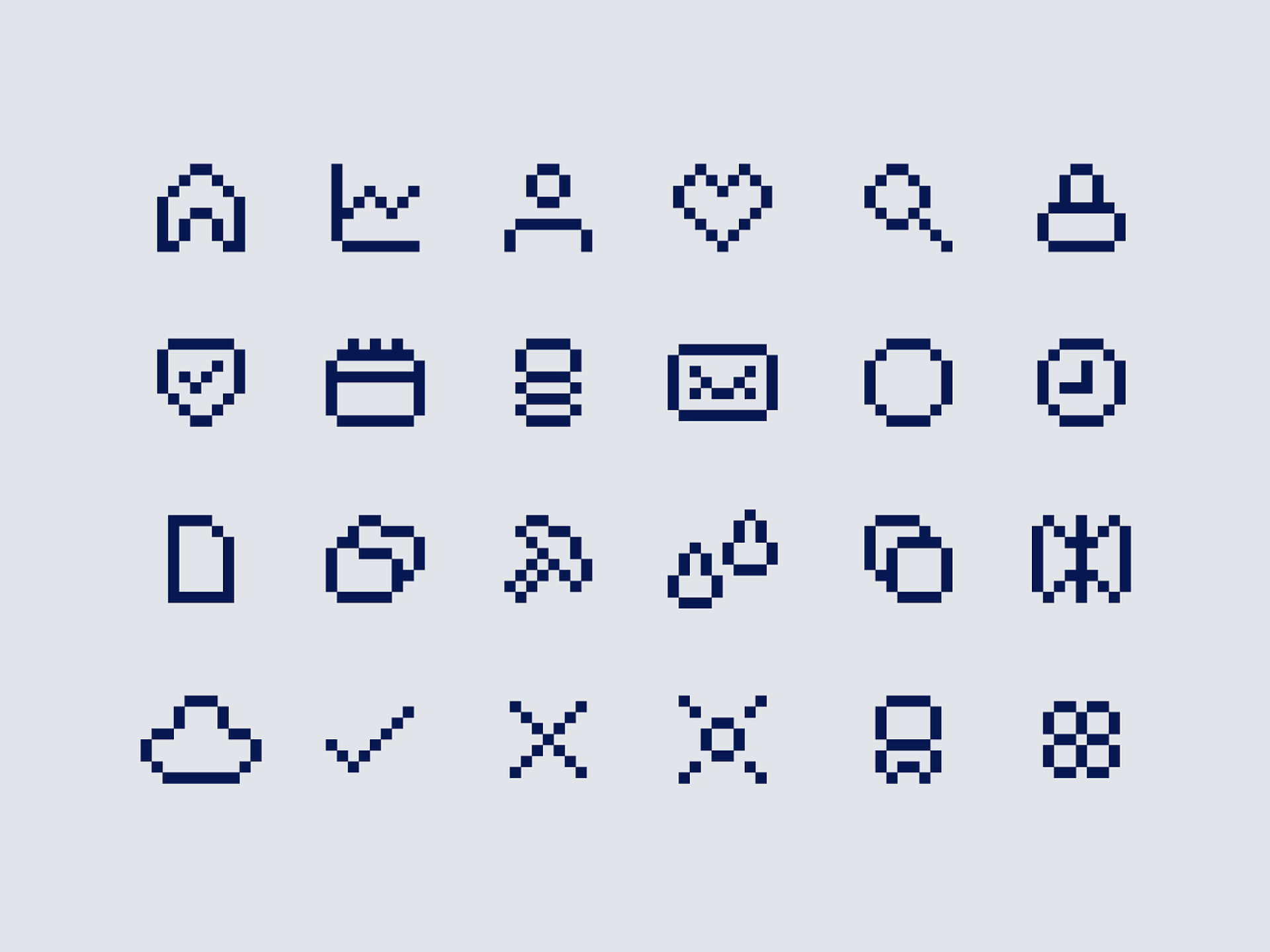
Kevin Moran is a fantastic illustrator who also knows how to translate his vector knowledge to the icon design field. But he doesn't limit himself to just that, he achieves completely unique and personal styles thanks to experimentation. Through this process he achieves completely diverse results that range from small and minimalist icons where he prioritizes legibility to 8-bit pixel art, where he often plays with abstraction as a visual claim.
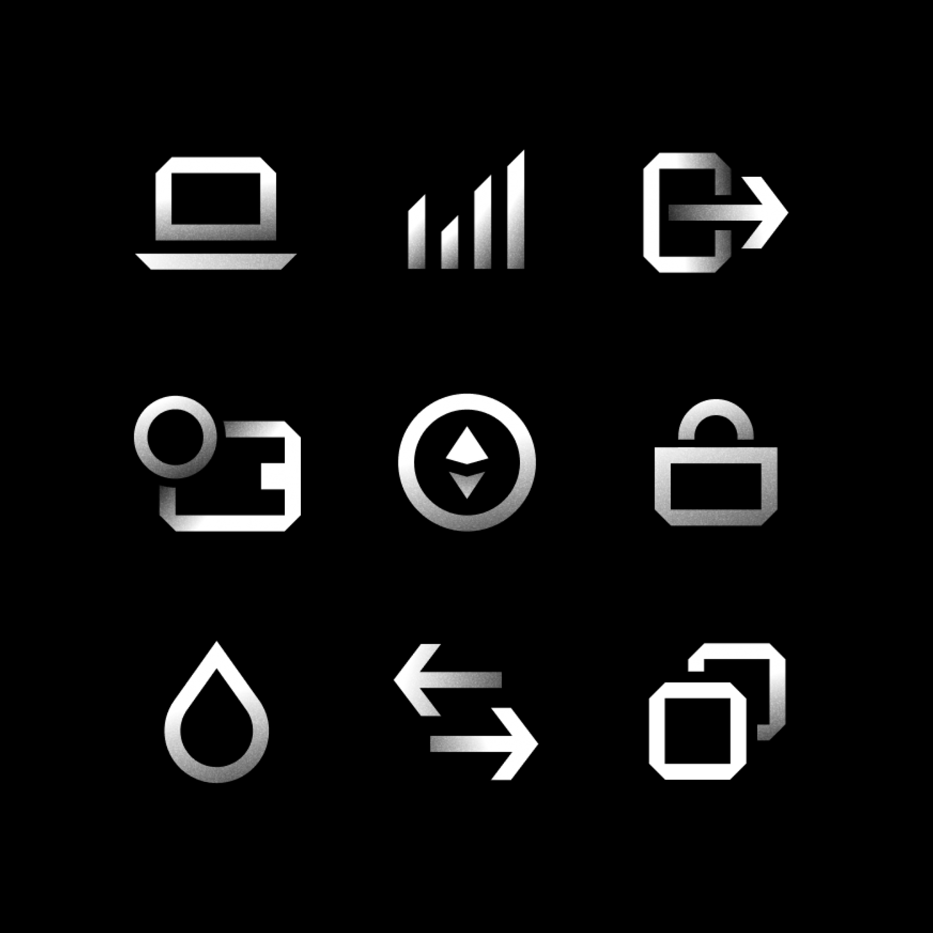
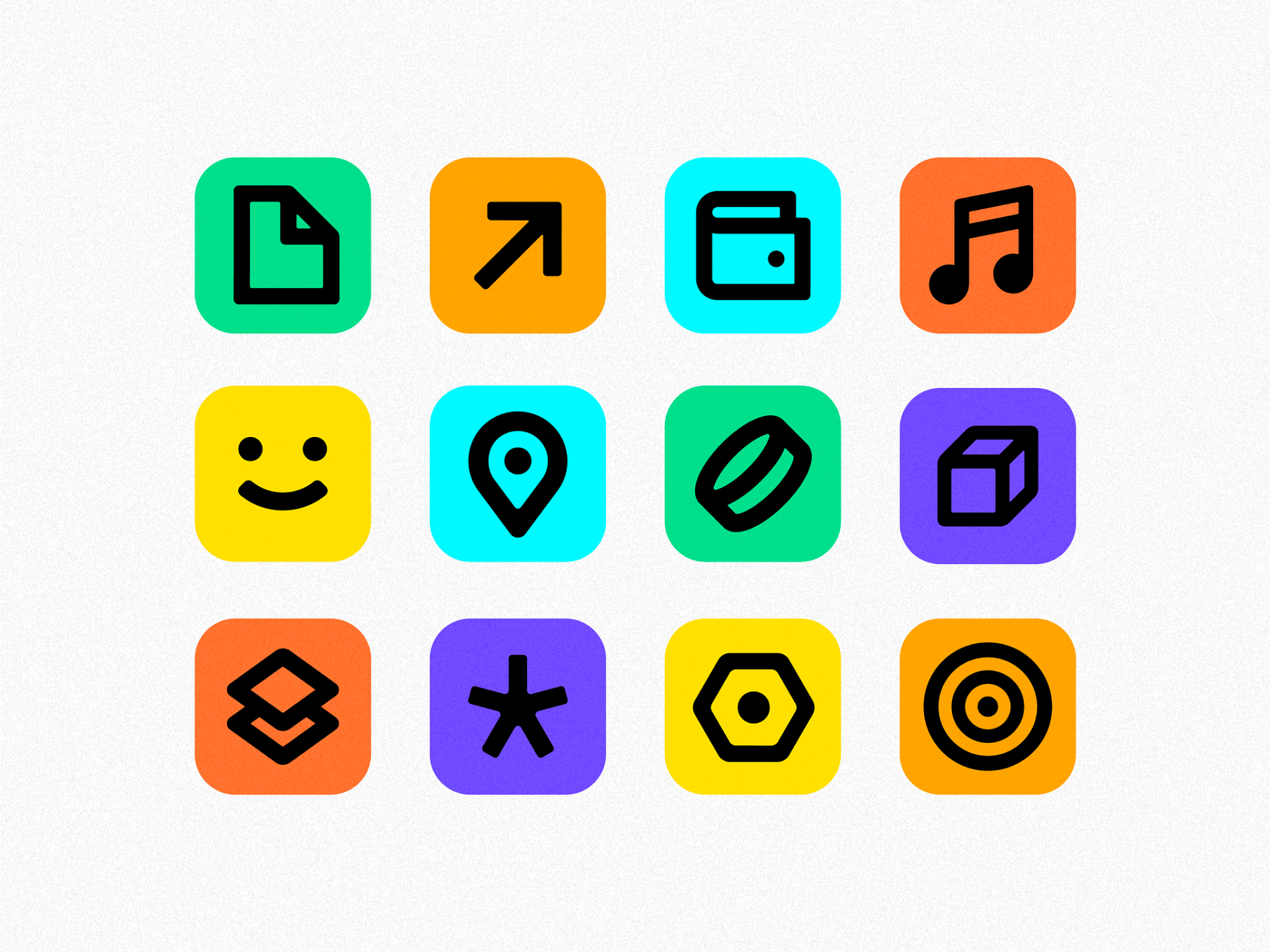



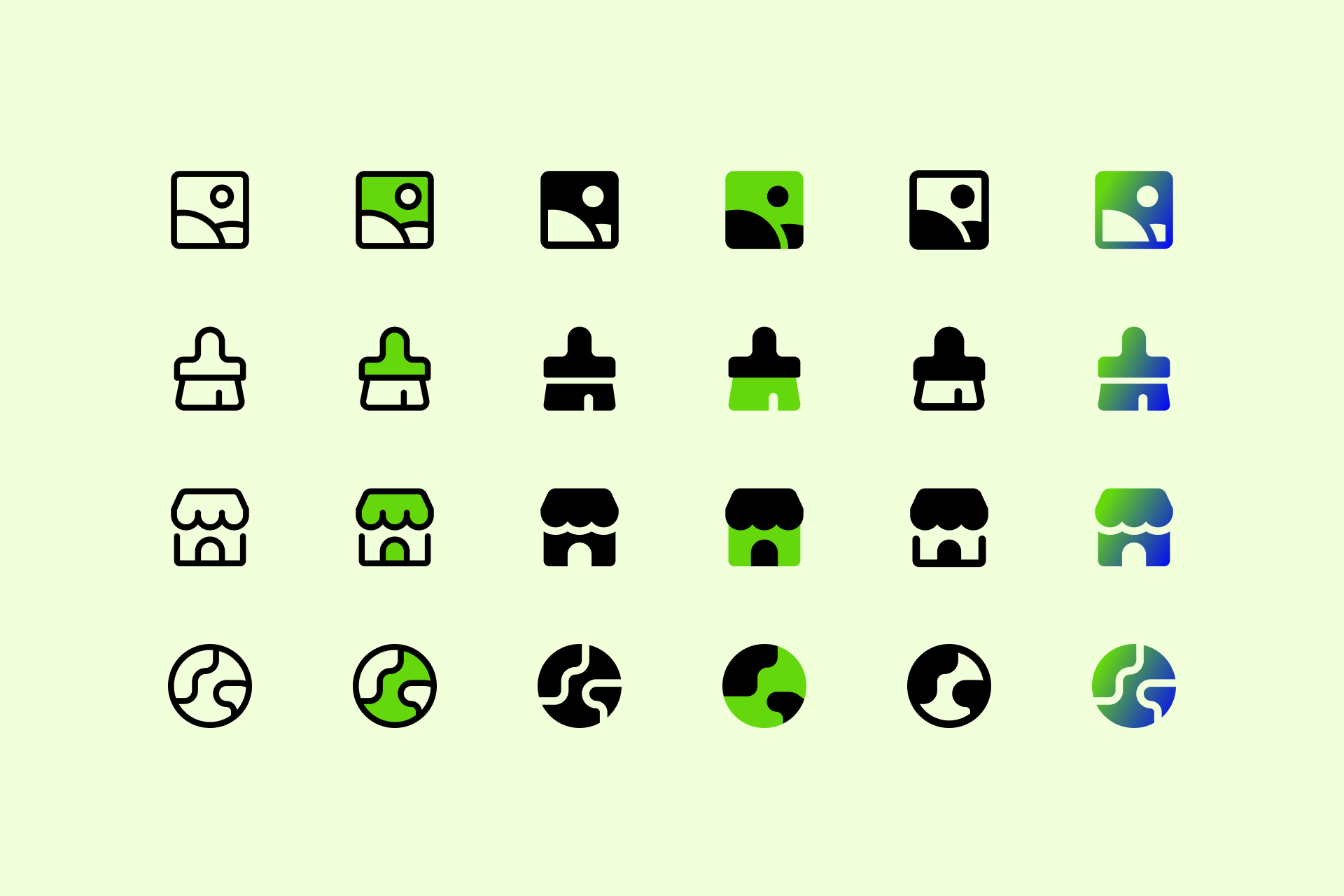
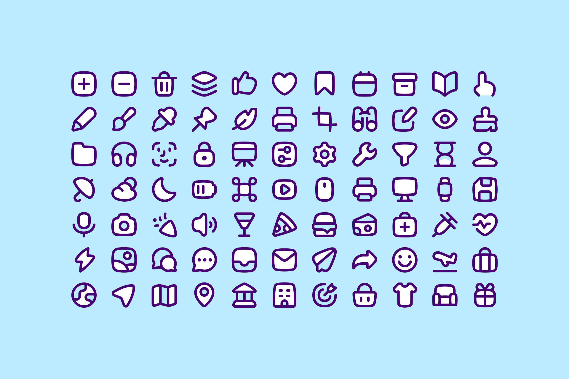
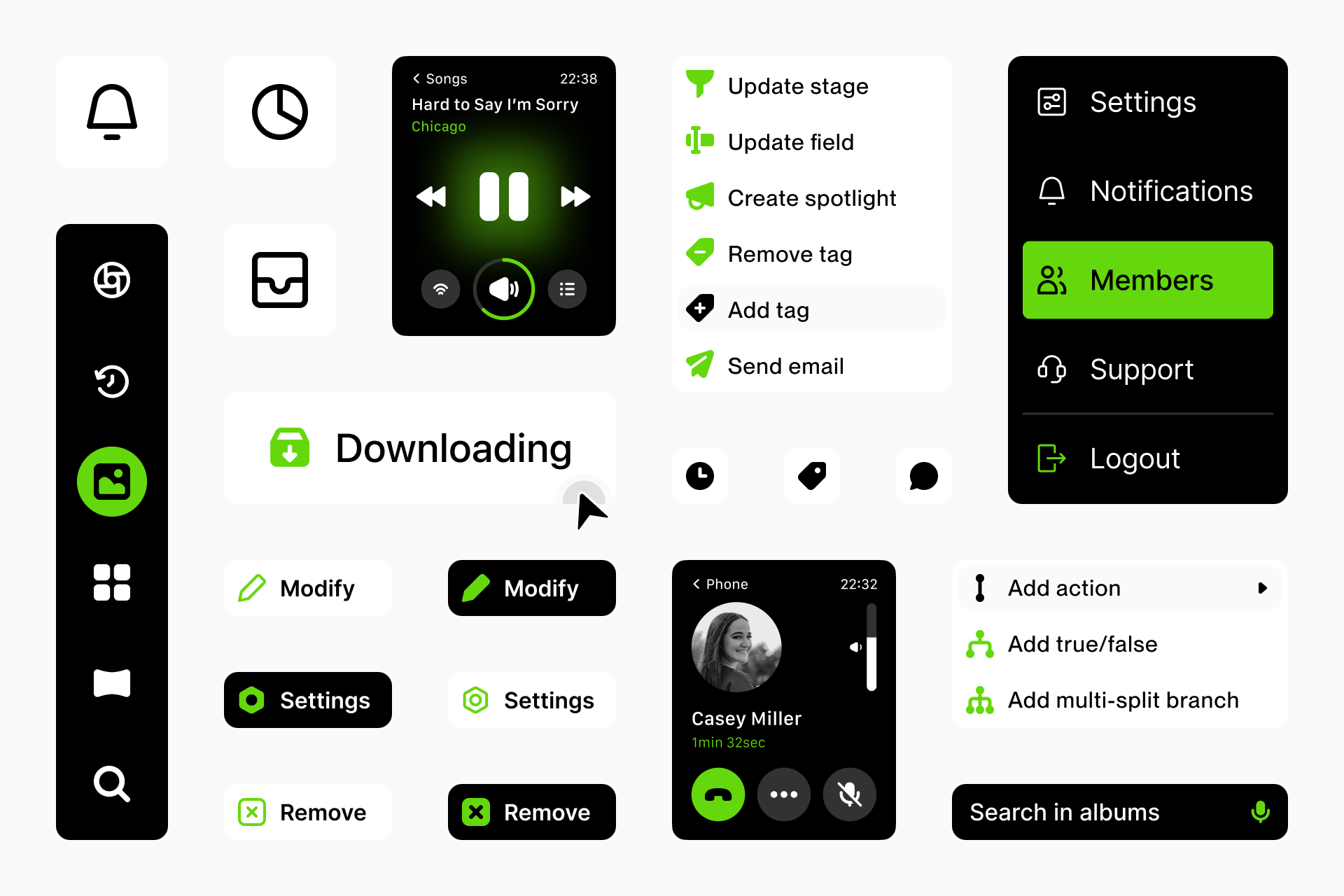
And, since they've learned from the best, we can't help but mention the Streamline design team. The Streamline library consists of hundreds of thousands of icons distributed in dozens of sets, each with a completely unique and consistent style. Their goal is to democratize icons and make accessible to all a large and diverse collection to suit the needs of any potential project. It's the best icon system for harmonious designs and faster workflow.
Other great icon designers
It's impossible to cover all icon designers, but we hope we've gathered at least the best ones in this list. If you think someone's missing, please let us know!
Dutchicon
Carlotta Govi
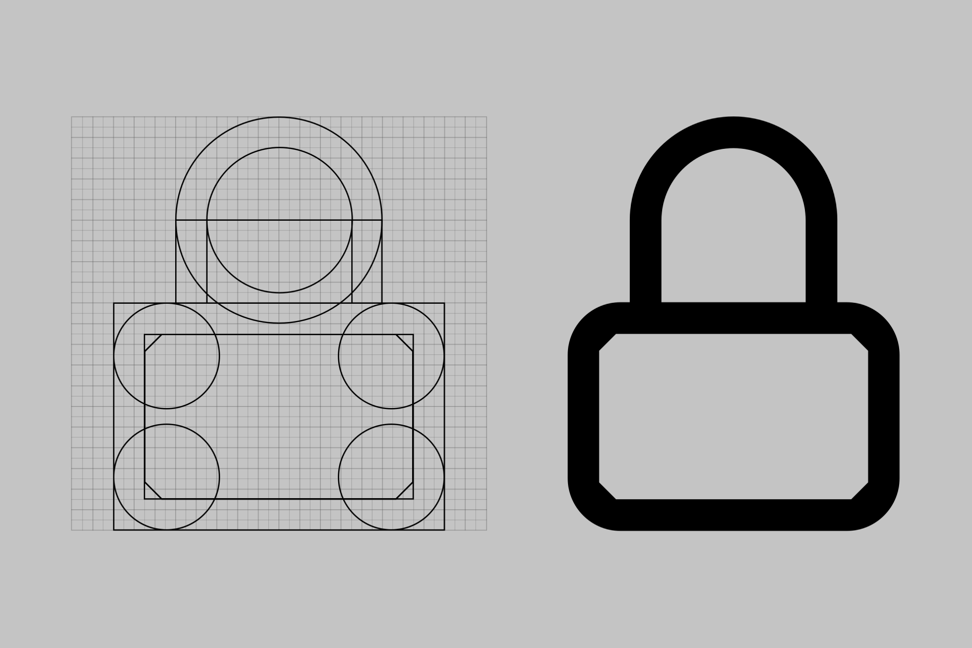
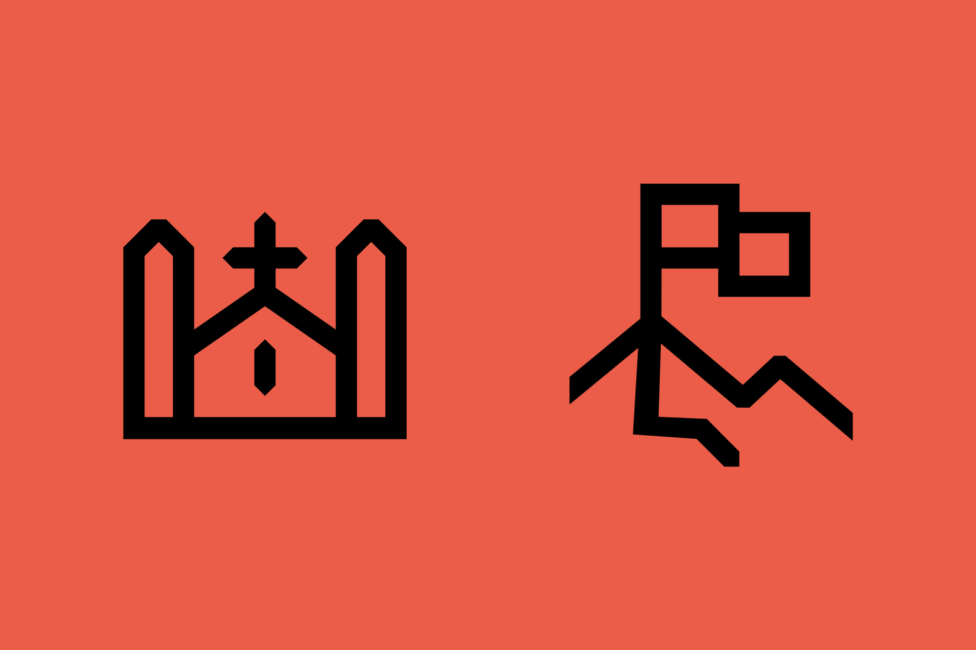
Wolf Bōese
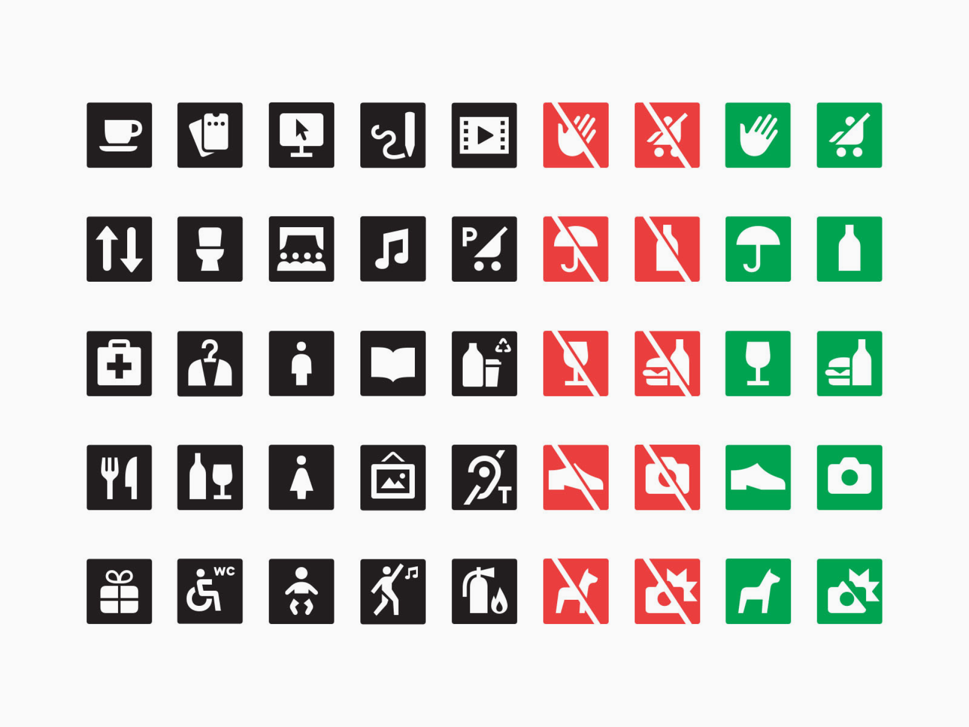
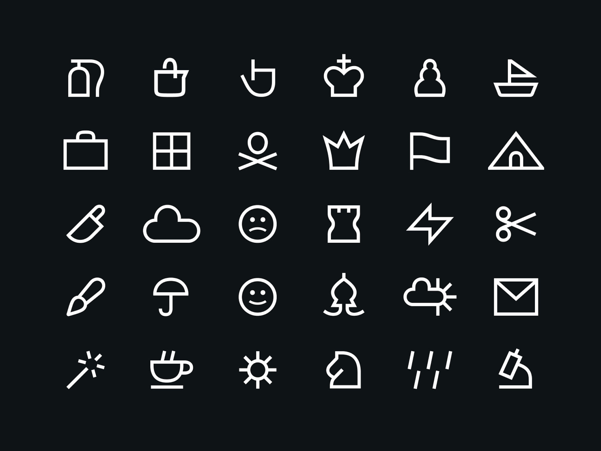
iconhaus
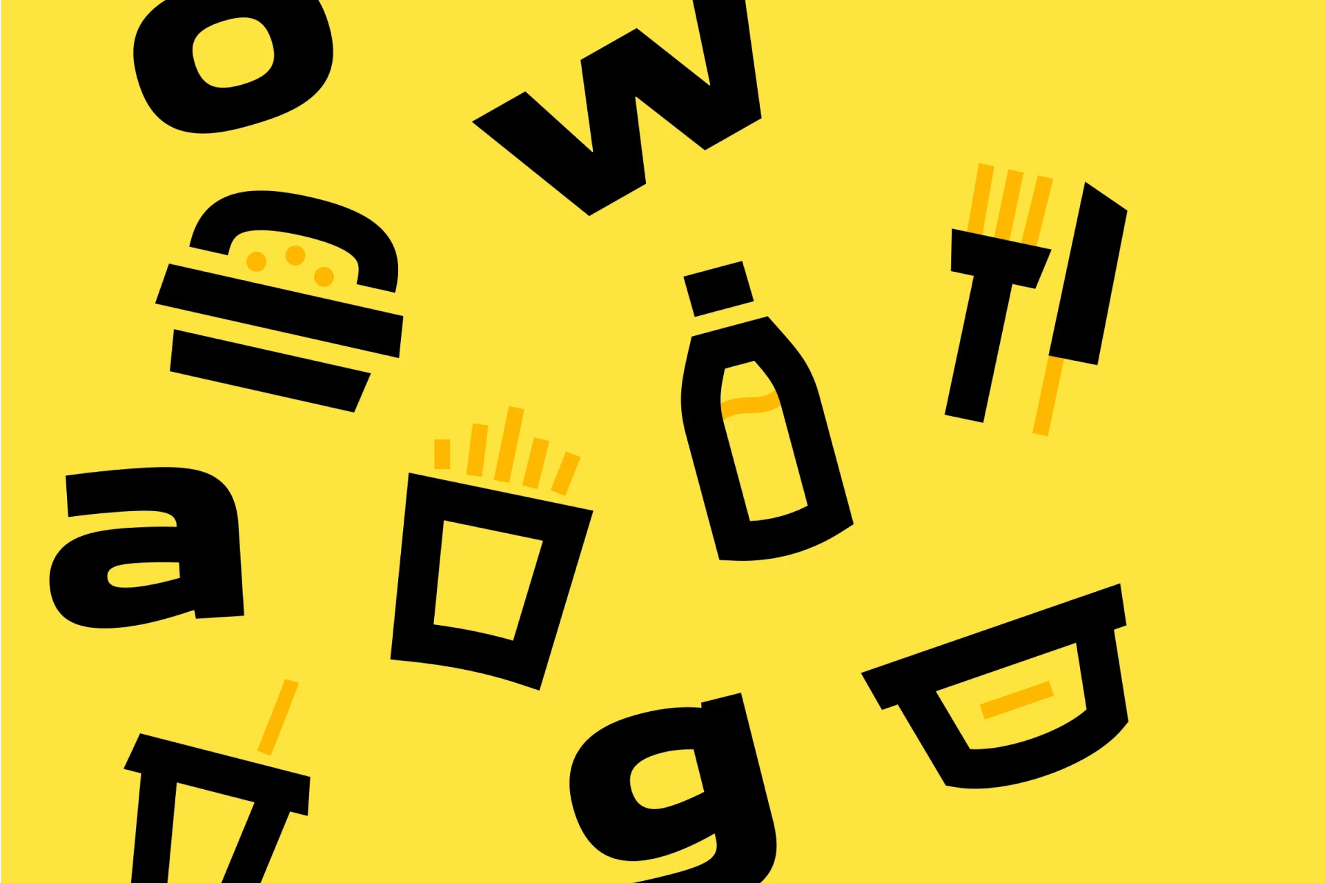

Jeff Wiggins
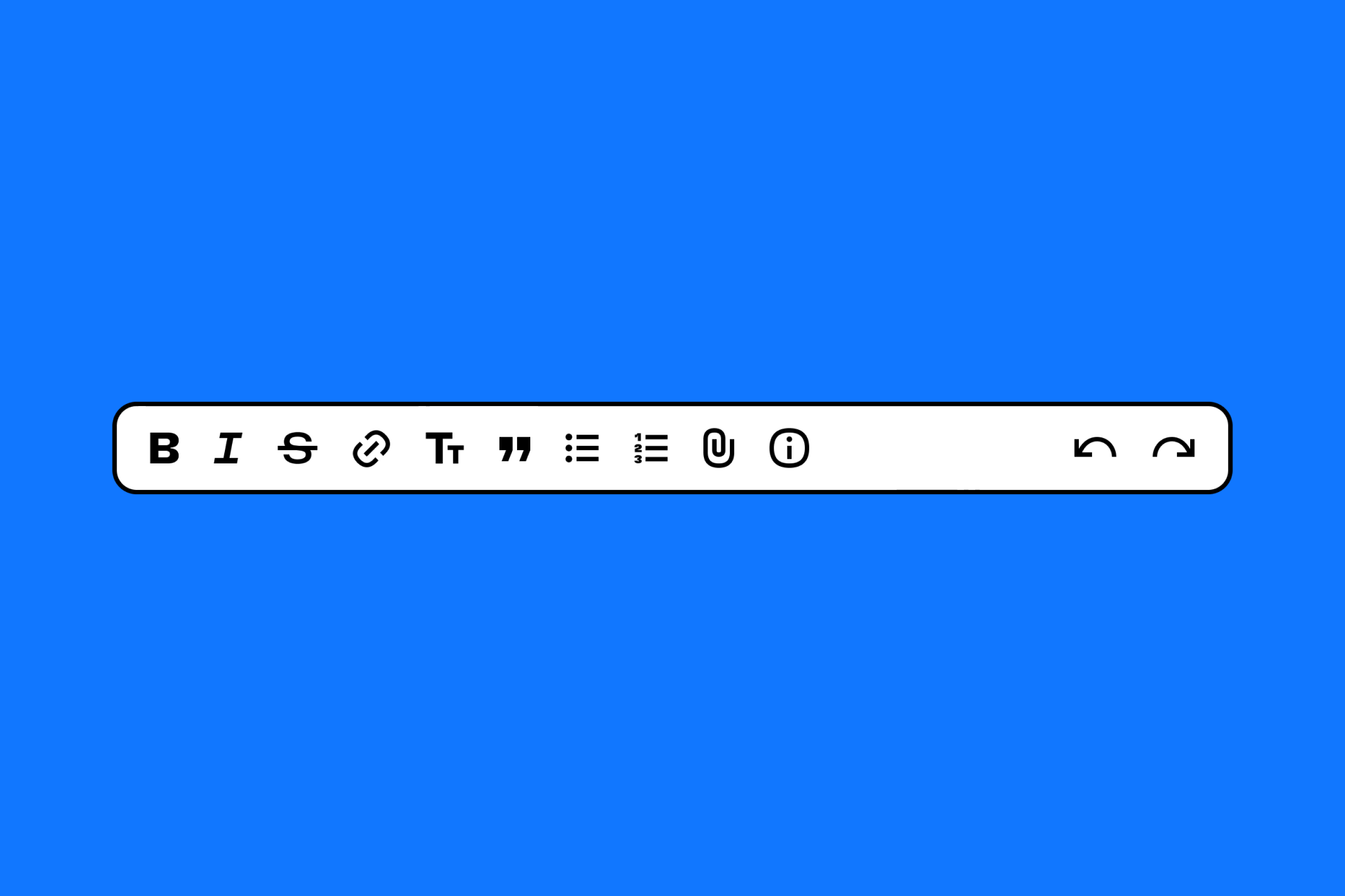

Noah Jacobus

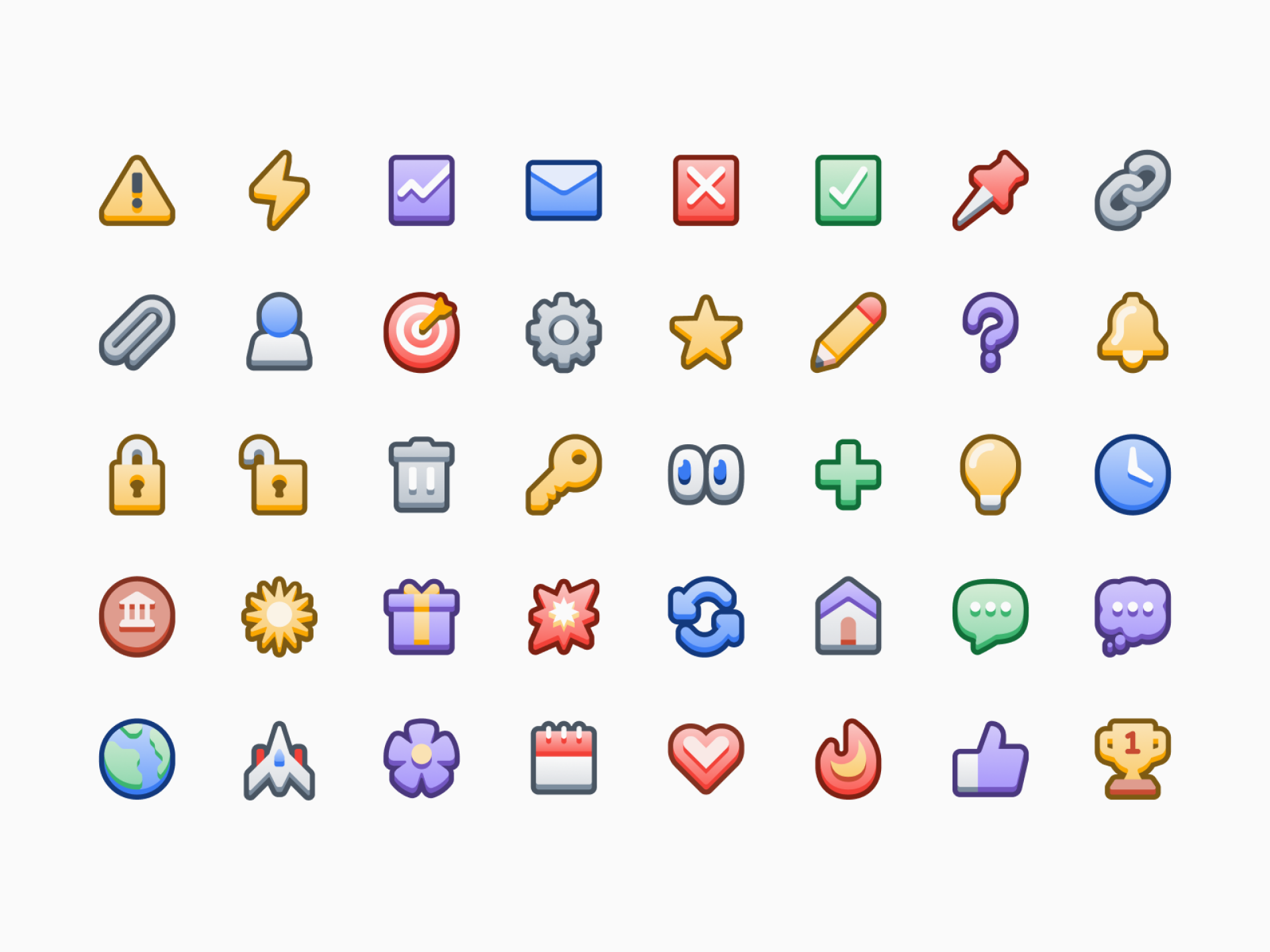
Helena Zhang
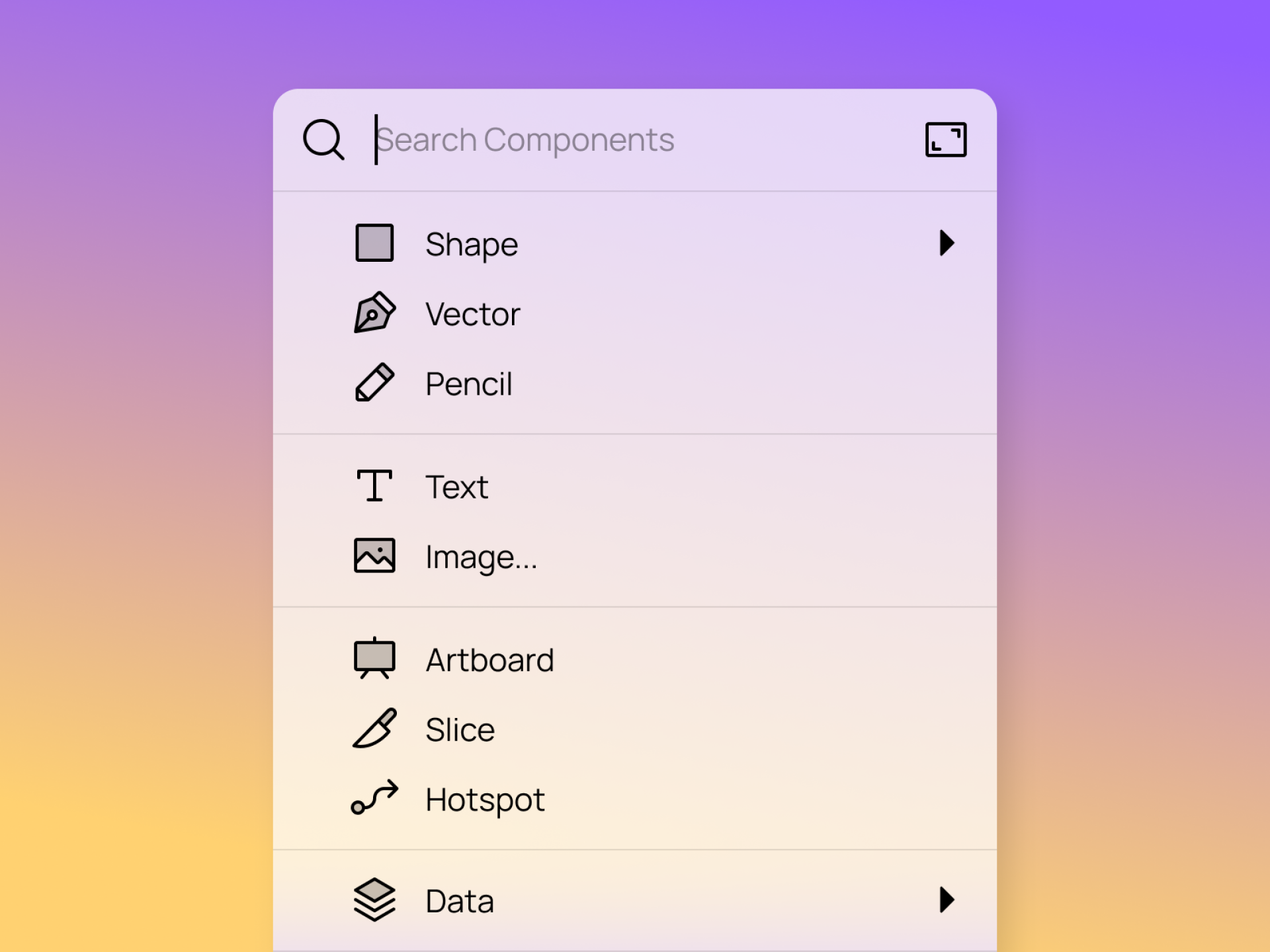

Martin David
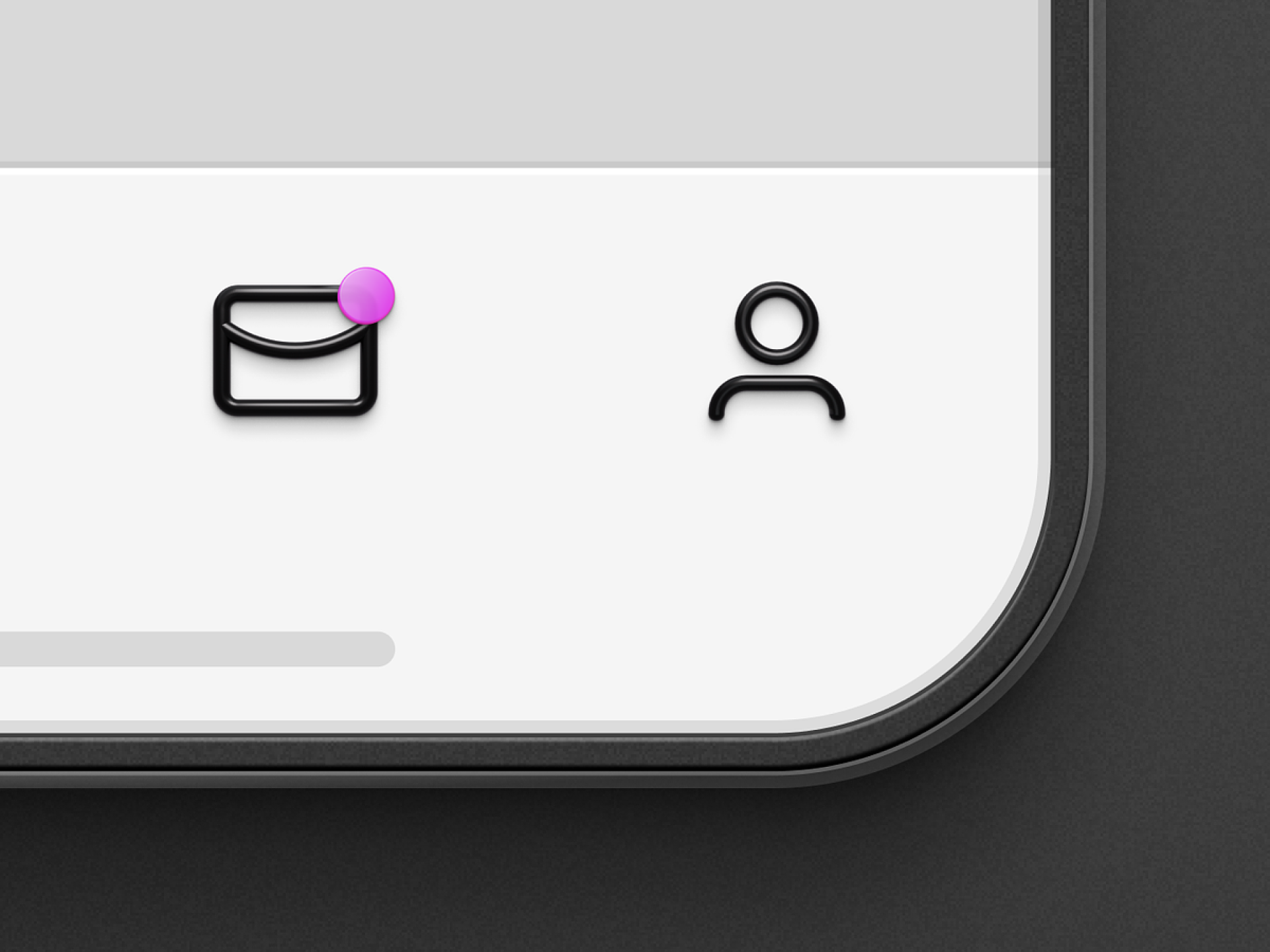

Parakeet

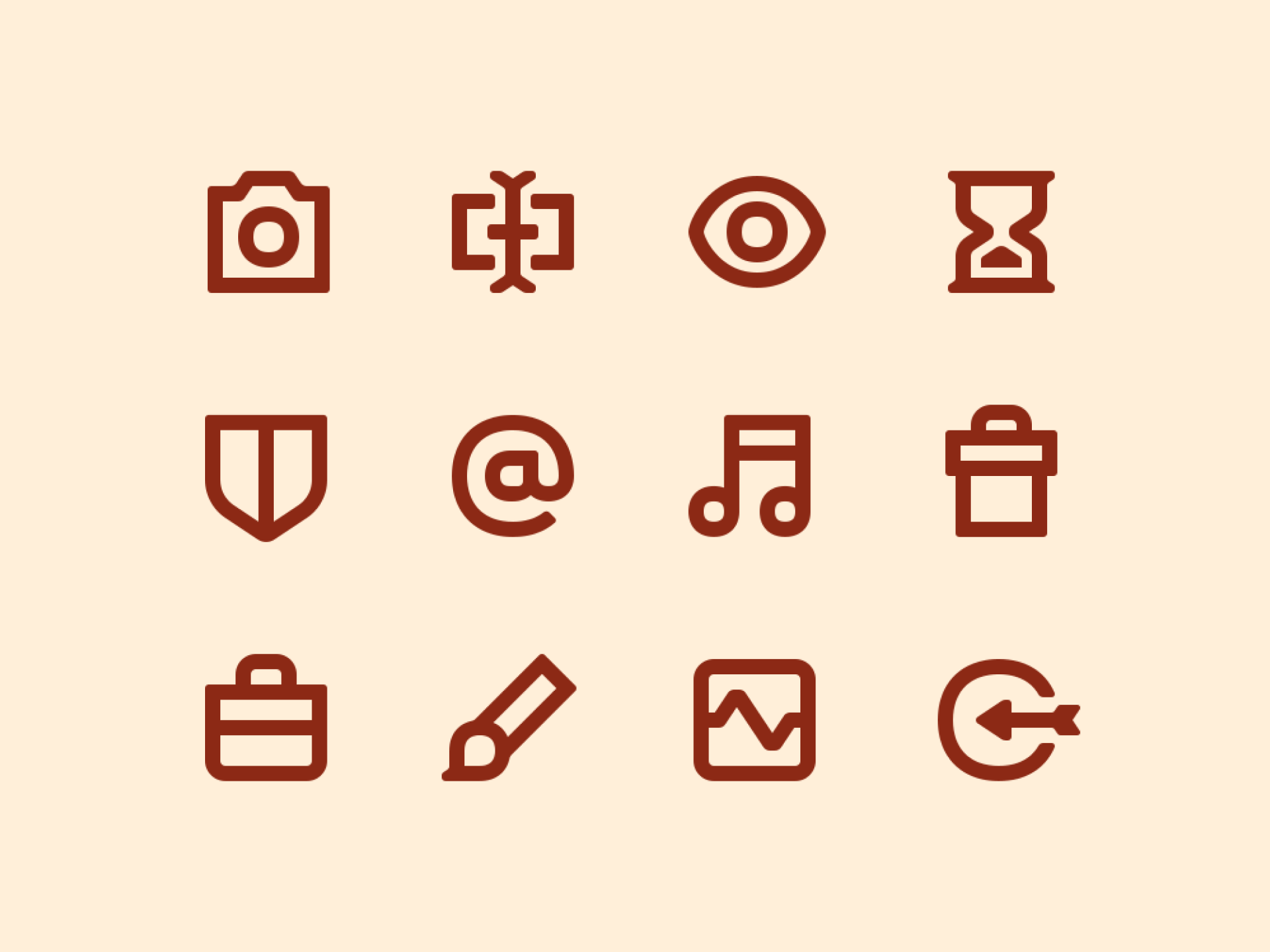
Dragan Sukurma
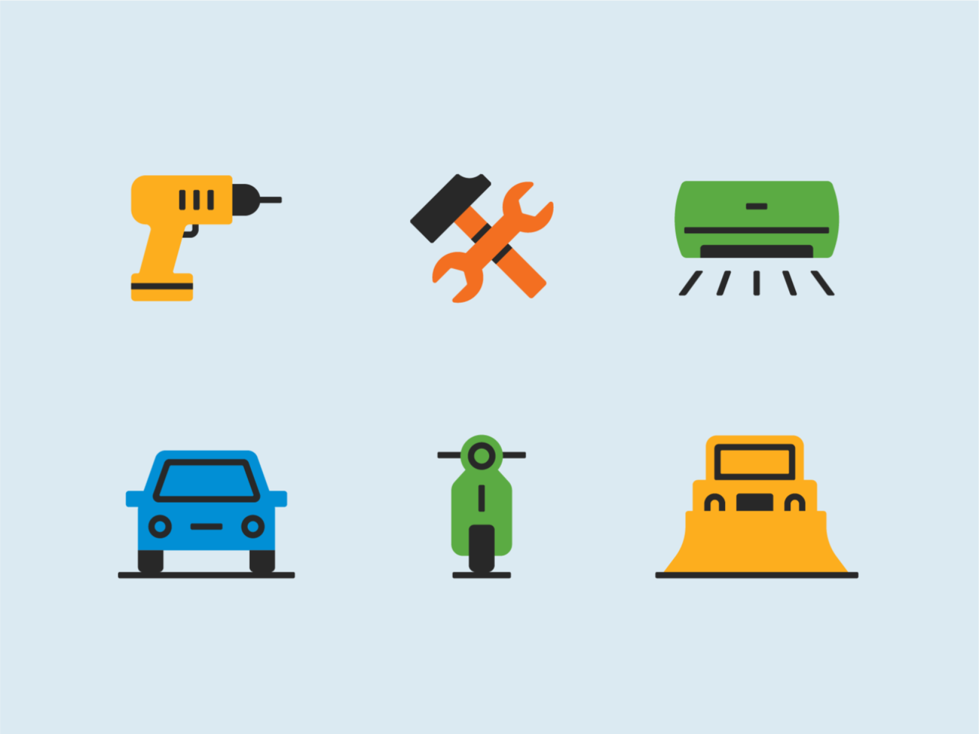

It may be difficult to put a face and name to iconographers as they don't have the same status as graphic designers dedicated to more generic or famous areas of creativity, but the truth is that it's a vindicable work.
Icon designers are responsible of guiding people in different environments (physical or digital) and, therefore, they do design in its purest form. They're not looking for visual spectacularity, they're problem solvers.
Feel free to reach out if you think someone's missing from our list :-)