The best free icon sets in 2025, picked by pro icon designers
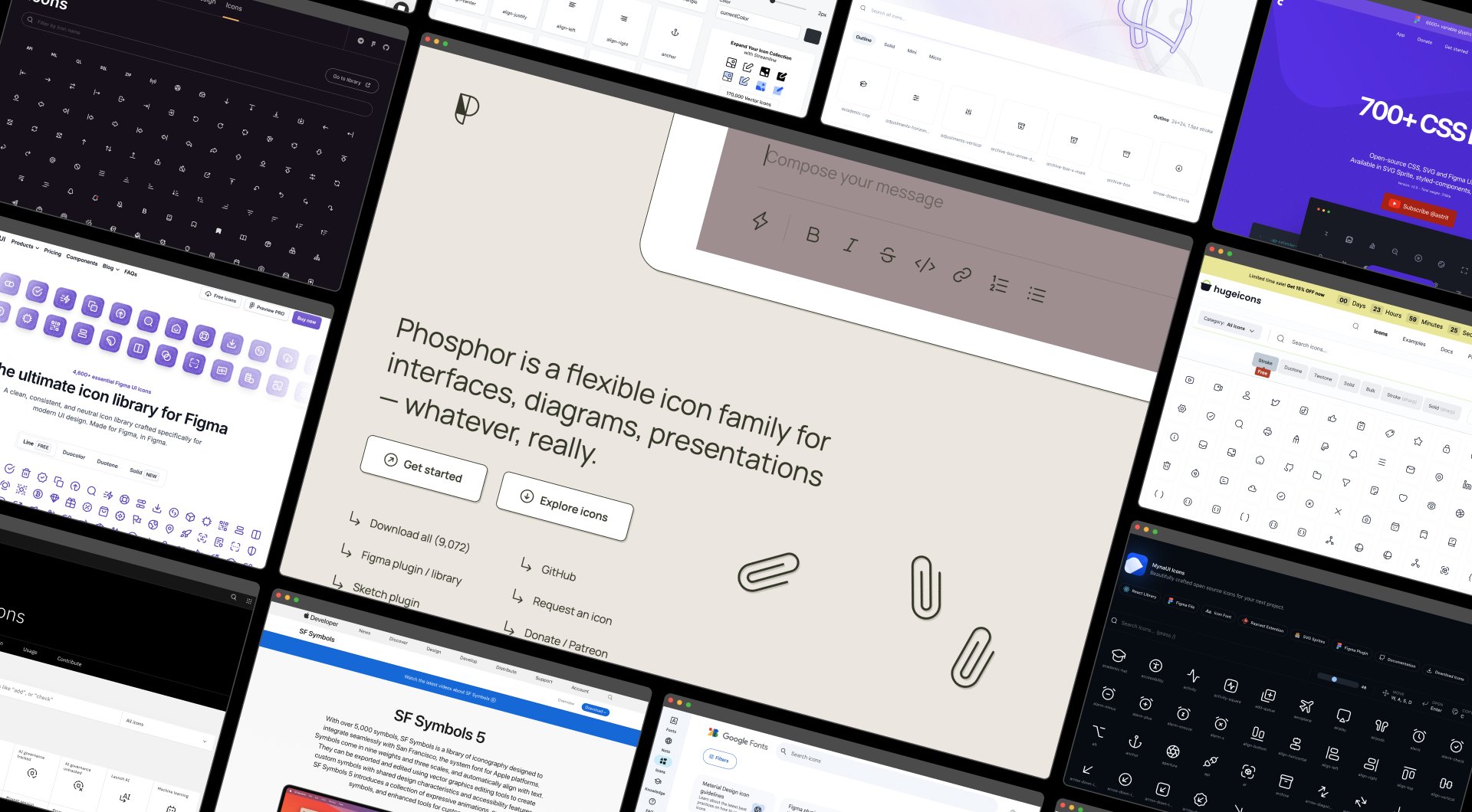
With 12 years of icon design experience, we actively monitor our competitors and the best free icon sets. Competition fuels our creativity, so we’ve compiled a list of our favorite free icons, most of which are added to our Streamline app for easy use and customization.
1. Streamline (17,918 icons)
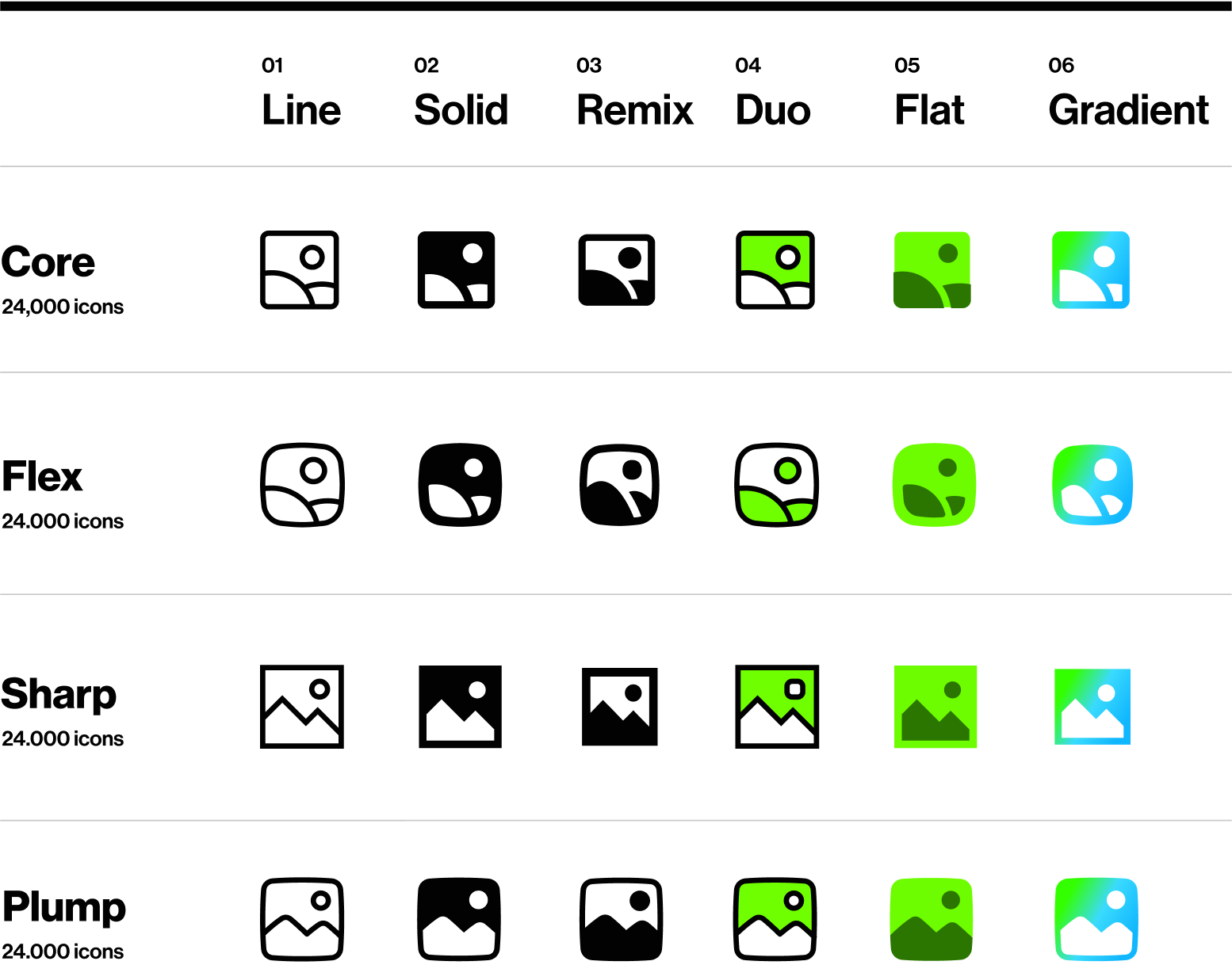
Streamline offers a versatile icon system for harmonious designs and faster workflow. Our collection includes meticulously crafted free sets, designed by a team of 8 icon designers with 12 years of experience. Access these free icon packs through our Streamline app, Figma plugin or Lucid plugin.
→ Core – The Helvetica of icons (8,000 icons). All the essential vector icons for user interfaces, based on a tiny 14px grid for maximum legibility.
→ Flex – Fluid icons (4,000 icons). A modern icon family with smooth curves, bringing fluidity and dynamism to your designs by rejecting traditional icon construction.
→ Sharp – Brutalist icons (4,000 icons). A geometric, high-tech icon set that adds a modern, bold, and classy touch to professional projects.
→ Plump – Friendly icons (4,000 icons). A set of chunky icons with a friendly, warm appearance and hand-drawn shapes, offering a distinctive, cartoon-inspired look.
Pros
‣ Perfectly legible icons
‣ Extensive variety with 12 sets and 26 styles
‣ Excellent customization, including variable stroke width
‣ Accessible via Figma plugin and full app with robust customization options
Cons
🟢 🟢 🟢 🟢 🟢 Consistency
🟢 🟢 🟢 🟢 🟢 Legibility
🟢 🟢 🟢 🟢 🟢 Set(s) size
🟢 🟢 🟢 🟢 ⚪️ Variety
2. Phosphor Icons (9,072 icons)
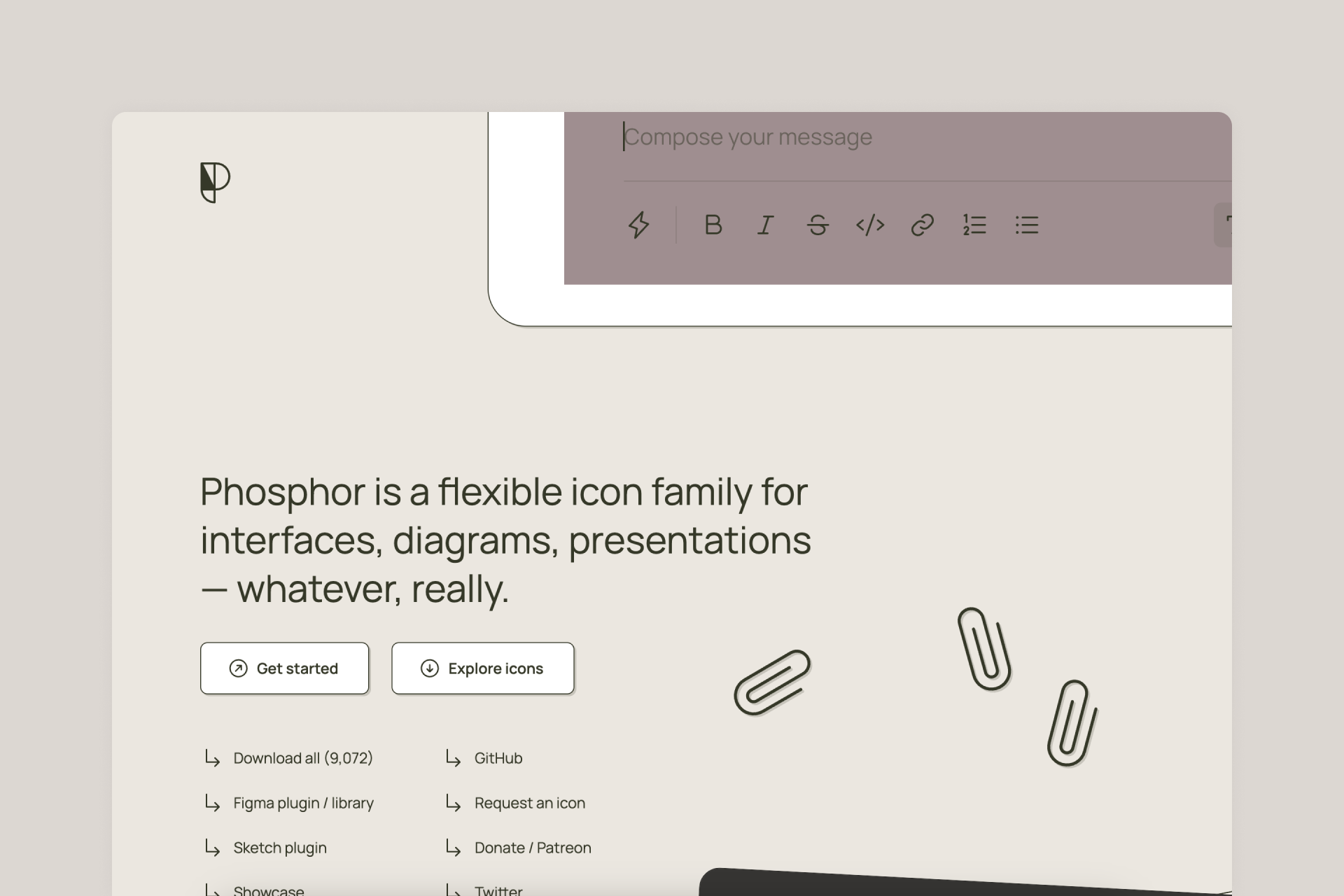
Phosphor Icons is a huge library designed by Helena Zhang and Tobias Fried, with over 9,000 icons across 6 different styles: Thin, Light, Regular, Bold, Fill and Duotone. Also accessible through Figma file, the creator's website and its own Figma plugin.
Pros
‣ Perfectly legible icons
‣ 6 different styles: Thin, Light, Regular, Bold, Fill and Duotone
‣ Great presentation
Cons
‣ Lacks customization for stroke width and path editing
🟢 🟢 🟢 🟢 🟢 Consistency
🟢 🟢 🟢 🟢 ⚪️ Legibility
🟢 🟢 🟢 🟢 ⚪️ Set(s) size
🔴 ⚪️ ⚪️ ⚪️ ⚪️ Variety
3. Feather (287 icons)
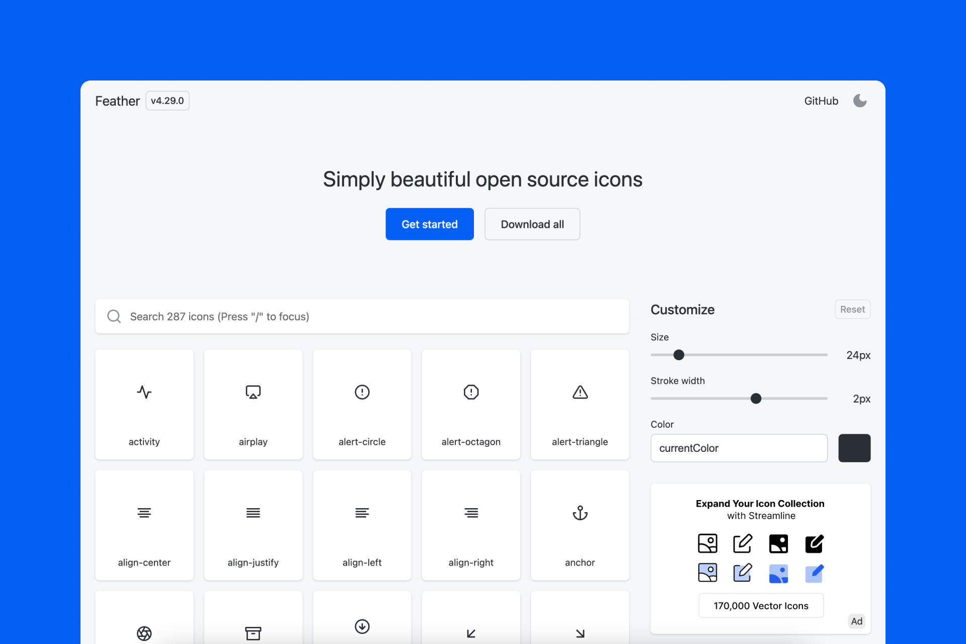
When launched, Feather was a shockingly good icon set, with a minimal style that inspired our own Streamline Regular set. Feather is a minimalistic and legible icon collection that focuses on the most essential icons for user interface. This library is beautifully presented and offers the possibility to customize the stroke width up to 3px in 0.5px intervals. Also available on the creator's website.
Pros
‣ Perfectly legible icons
‣ Adjustable stroke width
Cons
‣ It doesn't even have a Solid version
‣ Only 287 icons available
🟢 🟢 🟢 🟢 🟢 Consistency
🟢 🟢 🟢 🟢 🟢 Legibility
🟠 🟠 ⚪️ ⚪️ ⚪️ Set(s) size
🔴 ⚪️ ⚪️ ⚪️ ⚪️ Variety
4. Iconoir (1,583 icons)
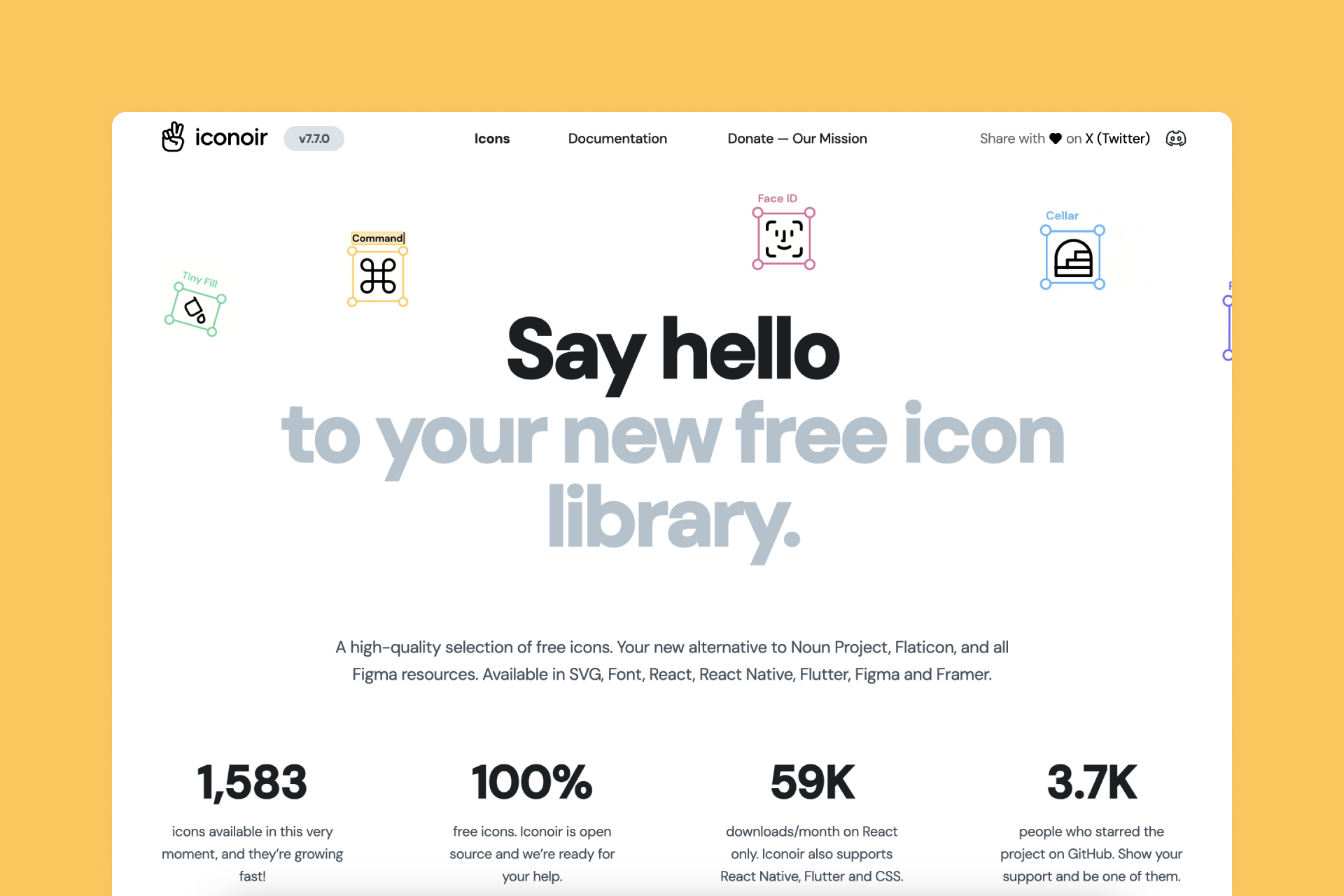
Iconoir offers a high-quality selection of free icons designed in a neutral style. Most of them are Outlined (with adjustable stroke width), while a few of them also have a Solid version. You can also access this library through a Figma file and on the creator's website.
Pros
‣ Pretty big library
‣ Adjustable stroke width
Cons
‣ Some icons have very small details that make them less legible
‣ Not all icons have a Solid version
🟢 🟢 🟢 🟢 ⚪️ Consistency
🟢 🟢 🟢 ⚪️ ⚪️ Legibility
🟢 🟢 🟢 🟢 ⚪️ Set(s) size
🔴 ⚪️ ⚪️ ⚪️ ⚪️ Variety
5. Remix Icons (2,850 icons)
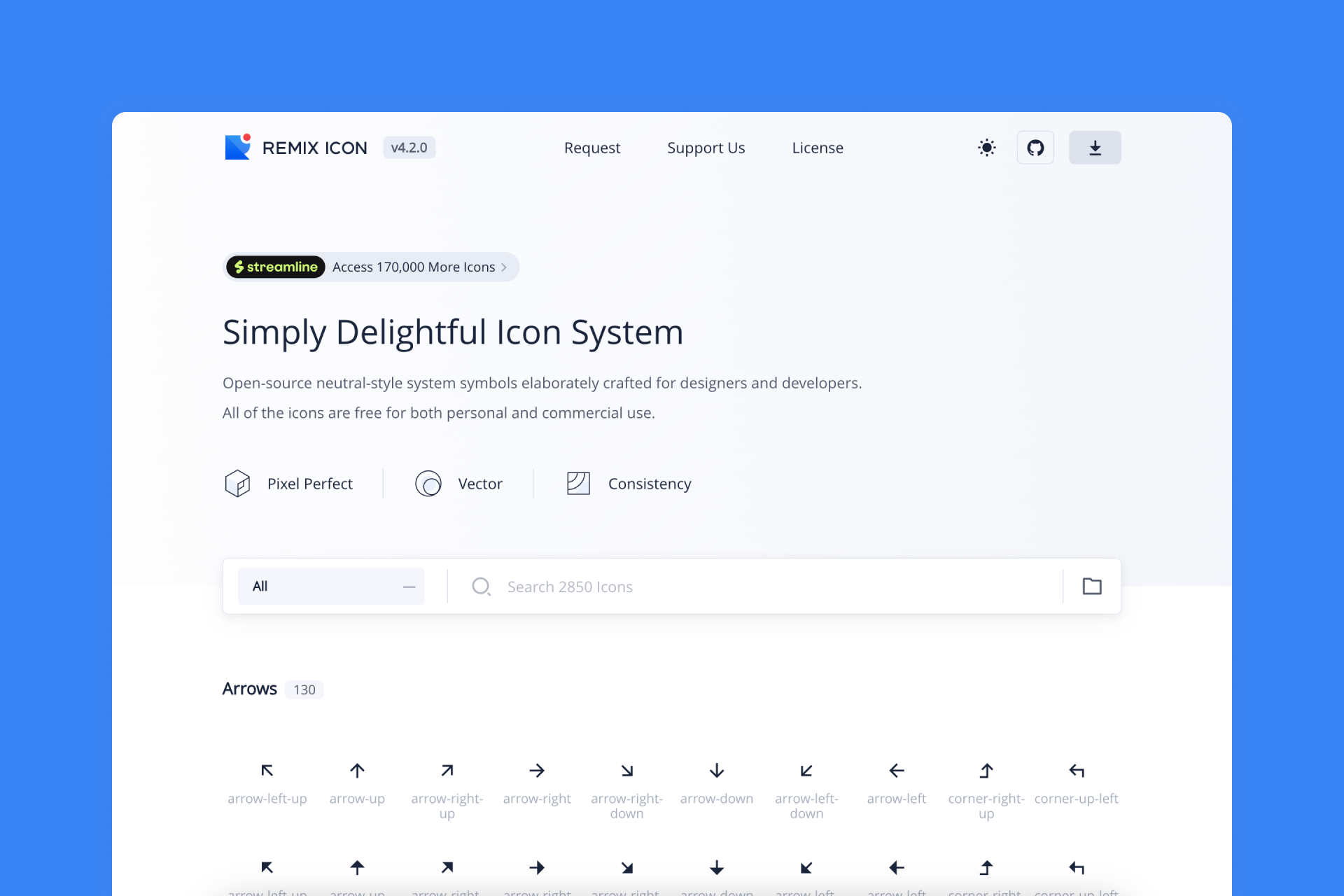
One of our favorites! Remix is a versatile collection of open source icons with a neutral and timeless look, meticulously designed for designers and developers. All these icons are presented in two different styles: Line and Solid, both perfectly consistent. The web app is also very well done.
Pros
‣ Pretty big library
‣ Adjustable stroke width
Cons
‣ The Fill version doesn’t always look good
🟢 🟢 🟢 🟢 ⚪️ Consistency
🟢 🟢 🟢 ⚪️ ⚪️ Legibility
🟢 🟢 🟢 🟢 ⚪️Set(s) size
🔴 ⚪️ ⚪️ ⚪️ ⚪️ Variety
6. IBM Icons (597 icons)
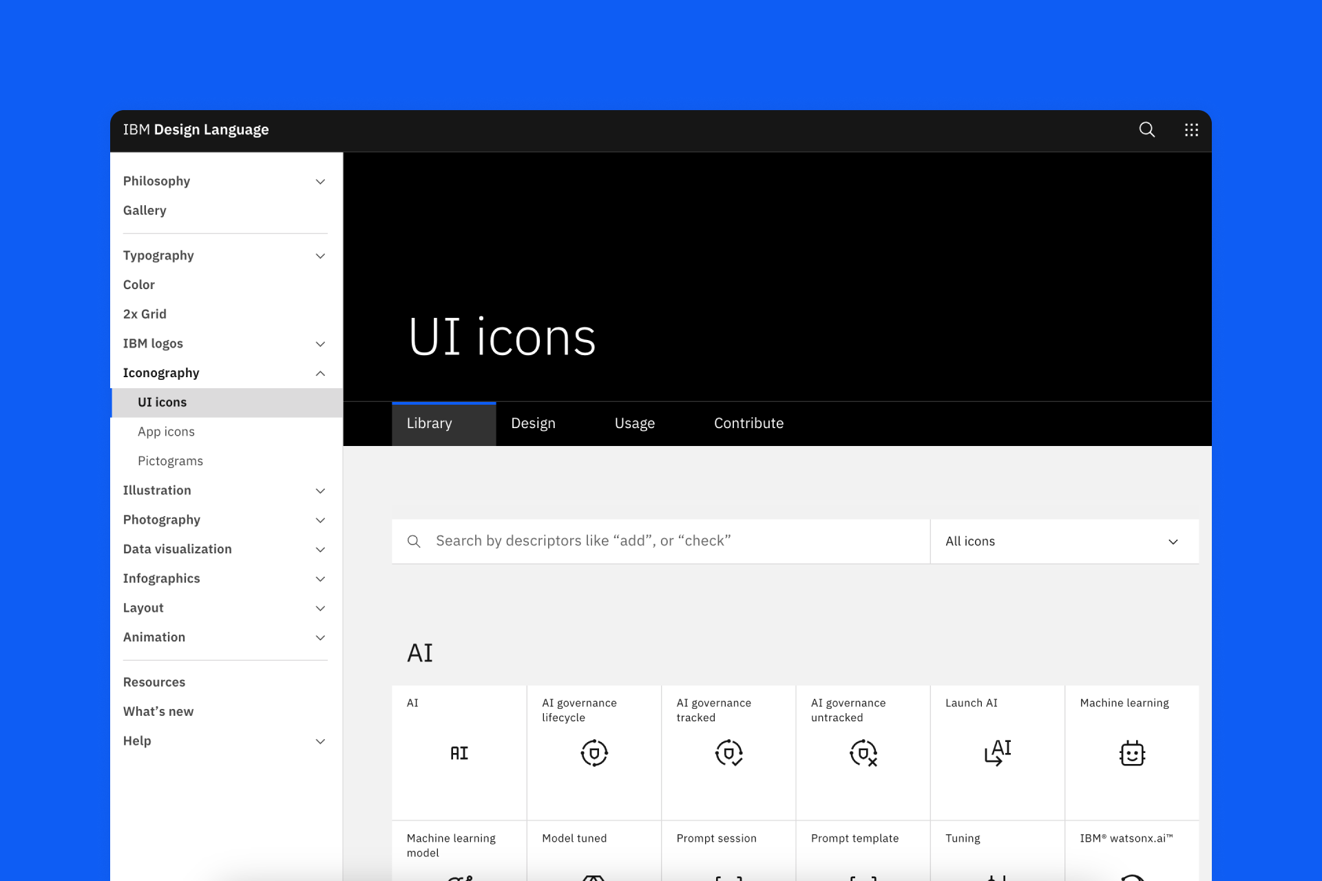
IBM's UI icon library is based on their Plex typeface, resulting in an incredibly legible set that works particularly well at small sizes. It looks a bit more unique than the usual line icon set, but it's still perfectly suitable for any project. You can also find the icons on the creator's website.
Pros
‣ Perfectly legible icons
‣ Pretty big library
‣ Great construction guidelines
Cons
‣ Some important icons seem to be missing
‣ Not all icons have a Solid version
‣ Less than 600 icons available
🟢 🟢 🟢 🟢 ⚪ Consistency
🟢 🟢 🟢 🟢 ⚪️ Legibility
🟢 🟢 🟢 🟢 ⚪️ Set(s) size
🔴 ⚪️ ⚪️ ⚪️ ⚪️ Variety
7. Untitled UI (1,172 icons)
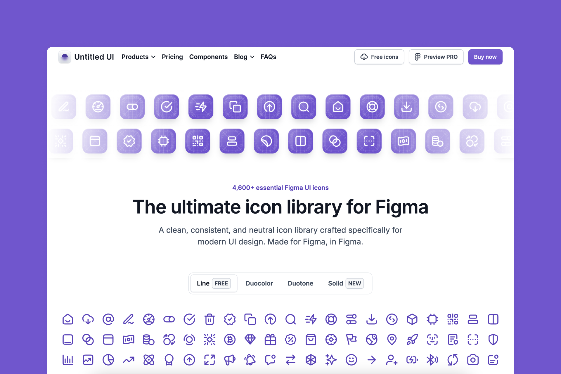
Made by a designer renowned for the quality of his Figma UI kits, it's a neutral and harmonious icon set with four different styles: Line, Duocolor, Duotone and Solid. You can access the complete Line icon library for free (also in Figma), with 1,172 icons covering all essential UI needs.
Pros
‣ Perfectly legible icons
‣ Pretty big library
Cons
‣ Only the Line version is free
‣ Rarely expanded or improved
🟢 🟢 🟢 🟢 ⚪️ Consistency
🟢 🟢 🟢 🟢 ⚪️ Legibility
🟢 🟢 🟢 🟢 ⚪️ Set(s) size
🔴 ⚪️ ⚪️ ⚪️ ⚪️ Variety
8. SF Symbols (5,000+ icons)
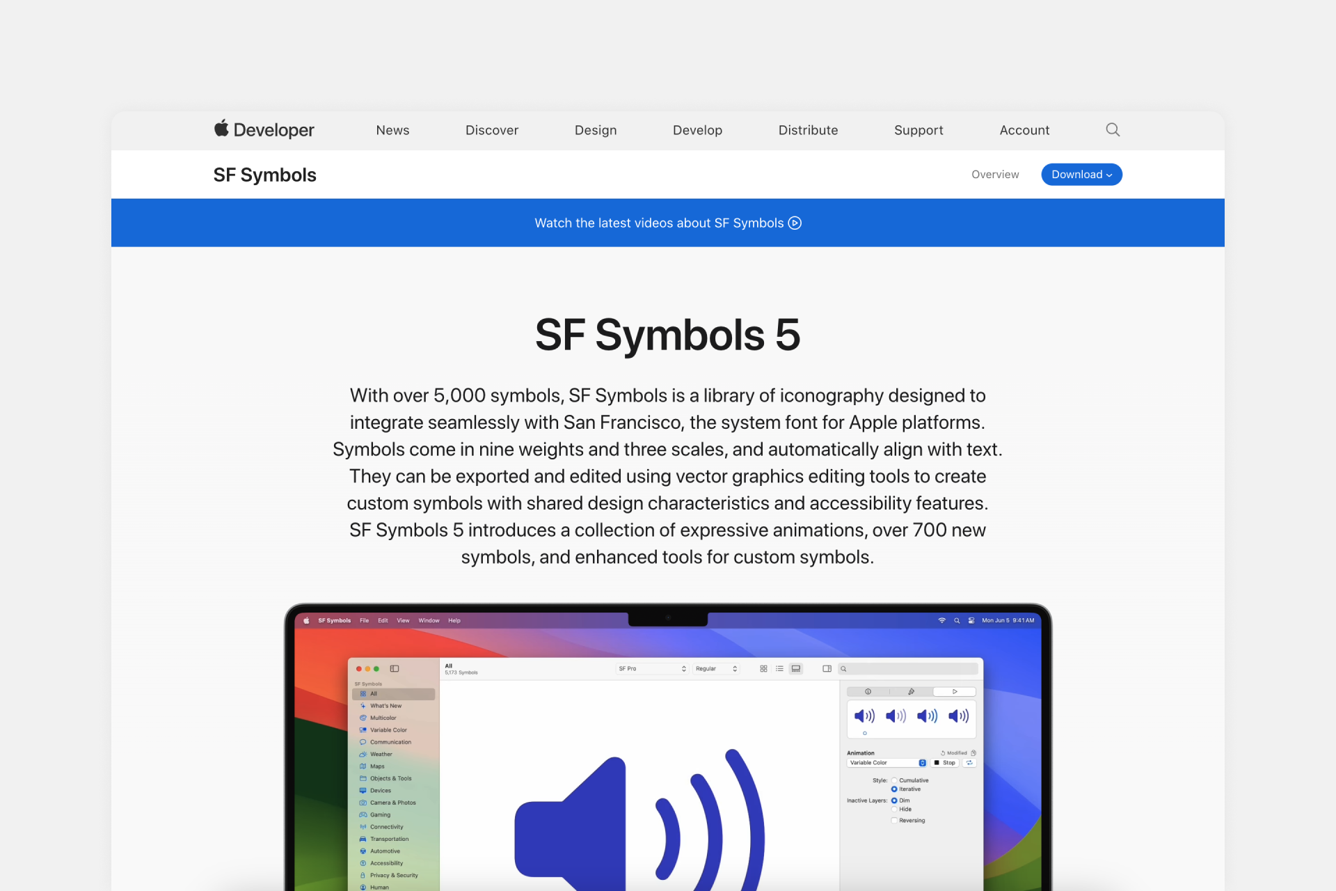
SF Symbols is an icon library designed to integrate seamlessly with San Francisco, Apple's system font. These icons are available in nine weights (from Ultralight to Black) and are easily customizable, including some basic animation options.
Pros
‣ Fantastic customization options
‣ It also offers animated icons
Cons
‣ The design quality of the icons is sometimes inconsistent.
⚠️ Usage is heavily restricted. You can use them only for Apple native apps on mobile or desktop.
🟠 🟠 ⚪ ⚪ ⚪ Consistency
🟢 🟢 🟢 ⚪ ⚪️ Legibility
🟢 🟢 🟢 🟢 ⚪️ Set(s) size
🔴 ⚪️ ⚪️ ⚪️ ⚪️ Variety
9. Material Symbols (10,000+ icons)
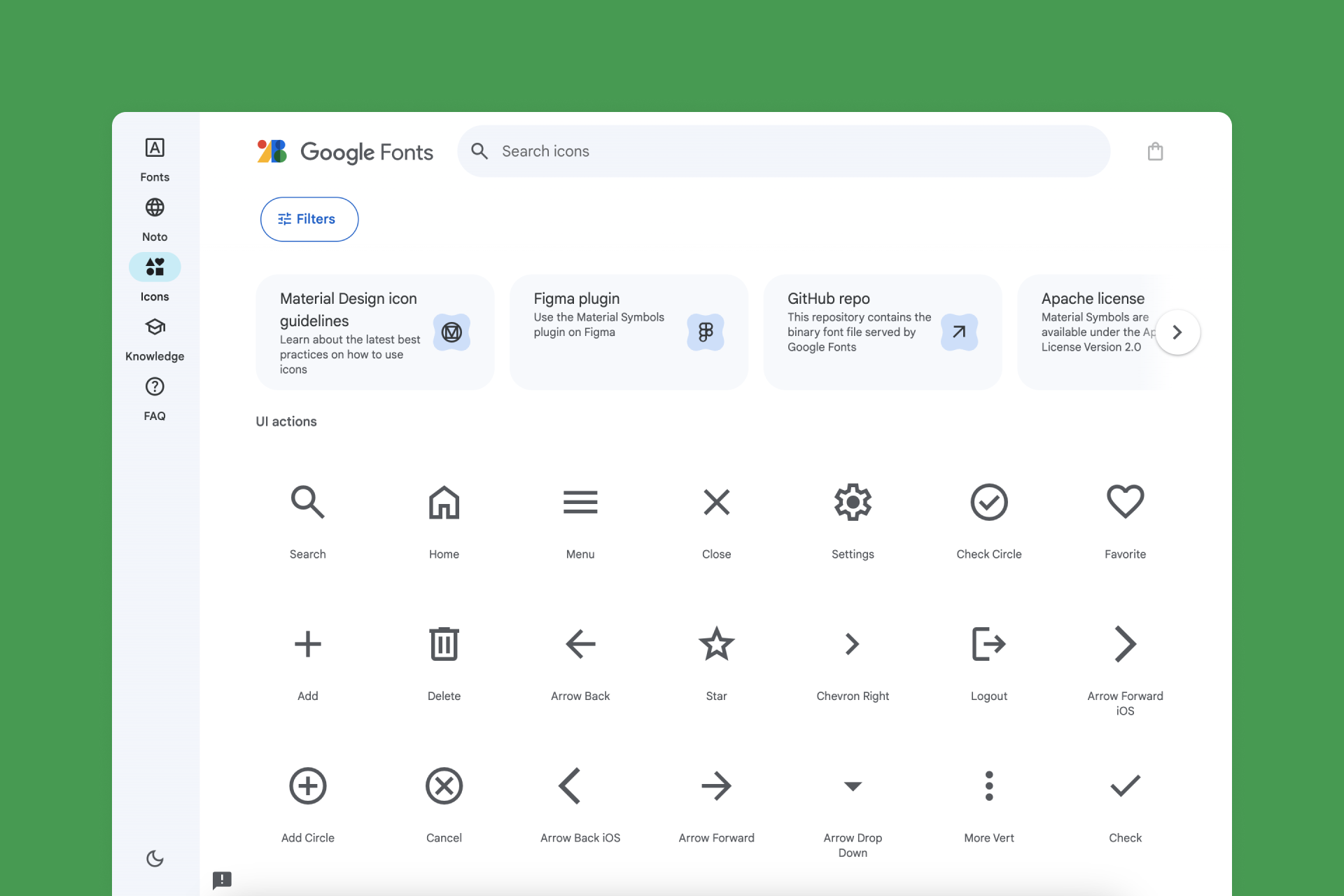
A staple for many designers, Material Symbols is a free collection of icons created as part of the Material Design system. It's available in two main styles (Line and Fill) with seven different line weights and two types of finishes (Rounded and Sharp) for maximum flexibility.
Pros
‣ It has Rounded and Sharp alternatives
‣ Good customization options
Cons
‣ Not all icons have a Solid version
‣ Some Line icons use filled parts, making them a bit inconsistent
‣ Material design style is a bit brutal, and some icons are not visually pleasant
🟢 🟢 🟢 ⚪ ⚪ Consistency
🟢 🟢 🟢 ⚪ ⚪️ Legibility
🟢 🟢 🟢 🟢 🟢 Set(s) size
🟠 🟠 ⚪️ ⚪️ ⚪️ Variety
10. Heroicons (1,152 icons)
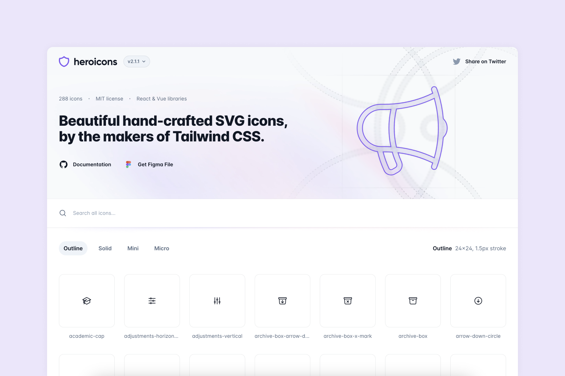
Heroicons is a minimalistic icon collection that focuses on the most essential icons for user interface. These icons come in four different styles: Outline, Solid, Mini and Micro, the latter two being a simplified version of Solid, built on a smaller grid. You can also access this library through their Figma Community file and the creator's website.
Pros
‣ 4 different styles: Outline, Solid, Mini and Micro
Cons
‣ Some icons remain the same between Outline and Solid styles
‣ Only 288 icons
🟢 🟢 🟢 🟢 ⚪️ Consistency
🟢 🟢 🟢 ⚪️ ⚪️ Legibility
🟠 🟠 ⚪️ ⚪️ ⚪️ Set(s) size
🔴 ⚪️ ⚪️ ⚪️ ⚪️ Variety
11. Lucide (1,460 icons)
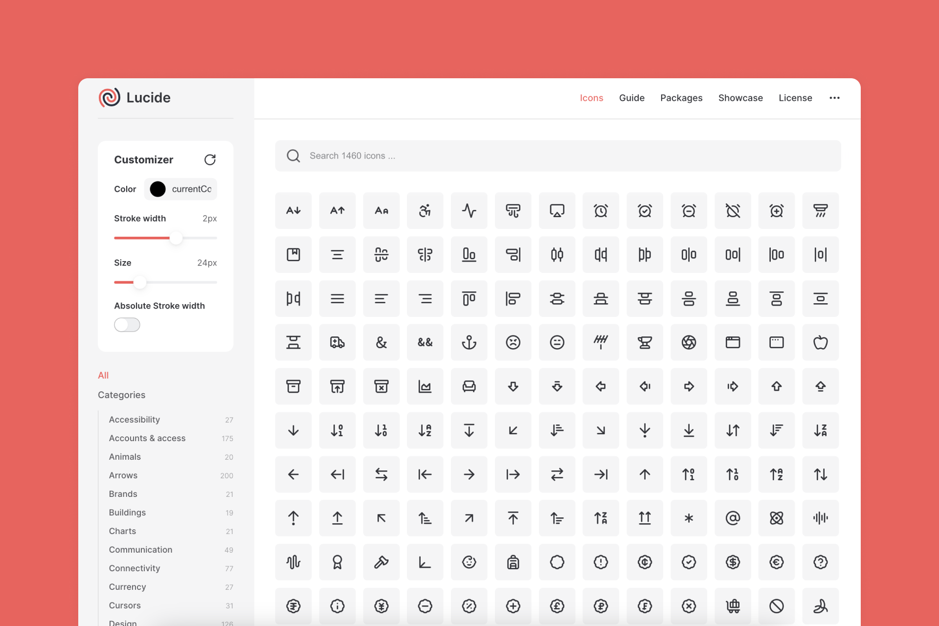
Lucide is a lovely library with tons of icons meticulously designed to meet all your needs, including a fairly wide range of categories. You also have the option to customize the stroke width, which makes it even easier to adapt to your projects. You can find the icon set on the creator's website or download a Figma plugin with the full collection.
Pros
‣ Pretty big library
‣ Adjustable stroke width
Cons
‣ It doesn't even have a Solid version
🟢 🟢 🟢 🟢 ⚪️ Consistency
🟢 🟢 🟢 🟢 ⚪️ Legibility
🟢 🟢 🟢 🟢 ⚪️ Set(s) size
🔴 ⚪️ ⚪️ ⚪️ ⚪️ Variety
12. Fontawesome (1,392 icons)
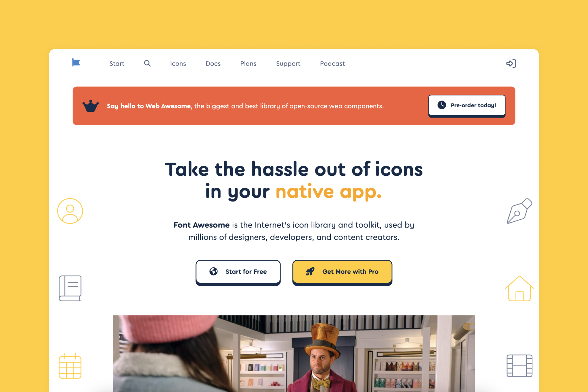
Fontawesome is one of the most popular icon libraries out there, covering the basic needs of any project and offering a wide variety of styles. A large selection of these icons (most of them presented in their Solid version) is available for free. You can also access it through their Figma plugin or the creator's website.
Pros
‣ Pretty big library
Cons
‣ Some Regular icons are a mix of fill and line, which doesn’t always work
‣ Not all Solid icons have a Regular version
🟢 🟢 🟢 ⚪️ ⚪️ Consistency
🟢 🟢 🟢 🟢 ⚪️ Legibility
🟢 🟢 🟢 🟢 ⚪️ Set(s) size
🔴 ⚪️ ⚪️ ⚪️ ⚪️ Variety
13. Hugeicons (3,800+ icons)
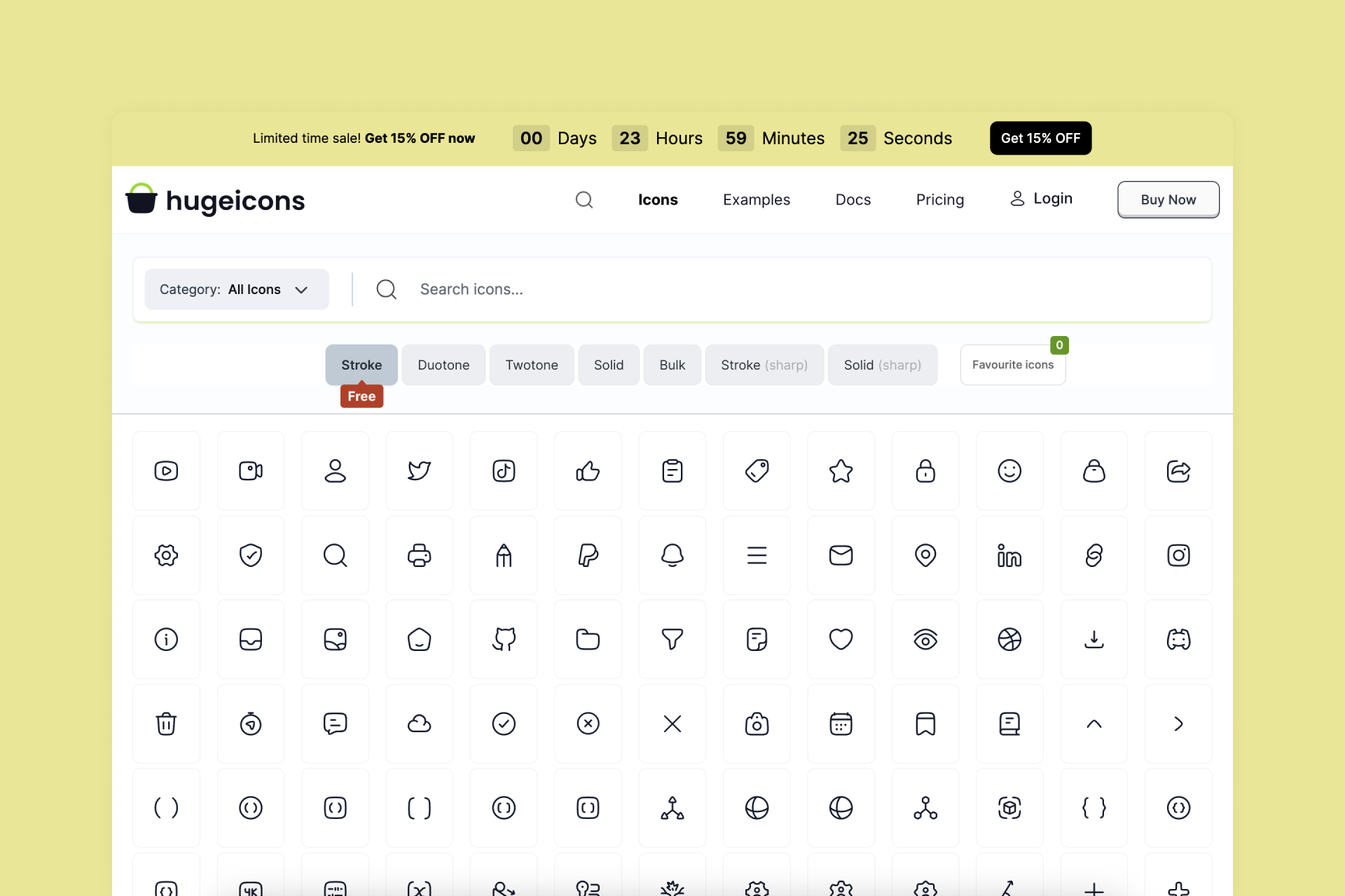
Hugeicons is a modern and friendly icon library with seven styles: Stroke, Duotone, Twotone, Solid, Bulk, Stroke Sharp and Solid Sharp. Only the former is available for free, but it's a beautiful and massive pack perfect for your next UI project. This free collections is also accesible through a Figma file and plugin.
Pros
‣ Perfectly legible icons
‣ Pretty big library
Cons
‣ Only the Stroke version is free
🟢 🟢 🟢 🟢 ⚪️ Consistency
🟢 🟢 🟢 🟢 ⚪️ Legibility
🟢 🟢 🟢 🟢 ⚪️ Set(s) size
🔴 ⚪️ ⚪️ ⚪️ ⚪️ Variety
14. Unicons (1,100+ icons)
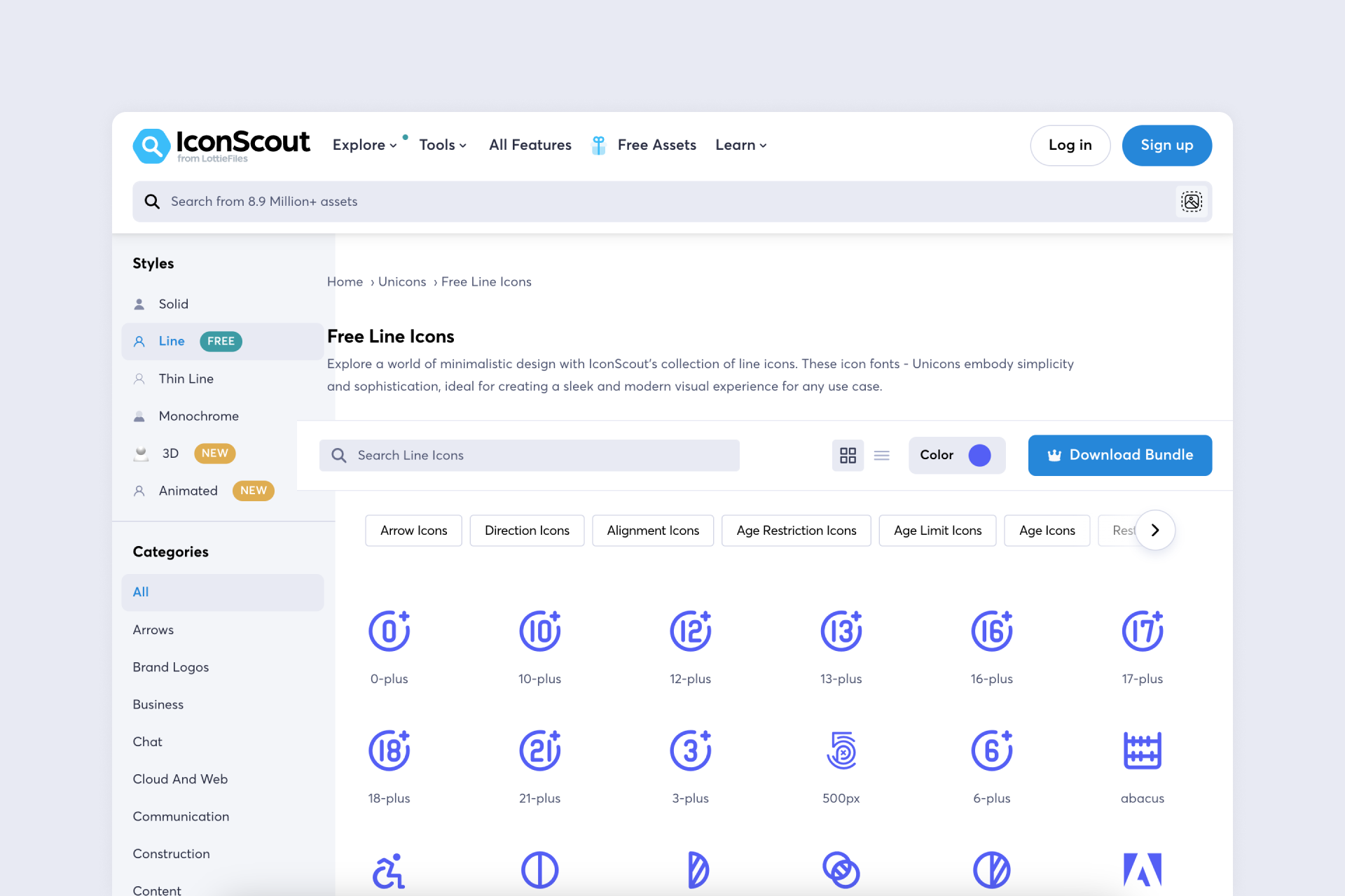
IconScout' Unicons is an amazing library consisting of six different styles: Solid, Line, Thin Line, Monochrome, 3D and Animated, with Line being the only free one. It's still a pretty big collection of over 1,000 neutral and verstile icons. You can also find the icons on the creator's website.
Pros
‣ Perfectly legible icons
‣ Pretty big library
Cons
‣ Only the Line version is free
‣ Navigation is a bit chaotic
🟢 🟢 🟢 🟢 ⚪️ Consistency
🟢 🟢 🟢 🟢 ⚪️ Legibility
🟢 🟢 🟢 🟢 ⚪️ Set(s) size
🔴 ⚪️ ⚪️ ⚪️ ⚪️ Variety
15. MynaUI Icons (1,090+ icons)
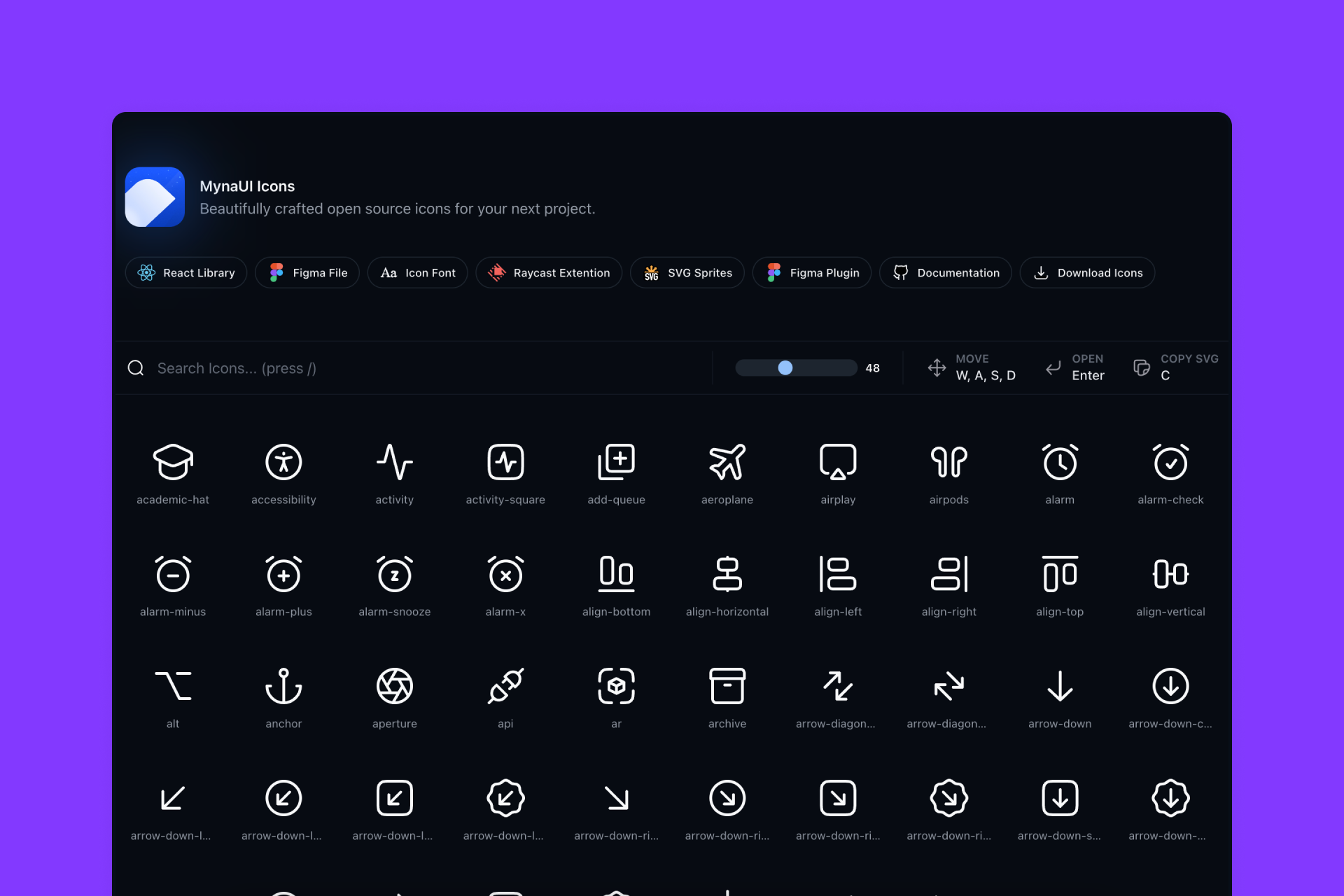
MynaUI is a beautiful and very complete library of line icons designed with a neutral and timeless approach, perfect for any interface project. This stunning collection is also available through a Figma plugin, the creator's website and a Community file.
Pros
‣ Perfectly legible icons
‣ Pretty big library
‣ Great presentation
Cons
‣ It doesn't even have a Solid version
🟢 🟢 🟢 🟢 🟢 Consistency
🟢 🟢 🟢 🟢 ⚪️ Legibility
🟢 🟢 🟢 🟢 ⚪️ Set(s) size
🔴 ⚪️ ⚪️ ⚪️ ⚪️ Variety
16. Atlas (2,701 icons)
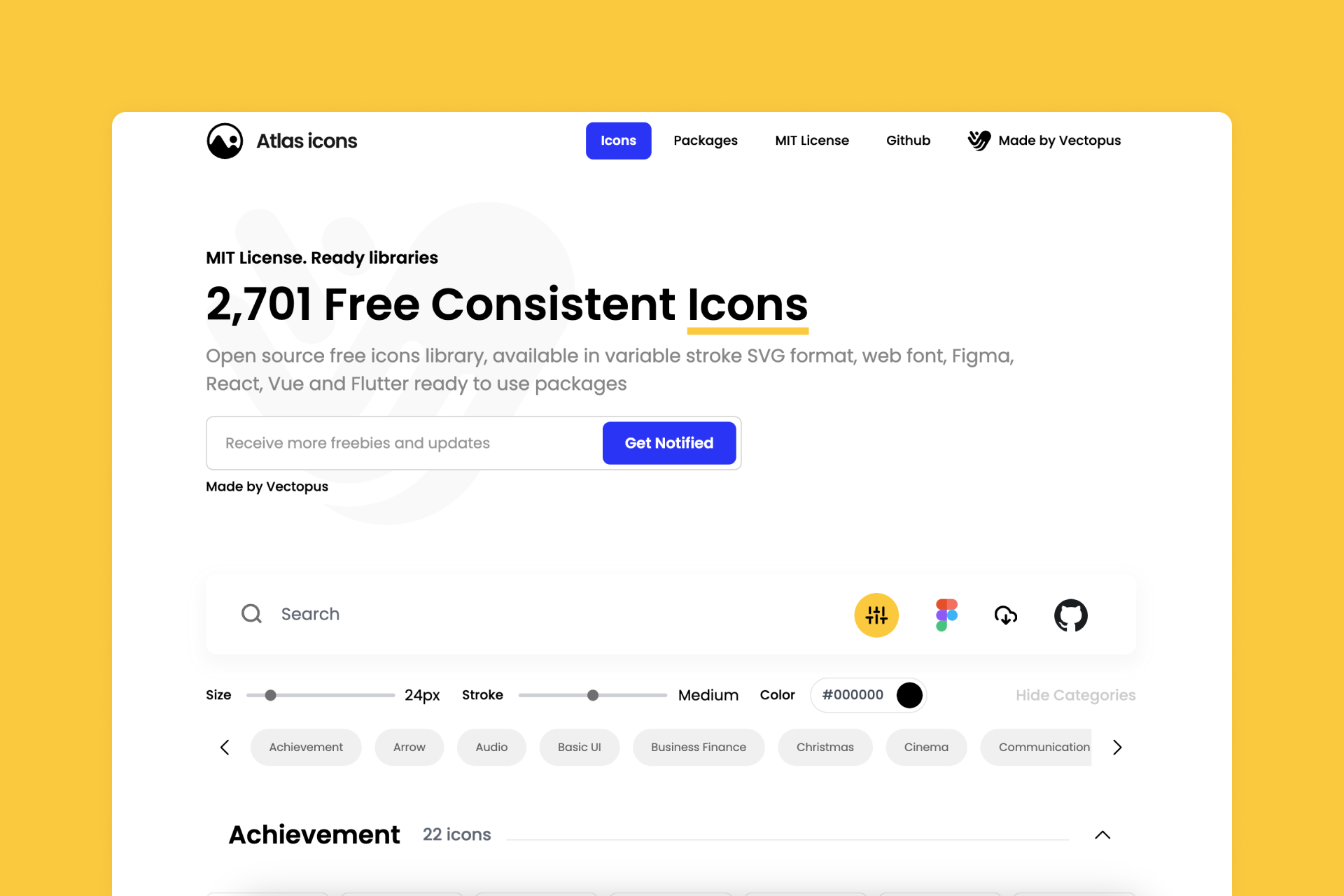
Atlas is an impressive library that covers all the basic needs for any UI project with neutral and timeless icons that stand out from most of the sets on this list thanks to their straight ends and more geometric appearance. You can also access this collection directly from Figma and the creator's website.
Pros
‣ Pretty big library
‣ 3 different weights: Thin, Medium and Bold
Cons
‣ Design is good, but pretty basic and lack personality
‣ It doesn't have a Solid version
🟢 🟢 🟢 ⚪️ ⚪️ Consistency
🟢 🟢 🟢 🟢 ⚪️ Legibility
🟢 🟢 🟢 🟢 ⚪️ Set(s) size
🔴 ⚪️ ⚪️ ⚪️ ⚪️ Variety
17. Sargam (840 icons)
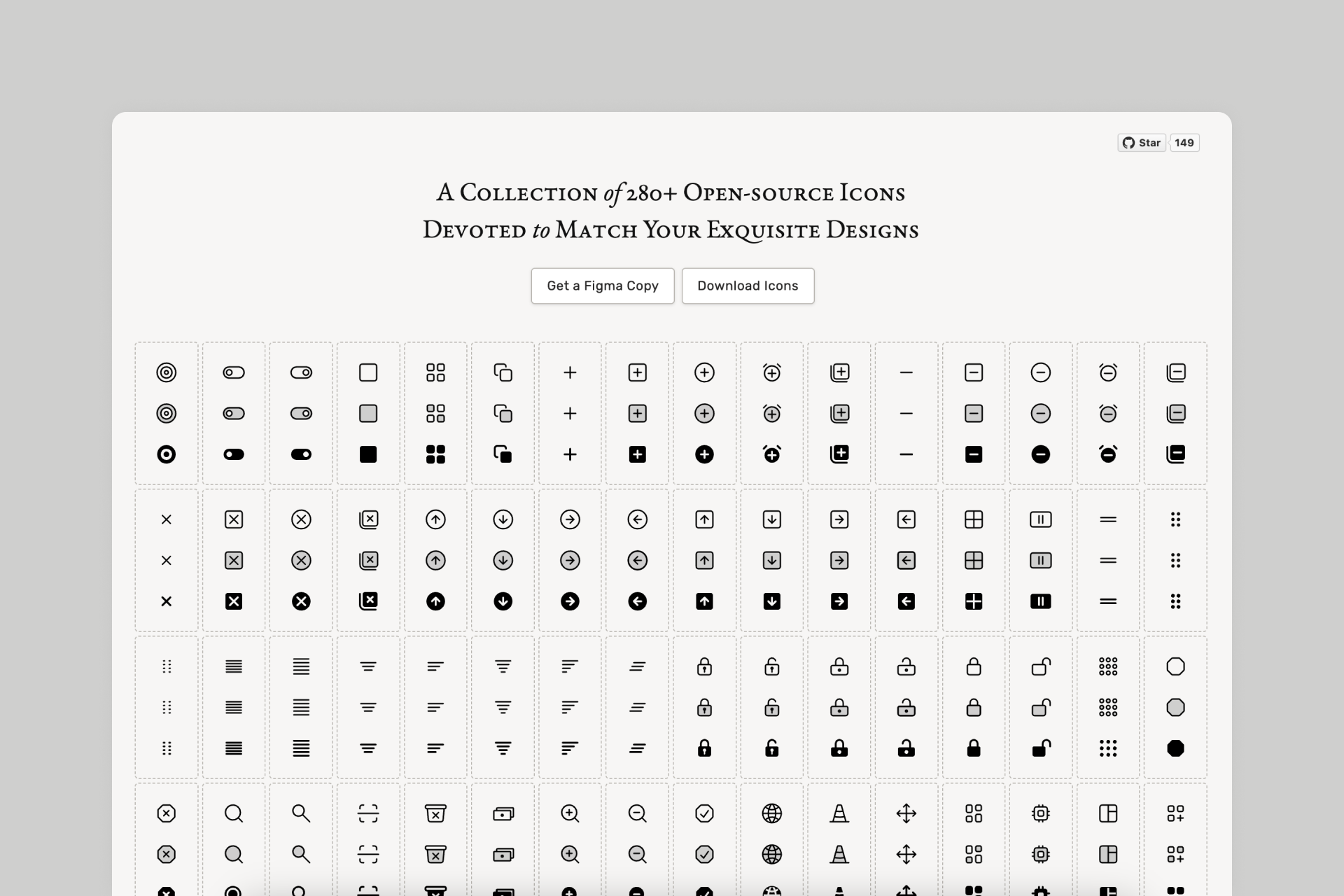
Sargam is a collection of over 800 icons divided into three different styles: Line, Solid and Duotone, all of them perfectly harmonized with smooth transitions between styles. You can also access this stylish library through a Figma file.
Pros
‣ Perfectly legible icons
‣ Great transitions between styles
Cons
‣ Some icons look unbalanced in terms of visual weight
🟢 🟢 🟢 🟢 ⚪️ Consistency
🟢 🟢 🟢 🟢 ⚪️ Legibility
🟠 🟠 ⚪️ ⚪️ ⚪️ Set(s) size
🔴 ⚪️ ⚪️ ⚪️ ⚪️ Variety
18. Gravity UI (660+ icons)
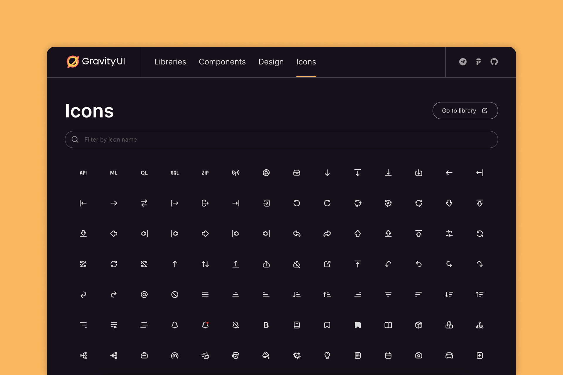
This collection is part of the Gravity UI design system, with over 600 line icons (some of them with a filled version). They're available for free on both their website and Figma Community file, among other UI components and illustrations.
Pros
‣ Perfectly legible icons
‣ Great presentation
Cons
‣ Not all icons have a Solid version
‣ Some important icons seem to be missing
🟢 🟢 🟢 🟢 ⚪️ Consistency
🟢 🟢 🟢 🟢 ⚪️ Legibility
🟢 🟢 🟢 ⚪️ ⚪️ Set(s) size
🔴 ⚪️ ⚪️ ⚪️ ⚪️ Variety
19. MingCute (2,926 icons)
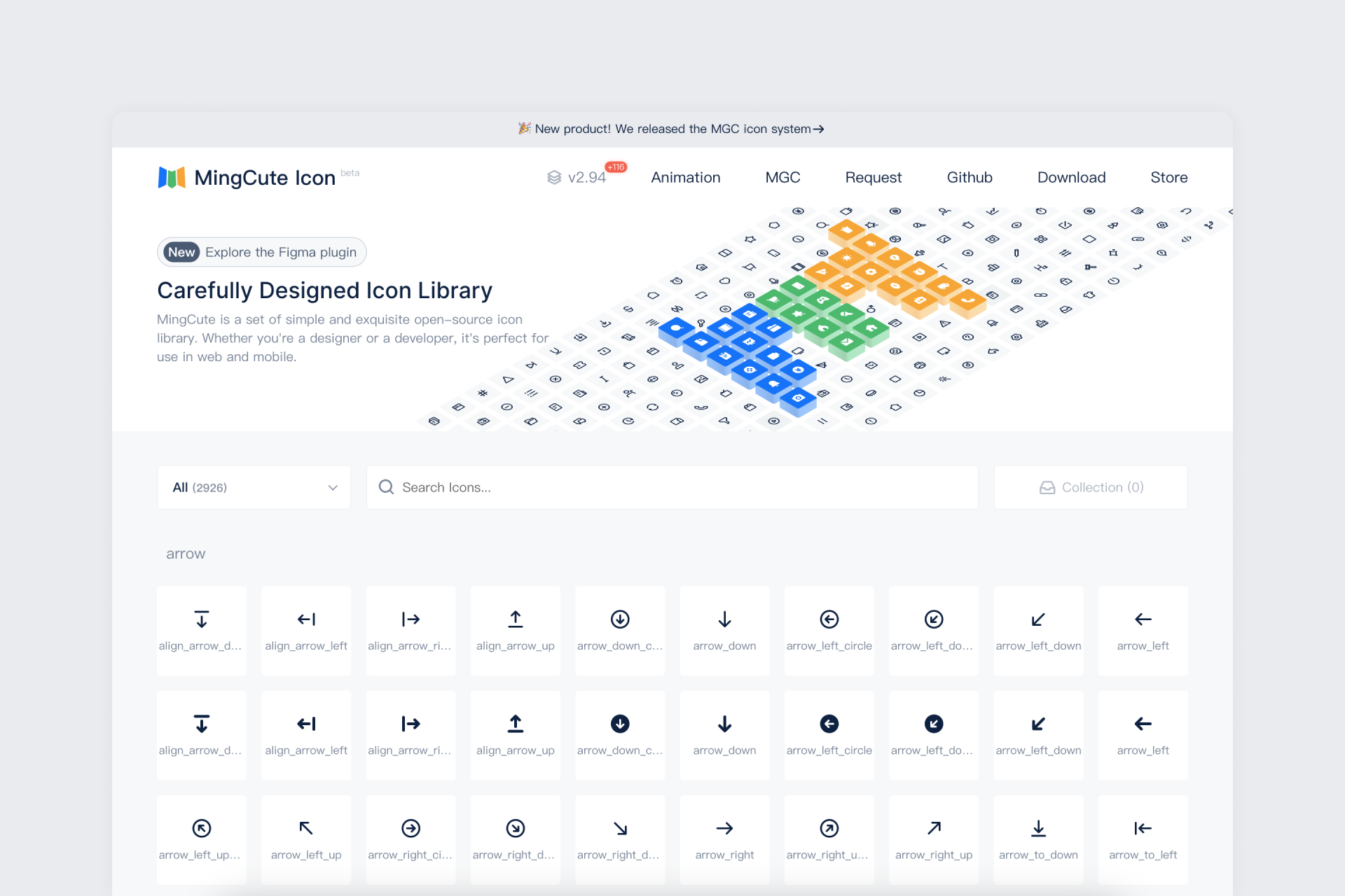
MingCute is a very complete pack with thousands of icons presented in two different styles: Line and Fill, and spread over more than twenty categories. These icons feature a neutral look with great legibility and smooth transition between styles. It's also accessible through a Figma plugin and the creator's website.
Pros
‣ Pretty big library
‣ Great Line to Fill conversions
Cons
‣ Some Fill icons don't look as legible
🟢 🟢 🟢 🟢 ⚪️ Consistency
🟢 🟢 🟢 ⚪️ ⚪️ Legibility
🟢 🟢 🟢 🟢 ⚪️ Set(s) size
🔴 ⚪️ ⚪️ ⚪️ ⚪️ Variety
20. Tabler Icons (5,289 icons)
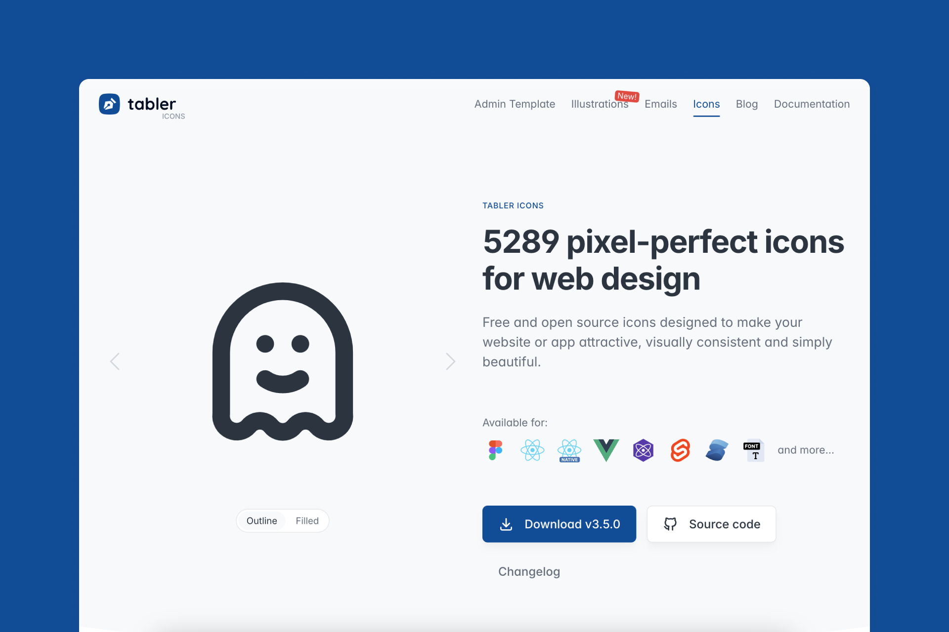
Tabler is another beautifully simple library with a huge choice of icons (Outline and Filled), also available through a Figma plugin and the creator's website. Not all Outline icons have their Filled counterpart, but the adjustable stroke width allows great flexibility.
Pros
‣ Pretty big library
‣ Adjustable stroke width
Cons
‣ Not all icons have a Filled version
🟢 🟢 🟢 🟢 ⚪️ Consistency
🟢 🟢 🟢 ⚪️ ⚪️ Legibility
🟢 🟢 🟢 🟢 🟢 Set(s) size
🔴 ⚪️ ⚪️ ⚪️ ⚪️ Variety
21. css.gg (704 icons)
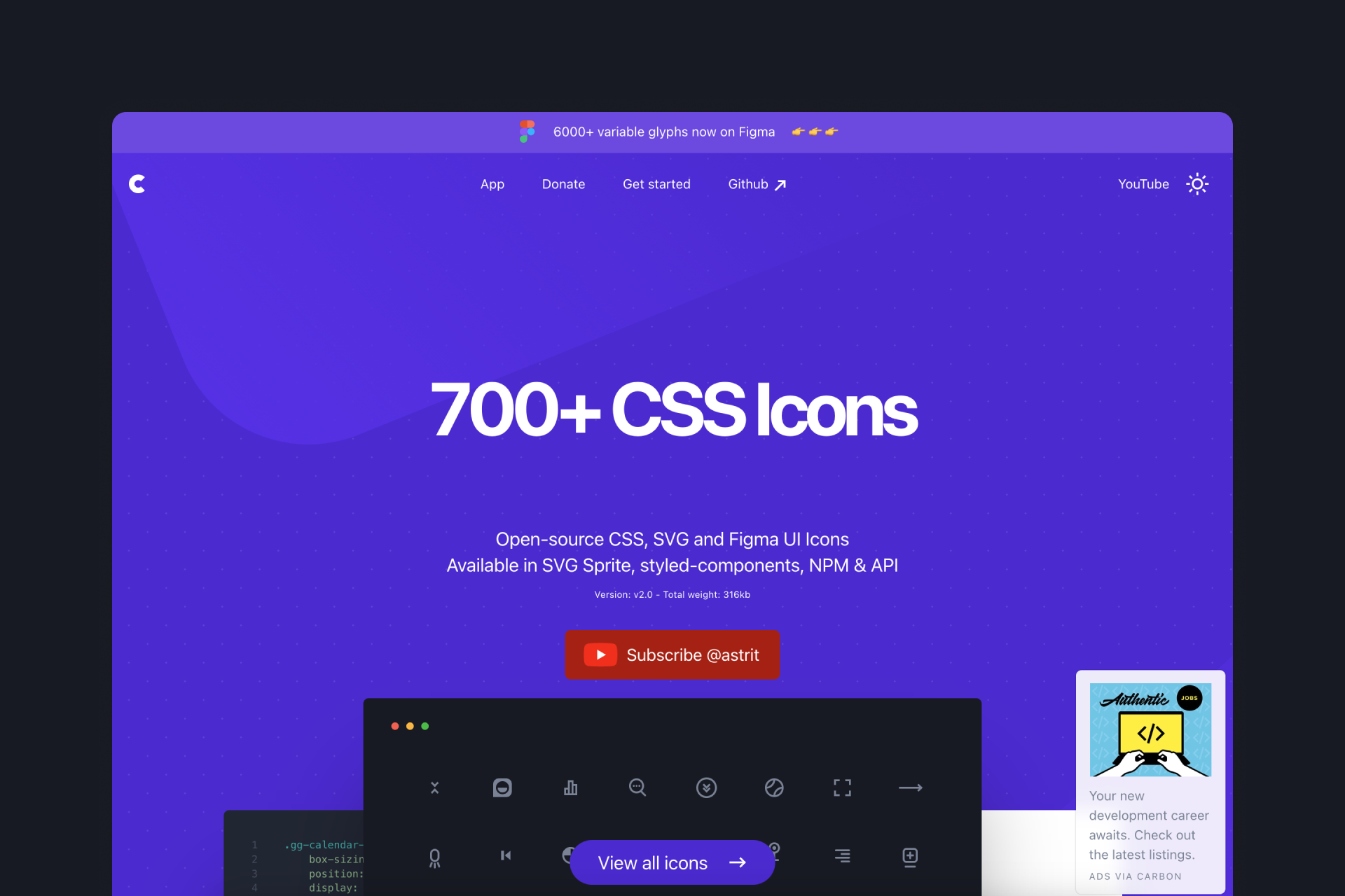
css.gg is an open source icon collection available in both SVG and CSS formats, which is also accesible through tools such as Figma and Adobe XD. It's a library of over 700 beautifully crafted icons, although it lacks a bit of consistency, which is more obvious in some cases than in others.
Pros
‣ Pretty big library
Cons
‣ There are several inconsistencies across the set
‣ It doesn't even have a Solid version
🟠 🟠 ⚪️ ⚪️ ⚪️ Consistency
🟢 🟢 🟢 🟢 ⚪️ Legibility
🟢 🟢 🟢 ⚪️ ⚪️ Set(s) size
🔴 ⚪️ ⚪️ ⚪️ ⚪️ Variety
22. Eva Icons (488 icons)
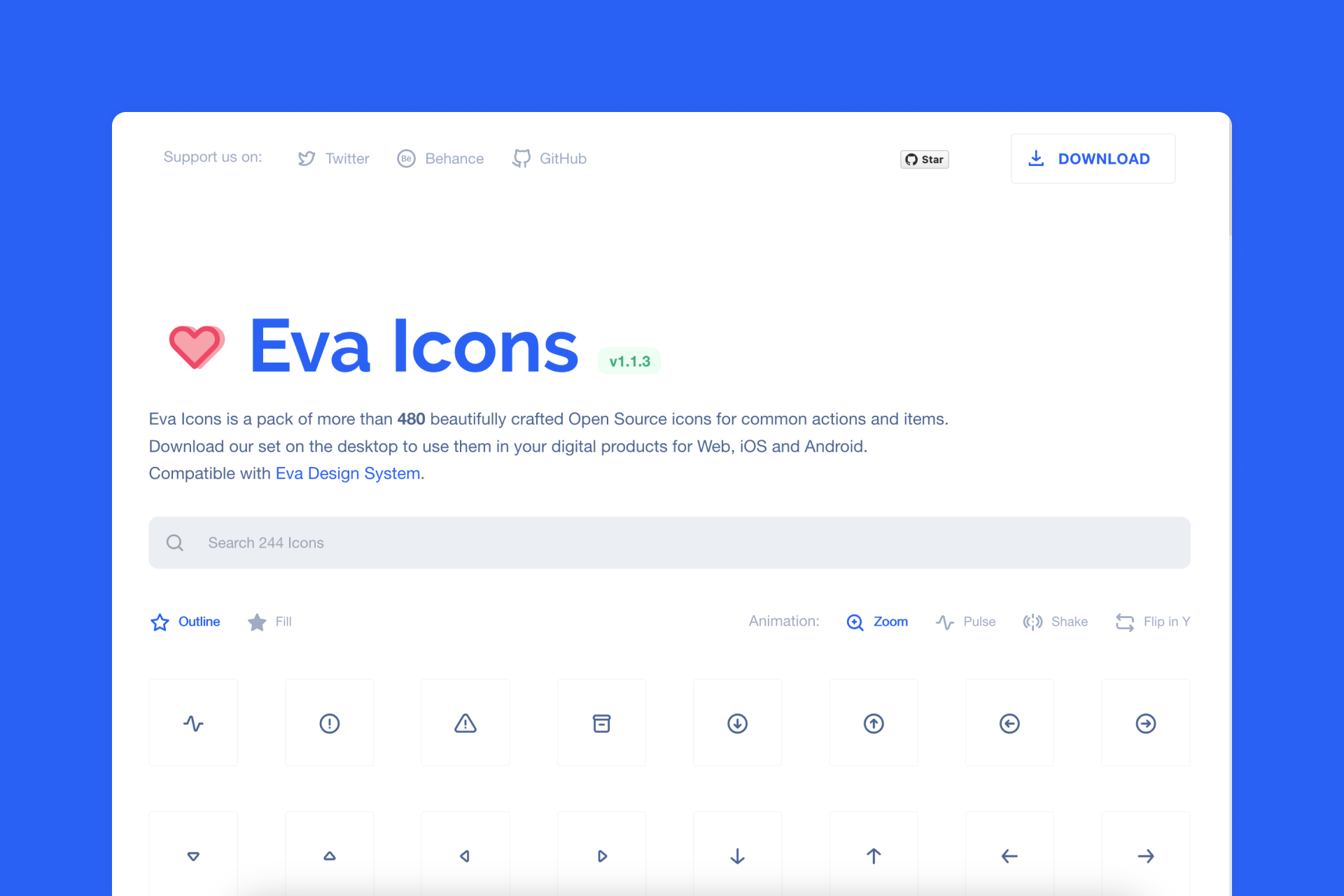
Eva Icons presents a collection of almost 500 signs divided into two different styles: Outline and Fill. Both styles work perfectly and look consistent enough, although some conversions between Outline and Fill don't seem very inspired.
Pros
‣ Perfectly legible icons
Cons
‣ Some icons remain exactly the same between Outline and Fill styles
🟢 🟢 🟢 ⚪️ ⚪️ Consistency
🟢 🟢 🟢 🟢 ⚪️ Legibility
🟠 🟠 ⚪️ ⚪️ ⚪️ Set(s) size
🔴 ⚪️ ⚪️ ⚪️ ⚪️ Variety
23. Radix (333 icons)
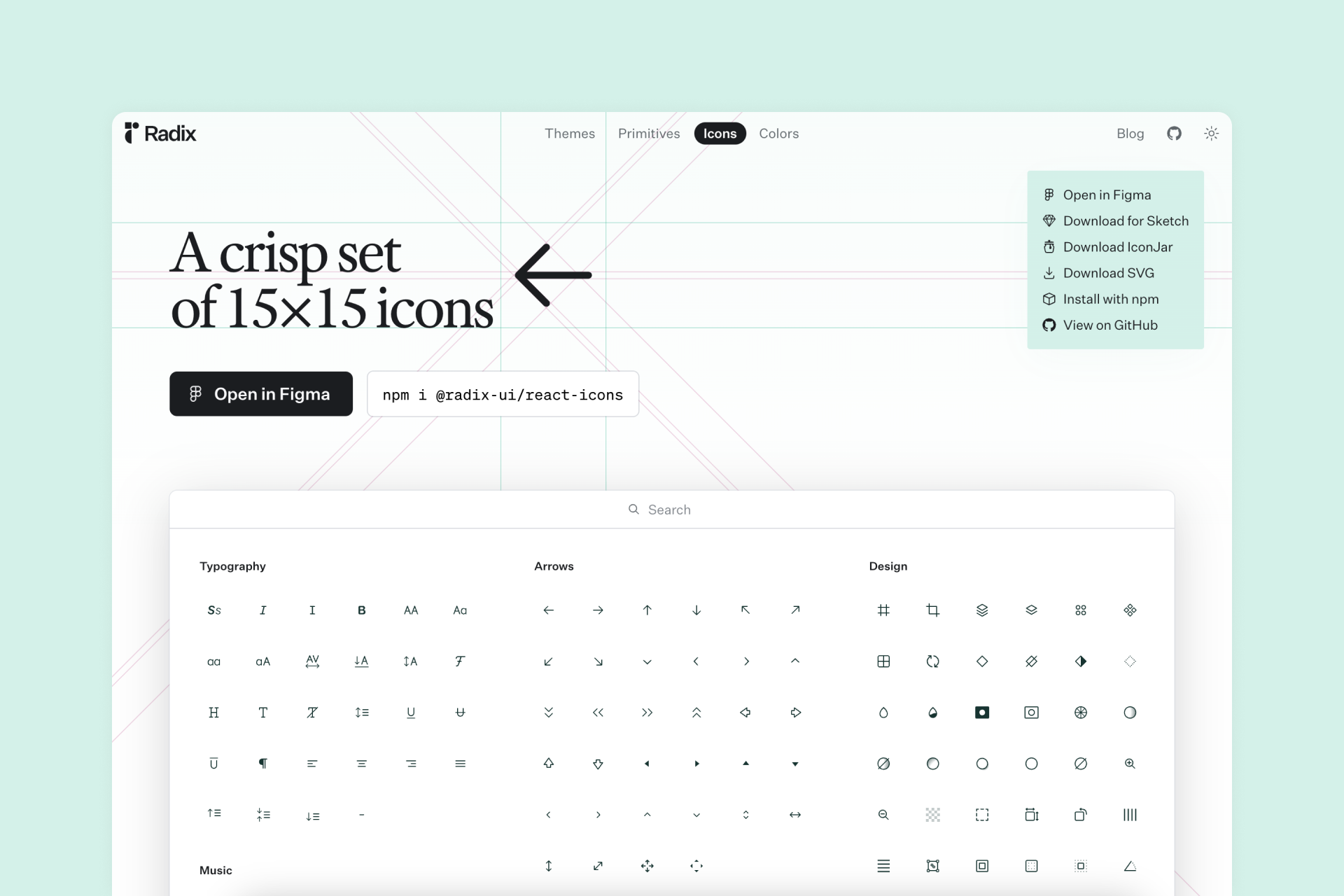
Radix is a crisp and simple icon set that has been built on a 15x15px grid (which allows for an effective reduction) and features a line style with a few filled versions. You can also access this collection of over 300 free icons directly through Figma and the creator's website.
Pros
‣ Effective reduction
Cons
‣ Some Line icons use filled parts, making them a bit inconsistent
‣ Not all icons have a Solid version
🟠 🟠 ⚪️ ⚪️ ⚪️ Consistency
🟢 🟢 🟢 🟢 ⚪️ Legibility
🟠 🟠 ⚪️ ⚪️ ⚪️ Set(s) size
🔴 ⚪️ ⚪️ ⚪️ ⚪️ Variety
24. Majesticons (760 icons)
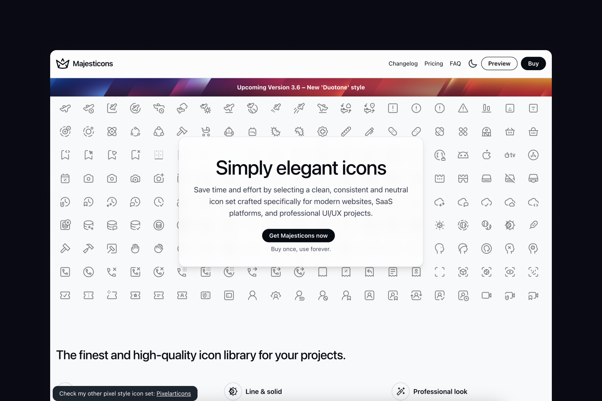
Majesticons is a massive collection of over 7,000 neutral and timeless icons built on a 24x24px grid and divided into two styles: Line and Solid. A free sample of these icons is available for free through both their website and a Figma file.
Pros
‣ Easy customization in Figma
Cons
‣ Some icons aren't very legible
‣ The transition between Line and Solid doesn't always work
🟢 🟢 🟢 ⚪️ ⚪️ Consistency
🟠 🟠 ⚪️ ⚪️ ⚪️ Legibility
🟢 🟢 ⚪️ ⚪️ ⚪️ Set(s) size
🔴 ⚪️ ⚪️ ⚪️ ⚪️ Variety
25. Bootstrap Icons (2,000+ icons)
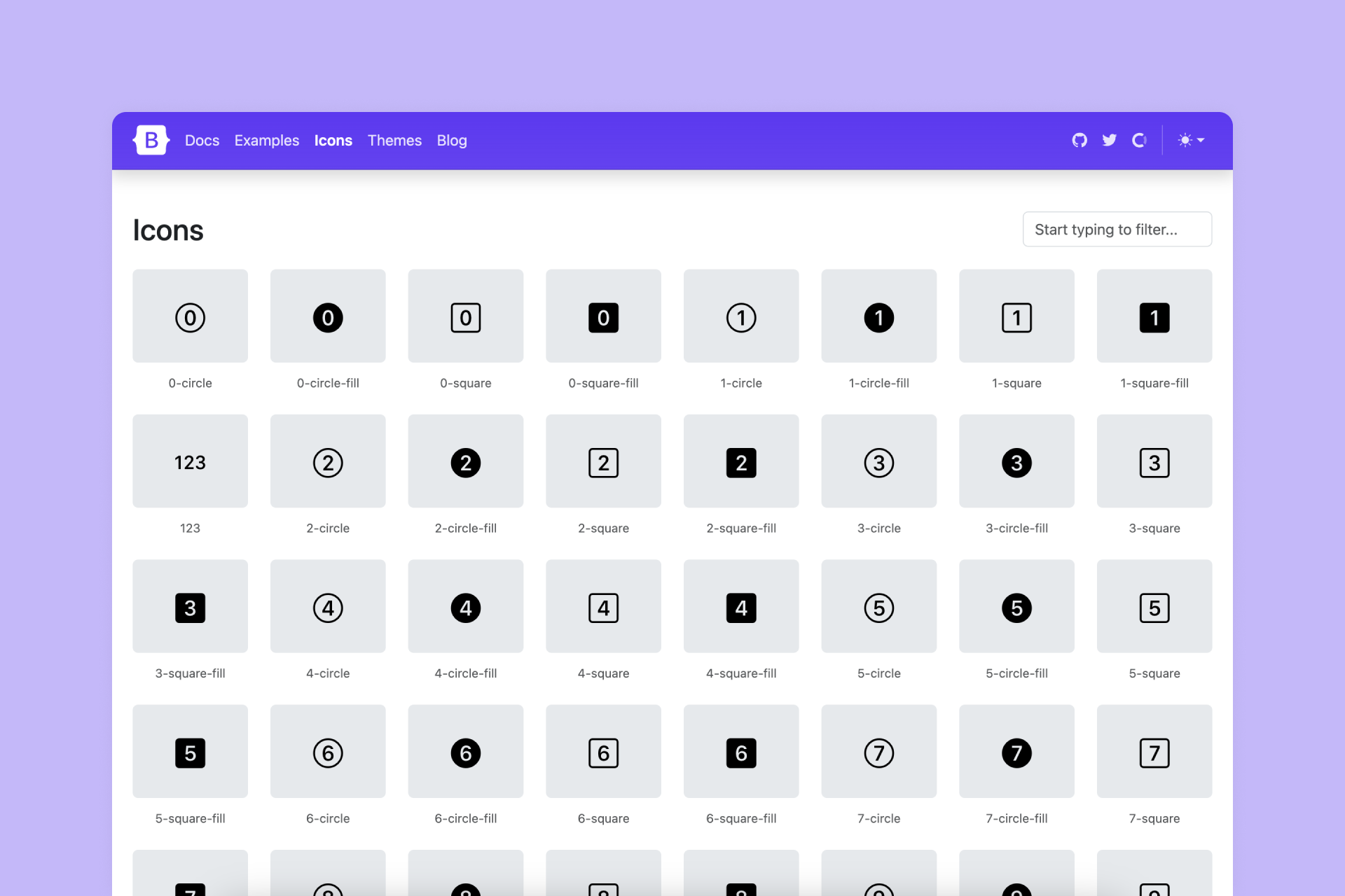
Bootstrap is a very popular library with over 2,000 icons in two styles: Line and Fill, also accessible directly from Figma and the creator's website. Some Line icons use two different strokes or filled shapes and not all of them have a pure Fill version, but it's still huge collection that covers all basic needs.
Pros
‣ Pretty big library
Cons
‣ Some Line icons look a bit inconsistent
‣ Not all Line icons have its own Fill version
🟠 🟠 ⚪️ ⚪️ ⚪️ Consistency
🟢 🟢 🟢 ⚪️ ⚪️ Legibility
🟢 🟢 🟢 🟢 ⚪️ Set(s) size
🔴 ⚪️ ⚪️ ⚪️ ⚪️ Variety
26. Ionicons (1,518 icons)
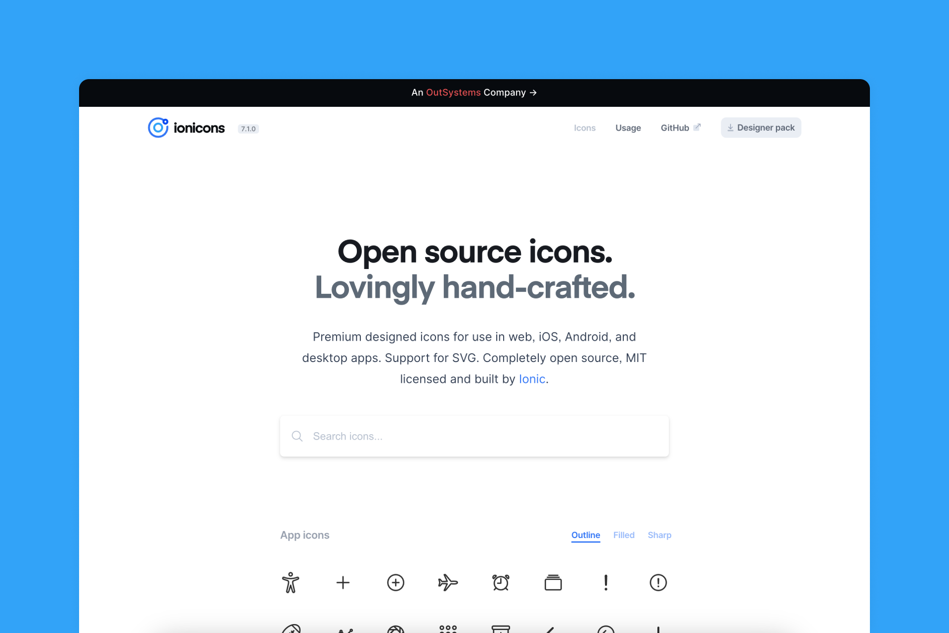
Ionicons is a collection of over 500 icons presented in three different styles: Outline, Filled and Sharp. Not all conversions are as smooth as they should be, but having a Sharp alternative to the Filled version offers greater flexibility.
Pros
‣ Big library
‣ 3 different styles: Outline, Filled and Sharp
Cons
‣ Some Line icons look a bit inconsistent
‣ Some icons remain the same between Outline and Filled styles