Mastering icons use in user interface
Learn the best practices of using icons effectively in interface design and understand the best ways to use them in your Figma designs.
When designing an interface, icons should not be an afterthought. They need to be an integral part of the design process from the beginning. Thoughtfully chosen icons that are consistent, recognizable, and aesthetically pleasing can elevate the overall user experience.
To really understand how to use icons in interfaces you must first learn why you should use icons in your interface.
 Madhurima Chatterjee
What to consider while using icons in UI
The most non-negotiable tips for designing interfaces that are visually appealing and intuitive:
Recognition
When selecting icons for your interface, you need to consider how recognizable they will be to users. There are two main types of icons: abstract and representative.
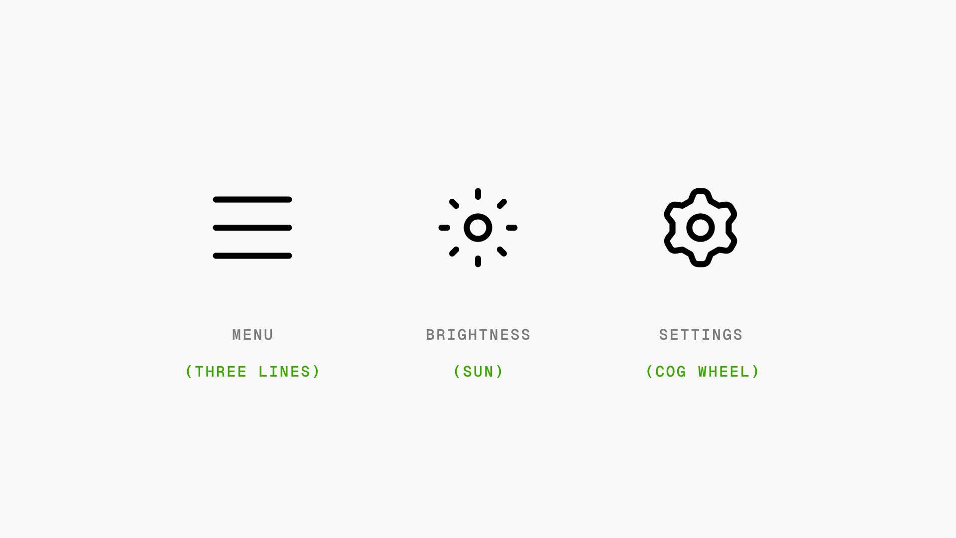
1) Abstract icons
Use simple shapes and lines to represent a concept. These icons rely more on learned recognition. For example, a hamburger icon with three stacked lines is commonly used to represent a menu that slides in from the side. Users need to already be familiar with this icon to understand what it means.
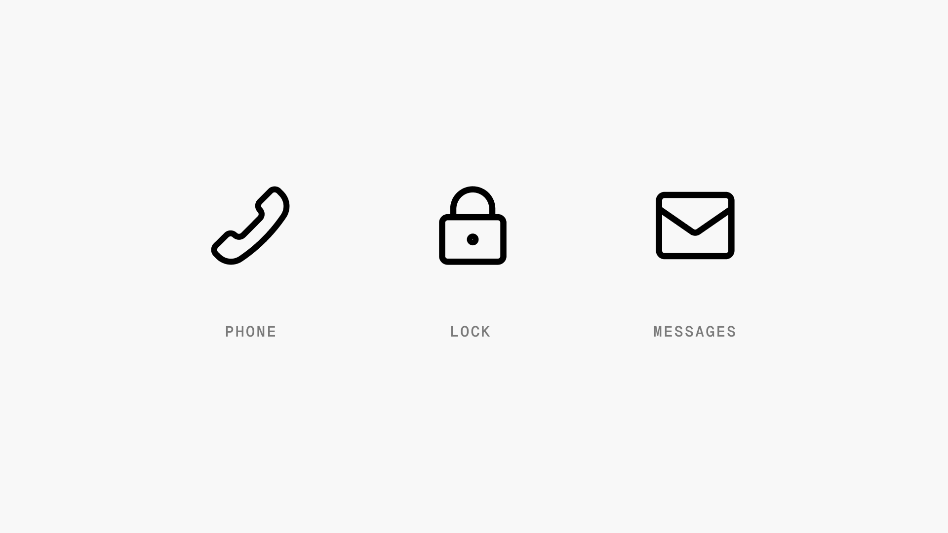
2) Representative icons look more like the real-world object or concept they symbolize. These are easier for users to interpret at a glance. For example, an envelope icon clearly represents email or messages.
Representative icons work well when you need icons that users can intuitively understand without previous exposure. In general, you'll want to lean towards more representative icons whenever possible.
Accessibility
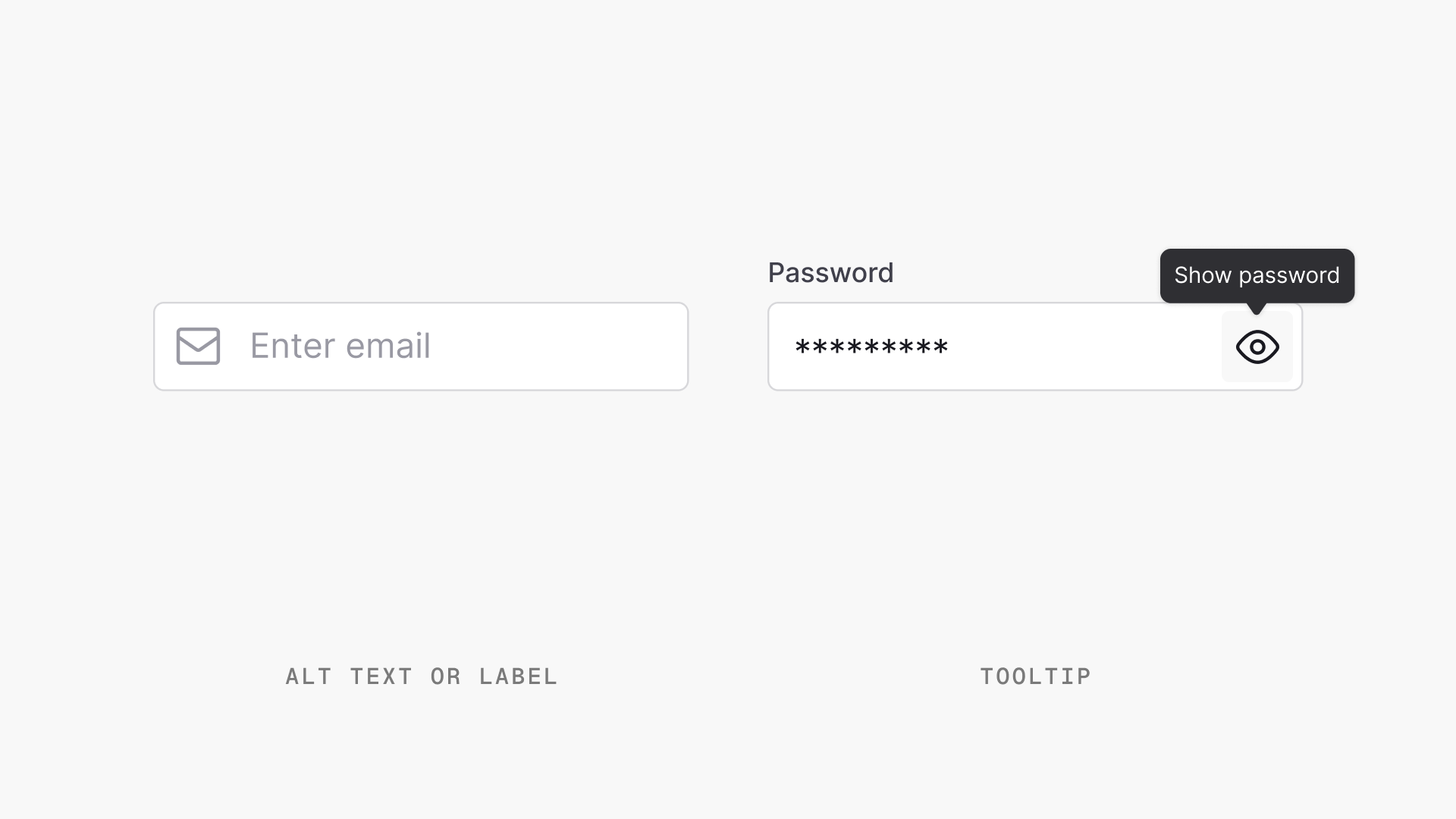
Icons can be a great way to communicate meaning, but they should not be the sole method of conveying important information. For accessibility, every icon should have accompanying alt text or label that describes the icon's meaning and purpose.
When adding alt text, be succinct yet descriptive. The goal is to provide the same information that the icon conveys visually.
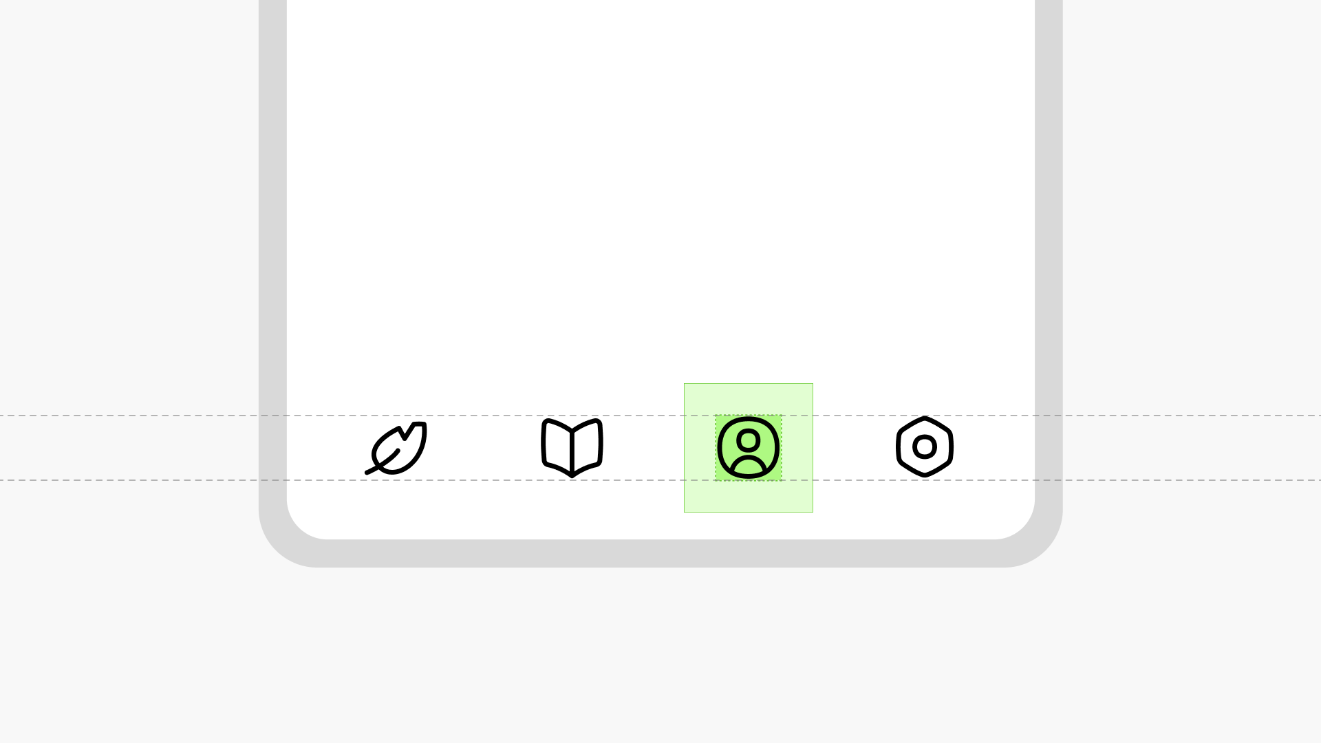
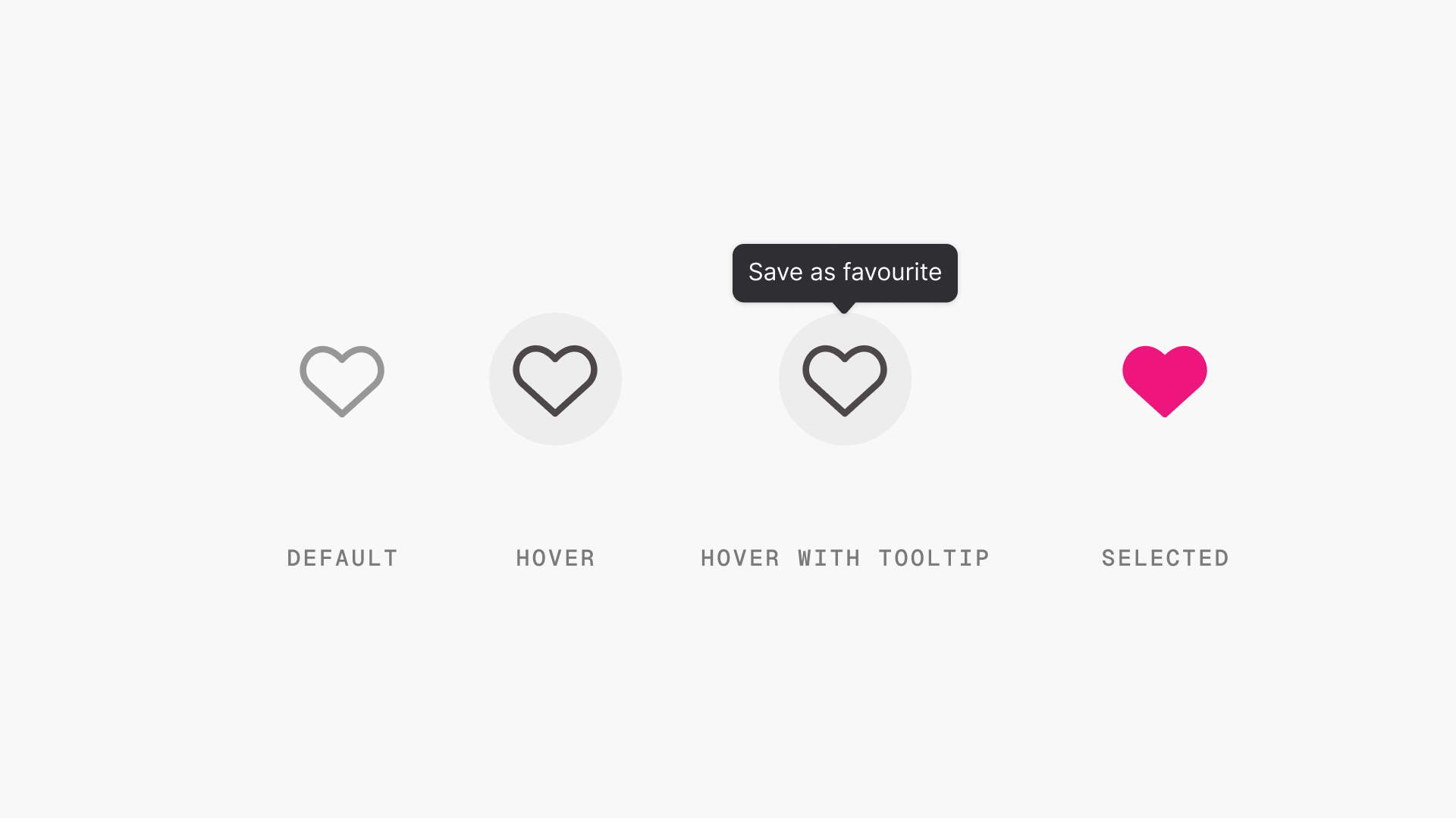
Interactive states
Icons are a useful way to indicate state changes and interactivity in an interface. Using icons to show state changes provides a quick visual cue that helps users understand what actions they can take.
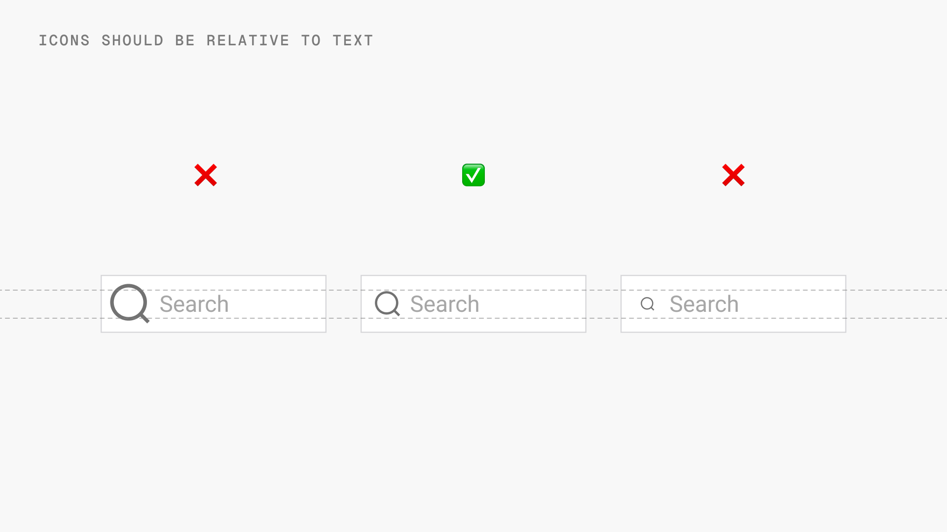
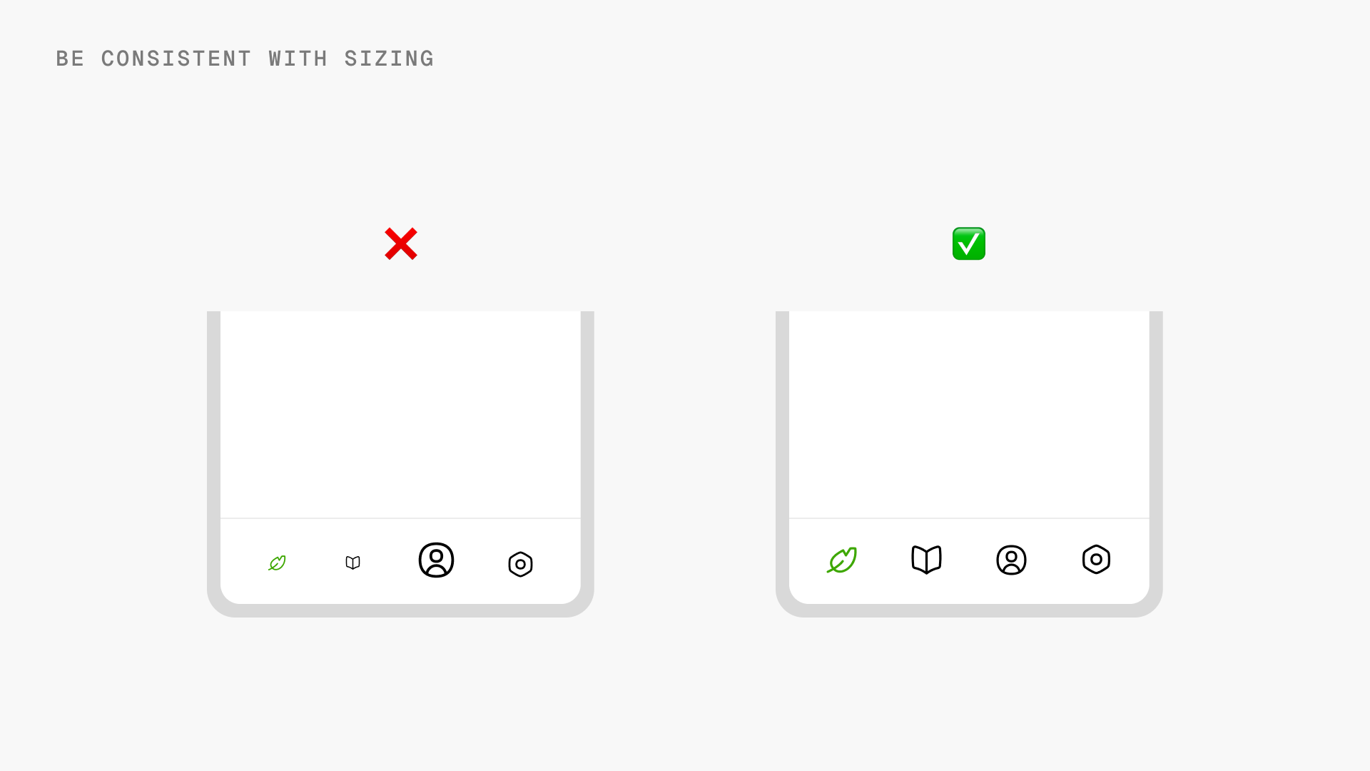
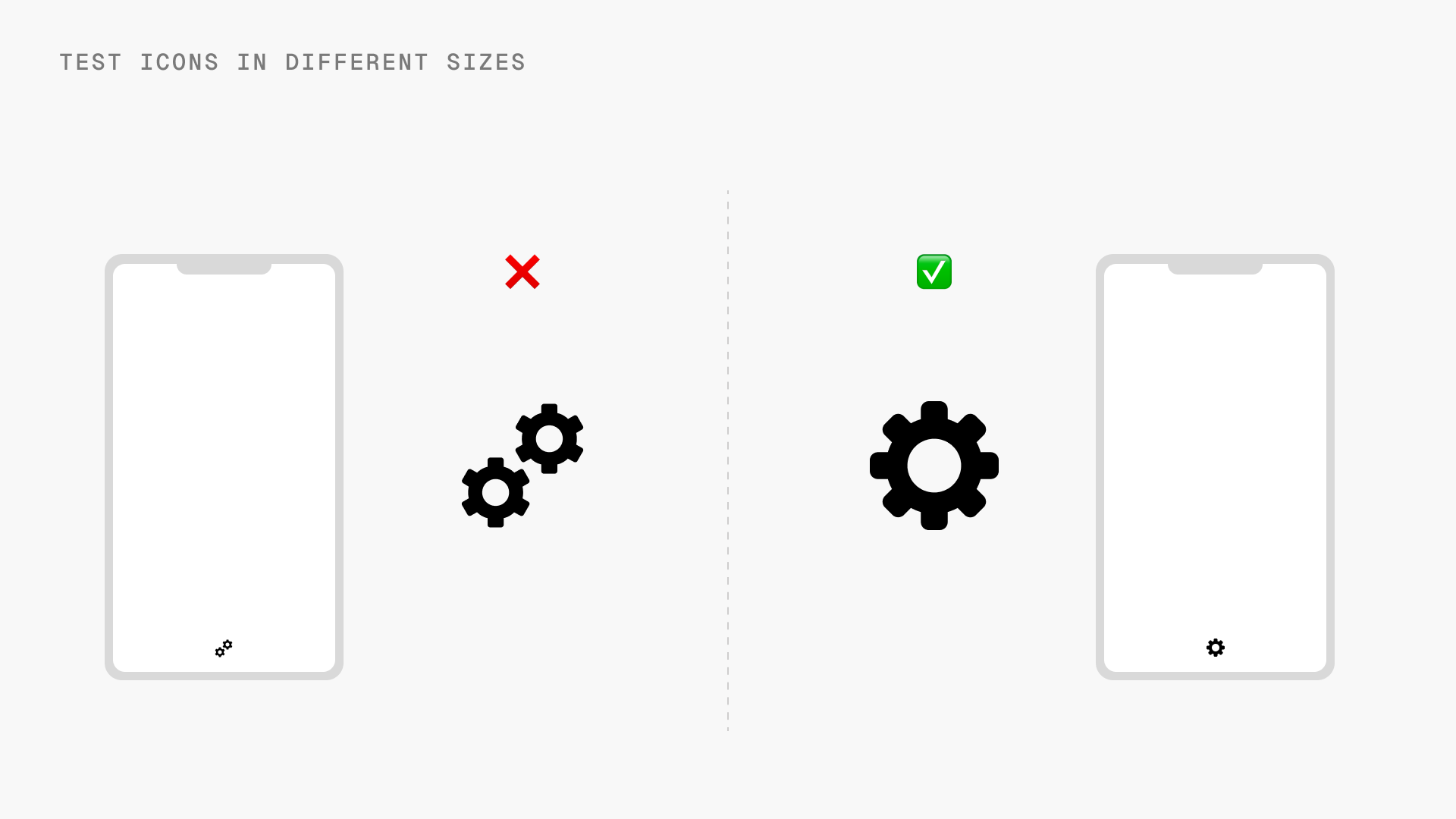
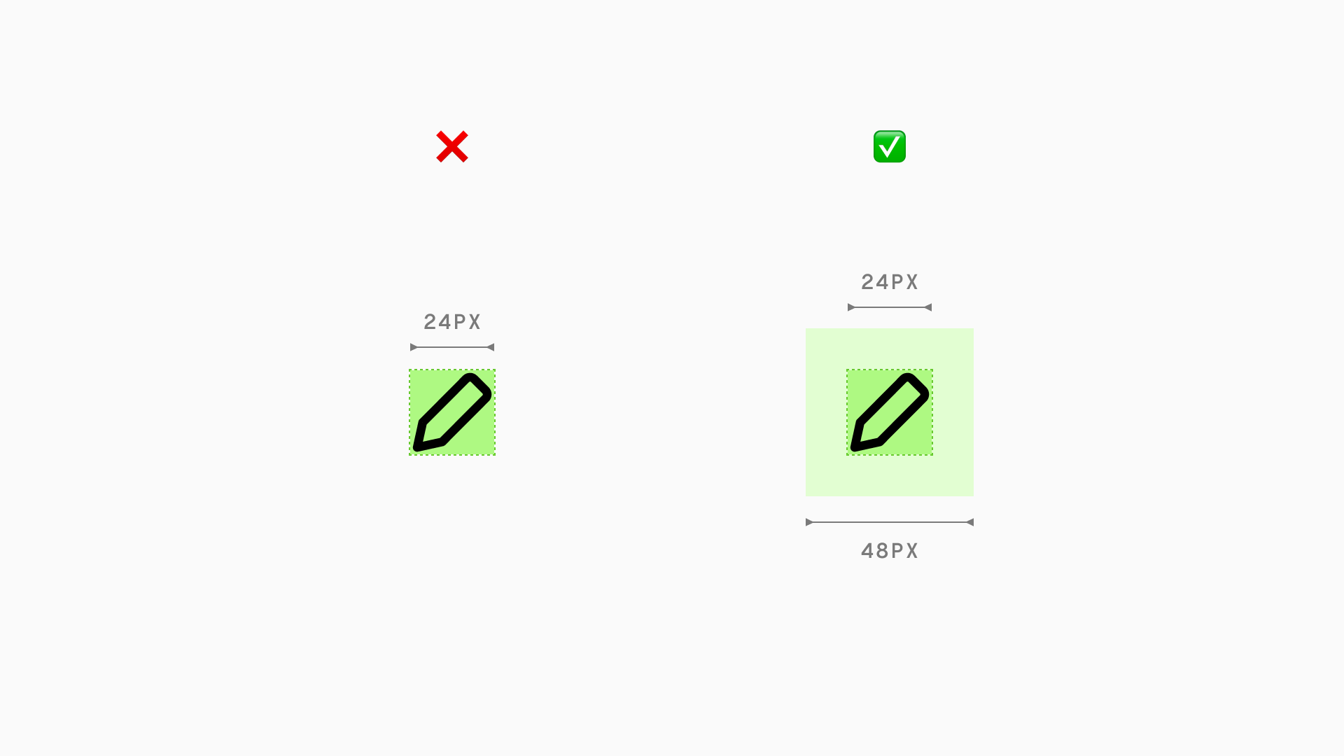
Sizing
When choosing icon sizes for your interface, consistency is key. Icons should be sized proportionally to other elements on the screen. Consistent proportions make for a polished, professional interface.
In general, while designing interfaces common bases are 16px for small icons, 24px for medium icons and 32px for larger icons.
Some tips on sizing icons:
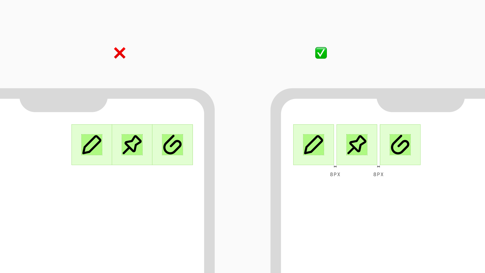
Spacing
Proper spacing around icons is essential for usability and accessibility. Icons should have enough padding or whitespace so they are easy to discern and interact with.
When placing icons in buttons or other clickable elements, make sure there is adequate space for the user to tap or click. The touch target around an icon should be at least 48 x 48px according to WCAG guidelines. A cramped icon that is too close to other elements can be difficult to press accurately. Having breathing room prevents misclicks and conveys that the icon can be tapped.
Similarly, don't place icons too close together. There should be spacing between icons for visual separation and ease of tapping on the touch targets. Adjacent icons without padding may appear cluttered and hard to parse.
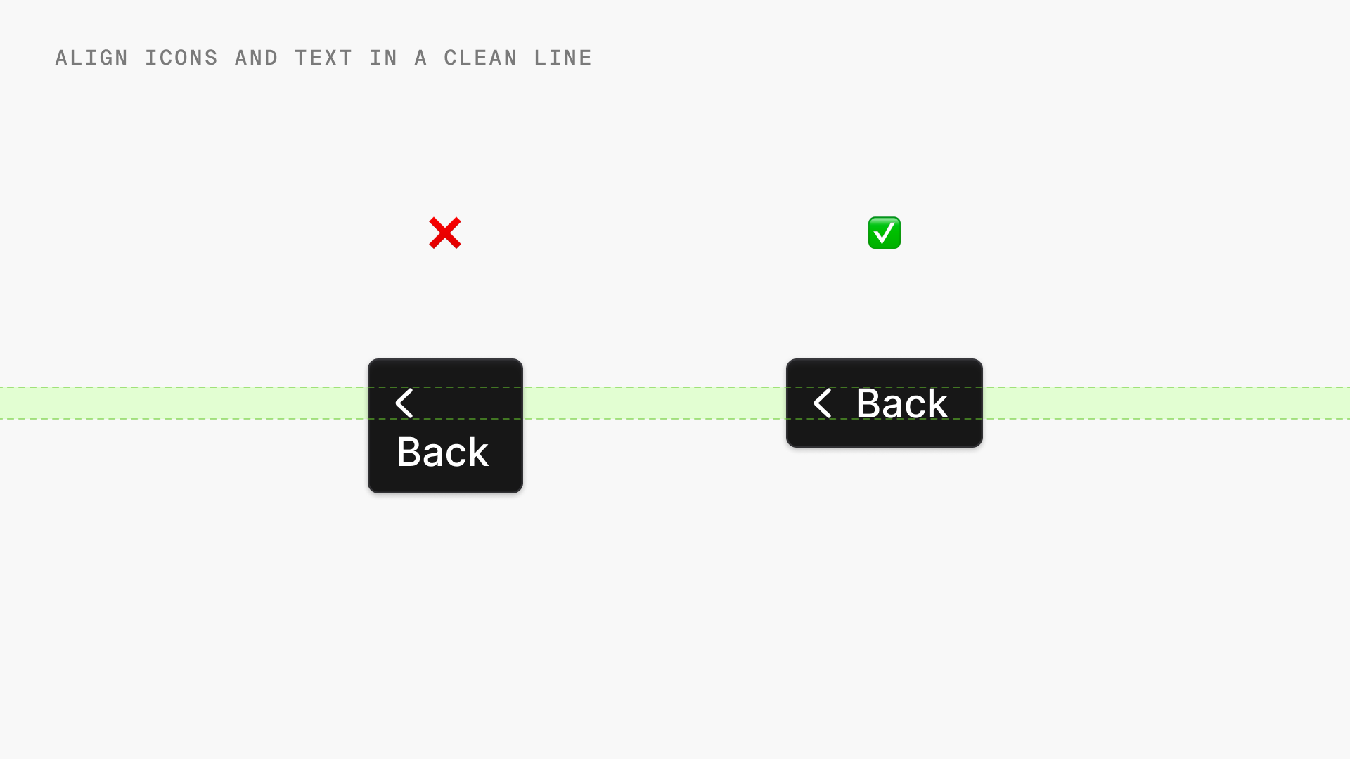
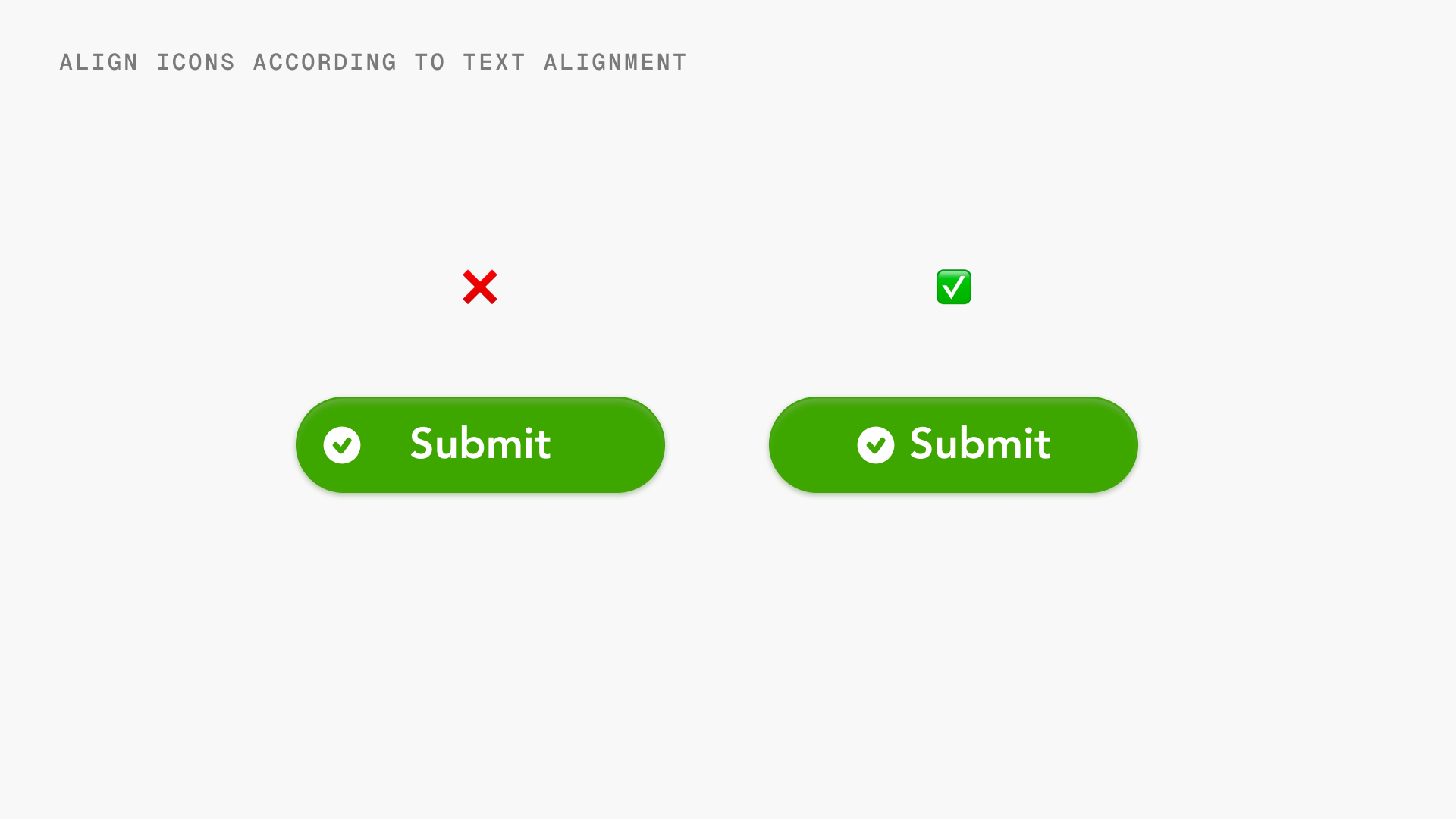
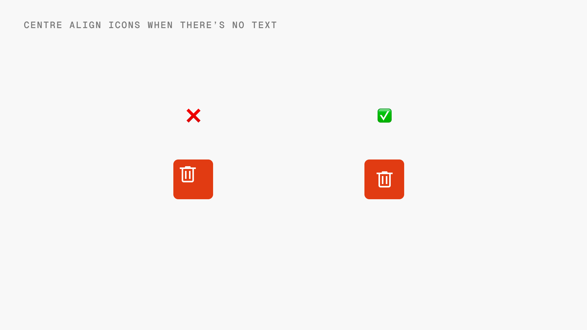
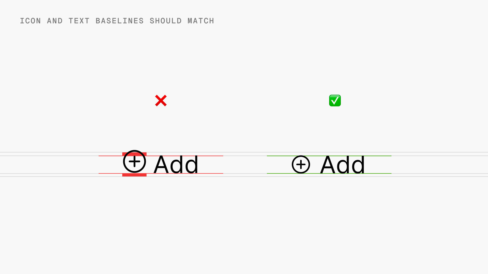
Alignment
The alignment of icons in a user interface plays a crucial role in the overall design and usability. Proper icon alignment ensures visual balance, clarity, and intuitive interaction.
Icon libraries
Ready-made icon libraries provide a huge selection of icons that you can easily implement in your interface designs.
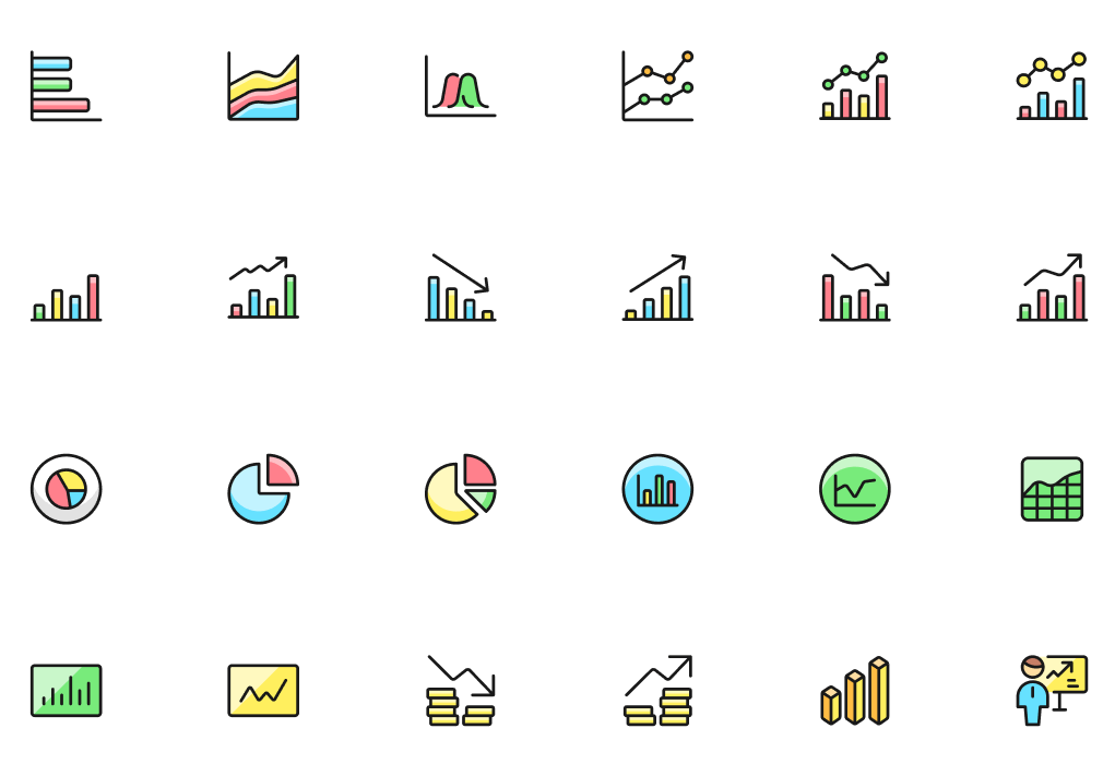
One of the most widely used icon libraries is Streamline. Streamline offers a diverse range of categories like web applications, transportation, medical, weather, ecology, health, culture, work, travel, AI and brand logos. The icons are vector-based and available in solid, regular, light, line, flat and duotone styles.
- Web app by Streamline: Copy/download free and pro vectors
- Figma plugin by Streamline: Drag and drop free and pro vectors into your Figma canvas
- Figma community files by Streamline: Start using free vectors for your next project
Designing an interface using icons in Figma
Figma makes it easy to design with icons and create icon systems for your interfaces.
Importing icons from icon libraries
- Use the assets panel to import icons from Streamline Plugin. This allows you to bring them into your Figma file.
- You can resize, change color and strokes to customize any vector icon.
Steps for dropping icons in Figma and adding as a component; Icon used: Core Line from Streamline Plugin
Using the components
- Once component is created it's easy to drop icons from the asset panel present in the left sidebar
- Quickly swap them with another icon by holding 'option or ⌥' key for faster workflow.
Use the asset panel to drop icons directly into your frame; Icon used: Core Line
Swapping icons by holding 'option or ⌥' key; Icon used: Core Line
Designing icon variants
- Create variants like outlined, filled, and colored versions of your icons.
- Use components so you can swap between icon variants easily.
Swapping between icon state variants in Figma; Icon in use: Core Line, Core Solid
Using auto-layout
- Put icons into auto-layout frames so that they resize responsively across device sizes.
- Make sure to set constraints so icons resize proportionally and don't become distorted.
- Use fixed width and height constraints to keep icons a consistent size if needed.
Icons are added in a button using auto-layout; Icon used: Core Line, Core Solid
How can you get started?
Now that you know the tips and tricks on how to include icons while designing user interfaces, get your hands on the best icon library with 196k icons:
- Web app by Streamline: Copy/download free and pro vectors
- Figma plugin by Streamline: Drag and drop free and pro vectors into your Figma canvas
- Figma community files by Streamline: Start using free vectors for your next project
Also, before you jump right in feel free to browse the interface use-cases by Streamline to get inspired. Happy Streamlining!