Why icon consistency is harder than it looks
The invisible decisions behind every consistent icon set.
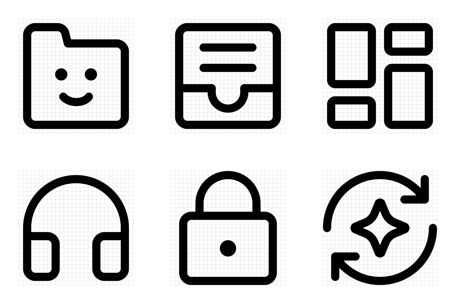
A great icon cannot just look good on its own. It has to feel like it belongs.
That sounds simple, but an icon library is a visual system made of hundreds or thousands of individual decisions. The real challenge is not drawing one good icon. It is drawing the thousandth icon so it still feels like it was made by the same hand, using the same visual language.
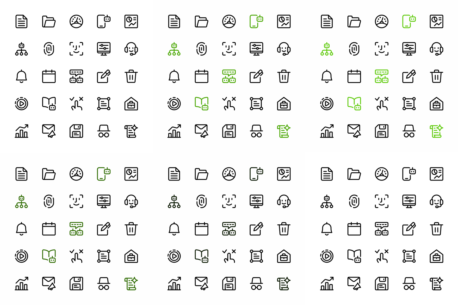
Consistency is made of small decisions
A consistent icon set is not shaped by one rule. It is the result of many subtle choices working together:
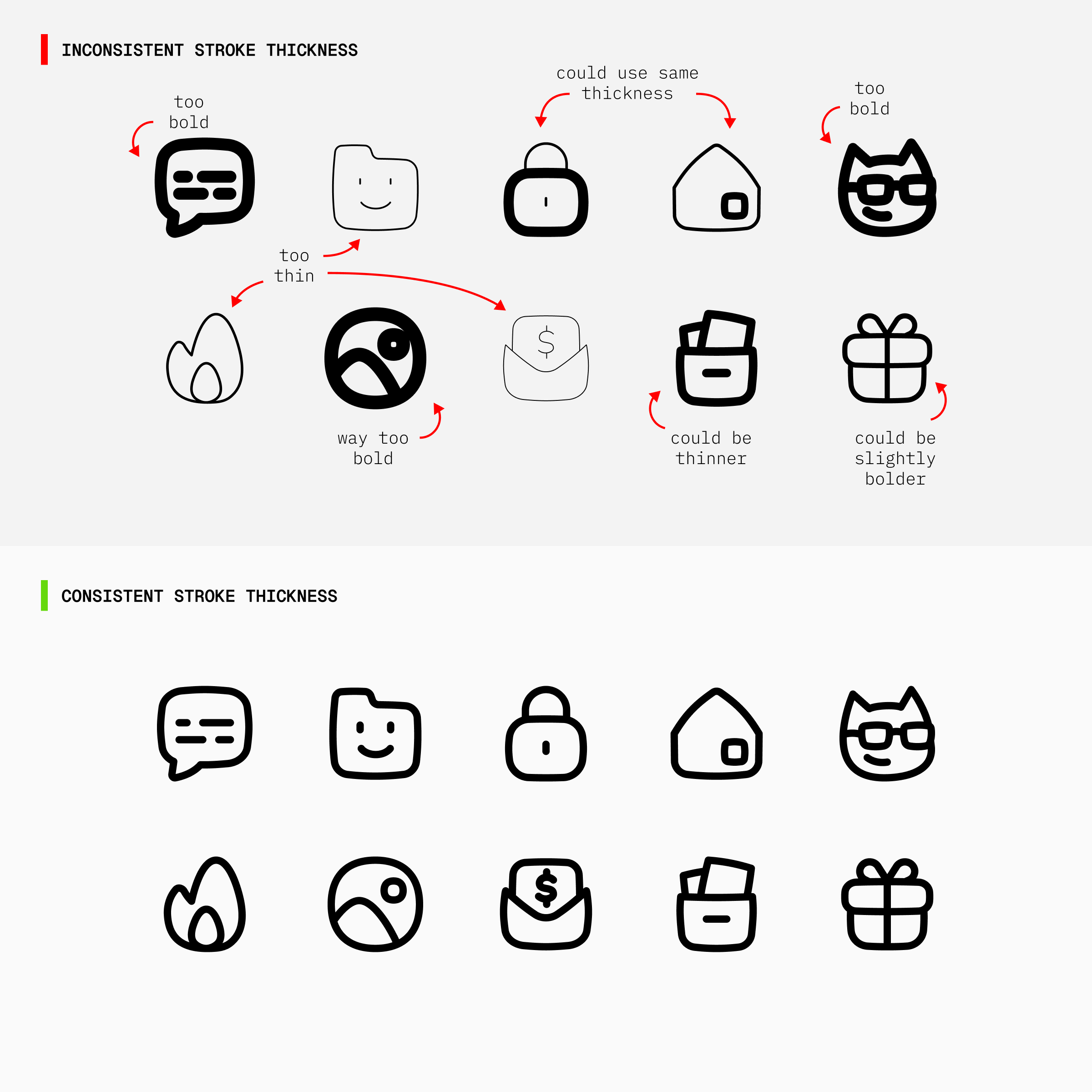
1. Stroke weight
Every icon should use the exact same line thickness, with no icon running thinner or thicker than the rest.
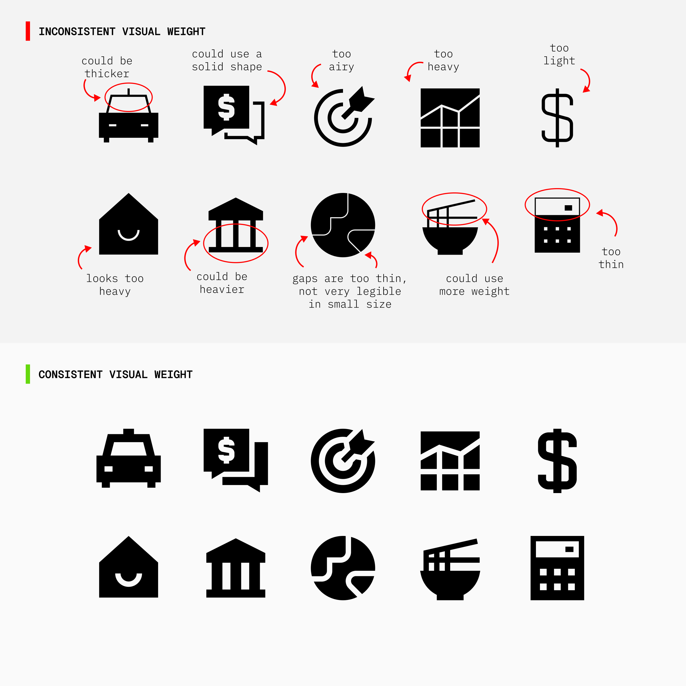
2. Visual weight
Icons should look equally heavy or light across the set, despite having different shapes or levels of detail.
3. Line construction
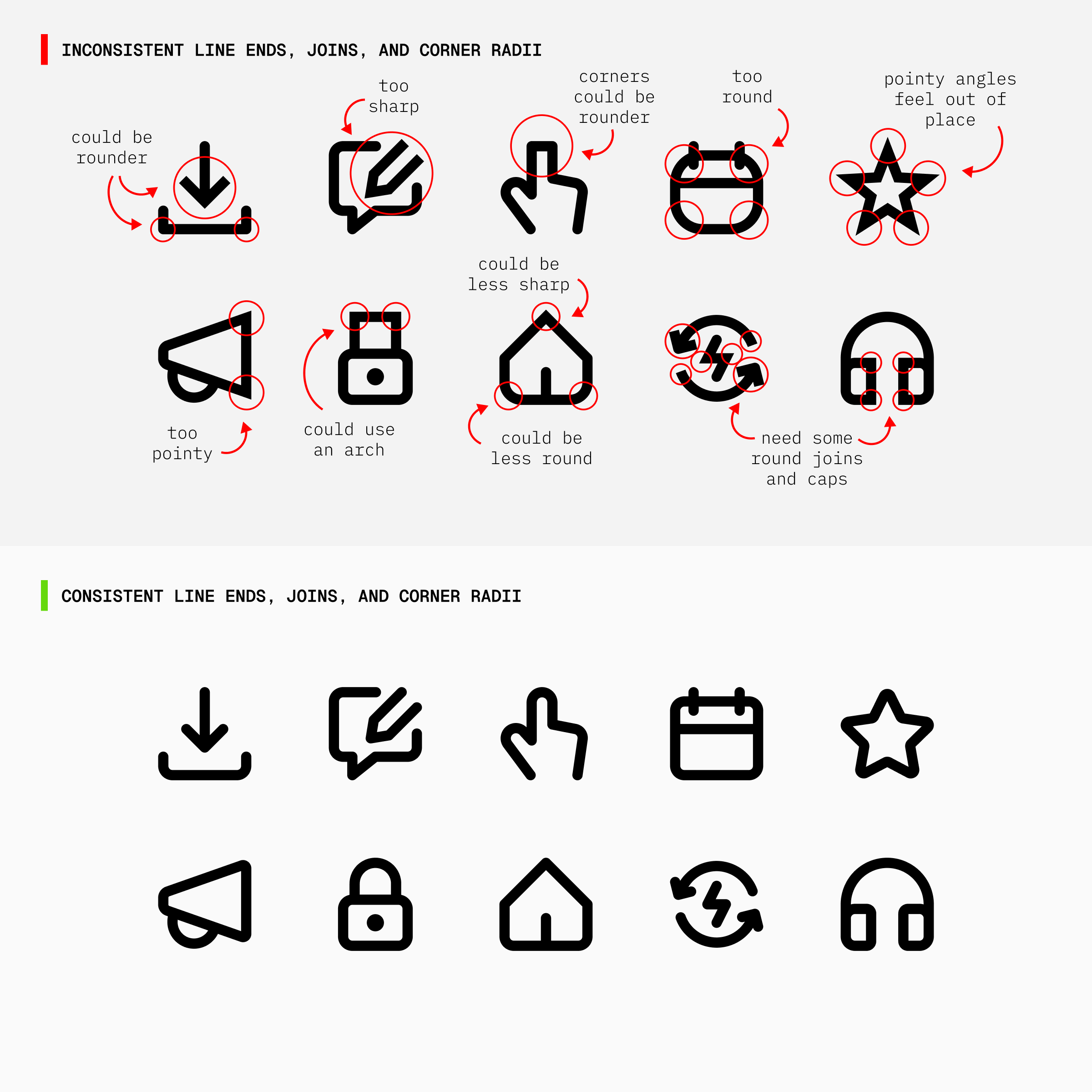
Where a line ends (caps), where two lines meet (joins), and how sharply or smoothly a shape turns a corner (corner radius), all of it should follow one consistent treatment across the set.
4. Gaps and spacing
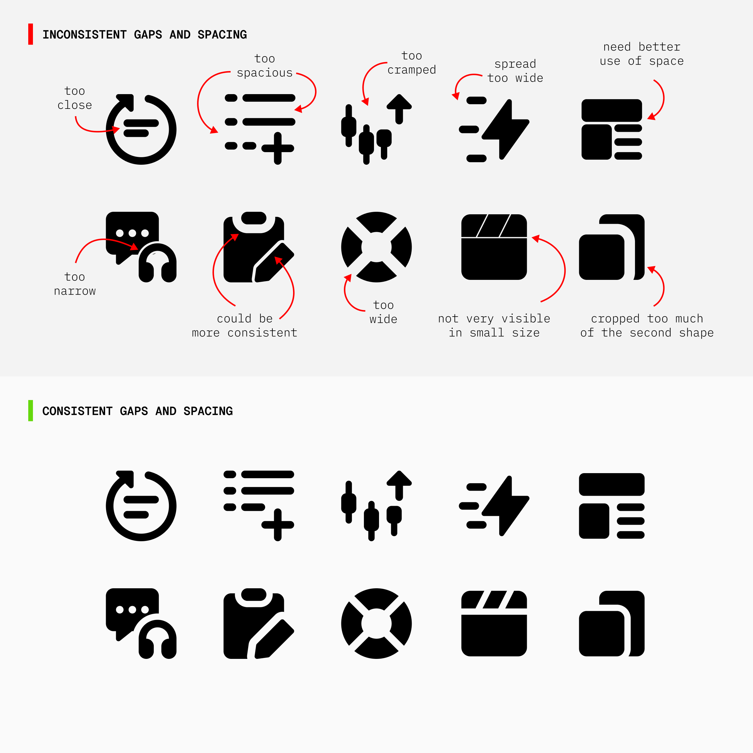
The space between lines, shapes, and parts of the icons should stay even across the set, not tight in one icon and loose in another.
5. Proportion and negative space
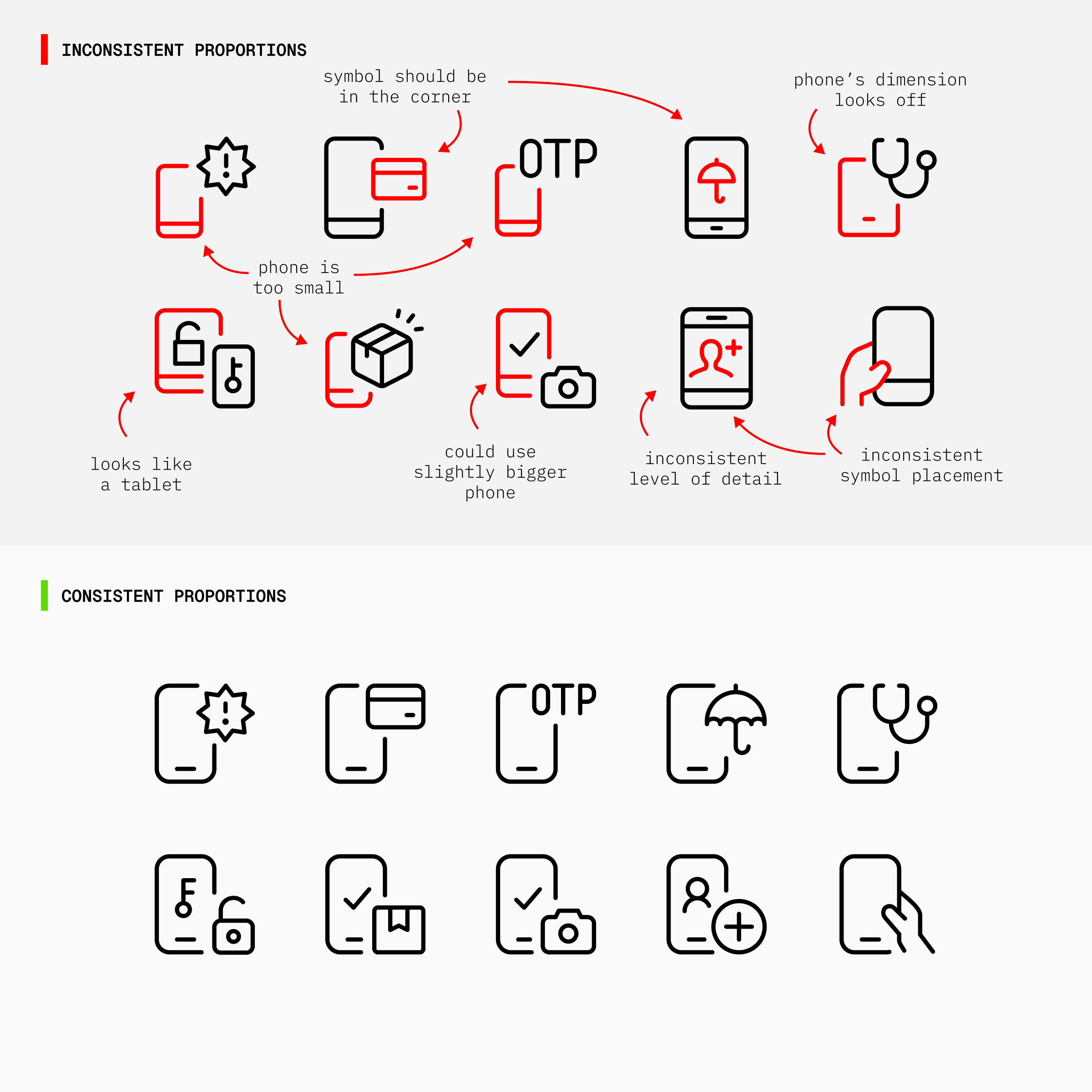
Elements should feel proportionally similar across concepts, so no icon appears unusually large, cramped, or delicate, and the negative space within the grid doesn't look too dense or too open.
6. Perspective
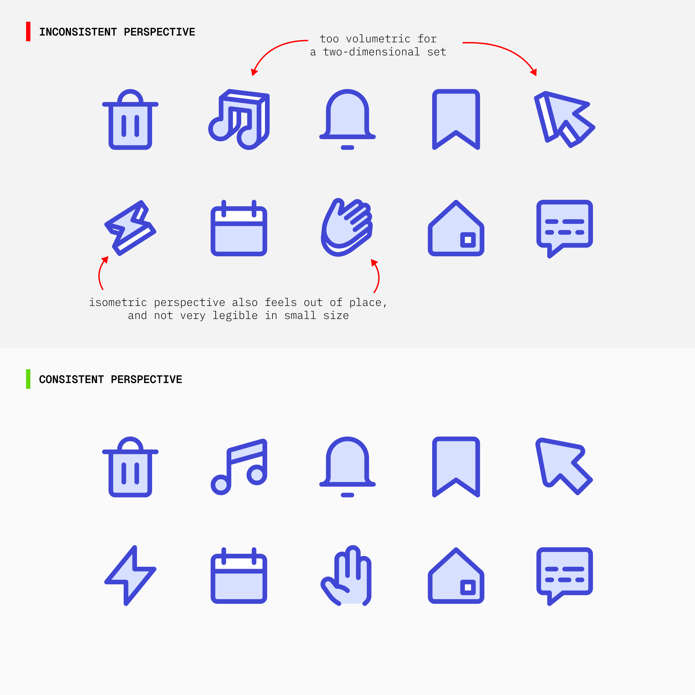
Every icon should be drawn from the same viewpoint, either orthographic or isometric, not two-dimensional in one icon and angled in another.
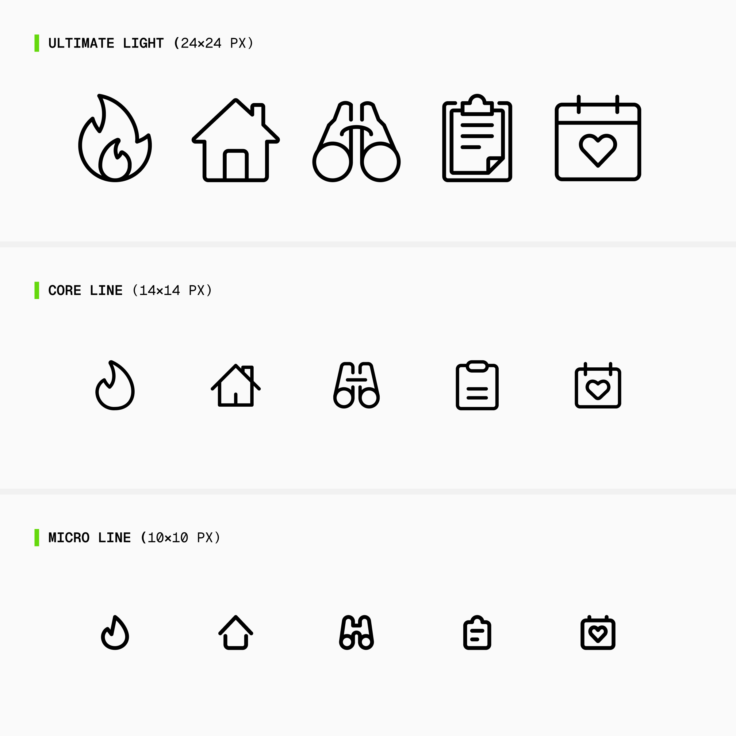
7. Level of detail and simplification
Icons need a comparable degree of complexity, with clear rules for which details are essential and which can be removed.
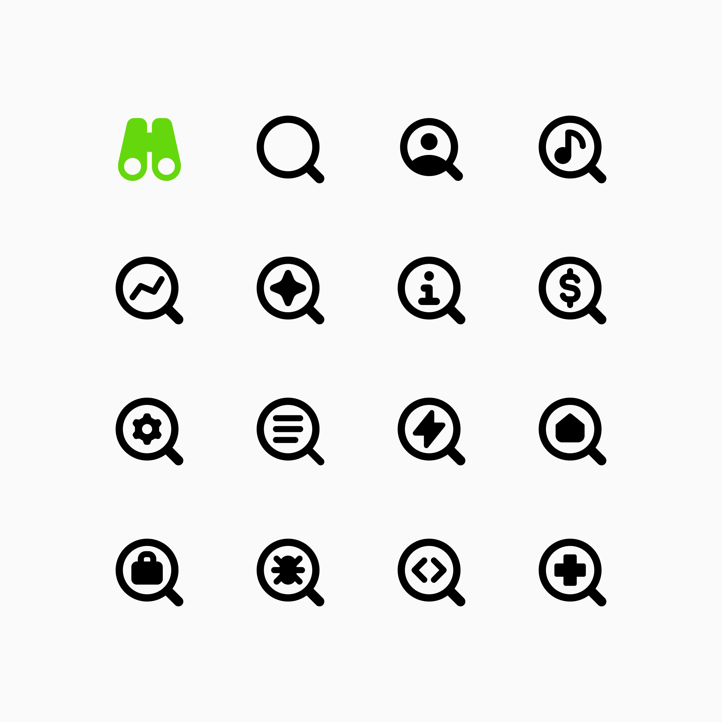
8. Metaphor choices
The way a concept is represented should match the library's visual vocabulary, using widely recognized symbols and established visual metaphors.
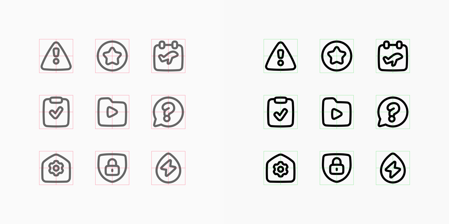
9. Optical corrections
Shapes often need to be adjusted by eye, not just by measurement, so they appear balanced and aligned.
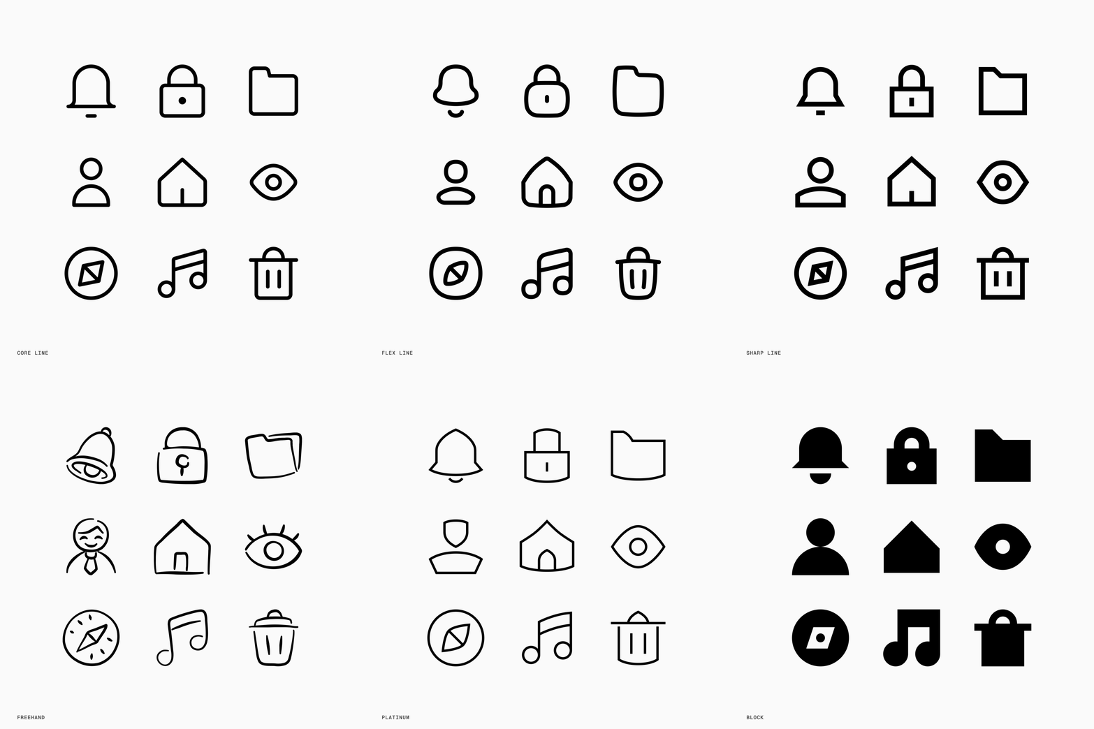
10. Style blueprint
Every icon should follow the same underlying construction as other icons in the same style, covering everything from how lines behave to how shapes are built.
None of these decisions is especially dramatic on its own. Together, they create the rhythm and personality of a set.
That is why an icon can be perfectly functional in isolation but still feel wrong next to the rest of the library. A slightly heavier stroke, an unusually tight gap, or a metaphor that feels too playful can be enough to break the connection.
The thousandth icon is the real test
The first few icons help define a style. The thousandth proves whether the style can last. As the library grows, every new concept tests that: every new icon has to still feel like it was made by the same hand.
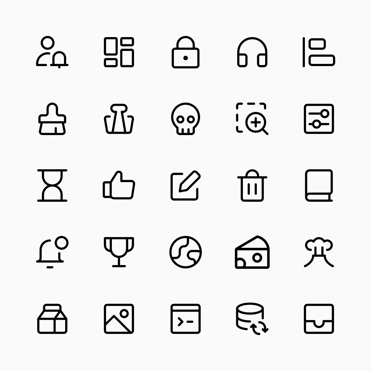
Design guidelines make this possible. We build them from the first icons, then refine them as we learn from feedback and from work on other styles. That's how a new icon, drawn a thousand icons later, can still be checked against what the first ones established.
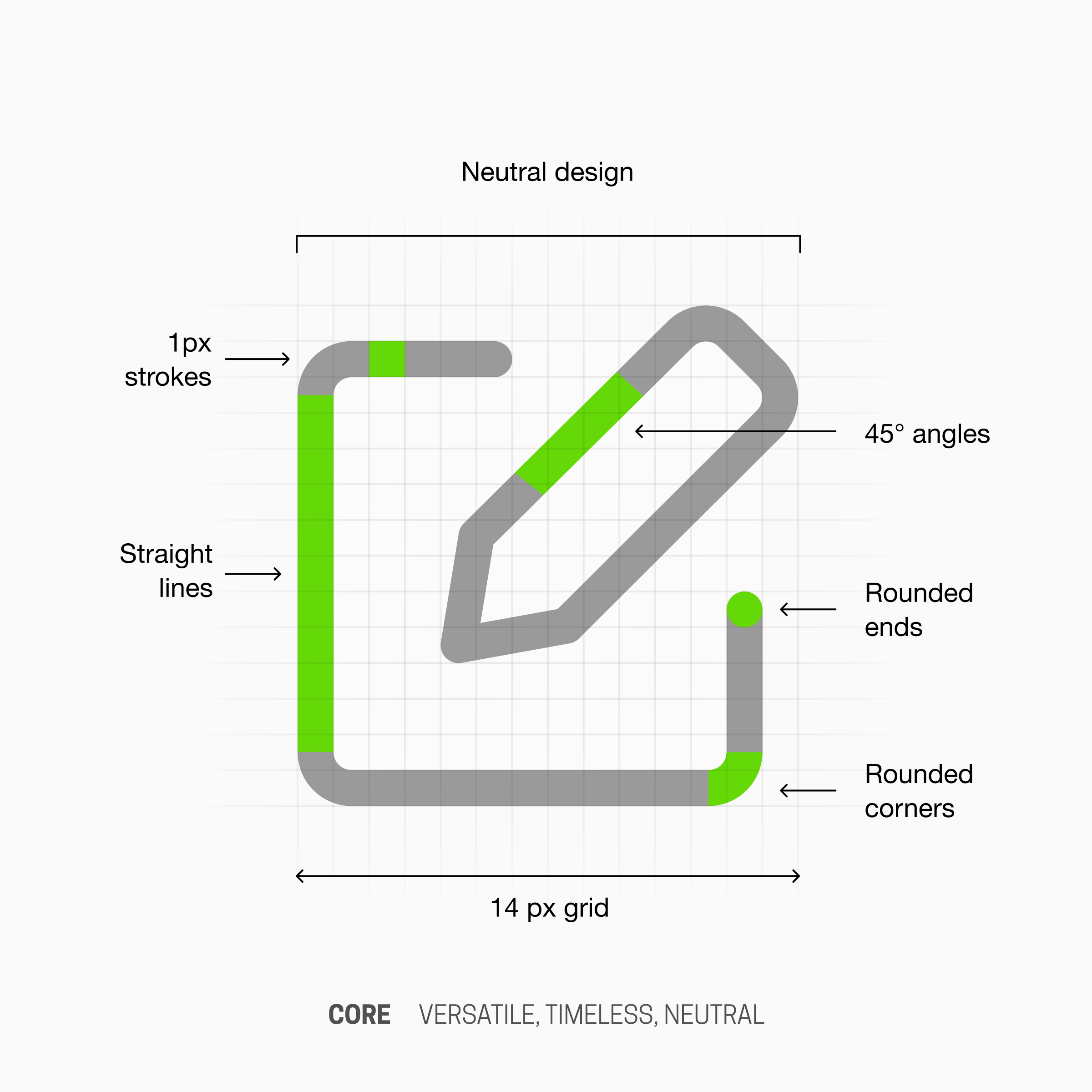
You might think our latest additions to the Core set were created by the same designer who made the first icons, but no. Several designers have worked on Core over time.
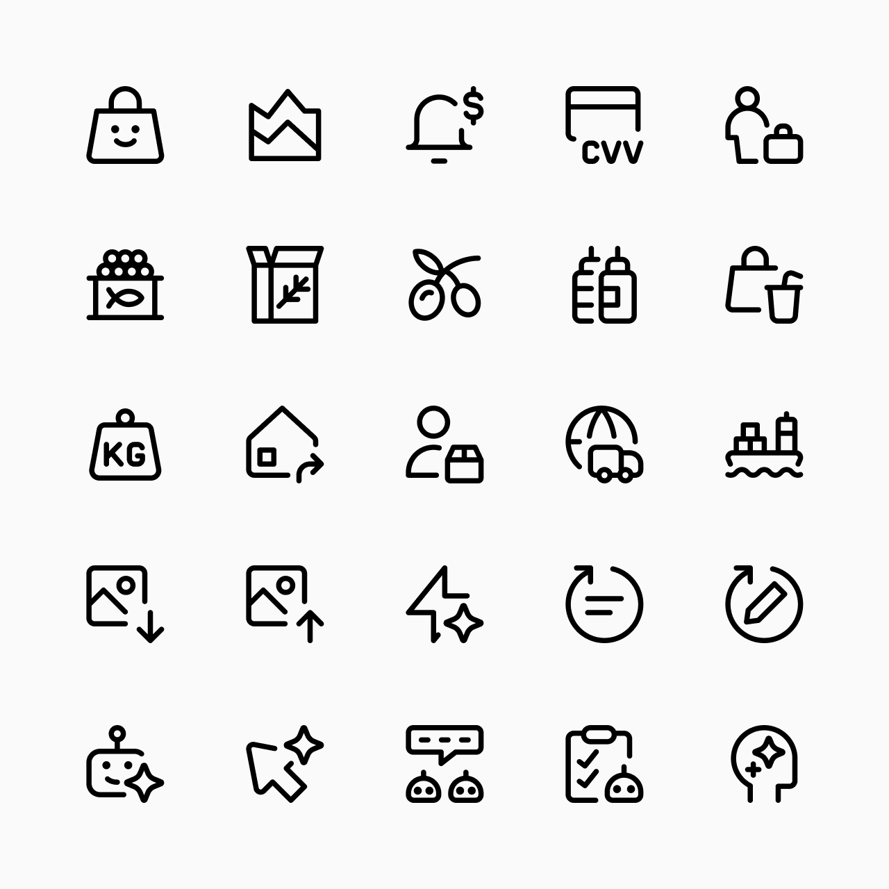
More personality means more rules
The more distinctive an icon style becomes, the more visible inconsistency becomes.
A neutral system has fewer stylistic constraints. Highly expressive styles depend on unique design rules: unusual proportions, exaggerated shapes, specific curves, custom perspectives, and so on. Those characteristics give a set personality, but they also leave less room for variation.
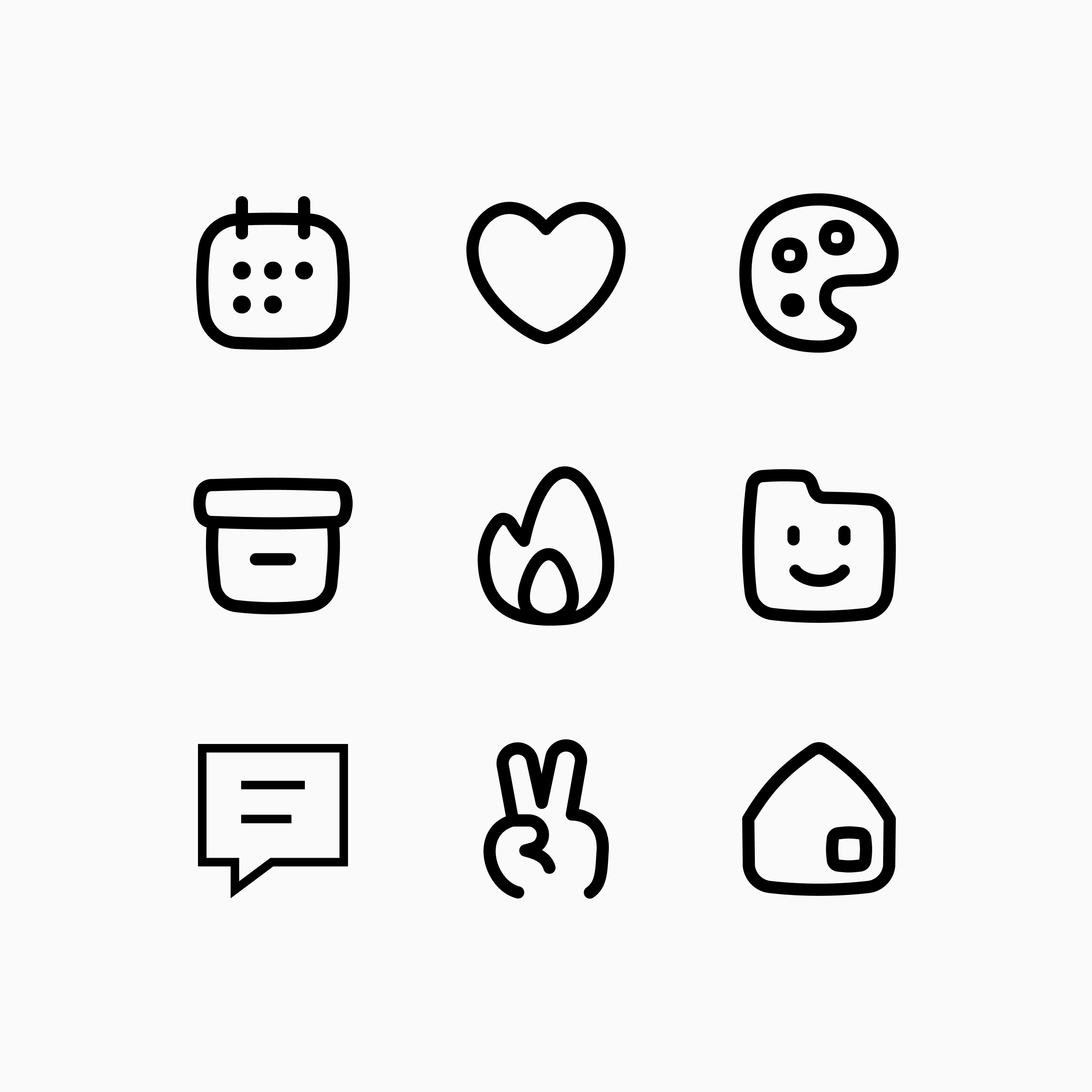
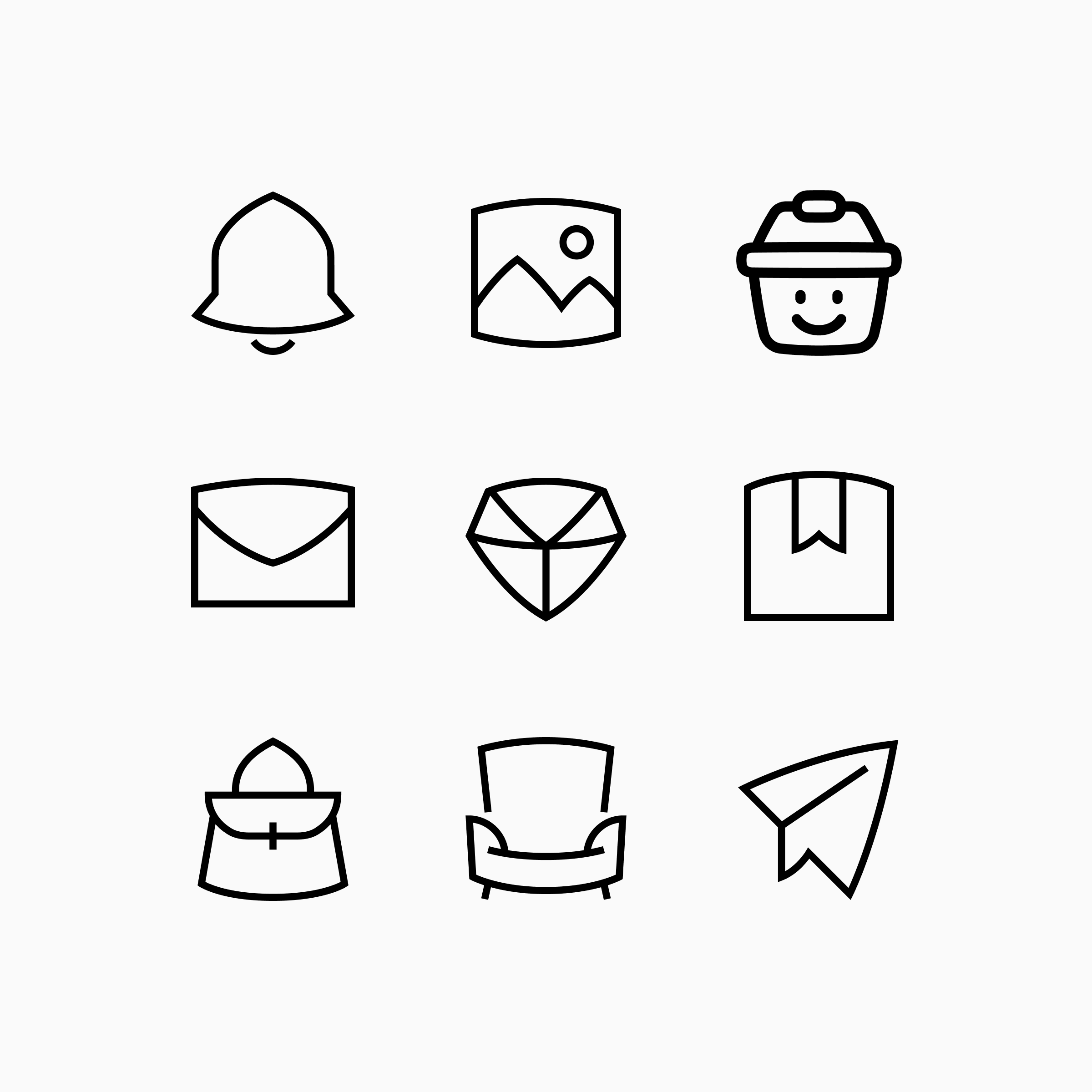
Minimal styles simply have fewer rules to break. The more expressive a style becomes, the more rules it introduces, and the more opportunities there are for inconsistency to show.
Consistency and legibility do not always agree
Good icons are consistent. Good icons are also legible. But holding onto both gets harder as a style becomes more distinctive.
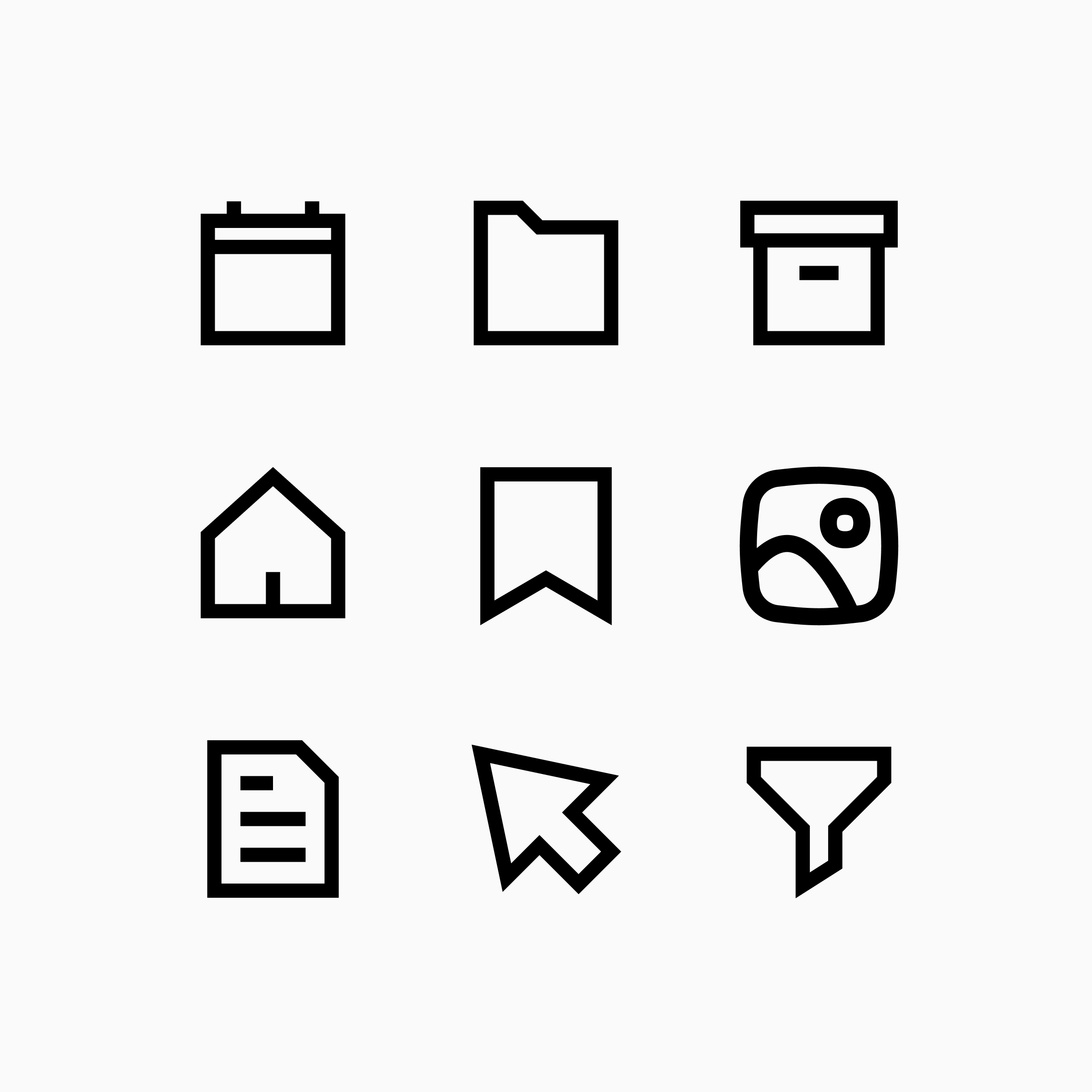
Some icons adapt naturally to a style, while others resist its rules and become harder to recognize. In Sharp, icons like a bookmark, a calendar, or a document adapt naturally to the style's straight lines and sharp corners. But push that rule onto everything, and icons like a notification bell, a user, an eye, or a fingerprint start to look off.
This creates a tension. If you follow every style rule too strictly, the icon may become harder to understand. If you preserve recognition, you may need to bend a rule. When that trade-off comes up, we prioritize legibility. That's why Sharp keeps a few curves and arches: to stay legible without losing its identity.
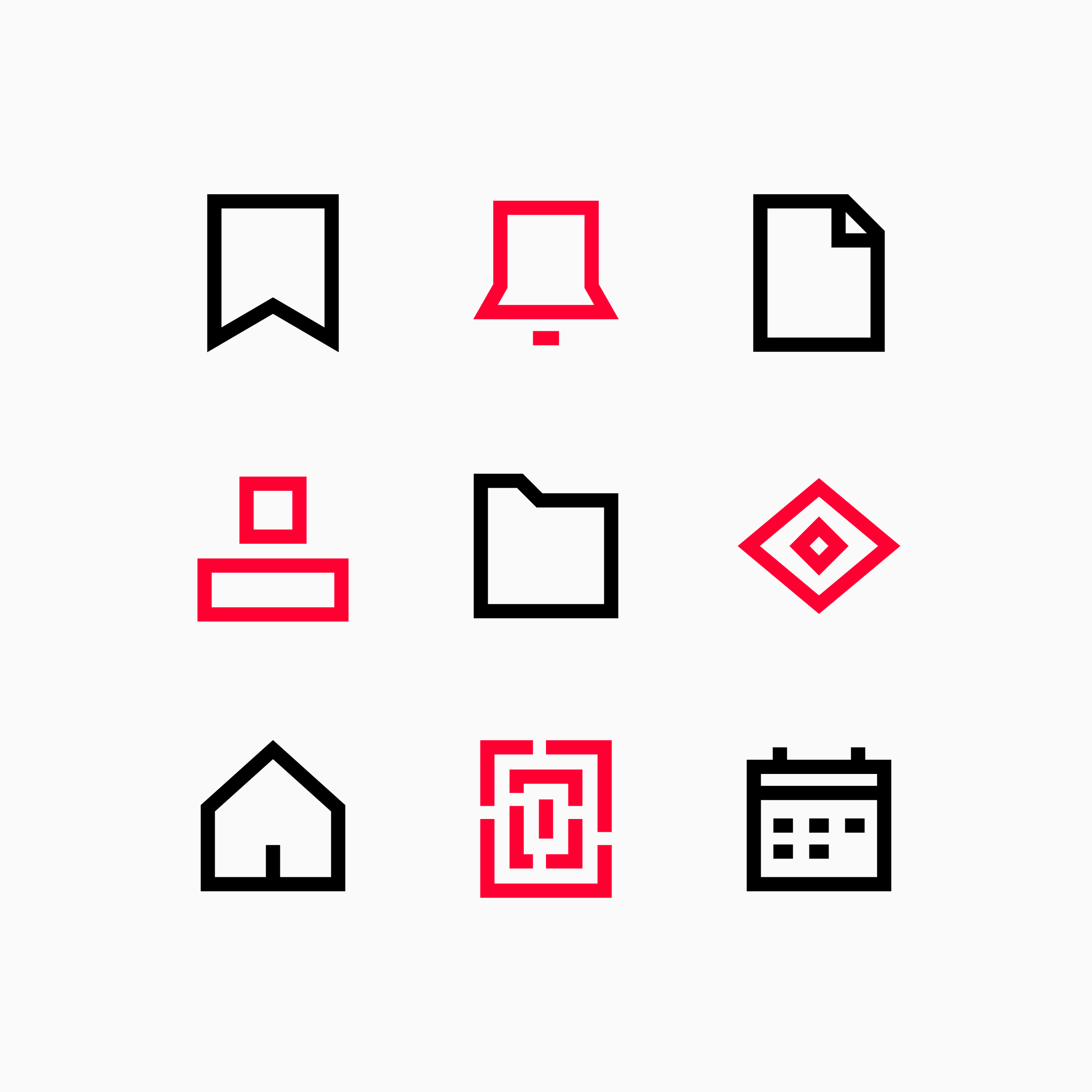
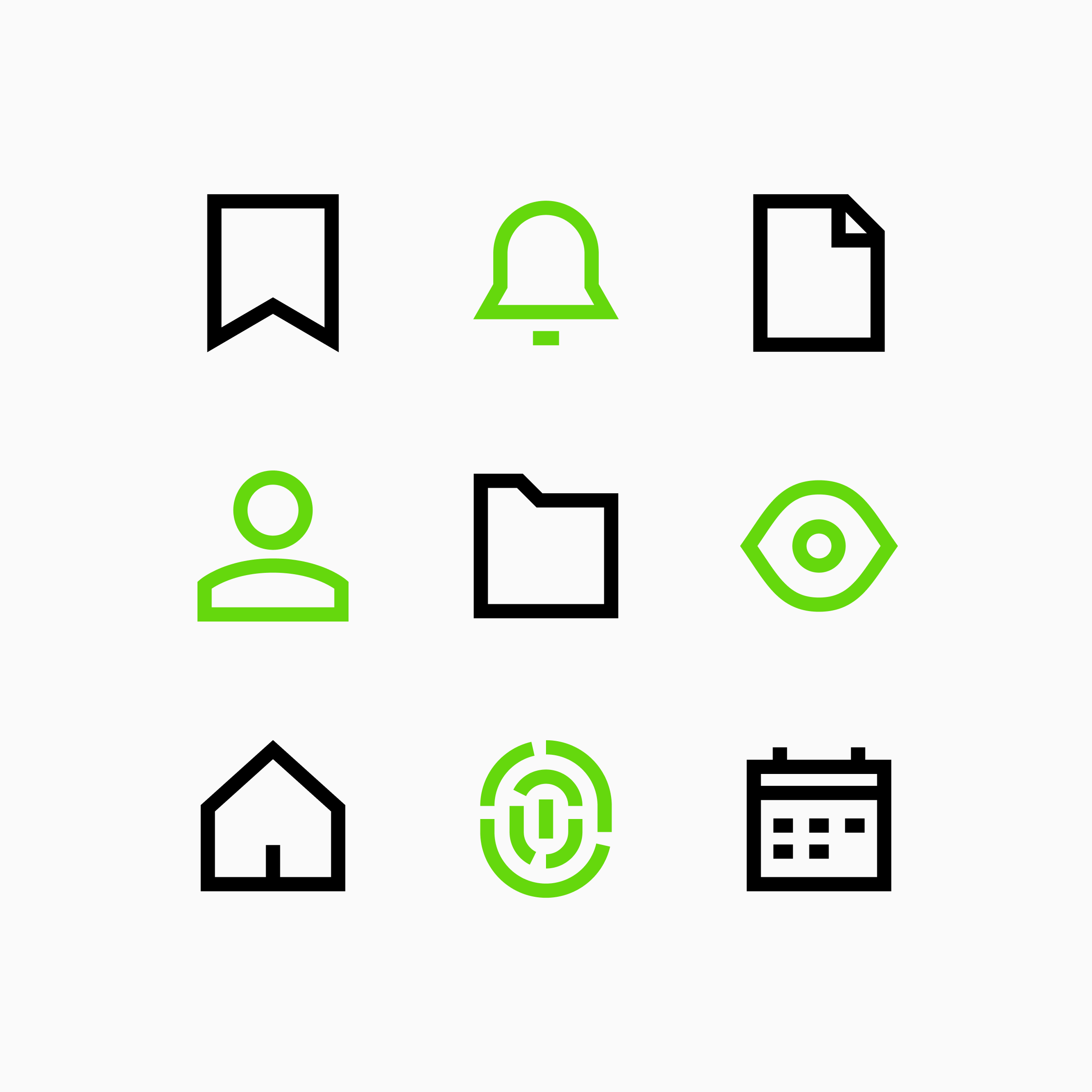
A bell, a user, an eye, and a fingerprint, forced sharp, then given back a few curves. Small exceptions like these are what keep Sharp icons legible.
The difficult part of icon design is often not creating the rules, but deciding when they deserve to be broken.
Consistency is a spectrum
No icon set is perfectly consistent, and it should not try to be. Every library balances competing priorities:
- Consistency: making icons feel like they belong to one visual system, even when their subjects are very different.
- Legibility: keeping icons clear at their intended size, including when reduced to a small interface control.
- Recognizability: preserving the details or metaphors people need to identify a concept quickly.
- Aesthetics: giving the set character and a distinctive point of view rather than making every icon generic.
- Production speed: designing efficiently enough to maintain and expand the library without compromising what matters.
- Scalability: accommodating new concepts and edge cases without losing the system's visual logic.
These priorities often pull in different directions.
A more detailed icon may be easier to recognize but less consistent with a minimal style. A highly stylized solution may be more memorable but less legible at small sizes. A faster solution may work today but introduce exceptions that make the system harder to scale tomorrow.
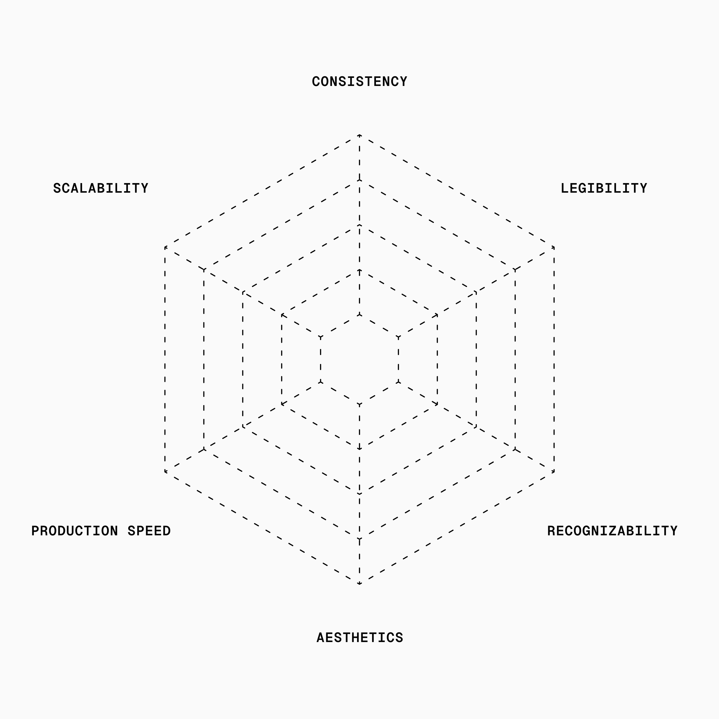
Priorities can shift over time, too.
Guidance leaned heavily into aesthetics early on, at some cost to legibility and recognizability. We've been working to improve that.
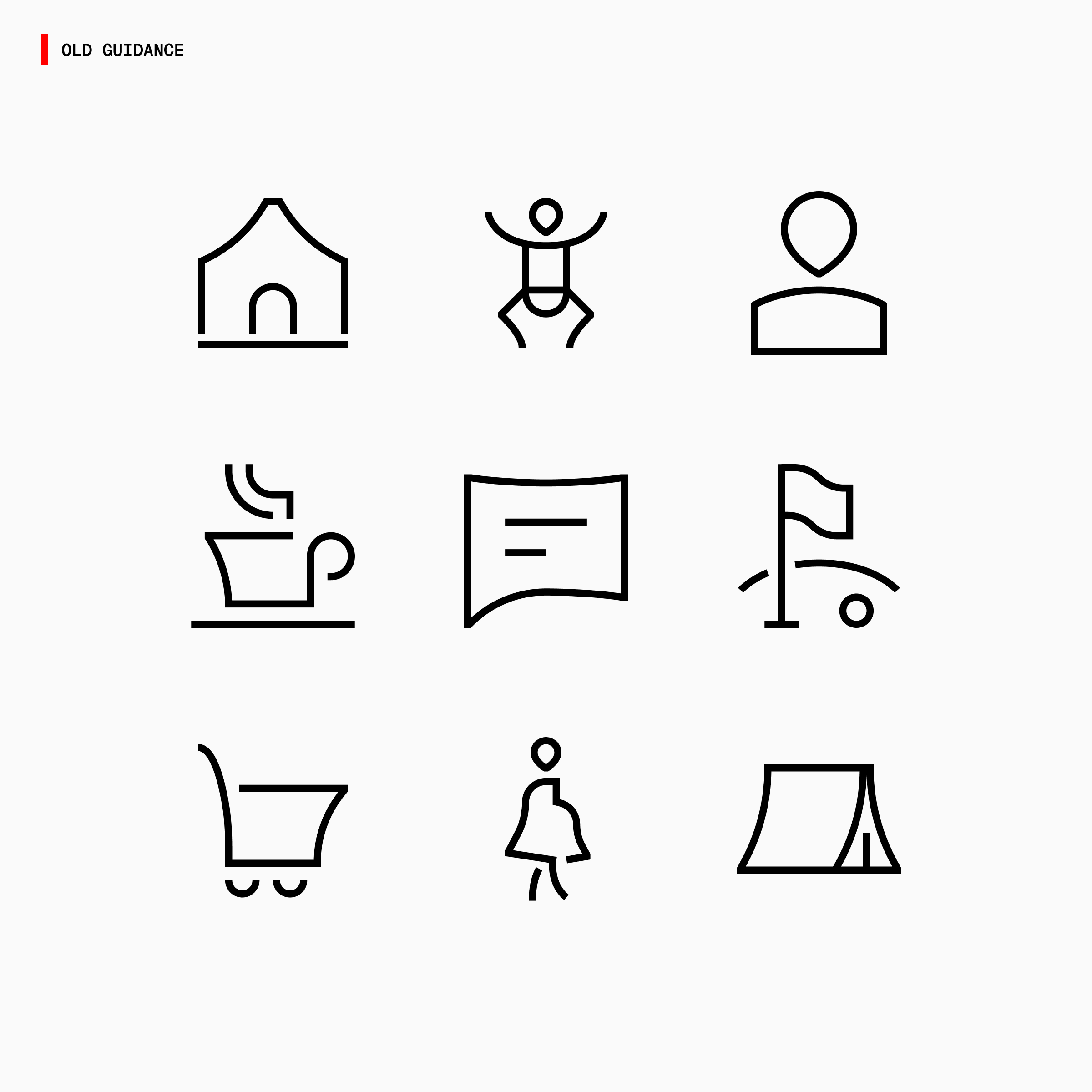
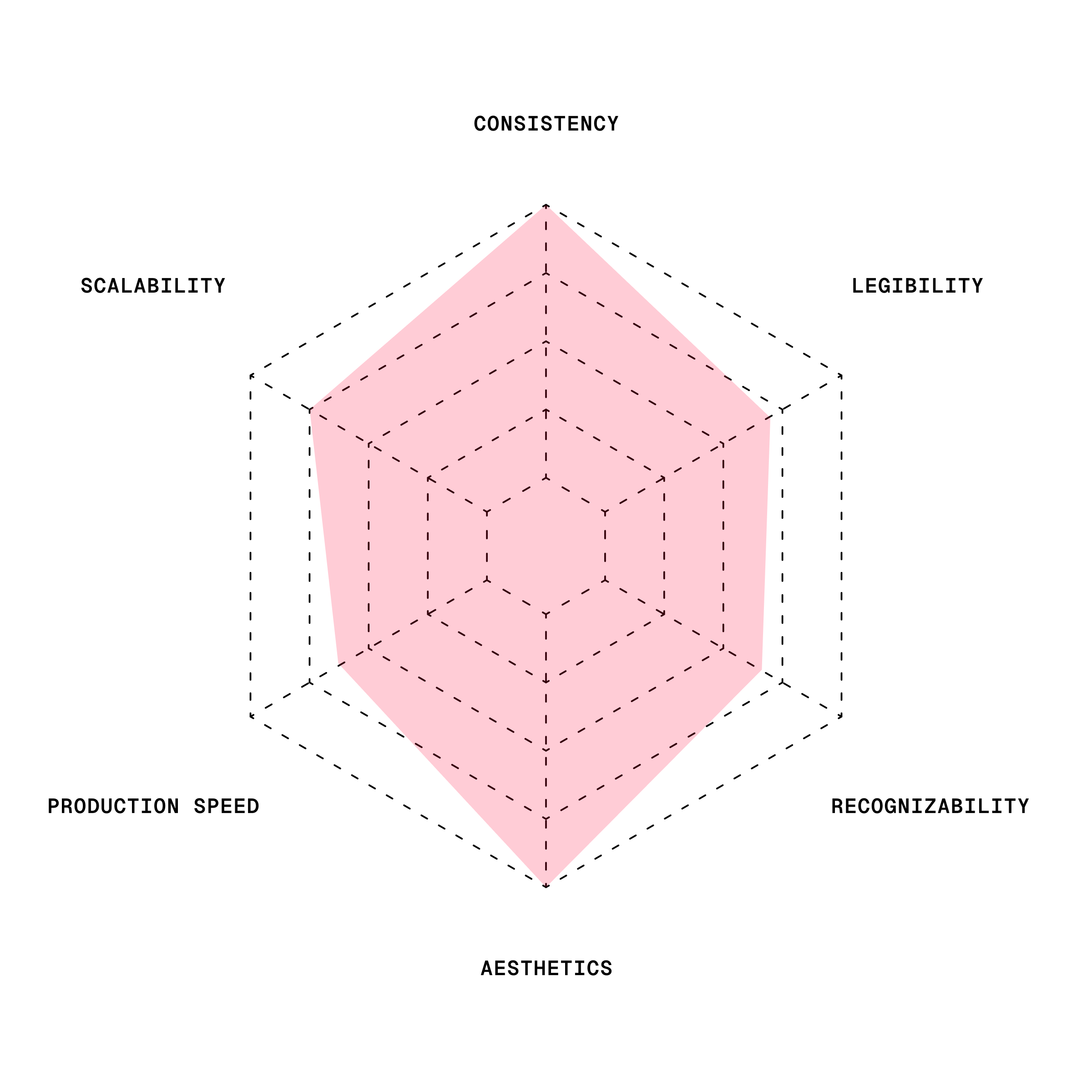
The new Guidance features more familiar shapes and symbols alongside its defining curves. We make sure those icons become more recognizable and legible at small sizes without losing their aesthetic look.
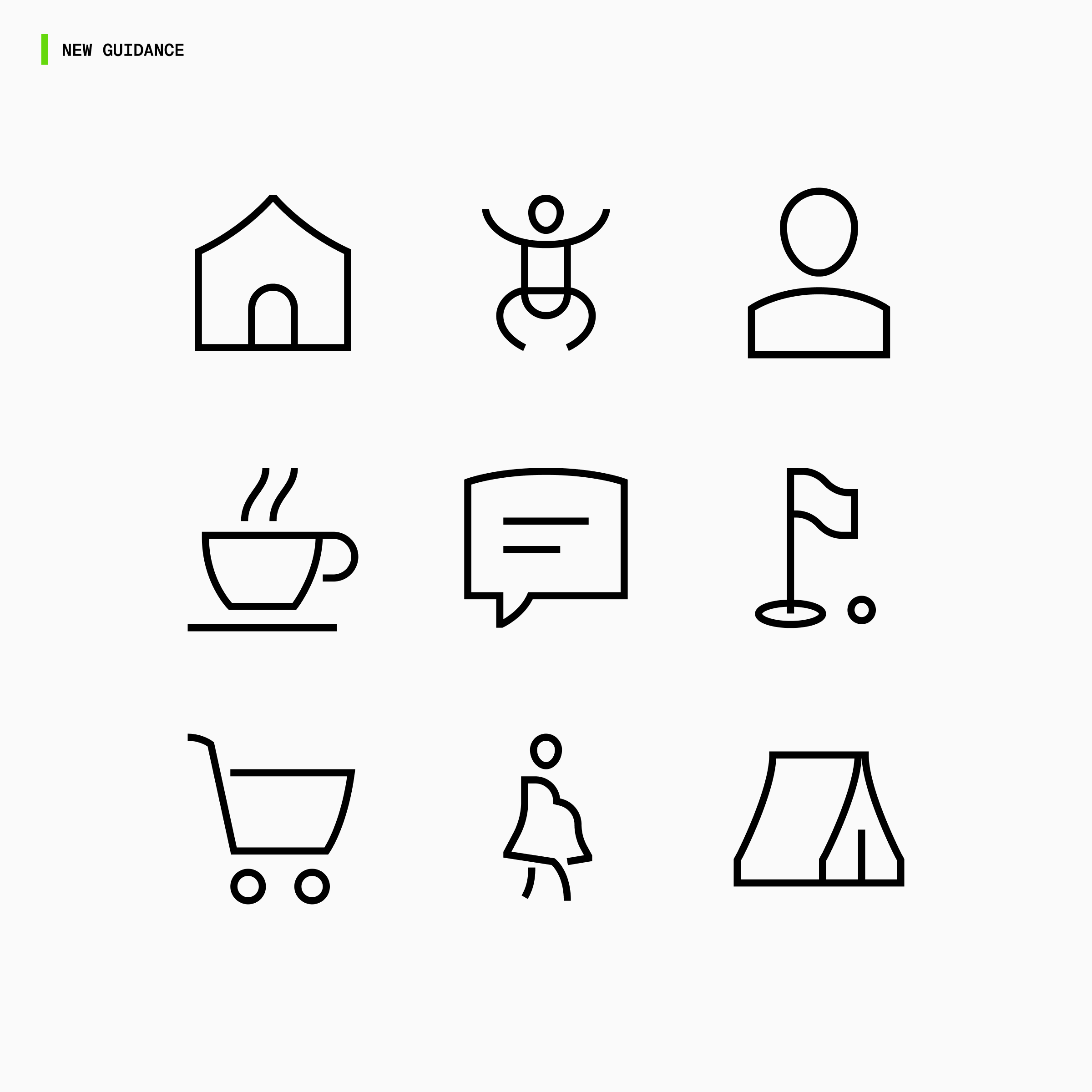
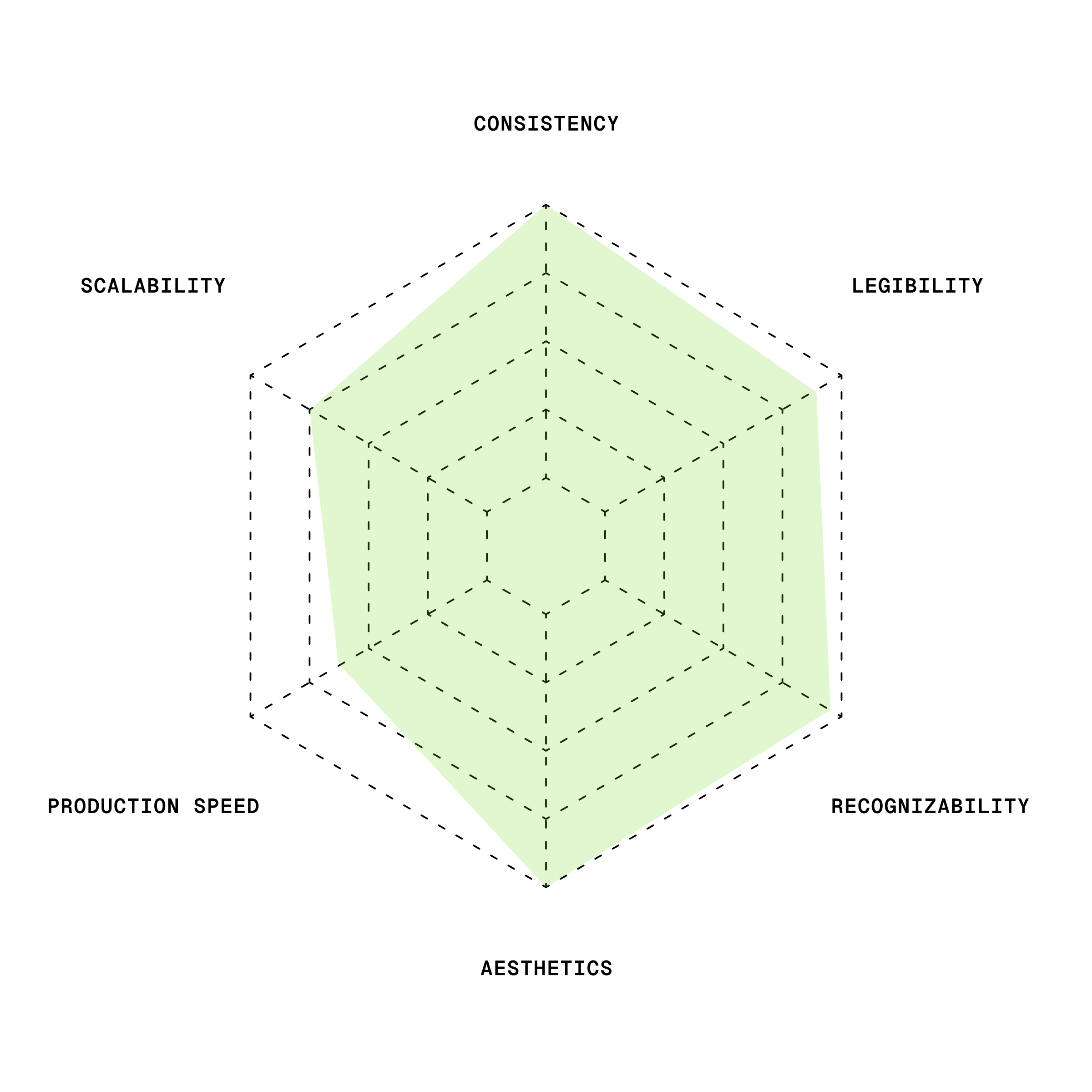
The goal is not to maximize one dimension at the expense of everything else. It is to make good decisions, one icon at a time.
See consistency up close
The easiest way to understand icon consistency is to compare styles side by side.
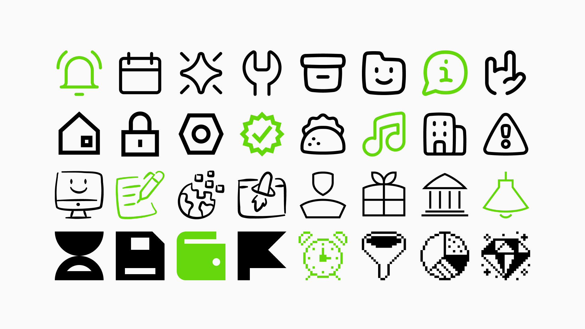
Browse the Streamline Icon System to see how thousands of icons stay connected while each style keeps its own personality.