Streamline Material Icons
Material Icons. Rebuilt and upgraded.
Google’s Material Icons provide a solid foundation, but they’re far from complete. Designers still end up redrawing missing icons and fixing inconsistencies, often resorting to mismatched third-party sets.
Streamline Material Icons is our solution: a professional-grade icon set that builds on Google’s system while addressing its biggest shortcomings.
Clean, consistent, and complete. Ready for modern products.
Built for Designers Who Need More
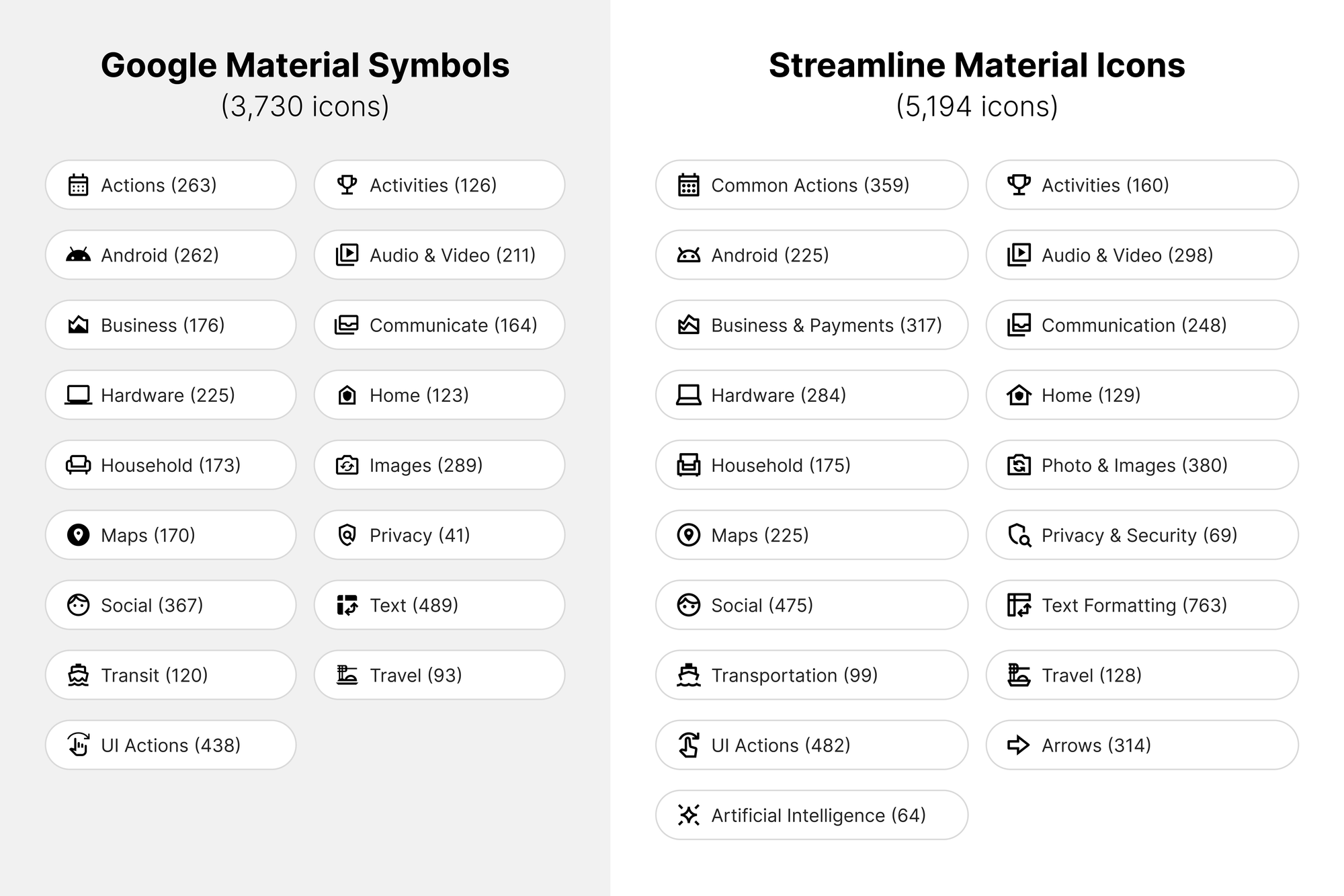
This isn’t just an expansion, it’s a redesign at scale. Streamline Material Icons builds on Google’s Material Symbols and takes them further, with:
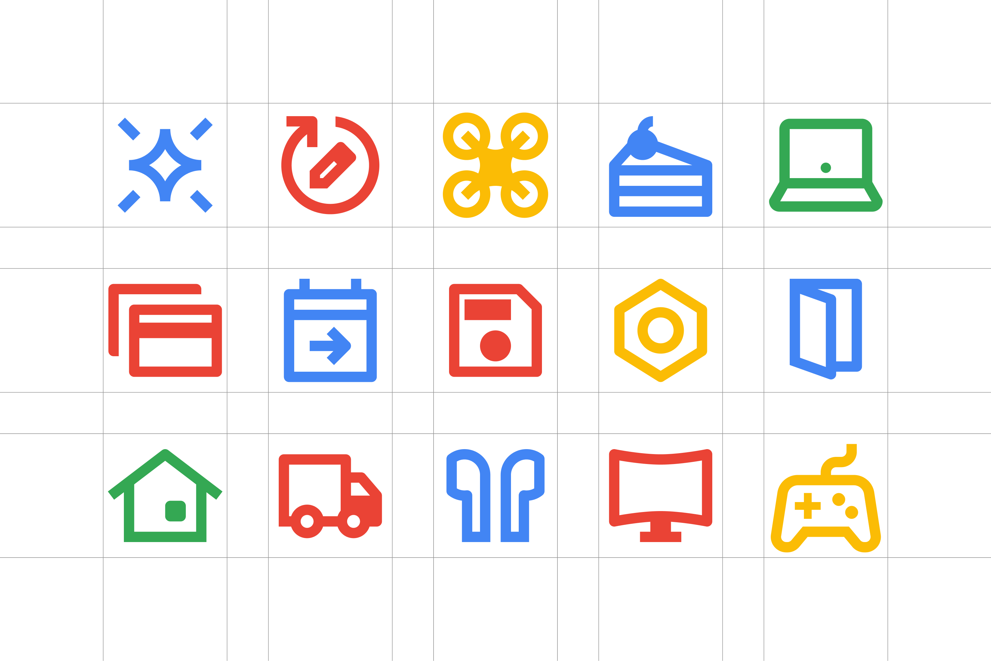
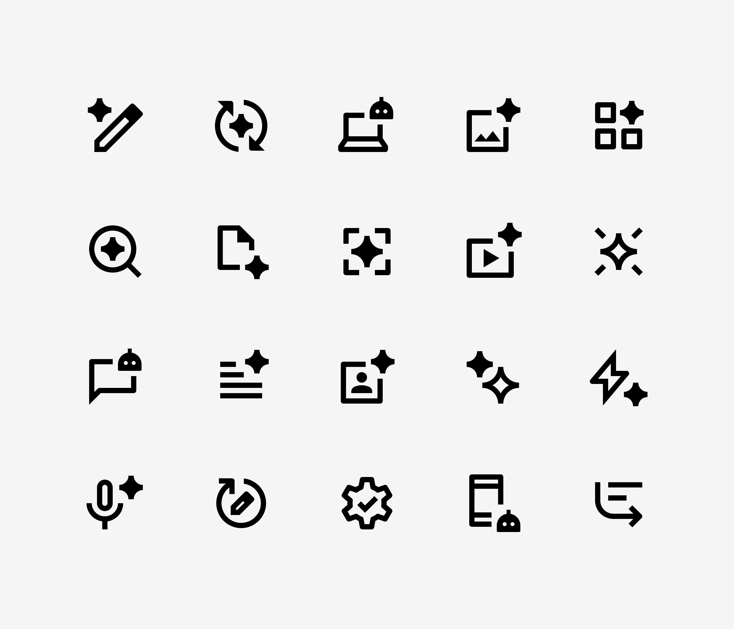
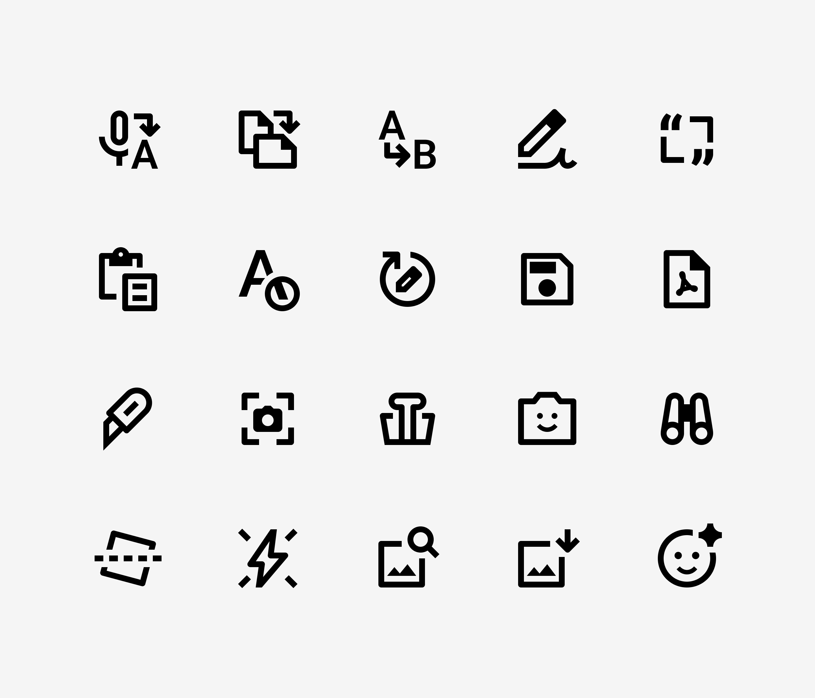
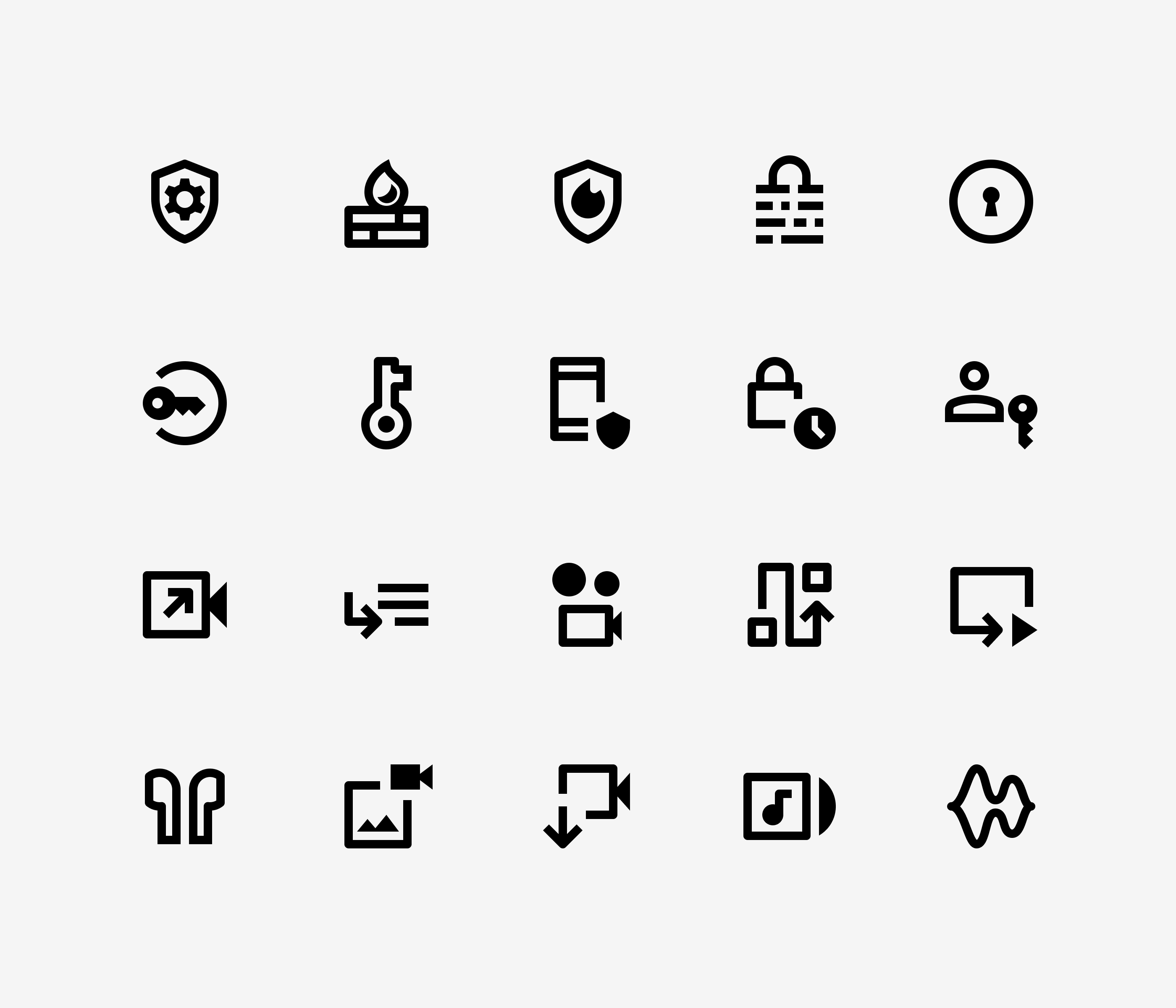
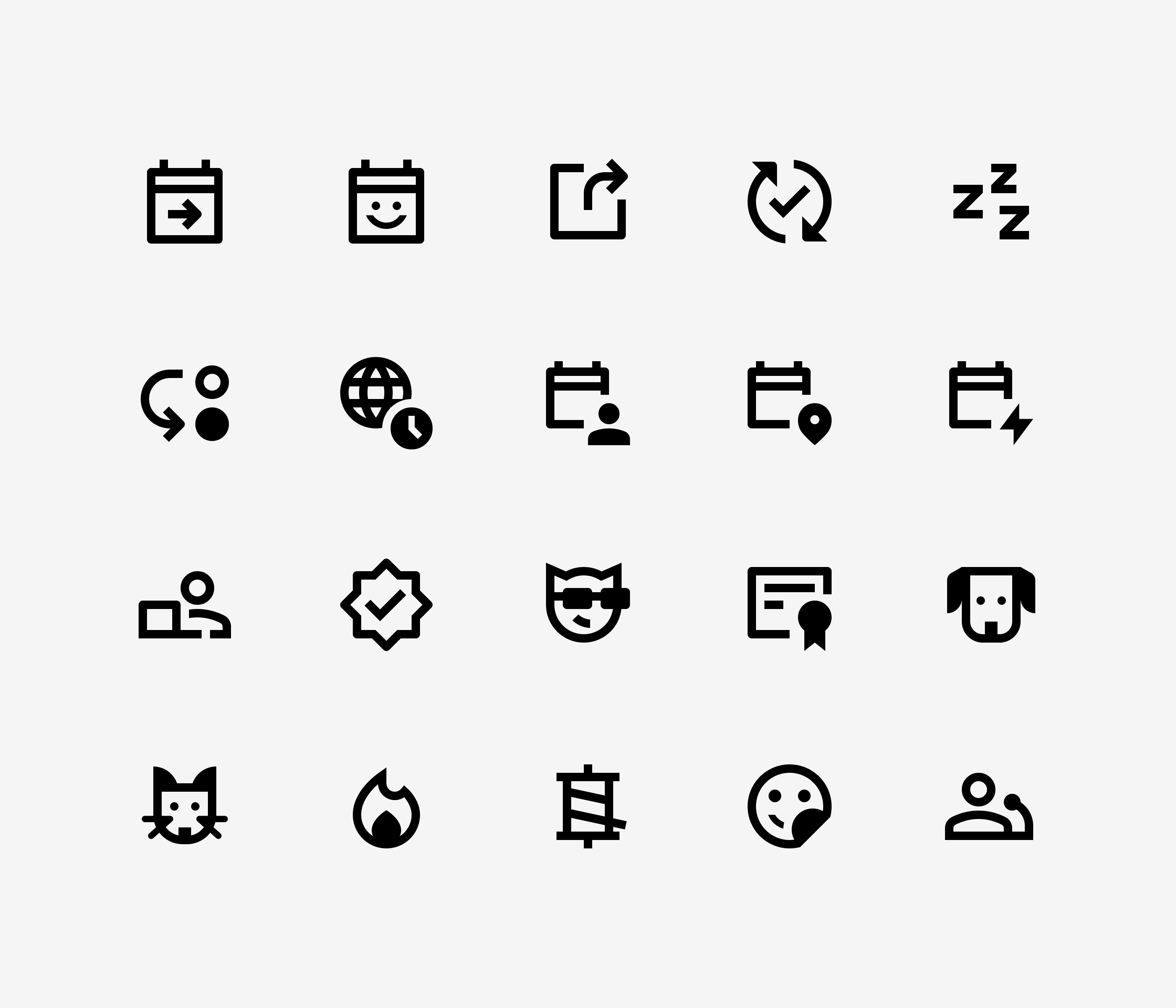
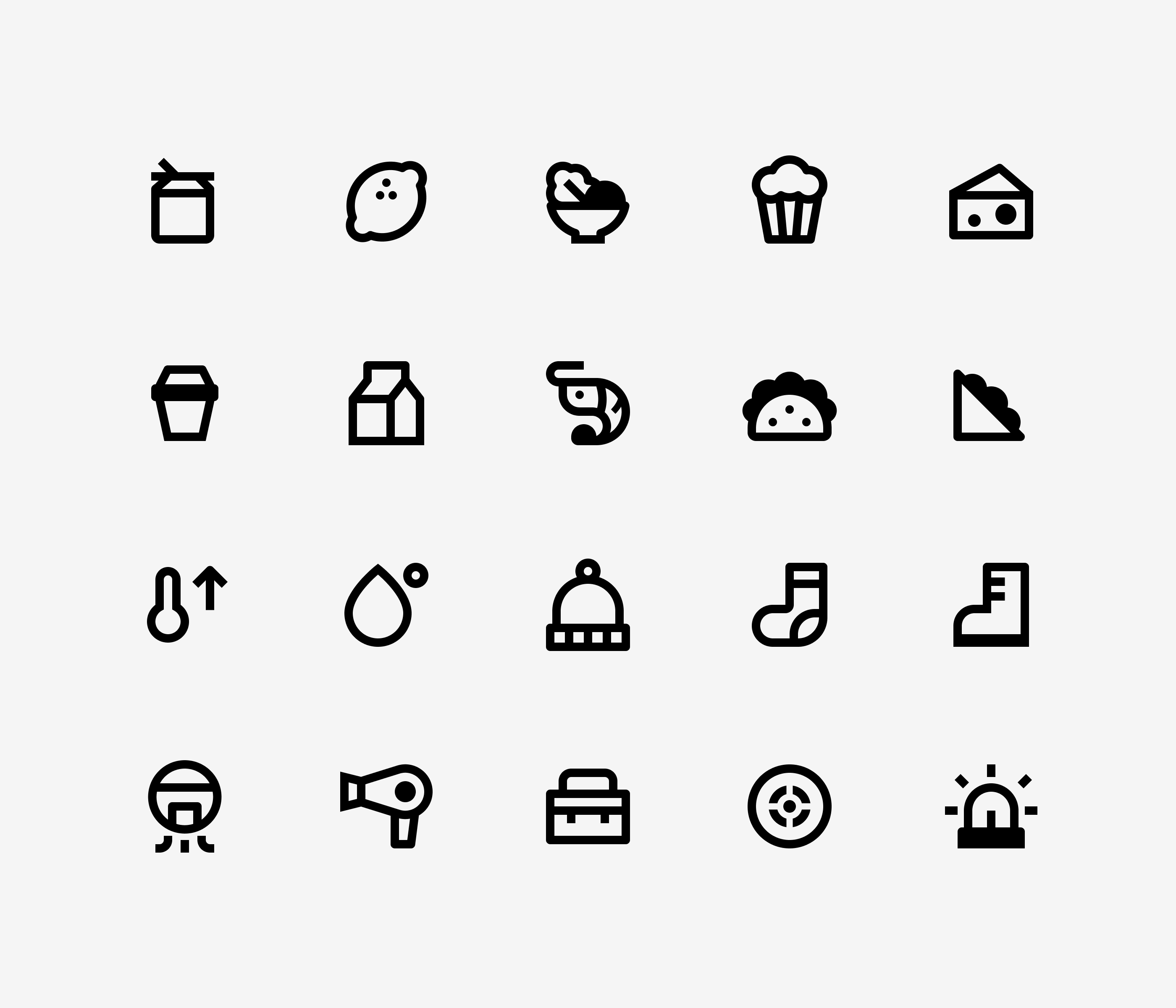
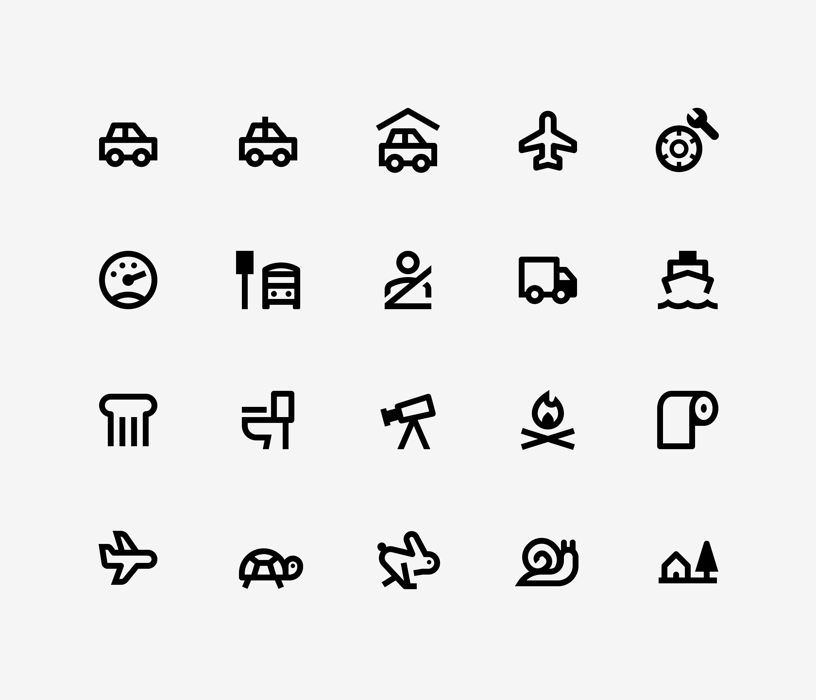
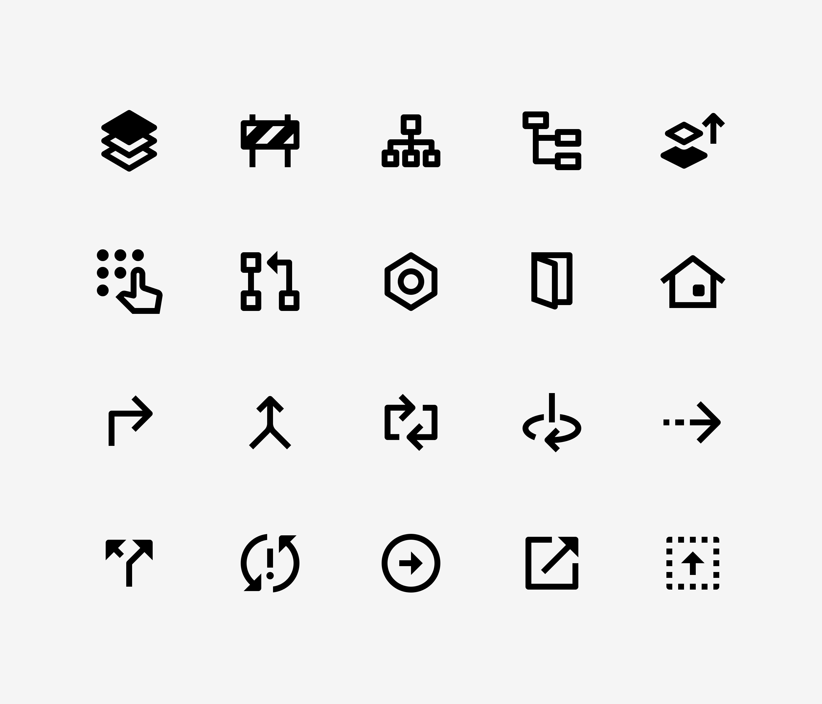
- 10,000+ total icons
- 5,000+ icons in Line & Fill versions
- Available now in Outlined style
- Rounded and Sharp styles coming soon
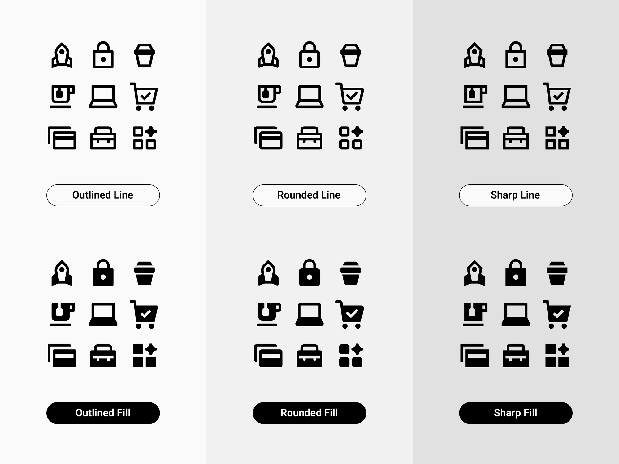
Every icon is redrawn or created from scratch to match Streamline’s standards: balanced shapes, consistent look, and a cleaner overall feel.
Designed for Clarity, Not Complexity
Streamline Material Icons are built on a 24px grid with a consistent 2px stroke (Material’s most widely used size).
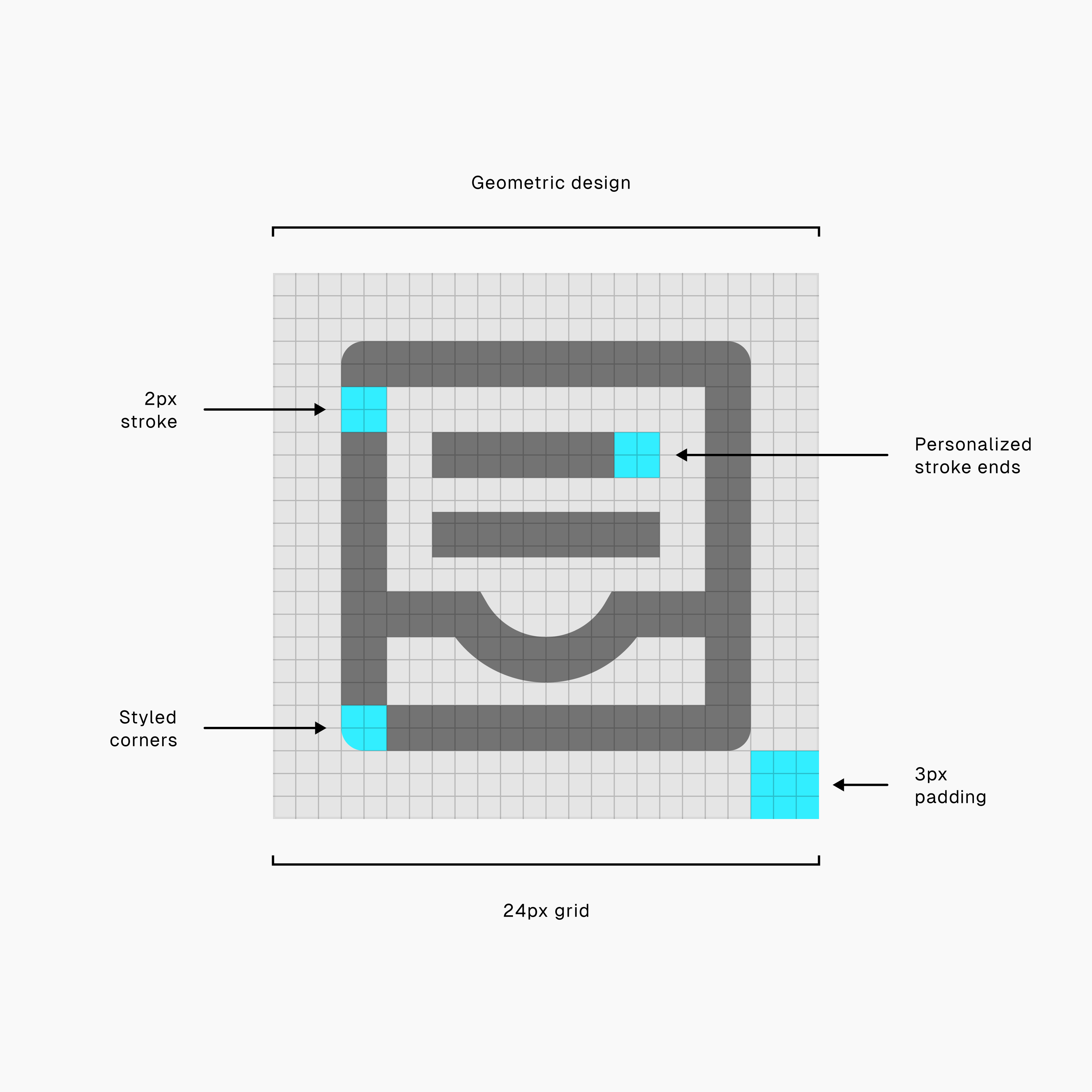
This isn’t just a default, it’s the sweet spot where icons stay legible, balanced, and visually clear across interfaces.
Modern Needs, Finally Covered
Material’s visual language is strong, but it wasn’t built for everything today’s products require.
That’s where we come in.
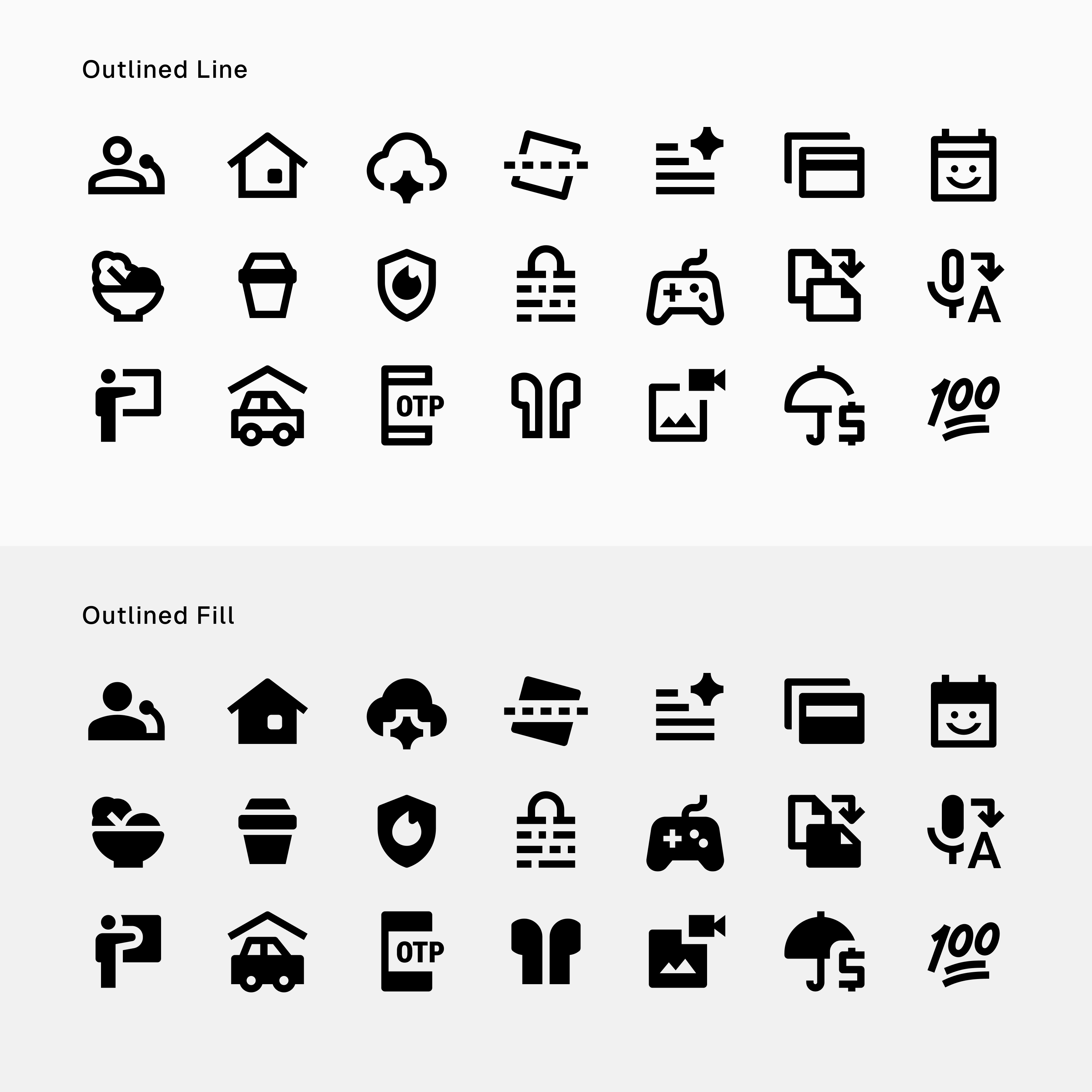
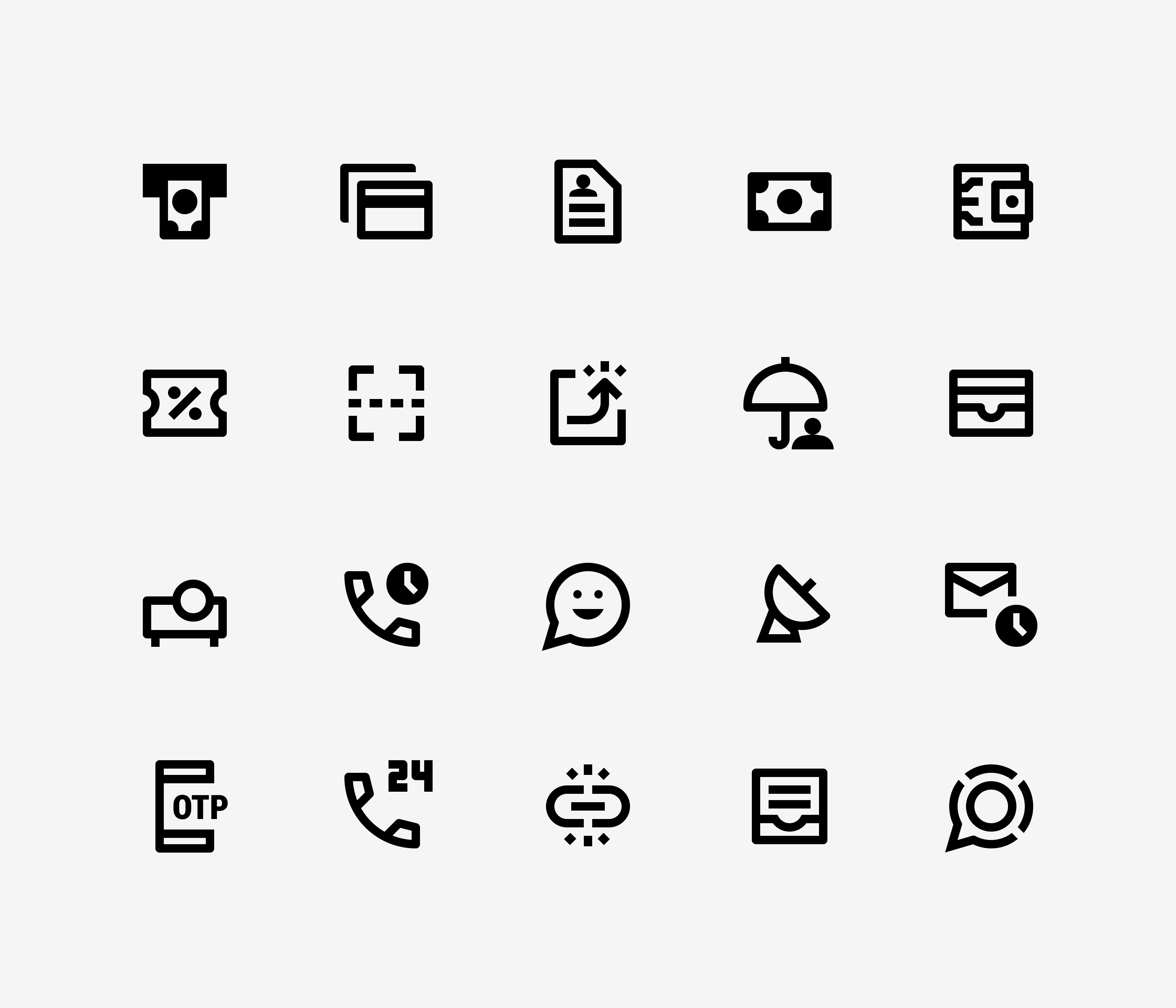
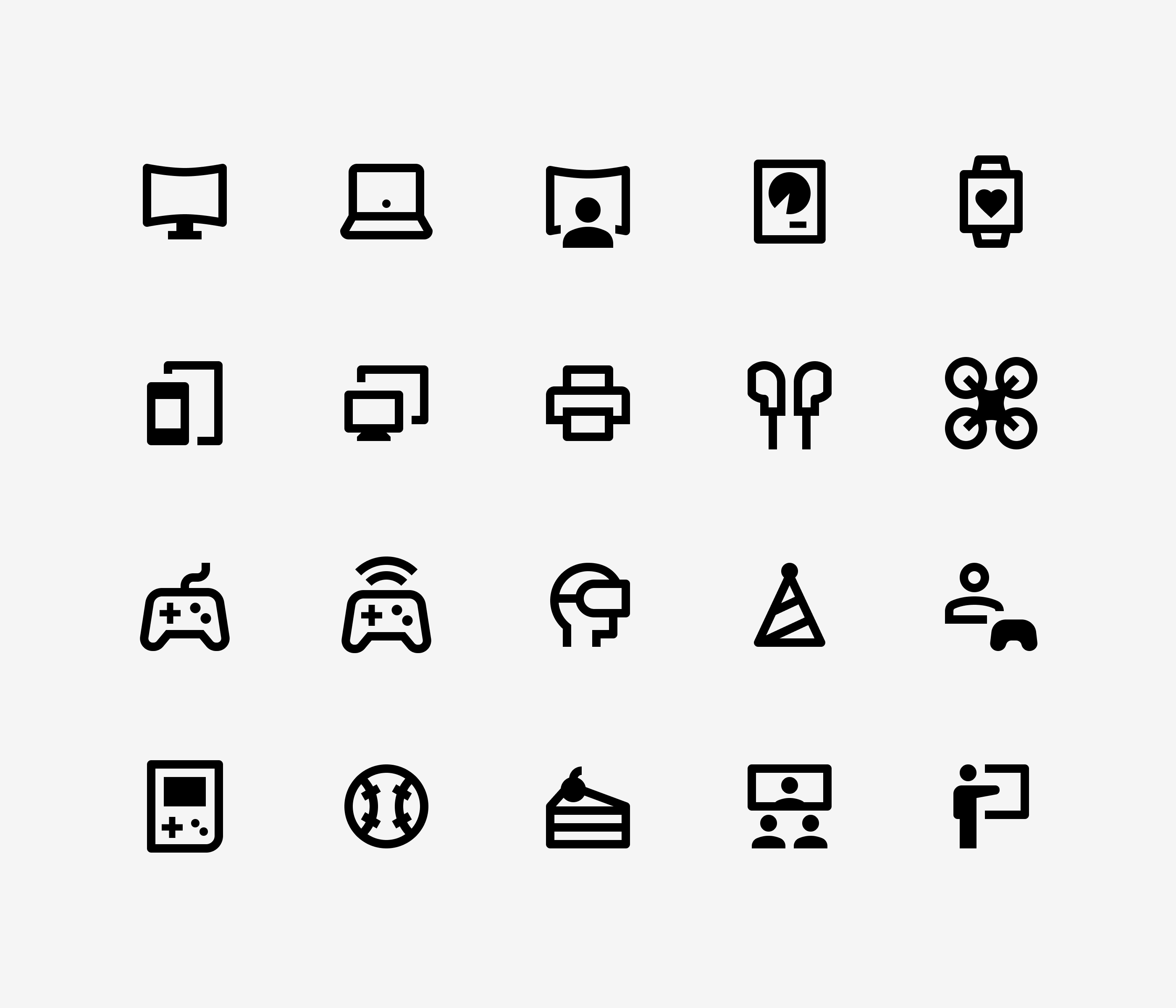
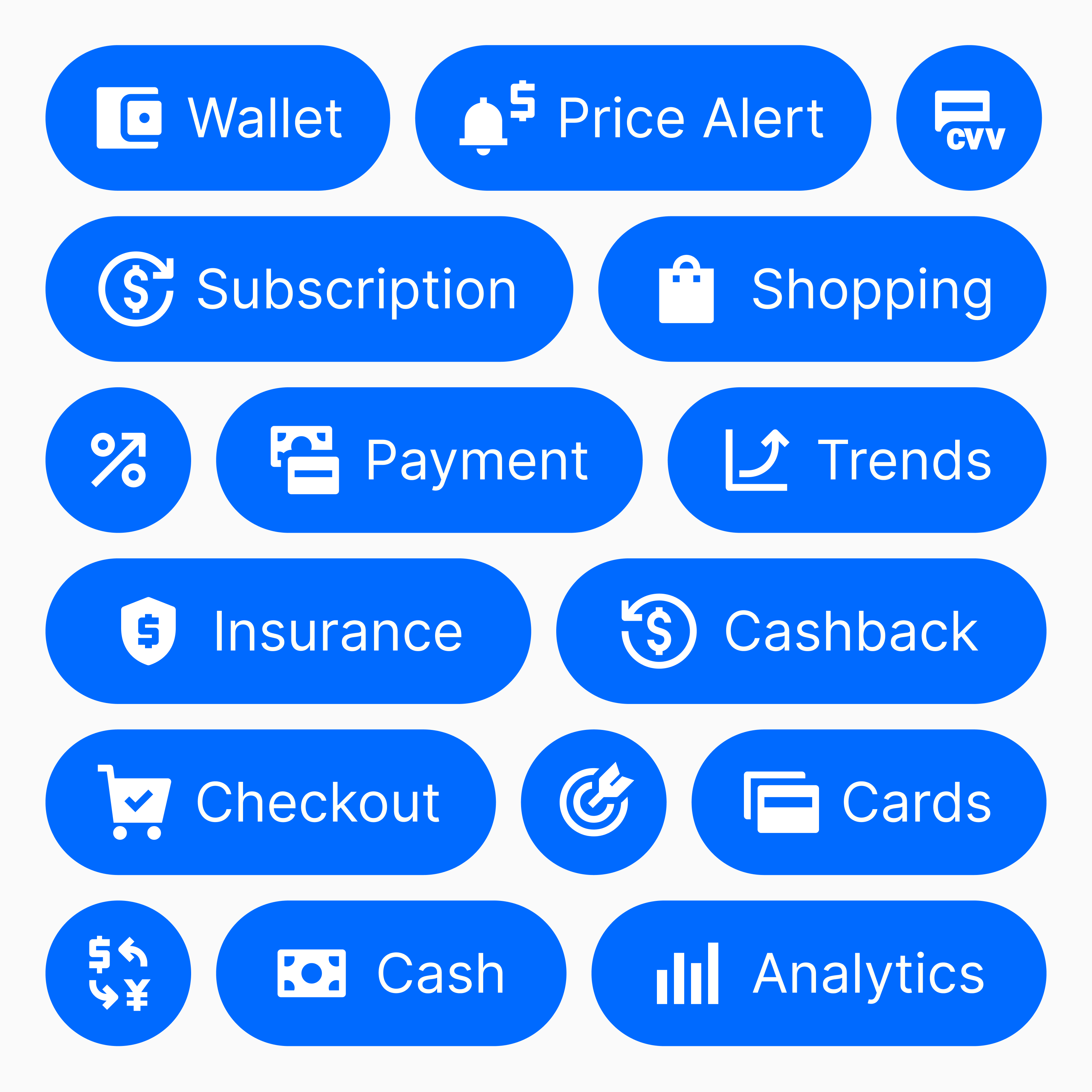
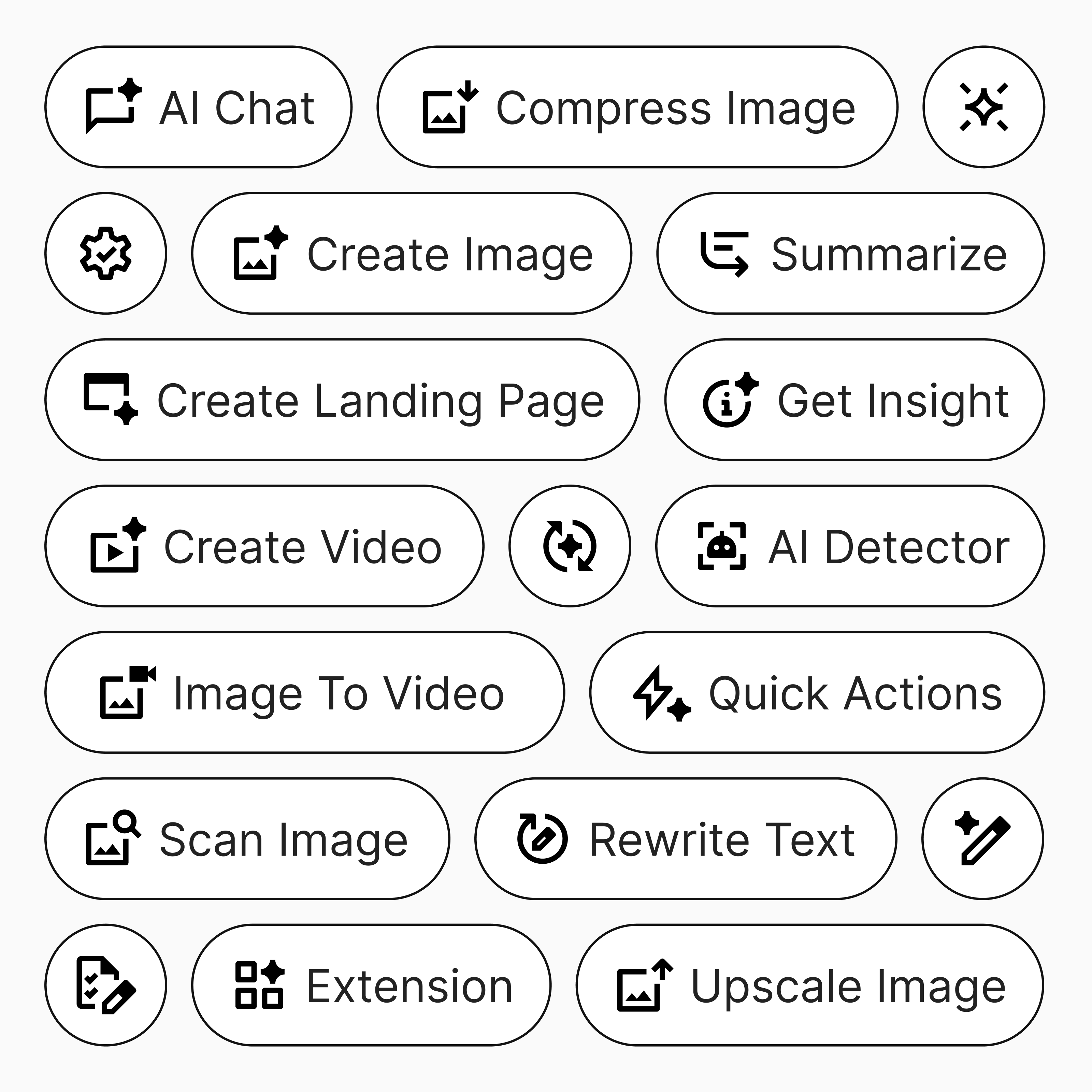
Streamline Material Icons adds the essentials: more icons in AI, business, security, multimedia, and other categories.
No more workarounds. No more settling.
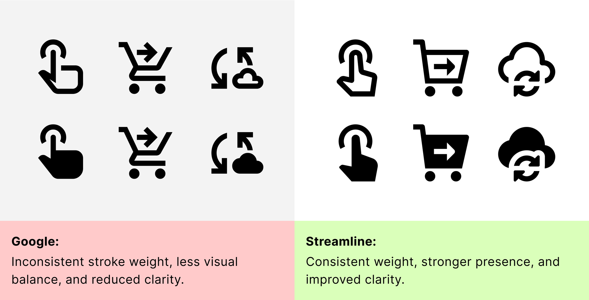
Consistency You Can See
Some icons in the original set were too rough for real products: off-balance strokes, vague shapes, inconsistent form.
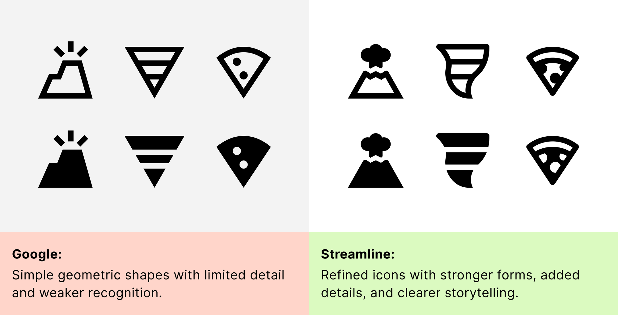
So, we redrew them (icon by icon) for clarity, precision, and consistency.
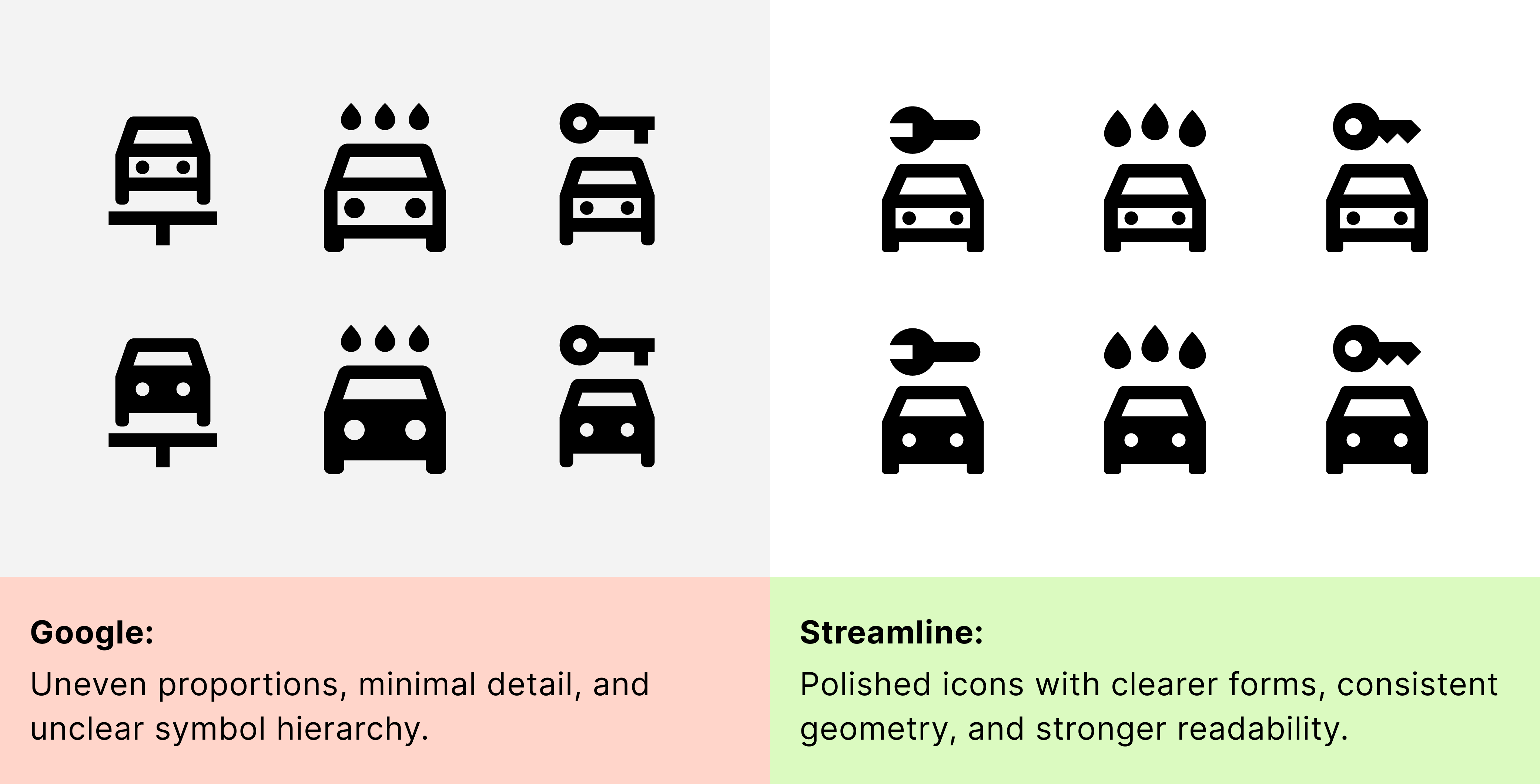
The difference is subtle, until you notice it. Then it’s impossible to ignore.
Made to Match the Right Fonts
Streamline Material Icons follow the same geometry and stroke logic as Google’s Material Icons. They pair best with typefaces that emphasize clarity, balance, and neutrality.
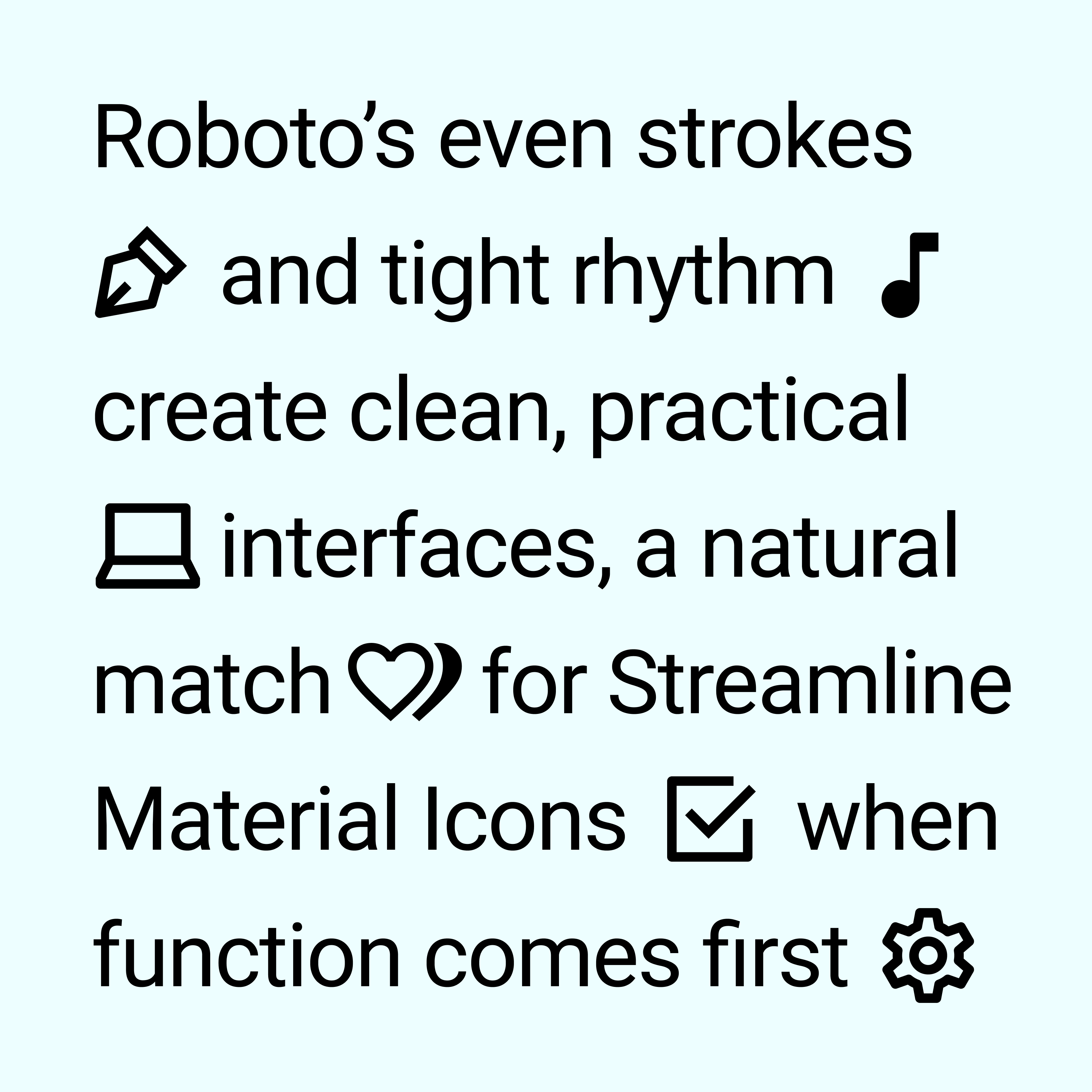
Roboto
Still the most consistent choice. Its clean forms and neutral tone align perfectly with the icon set.
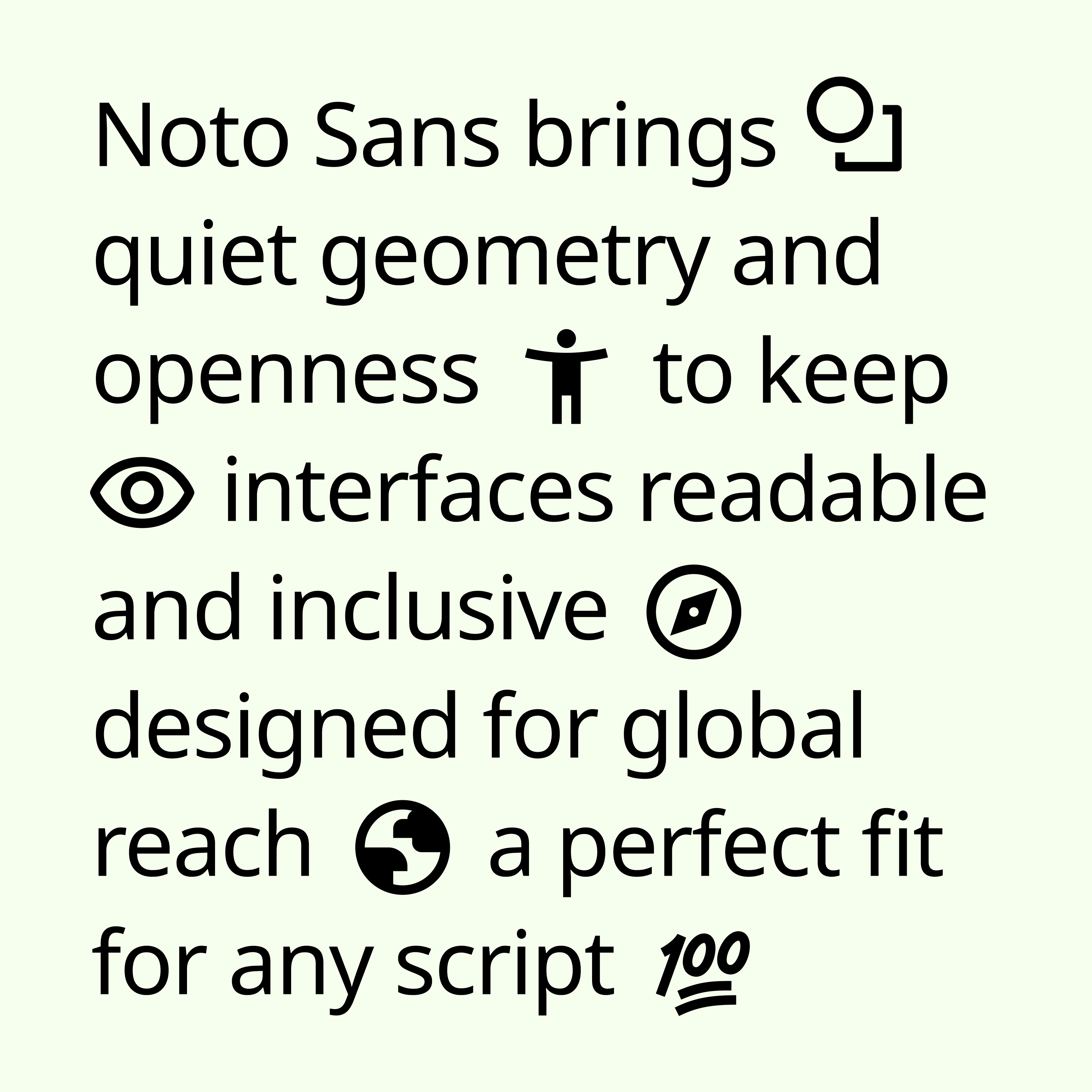
Noto Sans
Great for multilingual products. Its structure stays close to Roboto while expanding language support.
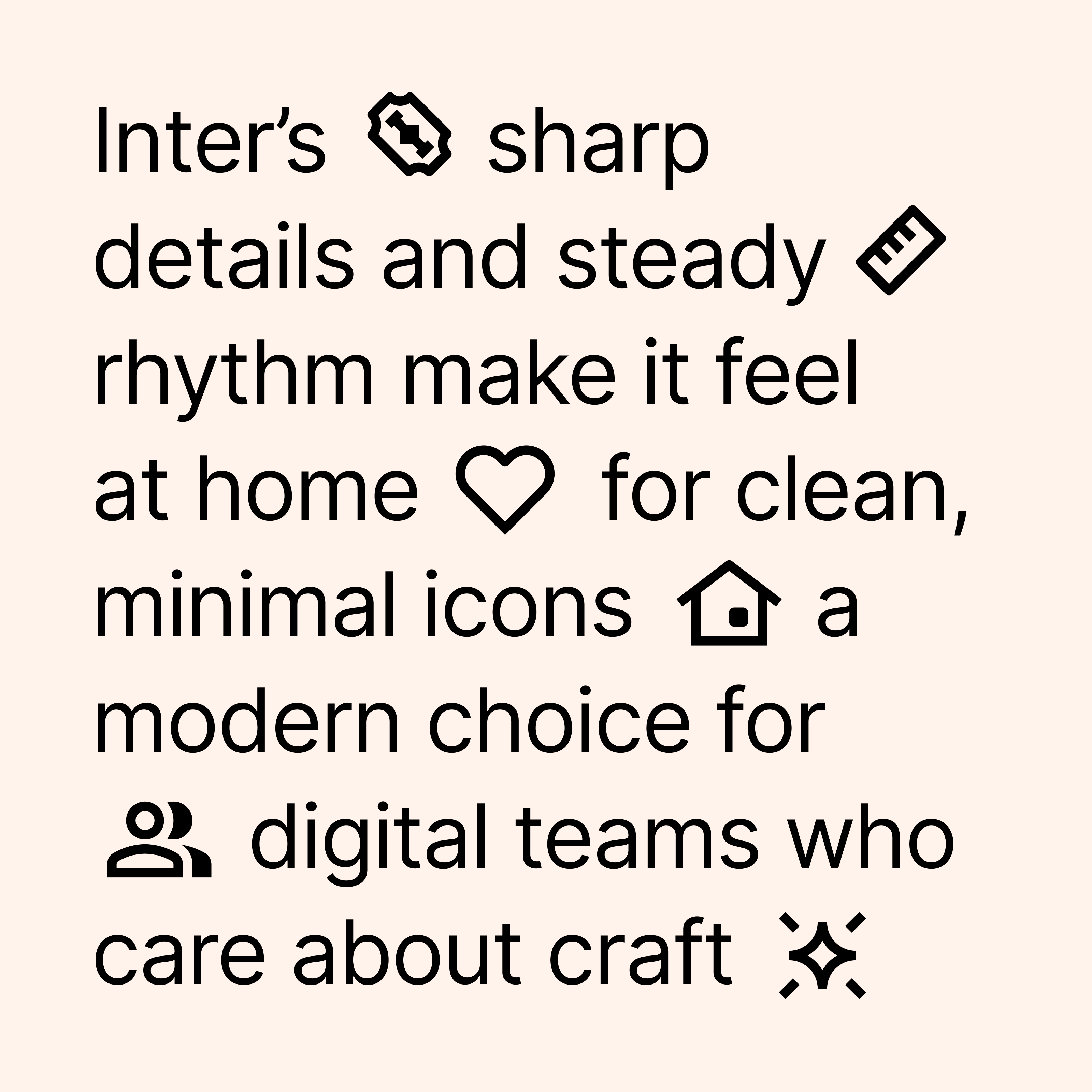
Inter, SF Pro, Open Sans
Other clean geometric sans-serifs that work well. Look for open counters, even strokes, and simple forms to avoid clashing.
What You’ll Stop Doing
With Streamline Material Icons, your team no longer needs to:
- Rebuild missing icons
- Patch visual inconsistencies
- Rely on third-party sets that don’t quite match
We’ve added 2,000+ new icons adapted from our Core, Sharp, Flex, and Plump sets and refined 3,000+ existing ones so everything aligns out of the box.
Use It When You Want It All
Stick with Material’s familiar look but skip its limitations. Use Streamline Material Icons when your product demands:
- More icons
- Cleaner geometry
- Visual consistency across your UI
Great for:
- Web & mobile apps
- UI kits & design systems
- Dashboards, products, and marketing visuals
Whether you’re designing for Android or building on Material principles, this is the set Google didn’t finish. But we did.
Part of the Streamline Family
Streamline Material Icons is crafted with the same care, precision, and design standards behind our Core, Flex, Sharp, and Plump sets.
It’s included in the Streamline Pro plan and available now in your library.
We’re actively expanding the set. Rounded and Sharp styles are coming soon. Have a request? Let us know what you’d love to see next.