Make your projects pop!
Pop icons—a bold and joyful style
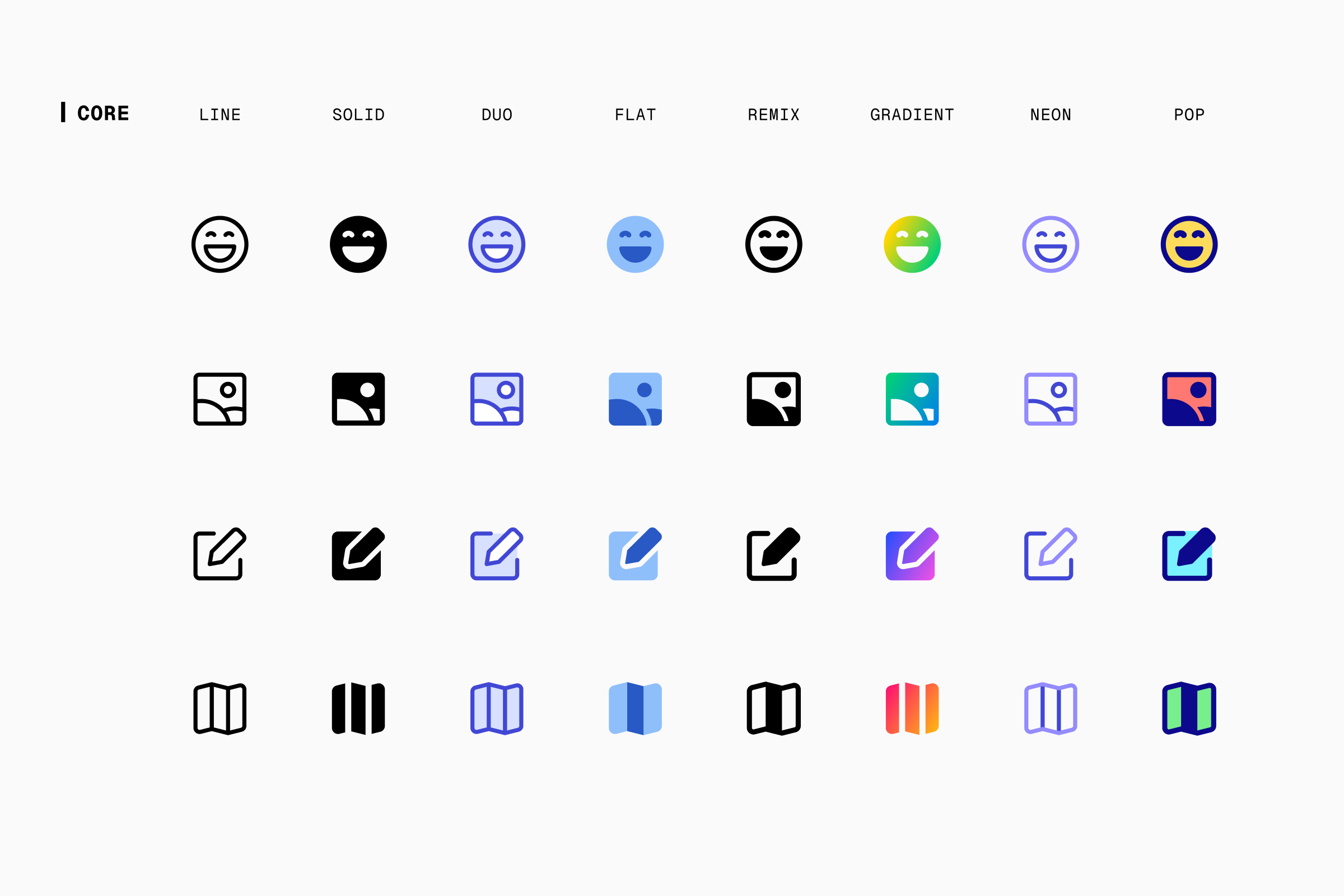
After Remix, Gradient, and Neon styles, we’re happy to introduce the eighth style of our Icon System: Pop!
Boldness meets colors
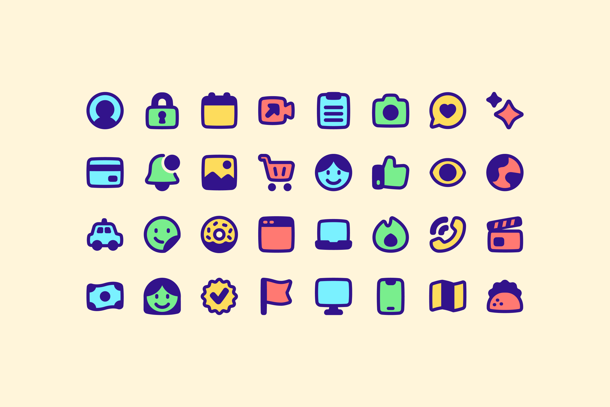
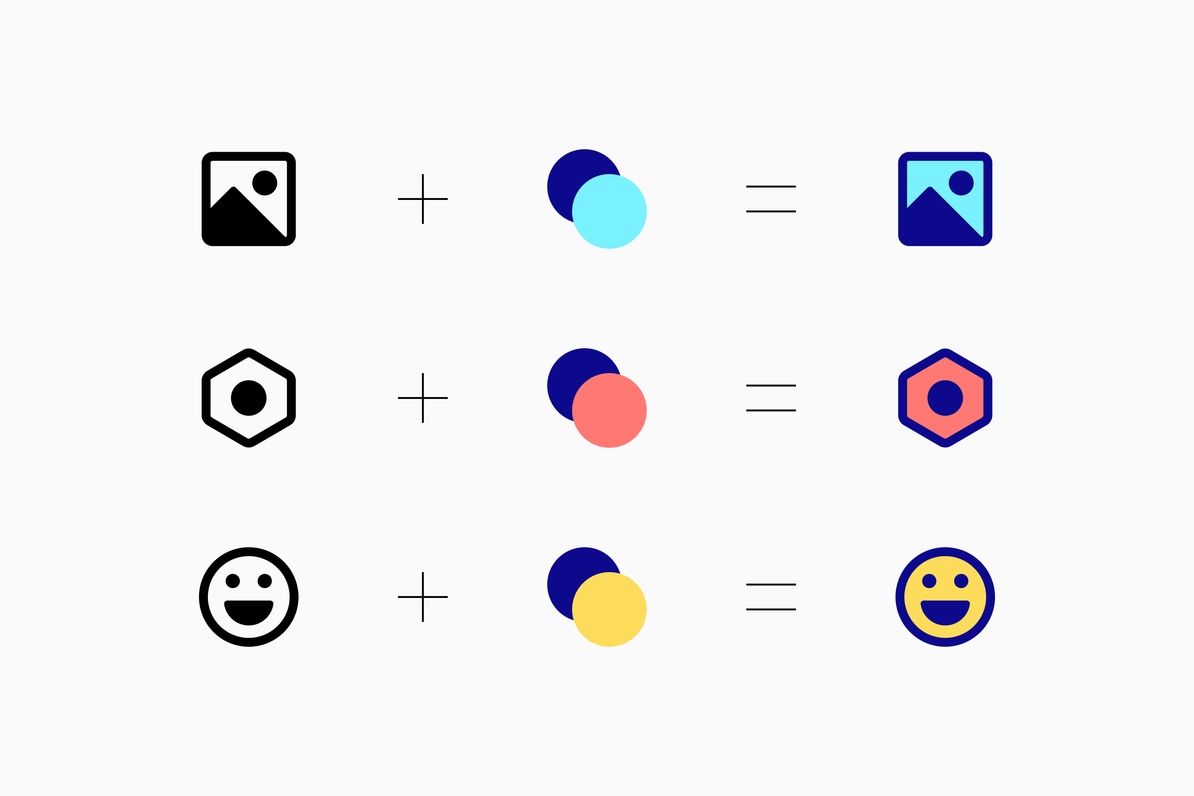
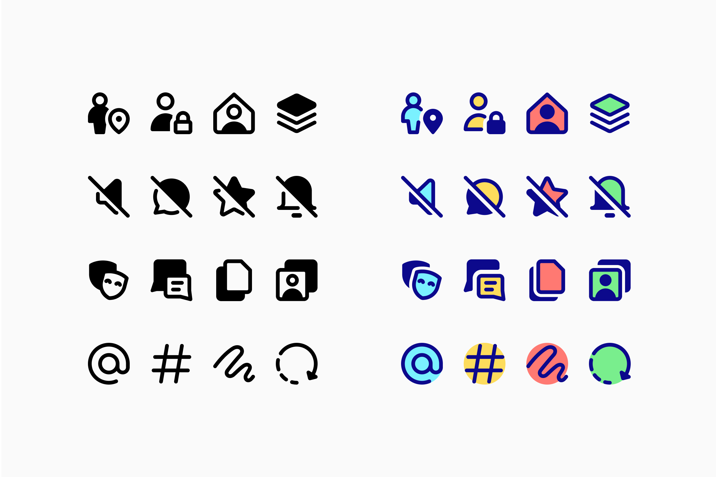
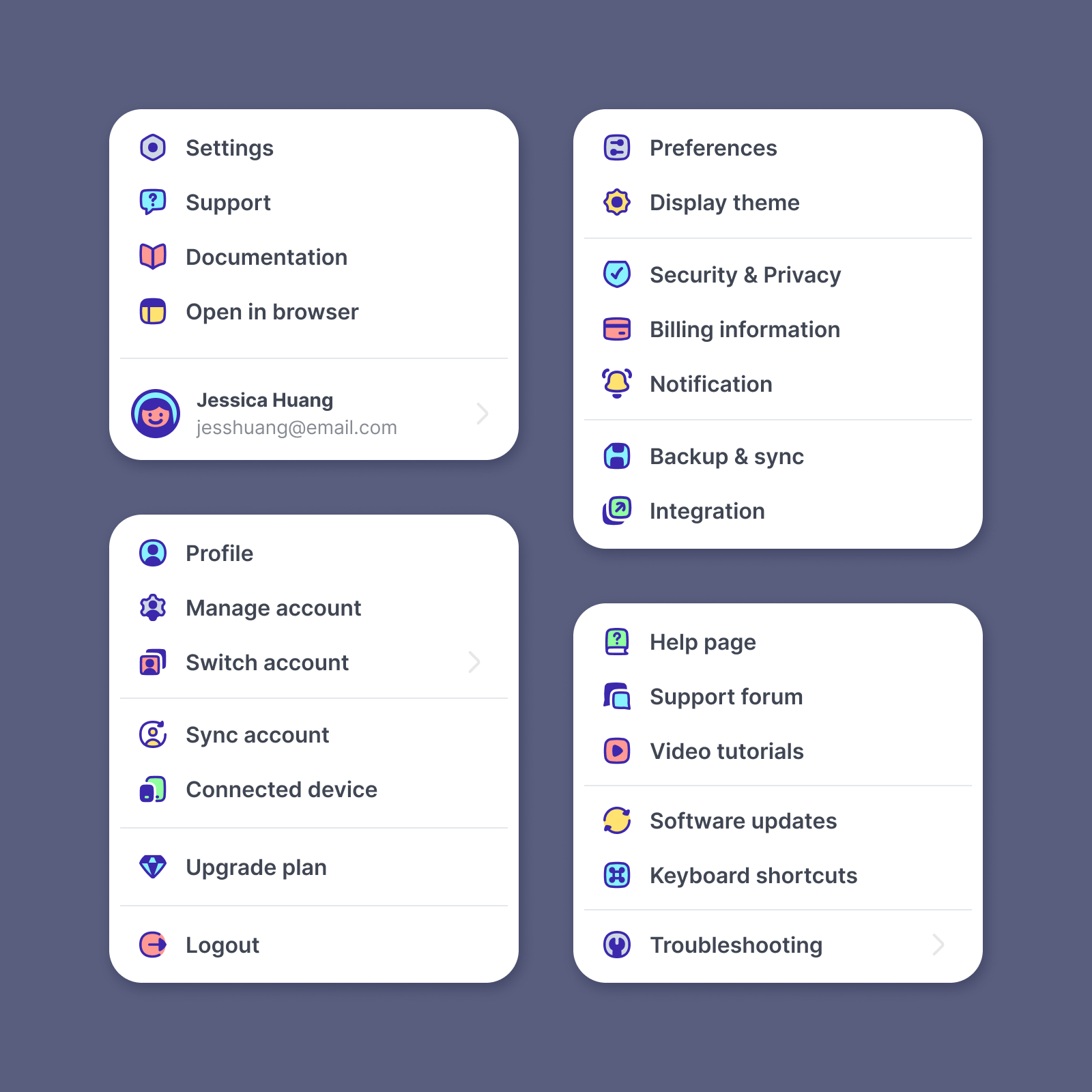
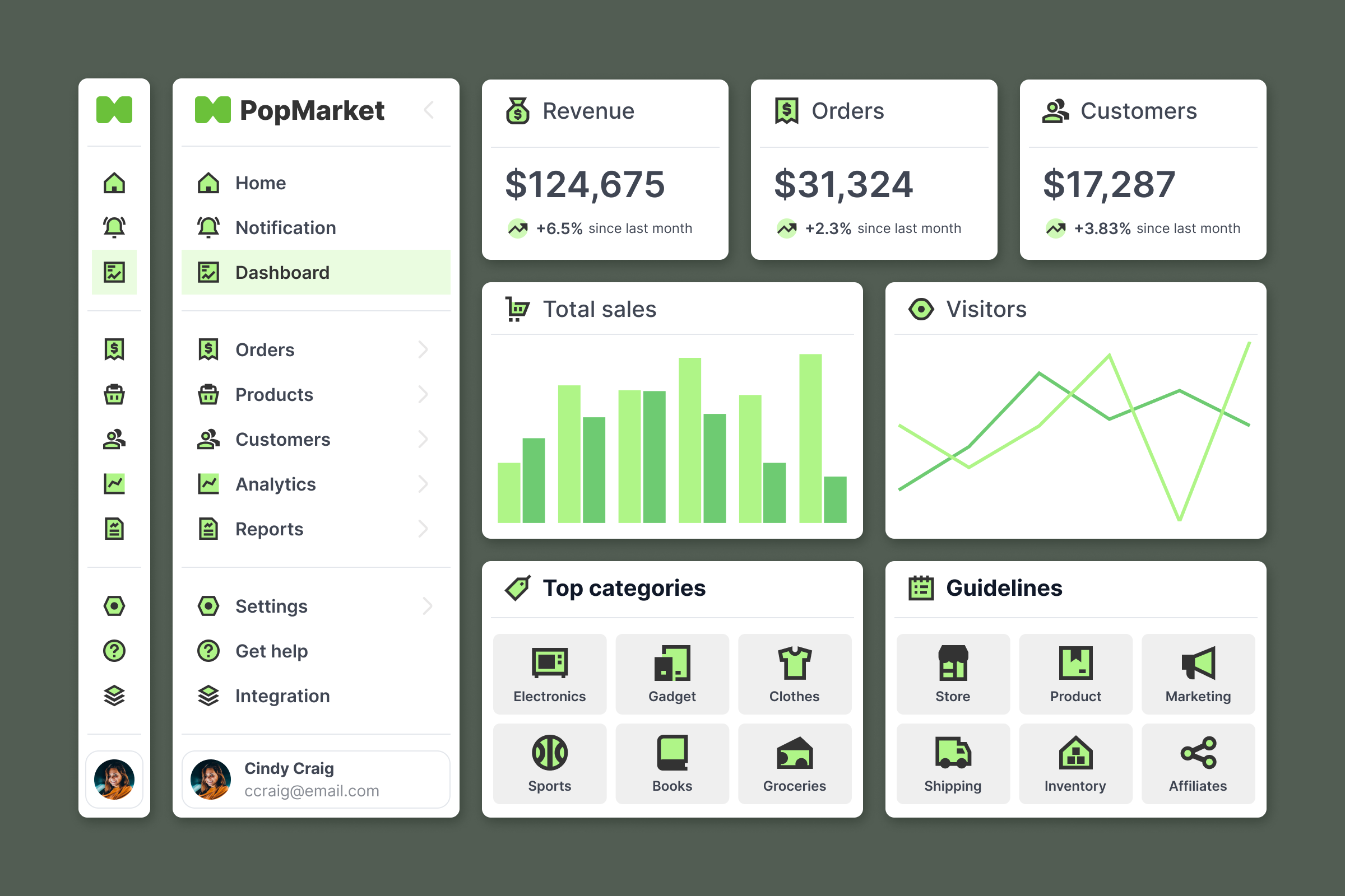
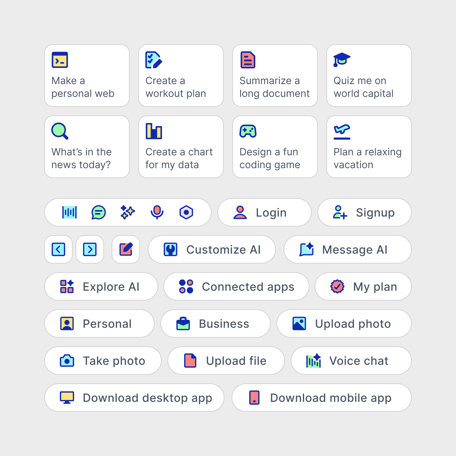
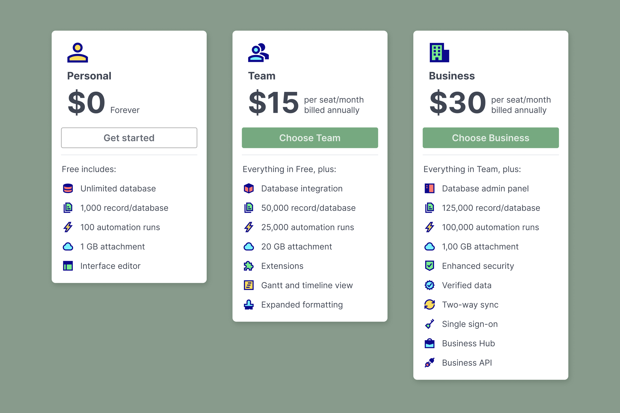
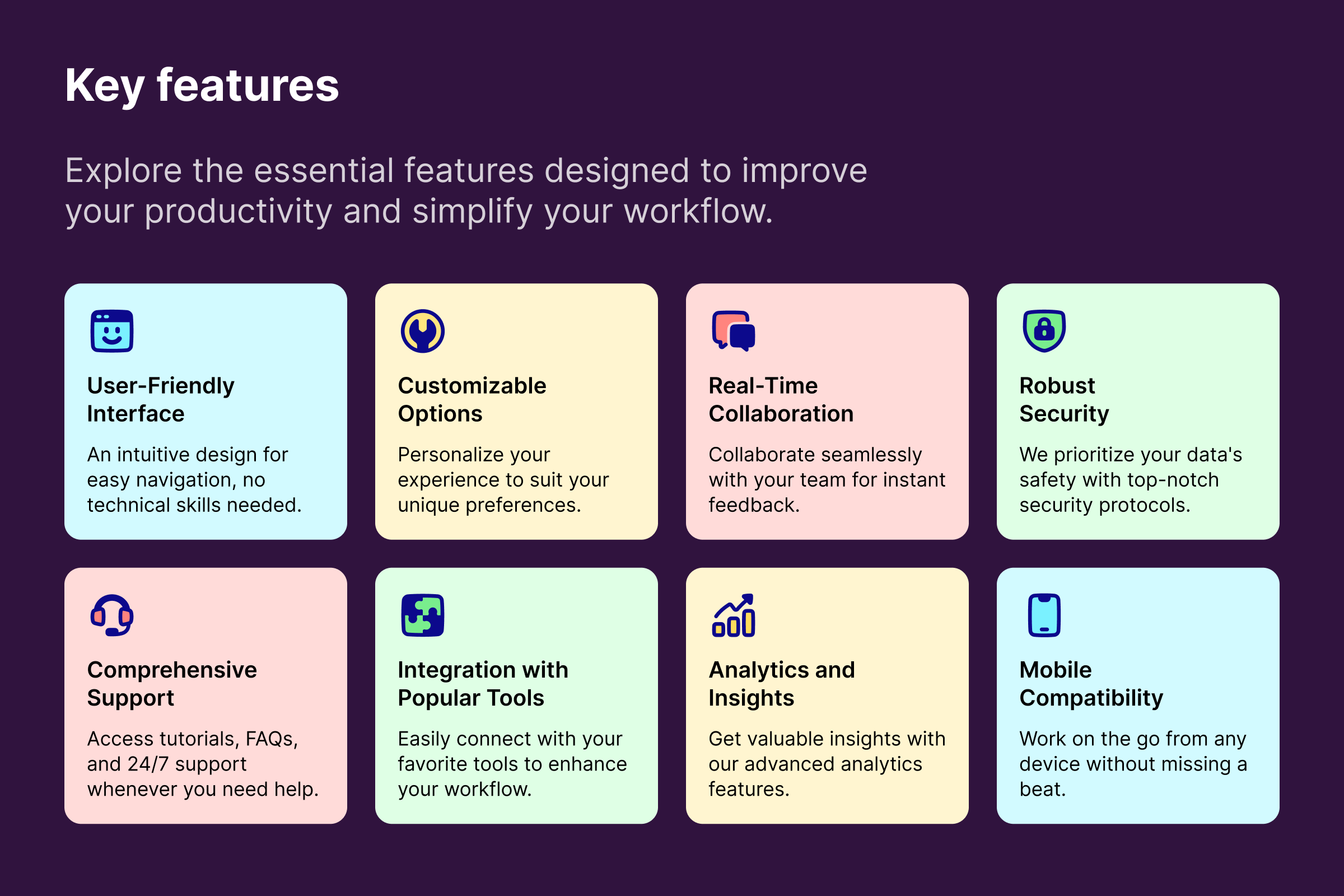
Pop is a colored version of Remix icons. It takes Remix's bold outlines and fills them with vibrant colors to enhance the icons' presence. This combination makes Pop an ideal pick for creating outstanding designs with icons that are both functional and aesthetically appealing.
Built to pop
Unlike Remix, which uses black fills to emphasize the icons' key elements, Pop is designed to showcase its colors.
With that in mind, some icons are restructured to provide sufficient space for the color fills, gaps are applied to reduce the dominance of dark parts, and colorful backgrounds are used when there is no space for fills.
Pop differently
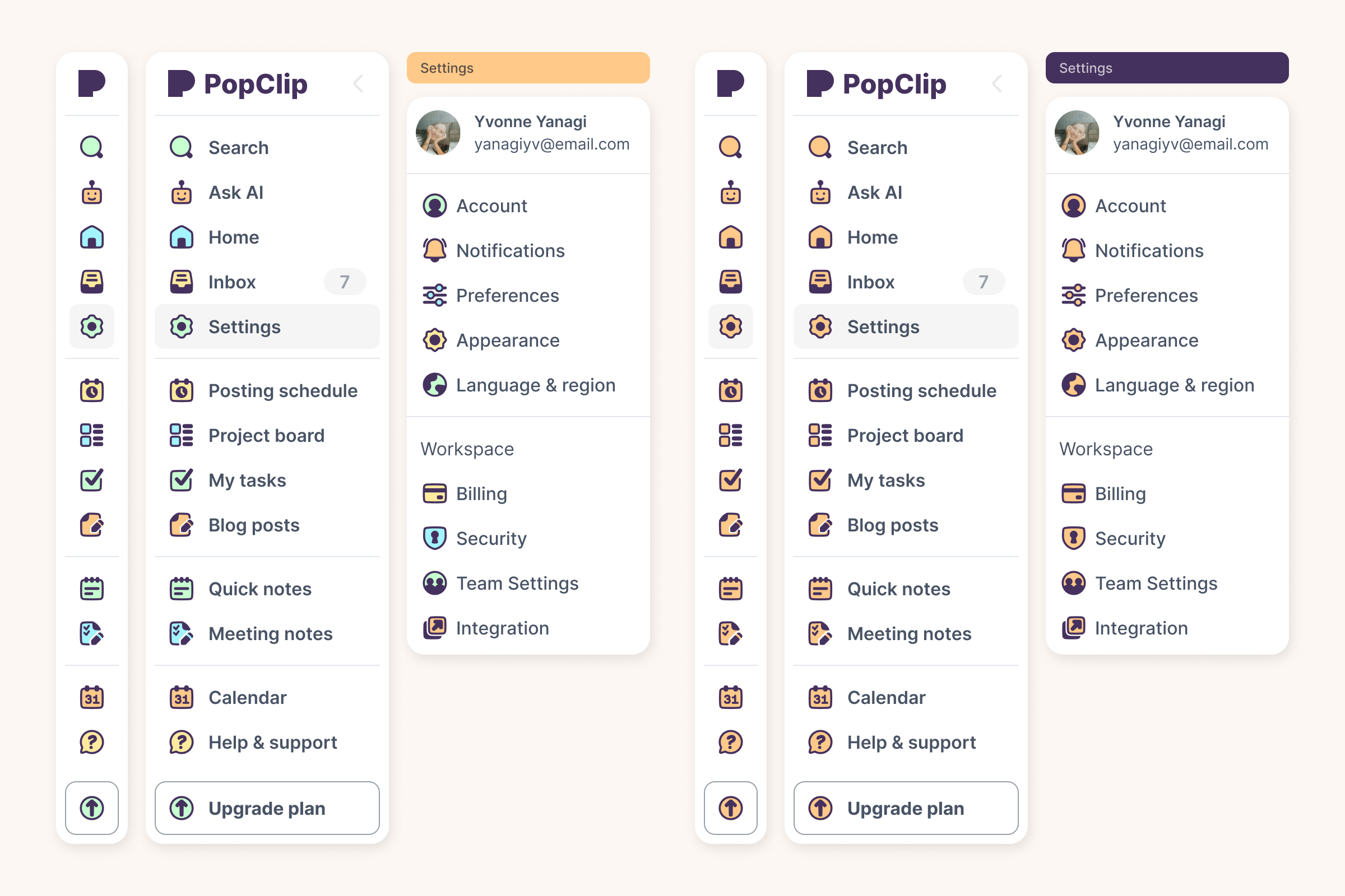
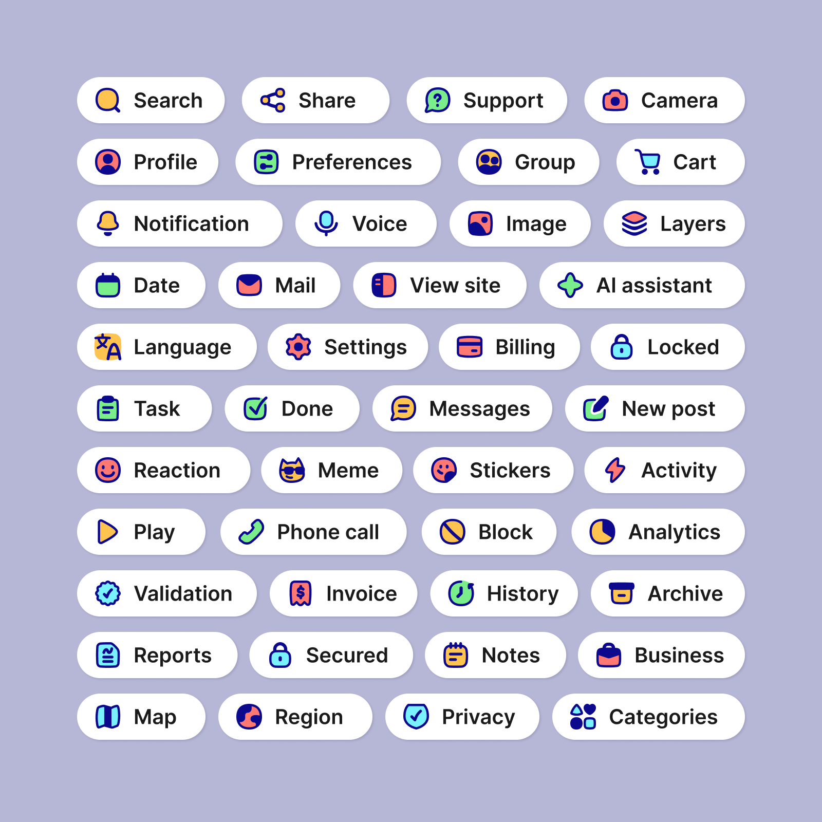
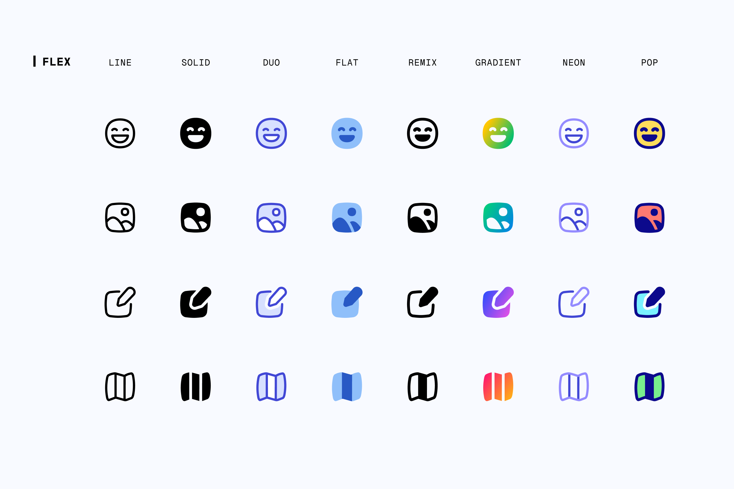
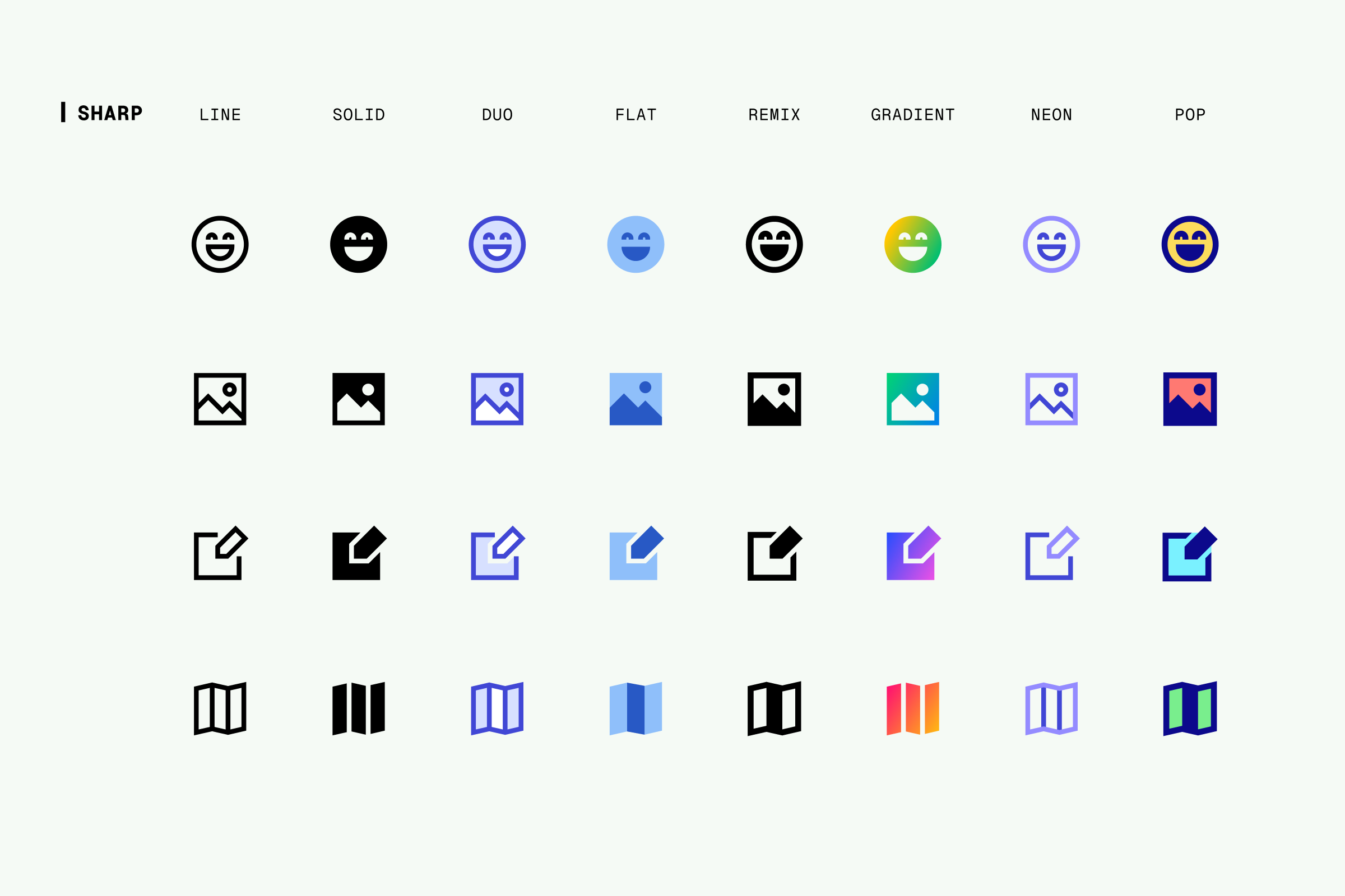
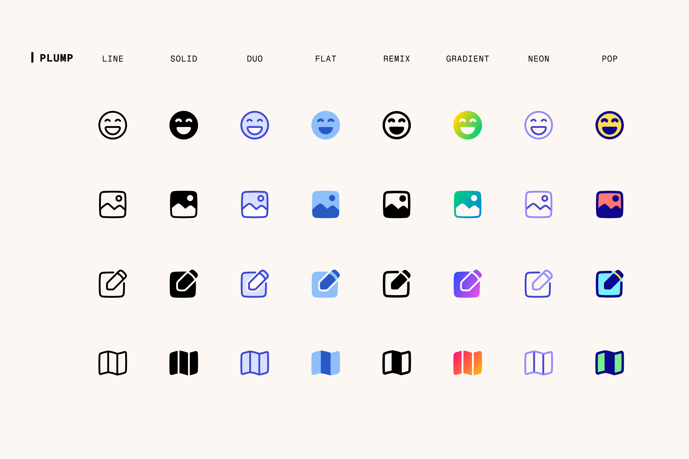
Like the other styles in our Icon System, Pop is available in four different families, each with its own unique personality to meet different needs: the neutral Core, the dynamic Flex, the geometric Sharp, and the friendly Plump.
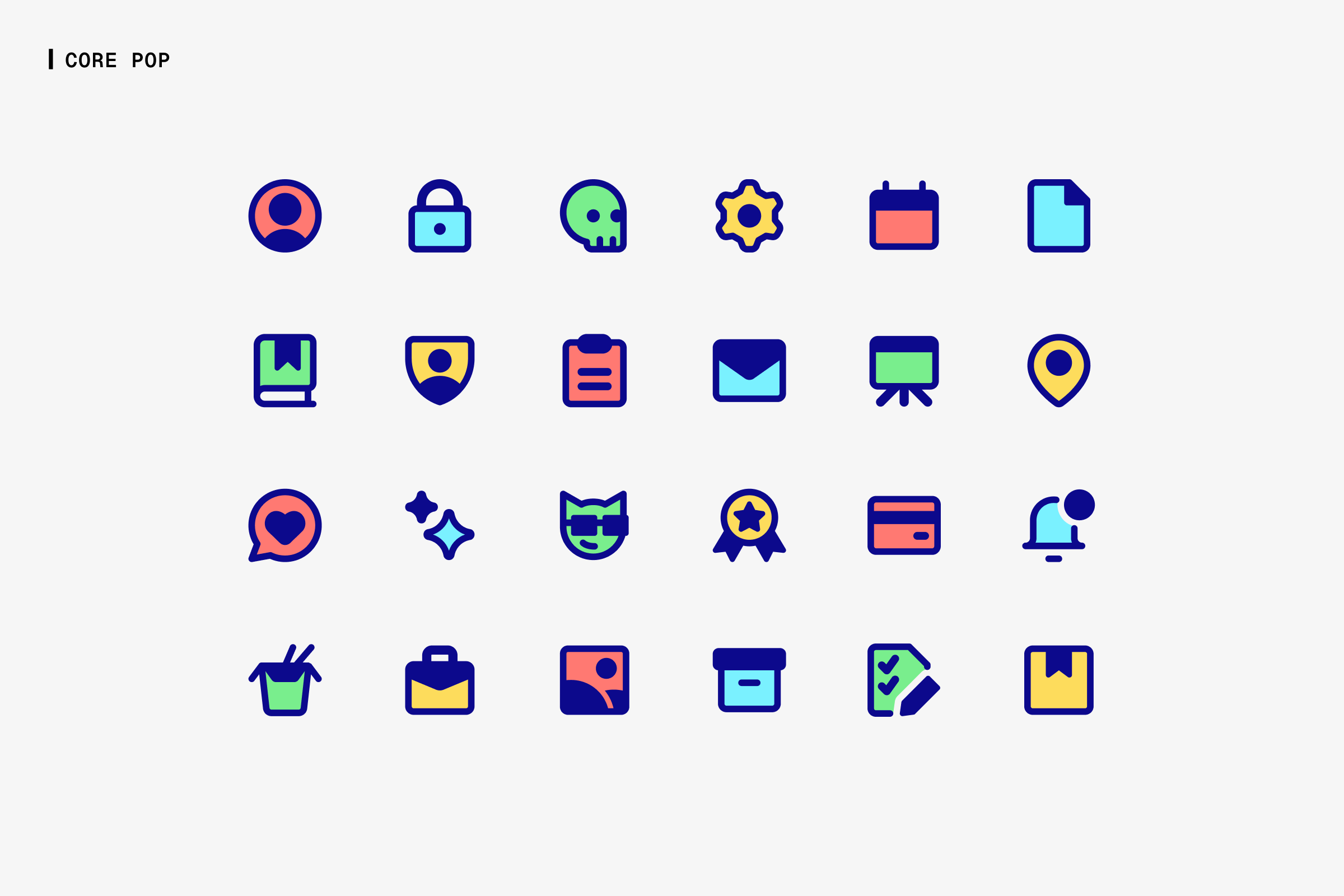
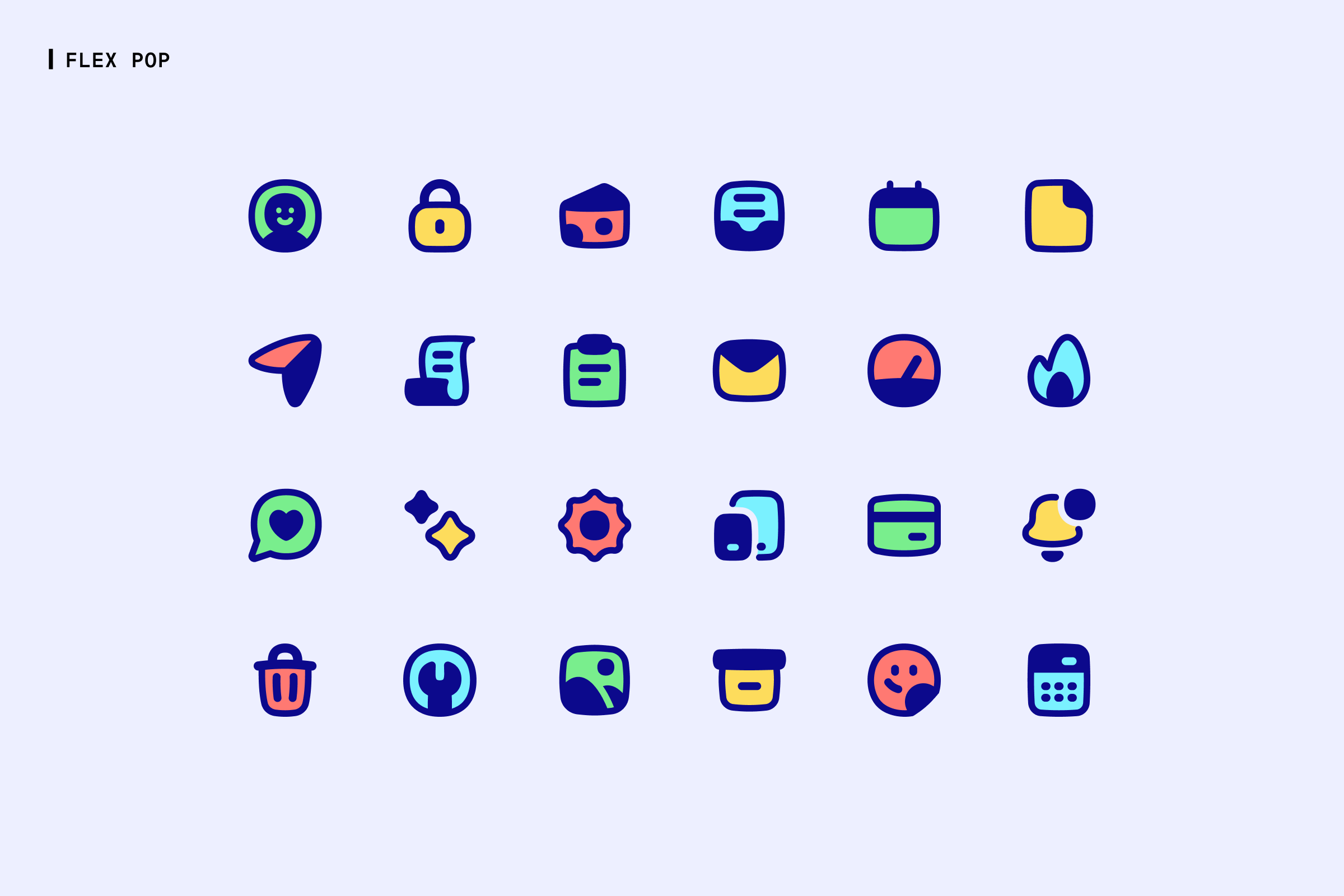
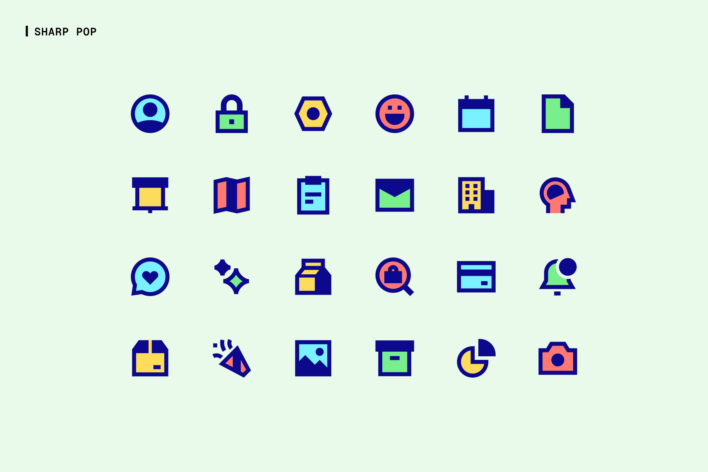
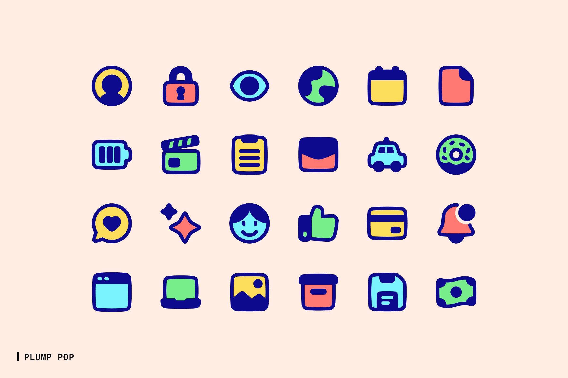
Pop style in different icon families: Core, Flex, Sharp, and Plump.
When to use Pop
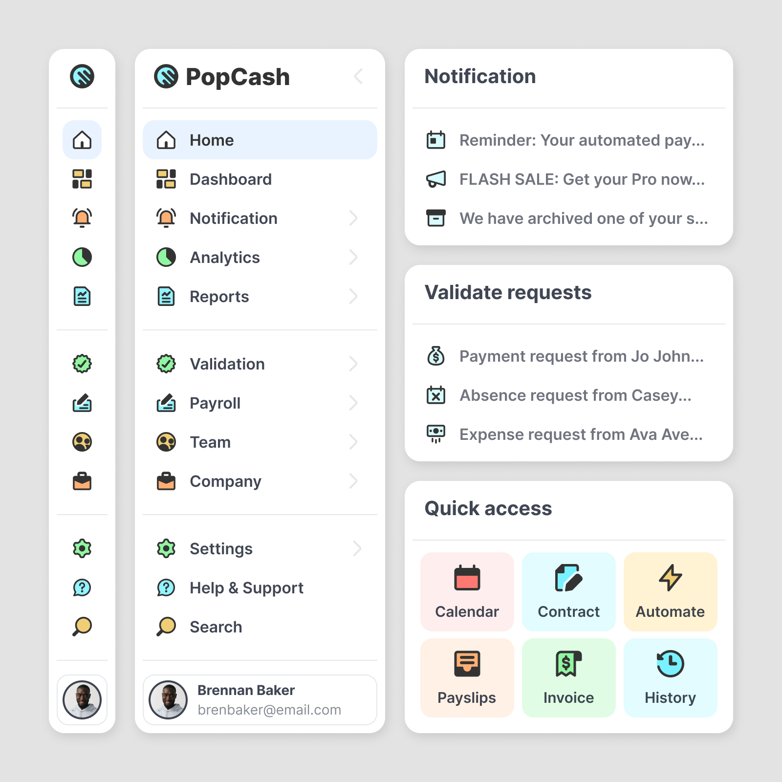
Pop is a refresh button for the conventional black-and-white interface. It's a playful style that makes everything it touches appear friendlier and more approachable.
Icons in this style are suitable for projects with bold and modern designs that need welcoming and engaging visuals. With each set's unique personality, they also help strengthen visual branding by blending seamlessly into various design projects.
The Icon System
The latest addition to the system brings each of our icon families to a total of eight unique styles. With this new update, we now reach 32 total styles and surpass 120,000 icons!
Our primary goal with this Icon System is to ensure that every user has access to a versatile visuals that can be tailored to their specific needs.
With 32 variants per icon, combined with the customization features in our app—such as stroke thickness, colors, and gradients—the options are virtually endless. Sky is the limit.
What's next
Pop is the latest style added to our Icon System, but we're not stopping here. In the coming months, we are going to add even more icons to the families—focusing primarily on interface icons while covering various areas like project management, communication, AI, e-commerce, business, travel, and many more.
Have specific icons in mind? Feel free to send us your request!
And now it's time to try out these new sets! Here's a complete list of all the new styles available in both our app and Figma plugin:
Enjoy designing!