Light up your designs with the new Neon icons
A duotone style with a modern look and high legibility
The Streamline Icon System just keeps getting bigger and bigger. In addition to Remix and Gradient, we're pleased to present a completely new style: Neon.
Now, each family within our Icon System has a total of 7 different styles. This means that we now have 28 styles with over 110,000 icons!
Let's see how Neon fits in
What is Neon
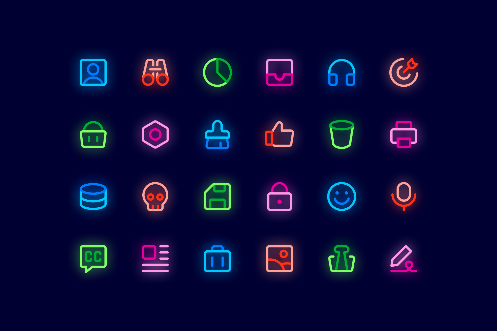
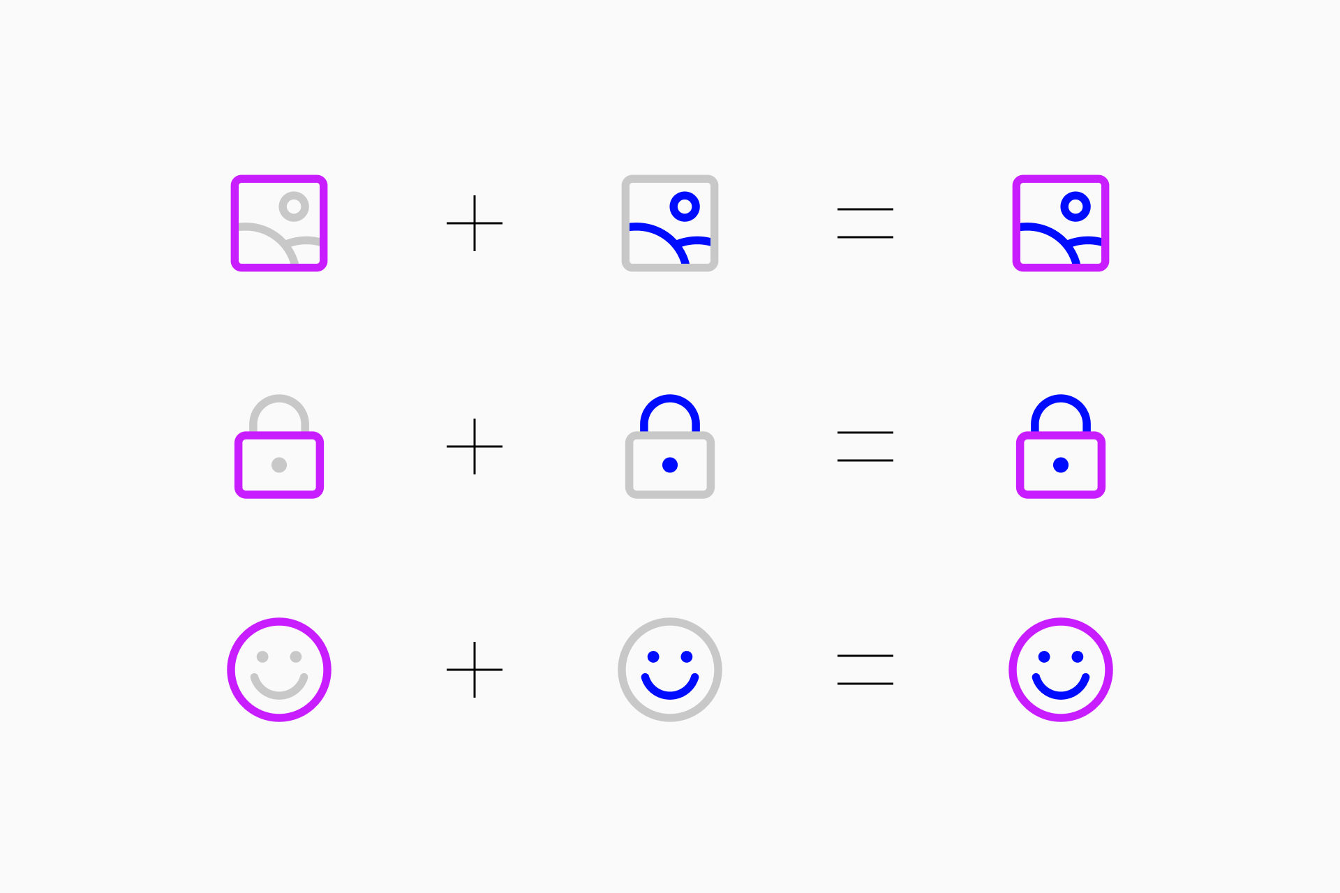
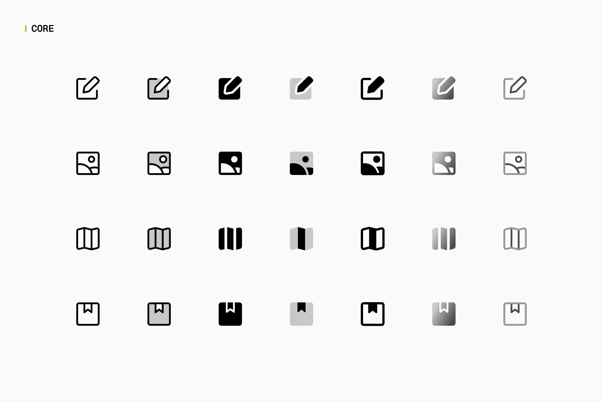
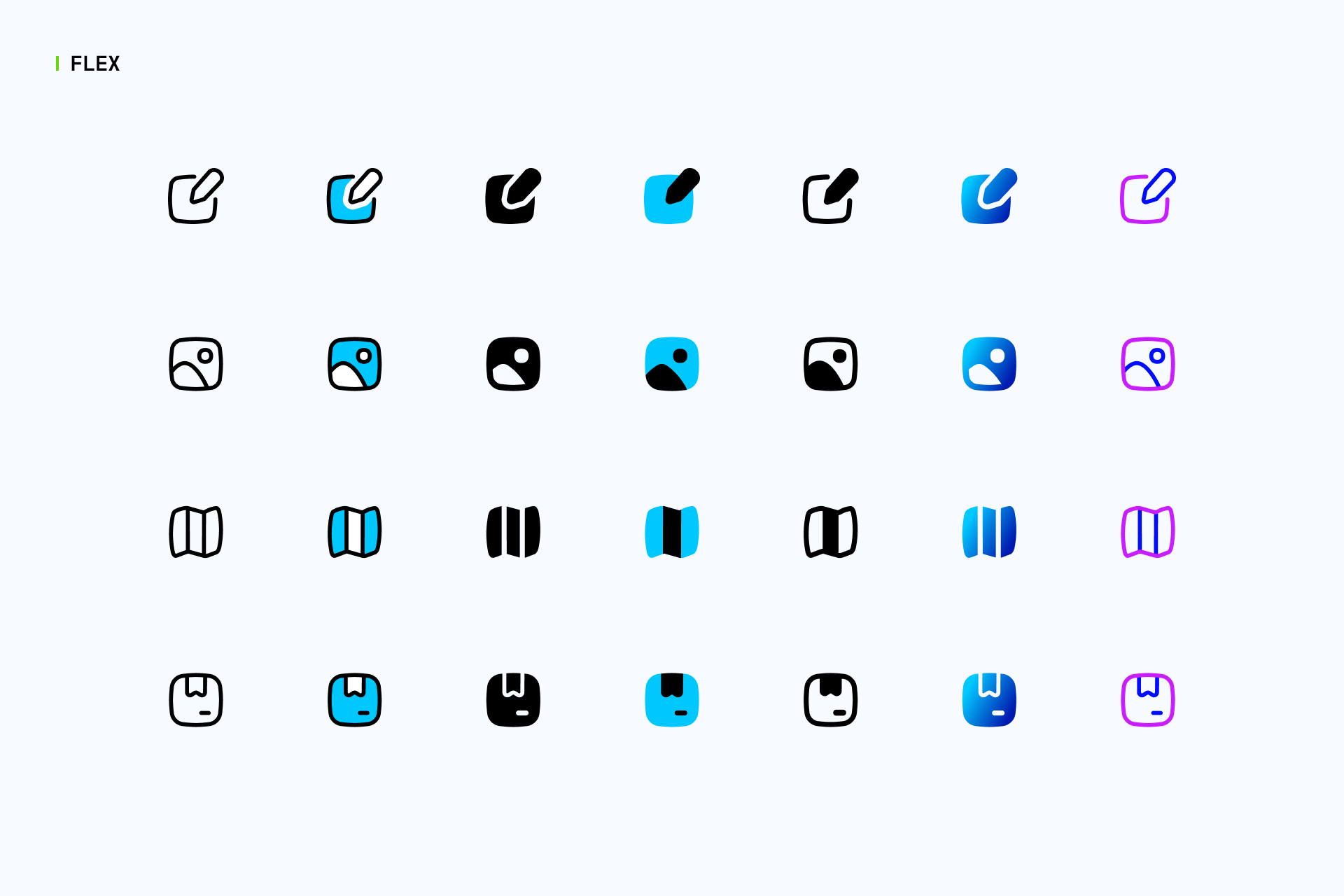
Neon is a new duotone variation based on our basic Line icons. It uses two different colors to effectively draw attention to key elements within each icon, ensuring clarity and emphasis even at small sizes.
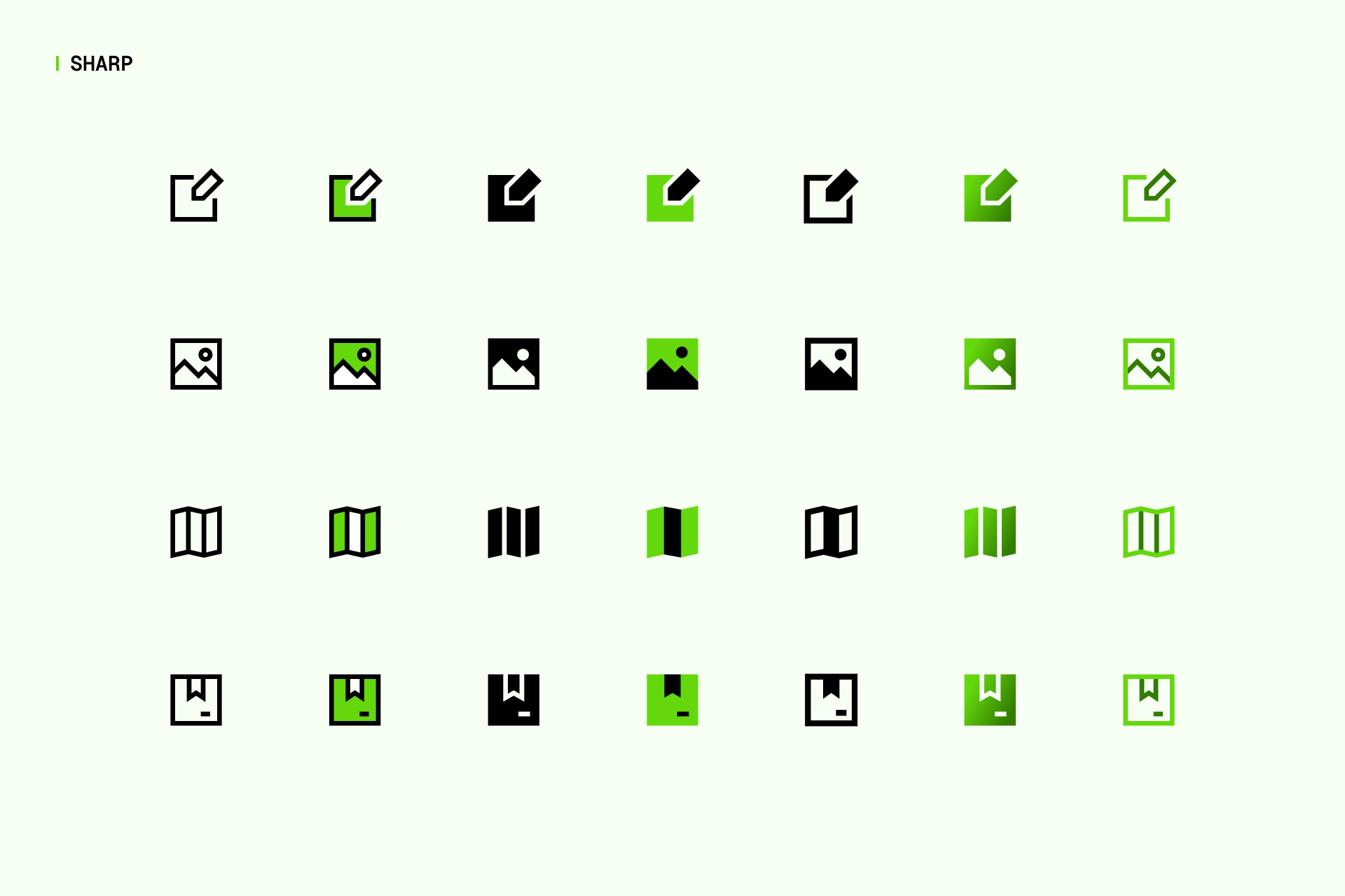
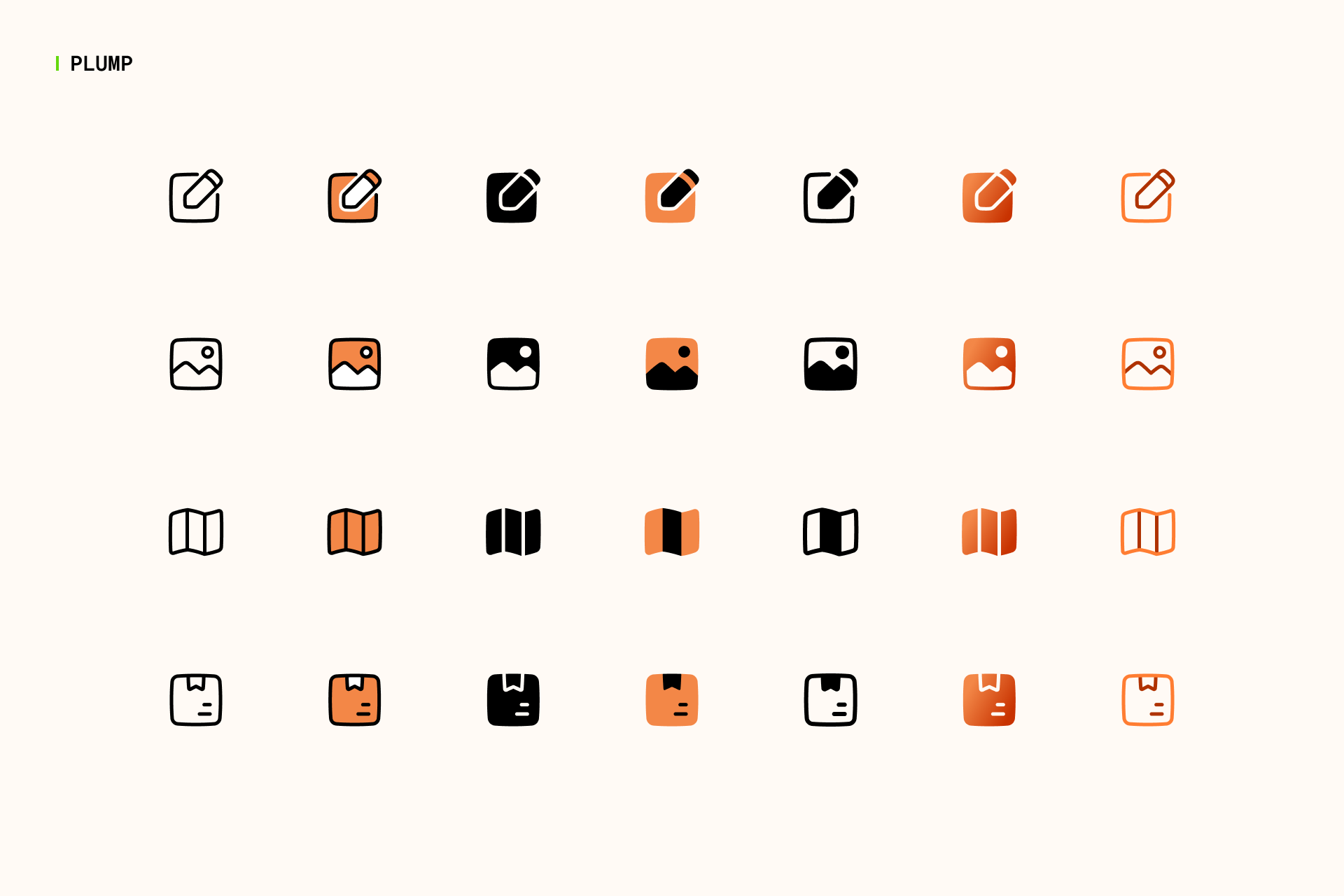
This style is available in 4 different families, offering a wide range of personalities depending on whether you need neutral (Core), curvy (Flex), sophisticated (Sharp) or friendly (Plump) icons.
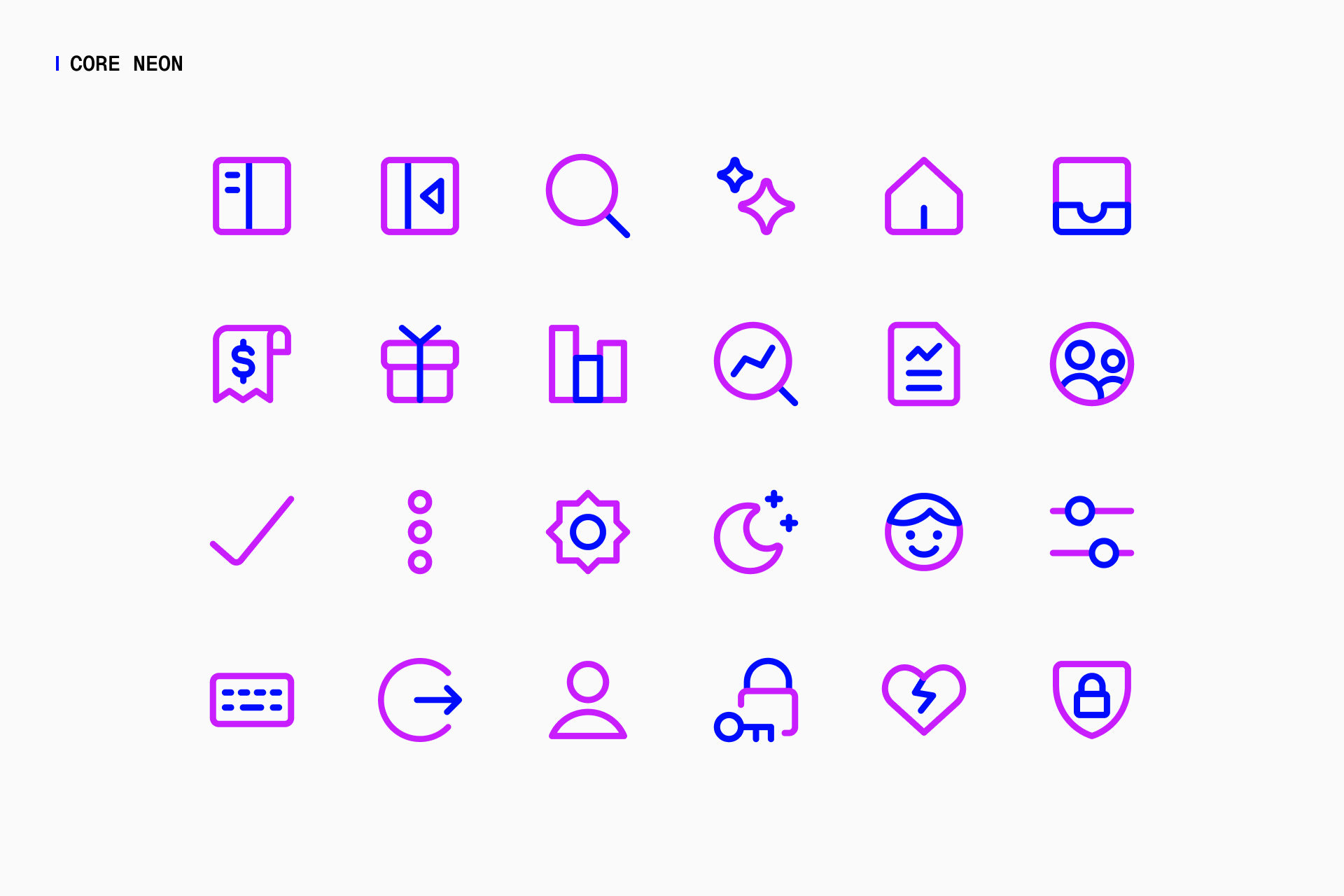
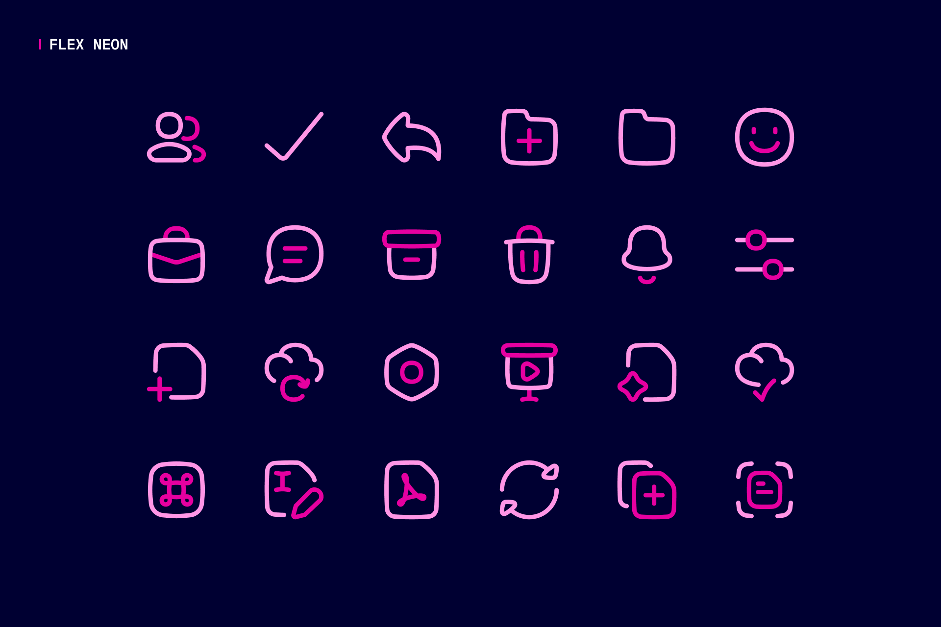
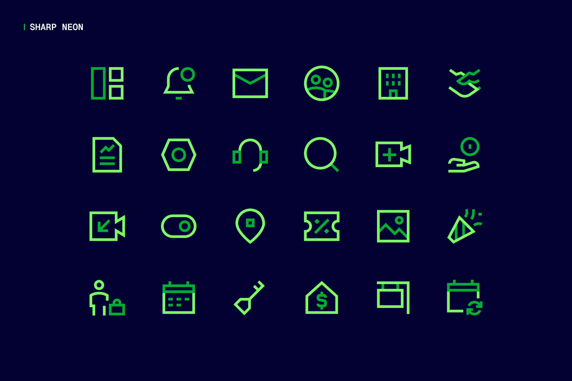
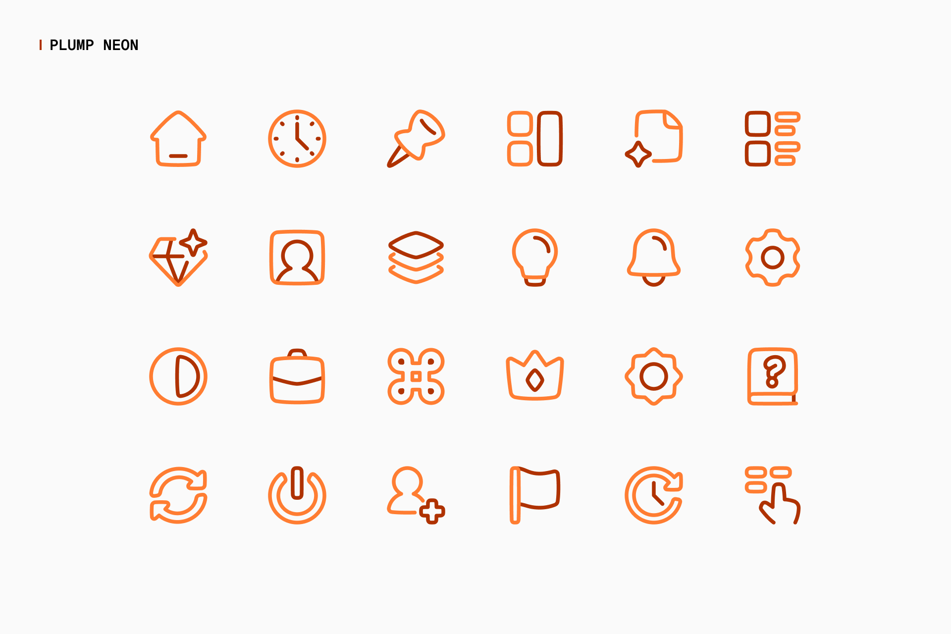
From top left to bottom right: Core Neon, Flex Neon, Sharp Neon and Plump Neon
When to use Neon
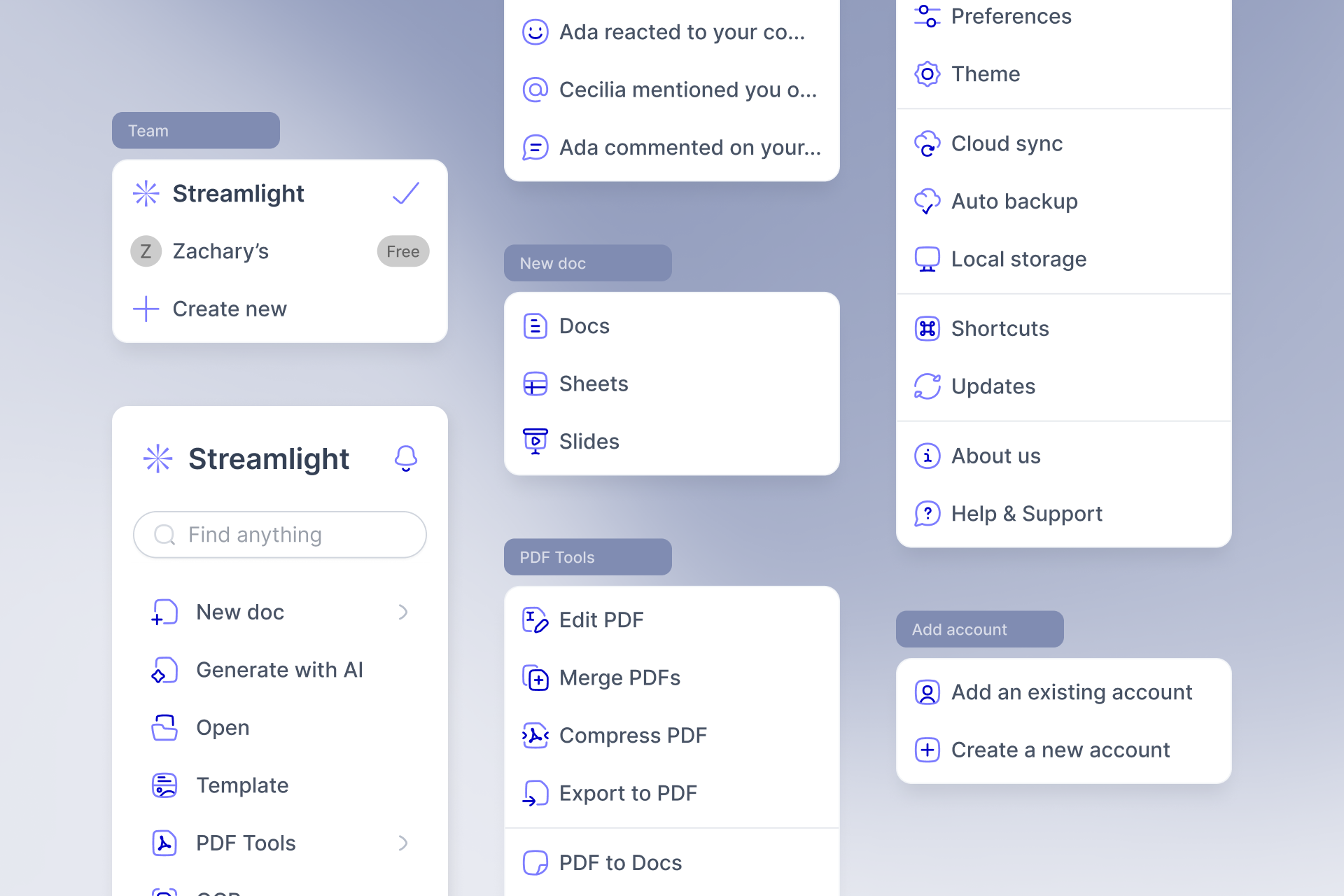
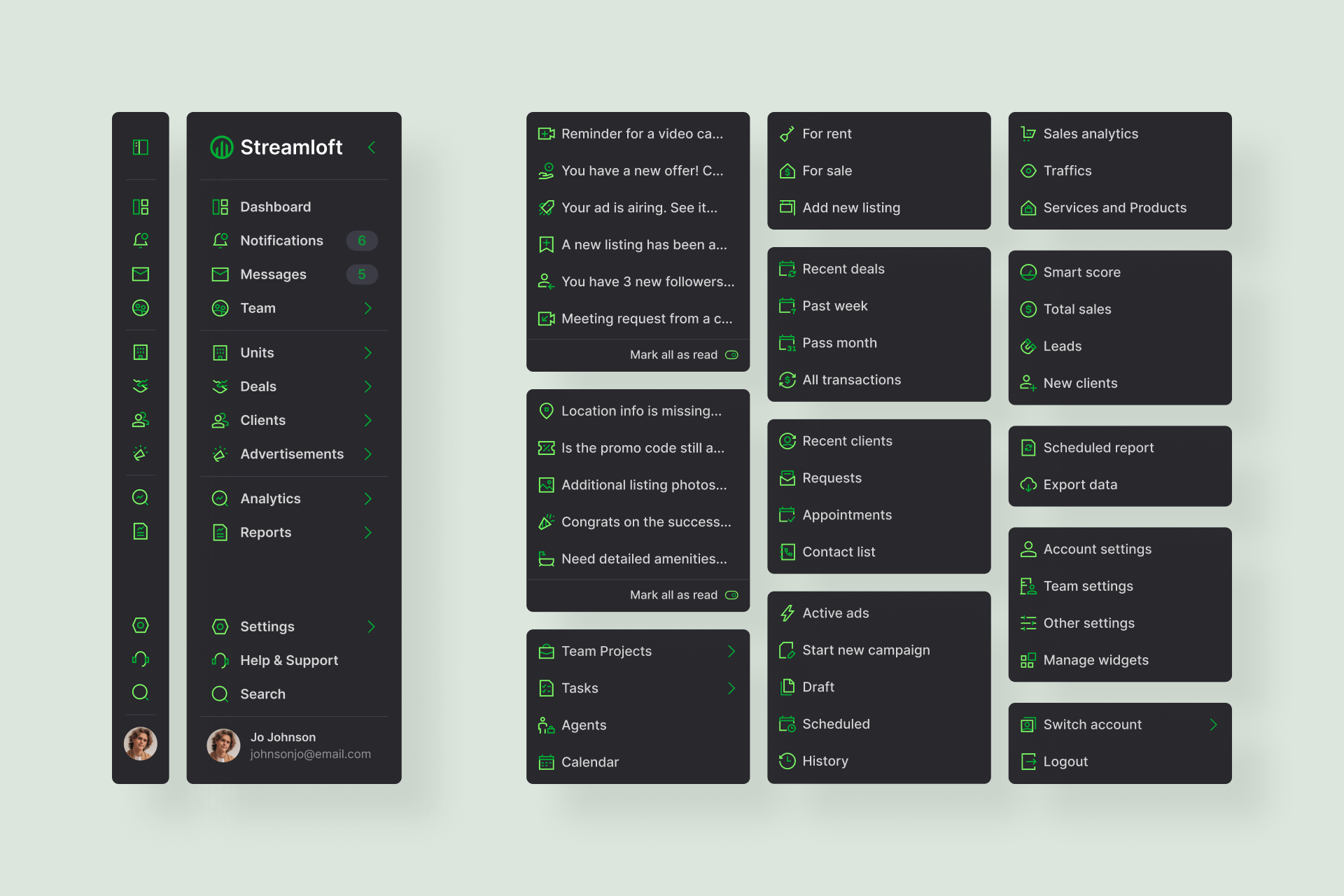
Neon icons are perfect for situations where visual clarity and emphasis are crucial. They can be used to highlight important actions, statuses or functions within an interface.
The two-color scheme helps differentiate primary from secondary elements, making these icons especially effective in complex environments where quick recognition and hierarchy are essential.
The Icon System
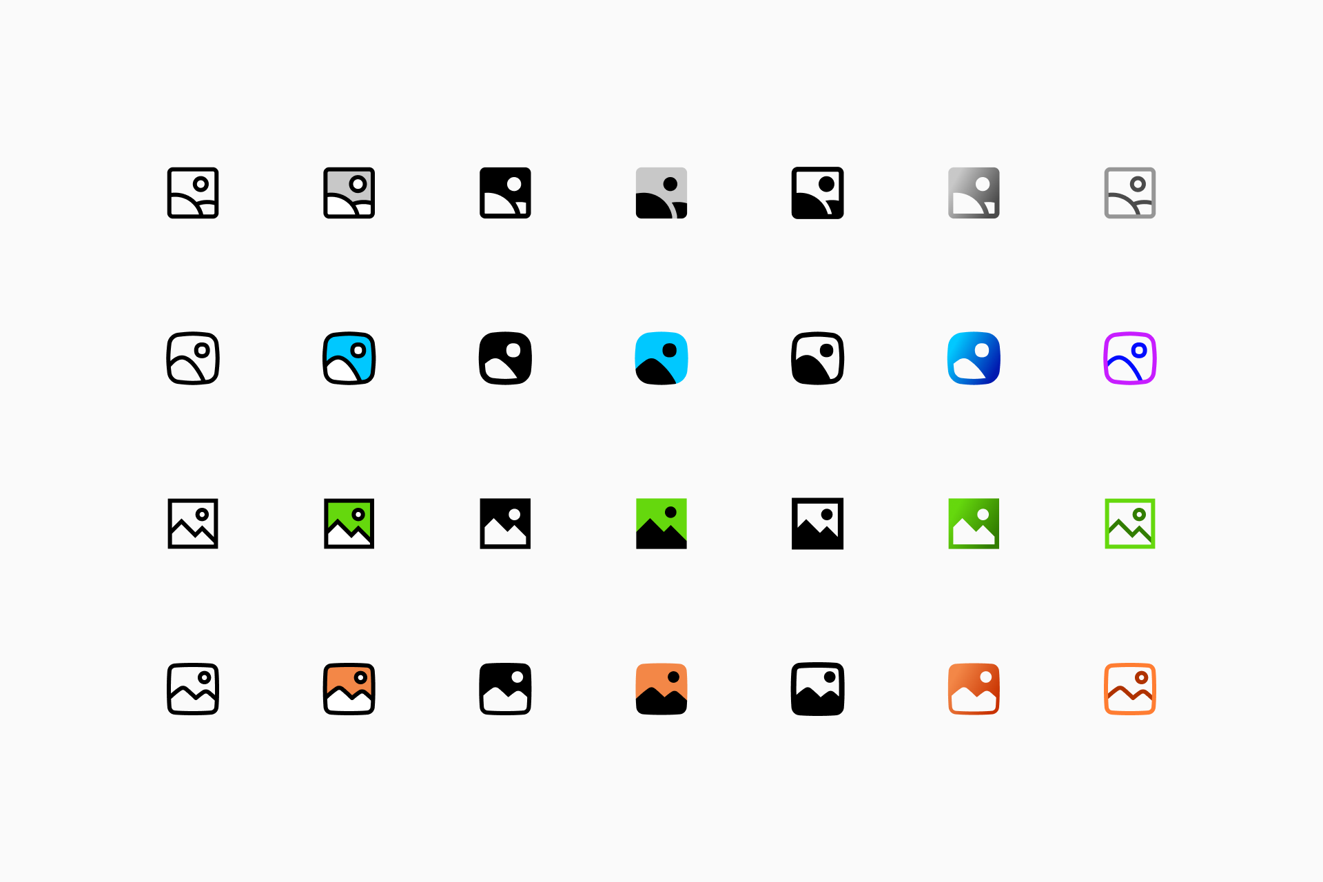
These new additions to our Icon System mean that each of our families (Core, Flex, Sharp and Plump) now has 7 different styles. The only thing we intend to achieve with this massive project is that any user has access to a flexible visual system that is easily adaptable to their needs.
From top left to bottom right: Core, Flex, Sharp and Plump
The potential of this system is impossible to measure, each icon has 28 variants to which we have to add the customization options available in our app: stroke thickness, color, gradients... And we don't plan to stop here.
And now it's time to try these new sets, so here's a complete list of all the new styles available in both our app and Figma plugin:
Enjoy designing!