The 'Jester' – Marketing archetype tips
Embrace the Art of Fun! Mastering the 'Jester' archetype in branding, by choosing the right colors schemes, typefaces, visuals, and icons.

The Jester brand archetype
Do you know your brand's personality? Brand archetypes are a very popular branding framework that classifies companies into 12 different archetypes.
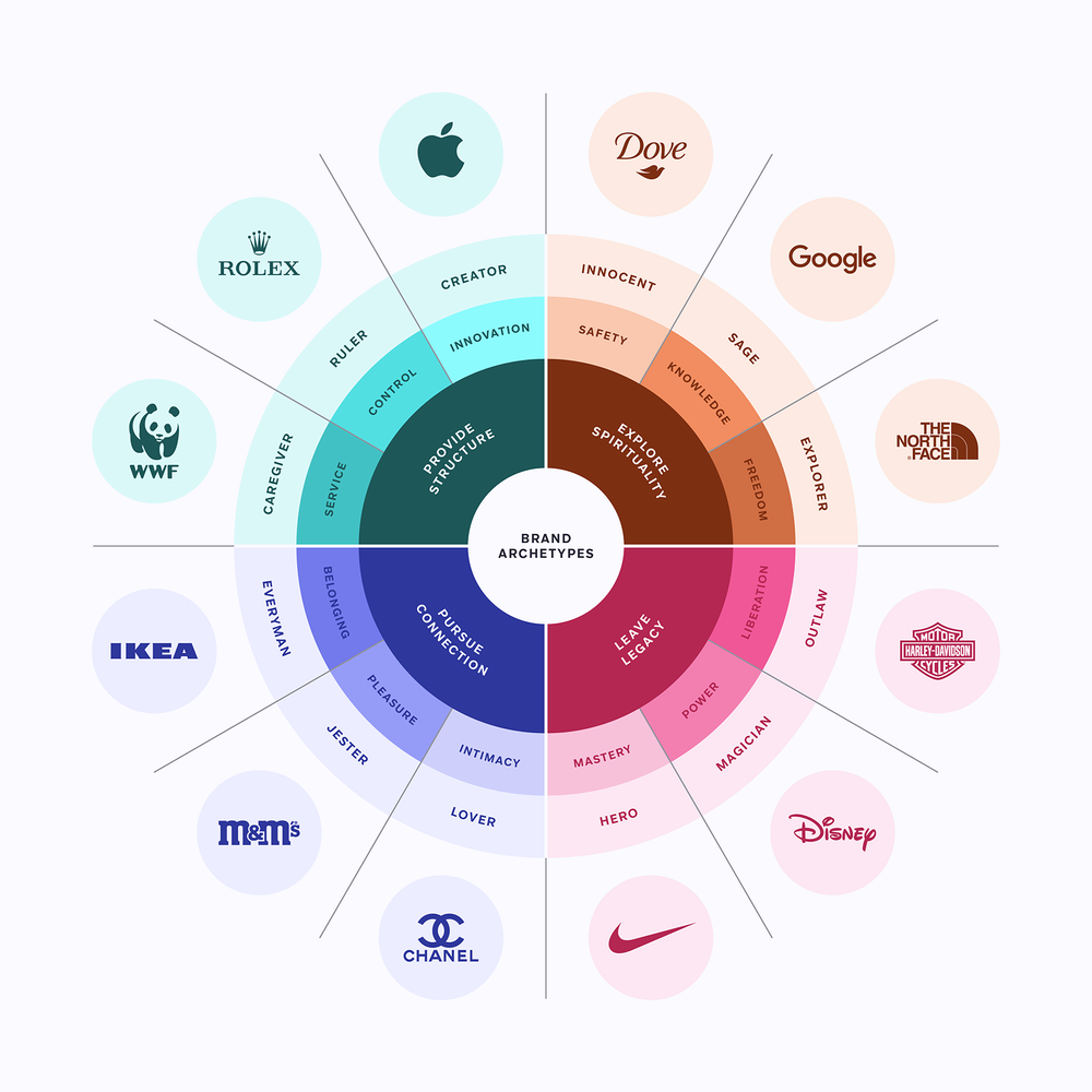
Your brand belongs to one of these archetypes and with this series of articles you’ll discover how to create an engaging message with graphics specially curated by the Streamline team.
Why should Mailchimp use Freehand icons?
Keep reading to find out the best assets for the Jester archetype.
Meet the Jester
The Jester archetype is characterized by humor, wit, and positivity. These brands represent a playful and optimistic spirit that seeks to bring joy and laughter to others, so they're always associated with enjoyment.
Goal: Entertainment
Message: Always look on the bright side of life
Voice: Playful, optimistic and funny
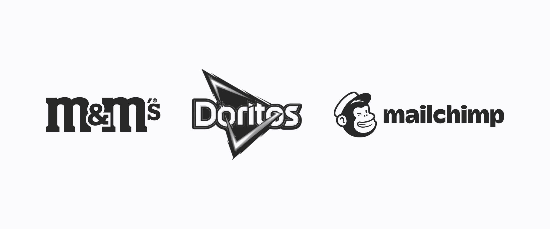
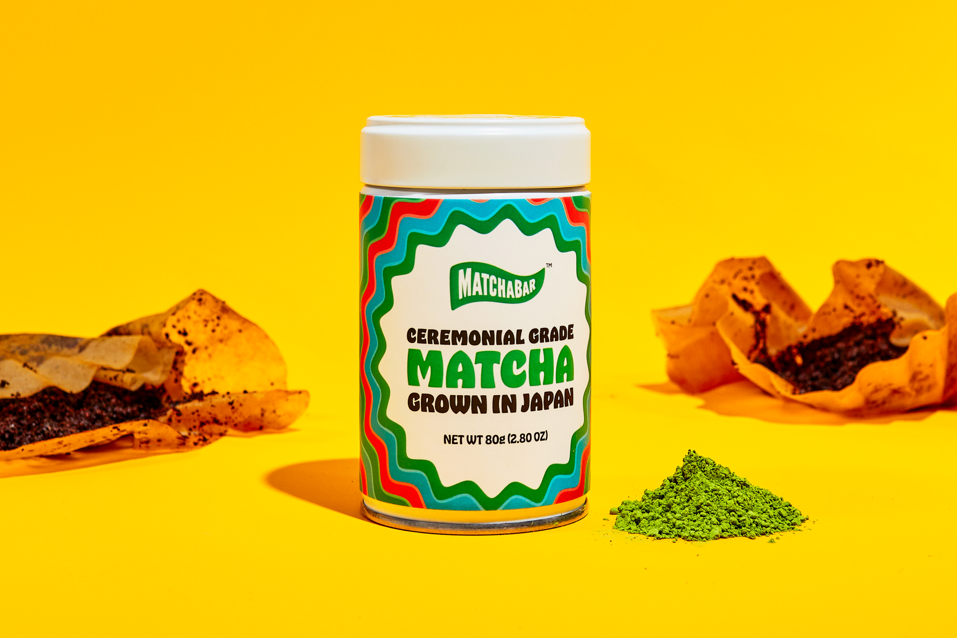
Some examples of brands that are part of the Jester archetype include M&M's, Doritos, Mailchimp, Skittles, Geico or Ben & Jerry's. All of them use humor to create memorable campaigns that capture the attention of their audience and reinforce their brand identity.
They often want to appeal to a younger audience and differentiate themselves from more serious and traditional brands.
The bright side of life
There are many ways of understanding life and the Jester suggests that no matter what challenges or difficulties one may face, there's always a silver lining, a reason to keep going. By embracing a positive mindset and looking for the good in every situation, one can live a happier, more fulfilling life.
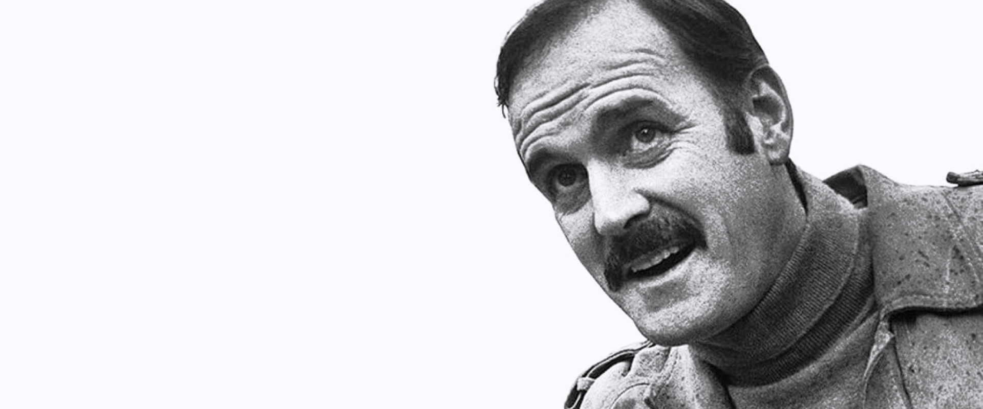
John Cleese, as well as any other Monty Python member, apply this philosophy to both their work and their lives.
"He who laughs most, learns best."
Adding "humor" to a design is a tough task as it requires a great sense of creativity. By experimenting with different elements and techniques, we designers can create projects that aren't only visually appealing but also entertaining and amusing. Let's get started.
Over the rainbow
In terms of colors, the best option for this archetype is a bright and vivid palette that reflect the brand's fun and lighthearted personality. For example, a rainbow color palette can work well as long as it's used in a way that supports the brand's message and identity.

Neon colors can also help to create a sense of energy and excitement, which can be perfect for brands that want to convey a playful and humorous personality.

You could also try unexpected color combinations. By pairing colors that are not typically seen together, brands can create a sense of surprise and delight that is perfectly in line with the Jester archetype.
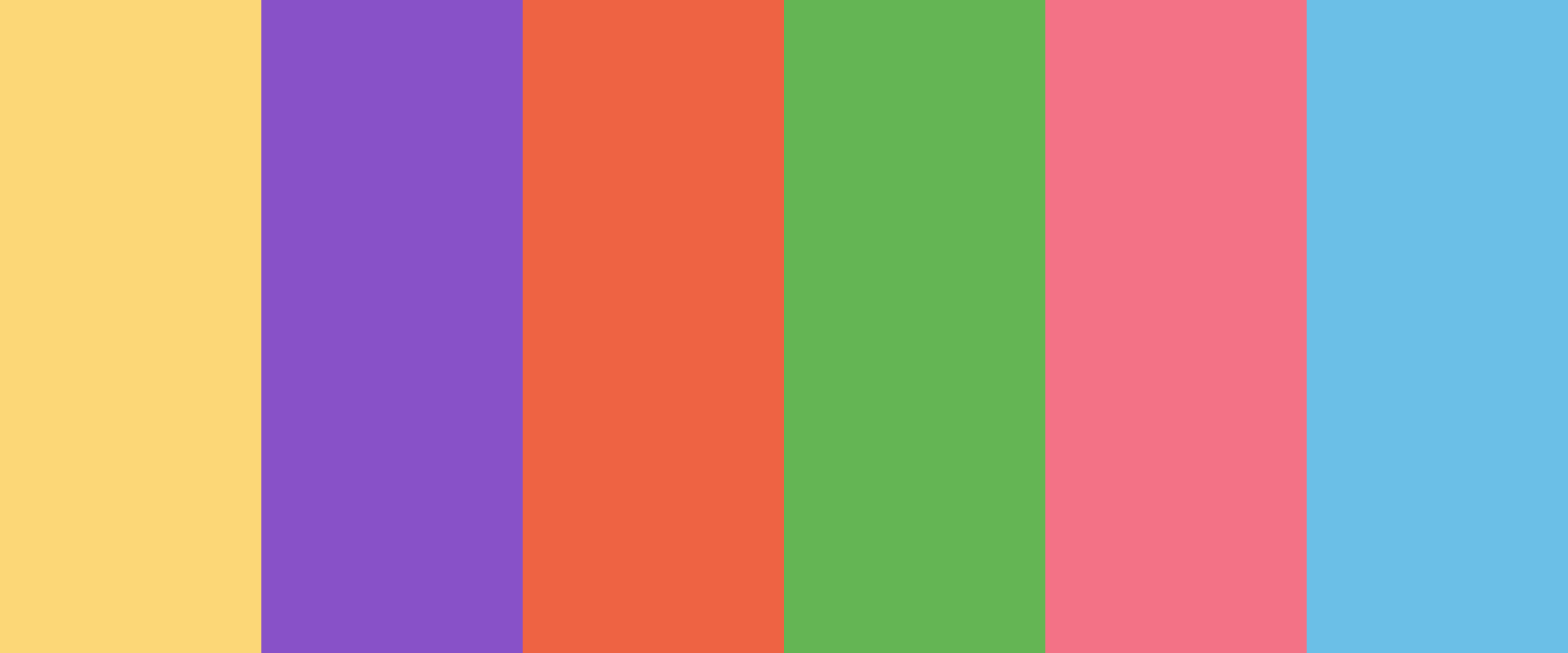
Overall, the Jester brands can incorporate a wide range of different colors, as long as they reflect the brand's values of fun and optimism.
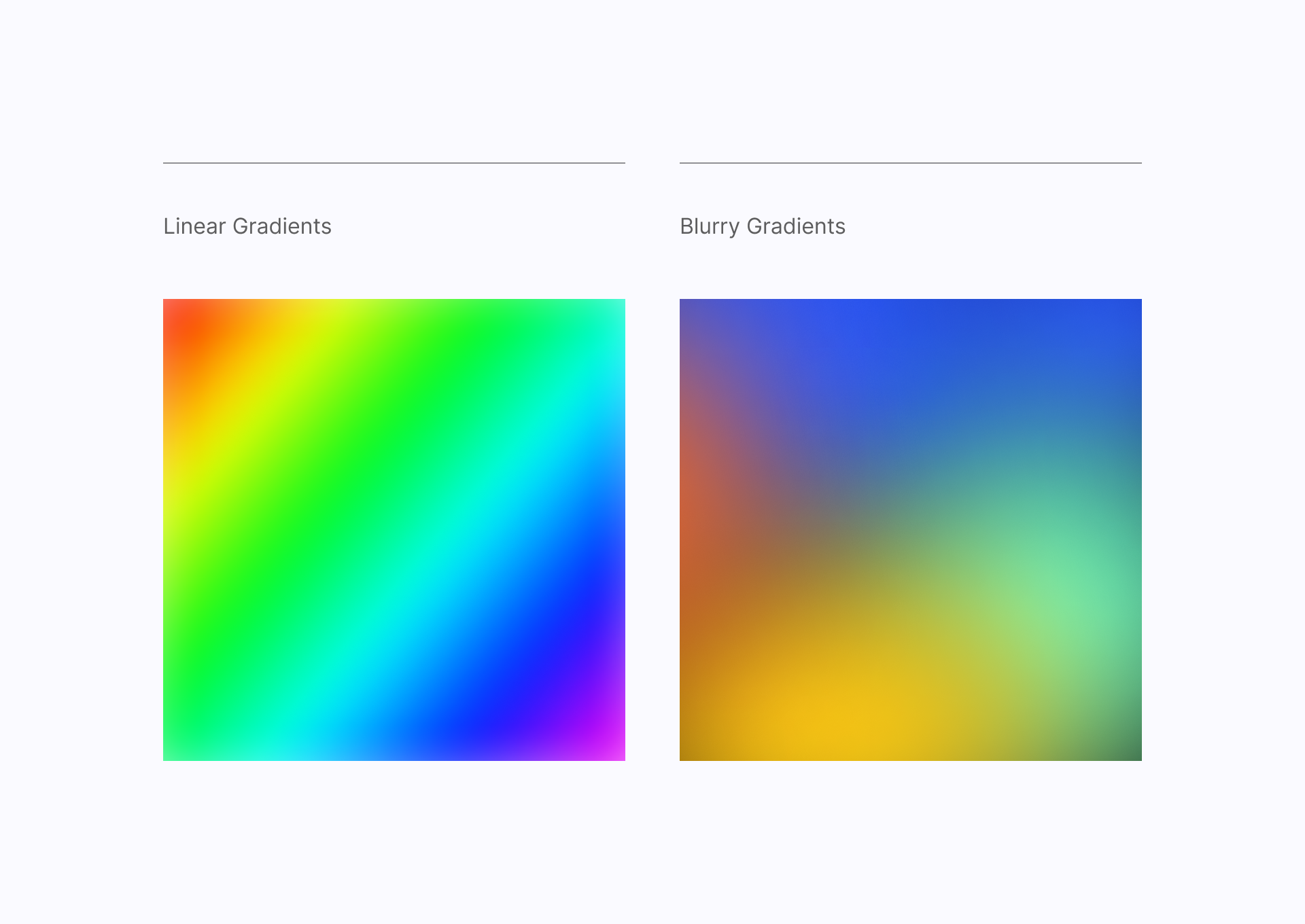
But if you really like colors (who doesn't?), gradients can be a great option to give a unique voice to these brands. With gradients you can also create a sense of movement and energy while incorporating a range of cheerful colors.
Breaking the rules
For this archetype it's important to select a typeface that reflects the brand's irreverent tone. This means choosing a font with personality and a fun and quirky style. Overly formal or serious typefaces should be avoided in favor of unconventional ones, is all about breaking the rules.
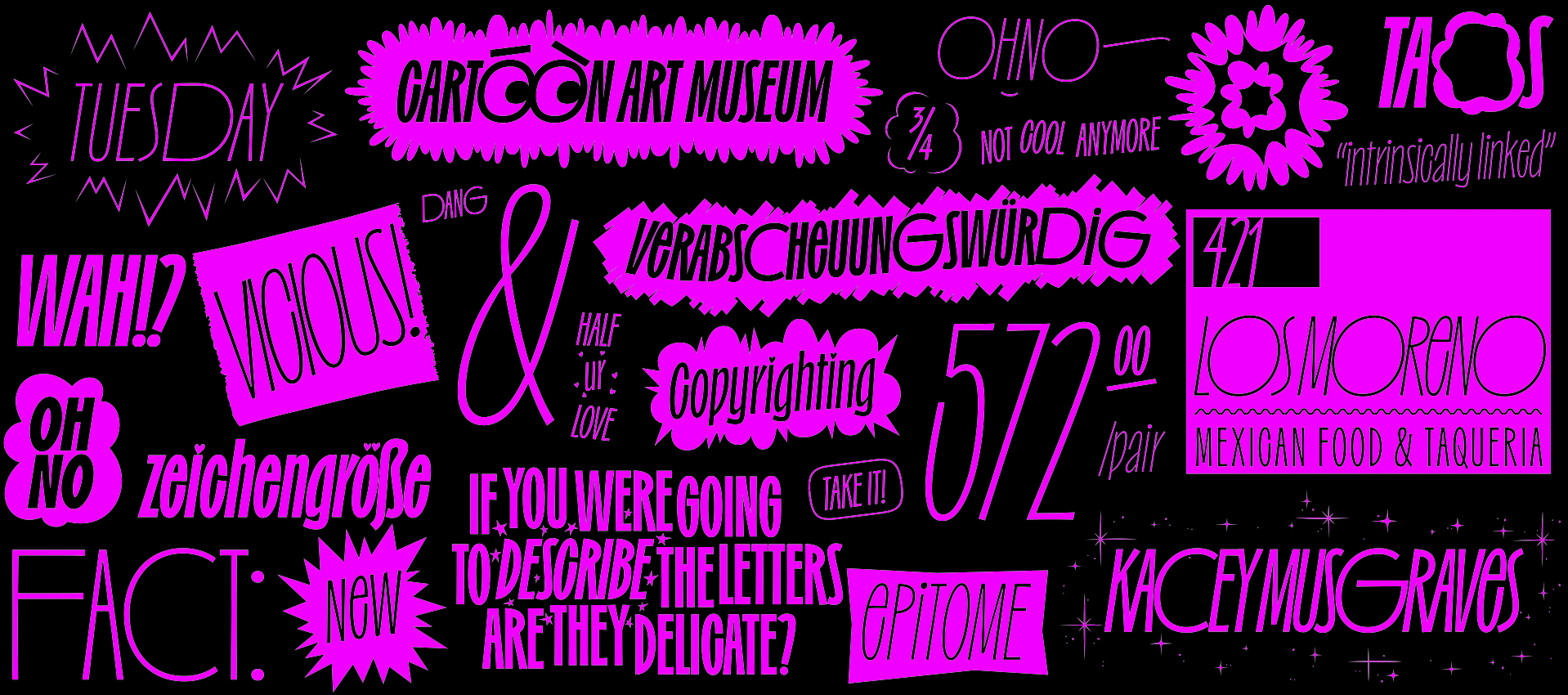
Anything by OH no Type would be a great choice. Irregardles, for example, is a condensed and cartoonish font perfect to create impactful designs at large sizes.
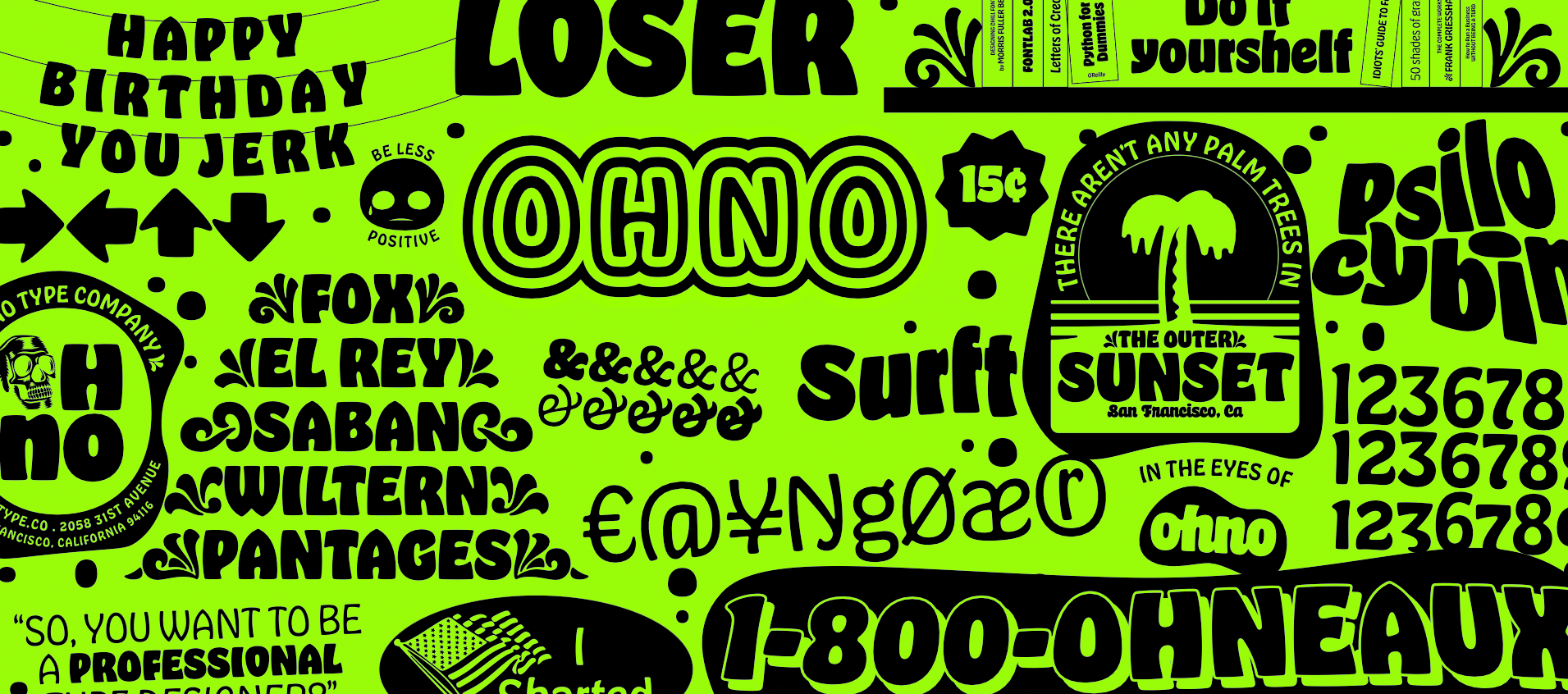
Hobeaux is a great alternative if you're looking for something chunkier and friendlier, an homage to Morris F. Benton's Hobo typeface.
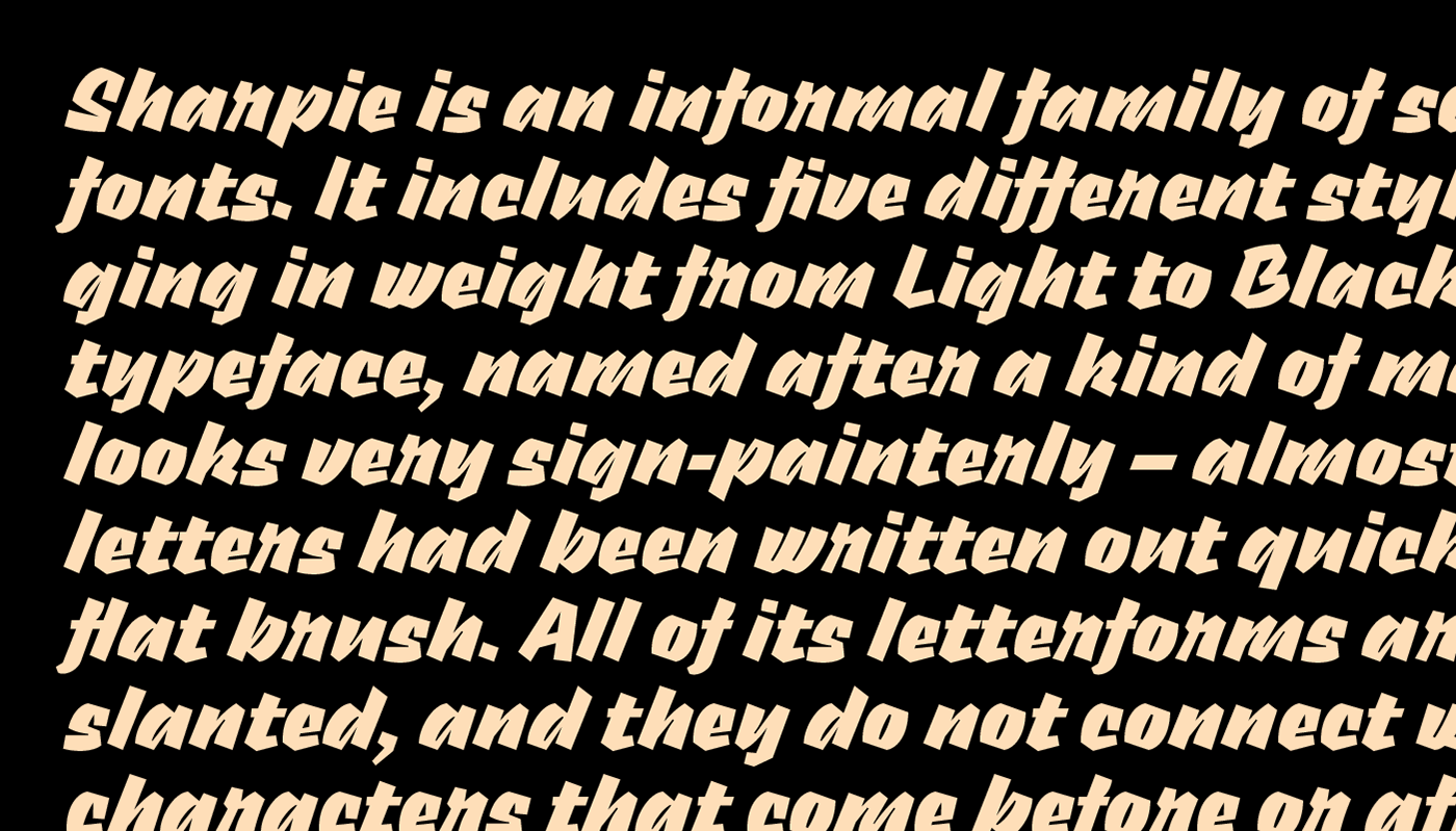
Typefaces that simulate a calligraphic stroke are also a great option, like Sharpie, a free font that tries to replicate a marker line and would add a personal and warm touch to any project.
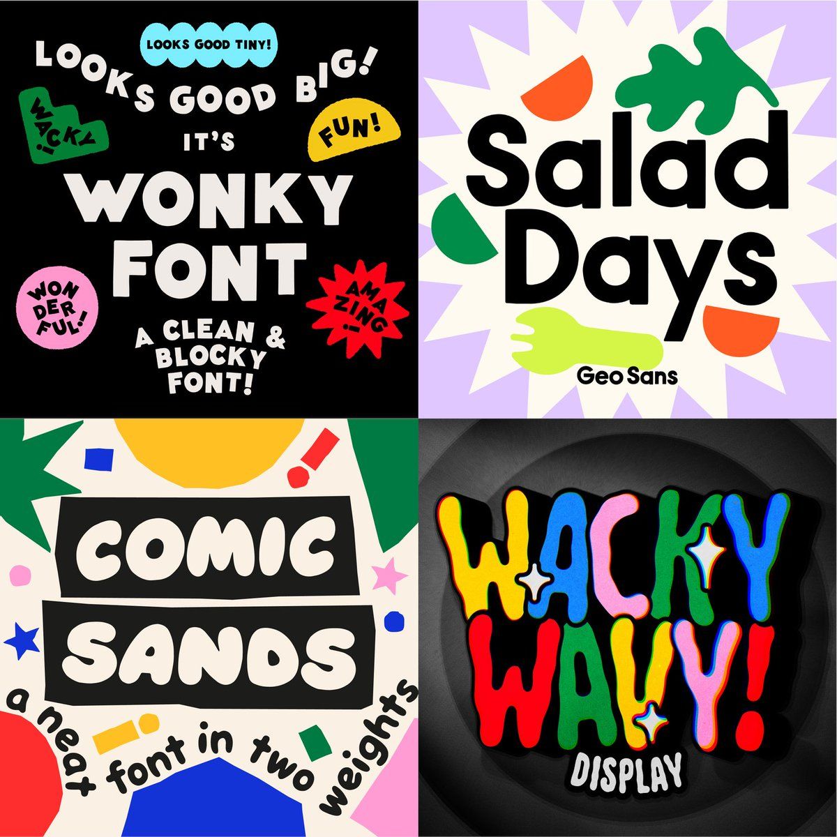
But if you really want to go crazy, Super Happy Good Time is a bundle that includes a bunch of unique and fun typefaces like Wonky Font, Salad Days, Wacky Wavy and Comic Sands. The names alone are pure fun.
F*ck the grid
While grids can be a useful tool to design icons, they are not always essential. In fact, many designers choose to create icons without using a grid at all. You heard me right! Grids can be limiting, and may not allow for the same level of creativity and experimentation as freeform design.
Let me introduce you to some creative and experimental icon sets that didn't need a grid (except for one, I'm sure you can tell which).
Look at these unique Stickies icons, a playful, friendly and bubbly set with a huge personality. Hand-drawn assets like Freehand have also gained popularity for their ability to communicate a warm and approachable image. And for those who appreciate retro design (and those who didn’t like my “F*ck the grid” statement), you also can go for Pixel. Lovely, right? Credits to Susan Kare for her pioneering and inspiring work for Apple.
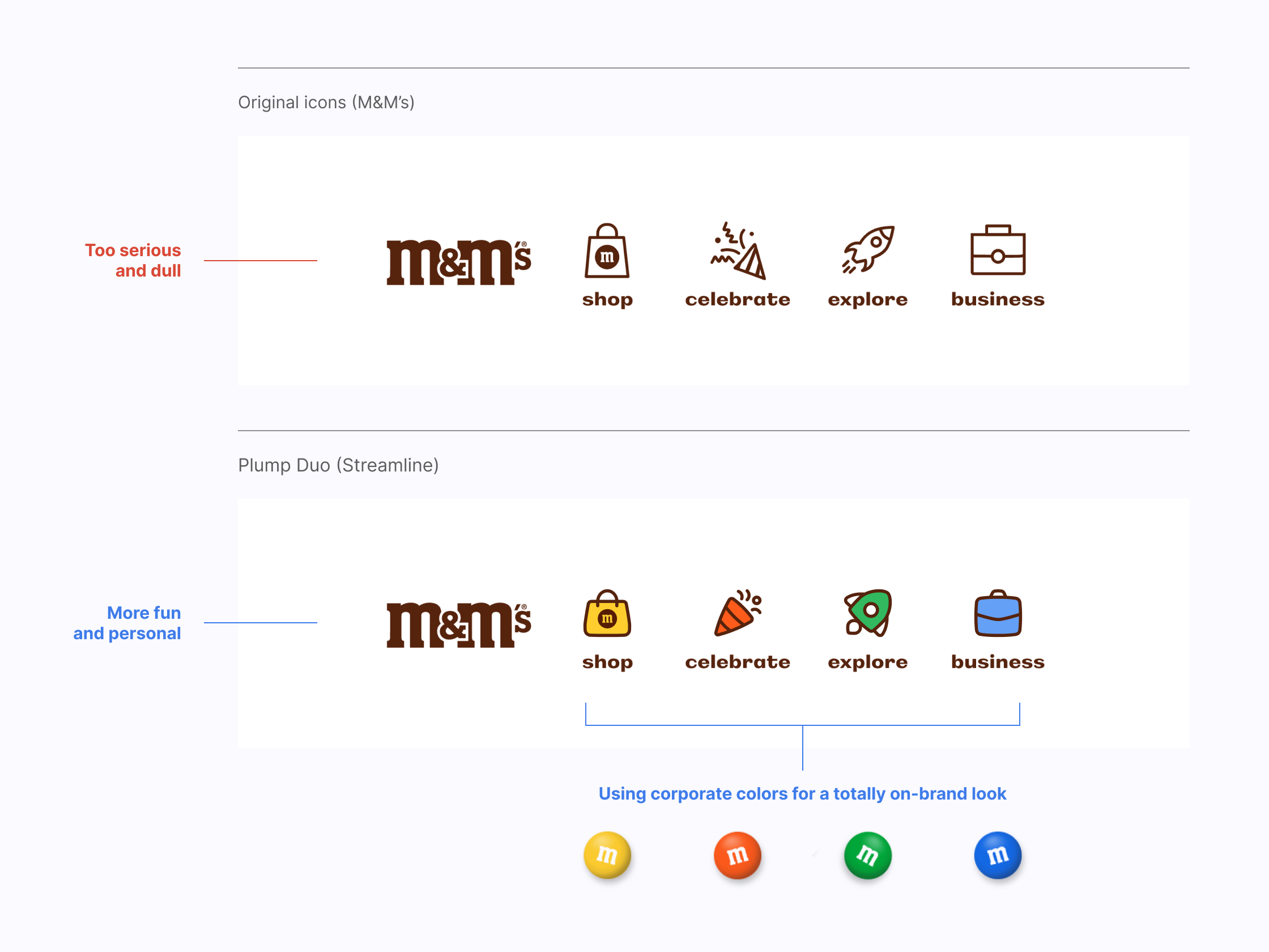
But there may be a point where these icons are "too crazy" for your brand, so if you're looking for a set with friendly vibes but better legibility and a more professional selection of icons, then choose Plump. Plus, it comes in 4 different styles: Line, Duo, Solid and Flat.
Plump Line is the most versatile option, it gives priority to the other graphic elements that are part of the layout. Plump Solid has a bolder look and is more legible at small sizes, they look gorgeous on a dark background. Plump Duo and Plump Flat are more joyful alternatives, they are a great option to match your brand needs thanks to their customizable colors.
Is that a dog in suit?
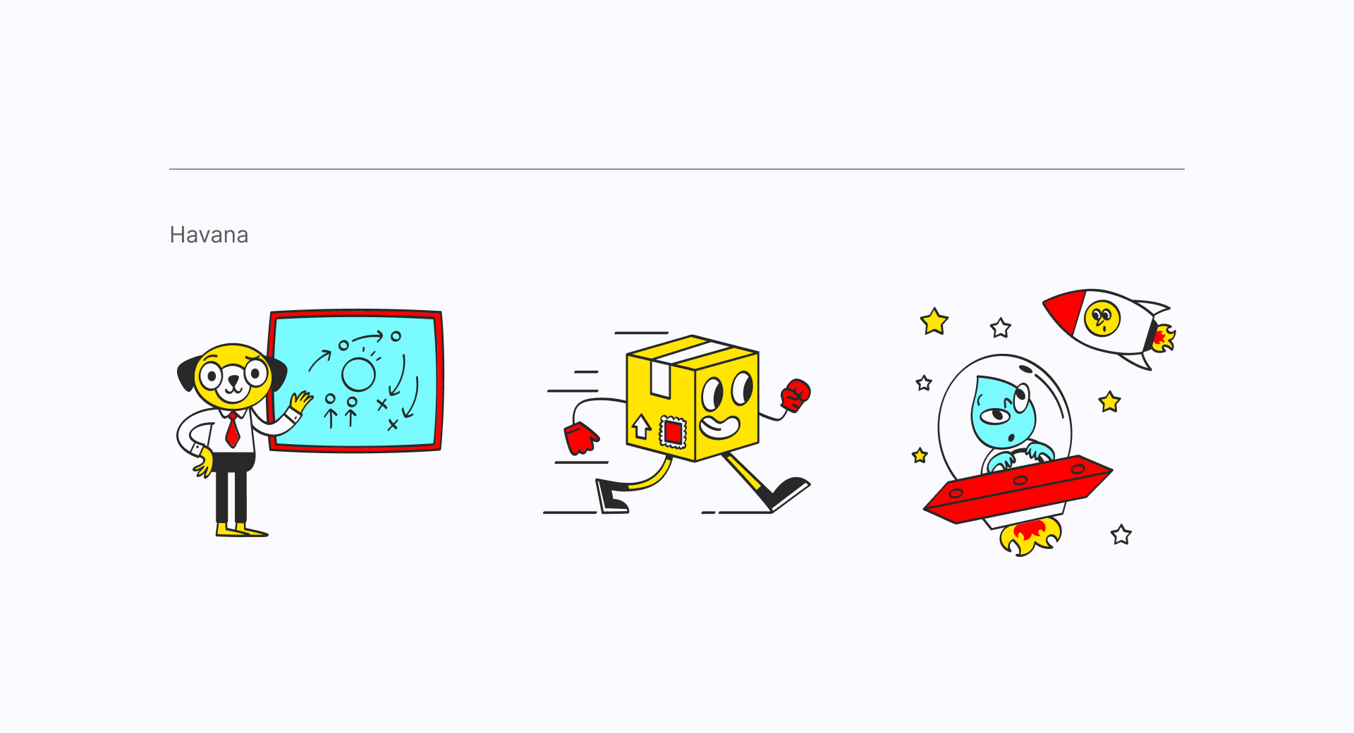
Fun and surreal illustrations are a great way to capture people's attention and inject some personality and humor into your design. This type of illustrations can be very imaginative and often feature unusual or fantastical elements. That's the case with Havana, an illustration set inspired by vintage comics. With these bright and shocking colors you'll certainly attract attention.
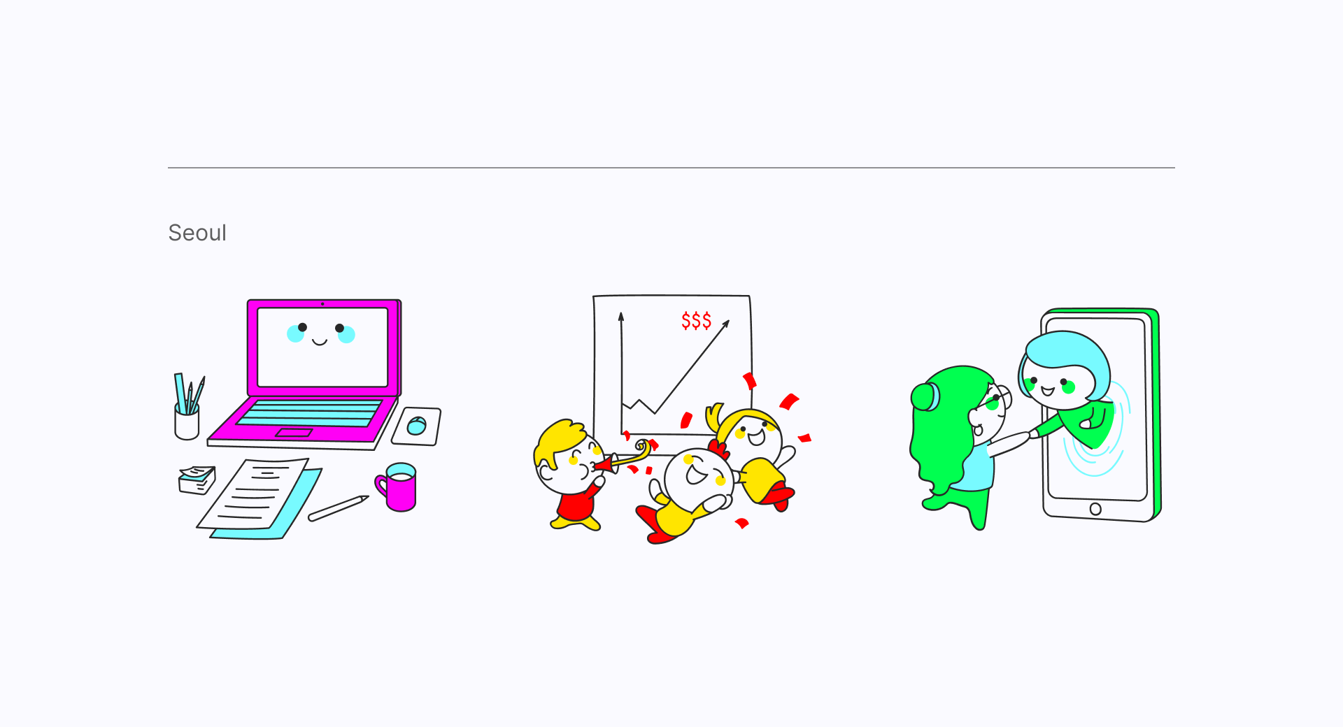
You can also check out Seoul for a more "kawaii" alternative, heavily inspired by Japanese and Korean comic book styles. Bright colors, exaggerated proportions, unexpected objects or cartoonish characters can be some of the elements you should be looking for while adding illustrations to a Jester brand. The key is to experiment until you find a style that fits your project.
Adding a dash of joy
You may still want to use other graphic elements in addition to the ones gathered here so far. Complementary visuals always fit the Jester archetype very well, as they tend to be inherently fun.
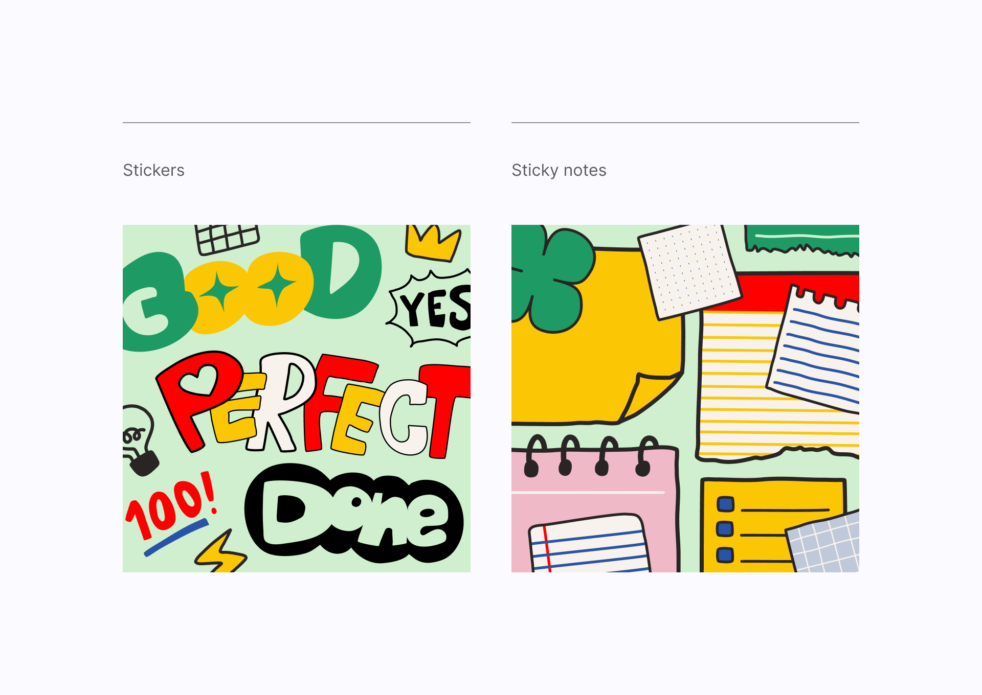
Like these little Stickers (or the Sticky notes, which are free), which can be used in many different contexts to add an element of surprise to your projects.
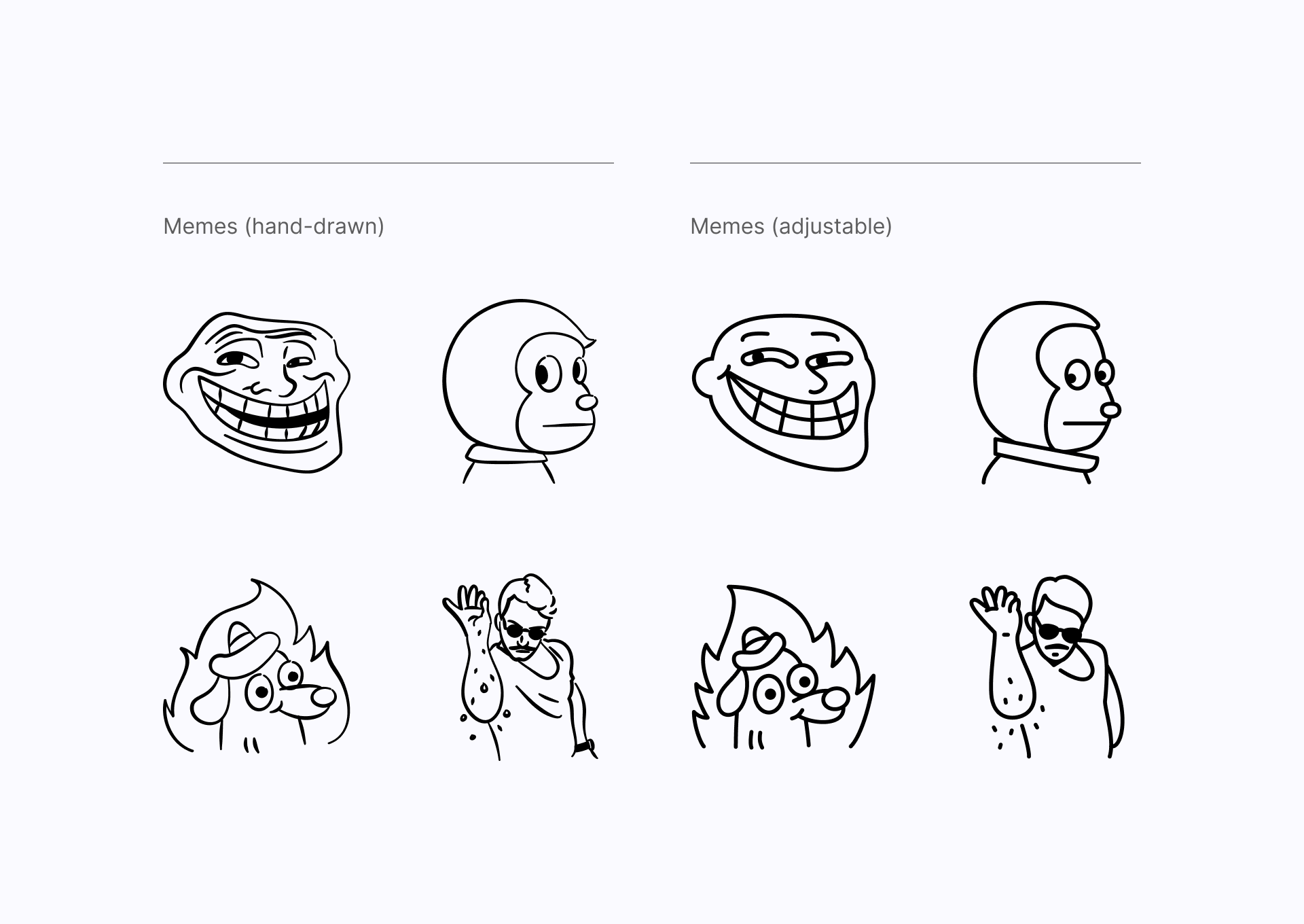
Using Memes can also be a very effective way to communicate a sense of humor for a Jester archetype brand. On this collection you'll find all your favorites Memes in two different styles: hand-drawn and line with adjustable strokes.
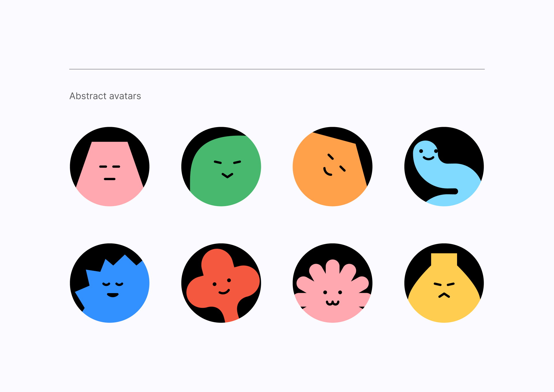
And what about these adorable avatars? The Abstract avatars set is perfect for enhancing your app's profile pictures and adding a charming touch to an element that we always take for granted but could be something more than a generic visual.
Groovy!
As with illustrations, adding a surreal element or environment in the photography guidelines of our Jester brand's imagery can be a great way to add a unique and playful twist. Surrealism is all about distorting reality and creating dreamlike images, which can be perfect for a brand that wants to convey a sense of fun and imagination.
Why so serious?
Some of these brands common themes may include living in the moment and not taking oneself too seriously, while they also encourage people to let go of their inhibitions, embrace their inner child and enjoy life to the fullest.
Here's a good start! 👇
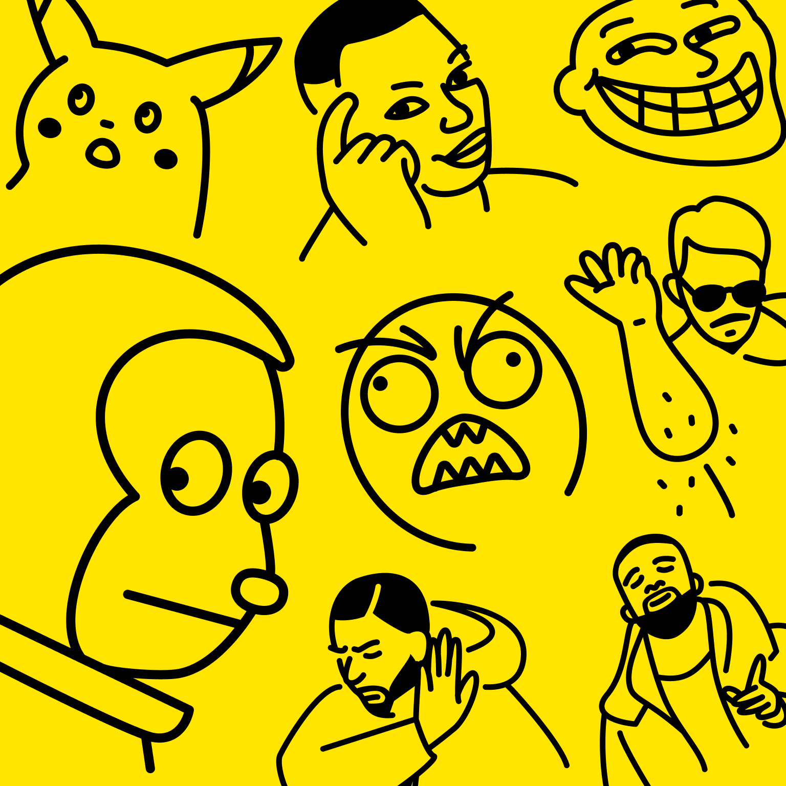
Memes
What took us so long? 😎 Now you can download vectors of all your favorite Memes in two different styles: hand-drawn or line (with adjustable strokes).
Interested in other brand archetypes?
Stay tuned for future articles!