Block – The purity of forms
A free icon set for modern and minimalist brands

Block is an icon set inspired by the Bauhaus principles of simplicity and geometric balance, a clear and modern style that focuses on the purity of forms.
It was conceived to be part of a modern and minimalist brand whose design and graphic communication is stripped to its essentials, just like Apple, Braun or Muji.
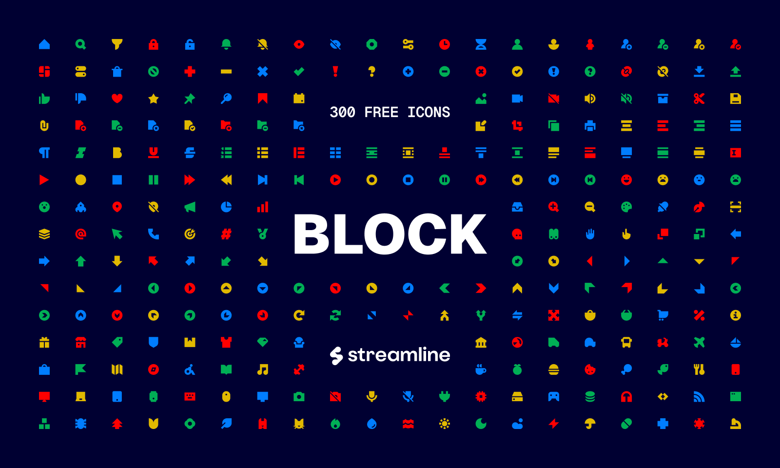
There are 300 icons in total distributed in 6 different categories and, in case we haven't already mentioned it, it's completely free.
The inspiration behind Block
Block icons are heavily influenced by modernist logos, the iconic Bauhaus Bauspiel toys, Herbert Bayer's Universal typeface and Bauhaus furniture. All these references prioritize elegance, personality and function above everything else.
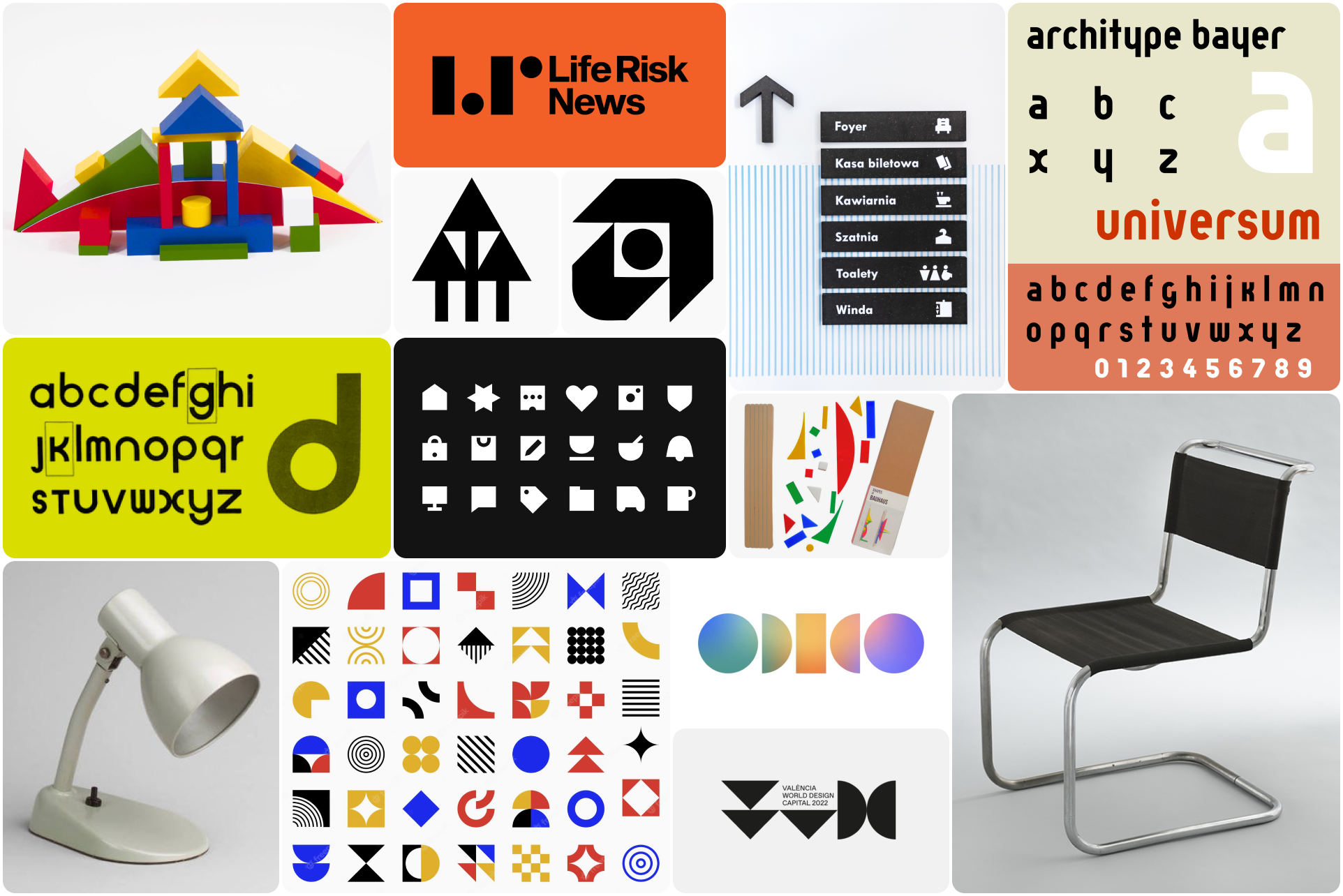
So each of our icons was meticulously designed using basic geometric shapes, resulting in a cohesive and minimalist aesthetic that reflects the timeless Bauhaus spirit of combining art and craft into harmonious and practical designs.
The design process
These icons were built on a 16x16px grid that allowed us to maintain restrictive construction guidelines and achieve the minimalist and almost abstract look we were looking for from the beginning.
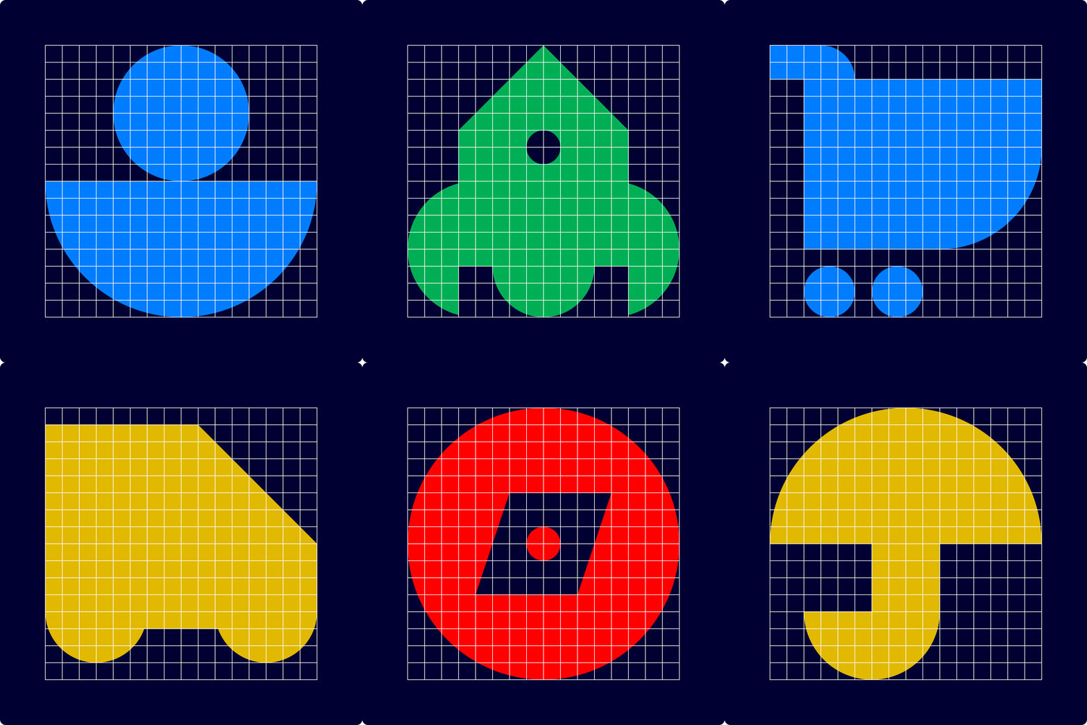
We made sure that all icons were built using simple geometric shapes, as if each of them was a logo and had a logical but unique skeleton and composition.
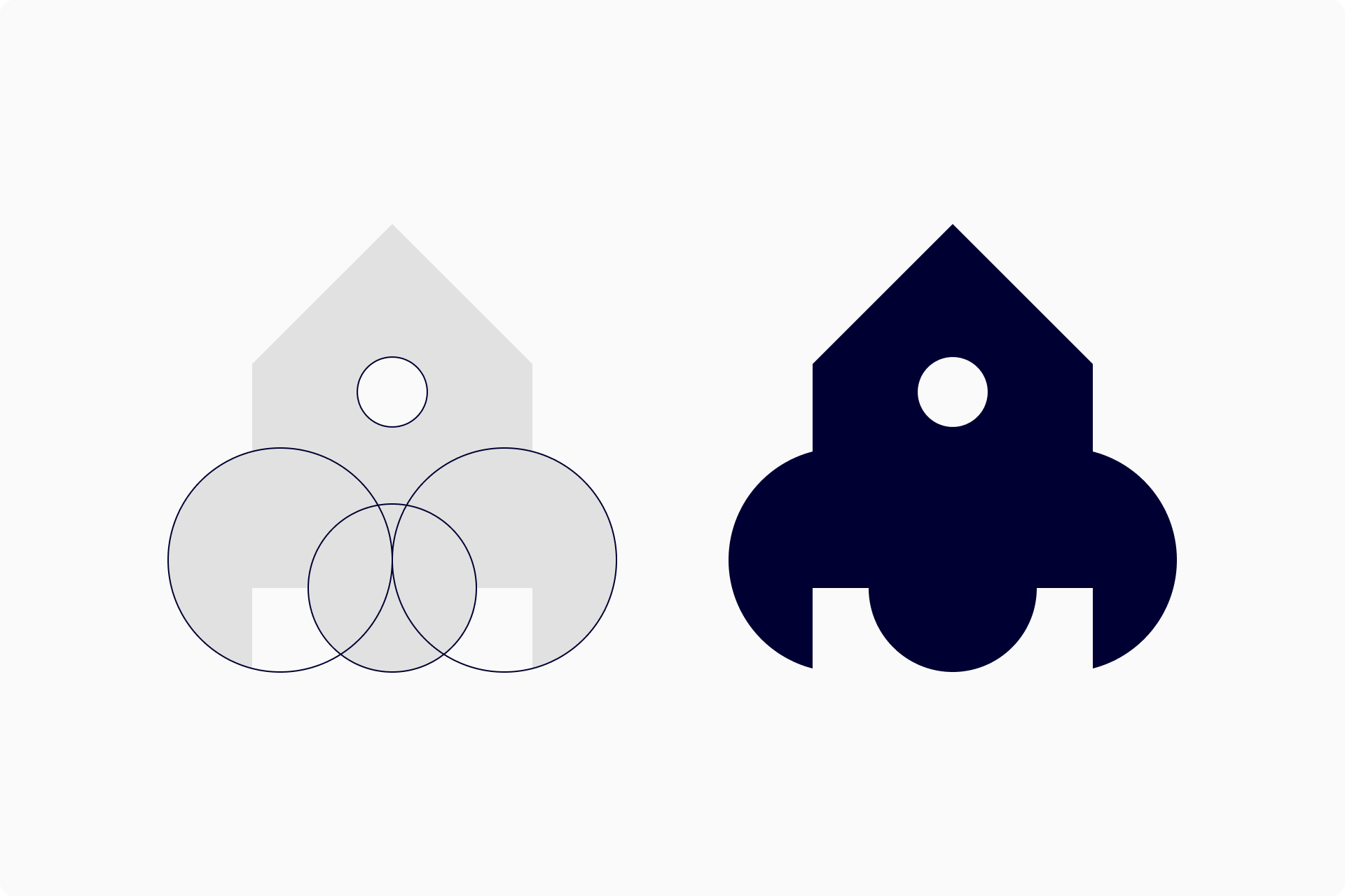
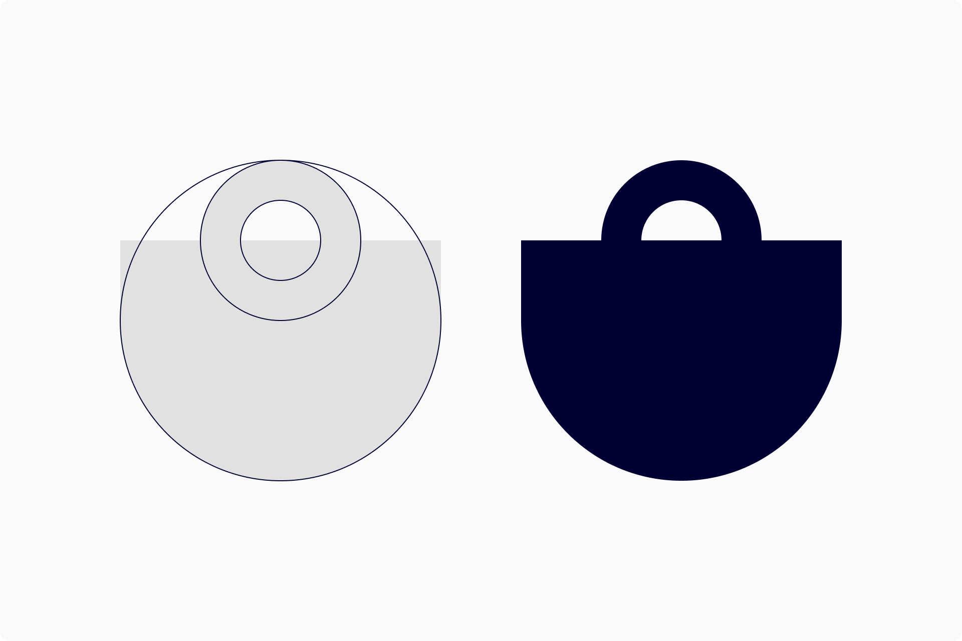
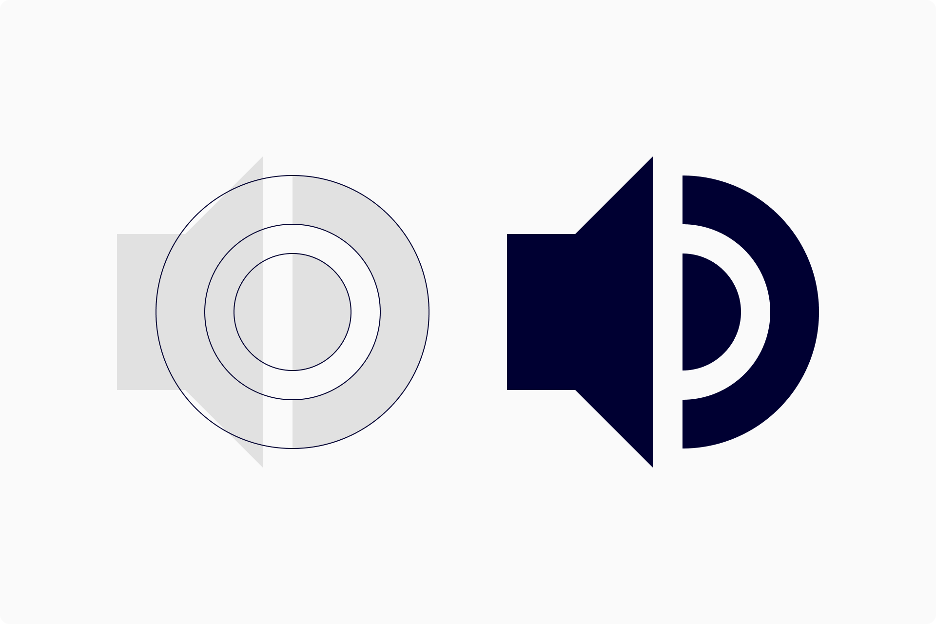
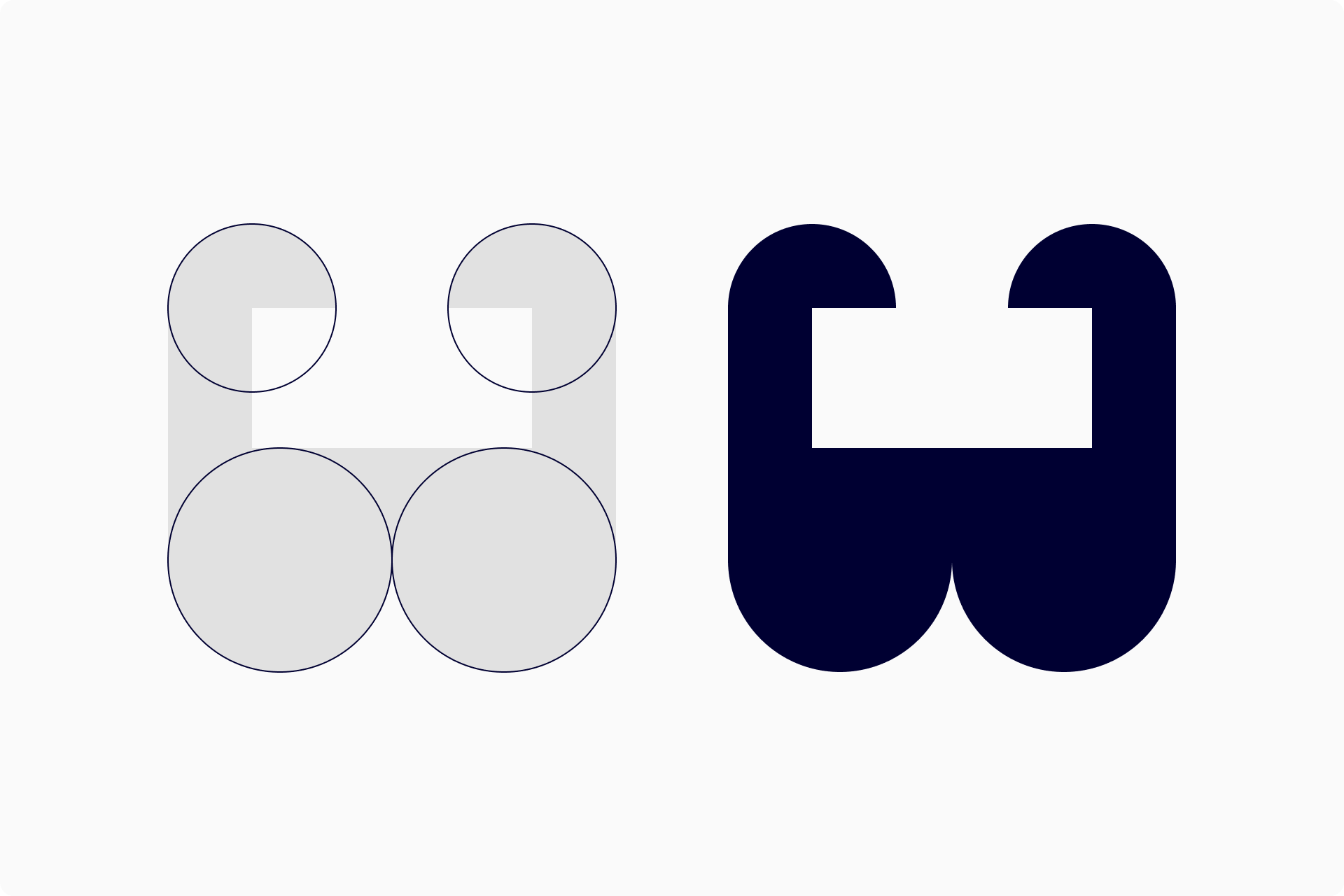
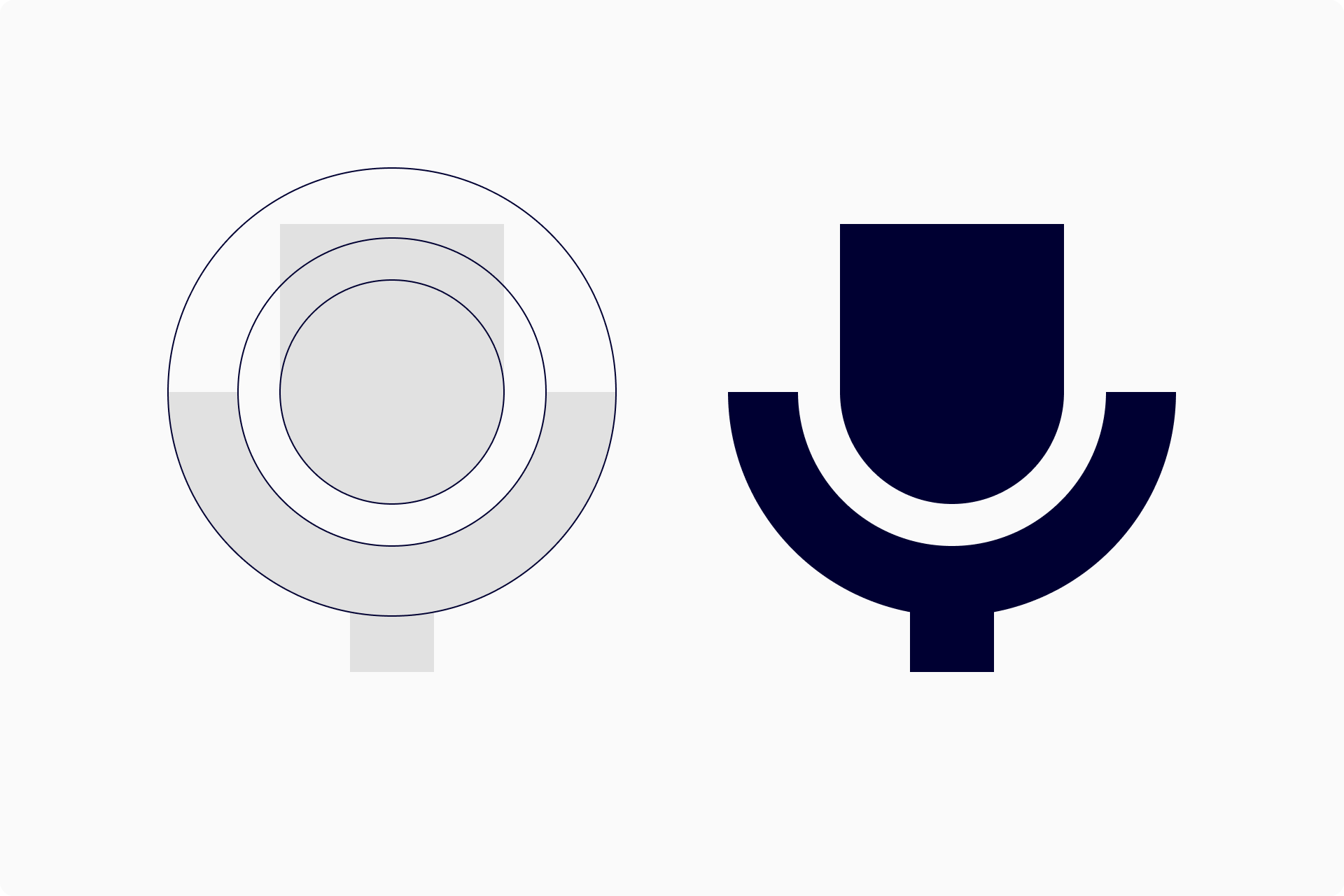
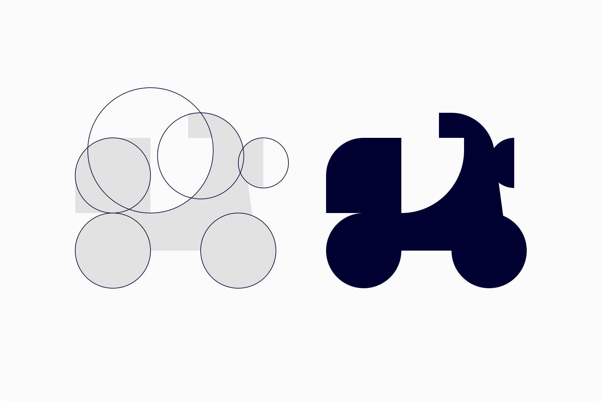
Construction guidelines for some of the icons
When designing the more complex signs, we chose an approach similar to that of sculpture, where we start with a large block of marble that we sculpt until we achieve the desired shape.
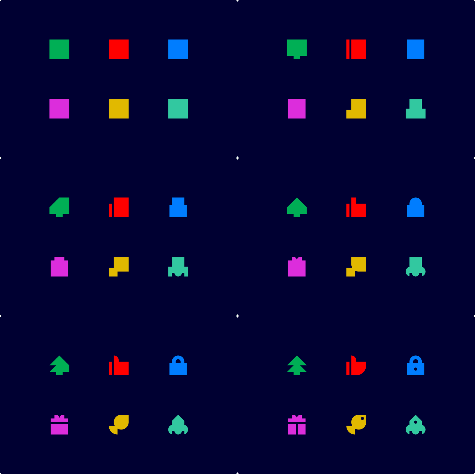
The set as a whole was conceived as some sort of modular system, where from a few shapes one could immediately create a lot of different variations, some more expressive, others more neutral.

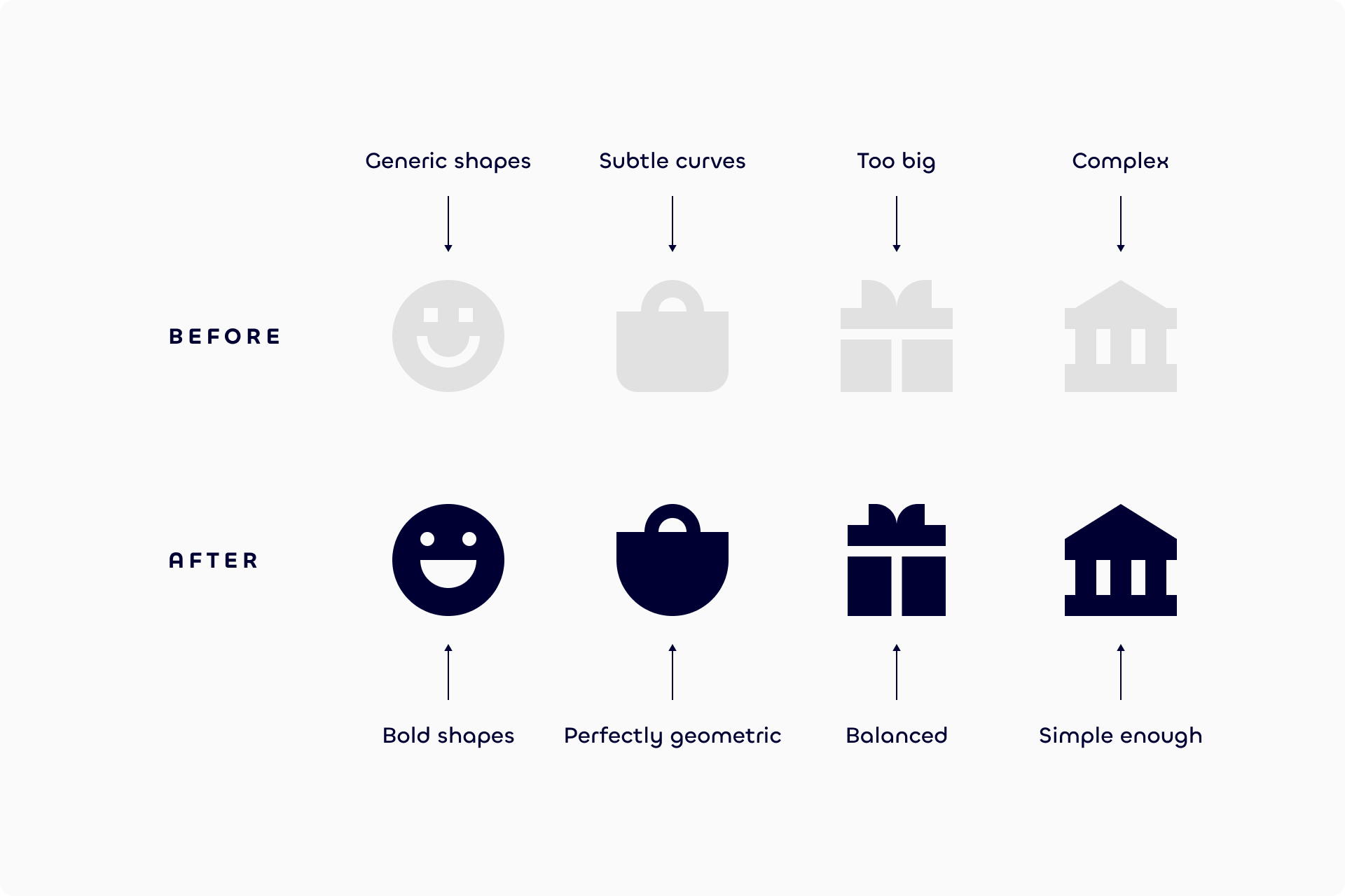
Most of the icons underwent several iterations along the way, as we always try to rest the icons for a while and tweak them at a later date to achieve the best possible version for each one of them.
We worked on this set for months until we achieved a selection of 300 icons that covered the essential needs of an average design project.
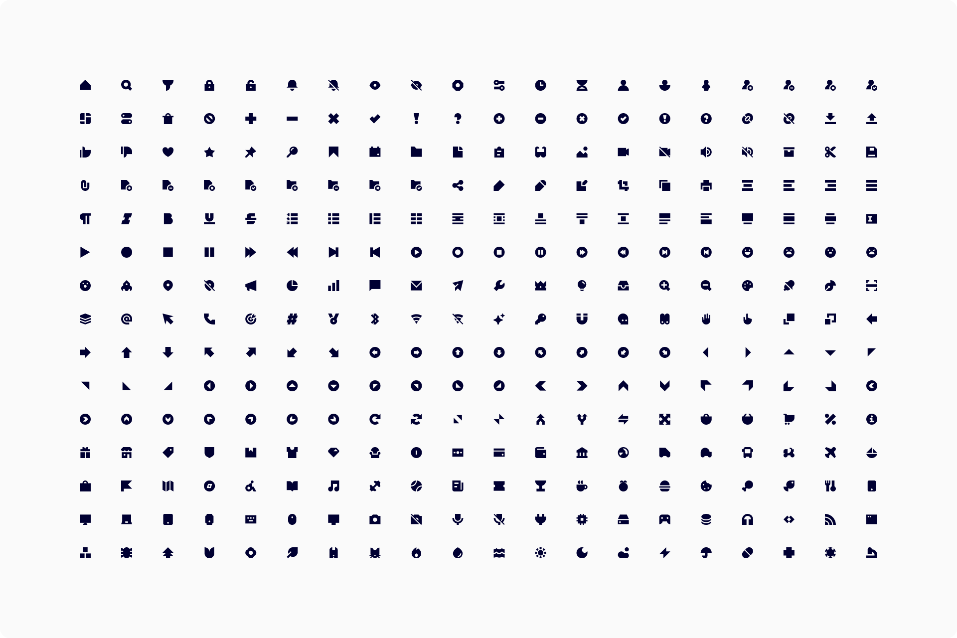
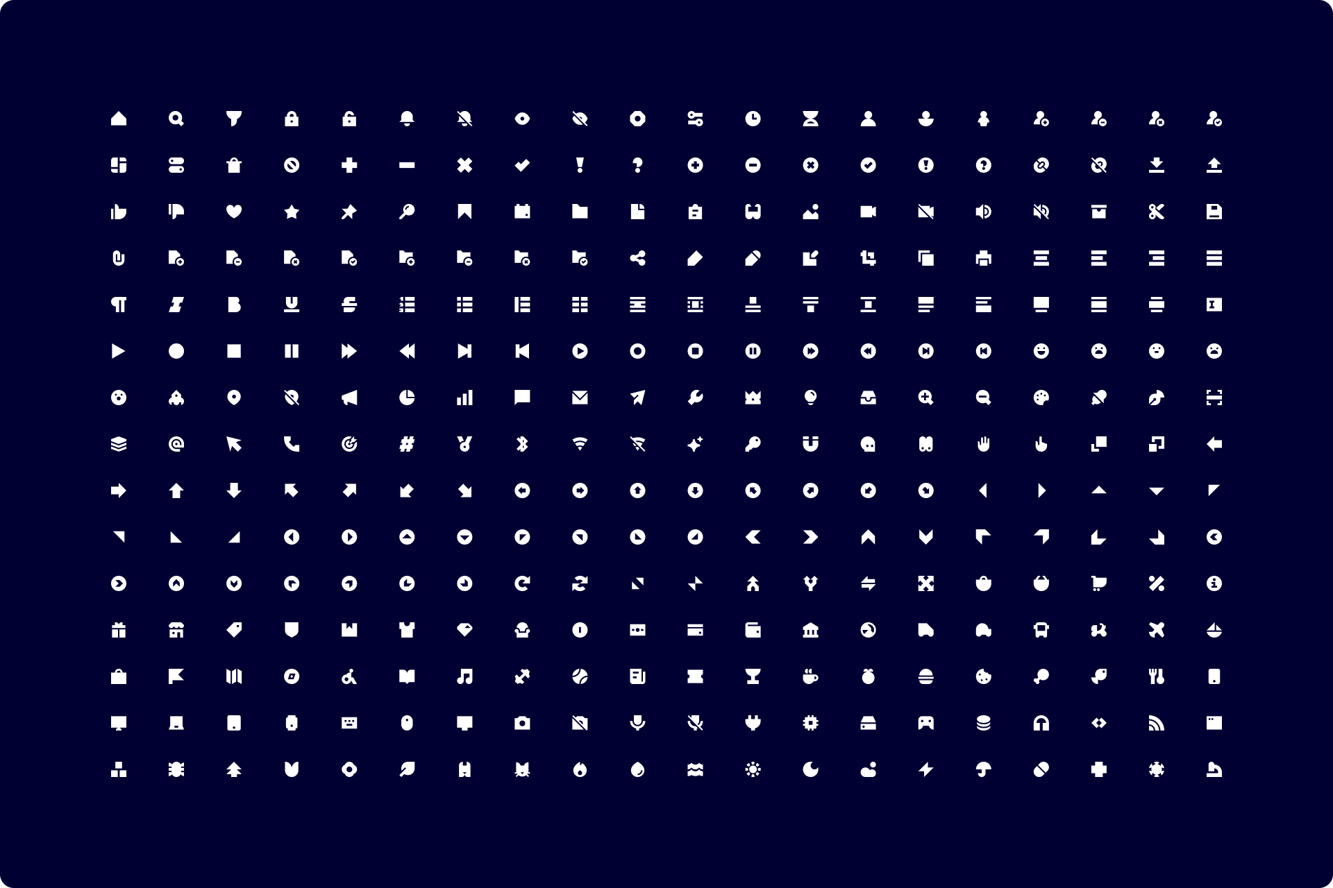
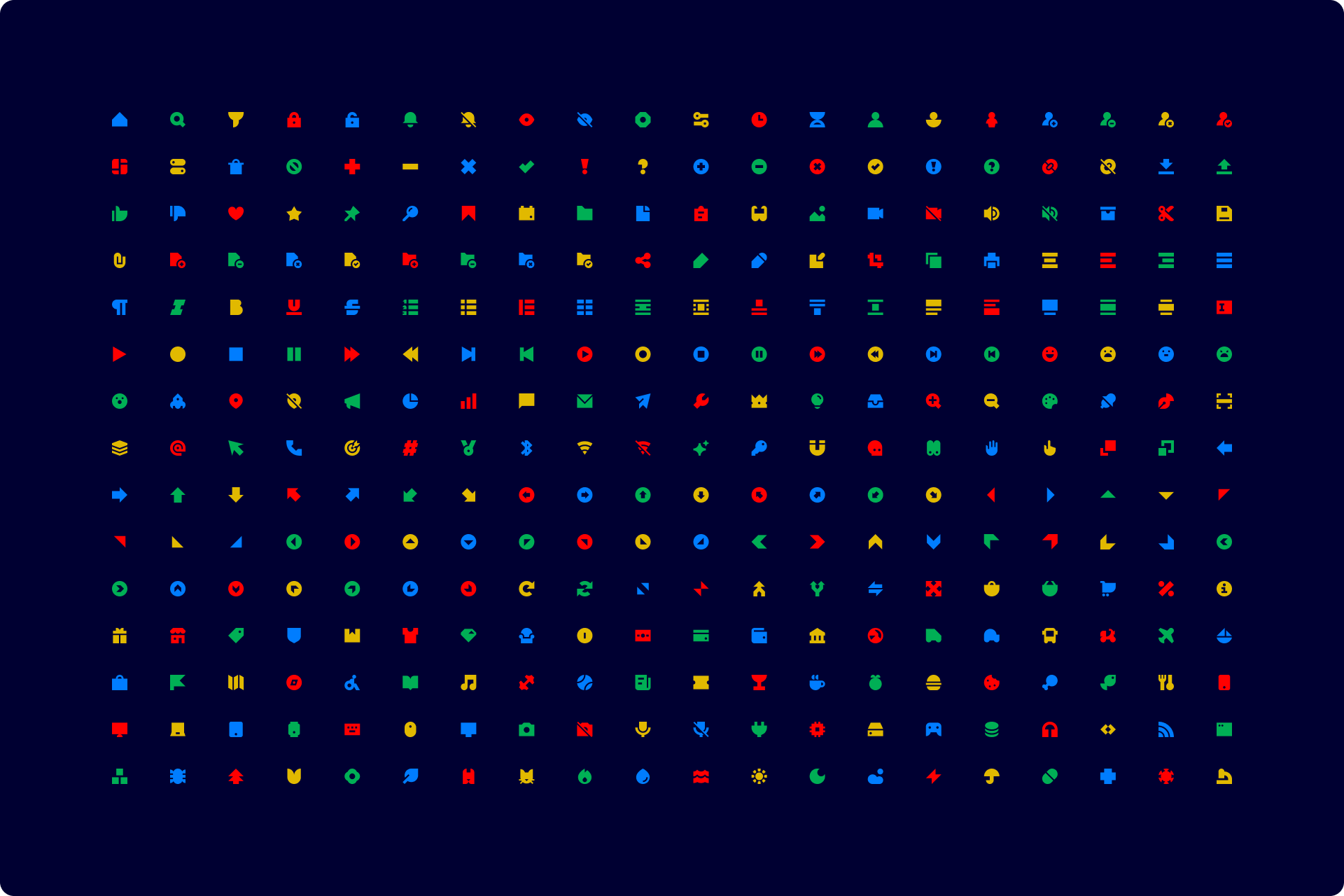
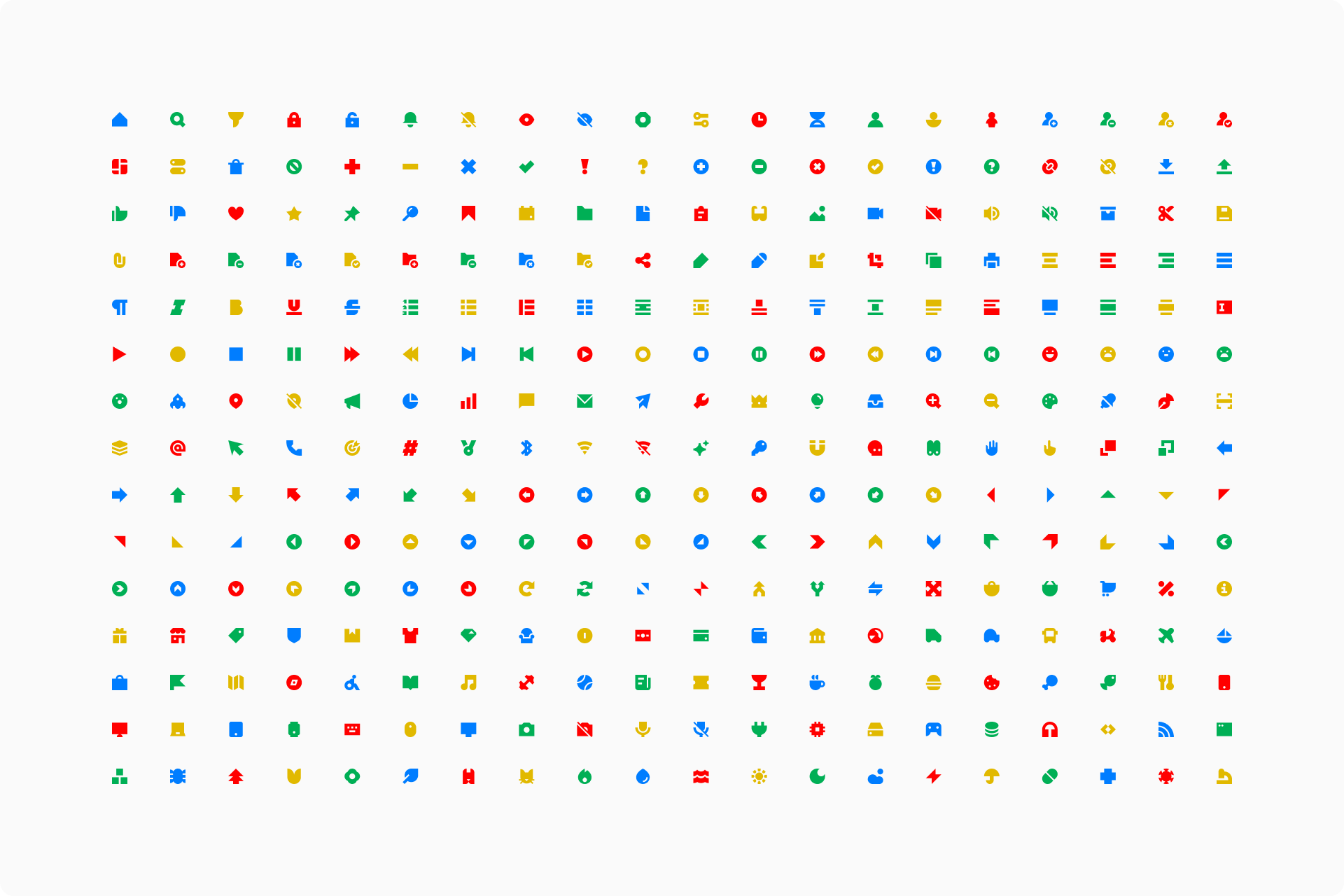
The 300 icons that were finally designed
When to use Block?
Block icons, as mentioned before, are especially suitable for modern brands whose visual language follows the same rules of minimalism and geometric purity.
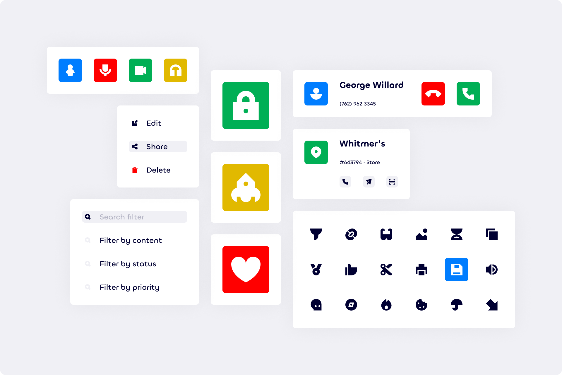
The context, however, is completely variable. Although they're intended more specifically for UI, they're versatile enough to work in fields ranging from packaging to editorial design, including data visualization or even signage.
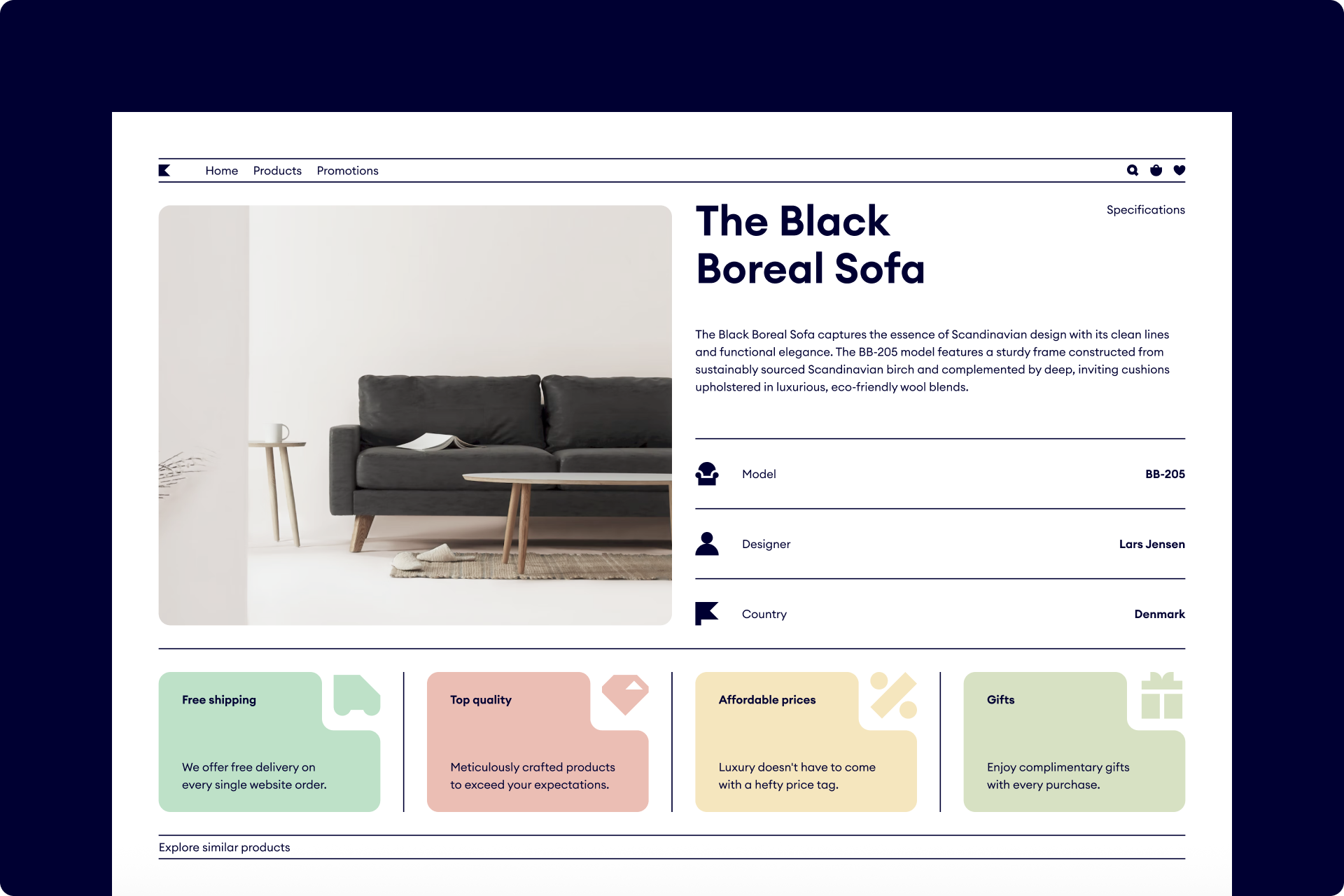
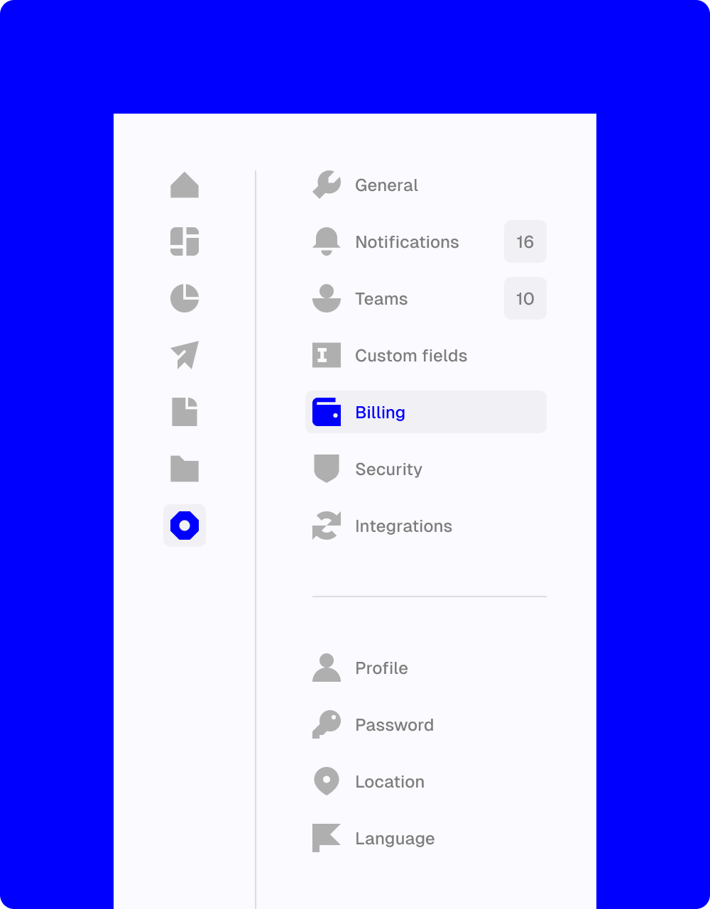
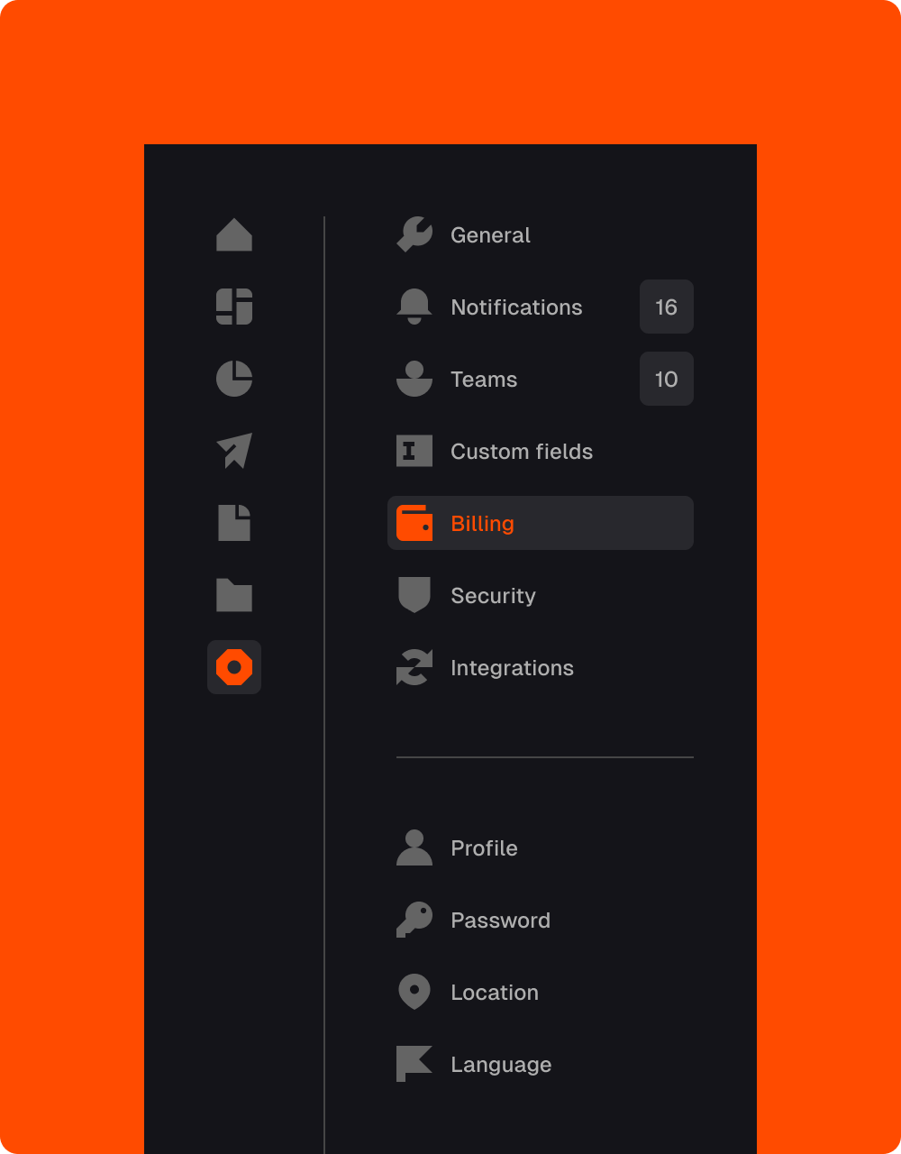
It's also interesting to mention which typefaces can accompany this set with greater solvency. Overall, neutral and timeless sans serif typefaces like Helvetica, Neue Haas Grotesk or Geist are safe choices.
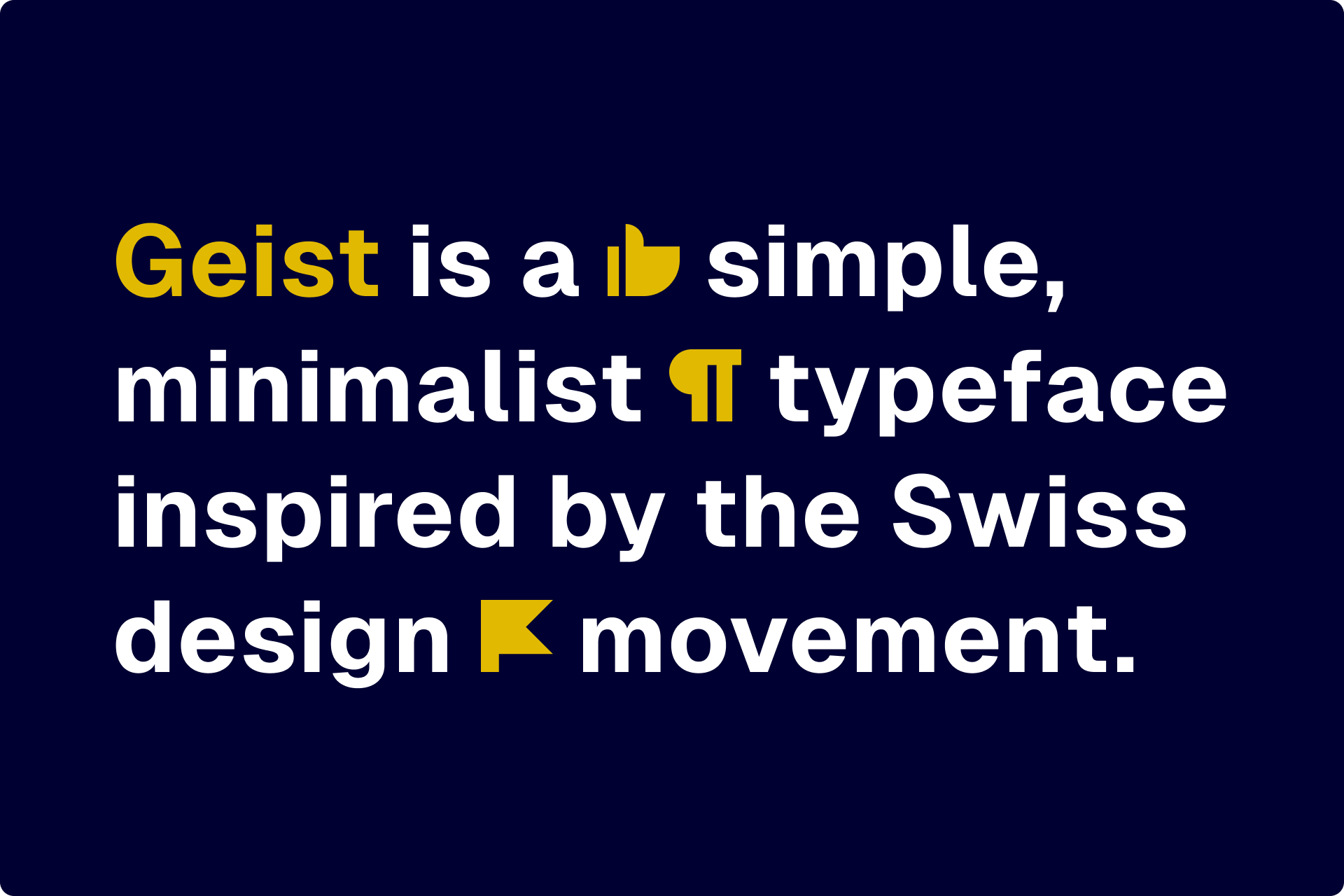
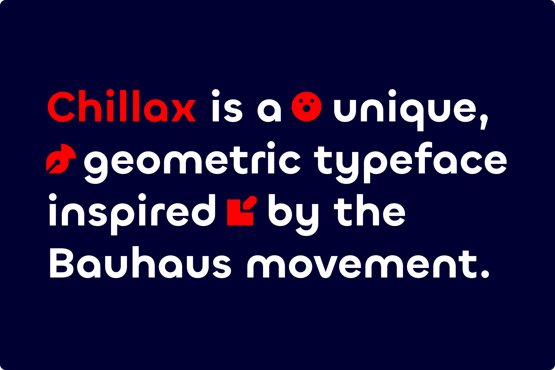
But if you're looking for a little bit of personality, try looking for a geometric typeface with a more unique construction (or directly inspired by the Bauhaus movement) such as Futura, Circular or Chillax.
The alternatives
If Block isn't exactly the style of icons your project needs, you may find better alternatives in our library. One of them could be Sharp, an icon set with a similar construction based on simple geometric shapes. Plus, it's available in four different styles: Line, Duo, Solid and Flat.

If what you like about Block is its bold appearance but you're not so enthusiastic about its brutalist shapes, you might want to consider a set like Plump, which also comes in four different styles: Line, Duo, Solid and Flat. This collection has a friendly and cartoony style that would be more suitable for cheerful projects.

We wanted to design an icon set like Block for a long time and we're happy to finally be able to share it with you, completely free. You can access it directly from our app or through a Figma file especially prepared for the occasion.
Enjoy designing with Block!
Block icons
A free icon set for modern and minimalist brands, inspired by the Bauhaus principles of simplicity and geometric balance.